
Abstract

INTRODUCTION
SCATTERPLOT
Probably the simplest analysis tool for microarray data visualization is the scatterplot. In a scatterplot each point represents the expression value of a gene in two experiments, one plotted on the x-axis and the other one on the y (
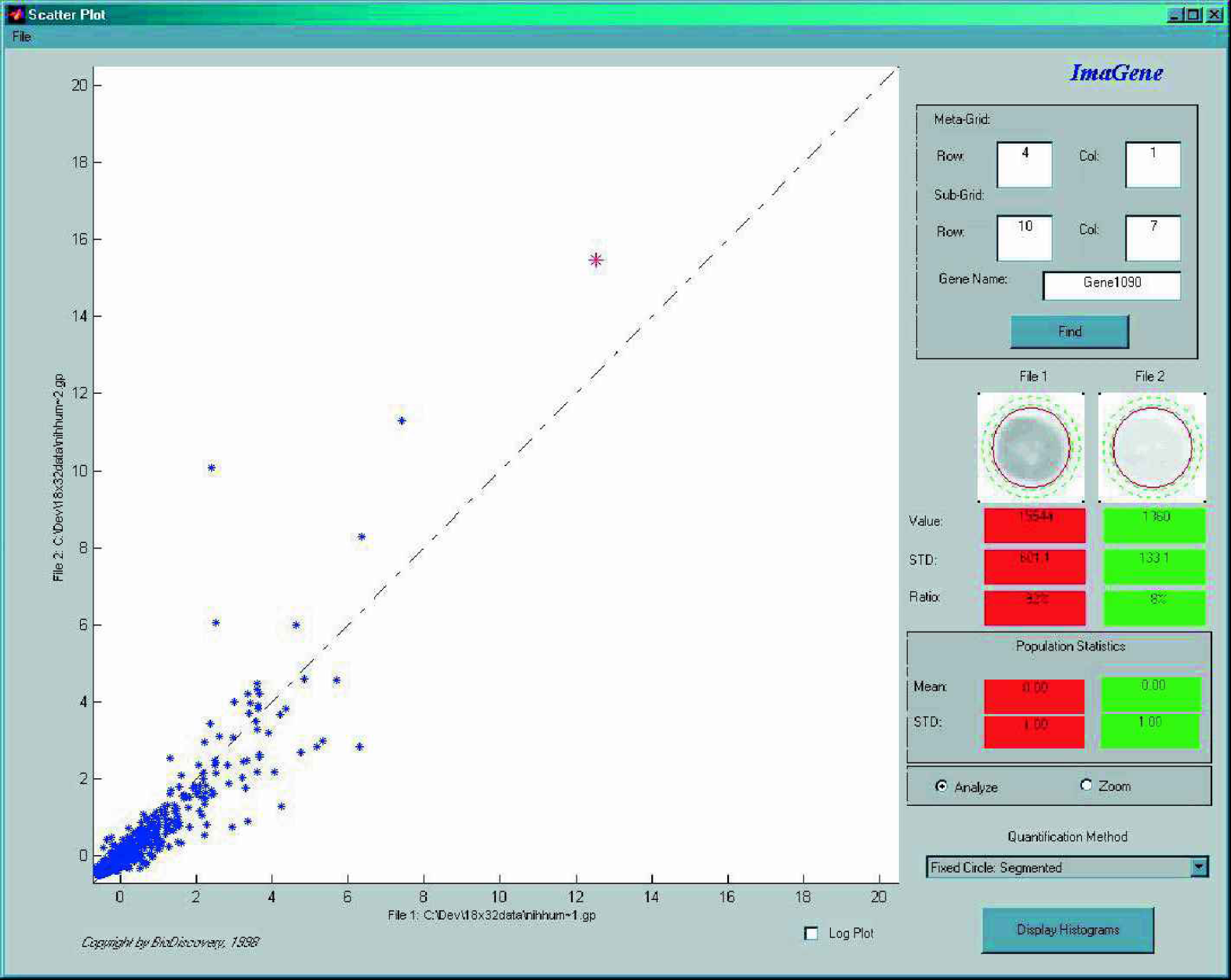
Scatterplot of two experiments. Every point in the plot shows the expression of a gene in the two experiments.
In such a plot genes with equal expression values would line up on the identity line (diagonal), with higher expression values further away from the origin. Points below the diagonal represent genes with higher expression in the experiment plotted on the x-axis. Similarly, points above the diagonal represent genes with higher expression values in the experiment plotted on the y-axis. The further away the point is from the identity line the larger is the difference between its expression in one experiment compared with the other.
PRINCIPAL COMPONENT ANALYSIS
It is easy to see how the scatterplot is an ideal tool for comparing the expression profile of genes in two experiments. Even three experiments could be plotted and compared in a three dimensional scatterplot. What can we do though when more than 3 experiments are to be analyzed and compared with each other? In case of twenty experiments for example we can not draw a twenty dimensional plot. Fortunately, there are techniques available in statistics for dimensionality reduction, such as Principal Component Analysis, that are able to compress the data into two or three dimensions (that we can plot) while preserving most or all the variance of the original dataset.
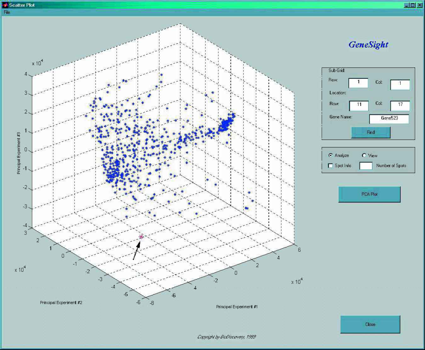
Principal Component Analysis on 600 genes across 21 experiments. Gene scores are plotted on the first three principal components. The gene pointed to by the arrow shows a possible outlier.
This multivariate technique is frequently used to provide a compact representation of large amounts of data by finding the axes (principal components) on which the data varies the most. In principal component analysis the coefficients for the variables are chosen such that the first component explains the maximal amount of variance in the data. The second principal component is perpendicular to the first one and explains maximum of the residual variance. The third component is perpendicular to the first two and explains maximum of the still remaining variance. This process is continued until all the variance in the data is explained. The linear combination of gene expression levels on the first three principal components could easily be visualized in a 3D plot (
PARALLEL COORDINATE PLANES
Two and three dimensional scatterplots and principal component analysis plots are ideal for detecting significantly up- or down-regulated genes across a set of experiments. These methods do not provide, though, an easy way of visualizing progression of gene expression over several experiments. These types of questions usually come up in time series experiments where, for instance, gene expression is measured every two hours. The important question in this case is how gene expression progresses over the duration of the entire experiment. The parallel coordinate planes plotting technique is best suited to answer these types of questions. With this method experiments are plotted on the x-axis and expression values plotted on the y-axis. All genes in a given experiment are plotted at the same location on the x-axis, only their y location varies. Another experiment is plotted at another x location in the plane. Typically the progression of time would be mapped into the x-axis by having higher x values for experiments done at a later time or vice versa. By connecting the expression values for the same genes in the different experiments one can obtain a very intuitive way of depicting the progression of gene expression (

The Parallel Coordinate Plot displays the expression levels of all genes across all experiments/files in the analysis. On the x-axis the experiments or experimental files are plotted. The y-axis shows the expression level of all genes across all experiments.
Among other experiments showing changes in expression, pattern during the cell's life cycle can readily be visualized this way. Not only does this type of display make it very easy to follow the changes in expression level over time, but it could well be applied to any other type of data as well. Due to the easy detection of unusual expression patterns, this type of plot can also be used well for outlier detection.
In addition, by applying different curve fitting techniques any expression pattern over time could be searched for in the data. By adjusting the required closeness of fit the number of chosen expression patterns could also be controlled.
CLUSTER ANALYSIS
Another frequently asked question related to microarrays is finding groups of genes with similar expression profiles across a number of experiments. The most often used multivariate technique to find these groups is cluster analysis. Essentially, this method accomplishes the sorting of the data by grouping (clustering) genes with similar expression patterns closer to each other. This technique can help establish functional groupings of genes or predict the biochemical and physiological pathways of previously uncharacterized genes.
The clustering method that is most frequently used in the literature for finding groups in microarray data is hierarchical clustering (1). This method typically operates on a similarity or distance measure of the data, such as: correlation, Euclidean, squared Euclidean, or city-block (Manhattan) distance. In addition to calculating the correlation or distance matrix, in most cases a linkage rule also has to be specified to indicate how distance should be calculated between groups and when groups are supposed to be joined together. The most popular linkage rules are: single, complete, or average linkage, or the centroid method. As an example, in the average linkage method the distance between two clusters is calculated as the average distance between all pairs of objects in the two different clusters. As a result of the grouping process, a tree of connectivity of observations emerges that can easily be visualized as dendrograms. For gene expression data not only the grouping of genes, but also the grouping of experiments, might be important. When both are considered it becomes easy to simultaneously search for patterns in gene expression profiles and across many different experimental conditions (
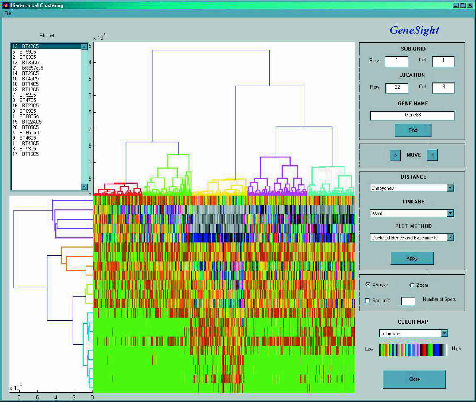
Color-coded gene expression values for 600 genes (horizontally) in 21 experiments (vertically). Simultaneous clustering of genes and experiments is visulazed by the top and left side dendrograms respectively.
Every colored block in the middle panel of
Although currently hierarchical clustering is an often employed way of finding groupings in the data, other nonhierarchical (e.g., k-means) methods are likely to gain popularity in the future with the rapidly growing amounts of data and the ever-increasing average experiment size. A common characteristic of nonhierarchical approaches is to provide sufficient clustering without having to create the full distance or similarity matrix, while minimizing the number of scans of the whole dataset.
CLASSIFICATION
Although cluster analysis is currently by far the most frequently used multivariate technique to analyze gene expression data, we have to emphasize that it is also the simplest such method. Cluster analysis is typically employed when there is no apriori knowledge about the data available. We are at the very beginning of understanding the gene interaction network of even some of the simplest genomes, but it would certainly be misleading to say that nothing is known about the functionality of genes in certain genomes. For example, the MIPS Yeast Genome Database classifies genes belonging to functional classes such as: the tricarboxylic-acid pathway, respiration chain complexes, cytoplasmic ribosomes and many others (5). Many of these functional categories represent genes which are, on biological grounds, expected to have similar expression profiles across a set of experiments (1,4). One could of course apply the previously described clustering scheme to group genes with similar expression profiles and from the known genes in each group conclude which group represents which biological functionality. With such a procedure one might find that the clustering actually came up with groups that biologically make sense, but the opposite is equally possibly. Depending on the chosen algorithm, some of its parameters, or just due to characteristics of the data, it is also possible that the found clustering has no biological significance at all. In that sense clustering is a somewhat ‘blind’ procedure, either producing some meaningful grouping or not. It has been shown to work in certain cases and it is certainly a useful tool for predicting functionality of previously uncharacterized genes based on group membership, but it also has its limitations.
A somewhat more directed way of grouping the data is classification. In this method genes of known functionality serve as a training sample to establish group characteristics. Unknown genes are then classified into the already specified groups. Notice that in this case, as opposed to clustering, we are guaranteed to end up with a result that is at least biologically interpretable. At the end of the classification process the unknown genes are classified into the groups that were created based on the functional characteristics and expressional profile of previously known genes. Therefore, classification emerges as a more direct way of obtaining grouping information in microarray data.
One has to empasize though that just as it was the case with clustering, classification can also be achieved using many different algorithms. Probably the simplest ways to classify data would be with Linear Discriminant Analysis. This method derives a variate, the linear combination of the independent variables (in our case these would be the gene expression value scores for all experiments in the study) that will discriminate best between a priori defined groups. Discrimination is then achieved by setting the variate's weights for each variable to maximize the between-group variance relative to the within-group variance. If the covariance matrices of the groups are significantly different from each other then Quadratic Discriminant Analysis might be a better choice for analysis. If the distribution of the whole dataset is significantly different from the normal distribution and/or no obvious transformation could be found that would bring the distribution closer to normal then nonparametric classification techniques should be used. The most typical of these are the different kernel methods, such as uniform, normal, biweight and triweight kernel method and the k-nearest neighbor algorithm. A promising classification technique from statistical learning theory is support vector machines. Different versions of this algorithm are able to classify huge amount of data with impressive speed and minimal memory requirement, but without the often occurring problem of overfitting the data (6).
COMPUTATIONAL MODELING
Currently cluster analysis is the most popular multivariate technique that is used to find structure in microarray data. As pointed out earlier it is not without limitations, but as probably the simplest possible multivariate technique it has quickly gained popularity. The authors predict that as the field matures we are likely to see a shift in the direction of more sophisticated classification methods appearing in the literature. Even though classification is certainly a more direct way of finding structure in the data than clustering, it still lacks the complexity that is required to capture all the connectivity and interdependence among genes in a genome.
One should keep it in mind that probably the ultimate goal of analyzing microarray data is at some point to discover how genes are related and affect each other, and are dependent on one another. Accordingly, the modeling device describing this interdependency has to have a matching level of complexity. There are not to many modeling tools out there that fit these requirements. Some of the possible candidates are: multilayer neural networks, systems of partial differential equations and structural equation modeling. At this point it would be too early and also hard to tell which one or several of these and other methods will turn out to be the most applicable modeling tool(s), but with the rapidly accumulating expression data these techniques are bound to appear in the relatively near future. Some early examples of applying neural networks to explain gene data (7), and mapping out the connectivity pattern of smaller regulatory networks (8) are already available.
CONCLUSIONS
In this paper we provided an overview of the most popular data analysis and visualization techniques used with microarray expression experiments. In our discussion we started out with the simplest tools, such as the scatterplot, principal component analysis and showing the data in parallel coordinate planes, gradually working our way towards the more complex analysis methods, such as the various forms of clustering and classification algorithms, ending on a note about the future of computational models. The discussion should give the reader an overview of the currently used most popular analysis techniques as well as some insight into what to expect in the near future.