
Abstract
In vitro chemosensitivity assays are invaluable for assessing chemotherapeutic agents' effects on cancer cells. Yet the dose–response curves generated by those assays, usually approximated by four-parameter logistic (4PL) models, are oftentimes difficult to interpret, with no clear indication of which metric should be used to compare them. Here, five commonly used metrics, absolute and relative half-maximal inhibitory concentration (IC50), area under the dose–response curve (AUC) based on trapezoidal rule and a parametric approach, and the effect at the maximal concentrations (E max ), were compared in both simulations and real-life scenarios to evaluate their use with 4PL curves. Despite the fact that IC50 is the most widely used metric to analyze dose–response curves, this study demonstrated that it was not the most reliable of the metrics tested. Fitted AUC showed the best overall performance in both the simulation and real-life scenarios; trapezoidal AUC showed similar performance to fitted AUC in most cases.
Introduction
The focus of this research was the quantification of dose–response curves assumed to follow a four-parameter logistic (4PL) model, which was defined as
where y is the response, x is the drug concentration, β 1 is the upper limit (top), β 2 is the lower limit (bottom), β 3 is the half-way response (IC50) between β 1 and β 2, and β 4 is the slope. The 4PL model, initially associated with ligand binding assays, was chosen for this study, because it is one of the most commonly used models for investigating nonlinear dose–response relationships in pharmacology laboratories today. 1 –4 Once the model is used to fit dose–response data, the estimated response at maximal dose, the estimated response at minimal dose, the curve slope, and the dose at 50% maximal response (IC50 or EC50) are all reported; from this information, responses at various concentrations can be calculated using the fitted model. 5 Although the 4PL model has its limitations (e.g., it is a symmetrical function and some dose–response data are not symmetrical), the 4PL model has the advantages that it is flexible, it can be used to fit data over a large range of distribution forms, and it is widely used and accepted in the pharmacology community. 4,5
In this study, five metrics were considered: relative and absolute IC50, fitted and trapezoidal area under the dose-response curve (AUC), and effect at the maximal concentrations (E max) (Fig. 1). Specifically, relative IC50 was the concentration that corresponds to the inflection point of the dose–response curve (halfway between the top and the bottom of the fitted 4PL curve); absolute IC50 was the concentration that causes 50% of maximal inhibition effect (halfway between top of the 4PL and zero); trapezoidal AUC was the area under the dose–response curve generated by piece-wise linear connection of the observed data points using the trapezoidal rule; fitted AUC was the area under the dose–response curve generated by the fitted 4PL model; E max was the summation effect at the highest three concentrations. (Note that this E max definition is slightly different than the usual definition. Here, it does not require that the plateau of the curve be reached at high concentrations.)
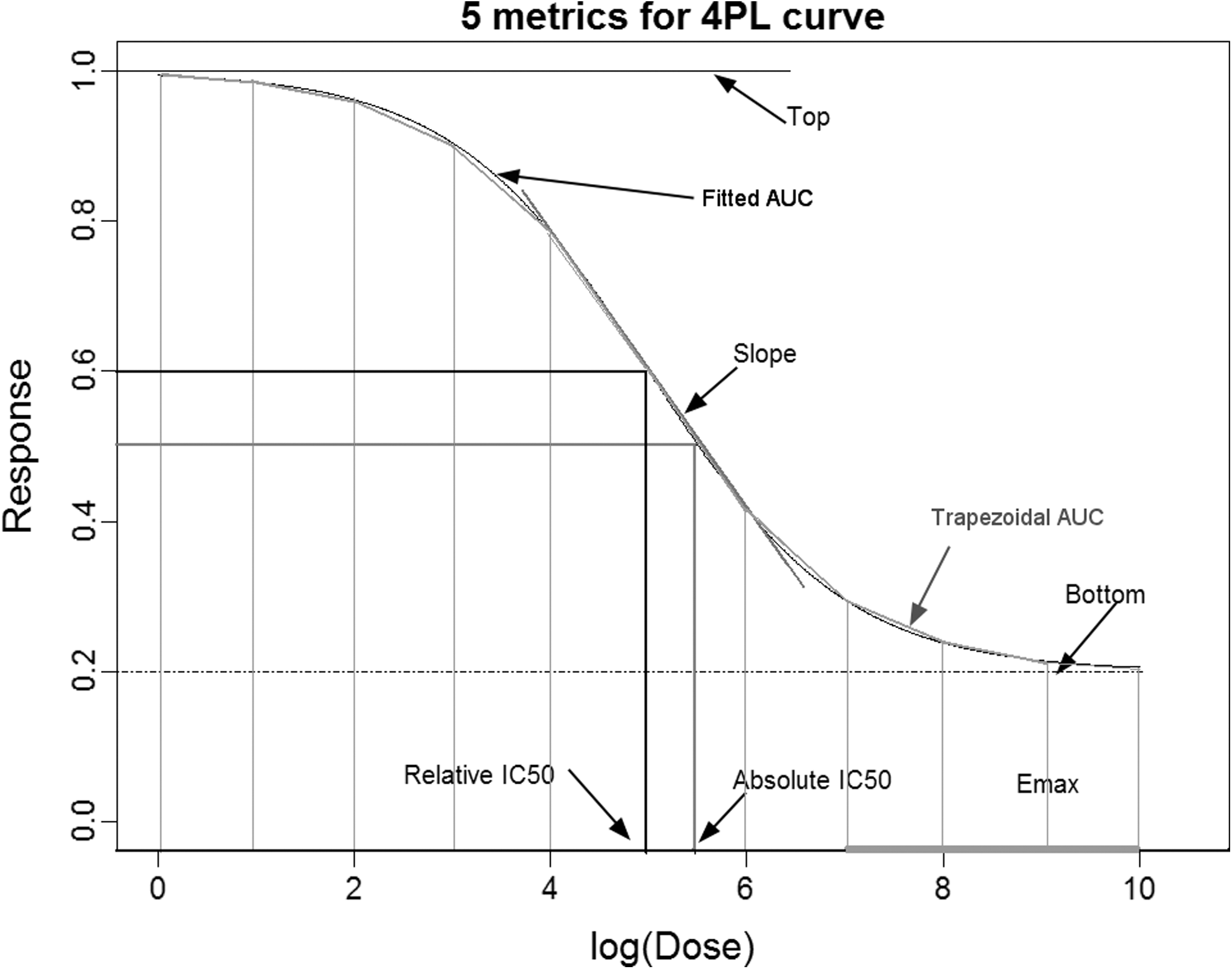
Five metrics illustrated on a sample four-parameter logistic (4PL) dose–response curve. This curve points out the five metrics evaluated in this study: relative IC50 (the concentration that corresponds to the inflection point of the dose–response curve, halfway between the top and the bottom of the fitted 4PL curve); absolute IC50 (the concentration that causes 50% of maximal inhibition effect, halfway between the top of the 4PL and zero); fitted area under the curve (AUC) (the model-based derivation of area under the curve); trapezoidal AUC (the area under the dose–response curve generated by piece-wise linear connection of the observed data points using the trapezoidal rule); and E max (the average effect at the highest three concentrations—a slightly different definition than the traditional definition).
These particular five metrics were chosen based on the authors' belief that these metrics are the most frequently used metrics for analyzing dose–response data. Relative and absolute IC50 are outputs of the 4PL model and are therefore the most often used to analyze dose–response curves. 5 They were considered here as the primary competitor metrics against which alternative metrics were to be assessed. Trapezoidal AUC was considered, because it is commonly used to quantify dose–response curves. 6 –10 Fitted AUC was included as a new method in this study. The primary advantage of fitted AUC over trapezoidal AUC is that the fitted curve is guaranteed to be monotonic, so the metric is less affected by measurement errors. E max was included, because it was used to evaluate dose–response data by groups that performed a similar in vitro assay to the one described here. 11,12 The metrics investigated in this study characterize different aspects of a dose–response curve; IC50 and E max are point metrics (IC50 reports a specific concentration at half-maximal response and E max reports a specific level of response at the maximum concentrations tested), whereas AUC is more of an overview or summation of a drug's effect across the entire range of doses tested. 13,14
Materials and Methods
The five metrics' performances were initially judged on their abilities to classify and rank curves in computer simulations, which created typical 4PL dose–response curves normally generated by in vitro sensitivity assays. Next, the metrics were assessed by “real-life” scenarios. These real-life scenarios evaluated the metrics' capacities to differentiate estrogen receptor (ER)-positive and -negative cell lines and the metrics' capacities to correlate with publically recognized drug sensitivities of cancer cell lines. The workflow is illustrated in Table 1.
Workflow for Materials and Methods
ER, estrogen receptor.
Assuming that there are 11 drug doses used in the assay, noted as
Trapezoidal AUC was the area under the curve based on the trapezoidal rule, which is calculated as
Here, it is assumed that the log-doses are equally spaced.
E
max usually refers to the drug effect at the highest concentration. For this study, E
max was defined a bit differently. To reduce variability, E
max equaled the summation of the last three responses on the dose–response curve. For the purpose of this study, E
max can be thought of as a truncated version of trapezoidal AUC, eliminating the requirement for the responses at the highest three concentrations to fall in an asymptote.
In the real-life evaluation of dose–response curves, quality control processes typically exclude outliers in datasets from downstream analysis; therefore, outliers were not included in the simulations described here. The focus of this research was to evaluate the five metrics' performance when the data fit the 4PL model and no outliers occurred. The simulations purposefully challenged the 4PL model with attributes, such as a truncated right end, to mimic what is seen in reality.
Computer Simulation Scenarios
The simulations performed here were based on the 4PL model, using the statistical software package R version 2.10.1, 1,18 which was also used for all the other statistical analyses in this study. In particular, the estimates of relative IC50, absolute IC50, and fitted AUC were based on nonlinear ordinary least square curve fitting of the 4PL model using R package DRC. In all of the simulations, normal random errors, ɛ∼N(0,σ2), were added to the true 4PL models. Different variation levels, σ, were investigated between 1% and 15%, but the relative performance of the metrics was found to be independent of the variation level (data not shown). Therefore, all of the simulations were based on σ=5%. Different in IC50s and bottoms were also investigated over a range of values. All the simulations assumed that the response range was between 0% and 100%, and the doses ranged between 0 (no treatment) and 10 (maximum concentration).
Two schemes were set up to assess the metrics: the classification scheme and the ranking scheme. The classification scheme contained scenarios that evaluated the metrics' abilities to correctly categorize samples into corresponding groups (see Supplementary Fig. S1 and Supplementary Table S1 for visualization of the classification scenarios; Supplementary Data are available online at
For the classification scheme, the two groups were assumed to represent two 4PL “families”: resistant to compound treatment and sensitive to compound treatment. There were eight classification scenarios considered within this classification scheme. For each scenario, the curve families had three parameters in common and differed in one (IC50 or bottom) (Supplementary Table S1). One hundred curves for each of the resistant and sensitive families were generated per simulation run. The median of the 200 values of each metric (a convenient number chosen to simplify programming) was used as the cutoff to determine resistant or sensitive in each scenario, and the error rate was then calculated for each metric in each scenario. For instance, if in one simulation run the top 100 estimated absolute IC50 values (classified as the “upper” group) include five curves that actually belong to the “lower” group, then the classification error rate for absolute IC50 in this simulation run is 5%. This process was then independently repeated 100 times, and the average classification error rate (ACER) and the standard deviation (SD) of classification error rates over the 100 simulation runs were calculated to appraise the performance of each metric. In this simulation scheme, the true membership of each curve was known by simulation design, so the parameter values (including the four parameters in 4PL and the noise level) were intentionally chosen so that each method had the chance to misclassify curves. This was done, because when two curve groups are very different, all of the methods can do a perfect job of classification. The objective was to compare the misclassification error rates by the five methods. To do a fair comparison, the eight scenarios were designed so that no one method was particularly favored. For instance, scenario 1 featured two parallel curves, which may have favored IC50 and AUC over E max; scenario 2 was a right-truncation of scenario 1, so E max was expected to improve; scenario 3 was comprised of two nonparallel curves, which may have favored AUC and E max over IC50.
For the ranking scheme, there were also eight scenarios considered. In each scenario, the curves had three parameters in common and differed in one (IC50 or bottom—the variable parameter); the variation range of the variable parameter is given in brackets (Supplementary Table S2). For each variable parameter in each scenario, 200 equidistant intermediate values were considered to span that variation range. In each simulation run, 200 curves were generated based on the 200 sets of parameter. The correlation between the true ranks of the variable parameter and the ranks of the simulation results (based on 4PL model fit) was calculated for each metric. The best-performing metric was expected to have a higher correlation with the true ranks of the curves. This simulation was repeated 100 times. The mean and the SD of the 100 correlation values by the metric were used to evaluate the metric's performance.
The intent of the simulation designs was to mimic different situations in reality (e.g., partial coverage of the entire assay dynamic range, nonparallel curves). For example, in the classification scheme, setting the true IC50 values around 5 (assuming the higher and lower plateaus were achieved at concentrations 0 and 10, respectively) meant that the entire curve could be observed, whereas setting the true IC50s around 8 meant that the assay dose design was not adequate to see the bottom part of the 4PL curve. Similarly, setting the slope parameter to 0.5 flattened the true 4PL curves so that the dose range only covered the linear portion of the 4PL curve, as in scenarios 5, 6, 7, and 8 of both classification and ranking simulation schemes. In fact, some of the curves appeared to be more linear than 4PL. The bottom was not set to zero in either simulation scheme, because (1) the bottom is rarely zero in real-life assays and (2) it allowed for the differentiation between absolute IC50 and relative IC50. However, the comparisons of the metrics were expected to be the same regardless of whether the bottom was set to zero or a different value such as 0.25.
To more fully explain and confirm the metrics' performances in the simulations under the classification scheme, the effect size and the coefficient of variation (CV) for each metric were calculated based on theoretical formulas and/or by simulations. Effect size was defined here as
where, for a given metric, Mean1 was the mean value of one group and Mean2 was the mean of another group; SD was the standard deviation of the mean based on the variation of the two groups. Theoretical formulas could then be derived for the means and variances of relative IC50, trapezoidal AUC, and E max. Using those derived formulas, the effect size and CV of each metric could then be calculated when the parameter values of the 4PL were known. There are no closed-form formulas for the mean and variance of fitted AUC and absolute IC50, so they were estimated based on simulations.
Real-Life Scenarios
The first real-life scenario involved 27 breast cancer cell lines obtained from ATCC (Manassas, VA), which were maintained in RPMI media (Mediatech, Herndon, VA) containing 10% FBS (HyClone, Logan, UT) at 37°C in 5% CO2. These cell lines included AU565, BT20, BT474, BT483, BT549, CAMA1, HCC1143, HCC1187, HCC1428, HCC1500, HC1569, HCC1937, HCC1954, HCC202, HCC38, MCF10A, MCF7, MDAMB157, MDAMB175VII, MDAMB231, MDAMB361, MDAMB436, MDAMB453, SKBR3, T47D, UACC812, and ZR751. Of these 27 cell lines, 10 were estrogen receptor positive (ER+) and 17 were negative (ER−). 19 Cells from each cell line were seeded at 320 cells per well in 384-well plates and were allowed to adhere to the plate for 24 h. A four-drug mixture of paclitaxel (T), 5-fluorouracil (F), doxorubicin (A), (McKesson Specialty Care Solutions, La Vergne, TN), and cyclophosphamide (C) (Niomech, Bielefeld, Germany), also known as T/FAC, was created and 10 serial dilutions of the mixture were made. 20 The wells were treated with each T/FAC dose in triplicate, one cell line per plate, with three control wells of media alone per cell line. The plates were incubated for 72 h at 37°C.
The second and third real-life scenarios used groups of 30 and 21 breast cancer cell lines, respectively. The group of 30 cell lines included AU565, BT20, BT549, HC1143, HCC1569, HCC1937, HCC1954, HCC38, MDAB157, MDAMB231, MDAMB453, MDAMB468, BT474, CAMA1, MCF7, MDAMB175VII, MDAMB361, MDAMB415, T47D, UACC812, ZR7530, CAL120, CAL51, CAL851, EFM19, EVAST, HCC1395, HCC1419, MFM223, and UACC893 (ATCC). The first 21 cell lines in the list were used in the third real-life scenario as well. All cell lines were maintained as described earlier.
All cell lines in both real-life scenarios were treated with 10 serial dilutions of paclitaxel in triplicate, one cell line per 384-well plate. Each plate contained three control wells of media alone. The plates were incubated overnight, treated with the serial dilutions of paclitaxel, and then incubated for 72 h at 37°C.
All plates in the real-life scenarios were assayed by the ChemoFx® drug response marker, an in vitro chemosensitivity assay (Precision Therapeutics, Pittsburgh, PA), to create dose–response curves for each cell line's response to treatment.
21,22
Briefly, ChemoFx began with the removal of media and nonadherent cells after the incubation period. The remaining cells were fixed in 95% ethanol and then stained with DAPI (Molecular Probes, Eugene, OR). A proprietary automated microscope (Precision Therapeutics) was used to capture and count UV images of the stained cells in each well. A survival fraction (SF) at dose i (
Each metric's average values for ER+ and ER− cell lines were calculated from the ChemoFx-generated T/FAC dose–response curves. The Student's t-test was performed to compare the separation of average values for each metric, the Wilcoxon rank test was run to test the ranks of the metrics, and the chi-square test was executed to evaluate how many times a metric correctly categorized a cell line based on ER status. Collectively, these tests were completed to determine which metric demonstrated the greatest separation between the two populations of cell lines.
In the second real-life scenario, the paclitaxel dose–response curves for each of the 30 cell lines were analyzed by each of the five metrics. Each metric's performance for each cell line was directly correlated to paclitaxel IC50 values for that cell line published in a publically available online database. 23,24 The database, created by the Wellcome Trust Sanger Institute, consists of dose–response data for cancer cell lines treated with various chemotherapeutic agents and analyzed using an ATP-based cell viability assay. 25 The Pearson's correlation coefficients associated the 30 values for each metric with the 30 Sanger IC50 values for the corresponding cell lines. The coefficients served to demonstrate how well each metric correlated with the paclitaxel IC50 values for each cell line listed in the Sanger database.
The third real-life scenario used a subset of 21 breast cancer cell lines with known ER status from the 30 lines used in the second scenario. 19 Nine cell lines were ER+ and 12 lines were ER−. Using the paclitaxel dose–response curves generated in the previous scenario, each metric was assessed by t-test to establish how well it separated the cell lines into ER+ and ER− groups.
Results
Classification Scheme
The classification scheme contained eight scenarios to test the five metrics, and the ACERs and SDs were calculated for each (Table 2). Overall, fitted AUC was the most reliable, with the lowest average error rate in six out of eight scenarios. Trapezoidal AUC behaved similarly to fitted AUC in all scenarios. Absolute IC50 and E max each had the lowest mean error rate in one out of eight scenarios, whereas relative IC50 never had the lowest mean error rates in any of the scenarios. As a whole, the differences in mean error rates for fitted AUC, trapezoidal AUC, and absolute IC50 were quite small with only relative IC50 and E max showing comparatively larger mean error rates in certain scenarios. Absolute IC50 always performed better than relative IC50, and E max had the lowest average error rate only when the curves were not parallel and the bottoms were truncated.
Average Classification Error Rates for Classification Scheme Scenarios
Average classification error rate and standard deviation (in parentheses) per metric for the classification scenarios, which tested the metrics' capacities to correctly classify the curves into sensitive and resistant groups.
AUC, area under the dose-response curve.
Ranking Scheme
The ranking scheme was comprised of eight scenarios to test the five metrics, and the mean correlation (MC) and SD were calculated for each metric in each scenario (Table 3). Again, fitted AUC performed best overall with the highest MC to true rank in six out of eight scenarios; trapezoidal AUC performed similarly in most cases. E max had the highest MC to true ranks in two out of eight scenarios, again when the curves were not parallel and the bottoms were truncated. Relative IC50 and absolute IC50 did not have the highest MC to true ranks in any of the scenarios. Once again, the differences between the MC to true ranks between absolute IC50, fitted AUC, and trapezoidal AUC were minimal with only relative IC50 and E max showing comparatively lower MC to true ranks in certain scenarios. As before, absolute IC50 was always preferable to relative IC50. In this study, classification and ranking scenarios showed similar trends in performance by the metrics, which serves to confirm the findings outlined here.
Mean Correlation for Ranking Scheme Scenarios
Mean correlation and standard deviation (in parentheses) per metric for the ranking scenarios, which tested the metrics' abilities to order the curves based on true parameter values.
CV and Effect Size
Assuming the true 4PL parameters are (β 1, β 2, β 3, β 4=(1, 0.25, 5, 1), and the error variance σ2=0.01 (the conclusion is independent of the actual values used), the CV calculations for trapezoidal AUC, relative IC50, and E max were made based on the derived formulas; the CVs for fitted AUC and absolute IC50 were calculated from simulations (Table 4A). The differences between the CV values in the theoretical and simulation instances were very small, showing good agreement between the two approaches. The ranking of the CV values was fitted AUC<trapezoidal AUC<relative IC50<absolute IC50<E max, which provides an indication of the relative stability of the five metrics. In terms of the effect size (the larger the value the greater the differentiating power of the metric for the classification scheme), fitted AUC performed the best, and trapezoidal AUC behaved similarly in all of the scenarios (Table 4B). Relative IC50 had the smallest effect size for most of the cases; absolute IC50 and E max were in between. These results confirm the simulation results in Table 1.
The Theoretical and Simulation Coefficient of Variation for the Classification Scenarios for Each Metric
CV, coefficient of variation; NA, theoretical formula not available.
Effect Size for the Classification Scenarios for Each Metric
These data serve to explain the metrics' performances in the simulations. Bigger effect size is expected to result in lower classification error rate.
Real-Life Scenario 1: T/FAC-Treated Differentiation Based on ER Status
Based on P values by t-test, Wilcoxon rank test, and chi-square test, absolute IC50 had the smallest P values and therefore differentiated best on ER status, followed by E max and then relative IC50 and fitted AUC (Table 5). Note that the dose–response curves may not have covered the whole span of the sigmoidal profile, so this may have resulted in a favoring of particular metrics over others (Fig. 2). Although absolute IC50 had the smallest P values in these cases, the differences in P values across all metrics and tests completed were very small, and therefore, all metrics could be regarded as differentiating based on ER status equally well.
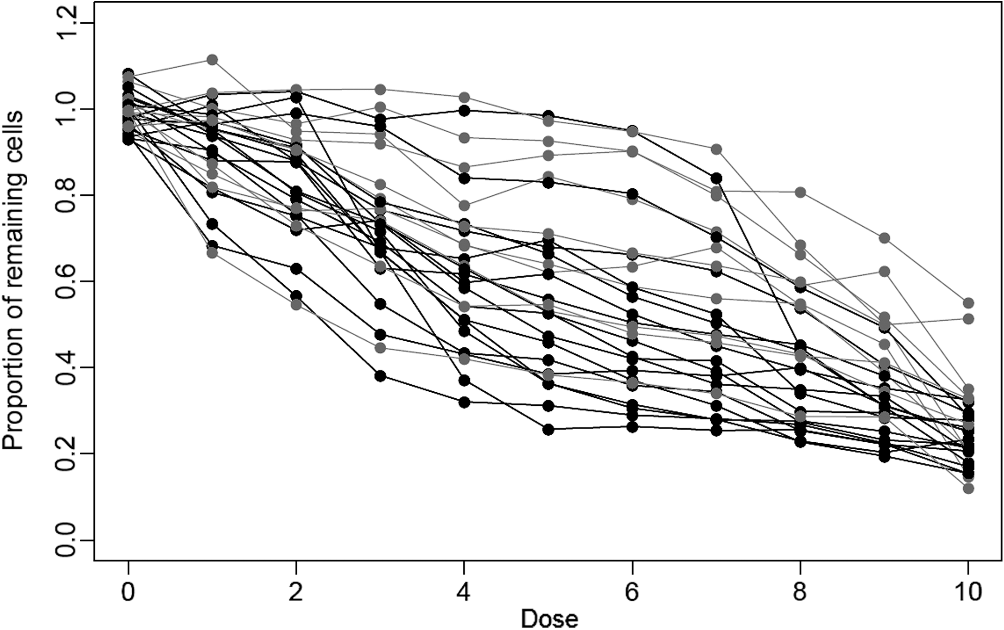
ChemoFx dose–response curves of the 27 breast cancer cell lines treated with T/FAC (paclitaxel [T], 5-fluorouracil [F], doxorubicin [A], and cyclophosphamide [C]). Each data point represents the average of triplicate measurements at a given dose. There were 17 estrogen receptor-negative (ER−) cell lines (black) and 10 estrogen receptor-positive (ER+) cell lines (gray).
P values to Assess the Metrics' Abilities to Differentiate 27 T/FAC-Treated Cell Lines Based on Estrogen Receptor Status
t-Test, Wilcoxon rank test, and chi-square test were run to evaluate each metric's ability to classify cell lines by ER status after generation of T/FAC (paclitaxel [T], 5-fluorouracil [F], doxorubicin [A], and cyclophosphamide [C]) dose–response curves by ChemoFx.
Real-Life Scenario 2: Paclitaxel-Treated Comparison with Sanger Database
The correlation coefficients (Table 6) associated each metric's values for each of the 30 cell lines to the corresponding paclitaxel IC50 values contained in the Sanger database. The highest correlation coefficients were generated by fitted and trapezoidal AUC, followed by absolute IC50, then E max, and finally relative IC50.
Correlation Coefficients to Demonstrate the Degree of Correlation Between the Five Metrics and the Sanger Database of IC50 Values in Paclitaxel-Treated Cells
Each of the five metrics analyzed palictaxel dose–response curves produced by ChemoFx for 30 breast cancer cell lines. Pearson's correlation coefficients were produced, which associated each metric's values for the 30 cell lines to the corresponding paclitaxel IC50 values for those same cell lines within the publically available Sanger database.
Real-Life Scenario 3: Paclitaxel-Treated Differentiation Based on ER Status
Table 7 reports the t-test P values for each metric that represent the difference in each metric's values between the ER+ and ER− groups. Again, fitted and trapezoidal AUC showed the smallest P values, followed by E max, relative IC50, and absolute IC50. The dose–response curves for the 21 paclitaxel-treated breast cancer cell lines are shown in Figure 3.
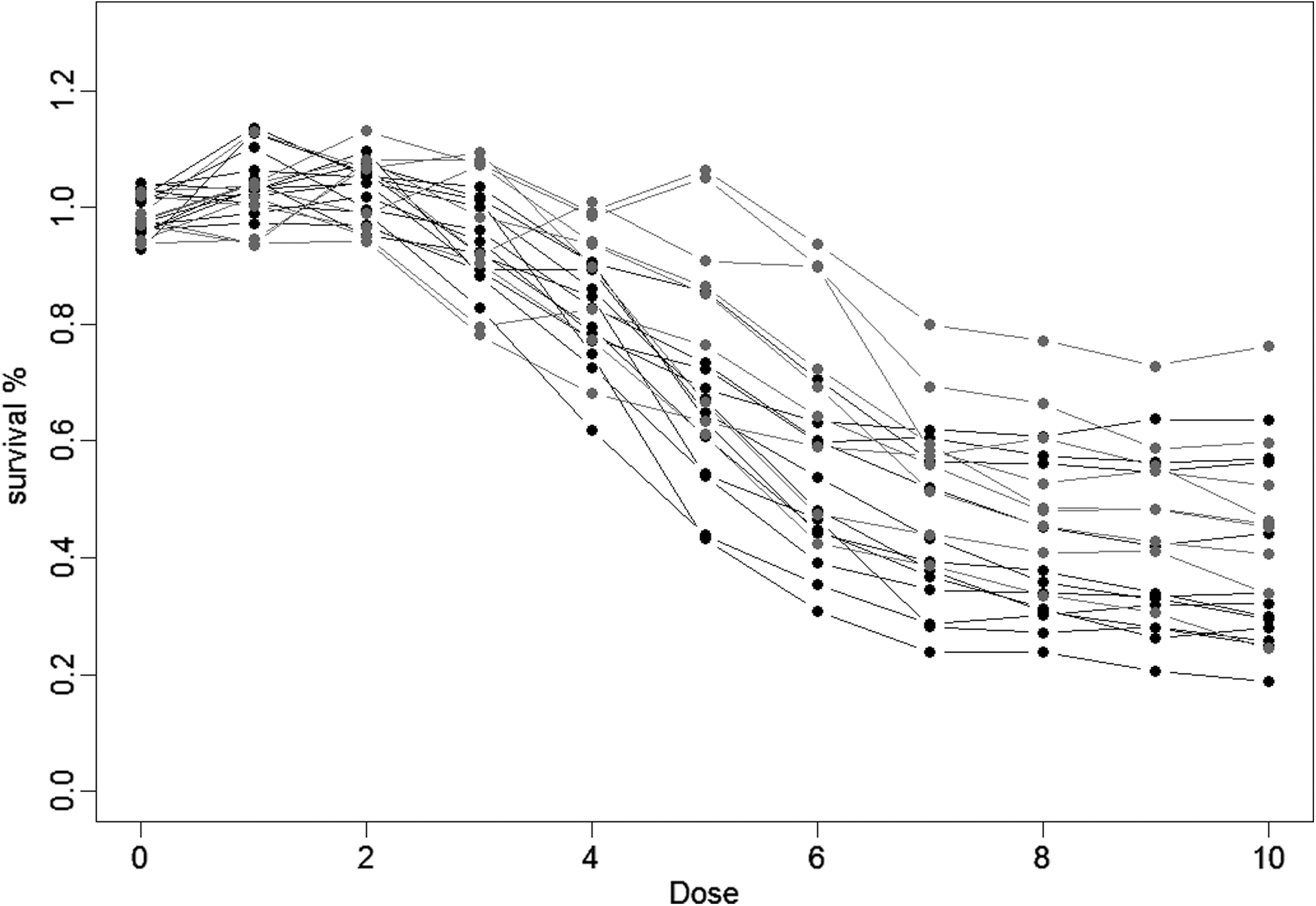
ChemoFx dose–response curves of the 21 breast cancer cell lines treated with paclitaxel. The paclitaxel dose–response curves are plotted for the 21 breast cancer cell lines of known ER status. Nine cell lines were ER+(in gray) and 12 cell lines were ER−(in black).
P Values to Determine the Metrics' Abilities to Differentiate Paclitaxel-Treated Cell Lines Based on Estrogen Receptor Status
ChemoFx generated dose–response curves for paclitaxel-treated breast cancer cell lines were analyzed by the five metrics. t-Tests were run to determine how well each metric separated the cell lines into ER+ and ER− groups.
Discussion
The purpose of this study was to investigate five metrics that are commonly used in 4PL dose–response curves by assessing those metrics' classification and ranking accuracy across computer simulations and real-life scenarios. The goal was to identify the metric that has the best performance in classifying and ranking dose–response curves. Even though sometimes other models are used in practice (e.g., polynomial models, smoothing spline models, 5-parameter logistic models), 4PL is the most popular. Therefore, this research focused on comparing the metrics when the underlying models were assumed to be 4PL. When the curve cannot be approximated by 4PL, for example, bell-shaped, then methods such as IC50 and fitted AUC cannot be directly derived without modifications on the model; in certain cases the point estimate such as IC50 may not be a suitable metric anymore. For assays with fixed concentrations, trapezoidal AUC and E max can be similarly calculated, because they are model-free.
Based on this research, we found that although relative IC50 is probably the most widely used metric for analyzing dose–response curves, data generated here suggest that relative IC50 oftentimes demonstrates poorer performance than other options in the majority of generated datasets. Ultimately, fitted AUC was the metric that showed the best overall performance in both classification and ranking simulation scenarios, executed well in differentiating based on ER status, and demonstrated high correlation with publically recognized drug sensitivities. In reality, performing a good fit of a 4PL model may pose a challenge to those who do not use sophisticated statistical packages; if that is the case, trapezoidal AUC, as opposed to fitted AUC, can be used, because trapezoidal AUC showed comparable performance to fitted AUC in most situations. In certain data situations, E max was slightly better than AUC calculations and was usually comparable to absolute IC50 values; however, the difference between E max and AUC calculations in those cases was insignificant. Finally, AUC and absolute IC50 always performed better than relative IC50.
This research considered IC50 to be a point-sensitive metric; the conclusion should be easily extended to IC#, where # is a number between 0 and 100. This investigation focused on the situations in which the curves did not cross, even though they might have been nonparallel, that is, all of the metrics were positively correlated. Therefore, it is intuitive that point-sensitive metrics such as IC50 and E max are not as reliable as summary-sensitive metrics such as AUC, because AUC accumulates information across the entire dose range. When curves do cross (Supplementary Fig. S3), it is much harder to rank curves. For instance, IC20 and IC80 could give opposite rankings for two curves. In those cases, the comparison and choice of the best metric would have to incorporate other information such as clinical knowledge.
One caveat for using AUC and E max is that their values depend on the range of doses examined and the sensitivity of the assay technology used. 26 –28 To appropriately compare two dose–response curves using either AUC or E max, the curves need to be measured across the same range of doses using the same assay detection technology. Alternatively, to calculate IC50 requires only enough data to fit a 4PL model. If the data can fit a 4PL model, the resulting IC50 remains relatively the same and is not impacted by the dose range tested or assay technology utilized. Therefore, although AUC was the metric that demonstrated the best overall performance in this study, AUC and E max should be reserved for comparing only the curves that cover the same range of doses using the same assay technology. On the other hand, IC50 requires that the data be approximated by a 4PL model. If the data do not produce a good fit of the 4PL model, then the IC50 estimate is not reliable. Alternatively, trapezoidal AUC and E max are nonparametric methods, and therefore, no model assumptions are required.
In this investigation of real-life scenarios, it was necessary to make some assumptions to proceed. The first assumption was based on the consistent in-house observation that ChemoFx outcomes correlate to the ER status of the cell line tested. Specifically, ER+ cell lines are more often labeled “resistant” by the assay, whereas ER– cell lines are more often labeled as “sensitive.” Reports in the literature confirm that ER status can be correlated with the outcomes of in vitro ATP assays, 11 yet no publications reflect the same correlation between ER status and ChemoFx outcome. In this investigation, this observation was assumed to reflect the truth.
It might seem surprising that the IC50 values from the ChemoFx assays did not show the strongest correlation with the IC50 values from the Sanger data. Possible explanations are that (1) Sanger data were based on ATP assays, ChemoFx used direct counting of the surviving cells; (2) the doses are different between the two assays, even though in theory this may not impact the estimate of the IC50 values, but in reality this could contribute to the differences; (3) in terms of absolute IC50, the correlation of 0.52 is comparable to the best of 0.56 from AUC methods, relative IC50 has the worst correlation of 0.41; (4) in scenario 1 of the simulations (both in the Classification scheme and the Ranking scheme), the truth is that IC50 value is the only differentiating factor between the curves, whereas the other three parameters are identical. Thus, it is expected that IC50 methods should be the best performers in this scenario, but still AUC methods showed superior performance.
In conclusion, this study demonstrated that, although widely used, relative IC50 is not as accurate as AUC or absolute IC50 in most situations, when ranking and classification of 4PL dose–response curves are necessary. AUC is generally the most accurate and best to use in the situations examined here. Fitted AUC should be utilized whenever sophisticated statistical software is available to accurately fit dose–response curves, but trapezoidal AUC is recommended if basic, more limited, software packages are used. The findings reported here can be extremely beneficial to researchers investigating candidate compounds in drug–response assays and should be considered to more precisely evaluate dose–response curves in the laboratory.
Footnotes
Acknowledgments
The authors thank Rebecca J. Palmer, PhD, for her assistance in the preparation of this manuscript and also thank the Informatics Team members at Precision for valuable inputs to this research as well as the development of the manuscript.
Disclosure Statement
No competing financial interests exist.