
Abstract
Abstract
In a recent article by Barfar and Padmanabhan (2015), we demonstrated how television viewership data could predict presidential election outcomes in the United States. In this article, we examine predictive models using a snapshot of Nielsen's national data on television viewership. The study is conducted with high-dimensional low sample size (HDLSS) data, whereby we conduct a comparative analysis with and without feature reduction on the data from the 2012 elections. We find that simple “single-show models” often provided more insights and predictive accuracies than models from feature reduction. Second, beyond the state and county levels of analysis, we show that the results continue to hold at the designated market area (DMA) level, crucial for television broadcasting because programs are often targeted at the DMA level. Finally, we examine the performance of the single-show models in the 2016 election season by applying them to the viewership information during the U.S. presidential primaries. We discuss implications of our findings for research and practice.
Introduction
The consensus among pollsters in the 2016 U.S. presidential elections was that Clinton would win easily. Nate Silver's FiveThirtyEight predicted a similar outcome, as well as The New York Times Upshot's elections model suggested an 85% chance for Clinton's victory. This failure of poll-data-driven models followed hard on a similar failure with predicting Brexit.
Trump's 2016 triumph was established in the key states, which in 2012 had supported Obama. Trump even won Wisconsin, a left-leaning key state since 1988. Why did the polls fail in the battleground states? Although there are many possible reasons, one reason may be in line with what the YouGov president conjectured in the midst of the 2015 UK election (The Telegraph 1 ): “What seems to have gone wrong is that people have said one thing and they did something else in the ballot box.” The YouGov president further blamed politicians for basing their campaigns on polling data; they “should campaign on what they believe, they should not listen to people like me and the figures we produce.” (ibid.)
Bias in polling data can be difficult to detect in cases of highly infrequent outcomes such as a presidential election. What can be done in such cases? Although refining and improving polling models are always possible, it may be useful to look elsewhere, at possibly other types of data that could provide signals to predict election outcomes. One such source is data on media consumption behavior of individuals, which could provide less biased proxies for voting intentions. Can such data collected on people's media consumption forecast elections? This is a question we have been probing for the past few years. The level of analysis in our approach has been the political regions (e.g., aggregated media consumption in a specific city, county, or state) rather than individual-level analysis, an aspect that sidesteps thorny privacy issues.
In a previous article published in Big Data, 2 we showed how television viewership data could potentially predict presidential election outcomes at the state and county levels in the 2012 U.S. presidential elections. In that research, we showed that a model trained with the viewership information of The Daily Show with Jon Stewart could correctly call 8 of the 10 swing states, including North Carolina—the only 2012 swing state that voted for Republicans. One of the two tossup states that were missed by our 2012 model was Wisconsin, where our model predicted a Republican victory in 2012. Interestingly, Wisconsin surprised political pundits in 2016 by voting for Republicans after 28 years. This article extends our previous research in three ways.
• We aggregate and distill almost a half billion minutes of television watch data across the United States into one row for each state/county, with the columns representing viewership statistics of each of more than 500 television programs broadcast nationwide. This is referred to in the literature as high-dimensional low sample size or HDLSS data. Traditionally in such cases, predictive modeling approaches employ feature reduction strategies to reduce the dimensionality. This article introduces an important line of inquiry by comparing this traditional application of feature reduction to simply building (thousands of) what we term “single-show models,” which predict the outcomes based on each single television show's viewership information. In these “single-show models,” the rows are still states/counties, but the columns are far fewer because they only capture the viewership statistics of that particular show. The results, although limited to this domain, show that single-show models have significant value.
• The U.S. television advertising market is based on “designated market areas” or DMAs. Television programs are usually targeted at specific DMAs, rather than a specific county or state. Although previously we showed the value of models at the level of state and county, here we examine whether viewership information can predict election outcomes at the DMA level of analysis, which is important to the billion-dollar political advertising market that targets at this level. The results continue to hold promise at the DMA level.
• Most of our results are from 2012 data, whereby we had extensive viewership information in the weeks leading to the elections. This time we examined detailed household-level viewership data in the months preceding the 2016 Democratic and Republican primaries in the United States, after which Donald Trump and Hillary Clinton emerged as their parties' nominees. The initial results indicate that television watch behavior could have had valuable signals for the 2016 election season as well. We hope to perform a complete analysis once we get access to 2016 viewership data in the weeks leading to the elections.
Before we proceed to the details, it is worth asking why we might expect media watch data to predict presidential election outcomes. At a high level, this can derive from latent tendencies that tend to exhibit common outcomes. A well-known example from online social media is the work of Kosinski et al., 3 whereby the authors predict individuals' personal traits and attributes based on their Likes on Facebook. In a similar vein, an individual's interest in the environment might be associated with an interest in National Geographic TV shows. Such an individual might prefer to vote for a proenvironment candidate. Aggregated across many viewers in a state, the “watch National Geographic” signal might be predictive of a political position it will support. This nonpartisan example deserves attention considering thousands of choices that are available to the average viewer today. 4 Among thousands of partisan and nonpartisan television programs, are there programs with such signals for predicting election outcomes? The answer appears to be yes.
The remainder of this article is organized as follows. In Data section, we introduce the data and program watch measures. In Single-Show Models Versus Dimensionality Reduction on HDLSS Data section, we conduct a comparative study on predictive modeling in the context of HDLSS data, that is, comparing the application of feature reduction to simply building thousands of single-show models. In Single-Show Models at the DMA Level section, we investigate the predictive performance of single-show models with DMAs as hypothetical political divisions. In Single-Show Models and the 2016 U.S. Primaries section, we apply the same modeling technique to the 2016 Democratic and Republican primaries. We conclude with a discussion of the implications of our research.
Data
A primary goal of this research is predicting presidential election outcomes at different levels (state, counties, and DMAs) using solely watch * data. That is, if we only have access to detailed television viewership data across the country, could we use those to make predictions at the different regional levels? Hence, the final feature vector for the analysis comprises the watch measures of different television programs in a specific state/county/DMA. These tables are constructed from the fine-grained television viewership data in the 2012 election hot phase, that is, October 1 through November 5, 2012 (a day before the 2012 election). This period contains half billion minutes of watching 138,000 telecasts, registered as millions <Person_ID, Telecast_ID, Minutes,…> tuples. We filter the database to only include the in-tab † panelists who were 18 years old or older by the election date.
For the 2012 analysis, we rely on the TV.com's 2010s rankings of popular shows in 25 genres. For each genre, we focus on the top 100 programs that have at least five telecasts aired throughout the period. We also include any show that is related to the 2012 race (e.g., debates and analysis). Given the overlaps between the shows in different genres, this leaves us 547 television programs to investigate as the potential predictors of the 2012 presidential election outcome.
In addition, we had access to detailed television viewership data for the first half of 2016, corresponding to many of the U.S. primary elections in the 2016 season. We use these data to analyze initial results from 2016 on whether television viewership data might have had valuable signals in the recent election season.
Program watch measures in political divisions
We previously proposed two watch measures that capture the popularity of a television program in different states/counties/DMAs. 2 The first is based on the time that a program is watched by the political division's electorate, and the second is based on the percentage of the program's “fans” in that area. Although these measures are explained in Barfar and Padmanabhan, 2 we briefly describe them hereunder for completeness.
The first measure, minutes per voter (MPV) is defined as the time that a typical in-tab voter in a political division spent watching the program in period T. If VC denotes the set of in-tab electorate in political division C and
To illustrate,
The second watch measure concerns the percentage of “fans” (POFs) of the program within a political division. In the hot phase, an in-tab voter is defined here to be a program's fan if at least one of the following conditions holds:
i. She has watched the program at least four times, each time for at least 10 minutes. ii. She has watched the program at least three times, each time for at least 20 minutes. iii. She has watched the program at least twice, each time for at least 40 minutes. iv. She has spent at least 90 minutes in total watching the program.
If
To extract the two watch measures, for each program we drill up on the time dimension from minutes to the 36-day analysis window, leading to election day in 2012, and on the location dimension from households to counties/states/DMAs. Beside the political divisions and their corresponding election attributes, the data schema (Table 1) has 1094 fields (i.e., 547 programs, 2 watch measures). The schema is used to extract the analysis data sets separately at county, state, and DMA levels.
Schema for show/election analysis
MPV, minutes per voter; POF, percentage of fans.
Single-Show Models Versus Dimensionality Reduction on HDLSS Data
As noted earlier, in our analysis almost a half billion minutes of television watch data all over the United States eventually get distilled into one row for each state/county/DMA, with the columns representing viewership statistics of each of more than 500 television programs broadcast nationwide. At the state level for instance, this could result in 51 rows and more than a 1000 columns (MPV and POF variables for each of more than 500 shows, plus the election outcome variable). This is a case of HDLSS data, relatively unusual in the big data context, whereby typically data sets contain millions of records. Unfortunately, there is no silver bullet here. Having HDLSS data means that we often have very few data points in a very high-dimensional space, making this very challenging for most inductive algorithms that try to learn from data. A common approach for modeling such data in predictive analytics is dimensionality reduction, that is, summarizing the high-dimensional feature set with considerably fewer dimensions and using the resulting dimensions as new predictors. Although the number of data points remains the same, they can now be viewed as samples from a significantly smaller dimensional space, making it more likely that inductive algorithms can find useful structure here.
Yet, there are two drawbacks to this popular approach. First, in the HDLSS context, it is not empirically clear whether using the reduced dimensions as predictors significantly improves the predictive accuracy. In their comparative review, Van Der Maaten et al. 5 found that different dimensionality reduction techniques did not improve the classification performance in four out of five of their natural data sets. Clark and Provost recently bring this up in a study in which they note that dimensionality reduction can even decrease predictive accuracies for “easier problems.” 6 The second drawback to applying dimensionality reduction concerns the potential application of this study. Forecasting election outcomes alone is clearly important; however, a significant application domain of this research is the multibillion dollar political TV advertising market. Even if a model with reduced dimensions predicts the election outcomes reasonably well, the effects of the new predictors on the states' election outcomes may not be as easily interpretable for campaigns as “single-show models.”
Dimensionality reduction and predictive performance
We first preprocess the state-level TV watch data with SciPy sparse singular value decomposition and then build different predictive models, namely decision tree, logistic regression, neural network, and random forests on the reduced feature space, and compute their leave-one-out predictive accuracies because of the data being just 49 rows at the state level. ‡
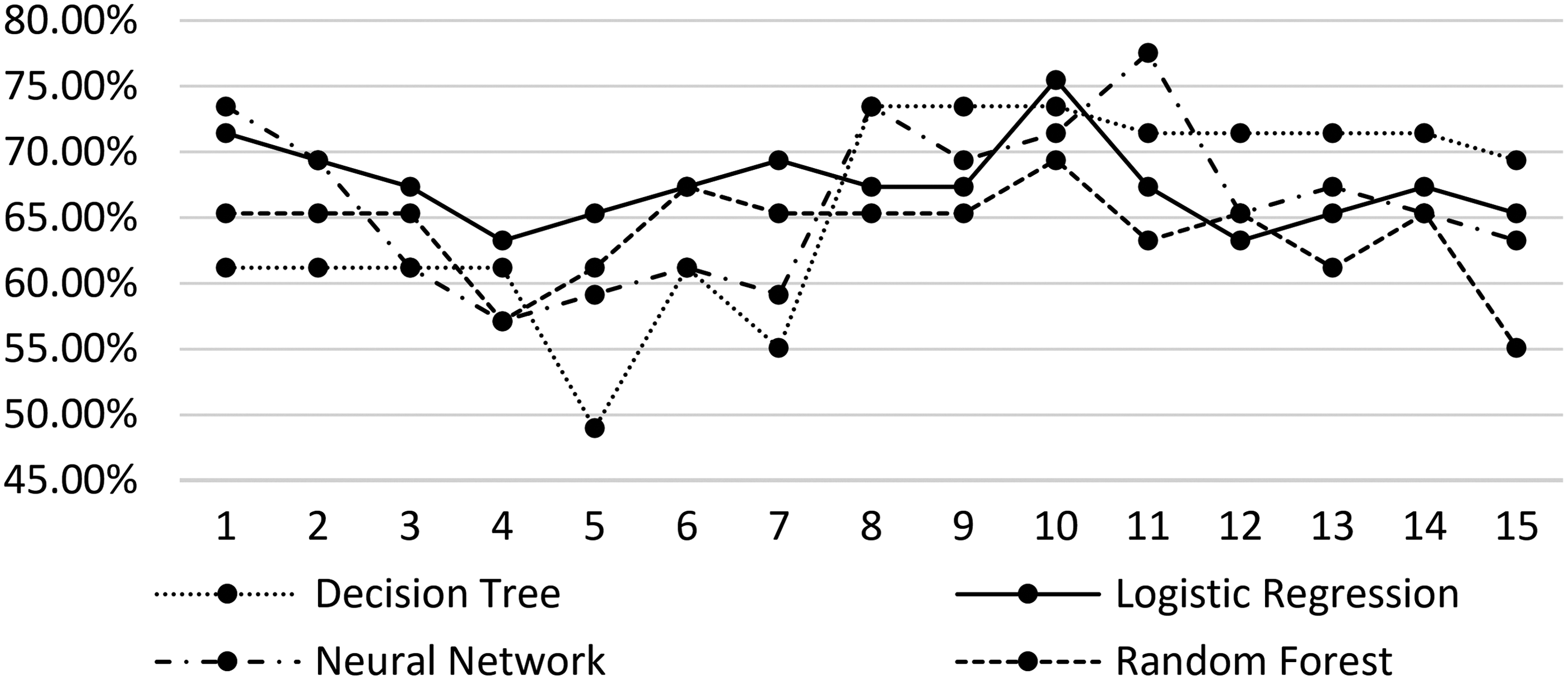
As the number of the selected dimensions can affect predictive performance, we incrementally run the process with the top 15 reduced feature space dimensions with respect to their explained variance. Table 2 lists the predictive accuracies of each model with respect to the number of included reduced dimensions. The best predictive performance of each model is in boldface. Among these models, the neural network model yielded the best predictive accuracy (77.5%) with 11 reduced dimensions. Decision tree and logistic regression models yielded 73.5% and 75.5% predictive accuracies with 8 and 10 input dimensions, respectively.
Dimensionality reduction predictive performance at state level
The maximum predictive performances are in bold.
Figure 1 shows that there is no clear trend in the predictive accuracies against the number of reduced dimensions. There are ranges of number of dimensions whereby logistic regression outperformed other models. There are also ranges whereby the decision tree models perform well. The random forest models outperformed the individual decision tree models initially, but for larger number of dimensions, they actually seemed to perform worse. Although it is hard to takeaway broad insights from these trends, the range of predictive accuracies should be noted for comparison with those from the best single-show models.
Singular value decomposition dimensions and predictive performance.
Single-show models
Single-show models use only those attributes from each show. For instance, the Duck Dynasty single-show model at the state level will have 51 rows for the states, and 3 columns—POFs, MPV, and the election result, whereby the POFs and MPV variables are for the Duck Dynasty program in each of the states. This addresses the HDLSS issue by building hundreds of individual single-show models in significantly reduced dimensions (we later discuss how to address the potential of false discovery, that is, building hundreds of individual models on small data can result in findings that exist by chance alone).
There is practical value from single-show models as well. Advertisers and campaigns can use these models to identify the shows with predictive signals to guide their targeting strategies. Hence we simply let each of the 547 TV programs construct an independent decision tree model (i.e., single-show model) for the 2012 election at the state level using the two measures explained in the Program Watch Measures in Political Divisions section (i.e., MPV and POFs). At the state level (N = 49, base rate = 53%), we extract the accuracy of each TV program tree using leave-one-out cross-validation.
Building hundreds of single-show models on HDLSS data raises the chance of learning spurious models that appear to be significant by chance alone. To highlight any evidence of predictive accuracy beyond what might arise through chance, we repeat the above process many times with the same feature vectors (i.e., TV program watch measures), yet on randomized election results. Specifically, in each round we keep the program watch measures but shuffle the election results. The “base rate” of the dependent variable (election result: D/R), importantly, is preserved when randomized data are created by shuffling the actual values among the rows. On such randomized data, we construct the single-show models again and extract their accuracies. Comparing the number of significant single-show models on the original data with the number of seemingly significant models on randomized data helps address the multiple hypothesis testing problem because of building hundreds of models on the original data. If for instance we learned 20 models with high-predictive accuracies from the more than 500 single-show models, but on the randomized data we on average learn 20 models with high-predictive accuracies, then it suggests that the learned single-show models are likely because of random chance alone. If in contrast the average number of highly predictive models on the randomized data is much smaller, it provides support to the case that there may be useful models in the best 20 learned from the original data.
Table 3 benchmarks the predictive performance of the original single-show models against the models that were extracted and tested on the shuffled election results. Consider the second row (i.e., ≥70%) in Table 2, for example. The results show that 15 single-show models have predictive accuracies more than 70% on the original data set. The rest of the numbers in the second row indicate that on the randomized data sets (where the base rate is preserved), between one and seven single-show models pass this accuracy threshold by chance. Comparing 15–3.2 (average number of significant single-shows by chance) or even 7 (maximum number of significant single shows by chance) suggests that the single-show models are likely to have some real signals for prediction in this case.
State-level single-show model accuracies on 2012 results versus shuffled results
The results show that there are three single-show models with predictive accuracies more than 80%. It is noteworthy that none of the models built on the reduced feature space (Table 2 in the Dimensionality Reduction and Predictive Performance section) yields such predictive performance. Furthermore, several single-show models have practical implications for political campaigns in that they clearly categorize the states to Democrats and Republicans. Duck Dynasty, The Daily Show with Jon Stewart, and Fox & Friends are illustrative examples for such single-show models with high-predictive performance. In contrast, the models with reduced dimensions (see the Dimensionality Reduction and Predictive Performance section) are not easily interpretable for political campaigns; each predictor is a combination of thousands of TV programs watch measures, making it difficult to determine how to act on the findings.
Single-Show Models at the DMA Level
DMA is a group of counties that form an “exclusive geographic area in which the home market television stations hold a dominance of total hours viewed.” (Nielsen Medial Glossary 7 ) A related notion used by the Federal Communications Commission (FCC) is television market area. 8 The market areas essentially delineate the digital and analog coverage of all full-service TV stations (for methodology see FCC.gov). Moreover, the “must-carry” rule mandates the cable TV operators to carry the signals of local TV broadcast stations (both commercial and noncommercial) within the same market area (FCC.gov). The United States is covered by 210 DMA regions.
Several reasons make the DMA worthy of attention in the context of political TV advertising. First, political campaigns can target DMA regions for their ads—making an ad ubiquitous within a DMA region. This is specifically important as Gordon et al. 9 have demonstrated how DMA-level advertisement can shift electoral votes and even change the election outcome. Second, the DMA electorate is exposed to the same TV programs. Third, the DMA-level analysis could potentially corroborate the political signals of TV viewership. This is mainly because at the DMA level, the unit of analysis in terms of both program watch and election outcome is solely determined by the television advertising market areas. Interestingly, there are DMAs within safe states where the election outcome is different than the outcome in the state it belongs to (e.g., Austin DMA in Texas). Even more important, there are several DMAs that cover counties from more than one state with different election outcomes.
In this analysis, we focus on the top 50 DMAs in terms of their number of in-tab electorate. This is an important set from the political campaigns perspective; 20 of such populated DMAs are located in 8 battleground states.
To determine the 2012 presidential election outcomes in the DMAs, we drill up from the 2012 county-level election results § to the DMA level. Specifically, we add up each party's votes in the DMA's counties and subsequently determine the election winner (i.e., Democrats vs. Republicans) and victory margin. In the few cases whereby a county is split between more than one DMA, the county's election statistics are accounted for all the corresponding DMAs.
Single-show models in the DMAs
The Extract, Transform, and Load system uses the show/election schema (Table 1) and computes the MPV and POF measures (see the Program Watch Measures in Political Divisions section) for the DMAs. Similar to the state-level analysis in the Single-Show Models section, we construct 547 single-show models for the 2012 election at the DMA level. We run similar randomization tests on the DMA-level data set as well to establish baselines for the number of significant single-show models. Table 4 demonstrates the informative value of TV programs at the DMA level (base rate = 25/50), benchmarked against predictive performances on 10 different shuffled election results. To illustrate, Fox & Friends' predictive performance is 80% (Fig. 2).
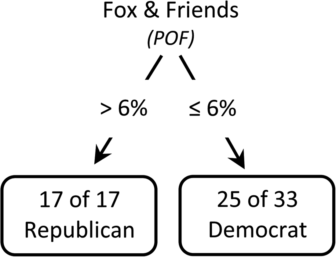
Fox & Friends' single-show model at designated market area level.
Designated market area-level single-show model accuracies on 2012 results versus shuffled result
There are a few main takeaways here. First, we continue to see valuable single-show models at the DMA level of aggregation, supporting the case that television viewership data can be useful in predicting election outcomes. Second, the actual “top” single-show models are different at different levels of aggregation—the strongest models at the DMA level are not the same models at the state/county levels. This is not surprising if we consider any region (county/state/DMA) to be simply an artificial boundary to group people who live there. The issue of where people live, how much choice they have in making that decision, and if people choose metropolitan regions versus counties or states are all complex questions. What we see from media watch data suggests that there is indeed some similarity in tastes among people who live together in any of these regions, but that the exact similarity will of course depend on where we draw the lines to segment people. Practically speaking, advertisers may use these models to learn single-show models at each level of aggregation and target the union of these to get broadest coverage, or the intersection of these, to be specific. We leave such considerations to future work.
Predicting presidential election outcomes in swing DMAs
One of the important issues that we addressed in our previous article 2 was the practical relevance of this work. As elections are infrequent, and as we need to know the outcomes to train or build the models, does it mean that such models can only be useful to look back, after the election results are known? Although there is certainly value for advertising even with looking back, we showed that there might be an interesting aspect here to predictive modeling in such cases. Often in elections, there might be notions such as “safe states” and “swing states.” What if, the week or night before the elections, we assumed that we knew the outcomes in the “safe states” and trained our models, could those models then be used to predict in real time what happens in the “swing states?” In our previous article we showed that the model based on the The Daily Show with Jon Stewart would have performed quite remarkably the night before the elections in terms of swing state predictions.
Similarly, an important set of DMAs that deserves subtler attention in election forecasting is the close DMAs, that is, those where victory margins were tight. Specifically, is it possible to train a single-show model with the watch measures in the “safe DMAs” until the election day to subsequently forecast the presidential election outcomes in the purple DMAs? Note that most of the close DMAs (six out of nine) are in the swing states, some of which even voted differently than their states.
We train 2 of the most informative single-show models at the DMA level (i.e., Fox & Friends and Duck Dynasty) with the 41 DMAs where the victory margin percentages are greater than 5%. We subsequently let both single-show models forecast the election outcomes in the nine swing DMAs. Table 5 demonstrates two very different battleground forecasting performances. Although Duck Dynasty shows forecasting accuracy no different from a toss-up on the close DMAs (i.e., 4/9), Fox & Friends could correctly forecast eight out of nine of the close DMAs the night before the 2012 presidential election. In fact, all the six close DMAs located in the battleground states are forecasted correctly by Fox & Friends.
Fox & Friends and Duck Dynasty's single-show models trained on safe designated market area
For Kansas City, Pittsburgh, and St. Louis where the DMA's counties belong to more than one state, the DMA's main state is determined based on the percentage of the DMA's in-tab electorate in the corresponding states.
Incorrect predictions are struck through.
Battleground.
Democrat.
Republican.
CA, California; D, Democrat; DMA, designated market area; FL, Florida; IL, Illinois; KS, Kansas; MD, Maryland; MO, Missouri; OH, Ohio; PA, Pennsylvania; R, Republication; WI, Wisconsin; WV, West Virginia.
Single-Show Models and the 2016 U.S. Primaries
Recently we were provided similar fine-grained household-level viewership data in the months preceding the Democratic and Republican primaries in the 2016 elections, after which Donald Trump and Hillary Clinton emerged as their parties' nominees. We embarked on a similar analysis to explore whether there were any signals in television viewership for these candidates. As this is a work in progress, we present here only some high-level summaries of initial findings (to date we have limited access to data, mainly for the first half of the year).
Unlike the presidential election, primaries occur at different times in different states, which creates issues if we consider the results in all states to build models. It is often speculated to be the case, for instance, that a candidate who is viewed as the likely nominee at some point will have a greater chance of winning the remaining primaries. This could be because of voters rallying around a now strong candidate or also because of campaign funds flowing more toward those viewed as likely winners. To avoid this effect, in our analysis of the primaries, we restricted our attention to the states before when it may have become obvious that there is a winning candidate. Specifically, for the Trump/non-Trump models, we examine data from the states before the other main Republican contenders dropping out of the primary elections. For Clinton/Sanders models, we examined the states before the result in California, after which the primary result was assumed to be almost final. Tables 6 and 7 benchmark the predictive performance of the single-show models against predictive performances on 10 different shuffled election results. Table 8 lists the most informative single-show models in the 2016 Democratic and Republican primaries.
Single-show models performance on 2016 Democratic primaries results versus shuffled results
Single-show models performance on 2016 Republican primaries results versus shuffled results
Top 5 informative shows in U.S. primaries (Republican and Democratic)
We present these results with many caveats. Restricting the focus on even fewer states implies far fewer records in such models. Also, not everybody can vote in these primaries. Often voting is restricted to those with formal affiliation to the individual parties. Hence, aggregating television watch data from all panelists might provide very noisy signals here. Still, the nonpolitical shows given in Table 8 deserve some attention. To illustrate, the Internet Movie Database (IMDB) describes Chrisley Knows Best as a show that “follows Atlanta-based self-made multimillionaire Todd Chrisley, his devoted wife Julie and their five children who live a seemingly picture-perfect Southern life with everything money can buy.” In its single-show model, the states where Chrisley Knows Best was more popular were also those that voted for Trump in the Republican primaries. Among the nonpolitical informative shows in the 2016 Democratic primaries, Key and Peele is a black satire that, according to Wikipedia, “covers a variety of societal topics, often with a focus on American popular culture, ethnic stereotypes, and race relations.” In a similar vein, “Skewering everything from pop culture to politics, Party Over Here features sketch comedy shorts, along with in-studio segments filmed in front of a live audience at the Alexandria Hotel in downtown Los Angeles.” The series stars three female actress/comedians. In their single-show models, Clinton's victory corresponded to higher watch of Key and Peele and Party Over Here.
We are continuing to examine the single-show models and the various timelines as well to determine how robust these models might be over time with respect to having useful electoral signals. One of the interesting initial findings was that half of the programs distributed by Adult Swim seemed informative for both Republican and Democratic primaries. This group of shows did not appear to be significant in 2012. As we get complete data for 2016, we hope to extend this analysis into the final election weeks.
Our early 2016 results also seem to show that there is significant difference from one election season to the next. Programs change over time, interests of viewers change, new shows come up, and the electorate itself changes because of natural reasons and migration. Hence, the value of these models will likely depend on how well they can be correctly calibrated to reflect the current cycle. This too is an important question that we will leave for future work.
Conclusion
Our research and findings have been the first to examine and show the link between television viewership and presidential election outcomes at the state, county, and DMA levels in the United States. This is an important result with practical implications for campaigns and the media, given the approximately $2 billion in television ad spent during the political campaign season in the United States. It is interesting to explore how these might be used. For instance, if greater viewership of a show correlates with regions that vote Democratic, the party may want to target those shows with messages that can firm up or energize their “base.” The same party might instead prefer to air more persuasive “change messages” in the programs that appear to correlate more with their opposition. Moreover, shows that have no predictive value might be of use here as well. Those could be shows that have a mix of voters of all types, making it valuable to reach broad audiences with a different message.
There are many important challenges we faced in the past 3 years as part of this research. At first glance, the notion of taking billions of minutes of television watch and converting those eventually into small tables with 50 rows, for instance, seems to fly in the face of common wisdom regarding the value of big data at the granular level. Yet, by focusing on two simple and intuitive metrics, we see results that are consistent with intuition. For instance, many experts whom we have interviewed seem to recognize why The Daily Show with Jon Stewart and Duck Dynasty models could work as they did. It is not just intuition that corroborated some of our results. In 2014, Facebook published a report that showed how television program likes correlated with political party likes based on data from millions of Facebook users. The extremes in their analysis were The Daily Show with Jon Stewart and Duck Dynasty. The fact that we were able to see this from data on television watch alone in 2012 (data from 2 years before the Facebook report) provides additional evidence that there is value in television watch data.
We also highlight the importance of understanding the exploratory perspective we have taken here. We have considered a stylized scenario whereby we ask, if we had data only on who watched what programs on television, could we use that alone to make election predictions? Note that here we do not use other information that may be available about individuals, or at the state level. We are not “controlling” for any of these factors here, because we are mainly interested in exploring if television watch alone has signals that could be of value in predicting outcomes. The value of doing so concerns discovery, whereby we might potentially discover shows that could have predictive value. Our results so far suggest that this exploratory perspective can yield interesting insights and lead to many important questions that can be addressed in future research.
Another key aspect is that there is no claim on causality. Instead we are focusing on discovery and predictability. Although correlations clearly do not imply causality, they can have predictive value that can be exploited. In our 2012 results from instance, it was the case that counties that had high viewership of Duck Dynasty voted Republican. Although there is no causality here, this correlation can indeed be exploited by predictive models. That said, as humans we are, however, rarely fully satisfied with predictability until we can explain why it exists. As we speculated earlier in this article, when it comes to linking television watch and voting behavior, it might be an unobserved latent variable that can explain some of the links. It might be possible for instance that there is some unobserved latent variable that “causes” individuals to watch a show, and that the same latent variable “causes” their preference for a candidate/party. Being able to identify such latent factors and tease out possibly causal explanations is yet another fascinating topic for future work.
There are some key limitations of this work that need to be recognized. Looking at data from a single election season makes it difficult to make broad conclusions. Unless the models and results can be tested across multiple elections, we will not be able to know how generalizable these findings may be. Also the notion of “safe states” is not one that is stable over time as some states that were once safe may not be so in the future. This can affect the applicability of these models in real time.
Footnotes
Author Disclosure Statement
No competing financial interests exist.