
Abstract
The statistical analysis of basketball games is a fast-growing field. Certainly, basketball data are scientifically relevant because an appropriate analysis provides a great deal of information about the performance of both players and teams. The number of games played each season generates a large amount of data worth analyzing. Basketball analytics is well established in U.S. leagues. In Europe, however, it has not been duly developed. This study focuses on the top three European team competitions: the EuroLeague, the EuroCup, and the Spanish ACB (Association of Basketball Clubs, acronym in Spanish) league. Their official websites provide access to game data for anyone who is interested, but they are only represented in a static tabular form. As a consequence, it is difficult to gain any valuable insights from them. This article presents a highly useful interactive tool, created with the free statistical software R, which makes it possible to visualize and explore basketball data from a large number of seasons. We will demonstrate its core functionality. An accompanying R package is presented in the Supplementary Data.
Introduction
The movement of basketball analytics began to take shape with the advent of both Hollinger's book 1 and Oliver's book. 2 Other works have been published since then.3–5 Sports, particularly basketball, are in the process of being digitized and a great deal of data are now available. Research on both statistical and computer-based methods for the analysis of games and players is considered an excellent source of competitive advantage. Proof of this importance is the number of calls for articles from various scientific journals in recent years.6–9 In particular, visualization of sports data has attracted considerable attention. A special issue of a journal presented four articles covering a broad range of topics, such as exploration of spatiotemporal trends in baseball, evolution of rankings over time with applications to soccer and cycling, analysis of soccer games combining motion and event data, and prediction of soccer team performance during tournaments. 10 A visualization system has also been developed for table tennis 11 and a new book has been released about graphical methods for baseball. 12
Regarding basketball, there have also been several attempts. A system called GameFlow combines multimedia data sets to conduct visual narration of games. 13 Another application, called HoopMatchups, was intended for monitoring the different team lineups during games. Its purpose is to provide a tool to be used while watching games live. 14 The BKViz tool includes multiple interactive views to analyze games in terms of individual actions and sequences of plays. 15 A fully automatic approach of calibrating camera motions in broadcast basketball videos can be used to visualize players' statistical data, among other applications. 16 Another web application is also available for visualization of basketball players and identification of those with extreme performances who stand out positively or negatively from the rest. 17 Even snapshots from live National Basketball Association (NBA) games are used for calculating the probability of the teams involved in winning. 18
In this context, the main purpose of this article is to contribute to this ongoing research on visualization systems by presenting a new fully interactive dashboard for European basketball data. The importance of visualization in research cannot be overstated. In any research study, first it is crucial to examine the data. Visualization techniques support exploratory data analysis tasks. Plots and charts allow researchers to identify meaningful variables, dense regions, correlations, patterns, missing data, and outliers. A thorough visual analysis can dramatically improve the predictive capacity of the machine learning models since they will contain all the discovered data characteristics. The visualizations included in the dashboard present basketball data in a visual context that allows users to make sense of game statistics. Then, data mining tools and predictive models can be used to make more educated decisions about teams and players. Another important research question covered by this work has to do with data integration. European basketball statistics are presented in a very unstructured format. This work has integrated and consolidated all the information in a common place. Having all the data in one place enables better and more effective analyses. Any research project will benefit from having an interactive application to investigate the data. For all the above reasons, the dashboard and this associated article contain a strong element of research.
In particular, this is the first comprehensive attempt to collect and visualize data from European leagues. Furthermore, this new app has been created using the statistical software R 19 with the goal of increasing the number of open-source projects in sports. As is true in any other field, R is a very useful piece of software for analyzing sports data in general and basketball data in particular. There are a number of related packages deposited on CRAN or GitHub. For the sake of brevity, the following is a review of the R packages and code available online for basketball. The Supplementary Data provides a document with additional R packages for other sports. The SportsAnalytics package 20 represents the first attempt to collect NBA data from previous seasons. There are other packages aimed at scraping data from https://stats.nba.com/ such as NBAapi 21 and nbaTools 22 and from https://www.basketball-reference.com such as ballr. 23 Regarding National Collegiate Athletic Association (NCAA) basketball data, the mRchmadness package 24 provides a lot of utilities to work with. More specifically, the package uncmbb 25 contains the match results from the University of North Carolina (UNC) since the 1949–1950 season. Furthermore, some authors provide their scripts together with their research articles. In the article by Cervone et al., 26 R code is provided relating to a new stochastic model for predicting the outcome of basketball possessions using SportVU spatial data. In the article by Maia, 27 the author explains a step-by-step procedure to create NBA shot charts using R. In connection with this, a tool called BallR is presented in the article by Schneider 28 for an interactive visualization of shot charts. In the article by Smith, 29 some links to R scripts are provided, with which movement data can be analyzed and visualized.
In summary, the main contributions of this work consist of (1) presenting an interactive web application to visualize and explore basketball data and (2) drawing attention to European basketball data for the first time. Data from the first to the latest season of the top three leagues can be obtained and analyzed. They will be constantly updated as new games are played. As a complementary task, we present the new R package BAwiR 30 associated with the app (the R commands used to produce the plots discussed in this article are provided in Supplementary Data). BAwiR is freely available on the Comprehensive R Archive Network. The rest of the article is organized as follows: the Problem Statement section states the motivations of the investigation; the Data section is concerned with the data collection procedure; the Dashboard for European Basketball Data section describes the main features of the dashboard; the Results section provides a detailed explanation of the type of plots shown in the dashboard; the most important aspects of the research are highlighted in the Discussion section; and the Conclusions section ends the article with some conclusions.
Problem Statement
There are particular challenges relating to the use of analytics in basketball as well as in any other sport. No coach is going to use statistical methods and visualizations if their practical utility is not understood. Because the people using this technology might have different levels of computer skills, the major goal faced in this research has been to create a sophisticated dashboard (in terms of an advanced configuration) that could be, at the same time, as understandable and easy-to-use as possible so that users, regardless of their expertise, can have as many analysis possibilities as possible. The visualizations should be able to communicate information to the basketball analysts intuitively, allowing them to navigate among data in a simple manner. Specifically, the main scientific endeavors that motivated this study were as follows: (1) total lack of analysis of European basketball data; (2) box score statistics only represented in a static tabular form (and in a nondownloadable format); and (3) few open-source projects for basketball. Details can be found below.
European basketball data
The NBA men's professional league has been embracing the use of analytics for a number of years and provides several data sources with a high level of detail. The important point to stress here is that all the basketball visualizations and software tools mentioned in the Introduction section are devoted to NBA data, precisely because of the large amount of data already available. At the opposite end of the spectrum are European basketball leagues and teams (including Spanish ones), which (to the best of the author's knowledge) do not support their decision-making with rigorous, data-driven statistical analyses. A plausible explanation is the lack of tools for obtaining and using the data they generate. This article focuses on both the top two, continent-wide, men's professional club competitions in Europe (the first-tier EuroLeague and the second-tier EuroCup) and the Spanish men's professional ACB (Association of Basketball Clubs, acronym in Spanish) league, which is the top national league in Europe. The rudimentary use of statistics shows itself in the way these leagues provide data from their games.* Everything is in tabular form, which might be enough to form a first impression, but makes it very difficult to gain a deeper understanding of the player and team performance. The fully interactive web application presented in this article aims to fill this gap.
Box score data
Player-tracking data (spatial data) have been the new milestone in basketball analysis. The 2013–2014 season was the NBA's first full season using SportVU technology in all NBA arenas. SportVU is an optical system that tracks the exact two-dimensional (2D) location of every player as well as the three-dimensional location of the ball. Thus, massive data sets are generated about what is happening on the NBA courts during each game. However, this type of technology is not yet present in Europe and the box score is still the main data source available about games. Moreover, its full potential is yet to be exploited. Since the box score statistics are recorded by scorekeepers, it is even worth trying to find ways to remove possible inconsistencies and biases. 31 Box score data from EuroLeague, EuroCup, and ACB have been collected for this work.
Open-source project
The dashboard has been created using the shiny R package. 32 In addition, the BAwiR R package is also presented in this article, which contains all the functions needed to acquire the data and produce the type of plots displayed in the app. BAwiR has been created to ensure reproducible research and encourage new extensions.
Data
Web scraping
Box scores are available online. From the point of view of user experience, https://www.basketball-reference.com/ is the most comprehensive repository of basketball data for both NBA and foreign leagues. Data can be downloaded from the website as .csv or .txt files. However, exports are intentionally limited to 100 rows, so the manual procedure requires a long time, especially if the amount of data is large. EuroLeague, EuroCup, and ACB games are available from their official websites. † , ‡ , § On all these sites, the user does not have the option of downloading the data as a .csv or .txt file, so the manual alternative—the traditional method of copying and pasting into a spreadsheet—is even more time-consuming, as well as being prone to errors, and tedious. Therefore, the processing of these data sets is complex and problematic. Web scraping allows us to automate the process by programming. There are two books that provide an excellent introduction to the processing and collection of web data using R.33,34
To make web scraping user-friendly and efficient, the author has followed the information included in the robots.txt on each of the three sites. ** , †† , ‡‡ The website owners use the robots.txt to specify which information may or may not be accessed. 34 In the EuroLeague and EuroCup robots.txt files, some web spiders are excluded from scraping the entire server and the general user is asked to pause between requests for 15 seconds. Regarding the ACB robots.txt file, all robots are allowed complete access. In this case, the author has also added in his R scripts the option to pause between requests for 2 seconds. In addition, to stay identifiable, the user's email address and the R version used can be specified. This entire procedure is a polite way to do web scraping and serves to certify that the user is working as transparently as possible for research purposes.
It is worth pointing out that downloading the games by web scraping allows us to obtain detailed game data since the user can filter by every round played (regular season, playoffs, and so on). An interesting feature of the NBA games collected at https://www.basketball-reference.com/ is that the player's age in every game is given. This is very valuable when the purposes of the research are related to time series or functional data analysis. 17 This information is not directly available in the European target websites, so the BAwiR package also includes functions to compute the player's age in every game and to add other player-related information, such as their position or nationality.
The scripts to create the database used inside the app are available at https://www.uv.es/vivigui/softw/do_create_data_app.zip For illustrative purposes, the data available in BAwiR were collected up to round 19 of the regular season of EuroLeague, round 3 of the EuroCup Top 16, and round 17 of the regular season of the ACB, all cases for the 2017–2018 season.
An illustrative example: demographics
The data frame created is a powerful source of information and enables a number of interesting analyses to be performed, not only about the games themselves but also about some other closely linked issues, such as demographic trends.
There is now some controversy in the Spanish basketball entity regarding the decreasing number of players born in Spain. Each club must have a minimum of four so-called trainee players (who may or may not be Spanish). They must have been enrolled in any Spanish team for a period of three seasons (either continuously or not), remaining in each team for a minimum of 6 months, regardless of their nationality and age, between the first year of the cadet category and the first year of the professional category—both inclusive. This results in teams with just one or two native Spanish players. Figure 1 shows a population pyramid with the number of Spanish and foreign players across the seasons. The decreasing pattern is clearly confirmed. Since the 2004–2005 season, there have always been more foreign players than Spaniards. This contributes to the discussion on the imbalance of nationalities in Spanish basketball.

Population pyramid showing the number of Spanish and foreign players playing in the ACB league across the seasons. The number of Spaniards has decreased over the years. ACB, Association of Basketball Clubs (acronym in Spanish).
Dashboard for European Basketball Data
The latest version of the app has been released at https://www.uv.es/vivigui/AppEuroACB.html (it takes a few seconds to boot), along with an accompanying explanatory document.
§§
Its capabilities include:
Box score data from three European leagues for any type of round (for instance, regular season or playoffs): ○ ACB (from the 1985–1986 season to the latest season played, including Copa del Rey and Supercopa competitions in the seasons where they took place). ○ EuroLeague (from 2000–2001 to the latest season played). ○ EuroCup (from 2002–2003 to the latest season played). 40 statistics to choose from. Filter by players' positions. 2D plot of any pair of stats. Table with the players displayed in the 2D plot. Circular plots of players' percentiles. Plot of players' monthly stats. Plot of players' yearly stats. Team heatmap. Team shooting plot. Team four-factor plot. Cross table with the results of regular season games. Map of nationalities. English and Spanish language versions.
The 40 stats available in the app are shown in Table 1. The games from the three leagues are described with the same basic statistics, but the ACB league also shows the shot percentages, number of counterattacks, number of dunks, and players' plus/minus statistics. From these, some advanced stats are computed. Table 1 also shows the type of variable with respect to its impact on the game.
Available statistics to choose from the web application
None of the statistics categorized as “Advanced” are available in the official box scores. They are derived from them.
The definition of PIE is given in https://stats.nba.com/help/glossary/ The definition of OE is given in the study by Shea and Baker. 4 GP, GS, and MP are only available for players, while PTSrv are only available for teams.
ACB, Association of Basketball Clubs (acronym in Spanish).
Results
This section explains the type of visualizations displayed in each tab of the application. Data up to round 17 of the 2017–2018 ACB season will be used for the rest of the section.
Two-dimensional plots and players' rankings
An interesting way to start visualizing the players' stats is by using a 2D plot, where we can locate every player in relation to the rest for the two variables represented. We can also see the relationship between the variables. A scatterplot is the typical plot in this case. As an illustration, Figure 2 shows the total minutes played and points scored by all centers from the ACB 2017–2018 season who played more than 100 minutes. As expected, there is a very positive linear relationship between these two statistics (the more minutes a player plays, the more the chances he/she has to score points). In the app, the information for each player is displayed by hovering over the points. In addition to players' statistics, the user can also represent the teams' statistics.
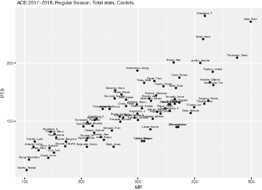
Minutes played and points scored by all centers who played more than 100 minutes in the first 17 days of the 2017–2018 ACB season.
In the second tab of the app, a table shows the list of the players represented in the 2D plot, ranked in decreasing order by the x-axis variable. This table mimics the way in which stats are provided in official websites of the basketball leagues. In this way, the dashboard allows the user not only to examine traditional tables but also to extend the analysis with informative plots. Table 2 shows three players from both the head and tail of the data frame.
Minutes played and points scored from the set of centers of the 2017–2018 ACB season who played more than 100 minutes (data from the first 17 days)
The table shows three players from both the head and tail of the data frame. The table is ordered by minutes played, in descending order. The column “Player_info” contains the link to the official website where the player's information is described.
Plot of players' percentiles
Interpretation of traditional tables can be enhanced with a graphical representation, such as the one displayed in Figure 3. This plot has four boxes per statistic. The first box contains percentiles 0 to 24; the second, percentiles 25 to 49; the third, percentiles 50 to 74; and the fourth, percentiles 75 to 100. Each box is represented with a different color, thereby facilitating its interpretation. As a general case, if a player has a percentile of x in the free throw percentage, this means that x% of league players have a lower percentage than him, while (100-x)% have a higher percentage.

Luka Doncic's and Alberto Abalde's percentiles for games played, minutes, points, field goal percentage, free throw percentage, assists, turnovers, total rebounds, plus/minus and performance index rating. Doncic excels in most aspects, but has to improve his ball skills (high percentile in turnovers) and free throw percentage. Abalde still has a great deal of room for improvement. Data from the first 17 days of the 2017–2018 ACB season.
Luka Doncic's and Alberto Abalde's percentiles for games played, minutes, points, field goal percentage, free throw percentage, assists, turnovers, total rebounds, plus/minus, and performance index rating are shown in Figure 3. Doncic, who was born in Slovenia in 1999, played for Real Madrid until the end of the 2017–2018 season. As of the 2018–2019 season, he is playing in the NBA with the Dallas Mavericks. He made his ACB debut at the age of 16 and is the most promising young player in the world. With regard to Abalde, he was born in Spain in 1995 and is a young player for Valencia Basket and has the ideal conditions to become a very good player. Therefore, it is worth having a look at their performances and comparing them.
For example, Doncic has a percentile of 96 for the points (PTS) variable, so four boxes are colored. This means that his scoring skills are very good. In general, Doncic excels in most aspects, but his free throw percentage and ball handling skills are not that good (high percentile in turnovers), so he still has room for improvement. Abalde is not performing that well, there is plenty more scope for improvement. However, his free throw skills are already very good.
The bubble plot allows the user to analyze players in a very simple way and to gain an overall idea of the aspects in which the player either excels or needs to improve. A number of variables can be displayed at once, so the overall activity can be visualized at a glance. The dashboard allows comparing any pair of players.
Plot of players' monthly statistics
On the official EuroLeague, EuroCup, and ACB websites, the highest level of detail is simply to display either the players' total or average stats for the total rounds played to date, only specifying the type of competition, such as regular season or playoffs (see e.g., www.euroleague.net/competition/teams/showteam?clubcode=MAD&seasoncode=E2017#!stats). In the app, the focus is further extended and the statistics per month can be assessed. This enables a very accurate evaluation of the way the players evolve over time. This gives analysts the ability to detect players' performance trends across the seasons. For example, if a particular player's performance dips during the same month every year, more adapted training plans can be proposed. These monthly plots provide much higher added value.
Figure 4 shows the average statistics of the same set of stats selected for the percentile plot, again for Doncic and Abalde (the user can choose any sample of statistics, players, and months in this tab of the app). Doncic's best performance was in December. In general, his performance is stable and consistent, except for the free throw percentage where he is not able to maintain a high percentage yet. He has been able to grab a good number of rebounds every game and share the ball with his teammates, as his high numbers in total rebounds and assists indicate. Abalde's best performance was also in December, averaging 9 points and 2.5 rebounds with 50% from the field in 19 minutes per game. His performance in October and January is pretty similar. By contrast, he did not have a good performance in November, averaging 2.5 points and 1.5 rebounds in 9 minutes per game.

Luka Doncic's and Alberto Abalde's monthly stats for games played, minutes, points, field goals percentage, free throw percentage, assists, turnovers, total rebounds, plus/minus, and performance index rating. Doncic's performance is quite consistent over the months, except in free throw percentage. Abalde's performance is more irregular data from the first 17 days of the 2017–2018 ACB season.
When it comes to displaying the evolution of the players' stats over months, a bar plot is suitable enough since we are combining multiple continuous variables (basketball statistics) and a categorical variable (time, measured in months).
Plot of players' yearly statistics
In addition to the monthly statistics, the user can also inspect the players' performance year by year. Figure 5 shows Doncic's and Abalde's average games played, minutes, points, and field goal percentage for the 2017–2018 season (the user can again choose any sample of statistics and players). In the app, all the seasons that each player has played are displayed, so the performance can be monitored over the player's entire career. By hovering over the points, the information for every season appears. Both monthly and yearly plots facilitate player profiling. In Figure 5, the only similar stat between both players is the field goal percentage. In contrast to the monthly plot, when the goal is to show the statistics over seasons, it is more visually effective to display a line chart.

Luka Doncic's and Alberto Abalde's yearly stats for games played, minutes, points and field goal percentage.
Team heatmap
A heatmap is a convenient way of visualizing a table of numbers, where colors replace numbers. Colors correspond to the level of the measurement, that is, the larger the value in the corresponding statistic, the more intense the color. In other words, the color intensity allows the user to easily pinpoint great achievements. The heatmap available in the app uses a different color gradient for different groups of stats (see the Type column in Table 1). When all the stats are represented together, the offensive statistics are shown in red, defensive statistics in green, the rest in purple, and advanced statistics in pink. In the app, this plot can be ordered by any of the available columns. This design helps the user to understand the player's performance for every single stat, putting things into a team context. Shots attempted, scored, and percentage are subgrouped to facilitate their interpretation.
Figure 6 shows a subset of stats for the Real Madrid players. It is arranged in decreasing order by plus/minus. The difference between Doncic's plus/minus and PIR and those of his teammates is noticeable. Other players stand out in other aspects. For instance, Felipe Reyes has grabbed a lot of offensive rebounds. He is a consummate specialist in this. The heatmap of the app also allows the user to hover over the cells.
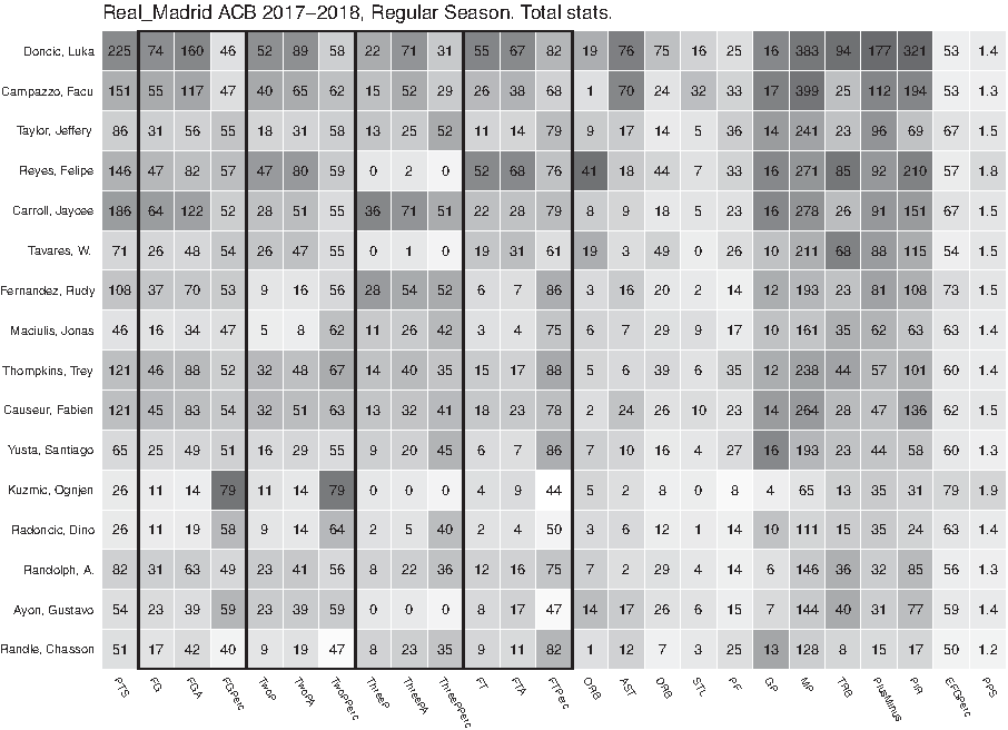
Real Madrid heatmap for a subset of stats. They are grouped into different categories, which are represented by different colors. The more intense the color, the more the player stands out in that aspect. For instance, Felipe Reyes has grabbed a lot of offensive rebounds.
Team shooting plot
Another focus of interest for analysts is to assess and compare the shooting activity of a team's players. Figure 7 shows the number of threes attempted and scored by every Real Madrid player, together with the scoring percentage. The players are sorted by percentage. In the app, the user can choose to display free throws, twos, and threes. Rudy Fernandez and Jaycee Carroll are scoring very effectively, with more than a 50% success rate, considering the large number of shots attempted. Doncic has attempted the same number of threes as Carroll, but he has scored 14 less. For analyzing the shooting activity, a stacked bar chart becomes the most suitable visualization. This is because we are combining several categorical variables, namely players and shots (missed vs. scored).
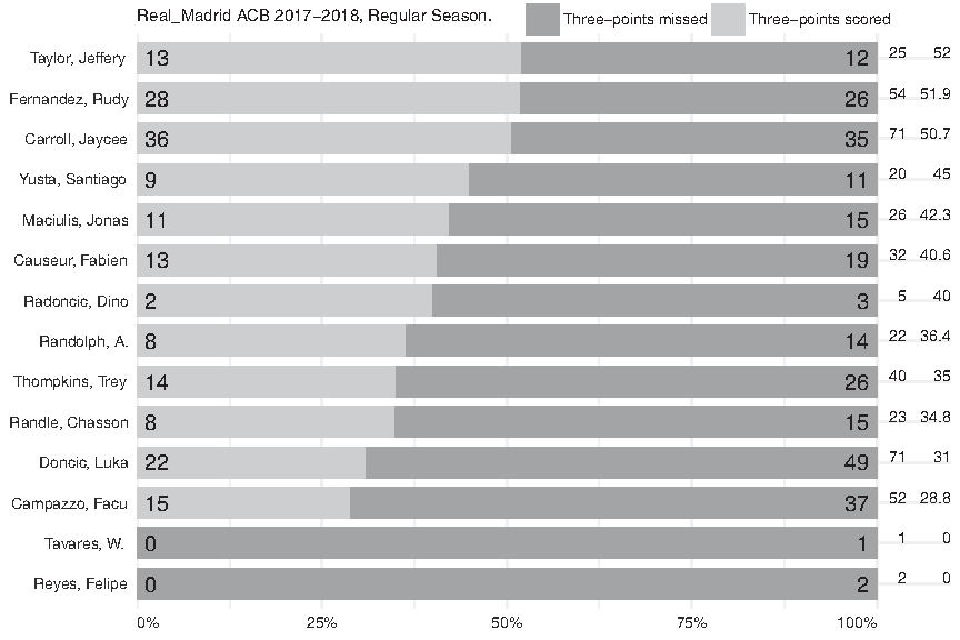
Three-point information for Real Madrid players. Rudy Fernandez and Jaycee Carroll have been shooting very effectively.
Team four-factor plot
The four factors were introduced by Oliver 2 and are considered the most relevant features to determine the team's success in each game. The factors are effective field goal percentage (EFG%), turnover percentage (TOV%), offensive rebound percentage (ORB%), and free throw rate (FTR). EFG% is a measure of shooting efficiency; TOV% is the percentage of possessions where the team missed the ball; ORB% measures how many rebounds were offensive from the total available rebounds; and finally, FTR is a measure of both how often a team gets to the line and how often they make them.
The ORB% is paradigmatic of the importance of this system for analyzing the team's performance more accurately. Offensive rebounds are usually measured in absolute terms, that is to say, people only count the total number of offensive rebounds grabbed. A few months ago, the author was watching a basketball game and the TV commentator said that Real Madrid was performing poorly at that time (after 10 rounds) in terms of grabbing offensive rebounds. The TV commentator was not wrong because this is what the official data were indicating www.acb.com/pdfs/num1025.pdf (go to page 9 of 24, table
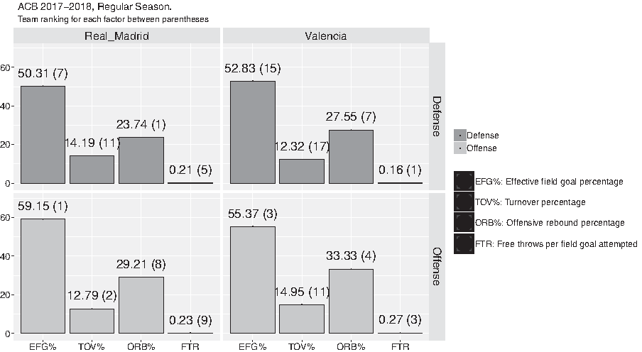
Offensive and defensive four factors plot for Real Madrid and Valencia Basket. Their ranking with respect to the 18 teams is shown in brackets for each factor. The four factors are effective field goal percentage (EFG%), turnover percentage (TOV%), offensive rebound percentage (ORB%), and free throw rate (FTR).
Total data for two-point, three-point, and offensive rebounds after the first 10 days of the 2017–2018 ACB season
Real Madrid is the second team that grabbed the fewest offensive rebounds. However, this is partially explained by its high scoring percentages, that is, the more the scoring success, the fewer the offensive rebounding options.
This means that Real Madrid scores many of its possessions, so there is no chance for rebounding (the more the scoring success, the fewer the offensive rebounding options). This is the reason why the number of offensive rebounds grabbed cannot be counted in absolute terms, as is the case in the official file, but must be done in relative terms, that is, considering the total number of available rebounds (the number of times that Real Madrid misses their shot and the ball can be rebounded). In this case, according to Figure 8, Real Madrid is the eighth best team. Therefore, the way the data are described so far needs to be improved to convey exactly how the teams and players are performing.
To establish the team rankings shown in brackets in Figure 8, we have to consider these facts: in defense, the best team in each factor is the one that allows the smallest EFG%, the highest TOV%, the smallest ORB%, and the smallest FTR. In offense, the best team in each factor is the one that has the highest EFG%, the smallest TOV%, the highest ORB%, and the highest FTR. In the case of Real Madrid, after 10 rounds, it had the best EFG%, it was the team that allowed the lowest number of offensive rebounds, and it had the second fewest turnovers. This good performance is in line with the fact that Real Madrid has led the league in the regular season. For the sake of comparison, the details for Valencia Basket are also represented in Figure 8. Valencia Basket is the team that allowed the lowest FTR in defense and is the third best team in EFG% and FTR in offense. However, Valencia is the fourth worst in EFG% in defense. The app allows the user to compare multiple teams at the same time. All these analyses about the four factors serve to highlight their importance. The four factors have never been computed for European basketball data. Therefore, a lot of information is being lost.
Another important point to clarify is that instead of defining the offensive and defensive rebound percentage for each team, as is the case in official repositories (see, for example, https://www.basketball-reference.com/teams/BOS/2018.html#all_team_misc), only the ORB% is computed. Thus, the plot has four facets, one per factor, and is easier to represent. A vertical bar chart is good enough for representing the four factors because we are trying to compare few categories (four factors) among several items (in defense and in offense).
Regular season cross table
In sports, a cross table is a two-way table consisting of the home and away teams involved in every game and the game result. It is used to display a large amount of game results. As an example, Figure 9 displays the results for regular season games of the 2017–2018 ACB season. Cells in red correspond to local wins (1) and cells in green correspond to visitor wins (2). By hovering over each cell, the user can see the game details.
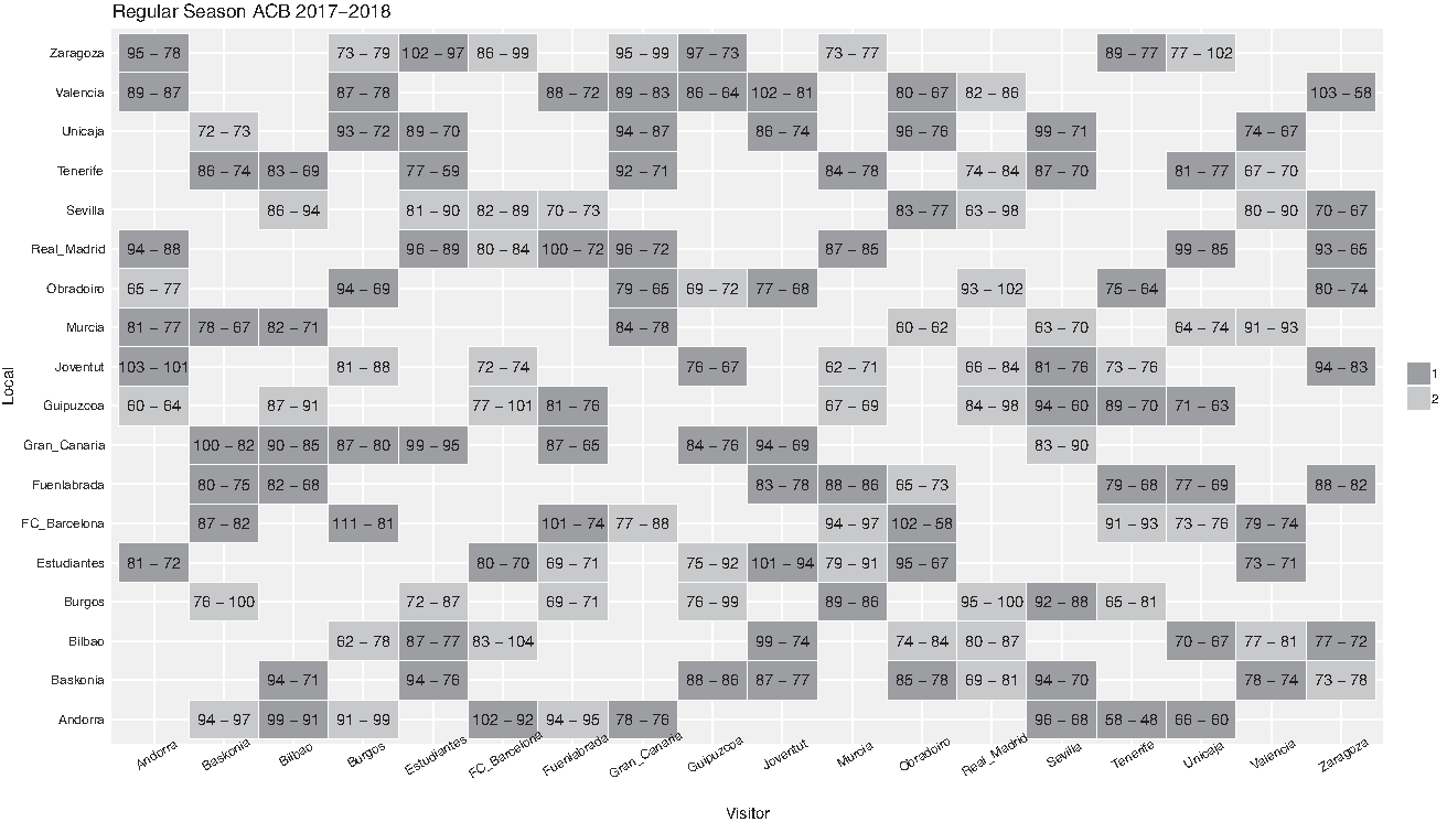
Cross table with all the regular season results for the 2017–2018 ACB season.
Map of nationalities
Like the demographic pyramid mentioned in the An illustrative example: demographics section, it is also very informative to see a map of the countries represented in the league and the number of players from each of these countries. This is shown in Figure 10 for the 2017–2018 ACB season. The players' countries of origin are shown in green. As can be seen in Figure 10, most players come from Europe and America. In the app, the user can see the exact number of players by hovering over each country.
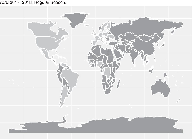
Countries represented (in dark gray) in the 2017–2018 ACB season.
Discussion
Basketball clubs, especially from the United States, have already realized the benefits of appropriate statistical treatment of data, especially as a considerable source of competitive advantage. By contrast, the movement of basketball analytics is only very slowly being introduced in Europe. Until promising tracking statistics arrive, box scores compose the only information available about the games played in any European basketball league. Box score data can deliver a lot of information if represented by means of educational plots. This article focuses on all the data collected from the top three European leagues: the EuroLeague, EuroCup, and Spanish ACB league. These leagues are very strong and offer a high level of performance in many games. This work aims to bring the analysis of game statistics in line with the importance and quality of these leagues.
The official websites of all three competitions display data about the games in a rigid tabular form, where insightful details are difficult to detect. To overcome this drawback, this article has presented a powerful, user-friendly web application created with R. To the best of the author's knowledge, an interactive tool like this has never been published for European data.
Player and team stats are visualized by means of highly informative plots. They are first represented with 2D plots. Individual player percentiles are described with circular plots, which help ranking players for every single stat in relation to the other players in the same league. In addition, the player's evolution can be monitored with monthly and yearly plots. Team players are assessed with a heatmap, where common stats are grouped under the same color and stats where the player is most different from the rest are highlighted. Scoring activity can also be carefully examined. Furthermore, the well-known four factors are shown for every team. All these plots help basketball professionals to find hidden patterns. Two complementary plots are also available, namely cross tables with regular season results and a map displaying the number of players from each country. The app is available in English and Spanish (more languages can be added).
The scripts to obtain the data and create the plots are available in the new R package BAwiR, which has been developed according to the tenets of reproducible research, quality, and learning. BAwiR is available on the Comprehensive R Archive Network.
Conclusions
It is widely accepted that dashboards and visualizations enhance decision-making. This is particularly important within the field of sports, where there is a lot of money at stake. An easy-to-use interface can contribute to running a professional franchise in the most efficient way, from recruitment to game strategy, since the player and team performance scores are better analyzed. In this regard, this work has been developed in the certainty that the web application presented in this article will help to gain a better understanding of basketball games that cannot be achieved with the current data display tables. Plots greatly increase the clarity and quality of presentation, making it easier for the user to draw the right conclusions. Communication is particularly important in sports analytics. Analysts will be collaborating with decision makers who do not have a scientific background. Thus, visualizations such as those provided by the app will help analysts to succinctly communicate findings from a wide range of data.
This tool offers the capability to study not just present stats but also an enormous amount of historical stats, which creates a whole new range of benchmarking opportunities for coaching. It is clear that teams and leagues should no longer be reluctant to use today's technology. In fact, this is a step forward in making basketball data more accessible and user-friendly. For the first time, this work provides a tool to make European basketball data available for advanced analysis.
The target people using this dashboard might have different skill levels. However, it is also important to emphasize that there is no need for advanced computer expertise. Most importantly, regardless of their basketball or analytical background, all the visualizations allow for a deeper understanding of what can otherwise be unconnected information. For the regular fans, the dashboard can facilitate better monitoring of the teams and players they support. In addition, because of the increasing popularity of fantasy sports leagues, where fans act as the manager of a team and compete against other participants based on the statistics generated by the real players, the visualizations can help them to choose the best possible players and, eventually, to win the league. Sports reporters can develop data journalism pieces where beautiful graphs endorse the stories. Data journalism is developing very rapidly and dashboards will make the work easier. Data visualization is also helping television broadcasters to impact and engage their audiences. Coaches and managers have to deal with the complex task of evaluating player performance in many complex situations and they make strategic decisions based on their instinct and experience, which might be biased. This app can be added to their toolkit as a complementary source of information and evidence. Scouting operations can also be enhanced by highlighting players who would best fit within the team's organization. The players themselves can also analyze their own performance and examine how rivals are performing. It is hoped that all the mentioned targeted users will find the dashboard useful. At the very least, it makes exploring the data very enjoyable.
Future work includes adding data from other national leagues, from national men's and women's team competitions at any level (professional or amateur). The app allows us to comprehensively visualize many different aspects relating to player and team performance in novel ways. However, the author would like to acknowledge that these particular visualizations are not necessarily the only ones that could represent interesting aspects of basketball data. There may be other more useful ones, even generated with other software tools. Therefore, the app will be under constant development with new relevant visualizations. In addition, the author also acknowledges that the current system is a bit slow (some of the plots take a few seconds), so future efforts will be also focused on trying to reduce the computing time.
Footnotes
Acknowledgments
The author would like to thank the official ACB, EuroLeague, and EuroCup websites for making the data accessible. The author worked on the first revision of the manuscript as a postdoctoral scholarship holder in international mobility at KU Leuven, Department of Computer Science, Belgium. The author is also grateful to the anonymous referees and Associated Editor for their valuable suggestions, which helped to enhance the manuscript as well as the dashboard.
Data Accessibility
Author Disclosure Statement
The author declares that there are no conflicts of interest regarding the publication of this article.
Funding Information
No funding was received for this article.
Abbreviations Used
References
Supplementary Material
Please find the following supplemental material available below.
For Open Access articles published under a Creative Commons License, all supplemental material carries the same license as the article it is associated with.
For non-Open Access articles published, all supplemental material carries a non-exclusive license, and permission requests for re-use of supplemental material or any part of supplemental material shall be sent directly to the copyright owner as specified in the copyright notice associated with the article.