
Abstract
Abstract
Life science studies represent one of the biggest generators of large data sets, mainly because of rapid sequencing technological advances. Biological networks including interactive networks and human curated pathways are essential to understand these high-throughput data sets. Biological network analysis offers a method to explore systematically not only the molecular complexity of a particular disease but also the molecular relationships among apparently distinct phenotypes. Currently, several packages for Python community have been developed, such as BioPython and Goatools. However, tools to perform comprehensive network analysis and visualization are still needed. Here, we have developed PyPathway, an extensible free and open source Python package for functional enrichment analysis, network modeling, and network visualization. The network process module supports various interaction network and pathway databases such as Reactome, WikiPathway, STRING, and BioGRID. The network analysis module implements overrepresentation analysis, gene set enrichment analysis, network-based enrichment, and de novo network modeling. Finally, the visualization and data publishing modules enable users to share their analysis by using an easy web application. For package availability, see the first Reference.
1. Introduction
P
In contrast, visualization is the essential way to understand biology networks and their regulation, especially when data sets are large and complex. Network data such as pathways and protein–protein interactions are more readable with specific visualization tools. In this field, important features of modern visualization tools include interactivity, efficient data exploration, quick visual data querying, visual comparison of data, and smart visual data filtering. There are several packages and applications that cover these requirements, such as standalone applications such as Cytoscape (Shannon et al., 2003) and Integrative Genomics Viewer (Thorvaldsdottir et al., 2013), JavaScript libraries such as D3.js, Biojs and plot.js. However, standalone applications usually lack the Application Programming Interface (API) to integrate themselves into automatic pipeline and the ability to run in a command line or remote environment. Moreover, programming with JavaScript libraries requires deeper web development knowledge. Here in PyPathway, we have implemented the visualization module similarly to Shiny, which is a commonly used R interactive visualization tool, enabling users to open their network and analysis results into an interactive visualization tool and share these data by exporting static HTML pages.
2. Methods
PyPathway implements several submodules: (1) the network process module, (2) the network analysis module, (3) the visualization module, and (4) the data sharing module. Figure 1 depicts the relationships among them. The network process module handles online network and pathway resources. The network analysis module migrates and optimizes several common network enrichment methods and modeling methods. The dynamic and interactive visualization module presents data in a very intuitive manner. Finally, the data sharing module simplifies the sharing and publishing of dynamic visualizations. Detailed information about implementation is described hereunder.
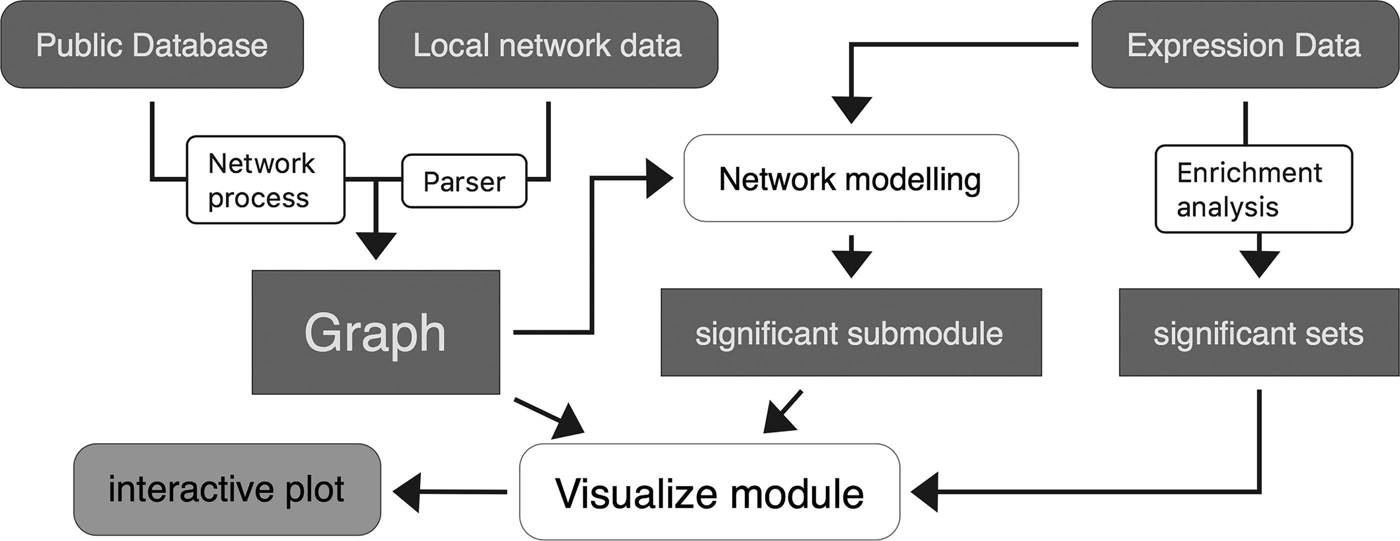
The relationship between the submodules and the structure of the PyPathway. White rounded rectangle indicates the submodule of the package; dark blue rectangles indicate network data and processed data.
2.1. Network process
Currently, there are many human curated pathway and interaction network databases. For pathway resources, KEGG (Kanehisa et al., 2017) is a well-known database providing high-quality pathway data for many species, and Reactome (Fabregat et al., 2017) is a free, open-source, curated, and peer-reviewed pathway database managing large amounts of pathway and network data. For interaction data, STRING (Szklarczyk et al., 2015) and BioGRID (Chatr-Aryamontri et al., 2015) store >1000 million protein–protein interactions. However, few databases such as KEGG have Python API implemented. We wrapped HTTP APIs from these databases to a simple and clear Python module, simplifying the querying, retrieval, and parsing procedures of network data.
2.2. Network analysis
Enrichment analysis of omics data is essential to find functional groups of genes, messenger RNA, proteins, and other molecules whose interplay can explain experimental observations. Numerous methods have been built, and according to the use of experiment data details and the interaction of the network data, these methods can be classified into three categories.
The set-based functional enrichment analysis only considers the function sets and ignores both the details of experiment set and topology of interactions among genes in the functional sets.
The network-based method takes the advantage of topology of the interaction network and considers the relationship between candidate genes and the functional gene set. Methods such as SPIA and Enrichnet use existing protein–protein interaction networks as a priori knowledge and calculate the network distance using random walk with restart to find out the average distance between significant experimental gene sets and functional gene sets. We implemented SPIA by migrating the R function to Python by using NumPy and Pandas.
Compared with functional enrichment, network modeling does not limit itself to predefined functional gene sets and seeks the most significant subnet in the interaction network. This takes the advantages of interaction network and experimental data but requires higher computing resources than the functional enrichment. We adapted and optimized two newly introduced and powerful algorithms [i.e., HotNet2 (Leiserson et al., 2015) and MAGI (Hormozdiari et al., 2015)] that seek submodule from protein–protein interactive networks combined with mutation and coexpression data.
Finally, we implement several network propagation methods: random walk, random walk with restart, and heat kernel. These methods simulate the heat diffuse process between the nodes and combine the topological structure into the analysis.
2.3. Pathway and network visualization
PyPathway supports the visualization of network data, pathways, and analysis results. All of these types of Python objects implement the visualization interface and share same methods and properties.
The interactive visualization module is implemented on the basis of the HTML and JavaScript technologies. We implemented the intercommunication between Python and JavaScript to present the dynamic visualization and capture the update of the graphic. The Jupyter notebook executes the user inputs and sends the data to the web application. The JavaScript then renders the data and presents the plot in the output region on the notebook's output area. Once user performs a certain interactive event, the JavaScript code triggers an event telling the notebook which part of the data is changed. The visualization is based on the abundant JavaScript visualization Ecosystem. Pathway graphs are presented using SBGNviz (Sari et al., 2015) and pvjs. Scientific plots are realized by using ECharts.js. The backend is based on Jupyter, a tornado web server, which handles the user inputs and renders the plots.
2.4. Data sharing
Interactive plots can be exported to a notebook or a self-contained HTML file.
The Jupyter notebook is a recommended way to share data and the analysis procedure. The notebook contains all the Python commands and outputs of every step. It is more intuitive than script file and all the visualizations remain dynamic on the output area.
Self-contained HTML files can be sent through usual sharing platforms and opened in any modern web browser in any operation system. Compared with the Jupyter notebook, this format exportation is quicker with the analysis code discarded and only the result presented. We implemented a module that organizes visualizations and adds a setting panel, making this visualization as a web application.
3. Results
In the following sections (3.1–3.5), several examples demonstrate the usage of this package.
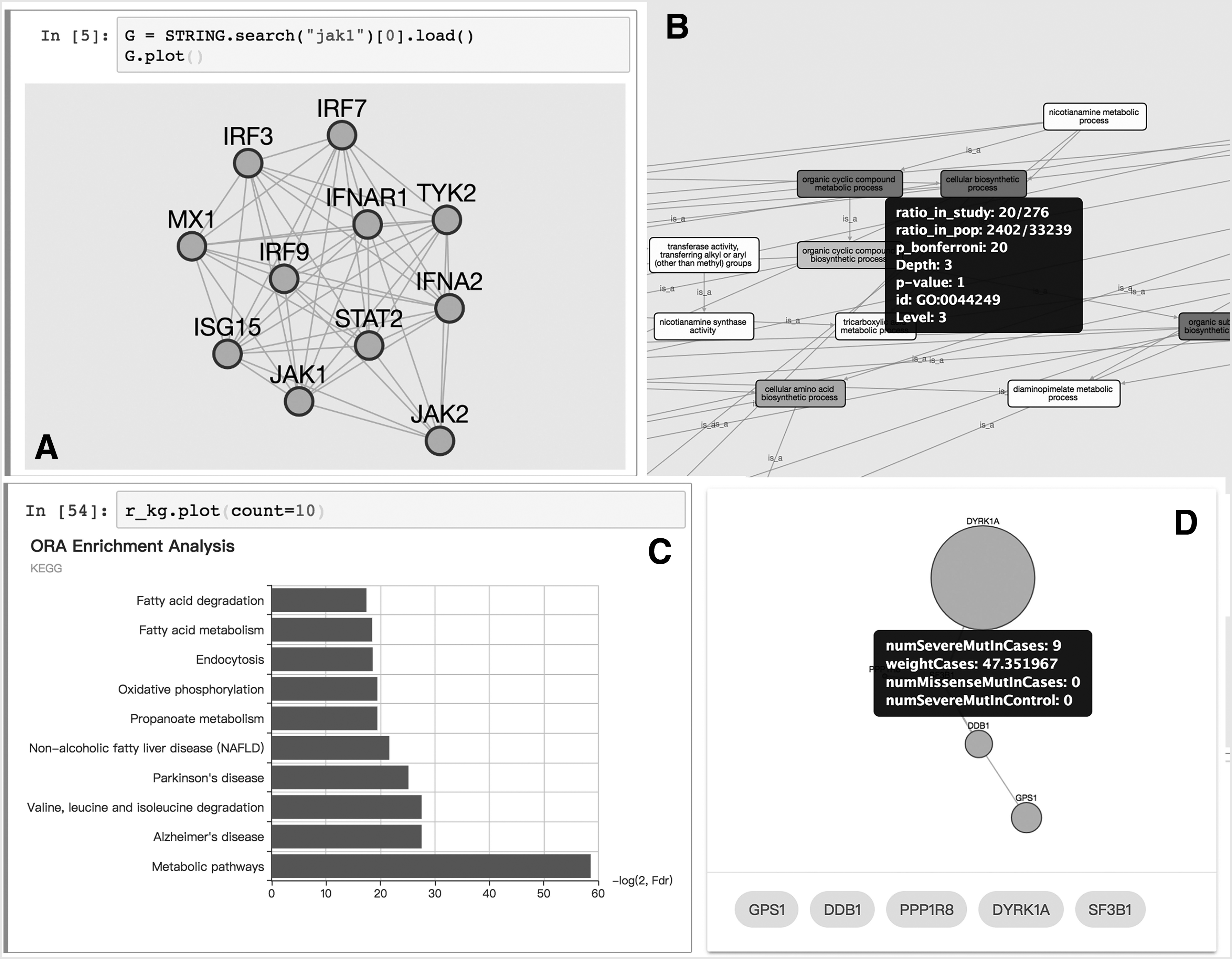
3.1. Network process and visualization
The interaction network database API is also implemented in our package. Figure 2A shows the query, retrieval, and visualization of protein interaction networks in an interactive environment. Few interactive visualization options include the display of detail information about a node or edge and the menu of actions such as “expand network” or “highlight the element.”
(
3.2. Functional enrichment
Several functional enrichment algorithms have been implemented in the analysis module. The result of each analysis contains a Pandas' DataFrame property, which lists statistical information of each functional set. A graph view of the relationship between each set (Fig. 2B) and a dynamic bar plot (Fig. 2C) is available for the visualization of the analysis.
3.3. Network modeling and propagation
Here, we reported an example of the use of MAGI, a powerful tool integrating PPI network, coexpression network, and mutation to reveal de novo function subnetworks. With PyPathway, it is only necessary to execute the command in the interactive environment. The generated subnetwork is visualized in a table view with the graph and the generated score (Fig. 2D). By using the plot method on the resulted object, the nodes are plotted with the detail information in the tooltip. The obtained subnetwork is exportable and can be displayed in the HTML page, where each single result is listed in the tab panel on the top. This page can be easily shared and integrated on existing websites.
3.4. Performance improvement
The network modeling methods usually compute the most significant subnetwork from the existing interaction networks and the mutation data. This task is NP-complete and takes numeric computing resources. Here, we optimized the modeling method with the parallel programming model and the implementation in low-level program language. For HotNet2, the Python implementation of node swap consumes most of the computing time and we migrated these parts of codes as a C extension, yielding ∼10 × faster than the original implementation. In MAGI, the color coding of graphs consumes most of the computing time but only uses one core of the CPU. Thus, we simply implemented a multithreading model to color the different graphs in a parallel manner. The speed improvement is ∼3 × than the original implementation. This test is performed in Ubuntu 16.04 with E3-1231 and 32GB RAM machine.
3.5. Remote manipulation
The high performance computing (HPC) and cluster usually run remotely and have high computing capacity. However, these machines lack graphic interface and cannot use GUI tools such as Cytoscape or Graphviz to visualize networks. Several ASCII command-line tools such as ASCIIGenome (Beraldi, 2017) are available to enable users to view their analysis results in remote. However, these tools usually visualize the result in the text environment that is not a feature-rich environment as these GUI tools. Here, together with our package, we introduced the Jupyter notebook that presents a rich visualization even in remote. The visualization module of PyPathway is tightly integrated with the Jupyter notebook.
4. Conclusions
PyPathway implements several functional enrichment methods, network modeling tools, and the dynamic visualization module. This package simplifies the network analysis and visualization procedure for Python users. One of the highlights of this package is the dynamic visualization module and the data sharing module, which integrate visualization results with web applications without requiring web development knowledge.
Footnotes
Acknowledgments
This work was supported by Fund of FEBL (2017FB04); the Fundamental Research Funds for the Central Universities (grant #: x2swD2172770); and the Science and Technology Program of Guangzhou (grant #: 201604020135) to Dr. Xiao-Chun.
Author Disclosure Statement
No competing financial interests exist.