
Abstract
One of the main methods to analyze gene expression data is biclustering, a nonsupervised technique, which consists of selection subgroups of genes that co-expressed under subgroups of experimental conditions. A large number of biclustering algorithms have been developed to classify gene expression data. These algorithms can give as output a large number of overlapped biclusters, whose visualization still requires deeper studies. We present VisBicluster, a web-based interactive visualization tool for displaying biclustering results. The developed visualization technique consists of laying out the generated biclusters in a two-dimensional matrix where each bicluster is represented as a column and each overlap between a set of biclusters is represented as a row. A search interface for the user is developed to query the matrix of bicluster intersection and visualize the results matching the queries. Our tool supports many interactive features such as sorting, zooming, and details-on-demand. We proved the usefulness of VisBicluster with biclustering results from real and synthetic datasets. Besides, we performed a user study with 14 participants to illustrate the clarity and simplicity of overlap representation with our tool.
1. Introduction
Computational analysis of gene expression data has the potential to (1) reveal behavior patterns on groups of genes for a particular biological or medical condition, (2) identify specific expression patterns such as alternative splicing, or to find or accurately locate transcripts, and (3) by the accumulation of evidences, eventually have applied results such as the development of drugs or the deeper understanding of different aspects of DNA and RNA. Several genomic data analysis workflows imply identifying groups of biological entities (e.g., genes) that exhibit similar behavior under certain conditions. The dominant method to analyze genomic abundance data is clustering first applied by Eisen et al. (1998), which consists of the selection of genes (rows) with similar expression patterns under the whole set of conditions (columns). Many clustering techniques such as hierarchical clustering (Sokal and Michener, 1958) and k-means clustering (Hartigan and Wong, 1979) are very popular in the analysis of gene expression data.
However, for specific biological aims, the detection of new patterns can be enhanced when the analysis is carried out in both dimensions simultaneously: genes and conditions. In fact, this allows finding subgroups of genes that coexpress only under certain experimental conditions. These nuggets of local patterns can be discovered based on the algorithmic technique called biclustering (Cheng and Church, 2000). After an initial bloom of different approaches and concepts of what a bicluster is (Madeira and Oliveira, 2004), new algorithms continue to be developed at a steady step. Biclustering has two main theoretical advantages over traditional clustering; bidimensionality, grouping both genes and conditions together, and overlap, allowing genes to contribute to more than one activity.
Giving these special characteristics of biclustering, its application to gene expression data often generates a large number of overlapping groups of coexpressed genes (called biclusters), which are very hard to present in an informative way in a single view. In fact, mapping the biclustering results in one visual form with its special features (i.e., bidimensionality and overlaps) is a nontrivial task. There are several visualization approaches in the literature for visualizing overlapping biclusters (Streit et al., 2014), which usually have the drawback of scalability.
Discovering new insights from large datasets needs a good combination of data processing algorithms with the strengths of interactive visualization techniques (Fry, 2004; Ware, 2004; Thomas and Cook, 2005; Keim, 2010; Holzinger, 2013). Such a combination is valid for biological datasets (Santamaría, 2013). The most popular techniques to visualize biclusters are heatmaps and parallel coordinates. In a heatmap (Eisen et al., 1998), genes are posted as rows while conditions are posted as columns with a color that represents the gene expression level. To draw a bicluster, its corresponding rows and columns are rearranged and usually placed in the upper left corner (Barkow et al., 2006). Heatmaps have the ability to draw more than one bicluster in a global view by reordering but at the cost of replicating rows and columns of certain biclusters, which may lead to ambiguity (Santamaría et al., 2008). Indeed, Jin et al. (2008) formulated the overlapping bicluster visualization problem as an optimization problem and defined a reordering approach that exploits analogies to the hypergraph vertex ordering problem. Grothaus et al. (2006) proposed to duplicate with a minimum rate, rows and columns, to be able to draw overlapped biclusters. Heinrich et al. (2011) follows the same strategy with the possibility to decide interactively which biclusters to show contiguously. Luscher et al. (2010) proposed an algorithm which consists of defining an optimal arrangement way that maximizes the areas of the largest contiguous parts of biclusters obtained from a gene expression matrix.
In parallel coordinates method (Inselberg, 1985), conditions are visualized as vertical axes and genes as lines, which join corresponding expression values. Cluttering limits the efficiency of this technique when applied to several biclusters (Santamaría et al., 2008), for example, using different colors for polylines corresponding to each bicluster (Heinrich et al., 2011). Usually, scalability is the principal drawback of these techniques either because of the large number of biclusters or because of high overlap rates. Some more sophisticated visualization prospects have been proposed based on Venn-like diagrams (Santamaría et al., 2008) and node-link diagrams (Streit et al., 2014).
In the studies of Santamaría et al. (2008) and Kaiser et al. (2013), the proposed algorithm consists of drawing biclusters as circles (bubbles). Brightness reflects the bicluster homogeneity. Circle size represents bicluster size. Position of each bubble depends on a 2D projection of the multidimensional points formed by the rows and columns in the bicluster. Overlaps between bubbles do not correspond to real overlaps among biclusters; they are just a projection-based approximation of biclusters' similarity.
BicOverlapper (Santamaría et al., 2008) used a Venn-like representation where biclusters are depicted as irregular surfaces called hulls and overlaps are shown by intersections of hulls. Groups of genes and conditions either on just one bicluster or on specific overlaps are represented by glyphs. A glyph is a pie chart divided into sectors whose numbers depict the number of biclusters where genes and conditions belong to. The size of a glyph depicts the size of the corresponding group. The graph layout uses a force-directed algorithm where biclusters are represented as flexible overlapped groups of genes and conditions. Genes and conditions specific to a bicluster or overlap between biclusters are pictured by heatmaps and/or parallel coordinates in a separate view under demand. This method can deal with a good number of sparsely overlapped biclusters but it suffers from low scalability, especially by mid to high levels of biclustering overlaps which we will discuss in the following sections.
Furby (Streit et al., 2014) visualizes biclusters, as well as their overlaps, as a node-link graph. Biclusters are the nodes of the graph, while shared genes and conditions between biclusters are considered as edges or bands. Each bicluster node is depicted as a heatmap matrix where rows represent genes and columns represent conditions of the corresponding bicluster. Overlaps between each pair of biclusters are encoded using bands that link the corresponding heatmaps at the position of the shared rows and columns. The thickness of the bands is proportional to the number of rows and columns shared by the biclusters. The graph layout uses a force-directed algorithm in which overlapping biclusters attract each other. Selecting a bicluster shows its details such as its name or the labels of its corresponding genes and columns. Furby has a high rate of interactivity with a simple design based on heatmaps. Bands that encode overlaps give the user a clear vision with details about shared genes and conditions between each couple of biclusters. Because of the use of 1-on-1 visualization of overlaps, the multi-bicluster overlaps are difficult to identify with this method. In addition, the scalability of this technique is low because, with a high level of overlaps, bands between biclusters will be too cluttered, rendering the full overview of the biclustering results impossible.
The aim of this article is to present a new method to visualize biclusters and their corresponding overlaps. It is based on a two-dimensional matrix where each bicluster is represented as a column and each overlap between a set of biclusters is represented as a row. The method is implemented in a web-based interactive visualization tool called VisBicluster.
We demonstrate VisBicluster performance for two types of data; a synthetic dataset as a case study and a real dataset from prostate cancer samples. Furthermore, we performed a user study with 14 participants to compare our design with another two biclustering visualization tools.
Our approach focuses on overlaps, making their search or selection straightforward on our matrix-based visualization. With this strategy, we avoid any source of visual clutters usually caused by element crossings (i.e., lines, shapes, and so on). The scalability of VisBicluster is high since it is capable of visualizing large numbers of highly overlapped biclusters simultaneously in an informative way. Linking and brushing techniques are also supported by the tool to permit the inspection of selected subsets of data from different views.
2. Methods
In this section, we detail the main characteristics of our visualization method. We first introduce how biclusters and their corresponding overlaps are depicted. Then, we focus on the detail view where elements (genes and conditions) of single biclusters or overlaps are represented as heatmaps.
2.1. Overlap matrix visualization
To convey biclustering overlap in a scalable way, we focused on such overlaps as the main entity on our visualization (Fig. 1).
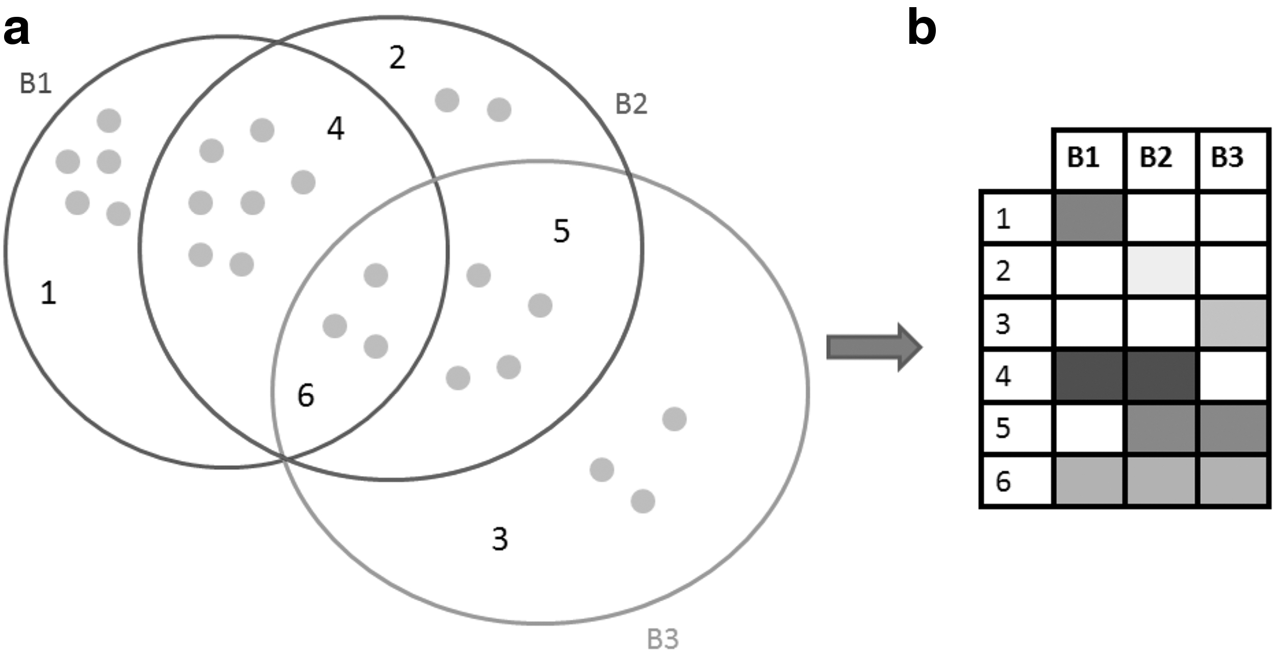
Bicluster visualization concept.
Biclusters B1, B2, and B3 with their overlaps are represented based on the proposed technique. The three biclusters are represented as a Venn diagram (Baron, 1969) (Fig. 1a). Zone 1 depicts elements of B1 which are not shared either with B2 or B3; it's the same meaning for zone 2 of B2 and zone 3 of B3. Zone 4 encodes the overlap (shared elements) between B1 and B2. Zone 5 illustrates the overlap between B2 and B3, while zone 6 depicts the overlap between B1, B2, and B3. Gray circles depict elements (genes and conditions) of each zone. Furthermore, our defined visualization technique relies on a two-dimensional matrix where individual biclusters are the columns and overlaps between biclusters are the rows (Fig. 1b). Each participated bicluster in any overlap is represented by a cell. We layout the matrix based on all the occurring overlaps between biclusters. Only biclusters that are present in an overlap will be represented with colored cells, which are encoded based on a white-to-black color scale. The more genes and conditions two or more biclusters share, the darker is the cell color (Fig. 1b). We choose the white-to-black color scale because it's the easiest scale to perceive hue changes to the human eye (Ware, 2004).
Rows with only one cell depict exclusive elements (genes and conditions) of a bicluster, while rows with two or more cells show overlaps between two or more biclusters. For example, the cell of the intersection between row 1 and B1 depicts genes and conditions of B1 not shared with any other biclusters. It's the same case for rows from 2 to 3 which encode exclusive genes and conditions for biclusters 2 and 3. Row 4 depicts the overlap between B1 and B3. Row 5 depicts the overlap between B2 and B3, while row 6 depicts the overlap between all the three biclusters B1, B2, and B3. Based on the used color scale, we can note that B1 has the largest number of exclusive elements (genes and conditions), and overlap between B1 and B2 is also the largest one. With this method of visualization, it is easier to know which biclusters are not overlapped. In our case, there is no exclusive overlap between B1 and B3.
Showing the biclustering results as a two-dimensional matrix avoids any source of cluttering caused by graph representation (Santamaría et al., 2008; Streit et al., 2014). Scalability of the proposed method is high especially for the number of visualized biclusters since participated biclusters are depicted as simple columns with minimum occupied space on the layout.
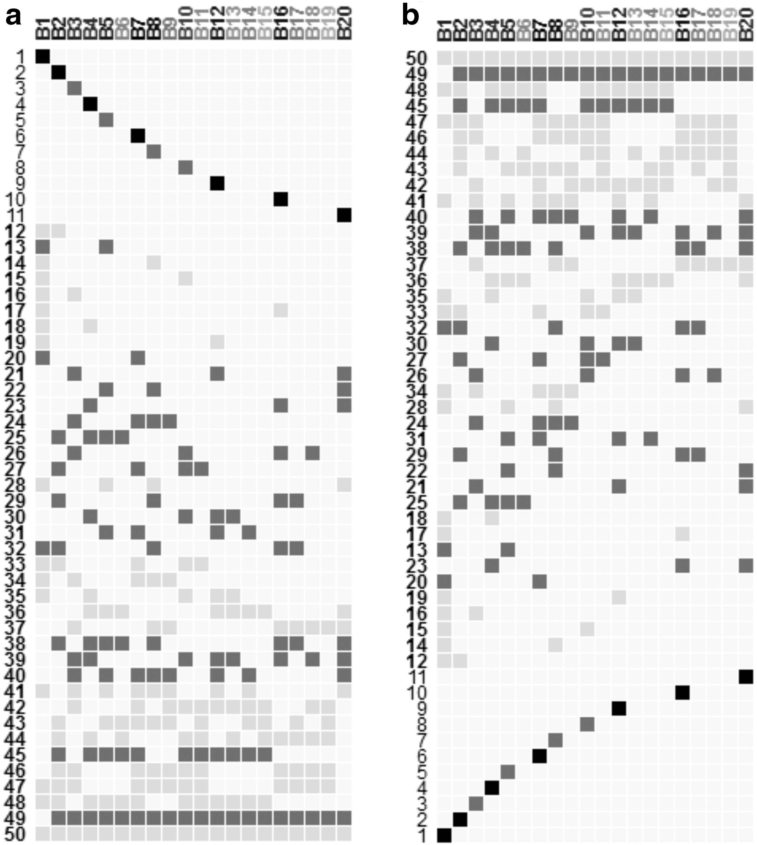
Figure 2 shows an example of biclustering result with 20 generated biclusters. Cells are encoded based on a white-to-black color scale, as well as the names of columns (i.e., names of biclusters). So, the more genes and conditions a bicluster contains, the darker is its name.
Overview of the matrix of overlaps visualization showing
2.2. Selection and highlighting
VisBicluster supports linking and brushing. Hence, selected columns or rows of the matrix of overlaps are shown on the right side of the interface as heatmaps. Clicking on column names shows the corresponding bicluster as a heatmap. To select several rows, the user needs to click on each number of the chosen rows. Then, double-click on one of selected rows shows the corresponding heatmap. For the case of one row, the analyst can either double-click on its number or click on any colored cell of the selected row.
Letting the analyst know details (number of genes, number of conditions, participated biclusters in an overlap, number of participated biclusters in an overlap, and name of a bicluster) about the currently selected bicluster or overlap is important for a well understanding of data. To achieve such a task, the analyst can hover over the name of a column, and the name of the corresponding bicluster, as well as its size (number of genes and conditions), are shown as a tooltip. Hovering over a number of a row depicts the number of corresponding overlap, the total number of overlapped biclusters, the size of the overlap (number of genes and conditions), and the list of participated biclusters. In a similar manner, hovering over a filled cell shows the details of the overlap that belong to it and also highlights the corresponding column and row of the matrix.
2.3. Filtering, sorting, and zooming
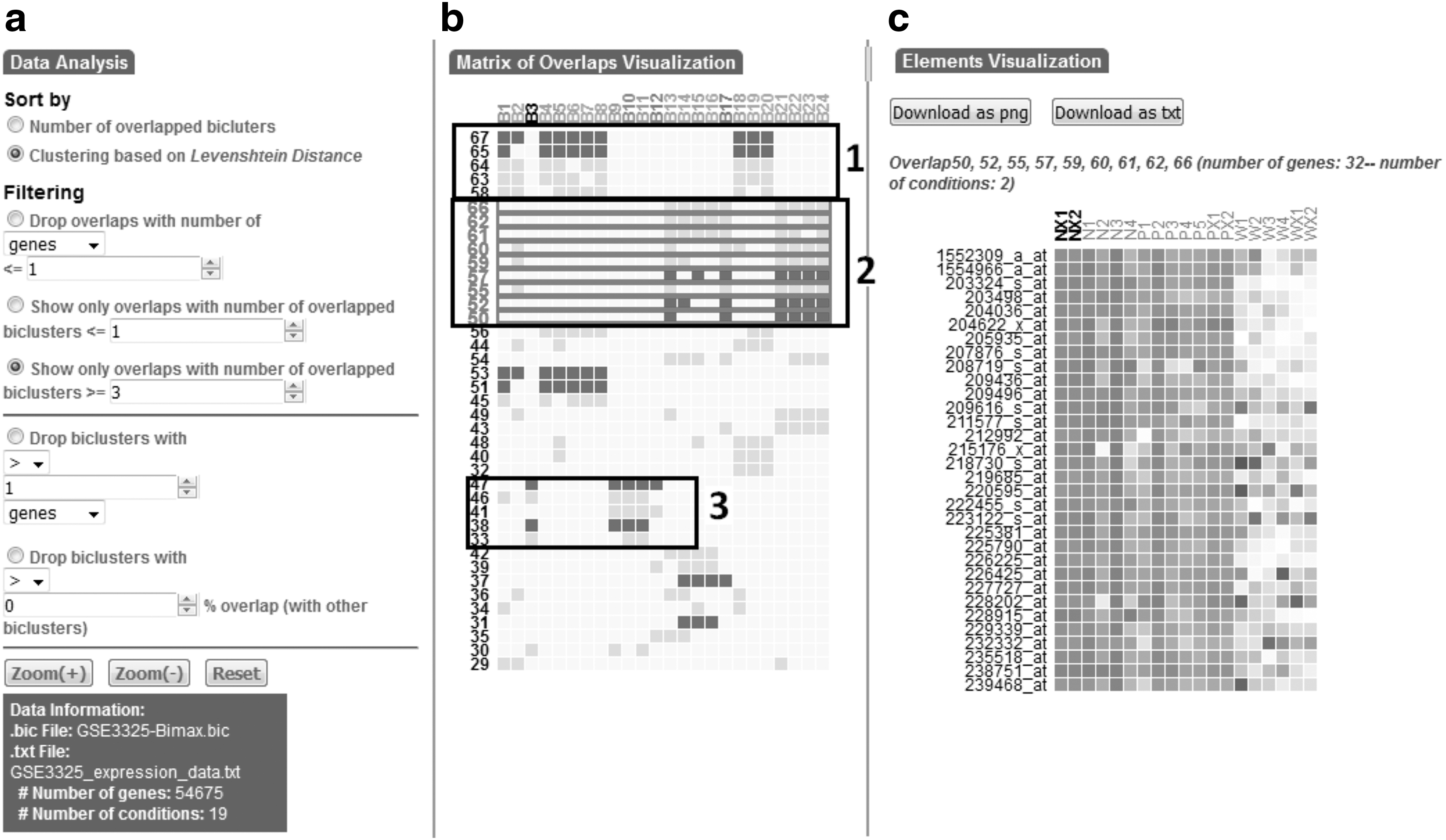
VisBicluster allows analysts to interactively apply interesting filters on the visualized data which help to, on one hand, simplify the visualization layout and, on the other hand, focus on subsets of biclustering result. Five kinds of filters are available to modify the layout:
Minimum genes/conditions number of overlaps: If this filter is chosen with parameter n, only overlaps with more than n genes or conditions are drawn. Minimum number of overlapped biclusters: If this filter is chosen with parameter n, only overlaps with more or equal to n overlapped biclusters are drawn. Maximum number of overlapped biclusters: If this filter is chosen with parameter n, only overlaps with less or equal to n overlapped biclusters are drawn. Size of biclusters: If this filter is chosen with parameter n, biclusters more/less/equal to n genes or conditions are dropped and the matrix is built again with the rest of biclusters. Rate of overlaps between biclusters: If this filter is chosen with parameter n%, biclusters with overlap rates with other biclusters above/below/equal to n% are dropped and the matrix is built again with the rest of biclusters.
Sorting and zooming are also supported by our approach. A primary sorting criterion is applied by default on the data based on the number of overlapped biclusters. The analyst can define a secondary sorting criterion that uses a clustering algorithm based on the Levenshtein distance (Levenshtein, 1966), which represents a string metric for measuring the difference between two sequences. This algorithm is useful to show the closest biclustering overlaps next to each other and to define clusters from the overlapped rows (Fig. 2b). Zoom factors adapted for the matrix of biclustering results can be manipulated by the analyst using zoom controls in the data analysis part of the global visualization interface. The analyst can either zoom in, zoom out, or reset the visualization, which not only eliminates zoom interaction but also drops any other applied filters.
2.4. Detail visualization
Besides the matrix of overlapped bicluster overview, the proposed technique allows the visualization of single biclusters or overlaps as a heatmap in the detail view part. We choose heatmap representation since it's the most commonly used technique to visualize this kind of biological data. Cells of heatmaps, which depict transcription levels of genes under each condition, are drawn based on a blue-white-red color scale. Highlighting any cell of the heatmap will show the corresponding transcription level and the corresponding gene and condition names. Analysts can bring a bicluster, a single overlap, or a set of overlaps into the focus of the heatmap visualization. Genes and conditions of each heatmap are rearranged to better understand the context of gene profiles. Analysts have the ability to export the data visualized as heatmaps either as text or image files.
2.5. Implementation
VisBicluster is implemented as a web application in JavaScript using the D3 library (Bostock et al., 2011). The tool is released under the open-source GPL3.0 license. The code source with multiple dataset samples and a user's guide are freely available at https://github.com/Haithem198717/VisBicluster A ready to use VisBicluster instance is available at http://vis.usal.es/~visusal/visbicluster
3. Results and Discussion
We demonstrate the usefulness of our bicluster visualization method by a representative analysis of two datasets. The first one is a synthetic dataset created by Padilha and Campello (2017), while the second is a real dataset encoding results of prostate cancer progression (Varambally et al., 2005). Then, using the synthetic dataset, we performed a user study to evaluate different aspects of VisBicluster compared to two well-known biclustering visualization tools, BicOverlapper (Santamaría et al., 2014) and Furby (Streit et al., 2014).
3.1. Synthetic dataset
The synthetic dataset generated by Padilha and Campello (2017) is composed of 500 rows and 200 columns. In Padilha and Campello (2017), the authors define datasets for six different bicluster models (constant, upregulated, shift, scale, shift-scale, and plaid) and in five different analysis scenarios (influence of noise, influence of the number of biclusters, influence of symmetric overlap, influence of asymmetric overlap, and influence of bicluster size). We note that our visualization technique is able to show biclustering results generated from any bicluster model and in any analysis scenario but we choose to use the dataset in the scale model with 75% of noise level in our results since we think that it is good enough to show the power of our method.
Two biclustering algorithms are used to analyze the data: Bimax (Prelić et al., 2006) and xMOTIFs (Murali and Kasif, 2003). Biclust R package (Kaiser et al., 2013) is used to execute these algorithms. These two biclustering algorithms are chosen because they use different strategies to search for biclusters so we can present and discuss the results of the visualization under different biclustering conditions. Indeed, Bimax is a divide-and-conquer algorithm, which starts with a binary data matrix as input and then searches for submatrices whose values are all equal to one, while xMOTIFs performs a greedy interactive search strategy to find submatrices with simultaneously conserved genes in subsets of experimental conditions (Padilha and Campello, 2017).
Bimax was executed with a binary threshold value equal to 0.5, so only transcription levels that are higher than this threshold are considered. The minimum size of biclusters was set to 2 × 2, finding 100 biclusters. We consider the first 20 ones. xMOTIFs was executed under its default parameters where the number of columns chosen was ns = 10, the number of repetitions nd = 10, the sample size in repetitions sd = 5, and the scaling factor for column result alpha = 0.05. Ten biclusters are yielded. Figure 3 shows the results for the two biclustering algorithms as two-dimensional matrices.
Bimax and xMOTIFs result visualization for synthetic data.
For Bimax results (Fig. 3a), with this representation, it is clear the high connectivity of most of the 20 biclusters between them (overlaps from 38 to 50), which demonstrates the exhaustiveness of Bimax algorithm. From the 20 biclusters, 11 of them have exclusive elements (genes and/or conditions not integrated in any overlap) since they have rows in the matrix of overlaps with only one filled cell (biclusters1, 2, 3, 4, 5, 7, 8, 10, 12, 16, and 20), while all elements of the remaining biclusters are present in at least one overlap. Based on the scale used to color the matrix cells, it's straightforward to infer overlaps with high number of genes and conditions. In fact, overlaps from 20 to 27, overlaps from 29 to 32, overlaps from 38 to 40, and overlaps13, 45, and 49 have a high number of elements (range from 4 to 10 elements) compared to other overlaps (range from 1 to 3 elements). Hovering over each corresponding row numbers, the analyst can infer that overlap24 between biclusters 3, 7, 8, and 9 is the largest one with 10 elements. It's the same process to infer bicluster sizes. For Bimax results, bicluster 7 is the largest one (72 genes and 2 conditions). In addition, the analyst can know the number of overlapped biclusters for each set of overlaps based on the number of filled cells for each row. For example, there are 9 overlaps between 2 biclusters and 3 overlaps among 3 biclusters.
For xMOTIFs results (Fig. 3b), the first 10 rows show that all biclusters have exclusive elements. The remaining 34 rows show overlaps between 2 or more biclusters, while overlaps 20, 22, 24, 32, and 33 are the most interesting one due to their larger sizes (involving 3 or more elements). Bicluster 4 is the largest bicluster since its column name is in black color compared to the other 9 biclusters. When the analyst hovers over on each column name, he notices that all biclusters contain few numbers of genes while they usually have high numbers of columns which reflects one of the characteristics of xMOTIFs algorithm.
3.2. Real dataset
To test the developed visualization method, now applied to a real dataset case, prostate cancer tissue dataset (Varambally et al., 2005) has been used. The dataset contains the gene expression values of 54675 H sapiens transcripts for 19 samples that have been analyzed using Bimax algorithm (Prelić et al., 2006). Because of the exhaustiveness of Bimax and to show a reasonable number of biclusters as a result, we follow this process:
Remove from the expression matrix the transcripts that have low variance (remove those with variance below mean-variance plus one standard deviation, keeping 8702 transcripts).
Binarize the resulting matrix with a binary threshold equal to 5%.
Remove transcripts with more than 50% of ones for the 19 samples. With this step, we get rid of possible housekeeping genes that have passed the previous filters, avoiding transcripts that will be in all the biclusters due to Bimax search. This renders 8325 transcripts.
Run Bimax and remove small biclusters (those with less than 3 samples and less than 30 transcripts) and generic biclusters (those with more than 10 samples).
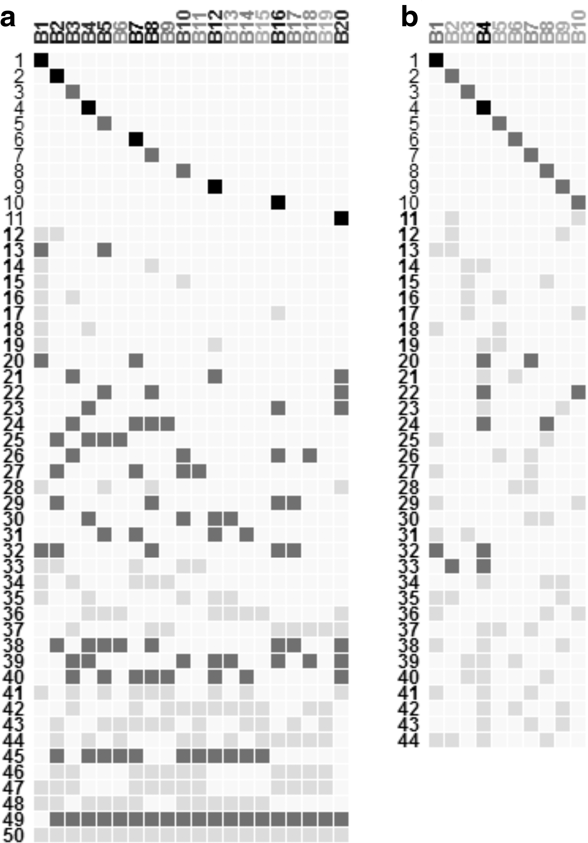
Twenty four biclusters are yielded following the previous process. Figure 4 shows the found results. Based on the visualization of Figure 4b, we find 39 overlaps between three or more biclusters where 11 of them are with larger (more than 4 elements) sizes based on our color-scale definition. Among them, we focus on three easily identifiable groups of similar overlaps (groups 1, 2, and 3 on Fig. 4b), which therefore can be interesting candidates for a detailed inspection. By selecting rows of each group of overlaps and visualizing each corresponding genes and conditions as heatmaps (for example, group 2 on Fig. 4c), we depict that group 1 contains biclusters that group conditions related to clinically localized prostate cancer (P5, PX1, and PX2). Genes of this group are highly active under these samples. Group 2 contains biclusters upregulated at benign prostate tissue samples NX1 and NX2, although its genes are also highly expressed for other benign (N1 to N4) and localized (P1 to P5, PX1 and PX2) samples. Group 3 contains genes that are upregulated under metastatic disease conditions (W2, W3, WX1, and WX2).
Bimax result visualization for Prostate cancer data.
We mention the importance of the overlap group 3, which includes the two largest overlaps (numbers 38 and 47, with 24 and 13 transcripts, respectively). The transcripts of this group are overexpressed under metastatic prostate cancer conditions, which can be used as predictors of prostate cancer progression in clinically localized disease state. Thus, these genes act as a signature for clinically aggressive prostate cancer, which is characteristic of metastatic disease (Varambally et al., 2005). Biclusters of this group of similar overlaps, which are B1, B3, B9, B10, B11, and B12, are also interesting in the analysis of prostate cancer microarray data especially the third one (B3) which is the largest bicluster and also it is integrated into the largest overlap (number 38). Indeed, this would suggest that this bicluster can be a predictor of progression of prostate cancer since all corresponding conditions are in metastatic disease state (Varambally et al., 2005).
3.3. Comparison with other tools
We performed a user study to evaluate different aspects of VisBicluster compared to two well-known tools, which are BicOverlapper (Santamaría et al., 2014) and Furby (Streit et al., 2014). We chose these tools since they implemented new techniques of bicluster visualization with combination with traditional ones like heatmaps or parallel coordinates. Thus, BicOverlapper used Venn diagrams while Furby is based on node-link diagrams. Our study specifically focused on the clarity and simplicity levels of the visualization methods to quickly find target information in relation to biclusters and their corresponding overlaps.
3.3.1. Comparison setup
The physical setup for the user study consisted of an Intel Core 2 Duo laptop computer at a frequency of 2 GHz and 3 Gigabytes of RAM. We chose 14 participants for this study. Six participants (3 male, 3 female) were PhD students with intermediate experience, five participants (3 male, 2 female) were computer science teachers at secondary level school, and three participants (3 male) were senior researchers and practitioners at a computer science faculty. The relevant functionality of each visualization tool and introduction about biclusters were explained to the participants. After the explanation, participants were invited to work as long as they want with each visualization tool and discover all the features of each one. In this training phase, they could ask questions to the test supervisor. Finally, participants were asked questions to uncover if they well understood the operating principle of each visualization tool to answer the given tasks correctly.
We used the bicluster results used in the synthetic dataset subsection with the same parameterization for Bimax biclustering algorithm to test the three tools. Figure 5 shows a snapshot of the overall visualization result for BicOverlapper and Furby.
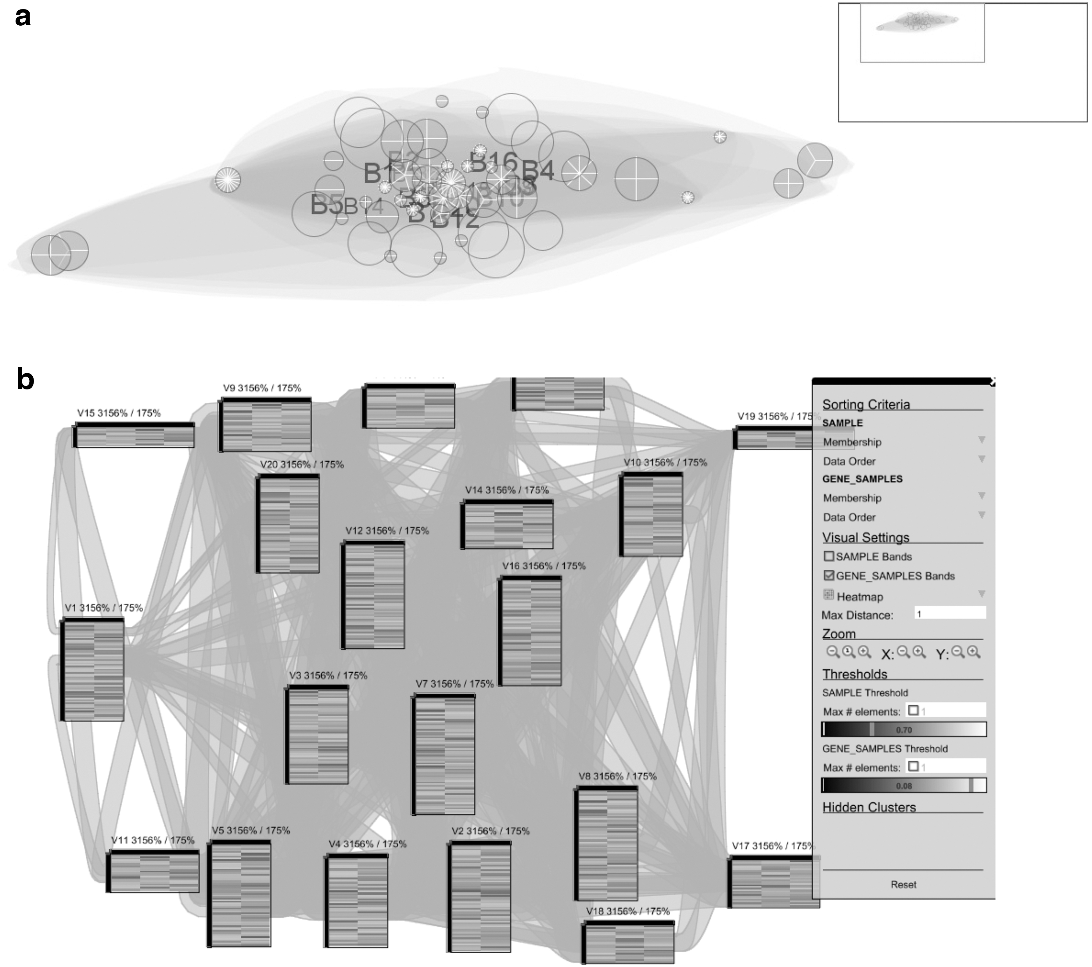
Bimax bicluster visualization for synthetic data with
We outline three major categories of tasks to be tested based on the work of (Alsallakh et al., 2014):
Tasks related to biclusters.
Tasks related to overlaps between biclusters.
Tasks related to bicluster elements (genes and/or conditions).
3.3.2. Different tasks
Participants were asked 10 tasks where some of them consisted of a certain number of subtasks. The following tasks and subtasks were asked in the study:
Task 1: Find out the total number of overlapped biclusters.
Task 2: Find out the total number of overlaps.
Task 3: Find out the list of biclusters that have elements (genes and conditions) not integrated into any overlap.
Task 4: Analyze overlaps: For example, find out if a certain pair of biclusters or if a certain group of biclusters overlap (i.e., have nonempty intersections):
4.1. Identify overlaps between k biclusters (In our test, we ask to find the number of overlaps between two biclusters).
4.2. Identify the biclusters involved in a certain overlap (In our test, the choice of the overlap is up to the participant).
4.3. Identify the biclusters not integrated into any overlap.
Task 5: Analyze exclusion overlaps: For example, find out if bicluster A does not intersect with bicluster B (In our test, we ask to find out if bicluster 1 has intersections with bicluster 2. If yes, what are the numbers of overlaps between them?).
Task 6: Find out the largest/smallest overlap (In our test, we ask to find only the largest overlap).
Task 7: Find out the largest/smallest bicluster (In our test, we ask to find only the largest bicluster).
Task 8: Analyze and compare bicluster exclusiveness: For example, find out if bicluster A contains more exclusive elements than bicluster B, or more elements shared with 1, 2, 3, or any number of biclusters (In our test, we ask to find out if bicluster 1 has more exclusive elements than bicluster 2).
Task 9: Analyze elements:
9.1. Find elements that belong to a specific bicluster (Participant's choice).
9.2. Find elements that belong to a specific overlap (Participant's choice).
9.3. Find elements belonging to a bicluster that are not integrated into any overlap (Participant's choice).
Task 10: Find elements based on their bicluster memberships: For example, elements in bicluster A and in bicluster B but not in C (In our test, we ask to find out shared elements between biclusters 1 and 2 but not involved in bicluster 3).
We conducted different test orders for the three tools with each participant. Thus, we didn't start always by the same order for the tested tools for all the 14 participants to avoid prelearned behavior biases from the first tested tools.
3.3.3. Study results
The results of the pilot study are summarized in Table 1 and Figure 6. The detailed results of answer times of different tasks for each participant are represented in Supplementary Table S1, while answers of each task are depicted in Supplementary Table S2.

Answering times of the tools Furby, BicOverlapper, and VisBiclusters for the proposed tasks.
Average Completion Times for Different Tasks
The average time to answer 8 out of 10 tasks is the lowest one for our tool compared to Furby and BicOverlapper. Furthermore, the global average of time of VisBicluster (1.8 s) is also the lowest one. This may be explained by the fact that our visualization has a specific visualization element for overlaps that is displayed in a sorted way (as a matrix) instead of as linkage elements subsidiary to main visual elements (biclusters). In fact, this strategy is simple to be analyzed by any type of users. Because we avoid clutter sources when drawing overlaps between biclusters, to answer questions about overlaps becomes a straightforward task.
However, we notice that Furby has the lowest answer time in tasks 1 and 7 (finding the number of biclusters and the largest or smallest one). This can be explained because the nodes that depict biclusters in the node-link diagram used by Furby are easily perceived by the participants. BicOverlapper hulls are very overlapping and extensive, while in VisBicluster the biclusters are ancillary to the overlaps themselves, making both approaches less efficient for these two overview tasks. Yet, Furby has the highest answer times for some tasks like tasks 2, 3, 10, and subtask 4.1 since links between biclusters which depict overlaps are very cluttered which render answering these tasks impossible (9 out of 14 participants cannot give answers about these tasks as presented in Supplementary Table S1). In contrast, BicOverlapper gives, in general, reasonable results for most of the tasks (global average answer time of 5.5 s). BicOverlapper only underperforms both Furby and VisBicluster in three tasks (1, 5, and 7), two of which are bicluster centered, while as explained before, biclusters are dissolved in this approach in favor of overlaps. VisBicluster, while also focused on overlaps, keeps bicluster information on a second level (as columns in the overlap matrix), solving this issue.
4. Conclusion
In this article, we have presented VisBicluster, an interactive visualization tool that analyzes and explores biclustering results. The representation of biclusters and their corresponding overlaps as a two-dimensional matrix enables analysts to gain an overview of the overall relationships between all biclusters. An easy-to-use web interface distributed with the layout software allows the analyst to investigate individual biclusters in detail more rapidly. We have demonstrated the applicability of the developed on two sets of data: a synthetic dataset and a real-valued dataset. We have evaluated VisBicluster by a user study and compared its performance with two other visualization tools.
Overlap is a major characteristic of biclustering, and overlap-centered tasks can answer analysts' questions about their experiments. Biclustering overlaps may lead, for example, to consensus patterns, biclustering interconnections, and results' syntheses. In an increasingly complex problem environment, visualization tools that help understand the also very complex analysis results, without altering or losing the context of the original data, are key for understanding data. VisBicluster offers an overlap-centered solution to help in the understanding of biclustering results, in a scalable way which permits the analysis of real gene expression data.
As a future work, we intend to research and optimize VisBicluster layout when multiple biclustering results have to be visualized and compared with each other. Furthermore, another interesting avenue for future research is the integration of additional biological knowledge from different biological repositories such as Gene Ontology (Ashburner et al., 2000) or KEGG (Kanehisa and Goto, 2000).
Footnotes
References
Supplementary Material
Please find the following supplemental material available below.
For Open Access articles published under a Creative Commons License, all supplemental material carries the same license as the article it is associated with.
For non-Open Access articles published, all supplemental material carries a non-exclusive license, and permission requests for re-use of supplemental material or any part of supplemental material shall be sent directly to the copyright owner as specified in the copyright notice associated with the article.