
Abstract
With rapid advances in single-cell profiling technologies, larger-scale investigations that require comparisons of multiple single-cell datasets can lead to novel findings. Specifically, quantifying cell-type-specific responses to different conditions across single-cell datasets could be useful in understanding how the difference in conditions is induced at a cellular level. In this study, we present a computational pipeline that quantifies cell-type-specific differences and identifies genes responsible for the differences. We quantify differences observed in a low-dimensional uniform manifold approximation and projection for dimension reduction space as a proxy for the difference present in the high-dimensional space and use SHapley Additive exPlanations to quantify genes driving the differences. In this study, we applied our algorithm to the Iris flower dataset, single-cell RNA sequencing dataset, and mass cytometry dataset and demonstrate that it can robustly quantify cell-type-specific differences and it can also identify genes that are responsible for the differences.
INTRODUCTION
Traditional single-cell profiling technologies such as flow cytometry and mass cytometry have been widely used to understand the cellular diversity through measurements of multiple proteins of the cells (Bandura et al., 2009; Spitzer and Nolan, 2016; McKinnon, 2018). Rapid advances in single-cell RNA sequencing (scRNA-seq) technologies have provided novel opportunities for new insights and discoveries by unveiling cellular heterogeneity at single-cell resolution (Ajami et al., 2018; Chung et al., 2017; Villani et al., 2017). Various technologies for scRNA-seq have been developed in recent years, and a large amount of scRNA-seq data are now routinely generated (Papalexi and Satija, 2018).
With the growing amount of available single-cell data, it is now feasible to conduct larger-scale investigations that require combining or comparing multiple single-cell datasets, which can potentially lead to novel findings. More specifically, comparisons of various experimental conditions, such as control versus stimulation or healthy versus disease, can unveil new findings that would not have been possible if the analyses were focused on only one sample or one condition (Bendall et al., 2011; Kang et al., 2018). Such comparisons based on single-cell data can be used to detect cell-type-specific biological responses to various conditions and elucidate which cell types exhibit greater changes due to the condition examined. One existing computational method called Augur (Skinnider et al., 2021) was developed to prioritize cell types that are most responsive to biological perturbation, where the key idea was to train machine learning models to quantify the difficulties in separating the same cell types across two datasets being compared.
In this study, we present a new pipeline that could (1) quantify cell-type-specific responses across multiple scRNA-seq datasets and conditions and (2) identify genes associated with the cell-type-specific responses. The core idea of this pipeline is to examine single-cell datasets in the uniform manifold approximation and projection for dimension reduction (UMAP) (McInnes et al., 2020) space and quantify differences in distributions of individual cell types between various conditions. For instance, if we have two datasets that are nearly identical, the two datasets would be inseparable in the UMAP visualization generated from concatenation of the two datasets. On the other hand, if we have two datasets that harbor systematic or cell-type-specific differences in its original high-dimensional space, concatenation of the datasets followed by UMAP will show visually obvious differences in the UMAP space. Hence, we quantify differences observed in a low-dimensional UMAP space as a proxy for the difference present in the high-dimensional space. When differences are systematic, such as the batch effect that would affect all cell types, the UMAP space will just show a clear separation of the two datasets, which is often not biologically meaningful. In contrast, when the differences are biological and cell-type specific, the UMAP space can reveal which cell types are more affected by the conditions because the UMAP space is able to preserve similarities among data points (cells) in the original space (Fig. 1a).
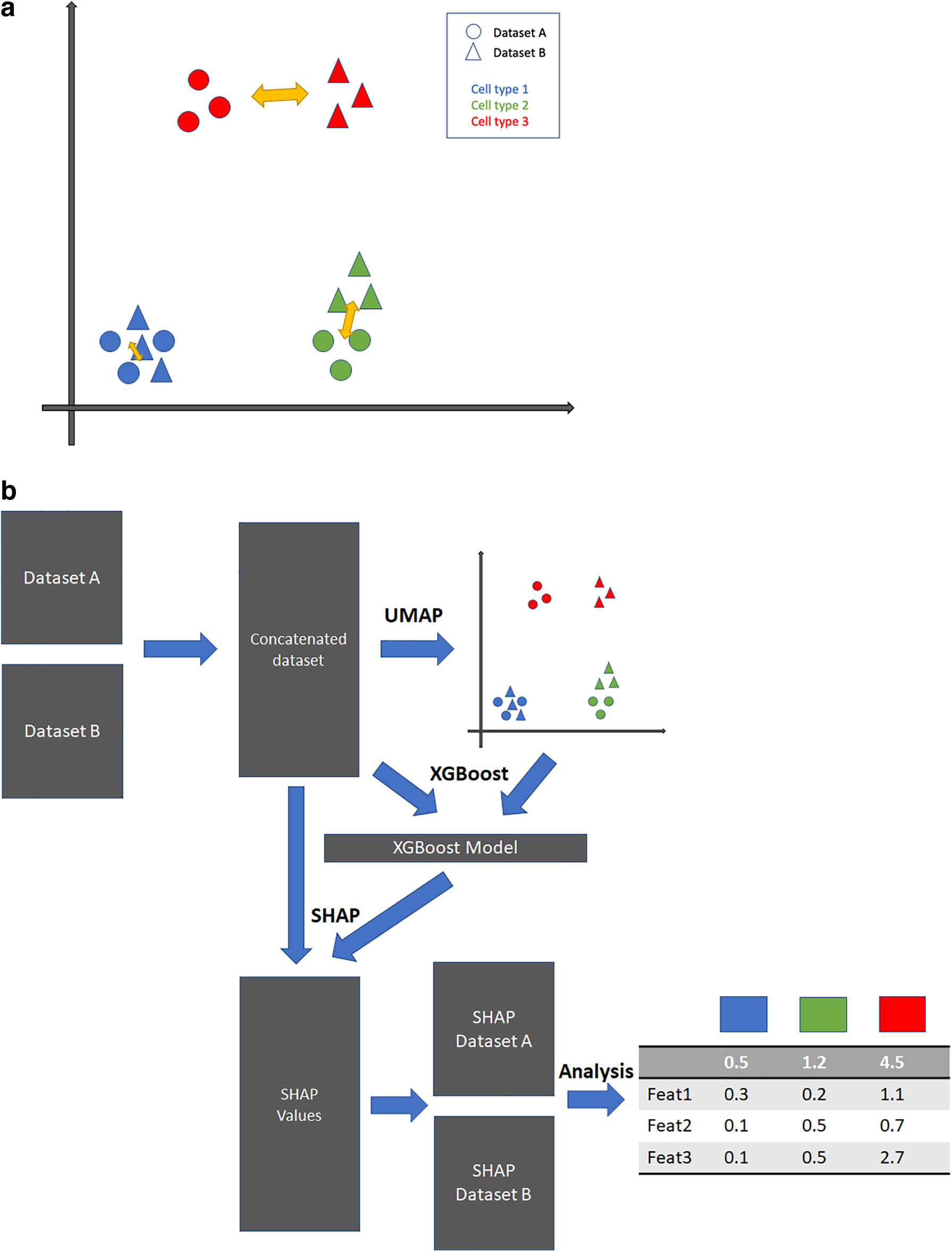
Overview of the suggested pipeline.
After transforming data from the original gene space to the UMAP space, a machine learning model, extreme gradient boosting (XGBoost), is trained to predict each cell's UMAP coordinates based on its gene expression profile. XGBoost (Chen and Guestrin, 2016) is a state-of-the-art machine learning algorithm based on the gradient boosting ensemble method and it has been widely used to analyze genomic data in various settings. Upon the training of the XGBoost model, the Shapley Additive exPlanations (SHAP) analysis is applied to the model. SHAP is designed to explain the output of the machine learning model through a game theory-based approach and its usage is specifically optimized for tree-based learning models (Lundberg et al., 2020). For each cell, SHAP analysis can quantify each gene's contribution to the coordinates where that cell is projected in the UMAP space. The SHAP values of cells in a specific cell type can be used to quantify which genes are associated with the changes of this cell type in response to the conditions being compared. A flowchart of our cell-type-specific variation quantification pipeline is described in Figure 1b. Using several sets of data in various experimental contexts, we demonstrated that the proposed pipeline could robustly quantify cell-type-specific differences and identify cell-type-specific genes associated with the variations.
In this section, the following method is tailored for comparisons of scRNA-seq datasets, yet usage of the suggested pipeline is not limited to scRNA-seq. Any sets of datasets generated by the same technology (for instance, flow cytometry vs. flow cytometry or mass cytometry vs. mass cytometry) and that share certain features that can be used for concatenation of the sets of datasets followed by UMAP visualization can be applied.
Data preprocessing
Our pipeline requires two or more datasets to compute cell-type-specific differences across the datasets. For each scRNA-seq dataset, we perform an initial filtering of cells (min_genes = 2000) and filtering of genes (min_cells = 3). Cells with high mitochondrial expression (5%) or too many total counts (n = 2500) are also removed. The filtered dataset undergoes library size normalization (target_sum = 10,000), log transformation, and identification of highly variable genes. Since each dataset has its own unique, highly variable gene list, we compute the union of the highly variable gene lists and use the union in subsequent steps of our pipeline.
Concatenation of datasets and dimensionality reduction
Given the union of highly variable genes in multiple datasets under consideration, we filter each dataset and reshuffle the rows (genes) so that each dataset contains single-cell expression data of the union of highly variable genes, and the order of the genes is the same for each dataset. The filtered datasets are concatenated to form one dataset. Dimensionality reduction is then applied to this concatenated dataset. More specifically, a principal component analysis (PCA), followed by UMAP, is applied to the dataset. The resulting UMAP coordinates go through a normalization step where we scale each axis from 0 to 10. This normalization step ensures that every run of our pipeline has comparable measurements in the UMAP space. The result of the dimensionality step is the two-dimensional UMAP coordinates of all cells across all datasets under consideration. The coordinates serve as an input to the subsequent SHAP analysis.
XGBoost to learn UMAP coordinates and gene expression
We concatenate the two datasets using the normalized and initially filtered datasets (from step 2.1). The combined dataset is an input to the XGBoost machine learning model. The model is trained to predict each cell's UMAP coordinate (from step 2.2) using the gene expression data. Since the goal of the XGBoost model is to learn the relationship between the UMAP coordinates and gene expression within the dataset, and the model is not intended to be used to make predictions for other datasets, the model is trained with the entire dataset. Upon completion of the fitting of the model, the model becomes another input to the subsequent SHAP analysis.
SHAP analysis
The SHAP analysis requires two inputs: model and data, it generates SHAP values from the inputs, and the dimension of the SHAP values is the same as the input data. For each cell, its SHAP values quantify each gene's contribution to determine its coordinate in the UMAP space. In our pipeline, the trained XGBoost model and concatenated datasets (from step 2.3) are the inputs to the SHAP analysis.
Quantifying cell-type-specific differences from SHAP values
Because SHAP values generated from the SHAP analysis have the same size (number of cells by number of genes) as the input dataset, we can filter the SHAP values by datasets and by cell-type label. For each cell-type label shared between two datasets, we can find two sets of SHAP values whose corresponding cells match the cell-type label in respective datasets. For each set of SHAP values corresponding to the cell-type label, we calculate the mean SHAP values per gene across the cells, resulting in a vector of length equal to the number of genes, which quantifies on average how much each gene contributes to the UMAP location of the cell type in one dataset. With two datasets, we have two SHAP vectors for the specific cell-type label, and we quantify the difference by taking the absolute element-wise difference between the two vectors and computing the sum of the element-wise difference. This serves as a score to quantify the difference in terms of one specific cell type across two datasets. The above steps are repeated for every cell-type label so that each label receives such a score.
Random permutation and correction of scores
To evaluate the statistical significance of the scores calculated from the previous step, the same method is applied to randomly shuffled SHAP values. The random shuffling of dataset membership and the subsequent variance scoring is repeated 1000 times. The score without shuffling is compared with the distribution of the 1000 scores from shuffled data so that we can use the 1000 scores from shuffled data to form a null distribution to derive a p-value for the observed score without shuffling. With random permutations, we can provide a corrected version of the original scores by subtracting the mean of the random shuffling from the original score.
Rank ordering of genes for each cell type
The above score quantifies the cell-type-specific difference between datasets for a specific cell-type label. It is often informative to examine the top genes that contribute most to cell-type-specific differences. Hence, we rank-ordered the absolute difference between the two SHAP vectors and show each gene's individual score, which could serve as valuable information to understand the biological interpretation of the difference detected.
Datasets
In this study, we used three different datasets to demonstrate the utility of our pipeline for quantifying cell-type-specific differences. The first dataset—Iris dataset—is used as proof of concept. The second dataset consists of scRNA-seq peripheral blood mononuclear cells (PBMC) interferon-beta (IFN-B) stimulation data (Kang et al., 2018). The third dataset is a mass cytometry dataset of human hematopoiesis in different perturbation conditions (Bendall et al., 2011).
RESULTS
Demonstration of cell-type-specific difference quantification on the Iris dataset
The Iris flower dataset is a multivariate dataset (150 samples by 4 features) comprising 50 samples from each of three different types of Iris flowers. The dataset contains four features: petal length, petal width, sepal length, and sepal width. To demonstrate our suggested pipeline, we simulated two scenarios. (1) In the first scenario (noise level = 0), the 150 samples are randomly divided into two independent datasets. (2) In the second scenario (noise level = 1), the 150 samples are randomly divided into two datasets and then Gaussian noise is added to one of the datasets.
For each flower label type, our pipeline provides the following information. As shown in the right panel of Figure 2, the second row shows the actual scores based on the difference in SHAP values for each label. The first row in the right panel of Figure 2 is the comparison (p-value) of the score with scores of random shuffling shown in the histogram. The dotted line on the histogram marks the score, and having a p-value that is not significant (for instance, p-value >0.05) might suggest that the scores are statistically insignificant compared with random shuffling. The second row in the right panel of Figure 2 shows random noise-corrected scores where scores are subtracted by respective means from random shuffling. Each dot in the plot is a feature and its coordinate is based on average SHAP values from each dataset. If two datasets are similar, the dots of features are likely to align well along the diagonal line, and if two datasets are different, the dots of features could deviate from the diagonal line, and the extent of deviation could indicate the contribution of certain features to the difference observed. For the two different scenarios mentioned above, the UMAP visualizations of datasets are shown in the left panels of Figure 2a and b.
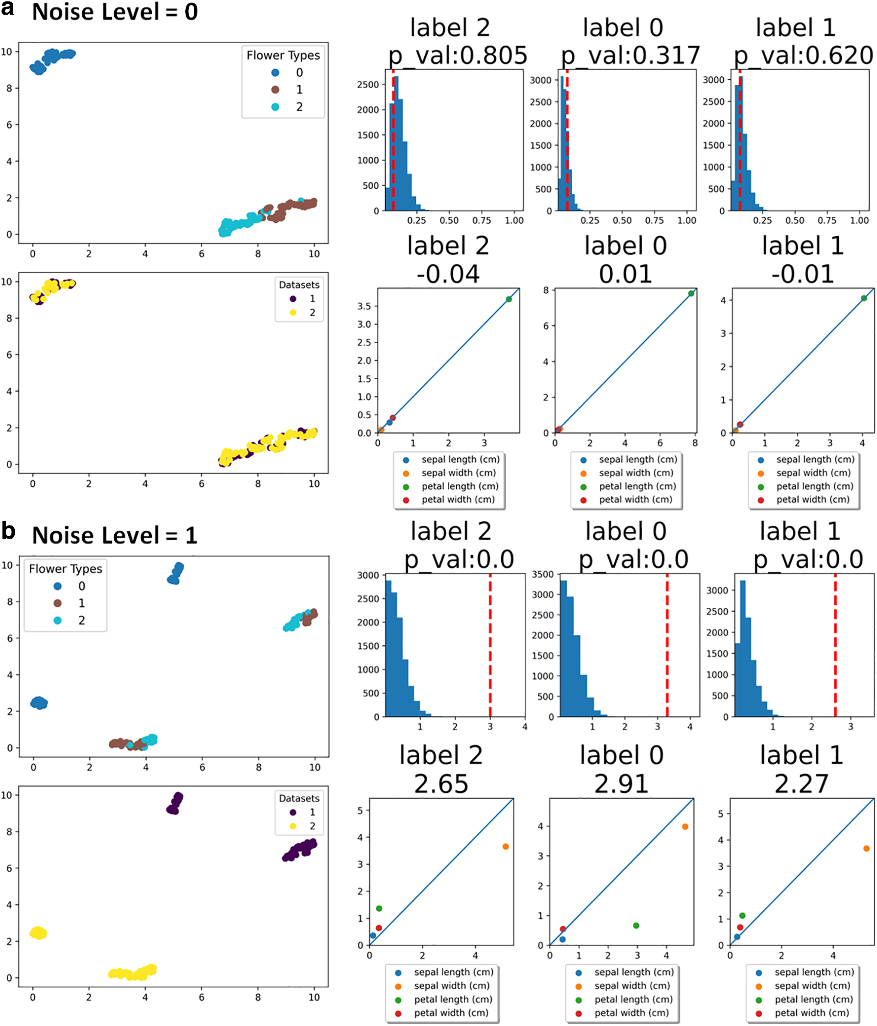
Results of the simulated Iris datasets.
For the first scenario, since the datasets are divided randomly without any perturbation, the two datasets are visually inseparable in the UMAP space (Fig. 2a). On the contrary, in the second scenario, because of the added noise on one of the datasets, two datasets are easily separable in the UMAP space (Fig. 2b). Subsequent scores of different flower types from the first scenario are close to 0 (second row of Fig. 2a), with all dots representing features aligning closely with the diagonal line. The scores are within the range of scores from random shuffling of SHAP scores (first row of Fig. 2a) reflected by high p-values. Such results suggest that the two datasets in the first scenario do not show meaningful differences between the two datasets, which is a correct interpretation given that the two datasets were randomly split without any systematic perturbation. On the other hand, results from the second scenario show much higher scores for all flower types and that the higher scores originated from the dots of features deviating from diagonal lines in the scatter plots (second row of Fig. 2b). Comparisons with random shuffling scores suggest a significant difference in the datasets, illustrated by extremely small p-values (first row of Fig. 2b). Given that we added systematic noise to one of the datasets in the second scenario, the results and interpretations correctly capture the difference simulated in these datasets.
To demonstrate the power of our pipeline, we prepared more specific perturbation scenarios using the same dataset. In the first scenario, we randomly split the original data into two, and we added Gaussian noise to only one feature in one of the datasets. Results for this feature-specific perturbation are shown in Figure 3a, where the perturbed feature is the petal width, and the perturbance resulted in a visual difference between the two datasets in the UMAP space. Random noise-corrected scores (second row of Fig. 3a) suggest some significant difference between datasets even after random noise correction, and we noticed that a specific flower type (i.e., label 0) was more affected by perturbance of the feature. Finally, the table in Figure 3a summarizes each feature's contribution to each label type, and it shows that the petal width is in fact the most contributing (to the difference) feature across all flower types, hence correctly capturing the perturbation we simulated.
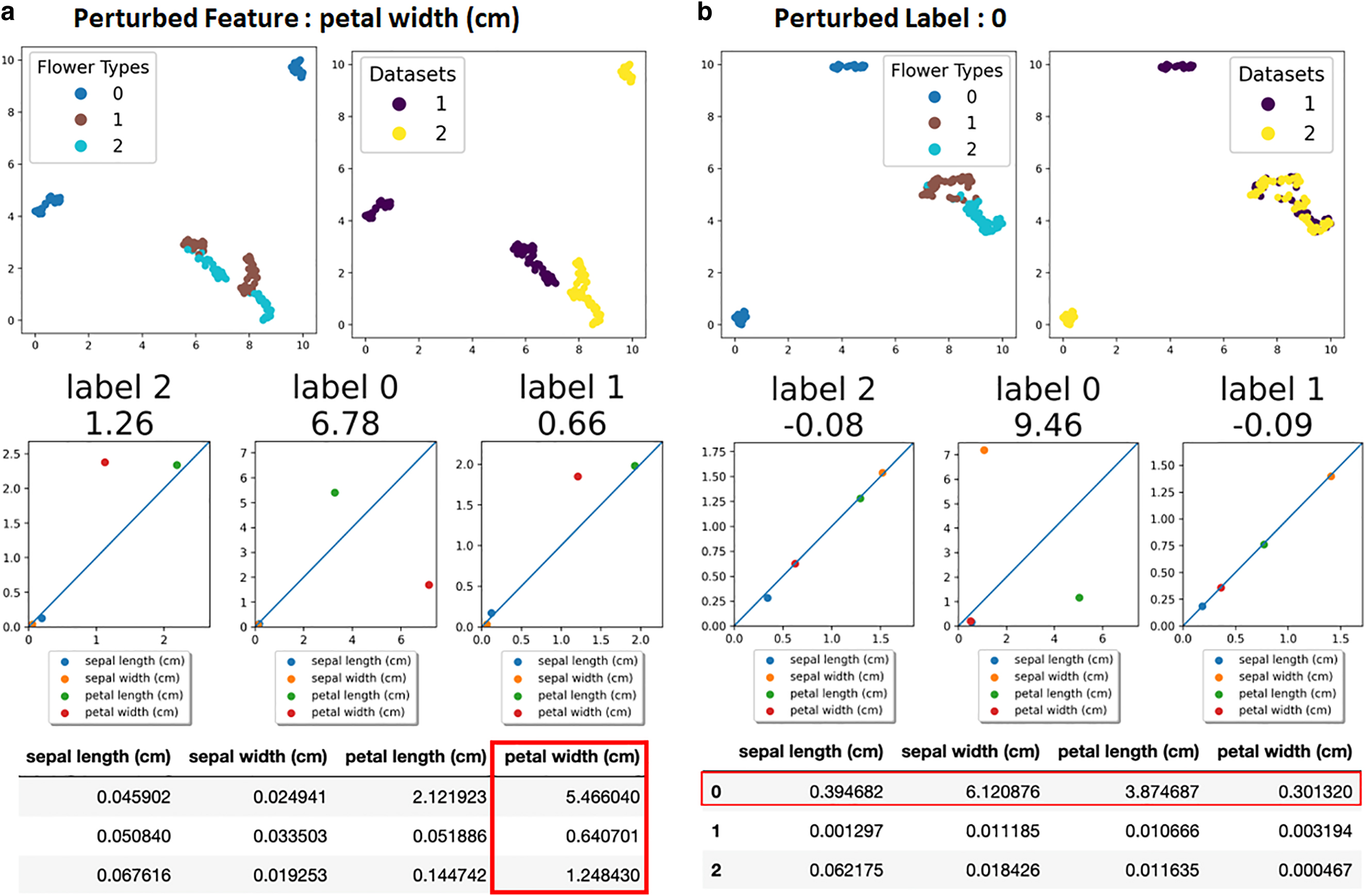
Feature-specific and label-specific perturbation.
In the second scenario, we randomly split the original data into two, and we added Gaussian noise to all features of one flower type only. Results of the label-specific perturbation of flower type 0 are described in Figure 3b. The UMAP visualization illustrates that only label 0 is visually differentiable among the labels, as shown in Figure 3b. The subsequent analysis demonstrates a significantly higher score for label 0, and large deviations of the features from the diagonal line in the scatter plots were also observed for label 0. The table in Figure 3b shows that all features of label 0 are orders of magnitude greater than that of other labels, hence again correctly capturing the very perturbation we simulated.
We applied our pipeline to human PBMC samples under two different conditions: one sample stimulated with IFN-B and another unstimulated sample serving as a control (Kang et al., 2018). When concatenated after the preprocessing step, the two datasets exhibit a large batch difference, as shown by the completely separate locations in the UMAP visualizations in Figure 4a. Using the provided cell-type labels, we observed that the difference is not specific to certain cell types, but all cell types were collectively affected, as shown in Figure 4a. Our subsequent analysis quantified such differences shown in the UMAP. In Figure 4b, we show scatter plots and noise-corrected scores (left) and comparisons with scores of random shuffling (right). All cell types received high variation scores (>1.3), and comparisons with randomly shuffled scores suggest that all scores are statistically significant signals. Such universal changes by IFN-B stimulation were also seen in previous studies where an analysis was done on the same set of datasets (Butler et al., 2018; Kang et al., 2018).
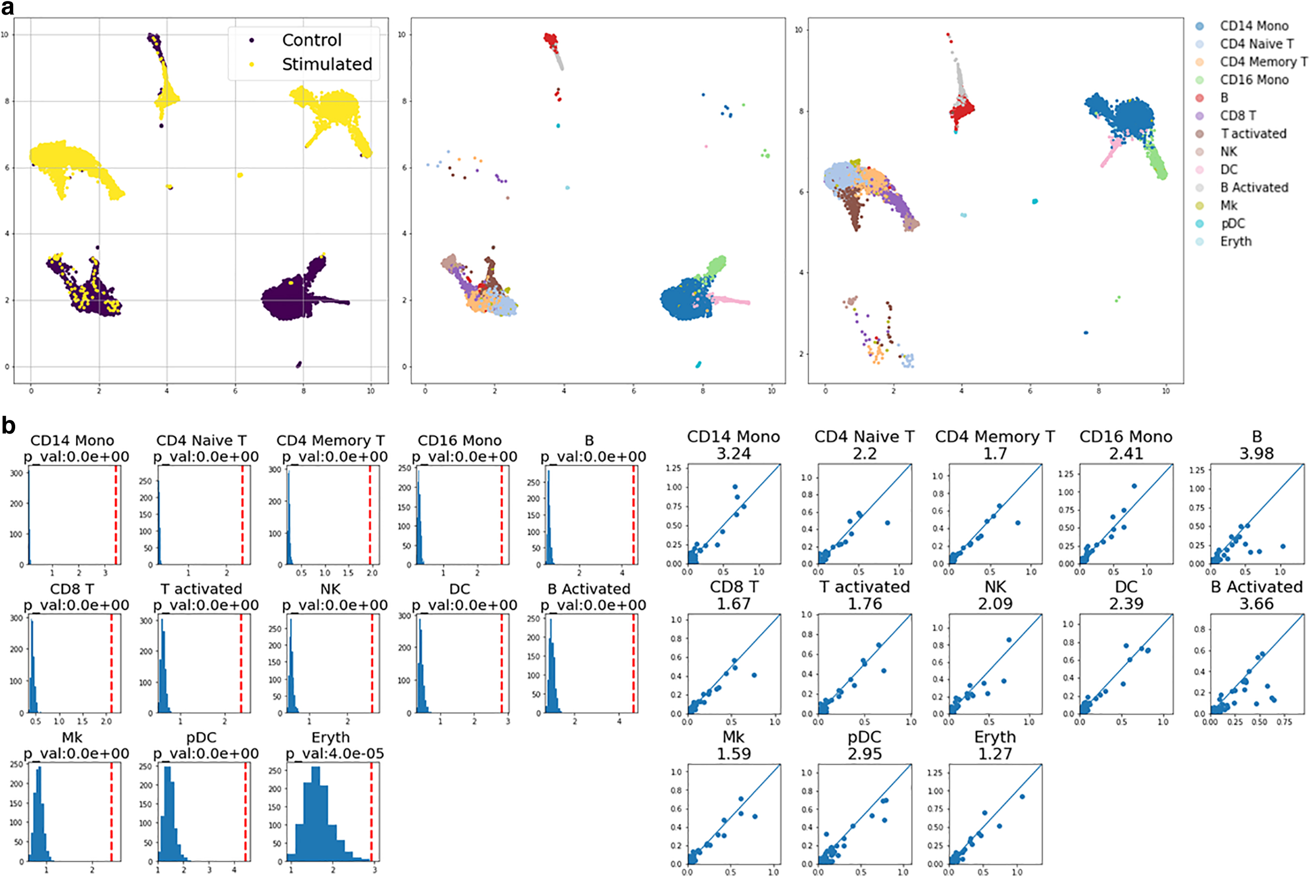
Stimulated PBMCs versus control.
To further demonstrate the utility of our gene scores in reflecting each gene's contribution to the difference in datasets, we took a closer look at some marker genes of human PBMCs. First, we used SHAP difference scores for cell-type-specific marker genes, and our scores suggest that the marker genes for specific cell types received higher SHAP scores, as shown by the cell type-by-gene matrix in Figure 5a. Second, we checked the scores for IFN-B genes (ISG15, IFI6, IFIT1, IRF7, MX1, and OAS1) that are known to be uniformly affected across all cell types. Comparing scores from this list of genes across all cell types with scores for all other genes, we observed that scores from the IFN-B genes were significantly elevated compared with other genes, as shown in Figure 5b. Third, we compared the IFN-B gene scores with the top 10% of genes with highest scores, and the scores of IFN-B genes are still comparable with the genes that received high scores, suggesting an elevated contribution of the IFN-B genes to the difference we observed in the two datasets. Last, we checked individual scores for cell-type-specific IFN-B marker genes (CMPK2, CXCL10, CXCL11, APOBEC3A, CCL8, and VCAN). The result is shown in Figure 5c, where certain cell types show greater responses to certain genes. For example, CD16 monocytes and CD14 monocytes were affected more by CXCL10, CXCL11, CCL8, and VCAN. Such findings were also described in a previous study (Butler et al., 2018), demonstrating the utility of our pipeline.
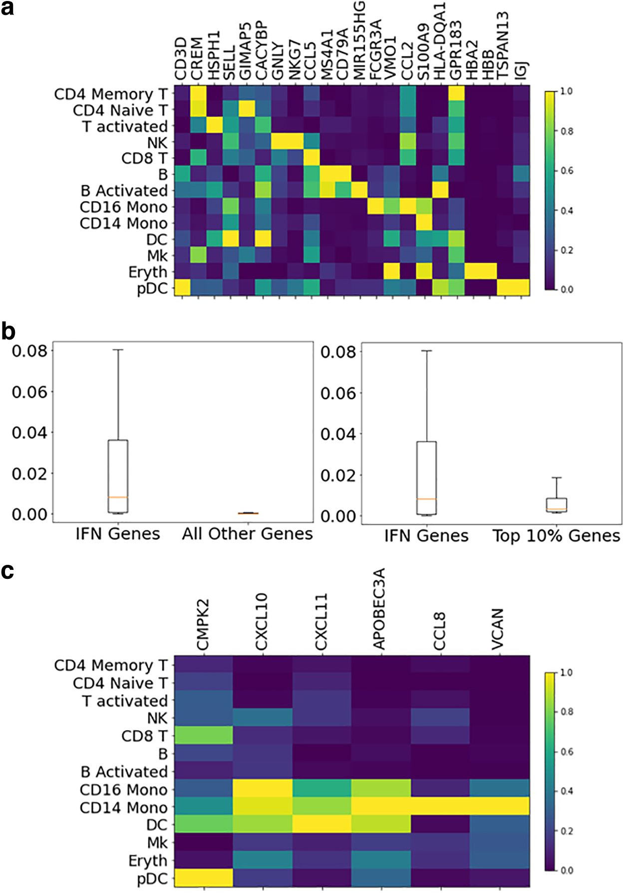
Individual gene scores for stimulated versus unstimulated PBMCs.
Next, we applied our pipeline to mass cytometry of human hematopoiesis datasets of bone marrow acquired from Bendall et al (2011). Specifically, we used the data corresponding to four unstimulated samples, one sample under granulocyte/macrophage colony-stimulating factor (GM-CSF) stimulation, and one sample under tumor necrosis factor alpha (TNFa) stimulation. Cell-type labels of these datasets were obtained from the previous study.
For each stimulated sample, we conducted four independent runs of our pipeline, with each run contrasting one of the unstimulated sample and the stimulated sample. Since each run generated a difference score for each cell-type label, by quantifying the changes of one cell type in response to a stimulation, we summarized the distribution of scores as per each cell-type label across the four comparisons, as shown in the left panel of Figure 6a. Monocytes, myelocytes, plasmacytoid dendritic cells (pDCs), promyelocytes, early monocytes, and megakaryocytes were cell types that had the highest changes due to GM-CSF stimulation, and these observations are congruous with earlier studies highlighting activation of myeloid cells under GM-CSF stimulation (Lotfi et al., 2019). Furthermore, we focused on the contribution of cell functional markers in the difference scores we observed, and STAT5 received high contributing scores among the highly scored cells, as shown in the left panel of Figure 6b. Previous studies have demonstrated that GM-CSF signals through STAT5 and its signaling pathway, hence our analysis corroborates with previous findings (Coffer et al., 2000; Voehringer, 2012). In addition, this result demonstrates that our pipeline not only scores the differences for individual cell types but also identifies markers driving the differences.
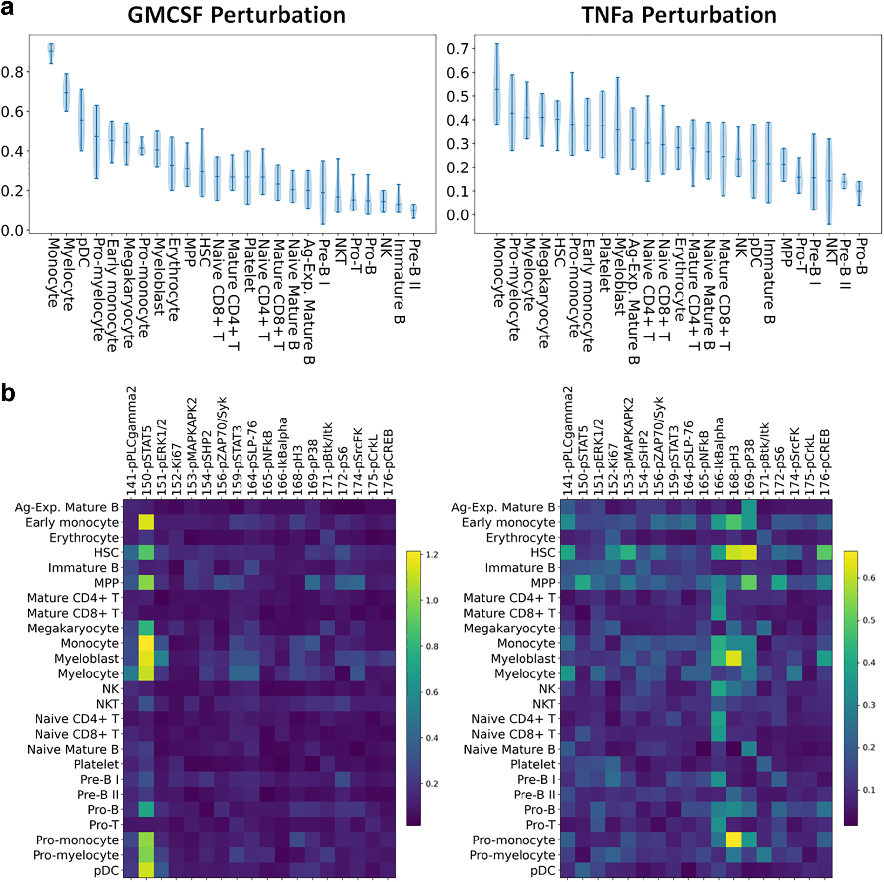
Human bone marrow hematopoiesis results.
The same analysis was applied to the unstimulated samples and the sample with TNFa stimulation. As shown in the right panel of Figure 6a, monocytes, hematopoietic stem cells (HSCs), myelocytes, and promyelocytes are among the top cell types that showed high difference scores, and these observations are again congruous with myeloid-derived changes observed in TNF signaling (Zhao et al., 2012). The contribution of cell functional markers, as shown in Figure 6b, suggests that IKBalpha is one marker contributing the most to the difference we observed across many myeloid lineage cell types. IKBalpha is a protein that inhibits the Nuclear Factor Kappa B (NFKB) transcription factor, where NFKB is a transcription regulator known to be directly activated by TNFa cytokines, hence confirming our finding (Hayden and Ghosh, 2014).
In this study, we present a new pipeline to quantify cell-type-specific differences and identify genes driving the difference. Our pipeline exploits the quantifiable differences seen in the low-dimensional UMAP and uses SHAP analysis to measure the difference. We have demonstrated that our algorithm could correctly capture various perturbation scenarios—systematic variation across all cells, variation on a specific feature, and variation on a specific label—as seen from the simulated datasets based on the Iris flower dataset. Then, we showed that our algorithm correctly captures biological responses to stimulation in human hematopoietic bone marrow mass cytometry datasets. We demonstrated the algorithm's utility in interpreting and quantifying differences in various scRNA-seq datasets, where our results agree with previous studies. We believe that our suggested pipeline is intuitive in the sense that we are quantifying the difference seen in UMAP visualization and quantifying how each gene contributes to the difference. Because our analysis is based on the difference that we can visually see, it makes results from our analysis readily interpretable.
There are several limitations to this work. First, our analysis is dependent on robust and accurate UMAP results. If certain differences in the high-dimensional space were not reflected in UMAP results, our analysis would not be able to capture them. No separation in the UMAP space suggests that there is no clear separation in the PCA space as per our pipeline, and it again suggests that separation is not shown in the highly variable gene space. This means that if some meaningful difference across two conditions is driven by genes outside of the highly variable genes, our algorithm might not be able to capture it correctly. Second, individual SHAP contribution scores could be affected by the curse of dimensionality in scRNA-seq data. The individual SHAP scores of genes are dependent on what XGBoost learns from the relationship between UMAP coordinates and gene expression profiles, and if XGBoost fails to utilize all correct features due to many features, and the existence of multicollinearity, some features could potentially not be identified by our pipeline.
Overall, our pipeline provides a thorough statistical approach to quantifying cell-type-specific differences. While many computational tools aim to correct and remove differences among datasets, which may be caused by technical artifacts or biological effects, our approach explores an alternative view to embrace the differences. Quantification of differences among datasets in a cell-type-specific manner has the potential to identify cell types that are most responsive to the conditions across datasets, as well as cell-type-specific changes in gene expression profiles. The source code of the proposed SHAP and UMAP-based analysis is available at https://github.com/hlim2033/scSHAP
Footnotes
AUTHORs' CONTRIBUTIONS
H.S.L. was involved in conceptualization, data curation, methodology, visualization, and writing—original draft. P.Q. was involved in conceptualization, funding acquisition, supervision, and writing—review and editing.
AUTHOR DISCLOSURE STATEMENT
The authors declare they have no conflicting financial interests.
FUNDING INFORMATION
This work was supported by funding from the National Science Foundation (CCF2007029). P.Q. is an ISAC Marylou Ingram Scholar and a Wallace H. Coulter Distinguished Faculty Fellow. The funders had no role in the study design, data collection and analysis, decision to publish, or preparation of the article.