
Abstract
The ambulatory glucose profile (AGP) and the frequency distribution for glucose by ranges are well established as standard methods for display, analysis, and interpretation of glucose data arising from self-monitoring, continuous glucose monitoring, and automated insulin delivery systems. In this review, we consider several refinements that may further improve the utility of the AGP. These include (1) display of the AGP together with information regarding dietary intake, medication administration (e.g., insulin), glucose lowering (pharmacodynamic) activity of medications, and physical activity measured by accelerometers or heart rate; (2) display of average time below range (%TBR), time above range (%TAR), and time in range (%TIR) by time of day to indicate timing of hypoglycemic and hyperglycemic episodes; (3) detailed analysis of postprandial excursions for each of the major meals after synchronizing by onset of meals and adjusting for the premeal glucose levels, enabling comparisons of magnitude, shape, and patterns; (4) methods to characterize distinct patterns on different days of the week; (5) display of glucose on a nonlinear scale to improve the balance between deviations associated with hypoglycemia versus hyperglycemia; (6) use of time scales other than midnight-to-midnight to facilitate analysis of time segments of particular interest (e.g., overnight); (7) options to display individual glucose values to assist in the identification of dates and times of outliers and episodes of hypoglycemia and hyperglycemia; and (8) methods to compare AGPs obtained from different individuals or groups receiving alternative interventions in terms of therapy or technology. These refinements, individually or collectively, can potentially further enhance the effectiveness of the AGP for assessment of glucose levels, patterns, and variability. We discuss several questions regarding implementation and optimization of these methods.
Introduction
The ambulatory glucose profile (AGP) is now well established for analysis of continuous glucose monitoring data 1 –13 both for clinical and research purposes. The AGP is also applicable to self-monitoring-of-blood-glucose (SMBG) data and was originally introduced for that purpose. 1 It was based on the principles underlying Exploratory Data Analysis (EDA) of Tukey, 6 as applied previously to glucose data using a discrete set of the eight time points commonly used for SMBG. 5 Construction of separate AGPs for different days of the week was proposed in 1988. 7 The display of a simplified frequency distribution for glucose in terms of discrete categories from Very Low to Very High was proposed in 200914 (rather than as a histogram for glucose on a continuous linear scale), and is generally presented as part of or together with the AGP in the form of a stacked bar chart. 13,14 Many articles have appeared to assist clinicians in the use and interpretation of the AGP. 13 –20 There have been several consensus conferences and other collaborative efforts to select the statistics that should accompany the AGP and glucose distribution. 8,9,21 –25
Proposed Enhancements
We propose several potential improvements to the AGP (Table 1).
Enhancements to the Ambulatory Glucose Profile
AGP, ambulatory glucose profile.
Display major determinants of glucose levels
To facilitate interpretation of the glucose patterns by time of day and of the patterns for % time below range (%TBR), % time in range (%TIR), and % time above range (%TAR), it is important to show several of the major factors influencing glucose levels: diet, medications (especially insulin when applicable), and physical activity. Figure 1 shows a schematic example. This type of display is in common usage for display of data for a single day from insulin pumps and hybrid closed-loop systems. We propose to display the combination of glucose and insulin data, pooling data from multiple days and displaying insulin and derived measures (calculated insulin on board, plasma insulin levels, and insulin pharmacodynamics), meals, and physical activity as individual data points, individual data points combined with percentiles, or using the percentiles alone as in common displays of the AGP for glucose. A schematic illustration is shown in the Appendix (see Figure A1). Results for glucose, insulin delivery, insulin bioactivity, meals, physical activity, and heart rate from multiple days can be pooled and averaged, with display of data points, a series of percentiles (usually 5th through 95th), or data points and percentiles superimposed.
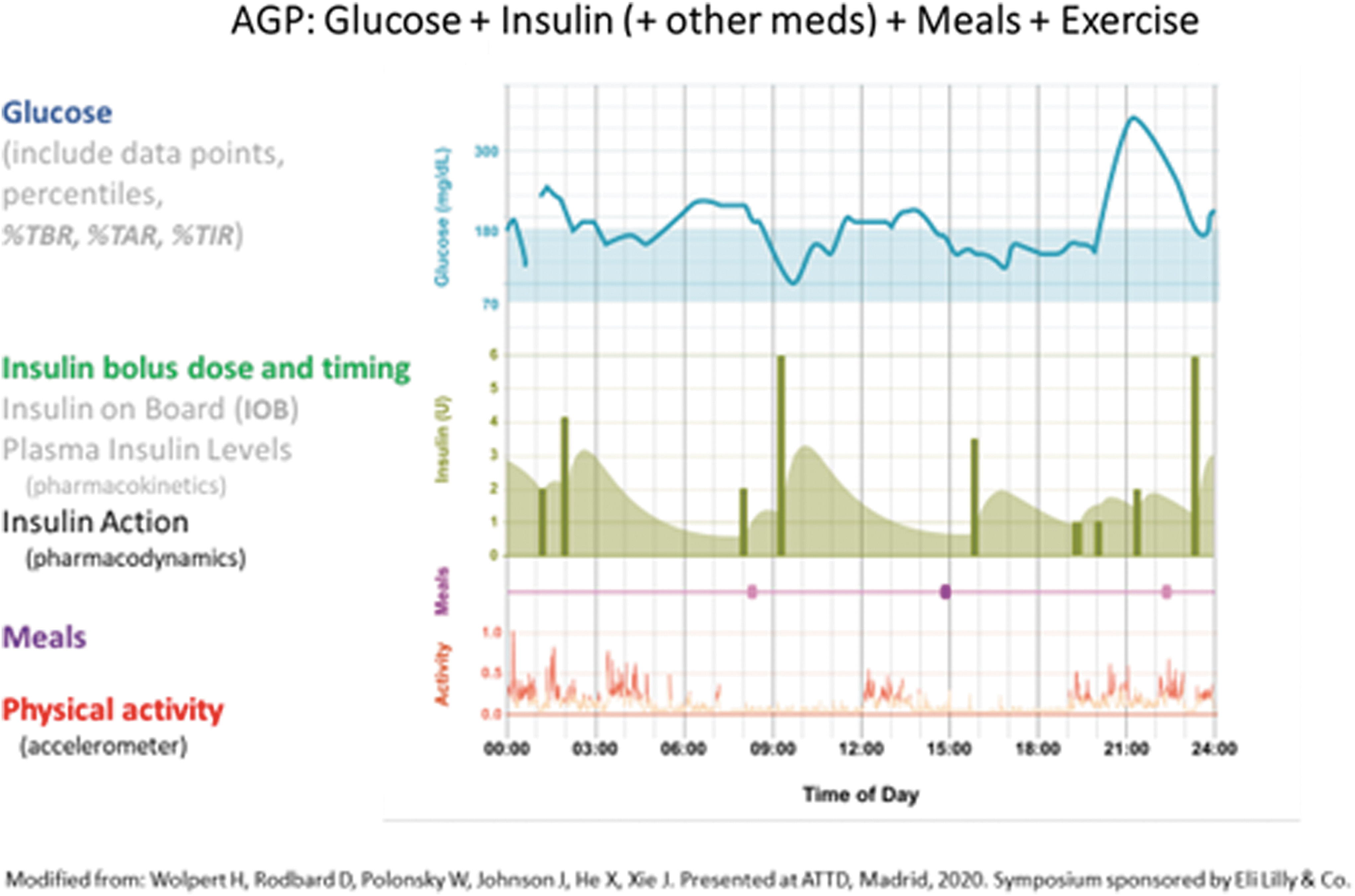
Display of Glucose, Insulin, Meals, and Physical Activity by time of day for one person for 1 day (schematic drawing). Insulin bolus dose and timing are shown together with model-based simulations of insulin pharmacodynamic activity in terms of rate of glucose disposal.
Meals: It is important to show the time of onset of meals and ideally their duration as well. It would also be desirable to display the amounts and nature of foodstuffs consumed during the meal at least in semiquantitative terms or in terms of carbohydrates, fat, protein, fiber, and calories when such data are available. 26 –28 If accurate dietary composition data are available, one can use a color-coded stacked bar chart to show the relative or absolute composition of carbohydrate, protein, saturated and unsaturated fat, and fiber.
Medications: When insulin is being used, it would be desirable to show both the timing and dosage for basal and bolus insulin (Appendix Figure A1) for a single day and as average values after pooling data from multiple days. In addition to the insulin injection doses or infusion rates, one can calculate three key aspects of insulin action: (1) the model-predicted level of insulin on board; (2) the model-predicted profile for plasma insulin; and (3) the model-predicted pharmacodynamic effectiveness of insulin (rate of glucose disposal from the extracellular space based on parameters obtained in studies of multiple individuals). 29 –32 The doses and timing of other medications can also be shown.
Physical activity: It is desirable to show physical activity on the same time scale, for example, as detected by accelerometers or pedometers, or by heart rate. 33,34 In studies of the effects of exercise on glucose, the time series for glucose and insulin can be analyzed after synchronization to either the onset or offset of strenuous physical activity.
Display of %TAR, %TBR, and (optionally) %TIR on the AGP using the same time axis at the glucose data
It can be very difficult to evaluate the risks of hypoglycemia or hyperglycemia at any specified time of day when displaying only the 25th and 75th percentiles for glucose. Use of a series of several percentiles (e.g., the 5th, 10th, 90th, and 95th percentiles) can considerably improve the graphical estimate of %TBR and %TAR. It is preferable to show the %TBR (both <54 and <70 mg/dL) and %TAR (both >180 and >250 mg/dL) by time of day. This avoids the need to make crude visual estimates, and greatly facilitates the identification of the times of onset and offset, duration, and maximal levels.
Detailed analysis of postprandial glucose excursions by type of meal
The AGP shows glucose elevations following the usual times for the major meals. However, the resolution of the postprandial excursions is usually limited because meals are consumed at different times on different days and the premeal (baseline) glucose also varies considerably from day to day. When data are pooled from multiple days (or from multiple subjects), these two factors result in shifting along the horizontal (time axis) and vertical (glucose axis) directions, respectively. Accordingly, we recommend that the postprandial segments of the glucose versus time curves be “normalized” by (1) synchronization with respect to the time of onset of meals and (2) subtraction of premeal baseline glucose to show only the excursion above baseline. In some cases, it may be desirable to make an additional correction for the slope of glucose versus time at the onset of the meal. This makes it possible to analyze glucose excursions for the major meals and snacks. Individual glucose values may be shown as discrete dots or connected with line segments. Pooled data from multiple days can be summarized using selected percentiles (e.g., 25th, 50th, and 75th percentiles), shading the area between the 25th and 75th percentiles, and (optionally) showing the individual glucose data points. If data from multiple days are superimposed, then it is usually best to dispense with line segments between consecutive data points (Appendix Figure A2).
It is helpful to show the distributions for time of onset of meals and for time of administration of meal-related insulin boluses (or other medications). These can be shown as histograms or Box plots along the horizontal (time) axis.
Comment: Since use of “normalizing” of the curves results in loss of information, it is desirable to display frequency distributions for: (1) times of onset of the meals; (2) premeal baseline glucose; (3) maximum glucose (G max); (4) amplitude of glucose excursion (ΔG max); (5) time lag between onset of the meal and time when the apex of the glucose peak is achieved (ΔT max); (6) %Recovery to baseline after a specified period of time (e.g., 2, 3, or 4 h) 35,36 ; (7) other metrics to describe the shape of the prandial excursions such as half-times (t 1/2) for the upstrokes and downstrokes of prandial excursions; and (8) time lag between onset of the meal and the first readily detectable rise in plasma glucose. These normalized postprandial excursion patterns for a specified time interval (e.g., 4 h following the median time of onset of given type of meal) can be superimposed on the full 24-h AGP, together with graphical representations of several of the above descriptive metrics. The average glycemic patterns following each of the three major meals can be obtained. One can test for heterogeneity of peak shapes for any one type of meal and compare the patterns from the three types of major meals to determine if they can all be characterized by a single pattern or shape with individual magnitudes, or whether a different pattern must be used for one or another type of meal.
Analysis by day of the week
Many methods have been used to display differences in glucose patterns between different days of the week. The simplest is show the mean ± 1 SD (standard deviation) or ±1 SEM (standard error of the mean) or 95% confidence intervals for mean glucose by day of the week. A second approach is to show the Box plot (consisting of the 0th, 25th, 50th, 75th, and 100th percentiles) by day of the week. 5 A third approach is to show the glucose distribution by times in categories or ranges, also by day of week. 14 Another is to show the AGPs constructed separately for each day of the week. 7 We previously proposed to analyze a CGM record of a 4-week duration, showing the median glucose by time of day for each of the days of the week individually, together with the median glucose for all days of the week combined. 16 One can then examine the correlations of the glucose patterns for any 1 day of the week with the overall pattern for all days to identify days that are consistent (or inconsistent) with the typical pattern. By calculating the pairwise correlation coefficients for the 21 possible pairs of 7 days of the week, one can identify days with similar or distinct patterns. 16 A cross-correlation analysis can be useful to evaluate time delays (horizontal shifts) in the glucose patterns from day to day or by day of the week.
Sandig et al. used two alternative approaches to compare glucose patterns for weekdays and weekends (defined as Friday 6 PM to Sunday 11:59 PM). 37 They compared the 10th, 50th, and 90th percentiles of glucose versus time of day for a group of subjects on weekdays versus weekends. The AGPs for weekends and weekdays showed considerable overlap and only a suggestion of a difference in patterns (cf. fig. 3 of Sandig et al. 37 ). However, by reanalyzing the data for each subject individually and calculating the mean difference between glucose levels on weekdays versus weekends for every possible time of day, it became clear that there was a dramatic, highly statistically significant ∼20 mg/dL increase in glucose on weekends, especially during the midnight to 3:00 AM time period (cf. fig. S3 in supplementary materials to Sandig et al. 37 ).
Display of glucose on a nonlinear scale to expand the hypoglycemic region and compress the hyperglycemic region
A change of 10 mg/dL has a completely different clinical significance depending on whether the glucose level is 64 or 190 mg/dL. To date, nearly all graphical displays of glucose have utilized a linear scale. This makes it difficult to appreciate small changes in the hypoglycemic range and inadvertently places an undue emphasis on the much larger variation seen in the hyperglycemic region. Accordingly, it should be helpful to use a nonlinear scale to expand or stretch the glucose scale in the hypoglycemic region, while compressing it in the hyperglycemic region.38 A simple, standard approach, well known to most scientists and clinicians, is the use of a logarithmic scale, that is, a “semilog” graph.
Comment: Alternative scales could also be used: (1) a “root” transformation of glucose (e.g., the cube root of glucose [G 1/3] or the fourth root of glucose [G 1/4], and similar functions of glucose could be used to expand the glucose scale in the hypoglycemic range) or (2) one can stretch the scale for glucose by a factor of 2 for glucose levels below 100 mg/dL, while compressing it by a factor of 2 in the range above 200 mg/dL. Similarly, one can expand the scale by another factor of 2 for glucose values below 50 mg/dL, while compressing the scale by another factor of 2 for glucose levels above 400 mg/dL. The logarithmic scale provides simplicity and is likely to be easier to use than several narrow ranges for glucose with abrupt changes in scaling factor. The log scale can be applied equally whether expressing glucose levels in terms of mg/dL or mmol/L. People with difficulty using or understanding a logarithmic scale might still prefer use of linear segments with abrupt changes in the scaling factor at arbitrary places along the scale, for example, at 50, 100, 200, and 400 mg/dL. A different set of breaks in the scale might be preferable when glucose is expressed as mmol/L, for example, 3.0, 6.0, 12.0, and potentially, 24.0 mmol/L.
Choice of timescale
A midnight-to-midnight time scale for the AGP has nearly always been used. In a few studies, for example, in studies examining hybrid closed loop for periods less than 24 h, shorter time scales have been used. One can also examine the AGP over 24-h periods starting at times other than midnight (e.g., 6 AM or 7 AM) to examine a typical daily pattern. When examining glucose changes in the late evening—overnight—early morning periods, it may be desirable to display the AGP using a noon-to-noon time scale. It may also be helpful to use a 48-h time period for display: a 48-h time interval was previously used to display motor activity and food consumption in studies of circadian rhythms in animals.
Display of individual glucose values
It can be helpful to show individual glucose data points by time of day. 5,7 This approach may help identify outliers. This will show data density—and allows one to identify outliers and glucose values corresponding to severe hypoglycemia or hyperglycemia. When using an interactive display, one can select an individual point to generate a pop-up window showing the time and glucose values, and any associated information.
Methods to compare AGPs from people receiving different forms of therapy, devices, or other kinds of interventions
The AGP has facilitated the comparison of patterns in people receiving different forms of therapy, for example, hybrid closed loop versus predictive low-glucose suspend versus sensor-augmented pump. It is customary to superimpose displays of the AGP using different colors or shading to distinguish groups of subjects receiving different forms of intervention or treatment, typically showing the 25th, 50th, and 75th percentiles. One can examine the differences in mean or median for glucose by time of day for two treatment groups. 39 Alternatively, one can characterize differences in times-in-ranges within or between subjects either for the full 24-h periods or for several narrow time windows spread throughout the day. 37,40
Discussion
Since its introduction in 19871 for SMBG and since 2008 as it has been applied to CGM, 2 –4 the AGP has proven to be extremely useful to patients, physicians, other members of the health care team, and researchers. Numerous variations have been utilized in the ensuing years. The AGP is almost always accompanied by the now-ubiquitous frequency distribution for glucose values in multiple segments of glucose 14 and several associated “statistics.” 8 –25 This report summarizes a number of proposals for improvement of the effectiveness and informativeness of the AGP, some that had been presented years ago (e.g., log scale, 38 display of data points, 5,7 risks or rates of hypoglycemia and hyperglycemia, 9,17 and analysis by day of the week 7,16 ) and some relatively recently (e.g., normalizing and synchronizing prandial excursions). 28,33 The ability to visualize glucose patterns simultaneously with the major factors controlling plasma glucose levels (e.g., dietary intake, 26 –28,33–34 medications [especially insulin], 29 –32 and physical activity/exercise 33,34 ) can enhance the effectiveness of the AGP.
We will now discuss several questions regarding these potential enhancements to the AGP: Who is the intended target audience?
To whom would these additional features be of interest and assistance? In principle, several of these enhanced features could be of interest to many or most of the current users of the AGP, including patients and their families and health care professionals (HCP) engaged in the care of people with diabetes. However, not all users will be interested in all of the enhancements. If people are experiencing difficulties achieving their goals for adequate control of prandial glucose excursions, then a detailed analysis of the postprandial period (with synchronization and correction for premeal glucose) might be of highest priority. For people experiencing hypoglycemia or hyperglycemia, simple displays of %TBR (using both <70 and <54 mg/dL) and %TAR (using both >180 and >250 mg/dL) by time of day might be of most interest.
Some people have difficulty understanding nonlinear scales, while others may find that use of a “semilog” scale for glucose is immediately helpful because it makes it easier to see and analyze glucose values in the hypoglycemic range.
Features that would be adopted may vary for every patient and HCP, and may change as the patient's “chief complaint” or principal clinical problem changes over a period of time.
How can these features be implemented in practice?
These kinds of features would need to be made available instantly and effortlessly if they are to be used by extremely time-pressed care givers. It would be desirable to incorporate these features into the software provided by manufacturers of CGM sensors and of insulin pumps, closed-loop systems, connected pens, fitness-trackers, and “apps” to eliminate barriers that would arise if it were necessary to employ a separate program or “app.” Alternatively, they could be incorporated into centralized systems for data integration.
There are multiple options that could be used for graphs, tables, statistics, layout and format of output, use of colors and icons, on-screen instructions and advice, and aids to interpretation and education. It would be important to optimize these displays using the principles and practice of usability laboratories and cognitive laboratories, to evaluate the extent to which additional information is desired, being provided, understood, and utilized. 41 Such evaluations might also consider the nature and extent of user training that might be desirable to obtain maximal benefit from the use of these enhanced features.
Would an enhanced AGP become too complex for people to use?
The currently well-established AGP can be difficult to comprehend for many users. Will the addition of several additional types of information (insulin and other medications, dietary intake, and physical activity) make the system so complex that it becomes intimidating? Do the “enhancements” result in a level of complexity that becomes intimidating or insurmountable? Could analyses and displays of this degree of “sophistication” be utilized in a practical manner during a brief patient-physician encounter? These are legitimate concerns.
First, to the extent that we are modifying or adding a few graphs to the AGP report, users who are already comfortable and experienced with the interpretation of graphs should be able to absorb the information rather quickly. Some of these graphics may be useful for education of the patient, the patient's family, personal caregivers, and health care providers. For instance, the simple display of %TBR and %TAR versus time of day may provide insights that are not readily appreciated even when the 5th, 10th, 90th, and 95th percentiles for glucose are displayed.
Second, the software that generates graphs and statistics for the enhanced AGP can also provide a basic level of interpretation, as some programs for CGM sensors and insulin pumps do currently, for example, identifying and prioritizing the major problems 15,16,42 and identifying “best days” and “worst days.” Much of the interpretation can be done by computer as soon as the data become available, so that useful results can be available at the onset of a clinic visit.
Third, the interpretation of multivariate data sets can be generated using artificial intelligence and various forms of statistical analyses to identify patterns and interactions among several streams of data, e.g., to examine relationships between hypoglycemia, physical activity, and dietary intake over periods of hours or days. The level of complexity of the outputs can and should be customizable. One can introduce new features in a sequential manner as the users gain more experience. Some features can be selected a priori by default or by personal choice, for example, (a) options to use a logarithmic or other nonlinear scale for glucose or (b) options to display the original glucose data points, percentiles, or both superimposed—and whether to allow the user to select the type of display interactively. Some aspects of the analysis can be presented only when there is an interesting and potentially clinically relevant finding to display, for example, whether some days of the week have similar patterns for glucose by time of day, while other days have consistently distinct patterns 7,9,16
Will the input data be sufficiently available, accurate, and reliable to be useful?
Glucose data are now generally quite accurate and often very abundant. Insulin data are reliable if captured from an insulin pump or a connected pen. Physical activity data can be accurate and reliable if captured from a pedometer or accelerometer, or from an array of multiple accelerometers, 34 for example, using sensors on arms, legs, and trunk. It remains to be seen what percentage of the time a person will wear these sensors and how this depends on their degree of motivation. Data regarding diet are often unavailable and have been notoriously unreliable, except in the content of research studies. However, some noninvasive passive methods may permit sensitive detection of eating behaviors, 43 and these can be complimented with automated methods for analysis of photographs of food obtained both before and after the meal 44 or by use of bar-code readers for individually packaged foods. The relative availability, accuracy, and importance of different types of dietary data are likely to improve, perhaps in conjunction with automated insulin delivery systems.
Is there a need for Scoring Systems in addition to the AGP and the frequency distribution of glucose by ranges?
Should the multistream data be used to generate one or more scores to evaluate the quality of glycemic control? Multiple scoring systems to evaluate an overall quality of glycemic control have been proposed.
45
–59
Some are based on the original glucose values without need for calculation of intermediary metrics: Schlichtkrull's M (or MR
),
48
blood glucose risk index and its two subcomponents (low blood glucose index and high blood glucose index),
49,50
IGC and its two subcomponents (Hypoglycemia Index and Hyperglycemia Index),
15
and GRADE and its three subcomponents for hypoglycemia, euglycemia, and hyperglycemia.
51,52
Others are based on use of between 2 and 5 intermediary scores or metrics: summations of scores for mean glucose, variability, hypoglycemia, hyperglycemia, and adequacy of data,
45
Q-score,
54
the Glycemic Pentagon
53
and its revised version, the Comprehensive Glucose Pentagon,
55
and the personal glycemic state.
56
In view of the mathematical complexity of some of the scoring systems (especially those based on the original glucose data), there has been a marked trend toward use of %TIR as the principal score for quality of glycemic control.
21
–25,57,58
Interestingly, %TAR has a slightly higher correlation and greater range of linearity with mean glucose and A1C than does %TIR.
57,58
It is essential to combine information from at least two metrics—one that reflects mean glucose level (A1C, mean glucose, %TIR, or %TAR) and one that reflects hypoglycemia (%TBR [T
< 70mg/dL and/or T < 54mg/dL], LBGI, GRADE
Leelarathna et al. 62 proposed a scoring system combing three metrics (%TIR, %TBR, and SD) based on expert opinion and illustrative cases. It remains to be seen to what extent this improves upon the use of just two input metrics, 45,60,61 and whether scoring systems utilizing 5 metrics 45,46,52 –56 can improve upon scores that use only two or three metrics. Scores, and changes in scores over time, may be most helpful in identifying situations where a drill-down with additional analyses would be important to the care of an individual patient.
We expect that at least a few of the enhancements to the AGP discussed in this review will prove to be useful to patients and health care professionals. Some users may need instructional materials to help them maximize the utility of the available information. Others may rely progressively on automated artificial intelligence systems for interpretation of the data. These approaches can be used to make comparisons of the quality of glycemic control for a person at different points in time. It will usually be informative to provide a comparison of any one person with a reference group,
2,51,53
–55
expressed in terms of percentiles. This will make it possible to provide guidance such as “When compared to other people with similar clinical characteristics, this patient ranks in the [specified percentile] in terms of risk of hypoglycemia,” rather than a “raw score” such as %TBR or a numerical score on an unfamiliar parameter (e.g., LBGI, GRADE
One can expect that there will be need for customization for different situations and continuing exploration and experimentation to optimize each of the many complementary forms of analysis now available (graphical, statistical, scoring, artificial intelligence, and machine learning).
Conclusion
Several methods have been proposed for enhancement of the AGP—perhaps most importantly the combination of glucose data with data regarding medications (especially insulin), dietary intake, and physical activity. Possibilities for improved graphic displays include display of %TBR and %TAR by time of day, nonlinear scales (log scales) for glucose, display of glucose data points together with the series of percentiles, use of limits for the time-of-day axis other than midnight-to-midnight, and display of insulin not only in terms of dose and time administered but also in terms of expected plasma insulin levels and pharmacodynamic (glucose disposal) activity. One can utilize statistical criteria to identify days of the week with similar or markedly dissimilar patterns by time of day when sufficient data are available. Several of these approaches should be suitable for incorporation into software for analysis of data obtained from CGM, insulin pumps, and closed-loop systems, for use by patients and health care professionals.
Footnotes
Acknowledgments
The author thanks several colleagues for many helpful suggestions regarding use, display, and modifications of the AGP. Development of the original AGP was primarily a collaborative effort with Roger Mazze. Figure 1 and APPENDIX FIGURES A1 and ![]() are based in part on collaboration with Dr. Howard Wolpert, Jie Xue, and Xuanyao He of Eli Lilly & Co. Jie Xue developed software for display of the AGP showing percentiles and glucose data points alone or combined, including the ability to interactively display date, time, glucose levels, and ancillary information for any data point. The smoothing algorithm for percentiles in the original AGP was developed by David Lucido.
are based in part on collaboration with Dr. Howard Wolpert, Jie Xue, and Xuanyao He of Eli Lilly & Co. Jie Xue developed software for display of the AGP showing percentiles and glucose data points alone or combined, including the ability to interactively display date, time, glucose levels, and ancillary information for any data point. The smoothing algorithm for percentiles in the original AGP was developed by David Lucido.
Prior Presentations
H. Wolpert, D. Rodbard, W. Polonsky, J. Johnson, X. He, J. Xue, S. Krugman. Call to Action: Insulin Dosing Metrics—Preparing to Leverage the Potential of Connected Insulin Pens. ATTD 2020, February 21, 2020, Madrid, Spain. Symposium sponsored by Eli Lilly and Co.
D. Rodbard: New Enhancements to the Ambulatory Glucose Profile, in ATTD 2017, Paris, Abstract 137, Diabetes Technology & Therapeutics Feb 2017. A-56.
Author Disclosure Statement
No competing financial interests exist.
Funding Information
This study was funded by Biomedical Informatics Consultants LLC.
Appendix
We sought to find an appropriate way to compare glucose values accumulated over a period of multiple days with the insulin administration during that same length of time. Appendix Figure A1 shows a schematic representation of the AGP for glucose (upper panel), and the pattern of insulin administration and activity (lower panel).
The average smoothed insulin pharmacodynamic activity profile should be more informative than calculated insulin-on-board or plasma insulin levels (pharmacokinetics). Insulin dose per unit of time (e.g. 30 minutes) is calculated as the average insulin dose administered during that brief time period multiplied by the number of doses that had been administered in that time period, divided by the total number of days being analyzed. The pharmacodynamic activity of insulin can be calculated using one of several available models (A1 –A4). Calculation of percentiles for insulin doses and glucose lowering activity (per unit time) is similar to that used for glucose.
References
Supplementary Material
Please find the following supplemental material available below.
For Open Access articles published under a Creative Commons License, all supplemental material carries the same license as the article it is associated with.
For non-Open Access articles published, all supplemental material carries a non-exclusive license, and permission requests for re-use of supplemental material or any part of supplemental material shall be sent directly to the copyright owner as specified in the copyright notice associated with the article.