
Abstract
Abstract
This article presents a statistical and visual comparison of water quality changes caused by a large river restoration project. Since water quality data are often shown as a non-normal distribution with high seasonal variations, appropriate statistical methods should be selected according to data characteristics for accurate scientific decision-making. In this study, a normality test was first performed using the Shapiro–Wilk test and two statistical comparison tests were then performed, including the paired T-test and the sign-test. Seasonality was considered by comparing monthly data pairs. In addition, a diagonal pair comparison plot was proposed as a visual comparison method. This plot is a graphic data display, where monthly paired water quality is represented by X–Y coordinates. From this study, it was concluded that the series of statistical and visual methods would be suggested for comparison of non-normally distributed water quality with high seasonal variations.
Introduction
A
River restoration projects can have a positive or negative influence on water quality. The reduction of the pollutant load from the watershed and the sediment dredging may enhance the water quality of the river (Zhang et al., 2014a, 2014b). The increased water volume by the enlarged river channel may dilute the concentration of pollutants loaded from point and nonpoint sources. However, the installation of river channel weirs may cause increased river depth and a stagnant water body, which may induce unexpected results with respect to water quality (Lee and Park, 2013; Cha et al., 2016). A stagnant water body enhances the sedimentation of suspended solids (SS) accompanied by trace pollutants and precipitation of calcium carbonate, resulting in clean and soft water (Bainbridge et al., 2012; Schaffelke et al., 2012; Jung et al., 2015). However, the increased river depth prevents oxygen penetration into the bottom of the river, which reduces the self-purification capacity of the river (Homoky et al., 2012; Kim, 2018).
Water quality impacts caused by restoration projects attract a great deal of attention, such that an accurate assessment has become a nationwide issue in Korea. The most reliable scientific method is the statistical comparison of water quality data observed from the river before and after the restoration project (Ruiz-Jean and Mitchell Aide, 2005; Woolsey et al., 2007; Hirsch et al., 2010; Sprague et al., 2011; Wan et al., 2014; Hirsch et al., 2015; Hickman and Hirsch, 2017). Several statistical methods are available for data comparison. In natural rivers, most water quality data are shown as non-normal distribution with high seasonal variation (Helsel and Hirsch, 1992; Yue and Pilon, 2004; Hirsch et al., 2010). Therefore, only a few selected methods can be used for data comparison of water qualities collected from natural rivers (Boyer et al., 1999; Zipper et al., 2002; Lee et al., 2010; Kroon et al., 2012; Naddeo et al., 2013). In addition, a simple and clear visual comparison of water quality is necessary to show the results of the restoration project to people who do not have much statistical knowledge.
This article presents a statistical approach to the assessment of water quality data collected from a natural river system, where high seasonal variations and non-normal distributions were observed. A simple and clear visual comparison method is also proposed, with the results of water quality changes caused by a river restoration project.
Materials and Methods
Study area and water quality data
A restoration project was carried out in the Geum River from 2010 to 2011. The Geum River is one of four major river systems in South Korea and plays an important role as a water resource for agriculture, industry, and municipalities in the mid-west area. The river basin is located in the mid-west (126°40′8″ to 128°3′25″E, 35°34′42″ to 37°3′7″N) of the Korean Peninsula. Its basin area and river length are 9,915 km2 and 398 km, respectively. The river comprises more than 20 tributaries (Fig. 1). The mean annual precipitation is 1,374 mm (2005–2014) and the monthly precipitation is highly variable by season, where more than 60% of the total rainfall occurs during the wet monsoon in the middle of the year, during the dry seasons except for summer, and during a cold winter (Lee et al., 2012, 2015). The river has benefited from the considerable effects of flow duration control through the two upstream dams (Ahn et al., 2014). The total water use consists of water abstraction from the river and reservoirs equivalent to 2,522 × 106 m3.

Study area map with water quality monitoring stations and constructed weirs.
Heavy restorations were carried out in the downstream area below the Daecheong Reservoir. A large amount of benthic sediment and a large portion of the riverside floodplain were dredged, and three multipurpose weirs were constructed. In the upstream area, only very light restorations, such as shore protection efforts and riverside maintenance, were carried out. Benthic sediment dredging and weir construction were not conducted in the upstream area (Table 1).
Water quality data were obtained from the national water quality monitoring stations operated by the National Institute of Environmental Research (NIER), the Korea Ministry of Environment (http://water.nier.go.kr). One hundred twenty-nine monitoring stations (31 stations of main stream and 98 stations of tributaries) are located in the Geum River basin. Each monitoring station measures 19 water quality indicators with a monthly base, including pH, temperature, conductivity, dissolved oxygen, 5-day biochemical oxygen demand (BOD), chemical oxygen demand (COD), SS, total nitrogen, total phosphorus (TP), and chlorophyll a (Chl-a).
Water quality data compared in this study were collected from 19 stations (M1∼M19), which are located in the restoration project section of the main stream (Fig. 1). Among the 19 stations, 12 stations (M8∼M19) were located in the downstream area and 7 stations (M1∼M7) were located in the upstream area. In this study, four major water quality indicators were compared: BOD, COD, TP, and Chl-a. The data measured between 2012 and 2013 (after the project) were compared with the data measured in 2009 (before the project). Considering the restoration intensity, the comparison of water quality data was carried out by separating the upstream and downstream stations.
Methods
Since the water quality in the Korean peninsula is highly seasonally variable, the data seasonality should be included in the statistical and visual methods. Thus, the water quality data measured on a similar Julian day or the same month/season need to be compared, such as January data with January data and February data with February data. In addition to seasonality, the normality is also important in the statistical comparison of water qualities. If the data show a normal distribution, parametric methods can be applied. If not, nonparametric methods are more appropriate (Charles and Terry, 1992). To select the proper statistical method, a normality test should therefore first be performed.
The flowchart of the statistical and visual methods is presented in Fig. 2. As shown in this figure, two comparisons were conducted independently. In the statistical comparison, the parametric (paired T-test) and the nonparametric (sign-test) tests were performed after the normality test (Shapiro–Wilk test). Generally, the parametric test is more powerful than the nonparametric test for population estimation. Another advantage of the parametric test is that the degree of changes can be calculated. However, the parametric test is very sensitive to outliers and often produces incorrect estimation with non-normal distribution data (Hamed, 2008). Therefore, for the natural river data, a nonparametric test is more suitable. In this study, all three tests (normality, parametric, and nonparametric) were performed together such that they would complement each other.
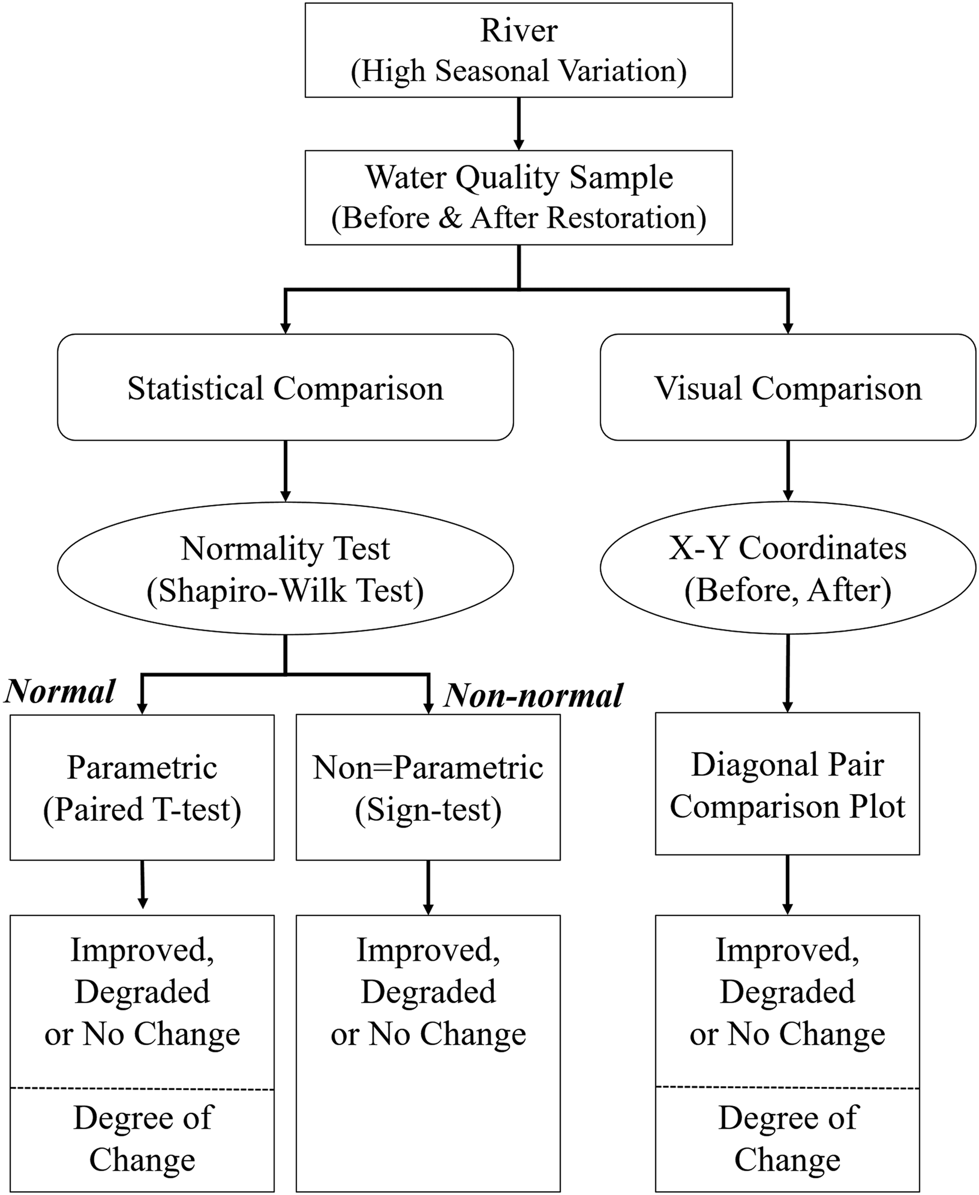
Flowchart of the statistical and visual comparison methods.
Statistical comparison
Normality test
A normality test is a fundamental step in water quality statistics. Approximately 40 numerical methods of normality can be used, such as the Pearson's chi-squared test, chi-square goodness-of-fit test, Anderson–Darling test, Lilliefors test, Shapiro–Wilk test, and the Kolmogorov–Smirnov test (Dufour et al., 1998; Razali and Wah, 2011; Lee et al., 2014). In this study, the Shapiro–Wilk test was performed using the SPSS 21.0v package and the result was confirmed by the graphical method using a histogram.
The Shapiro and Wilk (1965) test is often used for a sample size of less than 50. This was the first test to examine the normality with skewness or kurtosis. The Shapiro–Wilk test modified by Royston (1982a, 1982b, 1995) is available for a sample size between 3 and 5,000. The Shapiro–Wilk test statistic W is given as follows:
where xi is the ith order statistic (i.e., the ith smallest number in the sample),
where
Sign-test
A sign-test is a nonparametric test used to determine the difference between the pairs that have seasonal variation and non-normal distribution. The sign-test is based on the positive or negative signs for comparisons of paired observations
where the statistic S indicates the number of successes in n trails, and therefore has a binomial distribution with p = 0.5 under
Paired T-test
The paired T-test is a parametric test used to compare two population means that have normal distribution with means
where di is the mean difference of the paired data (xi, yi) for i = 1, …, n. It is observed that Sd is the standard deviation of the difference.
Visual comparison
A diagonal pair comparison plot was proposed in this study as a simple and clear visual comparison of water quality. This method is a visual data display in an X–Y graph, as shown in Fig. 3, where monthly paired water quality data are represented by two axes, such as before (X) and after (Y). The data point falls above, below, or on the diagonal line, referring to degradation, improvement, or no change, respectively. If more points of data occupy the upper triangular areas of the graph, the water quality has been degraded by the restoration. In the same way, improvement has more data points in the lower triangular areas of the graph. The numbers of data points above, below, or on the line are recorded in the upper right corner in the graph, because they are critical to the sign-test. The percentage degree of change (
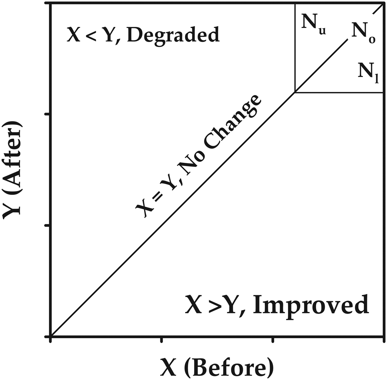
Schematics of proposed diagonal pair comparison plot (Nu: number in upper diagonal zone; Nl: number in lower diagonal zone; and No: number on-line).
where
Results and Discussion
Statistical comparison
Normality test
Results of the normality tests are presented in Table 2. Twenty-four data sets were analyzed in the Shapiro–Wilk test. Each data set included 84 samples from 7 upstream stations and 144 samples from 12 downstream stations, measured during the years of 2009 (before the restoration), 2012 (after the restoration), and 2013 (after the restoration for confirmation), for 4 different water quality parameters, including BOD, COD, TP, and Chl-a. Each data set was tested at a 95% confidence level (α-level 0.05). If the p-value was smaller than a given α-level (0.05), the null hypothesis was rejected and the alternative hypothesis was accepted. In such a case, it was assumed that the data would show non-normal distribution.
BOD, biochemical oxygen demand; COD, chemical oxygen demand; TP, total phosphorus; Chl-a, chlorophyll a.
As expected, most data sets were confirmed to be non-normal distribution, except for BOD of 2012 in upstream and BOD of 2013, COD of 2009, and 2012 in downstream. The p-values of these four data sets were more than the given α-level (0.05), so the null hypothesis was accepted, as shown in Table 2. Even though these four data sets were proven to have normal distribution, the parametric test (the paired T-test) can be applied to only one comparison between the COD data sets of 2009 and 2012. From the normality test, it was therefore concluded that the nonparametric method (sign-test) should be used for water quality comparisons.
To identify the reason for the non-normal distribution, the frequency histogram of each data set was drawn and is shown in Figs. 4 and 5, which include upstream and downstream data, respectively. From these figures, it can be recognized that most graphs have tails extending to the right with several outliers; these graphs are called right-skewed graphs. These right-skewed graphs are well known as very typical distribution of water quality data. Although the BOD graphs of 2012 shown in Fig. 4 and of 2013 shown in Fig. 5 were proven to have normal distribution by the Shapiro–Wilk test, the data frequency does not seem to be visually symmetrical. Only two data sets (CODs of 2009 and 2012 shown in Fig. 5) show visually symmetrical distribution without outliers. From the 24 histograms shown in Figs. 4 and 5, it was concluded that the non-normal distribution of most data sets is caused by the right-skewed frequency with outliers.
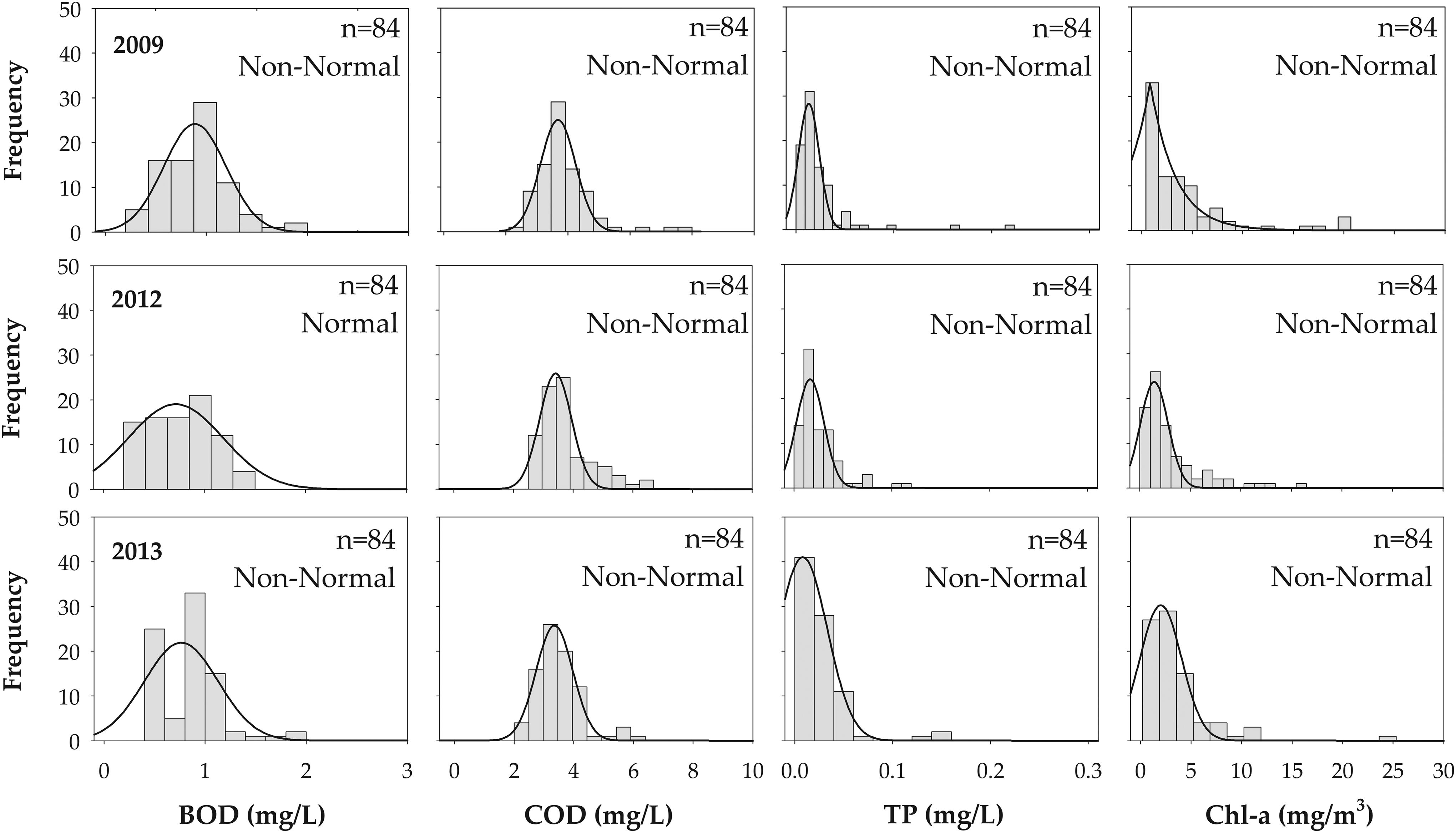
Frequency histogram of water qualities with respect to data normality in upstream stations.
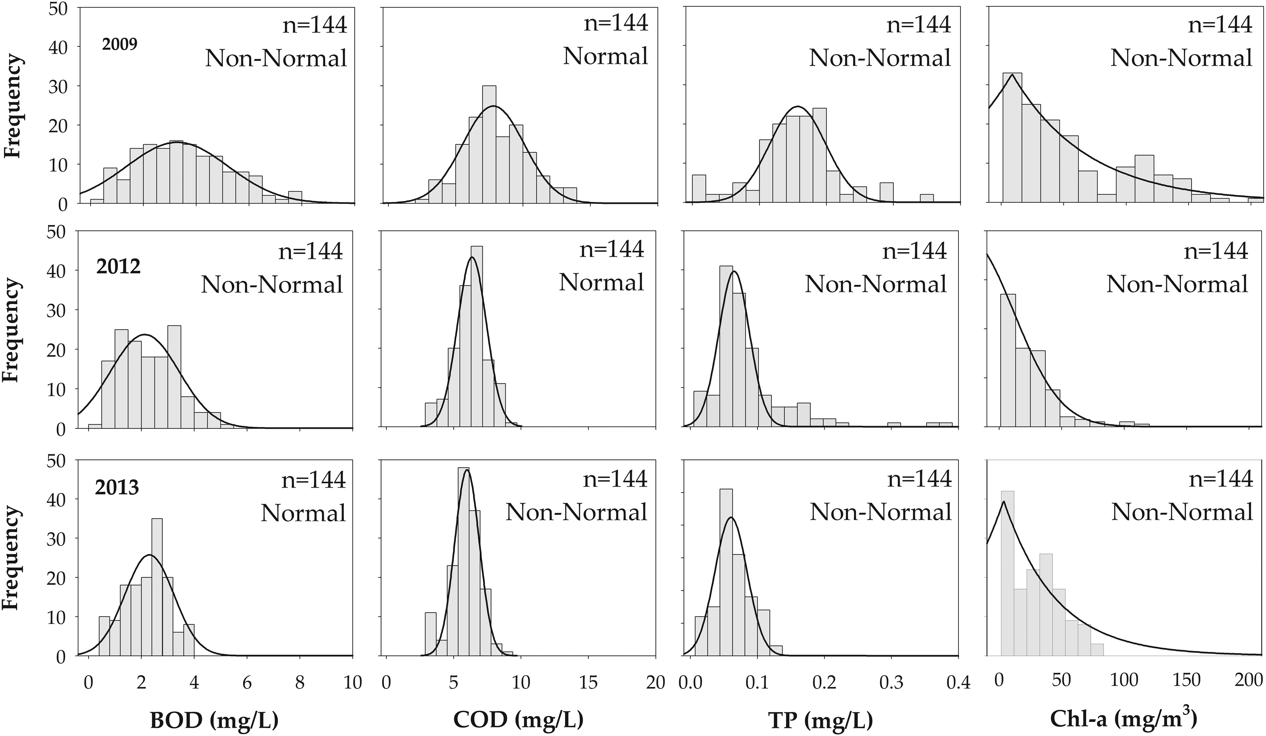
Frequency histogram of water qualities with respect to data normality in downstream stations.
Comparison test
Data of 2009 (before the project) were first compared with those of 2012 (after the project). Spatially, the statistical comparison was carried out by separating the upstream and downstream data, depending on the project intensity (heavy and light restoration). To confirm the first statistical results, the data of 2009 were also compared with those of 2013.
From the normality test, it was determined that most of the data sets should be shown as having non-normal distribution. Therefore, the nonparametric sign-test can provide a scientific judgment. The sign-test can only determine whether or not the water quality was improved. The degree of water quality change cannot be calculated from the sign-test. To compensate this weakness of the sign-test, the paired T-test was also applied.
Table 3 shows the results of the water quality comparison between 2009 and 2012. As shown in the sign-test results, all of the water quality parameters (BOD, COD, TP, and Chl-a) were improved in the downstream stations. In the upstream stations, the BOD, COD, and Chl-a were not changed, but the TP was degraded. From the paired T-test, all of the parameters (BOD, COD, TP, and Chl-a) should have improved in the downstream stations. In the upstream stations, the BOD and Chl-a were improved, but the COD and TP had not changed. To summarize, both the sign-test and the paired T-test showed the same results in all water quality parameters in the downstream stations. In the upstream stations, however, the two tests showed different results in all water quality parameters, except COD. In these cases, it can be inferred that the sign-test results should have provided a more accurate estimation of the population qualities than the paired T-test, because all of the data sets showed non-normal distribution.
Table 4 shows the results of the water quality comparison between 2009 and 2013. As shown in the sign-test results, all of the water quality parameters (BOD, COD, TP, and Chl-a) were improved in the downstream stations. In the upstream stations, the BOD, TP, and Chl-a had not changed, but the COD was improved. From the paired T-test, all of the parameters (BOD, COD, TP, and Chl-a) should have improved in the downstream stations. In the upstream stations, the BOD, TP, and Chl-a had not changed, but the COD was improved. In short, both of the tests showed the same results in all water quality parameters in the upstream stations as well as in the downstream stations.
To compare these results with the first statistical results presented in Table 3, very similar results were obtained in the confirmation tests (2009 data vs. 2013 data). From the comparison tests, it was concluded that all of the water quality parameters should have distinctly improved in the downstream stations after the restoration. In the upstream stations, however, no statistically discernable changes were observed, where most water qualities were shown to be unchanged in both tests.
Degrees of improvement were estimated from the paired T-test and are presented in Table 5. Since most of the data sets were proven to have non-normal distribution, these estimated degrees are only useful if both the sign-test and the paired T-test show the same results. In this study, the results of the sign-test and paired T-test are mostly the same, such that the quantitative improvement was evaluated by the arithmetic mean. In the downstream stations, BOD, COD, TP, and Chl-a were improved by 36.3%, 22.3%, 44.4%, and 57.7%, respectively, for 2012, and 38.0%, 26.8%, 58.2%, and 47.6%, respectively, for 2013, as shown in Table 5. It can be seen that the heavy restoration project was more successful in TP and Chl-a enhancement than in BOD and COD enhancement. In the upstream stations, however, the light restoration did not result in discernible improvement in all the parameters. In conclusion, it was clearly confirmed that all water qualities should have been significantly improved by the heavy restorations in the downstream area.
Visual comparison
Figure 6 presents the diagonal pair comparison plots of BOD and COD in upstream and downstream stations. Monthly paired data points were represented by X–Y coordinates. In the upstream plots, the data points are scattered around the diagonal line and the number of data points is similar in both the upper and lower triangular zone. In the calculated mean point, the X-value is almost equal to the Y-value. From the upstream plots, it can be seen that neither BOD nor COD should have improved or degraded by the restoration. In the downstream plots, however, most data points are located in the lower triangular zone. In the calculated mean point, the X-value is much larger than the Y-value. From the downstream plots, it can be seen that both BOD and COD should be significantly improved by the restoration. The water quality changes can also be assumed from the number of data points above, below, and on the line presented in the upper right corner box.
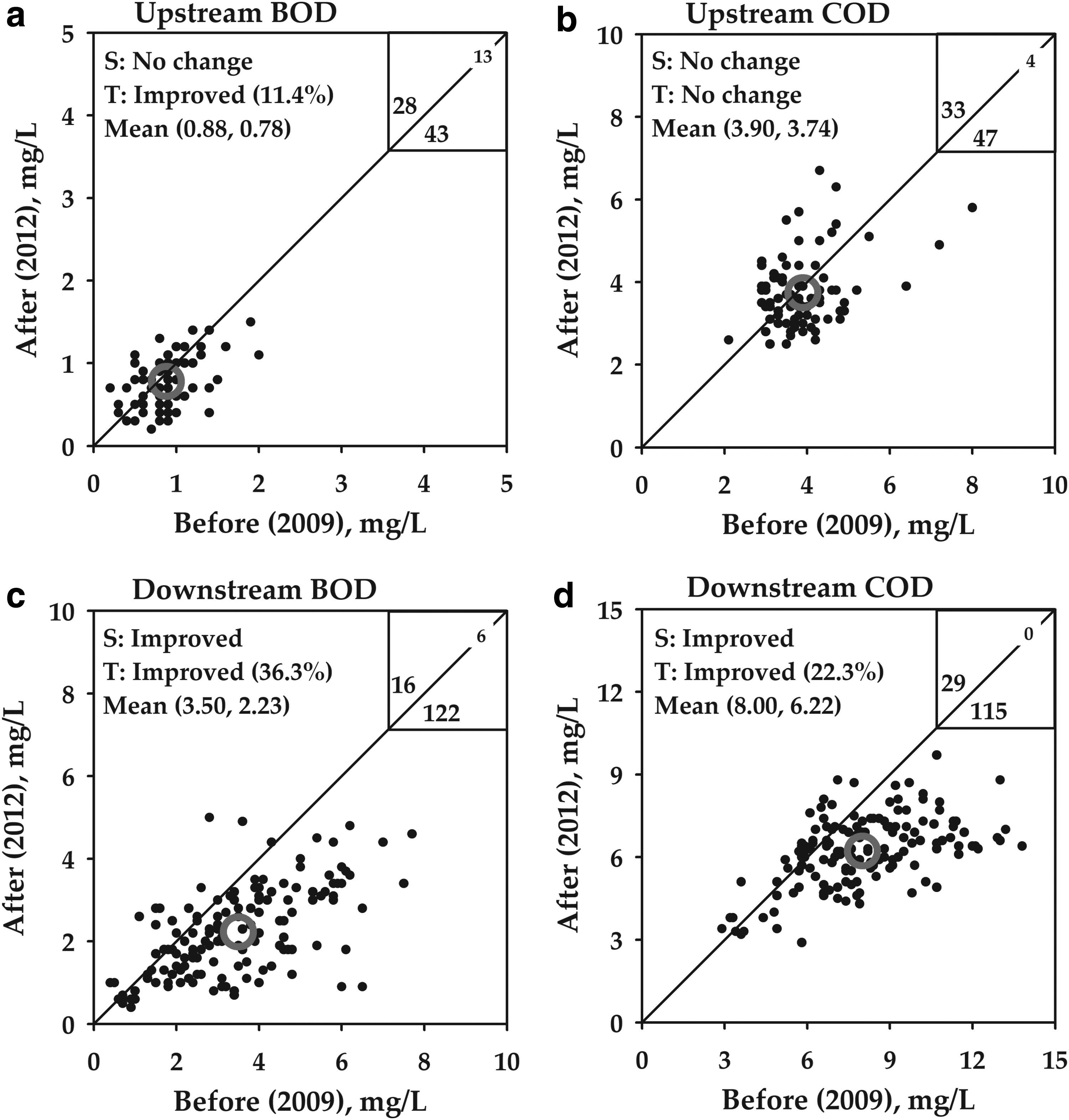
Diagonal pair comparison plot of BOD and COD (2009 vs. 2012) (Gray circle: mean). BOD, biochemical oxygen demand; COD, chemical oxygen demand.
Figure 7 presents the diagonal pair comparison plots of TP and Chl-a in upstream and downstream stations. In the upstream plot of TP, the number of data points in the upper diagonal zone is considerably more than that in the lower diagonal zone, but the X-value of the mean point is almost equal to the Y-value. This plot explains why different results were obtained from the sign-test and the paired T-test. In the upstream plot of Chl-a, the number of data points in the upper diagonal zone is equal to that in the lower diagonal zone, but the X-value of the mean point is much larger than the Y-value. In this case, no change was shown by the sign-test, even though the paired T-test showed 22.3% improved Chl-a. In the downstream plots of TP and Chl-a, most data points are located in the lower triangular zone. At the calculated mean point, the X-value is much larger than the Y-value. From these plots, it can be seen that both TP and Chl-a should have significantly improved. The restoration project improved TP and Chl-a by 44.4% and 57.7%, respectively. The improvement can also be assumed from the number of data points presented in the upper right corner box.

Diagonal pair comparison plot of TP and Chl-a data (2009 vs. 2012). Chl-a, chlorophyll a; TP, total phosphorus.
Confirmation test results of BOD and COD are presented in Fig. 8. In the upstream BOD plot, the numbers of data points are 35, 9, and 40 shown above, on, and below the diagonal line, respectively. In the calculated mean point, the X-value is equal to the Y-value. These results were obtained because no changes resulted from the sign-test and the paired T-test. In the upstream COD plot, however, the number of data points in the lower diagonal zone is greater than that in the upper diagonal zone, and the X-value of the mean point is larger than the Y-value. From both the sign-test and the paired T-test, it was therefore shown that COD should have improved. From the downstream plots, it can be seen that most data points are located in the lower triangular zone and the X-value of the calculated mean point is much larger than the Y-value. Therefore, in the downstream stations, it can be confirmed that both BOD and COD should have significantly improved by the restoration.
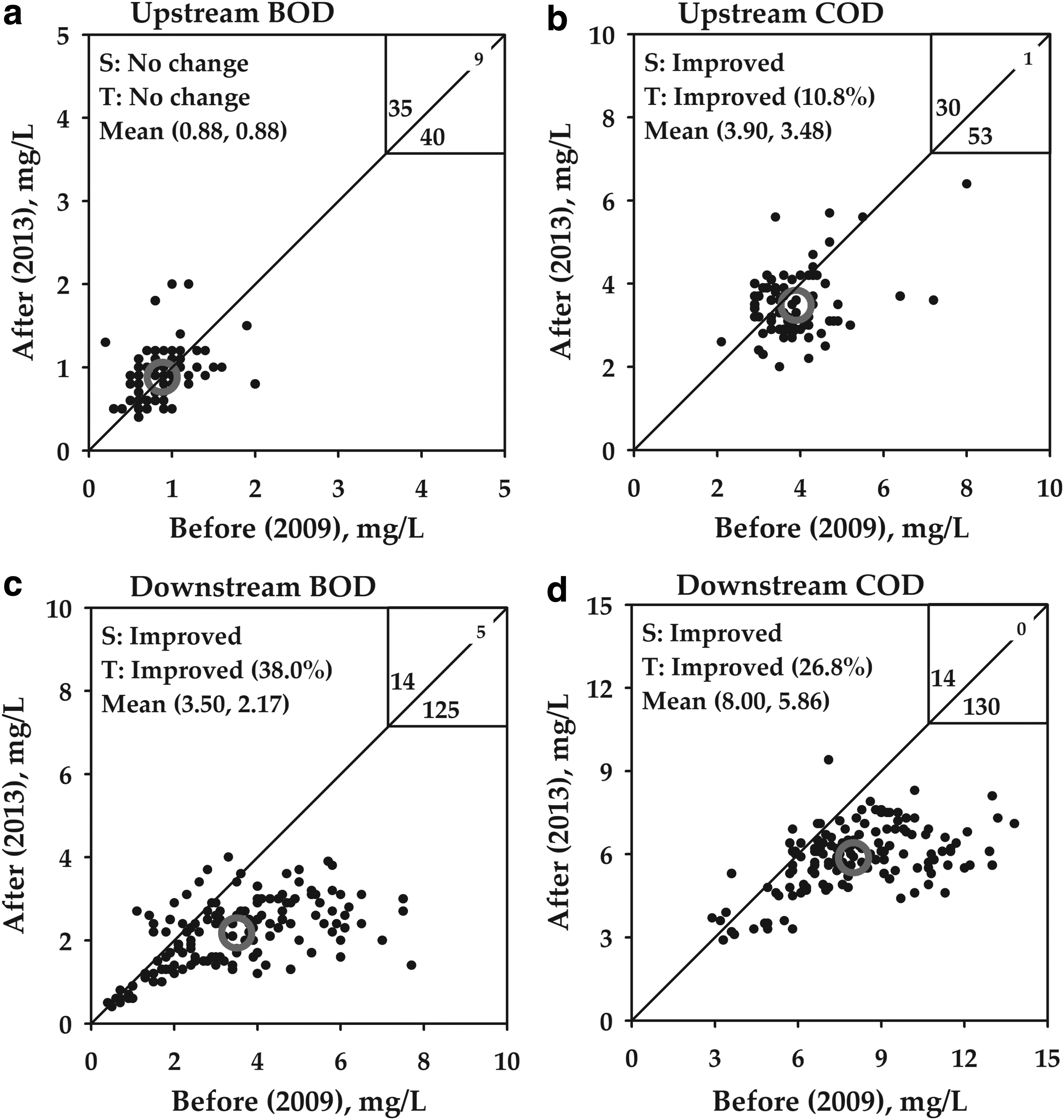
Diagonal pair comparison plot of BOD and COD data (2009 vs. 2013).
Figure 9 presents the confirmation test plots of TP and Chl-a. In the upstream plot of TP, the number of data points in the upper diagonal zone is greater than that in the lower diagonal zone, but the X-value of the mean point is almost equal to the Y-value. In the upstream plot of Chl-a, the number of data points in the upper diagonal zone is greater than that in lower diagonal zone, but the X-value of the mean point is larger than the Y-value. These figures show that the sign-test and the paired T-test showed no changes of TP and Chl-a. It should be noted that the data points of TP and Chl-a are widely scattered in the plots with high standard deviation. In the downstream plots of TP and Chl-a, most data points are located in the lower triangular zone. In the calculated mean point, the X-value is much larger than the Y-value. From these plots, it can be seen that both TP and Chl-a should have significantly improved. TP and Chl-a were improved by the restoration project by 58.2% and 47.6%, respectively.

Diagonal pair comparison plot of TP and Chl-a data (2009 vs. 2013).
Conclusions
To assess the water quality changes by the river restoration project, a statistical and visual comparison study was performed. Since the water quality data are often shown as having non-normal distribution with high seasonal variations in natural rivers, appropriate methods should be selected according to data characteristics for accurate judgment.
From the normality test, it was determined that most data would be shown as having non-normal distribution, as expected. To identify the reason for non-normal distribution, the frequency histogram of each data set was drawn. From the histogram, it was demonstrated that the non-normal distribution was caused by the right-skewed frequency with outliers. For the water quality comparison, the nonparametric sign-test was applied. Since the sign-test cannot provide the degree of change, the parametric paired T-test was also applied. The improvement or degradation of water quality was determined by the sign-test and the degree of change was computed as arithmetic mean, only when both the sign-test and paired T-test results were the same. A diagonal pair comparison plot was proposed as a simple and clear visual comparison of water quality. This plot is a visual data display in an X–Y graph, where monthly paired water quality data are represented by X–Y coordinates.
From the statistical comparison, it was concluded that all water quality parameters should have distinctly improved in downstream stations after the restoration. In the upstream stations, however, no statistically discernable changes were observed, and most water qualities were shown to be unchanged in both tests. From the comparison plots, it can be seen that all water quality parameters were significantly improved in the downstream plots, but no discernable changes were observed in the upstream stations. The degree of changes could be calculated from the X and Y values of the mean point in the plots. The water quality changes can also be assumed from the number of data points above, below, and on the line presented in the upper right corner box. From the number of data points in the upper and lower diagonal zones, the water quality changes could be clearly visualized. The series of statistical and visual methods presented in this article would be suggested for comparison of non-normally distributed water quality with high seasonal variations.
In this study, we have conducted a visual comparison of water quality data by the diagonal pair comparison plot as well as a statistical comparison of non-normally distributed data collected from the natural river. The results presented that the degree of restoration project carried out in upstream and downstream resulted in the different impact, positive or negative, on the water quality change of study area.
Footnotes
Acknowledgments
This study was partially supported by the Ewha Womans University Research Grant of 2017. The authors would like to thank the anonymous peer reviewers for improving the quality of this article.
Author Disclosure Statement
No competing financial interests exist.