




Abstract
Background:
Residents of census tract 708 in St. John Parish, Louisiana, face the highest nationwide cancer risk from air pollution due to chloroprene emissions from the Denka Performance Elastomer facility. The University Network for Human Rights worked with residents of this predominantly Black community in Cancer Alley to design and implement a survey-based health study of the area. The study aimed to (1) assess the relationship between household proximity to the facility and reported illness, and (2) advance the advocacy objectives of the community.
Methods:
The survey area consisted of households within a 2.5-km radius of the Denka facility. Sixty percent of the households within 1.5 km of the facility (“Zone 1”) and 20% of the households between 1.5 and 2.5 km from the facility (“Zone 2”) were randomly sampled. Survey implementers collected information on cancer diagnoses about all residents of each surveyed household. Information on chloroprene-linked medical symptoms was collected about respondents (those who took the survey) only.
Results:
Cancer prevalence among the survey sample is (1) significantly higher than what is considered likely using Monte Carlo simulations based on Surveillance, Epidemiology, and End Results prevalence data (p = 0.0306); and (2) associated with proximity to the facility, with significantly higher-than-likely prevalence in Zone 1 (p = 0.0032) and lower prevalence in Zone 2. Levels of medical symptoms among respondents are high and also associated with proximity to the facility.
Discussion:
Our findings highlight the need for action to compel Denka to reduce chloroprene emissions to Environmental Protection Agency-recommended limits.
Conclusion:
Our findings are consistent with Cancer Alley communities' lived experiences of the debilitating health consequences of the area's industrial emissions. The burden of proof must shift to polluting industries.
Introduction
Cancer Alley and the Denka neoprene facility
Louisiana's heavily industrialized corridor between New Orleans and Baton Rouge has long been known as “Cancer Alley.” More than 200 chemical plants and refineries are concentrated in this 210-kilometer stretch of land along the Mississippi River, mostly in or near historically Black communities where many residents can trace their lineage to ancestors who were enslaved in the area. 1 Since the late 1970s, many Cancer Alley residents have attributed cancer and other illness in their communities to toxic industrial pollution 2 and sought to use regulatory and legal challenges as well as grassroots struggle to compel industry to reduce emissions. 3
In the past several years, Environmental Protection Agency (EPA) data have bolstered suspicions about the link between air pollution and negative health outcomes in Cancer Alley. 4 According to the most recent EPA National Air Toxics Assessment (NATA), 7 of the 10 U.S. census tracts with the highest cancer risk from air pollution are in Cancer Alley, including the tract with the highest nationwide risk—tract 708 in the town of Reserve in St. John the Baptist Parish. 5
Nationally, the average estimated risk of developing cancer from air pollution is 32 per million people; in Louisiana's census tract 708, the estimated cancer risk from air pollution is 1505 per million people—47 times the national average. 6 The vast majority of this risk, moreover, is attributed to a single chemical, chloroprene, emitted by the Denka Performance Elastomer neoprene facility. EPA attributes 85% (1279 per million people) of the cancer risk from air pollution in census tract 708 to chloroprene emissions, 12% (187 per million people) to ethylene oxide emissions, and 3% (38 per million people) to all other pollutants. 7 The Denka facility is the only source of chloroprene emissions in St. John Parish 8 and the only producer of chloroprene and neoprene in the United States. 9
The neoprene facility, owned by DuPont until its sale to Japanese company Denka Performance Elastomer in November 2015, has been pumping chloroprene into the neighboring Black community since 1969. 10 Residents of the community had long felt that there was too much illness in the area—far beyond what could be considered normal. 11 As one resident told us, “We're just sitting here, waiting to die.” 12
EPA's Integrated Risk Information System (IRIS) classified chloroprene as a “likely human carcinogen” in 2010. Reflecting this new IRIS assessment of chloroprene toxicity, the 2011 NATA (published in December 2015) estimated highly elevated cancer risk from air pollution near the Denka facility. Upon learning about EPA's estimate of their cancer risk in July 2016, residents of Reserve formed a community group called Concerned Citizens of St. John the Baptist Parish (“Concerned Citizens”). Concerned Citizens has demanded a significant reduction in chloroprene emissions from the Denka facility, such that air concentration of the chemical does not exceed 0.2 μg/m 3 —the maximum chloroprene air concentration that would keep cancer risk from air pollution within EPA's “upper limit of acceptability” (100 per million people). 13 Concerned Citizens' ongoing struggle for environmental justice has gained increasing traction and national media coverage. 14
In January 2017, Denka signed a voluntary agreement with the Louisiana Department of Environmental Quality to reduce its emissions. 15 Although chloroprene air concentrations have dropped since then, EPA's monitoring data have continued to show concentrations well in excess of 0.2 μg/m 3 in the neighborhoods around the Denka facility: in 2020, 35% of air samples exceeded the 0.2 μg/m 3 threshold and the mean chloroprene air concentration was 0.7 μg/m 3 —more than three times the threshold (Table 1).
Summary Statistics of Environmental Protection Agency's Chloroprene Air Monitoring Data
Although EPA's estimates of air pollution-related cancer risk have been critical in elevating the long-standing concerns of Cancer Alley residents, these risk estimates have not compelled adequate action to protect human health. As discussed further hereunder, although building upon risk estimates with health studies to determine observed levels of negative health outcomes is valuable, such studies should not be necessary to compel action to protect human health. Once EPA has determined that residents of certain areas may face unacceptably high health risks, strong and swift action is not only warranted but obligatory. 16
Genesis and goals of our community-engaged research project
The University Network for Human Rights (UNHR) is a nonprofit organization that works closely with communities affected by rights abuse to amplify and advance their struggles through community-led interdisciplinary research, documentation, and advocacy. The authors of this study—UNHR researchers and leaders of Concerned Citizens of St. John Parish—first met in fall 2017. 17 Concerned Citizens then convened several joint community meetings with UNHR researchers to discern residents' most pressing concerns and advocacy priorities. Residents discussed at length their anecdotal evidence of abnormally high levels of cancer and other illness in the community. Multiple people reported, for example, that in almost every household on the streets closest to the Denka facility, someone had cancer or had died of cancer. Residents felt that, to have an impact, this anecdotal evidence needed to be supplemented with quantitative data collected through a household health survey of the area near the plant.
After community members identified a survey-based household health study as one of their priorities, UNHR researchers began working closely with Concerned Citizens to develop a community-engaged research plan for implementation of the study. The goals of the study were (1) to determine the overall health status of a large sample of residents living in the area of the Denka facility, (2) to assess the relationship between household proximity to the Denka facility and reported illness, and (3) to advance the advocacy objectives of Concerned Citizens by collecting and analyzing data that might be useful in the group's efforts to compel Denka to adhere to the EPA's 0.2 μg/m 3 guideline for maximum chloroprene air concentration.
The survey instrument focused on chloroprene-linked health outcomes, in particular, because (1) the vast majority of the cancer risk from air pollution near the Denka facility is due to chloroprene emissions, (2) these emissions can be attributed to the Denka facility since it is the only source of chloroprene emissions in St. John Parish, and (3) the study was motivated by community members' concern about their exposure to chloroprene, which EPA had recently brought to their attention after the release of the 2011 NATA.
Methods
Epidemiologists and statisticians at Stanford University provided input and guidance to ensure use of proper actuarial processes, study design methods, and survey implementation principles and techniques. As a field epidemiology investigation, the study was (1) initiated in response to what community members described as a public health crisis in the area near the Denka facility, and (2) conducted in the field, through survey-based collection of residents' health information. 18 Stanford University's Research Compliance Office has determined that no IRB review would have been required “[b]ecause the goal of this project was advocacy for a specific issue in a specific situation and not generalizable research.”
Survey instrument
To guide the development of our survey instrument (Appendix A1), we used peer-reviewed studies based on similar household health surveys. 19 The survey instrument was designed to collect certain health and other information—including age, sex, part- or full-time residency status, cancer and other medical diagnoses, and child health—about all residents of a household. Additional information was collected about respondents (those who took the survey) only, including race/ethnicity and medical symptoms.
Many symptoms and diagnoses were included in the survey instrument because of their link to chloroprene exposure, according to EPA's Toxicological Review of Chloroprene. Other symptoms and diagnoses were included after community members identified them as particular sources of concern in focus group sessions held in February 2018.
In addition to cancer diagnoses, the following chloroprene-linked health symptoms were included in the survey instrument: headache, dizziness, fatigue, shortness of breath, rapid heart rate, heart palpitations, chest pain, and irritation of the eyes, nose, throat, and skin. 20 In light of community members' particular concern about health impacts on children as well as evidence suggesting that children are more susceptible than adults to the toxic effects of chloroprene exposure, 21 we also collected survey data on two specific symptoms in children: headaches and nosebleeds. Community members cited both of these symptoms as common in children who live and/or attend school in the area near the Denka facility. (In addition, as noted, headaches are linked to chloroprene exposure.)
Finally, the survey instrument included questions on the frequency and strength of chemical odors in the area as well as residents' level of concern about pollution in their community.
A draft survey instrument was piloted with five residents of the area in February 2018 and modified accordingly for clarity and efficiency of data collection.
Study design
The geographic scope of the study was the area within a 2.5-km radius of the Denka facility. In Figure 1, the outer circle circumscribes the entire survey area and the inner circle circumscribes the area within 1.5 km of the facility. The facility—with a red dot at its center—can be seen at the center of the survey area. In the map on the right, gray dots represent households. Residents of the orange-colored census tract (708) face the nation's highest cancer risk from air pollution, according to EPA. Residents of the yellow-colored census tract (709) face the third-highest nationwide risk.

Maps of survey area.
We ultimately surveyed 60% of households (267 out of 445) within the 1.5-km radius of the plant (“Zone 1,” as shown in Fig. 1) and 20% of households (271 out of 1376) located between 1.5 and 2.5 km from the plant (“Zone 2”). Households were randomly sampled. After obtaining addresses by census block online, we used a census batch geocoder to geocode the addresses. We determined that there are 445 total households in Zone 1 and 1376 total households in Zone 2, according to 2010 census information. We designed our protocol to ensure that we would randomly survey at least 250 households in Zone 1 (56% of the Zone 1 total) and at least 250 households in Zone 2 (18% of the Zone 2 total). Assuming a survey response rate of ∼50%, we used the R random number generator to generate a randomly ordered list of all 445 households in Zone 1 (predicting that we would need to attempt to survey all 445 households to achieve our target number of 250 surveys in Zone 1). We also used the R random number generator to randomly select (and randomly order) 500 addresses in Zone 2 (predicting that we would need to attempt to survey at least 500 households to achieve our target number of 250 surveys in Zone 2). Once we had attempted to survey all 500 households on our Zone 2 list at least twice without reaching the target number of surveys (250), we generated a randomly ordered list of all remaining households in Zone 2. To reach our target number of surveys for each zone, we attempted to survey almost every household in Zone 2 and every household in Zone 1. Thus, the survey response rate is equivalent to the percentage of households ultimately surveyed in each zone.
Study protocol
One day before the start of survey implementation, a team of community members and UNHR researchers distributed flyers throughout the survey area. The flyers informed residents about the upcoming health survey, its goals, and the possibility that their household might be randomly selected for participation. The flyers also stated that residents' participation in the survey was entirely voluntary.
After undergoing intensive training and practice in survey implementation principles and techniques under the supervision of Stanford University experts, a team of 14 Stanford undergraduates implemented the survey over 9 days (March 22–30, 2018). The survey area was divided into seven geographic subareas for ease of survey implementation (i.e., so that survey implementers could be assigned to a subarea for a given period of time rather than having to walk long distances from household to household across the entire survey area). Survey implementers almost always worked in pairs. Each day, each pair of survey implementers was assigned to one of the seven geographic subareas and provided with a list of households in their subarea. The list was randomized, but to reduce time spent walking between households, the route efficiency was optimized for each set of 20 addresses. Survey implementers attempted to survey each of the 20 route-optimized households twice before moving on to the next set of 20. The following day, survey implementers made a third attempt to survey households that had been attempted twice the previous day, before moving on to the next set of households. Survey implementers generally did not visit a household more than three times. If a household member declined to participate in the survey, implementers did not attempt to survey that household again. Households were surveyed from ∼9 am to 7 pm each day.
For each household surveyed, one household member (the “respondent”) provided health and demographic information about themself and every other person living in the household. We use the term “residents” to refer to everyone for whom data were collected (i.e., respondents plus all other household members).
Survey implementers obtained verbal informed consent from each respondent before proceeding. Upon encountering a potential respondent, survey implementers introduced themselves and conveyed the purpose of the survey. They explained that participation in the survey was voluntary; that, if the potential respondent chose to participate, neither their name nor the names of any of their household members would be recorded; that any information provided would remain strictly confidential and would not be shared outside our research team; and that the overall results of the study would be made public but no one's identity or identifying health information would be disclosed. If the respondent verbally consented to participate in the survey, one of the survey implementers asked the survey questions, while the other recorded the respondent's answers on a paper survey.
After completion of survey implementation, the data from each survey were manually entered into an electronic REDCap instrument.
Data analysis
Monte Carlo analyses of cancer prevalence
We used Monte Carlo simulations in RStudio to analyze our data on cancer prevalence among residents surveyed. We simulated a population in the United States with the same race, sex, and age demographics as the survey sample. Using 10,000 simulations, we generated probability distributions of cancer prevalence in the simulated population based on the National Cancer Institute's 2015 Surveillance, Epidemiology, and End Results (SEER) data for 23-year cancer prevalence (see Appendix A2 for code abstract). 22 “Simulated” cancer prevalence refers to the probability distribution of outcomes generated by these 10,000 simulations. We then compared 23-year cancer prevalence in the survey sample (“observed” cancer prevalence) with the 23-year cancer prevalence values that are likely—based on SEER data broken down by race, sex, and age—in a demographically similar U.S. population (see Appendix Table A1 for the race/sex/age breakdown of the survey sample with corresponding SEER prevalence data for each demographic). We determined the probability (p-value) that a simulated population with the same race, sex, and age makeup as the survey sample would have a cancer prevalence as high or higher than that observed in the survey sample. We considered results significant when p < 0.05. 23
For every resident in the survey sample, we had a corresponding resident—of the same race, sex, and age—in the simulated population. Each member of the simulated population was assigned a value of 0 (no cancer diagnosis in the previous 23 years) or 1 (one or more cancer diagnoses in the previous 23 years). The probability that a simulated resident in a certain race/sex/age group would be assigned 0 or 1 was based on SEER data. For example, according to SEER data, 23-year cancer prevalence among Black men between the ages of 60 and 69 years is about 12.8%. In the simulated population, every Black male in his 60s was randomly assigned a value of 1 with probability p = 12.8% (otherwise, a value of 0 with probability 1 − p = 87.2%). Each simulated resident was assigned a value of 0 or 1 in this manner, using the SEER cancer prevalence data for that resident's race/sex/age group. The process was then repeated 9999 times to generate a total of 10,000 simulations. This enabled us to compare the observed cancer prevalence outcome in the survey sample to a distribution of cancer prevalence outcomes in the simulated population. Race, sex, and age were considered in our Monte Carlo analyses because SEER data are broken down by these three demographic variables. Other demographic variables (such as socioeconomic status) could not be considered because we lacked comparable national cancer prevalence data for other variables.
We ran Monte Carlo simulations for cancer prevalence in the overall survey area as well as by spatial zone. After separately determining cancer prevalence probabilities closer to the Denka facility (in Zone 1) and farther away from the facility (in Zone 2), we were able to determine whether or not there is an association between cancer prevalence among the survey sample and proximity to the Denka plant.
We ran Monte Carlo simulations both with and without a smoking exclusion criterion. This exclusion criterion removed all residents who live in households where anyone smokes on a daily basis. Since corresponding residents were also removed from the simulated population, the smoking exclusion criterion impacted the range of simulated outcomes as well as the survey outcome.
Age-adjusted cancer prevalence by spatial zone
In addition to Monte Carlo analyses, crude survey data on cancer prevalence in each zone were age-adjusted to the U.S. Standard Population in the year 2000 so that the survey data by zone could be directly compared with SEER's national cancer prevalence (which is also age-adjusted to the 2000 U.S. Standard Population). Survey data were age-adjusted both with and without a smoking exclusion criterion.
Health symptoms and pollution data
We did not use Monte Carlo simulations for health symptoms and pollution data because we lacked comparable national data by demographic group. Survey data on the following symptoms and pollution questions are presented by spatial zone: (1) headaches and nosebleeds in children; (2) chest pain and heart palpitations; (3) wheezing and difficulty breathing; (4) headaches, dizziness, and lightheadedness; (5) eye pain/irritation and watery eyes; (6) cough, sneezing, and sore/hoarse throat; (7) skin rash/irritation and itchy skin; (8) fatigue/lethargy; (9) chemical odors; and (10) concern about pollution.
Results
Analysis of EPA's chloroprene air monitoring data
Since 2016, EPA has collected chloroprene air concentration data from six monitoring sites surrounding the Denka facility. 24 Using these data, we calculated annual mean concentrations in two different ways (Table 1): in our “lower bound” method, we replaced entries listed as “ND” (concentration not detected) with values of 0 μg/m 3 and kept all values below the method detection limit (0.0417 μg/m 3 ) as they are. In our “upper bound” method, we substituted 0.0417 μg/m 3 for each “ND” entry and for each value below 0.0417 μg/m 3 .
In 2020, the maximum chloroprene air concentration detected was 22.6 μg/m 3 , 113 times the 0.2 μg/m 3 threshold. The lower and upper bound mean concentrations that year—0.7175 and 0.7349 μg/m 3 , respectively—were both more than three times the threshold. 35.4% of air samples collected in 2020 had a chloroprene concentration that exceeded 0.2 μg/m 3 .
Analyses of cancer prevalence
Of the 1640 total residents in the survey sample, eliminations from the data set were made as follows for the analyses of cancer prevalence: 98 part-time residents (defined as those who live in the household for only 1–5 days of the week, inclusive) were eliminated from the data set. Eight residents for whom we did not have all three pieces of necessary demographic information—race, sex, and age—were eliminated from the data set. Twenty-one residents who reported a race/ethnicity for which there is no SEER analogue (and, therefore, no comparable national cancer prevalence statistic) were eliminated from the data set. Finally, since we used SEER's 23-year cancer prevalence statistics, we eliminated the six residents whose only cancer diagnosis happened in 1994 or earlier (>23 years before the health survey).
After all eliminations, the numbers of residents included in the cancer prevalence analyses were 777 in Zone 1 (from 262 households) and 730 in Zone 2 (from 263 households), for a total of 1507 (from 525 households).
Although race information was collected for respondents only, we assumed—for purposes of the cancer prevalence analyses only—that all residents of a household shared the race of the respondent. If a particular respondent was eliminated from the data set (due to one of the aforementioned elimination criteria), all members of the respondent's household were eliminated from the data set as well (since the other household members' race depended on the respondent's race).
Monte Carlo analyses of cancer prevalence across survey area
In a probability distribution of 10,000 simulations, the median value for 23-year cancer prevalence in a population with the same race, sex, and age demographics as the survey sample was 4.4% (Fig. 2). In other words, half of the simulations yielded cancer prevalence values <4.4% and half of the simulations yielded cancer prevalence values >4.4%. The median is, therefore, an approximation of the cancer prevalence outcome that is most likely in a simulated population with the same demographic makeup as the survey sample. 25 In Figure 2, the median is represented by the dotted vertical line in the distribution.

Simulated and observed 23-year cancer prevalence.
The percentage of survey residents who reported at least one cancer diagnosis in the previous 23 years (“observed cancer prevalence”) was 5.4%, significantly higher than indicated by Monte Carlo simulations based on SEER prevalence data (p = 0.0343) (Fig. 2). This p-value indicates the probability that a simulated population with the same demographic makeup as the survey sample would have a cancer prevalence greater than or equal to that of the survey sample. In Figure 2, the survey sample cancer prevalence is represented by the solid red vertical line in the distribution. The greater the distance between the solid red line (survey sample cancer prevalence) and the dotted line (approximation of most likely cancer prevalence), the more unusual the cancer prevalence in the survey sample.
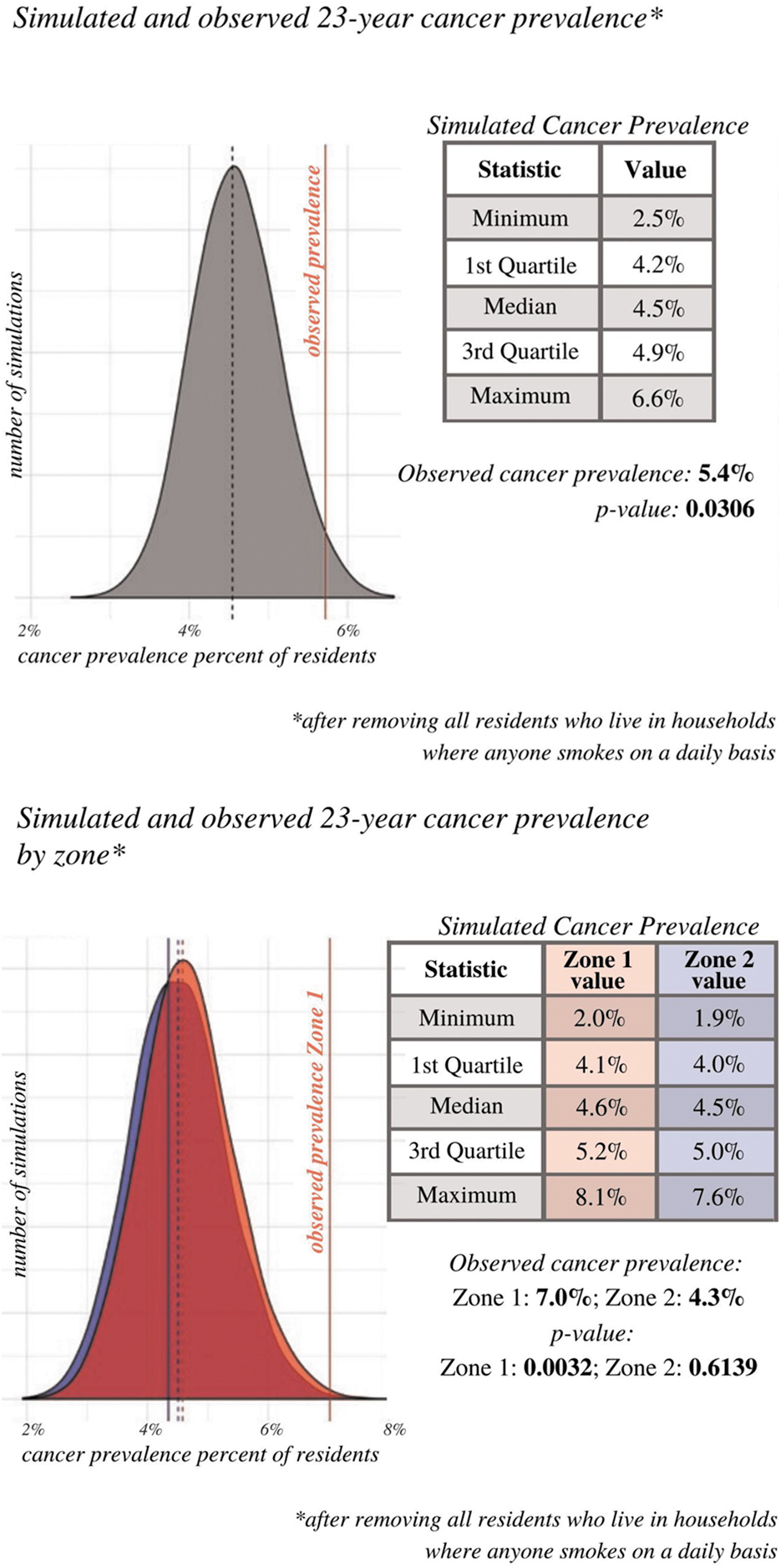
When the smoking exclusion criterion was applied, the median value for cancer prevalence in the probability distribution for the simulated population was 4.5% (Appendix Fig. A1). The percentage of survey residents who reported a cancer diagnosis in the previous 23 years was 5.4%, significantly higher than indicated by Monte Carlo simulations based on SEER prevalence data (p = 0.0306) (Appendix Fig. A1).
Monte Carlo analyses of cancer prevalence by spatial zone
In probability distributions of 10,000 simulations by spatial zone, the median value for cancer prevalence in Zone 1 was 4.6% and the median value for cancer prevalence in Zone 2 was 4.4% (Fig. 3). In other words, in Zone 1 half of the simulations yielded cancer prevalence values <4.6% and half of the simulations yielded cancer prevalence values >4.6%, and in Zone 2 half of the simulations yielded cancer prevalence values <4.4% and half of the simulations yielded cancer prevalence values >4.4%. The median is, therefore, an approximation of the cancer prevalence outcome that is most likely in a simulated population with the same demographic makeup as the survey sample for each zone. 26 In Figure 3, the red distribution shows the range of cancer prevalence values likely for a simulated population with the same demographic makeup as the Zone 1 survey sample, and the blue distribution shows the range of cancer prevalence values likely for a simulated population with the same demographic makeup as the Zone 2 survey sample. Because there is not a significant difference in the range of simulated cancer prevalence outcomes for Zone 1 and Zone 2, the two distributions overlap significantly. The median for Zone 1 is represented by the dotted red vertical line, and the median for Zone 2 is represented by the dotted blue vertical line.
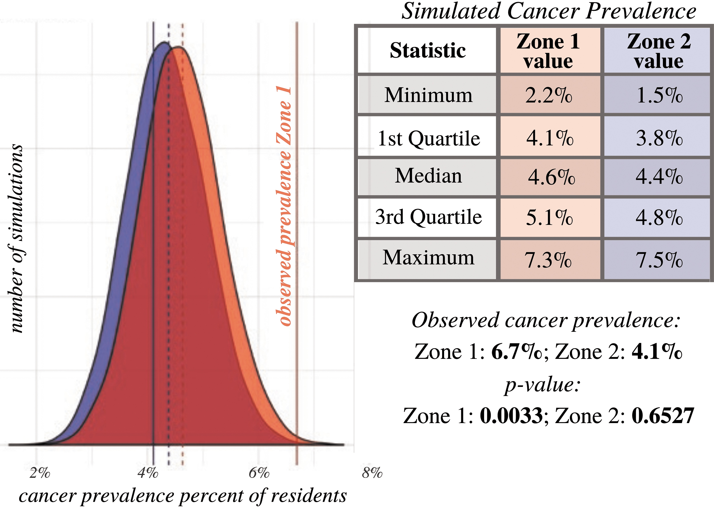
Simulated and observed 23-year cancer prevalence by zone.
APPENDIX FIG. A1.
The percentage of survey residents in Zone 1 who reported a cancer diagnosis was 6.7%, significantly higher than indicated by Monte Carlo simulations based on SEER prevalence data (p = 0.0033) (Fig. 3). This p-value indicates the probability that a simulated population with the same demographic makeup as the Zone 1 survey sample would have a cancer prevalence greater than or equal to that of the survey sample. The percentage of survey residents in Zone 2 who reported a cancer diagnosis was 4.1% (Fig. 3). In Figure 3, Zone 1 cancer prevalence is represented by the solid red vertical line, and Zone 2 cancer prevalence is represented by the solid blue vertical line. The greater the distance between the solid line (survey sample cancer prevalence for zone) and dotted line of corresponding color (approximation of most likely cancer prevalence for zone), the more unusual the survey sample cancer prevalence for that zone.
When the smoking exclusion criterion was applied, the median value for cancer prevalence in the Zone 1 probability distribution was 4.6% and the percentage of Zone 1 survey residents who reported a cancer diagnosis was 7.0%, significantly higher than indicated by Monte Carlo simulations based on SEER prevalence data (p = 0.0032) (Appendix Fig. A1). The median value in the Zone 2 probability distribution was 4.5% and the percentage of Zone 2 survey residents who reported a cancer diagnosis was 4.3% (Appendix Fig. A1).
Age-adjusted cancer prevalence by spatial zone
Age-adjusted cancer prevalence among residents surveyed in Zone 1 was 5.0139%, 44% higher than SEER's age-adjusted national cancer prevalence of 3.4851%. When the smoking exclusion criterion was applied, age-adjusted Zone 1 prevalence was 5.1421%, 48% higher than the national prevalence of 3.4851%. Age-adjusted cancer prevalence among residents surveyed in Zone 2 was 3.5308%. When the smoking exclusion criterion was applied, age-adjusted Zone 2 prevalence was 3.5112%.
Race/ethnicity, health symptoms, and pollution data
The race/ethnicity, health symptoms, and pollution data presented hereunder were collected for survey respondents only, with the exception of data pertaining to children in the household. After part-time respondents were eliminated from the data set, the sample size for race/ethnicity, symptoms, and pollution data was 263 in Zone 1 and 259 in Zone 2 (a total of 522). Data on headaches and nosebleeds in children were collected from survey respondents, who were asked about the health of any children in their households. After part-time children were eliminated from the data set, the sample size for child health data was 186 in Zone 1 and 220 in Zone 2 (a total of 406).
Race/ethnicity data
The overwhelming majority of respondents in the survey area (80.7%) identified as Black. 15.7% of respondents identified as white, and 3.6% identified as another race/ethnicity or did not provide race/ethnicity information. Black respondents were not distributed evenly throughout the survey area. In Zone 1, a higher proportion of respondents identified as Black than in Zone 2 (93.2% vs. 68.0%). Conversely, 4.9% of Zone 1 respondents and 26.6% of Zone 2 respondents identified as white. 1.9% of Zone 1 respondents and 5.4% of Zone 2 respondents identified as another race/ethnicity or did not provide race/ethnicity information.
Health symptoms data
More than 40% of children in households surveyed in Zone 1 (40.3%) reportedly suffer from headaches. This proportion dropped to 28.6% in Zone 2. More than one-fifth of children in households surveyed in Zone 1 (21%) reportedly suffer from nosebleeds. This proportion dropped slightly in Zone 2, to 18.2%. Nearly 40% of Zone 1 respondents (37.3%) reported that they experienced chest pain, heart palpitations, or both at least 1 day per week in the past month. This proportion dropped to 27.8% in Zone 2. Approximately one-third of Zone 1 respondents (33.5%) reported that they experienced wheezing and/or difficulty breathing at least 2 days per week in the past month. This proportion dropped to 24.3% in Zone 2. More than half of Zone 1 respondents (50.6%) reported that they experienced headaches, dizziness, and/or lightheadedness at least 2 days per week in the past month. This proportion dropped to 37.5% in Zone 2. Nearly half of Zone 1 respondents (44.5%) reported that they experienced eye pain/irritation and/or watery eyes at least 2 days per week in the past month. This proportion was roughly the same in Zone 2 (43.6%). More than 40% of Zone 1 respondents (41.1%) reported that they experienced cough, sneezing, and/or sore/hoarse throat at least 4 days per week in the past month. This proportion dropped to 33.6% in Zone 2. More than one-third of Zone 1 respondents (34.6%) reported that they experienced skin rash/irritation and/or itchy skin at least 2 days per week in the past month. This proportion dropped slightly in Zone 2, to 30.5%. Nearly 30% of Zone 1 respondents (29.3%) reported that they experienced fatigue/lethargy at least 4 days per week in the past month. This proportion dropped to 22.8% in Zone 2.
Pollution data
Approximately half of Zone 1 respondents (49.4%) reported that they smell chemical odors while inside their homes “at least a few times per month.” This proportion dropped to 31.3% in Zone 2. More than half of Zone 1 respondents (51.7%) reported that they smell chemical odors while outside their homes “at least a few times per week.” This proportion dropped to 42.1% in Zone 2. More than three-fourths of Zone 1 respondents (76.4%) reported that they smell chemical odors while outside their homes “at least a few times per month.” This proportion dropped to 67.2% in Zone 2. 84.0% of Zone 1 respondents reported that they are “extremely concerned” about pollution in their community. This proportion dropped to 63.7% in Zone 2.
Discussion
To our knowledge, this is the first study conducted in Cancer Alley that evaluates the potential link between household proximity to a particular industrial facility and reported adverse health outcomes. Our analysis yielded three major findings. First, cancer prevalence among the survey sample is significantly higher than what is considered likely using Monte Carlo simulations based on SEER prevalence data. Second, cancer prevalence among the survey sample is associated with proximity to the Denka facility, with significantly higher-than-likely prevalence in the zone closer to the facility and lower prevalence in the zone further from the facility. Third, levels of chloroprene-linked health symptoms among the survey sample—including among children—are high and also associated with proximity to the Denka facility.
Across the survey area as a whole, cancer prevalence among residents surveyed is significantly higher than what is considered likely for a U.S. population with the same race, sex, and age makeup. Removing residents who live in households where anyone smokes on a daily basis does not alter this result. When cancer prevalence among the survey sample is analyzed by spatial zone, prevalence in the zone closer to the Denka facility (Zone 1) is more statistically significant (with a p-value 10 times lower) than prevalence in the survey area as a whole. Prevalence in Zone 1 is higher than prevalence in Zone 2, further from the facility. Again, applying the smoking exclusion criterion does not alter this result.
Our findings on other adverse health outcomes linked to chloroprene exposure show that high proportions of respondents regularly experience cardiac symptoms, difficulty breathing, headaches, eye irritation, respiratory symptoms, skin irritation, and fatigue. In virtually every case, respondents who live closer to the Denka facility (Zone 1) are affected in higher proportions than respondents who live further away (Zone 2).
Our findings on child health show that >40% of children in surveyed households in Zone 1 suffer from headaches, an outcome linked to short- and long-term chloroprene exposure. Since the beginning of their struggle for environmental justice, Concerned Citizens of St. John Parish has advocated for the health and well-being of the children in their community. In particular, Fifth Ward Elementary School—located less than a third of a mile from the Denka facility—has been a focal point of activism. 27
A strength of the study was the random sampling design, which reduced the possibility of selection bias. Race data from survey samples in Zones 1 and 2 were representative of the respective larger areas: according to American Community Survey data, Zone 1 is 95% Black and 5% white (compared with 93% Black and 5% white in the survey sample) and Zone 2 is 71% Black and 27% white (compared with 68% Black and 27% white in the survey sample). 28 Additional strengths of the study included the spatial analysis of the data, that is, the use of geographic zones by proximity to the facility; the consideration of confounding variables such as smoking, age, sex, and race; the value of field epidemiology, that is, data collection in the field to investigate concerns about community health; and the strong partnership and relationship of trust between researchers and community members, which facilitated the design of a robust survey instrument (including through the use of focus groups) and collection of a large amount of data. Survey respondents were neither aware that the study design relied on the use of geographic zones nor aware of the zone in which their residence was located, reducing the possibility of awareness bias.
A limitation of the study was the reliance on self-reported health information provided by a single household member about all members of the household. On the one hand, respondents may have underreported other household members' health conditions. On the other hand, awareness bias in respondents who were concerned about air pollution, their own health, or household members' health may have increased reporting of adverse health outcomes. Other limitations included the use of only two comparison groups, limiting the ability to conduct statistical tests; the lack of reliable statistics to enable robust comparison of symptoms data; and potential confounding factors that were not considered, such as inclusion of multiple household members who share an indoor environment and may share genetics. In addition, our use of proximity to the facility was an indirect measure of exposure to air emissions; more precise measures of exposure include air monitoring and biomonitoring of individuals. Finally, stigma associated with illness—especially cancer—in the community may have led to a nonresponse bias that favored healthier individuals and households.
None of our findings came as a surprise to community members; rather, the study findings were consistent with community members' lived experiences. Community members view the health study as a useful tool to advance their struggle for clean air. Simultaneously—5 years after discovering that they face the highest likelihood in the country of developing cancer from air pollution—residents are weary of hearing and reading about adverse health outcomes and pollution in their community and believe that it is long past time for action. More than sufficient evidence of chloroprene toxicity and community suffering has been collected to justify action; now, the state must compel Denka Performance Elastomer to reduce emissions so that chloroprene air concentration does not exceed EPA's maximum guideline of 0.2 μg/m 3 .
Conclusion
EPA's estimate of cancer risk alone should have been enough to warrant swift and decisive action. As valuable as they are, health studies such as this one should not be necessary to compel decision makers to act to protect public health. Consistent with the precautionary principle in environmental science—which maintains that “when an activity raises threats of harm to human health or the environment, precautionary measures should be taken even if some cause and effect relationships are not fully established scientifically”—action to protect public health in St. John should be taken on the basis of EPA's estimate of cancer risk in the parish. 29 Producing definitive scientific proof of a cause-and-effect relationship between chloroprene emissions and cancer in the area of the Denka facility would be virtually impossible—a feature of scientific uncertainty that polluting industries have long exploited to maintain their potentially toxic activities. Communities across Cancer Alley should not have to bear the burden of proof to achieve environmental justice. It is long past time for this burden to shift to Denka and other industries that are threatening human and environmental health.
Footnotes
Acknowledgments
We extend our deepest gratitude to the St. John Parish residents who participated in this study. James Cavallaro, Executive Director of the University Network for Human Rights, played an instrumental role in the survey implementation process and provided constructive feedback throughout the data analysis phase. Elan Dagenais provided invaluable assistance with data analysis. Finally, we thank our 14 survey implementers: Ravi Chandra, Neha Chetry, Julia Daniel, Vance Farrant, Hattie Gawande, Yu Jin Lee, Sarah Maung, Kinsey Morrison, Keith Nobbs, Lorenzo de la Puente, Noam Shemtov, Hannah Smith, Mauranda Upchurch, and Alisha Zhao.
Author Disclosure Statement
No competing financial interests exist.
Funding Information
This study was designed and implemented while the first author was an instructor at Stanford University. As such, all hard costs of survey implementation were assumed by Stanford University. When the first author transitioned employment to co-found the University Network for Human Rights, the study was in the data analysis phase and no additional hard costs were incurred.