
Abstract
Background:
Medical practitioners have had to learn more and more statistics not only to perform studies but more importantly, to interpret the medical literature and apply new findings to practice. We believe that because of a lack of formal training in statistics, the prevalence of some common errors is simply because of a lack of knowledge and awareness about these errors, which frequently leads to the misinterpretation of study results.
Discussion:
This article reviews some of the common pitfalls and tricks that are prevalent in the reporting of results in the medical literature. Common errors include the use of the wrong average, misinterpretation of statistical significance as practical significance, reaching false conclusions because of errors in statistical power interpretation, and false assumptions about causation caused by correlation. Additionally, we review some design and reporting practices that are misguided, the use of post hoc analysis in study design, and the pervasiveness of “spin” in scientific writing. Last, we review and demonstrate common pitfalls with the presentation of data in graphs, which adds another potential opportunity to introduce bias.
Conclusions:
The tests used in the medical literature continue to change and evolve, usually for the better. With these changes, there will certainly be opportunities to introduce unintentional bias. The more aware we are of this, the more likely we are to find it and correct it.
Since the adoption of the evidence-based paradigm in medicine, medical practitioners have had to learn more and more statistics not only to perform studies but more importantly, to interpret the results of the work of others. Currently, statistics competency is not required for admission to medical school, residency, or fellowship; graduate medical education training programs are thus left with the task of teaching new physicians basic statistics and study interpretation. However, this burden of additional knowledge and skill set acquisition is generally left to the individual physician with no guidance in a vast and complex field. To the credit of medical practitioners and training programs, many acknowledge this knowledge gap and take collective action together to gain skills in statistical analysis and interpretation. There are journal clubs, article series, Internet video channels, books, and crash courses on the topic of biomedical statistics interpretation. Additionally, universities often employ trained statisticians to guide clinical research experimental design and reporting. As medical science has advanced, the statistics used have advanced as well, with improvements in validity and sophistication.
For newcomers to medical research, the field can be intimidating. When choosing how to report the findings of an experiment in a journal article, clinicians often report and format their results in a way similar to existing literature. However, the statistical values and methods from one experiment do not necessarily apply to the next. These errors can culminate in misleading results or failure to find a treatment effect solely because of inappropriate statistical design. However, clinicians do not need to be expert statisticians to interpret medical literature or produce meaningful research. Most of the statistical reporting in medicine is fairly standardized and a solid foundation in basic statistical principles and experimental design can get one far in interpreting and evaluating medical research reports.
This article reviews some of the common pitfalls and tricks that are prevalent in the reporting of results in the medical literature. We do not imply that any of these errors in reporting are used to mislead the reader intentionally, on the contrary, we believe that because of a lack of formal training in statistics, the prevalence of these common errors is simply caused by a lack of knowledge and awareness about the error.
How to Lie with Statistics
Using the wrong “average”
Every research article contains a results table that summarizes the findings of the experiment without showing every data point obtained during the study. Indeed, it would be hard to draw conclusions from an article listing just the raw data obtained by the experimenter. It is also hard to compare groups without some value to summarize the group. These summary statistics attempt to describe the data set gathered in the experiment. The most common value reported is the arithmetic average or mean, which is the sum of all the values divided by the number of values. This is usually accompanied by some measure of dispersion: standard error or standard deviation. There are two other descriptions of the middle value for a data set that may be more appropriate, depending upon the shape of the data distribution: the median, which is the middle value in a set, or the mode, which is the most common value in a set [1]. The mean describes the middle value, or colloquially what we think of as the average only if the distribution of the data set is normal, or follows a classic bell-shaped curve. However, many distributions are not normal (i.e., non-parametric). Some are skewed to trend toward lower or higher values, and some are bimodal, with two peaks at different points along the curve. Note that in a normally distributed data set, the mean, median, and mode are all the same value [2].
For skewed data, a better description of the data distribution is the median, which represents the actual middle: half of the values are above the median and half are below. When the mean is used on a skewed data set, outliers can greatly affect the mean. When the median is used, the result is much closer to the real center value, which is likely a better representative number for the data set [3]. For example, consider the commonly used outcome measure intensive care unit (ICU) length of stay (LOS), usually measured in days. This metric is heavily skewed toward the lower end, because the majority of ICU courses are short. Most patients either recover quickly or succumb quickly. However, a small proportion of patients will experience chronic critical illness and remain in the ICU for a long period of time. These high outliers with longer ICU LOS will have a more significant effect on the mean than the median.
If you were comparing treatments and one group had an outlier with a long course, the mean will be higher, and you might falsely conclude that the treatment is harmful. The median values in the groups, however, might be similar, because the single outlier has little effect on the median. Whereas the standard error or deviation is reported frequently with the mean, the median should be reported with an interquartile range. This gives the range of values in the data set that are within the 25th to 75th percentile. The median reported with an interquartile range gives an accurate picture of what the dispersion of the data distribution looks like [3].
Last, an average may simply be the wrong way to try to describe something. There are several examples of well-known averages that do not really provide any useful information. Famously, the average temperature in Death Valley, California, a desert basin known as one of the hottest places on Earth, is 77°F [3]. When reporting an average, make sure that it helps describe the data set accurately.
Statistical versus practical significance
When performing an experiment or gathering a sample of data, it is important to distinguish the results as either representative of the truth or caused by random chance from sampling error. Most of the time, this probability that the results are because of chance is reported as the p value. The p value, ranging between 0 and 1.0, is the probability that the results of the experiment (or more extreme results) were the result of chance alone. Typically, in scientific literature a p -value of 0.05 is used as a threshold for statistical significance; that is to say, if there is a greater than 5% probability that the observed result is the result of random chance, the result does not meet the traditional definition for statistical significance. In the usual null hypothesis significance testing paradigm common in medical science, these results are then discarded in the interpretation of the experiment and the study is deemed a negative study [2–4].
Statistical significance, although important, does not provide any information about the effect size or the difference in groups measured. It is possible to have a large effect that does not quite meet the standard for statistical significance; it is also possible to have a small (clinically insignificant) difference be noted as statistically significant. Statistical significance is not equivalent to practical significance. It only gives a measure of probability of the results being caused by chance. Similarly, near equal p values do not imply near equal effect sizes. Sometimes, two results can both be statistically significant and completely contradict one another [4].
The 0.05 threshold for significance that is commonly agreed upon is also somewhat arbitrary. A result with a p value of 0.06 (6% probability of a result caused by chance) would commonly be discarded because of a lack of statistical significance, even with a large effect size, whereas a result with a p value of 0.04 (4% probability of a result caused by chance) may be interpreted as unassailable truth. As an example: “We compared drug A and drug B to placebo. Treatment A showed a statistically significant benefit over placebo (p = 0.049). Treatment B had no statistically significant benefit (p = 0.051). Therefore, treatment A is better than treatment B.” The error here is the last sentence: treatment B may have had twice the treatment effect of treatment A, but because of a p value right over the threshold, the finding might be completely discounted. It is important to remember what statistical significance actually means and that it does not have anything to do with practical significance. Our tendency to assess for difference in significance should be replaced by assessing for significance of the difference [3].
Confidence intervals
A confidence interval is potentially a better measure of statistical significance than the pvalue. The 95% confidence interval is given as a range of values whereby if the experiment were repeated multiple times, in 95% of the repetitions, the true value (the point estimate) will fall within that range. When comparing relative effects (such as odds ratios or relative risk ratios), a confidence interval that includes 1.0 would imply that the result is not statistically significant, because a contradictory result could be found if the experiment were repeated, and the positive results of the current trial could be due to chance alone. The 95% confidence interval also provides important information about the effect size and the sample size, because a narrow confidence interval shows a high degree of confidence in the results, whereas a wide interval may imply either a weak signal or that a study is underpowered [3].
Reporting the 95% confidence interval has advantages compared with reporting only the p value as a measure of significance because it provides additional information. One cannot tell the size of the effect or about the experimental design from the p value alone. In fact, the p value can be manipulated depending upon the experimental design to demonstrate significance at the threshold of 0.05. Confidence intervals should be used to supplement, or even in lieu of, p values when possible [3,4].
Statistical power
Statistical power is the probability that a study will distinguish an effect of a given size from pure chance. Power tells us if we have a large enough sample to see a desired treatment effect, because not all subjects will have the same reaction or result. Power is used to calculate the necessary sample size to detect the effect in an experiment and must calculated before the experiment begins. Power is affected by four factors: magnitude of the effect, size of the bias, sample size, and measurement error [4]. The magnitude of the effect changes the number of subjects needed to see the effect with statistical significance. If an intervention being studied has a large, easily detectable effect, it will require fewer subjects to reliably detect the difference. However, estimating too high an effect size may decrease the number of positive results, and the effect may be missed entirely [3]. For example, say that an investigator desires to study the effect of probiotics on decreasing the risk of Clostridium difficile-associated diarrhea after antibiotic administration. Based on prior literature, our investigator believes that the true effect of the probiotic is 20% decrease in Clostridium difficile acquisition, but when she performs her power calculation, she is dismayed to discover that the required sample size is simply too large to feasibly complete the study within a reasonable amount of time at a single institution. Therefore, to decrease the required sample size, she repeats her power calculation using an expected effect size of 80% decrease in of Clostridium difficile acquisition. Unfortunately, when the experiment is completed, the true effect is actually 50% decrease in of Clostridium difficile acquisition, a clinically important difference, but because of the too small sample size, she is unable to demonstrate statistical significance.
Overestimation of the magnitude of effect thus increases the risk for type 2 error, or false-negatives. The size of the bias is the difference between the groups being studied [3]. Staying with our probiotic example, if the treatment group had a different baseline of Clostridium difficile complication rate compared with the placebo group, the treatment effect would be different for each group. Accounting for this difference will change the power of the study and risks increasing error. The larger the sample size, the higher the probability that the study will be able to distinguish the effect from pure chance. Increasing the sample size will always increase the power of a study. Increasing the sample size, however, can be difficult because of limitations of budget, manpower, time, or enrollment. Finally, measurement error can also affect the statistical power. If there is a large margin for error in the measurement, or poor accuracy, it will be harder to detect the true value, and the study will have less power [3,4].
The importance of statistical power is demonstrated all too often in the literature. A common report in medical research is the comparison of two interventions that shows no difference in outcome (a “negative” study), and the author concludes that the interventions are equivalent. In many cases, the failure to find a difference between the treatment arms is in fact due to an underpowered study. The treatment effect or relative risk is small and would require a larger sample size to reliably detect [4]. To use an absurd example, suppose that a researcher decides to compare the rates of surgical site infection (SSI) after prepping the skin with chlorhexidine versus pig feces. In this experiment, the research enrolled one subject in each arm and the rate of SSI was 0% and 100%, respectively, but the p value is 0.58. Therefore, the researcher declares this a negative trial and falsely concludes that the two treatments are equivalent. The correct interpretation of these results should be that the experiment was “unable to detect a difference in interventions,” not that they are necessarily equivalent. There is risk here of type 2 error or a false-negative. The more underpowered the study, the greater the risk of type 2 error. Truth inflation is the opposite of the above scenario. In an underpowered study, it is also possible to inflate the treatment effect. Just as the underpowered study may fail to find the treatment effect, it may inflate it (i.e., report unusually high treatment effect because of chance related to the small sample size). This type of error is especially common when misinterpreting anecdotes and case reports. Larger subsequent studies almost universally report small treatment effect sizes [3].
An a priori power calculation before initiating study enrollment is crucial to the experimental design and transparent reporting. For the author, explaining the statistical power calculation in the methods helps the reader draw conclusions from the data. Whenever reading a trial that reports “no difference” the reader should always examine the power analysis and sample size to decide if the trial enrolled sufficient subjects to detect a difference between groups. Next, the reader should consider the estimated magnitude of effect and determine whether or not it was a reasonable assumption. It is always informative to compare the estimated magnitude of effect with the actual magnitude of effect observed in the trial to assess the investigator's accuracy in predicting the treatment effect size. If the trial did report a difference, the reader should examine both the point estimate (mean or median) as well as the 95% confidence interval to gain better understanding of the treatment effect size [3].
Correlation versus causation
It is often stated that correlation between two events does not imply causation (i.e., that one event caused the other) [2]. Despite knowing this, it is especially hard with epidemiologic studies to remember this fact (Fig. 1). In formal logic, there are two formulations of this truism. The first is “post hoc, ergo propter hoc,” or “after this, therefore because of this.” Event B occurs after event A, therefore, A caused B [4]. This logic error is common among members within the anti-vaccination movement: young children are diagnosed with an illness that is then blamed on the preceding vaccine administration. The second logic error is “cum hoc, ergo propter hoc,” or “with this, therefore because of this.” A and B happened together, therefore one caused the other. Well-known examples of this fallacy are “the rooster crowing in the morning causes the sun to rise,” and “hospitals are full of sick people, so hospitals cause illness.” The error lies in the face that either the causal relationship is reversed, there is a third factor that leads to both events A and B, or that the relationship is pure coincidence, as shown in Figure 1 [4].

Correlation does not equal causation.
It is common for researchers to report findings of positive correlations in causality language in scientific research titles and abstracts, whether intentionally or unintentionally. The astute reader must always be on guard for publications that confuse correlation with causation.
Post hoc data dredging
Data dredging is the practice of probing data in unplanned ways after the data is collected to produce a reportable result. The main problem with data dredging is that it does not accurately reflect the course of analysis or experimental plan to answer the research question being studied. The danger is that it can involve decisions that introduce bias—how to deal with outliers, covariates, groups to combine or split—to produce a statistically significant p value [4,5].
One common form of data dredging comes in the form of testing multiple subgroups to produce a positive result. This, however, is likely to produce a positive finding solely as a result of chance. With a significance threshold of 5%, if enough tests are performed on the same set of data, obtaining a false-positive result is practically guaranteed. By testing multiple subgroups or factors on the same data set, false-positives are generated. This is known as the base-rate fallacy. Another form of data dredging is “fishing,” assessing models with multiple combinations of variables and selecting the best model to generate a flashy headline or result [5].
The impact of data dredging is unknown, but likely widespread; a large proportion of studies with statistically significant results come with a p value just under the 0.05 threshold. The magnitude of the bias introduced is also unclear, but it is certainly worse in studies in which effect size is small, dependent measures are imprecise, experiment design is flexible, or sample size is small [5].
To prevent the introduction of these biases, plans for data analysis should be finalized and reported prior to data gathering, especially when a large collective database is to be used. Other experimental design decisions should also be made prior to gathering, such as when to stop data gathering, how to handle outliers, and so forth, before calculating results, and making sure the study is sufficiently powered. Also, the culture in research publication at large should strive to report studies for good design rather than noteworthy results [5].
Spin
Because medical research determines practice, it is of utmost importance that data speak for itself. Unfortunately, there is much leeway in how results are reported, and all too often, either intentionally or unintentionally, data are presented along with emphasis or conclusions that make assumptions from the data to draw attention to the article [6]. The term spin has been defined as intentional or unintentional reporting that does not faithfully represent the data and could influence the impression of the results by readers [7].
Spin can take several forms including misleading reporting, inadequate interpretation, and inadequate extrapolation (Table 1). The attribution of causality when study design and analysis do not justify it, unjustified focus on secondary end points, stressing statistically significant end points while ignoring or minimizing those that did not meet statistical significance, claiming non-inferiority or equivalence for a non-significant end point, or implying significance by pointing to trends are some of the ways spin can be introduced into an article. Spin is quite prevalent, with one study reporting that 84% of non-randomized studies had at least one example of spin in the abstract, most commonly the use of causal language [8].
Spin Classification
Spin has been shown to influence the interpretation of scientific data by the reader. In a randomized controlled trial by Boutron et al. [9], 150 clinicians evaluated abstracts with spin and another 150 evaluated them with the spin removed. They found that the added spin led clinicians to think the treatment was of benefit. Paradoxically, they found that spin also made clinicians want to read the details of the study more as they judged it less rigorous. Spin is of even greater concern when it is passed along as part of a collection of articles used in a meta-analysis, because the unjustified conclusions can continue to affect results of larger studies. To combat this, data should be included in raw format for meta-analysis or systematic review.
Spin can be avoided if the writer and scientist are careful not to include conjectures about the results of a study. Peer reviewers and journal editors should maintain a high degree of suspicion against spin bias to eliminate it from published journals. However, the reader should be aware that the majority of contemporary published scientific literature likely contains some degree of spin [6].
How to Lie with Figures
Data should speak for itself. Unfortunately, either because of unintentional omission or to conscious efforts at misdirection, the graphical representation of data can greatly alter the message interpreted by the reader. Here are several common tricks that can be used to misrepresent data.
Vertical axes
Changes to the vertical axes on graphs can drastically alter the reader's visual interpretation of the information presented. It is important to review the axes when interpreting a graph; without doing so, the reader may misinterpret data that have been generated automatically, or worse, be led to believe a relationship that is misrepresented [4,10]. Consider a study comparing the effect of two treatments on hospital LOS. The treatment A group had a median LOS of five days; the treatment B group had a median LOS of 4.5 days. Here, we show four graphs depicting the same data, presented clearly in Figure 2A. The reader can conclude that there is little difference between groups, and each value is within the margin of error of the other.
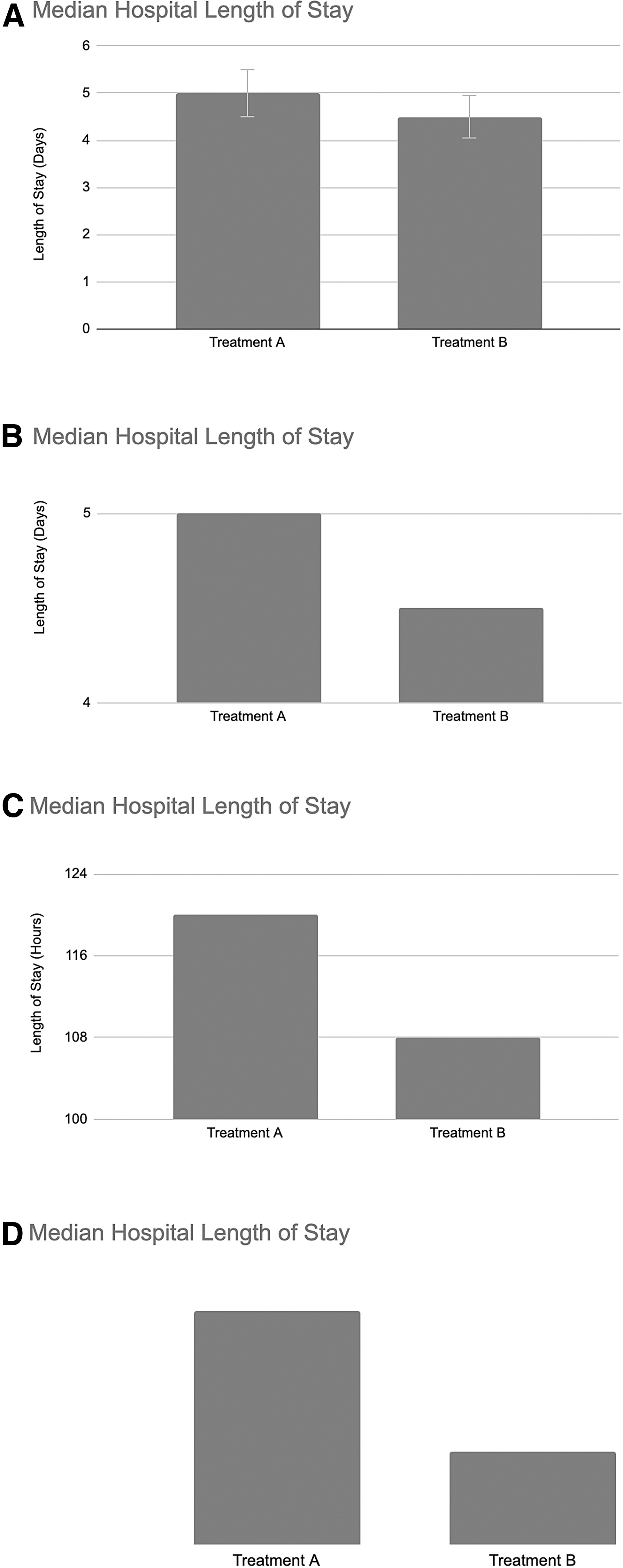
Vertical axes can be manipulated to convey different messages or support an argument. (
By truncating the vertical axis on the graph (and omitting the error bars), as depicted in Figure 2B the message is somewhat different. Here, with a quick glance at the graph one might interpret that treatment B reduced LOS by half. A look at the axes, however, still reveals the truth, but the intuition comparing the size of the two bars is hard to ignore. Changing the scale of the graph (from days to hours) also obscures the truth somewhat, making the difference between groups seem larger, as seen in Figure 2C. Without labels on the vertical axis (Fig. 2D), the reader is left to make assumptions based on the size relationship between the bars. When reading a graph, it is always important to review the axes on the graph to interpret the data clearly. If any of the above modifications to the vertical axis is present, readers should ask themselves if there is a reason the axes were chosen a certain way [10].
Cumulative graphs
In 2013, Tim Cook of Apple, Inc. famously presented the graph shown in Figure 3A at an Apple event (note the missing vertical axis). At the time, iPhone sales were decreasing with declining market share as competitors phones improved. This graph, however, paints a much more optimistic interpretation of iPhone sales, with constant growth. The fact that it shows cumulative sales over time hides the fact that the slope on the far right side is declining, which reflects the then recent decline in sales [4].

Cumulative graphs. (
As another example, consider the graph (Fig. 3B) from the U.S. Centers for Disease Control and Prevention (CDC), which shows the cumulative total number of coronavirus disease 2019 (COVID-19) cases in the United States as of February 11, 2021. A quick look shows -19 on the rise and out of control. One closer inspection, though, one can see the decreased slope at the far right side of the graph, showing the decreased daily incidence of new infections. And in fact, the daily infection rate at this time is significantly decreased, as shown in Figure 3C. Cumulative graphs are a way of obscuring the data that are actually of interest. It adds to the sum total, making the small incremental changes less significant [4].
Three-dimensional pie charts
Pie charts are best used to represent the constituent parts of a whole group. There are unfortunately several small modifications to pie charts that can alter the message. The first is the units used on the pie chart. Any proportion can be used to show the relationship between slices: a percentage, fraction, or ratio. Numbers that describe amounts, however, should not be used. Additionally, the percentages in a pie chart need to add to 100%. This seems obvious, but small groups that are outliers are often left out for convenience. This alters the size of the remaining slices, changing the interpretation of the chart. Three-dimensional pie charts can be used to change the reader's perception of the data. In a three-dimensional pie chart, the bottom slice looks larger because it also includes the edge of the pie, making that piece look proportionally larger and more important (Fig. 4A and 4B) [10].

Pie charts can be altered to emphasize certain portions. (
Stacked graphs
Stacked line graphs can also obscure the truth in the data. Because the area under each line is cumulative, each individual component has a different baseline value [4,10]. Consider the following three examples of the same data depicting the incidence of ventilator-associated pneumonia (VAP), catheter-associated urinary tract infection (CAUTI), and central line-associated blood stream infection (CLABSI) over four months in an ICU. In the stacked line graph (Fig. 5A), it is difficult to discern that the VAP rate has stayed the same, and that the CAUTI rate actually continued to decline in August. In the stacked bar graph (Fig. 5B), it is easier to see that the VAP rate is constant, but it is still difficult to tell that the incidence of CAUTI has decreased, or by how much. The clustered bar graph (Fig. 5C) clearly demonstrates the trends for each of the infections. By grouping collective data in different ways, a different message can be emphasized, or data can be obscured. Stacked graphs should be avoided when possible. Clustered graphs clearly show trends in data alongside one another [10].
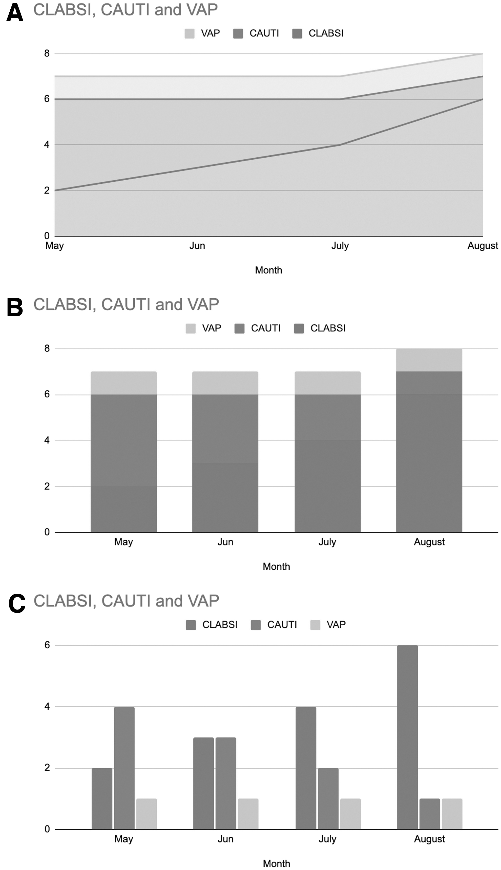
Stacked and clustered graphs can influence the reader's interpretation of the data. (
Conclusions
We have described several of the common pitfalls in the reporting and interpretation of statistics and figures in the literature. In many scenarios (especially those involving non-parametric data), the median should be used in place of the mean to summarize a data set. Although still prevalent, p values are being used more and more in conjunction with a confidence interval. Confidence intervals should be used in lieu of a p value when possible, because they add information regarding the sample size, accuracy, and power of the study in question. When considering the results of a study, one should always try to determine if the sample size was sufficient, because an underpowered study is at risk of false-negatives as well as false-positives. Correlation does not imply causation, which is especially important to remember for non-randomized study designs, which comprise the vast majority of scientific literature. Data dredging introduces unknown and unintentional bias that is impossible to account for. Spin, whether intentional or unintentional, is extremely prevalent and has been shown to influence a reader's understanding of the study. Last, constructing graphs and figures adds another potential opportunity to introduce bias, and the careful reader must review the axes and consider any other graphic complexity or manipulation that obscures the truth in the data. The tests used in the medical literature continue to change and evolve, usually for the better. With these changes, there will certainly be opportunities to introduce unintentional bias. The more aware we are of this, the more likely we are to find it and correct it.
Footnotes
Funding Information
No funding was provided for this work.
Author Disclosure Statement
No competing financial interests exist.