
Abstract
Clear, reliable and communicative icons, central to navigation in ship–bridges, rely on the International Electrotechnical Commission (IEC) 62288 guidelines. This contrasts with uses of technical, industry icon guidance standards and prototypical icon alternatives in Interaction Design. This article explores how guidance on standardised navigation icons for common function controls in IEC 62288 may limit icon development. Following review of related research and analysis of existing professional icon guidelines, conceptual icon design prototypes from Interaction Design are presented to offer prospective and communicatively centred contributions to icon standards. The study is located within qualitative, situated inquiry and Research through Design methodologies in Human–Computer Interaction encompassing conceptual design prototyping and visual design methods. Comparative analysis is made of established icon standard forms and proposed alternatives from the maritime interaction design OpenBridge project. Key findings include identifying that current guidance frameworks for navigational icons contain semantic gaps for interaction designing and operational usage; applicability of a proposed framework enhancing communicativity in icon design and standardisation; and qualitative contribution of a prototype Icon Library to navigation icon designing. Implications for navigation icon design and standardisation processes via conceptual prototype design are discussed as in need of further user study and uptake in the sector.
Keywords
Introduction
Positioning icon design and ship–bridge interface research
Safe and efficient maritime navigation depends on the careful, communicative design of the ship–bridge systems and interfaces and related icons. Research into the iconography in maritime interfaces 1 has often understandably been concerned with safety criticality and usability. Related studies have been conducted with reference to key guideline frameworks, such as the International Electrotechnical Commission (IEC) 62288. 2 Analysis of navigation icon design, predominantly centred in user studies and in conformance with formal guidelines, is important for understanding ship–bridge interactions and their wider roles in systemic maritime communication, on ship and on land. The design of navigation icons often focusses on micro symbolic aspects of ship–bridge interfaces when, in effect, icon design is fundamental to multiple, intersecting and essential aspects of maritime communication.
There is little detailed analysis of the span of design needed in the development of maritime navigation icons, including reflexive research from Design Studies, that ranges from ideational conceptual work via iterative prototyping that draws on situated and contextual expertise of designers, mariners and researchers, through to user testing and study in dynamic use contexts.
Research in Human–Computer Interaction (HCI) recognises that each of these aspects contributes, separately and together, to shaping wider, connected, reliable and communicative interactions. 3 Today's interaction design methodologies and methods are seen to need a span of linked expertise and exchange in linked aspects and phases of building design-informed interaction systems and interfaces. In an HCI frame, this entails the interplay of professional practice and qualitative design-based inquiry, which is informed by contexts of use and complements empiricist usability studies.
Currently, a gap exists in maritime navigation research between professional graphic and interaction design practices and expertise concerning graphical user interface (GUI) standards, components and the current design of icons. Such redesign also needs to be both situated in and informed through professional and academic graphic, visual and communication design expertise, rigour and practice. The interaction designing and researching of maritime navigation icons face several challenges that need to be more fully articulated and addressed for design-based expertise and research to be realised. These matters need to be acknowledged and unpacked in terms of three linked aspects: how current regulatory guidelines constrain views on navigation icon design and inputs from qualitative interaction design; ways graphic aspects of icon design may be understood, redesigned and designed anew; how communication design aspects of icon design may contribute to the needs of communicability, effective operations and safety criticality.
Overall, there are opportunities for maritime icon design to be more fully elaborated in design terms in which expertise, gleaned through usability studies and validated through user testing, may also be informed through ideational, prototyping and graphic communicative aspects of qualitative material and relational design and research. 4 These are accepted approaches within HCI that is wary of falling into user determinism 5 at the cost of close textual and communicative analysis.
Several complex challenges and needs face the contemporary design of maritime icons. First, current icon guidelines lack critical analysis of the graphic and visual design characteristics and qualities they embody and promote. Textual, content analysis is needed to examine the design components and quality of existing icons in terms of their continued effective communicability, matters of redesign and the need for new icon designs. Such close analysis and related proposals for further design and use-based analysis need to be more elaborately framed in interaction communication design terms. Second, navigation icon design aligned with prevailing guidelines has not adapted to the needs of modern user interface development established in HCI. Nor has it taken up interaction design industry practices in icon and interface design, such as Google's Material Design (GMD) Guidelines (Google LLC, n.d-a). 6 Third, mismatches also arise where normative icon guidelines do not align with contemporary design work that already treats icons as modular interface components. 7 ; 8 Fourth, research into visual and communicative aspects of navigation and maritime icon design is in need of further development. Close analysis of icon prototype design may be understood in terms of making conceptual and communicative resources for elaborating on the mediated meaning-making icons contribute to in maritime navigation. Such focus may then inform and enrich potential uptake, uses and subsequent user-informed analyses.
Digital information and interaction design has changed ship–bridges and systems design from stand-alone items to distributive interactional interfaces encompassing multimodal interfaces and safety critical and operational design. Today, it is informed by a transdisciplinary mix of expertise from mariners to naval architects, by way of usability specialists and a diversity of design skills and inquiry in a rapidly changing industry and research environment. Maritime navigation icons are central to the entire operations of ships and to the sector; they undeniably deserve close, situated design critical analysis together with conceptual and heuristic qualitative studies as HCI contributions to linking expertise in icon design, development and standardisation.
Research focus
Analytical framing
In a qualitative approach to maritime interaction design of navigation icons, the research frames and examines conceptual and communicative relations between existing formalist maritime guidance frameworks and the design and analysis of conceptual icon prototypes. The article presents a semantic-centred and interaction design situated heuristic complement to prevailing standards for maritime navigation control icons. The main questions addressed are: In what ways does normative guidance on standardised navigation icons for common function controls presented in IEC 62288 pose limitations to the development of ship–bridge interfaces informed by contemporary Interaction Design? How may navigation icon prototypes offer complements and alternatives to existing practices and conventions?
Analytically, the study investigates visual, communicative and multimodal navigational icon forms in an interaction design frame 9 situated within the field of maritime interface design. 7 ; 10 It does so as a mode of analysing relations between prevailing regulatory, industry-infused icon guidelines and ways the design conceptual and ideational form-giving of propositional icons may contribute to ongoing expertise and development of icon regulatory standards. Close, contrastive study of icons, given and prospective, is conducted concerning existing regulatory guides and forms. This is extended to experimental, prospective and prototypical icons emerging from a maritime interaction design practice and research lab. Through visual semiotic iconic analysis of illustrative prototype exemplars – informed by interaction design industry practices and guides – the study proposes a communicatively oriented framework for further analysis.
Research design and methods
In terms of research design, this research is the first stage of a three-phase study into maritime navigation icon design in the research project Designing for Rich Multimodal Interaction Design Systems within the portfolio of research projects of the Ocean Industries Concept Lab (OICL) in Norway. Part 2 of the study examines semiotic and visual communication analysis of selected prototype navigational icons. Part 3 focuses on user responses to prototypes and to their potential contribution to communicatively oriented processes of navigation icons standards development.
Methodologically, we adopt qualitative and design research methods (e.g., 11 in tandem with Research through Design (RtD; e.g., 12 . We do so to draw out nuanced, graphic and multimodal communication interaction design perspectives on existing navigation icon design guidelines and illustrative icons together with conceptual and ideational icon prototypes. This includes: (1) identifying core features of given current regulatory guides and employs close visual and communicative analysis to address their status and constraints; (2) using graphic and visual design analysis to examine exemplars of contrasting icons translated from the regulatory guides, and then offers exemplars of prototype icon adaptations; and (3) enacting close visual analysis of new prototype icons to raise matters for qualitative design recommendations for icon standard specification.
The study takes up close design-based events and developmental design work, and evaluative responses to it through the Figma platform for collaborative online open design and communication. In addition to a set of comparative tables in the article, an online Appendix includes 48 open-access exemplars of icons for further consideration and redesign through user studies.
The article seeks to open up a space for the wider study of navigation icons. It does so through examining existing frameworks, via close analysis of the guidelines, together with qualitatively framed visual analysis of design prototypes.
Summary of findings
The study resulted in three main findings: (1) Bridging the Gaps Between Design Standardisation and Technological Advancements; (2) Specific Challenges with Design Iconicity; and (3) General Challenges Delimiting Guidance Ubiquity. The findings point to two main aspects for the design of navigation icons: Guidelines-based: Current maritime icon research is guidelines-focused and relies heavily on usability and regulatory compliance. Very limited attention is given to the broader systemic communicative–interactional design of icons. Guidance frameworks are dated in relation to contemporary design-oriented HCI expertise situated in practice-based systemic orientation and maritime interface design methodologies. Design-oriented: Current guidance frameworks under-represent contributions from professional graphic-semantic, visual-semiotic and communicative interaction design practices that might shape these regulatory guidelines and maritime interface standards. Maritime navigation may be enhanced through critical communicative attention to icons as design artefacts that mediate meaning across ship–bridges, and between shore-based and remotely operated interface contexts. These icons may be essential in the designing of multimodal, dynamic and distributed graphical user interface systems.
International standardisation and maritime usability
Several international organisations have contributed to the development of guidelines for information presentation standards on navigation-related equipment displays in the maritime domain. This includes navigation icons, along with associated usability evaluations to promote standardisation and conformity of equipment and ship–bridge interfaces. Amongst them, the International Maritime Organization (IMO) has contributed to the generation of conventions such as Safety of Life at Sea (SOLAS). Chapter V, Regulation 15 (V/15) – Principles relating to bridge design, design and arrangement of navigational systems and equipment and bridge procedures, which has particularly been relevant as a formal guide for conformance. These efforts are supported by the IEC, which provides detailed guidance and testing standards that complement the IMO's performance requirements. An example of this is – IEC 62288 titled Maritime navigation and radiocommunication equipment and systems – Presentation of navigation-related information on shipborne navigational displays – General requirements, methods of testing and required test results. This guidance outlines the presentation of symbols related to navigation indicators, Automatic Identification System (AIS) targets and radar aids. In addition, it is currently used to support the issuance of type approval certificates for navigational instruments. Further, the International Hydrographic Organization (IHO) provides guidance through documents such as the S-52 – Electronic Chart Display and Information Systems (ECDIS) Presentation Library, which outlines specifications for the use of colours and symbols in electronic chart data. Subsequently, developments in the S-100 framework are expected to further enrich layers of maritime information through standardisation of maritime objects using rich data channels in real-time situation support systems. 13
Together, such standards along with their specifications function as a ‘guidance framework’ that supports design and development efforts concerning ship–bridge User Interfaces (UIs). However, this framework remains insufficient as the guidance documents do not cover the full range of design requirements for current GUIs and related icons. Also, this ‘guidance framework’ does not align with other established state-of-the-art interface standards and interaction design principles for visual and action-perception, such as GMD guidelines for interface design. 6 Furthermore, these specifications do not integrate with Web Content Accessibility Guidance (WCAG) 2.1, 14 that are critical for providing accessibility accommodations. While these various specifications may not be formally mandated as de facto requirements for maritime interface design purposes, they are commonly used as normative references for interface design and development in contemporary information technologies concerning ship–bridges.
The current standard for iconography in maritime navigation displays is primarily based on the IEC 62288 and IHO S-52 documents. 15 While these documents provide for standards for icons and cartographic symbols and their colour presentation in Electronic Navigation Charts (ENCs), they do not focus specifically on icons. The documents, however, contribute to the overarching ‘guidance framework’ for presentation of information in ECDIS.
Despite the prevalence of guidance documents, maritime usability studies highlight ongoing issues with information display and user performance. 16 Hareide and Ostnes 17 reported that ECDIS received significant attention but was hard to read due to small fonts and poor placements, identifying design shortcomings in data availability, interaction with elements such as speed logs as well as route monitoring. Danielsen et al. 18 also indicated that there exists suboptimal usability in ship–bridge design and equipment. These usability studies have suggested that the redesign of GUIs should be considered further. This includes recommendations that there is a need for redesigning of critical UI elements in and beyond traditional GUIs, that support higher degrees of shared situational awareness 19 and enhance user's experience and collaboration during maritime operations. 20
Results from these usability studies indicate that while guidance documents exist for designing ship–bridge interfaces, confusion in interfaces and its use exists in navigators, often demanding extra attention and focus on interpreting ECDIS data. These instances indicate that there has been a lack of systematic application and enforcement of SOLAS V/15, which aims at ensuring usability.
Furthermore, the usability evaluation criteria outlined in the IMO's Maritime Safety Committee (MSC), Circular MSC.1/Circ.1609, evaluates icon usability based on four aspects: concreteness, literal representation and complexity, semantic distance and familiarity. In relation to studies using these usability criteria, Vu and Lützhöft 1 point to inconsistencies that exist in guidelines associated with iconography. They found that currently icons do not always convey their intended meanings. Vu and Lützhöft further identified that while certain parts of icons were discernible, others were not, as the icons did not match real-world metaphors, which affected the aspect of concreteness. Additionally, they highlighted that certain parts of some IEC icons increased the visual complexity of understanding the icon but did not necessarily affect overall understanding. Furthermore, certain icons were missing from the guidelines, and in such a situation, an interface design manufacturer has the option to choose an appropriate icon suited to meet missing needs. This has led to inclusion of ‘text labels’ as icons, where icons were missing an appropriate graphical identifier and may have broken the principle of consistency. Lastly, in the study, these researchers observed that certain icons in the guidelines were not identified at all by maritime user representatives. This points to a mismatch between the content of the guidelines and the understanding and recognition of icons in use by mariners.
Beyond icon-based inconsistencies, digital scaling and display variability further complicate standardisation in the sector. Differences in ECDIS aspect ratios, pixel density and screen technologies affect rendering, visibility and visual quality, even when displays comply with standards. 21 Such issues have led to cognitive-perceptual factors being adopted as the primary frameworks in maritime usability studies for evaluation.
A further matter concerns evaluation. Vu 22 suggested that a validation of their usability studies of icons required a summative evaluation of suggested design recommendations using high-fidelity prototypes with sufficient sample users. These suggestions were mostly based on changes in metaphors of the icons for enhanced comprehensibility and not primarily influenced by a design orientation.
The various arguments above suggest that there is an important need to acknowledge a mismatch between the formality of standards-centred specifications of formal, normative guidelines in IEC 62288 and the evolving contexts of ship–bridge interaction design research. These guidelines function as essential checkpoints for ensuring design consistency and operational integrity relating to icons. However, regularly updated guidance documents, that include interaction design-led contributions on icon design and interfaces, could support the inclusion of evolving needs of users and technological developments.
Usability, semantics and aesthetics
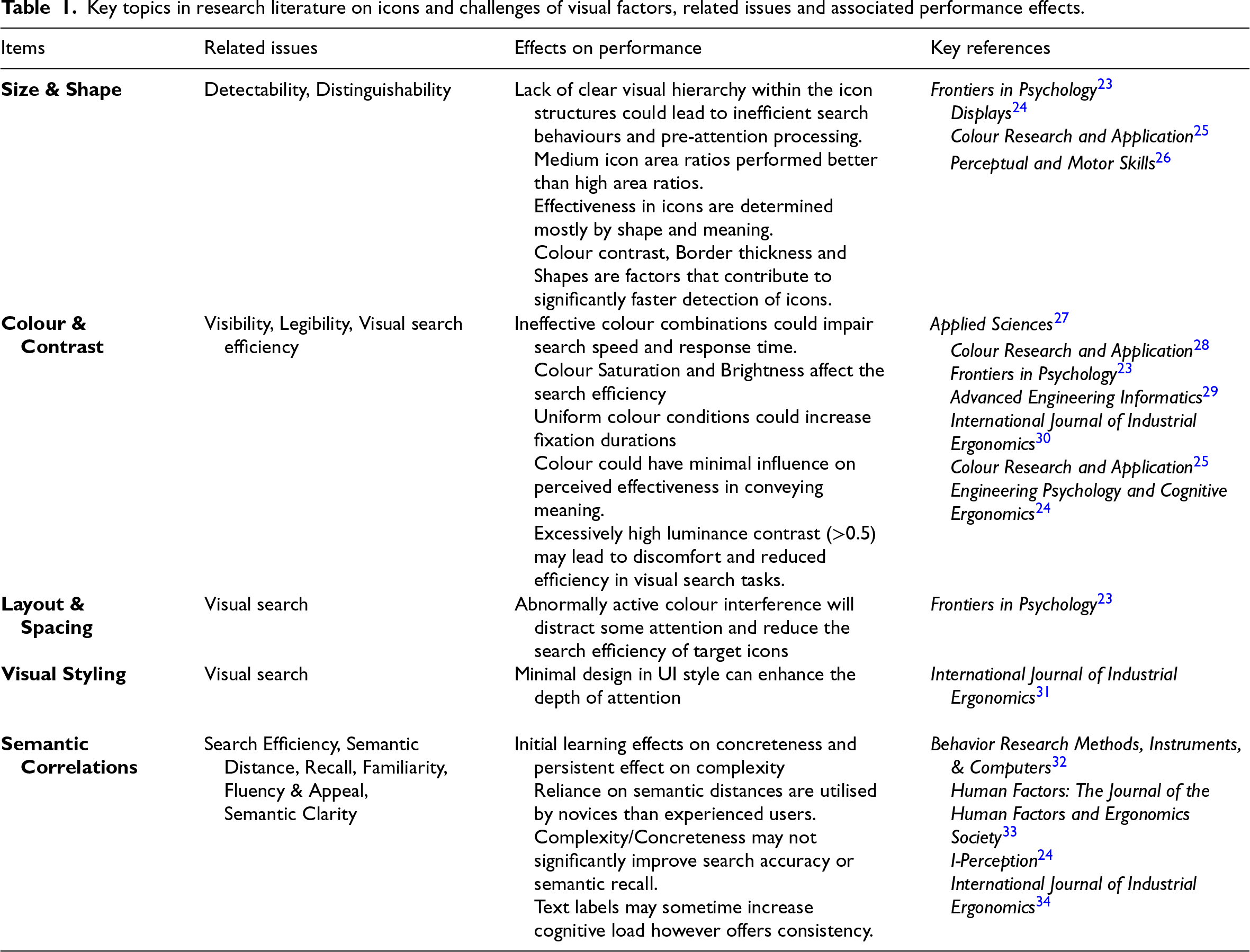
Icon development has been informed by research across disciplines such as HCI, Applied Psychology, Human Factors and Ergonomics and Design Studies. The research has identified a set of intersecting factors, such as aesthetic, perceptual, information and communicative factors. Visual representation of icons – sizing, shape, colour and contrast, layout and spacing – significantly influences human factors issues such as detectability, distinguishability, visibility, legibility, visual search efficiency, meaning and semantic clarity of icons.
Table 1 charts a set of key items from the research literature on icons and related issues to do with visual representation, experiential and associated performance. Next, we go through these items and the listed issues and effects.
Key topics in research literature on icons and challenges of visual factors, related issues and associated performance effects.
Key topics in research literature on icons and challenges of visual factors, related issues and associated performance effects.
Research on icon usability has largely focused on the examination of formal properties shaping visual detection. On the category Size and Shape in Table 1, findings indicate that icon detectability is strongly shaped by formal properties. Visual contrast, hierarchy, area ratio and structural detail affect search efficiency and task performance. 23 , 24 Whether focusing within the anatomical structure of icon or its framing, findings suggest that there might be a strong influence of sizing and shape on the detectability and distinguishability of icons, which makes them an important factor for evaluating and testing icons.
Additionally, concerning Colour and Contrast plays a heightened role in visual search and attention. Variation in screen size, background structure and figure-ground ratios alter visual processing; 35 dark-light polarity increases attention and fixation; 36 and excessive luminance contrast reduces search efficiency and causes discomfort. 24 Collectively, these suggest that colour and contrast operate within perceptual thresholds, where detectability may be calibrated through appropriate visual balance.
Similarly, when refereeing to Layout and spacing, colour configurations condition visual search efficiency. While high contrast can enhance visibility, 26 mis-calibrated saturation, ineffective pairings and excessive salience increase cognitive load and impair performance.23,28
Lastly, studies in association with Stylistic variables indicate that such factors may not uniformly enhance semantic effectiveness when considered in isolation (see29,30 on colour associations; 37 on flat-graphical styling). This variability may reflect the dynamic shifts in strategies during digital interface interaction. 38 Taken together, this suggests that while formal perceptual variables remain structurally consequential for visibility and related performance as foundational determinants of icon performance, a singular framework may not adequately account for the situated dynamics and associated evaluations in operationally constrained maritime interfaces.
In addition to perceptual models, a substantial body of studies foregrounds icon usability, not necessarily benefiting from structural reduction pursued solely for optimisation. These suggest that semantic determinants substantially increase the complexity of icon design and its evaluations. Earlier research indicates that hybrid pictorial-text icons were preferred across domains over purely pictorial and textual forms. 39 Where combinations were not feasible, longer textual abbreviations were favoured. Across related studies, McDougall and colleagues suggested that icon effectiveness is experience-dependent and emerges as an outcome of co-relation between perceptual and semantic variables. 32 Here, variables such as concreteness support only initial learning, 40 semantic distance predicts performance in novice users 33 and familiarity becomes the strongest determinant of efficiency with experience. 41 Other contextual factors, such as feature groupings, further moderate search performance. 42 Such studies indicate that icon effectiveness thus appears less as a fixed attribute of design and more as a relational process shaped through learning and familiarity.
Fluency and Appeal also form a Related Issue Category. Studies have explored the aesthetic and cognitive dimensions, showing that there exists a complex relationship between visual design, cognitive processing and user preferences. 43 In icon processing, McDougall et al. 44 argued that fluency in processing is a critical mechanism for underlying icon appeal. The designs of a previous era may influence user evaluations of icons. 45 Visual design and user cognition are closely intertwined as appeal is influenced by user preferences based on temporal location. Design principles could therefore be adapted for specific contexts, as shown in safety-critical environments such as aircraft functions.
Taken together, the literature reveals a persistent gap between optimisation models grounded in formal properties, semantic-dependent processes and cognitive-aesthetic aspects. This foregrounds the importance of semantic clarity and fluency in meaning construction for icon performance. Experimental studies (see 24 indicate that increased visual complexity or concreteness does not systematically improve search efficiency or semantic recall.
While such findings may not fully capture the realities of maritime environments, they suggest that perceptual elaborations alone cannot function as stable usability determinants, indicating the need for a more design and communicationally integrative approach. As recommended by Silvennoinen and Jokinen, 45 the strategic use of design styles enhancing icon distinguishability that cater to user preference could show positive views on performance in situations where semantic familiarity is low, or the presentation of context is semantically ambiguous.
Within design-oriented HCI research, early works on icon have predominantly used perceptually oriented usefulness and effectivity46–48). This has been supported alongside practice-led design principles and standardised visual symbology. 49 While a foregrounding in structural clarity from perceptual determinants has remained within the field, in visually and communicatively rich interaction design, interaction has been conceptualised as socially and contextually grounded symbolic action. 3
In Design terms, ship–bridge interfaces and their iconographic communicability cannot remain in a specific tradition but extend towards product-system semantics 50 and situated interpretation (see 51 ). From this expanded perspective, icon design extends towards a socially mediated, meaning-centred and collaborative practice embedded within and for distributed computational environments. For maritime icons-based ship–bridge interfaces, this convergence suggests that there is a need for extension towards a communicatively oriented, design-led approach to re-standardisation that integrates perceptual aspects with semantic clarity in maritime-operational contexts.
Methodology and methods
Research design and methodology
Methodologically, the study draws on principles and practices for icon design within the maritime sector in HCI and links these to establish ideation design exploratory practices established in HCI and related Design Studies. 52 The research is positioned within qualitative inquiry and informed by HCI and Social Science research methods as reflexive and recursive activities. 11 It is framed as a mode of situated shaping of knowledge 53 between activities of making and analysing. Close systematic and content analysis of existing icon regulatory frameworks and examples was carried out. Visual research methodologies and methods (e.g., 54 ) were taken up for contrastive analysis of icon exemplars to highlight variation between standard forms and exploratory prototypes. A design experimental methodology was also included that drew on RtD approaches12,55 to shape design-driven conceptual analysis. A situated case study methodology was linked to this, informed by experts in the design and research teams together with inputs from industry specialists and users from related research and public events positioned around societal and industry needs. 56
The research design was constructed to allow for analysis of the two core problematics: limitation of existing regulations and potential of prototype icons. Three interpretative research design frames within a relational design perspective 4 were adopted. These drew on applied qualitative methods from content, visual and communicative research together with transdisciplinary digital design inquiry methods (e.g., 9 ).
The first frame concerns alignment with regulatory guidelines. Here, icons were analysed in terms of visual and graphic content in relation to existing regulatory standards such as IEC 62288 and IHO S-52 to assess interpretability and redundancy of navigational forms and functions. These were compared with industry-oriented options, systematic content analysis was carried out and related to graphic, visual and communication design research and four key aspects for analysis were selected. Visual methods used in HCI 57 were applied to highlight the role of the symbolic and interpretative, semiotic and communicative in the mediated meaning making of icon designing.
The second frame is that of design as inquiry, where observations are drawn from design activity as a situated knowledge creating practice (e.g., 58 ). We focused on the generative and reflective potential of designing as a method, including the expertise of the research team and consultative events (see below), to uncover presentational needs and responses. Here, co-design methods for design and research and prototyping 59 were adopted that drew on situated qualitative inquiry in the work of OpenBridge project's design ecology of industry and research-informed, bottom-up processes of icon design and development.
Third is the use of heuristic qualitative evaluation via design system principles. Here, established design system guidance, such as GMD, was applied to assess consistency in icon construction through prototyping of visual exemplars within the design developmental icon library generated within the OpenBridge system.
A qualitative practice case study approach 60 was selected to provide a methodological and applied research context within which to develop a design-oriented investigation into iconography in maritime user interfaces. An extended case method approach was adopted as it highlights qualitative and ethnographically gleaned knowledge in contexts of design activity 61 that is validated through the interplay of qualitative methods.
The navigation icon case was chosen, firstly, to critically examine the visual, structural and semantical coherence of the existing icons in the standard. The aim was to offer a design-led critique of structure and alignment with operational requirements, situating the study within a framework of regulated GUI design. Secondly, the case was set up to enhance understanding and specific expertise on what navigational standards icons in the maritime are conceptualised currently and how one might do the same, generatively and in bottom-up processes, with advanced design expertise from interaction design. The case was also chosen to further identify possible icon alternatives to meet the requests of members of our maritime design research and professional consortium who have struggled with icon guidelines in their work on digital user interfaces. Evaluation of the IEC 62288 icons was conducted through an open community-based process that leveraged group evaluation in open seminars attended by industry members and related design-research processes within the icon design-research team, informed by an overarching pragmatist perspective on use.
Context, participation and activities
The study took place within the design research context of the OICL (https://www.aho.no/english/research/groups-and-centres/oicl/) in Norway and related OpenBridge Design System (http://www.openbridge.no). Ocean Industries Concept Lab is committed to developing knowledge that supports user-centred innovation processes in the maritime domain. The lab is rooted in design practices such as industrial, interaction, graphic and service design and collaborates with leading industry actors.
This study is within the OpenBridge open-source design system and guidelines for building safe, efficient and scalable interfaces in maritime and industrial workplaces. The OpenBridge Design System has been developed to realise consistent user interfaces across all systems on a ship and is the first open maritime design system of its kind. It supports the creation of maritime user interfaces and is used widely by designers and developers worldwide. The design system continues to be refined. It includes a wide range of user interface components and design patterns that enable the consistent design of user interfaces informed by the work of professional design teams and their expertise, with inputs from industry specialists and work contexts and through applied research that ranges from conceptual ideation to user testing. OpenBridge is also an online collaborative tool that is built on the application Figma.
OpenBridge has devised an Icon Library (Figure 1) of over 1 800 items. It builds on icon design from GMD as a prescriptive and IT industry best practice guide. OpenBridge describes how to define design icons suitable for the readability of interface components and icons across all screen displays within the ship–bridge and associated interfaces. An exemplar of methods on requirements generation in the lab can be found. 20
The OpenBridge icons section from the Ocean Industries Concept Lab (OICL) online resources, with links to the design and communication platform Figma.
Concerning design and research expertise, the study was carried out by a transdisciplinary team of three researchers and a maritime interaction designer at OICL, with inputs from three other Lab researchers, amounting to a total of 7 experts (5 Norwegian, 2 international; 5 males, 2 females). The four authors have international design and research experience in: distributed interaction and maritime interaction systems design, systemic interaction design in safety-critical situations, user experience research and design, digital media and communication design, futures research and higher education.
Collaboration and participation were central to the study. Two strands of collaboration were intertwined.
The first was close collaboration between the interaction designer in the project and the director of OICL as maritime interaction designer–researcher; the second was collaboration between the three researchers in the study, drawing on their diverse disciplinary expertise concerning qualitative and design-based research methods. In addition to the co-design aspects, collaboration extended to reviewing and responding to comments in Figma within the flow of the work. More pointedly, the key icon designer and OICL leader as designer–researcher presented icon designs to two public industry and research annual events (see below) and elicited professional comments that, with the online tool Figma, were factored into the critical reflexive qualitative designing of the icons. Figma allowed for collaborative editing and visual representation and commentaries in icon design processes and development, within and across the three main parts of the study. Collaborative and distributed, iterative research writing was central, along with critical reviewing by the designer and an external HCI expert.
Data gathering, generation, analysis and evaluation were part of the three main parts of the study.
Part 1: Identify and analyse given guides and visualise these
Data was collected in the form of visual representations of navigation control icons from E.3. to E.10 annex in the IEC 62288 guide. A selection of these icons is shown in Table 5 that also contains related Symbol Names and Reference Numbers from the IHO S-52 guide. The data in the IEC document was transcribed in the OpenBridge design system and discussed in project meetings in a collaborative setting with consortium members. Transcriptions of the IEC 62288 guide were done in conjunction with the sorting criteria shown below to establish and identify the visual, functional and visual form-based shortcomings of the suggested icons. This was executed to ascertain their translability and transferability into a contemporary design system for application in interaction design practice. The data was cross-supported with screenshots from the IEC and IHO standards. Analysis and evaluation of the data were based on design heuristics using expert design judgements, reflections and related collaborative analyses. 62
Participant observation by one of the interaction design research authors was undertaken throughout the development of the process from a technical design expertise perspective. This was done to draw on the holistic design-driven expert knowledge that bridges practical needs, aesthetic and functional form-based coherencies and regulatory demands. Further, these observations were utilised to draw on generalisable patterns for occurrences that largely form the morphology of issue that transpose the standards in forms of annotations. These observations drew on the intermediate-level knowledge that the designers used to execute the essentials of such a formal analysis. The data collection process helped in documenting the participant reflections in the form of design rationale, criticism and commentary online and open for open commentary by the associated specialist networks.
Part 2: Conversion of givens, adaptations
Conversion of given icon specifications to accommodate guides from industry was carried out by the icon designer. Design expertise in graphical–interactional and multimodal form provided an important qualitative base for assessing the match and mismatch between the two differing guideline approaches. This worked in concurrence with knowledge drawn from framework-agnostic UI web components, front-end frameworking and back-end architectures. This enabled design visualising and associating with code-based structure (markup languages), styling (CSS) and applicable interactivity (JavaScript).
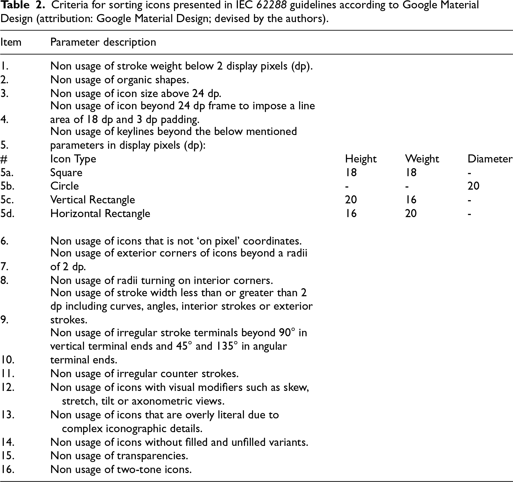
Collaborative design sessions in online tools enhanced the process with comments from an open design and technical community (see Part 3). The related issues from the IEC 62288 document and the findings of the study were also discussed with a technical expert on digital cartography, representative on technical committees in international standardising processes. The expert clarified that there are overlaps of symbols in hydrographic standards and icons in the ECDIS. Criteria for sorting data were based on principles drawn from GMD framework for iconography design (Table 2), along with general user interface design principles and accessibility accommodations drawn from WCAG 2.1 (Table 3). The criteria and sorting were decided by two interaction design researchers in the study.
Criteria for sorting icons presented in IEC 62288 guidelines according to Google Material Design (attribution: Google Material Design; devised by the authors).
Criteria for sorting icons presented in IEC 62288 guidelines according to Google Material Design (attribution: Google Material Design; devised by the authors).
Parameters for sorting IEC 62288 icons according to Web Content Accessibility Guidelines (WCAG) 2.1. (Based on: Web Content Accessibility Guidelines (WCAG) 2.1. Devised by the authors).
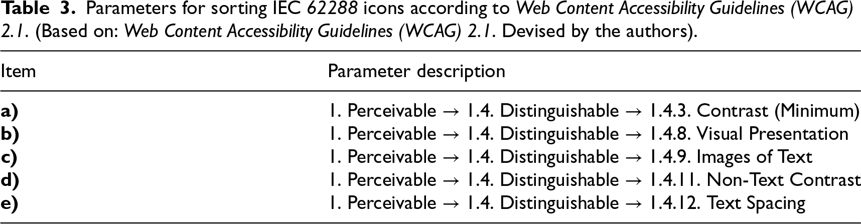
Table 2 shows nuanced visual details and coherence of graphical form through 16 parameters for which short descriptions are listed. These parameters were used as a reference to build visual coherence in the proposals for redesigned icons for modern interfaces. Table 3 depicts parameters for sorting derived from WCAG's perceivable and distinguishable principles. The sorting was also used to assess the salvageability of icons in the existing standards. Using criteria such as clarity, coherence and consistency, icons were evaluated as to which could be meaningfully retained, which required changes and which might not work.
Contextual qualitative inquiry validation was adopted as well as category-based analysis, as a mode of affinity mapping. 63 Validation was also supported with close and expert reading by the design research team and via expert contributions on gathered empirical material, akin to axial mapping in qualitative research in design-oriented HCI studies. 64
The icon-conversion process was facilitated through three intersecting activities: organised participatory workshops hosted by OICL, in related research seminars, and via active online platform communication. Prior to the study, regular monthly consultation and communication with maritime subject matter experts across Lab projects had taken place on icon design for maritime use; these had been a major part of building the design–research expertise between the designer and OICL designer–researcher that was central to this inquiry. This contributing knowledge was activated by the study's researchers and designer to identify interpretive gaps in the iconography guidelines and conduct related affinity mappings.
The study drew on two key shared and integrative annual events in 2024 and 2025, supported by an open platform design development and the Figma communication platform. The events included three members of the author team (the designer, OICL director–researcher and interaction design researcher), and 35 industry and research participants at each event. Demographically, this formed a community of Lab-related developers, maritime experts, mariners, industry collaborators and researchers as well as representatives of approval organisations.
Comments were filtered into Figma as needed in and after the events, as were observations on the discussion into icon design by the designer and lab leader. Source files of OpenBridge-supported work in the project were made available for all participants as well as to a mailing list of 140 members, including 35 companies and the wider OICL research consortium of international research and industry partners.
Altogether, insights from these sessions, drawn from observations, notes and recordings and debriefings, were then taken into design–research meetings, collaborative design work sessions and iterative internal reviewing by the design–research team over a period of six years. Icon qualitative evaluation was also anchored in the expertise, and practical action that the team and participants brought through their embodied practice in related fieldwork, visits, consultations and professional experiences of icon use as dynamic semiotic resources. 65
These relations built well established as productive qualitative feedback mechanisms as part of the wider OICL approach and helped guide the icon adaptations. Industry and regulatory OICL partners and participants to the events and Figma space were means of quality controlling that the icons would meet industry needs and professional, graphic and informational as well as communicability. Figma facilitated several related aspects: the prototyping of icons, version control and real-time collaboration between the design team and other stakeholders, allowing for rapid iterations and adjustments based on feedback. The tool's dynamic features made it possible to efficiently align the design with stakeholder expectations already established in related studies in OICL.8,66,67
Analysis of guides and framings
Issues with existing guides
Several issues arose in the research to do with the existing guides. These were: (1) Specific form and colour lineage are derived from the guide, (2) The inclusion of icons with similarity to cartographic symbols, (3) Unclear identification of what is a symbol and an icon, and (4) Ways visuals are represented as icons in the iconography guide do not provide clear visual affordances. These issues have not been clearly identified in previous research literature and offer a group of key aspects for further design and analysis. Specific form and colour lineage are derived from the guide
The IEC document has icon colours derived from S-52. This gives colour codes for cartographic presentation. The IEC guideline assigns colour to the icon. This can create an issue in contemporary UI design, which separates icon shape creation from colour assignment. The assigning of colour may be dependent on both cartographic functions and interface functionality. There might be issues that colour presentation in the icons is not within accessibility accommodations used for contrast perception. The inclusion of icons with similarity to cartographic symbols
The iconographic symbology of IEC is derived from cartographic symbols from S-52. Cartographic symbols are descriptors of objects in charts, while icons are objects in a user interface. Table 4 shows the overlaps of descriptors and icon associations. The left column shows icons from IEC 62288 Table E.6, showing control of chart display functions. The E.6 Table is chosen because it shows all the cartographic symbols that the IEC uses from the IHO S-52 presentation standard. The right-hand column shows the Symbol Names and Reference Numbers from the IHO S-52.
List of navigation icons from IEC 62288 with symbol codes from IHO S-52.
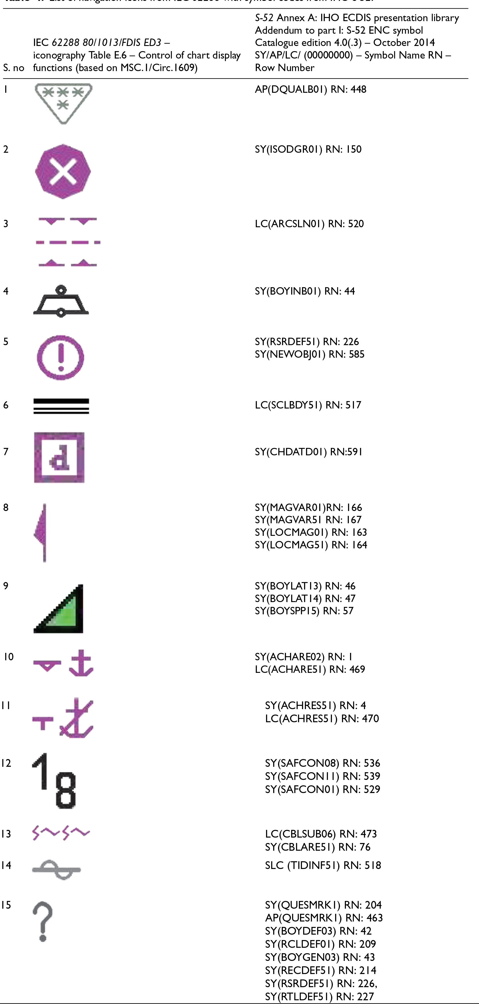
Having studied 538 descriptor diagrams, an important point arises. The IEC guide uses the term icons for visual icons, and the term symbols to refer to icons in the table. Further, in the IHO guide, the terms Symbol and Symbol Name are used to refer to descriptor diagrams in the ‘S-52 ENC Symbol Catalogue – Paper Based Description of Symbols for Use on ECDIS’.
Table 4 does not present a graphic representation of descriptor diagrams from IHO as these in fact have two distinct layers in reference to colour values and multiple instances of colouration. In terms of interface, this can result in the co-appearance of elements that are in the form of both UI icon items and descriptor symbols. The proximity of these two levels of visual representations on an interface may cause potential confusion with navigation and miscommunication. There is then a need to critically evaluate the icons and evaluate some solutions for potential resolutions. Unclear use of terms for symbol and icon
The IEC definition of icons and symbols does not clearly distinguish between terms for symbol and icon. Used interchangeably, this creates potential issues of the design icon and symbol types. Ways visuals are represented as icons in the iconography guide do not provide clear visual affordances
The ways visuals are represented as icons in the iconography guide do not provide clear visual affordances as to how they are to be used. These four key issues provide some of the grounds for the development of a proposed framework for clarifying icon communicability. This is the topic of the next subsection.
To meet the clarity and communicability of icons in interfaces, we drew up a proposed framework for icon standardisation infused with design expertise from interaction design.
A Semantic Framework for Icon Standardization is presented in Table 5. In the Framework, 12 thematic categories are included. These span the range of issues identified in two areas: (1) referring to critical aspects of the iconographic guidance framework derived from IEC 62288 and IHO S-52 guides, and (2) the design of design exemplar responses to those guides to offer improved communicativity. The categories were drawn up to show how design-led inquiry can restructure limitations of given standards and guidelines in a more holistic way. The categories make it possible to more fully discuss challenges associated with practice as well as interpretations of guides. Descriptors are given for each of the categories.
Challenges encountered during the design process included reconciling the IEC icon designs with contemporary UI requirements in the interaction design industry. One major challenge was adapting the icons to ensure visual clarity and scalability across a variety of screen sizes while maintaining their intended meaning. Some icons required significant redesign to align with modern UI standards, while others were completely reimagined via the OpenBridge design project.
The thematic categories in Table 5 are also summarised descriptively. Together, these elements form what we term a Semantic Framework for Icon Standardization. The framework identifies a set of visual and communicative affordances on iconography in ship–bridge interfaces. This points to the underlying expertise required to look at iconographic communication as a human-centred ship-building artefact that aids the development of ship-building progress in contemporary practices.
Analysis of thematic categories in the semantic framework for icon design and standardisation
Orientation
Next, we unpack the dozen thematic categories in the framework through close comparative analysis, including visual icon representation and text descriptions. We show examples of icon/symbol from the framework derived from IEC 62288 and IHO S-52 and relations to S-100 and compare it with the prevalent iconography guidelines that are available for developing modern information technology (IT) systems.
In covering the 12 items in the Framework, we draw on the work of the OpenBridge project. The OpenBridge Design System guidelines use the base icon size of 24px, where each icon has a 22px grid with a 2px safe frame. The main visual weight of the icon is placed within the frame filling the square so as to avoid long or high icons, following GMD's principles for iconography adhering to material symbols, which could be used to create icons as fonts designed for direct CSS customisability through WOFF2, WOFF fonts instead of just Scaler Vector Graphics (SVGs). In this system, icons are placed within 24px in a reference size for 75 cm reading as recommended by IEC 62288 guidance.
While there might be strict protocols for testing of designed GUIs, in-situ workplaces or in testing labs and/or simulators, form-giving of these interfaces may not be executed on an active Integrated Navigation System hardware and thus evaluation during form-giving is captured and presented. Interaction design practitioners have used a standard workplace system for the purpose of form giving, and the same systems were used in this study. Design heuristics for icons are used, some of which could be understood as follows: (a) icons representing a referent should be as accurate as possible, (b) icons should be distinguishable from each other, (c) icons should follow a consistent visual style and (d) icons as a whole should remain legible even in their minimum size.
For each instance of the 12 exemplars in the Semantic Framework for Icon Standardization, we pinpoint specific limitations of the iconography guidelines as specified in E.3–E.10 in the IEC 62288 guidelines. We then indicate implications for usage and adoption, and we make links to related research.
Analysis of exemplars
Lack of visual feature differentiation
In Table E.10 – Groups of functions (based on MSC.1/Circ.1609), the gear pictogram is used as a settings icon and appears consistently in depicting Radar Settings, Chart Settings, Trial Setting and TGT setting. As shown in Figure 2, it is shown that all four unique icons use the same pictogram, with the only differentiating factor in the icons being the text below in which in a 24px space appear extremely small. This could possibly cause confusion amongst the users as to which setting is where and which setting icon corresponds to which setting function. This makes a dependency on reading the text below the gear pictogram, which is another separate ‘programmable’ object ‘label’. This could also be seen as breaking the standard GUI convention, as one cannot determine where the touch area is anymore. This raises the issue as to whether it is an icon with a label or a label icon. Differentiating visual features may assist in overcoming redundancies in understanding the functional referent rather than the visual one, as noted by McDougall et al. 42 For icons and navigation, there is potential value here in that distinctions of anticipatory action affordances in system settings are needed to support interpretability. Navigationally, this matters as it concerns which referent does what in a scenario where scales of movement, from hand to vessel, matter.

Setting icons from table E.10 – groups of functions in IEC 62288.
Certain icons, as shown in Figure 3, are overloaded with details that attempt to explain the icon's referent, interrupting rapid and continuous representation. 32 However, these icons may be difficult to interpret in a short time. Intricate features may require users to spend more time reading included visual details to understand them, making them potentially harder and longer to interpret. More informationally precise referents in an icon may help disambiguate the density of elements and potential unclarity possible through excessive shape detail.

Varied icons from IEC 62288 showing excessive visual details.
Certain icons, as shown in Figure 4, have excessively filled regions, a known issue in graphic design, 68 compared to other icons in the guidance document. On non-OLED or Reflective LCD displays, this might create readability issues for some users, particularly in low-light conditions. Filled regions on such display could be susceptible to emitting more light than compared to the no-fill regions or those with only outlined elements. In matters of visual prominence, focus may be achieved by accentuating outlines rather than allowing distraction from excessive colour fill.

Icons that show excessive fill areas.
The visual merging of multiple objects in icons for ship–bridges has not received coverage in research literature. Certain icons, as shown in Figure 5, contain elements that overlap and blend with each other. This could reduce clarity, as their shapes become ambiguous in the absence of clear figure–ground relations and interference amongst adjacent elements and harder to interpret. 46 Reduction in visual objects could bring visual clarity to interpreting the referent of the icon for the users for the purpose/process of use. 49 This theme of visual merging of multiple objects in icons could be important for further inquiry into clarity of navigation.

Icons that show visual merging of elements.
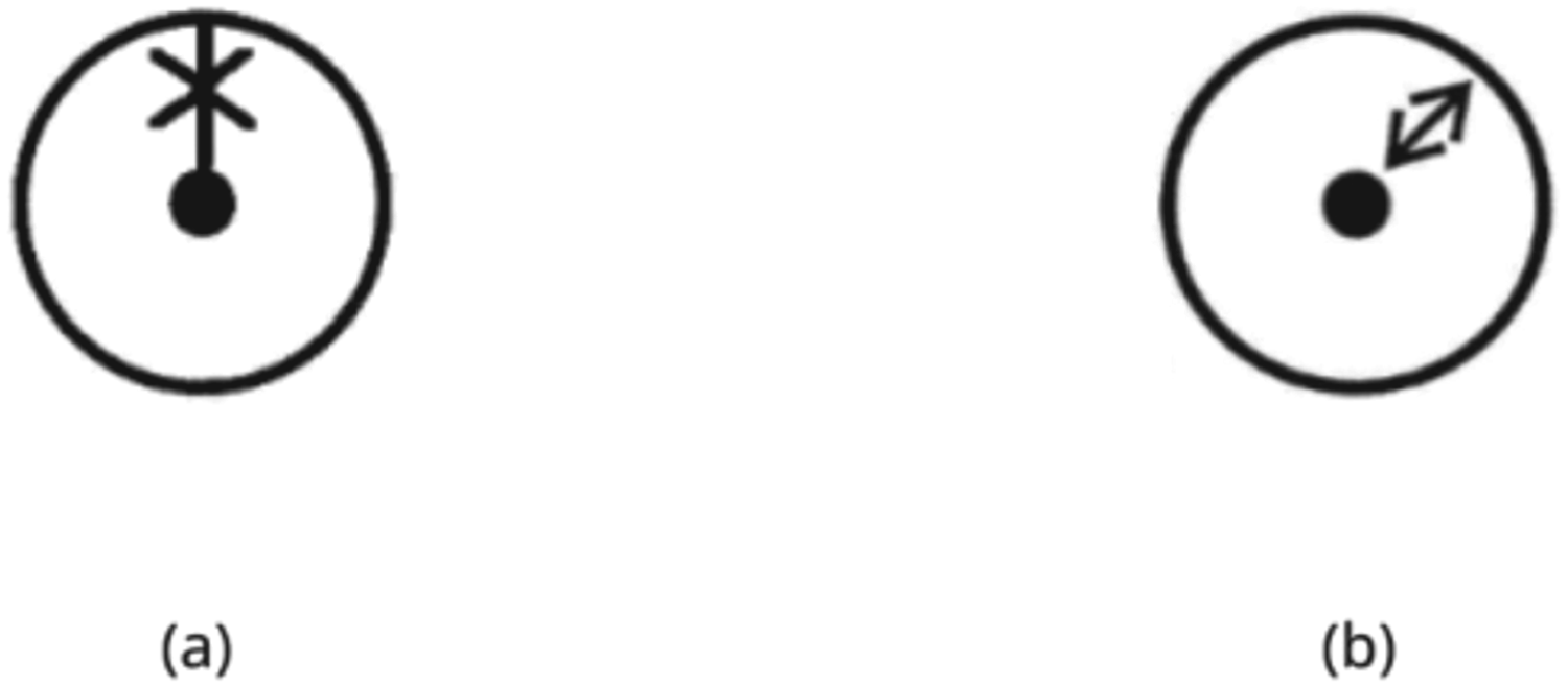
Icons that do not provide sufficient visual space for the main referent.
Certain icons lack sufficient emphasis on the main referent, making it difficult to distinguish them from similar-looking icons. For example, in Figure 6, (a) ‘Heading Line Off’ and (b) ‘Range’ icons are associated with Radar. These icons fail to highlight clearly the primary referent, which is the heading line. This is because the secondary referent, that is, the circular radar element enclosing the heading line, dominates the visual space of the icon and thus replaces emphasis from the primary referent. Paying attention to the specific saliency of sub-referent visually could enhance differentiation without losing group association. Where Vu 22 argues that close association with relatable metaphors matters, the finding here for maritime navigation is that seemingly simple ‘directional’ function icons may need closer attention to a clearer directional referent to avoid compromising navigation.
Too similar visual representation of icons for different functions
Some icons show visual similarity despite serving different functions. For example, in Figure 7, (a) ‘Target Association Priority Radar’ and (b) ‘Target Associating Priority AIS’ are visually similar in formal construction but differ in functionality. The primary distinction is the stroke width of the sub-elements and its alternating variation for the purpose of distinguishability. This may cause issues associated with differentiating between the two icons in certain users. Functional differentiations could be achieved through focus on differentiation of referents, rather than visual grouping mechanisms, together with the focus on the on/off state. The finding here, like the argument made by Vu and Lützhöft 1 concerning differentiation of metaphors in different systems, is that navigation connected to radar targets may be disambiguated from navigation associated with AIS targets through clearer icon symbol distinction.
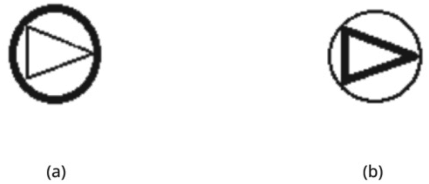
Icons that show similarity in visual sub-elements but are functionally different.
Certain icons contain text as part of the visual composition, as shown in Figure 8, with icons (a) ‘LOP’ and (b) ‘True Relative’. These text elements, positioned alongside graphical sub-elements, are too small to remain legible in a 24px space and cannot be resized adequately within the icon constraints. This can cause issues in clearly reading the text elements that are part of the icon's visual structure. Replacing text as graphics with shapes may enhance legibility. Research mentions that texts as visual icons may be cognitively heavy;49,69 however, they do not talk about the salience aspect associated with it. For navigation control icon design, text may not be relied upon as a primary visual referent at small sizes; instead, graphical cues based on clear, distinct, stable shapes may be appropriately communicative.
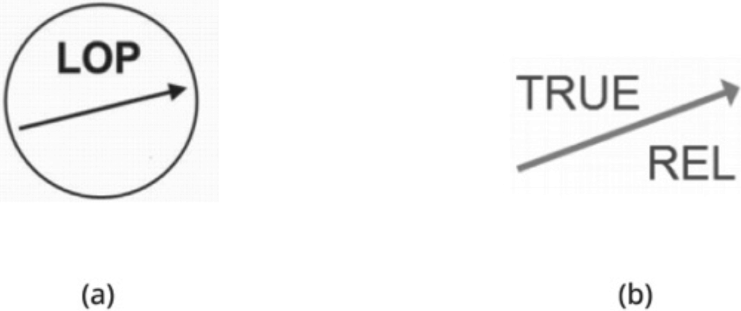
Icons with embedded text showing legibility issues at 24px due to text size constraints within visual structure.
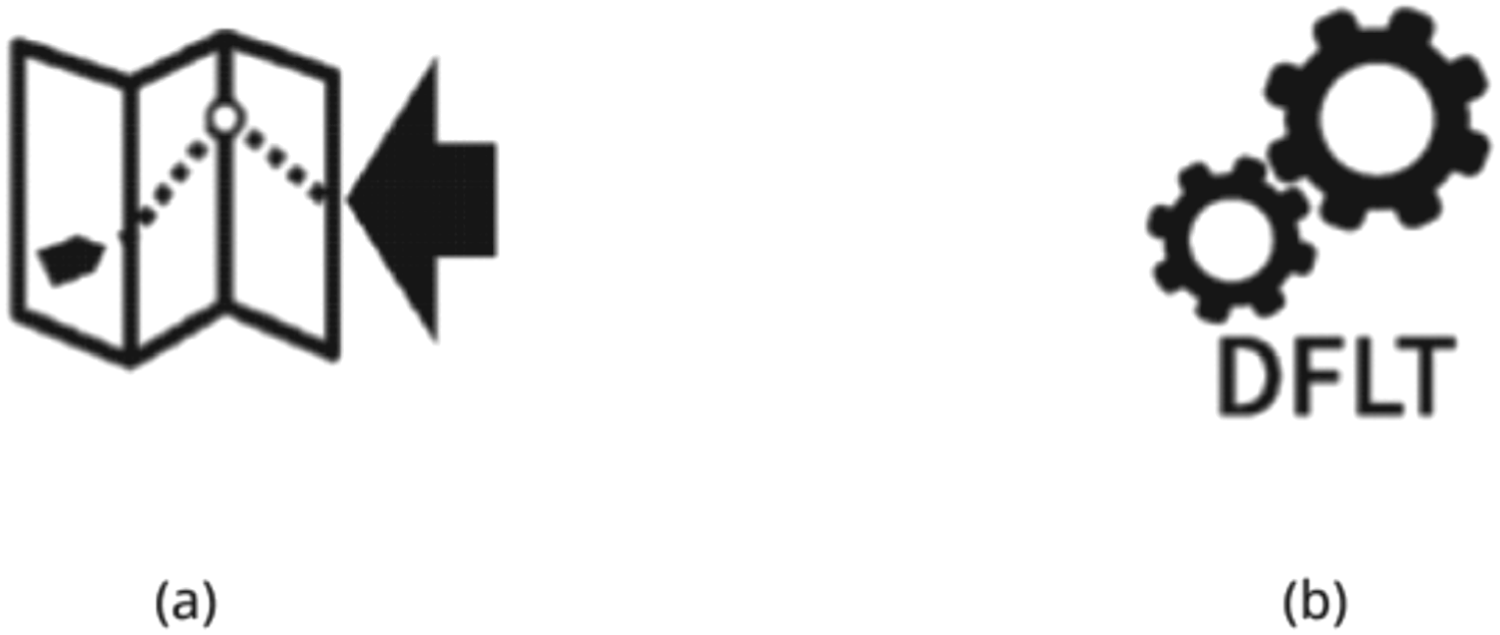
Icons combining several referents through visual elements could become semantically unclear and create clutter by being overloaded, as seen in Figure 9, with icons (a) Import Route and (b) Default Settings. This could challenge user's ability to rapidly interpret the icon as ambiguity arises and undermines the icon's function of presenting information as communicatively precise visual shorthand. Clearer communicability for icons may be arrived at by reducing elements that may complicate the message or add ambiguity. Research on semantic distances has argued that complexity associated with semantic recall and search increases with the volume of referents. 70 For navigation control icon design, this research highlights that the reduction of the multiplicity of referents may enhance semantic precision and directed navigation.
Icons combining multiple referents risking semantic overload and visual clutter.
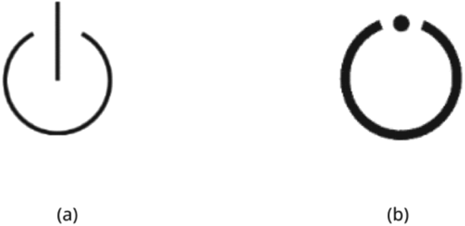
As shown in Figure 10, (a) from E.3 – General Controls and (b) from E.5 – Radar specific controls both contain an icon/symbol labelled as ‘Standby’. These icons are described in E.3 as ‘To identify the standby alternate control or switch and to identify the combined ‘on/off’ plus standby alternate control or switch whereas Table E.5 specifies this symbol for Radar. A radar may use this symbol or the symbol specified in Table E.5.’ whereas in Table E.5 state, ‘To identify the ‘Radar stand-by’ position of the switch and Table E.3 specifies this case for general use. A radar may use this symbol or the symbol specified in Table E.3.’ These two icons, despite being visually distinctive, could possibly create situations of redundancy as they contain the same label (‘Standby’) for both general and radar-specific controls, with overlapping permissions for symbol usage. This dual use without a clear distinction could mislead users about the control's actual function. Conveying core function unambiguously may be achieved through an identifiable icon as opposed to multiple icons confusing similar functionality. We argue that what is potentially new in maritime icon development is that icon functionality and symbol referentiality be rendered isomorphic, so that, as Lützhöft and Nyce 71 argue, metaphors may more precisely support safety in navigation.
Icons sharing the same labels and usage risk confusion despite visual distinction.
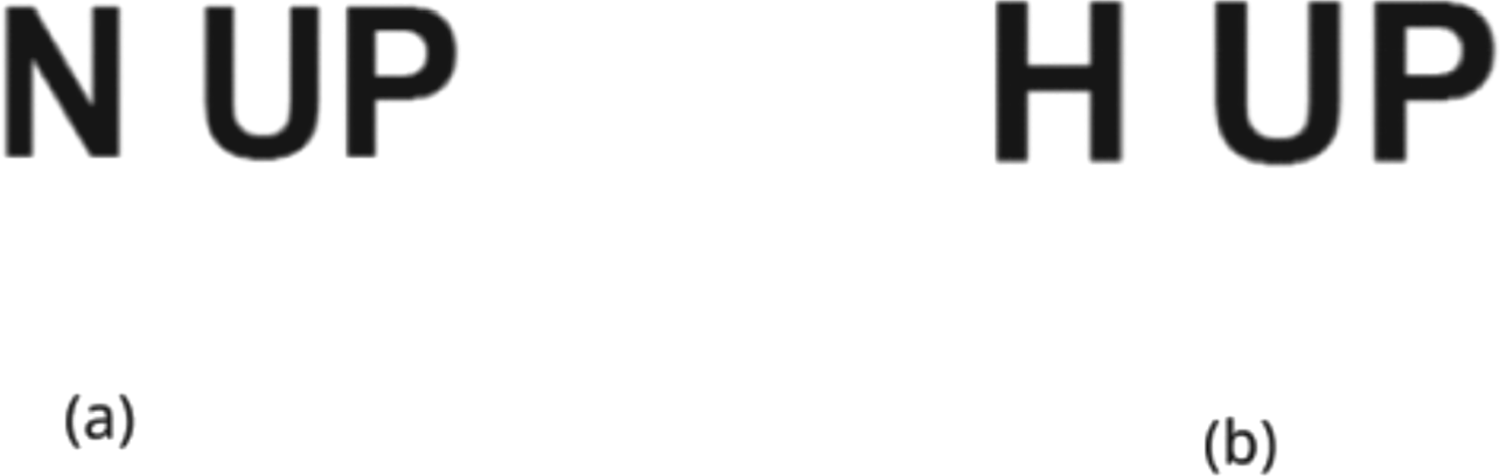
Text-based icons such as ‘N-Up’ and ‘H-Up’ as shown in Figure 11 could be perceived as too similar and hard to differentiate. Similar issues could be found in ‘Tune’ and ‘Gain’ icons as shown in Figure 12. An implication of this is to consider alternative icons to replace these well-known text icons into icon buttons and introduce these as new standards gradually. Consequently, it is important to mark the difference of function by clearly distinguishing the similarity of alphabetic letters. While this may be a known matter for GUI design for movement-associated displays, 48 in this instance, the issue has implications for navigational iconicity. An associated function may be misinterpreted and problematic regarding related motion and directional detectability during rapid shifts in attention.
Icons risking visual similarity and reduced discriminability.
Icons showing reduced internal discriminability and lack of visual cohesion as a functional group.
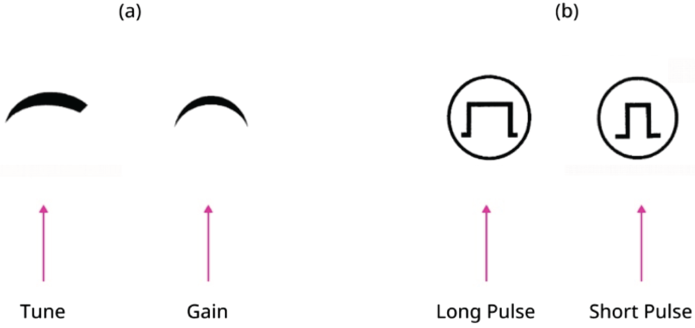
A key issue observed in the icon sets, as illustrated in Figure 12, concerns visual discriminability within and across icon family. In part (a) ‘Tune’ and ‘Gain’ icons lack sufficient visual distinction to be immediately recognised as performing separate functions. This is also perceived for part (b). Conversely, while these two sets (a) and (b) show internal ambiguity, they could be seen as too visually disjointed from one another to function cohesively as a collective grouping of functions. Specifically, this could be observed in ‘pulse’ icon set in (b) which uses prominent circles as motifs that are not present in the ‘tune’ ‘gain’ icon set in (a). This could result in an inconsistent visual language across the control family. By highlighting the difference between visual resemblances and the visual grouping of related functions, it is possible to avoid complications arising with selection in movement when using the interface. McDougall and Isherwood 41 mention concreteness and familiarity of icons when establishing visual concreteness; here, the finding is that more familiarity between icons leads to a reduction in concreteness. For maritime navigation, this may contribute to an increased lag associated with search time. Consequently, increasing concreteness may ensure navigability without delays in search.
Outdated visual metaphors in terms of technological relevance
Certain icons may incorporate outdated metaphors in terms of technological relevance, and this may undermine their effectiveness in contemporary operational situations. This is shown in Figure 13, where icons for (a) Messages (AIS) and (b) Print Screen have referent in earlier print and digital communication, as can be seen in the camera icon in image (b). Here, the icon may be confused as a ‘standard camera’ icon, and for many users, it could represent abstract pictography rather than a metaphor intended to convey an option to take a screenshot. This dissonance between the referent and the icon/symbol 70 could potentially hinder first-time recognition of the purpose of the icon and thus result in possibly delayed response time in use. Messages in AISs need to be communicatively identifiable and unambiguously dispatched and received for the purposeful plotting of vessel traffic.
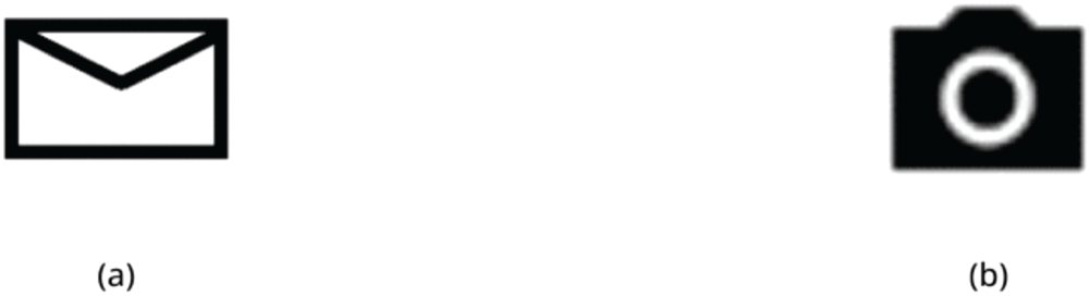
Icons relying on unclear or outdated metaphors risking misinterpretation in a contemporary UI context.
A design informed complement
Based on the issues highlighted above, the OpenBridge project, with its related research and industry-facing projects, has been working to redesign key navigational control icons from IEC 62288, specifically Tables E.3 to E.10. The proposed new icons from OpenBridge are a design contribution to the existing categories and standards in the form of a Design Icon Library. The aim of making these icons and Library has been to offer a design-informed complement to IEC that draws on situated specialist lab and international partnerships – in research, design and industry – to highlight a design-infused expertise view on working with details and communicability of icons and interaction design in the ship–bridge interfaces. It should be noted that the new icons are proposals and are not allowed for use by any conformance authority, nor have they been widely empirically validated. Further understanding of improved icon design, we suggest, may be supported by clearer comparisons of design-based concepts, prototypes and propositions ahead of user testing as shown here. Such work is common in early phase work in developmental design work ahead of contexts of user review and situational validation.
Translation, modification and proposition
Tables in the supplementary material depicts designs developed by OpenBridge in three different categories of translation, modification and proposition. These categories cross seven related tables we have devised. These seven draw on IEC 62288 iconography guidelines and their Navigation Terminology and Icons for Common Function Controls (hot keys and shortcuts) Tables E.3–E.10. The categories we developed are: (1) Direct translation from the original IEC 62288 icon guidelines, (2) Modification of direct translations as icon buttons and icon buttons as labels, and (3) Redesigned and new icon proposals. This demarcation offers a multi-level and communicative approach to icon standardisation for design practice and for future standard development.
In each of the seven tables shown in supplementary material, Column 3 refers to the translation of the IEC icons into usable ones. Column 4 covers modified icons as buttons and icon buttons as labels. Column 3 refers to the translation of the IEC icons into usable ones. Column 4 covers modified icons in which icons with text or text used as graphics are modified to icon buttons and icon buttons with labels. Column 5 contains proposals for completely redesigned icons.
Concerning text icons converted to text buttons, we worked to clarify the potential confusion of using text as icons and replacing them with text buttons to enhance legibility. A total of 31 exemplars is included in supplementary tables, Table 8. Table of icons for general navigation function, Table 10. Table of icons of control of chart display functions, and Table 13. Table of icons of groups of functions.
Referring to icons converted to icon buttons with labels; a total of 11 items were designed to distinguish between existing categories of icon with text labels and text icons. These items are shown in supplementary material, Table 13. Table of icons of group of functions. A total of 52 completely redesigned icons is proposed across all the tables in the supplementary material. These icons are designed to support better communicativity in maritime interfaces. Next, we present one indicative example (Figure 14) of how the content of these three categories was developed. Below, nine icons are shown that have been drawn from different Tables included in supplementary material.
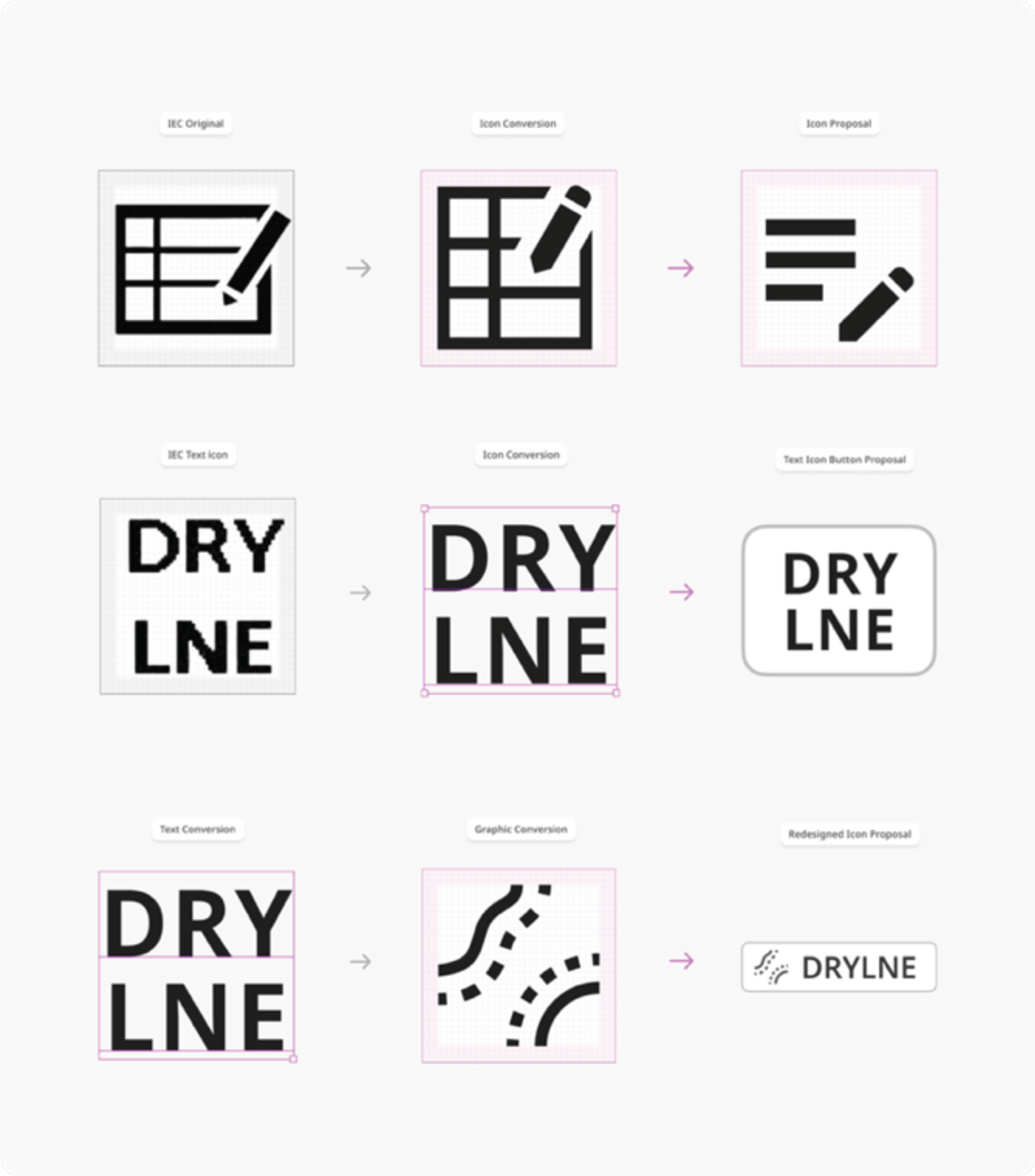
Summary of icon conversion process leading to direct conversions and proposal in the form of redesigned icons, icon buttons and text buttons.
The first row (top) presents an icon called ‘Record Event’. The left-hand image is the IEC original icon; the centre top image is the conversion of that image to a usable 24dp format. The third and right icon is the proposed wholly new one that reduces visual complexity and has the intention of aiding recognition.
In the central section, referring to an icon called ‘Drying Line’ from Table E.6, the left-hand text-based graphic icon is again from the IEC standard. The central icon has been converted from a text-based graphic icon (raster format) to a text-based usable format graphic icon (scalable vector format). To the right is an icon proposal that uses the graphic text icon as a stand-alone text icon button.
In the lower section, the three items are from the set of proposed icons from OpenBridge on the icon ‘Drying Line’. To the left is a graphic text icon. The left-hand image is a direct text conversion icon of a text-based icon graphic. In the centre, we see a graphic conversion of the same icon. To the right is a proposal that incorporates text and icon to form a text icon graphic button. This also shows how the nesting of icons in an interface element as a component is executed.
Despite the advancement of digitisation efforts in the maritime ship-building domain, the development of corresponding graphic interaction design-informed icon standardisation has remained markedly slow. This phenomenon indicates a structural delay between technological development, innovation activity and regulatory adaptation. Further, there is a misalignment of guidance frameworks and standards, including design, in this sector that arises through the inclusion of divergent design philosophies, different visual languages and diverse interaction paradigms leading to inconsistencies that can disrupt work and undermine usability.
OpenBridge has an Icon Library of 1 800 + icons that are functionally designed to suit the requirements for designing maritime graphical user interfaces, which may facilitate human–machine interaction. The Library contains icons designed for the purpose of Maritime system UIs, alerts, automation, weather and environment.
More specifically, the Library has 120+ icons derived from the IEC 62288 guide. From the 120+ icon list, next we show a selection of six items (Figure 15(a) to (f)) that illustrate possible alternatives to the IEC icon categories critiqued above. The selection of six items covers all icon types in the IEC 62288 Guide.
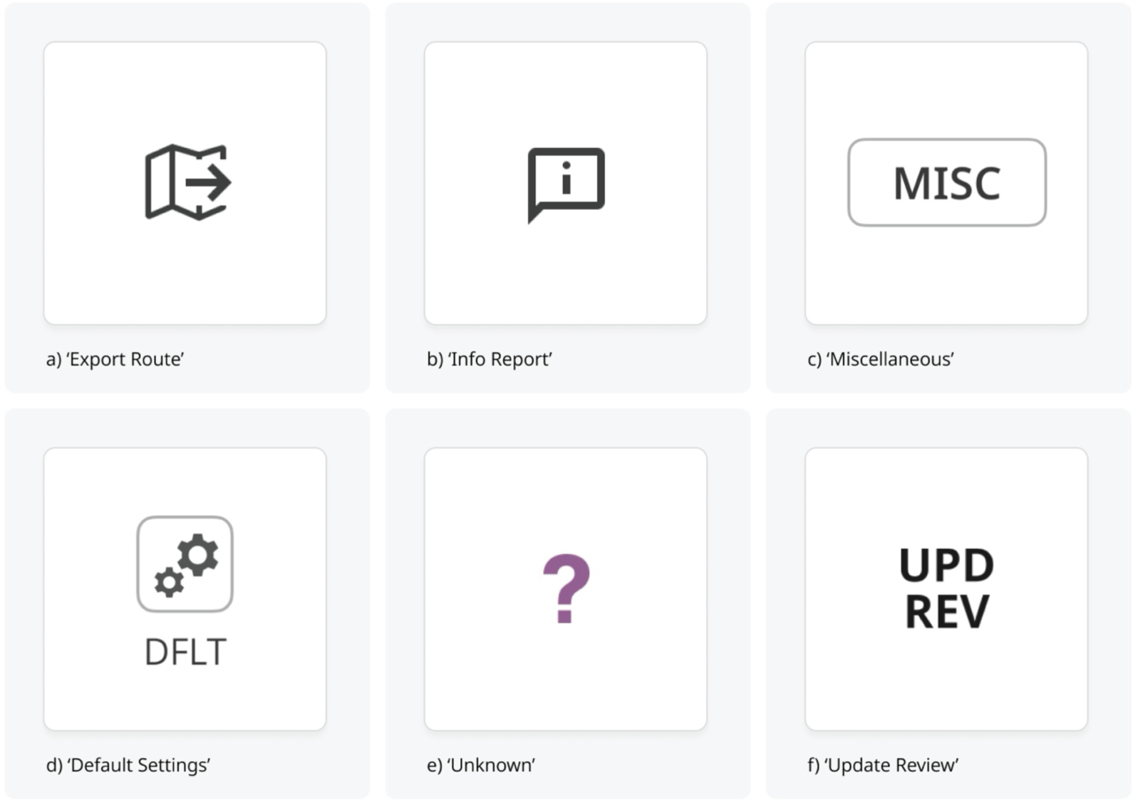
Selected navigational control icon categories from the OpenBridge project (Images a–f, from left to right).
Image (a) indicates the navigation control function ‘Export Route’. This new proposed icon has reduced visual metaphors by the removal of sub-icon parts. This simplification is designed to foreground the navigation function of exporting a predefined route from one system to another.
In image (b), we see the icon called ‘Info Report’. This proposed icon aims to provide information associated with a navigational function. Selecting a navigation icon object may thus be supported informationally by also choosing this icon. Navigationally, it intends to inform situational clarity to a work activity.
Image (c) presents an icon function ‘Miscellaneous’ that signals an option or source for more information concerning control of chart display functions. This icon replaces a ‘text as image icon’ with a button-operated function. This makes a clearer distinction between text in the interface and the functions in the interface. This change is designed to enable the selection of various layers to aid the control of chart-based functions.
In image (d) ‘DFLT’ refers to the navigational function related to ‘Default Settings’. The new design removes the text from the icon boundary which was used as a graphic contribution to the icon design itself. Here, it is converted into a button with a distinct label. In terms of navigation, general navigability of information in the interface concerns the rapid identification of general functions.
With image (e), the navigational challenge is to identify unknown items in the chart functions. The icon labelled ‘Unknown’ is symbolised through a large, coloured question mark. Colour here is dictated by the IHO S-52 symbol guidelines. The icon's legibility is improved by increasing and unifying the thickness of the contour boundaries.
In image (f), the navigational challenge is to highlight an object that has undergone a modification in the display of chart functions. The icon is labelled Update Review ‘UPD REV’ and takes the form of a text icon. The icon aims to update revisions of changes to chart functions. The main change to the IHO S-52 is in font and colour to unify the item with other text-based ones and make this a text button.
Outline of findings
We arrived at two overarching findings – Guidelines-based and Design-oriented (see ‘Introduction’ section) that point to three more specific findings.
The first finding was the identification of recurring issues limiting icon standardisation in ship–bridge interfaces. The second finding was the emergence of a transitional and propositional view on the need for the revision of icon standardisation. This resulted, thirdly, in the design of a proposed Revised Framework for Icon Standardization (see Table 6).
A semantic framework for icon standardisation based on a summary of categories of related design issues on the iconographic guidance framework derived from IEC 62288 and IHO S-52. (Devised by the authors).
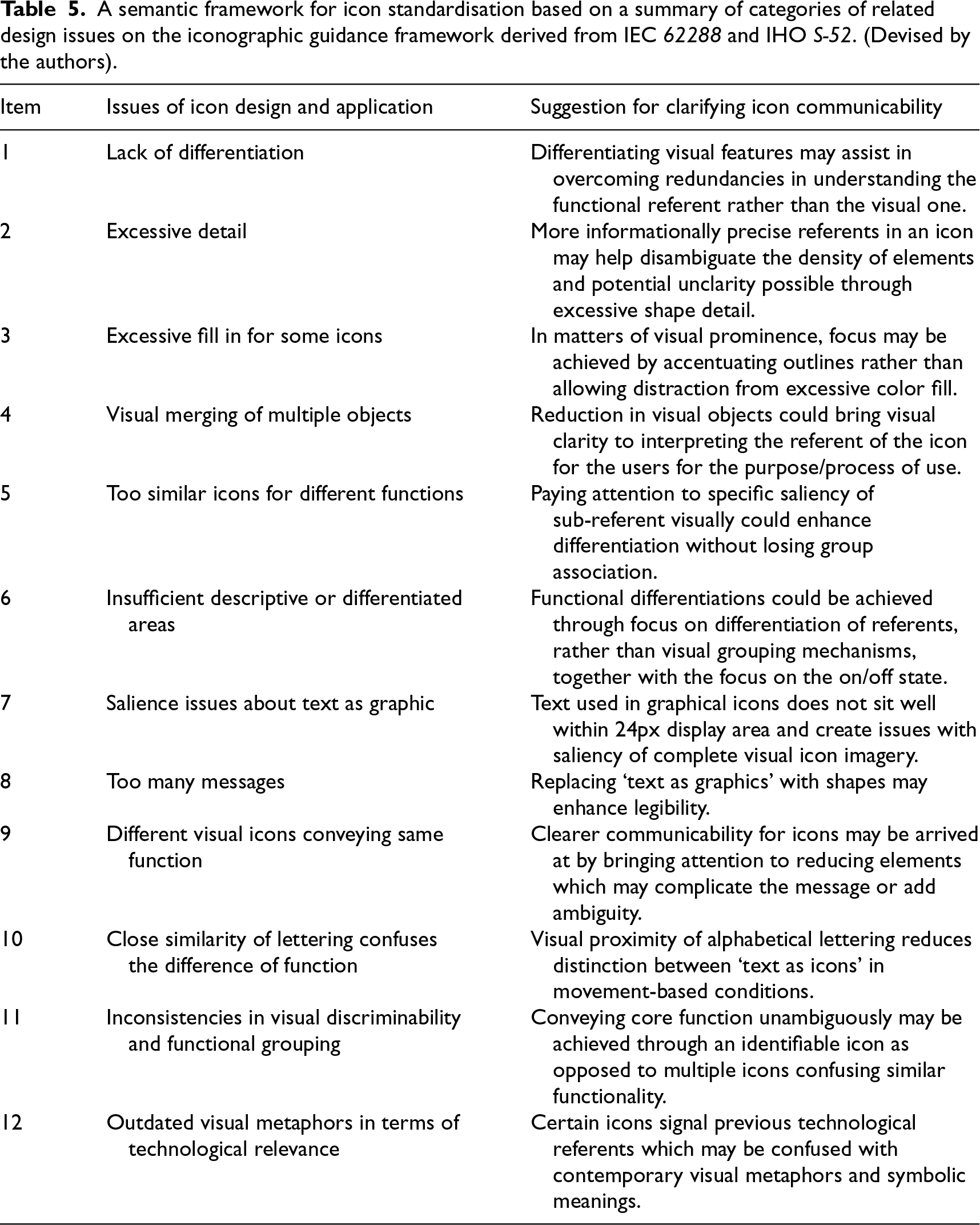
A semantic framework for icon standardisation based on a summary of categories of related design issues on the iconographic guidance framework derived from IEC 62288 and IHO S-52. (Devised by the authors).
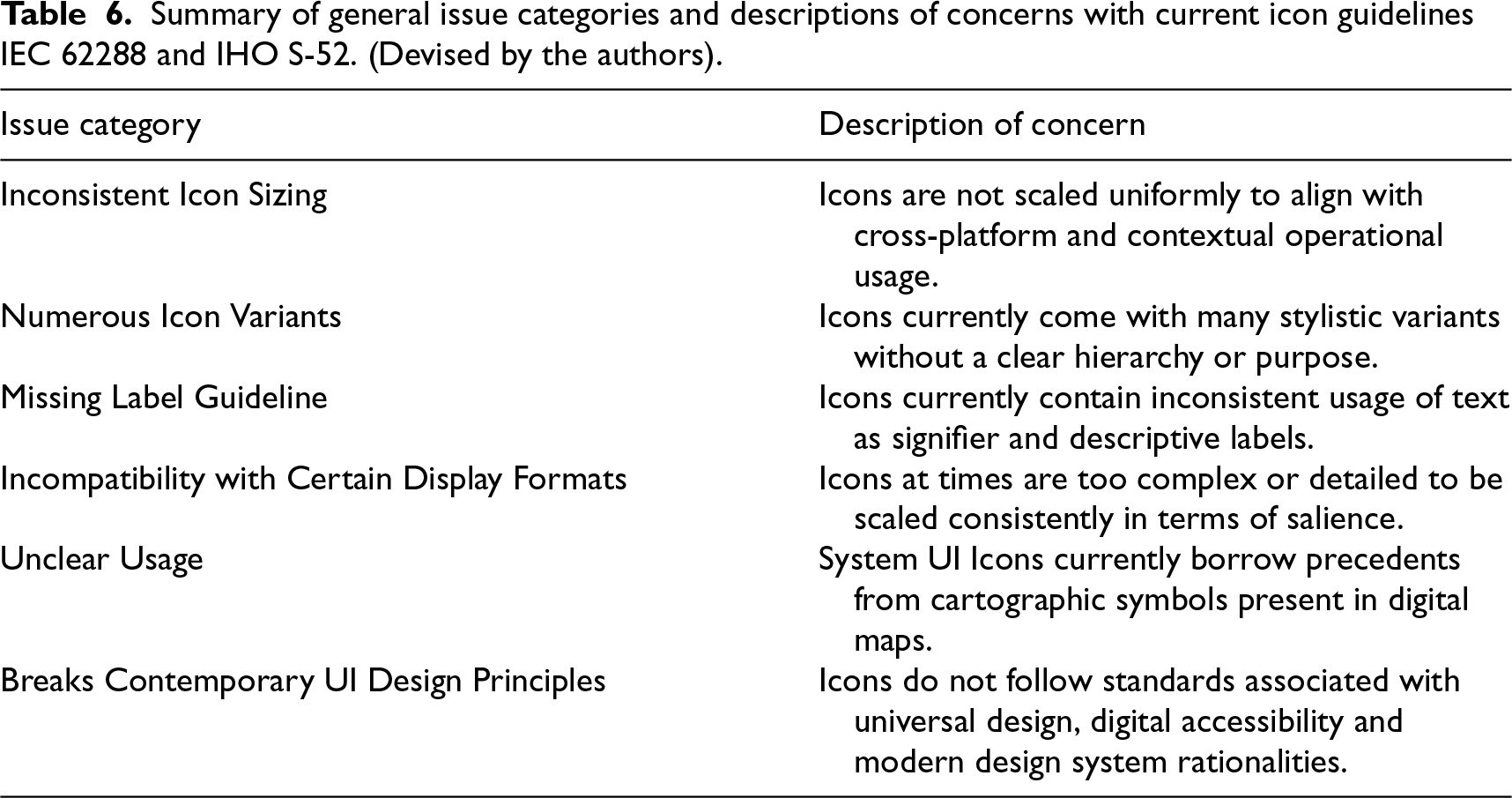
Summary of general issue categories and descriptions of concerns with current icon guidelines IEC 62288 and IHO S-52. (Devised by the authors).
Working through the Framework with these exemplars from OpenBridge project Icon Library, we see that there are issues for consideration in working to complement existing guidance frameworks to do with building further design heuristics in ship–bridge icon design and development. In a wider view, we see that the Icon Library functions as a design prompt for further discussion, user testing and validation in contexts of use.
Research on icons and interfaces on ship–bridges acknowledges the importance of standards and practice. Lützhöft, Grech, and Porathe 72 further argue icons might help declutter UIs through reduction of text and human-centeredness.
Guidance documents may aid specific purposes (such as providing a distinct regulatory and usability assessment framework), and interdependency of guidance document information may be seen as natural in an integrated work. However, these documents often exhibit overlapping and outdated information creating conflicts in application for interaction design, more specifically in GUIs design.
A main finding is current core guidance frameworks for maritime interfaces currently have shortcomings on icon specification. Through design–research-led translations of icons for contemporary interface design systems, supported by comparative document analysis, participant observation and the analysis of case-based artefacts, a set of 12 issues on icon design was drawn up (Table 5). The finding is the offering of a semantic framework for reworking icon specifications and as provisional inputs to icon standardisation. This incorporates concerns about the current icon ‘guidance framework’ derived from IEC 62288 and IHO S-52.
An additional finding is that there is a need to demarcate categories of issues and their content concerns to clarify the mainstream guidelines. Prototypical icon design offers a productive means to arriving at this content. In Table 6, a set of six icon design heuristic categories is shown together with descriptions of their interaction concerns. These offer design-infused material contributions – visual, communicative and technical – to reworking icon design components and related standardisation criteria.
Specific challenges with design iconicity
As currently presented in IEC 62288, amongst specific challenges discussed above is a lack of consistency in iconicity. However, inconsistency may be seen as challenging for interaction icon design as many of the provided icons do not conform with a common size. This impedes functionality to design interfaces with components in addition to visual style, decisions on size and formatting, thereby making it difficult to integrate them with contemporary design systems that support scalable and legible interfaces. 7
We found that navigation icons currently rely on text as graphical sub-elements, either embedded or appended, reducing the immediate recognition as a symbol/icon. This may cause issues such as increased cognitive load among users. 17 Some of these icons/symbols may not meet formal descriptions of an icon, often resembling labels as earlier critiqued by Rogers. 47 These issues of navigational iconicity reflect that there are matters for clarification associated with usability, consistency and semantic clarity.
While it might be difficult to deviate from the IEC standard, we have demonstrated that IEC icons are taken from cartographic symbols and applied as digital UI icons. An associated finding was that there is an overlap of regulatory navigational icons with cartographic symbols, particularly in Table E.6 of IEC 62288. Electronic navigation charts symbols typically represent physical features in a maritime environment, while system user interface icons are mostly intended to communicate system functions. Many of these icons closely resemble chart symbols from the IHO S-52 RNC Presentation library. Drawing on such strong similarity in terms of shape and colour may create two issues for readability. First, there could be a mix-up in colour coding of IHO symbols and system icons. Second, the contrast ratio might be insufficient in certain ambient conditions along with issues originating with similarities creating semantic ambiguity. We found that, for the design of navigational icons, clarification is needed concerning icons, symbols and usage in UIs to support greater clarity in navigating. Currently, there is no regulation regarding this shift; we recommend that these icons be substituted with specialised ones decided after appropriate evaluations.
In addition to these limitations, we also found that inconsistencies in icon distinctiveness and grouping may further complicate the usability of icons. While some icons in IEC 62288 Table E.5 are visually unified through common visual features, others deviate from these features, either by omitting or misusing them to convey the meaning of the icons. This might disrupt the semantic and functional inheritance as has been widely discussed in interaction design. 73 Akin to claims by McDougall and Isherwood, 41 this means that icons within the same functional group should be visually related yet distinguishable in terms of representation of referent function.
A further finding was that the distinguishability of icons may be impacted by changing ambient conditions of luminance and movement for usability. In certain operational conditions, icons emit excessive light, especially in night mode. This has been observed from the inputs from stakeholders who have stated issues with light problems associated with these icons on physical devices. Certain IEC icons in Tables E.3–E.10 may not show considerations for usage in variable lighting conditions and may become visually disruptive; for example, moderately bright icons may appear overly intense due to low background luminance, resulting in glare or discomfort. Contrast perception may not be influenced solely by luminance, but by a combination of factors such as display technology, ambient movement and lighting conditions. Further, perceived contrast across interface solutions may be seen as an emergent requirement as Nordby et al. 20 argue in the context of augmented reality-supported maritime navigation.
General challenges delimiting guidance ubiquity
One of the main guidance limitations of IEC 62288 together with the IMOs MSC.191 is the provision of minimum performance of navigation displays. These performance aspects refer to important features such as minimum resolution, size and graphical quality. These requirements place considerable responsibility for implementation with system manufacturers. Our experience is similar to that of Mallam and Lundh 16 in that designing and building contemporary interfaces largely remains based on document formats that do not support designing for updated technology in ship–bridge interfaces and their icons.
We also found that the current lack of adaptability in the prevailing guidance framework also matters in terms of functional concerns around accessibility. Here, visual sizing and contrast (text and non-text) in the icons may fail to meet certain accommodation requirements as outlined in accessibility conventions such as WCAG 2.1, particularly in terms of distinguishability. As has been noted by Rødseth and Lee 74 concerning common structures for maritime data exchange, a further challenge concerns making guidelines available for diverse and international maritime technology and design fora.
In addition, while the IEC 62288 standard identifies icons as language-independent communication through symbols, we identified that it currently does not provide a consistent visual system and semantic grammar in accordance with clear programmatic definitions of icons as symbols as long discussed in interaction design. 49
Recommendations and directions
To address the above-mentioned issues, a multi-step approach to icon design is recommended. The recommendations are derived from consistent, conceptual and exploratory designs. While there might be issues with cognitive load, the next phase of research evaluates the proposed icons through formal user studies. Three recommendations follow.
First, concerning readability and distinction of navigation icons, some reflection on icon size may be worth further consideration. The existing IEC 62288 guide specifies a 5 mm/m size at a nominal viewing distance at 1 m for the icons which are general symbols. They also give a leeway of size for some symbols of 8.7 mm/m at a nominal viewing distance of 1 m. The IEC also suggests that the text, which also includes letters and numbers, could be greater to or equal to 3.5 mm/m. OpenBridge recommends that all icons could be refurbished to a consistent size more than 3.5 mm/m so that they remain legible.
Second, navigation icons that do not meet the requirements of the proposed Semantic Framework for Icon Standardization may require complete redesign. Text-based icons could be transited to clearly labelled buttons. Icons currently accompanied by text underneath should be converted into icons with integrated labels.
Third, navigation icons that do not adhere to the standard description of an icon should either be removed or be re-designed with appropriate attributes as stated in earlier steps. This is specifically in terms of the System UI icons that have provenance in visual terms, but not in terms of colour codes, from the IHO S-52 and S-100 guidelines. While the study does not advocate for a change in the current standards, that is, IEC 62288, and neither suggests that S-100 overrides IEC 62288, the recommendations certainly could pave the way towards a new icon standard in S-100. More precisely, S-100 should have new guidelines for icons and should not be limited to icons that are currently available but also apply an icon-design framework for new navigation icons. This could be applied where there is also a missing icon guidance document for maritime equipment.
Conclusion
Central to this study has been an exploration of ways core guidelines for navigation control icon standardisation may be more fully understood in the context of ship–bridge interface design. Such work is situated on needs that are based on safety, reliability and communicability for maritime work and operations.
We have addressed what we see as a paradox around relationships of form and standardisation of icons. This sits between the specifications of regulatory agencies and guides and emerging exemplars from design-based generative prototyping. On one hand is the clear and necessary specification for purposes of standardisation, reliability and safety of icon design as in IEC 62288. On the other hand, is the emergent and experimental icon design informed by industry-situated knowledge and exploratory and reflexive practice-based research located in an interaction design research lab.
Through close reference to guidance literature and industry standards for HMI design, we have argued that there is room for contributions from visual dynamics and semiotic modalities of interaction design in HCI. Such contributions to icon design affect the focus on the human in digital and technological interaction. Prior focus on functionality and standardisation has been achieved without addressing the communicative roles of interaction design in HMI design. We argue that this focus and guidance framework has constrained the aesthetic, cognitive and affective dimensions of user interaction and icon design for ship–bridges.
Our research asserts that visual modalities in interaction designing, and in this instance icon design, be understood as dynamic mediators of semantic, behavioural and interpretative interactions and not merely as static representational devices in user interfaces. Attention to granular visual designs that facilitate interactions for complexity-rich workplaces needs to be integrated within broader innovation trajectories and their relation to standardisation processes. These too need to acknowledge that attention to design-orientation in the development of human–machine interface development requires a systemic and integrated approach; this is one that works through visual dynamics, user cognition and interactional aesthetics.
The study identifies that current icons violate multiple design principles and suffer from a lack of applied guidelines. Furthermore, creating additional icons that fall outside of IEC standards is made more difficult by the absence of supporting design guidance to ensure consistency with existing styles. We have demonstrated how to improve these icons through a stepwise process. This includes (1) Unification, which involves moving current icons into the same visual framework, (2) Structural Redefinition, that looks at refining the relationships between icons, buttons and labels and (3) Redesign which is to reimagine icons that severely breach fundamental design principles.
Footnotes
Funding
This research has been conducted under the OpenZero Project, Project #344160, funded by the Norwegian Research Council.
Declaration of conflicting interests
The authors declared no potential conflicts of interest with respect to the research, authorship, and/or publication of this article.