
Abstract
The effects of the Great Recession on housing equity and homeownership have been well-documented. However, we know little about how rental households fared and the efficacy of housing subsidies in addressing affordability gaps. This paper examines the extent to which rental housing became less affordable for Extremely Low-Income (ELI) households – those earning less than 30% of the Area Median Income (AMI). I then run regression models to determine the local characteristics most strongly associated with larger affordability gaps, with a focus on whether housing subsidies are effective at combating such gaps. Rental affordability gaps became more pronounced during the Great Recession. In nearly 70% of the counties in my sample, there was an increase from 2007 to 2010 in the number of ELI households per affordable rental unit. Across the country, the increase was 17%, a dramatic increase in only three years. There is considerable variation across the country, with acute affordability crises often concentrated in the South, particularly Florida. Regression models provide compelling evidence that housing vouchers, public housing, and project-based Section 8 subsidies play an important role in limiting the extent to which large numbers of ELI households are competing for a shortage of low-cost rental units. However, these programmes do not respond quickly to local needs – such as those brought about by the Great Recession. A pilot study where local housing authorities had funding to be more agile and responsive would be an important step toward crafting better policy.
Introduction
The Great Recession caused a substantial upheaval for Americans across the income spectrum. Those with housing equity were hit particularly hard and the declines in housing wealth – particularly between 2007 and 2010 – have been well-documented. What is less discussed is the effects on renters who, on average, experienced declines in income because of massive unemployment. Further, in many markets, the foreclosure and credit crises contributed to increased demand for rental housing, as foreclosed homeowners began to rent and fewer households became homeowners. As a result, renters had more competition for rental housing and less money to pay for it.
This paper analyses the state of rental markets before and after the Great Recession in the USA. Specifically, I examine the extent to which rental housing became less affordable for Extremely Low-Income (ELI) households. ELI households are defined by the US Department of Housing and Urban Development (HUD) as earning less than 30% of the Area Median Income (AMI) and are the primary target population for rental housing subsidy programmes. I then run models to determine the metropolitan area housing market and economic characteristics most strongly associated with larger affordability gaps before and after the Great Recession. Prior research has examined the determinants of metropolitan house prices (Abraham and Hendershott, 1992; Capozza et al., 2002; Goodman, 1988). This paper will identify locations with the starkest rental affordability gaps and whether housing subsidies are effective at reducing such gaps.
Nationwide, it is clear that rental affordability gaps became more pronounced during the Great Recession. In nearly 70% of the 536 largest counties in the country, there was an increase from 2007 to 2010 1 in the number of ELI households per affordable rental unit. Across the country, the increase was 17%, a dramatic increase in only three years.
Not surprisingly, the data show wide variation across the country in housing affordability gaps, but some of this variation comes in unexpected places. Affordability problems were clearly greater along the coasts – particularly in Florida, which has a stronger confluence of poverty and high housing costs than virtually anywhere else in the country. But counties and metropolitan areas elsewhere in the South also had very high affordability problems. This is driven in part by the high poverty rates in these areas, but the affordability measures in this paper account for Area Median Income, meaning high poverty rates are not the only factor – housing costs clearly play a role as well.
The measures in this paper are designed to reflect housing subsidy demand – the more households competing for each unit of low-priced rental housing, the greater the demand for housing subsidies. The regression models provide suggestive evidence that public housing and housing vouchers may play a role in reducing the number of ELI households competing for low-cost rental units. In the cross-sectional models, public housing and Section 8 New Construction (2007 and 2010) and vouchers (2010 model only) are strongly associated with lower competition for low-cost housing units for extremely low-income households. Using panel data, housing vouchers have the same association, but not public housing or Section 8 New Construction. I hypothesise that a housing subsidy policy that responded to needs would allow us to more definitively assess the role that these subsidies can play in shielding low-income and extremely low-income households from severe rent burdens.
Housing affordability and the Great Recession
Poverty increased dramatically during the Great Recession. From 2006 to 2010, the number of Americans living in poverty grew 27% (36.5 to 46.2 million), more than eight times the US population increase over that time (Seefeldt and Graham, 2013). Furthermore, the rate of deep poverty – those living in households with incomes below half of the poverty line – was higher in 2010 than in any year since we began collecting the statistic in 1975.
Despite drastic increases in the number of households in poverty, the effects of the Great Recession on housing affordability gaps are not straightforward. First, while large reductions in income reduce the rents that households can afford, poor employment prospects tend to delay household formation. The number of households (owner and renter), and their incomes, help determine demand – and thus price – for housing. Lee and Painter (2013), looking historically at recessions in the USA, find that a 1% increase in the unemployment rate leads to a 1–2% decrease in the probability that an individual will establish a renter household. They find that household formation was particularly low in the most recent recession, when there was almost no growth in the total number of US households from 2008 to 2010, whereas typical growth is 1% per year (Lee and Painter, 2013).
However, although there were fewer households forming, a greater proportion of new and existing households were renters, as the homeownership rate was in decline because of foreclosures, economic uncertainty, and reductions in mortgage credit. Through these forces, the homeownership rate declined to 66.5% in the first quarter of 2011, down from the first quarter 2005 peak of 69.2%. This has continued to decline in recent years, down to 64.4% in the third quarter of 2014 (US Census Bureau, 2014). Correspondingly, the Joint Center for Housing Studies (2011) reported that renter households increased by 3.4 million (roughly 10%) between 2004 and 2009.
On the supply side, the housing boom oversupplied housing in most US markets. And, the Joint Center for Housing Studies (2011) noted that that rental vacancy rates were up as backlogs of multifamily rental developments were completed during and after the Great Recession, leading some to suggest that the Great Recession was good for rental affordability (Capps, 2015). However, although it is true that rental vacancy rates tend to put downward pressure on rents (Gabriel and Nothaft, 2001), it is unclear whether the jump in vacancy rates was high enough (from 9.8% in 2005 to 10.6% by 2009) to substantially affect rental affordability. Furthermore, moving forward from the Great Recession, the difficulty for multifamily developers to obtain financing for rental projects likely slowed the rate of rental construction growth. In fact, the rental vacancy rate has continued to decline since the Great Recession, and in the first quarter of 2016 was at its lowest point since 1986 (US Census Bureau, 2016).
A key reason these supply and demand factors may not have reduced rents is because it is well-known that prices for rental housing are ‘sticky’, meaning we should not expect the cost of rental housing to decline quickly because of market conditions. Ozimek (2013) points to the duration of leases as the culprit, noting that data from the American Housing Survey (AHS) report that leases are for a year or more approximately 45% of the time. Genesove (2003) found using annual AHS data from 1974 to 1981 (the last years for which we have annual AHS data), that 29% of rents failed to change in price from year to year. Ozimek (2013) reports analyses from Bureau of Labor Statistics (BLS) data covering 1998 to 2011 that suggests rents are even stickier – there was a 69% probability of no rent change after six months and a 34% probability of no rent change after two years. Thus, even in times of decreasing housing demand because of lower purchasing power and reduced household formation in most markets, rents are unlikely to decrease enough to affect housing affordability indicators.
Public policy can also have an effect on rental housing affordability, particularly through housing subsidy programmes. However, the three major federal rental housing programmes – Housing Choice Vouchers (HCV), the Low-Income Housing Tax Credit (LIHTC) and Public Housing – are not designed as safety net programmes where benefits and/or coverage increase in times of need. And the fourth programme under investigation in this paper – Section 8 New Construction – has not produced new housing for years. There is no entitlement to housing assistance. On the contrary, construction through the LIHTC – by far the largest programme that subsidises construction of new housing units – slowed during the recession because of the difficulty of finding credit for multifamily development (Joint Center for Housing Studies, 2015). Public housing was also declining in raw numbers over this time period, particularly via the HOPE VI demolition programme (Goetz, 2013). Using HUD data, I calculate that total housing vouchers utilised through the programme increased by a modest 5.3% from 2007 to 2010 (US Department of Housing and Urban Development, 2016c). In other words, these subsidy programmes did not expand to an extent that would stabilise housing costs for low-income and ELI households.
Existing evidence on housing affordability gaps
Given the above discussion on what might happen to housing affordability during recessions, what does available evidence tell us about what did happen during the Great Recession? Initial reports are quite worrisome. The US Department of Housing and Urban Development (2013) summarised data from the American Housing Survey (AHS) and reported that while the growth in the number of households paying more than half of their income to rent largely reflected steady population growth throughout the country, those numbers skyrocketed through the Great Recession. Just over 5 million households had such severe rental burdens in 2003, which increased to nearly 6 million by 2007, but then jumped to nearly 8.5 million by 2011. Thus, while the number of severely rent-burdened households increased 13% in the four years preceding the Great Recession, there was a 44% increase in the subsequent four year period (US Department of Housing and Urban Development, 2013). It is important to note that these are trends in household spending patterns that have been developing for decades – households have been devoting a greater share of their incomes to housing since the 1960s. However, the leap in rent burdens that occurred as a result of the Great Recession was unprecedented.
Kroll (2013) presents post-recession data on housing affordability according to three different measures: ability to purchase a home, share of income spent on housing, and the income residual – the difference between the amount spent on housing and what is left over for spending on all other goods. She found that renters and owners in the USA experienced divergent trends in the proportion of income that is spent on housing. For owners with mortgages, the percent of income spent on housing stayed around 25% nationwide from 2005 to 2011, whereas the renter housing cost proportion increased in 2009, 2010, and 2011 – from roughly 30% to 32%. Furthermore, Kroll finds dramatic increases in the proportion of US renters paying 30% or more of their income for housing. Similarly, Bean (2012) highlights that rents increased (3%) while median rental household income declined (6%) from 2007 to 2010. Bean also reported that from 2007 to 2010, the proportion of households spending 30% or more on rent increased in all four regions of the country and in rural, suburban, and central city areas.
Data from the Joint Center (2013 ) corroborates many of these findings on households paying 30% or more of their income on rent, and provides additional data on severely rent-burdened households (those spending 50% of income or more). They report that from 2000 to 2010, the proportion of severely rent-burdened households rose from 20% to 27% of all renter households, a rapid increase in such a short amount of time. Colburn and Allen (2017) use the Survey of Income and Program Participation (SIPP) and find that the percent of severely rent-burdened households jumped from 23% to 27% from 2005 to 2009. For low-income households, that increase was from 69% to 77%.
MacDonald and Poethig (2014) look at extremely low-income renters (ELI – incomes at or below 30% of the Area Median Income (AMI)). Using data in 2000 and 2012, they conclude that no county in the nation has as enough affordable units to house all of its ELI population.
What can housing subsidies do about affordability?
As noted above, the major housing subsidy programmes – housing vouchers, public housing, LIHTC – are not entitlement programmes. As additional households slip into poverty and qualify by income, more subsidies do not typically become available (although local subsidy numbers are not fixed over time). Furthermore, housing subsidies have limited reach into the low-income population. As of the 2012 ACS, there were 28.3 million households in the bottom three income categories (less than US$25,000) (US Census Bureau, 2014). In comparison, HUD reported 1.1 million active public housing units, 2.2 million housing vouchers, fewer than 800,000 Section 8 New Construction units, and just under 2 million Low-Income Housing Tax Credit (LIHTC) units. 2 There are thus approximately 6 million total subsidies, or less than one for every four lower income households. However, this is an overestimate, as voucher households often live in LIHTC units. In Florida, for example, Williamson et al. (2009) estimate that approximately 16% of the state’s vouchers are used in LIHTC units and that 10% of LIHTC units are paid for using a housing voucher. On the other hand, these subsidies are tremendously important for those that receive them. Horn et al. (2014) estimate that the average voucher household with children has an annual income around US$13,000 and the average value of their housing subsidy is around US$8000 per year. In other words, for participating families with children, these benefits add approximately 60% of post-tax income to the typical budget.
Not only do subsidy programmes fail to respond to national economic conditions, but localities have limited control over housing subsidy budgets, meaning these programmes are not particularly responsive to changes in local housing markets. The size of the public housing and voucher programmes are determined at the federal level by Congressional appropriations to HUD. The allocation of LIHTCs across cities and counties is also formulaic. However, there is substantial variation across metropolitan areas and counties in terms of the proportion of households using housing vouchers and living in public housing. In fact, I calculate that in 2010, just less than 6% of New Orleans MSA households used a housing voucher, compared with less than 1% of households in the Sarasota-Bradenton, FL MSA. Looking at public housing, just under 5% of New York MSA households live in public housing, compared with less than 0.01% of households in the San Jose MSA.
Much of the variation in the public housing programme is due to historical circumstances – the vast majority of public housing was built prior to 1980, and over half was built before 1969 (Orlebeke, 2000; Schwartz, 2010), meaning older metropolitan areas in the Northeast and Midwest built many more public housing units during the mid-20th century than did those in the South and West. The other main factor is the HOPE VI programme, which contributed substantially to the 19% decline in the nation’s public housing stock from 1994 to 2008 (Schwartz, 2010). There was substantial variation in the extent to which HOPE VI affected public housing stock across the country. Goetz (2013) found wide variation across cities – four cities (Hartford, Memphis, St. Petersburg, and Detroit) demolished more than half of their public housing stock from 1990 to 2007 while Providence and New York City demolished less than 1% of their public housing stock during that time.
There are many factors that affect the size of a MSA or county voucher population. First, HOPE VI may again be a factor, given many jurisdictions replace some of these demolished units with vouchers to displaced households. It is also possible that voucher numbers grow through increases in the utilisation rate. There are a number of ways in which utilisation can increase, including better targeting of subsidies to populations that are more likely to use them, the implementation of Source of Income (SOI) laws that prohibit discrimination by landlords against using vouchers to pay for housing, the effectiveness of local housing authorities in connecting voucher holders to housing, and more accessible rental markets. Additionally, housing authorities can decide whether they are going to provide deeper subsidies to fewer households (i.e. the ELI population and poorer) or smaller subsidies to a larger group of households.
We might expect the individual housing subsidy programmes to have differential effects on affordability. O’Regan and Horn (2013) report income levels for all four subsidy groups under examination in this paper – LIHTC, public housing, voucher, and Section 8 New Construction for 18 states for which they could obtain income data on LIHTC households. They find that LIHTC households are less poor than the households receiving the other three subsidies. Specifically, while between 74% (Section 8 NC) and 77% (public housing) of the three non-LIHTC groups had incomes below 30% AMI, only 45% of LIHTC households were this poor. Given these income breakdowns, we might expect public housing, voucher, and Section 8 programmes to have the greatest impact on affordability for ELI households, whereas the LIHTC would be more likely to affect low-income household affordability. It is important to note, lastly, that these effects are not purely mechanical. US$1 of government spending on LIHTC, vouchers, or public housing does not necessarily translate into US$1 less spent by a recipient household on housing. There is strong evidence that LIHTC crowds out private construction (Eriksen and Rosenthal, 2010; Malpezzi and Vandell, 2002) and that housing vouchers may raise the price of housing for the unsubsidised (Eriksen and Ross, 2015; Susin, 2002). Therefore, it remains to be seen how housing subsidies may affect housing affordability.
Data and methods
Using data from the 2007 and 2010 waves of the American Community Survey, I estimate the trends in rental housing affordability for different low-income and extremely low-income households. Specifically, I calculate the number of rental households that earn 30% and 50% of Area Median Income (AMI), common benchmarks for extremely low-income and low-income households, respectively. Then, I match that demand to supply – again using the ACS, I estimate the number of rental units that exist in each market (counties and MSAs) that would be affordable to those households in order to analyse the extent to which each housing market’s rental housing is matched to its rental population in terms of affordability. 3
My sample is each county and MSA with population greater than 100,000. In Table 2a and 2b, I list the counties and MSAs, respectively, that have the greatest and least shortfalls of affordable rental units in 2007 and 2010. For the regression models (results in Tables 3 through 5) I focus on counties, in order to have a richer sample. There are 536 counties in the USA with population greater than 100,000, and my regression sample reduces to 505 in 2007 and 516 in 2010, almost entirely due to missing rental data in the ACS. The vast majority of these counties with missing data were smaller, with population nearer to the 100,000 person threshold. The sample of 536 counties include 240.6 million people, 77% of the US population.
To estimate these models, I add data from HUD’s Picture of Subsidized Households (US Department of Housing and Urban Development, 2016b) to capture the prevalence of housing subsidies in each county. This is a database of reports from local housing authorities to HUD on the number of subsidies under their jurisdiction. This database is regularly updated and includes data across the country since 2000, at levels of geography as small as the census tract and as large as the country as a whole.
I use a number of measures to capture the extent to which a housing market’s renter population is housing cost-burdened. I begin by counting the number of households below 30% and 50% of Area Median Income (AMI) in each county. Then, I calculate the number of rental units in US counties that would be considered affordable to those households. To do so, I use common thresholds of rent burden (30% of income) and severe rent burden (50% of income), and produce four separate measures of the affordable housing stock:
Rental units below 30% of income for ELI households (earning 30% AMI or less).
Rental units below 50% of income for ELI households.
Rental units below 30% of income for low-income households (earning 50% AMI or less).
Rental units below 50% of income for low-income households.
I use these measures, rather than the proportion that households actually pay for rent, for two reasons. First, these measures allow me to observe the full menu of options available to households, rather than the choices they actually make. This way, I am identifying what the market is providing, rather than adding potential noise coming from variation across areas in what people choose to spend. Second, the ACS breaks down rental housing costs as a percent of household income using only seven income categories, whereas I have 11 income categories when looking at the entire population of renters. This allows me to more precisely estimate the numbers of households below 30% and 50% AMI.
For each housing market (county and MSA), I calculate the ratio between the number of households in each AMI category (30% and 50%) and the number of units below each threshold, to identify the number of households that exist per each unit that those households can theoretically afford. I compute each of these values in 2007 and 2010, and then calculate the change between those years, to see what markets had the greatest increases in rent burdens.
Using these variables, I estimate a set of regression models that identify the housing and demographic characteristics of counties – with particular attention to housing subsidies – that are most strongly associated with higher rent burdens before and after the Great Recession. These are OLS models that take the following form:
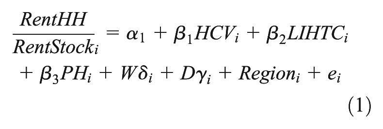
where
Cross-sectional models may be unable to control for historical factors that might lead to both a higher prevalence of subsidies and greater numbers of low- and extremely low-income households or higher rental housing costs. For example, as noted, public housing is disproportionately located in older counties, which often also have higher poverty rates (though perhaps lower housing costs). Further, the presence of public housing and other subsidies in a city itself could attract low-income households from neighbouring jurisdictions. This is an important factor when considering whether the observed relationships in this paper are indeed causal. To the extent that low-income households move to jurisdictions with greater subsidy availability (or leave jurisdictions with less availability), this would create a two-way relationship between housing subsidies and competition for low-cost rental housing. In a cross-sectional model, we would thus be more likely – all else equal – to see a positive relationship between housing subsidy prevalence and the competition for low-cost housing. In other words, we would be more likely to conclude that housing subsidies make housing less affordable. Annual data can limit the extent that this is a problem, as we have little reason to believe that low-income households are able to anticipate year-on-year reductions in the availability of housing subsidies fast enough to make a move that would show up in the data. However, households may respond to increased housing affordability and poverty problems by being more likely to use the subsidies that they are granted. To the extent this occurs, this would capture an important role that housing subsidies can play – hardship leads to increased uptake of the subsidy, which then reduces hardship.
Furthermore, while localities have limited resources to increase housing subsidies in response to housing market conditions on an annual basis, they may be able to influence HUD to provide additional funds or subsidies over a longer time horizon. Given these historical factors that may lead to spurious correlations, longitudinal data improves our ability to isolate the effects of housing subsidy programmes on affordability. Accordingly, I construct a panel data set annually for the years 2005 to 2012. I focus on this time period both to include years before, during, and after the Great Recession and because the ACS begins providing annual estimates in 2005. Using these data, I run a set of fixed effects regression models that control for time-invariant characteristics of counties in addition to the above demographic and housing variables also measured annually, excluding the foreclosure rate and regulatory index variables, as those are only available in one year. With annual data, we can be more confident that observed effects are due to actual impacts that housing subsidies are having on housing affordability, and not the other way around. These models offer a more robust specification of the relationship between housing subsidies and affordability.
The best argument that a relationship between housing subsidy prevalence and affordability using annual data is likely causal is that – as noted – counties do not have much control over the size of their subsidy portfolios from year to year. However, to the extent that counties and housing authorities can make these changes, this would bias toward a positive relationship between subsidy numbers and affordability problems. However, housing authorities can tweak the number of households served (which I can measure) by making the average subsidy more or less generous (which I cannot measure). In some communities, for example, growing problems with homelessness and deep poverty may lead housing authorities to provide larger subsidies to a smaller group of households. To the extent this occurred, this could bias toward a negative relationship between subsidy numbers and affordability problems.
Results
Table 1 displays descriptive statistics for selected variables for the 536 counties with 2005 population greater than 100,000. In 2007, the average county had 2.9 ELI households per rental unit that would consume 30% or less of the income of those households. In other words, for every rental unit that would be deemed affordable to an ELI household there are nearly three households competing for that housing unit. In 2010, that number climbed to 3.3 households per unit.
Descriptive statistics for the 536 largest counties.

For low-income renter households (incomes less than 50% AMI), there were 1.2 households per rental unit at a 30% income threshold, and that ratio held steady (1.3) between 2007 and 2010. Looking at the 50% income threshold, there were just slightly more rental units at or below these price thresholds for both populations – those earning less than 30% and 50% AMI. In 2007, there were 0.7 ELI households for each rental unit priced below a 50% income threshold for that population, which held steady (0.8 households per unit) in 2010. In the average county, we could thus expect that a unit below that 50% threshold would exist for each household. However, that is a very high threshold that does not leave much income for transportation, food, child care, and the myriad other expenses that they face.
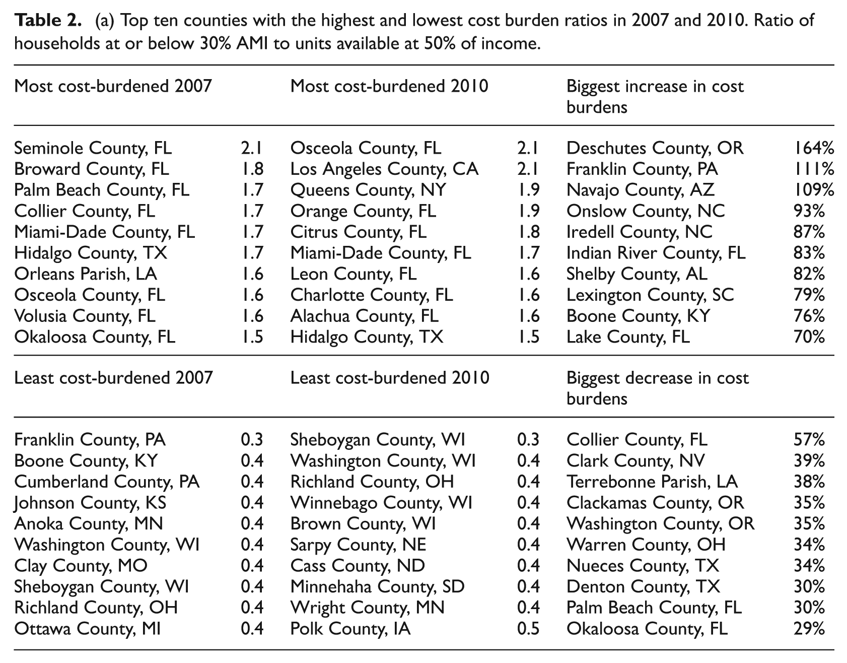
The wide differences between rent burdens across the country are displayed in Table 2. Here, I list the top ten MSAs and counties with the highest and lowest rent burden ratios in 2007 and 2010, along with the top ten in terms of greatest increase and decrease in rent burden ratios. Table 2a lists the counties and 2b lists the MSAs. In Figure 1, I provide a map to better visualise the concentration of high cost-burdened counties across the country.
(a) Top ten counties with the highest and lowest cost burden ratios in 2007 and 2010. Ratio of households at or below 30% AMI to units available at 50% of income.
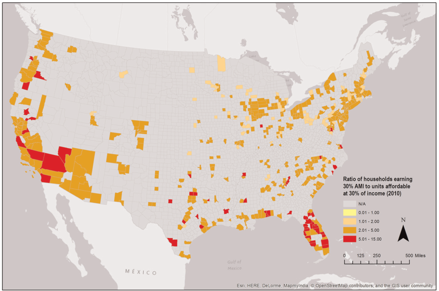
Map of 536 US counties: Ratio of households earning 30% AMI to units affordable at 30% of income (2010).
The differences between the least and most affordable counties and MSAs are quite large. In the least affordable markets, there are about 1.5 to 2 ELI rental households competing for a unit that costs half their household income. In the most affordable markets, that ratio is flipped – there are over 2 units available (albeit at a high-budget cost threshold) for each ELI rental household.
Many high housing-cost-burdened MSAs and counties are in the parts of the country where we would expect them to be – along the coasts and in areas of high poverty. The counties with the highest ratio of rental ELI households to rental units available at 50% or lower of that income level are almost all located in Florida – that holds in 2007 (when eight of ten were located in Florida) and 2010 (seven of ten in Florida). Using that metric at the MSA level, five of seven Florida MSAs are in the top ten in 2007, and three of the seven Florida MSAs are in the top ten in 2010. Florida counties comprise seven of the top ten least affordable counties in the country in both 2007 and 2010. Given the fact that the AMI thresholds vary across counties and should control somewhat for the high cost of housing, the concentration in particular areas of the country is striking. There is a strong confluence of poverty and high housing costs in Florida that is driving these numbers. Poverty appears to drive these numbers as much as high housing costs – despite the variability of the AMI numbers, the non-Florida counties and MSAs are just as likely to be in areas of the country with high poverty (the deep South) as high-cost areas such as California and New York.
Looking at changes from 2007 to 2010, there is consistency between the two years in terms of the MSAs and counties with the highest rent burdens. But there was a lot of change in these indicators for such a short amount of time. The average county had a 17% increase in the ratio between rental ELI households and the number of units priced at or below 30% of income. For 30% AMI and 50% income, there was an 11% increase. Further, some rental housing markets were acutely affected by the Great Recession. Five metros (Table 2b) – Wilmington–Newark, DE–MD, Allentown–Bethlehem–Easton, PA, Norfolk–Virginia Beach–Newport News, VA–NC, Orlando, FL, and Tulsa, OK had increases of 60% or more in the number of ELI households per rental housing unit at the 30% income threshold, 50% income threshold, or both. The county-level changes were very high in some cases. In several counties, the number of ELI households for each rental unit at or below 30% of income doubled in three years. Looking at the data, it is not obvious why such dramatic changes occurred in these areas. Poverty rates increased significantly in many of the counties with big changes toward reduced affordability, and the vacancy rate decreased in some of these areas. In the areas that became more affordable, the poverty rates held steady or increased, while many had significant declines in the vacancy rate. The most predictive factors, then, seem to be strong increases in the poverty rate (which occurred nationwide during the Great Recession), along with a tightening in the housing market.
(b) Top ten MSAs with the highest and lowest cost burden ratios in 2007 and 2010. Ratio of households at or below 30% AMI to units available at 50% of income.
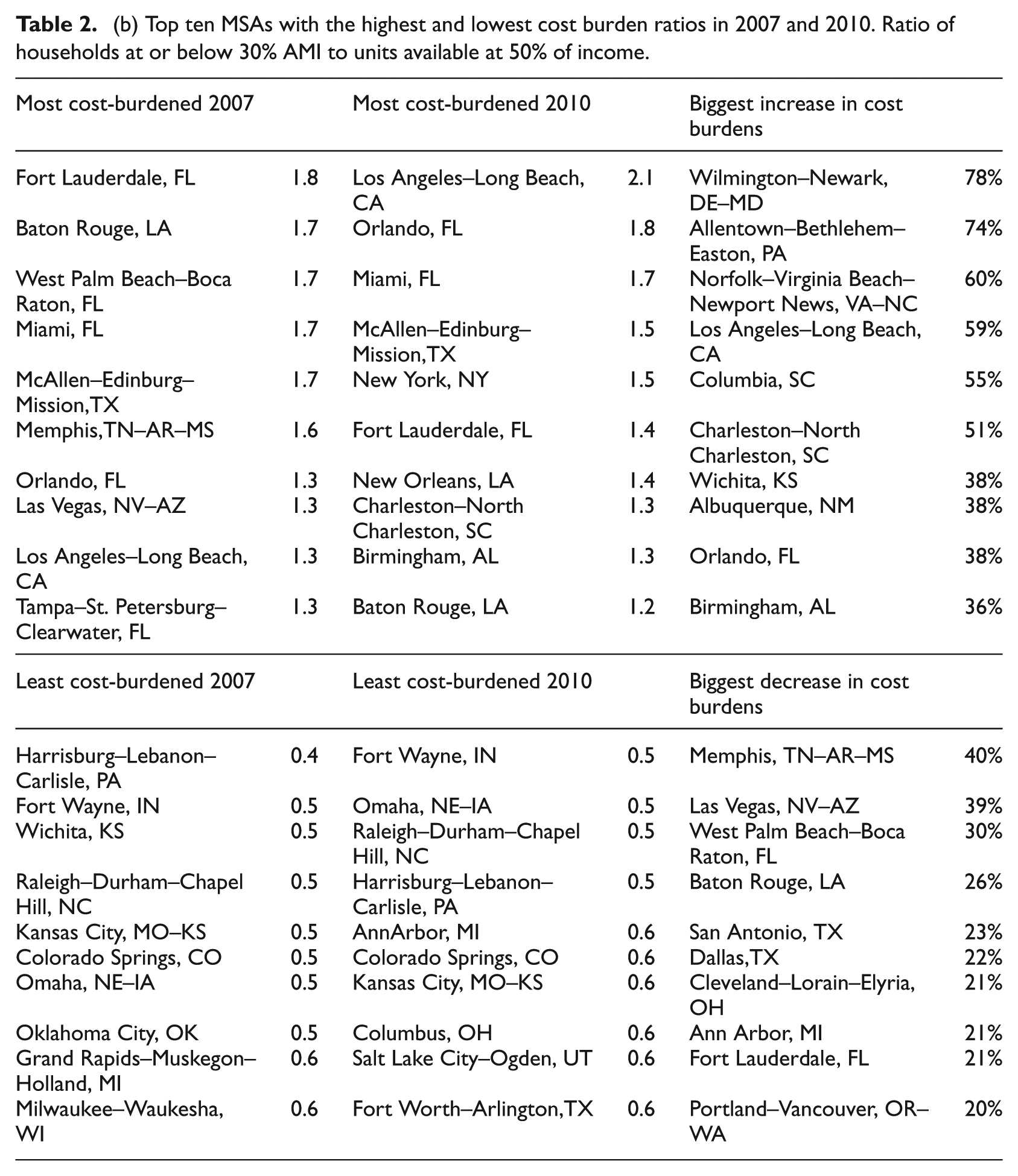
Table 3 contains first set of results that attempts to explain these substantial variations in housing affordability, with specific attention to the role of housing subsidies. The four dependent variables are as described in section ‘Data and methods’ (each household type with housing affordability defined as 30% or 50% of household income). The models in Table 3 focus on the county sample at the onset of the recession in 2007. Table 4 replicates these models at the tail end of the recession, in 2010.
Cross-section regression results, 2007.
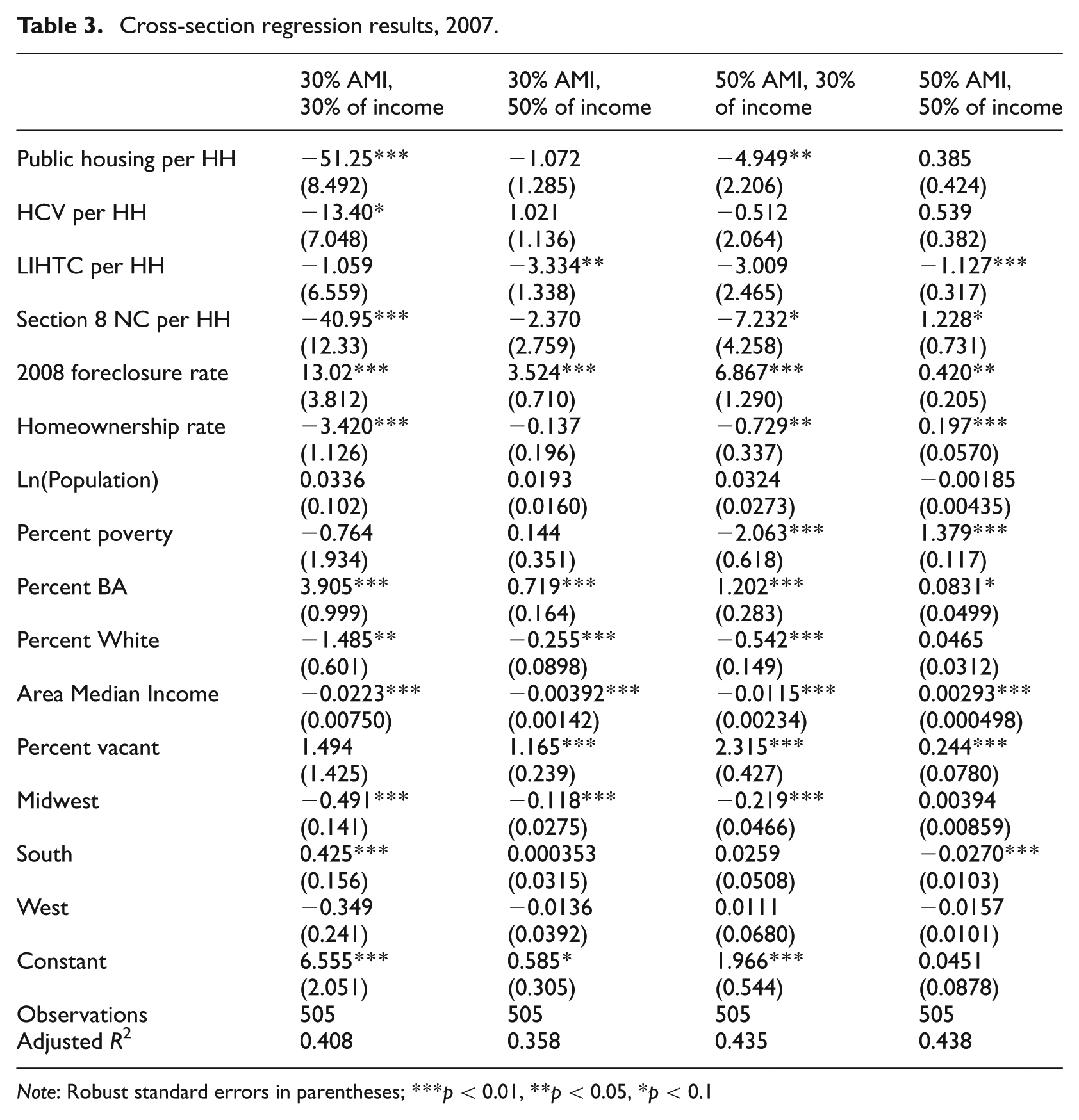
Note: Robust standard errors in parentheses; ***p < 0.01, **p < 0.05, *p < 0.1
Cross-section regression results, 2010.
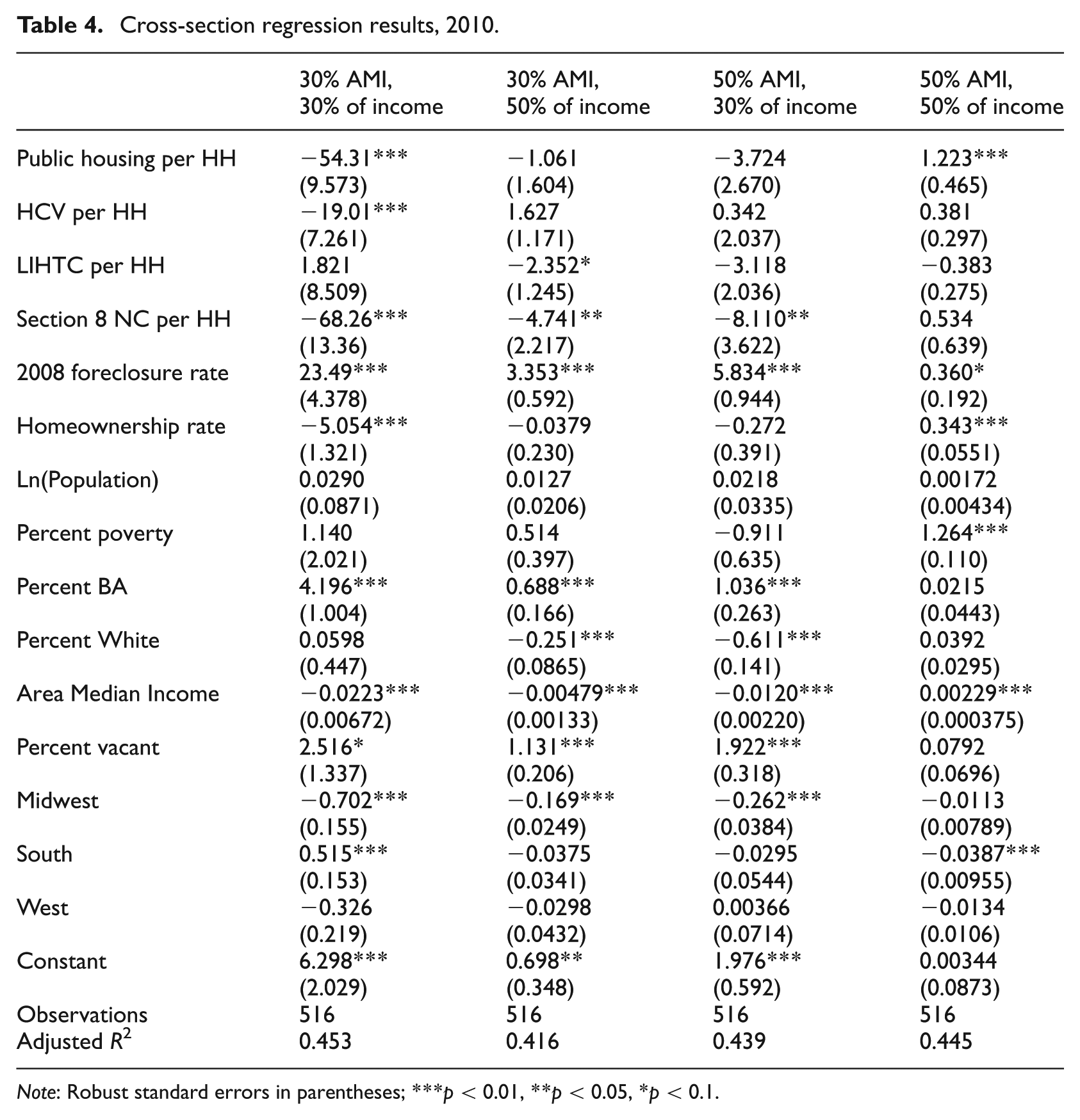
Note: Robust standard errors in parentheses; ***p < 0.01, **p < 0.05, *p < 0.1.
In the 2007 results, there is a strong public housing and Section 8 New Construction effect at the 30% of income threshold. The LIHTC effect is restricted to the 50% of household income threshold. Each of these coefficients makes theoretical sense given the particularly low incomes of public housing tenants (see footnote 2), that public housing rents are set at 30% of monthly income, 5 and that LIHTC income targeting is more flexible. The coefficient on the public housing variable appears large (for an additional public housing unit per household we observe a decrease in 51.25 households below 30% AMI competing for affordable units), but evaluated at feasible public housing per household numbers, these effects are plausible. The effect of a one standard deviation increase in public housing units per household (0.009) is a decrease of 0.46 30% AMI households competing for housing at the 30% threshold. Other variables that appear to reduce the competition for affordable units at the 30% AMI, 30% income threshold include the homeownership rate, percent non-Hispanic White, median income, and living in the Midwest region. Variables that have the opposite effect are the foreclosure rate (potentially increasing competition for rental units), the Percent with a BA, and living in the South. It is important to note the consistency with which foreclosure rates are connected to greater affordability problems – this is observed in seven of eight models.
For the other dependent variables in columns two to four, public housing prevalence is again strongly associated with lower competition for units at the 30% income threshold, this time for households earning 50% of AMI. LIHTC units have a significant effect on affordability for the 50% AMI households at the 50% affordability threshold. This is not surprising, given LIHTC units add to the housing stock yet the affordability restrictions apply to only a fraction of the units. 6
In 2010, the observed relationships for the housing and demographic variables are largely repeated from the 2007 models. However, the housing subsidy results are different in important ways. The main public housing result – 30% AMI and 30% of income – holds, but public housing no longer appears to reduce affordability problems for 50% AMI households and is associated with increased affordability problems for the 50% AMI group at the 50% income threshold. Given public housing should not have as much of an effect on this income group, this could be evidence suggesting a crowd-out effect from public housing on the private market. But this result is not robust – it is not observed in the 2007 models nor in the models using panel data. The coefficient on housing vouchers nearly reached statistical significance in the 2007 model for the 30% of AMI population at the 30% cost threshold (t = −1.90), and in the 2010 model is strongly associated with reduced rent burdens at the 1% level. The coefficient on housing vouchers is about one-third the size of that on public housing. As we will see, this result holds in the panel data model. The significant LIHTC results from 2007 are no longer significant in 2010, and are not significant in the panel model.
The panel data regression results offer the strongest controls for idiosyncrasies between different counties that do not vary over time and may be correlated with housing affordability and housing subsidy activity. Table 5 displays these results, which are different in important ways from the cross-section models. Public housing prevalence is no longer associated with reduced rent burdens for the 30% AMI group at the 30% income threshold – or any of the other measures of affordability. The only housing subsidy variable that appears to reduce rent burdens is housing vouchers per household. The coefficient of −9.05 suggests that a one standard deviation increase (0.01) in housing vouchers per household would lead to a decrease of 0.01 households below 30% AMI competing for affordable housing units. This is a rather small effect – the mean is 3.1, and this effect is about 0.3% of that. Among the control variables, the percent poverty and percent vacant are positively associated with affordability problems – the vacancy coefficients there are unexpected, although research is mixed on the relationship between vacancy and rents (Eubank and Sirmans, 1979; Gabriel and Nothaft, 2001). As in the cross-sectional models, AMI is negatively associated with the first three affordability measures, and positively associated with affordability at the 50% income threshold for 50% AMI households.
Panel data regression results, 2005–2012.
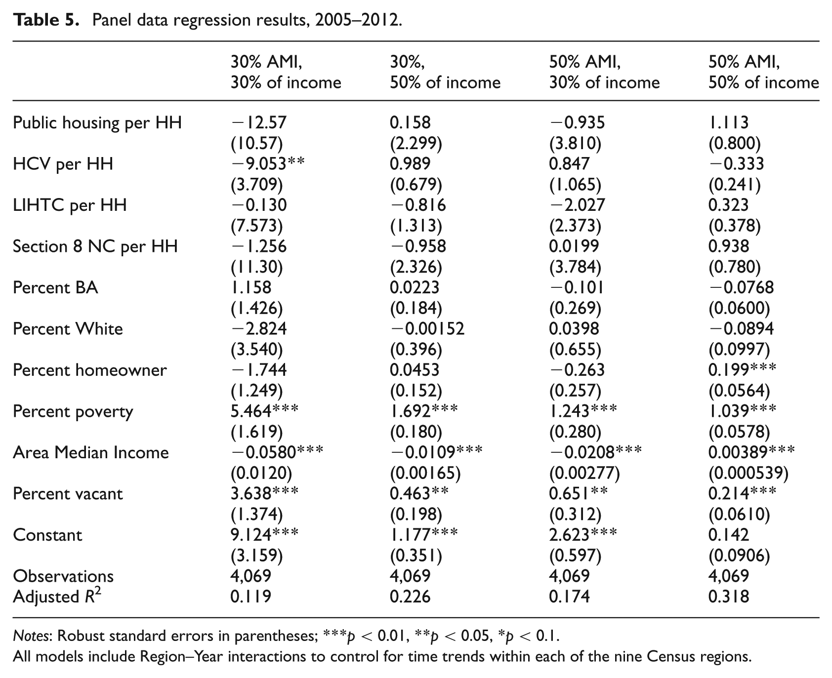
Notes: Robust standard errors in parentheses; ***p < 0.01, **p < 0.05, *p < 0.1.
All models include Region–Year interactions to control for time trends within each of the nine Census regions.
Across the three sets of models, the most consistent housing subsidy effect is from housing vouchers for households earning 30% income, using the 30% cost threshold. For public housing, this effect is only in the cross-section models. It is important to note that the significant coefficients on the public housing and housing voucher variables are observed in connection to the dependent variable that we would expect to be most affected by these subsidies – the 30% AMI population is the target for these subsidies, and rent for public housing and voucher families typically cannot exceed 30% of household income. Given this is the affordability measure that public housing and vouchers should most directly effect, it is an intriguing result that this is where we observe the effect, and the lack of effects on other affordability measures can be considered a successful falsification test. If the results held in the other models, that would be evidence for omitted variables that were correlated with both public housing and/or voucher prevalence and affordability problems. However, these effects are not fully consistent across all models, and must still be considered suggestive evidence.
Discussion
There is ample evidence to support the growing concern over rental housing affordability in US urban areas. I estimate there are more than three extremely low-income households for every rental unit that would be considered affordable (at the 30% threshold) for such households. There is nearly a one to one ratio between the number of ELI households and the number of rental properties that are priced at 50% of that income.
The decline in incomes during the Great Recession (at the low end of the distribution) was clearly more substantial than decreases in rents resulting from the housing market collapse. Further, many areas are particularly rent burdened. Across the sample of counties, the range of ratios of extremely low-income households to rental units affordable to that population (at 30% of income – tables available upon request) ranges from 0.9 to 13.4 – an ELI family finds it more than 13 times as difficult to find an affordable unit in Clayton County, GA (part of the Atlanta metropolitan area) as in Linn County, IA. Some of these variations are not quite as one would expect. Rental housing unaffordability is much more pronounced in Florida and other areas of the South. While Florida’s housing affordability problems are no secret, the Houston, Atlanta, and Baton Rouge metropolitan areas on the top ten lists are noteworthy surprises, whereas markets such as Boston and San Francisco appear in 2007 and 2010 on the list of MSAs where there is a lower ratio of very low-income households to affordable rental properties. Perhaps the poor have largely left these markets because of the lack of affordable rental opportunities.
The analyses in this paper suggest that public housing and vouchers may be effective in reducing rent burdens for ELI households, but these results were not fully consistent across all models. It may be the case that a more responsive housing subsidy policy – in which low-income households could quickly obtain assistance to address their needs – would have a greater effect. Housing subsidies do change in prevalence from year to year (year-on-year change in housing vouchers per capita in the 75th percentile county was a robust 5.7%), but not in systematic response to affordability problems. An experiment in which HUD authorised a set of housing authorities to be more responsive to local housing subsidy demand would allow us to more precisely observe the effects of housing subsidies on affordability. I do observe effects from public housing and vouchers on the affordability measure with the clearest link to these subsidies – 30% AMI households, with the cost threshold at 30% of income.
There are further realities that complicate our ability to estimate a relationship between the various housing subsidies and affordability. The LIHTC programme (and Section 8 New Construction, although it currently creates no new housing) should contribute to the housing supply, but the LIHTC is able to target higher income households (up to 60% AMI – see footnote 6 ). For housing vouchers, the data may further impede our ability to tease out the effects of this programme. In the ACS, respondents are supposed to ‘report the rent agreed to or contracted for even if paid by someone else such as friends or relatives living elsewhere, a church or welfare agency, or the government through subsidies or vouchers’ (US Census Bureau, 2010). While there is plenty of reason to believe that households report what they pay (contract rent minus any subsidies), we do not truly know whether this is the case. 7 Voucher effects may be hard to detect because voucher households are not supposed to subtract out the value of the voucher in reporting rents.
Local housing authorities do have some power in determining the size of their subsidy populations, chiefly through decisions about targeting. Housing authorities have flexibility in whether they choose to provide deeper subsidies to fewer households (i.e. the ELI population and poorer) or smaller subsidies to a larger group of households. If they choose to provide smaller subsidies to more households, their numbers would increase. We know very little about how these targeting decisions affect affordability on a larger scale.
In a more ideal world for housing affordability, housing authorities would not necessarily have to choose between funding the extremely poor and the very poor. The Center on Budget and Policy Priorities (CBPP) estimates that one in four families that qualify for rental assistance actually receive it (Center on Budget and Policy Priorities, 2013). Additional flexibility about the types of subsidy would also potentially make these subsidies more effective. Tighter housing markets should build more and make more use of the LIHTC, whereas higher poverty areas with a lot of supply should utilise more vouchers.
The analyses in this paper confirm that the rental affordability problem is getting worse for low-income households, housing subsidies are not growing at the same rate as this problem, and these subsidies have the potential to alleviate these problems for extremely low-income households. However, the country’s public housing stock is shrinking, the voucher programme has stagnated, subsidies on Section 8 and LIHTC developments are expiring, and there is very little political will to reverse these trends.
Footnotes
Acknowledgements
I would like to thank CJ Gabbe and Rachel Wells for excellent research assistance. I would also like to thank three anonymous referees, the journal editor, Paavo Monkkonen, and participants at the Urban Affairs Association and Association of Collegiate Schools of Planning research conferences for for very helpful feedback at several stages.
Funding
This research received no specific grant from any funding agency in the public, commercial, or not-for-profit sectors.