
Abstract
Visualization is a potentially powerful tool for exploration and complexity reduction of categorical sequence data. This article discusses currently available sequence visualization against established criteria for graphical excellence in the visual display of quantitative information. Existing sequence graphs fall into two groups: They either represent categorical sequences or summarize them. The authors propose relative frequency sequence plots as an informative way of graphing sequence data and as a bridge between data representation graphs and data summarization graphs. The efficacy of the proposed plot is assessed by the R 2 and the F statistics. The applicability of the proposed graphs is demonstrated using data from the German Life History Study on women’s family formation.
Introduction
This article addresses visualization of categorical sequences. Categorical sequences in the social sciences consist of sequentially linked categorical states that make up a social process. Examples include employment careers (Widmer and Ritschard 2009), pathways to adulthood (Bras, Liefbroer, and Elzinga 2010), and family formation processes (Elzinga and Liefborer 2007). The process of family formation, for instance, can be described with four categorical states: single (S), cohabiting (C), married (M), and divorced (D). Two (of the many) possible family formation sequences are (S, C, C, C, M) and (S, C, M, M, D). Let each time point denote one year, then sequence (1) is a family formation process of being single for one year, then cohabiting for three years, followed by being married for one year. Sequence (2) shows a process of being single for one year, then cohabiting for one year, being married for two years, followed by a divorce. Of course, two individuals who experience the same family formation process in terms of the order of family formation states, for instance (S, C, M), will often be characterized by different durations in these states. Consequently, individual sequences can generally differ from one another both in terms of the order of states and the duration spent in each state.
Methods for describing and analyzing categorical sequence data are increasingly widespread in the social sciences, especially in life course and career research (e.g., Aisenbrey and Fasang 2010; Gabadinho et al. 2011a; Piccarreta and Lior 2010, see also Buchmann and Kriesi 2011). The recent TraMineR package for analyzing and visualizing sequences in R, developed by Alexis Gabadinho and coauthors (2009), set a milestone in facilitating the practical implementation of sequence analysis and furthering technical advancements (see Gabadinho et al. 2011a for a guide on analyzing sequences with the TraMineR package).
Sequences of categorical states are far more complex than simple numerical variables (see Gabadinho et al. 2011a). They cannot be easily summarized or treated with techniques available for categorical variables that only take on a small number of values. In the social sciences, research questions are often directed at comparing sequences with one another and thereby at a relational property of a set of sequences, that is, the degree to which they are similar to one another. This relational information adds another layer of complexity in dealing with categorical state sequences. Visualization is a potentially powerful tool for exploring and reducing the complexity of such data structures (Tukey 1977). The primary method of visualization in sequence analysis has been the sequence index plot, introduced by Stefanie Scherer (2001) to analyze early career patterns in Germany and Britain. Recent developments include sequence frequencies plots (Müller et al. 2008), state distribution plots (Billari and Piccarreta 2005), representative sequence plots (Gabadinho et al. 2011b), multidimensional scaling (MDS) sequence index plots (Piccarreta and Lior 2010), and smoothed MDS sequence plots (Piccarreta 2012).
This article discusses currently available methods for visualization of categorical sequences in the social sciences and proposes relative frequency sequence plots as a useful additional means of sequence visualization. Similar to Piccarreta’s (2012) smoothing techniques for removing individual noise in sequence index plots, our approach aims to reduce the problem of overplotting by using medoid sequences. However, the two approaches differ in that the relative frequency plot emphasizes the graphic representation through equal-sized frequency groups across the full range of a sample. In contrast, Piccarreta’s (2012) nearest neighborhood approach lets individual sequences form neighborhoods. The difference between the two will be discussed at length below. Our approach is more conducive to cross-nation or cross-sample comparisons because it maintains a visual representation of the relative frequency of certain types of sequences across the full range of a sample. In addition, we visually assess heterogeneity within relative frequency groups with dissimilarity-to-medoid box-and-whisker plots. Finally, we propose an R2 statistic that allows us to perform an F test to guide the necessary choices when constructing relative frequency sequence plots.
To illustrate the proposed plots, we use data from the German Life History Study (GLHS) (Mayer 2007) on family formation of 474 women born in 1971 in East (N = 132) and West Germany (N = 342). We consider retrospective life histories collected between 1996 and 1999 and followed up again in 2005. Only women for whom information from the 2005 follow-up is available are included to follow their family formation from age 15 until age 33. The family formation sequences consist of seven states that combine relationship status and parenthood: (S) single, (R) in a relationship, (CNC) cohabiting with no child, (CC) cohabiting with a child, (MNC) married with no child, (MC) married with a child, and (DW) divorced/widowed. 1 To illustrate how the relative frequency plots feature in group comparisons, we compare the East and West German subsamples.
Sequence Analysis and Sequence Visualization in the Social Sciences
Optimal matching (OM), originally developed in biology to analyze strings of DNA, was the first type of sequence analysis that made inroads into the social sciences (Abbott and Tsay 2000; Abbott and Forrest 1986). OM determines sequence similarities by aligning sequences with three transformation operations—substitution, insertion, and deletion—in a pairwise comparison of all sequences with one another. The output of OM is a pairwise dissimilarity matrix for all possible pairs of sequences. Most of the early applications used this pairwise dissimilarity matrix in a cluster analysis to find salient patterns of a social process by identifying groups of similar sequences. For example, Brzinsky-Fay (2007) uses OM to identify the most common patterns of labor market entry sequences in different countries. For comprehensive introductions to OM, see MacIndoe and Abbott (2004) and Billari and Piccarreta (2005). Other ways of determining sequence similarity include Lesnard’s dynamic Hamming distance (DHD; Lesnard 2010) that emphasizes the timing of states in a process and Elzinga’s (2003, 2010) subsequence metrics that comprise a variety of different dissimilarity measures.
The pioneering applications heralded sequence analysis as the temporal facet of a larger conceptual shift in the social sciences “turning from units to contexts, from attributes to connections, from causes to events” (Abbott 1995:93). Initial critique was framed as a general opposition against sequence analysis but essentially targeted issues resulting from a relatively unpolished transfer of OM from biology to the social sciences (Levine 2000; Wu 2000). Critics argued that the OM algorithm for sequence comparison fails to represent any sociologically meaningful notion of time, is highly sensitive to arbitrary decisions made by the researcher, and generates dissimilarity measures between sequences that lack any meaningful interpretation (Aisenbrey and Fasang 2010; Elzinga 2003; Levine 2000; Wu 2000).
Since this initial criticism, the social sciences have turned into a vibrant field of methodological development of sequence analysis (Aassve, Billari, and Piccarreta 2007; Bison 2009; Blanchard, Bühlmann, and Gauthier 2012; Brzinsky-Fay and Kohler 2010; Dijkstra and Taris 1995; Elzinga 2003, 2008, 2010; Gabadinho et al. 2009, 2011a, 2011b; Gauthier et al. 2009, 2010; Halpin 2010; Hollister 2009; King 2011; Lesnard 2010; Martin, Schoon, and Ross 2008; Piccarreta 2012; Piccarreta and Billari 2007; Piccarreta and Lior 2010; Pollock 2007; Robette and Bry 2012; Stovel and Bolan 2004; Studer et al. 2011; Wiggins et al. 2007). Along with this tailoring of sequence tools to social science research questions, sequence analysis is increasingly established as a method of choice in life course and career research (e.g., Biemann and Wolf 2009; Fasang 2012; Stovel, Savage, and Bearman 1996). Most of these methodological innovations optimize cost settings in OM (Gauthier et al. 2009; Hollister 2009; Lesnard 2008, 2010) or refine measures of sequence similarity to link them more closely to theory (Elzinga 2003; Gauthier et al. 2010). In the wake of these methodological developments of sequence measures, visualization of categorical sequences is drawing increasing attention (Aassve et al. 2007; Billari and Piccarreta 2005; Gabadinho et al. 2011a; Müller et al. 2008; Piccarreta 2012; Piccarreta and Lior 2010).
Visualization of Sequences in the Social Sciences
In the social sciences, research questions about categorical sequences are directed both at variation within individual sequences over time and at variation between sequences in a given population. For example, how do family formation processes unfold over time and how similar are they across a population? Variation within individual sequences over time can be measured with different complexity measures (Elzinga 2010). Variation between sequences is a relational property that refers to the similarity of sequences to one another. It can be measured as the dissimilarity between pairs of sequences.
In addition, social scientists are interested in qualitative sequence patterns, that is, the question of “what” the sequence patterns mean substantively, as well as quantitative summary measures that provide answers to the question of “how much” of something is present in the sequences. Qualitative sequence patterns capture sequential processes in the spirit of narrative positivism, which was originally suggested by Abbott (1992) as the conceptual and theoretical foundation of sequential thinking in the social sciences. Quantitative summary measures of sequence information have become increasingly more sophisticated, as the technical development of sequence analysis advanced (e.g., Elzinga 2003, 2010; Gabadinho et al. 2011b). They also more readily bridge across to mainstream regression-based quantitative methodology (Biemann and Wolf 2009).
This interest in the variation within and between sequences as well as in qualitative and quantitative sequence information is challenging for visualization. Graphical tools for complexity reduction used in quantitative time-series analysis, such as line graphs or histograms, are useful to show summary measures of quantitative sequence information, but they cannot visualize qualitative information of sequence patterns (Müller et al. 2008). Sequence states, such as being married or divorced, are categorical and qualitative in nature. It is therefore not possible to calculate averages as meaningful summary measures and plot them over time. One challenge for the visual display of social science sequences is thus to effectively extract the most salient qualitative sequence patterns, while at the same time maintaining quantitative information about the dispersion of sequences around these patterns.
Given this complex and relational data structure, visualization is a potentially powerful tool of exploration and complexity reduction of categorical sequences. Visualization has a long-standing tradition in exploratory and descriptive data analysis (Tukey 1977). As Tukey (1977: v) puts it, “A basic problem about any body of data is to make it more easily and effectively handleable by minds.” To this end, graphs are useful to the extent that they make a simpler description possible and help us look below the described surface and thus make the exploration more effective (Tukey 1977). More recently, visualization has received much attention in social network analysis (Freeman 2002) that examines similarly complex relational data. Network graphs are at the same time a prime example of the pitfalls of visualization (Han 2010). While a good graph will often be the most effective way to convey complex information from data, graphs can also easily be deceptive of actual patterns in the data or distract from main patterns with mere visual “bells and whistles” (Han 2010; Tufte 2001).
According to Tukey (1977: vi), “the greatest value of a picture is when it forces us to notice what we never expected to see.” Tufte (2001) suggested some standards for graphical displays of quantitative information, arguing that the objective of graphs is to communicate complex ideas with clarity, precision, and efficiency. Piccarreta and Lior (2010:166) invoke Tufte’s (2001:51) guidelines when they note that “Graphical excellence is that which gives to us the viewer the greatest number of ideas in the shortest time with the least ink in the smallest space.” Graphical integrity is put forward as the most important principle of graphical excellence. Put simply, graphical integrity is achieved when a graph “tells the truth about the data” (Tufte 2001:105), that is, when visual representation is consistent with the numerical representation in the data. Because visual perception is context dependent, context is essential for graphical integrity. Context dependency is particularly important for group comparisons that place information about one group in the context of information about another group.
Review of Sequence Visualization
Sequence index plots have been the primary means of visualization in sequence analysis (Brüderl and Scherer 2006; Scherer 2001). The sequence index plot graphs horizontal stacked bars across the x-axis. The x-axis represents the order in sequences, usually time. Each stacked bar represents one sequence. The y-axis shows N individual sequences. Different colors indicate different states along the sequence. Currently, sequence graphs broadly fall into two groups: The data representation group includes the sequence index plot and its extensions. The data summarization group comprises plots that aggregate and summarize quantitative sequence information. The sequence index plot and its extensions are primarily useful to convey information about qualitative sequence patterns. They visualize variation within individual sequences over time, as well as variation between sequences, albeit without quantifying this variation. Aggregate and summary plots illustrate quantitative information about sequence characteristics. Since they aggregate information across individual sequences, they lose sight of variation within individual sequences and focus on quantifying variation between sequences in a given population. “
Subsequently, we present the data representation and data summarization graphs for sequence visualization and highlight their respective advantages and limitations. We use a perceptually based HCL color space (hue = different types of colors, chroma = differing colorfulness, luminance = differing intensity of gray) that maps onto these three dimensions of color perception (see Zeileis, Hornik, and Murrel 2009). Generally, one has to choose between a qualitative, sequential, or diverging color palette to represent the sequence states. For most sequence analysis applications in the social sciences, a qualitative color palette will be suitable since there is usually no directionality in the categorical alphabet of sequence states. If all or parts of the sequence states are ordinal and directional, it is advisable to reflect this in the choice of color by using a sequential or diverging color palette (Zeileis et al. 2009).
Family formation states are essentially qualitative, but there is some directionality in the combination of the relationship status “cohabiting” and “married” with and without having children. We therefore use a qualitative color space but include a sequential element in representing the state “cohabiting with no child” (CNC) as light green and “cohabiting with child” (CC) as dark green, as well as the state “married, no child” (MNC) as light blue and “married with child” (MC) as dark blue, respectively. For the other states, we use hues outside the blue and green chosen for cohabiting and married: a sand color for “single” (S), orange for “in a relationship” (R), and pink for “divorced/widowed” (DW). The colors were specified using R’s vcd and colorspace packages (Zeileis et al. 2009). If possible, the sequence states in the legend should be arranged according to some substantive criterion rather than simply alphabetically or randomly (Wainer 1984). We thus ordered the sequence states in the legend roughly following the normative unidirectionality of family formation from (S) “single” to (MC) “married with child”.
Data Representation Graphs: The Sequence Index Plot and Extensions
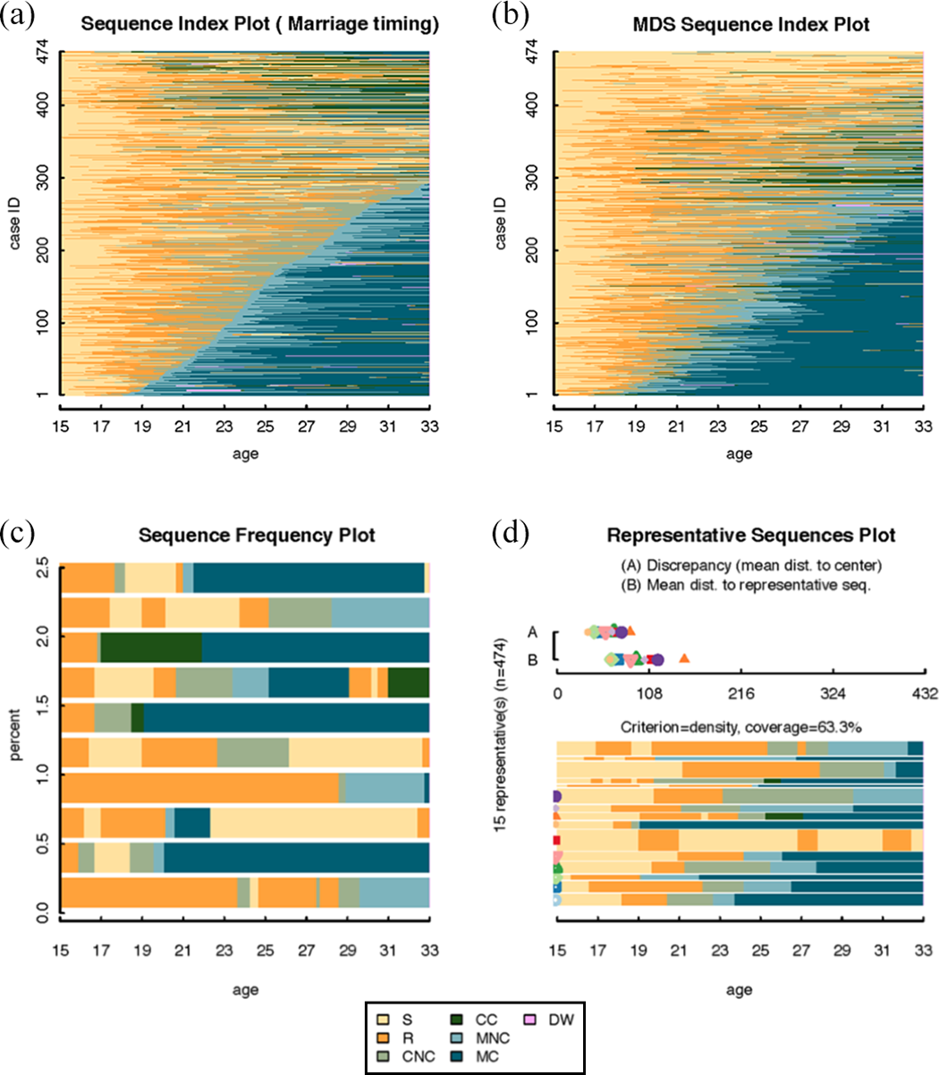
Table 1 shows descriptive statistics for the example data on family formation, including the percentage of women who ever experienced each focal event and the mean age at the first occurrence of each focal event. Figure 1 shows the sequence index plot and its extensions for the example data.
Descriptive Information About the Example Data on Family Formation of Women Born 1971 in East and West Germany Between Age 15 and 33 (N = 474).

Source: German Life History Study (GLHS).
Data representation graphs: the sequence index plot and extensions.
Sequence Index Plots
Figure 1(a) shows the original sequence index plot (Scherer 2001). The sequences are sorted according to the age of first marriage. The x-axis counts months from age 15 until age 33. Most women have several time periods in noncohabiting relationships, which are represented by orange, before they cohabit, marry, and have children. About 60 percent of the women marry by the age of 33 and most of these women have children within a year or two after marriage (Table 1). The top of Figure 1(a) shows women who either remain in noncohabiting relationships or have children in cohabiting relationships. Sequence index plots are most illuminating as an internal representation of qualitative sequence patterns within relatively homogeneous sets of sequences (Kohler and Brzinsky-Fay 2005; Piccarreta and Lior 2010). For relatively small samples of sequences, they give an accurate representation of the data and are informative about qualitative sequence patterns.
In sequence index plots, issues of graphical integrity arise from overplotting and the order in which sequences are sorted in the plot. Assigning them meaning is mainly a subjective task, as is frequently the case in the interpretation of qualitative information. Sequence index plots increasingly fall short to accurately show the data with increasing sample size and decreasing patterning in the empirical distribution of the sequences. For more than a couple of hundred sequences, sequence index plots are systematically deceptive due to overplotting, a common problem for graphs that encode data with points or lines. Overplotting means that multiple objects share the same space and are plotted on top of each other. As a result, it is impossible to see the individual values (Few 2009). There is a technical limit to how thin each stacked bar can be plotted and, more generally, how thin a line remains visible to the human eye. When overplotting occurs, the stacked bars are no longer discernible, thus no longer represent individual sequences, and therefore misrepresent the data. Sequence index plots can be particularly deceptive in the comparison of sequence groups of unequal sizes, because the degree of overplotting increases with group size and is therefore not constant across comparison groups.
In addition, the visual impression of sequence index plots depends on the order in which sequences are plotted along the vertical axis. This is a specific case of context dependency of visual perception: The order in which sequences are plotted along the vertical axis places each sequence in an immediate graphical context. In some applications, it makes sense to order sequences according to the timing of a focal transition of substantive interest, for example, the age of first marriage as in Figure 1(a). However, this anchors the interpretation of the family formation sequences at the timing of this central transition and loses sight of central tendencies in the timing of other transitions, such as fertility. Unlike the problem of overplotting, the sensitivity to order does not mean an outright misrepresentation of the data. Nonetheless, order is influential as a context in which each individual sequence is visually perceived. Sequence index plots of the same data ordered differently highlight different features of the sequences and will therefore communicate different information to the viewer. As sequence index plots were applied more widely, the problems of overplotting and sensitivity to order of the sequences in the plot became more apparent. This triggered the development of several extensions of the sequence index plot.
MDS Sequence Index Plots
MDS sequence index plots proposed by Piccarreta and Lior (2010) address the problem of sequence order by sorting sequences according to their score on the first factor derived by applying MDS to a given dissimilarity matrix. The MDS factors “explain” the observed dissimilarities and are extracted in a decreasing order of importance. Hence, the first factor can be considered as the most important in the explanation of the observed dissimilarity matrix. Figure 1(b) shows the MDS sequence index plot for family formation with our example data. The sequences are ordered according to a score derived from MDS using a dissimilarity matrix derived with OM with indel costs of 1 and constant substitution costs of 2. Figure 1(b) shows women who marry and have children early on one end of a continuum, and women who remain unmarried and do not have children on the other end. Women who have children in cohabiting relationships, represented in green, are located in the middle. The first factor of MDS in this application can thus be interpreted as a more-to-less scale of traditional family formation with early marriage and motherhood representing the most traditional family formation sequences. MDS sequence index plots therefore provide a substantively meaningful way of sorting sequences in the plot that hinges on the quality of the MDS given the sequence dissimilarity criteria chosen. Piccarreta and Lior (2010) emphasize the exploratory value of MDS sequence plots, since the sorting criterion is derived from the data. In addition, MDS sequence index plots can illuminate multiple dimensions of sequences, such as occupational histories and family histories by sorting them on several factors derived with MDS successively. This is particularly advantageous, given an increasing theoretical emphasis on the multidimensionality of sequences in the social sciences (e.g., Gauthier et al. 2010; Han and Moen 1999; Pollock 2007; Stovel et al. 1996). Despite these advantages, like sequence index plots, MDS sequence index plots are sensitive to overplotting for large samples.
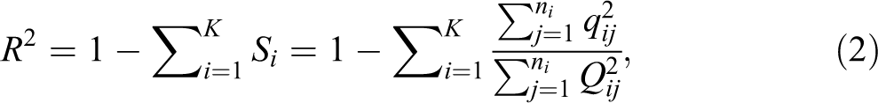
Sequence frequency plots (Müller et al. 2008) can be useful for addressing overplotting. They are sequence index plots of the most frequent sequences in a set of sequences. The y-axis shows the percentage of the sample represented by the most frequent sequences. The bar widths are proportional to the sequence frequencies. Figure 1(c) shows the sequence frequency plot for the 10 most frequent sequences in the example data on family formation. In the example data, every sequence is unique. The frequency plot then boils down to a random selection of 10 sequences that only represent 2.1 percent of the example data. Because the example data were initially sorted according to the beginning state of the sequences, in Figure 1(c), 10 sequences are selected that start with being in a relationship, represented by orange. The full sequence index plot in Figure 1(a) shows that this is a poor representation of the sequence set, because most women’s family formation sequences in fact start with being single at age 15. Sequence frequency plots are useful when there are few distinct sequences that represent large parts of the sample. They provide only a very partial view when there are many distinct sequences (Gabadinho et al. 2011b). They can be particularly misleading when the empirical distribution of sequences is such that there are many similar but not quite identical sequences. In this case, plotting the most frequent sequences suggests greater heterogeneity in the sequences than is actually present. For instance, the sequence index plot (Figure 1(a)) and the MDS sequence index plot (Figure 1(b)) clearly indicate some patterning in the example data with groups of women who have more or less similar family formation experiences. This information is lost in the sequence frequency plot in Figure 1(c).
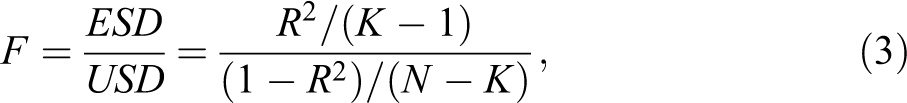
Representative sequence plots (Gabadinho et al. 2011b) aim to extract a subset of sequences to represent a whole set of sequences. Based on a representativeness score, a list of sequences is selected as representative sequences. Gabadinho et al. (2011b) suggest five measures of sequence representativeness: sequence frequency, neighborhood density, mean state frequency, centrality (medoid sequences, i.e., observed sequences that are least dissimilar to all other sequences), and sequence likelihood (the product of the probability with which each of its observed successive states is supposed to occur at this position). The candidate list for representative sequences always includes the same set of sequences: the list of unique sequences appearing in the data. They are sorted in a different way, depending on the selected sorting criterion. In a second step, redundant sequences, that is, sequences that are very similar to one another, are eliminated from the list of candidates for representative sequences. Then the selected representative sequences are plotted in a sequence index plot with the additional information on which percentage of the entire sample they cover. Figure 1(d) shows 15 representative sequences based on a distance matrix derived using OM indel costs of 1 and constant substitution costs of 2. At a neighborhood radius of 25 percent of the theoretical (maximum) distance, these representative sequences cover 44.3 percent of the sample. The researcher can calibrate the maximum distance to a representative sequence that is required to consider a sequence as “covered” by this representative.
An obvious advantage of the representative sequence plot is that it comes with quality measures of how well the selected sequences represent a set of sequences. They are displayed above the sequence index plot of representatives (Figure 1(d)) as symbols ranging on a scale from 0 to the maximum possible dissimilarity between sequences for the respective representativeness scale. Each symbol is associated with one representative sequence. There are two scales: criterion A and criterion B. Criterion A shows the mean dissimilarity of all sequences to one another within a subset of sequences that is represented by one representative. Criterion B indicates the dissimilarity of the representative sequence to the sequences it represents. On both scales, lower dissimilarity indicates better representation. For the example data, 15 representative sequences are selected to represent 63.3 percent of the sample when we allow for a fairly large neighborhood radius of 25 percent of the theoretical maximum distance in order to consider a sequence as “covered” by this representative.
Representative sequence plots are more sophisticated than sequence frequency plots on several accounts, including the added value of a quality criterion. Their usefulness for representing a set of sequences in a substantively meaningful way hinges on the empirical distribution in the data and the representativeness criterion chosen. For instance, one can question whether it makes sense to eliminate similar representatives as redundant or treat this similarity in representatives as substantively interesting information about the sample. Neither the sequence frequency plot in Figure 1(c) nor the representative sequences plot in Figure 1(d) provides an intuitive visual impression of the holistic pattern visible in the sequence index plots in Figure 1(a) and 1(b). One reason is that the example data contain many similar but not identical sequences. Arguably, this is typical for sequences in life course and career applications, since structural contexts, such as welfare states and labor markets, shape individual lives to be strongly patterned but rarely identical.
Piccarreta (2012) proposes smoothing techniques in order to reduce overplotting in sequence index plots by removing individual noise. For each sequence, this technique focuses on its neighborhood, which is given by a set of sequences that are closest to the respective sequence. The original sequences are then substituted by a smoothed sequence. In her application, she proposes the medoid sequence that summarizes the sequences in the neighborhood by having the minimum distance to all other sequences in the neighborhood. The neighborhood can be defined either by a set of a given number of sequences or by a radius approach. Combining the two allows for neighborhoods of different sizes depending on sequence heterogeneity in local neighborhoods. She also proposes an R2 and an S 2 statistic to evaluate the goodness of fit of the smoothing.
Data Summarization Graphs: Quantitative Sequence Information
Figure 2 shows summary graphs of quantitative sequence information, such as the average time spent in each categorical state, or the aggregate distribution of states at each time point. They fundamentally differ from the sequence index plot and its extensions, because they do not display individual sequences over time. It is impossible to extract information on individual sequences from them. Instead, they depict summary information for the entire sample of sequences. Essentially, all of these summary plots represent different facets of the same information and can largely be derived from each other. However, they highlight different information about the sequences. A more extensive review of these graphs can be found in Gabadinho et al. (2011a).

Data summarization graphs: quantitative sequence information.
State distribution plots (Billari and Piccarreta 2005) aggregate the frequency of each state at each time point. Figure 2(a) shows the state distribution plot for the example data. At the beginning of the sequences only two states occur: being single and in a relationship. At the end of the sequences, all seven states occur. Being in a noncohabiting relationship is the most common state for women in their early 20s. Cohabiting, marriage, and motherhood gain importance as women approach their 30s. State distribution plots give a good overview of the time point–specific distribution of states. However, similar state distribution plots can mask very different individual sequences, because they contain no information about how individuals move back and forth between these states over time.
Kaplan–Meier (KM) survival curves, a standard tool in epidemiology and demography, are useful to visualize the timing of successive stage transitions along a set of sequences. Figure 2(b) shows KM survival curves for transitions into six focal events in the family formation process: (1) into a “relationship” (R), (2) into “cohabitation without a child” (CNC), (3) into “marriage without a child” (MNC), (4) into “cohabitation with a child” (CC), (5) into “marriage with a child” (MC), and (6) into “divorced/widowed” (DW). The KM survival curves 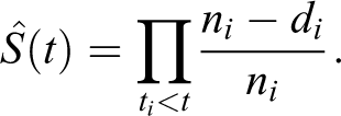
Modal state plots (Gabadinho et al. 2011a) are bar graphs of the modal state; that is, the most frequent state at each time point. The height of the bar is proportional to the frequency of the respective state at this time point. Figure 2(c) shows the modal state plot for the example data. Until around age 20, being single is the most frequent state, then being in a relationship, and from age 30 onward being married with children is the most frequent state for women in the example data.
Mean time plots (Gabadinho et al. 2011a) are histograms of the mean time spent in each state across all time points. Similar to the state distribution plot and the modal state plot, the mean time plot in Figure 2(d) shows that German women spent the most time being single and in a noncohabiting relationship between the age of 15 and 34. The least time was spent being divorced. The mean time plot is one of many possibilities to visualize quantitative summary information about sequence structures with standard plots such as bar or line graphs. Other possible summary measures are, for instance, sequence turbulence or complexity measures (Elzinga 2010) as an indicator for variability within individual sequences over time, or the transversal entropy (Billari 2001; Fussel 2005) as an indicator for the variability between sequences at each given time point. For instance, the transversal entropy plot (Billari 2001; Fussel 2005) displays Shannon’s entropy index as a line graph.
In addition, Aassve et al. (2007:381) propose a tree-based sequence representation to graphically represent clusters of sequences, obtained by referring to a given dissimilarity matrix. The central idea is to use medoid sequences to represent clusters. This type of graph is neither an extension of the sequence index plot nor a summary plot of aggregate sequence characteristics. Each cluster is represented by one tree and the medoid sequences in each cluster are the branches of the tree. The nodes in these branches represent the sequence states visited, for instance unemployment or marriage in their application. The length of the arrows that connect two consecutive states is proportional to the average duration of time in one state before experiencing the next (Aassve et al. 2007:280). The tree-based graph capitalizes on graphical representation with single cases to illuminate findings, a mode of representation that is usually reserved for qualitative data analysis. Drawbacks of the tree-based sequence representation are that they are only useful for relatively homogenous groups and that the dispersion of sequences around the medoids is lost in the graphical representation.
Relative Frequency Sequence Plots
We propose relative frequency sequence plots as a bridge between the data representation graphs and the data summarization graphs that were reviewed above and as an effective method to address overplotting.
2
The plot is a data reduction technique that is particularly useful when there is strong but fuzzy patterning in the data, that is, when there is patterning into similar sequences but there are few identical sequences. This seems to be a fairly common pattern especially in life course and career applications (e.g., Bras et al. 2010; Brzinsky-Fay 2007; Elzinga and Liefbroer 2007; Fasang 2010, 2012). Relative frequency sequence plots proceed in the following steps: Sort the sequences according to a substantively meaningful principle; Divide the sorted sample into K similarly sized frequency groups, with the aim of avoiding overplotting and maintaining data representation; Choose the medoid sequence of each frequency group to represent this group; Plot the selected representative sequences as a sequence index plot; Plot the dissimilarities to the medoid within each frequency group as a box-and-whisker plot; Calculate an R2 statistic and an F test to evaluate the goodness of fit of the chosen relative frequency sequence representation.
Unlike representative sequence plots (Gabadinho et al. 2011b) and the smoothing technique proposed by Piccarreta (2012) that aim to find representatives for the whole set of sequences from neighborhoods that may have varying sizes, relative frequency sequence plots first partition the sample into relative frequency groups and then find representatives within these groups. Each plotted sequence thereby represents an equal number of sequences. The goal is to visually represent the relative frequencies of sequences in a given sample. In contrast to the representative sequence plot and the smoothed MDS plots, if the medoids of the two frequency groups are similar, this is translated into quantitative information and not eliminated as redundant. In contrast to the top-down approach of selecting a few most frequent or representative sequences in sequence frequency plots (Müller et al. 2008) and in representative sequence plots (Gabadinho et al. 2011b), the relative frequency sequence plot follows a bottom-up approach that represents sequences across the full range of the sample.
Compared to the smoothing technique proposed by Piccarreta (2012), especially when it comes to which sequence goes into which relative frequency group or neighborhood, the relative frequency sequence plot can be considered “supervised” while her approach is “unsupervised,” analogous to supervised and unsupervised classifications. This difference has some important ramifications. Consider as an extreme example 100 sequences, of which 95 are identical while the remaining 5 are different from the 95 but similar to one another. The approach proposed by Piccarreta (2012) would produce two medoid sequences, the first representing the identical 95 and the other representing the remaining 5. In our approach, if we choose 20 relative frequency groups, the entire sample is faithfully represented in terms of the proportional representation. Her approach, even though more efficiently summarizing the data (i.e., using only two neighborhoods or medoids), does not visually express the relative frequency of representative sequences and thus is less informative in this respect. Another extreme would be given by a very heterogeneous sample. In this case, neither approach can summarize the data with a high degree of goodness of fit. When this heterogeneity is unevenly distributed across the sample, however, our approach would give a more representational view of the data. In sum, while Piccarreta’s (2012) approach is statistically efficient (in terms of summarizing data), it is visually less informative. The relative frequency sequence plot may be statistically less efficient (by using more representative groups) but is visually more informative.
There can be different methods for choosing the representative sequence within each frequency group. We use the medoid as a natural choice, since the medoid is a good local representative that is less influenced by data noise and outliers (than the mean or centroid) and can be obtained also when only dissimilarities are available (Aassve et al. 2007; Piccarreta 2012). In principle, all of the representativeness criteria proposed by Gabadinho et al. (2011b) can be used. To evaluate the quality of representation within the frequency groups, we propose to complement relative frequency sequence plots with dissimilarity-to-medoid plots. Dissimilarity-to-medoid plots visualize the dispersion of dissimilarities of the medoid sequence to all other sequences within each frequency group K as box-and-whisker plots. They show both the mean distance within each frequency group K and the dispersion around the means. Subsequently, we walk through the six steps of generating relative frequency sequence plots using the example on women’s family formation.
Step 1: Sort the Sequences According to a Substantively Meaningful Principle
Initial sorting determines which sequences are grouped together during the partitioning into frequency groups. In the social sciences, sensible sorting principles are the timing of a focal transition of substantive interest, such as the age of first marriage, their scores on an MDS factor, the dissimilarity to the most frequent sequence, or the dissimilarity to a theoretically motivated ideal typical sequence. Choosing the timing of a focal transition of substantive interest can be problematic if sizable proportions of the sample do not experience this transition. For instance, only 60 percent of women were ever married in the observation period covered in our example data. Thus, sorting according to the age of first marriage leaves the sorting of the remaining 40 percent uncontrolled. Choosing the MDS factor, or the dissimilarity to some meaningful sequences as a sorting criterion, circumvents these problems, but warrants careful consideration of the dissimilarity measure chosen. For instance, if one believes the timing of transitions to be particularly meaningful for the substantive process of interest, one may chose Lesnard’s (2010) DHD. If one considers the order in which states occur within the sequence particularly important, one of Elzinga’s (2008) subsequence metrics, or OM with low indel costs and high substitution costs might be a better choice. Finally, the dissimilarity to the most frequent sequence as an additional sorting option is only meaningful, if there is a most frequent sequence that represents a considerable part of the sample.
As a general rule, the sorting principle and dissimilarity measure should be guided by the substantive interest in sequence variation and the empirical distribution of the sequences. The family formation sequences in the example data do not contain a meaningful most frequent sequence because each sequence is unique. Two sensible sorting criteria are the timing of first marriage as a transition of theoretical interest and a score on the first MDS factor extracted from a dissimilarity matrix built using the DHD (Lesnard 2010). The DHD emphasizes the timing of transitions between family formation states, which we consider theoretically important in the process of family formation. The goodness of fit of relative frequency sequence plots using different sorting criteria can be evaluated using the R2 and F test proposed in step 6.
Step 2: Divide the Sorted Sample Into K Similarly Sized Frequency Groups
The partitioning into K frequency groups should divide the sample into equal-sized frequency groups. As a rule of thumb, it is advisable to specify around 100 frequency groups if this specification passes the F test proposed below and increase K accordingly otherwise. Up to 100 representative sequences can easily be plotted and interpreted as a conventional sequence index plot without overplotting. Further reducing K is not necessary to avoid overplotting. If the case numbers of the full sample are not evenly dividable by the chosen K, for instance at an N = 474 and K = 100 in our example application, one can easily allow the small difference of one sequence in frequency group sizes to obtain the exact K without eliminating any of the original sequences. In our example application, we can choose 74 frequency groups of five sequences each and 26 frequency groups of four sequences each to cover N = 474 sequences at K = 100.
Note that a medoid can only be chosen for frequency groups that have at least three sequences. Also, the box-and-whisker plot of dissimilarities to the medoid in each frequency group becomes more informative with an increasing number of sequences per frequency group. At the very least each frequency group should have two sequences. If some frequency groups contain only one sequence, it is not clear which sequences to omit for the plot, that is, where on the sorting criterion to place the frequency groups with only one sequence and those with two sequences.
For relatively small samples of a several hundred or fewer sequences, in principle, the sequence heterogeneity will grow with sample size, suggesting a greater number of frequency groups or K with increasing sample size. However, the size of a sample and sample heterogeneity are not necessarily linearly associated, especially for larger samples. When using a good representative national sample (usually of a size of a few thousand or larger), the increase in the amount of heterogeneity with increasing sample sizes should become negligible. Therefore, the strategy of using up to 100 frequency groups with each group representing larger percentages of the sample should still be a feasible solution to extract main sequence patterns effectively. Ultimately, the choice of K should be informed by visual effects and by the R2 and F test statistics proposed below.
Step 3: Choose the Medoid Sequence of Each Frequency Group to Represent This Group
In our example application, each frequency group has one unique sequence with a minimum sum of dissimilarities to all other sequences in the respective frequency group with several different distance measures. However, two or more sequences in a frequency group potentially share the same minimum sum of dissimilarities to all other sequences. This is similar to the problem of tied pairwise sequence dissimilarities in cluster analysis using a sequence dissimilarity matrix, that is, when two pairs of sequences have the same dissimilarity to one another (Martin et al. 2008). If such tied minimum sums of dissimilarities occur, one can randomly select one of them, assuming that they represent the frequency group equally well. The choice of the dissimilarity measure should be guided by substantive and theoretical considerations and the R2 and F test below.
Step 4: Plot the Selected Representative Sequences as a Sequence Index Plot
This step is straightforward and simply requires plotting the selected medoid sequences for the relative frequency groups as a sequence index plot sorted according to the initial sorting criterion.
Step 5: Plot the Dissimilarity to the Medoid Within Each Frequency Group
The bottom-up approach of sequence frequency plots that represents sequences across the full range of the sample requires the division of the sample into equal-sized frequency groups. Depending on the empirical distribution of the sequences, some of these equal-sized frequency groups represent a very homogenous group, while others represent a more heterogeneous group of sequences. The quality of the representation then is not the same across the whole sample. We therefore complement relative frequency sequence plots with dissimilarity-to-medoid plots.
The dissimilarity-to-medoid plot provides information about the dissimilarity of the medoid sequences to the respective frequency group they represent in a box-and-whisker plot. For instance, if a frequency group contains six sequences, of which one is the medoid, the average dissimilarity is simply calculated as the average dissimilarity among the five remaining sequences to the medoid. The box-and-whiskers present the deviation of the distances to the medoid and give information on the distribution of the sequences in the group. For frequency groups that contain only two sequences, the distance to medoid plot is reduced to showing dots for the distances between the two sequences in each frequency group. Note that the dissimilarity-to-medoid is analogous to criterion B of the representative sequence plot (Figure 1(d)) if the medoid is chosen as the representativeness scale.
Rather than looking at the dissimilarity-to-medoid plot as an absolute quality benchmark, one can think of it more broadly as providing additional information about the data. Since the sequences are ordered according to a meaningful principle in the first place, the dissimilarity-to-medoid plot is informative about sequence dispersion at different locales on this continuum. We will use the example data to demonstrate how this can be useful for the substantive interpretation of sequence variation.
Step 6: Calculate the R2 Statistic and F Test to Evaluate the Goodness of Fit
Relative frequency sequence plots require three critical decisions: choice of a sorting criterion, choice of a distance measure to identify the medoids in K frequency groups, and the number of frequency groups K. To evaluate the sensitivity of relative frequency sequence plots to these choices, we propose an R2 statistic that can be assessed with an F test based on contrasting distances to the frequency group–specific medoids and the distances to the general medoid. We extend Piccarreta’s (2012) proposition of an R2-type statistic based on the general medoid—the medoid sequence for the entire sample—and calculate an R2 that contrasts distances to frequency group medoids to distances to the general medoid.
Let Si
denote the fraction of each relative frequency group of the total group-specific distance squared to the total general distance squared for the same group:
Note that the F statistic in equation (3) assumes an F distribution, which is based on the following assumption: The variable involved in equation (3) is an independently distributed chi-square variable. Concerning the assumption, chi-square distributions are sum of squared (deviation/normal) distributions. If the data are dependent, which would be the case for simple pairwise sequence distances, they would not meet the criteria for a chi-square distribution. However, Si , the basis for calculating the R2, is not based on a simple sum of squared distances but instead on a sum of squared distance ratios, that is, the ratio between the distance of a sequence to a local medoid to the distance of this sequence to the global medoid. In principle and on average, a smaller or greater local distance is not related to a smaller or greater global distance. Therefore, the ratio of two kinds of distances randomizes the sum of squared distances. We consider the group-specific summed squared ratios as “cases.” They are a sum of independent squared ratios and thus meet the assumption of the F distribution, that is, we can reasonably assume that they are based on an independent chi-square distribution.
Table 2 shows the R2 and F test in equation (3) for different distance measures and sorting criteria for K = 100. In terms of distance measures, we use the DHD, OM with constant substitution costs of 2 and indel costs of half the max subcosts of 1 (see MacIndoe and Abbott 2004), as well as the Longest Common Prefix (LCP) distance, one of Elzinga’s subsequence metrics (Elzinga 2008). Two different sorting criteria are tested: the age of first marriage and the score on the first factor derived by applying MDS with the respective distance measure. Note that one could also use a different distance measure in the MDS and to calculate Si , if one had a theoretical or substantive justification for doing so.
Overview of R2 and F Test for Different Combinations of Sorting Principle, Distance Measure, and K = 100 Frequency Groups, For Example Data on Family Formation With N = 474.

Note: DHD = dynamic Hamming distance, OM = optimal matching with substitution costs = 2 and indel costs = 1, LCP = longest common prefix distance; MDS = multidimensional scaling.
The R2 and F test indicate that sorting on the score of the first MDS factor always fares better than sorting on the age of first marriage (Table 2). Also, the DHD yields the highest R2 when the sequences are sorted according to the age of first marriage, whereas the R2 is highest using OM when the sequences are sorted according to the score of the first MDS factor. Both the R2 values obtained with the DHD and OM improve considerably compared to those obtained with the LCP distance. Family formation is a fairly unidirectional process in which timing is highly consequential. The DHD and OM both give a more sophisticated account of timing than the LCP distance, which focuses more on the order of states. It is also intuitive that the sorting on the factor derived by applying MDS yields better results. It gives a sorting guideline across the full range of the sample, whereas the age of first marriage only provides a sorting guideline for the roughly 60 percent of women who are ever married (see Table 1) in our example data, leaving the remaining sorting uncontrolled.
Based on the R2 and F tests in Table 2, sorting according to the score of the first factor derived with MDS and using OM is the best specification of the relative frequency sequence plot. It clearly avoids overplotting with 100 sequences at an R2 of .552 and passes the F test at α = .001. This model has enough “explanatory” power in visually summarizing the sequences in the sample. In contrast, the worst specification is given when the sequences are sorted by the age of first marriage with the LCP distance at an R2 of .165 that does not pass the F test (Table 2).
Figure 3 illustrates these two best and worst specifications of the relative frequency sequence plot (Table 2). Graphs 3(a) to (c) in the upper panel show the sequence index plot, relative frequency sequence plot, and dissimilarity-to-medoid plot sorted by the score on the first factor derived by applying MDS and using OM. The relative frequency sequence plot provides a condensed and crystallized visualization of the same substantive pattern visible in the original sequence index plot. Thus, it performs well as a complexity reduction to extract the main sequence patterns without notable information loss when combined with the dissimilarity-to-medoid plot. Less ink is used than in the full sequence index plot, thus providing a better data-ink ratio. More importantly, overplotting is avoided.

Sequence index plot, worst and best specification of relative frequency (RF) sequence plot and dissimilarity-to-medoid plot of women’s family formation based on R2 and F test in Table 2 with K = 100.
The dissimilarity-to-medoid box-and-whisker plot in Figure 3(c) underlines a polarization between women who marry and have children early in the lower part of Figure 3(b) and women who remain single and in noncohabiting relationships until the age of 33 at the top. Family formation sequences are particularly similar to their frequency group medoids with a low mean distance and lower dispersion around this mean at both ends of the continuum from more-to-less traditional family formation. Sequence dispersion is largest in the middle range of the scores on the MDS factor, where family formation sequences change states more frequently including several cohabiting episodes. This supports the polarization hypothesis of women’s family formation, particularly in West Germany, into two homogenous patterns: a traditional early marriage and motherhood pattern and a delayed family formation pattern of women who forgo and delay family formation to establish employment careers (see Buchmann and Kriesi 2011). Together Figure 3(a) to (c) suggests that these patterns are internally relatively homogenous opposites on a continuum derived with MDS.
Quite the contrary, the specification sorted by the age of first marriage and using the LCP dissimilarity fails to convey this information on a polarization of women into two homogeneous patterns located on a continuum from more-to-less traditional family formation. The crucial point is that the visual summary of the set of sequences is distorted. Notably, in the lower panel with plots 3(d) to (f) the state “in a relationship” (R), represented by orange, is not properly represented visually. The medoids mostly summarize and describe the other relationship states.
We can conclude that when correctly specified as indicated by the R2 and F test statistics and combined with the dissimilarity-to-medoid plot, the graphical representation of relative frequency sequence plots is consistent with the numerical representation in the data. The context dependency of visual impression based on the order of sequences is made explicit in step 1 of generating relative frequency sequence plots, the choice of a sorting criterion. As noted by Piccarreta (2012:368), there are theoretical justifications for each of the available distance measures. The choice of a distance measure is a substantive and theoretical concern that should be guided by the research question/research questions at hand. It has to be chosen carefully and most applications will benefit from comparing several. The R2 and the F test provide a statistical guideline for this comparison. In our example application, substantive and statistical criteria closely correspond in unanimously supporting a specification sorted by the score on the first factor derived by applying MDS and using OM both for the MDS and for the medoid extraction. For this specification, 100 sequences prove sufficient to represent the heterogeneity of the sequences across the full range of the sample while at the same time maintaining a visual sense of the relative frequency of specific types of sequences from more-to-less traditional family formation. Further reducing the number of relative frequency groups K is not necessary, since 100 sequences are not at risk of overplotting and give a good visual representation of the example data on women’s family formation.
Relative frequency sequence plots can also address the context dependency of visual perception in the comparison of groups of unequal sizes by way of relative frequencies. Figure 4 shows sequence index plots, relative frequency sequence plots, and dissimilarity-to-medoid plots separately for East (N = 132) and West German (N = 342) women. We specify 66 frequency groups for both German subsocieties. For West Germany, this amounts to five or six sequences per frequency group at R2 = .543 and F = 5.039 that is significant at the 10 percent level (upper tail cutoff = 1.304) using OM and the MDS sorting criterion. The East German sample is divided into 66 frequency groups of two sequences each at R2 = .582 and F = 1.416 that is just significant at the 10 percent level (upper tail cutoff = 1.377) using the same specification. Correspondingly, the dissimilarity plot in Figure 4(f) is reduced to a simple dot plot that shows the distance between the two sequences in each frequency group. Allowing more frequency groups for East Germany would entail at least some frequency groups of only one sequence, which are problematic for reasons outlined above. To avoid overplotting, it is not necessary to go below 66 frequency groups. The relative frequency sequence plots with K = 66 pass the F test for both German subsocieties and present a good visual comparison of the salient family formation patterns.

Sequence index plot, relative frequency (RF) sequence plot and dissimilarity-to-medoid plot of family formation in East and West Germany, optimal matching, sorted by scores on a factor derived with multidimensional scaling (MDS), K = 66.
The comparison shows that among East German women motherhood in cohabiting relationships is far more common and the sequence of relationship states varies more in terms of timing and order. In West Germany, women polarize into either a traditional or a delayed family formation group. Also, there is much stronger sequencing into a traditional pattern of entering a relationship followed by cohabitation, then marriage, and then motherhood in West Germany compared to East Germany.
In sum, the relative frequency sequence plot is a simple technique for reducing overplotting that maintains the possibility to trace representative individual sequences over time and visualizes qualitative sequence patterns. Combined with the dissimilarity-to-medoid plot, they also provide an explicit visualization of the quantitative information on sequence dispersion. The R2 and F test statistics offer guidelines for the joint choice of the sorting criteria, distance measure, and number of frequency groups K. These choices however should also be backed up by theoretical and substantive considerations. As our example above showed, these likely will lead to similar conclusions in most cases. We argue that these plots are particularly useful for analyzing categorical sequences in the study of life courses and careers, because patterning in these types of sequences is often strong but fuzzy—there is strong patterning either into distinct groups or along a continuum as derived by applying MDS but there are few identical sequences.
Conclusion
As noted by Lewandowsky and Spence (1989), statistical graphs are used for different purposes: to communicate information to an audience or to analyze data. We believe that a statistical graph that is meant for communicating information to an audience is at the same time always an analysis of the data. The inseparability of communicating and analyzing data is reflected in Tufte’s (2001:51, italics in original) standards for graphical excellence, when he states that the well-designed presentation of interesting data is “a matter of substance, of statistics, and of design.” As Tukey (1977) showed long ago, a visual exploratory analysis is one approach to analyzing data with the objective to formulate testable hypotheses.
In this article, we drew attention to visualization as a nascent but growing field in sequence analysis in the social sciences. Given the complexity and information density of categorical sequences in the social sciences, visualization is a particularly promising tool for communicating and analyzing sequence data. This article reviewed currently available graphs for sequence visualization and highlighted their advantages and disadvantages for addressing different types of research questions and different empirical distributions in sequence data. We proposed relative frequency sequence plots complemented by dissimilarity-to-medoid plots as useful additional graphs for analyzing categorical sequences and as a graphical bridge between data representation and data summarization. The efficacy of the proposed plot was assessed by the R2 and the F statistics. We demonstrated the advantage of relative frequency sequence plots and dissimilarity-to-medoid plots with the example of women’s family formation. For future research, it would be useful to test the proposed plots and statistics with large samples of a few thousand sequences and further elaborate criteria for adjudicating between different specifications, especially for arriving at an optimal number of K.
Visualization using graphs has been an essential tool for the analysis of statistical data for over 200 years (Lewandowsky and Spence 1989) and has a long-standing tradition in exploratory data analysis (Tukey 1977). Researchers use statistical graphs to assist their understanding and interpretation of statistical properties in data. As Anscombe (1973:17) well summarized, there are two basic purposes of graphs: “to help us perceive and appreciate some broad features of the data” and “to let us look behind those broad features and see what else is there.” Following up on these comments, we regard the relative frequency sequence plot as primarily fulfilling the first purpose of helping us perceive and appreciate some broad features of the data by extracting qualitative sequence patterns.
Footnotes
Acknowledgment
Earlier versions of this article were presented at the American Sociological Association's Methodology Section meeting, and at workshops and colloquia at the Population Research Institute, Penn State University; Workshops in Methods, Indiana University; the Department of Sociology, University of Macau; and the Sociology Institute, Academia Sinica. We thank the participants at these presentations and the reviewers and editor of SMR for insightful and constructive comments.
Declaration of Conflicting Interests
The authors declared no potential conflicts of interest with respect to the research, authorship, and/or publication of this article.
Funding
The authors received no financial support for the research, authorship, and/or publication of this article.