The observed increase in economic inequality, where the major concern is relative to the huge growth of the highest incomes, motivates to revisit classical measures of inequality and to offer new ways to synthesize the variability of the entire income distribution. The idea is to provide policy makers a way to contrast the economic position of the group of the poorer percent of the population and to compare their mean income to the one owned by the percent of the richest. The new measure is still a Lorenz-based one, but the significant focus is based here in equally sized and opposite parts of the population whose difference is so remarkable nowadays. We then highlight the specific information given by the new inequality measure and curve, by comparing it to the widely employed Lorenz curve and Gini index and the more recent Zenga approach, and provide an application to Italian data on household income, wealth, and consumption along the years 1980–2012. The effects of estimating inequality indices and curves from grouped data are also discussed.
Generally speaking, classical measures of inequality compare various portions of the left tail of the income distribution with the overall mean. Nowadays, income distributions are getting more and more skewed, thus reflecting the increased inequality and the observed shift of the highest incomes toward even higher values. Under the current situation, the role of the mean as the benchmark for inequality measures—as in the Gini index—has become questionable. Recently, Gastwirth (2014) proposed to redefine the Gini by selecting the median as the central reference to better detect the changing income inequality in the United States and Sweden. Palma (cf., e.g., Cobham and Sumner 2013) pleaded for the comparison of certain few portions of lowest and highest incomes. A similar philosophy underlines the introduction of Zenga’s (2007) index of economic inequality, which compares the mean income of the percent of the poorer with that of the remaining percent of the richest people.
In this article, we further explore this topic and, in particular, introduce an index of economic inequality that hinges on the relativity of the notions of large and small and compare equal shares of population situated at the opposite tails of the distribution. The definition of the index is based on a new inequality curve, given in A New Focus in Measuring Inequality section, where we also discuss its motivation and provide some of its properties. Then, in Different Measures for Different Focuses section, we develop an analysis by contrasting the Gini index and the new measure. In Inequality Curves for the Pareto and Lognormal Distributions section, assuming the Pareto and the Lognormal model as underlying distributions, we obtain the new inequality curve and compare it with the Lorenz and Zenga curve. Then, we introduce an estimator for the new measure in Empirical Estimator for the New Index of Inequality section and provide an example to show how to calculate an estimate of the measure on real data. As in some cases, for confidentiality reasons, only grouped data are available; in Estimating Inequality Measures from Grouped Data section, we deal with three common ways of evaluating inequality indices and give bounds for the estimation error. Finally, a longitudinal analysis on income, wealth, and consumption on Italian microdata coming from the Bank of Italy is presented in An Application on Italian Income Data section. Our aim is to observe the relationship between the three indices, that is, the Gini, the Zenga, and the new proposed one, along time, and to describe the dynamic of inequality. We also provide a comparison with estimates obtained from grouped data. Concluding remarks are given in Concluding Remarks section.
A New Focus in Measuring Inequality
In view of measuring economic inequality in a society, suppose that we are interested, for instance, in incomes. Let be an “income” random variable with nonnegatively supported cumulative distribution function (cdf) .
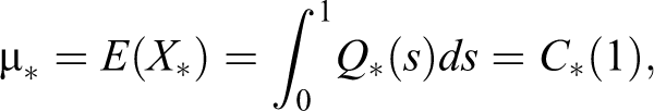
Next, define as the pth quantile of and suppose that possesses a finite mean
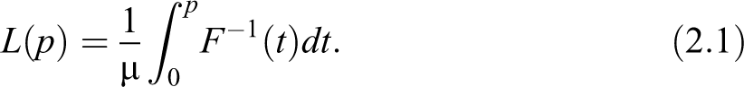
The Lorenz curve, introduced by Lorenz (1905), is an irreplaceable tool in this domain defined by
The curve expresses the share of income possessed by the percent poorer part of population and has been mathematically formulated as in equation (2.1) by Pietra (1915).
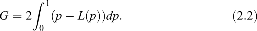
We may now recall the classical Gini index (Gini 1914)
In his seminal paper, Gini defined the index as the ratio of the area that lies between the line of equality and the Lorenz curve over the total area below the line of equality (see Figure 1). Following Gini’s line of thinking, a measure of the actual inequality in a population should be provided in a relative way, by comparing the area between the observed Lorenz curve and the equality line, to the area we would obtain in the case of absolute inequality (where the Lorenz curve coincides with the bottom and rightmost edges of the unit square). Obviously, the index is also twice the area between the Lorenz and the equality line, and this is the interpretation we more frequently find in the literature.
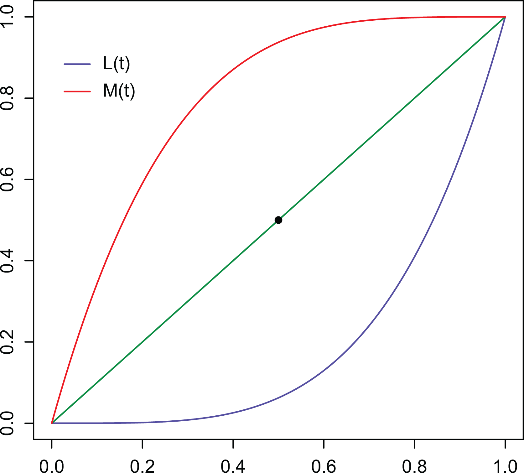
Curves and .
In the following, we will also employ that provides the share of income owned by the richer percent of the population. Obviously, is the curve obtained by applying a central symmetry to , with respect to the center of the unit square, as shown in Figure 1 and allows us also to rephrase the Gini into .
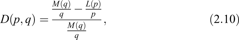
Using , we may recall also the Zenga index (Zenga 2007).
The Zenga index contrasts the mean income of the percent of the poorest, given by , to the mean income of the remaining percent of richest population, expressed by . For each , the idea is to divide the population by a poverty line, given by the pth quantile, and compare the mean incomes in the obtained partition giving raise to the Zenga inequality curve
To summarize the entire information, the Zenga index is the expected value of all such comparisons:
This is particularly interesting because, when compared to the Gini, the Zenga index considers two adjacent and exhaustive groups of population while the Gini can be rephrased as the expected value of all comparisons between the overall mean income and the mean income of the poorest, given by , with weight function :
We notice, in passing, that the latter formula for the Gini index shows also the central role played by the mean we anticipated in the Introduction section. As the groups considered in the Gini are overlapping, we argue that it is more difficult to highlight their differences. Moreover, the weighting system adopted to normalize the Gini, that is, the weight , emphasizes the less interesting comparisons, that is, those referred to almost overlapping groups, and minimizes the potentially more noticeable contributions, given by low values of , that is, when we compare the extremely poor people with the entire population (see Greselin, Pasquazzi, and Zitikis [2012] and Greselin [2014] for a more detailed discussion and several interpretations of results on real data of both indices). This is the reason why the Gini index, the most commonly used measure of inequality, is known to be insensitive to the tails of the distribution and insensitive at high levels of inequality—precisely when and where we might care most.
Motivated by the observed shifts toward the extreme values in income distributions, our proposal here is to adopt a new focus: We consider equally sized and opposite groups of population, and we compare their mean income. We intend to contrast the economic position of the group of the poorer percent to the one of the percent of the richest by introducing the following new inequality curve
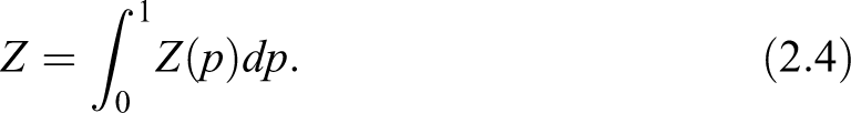
Naturally, we define also the corresponding measure of inequality as the expected value
We would like to stress here, that in comparison with the Gini, the new index contrasts mean incomes of opposite groups, and in comparison with the Zenga, considers equally sized groups of population instead of complementary ones.
Discussion of the New Definition
The aim of this subsection is to provide an in-depth discussion on the above-introduced index of inequality.
We begin with a brief technical motivation for the choice of the weighting function in the definition of the index D, by inserting it into a broader family of modifications of the Gini index we can find in the statistical literature. The area , and its various modifications, has been of particular interest and thus has given rise to a wealth of indices. The aforesaid modifications are based on emphasizing or de-emphasizing (depending on the purpose under consideration) the difference in some regions of the unit interval by using a weight function . Let us consider hence the following general class of indices
The entire family yields indices that satisfy the principal axioms usually required for inequality measures (listed in the following Properties of the Index D subsection), provided that is a weight function, that is,
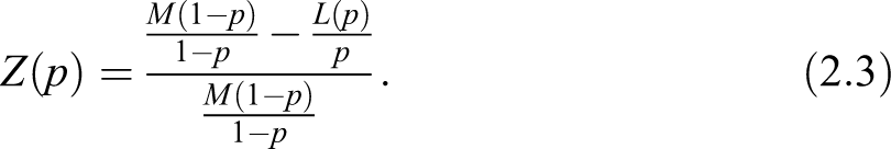
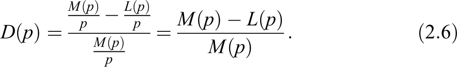
The question about how to select a meaningful weight function arises quite naturally at this point. We argue that a weight function that takes into account the income distribution could be of particular interest, and indeed, this is the case for the index where we have set . Our choice is also motivated by the fact that, in this way, turns out to be the relative variation of with respect to ; therefore conjugates the same relative approach given by Gini and the modern philosophy of the Zenga index. With respect to the latter, comparing equation (2.3) with equation (2.6), appears to be easier to be evaluated.
A second topic of discussion is related to the fact that income distributions are skewed. We could argue, as an acute reviewer suggested, that we would better address inequality by comparing two unequal tail measures. We may generalize formula (2.6) and consider a two parameters inequality surface
to convey the relative difference from the average income of the percent of richest with respect to the average income of the percent of poorest individuals in the population. Let us now study the properties of this new surface. has the property of scale invariance and decreases under uniform increase in incomes. Moreover, it is a decreasing function in , for fixed (increasing function in for fixed , respectively). In case of perfect equality, we still have whereas for maximum inequality, we obtain . To attach some interesting interpretation do in the literature, we may recall here the Palma ratio (cf., e.g., Cobham and Sumner 2013), which is the ratio of the income share of the top 10 percent to that of the bottom 40 percent, hence . The Palma ratio is based on the empirical fact that the middle classes—more accurately the middle-income groups between the rich and the poor (defined as the five middle deciles, 5–9)—tend to capture around half of gross national income, wherever you live and whenever you look. The other half of national income is shared between the richest 10 percent and the poorest 40 percent, but the share of those two groups varies considerably across countries. We may also wonder whether the top 10 percent is actually a good enough selection. After all, in the United States, for instance, it is hardly the growth of the top 10 percent that is driving inequality. Even the top 1 percent is probably too expansive. Following Piketty’s studies (Piketty 2014), the big driver of inequality is the extraordinary growth in the top0.01 percent. Even if we may not be sure how applicable that is in other countries or contexts, we can reckon that politically, it is important. For example, if new taxes are necessary, we have to devise an effective targeting without—not trivially—making unnecessary enemies. So, how about considering ? Ratios like can combined and compared, perhaps added to a synthetic measure to give a more informative view. In particular, because they are generated from the same data, it would not be difficult to track them side by side, for some meaningful values of and , or— analogously—to give a set of percentiles (as in table 3.12; Foster et al. 2013) selected by the researcher to highlight particularities in the income distribution. The last example we want to mention here comes from the Organization for Economic Cooperation and Development (OECD) data set on inequality (see https://data.oecd.org/inequality/income-inequality.htm). Among the available tools to measure inequality, they provide the Gini index, and some few indicators, like
S90/S10, interdecile income share ratio (the ratio of the average income of the 10 percent richest to the 10 percent poorest);
S80/S20, the interdecile ratio comparing the average income of the 20 percent richest to the 20 percent poorest;
P90/P10, the interdecile ratio we mentioned before;
P90/P50, the ratio of the upper bound value of the ninth decile to the median income; and
P50/P10, the ratio of median income to the upper bound value of the first decile.
Following another line of reasoning, when setting , we obtain , that is, we come back to the Zenga, an inequality curve with a sensible interpretation.
But then, when the aim moves toward obtaining a synthetic measure, we have to fix and integrate in or vice versa. It is hard to devise an interpretation of, say, , which would be the average relative difference from the mean income of the percent of richest individuals, with respect to all the poorest fractions of population. If we could go further, and introduce , that expresses the average relative difference from the mean income of all the richest fractions with respect to all the poorest fractions of population. We could easily see that, in this way, we would loose the simplicity and the clear interpretation of our proposal. Moreover, averaging over all values of and will loose the contrast we want to detect between poor and rich groups of people in the same society. To conclude our discussion, the asymmetric definition can complement information provided by an overall measure of inequality, for particular values of and , but we would not develop further on it.
It is worth to notice that our proposal, based in comparing equal tails, is also settled in the framework of economic studies, where ratios of family income earned by the top quintile of households relative to the bottom quintile have been widely employed (Cowell 2011; Crystal and Shea 1990; Deininger and Squire 1996; Drudi and Tassinari 2014; Foster et al. 2013; Grubel 1998; Norton and Ariely 2013). Beyond the widely employed interquantile ratios, like , we also find interquantile share ratios denoted as, say, . The latter compares the average income of the 20 percent richest to the 20 percent poorest. The most famous interquantile share ratio is Kuznet’s ratio , a common measure of income inequality, derived from the ratio of the incomes received by the top 20 percent and bottom 20 percent (either bottom 40 percent) of the population. We have that ; hence, the inequality curve is equivalent to the information obtained by all the Kuznet ratios we obtain by considering different percentages of people situated at opposite sides of the income parade (Pen 1971).
Finally, ratios between opposite percentiles of clinic measurements are commonly used for instance, for diagnostic purposes in medicine (see, f.i., Szklo 1998; Giashuddin et al. 2009, among many others) and in research evaluation as well (Starbuck 2005). Here, in the definition of the new index in equation (2.7), we are averaging among all the possible ratios; hence, we take into account contrasting information coming from the entire income distribution.
A Comparison Among Inequality Curves on Real Data
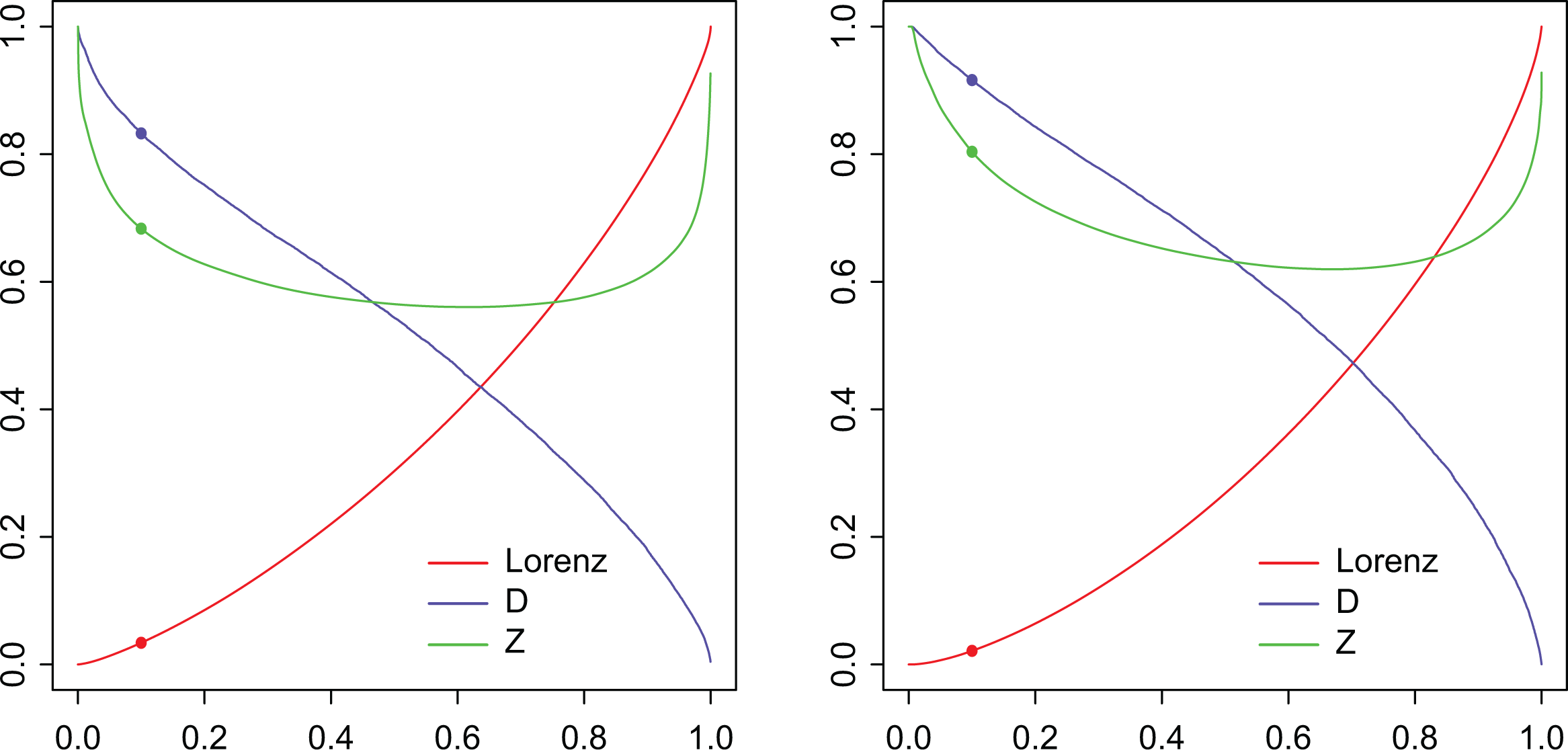
Now, we want to employ real data to compare the information conveyed by the considered inequality curves. While inequality indices are summary measures for the extent of inequality in a distribution, inequality curves provide a detailed (or pointwise) description of inequality. We will consider the widely employed Lorenz curve and compare it to the curves and . Figure 2 shows results obtained from Italian income data, at two different time periods, namely, years 1991 and 2012 for the left and right panel, respectively (more information about the data can be found in An Application on Italian Income Data section). Our objective is to verify whether or not, and to what extent, “the crisis developed countries are immersed in further accentuate differences between their citizens, thereby raising inequality with alarming consequences” (Larraz 2015, p. 509). We also would like to verify which inequality curve is more informative for our analysis. Our findings show that comparing two periods of crisis, the effects of the more recent one on the poorest part of the population are highlighted by the differences in the values of , , and , for low values of , say, for as in Table 1. For example, we observe that the Lorenz curve decreases from in 1991 to the value of 0.021 in 2012. This means that in 1991 the 10 percent of the poorest people owns 3.4 percent of the total income, and their share decreases to only 2.1 percent in 2012. Along the same time period, registers a more marked change: tells us that the mean income of the 10 percent of poorer part of the population is equal to only 16.7 percent of the mean income of the 10 percnt richest part while it decreases dramatically to 8.4 percent in 2012. Indeed, looking at formula (2.6), we may rewrite , hence , from which we derive the way to interpret values of trough their complement to 1. Similar comments hold for the Zenga curve, namely, tells us that the mean income of the 10 percent of poorer part of the population is equal to only 31.7 percent of the mean income of the remaining 90 percent richest part while it decreases to 19.6 percent in 2012. To obtain the interpretation, from formula (2.3), we proceed in an analogous way as for and derive . We have seen that the information given by the inequality curve makes us aware that the situation of the most fragile part of the society remarkably worsened in the second crisis. Moreover, its increased relative distance from the wealthy segment of population may arise some questions to policy makers.
L(p), Z(p), and D(p) curves for Italian income data, (left panel: data for year 1991, right panel: data for year 2012).
Italian Income Data: Pointwise Inequality Measures , and, for .
Year
L(0.1)
Z(0.1)
D(0.1)
1991
.034
.683
.833
2012
.021
.804
.916
Properties of the Index D
Axioms, in inequality measurement, are desirable properties of the indices. Following an axiomatic approach, we will consider three basic properties (Pigou–Dalton principle, scale invariance, and decrease under uniform increase in incomes), and we show that the index satisfies all of them.
1. Scale invariance: The index does not change when all the incomes are scaled by the same factor.
Proof. Cumulative shares of income, as well as the Lorenz curve, are invariant when passing from to for all ; hence, is invariant too.
2. Pigou–Dalton principle of transfers: This axiom says that transfers from rich to poor (i.e., progressive transfers) that preserve the mean and the rank of the individuals should decrease the value of the inequality measure.
Proof. To show that satisfies this classical requirement for inequality measures, we denote by and , respectively, the Lorenz, the curve and index evaluated on a population, and by and the same quantities evaluated after a Pigou–Dalton transfer on the original population. To show that , we prove the stronger inequality .
Let , then
and
The inequality is equivalent to the following
and the latter, after simplification, transforms into
Recalling that under a Pigou–Dalton transfer, we have that , hence . □
3. Decrease under uniform increase in incomes: If all the incomes of individuals uniformly increase (mathematically speaking, it means that we pass from the initial random variable to for some positive constant ), then the inequality measure should decrease.
Proof. Recalling that increases under the addition of a fixed quantity to the incomes, and based on the previous property that assures , we obtain the thesis. □
In the following, we will enunciate and show some more properties of the index , also in relation with the Gini and the Zenga indices.
From the definition, we get , , and .
is a decreasing function.
Proof. We will equivalently show that the function is increasing. Let and such that , then
where
As is a nondecreasing function, we get
and
Hence , which is equivalent to . □
Case of perfect equality: In this case, we have , hence for all and .
Case of maximum inequality: Denoting by the population size, we have that for and for , hence . Similarly, we arrive at .
The following inequalities hold true among the three indices: .
Proof. The first inequality, , is straightforward due to the fact that . To prove the inequality , it is sufficient to state that
We prove the stronger relation
which is equivalent to
The latter inequality holds as and
□
Example. Let us consider the family of Lorenz curves given by the equation . When changes from to , this family modelizes a smooth transformation from the case of perfect equality to the maximum inequality one. Denoting by and the corresponding indices, we are interested in studying their asymptotic behavior, as . We have
Therefore, and share the same asymptotic behavior as they approach with order while for the order is equal to .
Different Measures for Different Focuses
A complete distribution—of inequality or anything else—cannot be captured in a single measure. Any single measure that is used must inevitably reflect a normative view about what aspects of the distribution are more important (Atkinson 1970). Different measure of inequality can produce different rankings between distributions because they highlight different aspects for the distribution inequality (Jasso 1982). In this view, a measure of inequality is never regarded as in general superior to another, but more appropriate for a particular purpose. In this sense, we would like to challenge the wide use of the Gini that results in important features of inequality being hidden. We will explore the difference between the Gini index and the new index D by comparing the two following particular cases.
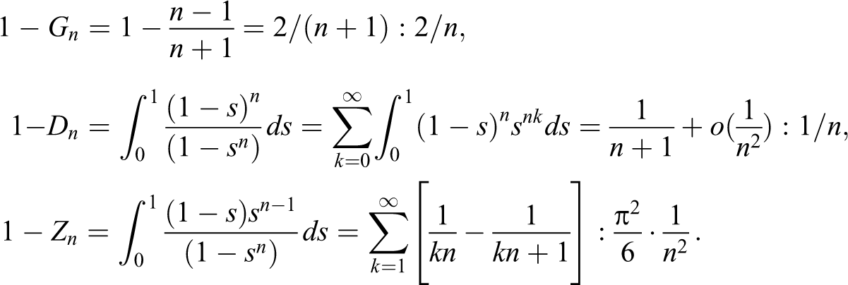
Firstly, let us set and consider the Lorenz curve given by two adjacent segments, the first one joining the points and and the second segment spanning from to (see the left panel in Figure 3). Let us denote this family of curves by . This position describes a society in which percent of the population is owning nothing, and the entire wealth is equally distributed among the remaining percent of the population.
Two possibile societies described by the Lorenz curves and (and corresponding and ). The particular case of is represented.
Afterward, let us define a second family of Lorenz curves, considering the two segments connecting with and then with (see the right panel in Figure 3). We will denote this second family of Lorenz curves by . Hence, describes all the societies in which the richest person owns percent of the overall wealth, and the remaining individuals own percent of the overall wealth in equal parts.
Obviously, the Gini index is equal to for both cases, in other words, . Notice that for we arrive at the maximum inequality, while for we get the perfect equality.
We aim at deriving now the index for the considered families of Lorenz curves. Looking again at Figure 3, in the left panel, we have for and for ; analogously, for and for . To obtain , for , we get
while for , we obtain
Similarly, in the right panel of Figure 3, we have and for ; hence, we obtain
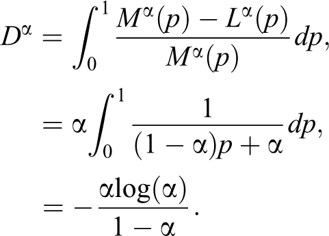
Figure 4 shows the different behavior of the indices and with respect to
The indices and for .
We may argue that, for intermediate values of , there are good reasons for preferring the index . For instance, we may set and consider a first society described by the curve , in which 30 percent of the people have no income—with the remaining 70 percent individuals sharing in equal parts the entire wealth—and a second society with , where all but one individual share the 70 percent of the income, in equal parts, and the richest person has an income equal to 30 percent of the whole wealth. Besides our personal perspective, given perhaps by our utility function, the first society seems remarkably more unequal and problematic from the point of view of welfare. This is precisely what the different values of conveys, namely, and .
Inequality Curves for the Pareto and Lognormal Distributions
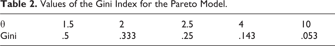
In this section, we want to compare the behavior of the inequality curves , , and when assuming some commonly used two-parameter models for income distributions, say the Pareto and the Lognormal.
The Pareto model (Pareto 1895) is particularly effective for representing the rightmost tail of economic size distributions. The cumulative distribution function is given by , with parameters and (to have finite expectation). The Lorenz curve is given by
We observe that there is no dependence from parameter , as the latter is a scale parameter. The Gini index for the Pareto model is given by . Table 2 shows that the most plausible values of the Gini correspond to a very small range, that is .
Values of the Gini Index for the Pareto Model.
1.5
2
2.5
4
10
Gini
.5
.333
.25
.143
.053
Figure 5 shows the curves , , and for the Pareto model for different choices of .
Curves , Z(p), and for the Pareto model.
The index is hence given by
but, unfortunately, a closed form solution for the integral is not available, as far as we know.
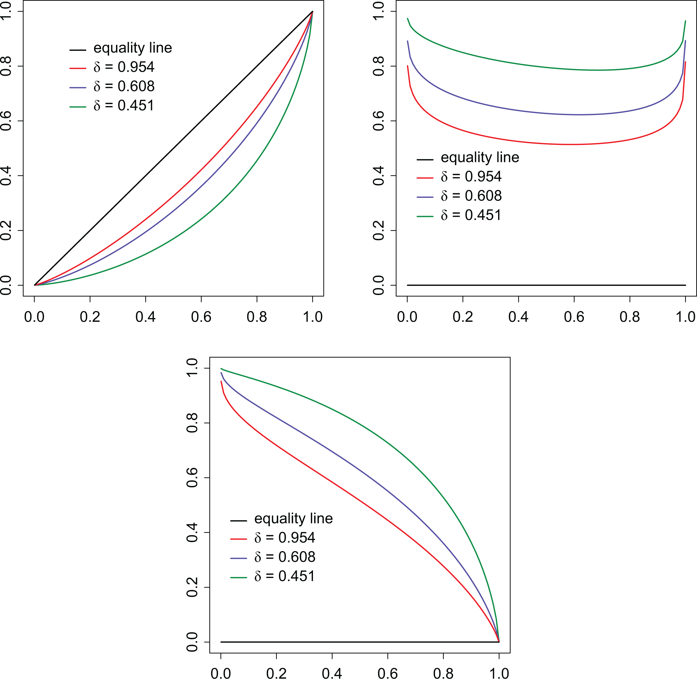
A second distribution frequently employed for economic variables is the Lognormal model, with parameters and . The Lorenz curve, in this case, is given by for , where is the standard normal distribution function. Polisicchio and Porro (2009) derived the Zenga curve
and we obtain here the curve
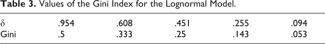
For the Lognormal distribution, being a scale parameter, only appears in the inequality curves and indices. The Gini index, for the Lognormal model, is given by , and Table 3 shows the values of we have to adopt to obtain the same Gini values we previously obtained in Table 2 for the Pareto case. Again, for plausible values of the Gini we meet in real income distribution, we have to choose . The curves , , and for the Lognormal model are given in Figure 6 with values corresponding to the same three Gini values we considered in Figure 5 for the Pareto case.
Curves , Z(p), and for the Lognormal model.
Values of the Gini Index for the Lognormal Model.
.954
.608
.451
.255
.094
Gini
.5
.333
.25
.143
.053
For both models considered in this subsection, we can easily observe that is an increasing function (while is a decreasing function) in terms of the inequality parameter that are for the Pareto model and for the Lognormal, respectively. Therefore behaves like the classical measures: It is monotonic with respect to the inequality parameter.
Finally, the index for the Lognormal model can be given as
but, unfortunately, also in this case, a closed form solution for the integral is not available, up to our knowledge.
Empirical Estimator for the New Index of Inequality D
Let us suppose that data are outcomes of independent and identically distributed random variables, and let be independent copies of . Denoting by the corresponding order statistics, we introduce an estimator for the index
Now, we provide an example to see in detail how to obtain the point estimate on raw data. To give an illustration, we have chosen a very simple case. It consists of a population of 10 individuals whose ordered incomes are respectively given by EUR€5, EUR€10, EUR€15, EUR€40, EUR€60, EUR€100, EUR€150, EUR€200, EUR€280, and EUR€500. After evaluating the cumulated and retrocumulated values , we set up nine ratios in the rightmost column, to compare the mean income of the poorest and the richest persons. Note that the 10th ratio would contrast the entire population with itself; hence, it is not of interest. Finally, the average of the values gives .
Observe that in Table 4 we consider ratios of cumulative sums, as the frequencies we would use to obtain mean values cancel out.
Evaluation of on a Population of 10 Individuals.
Individuals
1
5
5
500
.990
2
10
7.5
390
.981
3
15
10
326.667
.969
4
40
17.5
282.5
.938
5
60
26
246
.894
6
100
38.333
215
.822
7
150
54.286
190
.714
8
200
72.5
168.125
.569
9
280
95.556
150.556
.365
10
500
—
—
—
We note, in passing, that some inequality measures, such as for instance the Atkinson and the Theil indices, require a positive support, while our measure D (as the Gini, Zenga, and more generally all measures based on the Lorenz) does not require this unrealistic assumption and admits also null incomes.
Estimating Inequality Measures From Grouped Data
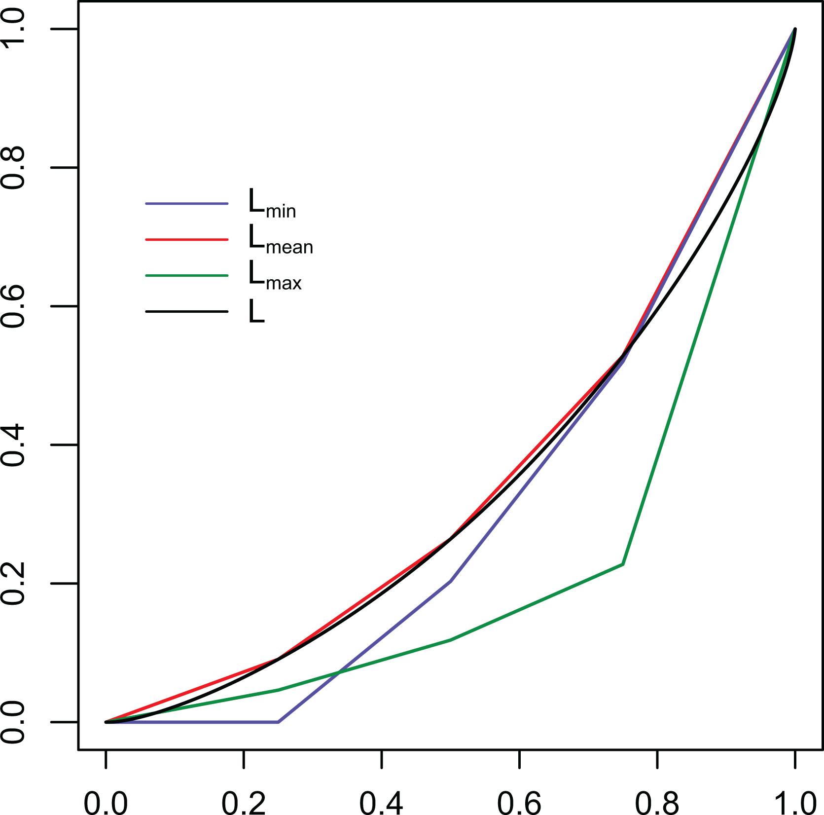
Many statistical offices, due to obvious confidentiality reasons, prefer to provide open access to grouped data instead of to the personal ones. In this section, we want to assess the error in estimating the inequality curves and indices when we only know the gathered information. Let us model the problem by supposing that the random variable we introduced before is now substituted by the random variable that describes the grouped income data and denote the number of groups by . There are three main ways to deal with classified data: to represent each class by its mean value , by its maximum , or by its minimum value . Hence, assuming here the almost sure boundedness of the cdf of , it will be approximated by one of the followings:
Figure 7 shows the three different ways to approximate the quantile function of .
Three common ways to approximate the continuous quantile function of a random variable , by considering its maximum value , its minimum value , or its mean value , after grouping the data.
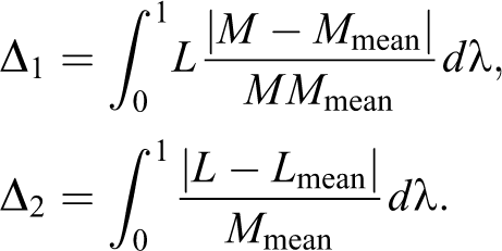
Denoting by the quantile function for , where stands for , or , we define the integral counterpart of by
Then, we denote the expectation of by
the corresponding Lorenz curve by , the “dual” curve by
, and, finally, the related indices still using the starred notation:
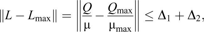
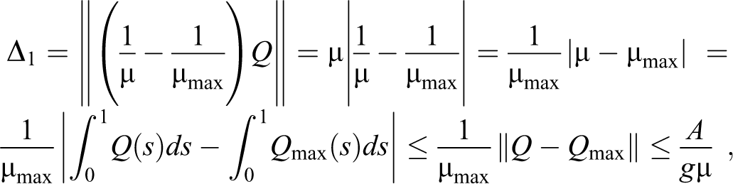
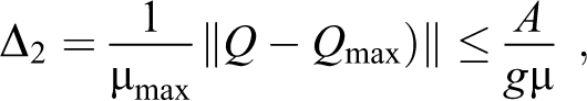
Perhaps, the choice of is the most preferable as .
To control the error in estimating the inequality indices, it is convenient to begin by estimating the norms of the quantiles where . The choice of this particular norm is motivated by our further aim to assess the error for the indices, the latter being integrals of quantile functions. From the definition of the quantile function , we have that
and
where we set .
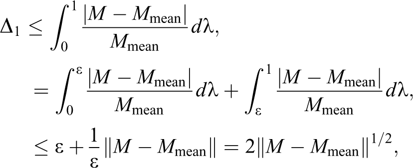
We immediately obtain a first bound on the Lorenz curves:
Analogously, we look for an upper bound for We have
where
and
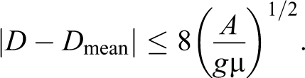
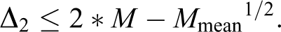
recalling that . We have obtained, hence, the following bound:
Finally, with similar steps, we get the third upper bound we are interested in
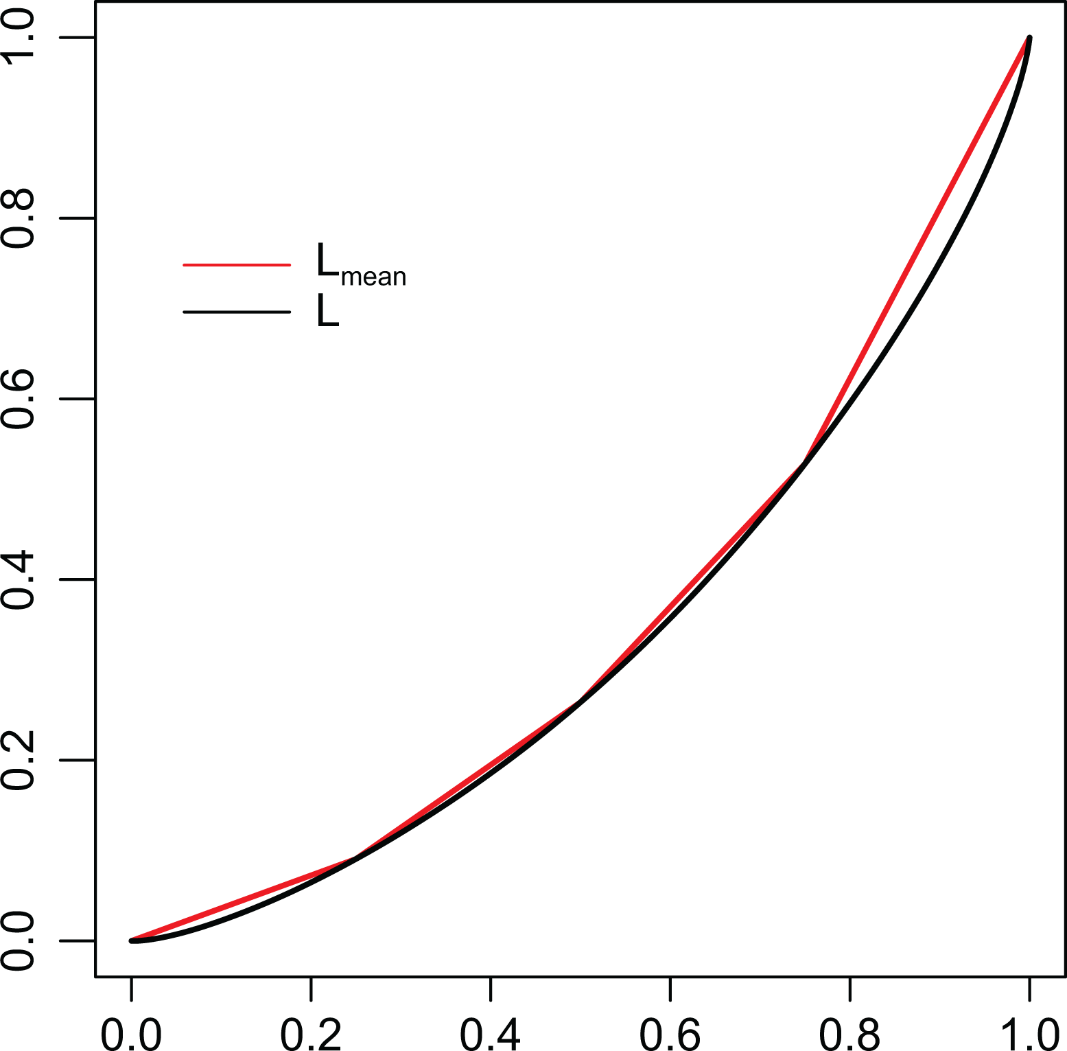
It is worth to recall that the curve is a polygonal curve inscribed into the curve, in other words, it provides an underestimation of the inequality, as described in Figure 8, in such a way that
Comparison between the Lorenz curve estimated from grouped data, and the curve obtained from microdata. Here, we consider four groups, delimited by quartiles.
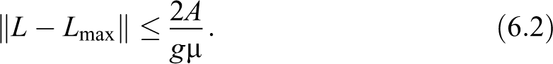
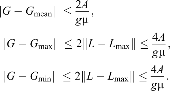
The latter remark, jointly with estimations (6.1) and (6.3), gives the following proposition.
Proposition 6.1: We have
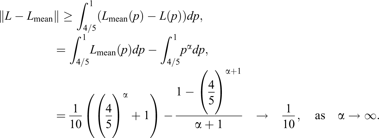
Remark: The following example shows that moving from to , the Gini index could have a sensible change. By setting , , with , and taking classes or grouped values, we have
When , considering our choice of the Lorenz curve , we are approaching the maximum inequality, and in this case, we get , or, in other words, ; hence, the grouping could significantly distort the estimation.
The next result gives a bound for
Proposition 6.2: The following inequality takes place
Proof. We have
where is the Lebesgue measure and
We look for getting a bound for now:
if we set . We may proceed similarly for , and we get
As , we conclude with the desired bound for the index :
The same bound can be established for and by analogous steps.
Propositions 6.1 and 6.2 are related to the indices and , respectively, and appropriate bounds for can also be evaluated by following a similar approach.
For data sets having the last interval or group with an infinite right end point, for example, income “1,000,000+,” with nonzero frequency, usually at least the mean value of the last class is provided. If this is the case, the “mean” version of the cdf is still doable. For the “max” version of the cdf, the right open-ended interval remains a problem, whenever the maximum value of the data is unknown. One can still derive an upper bound to by assuming that all but one income equals and solve for from the gth group mean .
On a more general note, our approach for evaluating the indices D and Gini on grouped data is devoted to provide bounds when comparing different methods of approximating the cdf of , and consequently, the quantile function and the Lorenz. Finally, from the “min,””mean,” and “max” Lorenz approximation, we derive the indices. In this way, our purpose is to deal with the inequality between the groups. Many other contributions (from Goldsmith et al. 1954) are available in the literature to deal with the “grouping correction” to take into account the variability inside each group. A careful review on the latter issue is given in Lyon, Cheung, and Gastwirth (2016).
An Application on Italian Income Data
Longitudinal data have been being collected for a long time, but the idea of using such data for research purposes is a relatively recent development. They have, in fact, been gathered at the national level for more than 300 years (Menard 1991). The first regular, periodical collections of census data were carried out in Quebec Canada (CDN) when it was still a French colony, called New France (1665–1754). Other long-running periodical censuses that should be mentioned are Sweden (started 1749), Norway and Denmark (1769), and the United States (1790). In Italy, the first census was launched in 1861, the year of unification.
Nowadays, Italian data are collected by the Bank of Italy. The survey on household income and wealth (SHIW) began in the 1960s with the aim of gathering data on the incomes and savings of Italian households. It includes demographic characteristics, housing, health, education, employment, incomes, payment instruments, forms of saving, nondurable and durable consumption, forms of insurance, and labor force participation. Over the years, the scope of the survey has grown and now includes wealth and other aspects of households’ economic and financial behavior. The sample used in the most recent surveys comprises about 8,000 households (24,000 individuals), distributed over about 300 Italian municipalities. The data on the households are freely available, in an anonymous form, for further elaboration and research on the Bank of Italy’s site (www.bancaditalia.it). The description of the structure of the historical archive and of its variables is also available (see Bank of Italy 2016. Historical Database of the Survey of Italian Household Budgets, 1977–2012). We will elaborate on homogeneous information from the Historical database that also allows for longitudinal analyses.
As for all survey data, sampling design involves unequal stratum sampling fractions, and the use of sampling weights is required to obtain unbiased estimates. These weights account also for nonresponse process, in order to reduce the estimation bias. The changes in sampling design over the years (in the sampling frame, in the way sampling weights are computed, etc.) imply that the weights are not fully homogeneous. Even if since 1987 the sampling strategy is basically the same, to further reduce the variability due to the different approaches used to calculate weights over the years, a set of modified weights were calculated by raking the sampling weights to the labor force survey. These weights should grant greater stability to the estimates. Hence, following the indications provided by the SHIW documentation, we adopted the weights PESOFL2 to provide the better available estimate of the Italian resident population. A household is a group of persons living together, whether related by kinship or not, who fulfill their needs by pooling all or part of the income earned by the members.
In our foregoing analysis, we will compare data on income, wealth, and consumption. By income, we denote the net household income that is the sum of payroll income (net wages and salaries, fringe benefits), pensions, and net transfers (pensions, arrears, financial assistance, scholarships, alimony, and gifts).
By wealth, we consider the sum of real assets (dwellings, land, etc.) and financial assets (deposits, securities, shares, etc.) minus financial liabilities (mortgages, personal loans, etc.).
Finally, consumption refers to durable and nondurable goods bought by the household. Among the durable goods, the survey lists jewellery, works of art, means of transport, and furniture and sundry equipments. Nondurable goods include money spent on average per month and monthly rent.
From the beginning of the study of household welfare and consumption, the need was felt for standards with which actual income, wealth, and consumption behavior could be compared across households of different size. An equivalence scale reflects the fact that there are scale economies in an household. There are collective goods that are consumed by everybody and private goods that are consumed specifically by one individual. The equivalence scale depends on the proportion of collective versus private goods in the household. The usual statistical practice consists in dividing the household income by a function of the household size , say to obtain the equivalent income. The equivalent income is therefore the income that each individual of a household would need if she or he had lived alone maintaining the same standard of life that she or he enjoys as a member of the household. In the present study, we use the modified OECD equivalence scale that assigns 1 to the household head, 0.5 to the other adult members of the household, and 0.3 to the members under 14 years of age (see Brandolini and Cipollone 2002 and references therein). Following almost all studies analyzing income and wealth, the equivalence scale applied to income is also applied to wealth and consumption (Magrabi 1991; OECD 2013:169). We present herein the relationship between the three indices, to describe the dynamic in inequality, across time periods. We are also interested in assessing whether income, wealth, or consumption follow the same pattern or we can devise a different behavior for them.
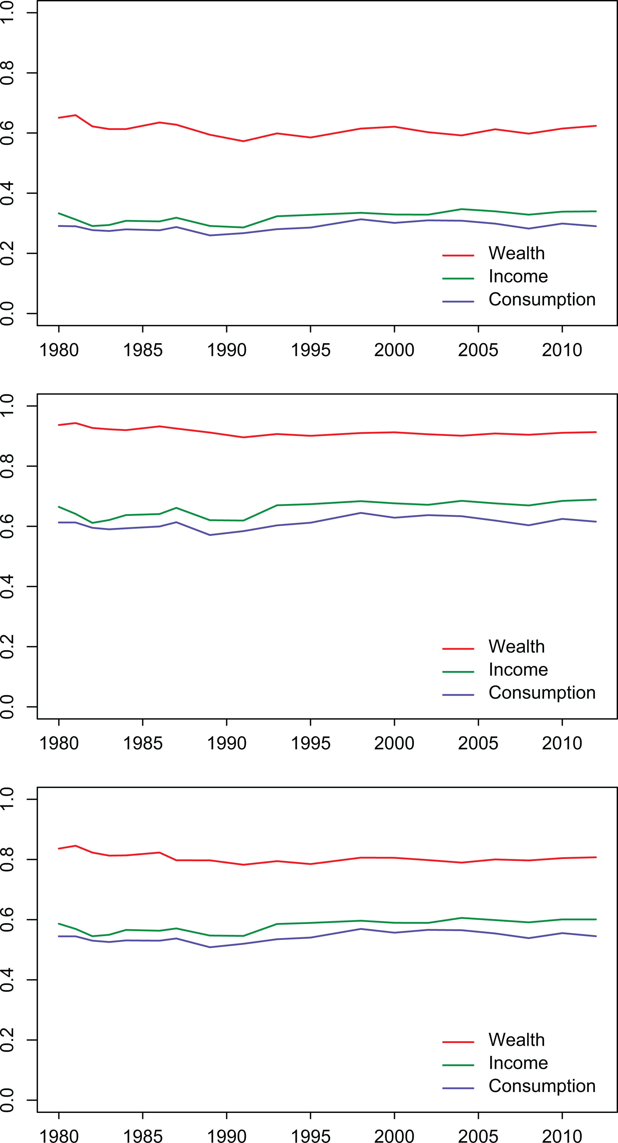
Our analysis of the household distribution of income confirms Brandolini’s (2008) results where the author, according to the SHIW evidence through the Gini index, observe that, from the early 1970s to 1982, the inequality of household disposable incomes fell considerably (see the upper panel in Figure 9). It remained rather stable in the mid-1980s, it grew in 1987, and it declined further in 1989–1991. A sharp increase between 1991 and 1993 brought the Gini index back to the value of 1980. Since then, the Gini index has exhibited some fluctuations but no steady tendency to increase or decrease: For instance, the rise in 2003 was reversed within the next two years. The first phases correspond to statistically significant changes:Of the 14 pair comparisons, 1977–1982, 1982–1987, 1987–1991, and 1991–1993 are significant at the 1 percent level. Between 1993 and 2006, on the other hand, none of the pairwise comparisons are statistically significant (see Brandolini 2008).
Inequality indices G, Z, and D on SHIW Italian household income data (upper panel), wealth (central panel), and consumption (lower panel).
We observe a similar behavior for the three indices G, Z, and D along time, denoting a substancial agreement in measuring the dynamics of changements.
When it comes to wealth inequality (central panel in Figure 9), we see that G declines along the years 1980–1990, with a more apparent change in comparison to D and Z. The three indices, in any case, do not show a huge variation along the considered period. Both income inequality and the intergenerational transmission of social advantage, throught inherited wealth, make Italy much closer to the Anglo-Saxon economies and their relatively high levels of inequality than to the Continental European ones (Ballarino et al. 2012).
Finally, with reference to consumption, inequality decreased till 1990, had a steady light increase in 1990–2000, and subsequently rose in 2010 reaching again the values observed previously in 1980.
Figure 10 selects a specific measure (the Gini index in the upper panel, the Zenga, and the D index, respectively, in the central and lower panels) and describes the dynamic of wealth, income, and consumption inequality along time. We observe that, during the entire period under consideration, wealth is significantly less equally distributed than income, and income, in turn, is slightly less equally distributed than consumption (Jappelli and Pistaferri 2010).
Inequality indices on SHIW Italian household income, wealth, and consumption data measured by the three inequality indices: G (upper panel), Z (central panel), and D (lower panel).
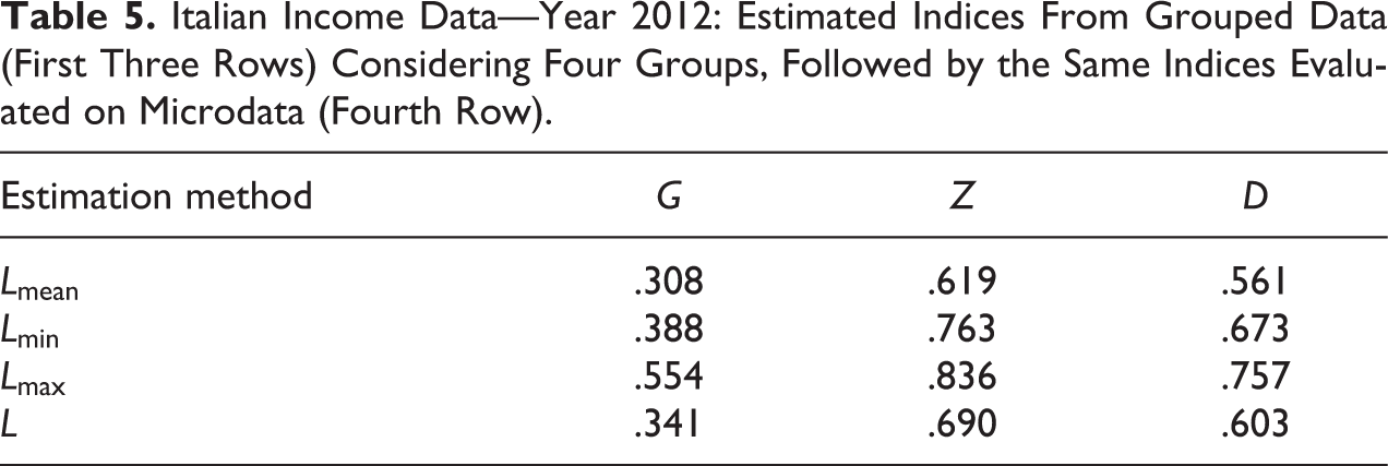
After the longitudinal study, we now choose income data from year 2012: Our aim here is to show how the grouping could affect the estimates, along the lines of our considerations in Estimating Inequality Measures From Grouped Data section. First of all, we draw, in Figure 11, the four Lorenz curves: obtained from the microdata and obtained from the grouped data, considering four groups given by the quartiles.
Lorenz curves evaluated with the three methods derived from , , and in Estimating Inequality Measures From Grouped Data section.
Then, we evaluated the indices following the three methods, on the raw data, and the results obtained are shown in Table 5.
Italian Income Data—Year 2012: Estimated Indices From Grouped Data (First Three Rows) Considering Four Groups, Followed by the Same Indices Evaluated on Microdata (Fourth Row).
Estimation method
G
Z
D
.308
.619
.561
.388
.763
.673
.554
.836
.757
.341
.690
.603
We observe, on one side, that considering the approximation given by , and evaluating accordingly, we obtain results for the indices that are pretty close to the values derived from the data. On the other side, the differences in Table 5 between the approximations given by and , and the true values of the indices are remarkable. We may conjecture that increasing the number of groups to 10, we get a much better approximation (results in Table 6), but we see that still the choice of is greatly more advisable.
Italian Income Data—Year 2012: Estimated Indices From Grouped Data (First Three Rows) Considering 10 Groups, Followed by the Same Indices Evaluated on Microdata (Fourth Row).
Estimation method
G
Z
D
.334
.669
.594
.335
.701
.615
.534
.814
.740
.341
.690
.603
Concluding Remarks
Inequality in wealth and income has increasingly become a topic of interest not only to academics but also to policy makers—as witnessed by the rise of the Occupy Wall Street movement and the role that inequality plays in defining issues such as taxation and universal health care.
Recent dramatic increases in the rightmost part of the income distribution have motivated a fresh rethinking of the issue and of the tools that are commonly used for measuring inequality. We contribute to this debate by introducing a new measure, based on contrasting the incomes owned by opposite, and equally sized shares of population and averaging over all contributions given by the antithetic parts of the income distribution.
We compared our proposal with the benchmark, that is, the Gini index, and also with more recent proposals in the literature, like the Zenga index, providing a discussion about the different focus adopted by each index. We developed a detailed comparison among the three measures, by applying them to Italian data, and considering income, wealth, and consumption along the period 1980–2012. Indeed, adopting a measure, for research purposes or for taking informed decision, means to choose a particular point of view to be employed for summarizing microdata.
We have also assessed the influence of measuring inequality on grouped data, as sometimes for confidentiality reasons, we do not have access to the detailed informations by showing the effects of this practice on real income data.
Finally, we argue that the findings illustrated in this article suggest to investigate also subgroup decomposition and decomposition by sources for the index (as in Larraz 2015 and Zenga et al. 2012). Moreover, inferential results (as in Moran 2006 for the Gini index or in Greselin et al. 2010 for the Zenga index) are crucially needed for making statistically significant inequality comparisons for the new index, and this will be the object of future work.
Footnotes
Declaration of Conflicting Interests
The author(s) declared no potential conflicts of interest with respect to the research, authorship, and/or publication of this article.
Funding
The author(s) received no financial support for the research, authorship, and/or publication of this article.
ORCID iD
Francesca Greselin
References
1.
AtkinsonA. B.1970. “On the Measurement of Inequality.” Journal of Economic Theory2:244–63.
BrandoliniA.2008. “Income Inequality in Italy: Facts and Measurement.” XLIV Riunione Scientifica, ISBN 978-88-6129-228-4, CLEUP Eds., Padova, Italy.
5.
BrandoliniA.CipolloneP.. 2002. Urban Poverty in Developed Countries. New York: Maxwell School of Citizenship and Public Affairs, Syracuse University.
6.
CobhamA.SumnerA.. 2013. “Putting the Gini Back in the Bottle? The Palma as a Policy-relevant Measure of Inequality.” Technical report, Kings College London, London, UK.
7.
CowellF.2011. Measuring Inequality. 3rd ed. London, UK: London School of Economics Perspectives in Economic Analysis.
8.
CrystalS.SheaD.. 1990. “Cumulative Advantage, Cumulative Disadvantage, and Inequality Among Elderly People.” The Gerontologist30:437–43.
9.
DeiningerK.SquireL.. 1996. “A New Data Set Measuring Income Inequality.” The World Bank Economic Review10:565–91.
10.
DrudiI.TassinariG.. 2014. “The Turn of the Screw. Changes in Income Distribution in Italy (2002-2010).” Statistica & Applicazioni12:123–37.
11.
FosterJ.SethS.LokshinM.SajajaZ.. 2013. A Unified Approach to Measuring Poverty and Inequality: Theory and Practice. Washington, DC: World Bank.
12.
GastwirthJ. L.2014. “Median-based Measures of Inequality: Reassessing the Increase in Income Inequality in the U.S. and Sweden.” Journal of the International Association for Official Statistics30:311–20.
13.
GiashuddinS. M.RahmanA.RahmanF.MashrekyS. R.ChowdhuryS. M.LinnanM.ShafinazS.. 2009. “Socioeconomic Inequality in Child Injury in Bangladesh–Implication for Developing Countries.” International Journal for Equity in Health8:7.
14.
GiniC. 1914. “Sulla misura della concentrazione e della variabilità dei caratteri” [“On the Measurement of Concentration and Variability of Characters”]. Atti del Reale Istituto Veneto di Scienze, Lettere ed Arti73:1203–48.
15.
GoldsmithS.JasziG.KaitzH.LiebenbergM.. 1954. “Size Distribution of Income Since the Mid-thirties.” The Review of Economics and Statistics36:1–32.
16.
GreselinF.2014. “More Equal and Poorer, or Richer but More Unequal?” Economic Quality Control29:99–117.
17.
GreselinF.PasquazziL.ZitikisR.. 2010. “Zenga’s New Index of Economic Inequality, Its Estimation, and an Analysis of Incomes in Italy.” Journal of Probability and Statistics26. doi: 10.1155/2010/718905.
18.
GreselinF.PasquazziL.ZitikisR.. 2012. “Contrasting the Gini and Zenga Indices of Economic Inequality.” Journal of Applied Statistics40:282–97.
19.
GrubelH. G.1998. “Economic Freedom and Human Welfare: Some Empirical Findings.” Cato Journal18:287.
20.
JappelliT.PistaferriL.. 2010. “Does Consumption Inequality Track Income Inequality in Italy?” Review of Economic Dynamics13:133–53.
21.
JassoG.1982. “Measuring Inequality Using the Geometric Mean/Arithmetic Mean Ratio.” Sociological Methods & Research10:303–26.
22.
LarrazB.2015. “Decomposing the Gini Inequality Index: An Expanded Solution With Survey Data Applied to Analyze Gender Income Inequality.” Sociological Methods & Research44:508–33.
23.
LorenzM. C.1905. “Methods of Measuring the Concentration of Wealth.” Journal of the American Statistical Association9:209–19.
24.
LyonM.CheungL. C.GastwirthJ. L.. 2016. “The Advantages of Using Group Means in Estimating the Lorenz Curve and Gini Index From Grouped Data.” The American Statistician70:25–32.
25.
MagrabiF. M.1991. The Economics of Household Consumption. New York: Greenwood.
MoranT. P.2006. “Statistical Inference for Measures of Inequality With a Cross-national Bootstrap Application.” Sociological Methods & Research34:296–333.
28.
NortonM. I.ArielyD.. 2013. “American’s Desire for Less Wealth Inequality Does Not Depend on How You Ask Them.” Judgment and Decision Making8:393.
29.
OECD. 2013. OECD Guidelines for Micro Statistics on Household Wealth. Paris: OECD.
30.
PenJ.1971. Income Distribution: Facts, Theories and Policies. New York: Praeger.
31.
PietraG. 1915. “Delle relazioni tra gli indici di variabilità (I, II)” [“On the Relationships between Variability Indices (Note I)”]. Atti del Reale Istituto Veneto di Scienze, Lettere ed Arti74:775–804.