
Abstract
Previous research has introduced several effect size measures (ESMs) to quantify data aspects of single-case experimental designs (SCEDs): level, trend, variability, overlap, and immediacy. In the current article, we extend the existing literature by introducing two methods for quantifying consistency in single-case A-B-A-B phase designs. The first method assesses the consistency of data patterns across phases implementing the same condition, called CONsistency of DAta Patterns (CONDAP). The second measure assesses the consistency of the five other data aspects when changing from baseline to experimental phase, called CONsistency of the EFFects (CONEFF). We illustrate the calculation of both measures for four A-B-A-B phase designs from published literature and demonstrate how CONDAP and CONEFF can supplement visual analysis of SCED data. Finally, we discuss directions for future research.
Introduction
Single-case experimental designs (SCEDs) involve the repeated measurement of a single case that is being exposed to different levels of at least one manipulated variable (Kennedy, 2005; Kratochwill et al., 2010; Onghena & Edgington, 2005). SCEDs have a long history in the behavioral sciences (see Barlow, Nock, & Hersen, 2009; Kazdin, 2011; Kratochwill & Levin, 2015) and recently have received a strong impetus by the publication of guidelines and standards for more general implementation and reporting in various scientific disciplines (Kratochwill et al., 2010, 2013; Shamseer et al., 2016; Tate, Perdices, Rosenkoetter, McDonald, et al., 2016; Tate, Perdices, Rosenkoetter, Shadish, et al., 2016; Tate et al., 2013; Vohra et al., 2016). The application of SCEDs has risen steadily over the years (Michiels, Heyvaert, Meulders, & Onghena, 2017; Shadish & Sullivan, 2011; Smith, 2012), making SCEDs now a popular research methodology in the educational sciences (e.g., Gast, 2010; Horner et al., 2005; Kennedy, 2005; Tankersley, Harjusola-Webb, & Landrum, 2008), clinical psychology (e.g., Barlow et al., 2009; Morgan & Morgan, 2001), sport and exercise psychology (e.g., Barker, McCarthy, Jones, & Moran, 2011), and the health sciences (e.g., Morgan & Morgan, 2009).
Visual Versus Statistical Analysis of SCEDs
As the number of applications of SCEDs has increased over the years, the repertoire of available analytical techniques has steadily grown as well, leading to intensified discussions regarding the appropriateness of these techniques (Manolov & Moeyaert, 2017). Generally, one can distinguish between statistical and visual analysis of SCED data and there has been an ongoing debate about the superiority of any of the two approaches (e.g., Heyvaert & Onghena, 2014; Kazdin, 2011; Kratochwill & Levin, 2015). Traditionally, visual analysis is the primary method for analyzing data obtained from SCEDs (Heyvaert, Wendt, Van den Noortgate, & Onghena, 2015; Kennedy, 2005; Lane & Gast, 2014; Smith, 2012). Conducting visual analysis of SCED data “refers to the viewing and inspection of all available data (i.e., for all sessions in each condition) plotted on a line graph (i.e., time series data), and making determinations about behavior changes based on the visible data characteristics.” (Ledford, Lane, & Severini, 2018, p. 4). The What Works Clearinghouse guidelines for SCEDs (Kratochwill et al., 2010) recommend inspecting six features of the data when performing visual analysis: level, trend, variability, immediacy of the effect, overlap, and CONsistency of DAta Patterns (CONDAP) across similar phases. These data aspects “are [visually] examined to determine the extent to which a meaningful change in the behavior occurred and the extent to which this change can be attributed to the independent variable [. . .]” (Kahng et al., 2010, p. 35). The advantages of visual analysis include the following: It allows for the observation of abrupt as well as subtle changes over time (Lane & Gast, 2014); it is transparent when appropriate guidelines are followed and these guidelines are referred to explicitly (e.g., Ledford et al., 2018); it is self-explanatory, easily manageable, and it is widely accepted (Barker et al., 2011; Barton et al., 2016; Kennedy, 2005); large intervention effects are easily detectible, clinically insignificant effects are disregarded, and Type I error rates can be reduced (Baer, 1977; Harrington, 2013). Furthermore, visual analysis is response-guided, which allows researchers to make needed changes (e.g., phase changes) while maintaining experimental control (Barton et al., 2016). However, the validity of visual analysis has also been seriously questioned over the years. Some of the major drawbacks of visual analysis include low interrater agreement (Heyvaert & Onghena, 2014; Park, Marascuilo, & Gaylord-Ross, 1990), a lack of clear decision rules (Bulté & Onghena, 2009; Perdices & Tate, 2009), serial dependency in the data misguiding visual judgment (Matyas & Greenwood, 1990), insensitivity of visual analysis along with high Type II error rates (Ottenbacher, 1990), and finally—directly contradicting the proponents of visual analysis—increased Type I error rates (Harrington, 2013; Heyvaert & Onghena, 2014). Harrington and Velicer (2015) therefore conclude that visual analysis “is prone to bias and should not be used as a stand-alone analytical method” (p. 181).
A meta-analysis by Ninci, Vannest, Willson, and Zhang (2015) showed that the use of precise operational definitions of the data aspects that are important for visual analysis, together with other methodological and procedural variables, can increase the interrater agreement among visual analysts of SCED data. Various operational definitions and quantifications have been developed over the years to assess the data aspects suggested in the What Works Clearinghouse guidelines (Kratochwill et al., 2010). These operational definitions and quantifications are referred to as effect size measures (ESMs). Table 1 offers an overview of ESMs for each data aspect. The overview is based on a review of the available literature on ESMs for SCEDs, but we do not claim comprehensiveness. As Table 1 indicates, several data aspects such as level, trend, and overlap have been studied more extensively than others. For example, it seems that there are many more proposals for quantifying overlap than there are proposals for quantifying immediacy.
Overview of ESMs for Each Data Aspect.
Note. ESMs = effect size measures; MASCD = meta-analysis of single-case design; SCD = single-case design; LSTE = Level and slope treatment effect; SLC = Slope and level change.
The advocates of statistical analysis of SCED data have argued that ESMs, confidence intervals, and statistical tests have the advantage of producing identical results independently of who performs the analysis (Heyvaert & Onghena, 2014; Park et al., 1990). Further advantages include that Type I and Type II error rates are better accounted for (Matyas & Greenwood, 1990) and that quantification of the effect(s) allows for easier comparison within and between studies (Brossart, Parker, Olson, & Mahadevan, 2006). Notwithstanding this controversy regarding what method is superior, there seems to be a growing awareness in the field that the two approaches are best used concurrently (e.g., Bulté & Onghena, 2012; Kromrey & Foster-Johnson, 1996; Manolov & Moeyaert, 2017; Michiels et al., 2017; Parker & Brossart, 2003; Perdices & Tate, 2009). If we want the visual and statistical analyses to complement and support each other, developing ESMs for each data aspect that is visually analyzed can be beneficial. As Ninci et al. (2015) conclude, “The levels of reliability in regard to visually analyzed ratings are often considered unacceptable. Including effect sizes provides a means of interpreting the reliability and generalizability of results; this can be useful for the acceptance of single-case research methods [. . .]” (p. 536).
The Lack of a Measure for Consistency
As Table 1 indicates, several ESMs have been offered for five out of the six data aspects suggested by the What Works Clearinghouse guidelines (Kratochwill et al., 2010). Using statistical and visual analysis in such a complementary way can greatly strengthen the conclusions drawn and increase the acceptance in the scientific community (Michiels et al., 2017). However, to the best of our knowledge, no quantification exists yet for expressing the degree of consistency in SCED data.
We believe it is worthwhile for the SCED community to clearly delineate their use of the concept “consistency” and then to consider quantifications of the degree of consistency in SCED data. This clarification and possible quantification is beneficial because “consistency,” as such, is a broad and ambiguous concept that is defined and applied in many ways across scientific disciplines. In psychometrics, for example, internal consistency refers to the extent to which the items of a test jointly measure the same construct (Cronbach, 1951; Henson, 2001); in statistics, consistency is the property of an estimator to converge toward the true population value if the number of measurements increases (e.g., Newey & McFadden, 1994); in logic, a theory is consistent if none of its statements are contradictory (Audi, 1999); and in epidemiology, consistency is one of the Bradford Hill criteria for inferring a causal relationship (Hill, 1965).
However, with respect to the analysis of SCED data, “consistency” has a very specific meaning: “Consistency of data in similar phases” involves looking at data from all phases within the same condition (e.g., all “baseline” phases; all “peer-tutoring” phases) and examining the extent to which there is consistency in the data patterns from phases with the same conditions. The greater the consistency, the more likely the data represent a causal relation. (Kratochwill et al., 2010, p. 18)
As this definition highlights, consistency plays a key role in establishing a causal link between the manipulation of the independent variable(s) and the dependent variable in SCEDs (Baer, 1977). The What Works Clearinghouse definition likely goes back to the guidelines for visual analyses by Horner et al. (2005). Horner et al. explain that visual analysts have to judge the “consistency of data patterns across multiple presentations of intervention and nonintervention conditions” (p. 171). In spite of not labeling it as consistency, one of the earliest definitions of this data aspect was given by Parsonson and Baer (1978): “While assessment of data within phases and between adjacent phases forms a major part of the visual analytic process, judgment of the congruity of data across experimentally similar phases is also important” (p. 128). These definitions circumscribe consistency as a data aspect that has to be assessed between phases implementing the same manipulation of the independent variable.
Other researchers describe consistency in the light of replicating a potential effect. As Kazdin (1982) briefly notes, the establishment of an effect through visual analysis of SCEDs depends among others on “the consistency of the effect across phases or baselines, depending on the particular design” (p. 237). Following this line of thought Barker et al. (2011) explain that “a treatment effect is inferred when replication is consistent” (p. 158). More recently, Ledford et al. (2018) have argued that consistency involves both data patterns between similar conditions and between different conditions: Consistency refers to the extent to which data patterns are the same within like conditions (e.g., in both baseline conditions in an A–B–A–B design; in baseline conditions for all participants in a multiple baseline across participants design) and the extent to which changes (in level, trend, or variability) are the same for each potential demonstration of effect. In SCD research, the critical factor in determining a functional relation is the consistency of behaviour change between conditions; consistent but small changes in level between conditions are superior to inconsistent changes of larger magnitude. (pp. 6-7, emphasis in original)
Based on this definition, the current article proposes two major approaches to quantify consistency in SCEDs. First, we propose to quantify consistency as the extent to which data patterns are the same within similar conditions, using the Manhattan distance (MD) between data points. Next, we propose to quantify consistency of each potential demonstration of an effect, using a metameasure of the other five data aspects. Finally, we show how these consistency measures can support the visual analysis of SCED data. Recently, a first proposal for assessing the consistency of effects visually has been published by Manolov (2018). He proposes multilevel estimates of the variance across effects as visual aids for assessing consistency in the context of multiple-baseline designs. This approach is, however, not applicable to A-B-A-B designs as the variance would be calculated based on only two data points (one for each change from A phase to B phase). To demonstrate our methods to assess consistency in A-B-A-B phase designs, we use four examples from published articles. The underlying rationale for focusing on A-B-A-B phase designs is threefold. First, it has been argued that A-B-A-B phase designs are perhaps the most widely known form of SCEDs (Barlow et al., 2009). This is also reflected in the emphasis on A-B-A-B phase designs in the What Works Clearinghouse guidelines. Second, A-B-A-B phase designs are more rigorous than, for example, A-B and A-B-A phase designs by controlling the flaws present in these designs (Barlow et al., 2009). Finally, an A-B-A-B phase design has two similar conditions of each manipulation of the independent variable and offers three potential demonstrations of an effect. The A-B-A-B design is therefore the minimum design in which consistency within participants can be assessed as each phase and phase change from baseline to intervention occurs twice. Any developed measures for consistency in A-B-A-B phase designs can then be expanded to other forms of SCEDs.
Four Examples of A-B-A-B Phase Designs
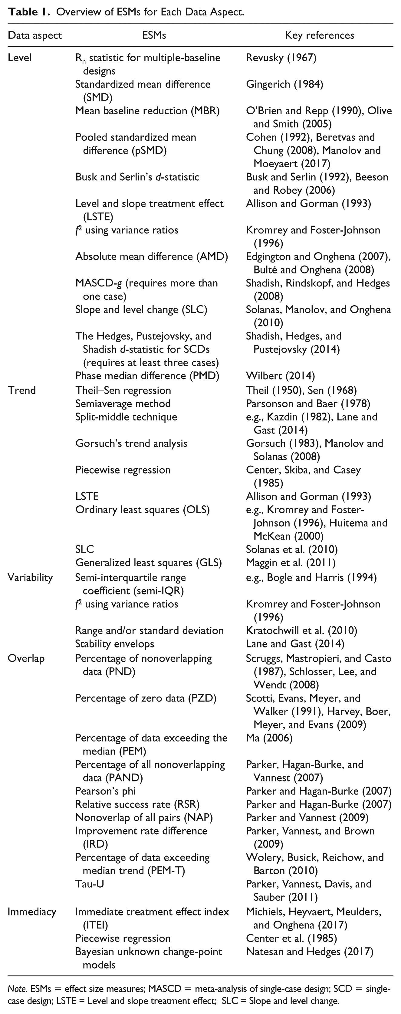
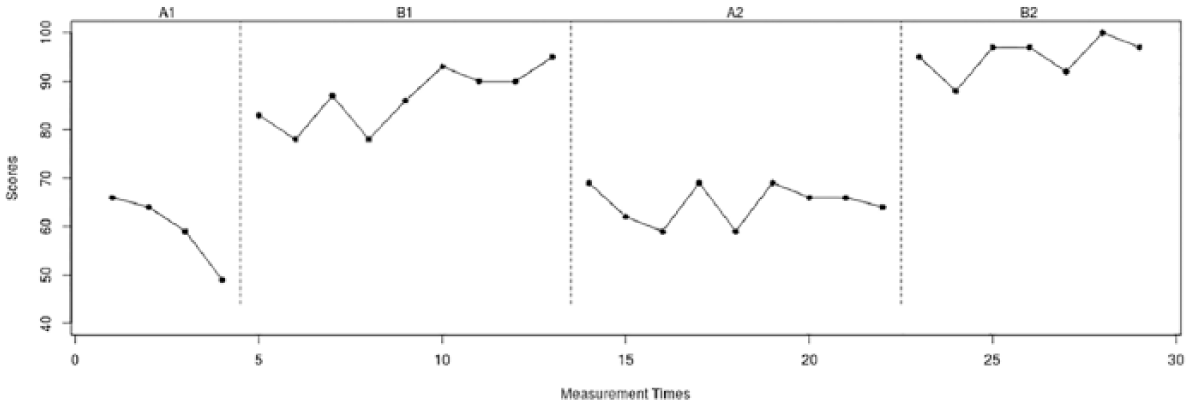
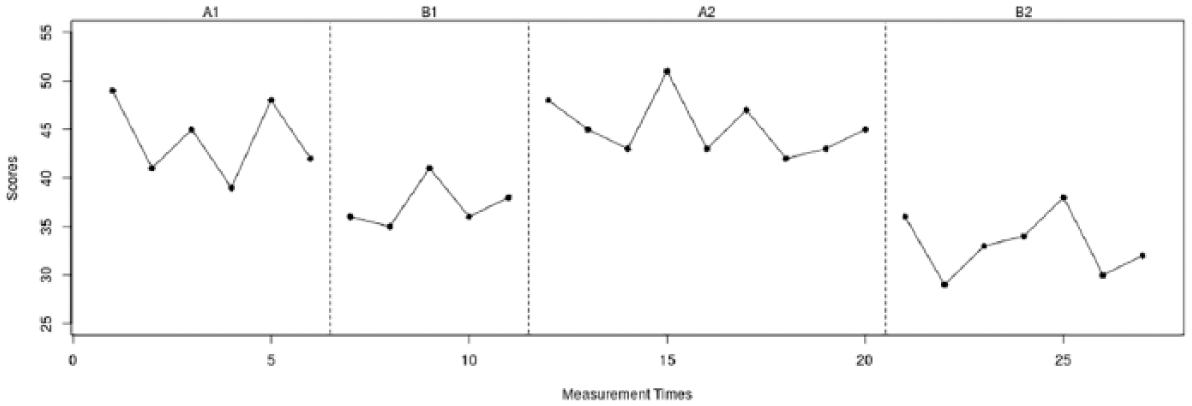
The first data set (see Figure 1) was retrieved from Yuen (1993). He used an A-B-A-B phase design to investigate the efficacy of the purposeful use of an additional template in a woodworking task for a woman with cortical blindness. The dependent variable was productivity, measured as the number of usable brackets outlined by the woman divided by the maximum number of usable brackets that could be outlined with a minimum of zero and a maximum of 100% with a total of 29 measurement occasions. The second data set (see Figure 2) was retrieved from a methodological article by Heyvaert and Onghena (2014). This data set consists of 27 measurement occasions for a male participant on the 15-item Impact of Event Scale (IES; Horowitz, Wilner, & Avarez, 1979) with a possible range of 0 to 75 to evaluate a new treatment program to decrease posttraumatic stress symptoms. The third data set (see Figure 3) was retrieved from the original What Works Clearinghouse guidelines who constructed a hypothetical data set with a range from 0 to 100 to illustrate guidelines for visually analyzing SCED data. This data set contains 41 measurement occasions. The fourth data set (see Figure 4) was retrieved from Mackay, McLaughlin, Weber, and Derby (2001). The authors used an A-B-A-B phase design to study the effectiveness of a precision request procedure to decrease the noncompliance of a child with disabilities. The dependent variable was measured with count data as the number of noncompliant behaviors per day for 20 days. For the Yuen, Kratochwill et al., and Mackay et al. data sets, raw data were unavailable. They were recovered from the published graphs using “GetData Graph Digitizer” Version 2.26 (Fedorov, 2013). Raw data and descriptive statistics for all four data sets are available in the appendix.
A-B-A-B phase design retrieved from Yuen (1993).
A-B-A-B phase design retrieved from Heyvaert and Onghena (2014).

A-B-A-B phase design retrieved from Kratochwill et al. (2010).

A-B-A-B phase design retrieved from Mackay et al. (2001).
Consistency Between Similar Phases: Operationalizations Based on MD
As both the definitions by Ledford et al. (2018) and Kratochwill et al. (2010) about consistency across similar phases were proposed in the context of visual analysis, they leave considerable space for interpretation on how to quantify this data aspect. In other scientific domains, the MD has a long-standing tradition in assessing similarity between data patterns (Cha, 2007). In analogy-based estimation for example, the MD is a widely used similarity measure that takes into account the distance between pairs of projects (Chiu & Huang, 2006). A difference between the MD and competing similarity measures is that it computes the sum of the absolute differences rather than their squares, as it is, for example, the case with the Euclidean distance (Kokare, Chatterji, & Biswas, 2003). An advantage of this is that it reduces the excessive influence of outlying data points as two time series can be similar even if one has an outlying data point. A conceptual advantage of MD is that it calculates the distance between two points if the only paths you can take are parallel to the axes (Sherwood, Perelman, Hamerly, & Calder, 2002), as shown by the dashed lines parallel to the y-axis in Figure 5. MD can also be applied to assess consistency in single-case phase designs: If the data patterns within similar conditions are more or less consistent, the MD between data points occurring at paired moments in time—for example, the MD between the first measurement in A1 and the first measurement in A2, and so on—should be low or high. The vertical dashed lines in Figure 5 show the MD between seven paired measurement occasions of the B1 and B2 phases in the Yuen data set.
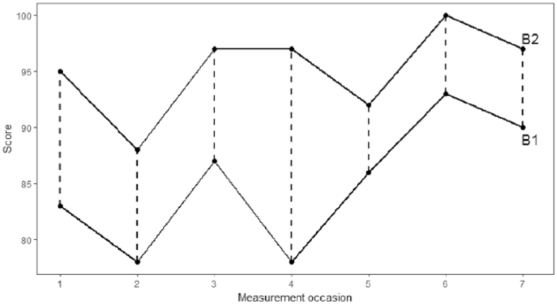
Example of Manhattan distance for seven paired measurement occasions from the B1 and B2 phases of the Yuen data set.
We compare scores at paired moments in time to evaluate if the two data patterns evolve consistently over time. To obtain the MD between two phases, we simply sum up the absolute differences (i.e., the vertical dashed lines in Figure 5). The MD then equals:

As we calculate the MD separately for the A and B phases,

The MMD for the example in Figure 5 is then 71/7 = 10.14.
Adjusting for Unequal Phase Lengths
Both the MD and MMD require identical phase lengths. This means that for each measurement occasion in the A1 or B1 phase there has to be a corresponding measurement occasion in the A2 or B2 phase. We propose two approaches for cases in which the phases differ in length. The first approach is to omit data points in the longer phase to reduce it to the same length as the shorter phase. In the example depicted in Figure 5, we omitted the last two data points of the B1 phase to reduce it to the same length as the B2 phase and then calculated the MMD for the remaining seven paired measurement occasions. However, if the two phases differ greatly in length, this approach to calculating MMD runs the risk of omitting a lot of data points.
An alternative is to calculate an MD distance measure between every possible sequence of observations in the longer phase—that is equal to the length of the shorter phase—and the shorter phase. The advantage of this approach is that it uses all data which is generally considered as a desirable feature of SCED ESMs (Maggin et al., 2011). For example, the B1 phase in the Yuen data set contains nine data points and the B2 phase seven data points. A first pairing of sequences would be Observations 1 to 7 in each phase, another would be Observations 1 to 7 in B2 and Observations 2 to 8 in B1, and finally Observations 1 to 7 in B2 and Observations 3 to 9 in B1. The number of possible pairings of sequences k then equals:

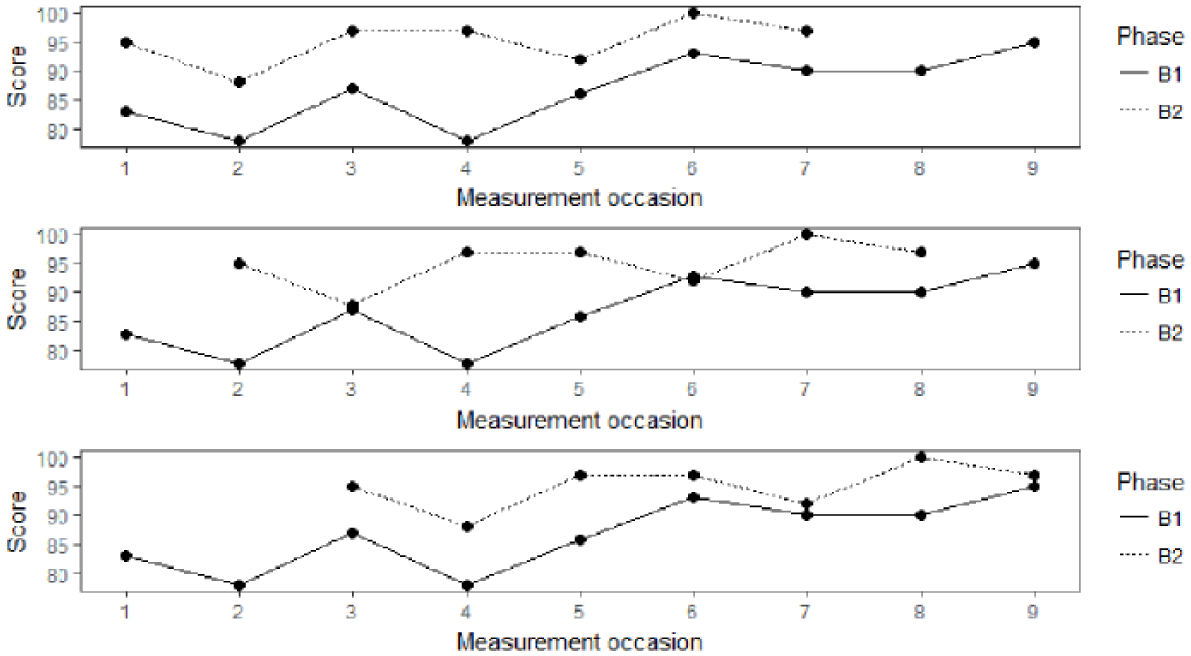
All three parings of possible sequences of equal length for the B1 and B2 phases of the Yuen data set.
By consecutively shifting the shorter phase by one measurement occasion to the right, we obtain all three possible sequences of equal length. Next, we can calculate the MMD for each possible pairing of sequences. The obtained MMDs can then be averaged across the number of compared sequences by summing the MMDs and dividing by k. The overall MMD (OMMD) across all possible comparisons then equals:

The additional index j denotes the paired sequences. For the sequences depicted in Figure 6, j can, for example, take the values 1, 2, or 3. In Figure 6, the OMMD is equal to (10.14 + 9.43 + 6.71) / 3 = 8.76; the sum of the three MMDs divided by the number of paired sequences that are compared. If two phases have an identical length—as it is, for example, the case with B1 and B2 in the Kratochwill et al. data set and all phases in the Mackay et al. (2001) data set—the MMD and OMMD yield identical results. Both measures are independent of the number of observations and comparisons as we divide by n and k, respectively.
Adjusting for the Unit of the Measurement Scale
Both measures, however, still depend on the unit of the measurement scale. The Heyvaert and Onghena data set used, for example, a measurement scale ranging from 0 to 75, while both the Yuen and Kratochwill et al. data sets used measurement scales ranging from 0 to 100 and the Mackay et al. (2001) data set used count data. Both the MMD and OMMD still have to be interpreted in the light of the variability of the data patterns. To remedy this, we propose dividing the OMMD by the pooled standard deviation of the two phases (either A1 and A2 or B1 and B2) as suggested in Van den Noortgate and Onghena (2008). The scale invariant CONDAP for all phases within the same condition then equals:
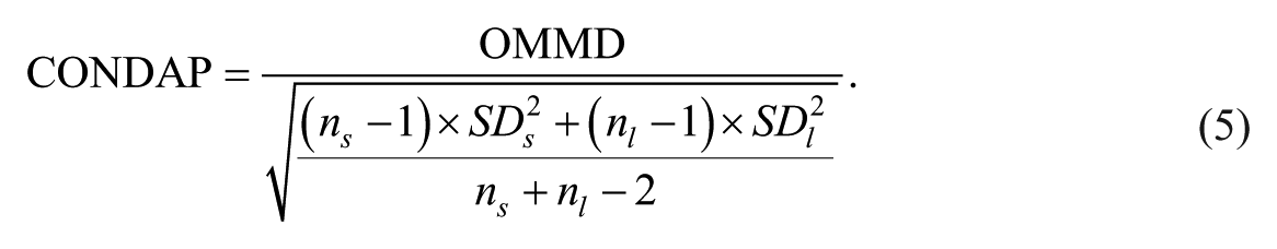
The MMD, OMMD, and CONDAP for each data set can be found in Table 2.
MMD, OMMD, and CONDAP to Assess Consistency Between Similar Phases.
Note. MMD = mean Manhattan distance; OMMD = overall MMD; CONDAP = CONsistency of DAta Patterns.
Interpretation of CONDAP
Table 2 shows how OMMD becomes scale invariant when converted to CONDAP. CONDAP expresses the distance between two phases in units of standard deviations. If two data patterns from similar conditions are perfectly consistent (i.e., identical), the absolute value of any MD-based measure will be zero. The reference number against which the MD-based consistency measures should be judged is thus zero, meaning that the closer the CONDAP is to zero, the more consistent the two data patterns are. As a distance measure, CONDAP is therefore essentially a measure of inconsistency. For example, initially we found an OMMD of 4.07 for the B1/B2 comparison of the Heyvaert and Onghena data set and an OMMD of 7.1 for the B1/B2 comparison of the Kratochwill et al. data set. As 4.07 is closer to zero than 7.1, we might conclude that the B1/B2 data patterns are more consistent in the Heyvaert and Onghena data set when only looking at the absolute value. However, by converting the OMMD to CONDAP, we see that the standardized consistency is higher in the Kratochwill et al. data set (CONDAP = .43) when compared with the Heyvaert and Onghena data set (CONDAP = .87). Similarly, the baseline OMMD in the Mackay et al. (2001) data set was initially higher than the intervention phase OMMD. Subsequently, standardizing OMMD to CONDAP shows that the baselines in the Mackay et al. data sets are actually more consistent than the intervention phases. These examples are in line with visual analysis as will be shown later. CONDAP is insensitive to the variability in the data patterns. The Heyvaert and Onghena data set utilized a measurement scale ranging from 0 to 75, whereas the Kratochwill et al. data set used a measurement scale ranging from 0 to 100 and the Mackay et al. data set used count data. Furthermore, CONDAP is sensitive to differences in central tendency between two phases. For example, the B1 and B2 phases in the Yuen data set seem to be similar at first sight. However, due to the noticeable difference in central tendency, the CONDAP for this comparison is the highest found in all example data sets; as such, a difference in level is a sign of inconsistency. Based on a systematic review of applied A-B-A-B phase designs published over the past 50 years (Tanious, De, Michiels, Van den Noortgate, & Onghena, 2018), we offer the following guidelines for interpreting the amount of consistency: very high, 0 ≤ CONDAP ≤ 0.5; high, 0.5 < CONDAP ≤ 1; medium, 1 < CONDAP < 1.5; low, 1.5 < CONDAP ≤ 2; very low, CONDAP > 2.
Consistency Between Adjacent Phases: Operationalizations Based on ESMs
Next to consistency between similar conditions, we can further assess the consistency for each potential demonstration of an effect. As the definition by Ledford et al. (2018) highlights, consistency of potential demonstrations of an effect involves an assessment of several data aspects for the amount of behavior change between conditions. Therefore, we call the comparison of ESMs for the five data aspects CONsistency of the EFFects (CONEFF). In fact, Barton, Lloyd, Spriggs, and Gast (2018) argue that this assessment of consistency is the primary factor when drawing conclusions about the existence of a functional relation. In the following, we want to outline how to summarize the consistency between potential demonstrations of an effect for each data aspect separately.
Each time when a phase change occurs from baseline to intervention or vice versa, it is possible to calculate the amount of change in these five data aspects: level, trend, variability, immediacy, and overlap. If the demonstration of an effect is consistent, so should be the changes in these five data aspects between A1 and B1 on one hand and A2 and B2 on the other. As Barton et al. (2018) point out, “Consistency also applies to behavior change across conditions. For example, the immediacy and magnitude of behavior change should be consistent each time similar condition changes occur” (p. 194). In an A-B-A-B design, two similar condition changes occur when changing from baseline to intervention. This is not to say that these are the only moments at which an effect can be demonstrated. We agree with Barlow et al. (2009) that an effect can also be demonstrated when changing from intervention back to baseline. However, a phase change from baseline to intervention is conceptually different from a change from intervention back to baseline. In addition, the only phase change that occurs twice in an A-B-A-B design is from baseline to intervention. Therefore, it is possible to assess the CONEFF for each of the five data aspects between these two demonstrations of an effect. As Barton et al. (2018) put it, “The purpose of SCD research is to determine if behavior change occurs when the intervention is introduced, and whether the behavior change can be replicated” (p. 190). Two steps are involved in calculating the CONEFF measures for A-B-A-B phase designs. In a first step, one needs to calculate an ESM for each of the five data aspects separately for each pair of adjacent AB phases. Based on a literature review (see Table 1), we chose the following ESMs for each data aspect: pooled standardized mean difference (pSMD; level), difference in ordinary least squares (OLS; trend), variance ratios (SD; variability), nonoverlap of all pairs (NAP; overlap), and immediate treatment effect index (ITEI, immediacy). An excellent overview of the main characteristics of several of these techniques is given by Manolov and Moeyaert (2017). We have chosen these five operationalizations for several reasons. First, pSMD, OLS, and SD are well-established measures in statistical theory. These measures are familiar even to researchers with little experience in conducting and analyzing data from SCEDs. Second, NAP offers several advantages over competing nonoverlap measures. It can be easily calculated by hand for shorter time series. Furthermore, NAP can be directly calculated from intermediate output of the nonparametric Mann–Whitney U and correlates well with the familiar R2 (Parker & Vannest, 2009). Third, ITEI follows directly the recommendations given in the What Works Clearinghouse guidelines. As the calculation of CONEFF is generic, researchers might, however, choose other ESMs if they prefer to do so.
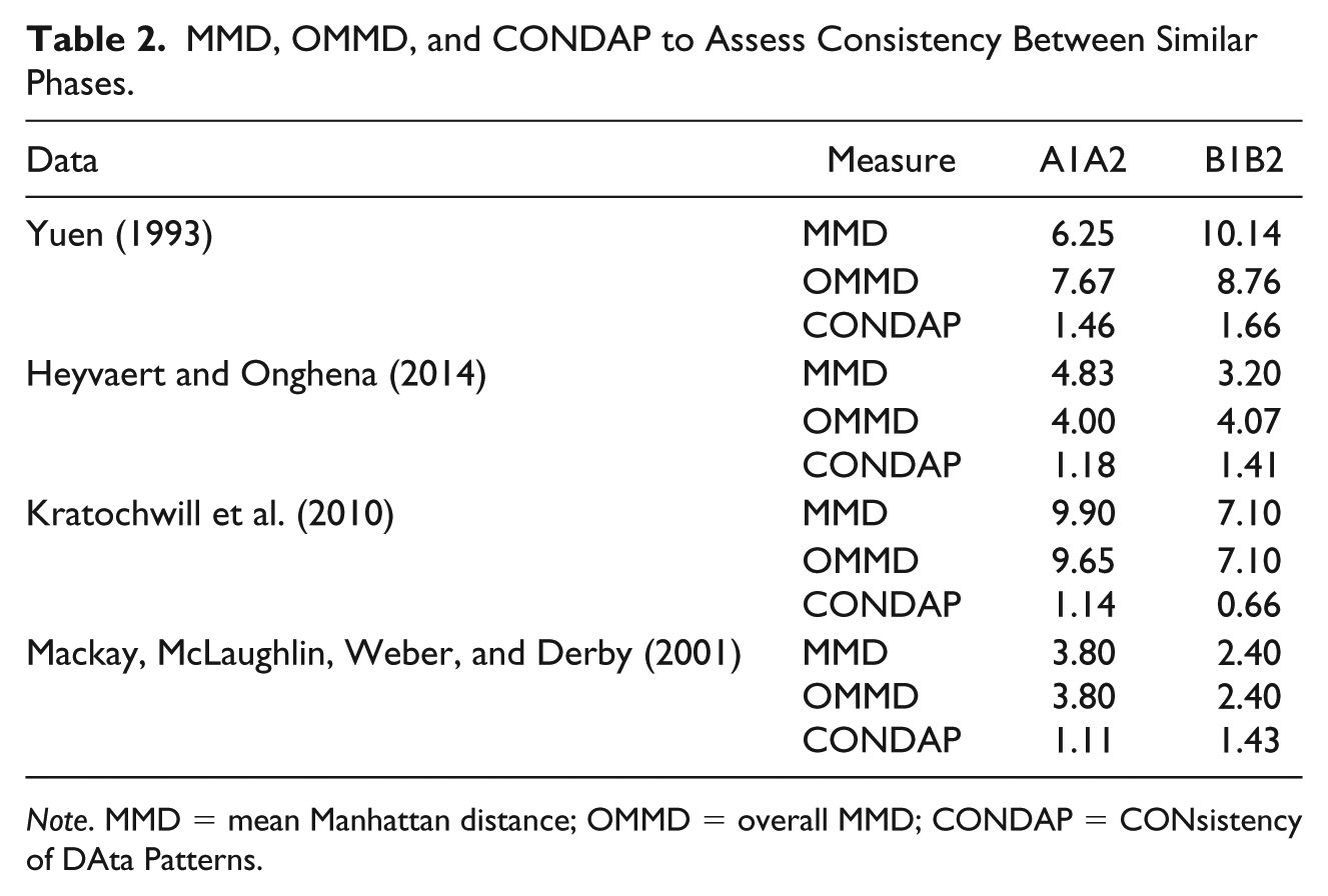
PSMD, ITEI, and NAP take into account data from adjacent phases by default. To calculate changes in trend, we employed the OLS method described in Kromrey and Foster-Johnson (1996), which calculates separate trend lines for the A and B phase and obtains an effect size from the associated R2 measures. For changes in variability, we calculated the variance ratios between each A phase and the following B phase. For instructions on how to calculate each of these five effect sizes, the interested reader is referred to the key references listed in Table 1. Table 3 gives an overview of the results of this first step in the columns labeled “A1B1” and “A2B2.”
Consistency as a Measure of Replicability.
Note. Level: Pooled standardized mean difference (pSMD); Trend: Ordinary least squares (OLS); Variability: Standard deviation (SD); Overlap: Nonoverlap of all pairs (NAP); Immediacy: Immediate treatment effect index (ITEI).
In a second step, the absolute difference between “A1B1” and “A2B2” can be calculated for each data aspect. The closer this number is to zero, the more consistent the replication of an effect is for that data aspect.
Linking Statistical and Visual Analysis
Visual analysis of SCED data remains to be frequently used and is sometimes the only analytical technique used in determining a functional relationship between the experimental manipulation(s) and the dependent variable(s) (Manolov & Moeyaert, 2017). Kennedy (2005) argues, for example, that a graphical display of the data is “the most revealing way of analyzing the data and provides the most information to the viewer” (p. 192). However, in light of the known shortcomings of visual analysis, we strongly recommend using visual and statistical analysis of SCEDs concurrently. This will provide even more detailed and contextualized information to the reader and fellow researchers. As Kratochwill and Levin (2014) point out, such a dual analytical approach should be widely applied: “For the future, we envision more widespread application of quantitative analyses, as critical adjuncts to visual analysis, in both primary single-case intervention research studies and literature reviews in the behavioral, educational, and health sciences” (p. 231). Using the four example data sets, we first want to show how CONDAP can be used to supplement the visual analytical process. Subsequently, we will show how CONEFF can be used in a similar way.
CONDAP
At first, a visual analyst might examine the extent to which there is consistency in the data patterns from all baselines. The A1 phase of the Yuen data set (see Figure 1) shows a clear negative trend. It appears that the A2 phase initially shows a negative trend as well, which does, however, not continue after the first three data points without a clear trend. Such trends, as well as the variability in the data patterns, can make it difficult to see what is happening (Morley, 2018). In addition, the A2 phase has five data points more than the A1 phase, making it even more difficult to assess the degree of consistency between the two phases by merely relying on visual analysis. The CONDAP for this comparison equals 1.46 indicating medium consistency. The A1 phase of the Heyvaert and Onghena data set consists of six data points and the data pattern is W-shaped for the first five data points. The first six measurements of the A2 phase show a similar W-shaped pattern, but the last three measurements show a pattern that is not reflected in the A1 phase. The CONDAP for this comparison equals 1.18, indicating medium consistency as well, but higher than for the Yuen data set. In contrast to the previous two data sets, in the Kratochwill et al. data set the A1 (11 data points) and A2 (10 data points) phases differ only by one observation in length. The A1 phase initially shows a negative trend, which is not reflected in the A2 phase. However, the remaining measurements of both data patterns resemble each other with a positive trend. Furthermore, both data patterns seem to have similar levels. The CONDAP for this comparison equals 1.14 indicating medium consistency similar to the Heyvaert and Onghena data set. The Mackay et al. (2001) data set has an equal number of data points in A1 and A2 (five data points each). The shape of the two baseline data patterns is nearly identical with an initial decrease, subsequent increase, and a final decrease in the therapeutic direction in the last two data points. But there is a noticeable difference in level between the two phases. The CONDAP of 1.11 indicates medium consistency similar to the previous two data sets. If we rank order the CONDAPs for the A1/A2 comparisons of the example data sets, we obtain the following order (from most consistent to least consistent): Mackay et al., Kratochwill et al., Heyvaert and Onghena, and Yuen.
Subsequently, a visual analyst might examine the extent to which there is consistency in the data patterns of all intervention phases. The B1 phase of the Yuen data set contains nine data points and initially shows a clear W-shaped form. This W-shaped pattern is repeated in a somewhat distorted form in the beginning of the B2 phase, which only contains seven data points. However, the last two data points of the B1 phase seem to show an increasing trend, whereas the last two data points of the B2 phase show a decreasing trend. Furthermore, there is a noticeable difference in level between the two data patterns. The CONDAP for this comparison equals 1.66 indicating low consistency. The B1 phase of the Heyvaert and Onghena data set contains five data points and the B2 phase contains seven data points. At first sight, the two data patterns do not seem to resemble each other a lot. However, a closer visual inspection reveals, for example, that the last three data points of each phase show nearly identical patterns. Furthermore, both data patterns show decreasing trends at first with subsequent increases. However, there also seems to be a difference in level. The CONDAP for this comparison equals 1.41 indicating medium consistency. The B1 and B2 phases of the Kratochwill et al. data set have identical lengths (10 data points). Both data patterns show a decreasing trend over time. The B1 phase shows somewhat more variability, but overall the two data patterns resemble each other strongly. The CONDAP for this comparison equals .66 indicating high consistency. The intervention phases of the Mackay et al. (2001) data set also have an identical number of data points (five each). Both patterns develop roughly similar over time, with an initial decrease followed by an increase in the contra-therapeutic direction. In the B1 phase, there is, however, at first a slight increase and no decrease for the last measurement, contrary to the B2 phase. In addition, there is a visually apparent difference in level. The CONDAP of 1.43 therefore indicates medium consistency. If we rank order the CONDAPs for the B1/B2 comparisons of the example data sets, we obtain the following order (from most consistent to least consistent): Kratochwill et al., Heyvaert and Onghena, Mackay et al., and Yuen. The ordering of CONDAP might prove especially useful in cases where the consistency between data patterns is not readily distinguishable by mere visual inspection of the graphed data.
CONEFF
As Morley (2018) points out, some data sets produce obvious effects: “For example in an A-B-A-B design when the phases are stable, with little variability or trend, when the intervention produces a large and immediate effect in the response and where withdrawing and reintroducing the intervention produces similar effects” (p. 88). In these instances, a consistent replication of the effect can be easily detected through visual inspection of the graphed data. However, in instances where one or more of the data aspects are not stable, the CONEFF measures can be a valuable supplement in support of visual analysis.
For example, the Yuen data set shows a perfect replication of nonoverlap for both potential demonstrations of the effect (absolute difference = 0). In addition, each introduction of the intervention results in a large change of level, with the pSMD above four and seven, respectively. The second introduction of the intervention leads, however, to a larger change in level (absolute difference = 3.39). Similarly, the intervention results in an immediate treatment effect with each introduction (ITEI > 25 in both cases). The absolute difference for immediacy equals 2.67 between both replications. The A1 phase shows a clear downward trend that is reversed in the B1 phase (OLS = 1.94). Between the A2 and B2 phases, there is only a minimal change in trend (OLS = .06). The variance ratio between A1 and B1 (1.56) is higher than for the second demonstration of the variance ratio between A2 and B2 (1.04). A variance ratio so close to 1 indicates only a minimal change in variability between the two phases.
Similar to the Yuen data set, the Heyvaert and Onghena data set shows a nearly perfect replication for nonoverlap. The absolute difference between the NAPs for both comparisons is only .05. Furthermore, visual inspection of the graph reveals that neither of the replications result in a noticeable change in trend. The absolute difference in the OLS measure is only .07. Furthermore, each intervention phase results in a decrease of level compared with the previous baseline. It can be seen that this decrease in level is, however, stronger for the second replication. The absolute difference of 1.95 between both pSMDs strengthens this visually apparent conclusion. Similarly, the immediacy of the treatment effect is visually apparent at both phase changes from baseline to intervention. The second introduction, however, results in a larger immediate treatment effect. The absolute difference between the ITEIs is equal to 5. The variance ratio between the first baseline and intervention phase equals 2.81. This change in variability might be hard to detect merely by visual analysis due to the one outlying data point and the fact that the B1 phase only contains five data points. The second introduction of the intervention leads to a much smaller change in variability with the variance ratio only being 1.17. The overall absolute difference in variance ratios is equal to 1.64.
It is visually apparent that both introductions of the intervention in the Kratochwill et al. data set lead to a complete nonoverlap. Therefore, the absolute difference between both NAPs equals 0. Visual analysis of the graphed data furthermore reveals that the intervention results in a decrease of level in the target behavior both times. The absolute difference between the two pSMDs is only .40, indicating that the changes in level are similar for both replications. Both introductions of the intervention lead to an immediate decrease in target behavior. The absolute difference between both ITEIs is only 3, indicating that the visually apparent immediate decrease in target behavior is similar for both replications. In addition, a negative trend in both intervention phases can be seen with each preceding baseline not showing a clear trend. The absolute difference in both OLS measures is only .38. The change in variability between both replications is visually less apparent. As the CONEFF, however, reveals, the first introduction of the intervention and the preceding baseline have a variance ratio of 3.12, whereas the second introduction of the intervention and the second baseline have a variance ratio of only 1.25. The absolute difference in variability between both replications thus equals 1.87.
Finally, the Mackay et al. (2001) data set also shows a near perfect replication of nonoverlap with NAP = .98 and 1 respectively. However, both baselines show a trend in the therapeutic direction before introduction of the intervention. This raises the question if the decrease in target behavior during the intervention phase is just a continuation of baseline trend. As the OLS measures indicate, there is only a small change in trend between A1 and B1 (.28) and no change in trend between A2 and B2 (.00), which might indeed indicate that the trends from the baseline phases just continue into the intervention phases. The consistent and visually apparent changes in level of 2.15 and 2.99, respectively, and 5.33 and 7.33, respectively, for immediacy with each introduction of the intervention should thus be interpreted with caution. Furthermore, each introduction of the intervention leads to quite large changes in variability with both variance ratios above four.
Discussion
Consistency is the only data aspect suggested in the What Works Clearinghouse guidelines for visual analysis of SCEDs that has not yet been formally operationalized. The present article addressed this gap in the existing literature by introducing two new measures to assess the degree of consistency in single-case A-B-A-B phase designs, CONDAP and CONEFF. CONDAP was introduced as a quantification of the degree of consistency between data patterns of phases implementing the same condition. CONEFF was introduced as a measure to assess the consistency between both potential replications of an effect in A-B-A-B phase design by systematically assessing each of the other five data aspects for each phase change from baseline to intervention. Using four example data sets from published literature, we first introduced a step-by-step guide on how to calculate CONDAP. Starting with a situation in which both phases have the same number of data points, we introduced the MMD as a means of obtaining the average MD between all paired observations of two data points. We then introduced the OMMD for situations in which the two phases differ in lengths. Finally, we converted the OMMD to CONDAP to make the measure scale invariant. Subsequently, we introduced CONEFF as a means of quantifying the changes in each data aspect with each introduction of the intervention. It was demonstrated how CONEFF can be calculated with previously validated ESMs for each data aspect to obtain a complete picture of the data set. As the calculation of CONEFF is generic, researchers might also choose other ESMs presented in Table 1 for each data aspect to calculate CONEFF according to the a priori hypotheses.
Both measures were presented in light of the growing consensus in the field that visual and statistical analysis of SCED data are best used concurrently, an issue which Kratochwill and Brody (1978) already addressed 40 years ago in this journal. The present study was a first attempt to systematically incorporate all six data aspects of the What Works Clearinghouse guidelines in a comprehensive analysis encompassing visual and statistical assessment of the data. As Kahng et al. (2010) pointed out, quantifications are of paramount importance as visual analysis does not quantify the magnitude of potential effects: In general, when raters evaluate whether intrasubject data have met criteria for demonstrating experimental control for research or clinical purposes, it is more likely that visual inspection produces a dichotomous decision (i.e., experimental control either is or is not demonstrated, rather than the degree to which experimental control has been demonstrated). (p. 43)
CONEFF is an important measure to get a complete picture of each aspect of the data at hand rather than just focusing on one data aspect—unless this has explicitly been hypothesized in advance. Reporting the CONEFF of potential demonstrations of an effect has at least two advantages. First, it increases the transparency of the results and thereby facilitates reproducing the results in independent studies (Wicherts et al., 2016). Second, it prevents that researchers can simply pick the results that show the desired outcome, “for instance, the researcher could report only a subset of many analyses that showed the researcher’s most desirable results” (Wicherts et al., 2016, p. 9). Similarly, CONDAP assesses the similarity between data patterns overall, rather than just focusing on favorable data aspects.
Similar to many of the popular nonoverlap techniques, CONDAP is distribution free and requires minimal data assumptions. MD-based measures are furthermore intuitive, straightforward, and easy to implement (Ding, Trajcevski, Scheuermann, Wang, & Keogh, 2008). It has been shown that CONDAP does not only conform with the logic and conclusions of visual analysis, but also exceeds the means of visual analysis by systematically quantifying the degree of consistency and offering a tool to compare consistency between data sets. The CONDAP values found in the example data sets ranged from 0.66 to 1.66. The lowest possible CONDAP is zero, which indicates perfect consistency. It should also be noted that CONDAP can only be calculated if there is variability in at least one of the data patterns, that is, at least one of the standard deviations is not equal to zero. If both of the standard deviations are equal to zero, we recommend using MMD if the two phases have the same number of data points and OMMD in case of unequal phase lengths. Finally, the consistency between A1 and A2—and by extension the obtained CONDAP—might be affected by an incomplete return to baseline levels. As no intervention has taken place before the first baseline phase, we might expect the consistency between baselines to be lower as the consistency between intervention phases because each intervention phase follows after a preceding baseline phase.
Limitations and Future Research
As a demonstration and small-scale field test of CONDAP and CONEFF, this article has several limitations. First of all, the sample size of only four published data sets does not allow for broad generalization of the two measures. However, focusing on these four data sets in-depth allowed us to demonstrate how statistical and visual analysis can maximally benefit from one another. Second, both CONDAP and CONEFF are substantially new measures for a data aspect that has not previously been quantified within the single-case community. As such, the performance of these measures cannot yet be compared with other operationalizations aimed at quantifying the degree of consistency in SCED data. Such comparisons can contribute toward further validation of the interpretational guidelines for CONDAP and help in establishing interpretational guidelines for CONEFF. Similarly, a cross validation of CONDAP and CONEFF with assessments by visual analysts can further strengthen the validity of both measures. However, we anticipate that this article will stimulate further research in this area. Another limitation concerns the design of the studies included in the demonstration. The demonstration of CONDAP and CONEFF was restricted to A-B-A-B phase designs. Future research could focus on extending the proposed measures to other SCED applications in which consistency is desirable including phase designs with more than four phases and multiple-baseline designs. As multiple-baseline designs follow the logic of A-B comparisons across behaviors or participants, CONDAP and CONEFF can be used without major modifications. For example, in a multiple baseline across participants design, we can compare the consistency of all baseline and experimental phases between subjects. In applications with more than four phases (e.g., A-B-A-B-A-B), it is possible to compare the consistency across all baseline phases and all experimental phases.
Both CONDAP and CONEFF offer several further potential avenues for future research besides the ones already mentioned. As CONDAP and CONEFF are the first measures to quantify the degree of consistency in single-case A-B-A-B phase designs, one potential avenue for future research is to reanalyze published studies with these new measures. As CONDAP is scale invariant, it allows for comparing the consistency of results between studies. Second, CONDAP and CONEFF, as such, might be incorporated as a test statistic in multiple randomization tests, which at the same time allows for obtaining nonparametric confidence intervals for the degree of consistency. These procedures are, for example, described in Edgington and Onghena (2007), Heyvaert and Onghena (2014), and Michiels et al. (2017). The null hypothesis in this scenario would be that there is no consistency in the data patterns of similar phases in case of CONDAP or that there is no consistency in the demonstrations of an effect in case of CONEFF. To test this hypothesis, the p value can be obtained by locating the observed test statistic in the randomization distribution given all permissible randomizations. If the proportion of test statistics showing equal or higher consistency than the observed one is smaller than or equal to 5%, the null hypothesis that there is no consistency can be rejected. In addition, a better understanding is needed of how CONDAP is affected by missing scores.
Contrary to CONDAP, CONEFF utilizes previously validated ESMs. Therefore, future research should address other challenges than validating CONEFF as a measure. It has to be noted, however, that the different ESMs differ in their sensitivity. For example, a perfect replication of nonoverlap is easier to achieve than a perfect replication of level as most overlap measures suffer from a ceiling effect. Furthermore, we have yet to develop a scale invariant ESM to assess immediacy as immediacy is currently the only ESM used in CONEFF which cannot be compared across studies. One important consideration in the field should be the incorporation of CONEFF in standard reporting tools. Reporting the CONEFF of the data set can greatly increase the acceptability and credibility of SCED research findings within and outside the single-case research community. Examples of R-codes for calculating the ESMs needed to assess the CONEFF and a generic R-function to calculate CONDAP are available in the digital attachment. In addition, many of the analyses presented in this article—including the construction of graphs—can also be executed by practitioners with little to no programming knowledge using the single-case data analysis shiny app available at https://tamalkd.shinyapps.io/scda (De, Michiels, Vlaeyen, & Onghena, 2017). Similar to CONDAP, a challenge for future research into metaconsistency in SCED data concerns the application of this measure beyond A-B-A-B phase designs.
Conclusion
This article introduced two measures to assess consistency in SCED data: CONDAP and CONEFF. CONDAP can be used to assess the consistency between data patterns implementing the same manipulation of the independent variable(s). It is an MD-based measure that calculates the overall average MD between all possible sequences of equal length of the two phases. CONEFF can be used to assess the consistency between potential replications of an effect. An assessment of the CONEFF requires the calculation of separate ESMs for level, trend, variability, overlap, and immediacy for each shift from baseline to intervention. Both measures have been shown to be valuable supplements to the visual analytical process. We hope to see CONDAP and CONEFF in the future as part of a holistic approach to analyzing SCED data encompassing statistical and visual analysis of each data aspect.
Footnotes
Appendix
Descriptive Statistics for Data From Mackay, McLaughlin, Weber, and Derby (2001).
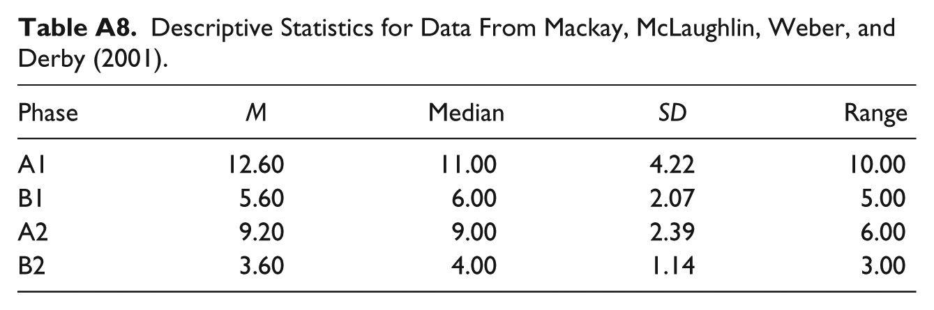
| Phase | M | Median | SD | Range |
|---|---|---|---|---|
| A1 | 12.60 | 11.00 | 4.22 | 10.00 |
| B1 | 5.60 | 6.00 | 2.07 | 5.00 |
| A2 | 9.20 | 9.00 | 2.39 | 6.00 |
| B2 | 3.60 | 4.00 | 1.14 | 3.00 |
Declaration of Conflicting Interests
The author(s) declared no potential conflicts of interest with respect to the research, authorship, and/or publication of this article.
Funding
The author(s) received no financial support for the research, authorship, and/or publication of this article.