
Abstract
Visual analysis of single-case research is commonly described as a gold standard, but it is often unreliable. Thus, an objective tool for applying visual analysis is necessary, as an alternative to the Conservative Dual Criterion, which presents some drawbacks. The proposed free web-based tool enables assessing change in trend and level between two adjacent phases, while taking data variability into account. The application of the tool results in (a) a dichotomous decision regarding the presence or absence of an immediate effect, a progressive or delayed effect, or an overall effect and (b) a quantification of overlap. The proposal is evaluated by applying it to both real and simulated data, obtaining favorable results. The visual aid and the objective rules are expected to make visual analysis more consistent, but they are not intended as a substitute for the analysts’ judgment, as a formal test of statistical significance, or as a tool for assessing social validity.
Visual analysis is strongly advocated and commonly used in single-case research (Lane & Gast, 2014; Ledford, Lane, & Severini, 2018; Maggin, Cook, & Cook, 2018; Parker, Cryer, & Byrns, 2006). Visual analysis allows assessing several data features to identify the presence of a functional relation between intervention and target behavior. According to the What Works Clearinghouse (WWC) standards (Kratochwill et al., 2010, see also Appendix A in Institute of Education Sciences, 2018), the data features on which visual analysis focuses are level, trend, overlap, variability, and immediacy for an A-B comparison. Moreover, for demonstrating a functional relation, it is crucial to assess the consistency of the results across several A-B comparisons within a study (Ledford, Barton, Severini, & Zimmerman, 2019). Several authors have described how visual analysis proceeds in relation to these data features. For instance, Ledford et al. (2018) emphasize the difference between using visual analysis for a formative purpose, focusing on the within-phase data pattern for deciding how to proceed, and using visual analysis for a summative purpose, comparing adjacent phases. As per Ledford et al. (2019), an important part of the visual analysis is the comparison of the obtained with the expected data patterns. Such a comparison is related to the expectation of an immediate or delayed effect and also to the potential confounding introduced by an improving baseline trend (Maggin et al., 2018). Furthermore, it has been highlighted that the magnitude of effect has to be quantified, once a functional relation has been established by means of visual analysis (Ledford et al., 2019).
Several authors (e.g., Harrington & Velicer, 2015; Vannest & Ninci, 2015; Vannest, Peltier, & Haas, 2018) and even journal editors (Karazsia, 2018) have advocated for the need to use visual and quantitative analysis jointly. Actually, adding trend lines, computing means and medians, and overlap indices are already part of the visual analysis as presented by Lane and Gast (2014). Moreover, a meta-analysis on the performance of visual analysts has identified the use of structured criteria as a factor in improved reliability (Ninci, Vannest, Willson, & Zhang, 2015). Thus, in relation to the importance of structured criteria, in the following sections of the current text, we first present the justification for the need of a new visual aid tool for making visual analysis more objective. Second, we describe the tool that we propose and provide a justification for its elements. We also clearly state what the tool is capable of achieving and what it is not suitable for. Third, we evaluate the tool by applying it to real data and to simulated data. Finally, we provide more general recommendations regarding the assessment of intervention effectiveness.
The Need for a New Tool
A visual aid tool is necessary on the basis of three pieces of evidence. First, the graphical representation of the data in any given study may not meet the requirements regarding the Y axis (Dart & Radley, 2017) and the ratio of the X-to-Y axes according to the number of data points depicted (Radley, Dart, & Wright, 2018), which can affect the result of the visual analysis. Second, there is evidence that visual analysis terms and procedures are used inconsistently (Barton, Meadan, & Fettig, 2019). Third, the agreement between visual analysts has been shown to be suboptimal (see the meta-analysis by Ninci et al., 2015, and later works: Diller, Barry, & Gelino, 2016; Wolfe, Seaman, & Drasgow, 2016). The evidence of the lack of consistency can be expected, given that for many of the data features assessed visually, there are no formal objective rules. For instance, Maggin, Briesch, and Chafouleas (2013) developed a protocol for applying the WWC Standards for visual analysis, but this protocol still includes multiple requirements of subjective judgments (e.g., Is the level discriminably different between the first and last three data points in adjacent phases? Is there an overall change in trend between baseline and treatment phases?). More recently, Wolfe, Barton, and Meadan (2019) proposed systematic protocols that ask for similar subjective evaluations (e.g., Project the trend of the first baseline phase into the first intervention phase. Is the level, trend, or variability in the intervention phase different than what you would predict based on the baseline data?). One issue is that the relevant data features can be defined operatively in several different ways: There are at least five ways to estimate trend suggested for single-case data (Manolov, 2018b) and at least nine different quantifications of overlap (Parker, Vannest, & Davis, 2011). Another issue is that the data patterns from different conditions can always be expected to be somewhat different or, stated otherwise, they cannot be expected to be exactly identical. This poses the question about how much different the data patterns should be to call them “different.” A third issue, in relation to the assessment of level, trend, variability, and overlap, is that there are no clear indications about how to proceed when the assessment of the different data features does not converge. On one hand, there are no formal indications regarding which of these data aspects to prioritize. On the other hand, it is that it is not clear whether a difference in only one of these data features (level, trend, or variability) is sufficient as a demonstration of a basic effect (to be replicated across at least three attempts), regardless of the evaluation of the other two data features.
In summary, to avoid making the visual judgments dependent on the (potentially inadequate) graphical representation, to clearly identify and report the tools used for assessing each data aspect, and to improve the agreement between visual analysts, a visual aid is necessary. In what follows, we justify why a new tool is necessary, taking into account the already existing tools.
For within-phase analysis, a relevant tool encompassing level, trend, and variability are stability envelopes (Lane & Gast, 2014; Ledford et al., 2018). According to this tool, stability in level, as opposed to variability, is defined as at least 80% of the data being within an envelope constructed on the basis of the median ±25% of the median. For assessing trend stability, the envelope is constructed likewise around the split-middle trend line. There are several issues with such a proposal. First, the specific values proposed are completely arbitrary. This is well illustrated by the fact that a previous text (Gast & Spriggs, 2010) referred to the envelope being constructed using ±20% of the median, whereas Lobo, Moeyaert, Cunha, and Babik (2017) suggest constructing the envelope using ±15% of the median. Second, no measure of the actual variability in the data is used for defining the envelope. Third, the split-middle trend line has been shown to be outperformed by a tri-split trend line (Parker, Vannest, & Davis, 2014).
For between-phases comparison, a well-known tool, highlighted by Kratochwill, Levin, Horner, and Swoboda (2014), is the Conservative Dual Criteria (CDC; Fisher, Kelley, & Lomas, 2003). In the CDC, the level is represented by the mean and trend is modeled via the split-middle method. Afterward, both the mean and the split-middle trend line are projected from the baseline phase into the intervention phase for comparison. The projections are adjusted conservatively in the direction of the expected effect, by shifting them a quarter of a standard deviation. On a positive side, the CDC has been shown to improve visual analysts’ decisions (Wolfe & Slocum, 2015; Young & Daly, 2016), although it has been stated that “[t]he validity of the CDC when data patterns produce disagreement among experts is unknown” (Wolfe, Seaman, Drasgow, & Sherlock, 2018, p. 349). In that sense, the CDC is not flawless. A first set of issues of the CDC are the sensitivity of the mean and the standard deviation to outlying values, especially if the data series are short, as well as the previously mentioned limitation of the split-middle trend line. Second, the variability of the data is not considered or represented visually beyond the conservative adjustment of the projected lines. Third, a quantification of the magnitude of difference between the projections and the actual data is not obtained. Fourth, no distinction is made between immediate and progressive/delayed effects. Fifth, it has been stated that more research is warranted on the application of CDC to data with baseline trends (Wolfe et al., 2018). Sixth, the CDC is only applicable to designs in which phases are compared (e.g., multiple-baseline design [MBD], A-B-A-B), but not to designs with rapidly changing conditions (i.e., alternating treatments designs [ATDs]). In the following section, we describe a new proposal and justify why we consider it a suitable alternative to the CDC.
The Visual Aid Implying an Objective Rule (VAIOR)
In this section, we provide an in-depth presentation of a new proposal for a visual aid. First, we comment on the usefulness of the proposal, while also clearly pointing at its limits. Second, we describe the steps it includes, when applied to MBD and reversal designs. Third, we justify the different elements of the proposal. Fourth, we describe how the proposal can be applied to ATDs. Finally, we provide general remarks on the use of the proposal. In a later section, there is an application to real and to simulated data.
Rationale for VAIOR: What It Is and What It Is Not
We refer to the proposal as VAIOR, an abbreviation of “visual aid implying an objective rule,” because the aim is to provide objective operative definitions for several terms such as level, trend, variability, and overlap, as well as an objective rule for determining whether a basic effect is present in an A-B comparison. VAIOR is designed to be useful both in situations in which an immediate effect is expected and when a delayed/progressive effect is expected. Thus, VAIOR aims to include information about all the data features that are commonly assessed when performing visual analysis: level, trend, variability, overlap, and immediacy. Overall, VAIOR is created as a tool for summative analysis. Nevertheless, a formative visual analysis (as described in Barton et al., 2019) is also possible, because the baseline projections that VAIOR entails can be extended for each successively obtained intervention phase measurement. This can serve for detecting early on any clearly insufficient or undesired effects of the intervention.
It is also important to state clearly what VAIOR is not (aimed or expected to achieve). First, an application of VAIOR to a single A-B comparison cannot be understood as an evidence for a functional relation, as several replications of the basic effect are necessary. Second, VAIOR is not a statistical test of a null hypothesis about no intervention effect. In that sense, VAIOR does not model or estimate the potential serial dependence 1 in the data, because there is no p value obtained on the basis of an assumption of independent data. (In contrast, the binomial test used after the CDC, Fisher et al., 2003, does assume that the measurements are independent.) Third, VAIOR does not include or represent a mastery criterion (e.g., 80% or more completion of a predefined criterion for several successive measurements, Kipfmiller et al., 2019). Relatedly, VAIOR does not quantify the number of sessions required until a mastery criterion is reached. Thus, VAIOR does not provide this potentially useful information for evaluating clinical significance and it cannot be used to distinguish between participants who are fast at achieving a criterion but fail to maintain performance, from participants who are slower but better at maintaining what is learned (Ledford et al., 2016). Fourth, VAIOR is not a measure of social validity (Horner et al., 2005), as it does not inform about whether the difference between conditions is practically significant, whether the behavior after the intervention is the normative range, or whether the intervention is acceptable and feasible in real settings. In summary, VAIOR is not meant as a substitute for either the visual analysis of all relevant information or the assessment of social validity. Finally, it has been said that the CDC serves a similar purpose as VAIOR and presents all the limitations mentioned in the current paragraph (and more).
Description of VAIOR for Multiple-Baseline and Reversal Designs
The application of VAIOR to each A-B comparison in the context of a strong design such as an MBD or a reversal (A-B-A-B) design entails nine steps. These steps are first presented and afterward justified in more detail.
Step 1: Estimate baseline trend using the Theil–Sen method (Sen, 1968).
Step 2: Estimate the amount of variability around the baseline trend, using the median of absolute deviations (MAD). In VAIOR, MAD is defined as the median of the absolute deviations from the predicted baseline values according to the trend line fitted using the Theil–Sen method.
Step 3: Construct a variability band 2 based on baseline trend plus/minus the MAD value.
Step 4: Project the baseline trend and variability band into the treatment phase.
Step 5: Choose the focus of the analysis (overall effect, immediate effect or cumulative growth) before data collection and on the basis of prior literature and/or the characteristics of the intervention and the behavior and to explicitly state this choice in the report, before presenting the results. If an immediate effect is expected, the first three data points in the intervention phase are used in the analysis (as in Kratochwill et al., 2010). If a cumulative growth, progressive effect (i.e., change in slope), or delayed effect is expected, the focus of the analysis can be the last three intervention phase data points, similar to the mean baseline reduction quantification (Olive & Smith, 2005) and to the 3-point decision rule (Riley-Tillman & Burns, 2009; see also Levin, Ferron, & Gafurov, 2017, for a proposal on delayed effects). In the absence of expectations for immediate or progressive/delayed effect, the comparison includes all intervention phase data points.
Step 6: Perform the main comparison between the A and the B phase. We here propose comparing the actually obtained intervention phase measurements to the variability band (rather than to the trend line), focusing on the upper or lower limit, according to the therapeutic aim.
Step 7: Summarize the results from the A-B comparison as a percentage. In this step, we quantify the percentage of data points in the intervention phase that are improved above or below the variability band projection; this would be an ordinal quantification consistent with nonoverlap indices.
Step 8: Summarize the results from the A-B comparison in terms of a dichotomous decision regarding whether a positive effect is present or not. The rules for such a decision would be as follows. If all of the first three intervention phase data points (when an immediate effect is expected) or all of the last three intervention data points (when a progressive or delayed effect is expected) improve the variability band projection, this would be counted as a “positive result,” in dichotomous terms. Where treatment outcome is more uncertain and all intervention data points are used, a slightly different definition of a positive result occurs on the basis of logic and preliminary simulation results (presented later). A positive treatment effect or result is identified only when the proportion of intervention phase data points improving the variability band projection is either 100% (as for immediate and progressive/delayed effects) or is at least twice the proportion of baseline data points that are outside the baseline variability band, whichever of the two quantities is smaller. The underlying idea is that if the trend line tightly fits or better reflects the baseline data (i.e., few and small deviations from this line are observed), fewer intervention data points outside of the projected variability band are needed to demonstrate an effect. That is, the reference for comparison would be clearer. On the contrary, if the fit of the trend line to the baseline data is not that good (i.e., many baseline data points out of the variability band), then stronger evidence is necessary.
Step 9: Assess the consistency of the results across replications of the A-B comparison. An experimental effect cannot be claimed on the basis of a single A-B comparison, in absence of replication (Kennedy, 2005) and the WWC Standards stipulate a minimum of three attempts to demonstrate an effect for MBDs and reversal designs. In terms of within-study replication, Maggin et al. (2013) suggest a minimal ratio of 3:1 of positive effects to no effects or negative effects. We consider that this recommendation is reasonable, albeit apparently not based on any empirical evidence, and it is easily applicable to VAIOR when its dichotomous rule is used.
In terms of how much evidence is sufficient, Lanovaz and Rapp (2016) developed a proposal for an objective rule based on the binomial distribution, although it refers to replications across studies. If we borrow their idea about using the binomial distribution, it is possible to define a rule for within-study replications. Specifically, the probability of success only due to chance could be set to be equal to the false positives rate for VAIOR (results presented later in the text). For instance, for phases with five measurements, independent data, and for an immediate effect, the false positives rate is 0.22. If there are five within-study replications, the probability of more than two positive results only due to chance is 0.0744, whereas the probability more than three positive results only due to chance is 0.0097. Thus, having four or five positive results would be enough evidence. If there are four within-study replications, the probability of more than two positive results only due to chance is 0.0356 suggesting sufficient evidence. Similar rules can be derived, for other phase lengths and assuming autocorrelated data. Nevertheless, it has to be underlined that the question answered by using the binomial distribution is whether the number of positive results can be expected to happen only by chance or there is something more. This is not necessarily the same question as whether there is consistent evidence regarding the presence of an intervention effect.
Interpretation of the results
To reduce the complexity of the proposal, a freely available, easy to use website was developed: https://manolov.shinyapps.io/TrendMAD. It marks with different colors the data points that improve the variability band and the ones that do not, to aid the visual inspection. Moreover, there is a quantification of the percentage of data points improving the variability band and a dichotomous indication of whether a “positive result” was obtained for an immediate effect, for a delayed/progressive effect, and for an overall effect, according to the criteria established.
Justification of the Elements of VAIOR for Multiple-Baseline and Reversal Designs
Overall, VAIOR entails a comparison between projected and actual intervention phase data, which is well aligned with the WWC Standards (Kratochwill et al., 2010; see also Ledford et al., 2019). A similar projection is included in the CDC. Thus, VAIOR is well aligned with the logic of prediction on the basis of the baseline data and predictable change in the target behavior (Riley-Tillman & Burns, 2009). VAIOR builds on that idea, including and representing error (variability) visually through the variability band and provides an objective rule.
Data features
Regarding trend, the use of the Theil–Sen method is justified for single-case data (Tarlow, 2017; Tarlow & Brossart, 2018; Vannest, Parker, Davis, Soares, & Smith, 2012) and is potentially more widely known as part of robust statistics (Wilcox, 2012). Theil–Sen is also resistant to outliers (unlike ordinary least squares estimation) and to the ceiling and floor effects, as cautioned against by Wolery, Busick, Reichow, and Barton (2010).
Regarding the fact that a trend line is represented rather than a mean line, it has to be noted that a trend line is a more comprehensive estimate of data than a mean/median line representing level. Trend can include the mean/median line as case of trend with a zero slope but the reverse is not true. Projecting a trend line avoids the need for checking several detrending options (Carlin & Costello, 2018) before obtaining the main quantification.
Regarding variability, VAIOR takes it into account in order not to assume that the trend line is a perfect representation of the data (Tarlow & Brossart, 2018). Moreover, including trend lines only may not be sufficient to ensure appropriate performance of novice visual analysts, with data variability and the presence of extreme values being relevant factors (Nelson, Van Norman, & Christ, 2017). VAIOR does represent data variability apart from trend, whereas fitting a straight line using the Theil–Sen method ensures that the influence of outliers is reduced. This is also well aligned with Wolery et al.’s (2010) comment that an analytical procedure needs to consider all data features. Furthermore, the variability band represented in VAIOR is based on a measure of variability of the data obtained, in contrast to other arbitrary rules such as the stability envelope (Lane & Gast, 2014; Lobo et al., 2017).
Regarding overlap, it is quantified after trend is taken into account, as recommended (Kennedy, 2005; Parker, Vannest, Davis, & Sauber, 2011; Wolery et al., 2010).
Focus of the analysis
We consider that the quantifications should reflect the type of effect expected before gathering the data (as has been recommended for randomization tests, Heyvaert & Onghena, 2014). Moreover, the quantification of the immediacy of the effect avoids dealing with far-away projections of the baseline trend considering the limitations of such projections (Manolov, Solanas, & Sierra, 2018; Parker et al., 2011), as well as a likely ceiling. In addition, when a comparison between actual and predicted data is performed only for the first three data in intervention phase, it becomes less relevant whether the straight line is the best possible representation of the baseline trend.
Outcomes of the application of VAIOR to an A-B comparison
We consider that a dichotomous indication regarding the presence/absence of a basic effect is warranted, because the application of visual analysis, in general, may be expected to lead to such a dichotomous decision. Regarding the percentage outcome, it would represent the number of intervention phase measurements that do not overlap with the expected range of intervention phase data in case the baseline trend continued. Thus, it would also be a useful quantification, especially if a quantitative integration of results across studies is desired.
Consistency
Regarding the overall assessment of the presence of an intervention effect, a distinction needs to be made between MBDs and reversal designs. In an MBD, all the comparisons follow the A-B sequence and the application of VAIOR is straightforwardly repeated for each tier. Thus, VAIOR is applicable to designs dealing with nonreversible behaviors. In an A-B-A-B design, one of the three comparisons follows the B-A sequence. This has led some authors to suggest omitting the B1-A2 comparison (Parker & Vannest, 2012; Scruggs & Mastropieri, 1998). Although this comparison is conceptually different, omitting it would lead to having only two attempts to demonstrate the basic effect. As an alternative, VAIOR can be applied to the B1-A2 comparison by fitting the trend line to the B1 data and projecting it, together with the variability band, into the A2 phase. If a researcher is not willing to consider the B1-A2 comparison, three attempts to demonstrate an effect would only be available in an A-B-A-B-A-B design. In any case, VAIOR is applicable to reversible behaviors.
Description and Justification of VAIOR for ATDs
The application of VAIOR to an ATD requires six steps and they are described in this section. Only justifications specific to the application to ATDs are included.
Referring to the analysis of ATDs in general, it has been stated that the “[d]ifferentiation in data paths is the primary means by which data are evaluated” (Ledford et al., 2018, p. 11), considering that the data paths are formed by the lines connecting the measurements belonging to the same condition. This differentiation can be considered as a difference in level or trend between the conditions compared (Wolery, Gast, & Ledford, 2014; trend is especially stressed by Janosky, Leininger, Hoerger, & Libkuman, 2009). Alternatively, the differentiation can be conceptualized as nonoverlap between the data paths (Barlow, Nock, & Hersen, 2009), understood as the lines corresponding to different conditions not crossing (Tate & Perdices, 2019). The visual structured criterion proposed by Lanovaz, Cardinal, and Francis (2019) and the procedure called ALIV (Manolov & Onghena, 2018) both refer to this way of analyzing ATD data. Another option is to perform comparisons between adjacent data points (Ledford et al., 2019). The specific application of the percentage of nonoverlapping data described by Wolery et al. (2014) and the procedure called ADISO (Manolov & Onghena, 2018) reflect this second kind of ATD data analysis. The steps for applying VAIOR, described next, are related to the comparison of data paths and not to the comparison of adjacent data points.
Step 1: Estimate Theil–Sen trend for the Condition A data. In this case, the independent variable in the Theil–Sen method (i.e., the measurement occasions) is not coded 1, 2, 3, . . ., nA, but represents the actual measurement session numbers for Condition A. For instance, if there are 10 measurement occasions, five per condition, and Condition A takes place in sessions 1, 4, 6, 8, and 9, these would be the values of the independent variable for estimating the trend line.
Step 2: Compute MAD on the basis of the difference between actual Condition A data points and predicted ones, represented by the trend line.
Step 3: Construct variability bands on the basis of trend plus/minus the MAD value. These variability bands, as is also the case for the trend line, refer only to the measurement occasions in the limits between the first and the last Condition A measurement occasion (i.e., between Sessions 1 and 9 in the current example). Thus, for some of the Condition B data points (e.g., Measurement Occasion 10), there will be no comparison possible. The idea not to extrapolate is also present in the visual structured criterion (Lanovaz et al., 2019) and in ALIV (Manolov & Onghena, 2018).
Step 4: Perform the main comparison between the A and the B phase. The Condition B data points are compared with the relevant limit of the variability band.
Step 5: Summarize the results from the A-B comparison as a percentage. Specifically, the percentage of Condition B data points that improve the variability band around the Condition A data path is computed. This percentage refers to the total number of Condition B data points actually compared (i.e., Measurement Occasions 2, 3, 5, and 7 in our example).
Step 6: Summarize the results from the A-B comparison in terms of a dichotomous decision regarding whether a positive effect is present or not. The rule or requirement here is a 100% improvement or at least twice the proportion of baseline values out of the variability band, whichever is smaller. ATDs with at least five sessions per condition (Wolery et al., 2014) and five repetitions of the alternating sequence (Kratochwill et al., 2010) are considered sufficient for demonstrating a functional relation. Therefore, one application of VAIOR to such a data sequence would be sufficient for demonstrating a functional relation, without the need to refer to additional rules for deciding whether there is consistency in the effect of the intervention.
Overall, the strength of the application of VAIOR to ATD data is that it identifies data patterns with clear distinction between the data paths even in presence of some minimal overlap (e.g., a single Condition B data point is within the variability band). Moreover, the variability band identifies situations in which the consistent differences are minimal or practically equivalent (e.g., when all or almost all Condition B data points are within the variability band, despite being superior to the Condition A data points).
Interpretation of the results
The website https://manolov.shinyapps.io/TrendMAD marks with different colors the data points that improve the variability band and the ones that do not, to aid the visual inspection. Moreover, there is a quantification of the percentage of data points improving the variability band and a dichotomous indication of whether the criterion for a “positive result” was met.
A Caution Regarding the Use of VAIOR
A relevant question is whether VAIOR can be considered applicable to any kind of data pattern. Given that the comparison performed is strongly related to the baseline trend, it is crucial to evaluate how well the trend line fits the baseline data in either MBDs, A-B-A-B designs, or ATDs. Quantitative indicators include the mean absolute scaled error (Hyndman & Koehler, 2006) being less than 1 (Manolov, 2018b), the coefficient of variation being less than 10% (Mendenhall & Sincich, 2012), and the trend stability envelope including at least 80% of the data (Lane & Gast, 2014). The general idea is that in case the baseline data are too variable to fit (and in MBDs and reversal designs, to project) any meaningful trend line, then this VAIOR procedure is likely to be less useful. Actually, data with great variability may reflect uncontrolled sources of error in the environment or measure. In such cases, data analysis may not be justified at all.
Overall, there are three aspects requiring human judgment and professional experience: (a) the assessment of whether the fit is reasonable, using numerical and visual criteria; (b) the assessment of whether the subsequent projection (with the corresponding variability band) is reasonable or it leads to impossible values; and (c) the focus of the analysis: on an immediate, overall, or progressive/delayed effect. This is well aligned with the evidence-based practice movement where evidence-based treatments are evaluated in context (Vannest & Davis, 2013) and should not be completely eliminated from the application of the visual aid that we propose.
Evaluation of the Proposal
In this section, we first present the application of VAIOR to real data, using different single case experimental designs (SCEDs). Afterward, a more thorough evaluation is presented using generated data with known underlying parameters.
Illustration With Real Data
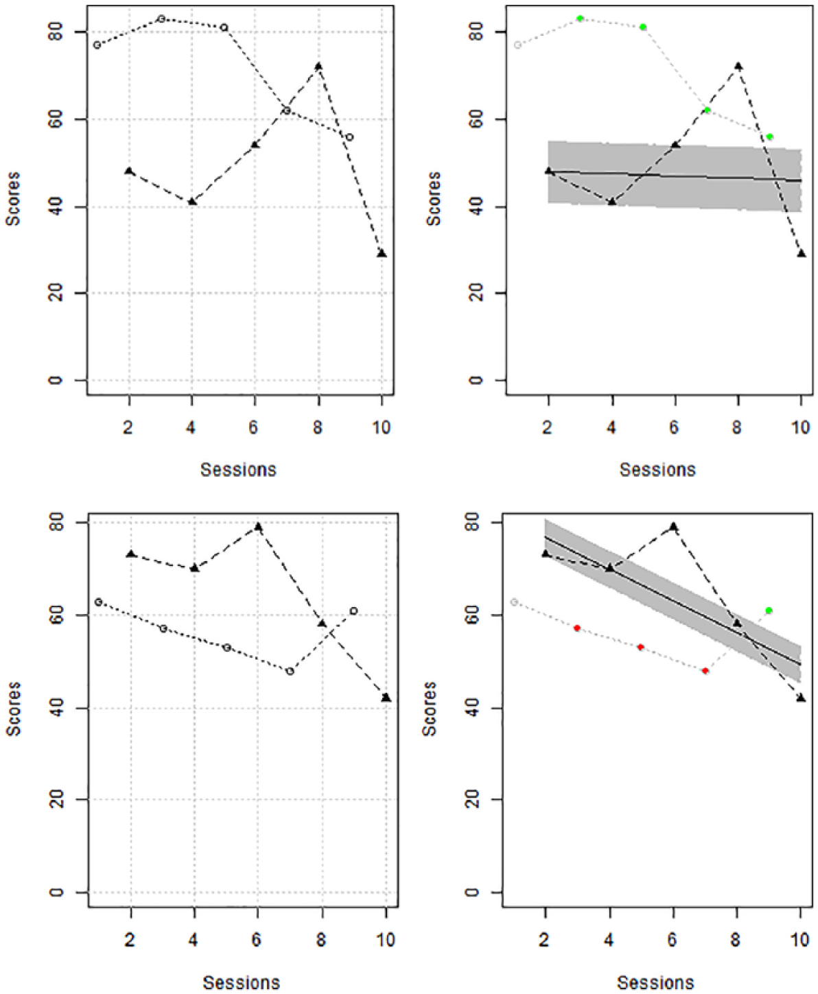
Illustrating an A-B comparison, Figure 1 represents the data from Allen, Vatland, Bowen, and Burke (2015): The target behavior is ordering food in this tier of the MBD. The output is obtained via the website https://manolov.shinyapps.io/TrendMAD. The right panel includes VAIOR added to the data: The shaded area represents the variability band constructed on the basis of the Theil–Sen baseline trend plus/minus the MAD value. In the website, the colors of the intervention phase data points reflect improvement over the projected variability band (green), or over the projected baseline trend (yellow), or no improvement over either of the projections (red).

Application of the proposal to an A-B-comparison; data on ordering food as target behavior gathered by Allen et al. (2015).
Figure 1 shows that, in terms of an immediate effect, there is 100% improvement over the upper limit of the variability band. In contrast, for a delayed or progressive effect, none of the last three intervention phase values would represent an improvement. Regarding the overall effect, VAIOR compares the percentage of baseline data points outside the baseline variability band (44%: four of the nine values are outside the baseline variability band) and, specifically, the criterion requires 88% of the intervention data points (i.e., at least 21 out of 23 values) to improve the upper limit of the variability band. Only 21.74% (5/23) of the intervention measurements show such an improvement and thus the criterion is not met.
Illustrating an ATD, Figure 2 represents the data from Taipalus, Hixson, Kanouse, Wyse and Fursa (2017) for Students 1 and 2. For Student 1 (upper panel of Figure 2, obtained via https://manolov.shinyapps.io/TrendMAD), the proposal helps ignore the one potentially outlying value. This visual indicates that one of the conditions (the “ball” condition in Taipalus et al., 2017) is clearly superior to the chair condition with 100% of the values of the ball condition outside the variability band constructed on the values of the chair condition. For Student 2 (lower panel of Figure 2), the proposal suggests that only 25% of the intervention phase data points represent an improvement in the “ball” condition, whereas 75% represent a deterioration.
Application of the proposal to a comparison phase of an alternating treatments design; data gathered by Taipalus et al. (2017) for Student 1.
Simulation Study
Data generation model: A-B comparisons
For data generation, we used the model described by Huitema and McKean (2000):
The fact that A-B comparisons were simulated does not entail that the simulation is relevant only for A-B designs, given that the A-B comparisons are the core of more complex and more methodologically appropriate single-case designs (Pustejovsky, 2019). The overall assessment of intervention effectiveness entails pooling the evidence from the separate A-B comparisons.
Data generation model: ATD with restricted randomization
The same models and parameter values for β1, β2, β3, and ρ1 were used, as for A-B comparisons. However, the way in which the dummy variable Dt is defined is different, given that we introduced the common restriction (Onghena & Edgington, 1994; Wolery et al., 2014) of having no more than two consecutive administrations of the same condition. Thus, also included were the sequences that can be obtained in ATDs with randomized blocks (see Onghena & Edgington, 2005). The number of measurements per condition (nA = nB) was set to 6 and 8, values also used in previous simulations on ATD (Lanovaz et al., 2019; Manolov, 2018a).
Data analysis
For the 10,000 simulated data sets for A-B comparisons, we performed comparisons to the projected upper variability band line, considering that the treatment effect simulated was an increase. Specifically, we tallied the number of iterations for which the proposal suggested (a) an immediate effect: 100% improvement of the first three intervention phase data points; (b) a progressive effect: 100% improvement of the last three intervention phase data points; and (c) an overall effect: 100% improvement or at least twice the proportion of baseline values out of the variability band, whichever is smaller. For the conditions in which there was no intervention effect simulated, an effect detected by the proposal would be a “false positive.” For the conditions in which there was an intervention effect simulated, an effect detected by the proposal would be a “true positive.” We are not using here the terms Type I error or statistical power, given that the proposal does not perform a test of statistical significance.
For A-B comparisons, the performance of the proposal was compared with three other similar options. First, the CDC (Fisher et al., 2003) was applied. The CDC entails obtaining the mean line and the split-middle trend line for the baseline data and projecting them into the subsequent intervention phase. Both lines are shifted upward or downward (according to the effect expected) 0.25 times the standard deviation of the baseline data. Afterward, the number of intervention phase data points that improve both lines is tallied. Finally, the binomial distribution is used to obtain the probability of obtaining as many improved intervention data points. A probability equal to or smaller than .05 is considered a positive result.
Second, the trend stability envelope (Lane & Gast, 2014) was constructed around the split-middle trend line for the baseline data. This envelope is based on the trend line plus/minus 25% of the baseline median. Afterward, the envelope is projected into the intervention phase. If the proportion of intervention phase data points included in the projected variability band is less than 80%, then we can conclude that the intervention phase data do not follow the baseline trend. Note that Lane and Gast (2014) suggest using the trend stability envelope for within-phase evaluation of variability, whereas we here adapted it for a between-phases assessment. Moreover, we required more than 20% of the intervention phase values being not just outside the envelope, but specifically above the upper line, as an increase of the target behavior was simulated. Third, we defined a variability band around the split-middle trend line on the basis of the variability in the baseline data, as quantified as the interquartile range of the differences between the actual values and the predicted ones from trend line (Manolov, Sierra, Solanas, & Botella, 2014). According to this option, if there is at least one intervention phase value above the variability band defined by the trend line plus/minus 1.5 times the interquartile range (as in the boxplot rule for detecting outliers), a “positive” result is obtained.
For the ATDs, we focused on the assessment of an overall effect according to the proposal: 100% improvement or at least twice the proportion of baseline values out of the variability band, whichever is smaller. It is less clear how to obtain a split-middle trend line for an ATD and, therefore, a comparison between the proposal and the previously mentioned alternatives was not compared for this kind of design.
Results and discussion of the simulation study
VAIOR, in its three different versions, shows lower false positive rates in identifying effects for the A-B-phase comparisons than the median-based and interquartile range–based trend stability envelopes (see Table 1). Nevertheless, in general, all procedures (including VAIOR) produce false positives rates that would be deemed completely unacceptable in case we were interpreting the results as Type I error rates (in which case a rate similar to .05 would be expected). The exception is the CDC, which yields acceptable false positive rates only when there is no general trend. It should be noted that only the CDC could be considered a statistical test, because it uses a probability model. The results for the VAIOR are especially good for longer series (i.e., nA and nB = 10) for which it even outperforms the CDC.
Relative Frequency of False Positives for A-B-Comparisons.
Note. Overall, immediate, and delayed effects refer to the three versions of the proposal made in the current text. CDC = conservative dual criterion; Md = median; IQR = interquartile range.
Autocorrelation inflates the false positives rates for the CDC and VAIOR, but their performance is still better than the one of the other two procedures. General trend inflates the false positives rates for the CDC. Therefore, VAIOR seems to be a reasonable alternative to the CDC if conservative judgment is desired.
The rates of true positives for VAIOR are lower than for the median-based and interquartile range–based trend stability envelopes and higher than for the CDC in A-B-phase comparisons (see Table 2). The proposal performs best when looking for an immediate effect (when such an effect is present, that is, when β2 ≠ 0) and when looking for a delayed effect (when there is a change in slope, that is, when β3 ≠ 0). Even when looking for an overall effect, the proposal detects the change in level more frequently than the CDC. The CDC was not designed to deal with progressive effects (i.e., change in slope) and it does not detect them frequently enough. Therefore, VAIOR is better than the CDC according to this criterion. Even though the true positives rates for the proposal were not as high as for the trend stability envelopes, these latter procedures were excessively liberal and should not be recommended.
Relative Frequency of True Positives for A-B-Comparisons for Detecting Immediate and Sustained Change in Level (β2 = 1 or β2 = 2 or β2 = 3) or a Change in Slope (β3 = 0).
Note. The results correspond to data with no autocorrelation (ρ1 = 0) or trend (β1 = 0). Overall, immediate, and delayed effects refer to the three versions of the proposal made in the current text. CDC = conservative dual criterion; Md = median; IQR = interquartile range.
Regarding ATDs with restricted randomization, the false positive rates (as reported in Table 3) are sufficiently low to ensure that the use of the proposal does not lead to liberal conclusions. VAIOR performs better at detecting effects when the magnitude of difference is large (i.e., when β2 ≥ 2, a difference of two standard deviations between the conditions). This is also true in cases where the difference between the conditions increases with time (especially for β3 = 0.4).
Relative Frequency of False Positives (β2 = 0 and β3 = 0) and True Positives (β2 ≠ 0 or β3 ≠ 0) for Detecting an Overall Effect in Alternating Treatments Designs.

General Discussion
VAIOR is intended to be a user-friendly objective rule leading to the same results when used by any visual analyst. In that sense, it builds on the logic of stability envelopes and the CDC, but encompassing more data features. In terms of applicability, VAIOR can be used not only with MBDs and reversal designs but also with ATDs, unlike the CDC and unlike recent analytical proposals (e.g., Carlin & Costello, 2018; Pustejovsky, 2018; Tarlow & Brossart, 2018).
Regarding performance, it is noteworthy that the CDC only performs better (lower false positives than VAIOR) when there is zero trend, or when data series are short (i.e., nA = nB = 5). In contrast, VAIOR produces lower false positives rates for longer series and higher true positives rates (especially for progressive effects). Furthermore, the high true positive rates for larger effects are well aligned with the use of visual analysis for identifying successful interventions with large effects (Lanovaz & Rapp, 2016).
Recommendations Regarding the Evaluation of Intervention Effects
When assessing intervention effectiveness and the quality of the evidence obtained, the characteristics of the design have to be considered. Several methodological quality scales can be consulted for desirable design and study features (Zimmerman et al., 2018). Despite the focus of the current text on visual analysis, social validity has to be assessed as well (Horner et al., 2005), an aspect that is yet to receive sufficient attention (Snodgrass, Chung, Meadan, & Halle, 2018).
Apart from visual analysis and any potential dichotomous decision regarding the presence or absence of an effect, it is important to quantify the magnitude of difference between conditions, because a convergence between several procedures increases the confidence in the conclusions regarding intervention effectiveness (Lobo et al., 2017; Vannest et al., 2018). Thus, we recommend to always compute an effect size index, apart from using visual aids, to avoid publication bias (Shadish, Zelinsky, Vevea, & Kratochwill, 2016). Although there is no consensus currently on the effect size to use in the SCED context (Busse, McGill, & Kennedy, 2015; Kratochwill et al., 2010; Tate et al., 2013), there are several options available, such as nonoverlap indices (Parker et al., 2011; Vannest & Ninci, 2015), response ratios (Pustejovsky, 2018), between-case standardized mean differences (Odom, Barton, Reichow, Swaminathan, & Pustejovsky, 2018), and multilevel models (Ferron, Bell, Hess, Rendina-Gobioff, & Hibbard, 2009). (See Gage & Lewis, 2013, and Manolov & Moeyaert, 2017, for summary reviews.)
Finally, it is important to fully report (Tate et al., 2016) all the characteristics of the participant, setting, and intervention, the characteristics of the design (e.g., whether a multiple-baseline is concurrent or not), the visual inspection rules followed, the quantifications of magnitude of effect, and the assessment of social validity.
Limitations and Future Research
Regarding the potential limitations of VAIOR, it is not intended as a test for statistical significance, clinical significance, or as a substitute for visual analysis or for the assessment of social validity. It could be argued that the fact that VAIOR entails several steps may reduce the ease to follow all calculations. Nevertheless, the CDC (Fisher et al., 2003) and current visual protocols also include multiple steps (Wolfe et al., 2019). Moreover, the website developed (see https://manolov.shinyapps.io/TrendMAD) incorporates all the calculations, which could be summarized in three steps: fitting the baseline trend line, projecting it into the intervention phase, and constructing around it a variability band. Furthermore, marking the improving data points in green, marking the deteriorating data points in red, and marking in yellow the points exceeding the trend line but not the variability band makes the visual inspection easier.
In addition, the use of the outcomes of VAIOR for a quantitative integration of results across studies (i.e., a meta-analysis) present some challenges. On one hand, if the rule for a dichotomous decision regarding the presence or absence of a positive effect is used, the only option for quantitative integration is vote-counting (Bushman & Wang, 2009). On the other hand, if the percentage nonoverlap outcome is used, it can be combined as done for other nonoverlap measures previously (e.g., Schlosser, Lee, & Wendt, 2008). However, Wolery et al. (2010) argue that overlap indices present important limitations such as not considering level, trend, and variability, and not measuring the magnitude of effect, especially in relation to ceiling effects once 100% nonoverlap is achieved. In relation to VAIOR, the percentage overlap is obtained once level, trend, and variability are considered, but the ceiling effect is still possible. To circumvent the drawbacks of nonoverlap measures, a quantification is possible, in the context of VAIOR, using the average difference between the projected relevant limit of the variability band and the actual intervention phase data, as in the Mean phase difference (Manolov & Solanas, 2013). Nevertheless, it has to be taken into account that VAIOR was developed mainly as a visual aid and not as an effect size index, similar to how the CDC is used.
In terms of the limitations of the simulation study, the evidence obtained using generated data is constrained to the conditions actually tested: a continuous (Normal) model for the random term ut, immediate and sustained change in level, linear general trend, and change in slope without modifying the linearity of the data pattern. Furthermore, the conditions simulated could have been broader in terms of series lengths and values of the autocorrelation parameter, but we wanted to keep the study feasible and similar to previous simulations.
A relevant future research would be to perform a field test with real data for obtaining the typical percentage values for VAIOR, as was done for the Nonoverlap of all pairs (Parker & Vannest, 2009) and for Tau-U (Parker et al., 2011). Moreover, a future study could compare the usability of VAIOR versus the CDC when training visual analysts.
Footnotes
Declaration of Conflicting Interests
The author(s) declared no potential conflicts of interest with respect to the research, authorship, and/or publication of this article.
Funding
The author(s) received no financial support for the research, authorship, and/or publication of this article.