




Abstract
Making treatment decisions based upon graphed data is important in helping professions. A small amount of research has compared usability between equal-interval and semi-log graphs, but no prior studies have compared different types of semi-log graphs. Using a randomized, cross-over, experimental design with 72 participants, this study examined the relative usability and acceptability of three types of graphs: Regular (equal-interval), Standard Celeration Chart (SCC; semi-log), and Standard Behavior Graph (SBG; semi-log). All participants used each graph across three usability tasks (Plotting Data, Writing Values, and Interpreting Trends). For the Plotting and Writing tasks, the equal-interval graph produced the greatest rate of correct responses. However, for the Interpreting task the SBG produced the greatest rate of corrects, while the equal-interval graph produced the smallest rate. User acceptability mainly favored the equal-interval and SBG graphs. Study findings and implications are discussed with respect to graph usability and acceptability during day-to-day practice.
Keywords
Psychologists, behavior analysts, educators, and those across many helping professions try to improve others’ lives by reducing maladaptive behaviors and increasing desired behaviors. In the process of improving an individual’s behavior and skills, graphing repeated measurements on time-series displays has been shown to be beneficial for making informed decisions when intervening to improve behavior in educational or other professional contexts (Baer, 1977; Cooper, Heron, & Heward, 2019; Daniels & Bailey, 2014; Johnston & Pennypacker, 2009; Stecker et al., 2005). For instance, research stemming from Ogden Lindsley’s work on precision teaching and standard graphing (see Potts, Eshleman, & Cooper, 1993), has shown how graphed data can increase students’ attention and on-task behavior in school settings (e.g., Binder et al., 1990; McDowell & Kennan, 2001), improve individuals’ motor skills (e.g., Twarek et al., 2010), and improve instructional decision-making and learning outcomes (Beck & Clement, 1991; Fabrizio & Moors, 2003). Additionally, in a review of more than 55 studies, Ramey et al. (2016) reported that precision teaching, which heavily relies upon graphing, is “an emerging treatment for individuals with developmental disabilities” (p. 186).
Although there is a rather extensive amount of research showing that graphing an individual’s behavior is effective in helping to achieve desired behavioral outcomes, very little research has explored whether using different types of graphs for behavioral data is (a) easier to use (e.g., when plotting data points and interpreting data patterns), (b) more or less preferred by the graph user, and/or (c) more or less effective in generating desired behavioral outcomes. In the following sections we will discuss the existing research that has attempted to address some of these topics, but first we describe the two most common types of graphs that appear in the behavioral intervention literature: equal-interval graphs (i.e., “regular” graphs) and semi-logarithmic graphs.
Equal-interval Graphs and Semi-logarithmic Graphs
In applied behavior analysis, the equal-interval line graph is the most common way to display data (Cooper et al., 2019). The passage of time is most often marked in equal intervals across the horizontal x-axis, and values of the dependent variable are most commonly marked in equal intervals along the vertical y-axis, increasing as they move up (Cooper et al., 2019)—for an example used in this study, see Appendix A. This type of equal-interval graph, and its many variations, has the advantages of being easy to construct and easy to customize (in order to fit nearly any time-series data set). Also, equal-interval graphs are reportedly easy to use and interpret through visual inspection when robust effects of behavior change have occurred (Baer, 1977; Cooper et al., 2019). Despite these advantages, the customization of each display has the disadvantage of producing misinterpretation if construction of the graph produces distortions; for example, changing the scale on a graph’s axis can have a significant effect on the interpretation of the graphed data (Huff, 1954; Lindsley, 1992; Tufte, 2001). Also, customization may result in less precise descriptions of the data displayed, require more time to interpret comparisons between multiple graphic displays, and make communication with others about the data more difficult (Datchuk & Kubina, 2011). For example, if a trend line is going up on a custom-made graph, most would be able to identify that the trend is going up. However, unless a standardized graphic display is used, we cannot quickly describe with precision how much it is going up. This challenge with customized, equal-interval line graphs and measurement also makes it difficult to communicate the data (and trends) to others, which is a meaningful disadvantage in any scientific endeavor (Datchuk & Kubina, 2011; Johnston & Pennypacker, 1993; Lindsley, 1992). On the other hand, with a standardized graphic display, one can precisely quantify data sets for any behavior (e.g., determine that a trend is increasing by a multiplicative factor of exactly 1.5) and relatively quickly communicate this data pattern to others. For extended discussion about this topic and alternative approaches for fitting a trend line on equal-interval graphs, see for example, Manolov (2018), Moeyaert et al., (2014), or Tarlow (2017).
In addition to the aforementioned disadvantages of custom-made equal-interval graphs, another limitation of these graphs is that visual data analysis may produce less than adequate consistency among individuals who interpret the same data. Specifically, although some studies show evidence of at least adequate interrater agreement through visual inspection (e.g., Bobrovitz & Ottenbacher, 1998; Ford Rudolph et al., 2019; Kahng et al., 2010), many studies have shown poor agreement among those who visually analyze the same data set (e.g., Danov & Symons, 2008; Deprospero & Cohen, 1979; Ninci, Vannest et al., 2015; Ottenbacher, 1993; Wolfe et al., 2016). Moreover, the likelihood for such inconsistencies is compounded by the reality that many professionals responsible for making data-based decisions, such as with line or bar graphs, do not have much coursework or applied training with this professional task (Begeny & Martens, 2006).
To address the aforementioned limitations with using equal-interval graphs, some researchers have developed systematic protocols to aid evaluation of graphs (e.g., Wolfe et al., 2019), others have developed additional statistics or graphic aides (e.g., trend lines) to assist visual interpretation of data (e.g., Fisher et al., 2003; Lane & Gast, 2014; Lane & Sándor, 2009; Manolov & Vannest, 2019), and some suggest more intensive training (e.g., Blair et al., 2019; Nelson et al., 2017; O’Grady et al., 2018; Young & Daly, 2016). Additionally, many researchers have suggested that data should be graphed using basic principles of standardization in the construction of visual displays (e.g., Dart & Radley, 2017; Datchuk & Kubina, 2011; Kubina et al., 2017; Lindsley, 1992; Pennypacker et al., 2003; Radley et al., 2018). Put simply, standards applied to a graphic display allow less room for distortion and misinterpretation due to faulty graph construction (Cleveland, 1994, Dart & Radley, 2017; Huff, 1954; Kubina et al., 2017; Tufte, 2001). For example, in helping professions such as psychology and education, graphing and displaying behavioral data in a standardized way is sometimes done with a semi-logarithmic (or semi-log) graph (e.g., Pennypacker et al., 2003).
The semi-logarithmic graph is similar to an equal-interval line graph in some ways: the x-axis shows the passage of time in equal intervals, and the y-axis shows the level of the dependent variable. However, as the name of the semi-log graph suggests, the y-axis is different from an equal-interval graph because it is spaced logarithmically (see Appendix B and C for examples used in this study). As Cleveland (1994) suggests, one should “use a logarithmic scale when it is important to understand percent change or multiplicative factors” (p. 95). Thus, if one is interested in showing rates of change over time, then a semi-log graph has clear advantages (Devesa et al., 1995; Schmid, 1986).
Key advantages of the semi-log display are that proportional change in data is easy to compare and communicate across a wide range of values on the same graph, and it can fit nearly any range of human behavior (Devesa et al., 1995; Pennypacker et al., 2003). Moreover, performances that are vastly different in magnitude can be compared side by side on the same graph in order to interpret variability in the data sets (Johnston & Pennypacker, 2009; Schmid, 1986). Again, on equal interval graphs, putting small magnitude data next to large magnitude data has the effect of flattening out the variability in the small magnitude data, and one therefore loses the ability to compare proportional variability between data sets (Johnston & Pennypacker, 2009; Schmid, 1986). Also, when the dependent variable changes exponentially through time, it is difficult predict where the dependent variable will be in the future if it has a curvilinear trajectory on an arithmetic graph (Cleveland, 1994). Fortunately, logarithmic axes tend to straighten the plotted trajectory of data that changes by multiplicative factors (e.g., human response rates), allowing the human eye to make comparisons and predictions more easily (Cleveland, 1994; Koenig, 1972; Motulsky, 2009; Schmid, 1986; Stevens & Savin, 1962).
For the aforementioned reasons, several in the field of behavior analysis contend that semi-log graphs are best for producing a standard display of behavior, and the Standard Celeration Chart (SCC) should be the type of semi-log graph used (Lindsley, 1992; Potts et al., 1993; Kubina & Yurich, 2012; Pennypacker et al., 2003). However, one potential disadvantage of a standard semi-log graph is that some users may prefer to retain the ability to customize their graphic displays and show absolute change in measured variables. Another potential disadvantage is that substantially more training and practice may be required to quickly and accurately plot and interpret data on a semi-log display.
Past Research Comparing Equal-interval and Semi-log Graphs
Despite the widespread use of graphing as part of intervention service-delivery across numerous helping professions, a relatively small number of studies have directly examined the comparative benefits of different types of graphing options. After completing a comprehensive search in databases such as ERIC, PsycINFO, and Google Scholar, we identified only six articles within peer-reviewed journals that directly evaluated and compared the relative benefits of equal-interval and semi-log graphs (counting the 15 studies from the Fuchs and Fuchs [1987] meta-analysis, a total 21 studies were identified). Five of the six articles were found within ERIC or PsycINFO using the following search terms for both: (“graph” OR “chart” OR “display”) AND (“equal interval” OR “frequency polygon”). Widening the search within Eric and PsycINFO yielded the previous five articles, plus one additional article from PsycINFO with the following search terms: (display OR graph* OR chart OR plot) AND (equal interval OR arithmetic OR frequency polygon) AND (logarithmic OR semi logarithmic OR log OR exponential OR 6 cycle) or (method* or compar* OR visual analy* OR visual appraisal OR evaluat*). Similar search terms in Google Scholar did not identify any additional articles relevant to our study.
Fuchs and Fuchs (1987) conducted a meta-analysis of the effect that a particular graphing method had upon student achievement. The 15 studies in the meta-analysis used a particular graphing method while carrying out Data-Based Program Development for academic achievement (i.e., “curriculum-based data collection that occurred at least twice weekly, with decisions concerning the adequacy of programs formulated on an individual, not group, basis” p. 7). The studies (combined) measured performance on reading, math, or spelling tasks of 3,166 student participants. Although the results showed a slightly greater mean weighted unbiased effect size (UES) on academic achievement with six-cycled semi-log graphs (UES = .53) than with equal-interval graphs (UES = .46), the differences were not statistically significant. The authors concluded that there was no evidence that using one graph over the other had any reliable or significant effect upon student achievement when using Data-Based Program Development. Moreover, they suggested that practitioners should select a type of graph based upon their “personal preferences and logistical considerations” (p. 11).
Not included in the Fuchs and Fuchs (1987) meta-analysis, were five studies that compared semi-log graphs and equal interval graphs in terms of interpreting mean level changes (Knapp, 1983), significance of trend and level changes (Bailey, 1984), prediction of performance (Marston, 1988), identification of an intervention location when given raw data to plot (Mawhinney & Austin,1999), and interpreting differences in trend and variability (Lefebre, Fabrizio, & Merbitz, 2008). Participant performances or ratings were not significantly different between the graphs used in the Knapp (1983) or Bailey (1984) studies. Marston (1988) found slightly fewer errors in prediction for some of the tasks in which equal-interval charts were used (p < .05), suggesting that the equal-interval chart might be slightly more accurate with prediction on similar tasks and data sets. Mawhinney and Austin (1999) reported that participants who used the SCC completed tasks more quickly compared to those who used an equal-interval graph, but the participants who used the equal-interval graph were nearly twice as accurate on those tasks (63% accurate versus 32% accurate).
Only Lefebre et al. (2008) showed that in a comparison of the SCC, equal-interval graph, and a tabular display, the SCC display led to the highest rate of correct responses for judgements of trend (2.54/min) and variability (3.72/min). The second most effective display, equal-interval graphs, led to correct responses at 1.45/min for trend and 2.71/min for variability. Lefebre et al. also reported the median accuracy of each display; again, the SCC had the highest level of correct judgments in trend (57%), followed by the equal-interval display (45%). However, equal-interval graphs had the highest level of correct judgements in variability (40%, compared to 33% for the SCC and tabular displays). At the end of their study, the 26 participants—all of whom were Board Certified Behavior Analysts (BCBAs)—reported their preference for the different types of displays. Findings showed that participants mostly preferred either the SCC (50%) or the equal-interval graph (46%), compared to the tabular display (4%). A notable limitation of the study was that approximately one third of the participants reported using the SCC at least as much as other graphs before participating in the study. This is remarkable since BCBAs in the field rated the SCC in the range of “low criticality” (a measure composed of their ratings of frequency of use and importance) on a job analysis survey in 2009 (Behavior Analyst Certification Board, 2011). Thus, as Lefebre et al. noted, their sampling procedures may have resulted in a proportionally larger number of participants with extensive SCC experience than would be expected from the sampled population.
In summary, the aforementioned studies revealed some evidence that semi-log graphs (such as the SCC) may produce better interpretation outcomes than equal interval graphs, but the majority of studies showed either no significant difference in outcomes or slightly better outcomes with equal-interval graphs across various measures of graphic performance. Although these studies add to our understanding about the relative strengths and weaknesses of different graphing tools, no peer-reviewed publications have directly compared user performance of different types of semi-logarithmic displays. Moreover, although a small number of the previous studies used the SCC among their comparisons (e.g., Lefebre et al., 2008; Marston, 1988; Mawhinney & Austin, 1999), others used an unreported type of semi-log graph (e.g., Bailey 1984; Knapp, 1983). Likewise, no known past studies have systematically evaluated novice users’ acceptability of different graphing methods. This is important because, within any helping profession that is aimed at assessing or supporting an individual’s potential and opportunities (e.g., a client in therapy or a student in a classroom), it is critical to understand the extent to which a respective treatment method and its relevant materials are usable and acceptable (Briesch et al., 2013; Sekhon, Cartwright, & Francis, 2017; Witt & Elliott, 1985). Though professionals who regularly construct graphs and disseminate them to other professionals are often not novices (unless they are students or just starting in their profession), consumers of graphic information may often be novices (i.e., people with little to no formal training with graphs). That is, through graphs, professionals often communicate information to clients, caregivers, paraprofessionals, etc.; however, similar to Marston’s (1988) discussion, if the graphic information is too difficult to follow or comprehend (without extensive training), then it is less likely to be useful to novices (and thus less useful to professionals)—no matter how technically accurate or advantageous the display is.
The terms usability and acceptability have been defined and conceptualized somewhat differently over the years, usually within the broader realm of social validity (Briesch et al., 2013). For the purposes of this study, we conceptualize acceptability according to a user’s self-reported preferences and perceptions about ease of use and future willingness to use. We define usability as the observed degree to which a person uses a graph effectively and efficiently to find, plot, and interpret data on a graph. These definitions are consistent with many past discussions of usability and acceptability (e.g., Briesch et al., 2013; Sekhon et al., 2017; Witt & Martens, 1983) and they are particularly aligned with documentation from the U.S. Department of Education’s Institute of Education Sciences (e.g., see the 2018 Special Education Research Grants, CFDA#84.324A).
A related limitation to past research exploring alternative graphing methods is that no previous studies experimentally assessed and compared usability and acceptability from the standpoint of novice users. This is important because several of the aforementioned authors have suggested that if there is pragmatically little difference in the effects of using various display types, then the type used should be based upon user preference (e.g., Fuchs & Fuchs, 1987; Marston, 1988). Thus, if preference for using one display over another is going to grow within a particular discipline, an important predictor of growth would likely involve the usability and acceptability for novice users. Finally, most past studies did not control or monitor their participants’ access to the graphing materials (e.g., Lefebre et al., 2008; Mawhinney & Austin, 1999), which could have affected participant accuracy and rate of correct responses.
Purpose of the Present Study and Research Questions
To address aforementioned limitations of the existing literature and offer an empirical examination of relative strengths and limitations of different types of graphs for behavior, the primary goal of this study was to examine the usability and acceptability of three different options for graphing and displaying data. More specifically, we examined the relative benefits of the common equal-interval graph, the Standard Behavior Graph (SBG), and the Standard Celeration Chart (SCC) by exploring both usability and acceptability dimensions of each graph. The SBG was derived from the SCC in an attempt to make the semi-log graph easier to use while preserving its technological application toward precise behavioral measurement (Kinney, 2013). Given the advantages of semi-log graphs stated earlier and the limited research directly examining options for semi-log graphs, a main focus of this study was to compare the SBG and SCC, which reflect two unique types of semi-log graphs. 1 We ultimately set out to address the following two research questions pertaining to graphing usability and acceptability:
RQ1: Given the possible advantages to using a semi-log graph, is there evidence that either the SBG or SCC is as usable (as measured by performance across three separate tasks) or acceptable (as measured by stated preference) as a regular, non-logarithmic, equal-interval graph?
RQ2: Of just the two semi-log graphs examined in this study, is there evidence that either is more or less usable or acceptable?
Method
Experimental Design and Study Overview
To answer our research questions, we utilized a randomized, controlled, crossover experiment (Kline, 2009; Simon & Chinchilli, 2007; Turner, 2013). In this type of repeated measures experimental design, participants receive all experimental conditions or tasks, and error variation is reduced because each participant serves as his or her own control by “crossing over” from one condition to another during the experiment. In our study, each participant completed three main tasks on each of the types of graphs: a regular equal-interval graph (Regular), the SBG, and the SCC. The three main tasks required participants to do the following with each type of graph: (a) plot data corresponding with a particular date shown on the graph (henceforth referred to as the Plot Raw Data task), (b) look at data already plotted on the graph and write the value of a point corresponding with a particular date (henceforth referred to as the Find/Write Values task), and (c) look at a series of pre-plotted data and interpret the general pattern of data (e.g., increasing, decreasing, or not changing)—henceforth referred to as the Interpret Trends task. For each task, we also collected data on the exact time required of each participant to complete it. Our dependent variables were therefore the number of correct responses per minute on the Plot Raw Data, Find/Write Values, and Interpret Trends tasks (for each type of graph). The three types of graphs and specific tasks are described in more detail later, but we offer this overview to help explain the experimental design.
To best address our research questions and control for the possible effects of practice, boredom, or fatigue while completing the graphing tasks, we used two different experimental condition sequences and counterbalanced the participants’ crossover. During study procedures, research assistants (RAs) were blind to the study purpose. As participants walked into the room, the RAs directed them to sit at any seat with a sealed folder in front of it. Though participants had no way of telling which group they were in, the seat they selected automatically placed them into either Group 1 (i.e., after completing the Regular graph tasks, the participant completed the SBG tasks followed by the SCC tasks) or Group 2 (i.e., after completing the Regular graph tasks, the participant completed the SCC tasks followed by the SBG tasks). Since our research questions sought to examine participants’ relative performance and preference on the SBG and SCC, we counterbalanced the order in which these two graphs were introduced, but always started each participant with the Regular graph task. Additionally, the Regular graph is most common and familiar to the majority of college students (e.g., introduced during middle and/or high school and usually shown in college entrance exams like the ACT and SAT). Finally, because the vast majority of our participants reported having at least “some” experience using regular graphs and no experience with semi-log graphs such as the SBG or SCC, the regular graph was the most logical graph to start with when orienting participants to the graphing tasks they would be asked to complete during the study. That is, starting participants with either the SBG or SCC (i.e., graphs they had no prior experience with) would have led to an unfair comparison given participants’ relative histories with experiencing regular graphs.
Participants and Setting
Participants included 74 undergraduate students (42 males and 32 females) who were recruited from an introductory psychology course offered at a large, public university located in the southeastern United States. Consistent with many psychology departments throughout the United States, students in this introductory psychology course had the option to complete a research-related course requirement by volunteering to participate in a study conducted within their university. All undergraduate students who volunteered to participate in our study had the opportunity to decline participation or withdraw from the study at any time, but 100% of those who signed up ultimately participated and completed all aspects of the study. All study procedures, including participant recruitment, were approved by the Institutional Review Board affiliated with the aforementioned university. All procedures were facilitated in an average size university classroom that was free from noise and distractions. Based on a brief survey that participants completed during the study (and described later), only two reported having no experience with graphing in general, but no participant had familiarity with the SBG or SCC graphs prior to the study. Unfortunately, the response rates of two participants could not be calculated because the data collection sheet with their start times for each task was lost during transport. Though their performance and preferences favored the regular graph and SBG, all of their data were excluded from the results because their rate of correct responses could not be determined without their start times. Thus, of the 72 remaining participants, 35 were assigned to group 1 and 37 to group 2.
Materials
Every participant received (a) a mechanical pencil with an eraser; (b) a piece of paper with a calendar that showed dates by month for the entire year of 2012; (c) a desk facing a large screen that showed video (with audio) instructions and a large digital clock; (d) sheets of paper that provided additional instructions, task items, and graphs to complete the tasks; and (e) two folders, one to hold uncompleted tasks and one to hold papers from completed tasks. Because these paper materials were central to the study procedures, we describe relevant details about these materials within the Procedures section. Participants were not allowed to use cell phones or calculators.
Toward the end of the participant’s experimental session, each individual received a brief survey developed for the purposes of this study. The survey asked: (a) How much experience have you had with graphing? (response options were: none, a little, some, a lot); (b) Have you heard of either the SCC or the SBG before learning of this study, please circle yes or no (If yes, explain where and when); (c) If forced to choose only one of the displays, which would you prefer to use? (regular graph, SBG, SCC, no preference—and then explain the reason for the response); (d) If you had to choose only from either the SBG or the SCC for displaying data, then please circle which displays you would choose (SBG or SCC—and then explain the reason for the response); (e) Which graph did you feel was easier to use? (SBG, SCC, the SBG & SCC were equally easy/difficult); and (f) If you felt one display was easier to use than another, please circle the choice that best estimates how much from least to most (just a little bit easier[1], somewhat easier[2], significantly easier[3], a great deal easier[4]). To ensure the participants understood the graph types when answering the questions, a full-color thumbnail image was provided under each answer choice when a choice included Regular graph, SBG, or SCC.
The survey’s main purpose was to compare user acceptability of the graphs. Critical to that purpose are participant preferences for the graphs overall, and their preferences between just the two semi-logarithmic graphs. To determine participants’ general preference or lack thereof, the survey question that allowed participants to select from the three graphs and also have a choice of no-preference was used (item c in the paragraph above). The following survey question (item d), removed the option of “no preference” to encourage a choice between just the two semi-log graphs that were being directly compared.
Graph Types
Regular graph
The Regular graph was a linear spaced grid (4 mm x 3 mm grid squares), similar to any common store-bought graphing paper. The y-axis was not labeled or numbered, but every grid line along the x-axis was already labeled with sequential dates (which corresponded to the graphing tasks described later). All the graphs were on 11 by 8.5 inch paper.
SCC
The SCC graph paper was the “Dpmin-11EC Standard Celeration Chart,” which uses the same shade of blue for every number, letter, and line upon it (in contrast to data plotted on it). It has a double y-axis with a base-10 log scale, ranging from about .0007 to 1000; each log cycle has a length of about 22 mm. The first and fifth horizontal grid lines in each log cycle are thicker and labeled along the y-axes. The primary y-axis is used to denote measures of rate (i.e., “count per minute”). The secondary y-axis scale is the reciprocal of the primary y-axis scale and is used to denote measures of time alone (i.e., duration and/or latency). The SCC’s x-axis has a linear scale, ranging from 0 to 140 days, each vertical grid line marks a day of the week–the thicker blue lines represent Sundays. There is approximately 1 mm of space between each of vertical grid lines.
SBG
The SBG graph paper was the “QYD7-A Standard Behavior Graph,” which uses green and blue grid lines, and red or black numbers and letters on the grid periphery. It has a double y-axis with a base-10 log scale, ranging from about .0007 to 1,440; each log cycle as a length of 30 mm. The first and fifth horizontal grid lines are thicker and labeled along both y-axes in each log cycle, but the second lines in each cycle are also labeled. The primary y-axis is used to denote measures of rate (i.e., “events per minute”). The secondary y-axis is used to denote measures of time alone (i.e., duration and/or latency), and its values are parallel (not reciprocal) to the primary y-axis. The SBG’s x-axis has a linear scale, ranging from 1 to 92 days (1 quarter of a year), each vertical grid line marks a day of the week–the thicker green lines represent Wednesdays, and the thick blue lines are Sundays. There is approximately 2 mm of space between each of the vertical grid lines.
Procedures
To effectively summarize our procedures, we first explain general procedures (e.g., the setting and sequence of events during each experimental session). We next discuss more specific procedures that addressed potential threats to internal validity. Last, we conclude by providing details about the main tasks that participants completed with each graph.
General Procedures
The study was carried out within a 15-week university semester (Sept. to Dec.) and participants were allowed to sign up for the study at any time during the semester. Participant involvement required only one experimental session that lasted approximately 2.5 hours, including time for breaks. Experimental sessions began during the third week of the semester and continued consistently across the next 12 weeks. There were no more than 11 participants in any one session. Before participants entered the university classroom used for a session, sealed coded folders were strategically placed on desks in the room so that a participant would not be sitting near another participant in the same experimental group and there was at least one empty seat between all participants. These procedures, in addition to RAs monitoring all sessions, ensured that participants would complete all tasks independently.
As soon as participants entered the classroom, the RAs directed participants to sit at any seat with a folder in front of it and not attempt to look inside the folder until directed. The seat they were in automatically put them in either Group 1 or Group 2 (as described earlier in the section about Experimental Design), and they had no way of discerning which group their seat/folder was assigned to. Each experimental session was systematically facilitated and monitored by RAs trained to use pre-recorded experimental procedure videos to guide and prompt their facilitation while simultaneously prompting and instructing the participants during each stage of the experimental session. Each session included the following stages: (a) an introduction from the RAs; (b) an orientation to using a Regular graph and how to interpret the x- and y-axis; (c) completing the three main tasks (i.e., the Plot Raw Data, Find/Write Values, and Interpret Trends tasks) using the Regular graph; (d) taking a 5-min break; (e) watching a 10-minute video tutorial about how to understand and use semi-logarithmic graphs (neither the SBG nor the SCC); (f) completing the main tasks for the SBG (for Group 1) or SCC (for Group 2); (g) taking a 5-min break; (h) completing the main tasks for the SCC (for Group 1) or SBG (for Group 2); (i) taking a 5-min break; (j) completing the survey; and (k) receiving a short debriefing about the project. RAs used a checklist of procedures to ensure all the steps were facilitated properly in each experimental session.
Procedural Controls and Interrater Agreement
Numerous procedures were employed to avoid potential threats to internal validity. For example, participants were greeted by the RAs when they entered the room and were given the same introduction and set of instructions (e.g., the RAs and procedures video gave explicit instructions about how and when to access the materials in each participant’s folder). Additionally, all steps related to participants completing their tasks were facilitated so that it was consistent across all participants and so that all data were collected objectively and systematically (e.g., there were specific procedures and materials to ensure all participants accurately recorded their completion time after each task and for RAs to confirm the time was recorded accurately; participants were unable to discuss any of the tasks with the RAs or other participants during the session or during breaks). Throughout each experimental session, two RAs monitored the room and confirmed that participants followed all instructions. However, the RAs were blind to the study purpose and were only told that participants would be doing graphing tasks with different types of graphs.
After all participant data were collected, interrater agreement (IRA) on participant correct responses was conducted on all graphing task responses for 36% of participants. Participant selection for IRA was randomized, then scored by trained research assistants using an answer key. The mean IRA was 97.6% (range, 71.4% to 100%).
Graphing Tasks
As stated previously, the Plot Raw Data, Find/Write Values, and Interpret Trends tasks were completed for each type of graph (Regular, SBG, and SCC). During the Plot Raw Data task, each participant was asked to plot 10 duration values on the graph after a brief orientation on how the secondary y-axis was used for duration values. During the Find/Write Values task, each participant was asked to find and record the values of 20 pre-plotted rate points on the graph. During the Interpret Trends task, each participant was instructed to interpret the trends of 20 short data sets (10 pairs composed of a set of rate values and a set of duration values). The instructions for each task briefly oriented participants to the scales for the axes of their particular display, stated what to do when finished with all the items, and stated where to record the time of completion. All tasks, instructions, and number of items within each type of task were the same regardless of the graph type. Only the specific items of the task and the type of graph used differed across study conditions. Additionally, since the regular graph has a linear y-axis, using the same data range (for plotted points) as the log-scaled graphs would not make for a fair comparison of performance with graphs across tasks. Thus, the researchers decided that keeping physical distances and relative spatial locations of data points similar across all the graphs would make for the best comparison between the log-scaled and linear-scaled graphs; therefore it was necessary to adjust the data ranges on the regular graph to approximate data point locations on the semi-log graphs. Because the basic tasks and instructions were consistent across graph types, we specify below the general directions for each task.
Though Brossart et al., (2006), recommend fully contextualized graphs, the contextual information provided in all of our graphs were limited to showing the time frame of data collection, the type of measure (count per minute and/or duration) and that the dependent variable plotted was always unwanted behavior. Brossart et al. noted that presenting decontextualized data could limit valid comparison to real world practice in which full context is available. However, previous research has found evidence that having full context, in and of itself, may not result in a significant difference or improvement in interpretation of graphic data (Ford et al., 2019; Ninci et al., 2015). Thus, since the amount of context that was provided was consistent across tasks, and given previous research, there is no compelling reason to believe that adding additional context to the tasks would have significantly improved the generalizability of the present study.
Plot raw data
The Plot Raw Data task contained 10 items, numbered 1 to 10 on a single page. Above the 10 items were the following instructions: “Look at the data entries below and plot each point on the graph provided for you. You will need to label the y-axis on the graph in the way you think is best. When you are finished, please raise your hand, turn your graph over, and on the back of the page write the time to the second (using the clock shown on the screen in front of you).” Below the instructions were the 10 items the participant answered by plotting a duration data point on a particular date. An item example of “raw data” was Monday, January 2nd: A duration of 1 minute. The 10 items were listed in chronological order (from Jan. 2nd to Apr. 18th). All 7 days of the week were represented by at least one item, and Monday, Wednesday, and Friday were always represented by two items. The items were evenly spread out across the calendar with no more than one data entry in a calendar week. Approximately half the dots from the items would fall above the midline, and half below, with data ranging from 1 second to 400 minutes for both semi-log graphs, and 15 seconds to 55 minutes for the regular graph. Moreover, for all graph types the range of space between correctly graphed points was between approximately ½ and 1 inch along the x-axis. Each grid line along the x-axis was pre-labeled for all the graphs, but for the regular graph only, the y-axis scale was blank to allow participants the ability to customize their display. On the right side of each graph, circled in red, was a key that showed the symbol to be used for plotting the duration of problem behavior.
Find/write values
The Find/Write Values task contained 20 items, numbered 1 to 20 on a single page. Find/Write Values on the SBG and SCC both ranged from .002 per min to 800 per min, but the SCC’s y-axis starts at .007 per min and goes up to 1,000 per min (where only 1 lines and 5 lines are labeled), and the SBG’s y-axes go from .007 per min to 1,440 per min (where 1 lines, 5 lines, and 2 lines are labeled). Above the 20 items were the following instructions: “Write your answer in the blank to the right of each question below. You may use the graph and calendar as needed. When you are finished, please turn your paper over and write the time on the back (to the second).” Below these instructions were the 20 items, each requiring the participant to find the rate on the accompanying graph and write the rate in the blank space. An example item (and space for the participant’s response) was: What is the rate of problem behavior on Thursday, Jan. 5th? ___ per minute. Item dates ranged between Jan. 2nd and Apr. 21st, but dates within the items were not listed in chronological order. The accompanying graph (i.e., the Regular graph, SBG, or SCC, depending on the study condition) was filled with over twice as many data points than were items, with no overall trend or pattern. The distribution of data points was fairly even across approximately 7 inches of grid width for each graph. Approximately half of the data points were above the mid-line, and half were below, data ranging from 5 per min to 145 per min. For the regular graph, the y-axis was pre-labeled “Rate of Problem Behavior (per minute)” and every other gridline along the y-axis was labeled by 10’s from 0 to 150. The x-axis was pre-labeled with the appropriate dates from Dec. 31st to Feb. 23rd. On the right side of each graph, circled in red, was a key that showed the symbol to be used for plotting the rate of problem behavior.
Interpret trends
The Interpret Trends task contained 20 items on a single page. Above the 20 items were the following instructions: “Look at the graph and circle one of the three answer choices to the right of each question. Please assume you want the problem behavior to decrease. Thus, if the behavior is occurring more and more within a week, the behavior is getting worse during that week.” Participants were also shown the following example of an appropriate response to a question to ensure the directions were clear: From 3/3 to 3/7, in terms of duration, the problem behavior is (circle one): getting better, getting worse, staying about the same. The accompanying graph (i.e., the Regular graph, SBG, or SCC, depending on the study condition) was filled with 20 data sets composed of five consecutive data points per set. Ten data sets displayed rate symbols, 10 displayed duration symbols, and every rate data set was paired with one duration data set over the same span of time (approximately 1 week). Trend lines were not drawn on any of the data sets because all the data sets had low variability around potential lines-to-best fit with very robust slopes, rendering trendlines an unnecessary visual aide. As shown in Appendices A, B, and C, had trend lines been drawn, their slope angles would have been approximately ±34° or more on all of the graphs (with the exception of the two data sets per graph that had no slope–approximately 0°). The plotted data on both semi-log graphs ranged from a level of .004 per min to 50 per min, and on the regular graph ranged from 15 per hr. to 128 per hr. Of the 20 rate and duration data sets, 45% displayed upward trends, 45% displayed downward trends, and 10% clearly displayed a flat trend (these trends were quasi-randomly distributed on the graphs to counterbalance for possible sequencing effects). On the right side of each graph, circled in red, was a key that showed the symbol to be used for plotting the rate and the duration of problem behavior.
Results
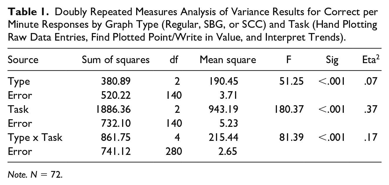
Initial analyses confirmed there were no significant differences (F = 1.94, p = .17, η2 = .002) in performance between participants who were in the different sequence of conditions (i.e., Group 1 [n = 35] or Group 2 [n = 37], as discussed in the Experimental Design section). Accordingly, we did not separate Group 1 and Group 2 data during subsequent analyses. A doubly repeated measures analysis of variance (RM-ANOVA) was computed for Graph Type by Graph Task. As shown in Table 1, all tested results were statistically significant, with η2 effect sizes ranging from medium to large. Of particular interest in this study was the possible difference in participants’ performance between Graph Types on each of the three Graphing Tasks. Given the significant differences evidenced in the RM-ANOVA, we explored possible differences between Graph Types with a series of post-hoc, paired t-tests.
Doubly Repeated Measures Analysis of Variance Results for Correct per Minute Responses by Graph Type (Regular, SBG, or SCC) and Task (Hand Plotting Raw Data Entries, Find Plotted Point/Write in Value, and Interpret Trends).
Note. N = 72.
Table 2 shows the descriptive statistics of the Graph Type (Regular, SBG, and SCC) by Graphing Task (Plot Raw Data, Find/Write Values, and Interpret Trends). As shown in that table, participants had the highest correct responses per minute for the Plot Raw Data and Find/Write Values tasks when using the Regular graph as compared to both the SBG and SCC. However, participants’ performance on those tasks was also significantly better when using the SBG compared to the SCC. With respect to interpreting data, participants’ correct responses per minute were significantly higher when using the SBG compared to both the SCC and Regular graph. Those using the SCC were also better able to interpret data compared to the Regular graph. Figure 1 visually presents the data across tasks and graph types, using a box and whisker display.
Descriptive Statistics of Graph Type by Graphing Task.
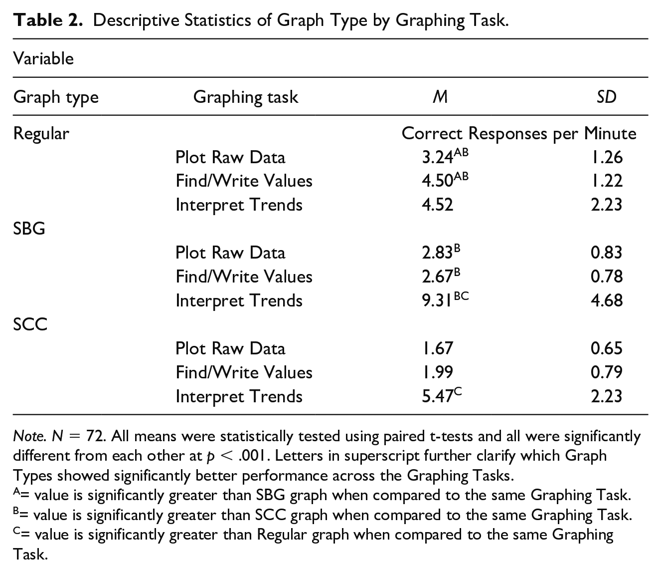
Note. N = 72. All means were statistically tested using paired t-tests and all were significantly different from each other at p < .001. Letters in superscript further clarify which Graph Types showed significantly better performance across the Graphing Tasks.
= value is significantly greater than SBG graph when compared to the same Graphing Task.
= value is significantly greater than SCC graph when compared to the same Graphing Task.
= value is significantly greater than Regular graph when compared to the same Graphing Task.
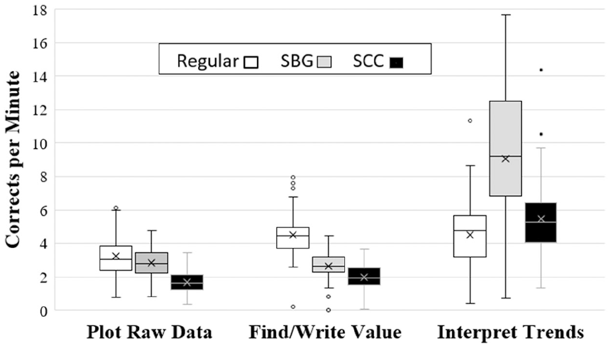
Rate of correct responding by task and group.
To supplement the analysis of grouped data across participants, the difference in performance with one type of graph versus another (on a specific task) was calculated for each participant. Table 3 shows the comparison of performances across the three graphing displays on a particular task, within participants. That is, the table shows how many participants did better on one display versus another, and how much better they did on average–in terms of correct responses per minute.
Within Participant Performance Differences Between Displays by Graphing Task.
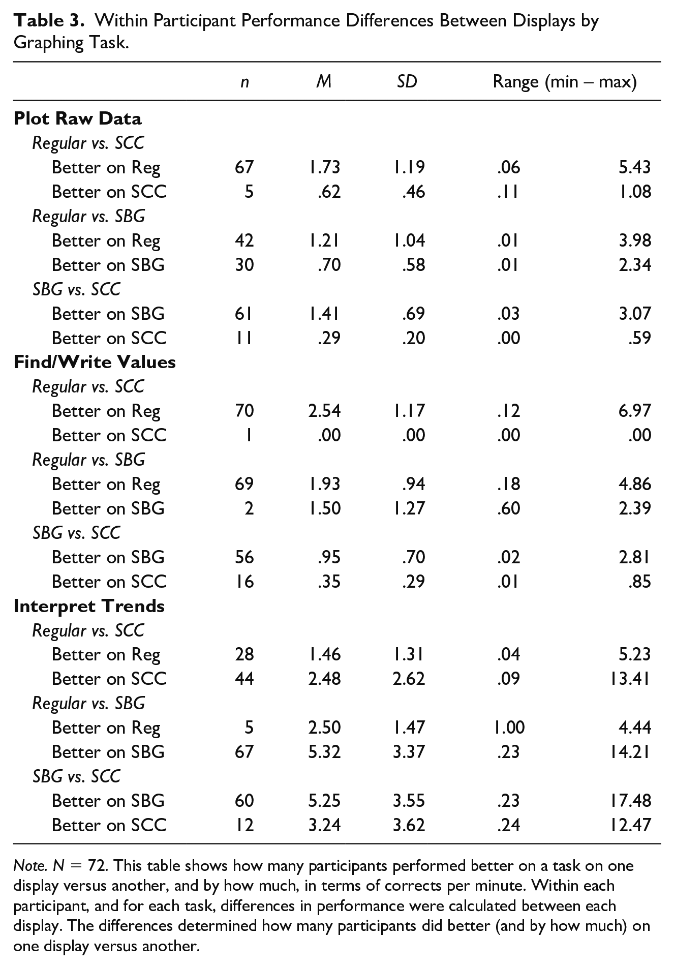
Note. N = 72. This table shows how many participants performed better on a task on one display versus another, and by how much, in terms of corrects per minute. Within each participant, and for each task, differences in performance were calculated between each display. The differences determined how many participants did better (and by how much) on one display versus another.
To address RQ2 of this study, Table 4 shows the results of the survey that participants completed. At the end of the study, just over half of participants (58%) indicated that their preferred graph was the Regular graph. However, 24% preferred the SBG and 18% had no preference. No participants reported a preference for the SCC. Also, related to RQ2, when participants responded to the questions comparing only the SBG and SCC, 85% reported a preference for the SBG and 78% reported the SBG was easier to use—with only 13% reporting that the SCC was easier to use and 10% indicating they were equally easy or difficult. In terms of the perceived magnitude of difference in ease-of-use between the SBG and SCC, 36% indicated the SBG was significantly easier and 42% reported it was just a little or somewhat easier.
Summary of Responses to the Preference Survey.
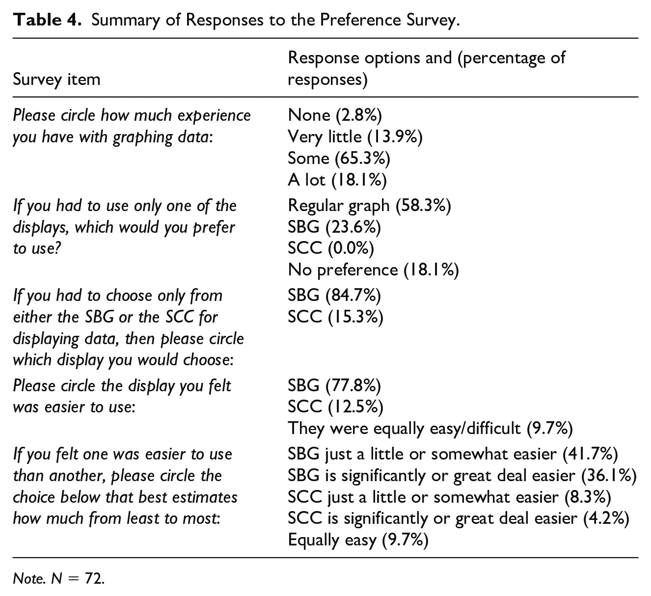
Note. N = 72.
Discussion
Those who work within helping professions (classroom teachers, behavior analysts, psychologists, etc.) can meaningfully improve the lives of those they support by using graphic displays of data to monitor progress towards goals, communicate information about such progress, and make informed changes to instruction or treatment as needed (Cooper et al., 2019; Fuchs & Fuchs, 1987; Lefebre et al., 2008; Ramey et al., 2016; Stecker et al., 2005; Twarek et al., 2010). Toward a goal of providing the best possible support for those served within a helping profession, such professionals have an obligation to utilize the most effective tools and practices that are realistically useful; thus, researchers within their profession are responsible for conducting systematic evaluations about the acceptability, usability, and effectiveness of such tools and practices. With respect to graphic displays of data as an important tool to support others’ well-being (by showing measures of behaviors or response products that affect the quality of their lives), only a small amount of research has thus far explored the extent to which different types of graphs are more or less acceptable, usable, and effective. The present study sought to address several gaps in this area of research (e.g., by examining differences between unique types of semi-log graphs, and by controlling for important threats to internal validity). Overall, we aimed to evaluate—among novice users—the acceptability and usability characteristics of three different types of graphs. Because many researchers and practitioners contend that semi-log graphs sometimes offer important advantages compared to equal-interval graphs (e.g., Cleveland, 1994; Devesa et al., 1995; Lefebre et al., 2008, Lindsley, 1992; Pennypacker et al., 2003; Schmid, 1986), a focus of the study was to evaluate potential differences in usability and acceptability between the SBG and SCC semi-log graphs.
Graph usability data showed that, on average, the Regular graph produced significantly higher rates of correct responding for the Plot Raw Data and Find/Write Values tasks compared to both the SCC and SBG semi-log graphs. These findings are consistent with a couple of past studies that documented participants as having higher accuracy when using an equal-interval versus semi-log graph (Marston, 1988; Mawhinney & Austin, 1999). However, it should be noted that the practical significance in rates of correct responding between the Regular and SBG graph was relatively small for the Plot Raw Data task, where the average difference was only 0.4 correct responses per minute. Additionally, we found that the semi-log graphs both resulted in significantly higher rates of correct responses for the Interpret Trends task, with the SBG graph resulting in more than two times the number of correct responses per minute compared to the Regular graph. Overall, our evaluation of usability across the Plot Raw Data, Find/Write Values, and Interpret Trends tasks showed mixed support for semi-log versus equal-interval graphs, as it depended on the specific type of task. This finding is fairly consistent with past studies that sometimes found no meaningful differences between graph types (e.g., Bailey, 1984; Fuchs & Fuchs, 1987; Knapp, 1983) as well as studies that evidence greater support for equal-interval versus semi-log graphs (e.g., Marston, 1988)—or vice versa (Lefebre et al., 2008). Unlike past studies, our study systematically evaluated three specific types of usability tasks and showed that usability may depend on not only the type of graph, but also the task.
As the first known study to systematically evaluate two unique types of semi-log graphs, we found that on average the SBG was more usable and acceptable than the SCC. With respect to usability, correct responses per minute were significantly higher with the SBG compared to the SCC on all three usability tasks. As noted above, stronger support for the SBG was also evidenced by finding that correct responding on the SBG was fairly similar to the Regular graph on the Plot Raw Data task and was more than twice as high as the Regular graph on the Interpret Trends task.
Overall ratings of acceptability still evidenced the most support for the Regular graph when participants were asked to choose between all the displays–42 out of 72 participants (58%) indicated preference for the Regular graph. When participants were asked to briefly explain why they preferred the graph they selected, the top 3 responses of participants who chose the Regular graph were the following: 29 out of 72 participants (40%) said it’s easier to read/use, 15 out of 72 (21%) said they were the most familiar with it, and 5 out of 72 (7%) said most people have seen/understand it more. However, when participants were asked to choose between just the two types of semi-log graphs, the SBG was far more preferred than the SCC–61 out of 72 participants (85%) indicated preference for the SBG. The top 3 responses of participants who chose the SBG from the two options were the following: 32 out of 72 participants (44%) said it’s easier to read/use, 19 out of 72 (26%) said the scales went up in the same direction on both sides, and 8 out of 72 (11%) said it’s more clearly labeled. The top three responses of those participants who chose the SCC from the two options were the following: 5 out of 72 participants (7%) said it’s easier to read/use, 3 out of 72 (4%) said it looks better, and 2 out of 72 (3%) said it has less information.
Implications for Research and Practice
The findings in this study offer some potential implications or considerations for research and practice. For example, for researchers interested in exploring relative benefits among different types of graphs, our findings suggest that, at least for users initially unfamiliar with semi-log graphs, the type of usability task may influence the relative advantages. As such, future studies should clearly define and comprehensively evaluate different types of usability tasks in order to compare graph types. Similarly, our study suggests that not all semi-log graphs are equally usable or acceptable, so future research examining semi-log graphs should (at minimum) clearly specify the characteristics of the semi-log graph, and potentially compare different types of semi-log graphs in order to elucidate relative advantages and disadvantages.
With respect to implications for practice, our acceptability findings revealed that just over half of the participants (58%) preferred the Regular graph, but approximately one quarter (24%) of the participants preferred the SBG, 18% had no preference, and no participants preferred the SCC (when the Regular graph was an option). As an initial study of user acceptability for semi-log graphs for users who, prior to the study, had no experience with these semi-log graphs, this finding suggests that approximately half of novice users may be open to using a semi-log graph—and in particular the SBG, which was the preferred type of semi-log graph by 85% of participants. These findings may have relevance for organizations (and directors of service-provider staff) that advocate for using semi-log graphs to support clientele. Put simply, most staff (and caregivers) will probably be unfamiliar with semi-log graphs and may have little to no experience interpreting graphed data when starting in the role (Begeny & Martens, 2006), but after a small amount of experience with a semi-log graph such as the SBG, this may enhance acceptability for using that graph. Furthermore, even novice users appear to interpret trends in data with the SBG far better than with an equal-interval graph. In settings where using semi-log graphs are part of standard practice, findings from this study suggest that novice users may have better acceptability and usability with certain types of semi-log graphs (e.g., using the SBG compared to the SCC). Thus, in such settings, those responsible for selecting tools and practices should consider trying alternative forms of semi-log graphs until identifying the one that is most usable, acceptable, and effective for supporting the individuals being served.
Another related consideration for practice is that leadership and/or service-providers should attend to the different dimensions of usability when considering alternative options for graphing behavioral data. For example, what user-related tasks are easiest to teach service-provider staff (e.g., plotting data points versus interpreting sets of data) and which, if any, are most attributable to making good data-based decisions? Also, if computerized software can assist with some usability tasks (e.g., typing frequency scores on a tablet that automatically plots data points on an electronic graph), would this impact the usability and preference for a particular type of graph? We would expect that if this study were redone using computer software (e.g., a “graphing app”), then performance would have been relatively equal across all the graphs in the first task (plot raw data) because the app would automatically plot the entered data. Additionally, if the graphing software on-hand was able to state the value of a data point merely by tapping on it or hovering over it with a mouse, once found by eye, differences between graphs on the find/write task may be reduced. However, for task 3 (interpret trends) we believe it is unlikely for an app to significantly change the results of the study, because interpreting trends is, to our knowledge, not something that can currently be automated with computer software (even if the trend values are automatically shown by the app). Many educational and behavioral health organizations have a tradition of using particular types of graphs, but if student or client behaviors can be better improved by using a different type of graph for monitoring and using data, such organizations should consider alternative graphing types and their relative effectiveness, usability, and acceptability.
Limitations and Future Research Directions
No single study can address all important research areas germane to that content area; thus, the findings and implications of this study must also be considered in the context of this study’s limitations and research questions that have not yet been answered. For example, because the regular graph tasks were introduced first for all participants (only the semi-log graph tasks were counter balanced), it is possible that practice effects were responsible for participants performing the poorest on the interpretation task for the regular graph. Though participants performed best on the regular graph with the other two tasks, the interpretation task itself may have required additional orientation or practice before participants could perform with maximum proficiency upon it. Thus, future research could examine this limitation by altering the order in which participants receive regular graph tasks. Additionally, on the interpretation task, as shown in Appendices A, B, and C, no trend lines were used. Use of trend lines could possibly have led to better interpretation results, especially with the regular graph, as has been demonstrated in some previous research on equal-interval graph interpretation (e.g., Fisher et al., 2003; Lane & Gast, 2014; Wolfe et al., 2019). Moreover, it stands to reason that if graphs can easily be used to their full potential (e.g., by providing pre-drawn trend lines), more effective client/student outcomes may be achieved in the helping professions. Thus, future research could provide pre-drawn trend lines through data sets on interpretation tasks.
Another limitation of this study was that it did not specifically examine the extent to which using any of the three graphs were more or less effective in generating desired behavioral outcomes. Arguably, for a graph to be effective in generating behavioral outcomes, it must be usable (e.g., those utilizing the graph must be able to accurately plot and interpret data on the graph); however, future research should specifically examine whether an individual’s behavior or rate of progress is differentially impacted by the type of graph used. From our examination of usability and acceptability, a logical next step would be for researchers to compare the differential effectiveness between using a Regular graph versus the SBG, while controlling for the order of their presentation. In such a study, researchers could also evaluate treatment providers’ acceptability and accurate use of each graph over time. Unlike the goal of our present study, such an evaluation over time would allow for an assessment of experienced versus novice semi-log graph users. A study like this would also be valuable because, at the present time, no previous studies have examined this type of SBG—and more research with this SBG is warranted to determine its relative value as a semi-log graphing option.
Finally, our study did not evaluate all aspects of usability and acceptability. For instance, future research might examine dimensions of usability that relate to training procedures for using different types of graphs. In the present study, we controlled for training by making it consistent across graph types and by using empirically derived best practices for teaching a concrete graphing skill with a 10 minute training video. Yet, it is possible that different approaches to training could impact the usability of a respective graph. Future research examining different types of graphs should also evaluate the student’s or client’s acceptability with each graph. Although the teacher or clinician may be better able to use one type of graph over the other to monitor behavior and make data-based decisions, perhaps the client (or client’s caretakers) may find a different type of graph easier to understand when evaluating progress toward a goal. Ultimately, future research in this area must continue to explore all dimensions of a graph’s acceptability, usability, and effectiveness to ensure that clients or students receive the most optimal level of support.
Footnotes
Appendix
Declaration of Conflicting Interests
The author(s) declared no potential conflicts of interest with respect to the research, authorship, and/or publication of this article.
Funding
The author(s) received no financial support for the research, authorship, and/or publication of this article.
