
Abstract
The release of the Google Maps API in 2005 spurred a trend of mapping mashups, adding cartography to online participatory culture. This article will present how the affordances of these ‘platforms’ give shape to the online participation of concerned citizens willing to access information during an environmental crisis. Based on the analysis of the radiation mashups created after the disaster at the Fukushima Daiichi power plant in 2011, this article will highlight two types of online participation. First, participation as data extraction, where concerned actors either monitored data using Geiger counters or extracted and republished data from official websites. Second, participation as data aggregation, where maps were used to display and compare radiation measurements from official or crowdsourced venues. The conclusion will highlight the necessity to study how online platforms assign a place and temporality to online participation.
Keywords
The explosions of three reactors at the Fukushima Daiichi power plant after 11 March 2011 disseminated nuclear radiation across the Japanese territory. Limited access to official information about the level and the location of radiation characterized the weeks following the event. Simultaneously, several maps appeared online. They were created by amateurs – nonexperts in geography and/or radiation-sensing – and used online web-based mapping technologies, primarily Google Maps, attempting to locate the radiation. These amateur radiation mapping practices relate to two recent trends in cartography: the rise of mapping mashups as part of online participatory culture and the ‘critical cartography’ theories and practices of cultural geographers, activists, and artists emphasizing public participation in maps.
This practice of merging different sources of digital content to create a new application is often described as creating a ‘mashup’, that is, remixing a plurality of digital content (e.g. music, image, video, text) (Sonvilla-Weiss, 2010). The mashup is emblematic of digital participatory culture, defined by Jenkins (2009a) as having ‘relatively low barriers to artistic expression and civic engagement’ and ‘strong support for creating and sharing one’s creations’ (p. 3). In particular, map-based mashups provide a prominent example of the mashup principle: they typically combine third-party or personal data with a base map to create a completely new application or service. Haklay et al. (2008) highlight three factors to explain the rise of ‘web mapping 2.0’: the availability of the public Global Positioning System (GPS) signal in 2001, the rise of various dynamic programming languages such as JavaScript, and, most importantly, the release of various mapping application programming interfaces, or API, (e.g. Google Maps or Yahoo Maps in 2005) providing access to free (under a certain use limit) and user-friendly base maps. As a result, the skills required to create online maps are increasingly distinct from traditional Geographic Information System (GIS) skills and instead are much closer to activities such as web design and online content management. As Farman (2010) puts it, adding a layer on Google Earth is closer to adding a picture on MySpace or Facebook (p. 12) and thus differs considerably, for instance, from using popular software such as ArcGIS.
This possibility to create online maps has been described by Eisnor (2006) and Turner (2006) as ‘neogeography’, by Goodchild (2007) as ‘volunteered geographic information’, and by Sui (2008) as ‘wikification of the map’. These terms emphasize the participation of amateurs – that is, non-geographers nor GIS experts – in producing, processing, and mapping geographic data. This crowdsourced participation in web mapping can take various forms, such as adding data to an already existing map or contributing information to a geolocated database (e.g. with OpenStreetMap, a mapping project based on contributions, and similar to Wikipedia). The ability to create a mashup by easily accessing an online base map, rather than being limited to high-cost, proprietary mapping applications, resituates the map in the participatory culture. As Jenkins (2009b) phrases it, ‘In geographic terms, participatory culture is what happens when you throw Google Earth out there and people start doing their digital overlays on it, in totally unanticipated projects’.
Despite the presentation of these web products as disrupting existing technologies, amateur production as seen in these mapping mashups echoes previous debates in the field of cultural geography regarding the political implications of public participation in mapmaking. The rise of GIS throughout the 1980s, accompanied by rhetoric of objective representation, triggered important debates in the field of geography (Schuurman, 2000): they addressed what a map is, how people can or should participate in the geospatial representation, and the place of technology in cartography (Crampton, 2010). Brian Harley was one of the earliest voices underscoring the necessity to ‘deconstruct’ the map. Drawing from the work of Jacques Derrida (Harley, 1989) and Michel Foucault (Harley, 1990), he described cartography as a specific knowledge power, bearing an internal power (when the cartographer imposes a specific territorial view on a space or an event within the map) and an external power (when maps are used by centers of political power) (Harley, 1989). Similarly, Wood et al. (2010) dramatically argued that ‘there were no maps before 1500’, in an attempt to recall how the spread of mapmaking was closely linked to the rise of modern nation-states and acted as justification for this new political organization.
The shared desire of these geographers and GIS practitioners to tackle the ‘bureaucratic positivism’ (Pickles, 1991) of GIS resulted in a range of initiatives during the 1990s to explore new forms of public participation in maps. For example, Public Participatory Geographic Information System (PPGIS) supports humanitarian projects where the members of a community are invited to bring their inputs in a map, whether mental maps, oral histories, or other forms of information (Rouse et al., 2007: 153). Tightly rooted in the larger discourse of critical theory, the more recent emergence of the field termed ‘critical cartography’ (Crampton and Krygier, 2006) combines activist, artistic, and theoretical perspectives to tackle issues of race, gender, and empowerment using mapping projects. Similarly, ‘radical cartography’ (Mogel and Bhagat, 2008) mixes a wide range of mapping tools with a tactical media perspective (Raley, 2009), leveraging hands-on and situated actions for spatial justice. The ways these initiatives interrogate the place of the public in mapping are directly in line with the radiation mashups studied here.
The radiation maps created after the 11 March 2011 accident at the Fukushima Daiichi power plant showed how these two debates about participation in maps, rooted in either web 2.0 technologies or in critical theory, are closely related. Many used ready-made and easily accessible base maps via the Google Maps API to create mapping mashup. They were also created primarily by amateurs who used these mapping technologies to take part in the assessment of the nuclear situation of the country, creating alternative sources of information that competed with official reports from the government and the Tokyo Electric Power Company (TEPCO).
The ‘politics of platforms’ (Gillespie, 2010) encompasses this co-determination between the technical and the political aspects of social media services, which also applies to web-based maps. Gillespie shows how online content providers (e.g. YouTube in his analysis) use the term ‘platform’ to present themselves as intermediaries between users, advertisers, and major media producers. By extracting this term ‘platform’ from the discursive context of the Internet industry, he also shows that the connectivity and the interoperability that these platforms advocate for are far from neutral. As Gillespie puts it, platforms shape online participation: their technical, legal, and commercial features simultaneously allow and restrain specific types of participation (Clark et al., 2014: 1447). The maps in this case study follow this principle of platforms. The Google Maps base map is accessible through queries toward its API to generate new applications by adding heterogeneous data. But these platforms also afford specific way to participate online. This article will show how the technical properties of web-based maps are tightly intermingled with the way amateurs participated in the online debate about the location and levels of radiation in Japan after the Fukushima Daiichi disaster. It will address the following central questions: How did the affordances of online maps create a specific mode of participation in assessing the radiation situation after the tsunami and ensuring nuclear disaster? To put it differently, what could the amateurs, those willing to assess the radiation situation, actually do with a map that they could not do with other participatory media, such as Twitter or blogs?
The answer to this question is twofold. First, the mapping platforms themselves provided a framework for the preliminary steps prior to creating radiation maps – that is, locating, extracting, and publishing radiation data. As online base maps have relatively low technical barriers, it was this preliminary step of the data collection that concentrated the bulk of the effort. However, while these online base maps may be easily accessible, they still require machine-readable data, preferably in a format capable of exchange with an API, such as that provided by Google Maps. The barriers these radiation cartographers had to overcome after the Fukushima disaster were indeed manifold, ranging from the absence of radiation data, their unstructured nature, or their dissemination across multiple websites. As a solution, they either used data created from Geiger counters or extracted data from official websites and released them in a structured format, in order to create their maps. Second, maps were specifically chosen to compare various sources of data, offering the possibility to mashup different datasets on a single base map. This aggregation of data via maps was facilitated by the platform Pachube, which distributed data through an API, making the information easier to dialogue with the Google Maps API. In the context of general distrust of the government and the lack of standards for amateur monitoring, this ability of online maps to aggregate multiple sources of data was used to verify government measures to see how they correlated with alternative and crowdsourced data sources.
Both these actions that occurred before the map (collectively building and structuring datasets specifically for online cartography) and through the map (aggregating different sources of datasets to verify them) show how the technical and political dimensions are closely intermingled in these participatory maps. As Carpentier (2011) asserts, online participation ought to be related to the notion of power. Accordingly, these maps constitute attempts to redistribute more equally the capacity to obtain information about radiation, with TEPCO and the Japanese government on one side and the public on the other side. In this case, amateur mapmakers decided not to rely only on the government data, but to find alternative means to produce data and to verify official measures.
This article is organized as follows. After presenting the chronology of the nuclear disaster at the Fukushima Daiichi power plant, this article will highlight the two forms of participation that aimed to remediate the lack of official information. First, participation as data extraction, where concerned actors either monitored data using Geiger counters or extracted and republished data from official websites; second, participation as data aggregation, where maps were used to display and compare radiation measurements from official or crowdsourced venues. Based on this case study of radiation mapping mashups in the wake of a major disaster, new perspectives on the study of participation in online platforms are offered.
Official communication after the Fukushima Daiichi power plant accident
Chronology of the event
On Friday 11 March 2011 at 14:46 JST, a 9.0 MMS earthquake strikes near the East coast of Honshu in Japan. This event is followed 30 minutes later by a tsunami, which floods the North coast of Japan, including the Fukushima Daiichi (that designates the site ‘Fukushima number 1’) nuclear power plant operated by TEPCO. As a consequence of these combined events, 1 the emergency core cooling system fails to stabilize the reactors’ temperature: they start to heat up, resulting in a meltdown. On 12 March, in order to control the increasing pressure inside the reactors, a release of pressure is ordered and water is sprayed by helicopters and firing hoses. Despite this, reactor no. 1 blows up the same day due to a hydrogen concentration, followed by reactor no. 3 on 14 March and reactor no. 2 on 15 March. During these events, radioactive material was released directly into the nearby air and water. In the first case, this occurred through radioactive plumes emanating from pressure releases or leakages from reactor vessel cracks. In the second case, radioactive material was released through the water used to cool down the reactor. 2
TEPCO and the Japanese government communication
The first challenge the Japanese public faced in order to understand the ongoing situation was the lack of official radiation readings available. Even though TEPCO published several press releases per day after 11 March 2011, the company did not provide real-time monitoring of the radiation levels at the plant. Press releases in March and April quoted quantified readings from TEPCO on 15 March, 17 March, 2 April, 10 April, 17 April, and 22 April 2011 (TEPCO, 2014). These press releases indicated that the situation had not changed since the previous monitoring and/or provide non-quantified statements.
The government also had difficulties in providing a real-time overview of the radiation situation. The official radiation monitoring is performed in Japan by a sensor network named System for Prediction of Environmental Emergency Dose Information (SPEEDI), administered by the Ministry of Education, Culture, Sports, Science and Technology (MEXT), which provided data to the Japanese government. However, since the first days of the event, the online map displaying SPEEDI data labeled the Miyagi and Fukushima prefectures (both the closest to the power plant) as ‘Under survey’. This was because the SPEEDI sensors were knocked out by the tsunami, which prevented them from reporting data (Onishi and Fackler, 2011). For the public, due to the immense interest, the website was also under heavy load and therefore barely accessible during the first days of the event.
Beyond these technical problems, the handling of SPEEDI data by the government has also been widely criticized. Toshiso Kosako, a scientist who took part in the advisory group set up by the government, highlighted in a New York Times article (8 August 2011) the lack of resources available to the prime minister during the crisis. Indeed, MEXT did not report the SPEEDI data to the government, giving the poor quality of the measurements as a pretext. He also pointed to the lack of experience by government agencies in using the complex SPEEDI data, which led those in charge of nuclear affairs ‘to pass […] the data to one another like a hot potato, with none of them wanting to accept responsibility for its results’ (cited by Onishi and Fackler, 2011). The Japanese prime minister at that time, Naoto Kan, confirmed this fact on 17 June 2011, when he declared that he had no idea what type of information SPEEDI was delivering and that he could not, as a consequence, make any decisions (RTBF info, 2011). In addition to technical and crisis management problems, the government was also suspected of simply withholding information since the beginning of the event, as revealed by the same New York Times article: In interviews and public statements, some current and former government officials have admitted that Japanese authorities engaged in a pattern of withholding damaging information and denying facts of the nuclear disaster – in order, some of them said, to limit the size of costly and disruptive evacuations in land-scarce Japan and to avoid public questioning of the politically powerful nuclear industry. (Onishi and Fackler, 2011)
Marian Steinbach, a German computer programmer involved in extracting radiation data, summed up the way the government handled the communication of radiation measurements: ‘they did not publish [the radiation readings] in real time, they did not publish [them] in structured format, and they published [them] whenever they wanted to’. 3
The shortcomings of official radiation data
Despite all these difficulties, information about the radiation levels in the country was still available. MEXT published daily monitoring releases with the remaining sensors. Japanese Nuclear and Industrial Safety Agency (NISA) recorded and published radiation measurements. Foreign groups such as the International Atomic Energy Agency (IAEA) (related to the United Nations) also produced radiation readings. Additionally, some groups were still able to publish results from their own radiation sensors on their individual websites.
Although the situation was not a total information blackout, official readings published online presented a second major problem. They were published in a read-only and not machine-readable format, as described with humor by Dr Ryo Ichimiya: ‘So far, almost data from radiation monitoring sites are provided as text or list style which is NOT machine readable (even some sites provides scanned PDF of a printed paper, Oh!) [sic]’ (Ichimiya, 2011).
A third difficulty came from the multiplicity of norms for radiation measurements, for example, Gray or Sievert, 4 among many others. The absence of a single norm generated a heterogeneous panel of readings according to the source. Even within one source, radiation measurement units were sometimes far from consistent. As Fleepcom, an individual involved in radiation data visualization, stated in a tweet, ‘Dear TEPCO/NISA, Please use consistent levels in your documents. Switching from µSv/h to mSv/h half way thru a document is dumb’. 5
The official account of the nuclear situation after 11 March had several flaws that prevented the public from having a clear picture of where and how much the nuclear radiation was. As a reaction to this situation, individuals attempted to address this lack of information along with the insufficient quality of information that was released by creating their own digital maps.
Mapping mashups and methods
The following is a list of online radiation mapping mashups created after the initial Fukushima Daiichi disaster (Table 1). They were collected between June and November 2011, under the following criteria:
The list contains only maps related to radiation measurement, that is, excluding crisis management maps.
These maps use a base map; data visualization without a geographic basis is excluded.
They are mashups, using a base map to plot external sources of data.
They were created by non-geographers and non-cartographers.
They are available online and did not require any specialized GIS software for access.
They are in English or Japanese.
The maps were identified through multiple measures:
Searching keywords using the Google search engine (Google.com and Google.co.jp) with various queries, such as ‘Japan OR Fukushima AND Radiation AND Map OR Cartography’ in English and Japanese.
Various websites gathering radiation maps were consulted. 6
During interviews, several mapmakers highlighted various maps.
Several social media monitoring websites were also used, such as Scoopit 7 and Twitter, using the same search keywords as the Google search queries.
List of mapping mashups.
Finally, the list contains only maps that are still available at the time of writing this article.
All these maps were created by heterogeneous actors. That is, they were either individuals (such as Satoru: map no. 2 or William Milberry: map no. 13) or organizations, either non-profit (such as Earthspiral: map no. 14) or for-profit (the web design company Spurs: map no. 10). This mapmaking activity was also characterized by a large array of different sectors involved. Maps were created by web-industry companies (e.g. Yahoo!: map no. 12 or Mapgenia: map no. 11), designers (Haiyan Zhang: map no. 3), scientists (volcanologist Yukio Hayakawa: map no. 8), hackers (Safecast: map no. 9), or anonymous individuals (map no. 1 and map no. 6).
The methodology chosen to investigate how these maps were created and validated was threefold. It consisted of a document analysis of the governmental radiation measurements reports and of TEPCO and the Japanese government management efforts concerning the crisis at the Fukushima Daiichi power plant. It also consisted of nine semi-directed interviews of key actors involved in the process of data extraction, monitoring, and mapping, conducted in presence or online between April and October 2011. These actors were identified after qualitative analysis of the collaborative work to create these maps that took place on Twitter, blogs, and shared spreadsheets. In addition, it consisted of direct observations of the radiation monitoring activity of the Safecast organization members, at the Tokyo Hackerspace in Japan in August 2011, where I specifically focused on how alternative Geiger counters were created, how they were handled to monitor the radiation, and how the data were published online.
Data extraction as participation
In most cases, creating maps to remediate the information crisis about the radiation situation started well before the creation of the visual maps themselves. The common first and necessary step was to identify sources of radiation data. But how did the radiation cartographers manage to overcome the various difficulties concerning the radiation data and eventually find structured data to display on their maps? Two sources of data were primarily used: that from radiation monitoring initiatives using Geiger counters and information from official datasets extracted and reformatted for online dissemination.
Monitoring the radiation with Geiger counters
The first solution to address the lack of and/or unstructured nature of available radiation data was to monitor the radiation levels from scratch using Geiger counters. Since the onset of the crisis, several Geiger counters were in fact in use across Japanese territory. Several individuals and organizations possessing Geiger counters published real-time readings on their websites. 8 But as Geiger counters quickly became out of stock in stores and online (Akiba, 2011), people willing to monitor levels of radiation had to find alternative means to do so, such as creating do-it-yourself (DIY) measurement devices.
The voluntary body Safecast played a key role in these monitoring efforts. Working closely with the Tokyo Hackerspace, the organization developed what Kera et al. (2013) called ‘humanitarian hardware’, by creating DIY Geiger counters that would eventually scale up to create an independent radiation-sensing network. In addition to a fixed sensor network, they produced radiation readings with local teams by feet and by car in order to create an exhaustive map and to regularly update the readings. All data gathered by fixed sensors and by walking and driving were mapped on the organization’s website and made available for download. Therefore, Safecast and like-minded organizations created what Morita et al. (2013) called a ‘civic infrastructure’, acting as alternative data providers to remediate the absence of information.
Still in operation, Safecast emphasizes the possibility to share the data that they produce from their alternative sensing network. The organization uses the Creative Commons 0 license (or ‘CC0’) for their data, allowing to ‘copy, modify, distribute and perform the work, even for commercial purposes, all without asking permission’. 9 This means that they give up any copyright, the data become part of the public domain and any modifications are possible without acknowledgement of Safecast as the source. 10 This data policy highlights the position of the organization as intermediaries, aiming to publish data that specifically foster further uses.
Extracting official data
Parallel to alternative Geiger readings, another way individuals located data was by extracting the published official readings in order to generate structured data files (a process commonly called ‘web scraping’, cf. Marres and Weltevrede, 2013). Marian Steinbach, a German computer programmer and designer, contributed to the data extraction efforts, processing and publishing radiation data from Japanese government websites. On 15 March 2011, he started a shared spreadsheet to collectively aggregate online sources of radiation information. Steinbach was looking for data with both time values – in order to compare changes in radiation levels before and after the accident – and geographical values – in order to locate them. These two items were available on the government website Bousai (excluding the Miyagi and Fukushima prefectures), which display the data from the SPEEDI network through an internal API. However, they were not downloadable.
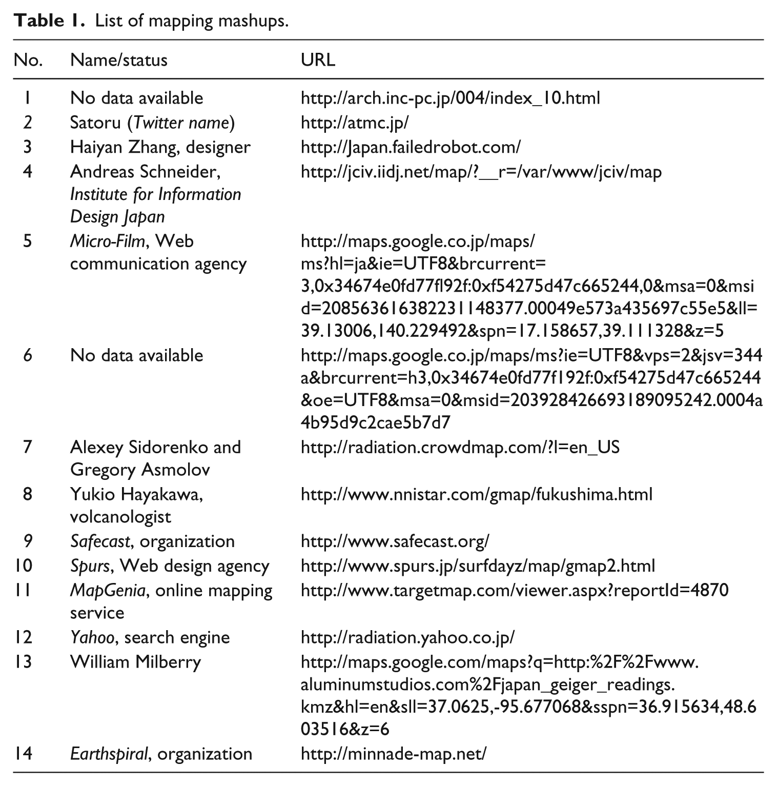
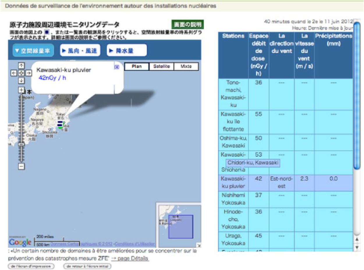
The Bousai webpage depicted above (Figure 1) uses an internal API to connect data in the spreadsheet on the right to the map on the left. As an example, positioning the cursor (invisible) on the line ‘Chidori-Ku, Kawasaki’ (in dark blue) opens up a window on the map. Double-clicking on this value displays the pop up window below (Figure 2).
Map displaying the SPEEDI data from the website Bousai. http://www.bousai.ne.jp/eng/index.html (last accessed 11 June 2012).
Pop-up window form the same map.
This pop up window (Figure 2) uses Flash and calls an API containing the values to display them. It is this API that Marian Steinbach queries and extracts as a structured file. 11 Following this manipulation, data extraction was automated on 16 March 2011. However, these data were expressed in Japanese. Geocoding the data was impossible for Steinbach, who does not speak the language. Following a call for collaboration launched on 17 March 2011, several people helped Steinbach translate and geocode the data. This data extraction resulted in two files (CSV) published on his website, still available and constantly updated. The first file updated every 10 minutes contains the values of the last hour; the second contains all the values extracted since 1 March 2011 until the time of download (Table 2).
The first eight values of the spreadsheet containing data from the previous ten minutes.

This table displays the station number, date and time, the value of radiation in nanogray/hour (SA), and rain in millimeters (RA).
Source: http://www.sendung.de/japan-radiation-open-data/ (last accessed on 24 September 2012).
Two other actors performed similar work: Dr Haruhiko Okumura, Professor in Computer Science at Mie University, and Dr Ryo Ichimiya, from the High Energy Acceleration Organization (KEK). Dr Okumura set up an index of scraped data from various official sources (MEXT, Fukushima prefectures). The data were automatically scraped from the official websites and converted into CSV files, among other formats. 12 Dr Ichimiya set up a webpage to publish scraped and refined official data, which also displays information according to ways it could be used (e.g. the tabs: ‘I’d like to know radiation dose in an area’ or ‘I’d like to make a my graph [sic]’ (Ichimiya, 2011).
The description of these modes of data collection shows that the participation in radiation mapping started well before the mapmaking in itself. The web-based maps required structured and up-to-date data along with precise geographic metadata to be mashed up on a base map. In order to overcome the flaws in the official data formats, the radiation mapmakers either used Geiger counter data and/or repurposed official data obtained through web scraping. But these technical characteristics of radiation data also bore a political aspect. Like all classification systems, formats are inherently political (Bowker and Star, 1999). Releasing data in PDF or other non-structured formats represented a choice, one conscious or not, by government and TEPCO not to encourage or enable reuse of their data. Extracting data and publishing them online was a strategy to contest this choice, aiming to trigger other applications and further uses of the data. As a result, after performing preliminary steps, radiation mapmakers employed web-based cartography to aggregate and compare different data sources.
Data aggregation as participation
Due to the locational and the invisible nature of nuclear fallout, radiation maps took on incredible value all across Japan after 11 March 2011, As opposed to textual PDF reports from the federal government, maps provided easier and more readable access to pertinent information. In addition to the location features, they helped to aggregate multiple data sources in a single view. This follows Corburn’s (2005) analysis of how the aggregation property of maps is an important incentive encouraging the public’s use during territorial conflicts (p. 176). Combining radiation data and web-based maps created a tool to verify governmental or crowdsourced measurements.
A platform for data aggregation
The project to aggregate various sources of data on a single mashup quickly faced the problem of the dissemination of data across many websites. Several methods emerged in efforts to tackle this problem. The first attempts consisted, for instance, of video recordings of Geiger counters published on real-time video streaming services. Others published lists of resources online, for example, the wiki Geigercrowd, aggregating URLs of websites providing radiation data, along with local administrations (the prefectures of Japan) and individual Geiger counters. 13 Similarly, the software application #Gwatcherver2 harvested and displayed all Twitter messages containing hashtag #Gwatcherver2, which contained radiation measurements. 14 However, the main drawback of these methods is that the data aggregated are not downloadable, and therefore not reusable in online maps.
The Pachube service was used to overcome this limitation by providing a platform to aggregate, but also to disseminate radiation data, with the explicit aim to facilitate their reuse in other applications. This service originated from the ‘Internet of things’ movement, created in 2008 to connect resources from different physical sensors (e.g. noise or CO2 pollution sensors). Promptly after the accident at the Fukushima nuclear plant, the Pachube administrator offered online storage to any user who would upload his or her radiation data on the platform. As Marian Steinbach describes it, So the Pachube guys were kind enough to create all those data feeds, because it is several hundreds sensors stations, and they created these feeds for every stations, for no fee, of course, it was pro bono, and that become a pretty important data app for all the people who would try to visualize that data. […] Because my CSV download aren’t an API, they just contain either the latest value, or all values, so one is very short the other one is very long, but in combination with Pachube API it is pretty powerful I think.
15
Unlike a CSV file published on a website, the data uploaded on the Pachube platform could, in turn, be downloaded through an API. It therefore provided a data format that made radiation data much easier to reuse. Data could be ‘fetched’ and fed to a third-party application, such as a web-based map. As the platform contained a large number of data feeds, 16 such as those from Marian Steinbach, Tokyo Hackerspace, and Safecast, it could then serve to feed other mapping mashups.
The verification of official data
Once different sources of data were available, aggregating them on a base map played multiple roles. First, it increased the pool of data that cartographers could use in their maps and acted as a means to get closer to an exhaustive description of the situation, thus helping Japanese residents make important decisions during the crisis (such as evacuating one’s home, not going outdoors, or not eating certain foods). Akiba (2011), a member of the Tokyo Hackerspace and Safecast, highlights the importance of comparing various datasets in order to reach the maximum available level of detail concerning the situation: Yeah, I think independent corroboration is really useful. I like Geiger maps and also RDTN.org. The more info you have, the easier it is to make an informed decision. I think having less information is what leads to panic because people naturally assume the worst.
In addition to having a better understanding of the situation, independent corroboration was also a means to control the official announcements. Another mapmaker reasserted the necessity to have unofficial data, in order to prevent the government from concealing incriminating things: People does not trust official data from Japanese government. We need real time data from various sources including Japanese government and non-official data. If we don’t have non-official data, government can cover up on government data [sic].
Here, maps served to verify data released by the government by comparing them with alternative sources. A rhetoric of transparency is employed in this quote: specifically, having official and non-official data on the same base map is supposed to create a fact-checking tool for the official nuclear readings. This same mapmaker pushed the aggregation necessity as far as saying that s/he did not discriminate between governmental or alternative data. Talking about the official radiation measures, s/he claimed, ‘We trust it. But one of the various. We trust non-official data as much as official data [sic]’. In a context of general distrust of the government, the credentials coming from a specific data sources were not deemed reliable enough to orientate the choice toward specific sources of datasets. Radiation data did not obtain their value from their original sources, but rather by being compared with other data sources.
The validity of crowdsourced data
Aggregating different data sources has important technical shortcomings, particularly due to the uneven quality of Geiger counters used and/or the lack of experience in radiation monitoring by those conducting the measurements. Nevertheless, mapmakers relied on the map as it is capable of aggregating and hence highlighting potential flaws in the data. By doing so, the priority was not the validity of data anymore, but rather the real-time coverage of the situation. As another anonymous mapmaker puts it, ‘I think accuracy is not very important in this case. It is important to compare the changes continuously’. To obtain a clearer picture in the absence of official coverage of the situation, accuracy of data became a secondary priority, and the validity came from a bottom–up process of aggregation and comparison.
This position toward knowledge reflects the participatory culture, with Wikipedia offering one of the most famous examples where post hoc peer review replaces a priori validation based on credentials. Comparing several sources of data also served as a token of their validity by allowing mapmakers to detect potential errors in their data. This strategy is illustrated by the experience of a Geiger counter owner, whose data are aggregated on the Haiyan Zhang’s map. A concentration of water in his sensor caused the measuring device to short circuit, resulting in measurements close to those in Fukushima. In reaction to the frenzied reactions of some users of the map, the Geiger counter owner answered by cautioning them the need to compare data sources, instead of over-interpreting one particular source: To a point I feel responsible for the nervous reactions online to this bad data, and to that extent I’m very sorry for causing unnecessary concern. To be clear though: I’ve publicly retracted the data in a number of places online and adequately explained the reason for the error – if people continue to attribute any value to this data they validate the complaints of TEPCO and the govt about citizen monitoring and its reliability. An assumption of any automated monitoring is that the sensor must always be regarded as not implicitly 100% trustworthy – so we check when the readings are surprising; the reason we do crowdsourced data is because many data points protect us from the overvaluing one bad data point. I’d love to believe that the positive outcome of this mistake is that more people deploy their own sensors to protect against it happening again – please prove me right. (our emphasis; Rick Knowles comments http://japan.failedrobot.com/)
This radiation cartographer cites here the aggregation of multiple data sources as a way to ensure the validity of the data displayed, as errors will be highlighted among the other data sources. This approach embraces the motto ‘given enough eyeballs, all bugs are shallow’ (Raymond, 1999).
Conclusion: studying online platforms
After the Fukushima Daiichi power plant accident on 11 March 2011, several maps were created by amateur cartographers to address the lack of information about radiation levels across Japan. These mashups are part of the web of platform, and their features gave shape to the online participation in the radiation assessment. This interrelation between maps and online participation took two forms. This first step started before the creation of the actual maps, as the radiation mapmakers had to locate data to populate the maps. In order to overcome the lack of and unstructured/non-reusable formats of official data, a mix of crowdsourced and scraped data was published online to be mashed up on maps. Second, as a main property of cartography is to simultaneously display different sources of data, maps were used to compare independent and official data measurements to assess their validity. This data aggregation became much easier after the platform Pachube concentrated and disseminated data from several sources.
This case study offers the opportunity to see how an everyday object can become deeply embedded in the online participatory culture. In this case, this embeddedness stems from technical features – the release of the Google Maps API – and from the abundance of remixable data – either from open data initiatives or from other online platforms delivering data compatible with mapping APIs. Also, online maps often attempt to seamlessly weave a continuum of data, services, and applications from the contemporary web. However, this type of integration is far from producing neither neutral nor irenic objects. On the contrary, as Zuckerman (2012) puts it, ‘the most powerful tools for political change are those that achieve wide adoptions and are integrated in everyday practices’. Therefore, one should not be surprised to see that these mapping applications were quickly chosen by radiation mapmakers eager to bring more light on the radiation situation of the country after 11 March 2011.
Mapping applications were described in this article as ‘platforms’ driven by specific ‘politics’, allowing and appraising specific uses, but also forbidding others (Gillespie, 2010). After describing how mapping platforms used in the wake of a recent disaster can shape the public participation, it is important to notice that these radiation maps did not constitute a breach of the original scripts (Akrich, 1987) of the platforms. The reality was quite the opposite, as these maps were used according to their affordances: queries toward a mapping API, merging of third-party data, publication online. If the Google maps API was first created by an act of hacking (Plantin, 2012), the uses of cartography to map the radiation are by no means examples of tactics (De Certeau, 1990) or repurposing of an online object (Rogers, 2009). Perhaps the primary idiosyncrasy in these radiation maps is their ability to take part in a controversial situation concerning the assessment of the radiation –arena web-based maps were not necessarily imagined to have value. Tactics are rather to be found through the independent radiation-sensing and the data extraction initiatives that challenged the official sources as sole data providers.
If the politics of platform designates specific ways of using a service, it also concerns the political nature of the participation through maps. Again, as Carpentier (2011) described, online participation is rooted in power relations. In the case study presented here, maps were created to renegotiate exactly who gets to access data and how data are allowed to circulate. In that sense, the action of mapmakers to extract and restructure data binds technical and political goals together in order to make the distribution of information about the radiation situation more equal between the official actors and the public.
Beyond mapping applications, this case study contributes to the study of participation in social media platforms. The investigation of power relations in radiation mapping necessitated not only to look at the object of the map itself but also at what happens before and after the maps. First, participation in mapmaking started before the maps were constructed, with the process of radiation data monitoring and data extraction to later feed the mapping mashups. Second, after maps were created, online platforms exerted consequences for the temporality of the maps. Several maps created soon after 11 March 2011 are now offline; other applications are not updated anymore. If this is closely related to the personal agenda of each mapmaker (Plantin, 2014: 140–143), it also comes from the properties of the platforms used. The service Pachube was renamed COSM in May 2012 and changed again in May 2013 to become Xively, illustrating the dynamic tendency of tracing these environments and the projects they enable. These various mutations invariably impacted the terms of services in accessing the data, which in turn impacted the accessibility of the radiation data feeds – a common characteristic of such platforms (Helmond, 2014). To conclude, if web platforms shape participation, they also assign a place and a temporality to online participation, which must be taken into account in their analysis.
Footnotes
Funding
This research received no specific grant from any funding agency in the public, commercial, or not-for-profit sectors.