



Abstract
Computerized presentation slides have become essential for many occasions such as business meetings, classroom discussions, multipurpose talks and public events. Given the tremendous increases in online resources and materials, locating high-quality slides relevant to a given task is often a formidable challenge, particularly when a user looks for superior quality slides. This study proposes a new, comprehensive framework for information quality (IQ) developed specifically for computerized presentation slides and explores the possibility of automatically detecting the IQ of slides. To determine slide-specific IQ criteria as well as their relative importances, we carried out a user study, involving 60 participants from two universities, and conducted extensive coding analysis. Further, we subsequently conducted a series of multiple experiments to examine the validity of the IQ features developed on the basis of the selected criteria from the user study. The study findings contribute to identifying key dimensions and related features that can improve effective IQ assessments of computerized presentation slides.
1. Introduction
Information quality (IQ), which is often defined briefly as the ‘fitness for use’ of information [1], plays a crucial role in the decisions and actions of information consumers [2]. As the amount of information surrounding an information consumer has been increasing rapidly, it has become highly challenging to locate a high quality source of information, which is often directly related to the performance of the consumer [3, 4].
Computerized presentation slides are the materials that are created with presentation software (e.g. PowerPoint, Keynote), as opposed to traditional presentation materials such as papers or overhead projector films [5]. Computerized presentation slides (hereafter mentioned as presentation slides or slides for convenience) are one of the most popular information media, commonly used in conjunction with business meetings, academic lectures, multipurpose talks and public events.
Acknowledging the importance of presentation slides, online services solely focused on presentation slides such as SlideShare 1 and SlideFinder 2 have recently emerged. While these specialized platforms offer the ability to perform a search against millions of slide files with the number growing continuously, most users must wade through a multitude of slides and discern the quality of slides before they locate a high quality slide file. This issue has become acute with the rapid increase in available slides and the growth of platforms offering similar services. Furthermore, on most platforms anyone can upload their slides without any quality verification, thereby making the job of locating high quality slides increasingly problematic.
To effectively tackle the problem of discerning the quality of presentation slides, developing an IQ assessment framework tailored for computerized presentation slides is a must [6, 7]. The assessment framework needs a taxonomy of IQ dimensions, criteria, tools and metrics in consideration of the unique characteristics of slides. However, to the best of our knowledge, no academic efforts have been reported for the development of IQ frameworks specifically targeted for presentation slides. Several recent studies have attempted to present an IQ assessment framework, not for slides, but for general documents such as Web documents and Wikipedia. A set of quality assessment models of Web documents has been proposed and evaluated [8–12], and a different set of quality frameworks for Wikipedia articles has been reported [13–17]. When considered together, those studies collectively reveal that IQ dimensions, criteria, models, tools and metrics vary depending on the types of documents being evaluated. For example, the criteria related to content and readability are essential for the quality of Web pages [8] and the quality criteria about coverage and structure are important for the quality of Wikipedia articles [14]. Such IQ assessment frameworks, however, might be inappropriate for slides, as slides have special features not found in regular documents or Web pages.
The overall purpose of this paper is two-fold: (1) develop a new, comprehensive IQ framework specifically tailored for computerized presentation slides from the perspective of slide users; and (2) examine the possibility of automatically assessing the IQ of slides on the basis of the developed IQ framework. Correspondingly, our research has been conducted in two phases (see Figure 1): (1) a user-involved study inclusive of interview, coding analysis and card sorting to identify the slide quality criteria exercised by slides users; and (2) a series of activities and lab experiments conducted to verify the applicability of the IQ framework, developed in the first phase, to automatic detection of high quality slides. In the first phase, we aim at securing a set of quality criteria, measuring diverse metrics at multiple levels for presentation slides, as well as determining the relative importance of each criterion based on its frequency of mentions made by the respondents. In the second phase, we first determine the quality of slides obtained from the Web to set the ground-truth. Then, we define quality features in terms of their IQ dimensions, and extract these features from the slides. These features are used for LTR (Learning to Rank) algorithm training [18]. After extracting 65 features in 10 IQ dimensions, we train LTR algorithms such as LambdaMART and AdaRank to reorder the initial search results. We examine the effectiveness of our proposed method by comparing the normalized discounted cumulative gain (NDCG) of the results produced by the trained LTR model with the results of the Okapi BM25 ranking function and Google slide search.
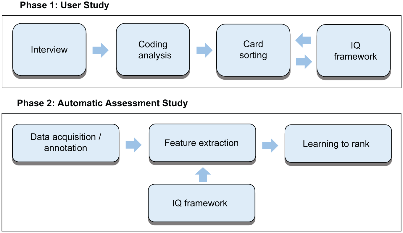
Overall research process.
To the best of our knowledge, this research is the first to develop a comprehensive IQ framework for computerized presentation slides, except for our preliminary study [19], which included a very limited set of quality features and did not include a user study. Compared with other prior research on IQ, our proposed framework can be seen as offering substantial advantages as its development is driven by users’ feedback obtained in a controlled environment, and its validity is confirmed via a series of automatic assessment experiments that involve state-of-the-art search algorithms.
The rest of the paper is organized as follows. Section 2 presents related work on IQ and slides design. Section 3 presents the details of our user study and its results obtained via qualitative analyses. Section 4 reports on our automatic slide quality assessments with the LTR technique. Finally, we conclude this paper with overall discussion in section 5.
2. Related work
IQ is often defined briefly as the ‘fitness for use’ of information [1] and more completely as ‘people’s subjective judgment of goodness and usefulness of information in certain information use settings with respect to their own expectations of information or in regard to other information available’ [20]. As people’s expectations of information are not uniform, IQ is inherently a multi-dimensional construct, commonly comprising several elements such as accuracy, objectivity, relevancy and completeness. For over a decade, a significant body of studies has been conducted on IQ taxonomy or on automatic IQ evaluation, with regard to various resources on the Web. Also, a number of guidelines have been proposed for slide design. We summarize those studies in this section.
2.1. IQ taxonomy
Several general IQ taxonomies exist in the literature. Table 1 summarizes these taxonomies, which were used as a basis for developing our IQ taxonomy of presentation slides. In the literature, context-general taxonomies [1, 7] and context-specific taxonomies [21, 22] have been reported. Wang and Strong [1] proposed a hierarchical conceptual framework of data quality, which has been widely adapted for many studies. Their study aimed at developing a general framework that captured the characteristics of IQ that were important to information consumers across the board. Their framework consists of four IQ categories: intrinsic, contextual, representational and accessibility. Each of those categories further includes elements as detailed in Table 1. Stvilia et al. [7] suggested a taxonomy through a literature analysis conducted using 32 representative articles. Their taxonomy has three categories (intrinsic IQ, relational or contextual IQ, and reputational IQ) and 22 dimensions.
IQ taxonomy in the literature.
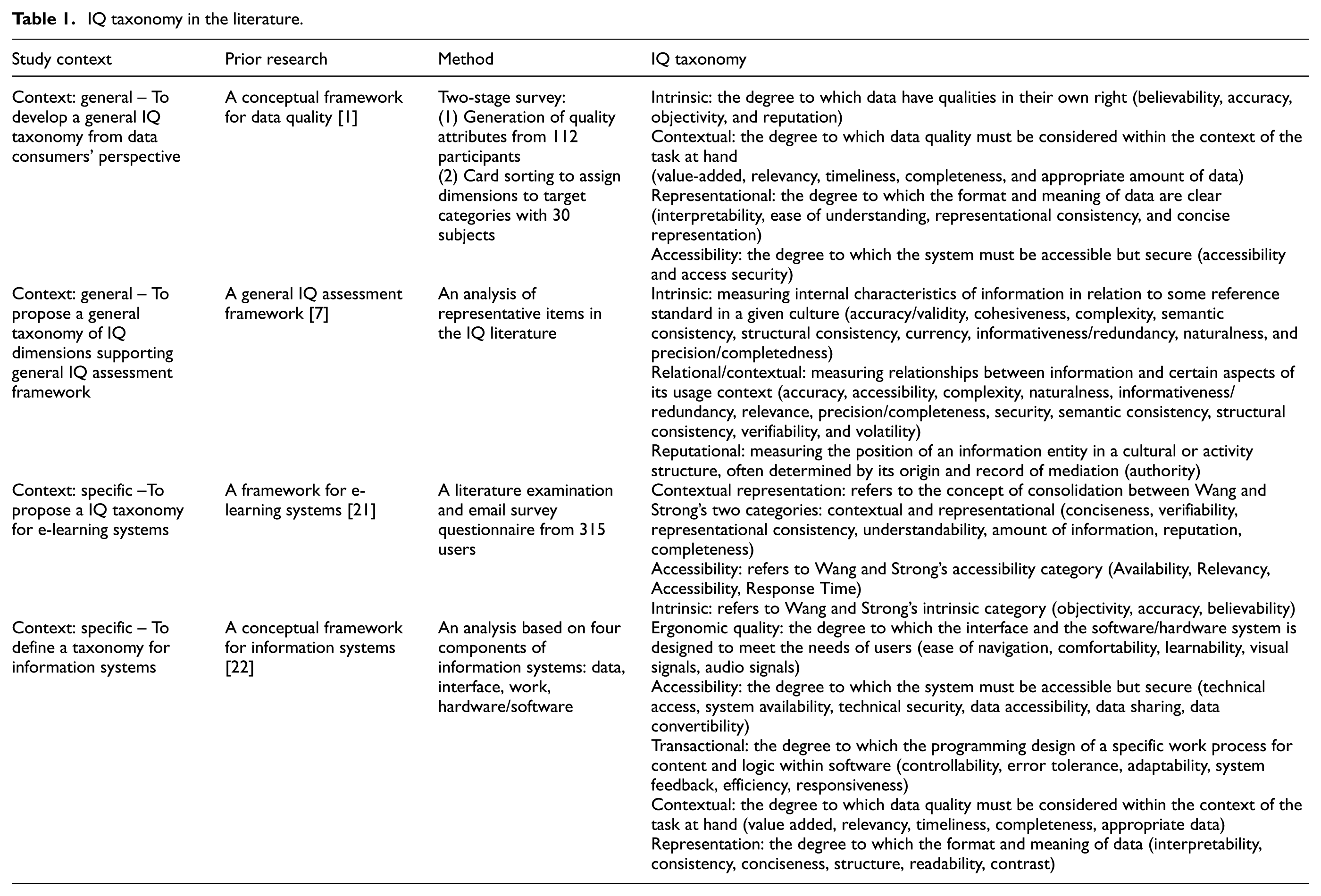
For context-specific taxonomies, Alkhattabi et al. [21] proposed an IQ taxonomy for e-learning systems including contextual representation, accessibility, intrinsic category and 14 elements (also called dimensions). They initially started with Wang and Strong’s taxonomy [1] in developing their framework. With a survey involving 315 users and statistical analysis, they revised the previous taxonomy to specialize it for e-learning systems. In their taxonomy, accessibility was emphasized as it included response time and availability, which were considered crucial for e-learning systems. Dedeke [22] suggested a context-specific taxonomy for information systems including ergonomic, accessibility, transactional, contextual and representation dimensions. Interestingly, the author proposed ergonomic IQ and transactional IQ, which are not found in other IQ studies, especially for information systems. In sum, prior research on IQ taxonomy suggests that a general IQ taxonomy has inherent limitations when it is applied to a specific application domain, and that an IQ taxonomy tailored for computerized presentation slides needs to be developed anew to properly reflect the unique characteristics of the information media.
2.2. Automatic IQ assessment
Automatic IQ assessment has recently received a considerable amount of attention from researchers in the Information Science community. However, no research has yet attempted to automatically assess slide quality except for our preliminary study [19]. Studies on quality-based retrieval can be divided into those that employ LTR (Learning to Rank) methods and those that do not. Many studies on LTR focused on estimating the relevancy between query and resources; few studies dealt with the query and resources in terms of quality even though quality is a more comprehensive concept than relevancy [1]. LTR techniques have gained considerable attention in recent years. Conventional ranking models such as BM25 and language modelling suffer from parameter tuning and over-fitting. However, LTR, a ranking method that uses machine learning, provides the advantage of automatically tuning its parameters, along with its ability to combine multiple evidence and avoid over-fitting [18].
LTR has been successfully adapted to various quality-based tasks that utilize Web resources. Richardson et al. [23] used RankNet, a modified neural network algorithm for learning rankings, to order Web pages with static features based on anchor texts and domain characteristics. Their research showed that simple URL- or page-based features outperformed PageRank. Choi et al. [24] used SVMRank to re-rank initial search results by combining the relevance and quality scores of medical documents. More specifically, they initially obtained search results with Okapi BM25 from the Medline and PubMed corpora, and then trained classifiers to assess the quality of the retrieved documents. Finally, they re-ranked the initial results, and observed a significant improvement in the final ranking performance. Regarding Q&A forums, Dalip et al. [25] adopted a Random Forest approach to rank the quality of answers. They employed a large set of features in groups named as user, review and structure. By conducting experiments with questions and answers in the Stack Overflow, they determined that user and review features were the most effective in the Q&A domain.
Several studies on quality-based ranking have used techniques other than LTR. These methods attempt to maximize retrieval performance in terms of quality by adding a document’s quality score to their own retrieval model score. Raiber and Kurland [26] developed a query-independent document quality measure that considered stop-words, document entropy, inter-document similarity and PageRank. They achieved Web-retrieval effectiveness (e.g. removing spam pages from the retrieved documents) by combining a Dirichlet-smoothed unigram document language model and a quality score. Bendersky et al. [8] attempted to incorporate the quality score of Web documents into a Markov Random Field retrieval model to achieve quality-based Web document retrieval. Using seven document features, such as the number of terms on a page, average term length and entropy, they demonstrated the effectiveness of quality-based retrieval over relevance-based retrieval. Alkhattabi et al. [27] proposed an IQ assessment model of e-learning systems. The authors proposed a linear equation to compute the overall quality score using quality metrics as well as their relative importance. The metrics are organized in an IQ taxonomy with 14 quality dimensions.
Quality-based classification studies have considered Web pages [28], encyclopedia [14] and presentation slides [19]. Wu et al. [28] tackled the classification problem based on the quality of Web pages by examining quality-related factors such as text length and image quantity. They suggested a learning method that divides training data into subsets according to the clustering results of the quality-related factors. For encyclopaedia documents, Dalip et al. [14] classified Wikipedia articles in terms of quality using the text, style, review and network features of articles. They proposed a machine learning approach based on regression analysis to combine these quality features into a single quality value. Regarding presentation slides, estimates of quality were made by our previous study [19]. In our study, we assessed the quality of slides with a total number of 28 Representational, Contextual and Intrinsic features, and classified the slides as high, fair or low quality.
2.3. Slides design
There have been several popular guidebooks by experts about designing successful presentation slides. Alley [29] in The Craft of Scientific Presentations and Reynolds [30] in Presentation Zen offer guidelines for typography, colour, layout and style for designing presentation slides and delivering successful presentations. These guidelines reflect the writers’ experiences, but are mostly based on anecdotal observations. As information quality is subjective judgement of fitness of use by its users, it is necessary to incorporate users’ perceptions and standards into slide quality criteria.
Several researchers have conducted experiments to improve the understandability of slides for the audience by suggesting alternative designs. Alley and Neeley [31] outlined an alternative design to the traditional design of presentation slides (i.e. a phrasal headline with a bulleted list). Their design used a succinct sentence headline instead of a topic phrase, assisted by visual evidence. In a case study involving PowerPoint slides, they showed that their proposed guideline was beneficial for engineering students and professors. A post-study survey indicated that 60% continued to use sentence headlines in most of their slides and 82% used visual evidence. Furthermore, 55% of the audience was mostly receptive to the alternative design. Further, Mackiewicz [32] examined 37 participants’ perceptions of slides for the clarity and attractiveness of graphs displaying two- and three-dimensional bars. These studies, however, focused only on a limited set of the design features of presentation slides.
3. User study
Our research employed a qualitative study [33] to determine the quality criteria of presentation slides directly from the users. Based on the guidelines offered by popular qualitative study handbooks [33, 34] and the research method used by a prior study on information quality assessment [17], our user study involved three major activities: (1) an interview in which users were observed during the evaluation process, (2) a coding analysis, which is an analytical process including code extraction from interview transcripts and code reconciliation, and (3) card sorting for assignment of the elicited criteria into appropriate IQ dimensions. During the interview, we asked users to think aloud their perceptions of slide quality. All of the users’ utterances were audio-recorded and fully transcribed. Then, we elicited IQ criteria from the interview transcripts through coding analysis [33, 34]. Although there exist some guidelines for successful presentation slide design by experts [29, 30] and research into the design of slides [31], criteria established through a user study can provide more diverse user views directly without being filtered by intermediaries. To determine the dimension of the IQ criteria, we conducted card sorting, which is a simple and user-friendly technique for understanding the participants’ thoughts and underlying rationale while producing objective topic groups and organizational structures [33, 36].
3.1. Formulation of initial IQ taxonomy
Our literature survey reveals that prior studies have focused on IQ assessment frameworks mostly for regular documents and that they might be inappropriate for presentation slides. Furthermore, those popular guidelines about the slide design provide a partial view of IQ, with limited inputs from users. Thus, the present study intends to bridge the gap in the literature by developing a comprehensive IQ assessment framework specifically focused on presentation slides from users’ perspectives.
Starting with the extant IQ taxonomies, we developed a new IQ taxonomy tailored for the domain of presentation slides going through a series of activities. Using Wang and Strong’s taxonomy [1] as the starting point, we borrowed some additional dimensions from other studies as deemed relevant for presentation slides. We excluded IQ dimensions about accessibility, as it is less essential for slides, given that presentation slides are abundantly available online and not tied to a single system. Instead, we added reputational category in consideration of Stvilia et al.’s work [7], as the quality of presentation slides is likely to be heavily affected by the person who created them. As a result, our taxonomy includes 4 categories (intrinsic, representational, contextual and reputational) and 13 IQ dimensions (see Table 2 and Figure 2).
Description for the IQ taxonomy.


An IQ taxonomy of presentation slides.
Following the definition of Wang and Strong [1] and Stvilia et al. [7], the intrinsic category refers to the quality originating from the data contained on the slides. The quality of intrinsic dimensions do not change based on the context in which the slides are presented. The representational category refers to the quality of information rendering, inclusive of visual aesthetics and rendering clarity. The contextual category is concerned with the quality of information within the context of the task at hand. In other words, the contextual IQ can be different depending on the context of the user’s task, while the intrinsic category including accuracy considers the quality of data itself, regardless of the tasks and contexts. Because users’ tasks and contexts vary across time and information consumers, IQ measurements of contextual quality are considered challenging [1, 7]. For instance, completeness (one of the contextual IQ dimensions, which is the extent to which the information had all of the required parts or necessary elements) of slides can vary because the required parts and necessary elements of slides are different for academic lectures and for self-study. Fewer parts might be required for users in class, while more parts may be necessary in self-study. On the other hand, accuracy, one of the intrinsic dimensions, is not affected by time or task. The reputational category measures the position of an information entity in a cultural or activity-related structure, often determined by its origin and record of mediation.
The initial version of the IQ taxonomy was further modified and refined through a series of activities involving users. Specifically, we conducted (1) a qualitative interview in which user opinions were obtained through the think-aloud process; (2) a coding analysis, which is an analytical process including code extraction from interview transcripts and code reconciliation; and (3) a card sorting experiment for the assignment of the elicited criteria into appropriate IQ dimensions.
3.2. Interview (think-aloud)
The participants for the study were 60 students from two national universities in South Korea. To remove any idiosyncratic issues associated with a single university or a single discipline, we recruited students in two broad fields of study at the two universities: (1) Management and (2) Science and Engineering. There was an equal mix of Management majors (30 – student majors included Management Science, Economics and International Trade), and Science and Engineering majors (30 – student majors included Mechanical Engineering, Bio and Chemical Engineering, Electronics and Information/Computer Science). For both, there was an equal distribution of 15 undergraduate and 15 graduate students, and gender was equally distributed (30 males and 30 females). The participants indicated that they frequently used presentation slides for activities such as classes, seminars, meetings and self-study. All participants received monetary rewards for participating in the interview study. Table 3 provides a summary of the interview participant statistics.
Summary of interview participant statistics.

Prior to the interview, each participant was asked to select three courses that he or she had taken successfully during the previous semesters and to pick the one he or she liked most. This selection process was needed to ensure that the participants fully understood the contents of the slides and the contexts in which the presentation slides could be used. Five slide files were randomly selected from one of the chosen courses. We used SlideShare, 1 which provides links to slides on the Web, to gather the slides used in conjunction with the interview. The selection process resulted in 31 courses and 155 slides in both PowerPoint(ppt/pptx) and PDF formats. Each participant had a one-to-one interview in a room dedicated to the interview study. The purpose of the study was briefly explained at the beginning of each interview. Participants filled out a short questionnaire about their background and signed an informed consent form. Next, the participant was asked to view the five monitor screens, each of which displayed one of the presentation slides from the course selected by the participant. Participants were allowed to go back and forth between the screens if they wanted to compare slides. They were also provided with the slides on paper for their convenience. They were asked to ‘think-aloud’ while they read and evaluated the quality of the presentation slides. They were also asked to indicate which one of the five slide files was of the lowest or of the highest quality and to provide an explanation for their choices.
3.3. Coding analysis
Verbal data was transcribed from the recordings of all the interviews. The analysis carefully followed the rules of qualitative study, and several steps were taken to ensure validity [33]. In the first stage, three coders conducted content analysis to code the interview transcripts and identify quality criteria as articulated in the scripts. Each coder independently open-coded the entire transcript. While there are various coding methods for diverse purposes, our study used Descriptive coding and In Vivo coding [34]. Descriptive coding summarizes the text in the transcript into one essential short keyword or phrase and In Vivo coding keeps the text in the subject’s own language to represent grounded concepts well. After the primary coding was completed, the resultant schemata were aggregated and all differences were reconciled. Several discussions and meetings were conducted to reconcile and merge the differences among the three coders. Finally, the coders recoded the entire sample using the aggregated final schema. Reconciliation included the unification of terms in codes and merging of codes between different expressions with an identical meaning. The rigorous coding process identified 216 quality criteria mentioned by at least two participants out of 3,617 total utterances regarding quality (1,557 positive; 2,060 negative). The iterative coding process included combining different expressions with the same meaning into a single quality criterion and selecting proper terms for expressing the criterion by the coders. We utilized Atlas.ti 7 3 , which is a widely used tool of qualitative data analysis and research.
3.4. Card sorting
Card sorting exercises were conducted to group the quality criteria into appropriate quality dimensions. This method commonly involves sorting a set of cards, each of which contains a label that addresses a topic, into groups that have common aspects among them [35]. Fifteen students (mean age: 26.7, SD: 2.4; Major: Management 7, Science 8), different from those who had participated in the interviews, were selected to perform the card sorting exercise, and were assigned to one of five teams. Each team consisted of three subjects. Each quality criterion with its description (identified through the aforementioned coding analysis) was printed on a card, and the subjects in a team setting were collectively asked to separate the cards into groups. The subjects were allowed to freely discuss their ideas among the team members during the sorting exercises [35, 36].
An open sorting exercise and a closed sorting exercise were performed in sequence. In the open sorting exercise, subjects were asked to perform a trial sort using 20 randomly selected cards without any predefined dimensions. They were asked to separate the cards into any number of groups (piles), label each pile of cards, and explain their rationale for grouping the cards together. This exercise was performed to ensure that the subjects understood the card sorting procedure. Then, a closed sorting exercise was conducted. In this sorting, the 216 quality criteria identified in the previous coding analysis step were used. The subjects were asked to place the 216 cards into the 13 quality dimensions presented in Table 2. The sorting took 191 minutes on average per session. There was a separate session for each group. We computed a correlation score of the card sorting study [36]. The correlation score indicates how often a card was put into the same category by different subjects, as in Eq. (1). The average correlation score was 0.70, which means medium agreement [36].

where
3.5. Results of interview
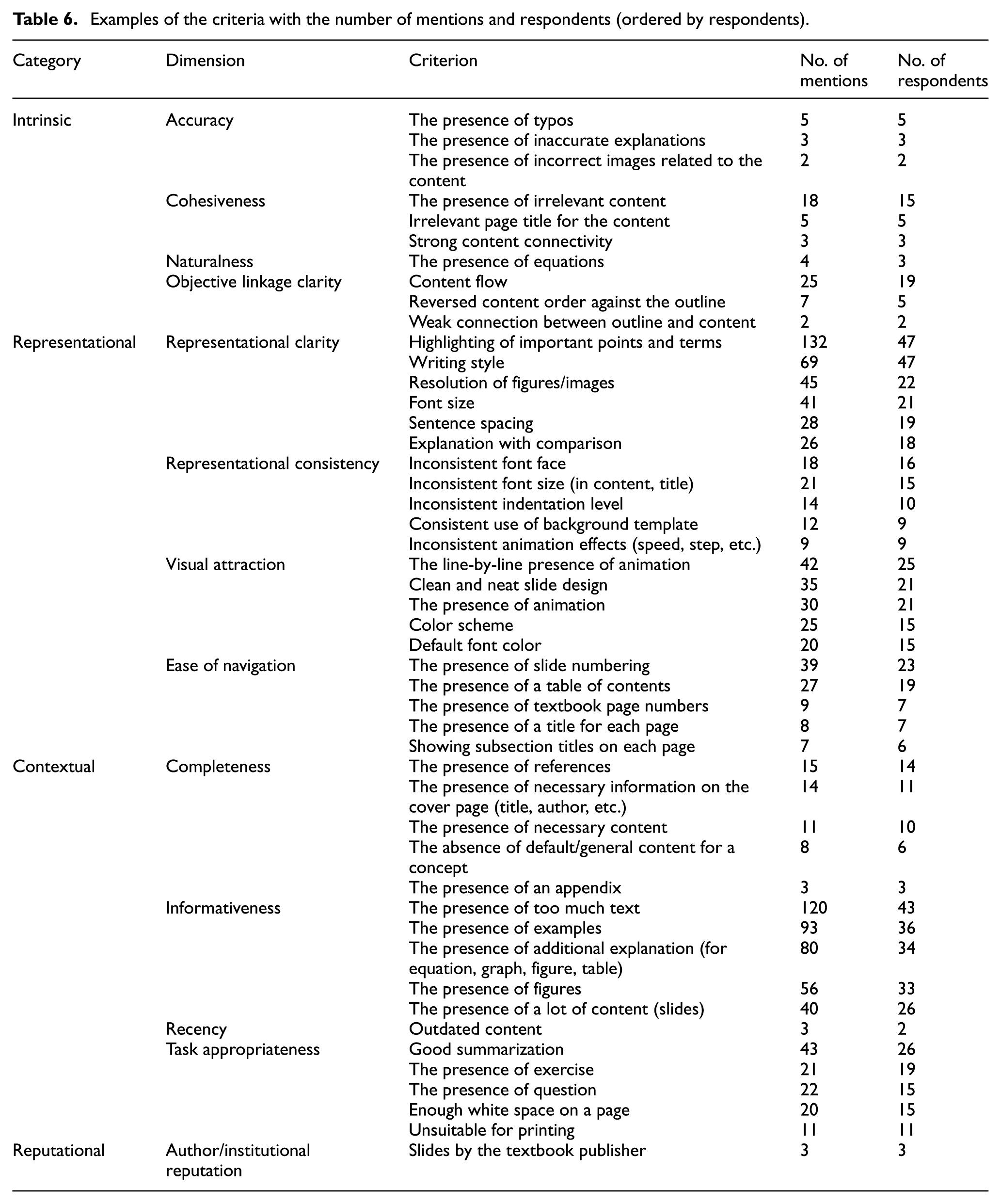
In this section, we report the results from the coding analysis. The top 10 criteria by the number of respondents are reported in Table 4. The three quality criteria –‘highlighting of important points and terms’, ‘writing style’ and ‘the presence of too much text’– were supported by over 40 people, which was over two-thirds of the entire subject population (60). The criterion mentioned by the largest number of respondents was ‘highlighting of important points and terms’, which was mentioned 132 times by 47 participants. A criterion is considered positive if all mentions made by all participants showed the quality as something positive. The results clearly indicate that users consider emphasizing key points with highlights as a desirable quality feature. Examples of direct mentions by users include ‘Another good thing is that highlighting the important parts in red helps my understanding; the title in bold is easier to see’, and ‘The important parts are highlighted with a strong color; therefore, I can take more notice of the significant parts.’
Top 10 quality criteria from coding analysis by respondents.

The second highly ranked criterion is ‘writing style’, which is mentioned 69 times by 47 respondents. This one is interesting as we found that users mentioned two types of writing style: ‘summarized writing style’ and ‘sentence writing style’. The former indicates that most texts in slides are expressed in summarized and condensed forms, while the latter means that texts are expressed in complete sentences. Each style received two contradictory interpretations by the participants. Some participants regarded ‘summarized writing style’ as preferable; however, others responded the opposite was true. ‘Summarized writing style’ was noted 27 times by 23 participants. Among them, 19 respondents (82.7%) considered it positive and four (17.3%) negative. Positive examples include: ‘The condensed, summarized style of writing using important keywords improves my concentration. It helps me reproduce key facts and ideas.’ Responding negatively, one participant said, ‘I can’t understand what this phrase means. A full, descriptive sentence would improve the explanation, though it would be a bit longer.’ On the other hand, ‘sentence writing style’ was mentioned 42 times by 24 respondents – five respondents (20.9%) considered it positive and 19 (79.1%) negative. A positive example was: ‘Explanations using natural sentences are much more understandable for me. I can catch the points from detailed explanations’, whereas a negative example was: ‘The sentences are hard to read because they are usually so long. I prefer short, well-constructed expressions in slides.’ Overall, 80.9% of participants (38 out of 47) preferred summarized expression (summarized writing style) over complete sentences (sentence writing style) in the slides (57 mentions out of 69).
Thirdly, ‘the presence of too much text (in the slides)’ was mentioned 120 times by 43 participants – 117 times (97.5%) negatively and 3 times (2.5%) positively. Negative examples include ‘It seems there are too many letters on the page to grasp the content’, and ‘When you take a course with slides that have a large amount of writing, they usually move more quickly. Because I cannot read beyond a certain point, I think it is not good.’ A positive example was ‘The advantage seems to be that I can study only with the slides without having a textbook.’ For more details, we report the top five criteria in each dimension in the next section and the first two criteria with the actual users’ comments in Appendix A. The results are organized according to the results of card soring.
3.6. Results of card sorting
Table 5 presents the distribution of the sorted criteria (i.e. 216 quality criteria matched with 13 quality dimensions in 4 categories) obtained from the closed sorting exercise. Regarding the quality category, the representational criteria (66.7%) were the most frequently mentioned by users. Contextual (28.2%), intrinsic (4.6%) and reputational (0.5%) criteria followed. The first two categories represent almost 95%, indicating that the participants considered those criteria that were directly related to comprehending the content of presentation slides naturally and within the context of the task at hand much more important. Regarding the quality dimension, visual attraction (28%), representational clarity (18%) and informativeness (12%) were the criteria most frequently mentioned.
Distribution of the criteria.

Table 5 also shows the average number of mentions and respondents for each dimension. Interestingly, ‘Visual attraction’ and ‘Representational clarity’ are the first and second dimensions in terms of the number of unique criteria. ‘Informativeness’ is the first dimension in terms of the average number of mentions and respondents, although it is the third dimension in terms of the number of unique criteria. This means that criteria in Informativeness were more uniformly shared by many respondents while criteria in Visual attraction and Representational clarity were diverse yet intensively shared by a small number of respondents. Criteria in Visual attraction and Representational clarity are more subjective, while those in Informativeness are more objective. Detailed results are given in Table 6, where we report only the top five criteria and the numbers of mentions and respondents in each dimension.
Examples of the criteria with the number of mentions and respondents (ordered by respondents).
3.7. Discussion
The results in Table 5 show that, compared with other categories, the Representational category criteria were mentioned more often by users regarding slide quality, agreeing with prior research on presentation slides. For instance, participants prefer visually rich slides that contain images, diagrams and graphs [31, 32], indicating that understanding the content of slides in an efficient and integrative manner is crucial. Because users have to pay a great deal of attention to what presenters offer, users naturally want the presentation materials to be cognitively intuitive and less burdensome.
It should be also noted that our finding on the importance of the Representational criteria is different from prior IQ research findings on other types of documents, such as Web documents and Wikipedia. In a qualitative study conducted to identify key criteria for the quality of Web pages, Rieh [11] found that Web users considered content as the most important object in the Web, followed by graphics and organization/structure. Yaari et al. [17] examined the quality criteria for Wikipedia articles using a group of 60 users and found that users more frequently mentioned coverage and structure rather than those criteria belonging to the Representational category. The accumulated research findings seem to suggest that users employ a different set of quality criteria depending on the type of document.
One notable criterion is ‘writing style’. Many participants preferred summarized expressions (summarized writing style) over complete sentences (sentence writing style) in the slides (by 38 respondents out of 47 and 57 mentions out of 69). It is interesting to note that these results do not completely coincide with Alley and Neeley [31], who proposed that the alternative (preferred) design depends on succinct sentence-style titles in slides. It should also be noted that our findings differ from Reynolds’s recommendation to use sentences rather than topic statements [30]. However, according to our results, more users prefer summarized writing style to sentence writing style. The results do not mean that sentence writing style always causes lower quality slides. Surely, Alley and Neeley point out there are exceptions to sentence headline – for example, on title slides, transition slides and any slides on which a sentence is not warranted. Synthesizing these prior study findings with ours, we conclude that slide authors need to be mindful in determining an appropriate writing style depending on the context and must pay careful attention to the pros and cons of the two styles. We also point out that this finding supports the claim that quality is a subjective concept, which depends on subjective judgement of goodness and usefulness of information [20].
‘Naturalness’ of IQ means the degree to which information is expressed by conventionally typified terms and forms in accordance with some generally accepted reference source(s). ‘The presence of equation’ is categorized into this dimension on the basis of the card sorting results in Phase 1. This allocation is reasonable considering that equations are generally made up of mathematical symbols, which represent conventional and typified concepts in a domain. ‘Task appropriateness’ is the degree to which information is proper and useful for a given task. This dimension includes those aspects denoting how much the slides are fit for the tasks for which they are designed, including class presentation, self-study, note-taking and reporting. As for task appropriateness, the criteria such as ‘good summarization’, ‘the presence of exercise’ and ‘the presence of question’ are assigned into this dimension.
One of the main contributions of the present study is providing a rich set of quality criteria (i.e. 216) for presentation slides. Because the open-ended interviews did not provide any prior criteria, the participants could come up with a variety of quality criteria. This set of criteria could be a foundation for developing diverse metrics at multiple levels for presentation slides. Another contribution is the measurement and consequent identification of the relative importance of each criterion based on user utterances obtained through the think-aloud process. The measurement data served as a basis for subsequent feature selection out of the whole set of criteria for automatic assessment in ranking. We selected and implemented the quality features by the number of mentions and respondents. Such insights are unavailable in the guidelines provided by professionals.
One limitation is that our user study considered only lecture slides, not other types of slides. However, experiments later prove that quality criteria from lecture slides are also effective in IQ assessment for other types of slides (see Section 5.1). Another limitation is that all our participants were Korean students. Their perceptions might be different from other ethnic groups due to cultural differences. Extant literature is unclear on how culture affects slide feature preferences and evaluations. Moreover, even though they are also information consumers, students might have different quality expectations than business professionals or subject experts. Nevertheless, it is important to note that the study findings provide a significant starting point for the establishment of slide quality criteria and dimensions from users’ perspectives.
4. Automatic slide quality assessment
In this section, we present our approach to automatically assessing the quality of presentation slides, ranking them via some of the quality criteria identified in our previous user study. Figure 3 describes our overall process of the automatic assessment approach. More specifically, our approach consists of two stages: initial search and slide quality assessment. The initial search stage aims to identify slides that are relevant to the query, without the consideration of slide quality. The second stage assesses the quality of each relevant slide and produces a quality-based ranking. In the second stage, we perform (1) data annotation to build a ground-truth dataset, which was divided into a training set and a testing set, (2) a feature extraction as a feed for an LTR model, and (3) an experiment of LTR model training and prediction/ranking.
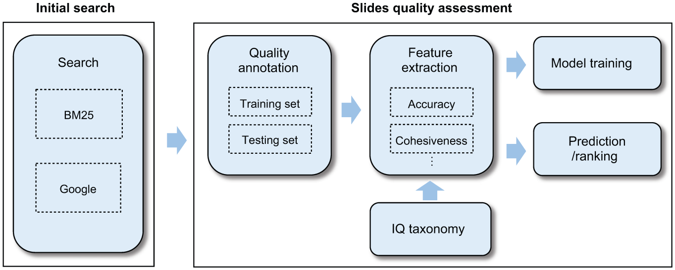
Overall process of automatic assessment.
4.1. Rationale and slide quality assessment
Compared with conventional ranking models such as BM25 and the statistical language model, LTR is an effective ranking model because it offers additional benefits such as automatically tuning parameters, combining multiple evidence and avoiding over-fitting [18]. In addition, LTR has been successfully adapted to various quality-based ranking tasks that utilize Web resources [23, 24, 25]. However, a main disadvantage of LTR is that it is quite expensive to create training data via labelling of all of them, in particular if the dataset is large. If this labelling issue can be overcome, LTR is a better choice than the traditional ranking models as LTR offers several advantages, as already mentioned. Thus, we decided to use LTR in conjunction with the features extracted from our IQ framework.
This section explains the rationale and realization of the learning scheme. LTR is a supervised learning method that includes training and testing phases [18, 37]. The training dataset consists of a number of queries and slides. The quality of the slides with respect to the query is represented by several grades, with a higher grade corresponding to higher quality. Let
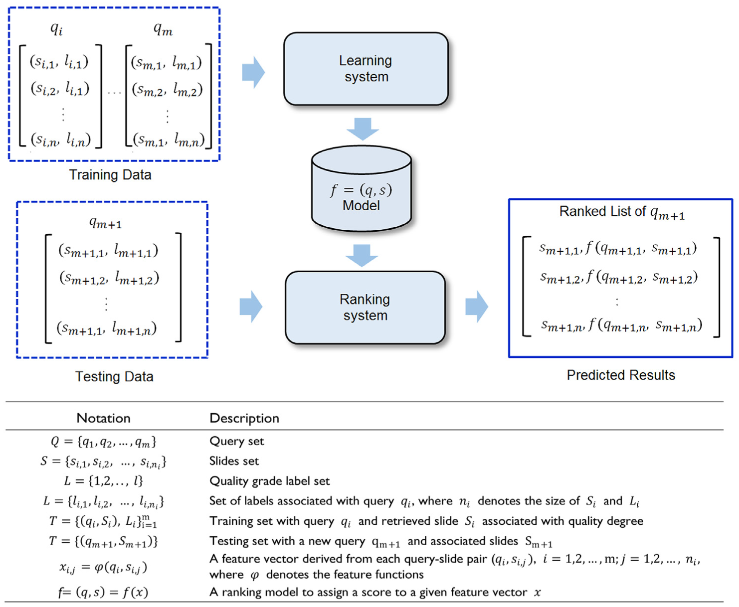
LTR scheme of quality-based ranking for presentation slides.
In the training phase, we applied the LTR algorithm to train the model for slide quality assessment. We first created a set of training slide queries and then generated relevant slides via BM25 and Google. Next, a group of judges were asked to determine the quality grade of each query and the returning slides set (see Section 5.1) by rating the quality of each slide and ranking the order of the slides in a query set. With the annotated data, the LTR algorithm generated a global model that considered the ranking relationships among the slides of each training query set. In the testing phase, we used k-fold cross-validation to generate a single held-back set from the dataset given by the BM25 algorithm and Google slide search. More specifically, k−1 different partitions of the whole dataset were used to train the LTR model, and the remaining partition was used as the test data. The learned LTR model then predicted the ranking score of each slide in the query set. The system produced a ranked list based on these scores. The k results were then averaged to produce a single assessment. In this manner, the assessment stage can be seen as a period in which re-ranking of the initial relevance search results was performed in consideration of quality. Both training and test data underwent the feature extraction procedure (see Section 4.2).
4.2. Features
This section describes the automatic assessment quality features that were inspired by our own user study findings. Quality criteria can be broadly divided into two types: measurable and non-measurable [17]. Measurable criteria are those criteria that can be objectively and reliably extracted by a computer program without user intervention (e.g. the number of words in slides) whereas non-measurable criteria are those criteria that are subjectively assigned by a human (e.g. writing style). We selected 35 measurable criteria from a total number of 216 criteria identified earlier through our user study, primarily considering two conditions: the number of respondents and implementation feasibility. The first condition was based on our assumption that those quality criteria mentioned by more users are likely to be more influential than the less mentioned criteria in determining the quality of slides. For example, in case of representational clarity, when we decided the features to be implemented, we considered the criteria from the top in the list (see Table 6). The criterion ‘highlighting of important points and terms’ is the most frequently mentioned one for the dimension. Thus, we thought it would be reasonable that highlighting important points should be selected and it would be modelled by checking the presence of ‘bold’ and ‘italics’, which were implemented by counting the number of bold and italic terms in the text. Fortunately, POI extractor 6 supports the extraction of bolded and italicized terms from the slide text. However, as a counter example, the second frequent criterion –‘writing style’ is very hard to measure objectively by computer because of its abstractedness. The cost to design a method to measure it is highly complicated and expensive. Therefore, we excluded the criterion. In this manner, we divided some criteria as measureable and others as non-measurable. We sought to obtain as many measureable features as possible from the user criteria so as to increase the measurement accuracy of the automated quality assessment approach. In total, we devised 65 measurable features across 10 IQ dimensions from 35 related user criteria. Appendix B shows how each of the implemented features is related to its respective dimension via user criterion obtained from our user study. In addition, we adopted some known features from prior research such as readability and entropy [8, 13, 14, 25]. We named the dimension of the feature following the dimension of the criterion from which the feature was derived. For example, the dimension of the feature numTypos is accuracy because the feature was derived from a criterion –‘the presence of typo’, whose dimension is accuracy according to the card sorting exercises.
The next step in the distillation of quality features was to devise extraction methods from the criteria to assess the quality of slides. The ‘Intrinsic’ category includes accuracy and cohesiveness features. Participants in our user study mentioned that ‘the presence of typo’ affected the accuracy of the slides. We formulated the user criterion ‘number of typo’ as a measurable feature [25]. To measure numTypos, the number of typos in the slides was counted using the spell checker in LanguageTool. 5 For cohesiveness, users mentioned ‘strong content connectivity’, and we measured it by calculating the entropy of the slide texts. This feature was also reported in previous studies [8, 25]. The entropy of a document D is computed over the individual document terms as:

The probability of word
The Representational category includes clarity, consistency, attraction and ease of navigation. Representational features include numHighlights from ‘highlighting important points and terms’ (clarity), conFontFace/Size and conFontFace/SizeRatio from ‘inconsistent font face/size’ (consistency), preAnim/numAnim/avgNumAnim from ‘line-by-line animation effect’ and defFontColor from ‘main font color’ (attraction), and preSlideNum from ‘the presence of page numbering’ (ease of navigation); these form one of the unique features for presentation slides which is not found in prior studies. In particular, ‘highlighting of important points and terms’ was the most frequently mentioned criterion. The total number of highlights in slides, including bolds, italics, underlines and shadows, was counted for numHighlights. The ratio between the number of highlights in the slides and the number of slides was calculated for avgNumHighlights. For consistency, for features such as conFontFace/FaceRatio, the consistency of the font face was measured with binary values and the ratio. We identified the dominant font face used in all of the slides at first and then checked the consistency to determine whether the dominant font face in each slide (page) had changed throughout all of the slides for conFontFace. We used the ratio of the number of slides that had different font faces with dominant font faces to the number of slides for conFontFaceRatio. conFontSize/SizeRatio was also estimated in this manner. Consistency of the font face of a slides s is estimated as:

where dominantFontCount(s) is the number of dominant font faces from each slide (page) in a slide file s. For attraction, the total number of animation effects in the slides (numAnims) and the number of animation effects per slide (avgNumAnims) were counted. We used the ratio between the number of animation effects and the number of pages in the slides for avgNumAnims. For preAnim, the presence of animation in the slides was identified with a binary value (yes or no). Furthermore, the default font color (defFontColor) in the slides was identified. We measured all font colours used and identified the most dominant font colour, which is represented in RGB format (e.g. R = 0, G = 0 and B = 0 for black). According to the user feedback, some font colours, such as green, grey, yellow and dark blue, severely harm visual attractiveness if they are used as the main colour. Avoiding these colours as the main font colour contributes to assuring the attractiveness of slides. Interestingly, we found hardly any user comments about colours that directly improve slide quality. It seems that users tend not to comment when the slides have no visible problem with font colours. According to our checking of the main font colour of slides in the high quality class, black was the most common font colour in high quality slides. For ease of navigation, the presence of slide numbers in the slides (preSlideNum) was measured with binary values.
The Contextual category includes completeness, informativeness, recency and task appropriateness. Features such as preCoverPageInfo from ‘the presence of necessary information in the cover page’ (completeness), numDiagrams from ‘the presence of diagram’ (informativeness), preExample/numExamples/avgNumExamples from ‘the presence of example’ (informativeness), and preSummary from ‘the presence of summary’ (task appropriateness) were new features in this category. For preCoverPageInfo, we checked whether the first page of the slides had a title in the title text box and information in the subtitle box. For numDiagrams, we summed the respective number of lines, autoshapes (drawing objects with a particular shape), and textboxes extracted from the slides. For preExample, numExamples and avgNumExamples, we used textual cues by checking the existence of keywords such as ‘for example’ and ‘for instance’ in extracted texts from the slides. Features measured using textual cues such as numExamples are marked in Appendix B. Recency of the slides was measured by how many months had passed since the slides were created (age) and modified (recency) [14]. For preSummary, the presence of a summary in the slides was measured with a binary value by checking for keywords such as ‘summary’ and ‘outline’. The Reputational category includes author/institutional reputation; however, we did not consider it in this study (see Appendix B for a full list of the quality features implemented).
5. Experiments
5.1. Experimental setting
To account for different characteristics of datasets and improve the overall robustness of empirical validation, we conducted multiple experiments. Specifically, three datasets were employed for our experiments: SLIDES-SA (SA means data obtained from SlideShare and Annotated by human), SLIDES-SF (SF means data obtained from SlideShare and Featured-selection classified) and SLIDES-GA (GA means data obtained using Google and Annotated by human).
For the first dataset, we collected 1276 PowerPoint presentation slides that were randomly selected from SlideShare. 1 The slides collected covered four study areas: Technology, Business, Education and Health. We asked judges to manually assign a quality grade (low, fair, or high) to the slides. These labels indicate the overall quality in each of the four IQ categories, i.e. Intrinsic, Representational, Contextual, and Reputational. Three annotators judged each slide. In the overall dataset, the inter-annotator agreement among the three annotators was κ = 0.63, which indicates substantial agreement [38]. Finally, we obtained 935 slides (low: 222, fair: 447, and high: 266) whose quality labels had been agreed on by at least two annotators out of three. We refer to these annotated data as SLIDES-SA.
To conduct a large-scale experiment using a different quality evaluation perspective, we crawled 24,995 slides again from SlideShare and collected 3655 featured slides and 21,340 non-featured slides. SlideShare provides editors’ picks as featured-selection slides on the Web site. 4 We assumed that the featured-selection slides were of high quality and the others not as high quality as those featured-selection slides. We refer to this data as SLIDES-SF.
Furthermore, for comparison with one of the popular and successful search engines, we collected 180 slides Googled with a filetype quantifier from 36 queries in two disciplines: Computer Science and Management (e.g. introduction to programming filetype:pptx or filetype:ppt). We downloaded the top five slides per query. For this dataset, we employed six graduate students as annotators, consisting of three majoring in Computer Science and the other three in Management, to assign a quality grade on a three-point scale to the slides. The three annotators from one of the two groups judged each slide file related to their major and we averaged the scores obtained from the annotators while rounding off the average score below the decimal point. Consequently, we obtained 180 slides (low: 28, fair: 93, and high: 59). We refer to these annotated data as SLIDES-GA.
SLIDES-SA and SLIDES-SF consist of slides crawled from SlideShare with different annotators. The featured-selection slides in SLIDES-SF were selected as high-quality slides by the curators at SlideShare. However, given that we cannot identify the selection process or the standards used by the curators, we needed another quality dataset (SLIDES-SA) with a manual annotation by our own annotators, who had experience of the IQ dimensions and criteria. With these two datasets, we checked the possibility of differences caused by different annotators in later experiments (see Section 5.2). Furthermore, we manually built SLIDES-GA with the search results returned by Google so that we can compare Google slide search with our proposed algorithm. There were no overlaps among the three datasets. A summary of the datasets is presented in Table 7. To extract the proposed quality features of the slides, we used Apache POI, 5 which is a Java API for reading and writing Microsoft Office files such as Word, Excel and PowerPoint.
Description of datasets.

We applied the Okapi BM25 algorithm [39] as a baseline method for SLIDES-SA and SLIDES-SF. This is one of the most effective retrieval algorithms, and is based on a probabilistic relevance framework. To obtain search results via BM25, we manually created the query sets for SLIDES-SA. We randomly selected 140 keywords (e.g. knowledge discovery, international business, social education, etc.) from the content of the slides in each category. For SLIDES-SF, we selected the top 500 most frequent tags (e.g. marketing, social media, etc.) from the tagsets of featured slides only to avoid a no-outcome of featured slides in the BM25 search results. The search results from the queries from the tags of all slides have sparse features because SLIDES-SF has a small number of featured slides, which can be a constraint of the experiment. These keywords were used as queries for the BM25 search algorithm to index the resulting slides of SLIDES-SA and SLIDES-SF in the initial search. We used an open-source search engine Apache Lucene 6 (version 4.9) to generate slide search results using the BM25 search algorithm. Further, we used Google search results as a comparative baseline for SLIDES-GA. For SLIDES-GA, we used 36 subject names (e.g. introduction to programming, investment, etc.) in Computer Science and Management as queries. Crawling SLIDES-GA from Google, we recorded the ranking of the slides and considered those rankings as initial search results. The initial list of slides from Okapi BM25 and Google were then re-ranked using the LTR algorithm with our proposed features. We utilized two listwise LTR algorithms: AdaRank [40] and LambdaMART [41], which have been widely adopted for LTR algorithms, in RankLib. 7 We set parameter values for our experiments as follows: AdaRank: no. of iterations = 500 (the number of rounds to train), tolerance = 0.002 (tolerance between two consecutive rounds of training), max selection count of a feature = 5 (the maximum number of times a feature can be consecutively selected without changing performance); LambdaMART: no. of trees = 1000, no. of leaves = 10 (number of leaves for each tree), learning rate = 0.1 (shrinkage factor, or the ratio of each regression tree in LambdaMART. LambdaMART then weights the score from each regression tree by the learning rate to ensemble these regression trees together). We empirically chose the values to result in roughly the best performance.
We conducted a 10-fold cross-validation and calculated the average performance of each LTR algorithm. We report two standard retrieval measures: the normalized discounted cumulative gain (NDCG) and mean reciprocal rank (MRR). The NDCG [42], a widely used metric in the information retrieval field, is adopted to measure the ranking performance. To calculate the NDCG, the discounted cumulative gain (DCG) at a particular rank position p is first calculated in a way that penalizes the score gain near the bottom more than near the top:

where

where
5.2. Results
Figure 5 compares the NDCG@k scores for AdaRank and LambdaMART using all the proposed features against the baselines (BM25 and Google) with the datasets: (a) SLIDES-SA, (b) SLIDES-SF and (c) SLIDES-GA. The results confirm that both AdaRank and LambdaMART outperform the baseline, with LambdaMART scoring higher than AdaRank. All the differences of AdaRank and LambdaMART over the baselines at all NDCG@k positions were statistically significant according to the Wilcoxon sign test (α<0.05), except between LambdaMART and AdaRank in SLIDES-GA, which is a relatively small dataset. We achieved increases of 23.4% (NDCG@5, LambdaMART, SLIDES-SA), 50.3% (NDCG@5, LambdaMART, SLIDES-SF) and 9% (NDCG@3, LambdaMART, SLIDES-GA), above the baselines. The results demonstrate that the proposed features can be used to effectively rank high-quality slides.
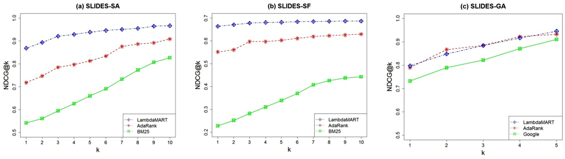
Performance of leveraging high-quality slides in the ranking using all features: (a) SLIDES-SA, (b) SLIDES-SF and (c) SLIDES-GA.
To analyze the impact of each category and each dimension, we measured the performance outcomes using the features of each category and each dimension separately. This analysis enabled us to identify how each category and each dimension contributes to the results. We conducted these additional experiments with only SLIDES-SA and SLIDES-SF because large datasets generally guarantee more stable results. Figure 6 presents the results of NDCG@5 (10-fold, LambdaMART) obtained for each IQ category (Figure 6(a)) and each IQ dimension (Figure 6(b)).
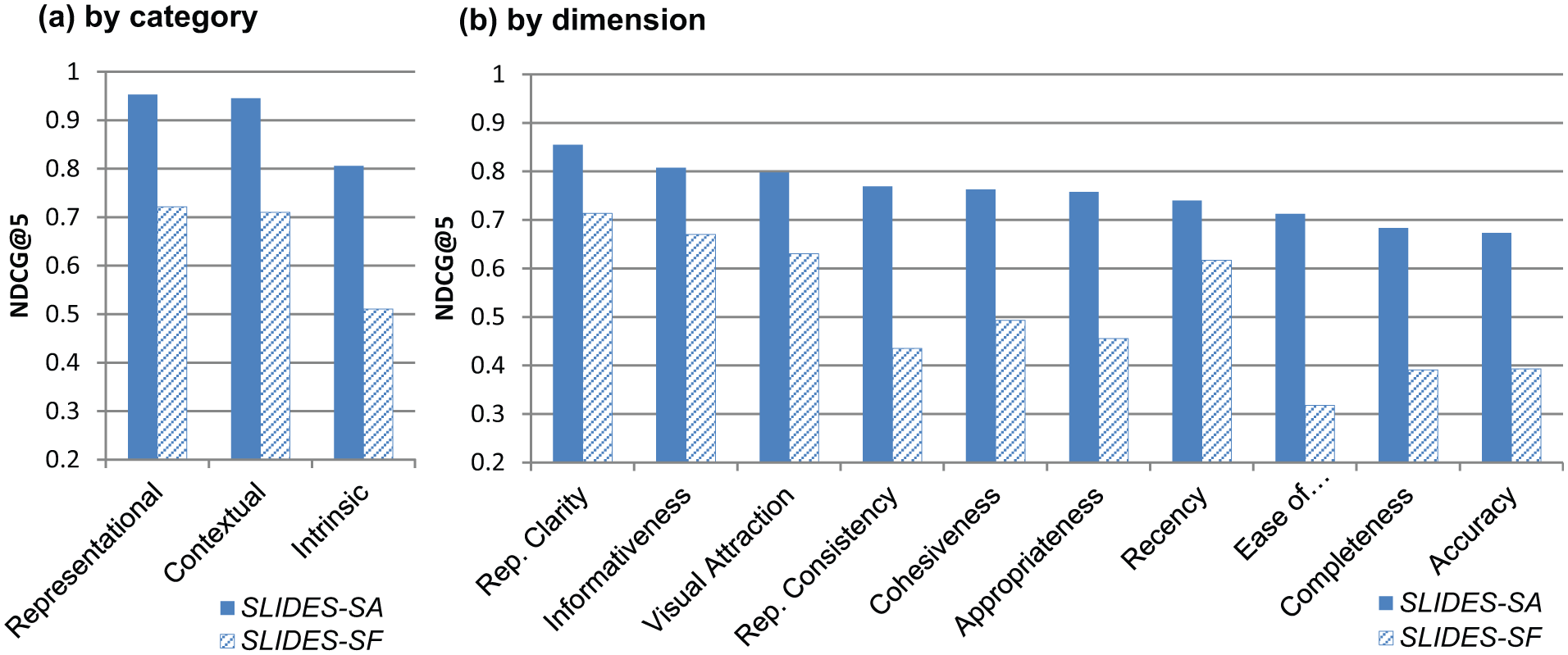
Performance by IQ category and dimension (LambdaMART, 10-fold).
From Figure 6(a), it is clear that the Representational category was the most important criteria in both datasets, followed by Contextual and Intrinsic categories. From Figure 6(b), significant differences can be observed, with representational clarity (0.87) producing the best impact, followed by informativeness (0.8) and visual attraction (0.79) in SLIDES-SA. Representational clarity (0.71), informativeness (0.67), visual attraction (0.63) and recency (0.61) are effective dimensions in SLIDES-SF. Representational clarity, informativeness and visual attraction consistently have a high impact on performance in both datasets. However, completeness, ease of navigation and accuracy scored lower than other dimensions, suggesting that these quality dimensions do not have much of an impact on the quality of slides. These experiment results indicate that representation clarity and informativeness are essential components in the assessment of presentation slide quality. The finding that representational clarity is important for assessing slide quality is rather natural because presentation slides are a form of visual-oriented communication device between presenter and audience, and representation clarity is directly related to the conveying of messages [29, 30, 32]. It should be noted that representational clarity is a distinctive and discriminative IQ dimension for slides, even though this category has not been pronounced in prior studies [8, 14, 25]. However, these results are contrary to previous reports in which readability was found to be the most important for the quality ranking of Web documents [8] or length, structure and style were central for assessing the quality of Wikipedia articles [14]. Reviews and user features were found to be most important for ranking quality in the Q&A domain [25].
In our experiments, LambdaMART exhibited better performance than AdaRank. Therefore, we decided to measure feature importance using LambdaMART. LambdaMART computes the importance of a feature by summing the number of times it is used in splitting decisions [43, 44]. The relative importance of other features is assigned by normalizing their importance based on the importance of the largest features. Thus, the most important feature has the importance score of 1, and the other features have a relative importance score between 0 and 1. For this experiment, we built two LambdaMART model sets containing 1000 trees, 10 leaves, and a learning rate of 0.1 during training with SLIDES-SA and SLIDES-SF. We then calculated the feature importance from the models. The top 10 features are listed in Table 8. Although there are some differences in terms of the feature importance between the two datasets, eight features appear in the top 10 features in both datasets – enough to support general conclusions. Features related to representational clarity were found to be highly important – four out of the eight features were representational clarity features. Another notable point is that six features (clarity: avgNumFontNames, numHighlights, avgFontSize and avgLineSpace; informativeness: numSlides and numImages) out of the eight most common are relatively simple to estimate, but have a significant impact on the quality of slides. Out of these features, five features excluding numImages have not been identified by any prior study.
Feature importance given by LambdaMART.

common in both datasets; * newly proposed in this study.
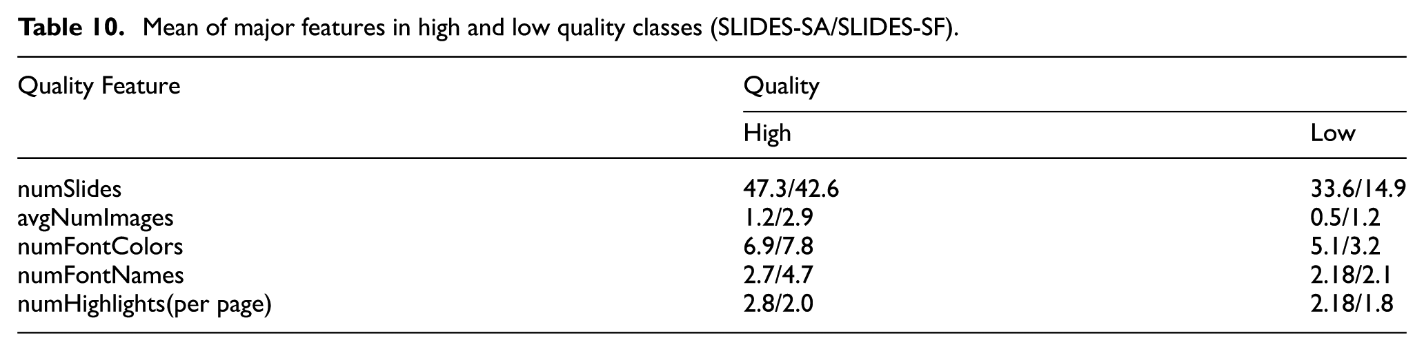
To demonstrate the effectiveness of our ranking strategy using other measures, we traced the highest and lowest quality version in the ranked list for the i-th query result. Table 9 shows the MRRH and MRRL values given by a baseline implementation of LambdaMART and a version comprising all the features in SLIDES-SA and SLIDES-SF. Our proposed method with all the features achieved a 31.8% improvement in MRRH and a 38.6% decrease in MRRL over the baseline in SLIDES-SA. In SLIDES-SF, we achieved a 45.7% improvement in MRRH and a 18.3% decrease in MRRL over the baseline. Note that the baseline value of MRRH (0.38) is much lower than that of MRRL (0.855) in SLIDES-SF because the featured slides are sparse in the top 10 search results. Thus, non-featured (low-quality) slides have higher positions in many queries. Despite this problem, our proposed method achieved improvements over the baseline in MRR across the two datasets, clearly demonstrating the robustness of the approach. Finally, we present the average score of major features in the high-quality and low-quality classes in Table 10. These results reveal the differences in high- and low-quality slides in terms of their constituent features. These results suggest that better-quality slides have a tendency to contain more slides (pages), images, font colours, font names and highlights, contributing to better representational clarity and informativeness.
Performance of ranking high-quality and low-quality slides (MRR).

Mean of major features in high and low quality classes (SLIDES-SA/SLIDES-SF).
6. Conclusion
In this paper, we have investigated the essential elements of presentation slide quality and proposed a new framework for IQ developed specifically for presentation slides on the basis of direct user inputs. From the user study conducted in Phase 1, we elicited a rich set of quality criteria for slide quality. We discovered that users felt that the quality of slides was mostly affected by criteria such as ‘highlighting of important points and terms’, ‘writing style’ and ‘the presence of too much text’. Furthermore, Representational criteria were emphasized for determining the quality of slides. Visual attraction, representational clarity and informativeness were the most frequently mentioned IQ dimensions. Because the open-ended interviews did not mandate any predefined criteria or guidelines, the participants were able to present a variety of quality criteria. These criteria provided valuable clues for the development of diverse metrics at multiple levels for slide quality.
We also proposed a comprehensive LTR method developed specifically to promote high-quality and penalize low-quality computerized presentation slides in Phase 2. We presented 69 features that capture 10 IQ dimensions such as representational clarity, informativeness and visual attraction. We distilled these features through an intensive user study and applied them to automatic assessment of the IQ of presentation slides. LambdaMART and AdaRank models trained by human-annotated data showed substantially better performance than the baseline methods in ranking the quality of slides. We demonstrated the generality of the proposed framework with three different datasets from different sources with different quality assessments. Across the datasets, we found that representational clarity, informativeness and visual attraction were the most effective features for ranking the quality of presentation slides, whereas completeness, ease of navigation and accuracy were relatively unhelpful. These results are consistent with the results of our user study. Six features (clarity: avgNumFontNames, numHighlights, avgFontSize and avgLineSpace; informativeness: numSlides and numImages) were very effective in identifying high-quality slides. The features numHighlights (highlighting of important points and terms), numImages (the presence of figures) and numSlides (the presence of a large amount of content) were the common features (criteria) confirmed to be important via LambdaMART (Table 8) and the user interview (Table 4). Based upon the results obtained in Phase 2, Figure 7 provides a revised taxonomy with the most important and effective dimensions emphasized in bold.
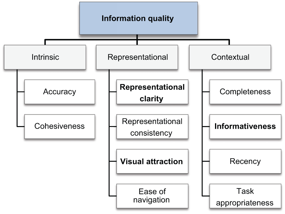
Revised IQ taxonomy of presentation slides.
Our comprehensive framework is built upon extensive user feedback. The subsequent automatic assessments conducted with the LTR strategy lead to a deeper understanding of IQ for presentation slides with empirical results. The framework has direct implications for practical applications and services. For instance, our proposed IQ assessment approach with LTR can be used by service providers such as SlideShare 1 and SlideFinder 2 , which have search and rank functionalities for a massive number of slides in their services. We expect that end-user satisfaction could be improved by rearranging their search results to separate high quality slides based on the user-driven quality criteria identified by our research.
In our future work, we intend to develop and implement a system that further utilizes semantic quality features especially in the Intrinsic category criteria. For example, we can measure cohesiveness with the entropy of text. However, cohesiveness can also be measured by the connectivity between two paragraphs. Thus, measuring cohesiveness via entropy alone may not give a complete picture. More sophisticated methods should be developed at the semantic level, enabling better IQ measurement of presentation slides. In addition, we are planning to apply our framework to other domains such as e-book or mobile content services, in which rich visual aids are highly sought after. For those applications, our quality framework can serve as an initial yardstick in identifying superior quality visual aids.
Footnotes
Appendix
List of quality features.

| Category | Dimension | Feature | Description | Related user criterion | Ref. |
|---|---|---|---|---|---|
| Intrinsic | Accuracy | numTypos | Number of typos Open Proof Reading library 5 (https://www.languagetool.org/) |
The presence of typos | [25] |
| Cohesiveness | Entropy | Entropy of texts in the slides |
Strong content connectivity | [8] | |
| Representational | Representational clarity | numHighlights | Number of font highlights | Highlighting of important points and terms | New |
| avgNumHighlights | Average number of highlights | Highlighting of important points and terms | New | ||
| numFontSizes | Number of font sizes | Font size | New | ||
| avgFontSize | Average size of font | Font size | New | ||
| numLineSpaces | Number of line spaces | Sentence spacing | New | ||
| avgSizeLineSpace | Average size of line spaces | Sentence spacing | New | ||
| preTable | Presence of tables | Explanation with comparison | [8, 13] | ||
| numTables | Number of tables | Explanation with comparison | [8, 13] | ||
| avgNumTables | Average number of tables | Explanation with comparison | [8, 13] | ||
| Resolution | Resolution of images | High resolution figure | New | ||
| preBullet | Presence of bullet points | Use of bullet points | New | ||
| numBullets | Number of bullet points | Use of bullet points | New | ||
| listRatio | Number of words in lists/word count | – | [13] | ||
| fracStops | Stopwords/non-stopwords ratio | – | [8] | ||
| avgTermLen | Average term length of texts | – | [8] | ||
| ARI | Automated readability index – |
– | [8, 14, 25] | ||
| Flesh | Flesch reading ease – |
– | [8, 14, 25] | ||
| Representational |
conFontFace | Consistency of dominant font face | Inconsistent font face | New | |
| conFontFaceRatio | Ratio of consistent font face pages | Inconsistent font face | New | ||
| conFontSize | Consistency of dominant font size | Inconsistent font size | New | ||
| conFontSizeRatio | Ratio of consistent font face pages | Inconsistent font size | New | ||
| conIndenLevel | Consistency of indentation level | Inconsistent indentation level | New | ||
| conBGTemplate | Consistency of background template | Inconsistent background template | New | ||
| Visual attraction | numAnims | Number of animation effects | Line-by-line animation effect | New | |
| avgNumAnims | Average number of animation effects | Line-by-line animation effect | New | ||
| preAni | Presence of animation effects | The presence of animation | New | ||
| numFontColors | Number of font colours | Colour scheme | New | ||
| avgNumFontColors | Average number of font colours | Colour scheme | New | ||
| defFontColor | Default font colour | Main font colour | New | ||
| numColors | Number of colours | Use of many colours | New | ||
| numTemplate | Number of templates | - | [14] | ||
| Ease of navigation | preSlideNum | Presence of page numbers | The presence of page numbering | New | |
| preTableCnts | Presence of table of contents (T, table of contents, TOC, list, etc. in the first 3 pages) | The presence of table of contents | New | ||
| Contextual | Completeness | preReference | Presence of reference (T, reference, appendix in the last 3 pages) | The presence of reference | [14] |
| preCoverPageInfo | Presence of necessary information in the cover page (title, author, department, organization) | The presence of necessary information in the cover page (title, author, department, organization) | New | ||
| preExtLink | Presence of external links (external video, webpage) | The presence of external link (external video, webpage) | [13, 14] | ||
| numExtLinks | Presence of external links (external video, webpage) | The presence of external link (external video, webpage) | [13, 14] | ||
| Informativeness | numTerms | Number of terms in the slides | The presence of too much text | [13, 14] | |
| avgNumTerms | Number of terms per page | The presence of too much text | [7, 12, 24] | ||
| preExample | Presence of examples (T, for example, for instance) | The presence of examples | New | ||
| numExamples | Number of examples (T) | The presence of examples | New | ||
| avgNumExamples | Average number of examples (T) | The presence of examples | New | ||
| preImg | Presence of image | The presence of figures | [8, 14, 25] | ||
| numImgs | Number of images | The presence of figures | [8, 14, 25] | ||
| avgNumImgs | Number of images per page | The presence of figures | [8, 14, 25] | ||
| numSlides | Number of slides | The presence of a large amount of content | New | ||
| preExplain | Presence of explanation for objects | The presence of additional explanation (for equation, graph, figure, table) | New | ||
| preDiagram | Presence of diagram | The presence of diagram | [13] | ||
| preDefinition | Presence of definition (T, definition, rationale) | The presence of terminology (term-definition) | New | ||
| info-to-ratio | Vocabulary size/word count | – | [13] | ||
| numSentences | Number of sentences – |
– | [13] | ||
| senteceLen | Length of sentence | Long sentence (Length of sentence) | [13] | ||
| Recency | Age | Number of months from created date | Outdated contents | [14] | |
| Recency | Number of months from modified date | Outdated content s | [14] | ||
| Task appropriateness | preExercise | Presence of exercises (T, exercise, workout) | The presence of exercises | New | |
| numExercises | Number of exercises (T) | The presence of exercises | New | ||
| avgNumExercises | Average number of exercises (T) | The presence of exercises | New | ||
| preQuestion | Presence of questions (T, question, problem, ?, Q and A) | The presence of questions | [13] | ||
| numQuestions | Number of questions (T) | The presence of questions | [13] | ||
| avgNumQuestions | Average number of questions (T) | The presence of questions | [13] | ||
| preKeyterm | Presence of keyterms (T, keyterm, keyword, appendix in the last 3 pages) | The presence of keyterm | New | ||
| preSummary | Presence of summary (T, summary, index in the last 3 pages) | The presence of summary | New | ||
| BM25 | Relevance between contents and user’s query, Apache Lucene 6 (version 4.9) | - | [25] |
We used POI Extractor 6 to extract the selected features from the slides (ppt files). POI Extractor provides multiple extraction functionalities such as image, textbox (font size, colours, bold and italics, etc.), objects, slide number, etc. Especially, the features measured using textual cues such as numExample are marked with T and the keywords for cues are provided. In case of using additional SW libraries, we specified them in the description.
Funding
This work was supported by the Institute for Information & Communications Technology Promotion (IITP) grant funded by the Korea government (MSIP) (No. R0101-15-0054, WiseKB: Big data based self-evolving knowledge base and reasoning platform).