



Abstract
Spatial bibliometrics addresses the spatial aspects of scientific research activities. In this case study, we use the Getis–Ord G∗ i (d) statistic for bibliometric data on US institutions to identify hot spots of institutions on a map publishing many high-impact papers. The study is based on a dataset with performance data (proportion and number of papers belonging to the 10% most frequently cited papers) and geo-coordinates for all institutions in the United States from the SCImago group (and Scopus). The Getis-Ord Gi* statistic returns, for each institution on a map, a z score. Higher z scores point to intense clustering of institutions, which have published a large proportion or number of highly cited papers (hot spots). The US maps, which we generate as examples in this study, point to four regions. These regions can be labelled as hot spots: around San Francisco, Los Angeles, Boston and Washington, DC. The empirical focus on institutional hot spots in a country using bibliometric data is of specific importance for science policy, because geospatial proximity is shown as an important factor for innovation processes.
1. Introduction
In recent years, a new trend in visualisation has related to the spatial mapping of bibliometric data, whereby geographical coordinates are added to the address data. Frenken et al. [1] label this trend ‘spatial scientometrics’ and define it as ‘quantitative science studies that explicitly address spatial aspects of scientific research activities’. According to Apolloni et al. [2] ‘spatial scientometrics aims to study where and under which conditions knowledge is created and transferred’. Bornmann and Waltman [3] introduced density maps, which can be used for the identification of broader regions, where highly cited papers have been published. Bornmann et al. [4] developed a web application (www.excellencemapping.net) to visualise institutional performance within specific subject areas as ranking lists and on custom tile-based maps [5,6]. The related application www.excellence-networks.net presents networks of scientific institutions worldwide [7]. It shows how successfully an institution has collaborated overall and with which other institutions this institution has collaborated particularly successfully.
In this case study, we calculate the Getis–Ord Gi* statistic with a non-binary spatial weight matrix [8–11]. We use a dataset with the following data: (1) proportion of papers belonging to the 10% most frequently cited papers (PPtop-10%), (2) number of papers belonging to the 10% most frequently cited papers (Ptop-10%) and (3) geo-coordinates for all institutions in the United States from the SCImago group (and Scopus). The Getis–Ord Gi* statistic returns, for each institution on a map (e.g. of the United States), a z score. Higher z scores point to intense clustering of institutions having a large number or proportion of highly cited papers (hot spots) and lower z scores point to the intense clustering of institutions having a low number or proportion of highly cited papers (cold spots). The empirical focus on institutional hot spots using bibliometric data is of specific importance for science policy, because geospatial proximity ‘is shown in many cases and contexts to be an important factor of innovation processes’ [12].
2. Methods
2.1. Dataset used
The study is based on bibliometric data on the institutional level from the SCImago group (see http://www.scimagoir.com). The SCImago group processes Scopus data and disambiguates the institutional address data. The data are usually characterised by several variants of the same institutional address [13]. We include in this study bibliometric data for institutions located in the United States. The data consist of geo-coordinates for the institutions (latitude and longitude) and their PPtop-10% and Ptop-10% for papers published between 2003 and 2013. We produced maps based on both metrics.
PPtop-10% and Ptop-10% are time- and field-normalised bibliometric indicators, which consider the different profiles of institutions in citation impact measurements. The citation impact of every paper published by the institutions has been compared with the impact of all other papers published in the same subject category and publication year. These comparisons revealed whether the institutional papers belong to the 10% most frequently cited papers within the corresponding subject categories and publication years or not.
The institutional data are used in this study on the lowest possible organisational level. For example, the National Institutes of Health has many subordinate institutions in the SCImago data: National Cancer Institute, National Institute of Allergy and Infectious Diseases and so on. Since subordinate institutions may be located in different cities, we decided not to aggregate the subordinate institutions to the main institution. Thus, the papers of the National Institutes of Health are not considered for the main institution as a whole, but for the different subordinate institutions.
Only US institutions with at least 10 papers are included in this study.
2.2. Detecting hot and cold spots
Getis and Ord [14] developed the Getis–Ord G∗ i (d) statistic to detect hot and cold spots on maps. This statistic is a local spatial autocorrelation, which assumes that the spatial associations are locally heterogeneous, even if global spatial autocorrelation exists. The statistic has been extended by Ord and Getis [15] to flexibly take into account degrees of spatial connections. The getisord command for the statistical software Stata [16], which was introduced by Kondo [9] and used in this study, allows the calculation of the Getis–Ord G∗ i (d) statistic with binary and non-binary spatial weight matrices. We used this command with the data described in section 2.1.
Detailed information on the statistic and its use with empirical data can be found in Kondo [9]. Appendix 1 of this article shows the commands, which we used in this study for producing the map in Figure 1 (which is based on PPtop-10%). We abstained from including the commands for producing the other maps in this article, because the procedure is very similar.

Mapping Getis–Ord G∗ i (d) of PPtop-10% for papers published by institutions in the United States.
3. Results
Figure 1 shows the results of the hot and cold spot analysis of PPtop-10% for papers published by institutions in the United States. Here, the non-binary spatial weight matrix is used for the visualisation. Each data point on the map represents an institution. Clusters of institutions appear in different colours, which depend on the institutional proportion of papers in a specific region.
The colours reflect the hypothesis testing results of complete spatial randomness at the 5% and 1% levels, respectively. The numbers of hot spot US institutions at the 5% and 1% levels are 145 and 391, respectively (see Figure 1). The hot spot institutions (which are coloured red) are characterised by intense clusters of institutions with large proportions of Ptop-10% in most of the cases.
On the map, we can identify at least four greater hot spots with high institutional PPtop-10%, which correspond more or less to the results of Mazloumian et al. [17] and Bornmann et al. [4,5]. Based on bibliometric data, Mazloumian et al. [17] quantified knowledge flows between 2000 and 2009 and identified global sources and sinks of knowledge production. For each institution (university or research-focused institution), Bornmann et al. [4,5] calculated and visualised the estimated probability of publishing highly cited papers.
The identified hot spots in this study are as follows: (1) the San Francisco region with, for example, Stanford University (P = 70,500, PPtop-10% = 29) and Google Inc. (P = 3386, PPtop-10% = 30), and (2) the Los Angeles region with, for example, the California Institute of Technology (Caltech; P = 31,226, PPtop-10% = 30) and the Jet Propulsion Laboratory (JPL; P = 18,501, PPtop-10% = 18). The JPL is a research and development centre in La Cañada Flintridge, USA. The laboratory is owned by National Aeronautics and Space Administration (NASA), but managed by the nearby Caltech. Its primary function is the construction of planetary robotic spacecraft. (3) The Boston region with, for example, the Massachusetts Institute of Technology (MIT; P = 74,546, PPtop-10% = 30) and the Broad Institute of MIT and Harvard University (P = 4130, PPtop-10% = 54). The Broad Institute is a biomedical research centre, which is located in Cambridge, USA. It is a nonprofit research organisation; its partners are the MIT, Harvard University and the Harvard teaching hospitals. (4) The Washington, DC, region with, for example, the Carnegie Institution for Science (P = 6237, PPtop-10% = 33) and the Joint Quantum Institute (P = 1004, PPtop-10% = 26). These four regions are hot spots in research, because they contain groups of spatially contiguous institutions with a comparatively large PPtop-10%. A greater cold spot can be found on the map around Houston with, for example, BP United States (P = 2184, PPtop-10% = 6) and Houston Baptist University (P = 115, PPtop-10% = 4).
Figure 2 shows the map, which is based on Ptop-10% for papers published by the US institutions. We logarithmised Ptop-10% before we included the metric into the analysis and visualisation. Since the results are very similar to Figure 1, we abstain from interpreting the results.
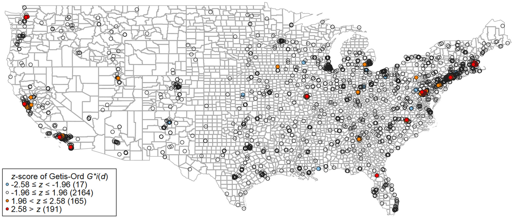
Mapping Getis–Ord G∗ i (d) of Ptop-10% for papers published by institutions in the United States.
Figures 3 (based on PPtop-10%) and 4 (based on Ptop-10%) show the development of the hot and cold spots over time. We separated the complete period (2003–2013) into two periods: 2003–2007 and 2009–2013. We excluded the intermediate year 2008 to have two distinct periods. The maps in both figures reveal similar results for the spatial distribution of institutional performance over time. The results for the two periods are not only similar to one another, but also to Figures 1 and 2. However, some differences are observable: in Figure 3, for example, the Washington, DC, region does not appear as hot spot during 2003–2007, but during 2009–2013. However, this difference is not observable in Figure 4. From Figure 4, it seems that the San Francisco region loses its status as a US hot spot over the years.
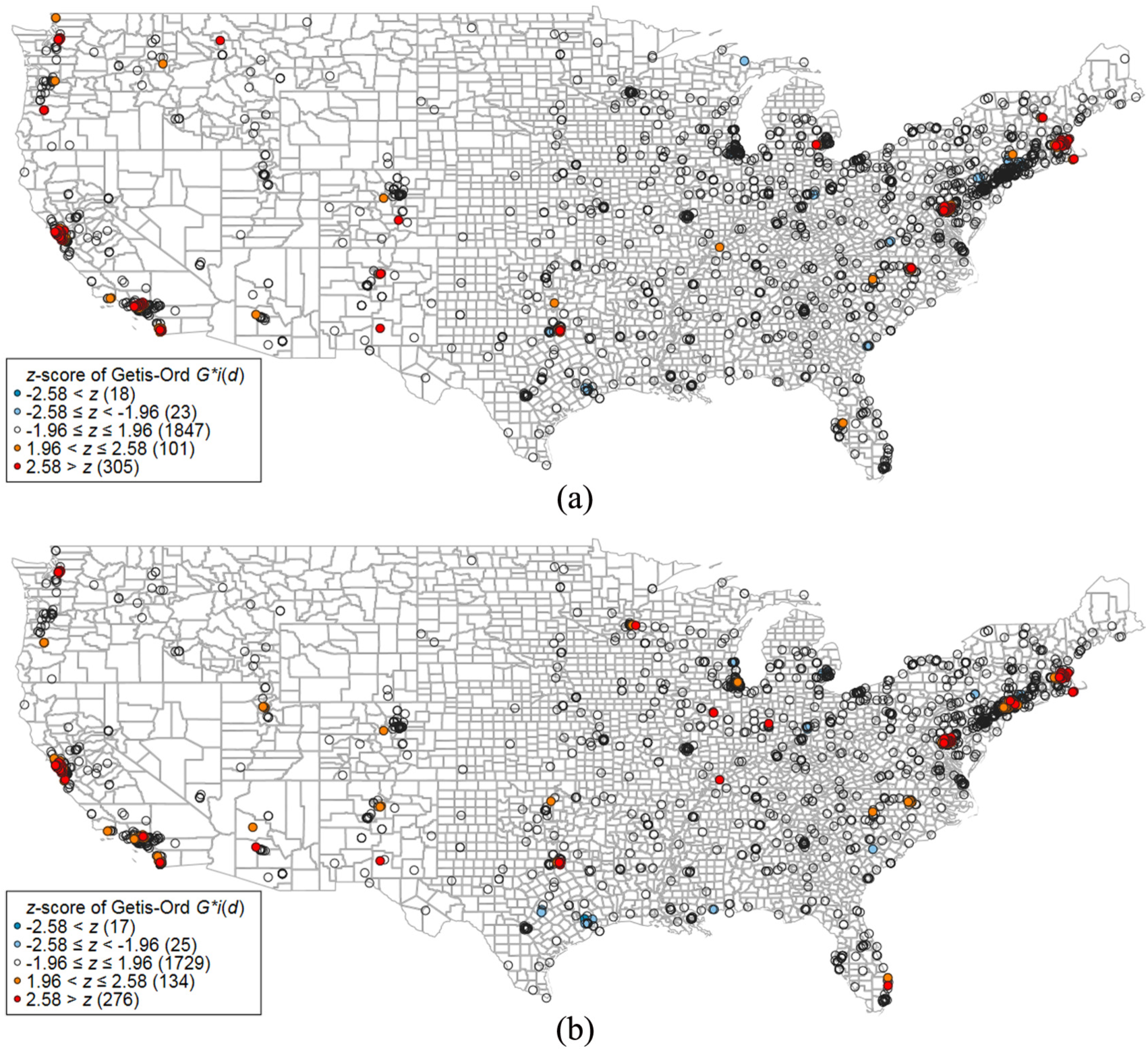
Mapping Getis–Ord G∗ i (d) of PPtop-10% for papers published by institutions in the United States within two time periods: (a) publication years 2003–2007 and (b) publication years 2009–2013.
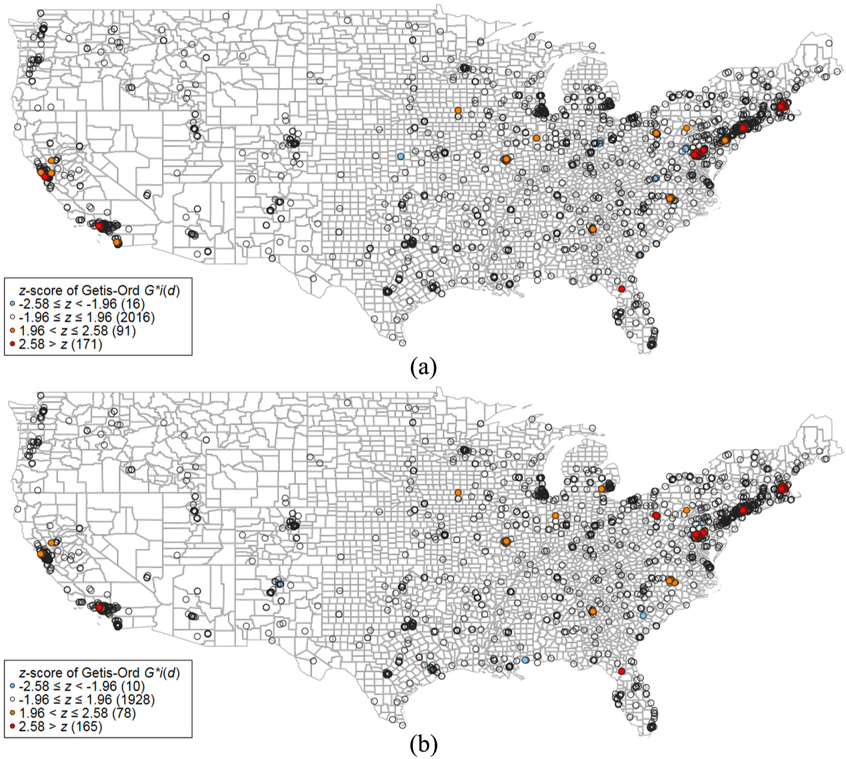
Mapping Getis–Ord G∗ i (d) of Ptop-10% for papers published by institutions in the United States within two time periods: (a) publication years 2003–2007 and (b) publication years 2009–2013.
4. Discussion
In post-academic science, the use of bibliometric data for evaluative purposes is common. A good example is the annual publication of the Leiden Ranking, which presents several bibliometric indicators for nearly 1000 universities worldwide [18]. The indicators reflect the productivity and impact of the universities in terms of publication and citation numbers. The publication and citation data are assigned to the universities using the addresses of the authors. Already in the early days of bibliometric research, information scientists have used the address data for network and science mapping visualisations. The available publication and citation data in literature databases (like Web of Science, WoS or Scopus) are comprehensive and visualisations (e.g. networks of co-authorship relations or citation relations) enhance the capacity to convey evaluative information to the users of these data [19].
For studies in spatial scientometrics, greater efforts are necessary to accurately assign addresses from publications to urban or regional categories [20]. For example, latitude and longitude data have to be reliably added to the authors’ institutional addresses. An overview of studies in spatial scientometrics is given by Abramo et al. [21]. An example is the study by Grossetti et al. [22], who analysed bibliometric data from the entire WoS database on the city level and revealed the dispersion of scientific activities both globally and within countries. In this study, we used the Getis–Ord G∗ i (d) statistic [14] for bibliometric data on the US institutions to identify hot spots of institutions with large PPtop-10% and Ptop-10%. The map points to at least four regions which can be labelled as hot spots: around San Francisco, Los Angeles, Boston and Washington, DC.
The identification of these spots within a country is especially interesting in science policy, because spatial proximity is often seen as an important requirement for innovation. According to the results of Savage [23] using Nature Index data (www.natureindex.com),
a lot of high-quality research comes from collaborations among people at institutions in the same city. Collaborators are often just a subway ride or a walk apart … Nature Index shows, for instance, that the world’s strongest collaboration between two institutions is between Harvard and MIT, which are separated by only three kilometers along the banks of the Charles River in Cambridge, Massachusetts. Their strong collaboration is driven partly by a joint venture called the Broad Institute. Harvard also collaborates frequently with Boston University, just across the river, and with Tufts in nearby Medford, accessible along the same subway line as MIT. (p. S21)
This case study demonstrates the use of the getisord command which was introduced by Kondo [9] for bibliometric data. Further possible studies could focus on countries other than the United States and use other output data than PPtop-10% (e.g. patent data). The identification of hot spots using the getisord command raises further questions, which could be addressed in follow-up studies: Is the productivity of high-impact papers enhanced by interactions and networks within the hot spots? Are local people at hot spots more skilled and innovative than people outside (e.g. skilled workers may prefer to live in certain geographical regions)? Possible visualisations of bibliometric network data can be found in Bornmann et al. [7].
Footnotes
Appendix 1
Acknowledgements
We would like to thank Keisuke Kondo, Research Institute of Economy, Trade and Industry (RIETI), for his generous support in using his Stata command.
Declaration of conflicting interests
The author(s) declared no potential conflicts of interest with respect to the research, authorship and/or publication of this article.
Funding
The author(s) received no financial support for the research, authorship and/or publication of this article.