
Abstract
Two viral photographs, #The Dress and #The Jacket, have received recent attention in research on perception as the colors in these photos are ambiguous. In the current study, we examined perception of these photographs across three different cultural samples: Sweden (Western culture), China (Eastern culture), and India (between Western and Eastern cultures). Participants also answered questions about gender, age, morningness, and previous experience of the photographs. Analyses revealed that only age was a significant predictor for the perception of The Dress, as older people were more likely to perceive the colors as blue and black than white and gold. In contrast, multiple factors predicted perception of The Jacket, including age, previous experience, and country. Consistent with some previous research, this suggests that the perception of The Jacket is a different phenomenon from perception of The Dress and is influenced by additional factors, most notably culture.
Keywords
Several researchers have tried to explain why people see the colors of #The Dress photograph differently. Many factors may contribute to the perception, such as daylight locus (Witzel & Gegenfurtner, 2018), age (Lafer-Sousa et al., 2015), gender (Lafer-Sousa et al., 2015), genes (Mahroo et al., 2017), differences in the retina (Rabin et al., 2016), type of screen (Gegenfurtner et al., 2015), cognitive functioning (Moccia et al., 2016; Schlaffke et al., 2015), individual differences in lightness, chroma, and hue perception (Jonauskaite, Dael, et al., 2020), and assumptions about the light conditions in the photograph (Wallisch, 2017; Witzel, Racey, et al., 2017; Witzel & Toscani, 2020). In the current study, we explored cross-cultural differences in the perception of two ambiguous photographs, The Dress (“The dress”, 2021) and The Jacket (Macrae, 2016), by recruiting participants from three different countries: China, India, and Sweden. In addition, we also explored the factors of age, gender, morningness, and previous experience seeing these photographs.
Potential Effects of Culture on Perception of The Dress and The Jacket
In general, people tend to associate colors with different concepts and emotions (Chen et al., 2020). Many color associations are consistent across cultures (Tham et al., 2020), especially color-emotion associations (Adams & Osgood, 1973; Hupka et al., 1997; Jonauskaite, Abu-Akel, et al., 2020). For instance, anger is associated with red, and fear is associated with black across cultures (Hupka et al., 1997). However, some color associations are culturally specific (Chen et al., 2020; Hupka et al., 1997; Tham et al., 2020). For instance, Chen et al. (2020) found that in China, red is associated with marriage and luck, whereas in the UK, luck is instead associated with the color green. Tham et al. (2020) also found that Chinese, but not English participants, associated the color purple with mysterious. Furthermore, Jonauskaite, Abu-Akel, et al. (2020) found that an individual’s reported color associations could be used to predict their nationality at levels significantly above chance, suggesting that color associations do vary between nations and cultures.
With ambiguous photographs such as The Dress, there are multiple ways to perceive the colors. Because of this open-endedness, it could be possible that some cultures are more biased to see certain colors than others, especially if those colors have certain associations. For instance, because white is associated with weddings in Western culture (Jonauskaite, Abu-Akel, et al., 2020), as are dresses, there could be a greater likelihood that Western individuals perceive the dress as whiter.
Perception of The Dress and The Jacket could also vary across cultures due to differences in color naming between the languages spoken in these cultures (Drissi Daoudi et al., 2017; Witzel O’Regan, et al., 2017). Like color associations, there is evidence of universal patterns in color naming (Baronchelli et al., 2010; Berlin & Kay, 1969; Kay & Regier, 2003; Lindsey & Brown, 2006), and different languages tend to have basic color terms that cluster around similar areas of color space (Kay & Regier, 2003; Lindsey & Brown, 2006). Despite these universal tendencies, color terms can still vary between languages in terms of centroids (Kay & Regier, 2003), the number of basic color terms (Berlin & Kay, 1969), and the boundaries between these terms (Roberson et al., 2000, 2005). Importantly, differences in color naming across languages can influence how colors are perceived, which has been demonstrated in both similarity judgments (Roberson et al., 2005, but see Kay & Kempton, 1984) and memory for colors (Roberson et al., 2000, 2005). Therefore, with ambiguously colored photographs such as The Dress and The Jacket, subtle differences in color naming between languages could lead to cultural differences in how these photographs are perceived.
Although Lafer-Sousa et al. (2015) used a nonlinguistic task to examine perception of The Dress and still found evidence for distinct categories, this does not necessarily mean that color naming had no influence on perception. Participants were first asked to name the colors, so it is possible that this initial naming could have influenced how they matched the colors in the color selection task. Moreover, color naming has been found to influence color recognition in nonlinguistic tasks (Roberson, et al., 2000, 2005).
Although differences in color naming could lead to differences in how The Dress and The Jacket are perceived, it is difficult to make specific predictions regarding which culture will perceive which colors. The ambiguities in these photographs are influenced by individual differences in assumed illumination (Wallisch, 2017; Witzel, Racey, et al., 2017; Witzel & Toscani, 2020) and subjective perception of lightness, chroma, and hue (Jonauskaite, Dael, et al., 2020), so it is unclear how color naming would interact with these factors to produce cultural differences. Furthermore, the basic color terms in Mandarin Chinese are a topic of debate as recent research suggests that some basic color terms in Mandarin were overlooked because multiple synonymous words are used to identify similar colors (Sun & Chen, 2018). Finally, there are potentially many different color associations (e.g., white being associated with marriage) across cultures that could further drive cultural differences (Chen et al., 2020; Jonauskaite, Abu-Akel, et al., 2020; Tham et al., 2020). For these reasons, we did not make specific predictions regarding which of our three samples would be more likely to perceive which colors but instead recruited these samples for exploratory analyses. However, we believe these three samples capture an interesting spectrum of cultures from East to West. According to Muthukrishna et al. (2020), cultures can be measured in terms of their distance from American culture and Chinese culture. Using China as the reference point, Sweden can be considered as highly distant from Chinese culture and India can be considered only moderately distant, indicating that it falls somewhere between the Eastern and Western cultures.
Previous Experiences of Light and Color Can Affect Subsequent Color Judgments
Assumptions about light conditions in a photograph like The Dress are likely to be affected by previous experiences of light exposure (Lafer-Sousa et al., 2015; Wallisch, 2017). The notion that previous experience affects future judgments is also compatible with research on the mechanisms of color constancy (e.g., Brainard & Hurlbert, 2015; Brainard et al., 2006) and the color memory effect (Hansen et al., 2006). This rationale is also in line with other more general findings from psychology that prior experiences act as a lens through which people make subsequent judgments (Bromme et al., 2010; Busemeyer & Bruza, 2012). For example, people are more likely to believe in theories they are more familiar with (Trautwein & Lüdtke, 2007) and to believe in knowledge that confirms their own view (Nickerson, 1998). As assumptions about light conditions have an influence on perception of ambiguous photographs like The Dress (Witzel, Racey, et al., 2017), and previous experiences of light exposure influence assumptions about light conditions, previous experiences of light exposure could affect, albeit indirectly, perception of The Dress and The Jacket.
Circadian Type, Previous Light Exposure, and Perception of The Dress Colors
In simple terms, circadian typology refers to individual differences in preference for mornings or evenings. Circadian typology can be measured by self-report on “morningness tests” with higher scores indicating that the individual prefers mornings. Lafer-Sousa et al. (2015) suggested that circadian type could be related to perception of the colors of The Dress, as people with different circadian types are likely to experience different light conditions. Furthermore, Wallisch (2017) showed empirical evidence in a comprehensive sample that people high in morningness were more likely to assume daylight conditions in The Dress photograph and to perceive the dress as white and gold compared with those low in morningness. Wallisch (2017) argued that people high in morningness are more exposed to daylight conditions and, therefore, are more likely to assume the light conditions they are most familiar with in The Dress photograph. According to Wallisch (2017), indoor artificial light involves longer wavelengths than outdoor daylight and is therefore more yellowish, whereas natural daylight is more bluish. As such, people with evening preference are likely more exposed to artificial light and, therefore, may be more likely to discount the long wavelengths in The Dress photograph, resulting in a more blue-black impression of The Dress. Vice versa, for people with morning preference, the mechanisms of color constancy may cause these individuals to discount the short wavelengths in the photograph resulting in a more white and gold impression of The Dress (Lafer-Sousa et al., 2015; Wallisch, 2017). Although Wallisch (2017) found evidence that circadian type influenced the perceived colors of The Dress, this effect may not be robust. For instance, Aston and Hurlbert (2017) did not find a relationship between perception of The Dress and responses on a morningness–eveningness questionnaire (see also Lafer-Sousa & Conway, 2017).
Previous Experience of the Photographs
In addition to previous experience of light conditions, previous experience and knowledge about colors of an object, like The Dress photograph, can also affect subsequent perception (Hansen et al., 2006; Karlsson & Allwood, 2016; Kimura et al., 2013). For example, bananas are perceived more yellow than the emitted light spectrum conveys because people know from past experience that bananas are usually yellow (Hansen et al., 2006). There is also some evidence that people who have previously seen The Dress photograph consider it more blue and black, consistent with how it is perceived in real life (e.g., Karlsson & Allwood, 2016; Lafer-Sousa et al., 2015). Therefore, we also measured previous experience of the photographs.
The Present Study
In this study, we explored if there were differences in perception of The Dress and The Jacket between cultures: China (Eastern), Sweden (Western), and India (somewhat in between Eastern and Western). Drissi Daoudi et al. (2017) argued that other countries (e.g., Georgia) may be interesting to examine because they might not be as familiar with The Dress as others. Hence, we also considered the effect of previous experience in comparing these three countries. In addition, we measured self-reported circadian typology and its relation to color judgments of The Dress and The Jacket. Finally, we also considered age, gender, and previous experience as these variables have also been found to be related to perception of The Dress.
A second goal of the study was to examine whether different factors contributed to the perception of The Dress and perception of The Jacket. The Jacket has been described to be perceived as green and gold or white and blue (Witzel, O’Regan, et al., 2017). Previous research found that The Jacket is a phenomenon different from The Dress (Vemuri et al., 2018; Witzel, O’Regan, et al., 2017). For instance, Witzel, O’Regan, et al. (2017) found that the perceived colors of The Dress were more influenced by assumed illumination than were the perceived colors of The Jacket, particularly relating to whether short-wavelength daylight or long-wavelength artificial light was assumed (see also Winkler et al., 2015). With The Dress, the alternative choices for the ambiguous colors (gold vs. black and white vs. blue) suggest that the variation between individuals is driven by perceived differences in lightness rather than saturation or hue (Gegenfurtner et al., 2015). In contrast, The Jacket involves ambiguity between the colors blue and green, which are adjacent. Therefore, part of the ambiguity for The Jacket may be that the perceived color falls somewhere between blue and green, and the participant has to make a judgment as to which color term best subsumes the perceived color. Because the effects of color naming are most pronounced for colors that fall between the boundaries of color terms (Roberson et al., 2005), The Jacket photograph may yield greater cross-cultural differences in reported colors than The Dress.
Method
Participants
Data were collected in association with another study (Karlsson & Allwood, 2018). The method was a web survey, and data were collected until 600 complete color answers were acquired from each of the three cultural zones (Table 1 shows age, gender, circadian type, and previous experience).
Descriptive Variables Between Three Countries.

Note. Age (mean, SD, and range), gender, circadian type, and previous experience of The Dress and The Jacket for the Chinese, Indian, and Swedish participants. A higher value on circadian type indicates that the participant is more of a morning person.
Ethics
The present study followed ethical guidelines in Sweden for survey data. The Chinese participants were recruited via a Swedish marketing research firm, and participants in India were recruited via MTurk. Participants in Sweden were recruited from a pool of adults that had already actively volunteered and signed up for participation in psychological research and can thus be considered consciously aware of participation in general.
Materials
Judgments of Colors
We asked two sets of questions regarding the color judgments. The first set concerned The Jacket, and the second set concerned The Dress. We expected that participants would be much more familiar with The Dress photograph (and the fact that is has ambiguous colors), so we presented The Jacket questions before The Dress questions to not raise suspicion that the photograph of The Jacket was ambiguous.
The questions about the colors of The Jacket were presented in the following order. “Please look at the photograph above”. “Have you seen this photograph of the jacket before?” (“yes”; “no”; “don't know”). “How would you describe the colors you perceive the jacket to have?” (“white and blue”; “green and gold”; “other, namely, … ”).
The same set of questions were then asked for The Dress, but the words “the jacket” were replaced with “the dress” and the suggested color options “white and blue” and “green and gold” for The Jacket were replaced with “blue and black” and “white and gold” for The Dress. The languages used were as follows: Simplified Chinese in China, English in India, and Swedish in Sweden. Necessary translations were made with the back-translation procedure (Brislin, 1970).
Circadian Type
Participants completed a measure of circadian typology in line with Adan and Almirall (1991). In this self-report measure, participants answered five questions concerning, among others, what time they usually go to bed, get up in the morning, and to what extent they considered themselves morning persons/evening persons. The questions were scored according to the instructions of Adan and Almirall (1991), resulting in a raw score between 0 and 25. A score ranging from 22 to 25 indicates strong morning preference, 18 to 21 indicates morning preference, 12 to 17 indicates no preference, 8 to 11 indicates evening preference, and 4 to 7 indicates strong evening preference. In our analyses, we used the raw score to maintain a high variance.
Procedure
After agreeing to participate, half of the participants answered knowledge questions first and half answered color questions first. After completing the questions about the photographs, participants then answered questions about gender, age, and circadian type.
Results
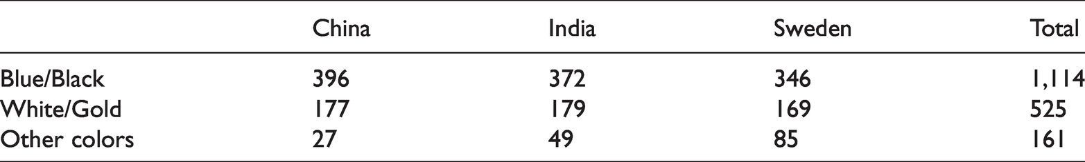
The number of participants who perceived The Dress as “blue and black,” “white and gold,” and “other colors” by country are displayed in Table 2. For completeness, we first conducted chi-square analyses to consider all three categories of perceived colors. We also conducted a logistic regression analysis excluding the “other colors” category, which has the advantage of assessing the unique variance accounted for by each predictor, but the limitation of only allowing for the analysis of a binary dependent variable (hence the exclusion of “other colors”). Collapsing across participants, a chi-square test revealed that the counts for the different perceived colors varied significantly, χ2(2) = 240.59, p < .001. “Blue and black” was perceived significantly more often than both “white and gold” and “other colors” (both p’s < .001). A 3 (perceived colors) × 3 (country) chi-square test revealed that the perceived colors varied significantly by country, χ2(4) = 35.64, p < .01. Chinese participants perceived “blue and black” more than expected (p < .05), whereas Swedish participants perceived “blue and black” less than expected (p < .01). However, there were no significant differences between the countries in perceiving “white and gold.” Finally, Chinese participants perceived “other colors” less than expected (p < .01), whereas Swedish participants perceived “other colors” more than expected (p < .01).
Number of Participants in Each Country Who Chose the Alternatives for the Dress.
The number of participants who perceived The Jacket as “green and gold,” “white and blue,” and “other colors” by country are displayed in Table 3A. Similar to The Dress, a chi-square test revealed that, collapsing across all participants, the counts of perceived colors varied significantly, χ2(2) = 770.98, p < .001. Participants more often perceived The Jacket as “green and gold” than “other colors” (p < .001) and more often perceived “other colors” than “white and blue” (p < .001). A 3 (perceived colors) × 3 (country) chi-square revealed that the colors perceived for The Jacket varied significantly by country, χ2(4) = 228.58, p < .001. Chinese and Indian participants perceived “green and gold” significantly more than expected (p < .01), whereas Swedish participants perceived “green and gold” less than expected (p < .01). Chinese participants also perceived “white and blue” more than expected (p < .01), whereas Indian participants perceived “white and blue” less than expected (p < .01). Finally, Chinese participants perceived “other colors” less than expected (p < .01), whereas Swedish participants perceived “other colors” more than expected (p < .01).
Number of Participants in Each Country Who Chose the Alternatives for the Jacket (A) and Extract of the Participants Choosing “Other Colors, Namely_” (B).
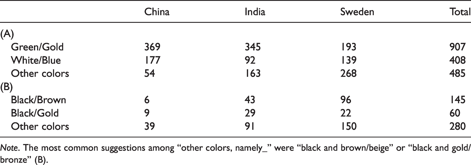
Note. The most common suggestions among “other colors, namely_” were “black and brown/beige” or “black and gold/bronze” (B).
The participant counts for some of the common open responses when the participant indicated “other colors” for The Jacket are displayed in Table 3B. Many Swedish participants chose “other colors” for the Jacket. The most common alternative after the predefined options of white/blue and green/gold was black in combination with brown or beige. The second most common suggestion was black in combination with gold or bronze. The remaining alternatives varied much among individuals, and a wide range of color combinations were suggested that included, among others, descriptions of blue/bluish, green/greenish, gray/grayish, and black/blackish hues in combination with some other color (e.g., blue/silver, blue/gold, blue/yellow, blue/red, blue/pink, blue/purple, turquoise/pink, turquoise-purple/pink, gray/brown, gray/gold, gray/black, gray/white, gray/brown, green/lighter green, green/gray, white/graphite, black/silver, black/orange, black/white, black/pink). Some participants also claimed that they could switch between colors or could understand that it could be perceived in different ways.
Logistic Regression Analyses
Binary logistic regression models are suitable for analyses wherein the dependent variable is categorical. Because the dependent variables were categorical (choice of colors), we used binary logistic regressions to investigate our hypotheses and examine the data. We conducted separate analyses for The Dress and The Jacket. The dependent variables were color choices between the predefined options: “blue and black” versus “white and gold” for The Dress and “green and gold” versus “white and blue” for The Jacket. (The alternative “other colors” was not considered in the binary logistic regressions to facilitate analyses.) Circadian typology (raw score) and age were entered as continuous predictors, and country (China, India, or Sweden), gender (male or female), and previous experience with the photographs (yes or no) were entered as categorical predictors in both models. Note that data were removed from analysis if the participant indicated “other” for gender, indicated “I don’t know” for previous experience, or if they did not provide a response for one of the aforementioned variables (e.g., did not report age).
The Dress Model
The overall logistic regression model for The Dress was significant, χ2(6) = 13.06, p = .042, Cox and Snell R2 = .01. The classification accuracy of the model was 68.1%. The predictors are displayed in Table 4.
Predictors in the Logistic Regression Model for The Dress.
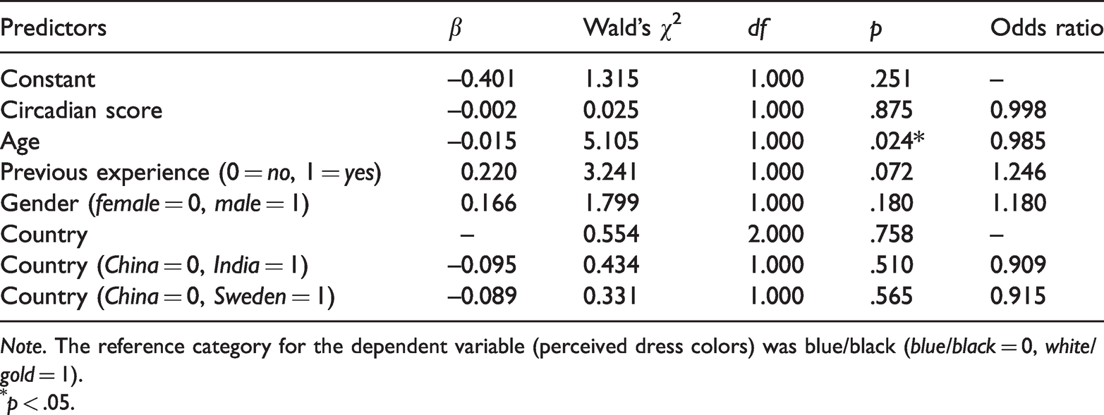
Note. The reference category for the dependent variable (perceived dress colors) was blue/black (blue/black = 0, white/gold = 1).
p < .05.
As can be seen, the only significant predictor was age (β = –.015, p = .024); for each 1 year increase in age, the participant was 0.985 times more likely to perceive The Dress as white and gold, indicating a slight decrease in the likelihood the participant perceived these colors. Previous experience approached significance (β = .220, p = .072) as participants who had previous seen The Dress photograph were 1.246 times more likely to perceive the colors as white and gold. None of the other predictors approached significance (p’s > .15).
The Jacket Model
The overall logistic regression model for The Jacket was also significant, χ2(6) = 68.81, p < .001, Cox and Snell R2 = .05. The classification accuracy of the model was 68.8%. The predictors are shown in Table 5.
Predictors in the Logistic Regression Model for The Jacket.
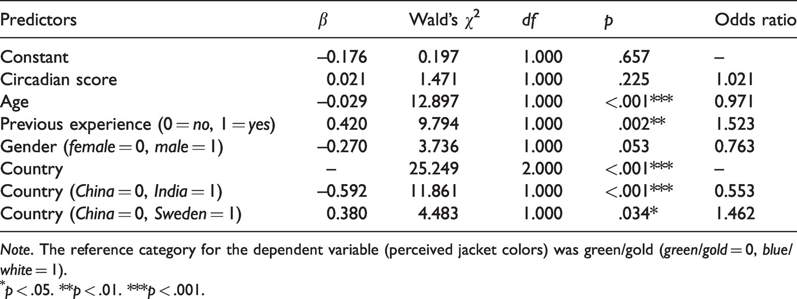
Note. The reference category for the dependent variable (perceived jacket colors) was green/gold (green/gold = 0, blue/white = 1).
p < .05. **p < .01. ***p < .001.
Similar to The Dress, age was a significant predictor for perception of The Jacket, β = –.029, p < .001. For every 1 year increase in age, the participant was 0.971 times more likely to perceive the jacket as white and blue (rather than green and gold), indicating a slight decrease in the likelihood of perceiving white and blue. Previous experience was also a significant predictor, β = .420, p = .002, as participants were 1.523 times more likely to perceive the jacket as white and blue if they had previously seen the photograph. Country also was a significant predictor (p < .001). Indians were 0.553 times more likely than Chinese to perceive the Jacket as white and blue (i.e., indicating they were less likely than Chinese to see the dress as these colors). In contrast, Swedes were 1.462 times more likely than Chinese to perceive the Jacket as white and blue. In addition, gender was a marginally significant predictor, β = –.270, p = .053, as males were 0.763 times more likely than females to perceive the Jacket as white and blue. None of the other predictors approached significance (p’s > .2).
In sum, multiple factors contributed to the perception of The Jacket, including country, age, and previous experience, whereas perception of The Dress was only found to be related to age.
Discussion
This study investigated the role of several factors that are theoretically related to color perception in ambiguous photographs such as The Dress and The Jacket. These factors included previous experience with the photographs, age, morningness, gender, and cultural differences. We collected participant samples from three countries with different cultures: Sweden, India, and China. We considered Sweden as a Western culture, China as an Eastern culture, and India as falling somewhere in between (Muthukrishna et al., 2020).
In the chi-square analyses, perception of both The Dress and The Jacket varied significantly between countries. For The Dress, a similar proportion of participants perceived The Dress as “white and gold” across countries. The main difference was that Chinese individuals were more likely to see The Dress as “blue and black” and less likely to see “other colors,” whereas for Swedish individuals, it was the opposite. This could potentially be due to cross-cultural differences in conformity. Collectivist cultures tend to display higher conformity in responses compared with individualist cultures (Bond & Smith, 1996). Higher conformity may have led the Chinese individuals to choose one of the preselected options rather than going against the common colors perceived and choosing “other colors.” Consistent with this, for The Jacket, Chinese individuals also chose “other colors” less often, whereas Swedish individual chose “other colors” more often, with Indian individuals falling somewhere in between. Chinese culture has been found to be higher in collectivism than Indian culture (Tu et al., 2011), so conformity may also be higher in Chinese individuals. Sweden represents an interesting case as it has both individualist and collectivist tendencies (Tian & Guang, 2017). Tian and Guang (2017) found that in Sweden, collectivism (and conformity) is more emphasized in the public sphere, whereas individualism is more emphasized in the private sphere. For the current study, perceptions of The Dress and The Jacket are personal opinions, so for Swedes where individualism is emphasized in private life, there may not be a strong tendency to conform to the preselected responses. Therefore, the finding that “other colors” was selected least often by Chinese, moderately by Indians, and most often by Swedes aligns with the notion that conformity is highest for Chinese individuals and lowest for Swedes (at least in this task), with India falling somewhere in the middle.
Another possible explanation for cross-cultural differences in selecting “other colors” is differences in color naming. Roberson et al. (2005) found that languages vary in terms of how often they use secondary color names. Some language groups may be more likely to employ secondary color names when the perceived color is an atypical exemplar of a basic color, whereas other languages are more likely to extend basic color terms. For the open color responses that followed if the participant selected “other colors,” there was some evidence that Swedish participants tended to employ more secondary color terms rather than stretching the preselected options compared with the other language groups. For instance, for The Jacket, several Swedish participants used terms such as “beige” (same as in English), “brons” (bronze), and “turkos” (turquois). Beige and bronze are somewhat similar to gold and could perhaps be considered atypical exemplars of gold, whereas turquois is in between blue and green. Therefore, rather than stretching the preselected options to label the colors they perceived, these participants instead chose to employ more precise secondary color terms. Swedes also commonly used color blends, such as blågrön (blue-green) and grågrön (gray-green). This tended to be less common for Chinese participants, and many of the “other color” responses simply involved different basic colors, such as “灰色” (gray) and “黑色” (black). Therefore, the cultural differences in selecting “other colors” for The Dress and The Jacket could also be due to language differences in using secondary color terms.
In the logistic regression analyses, there were only cultural differences in perception of The Jacket, but not The Dress. These analyses were somewhat limited in that binary logistic regression analyses only allow for a dichotomous outcome variable, and therefore, we did not include “other color” responses. Nonetheless, when just considering the two preselected options for both The Dress and The Jacket, and accounting for other factors such as age, gender, and previous experience, country was only a significant predictor for perception of The Jacket.
This may suggest that The Jacket is a different phenomenon than The Dress. The Dress involves colors that vary along the daylight locus (Lafer-Sousa et al., 2015; Witzel & Toscani, 2020). Witzel and Toscani (2020) recently developed an algorithm to alter other images to have a similar color distribution as The Dress. They found that these images also produced similar individual differences in perception, suggesting that the distribution of colors across the daylight locus was sufficient to cause the ambiguity effect. However, they also point out that such a color distribution may not be necessary for causing individual differences in perception as similar ambiguity effects have been demonstrated in images that do not have the same blue-yellow hues as The Dress (e.g., Wallisch & Karlovich, 2019; Werner et al., 2018). Consistent with this, we found individual differences in perception of The Jacket which similarly does not include the same yellow-blue color distribution as The Dress.
As mentioned in the Introduction section, one of the ambiguities in The Jacket is between the colors blue and green, which are adjacent. Therefore, part of the reason for the ambiguity could be that the perceived color falls somewhere in between blue and green for the observer. The boundaries for color terms can vary across languages, and cross-language differences in categorical perception of color tend to be strongest for colors on the periphery (Roberson et al., 2005), for instance, a color that is somewhere in between blue and green. Therefore, the cultural differences we observe for The Jacket could be due to subtle differences in color naming (and the associated boundaries for color terms) across the three languages sampled. Interestingly, this was not the case for The Dress, at least for the preselected options of “blue and black” and “white and gold,” which are the most commonly perceived colors of The Dress. This may suggest that the ambiguity in The Dress is not due to perceived colors falling between the boundaries of color terms but rather on assumptions of illumination (Witzel, Racey, et al., 2017). Therefore, the individual differences in The Jacket may be driven by different mechanisms than the individual differences in The Dress.
A limitation of the current study is that we only employed categorical color terms as response options rather than representing color term answers along a metric (see Lafer-Sousa & Conway, 2017; Witzel, Racey, et al., 2017). The latter would allow for analyses of correlations across participants, and this may shed light on which perceptual mechanisms are common between The Dress and The Jacket and which are different. This could be an avenue for future research, and it may be interesting to examine how these mechanisms interact with culture and color naming.
Another limitation of our study is that we did not directly examine how color naming and color associations relate to individual differences in the perception of these images. Rather, our purpose was to determine whether there were cultural differences to begin with. However, future research could examine these factors more directly. For instance, with The Jacket, participants could first be asked what associations come to mind for The Jacket (or that style of clothing) before they name the colors of The Jacket. If the associations differ between participants who perceive The Jacket as “white and blue” and “green and gold,” and if these associations are related to color associations for these color categories found in previous studies (e.g., Jonauskaite, Abu-Akel, et al., 2020; Tham et al., 2020), this would suggest that color associations play a role in perception of such images. Similarly, future studies could collect color naming data from participants before they name the colors of The Dress and The Jacket to assess whether there is a direct relationship.
Conclusion
We examined the perception of two ambiguously colored photographs, The Dress and The Jacket, across three different cultural samples: China, India, and Sweden. We found that for both The Jacket and The Dress, Swedish participants more often selected “other colors,” whereas Chinese participants less often selected this option, which could possibly be due to differences in conformity across these cultures or to differences in the use of secondary color terms in the two languages. When considering only the main color categories, we found that perception only varied significantly between countries for The Jacket, but not for The Dress. This suggests that perception of The Jacket may involve different mechanisms than The Dress, and future research should investigate whether the boundaries for color names across different language groups have a causal effect on perception of The Jacket.
Footnotes
Acknowledgements
We express our appreciation to Jun Lei for excellent translations and advice on our questionnaire and to the anonymous reviewers for their helpful comments on this article.
Declaration of Conflicting Interests
The author(s) declared no potential conflicts of interest with respect to the research, authorship, and/or publication of this article.
Funding
The author(s) disclosed receipt of the following financial support for the research, authorship, and/or publication of this article: This work was supported by JSPS KAKENHI Grant Number JP16J40092.