



Abstract
Transit agencies collect a vast amount of data on vehicle positions, passenger loading and, increasingly, origin–destination flows. Collecting and synthesizing these data to support operations and planning are significant challenges and can be constrained by information silos within transit agencies. In this paper, an open-source bus performance and journey visualization dashboard, Ridership and Operations Visualization Engine, is presented, which integrates multiple disparate data sources into a flexible and iterative analysis tool. It differs from existing commercial products by including origin–destination flows along with standard performance metrics, and is designed to be adaptable and relevant to any transit agency. Two case studies are presented to demonstrate the functionality of the dashboard: planning transit priority infrastructure and evaluating network design changes. The dashboard was developed in partnership with Chicago Transit Authority and Massachusetts Bay Transportation Authority, and practical details from the installation and maintenance procedures are included for prospective users.
Keywords
Enabled by advanced technology, modern public transit agencies collect a vast amount of data to measure performance, identify problems, and provide information to the public. For bus networks, this typically includes vehicle positions from automatic vehicle location (AVL) systems and passenger boarding and alighting counts from automatic passenger counting (APC) systems. This information allows agencies to track performance using several metrics, including speed, ridership, frequency, and crowding. More recently, transit agencies have begun to collect passenger origin–destination (O-D) flows, whether from fare collection systems, surveys, or inference algorithms, allowing them to make informed planning decisions based on actual demand patterns. Given that performance metrics and O-D flows come from multiple data sources with different formats, data types, and storage systems, it can be difficult and time consuming for transit agencies to obtain a holistic representation of network performance and ridership across multiple dimensions. Furthermore, the information is typically stored as tabular data at different spatial resolutions, which lacks the geographic context needed to identify relationships between different elements of the network. Existing transit performance visualization tools are largely commercial products with limited flexibility and expensive licenses that lack O-D visualization capability.
To make these data available to practitioners and provide a holistic view of performance and demand, the Ridership and Operations Visualization Engine (ROVE), an integrated, open-source transit performance and passenger journey visualization engine has been developed and is described in this paper. ROVE can be used by any transit agency to identify locations with poor performance, share information visually or in standard tabular form, and make data-driven service planning decisions through an intuitive user interface. ROVE was designed in partnership with two of the largest transit agencies in the United States, the Chicago Transit Authority (CTA) and the Massachusetts Bay Transportation Authority (MBTA).
ROVE was developed to be user-friendly, generalizable, and open-source. To that end, the user interface is designed for intuitive navigation by first-time users. It relies only on common data sources available at most transit agencies. Every component of ROVE is built with open-source software packages as opposed to proprietary or black-box software.
The framework of ROVE is shown in Figure 1. It takes four data sources as inputs in standardized formats: a generalized transit feed specification (GTFS), AVL, APC, and O-D data. Then, the data are synthesized and aggregated to produce a transit network shape file, aggregated passenger flows, and performance metrics via three data processing modules. Finally, a web-based visualization engine is built to provide a holistic view of transit performance metrics and allow iterative analyses through multiple flexible functionalities. Two categories of performance metrics are visualized in ROVE: bus operation metrics and passenger service-level metrics. Each metric can be shown at the stop-, timepoint-, and route level based on user input. Moreover, passenger journeys can be visualized in several different ways, including total flows, journey origins, and journey destinations. The components are modular; for example, agencies without O-D data can still implement the bus operation metrics.

Flowchart for ridership and operations visualization engine (ROVE) data processing and visualization.
Background
The development of transit performance metrics has been a rich field of research for decades ( 1 , 2 ). The U.S. Federal Transit Administration enumerated over 400 possible performance metrics in a 2003 report ( 3 ). A subsequent report also describes how archived AVL and APC data can be used to measure performance ( 4 ). Hammerle et al. describe an early application of AVL and APC to measure transit performance for CTA ( 5 ). Ma and Wang used these data sources as well as automated fare collection (AFC) to estimate speed, travel time reliability, ridership, and headway variance ( 6 ). To support operational decisions, APC and AVL data have been used in several studies to estimate bus arrival and departure times ( 7 , 8 ). In another application, APC and AVL data were combined to recommend additional recovery time between inbound and outbound trips to reduce bus bunching ( 9 ).
Several transit performance metrics have a spatial context and can therefore benefit from visualization. Recent studies have explored the benefits of using geographic information system software for dynamic, interactive visualization of transit performance measures at the stop-, route-, and network level ( 6 , 10 ). Visualization allows the user to integrate geographic data from disparate sources and infer spatial patterns, relationships, and trends ( 11 ). Data visualization serves to enhance communication during the problem solving process, and can also be used for exploratory analysis and development of hypotheses ( 12 ). A 2007 report on the status of transit performance visualization at the transit agency in Portland, OR ( 11 ) argues that “efforts to incorporate new data visualization techniques will do much to assist with the identification of operational problems as well as provide insight into potential solutions.” Kurkcu et al. developed an interactive performance analysis tool using AVL to visualize metrics at the stop-to-stop level ( 13 ). Stewart et al. describe how automated data can be visualized at the stop-to-stop and route level to support service planning and communicate with the public ( 14 ). However, to the best of the authors’ knowledge, an open-source transit performance visualization tool that synthesizes and aggregates disparate data sources, shows performance measurements at multiple levels, and offers journey-level information does not exist.
Data Sources and Preparation
In this section, the three categories of data utilized in this dashboard are described: GTFS, automated transit data (AVL and APC), and O-D data. Furthermore, the data processing, synthesis and aggregation used to generate a standardized data input file are discussed. Finally, a process is presented for the preparation of the mapping inputs, including the geographic representation of a transit network.
Generalized Transit Feed Specification (GTFS)
The first primary data source is the GTFS feed. GTFS is a widely adopted data standard originally developed for integrating transit information into web maps ( 15 ). There are static and real-time versions of GTFS; the static version is used as an input for this dashboard. It contains schedule and geographic information, including scheduled arrival times, stop sequences, and bus stop locations. GTFS is used by over 2,500 operators from almost every country around the world, almost all of whom make their GTFS feeds available to the public ( 16 ).
The GTFS feed is the source of all schedule-related performance metrics available in the visualization dashboard, including scheduled frequency, scheduled speed, and scheduled service hours. It is also used for performance metrics related to network design, such as stop spacing. The GTFS standard includes a set of required tables and fields, as well as many optional tables and fields. To ensure that ROVE can be widely adopted, the dashboard does not require any optional or customized GTFS features.
Automated Transit Data Sources
The second primary data source is automated transit vehicle-based data, which consists of event-based AVL data and APC data. AVL systems provide a location and timestamp at regular intervals or on the occurrence of an event (e.g., a bus arrives at a bus stop). These systems are used by agencies to track vehicle positions over time, facilitate real-time dispatching, and provide estimates of speed, running times, and delay relative to the schedule. APC systems, on the other hand, provide records of passenger boardings and alightings at each bus stop, which are used to track passenger loads and crowding. The automated transit data inputs are used by the visualization dashboard to calculate and display metrics related to on-time performance, speeds, wait times, and passenger loading.
There are many different AVL and APC vendors with different data formats, so it unlikely for the AVL and APC data processing step to be identical across different transit agencies. For example, CTA uses Clever Devices as their vendor for AVL and APC data, whereas MBTA uses an Urban Transit Devices system for APC data, each with different data structures. A standard input format is provided, which is shown in Table A1 in the Appendix, and any agency wishing to use ROVE will need to develop a custom procedure for converting their AVL and APC data to the standard format. As ROVE was sponsored by CTA and MBTA, custom procedures for collecting and transforming automated transit data into a standard process were developed for each agency.
There are ongoing efforts by the Transportation Research Board to create data standards for APC and AVL systems ( 17 ). Standardization of data inputs from APC and AVL systems would significantly reduce the amount of agency-specific customization needed, as a single process could be used to convert standards-compliant APC and AVL records into the ROVE input format.
Origin–Destination Data
The third data source utilized in the visualization dashboard is stop-level passenger journey O-D data. Understanding how demand patterns change before and after service changes with O-D data provides valuable insights into travel behavior, and provides guidance for planning service changes. O-D data consist of a record for every passenger journey stage that includes the boarding and alighting location; the standard input format for O-D used in ROVE is shown in Table A2 in the Appendix. O-D flows can be inferred for transit systems with “tap-on” fare collection ( 18 ) or collected directly for “tap-on, tap-off” systems. Systems for estimating or collecting origin, destination, and transfer data are becoming more common as transit agencies move to provide real-time information to riders ( 19 ). O-D data can also replace the boarding and alighting information derived from APC if APC coverage is limited.
Both CTA and MBTA transit networks have tap-on fare collection systems, therefore O-D data are inferred using the ODX algorithm developed by Sánchez-Martínez ( 20 ) and others at MIT. “ODX” is shorthand for “origin, destination, and transfer inference algorithm,” an extension of the O-D inference algorithm proposed by Zhao et al. ( 21 ). It takes automatically collected data, including AVL and automatic fare collection (AFC), as inputs and infers both destinations and transfers in a tap-on-only transit system. Given a series of tap-on records for a given smart card ID, the “tap-off” information is inferred as follows: i) if the current tap-on time is close to the previous tap-on time, the current vehicle “stage” is part of a transfer journey from the previous stage and the alighting location of the previous stage is generally the closest stop on that route to the boarding location of the current (second) stage; ii) if there is a large time gap between the current tap-on and the previous “tap-on,” the alighting location of the previous journey is generally the closest stop on the previous route to the boarding location of the current journey assuming passengers’ travel patterns are symmetrical and the distance between the inferred alighting location and the subsequent boarding location meets a maximum distance criteria; iii) the algorithm does not infer a tap-off stop location if the tap-on record does not satisfy either of the previous two scenarios. The resulting O-D data are used as an input for ROVE’s Journey Visualization feature.
Data Processing and Synthesis
Given the raw data from the transit data sources described earlier, three standardized ROVE input files are generated: a file containing shapes that represent the transit system, a bus performance metrics file, and a passenger flow file. Generating the static input files for ROVE is an offline procedure; new data and shape files can be created as needed or as part of a routine automated process.
Shape Generation
A standardized geographic representation of the transit network is required to display bus performance metrics and passenger journeys. The metrics and journeys are visualized through a set of colored lines representing a stop-to-stop segment, timepoint, or route overlaid on a monochrome base map layer. An example of the visualization of performance metrics for CTA at the stop-to-stop resolution is shown in Figure 2.

Example of the geographic representation of a transit network within the ridership and operations visualization engine (ROVE) interface, in which the lines are colored according to stop-to-stop travel speed for each segment.
The shapes are generated from the GTFS feed, which contains the coordinates of each transit stop in the network. Coordinates of the path that a vehicle takes between each pair of stops is not included in a standard GTFS feed so it must be inferred. The path of each bus is snapped to the road network using the open-source Valhalla routing engine ( 22 ) with the street network data collected from OpenStreetMap ( 23 ). Lacking additional information, the algorithm assumes that the bus takes the shortest path between any two stops, which has been shown to produce a high degree of accuracy ( 24 ). To further improve accuracy, agencies can make manual adjustments or incorporate coordinates from the optional shapes.txt table in a GTFS feed. The shapes for the rail network, which are used in the Journey Visualization feature, can also be created using the map matching process as OpenStreetMap contains a rail layer in addition to the street network layer. This shape generation process produces a clear shapes file for bus networks regardless of the quality or availability of shapes.txt coordinates offered in the GTFS feed. New shapes files should be generated for each period of data, as service patterns and stop locations can change over time. This process can have value independent of the visualization dashboard, as it can allow agencies to create the optional shapes.txt file for their GTFS feed or produce web maps to be shared with the public.
Metric Calculation and Aggregation
One key feature of ROVE is the ability to provide a holistic view of bus performance using 25 common transit performance metrics calculated from AVL, APC, GTFS, and O-D data. Combining O-D with the other data sources enables new metrics that would not be available otherwise; for example, it can be used to determine the percentage of passengers traveling along each segment that make a transfer to another bus route or rail line at some point during their trip. Table 1 shows the list of bus performance metrics, which consists of operations and passenger service-level metrics. Performance metrics are calculated at three spatial resolutions: stop level, timepoint level, and route level. Stop is the smallest unit of measurement, displaying the metrics for each pair of adjacent stops in the network. Route level displays the metrics aggregated along the entire route, with each direction calculated separately. Timepoint level displays the performance metrics aggregated between timepoints, which are generally larger segments than stop level, but smaller than the full route. The location of timepoints are defined by the agency.
Bus Performance Metrics Available Within Ridership and Operations Visualization Engine (ROVE)
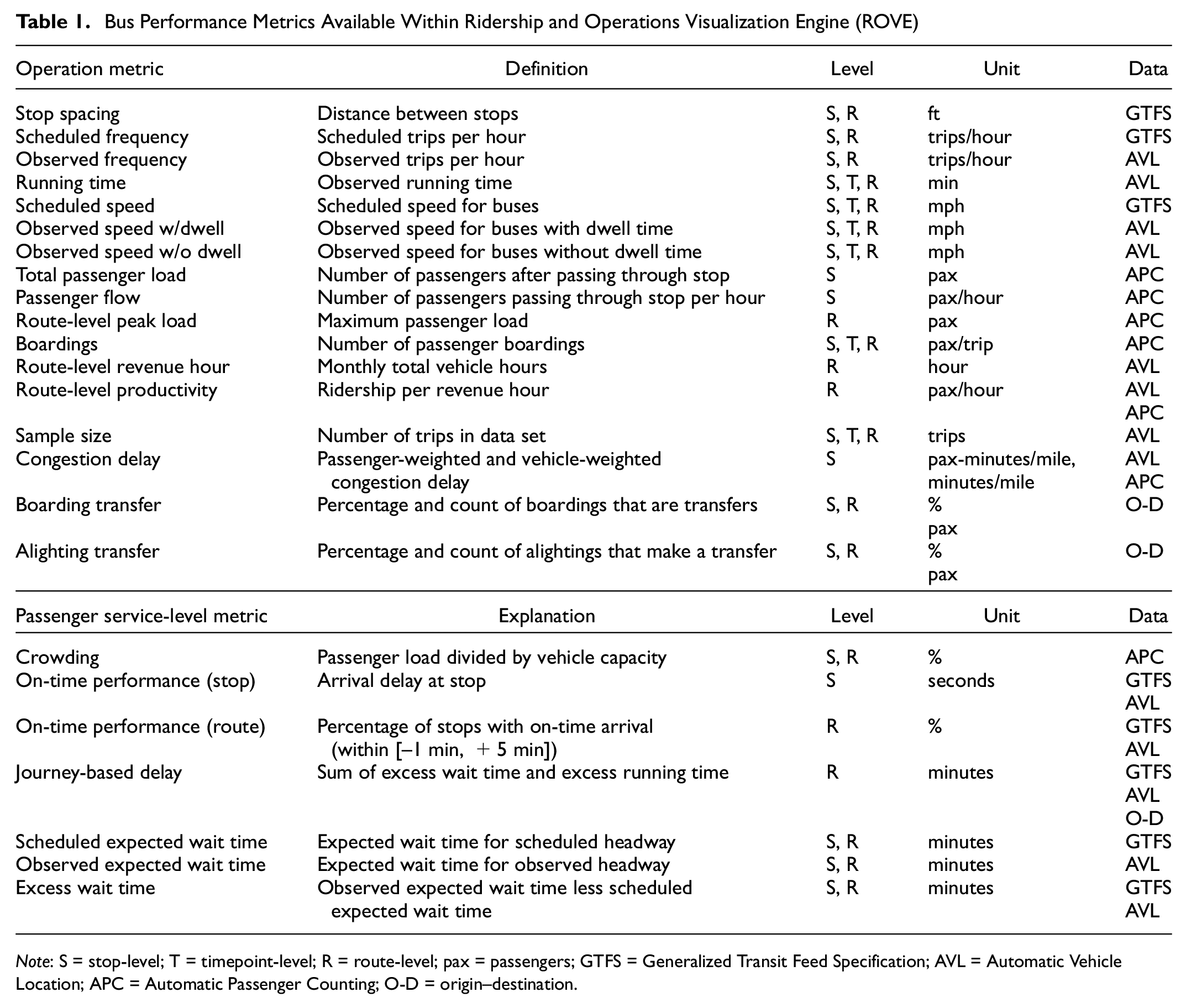
Note: S = stop-level; T = timepoint-level; R = route-level; pax = passengers; GTFS = Generalized Transit Feed Specification; AVL = Automatic Vehicle Location; APC = Automatic Passenger Counting; O-D = origin–destination.
Typically, the transit data are generated in monthly increments for weekdays, although weekends can be included if desired. One month provides a large enough sample to mitigate the impact of spurious incidents. Weekdays and weekends can be processed separately to create different data files for comparison. The size of the static data files varies by agency and period length, but it is typically less than 1 GB, allowing many such files to be retained in storage simultaneously.
Performance metrics are aggregated into several predefined time periods defined by the agency. To allow users to select a customized time range, metrics are also aggregated into 10-min intervals. This feature can be helpful in reviewing how timepoint-to-timepoint running times change throughout the peak hour and how those running times should be incorporated into future schedules. When selecting a time period across multiple time intervals, metrics for the selected time period are approximated by taking the average.
It should be noted that the performance metrics include only the bus network as that was of greater interest to transit agencies. There are no technical or data limitations preventing incorporation of rail performance in future versions.
Passenger Journey Aggregation
Another unique feature of ROVE is the ability to visualize passenger journeys. Passenger journey visualization leverages full-journey origin, destination, and transfer information and can generate further insights beyond simple measures of transit supply and performance. All origins and destinations in the passenger journey data are located only at stops or stations.
A data processing step is required to translate O-D data into passenger flows. Unlike AVL or APC data, which are typically available at the stop level, O-D data are typically represented as a pair of stops. To convert O-D pairs into passenger flows throughout the network, a preprocessing step is conducted to determine the set of stops and timepoints traversed as part of each passenger journey. The GTFS feed is used to find the path through the transit network, and the sum of passenger flows across each stop and timepoint is computed. Several different types of passenger flows are calculated for each stop or timepoint location: journeys originating at this location, journeys ending at this location, and journeys passing through this location.
Dashboard Architecture
ROVE is an interactive, browser-based web application built using the Flask web framework for Python ( 25 ). When ROVE is opened, the static input files are loaded by the Python back end and served to the web application. The web application and user interface were created using JavaScript and several common JavaScript libraries, including jQuery and D3. Leaflet, a widely used interactive web mapping library for JavaScript, is the primary mapping tool. When the user requests new data, the request is sent from the web application to the Flask server, which loads the specified data and returns it to the web application where it is used to populate the display. Loading one period of data for a very large transit network (e.g., CTA bus network) takes less than a minute.
User Interface
The ROVE user interface has three main components: the legend, the map, and toolbars that provide the main interactive functionality. The legend and toolbars are shown in Figure 3 below. Data from different time periods are loaded by selecting an analysis mode from the toolbar shown on the landing page. The dashboard has two different analysis “modes”: Performance Metrics and Journey Visualization. The Performance Metrics mode allows the review of the performance of the transit system, either during a single period or a comparison between two periods. When the Comparison mode is selected, the user specifies a baseline period and comparison period. The Journey Visualization mode allows the user to visualize passenger journeys throughout the transit network. Journeys can also be displayed for a single period or as a comparison between two periods.

Example of two ridership and operations visualization engine (ROVE) user interface components: (a) the legend and (b) the toolbars.
Performance Metrics
In the Performance Metrics mode, a time period (or periods) is selected, and the map is populated with the transit shapes displaying the default metric. One helpful feature is the ability to click on any transit line and view the line information and the values of all performance metrics for that segment displayed in a popup window. If the Comparison mode is selected, then metrics for the baseline period, comparison period, and the difference between the two periods will be shown in the popup display.
The panel to the left of the map contains metadata for the time period as well as the legend for the selected performance metric as shown in Figure 3b. By default, the legend bins are set to create quintiles, but the ranges of each bin can be adjusted using the toolbars. The colors are defined for each metric such that red lines indicate poor performance. The high–low color scheme for each metric is configurable.
Filters
The toolbar panel shown in Figure 3b contains the set of options and filters that are used to change the display. The selected data can be filtered along six primary dimensions: route, metric, level, statistic, direction, and time period. All of the filters can be engaged simultaneously, allowing for specific and flexible analyses.
Routes or route groups: This filter allows the user to select only a subset of routes for visualization. Routes can be selected by Route ID, by garage or by route type. Selecting one of the garage names will show all routes that are based at the selected garage. This can be useful as crews and vehicles are often assigned to specific garages. Selecting one of the route types will display all routes of the selected type, such as Commuter Bus or Rail Replacement Shuttle. These groups are configurable.
Metrics: This filter allows the user to select which metric is used for visualization. The selected metric defines the colors of the map lines. Each of the metrics described in Table 1 are available in the dropdown menu.
Levels: This filter allows the user to toggle the spatial resolution of the display. There are three primary options: Stop, Route, and Timepoint. Stop and Timepoint metrics also have an “aggregated” option, in which metrics are aggregated across routes if the routes overlap for the full stop-to-stop or timepoint-to-timepoint segment. This can be useful for certain applications, like transit priority planning, in which the aggregate measures within a corridor are more relevant than the measures for each route individually. Metrics are not aggregated unless the stop-to-stop or timepoint-to-timepoint segments are identical (i.e., start and end at the same stops or timepoints). As a result, performance metrics are not aggregated for routes that overlap but do not serve the same stop pairs, such as a local route and express route serving the same corridor with different (not shared) stops, timepoints, or both.
Statistics: There are two different statistics available for visualization: Median and Worst Decile. Median is the default and shows the median value for all of the trips in the period. Worst Decile shows either the 10th or the 90th percentile depending on the metric, following the same logic as the color display. The worst decile statistic is often used in transit planning for setting scheduled running times or for measuring overcrowding.
Directions: This filter defines which direction(s) are visualized.
Time Periods: There are two ways to filter time periods. First, a predefined time period may be selected from the dropdown menu. The number of options and their duration can be set in the configuration file. Any records that fall within the selected time period are used in the calculation of the metrics. Second, a custom time period with a 10-min resolution can be selected using the time period slider. Any observations that occur during the selected 10-min periods will be used to calculated the new performance metrics. The custom time period slider allows analyses of very small or specific time periods that might not be available from the dropdown menu.
Metrics: One of the most useful features of the dashboard is the ability to filter by the performance metrics themselves. Each metric can be filtered at any level (if the metric is available at that level), and the selected levels are independent from one another. For example, the user could filter observed frequency at the route level and crowding at the stop level to limit the display to high-frequency routes that experience significant crowding.
Exporting Data
The export feature allows the user to export all metrics in the current visualization to a spreadsheet. Depending on which level is selected, each row in the spreadsheet will represent a stop, timepoint, or route. The columns include identifying information about the stop, corridor, or route and all of the available metrics. The first- and last stop ID are included in the export, along with the stop names and the municipality in which the stop is located. This can be helpful for tasks in which jurisdiction is important, such as planning infrastructure changes. The stop ID field in the export can also be used to look up spatial information such as the coordinates of the bus stop. In Comparison mode, the export table includes three sets of metrics: the metrics for the selected baseline period, metrics for the selected comparison period, and the difference between the two periods. Only stops, timepoints, or routes that fall within the selected filter states will be included in the export, allowing the user to choose a set of routes or certain metric ranges within the ROVE interface rather than sorting through the exported table. The output is a CSV table that can be used for further analysis, creating charts, sharing information with other stakeholders, or inserted into a public report.
Journey Visualization
The Journey Visualization mode is separate from the Performance Metrics mode described above. Journey Visualization leverages O-D data, allowing a user to select stops or timepoints and display the passenger journeys that begin from, end at, or include the selection. Like the Performance Metrics mode, the Journey Visualization mode can be used to visualize journeys for a single time period or compare two different time periods.
A single stop or timepoint can be selected by clicking on any transit route on the map, whereas multiple stops can be selected with the “lasso” tool. Once a selection is made, the remaining stops or timepoints are recolored to indicate the passenger flow to or from the selection, as shown in Figure 4. Clicking on the other parts of the network will display a popup box containing the selection information and the passenger flow to or from the selection.

An example of the Journey Visualization mode display for the Massachusetts Bay Transportation Authority (MBTA) network.
Note that, unlike in the Performance Metric mode, the rail network is included in the Journey Visualization mode. This addition permits a full multimodal representation of passenger journeys. Rail stops and timepoints can be selected just like bus stops and timepoints. The rail network is displayed with a thicker line to differentiate it from the bus network.
The panel to the left of the map contains information about the current display. When no stop or timepoint has been selected, the legend shows only the metadata for the selected time period. When a stop or timepoint has been selected, however, two new elements appear, as shown in Figure 4. A legend indicates the correspondence between colors and passenger flow values, and a second table displays information about the selected stop(s) or timepoint(s).
Filters
There are four different dimensions for filtering the Journey Visualization mode: route, selection mode, level, and direction. Route, level, and direction have the same effect as the corresponding filters from the Performance Metric mode. The Selection mode filter is specific to the Journey Visualization mode. Selection mode allows the user to toggle between six different types of passenger flow visualizations. “All Flows” displays the passenger flows for all journeys that include the stops selected on the map. “Upstream Flows” and “Downstream Flows” show only the passenger flows that occur before or after the selected stop. “Origins of Alighting Pax” shows the passenger flows for all journeys that end at the selected stop. “Destinations of Boarding Pax” shows the passenger flows for all journeys that begin at the selected stop. Finally, “Transfer Journeys Only” is similar to “All Flows,” except that only journeys that involve at least one transfer are included.
These different Selection mode options allow the user to conduct a wide range of analyses. For example, reviewing all flows traveling through a set of consecutive stops allows agency staff to understand the travel patterns that would be disrupted by a detour and plan supplemental service accordingly. The downstream flows option can be used for planning short turns by showing the number of passengers who continue past a given stop. Visualizing the destinations of all passengers boarding within a given neighborhood enables the identification of opportunities for more direct service.
Exporting Data
Data from the Journey Visualization mode can also be exported when a selection is active. Each row of the CSV export table corresponds to a stop or timepoint that has nonzero passenger flow to or from the selection.
Background Layers
In either analysis mode, the “Import Background Layer” button allows the user to add nontransit background layers to the map for further geographic context. The set of background layers that are available is specified in the configuration file; any geospatial data represented by a GeoJSON file can be included. Examples include traffic signal locations, census tracts, and municipal boundaries. Figure 5 shows how traffic signal heads can be represented in ROVE using a background layer.

Example of importing a ridership and operations visualization engine (ROVE) background layer: traffic signal head locations within the Massachusetts Bay Transportation Authority (MBTA) network.
Case Studies
Two case studies are presented here to demonstrate how ROVE enables flexible, systemwide analyses that can be difficult to conduct with other transit visualization tools.
Case Study 1: Planning Transit Priority Infrastructure
Transit planners use performance data to identify concerns and target interventions to improve service. One of the biggest concerns for urban transit agencies is roadway congestion, which can lead to higher running times for bus routes. Higher running times can result in lower frequency of service, or require additional resources to maintain the same frequency. One common intervention to reduce running times is to install transit signal priority, a system that provides favorable signal timing for transit vehicles. When a bus is approaching a signalized intersection, it communicates with the signal controller to extend the green time, or to reduce the red time, to limit delays. Transit signal priority has been installed along bus routes operated by CTA and MBTA. Other types of transit priority infrastructure include dedicated bus lanes and queue jump lanes.
This case study illustrates how the Performance Metrics mode of ROVE can be used for data-driven transit priority infrastructure planning. A new performance metric is developed to identify locations where transit priority measures, such as transit signal priority, will have the largest impact. The new metric combines delay and passenger data from different sources to highlight routes with significant congestion delay and high ridership, demonstrating the potential of a dashboard with multiple inputs. Furthermore, the visualization component can be used to quickly identify clusters of high-potential locations for efficient installation planning, unlike a tabular analysis, which does not include geographic context.
This case study focuses on the CTA network and uses a full month of input data from October 2019. AVL data are used to measure stop-to-stop running times, and APC is the source for passenger loads. These are combined to create a performance metric that will be referred to as “passenger-minutes of congestion delay” or PMCD.
First, we find the minimum running time (with dwell time excluded) during the full month for each stop-to-stop segment in the network. The input data used in this case study includes a cleaning step to eliminate unusually short running time records, which can result from data quality issues. The 5th percentile running time could also be used in place of the minimum to mitigate the effects of data errors or very unusual outlier situations. The minimum running time typically occurs during off-peak hours, and is assumed to be the running time that corresponds to a zero congestion scenario. Then for all other trips in the period, the difference between the actual running time and the minimum running time represents an estimate of the congestion and intersection delay. There are other conditions that can contribute to longer running times, such as variable driver speed behaviors, traffic incidents, and weather, but congestion and intersection delay are among the most common ( 26 ). Taking the average running time across all weekdays in a month reduces the effect of any atypical events. Note that dwell time is subtracted from the running time calculation, so variation in dwell time at bus stops does not result in a greater measure of delay.
It is assumed that all delay is caused by congestion and signal timing is reasonable for a first-order analysis; however, additional screening may be needed before planning installation. Furthermore, not every stop pair will contain a traffic signal, so it is possible that some high PMCD corridors will not be candidates for transit signal priority installation. Such segments could be identified by loading the traffic signal locations as shown in Figure 5. If no traffic signal is present in a high PMCD corridor, other measures such as dedicated bus lanes could be used to alleviate delay. Once the high PMCD corridors are identified, further research should be conducted to determine the appropriate transit priority measure.
For each trip, the product of the delay and the passenger load is computed to produce a delay metric that is weighted by the number of affected passengers. The PMCD is then aggregated across all trips that serve each stop pair. This includes trips that are part of separate routes, as transit priority infrastructure will affect all bus routes that pass through the signal. Finally, the aggregated measure is normalized by the length of the segment so as to represent the intensity of the delay. The result is a measure for each stop pair in the bus network that represents the cost of congestion, measured in passenger-minutes per mile. This new performance metric can be visualized for the entire CTA bus network, as shown in Figure 6.

Visualizing passenger-minutes of congestion delay across the full Chicago Transit Authority (CTA) bus network.
Predictably, the majority of the high PMCD corridors are located in the downtown core, with additional corridors in the northwest and southeast. High ridership routes are more heavily concentrated in these dense areas. Viewing the entire network at once is not particularly helpful for planning individual installations; however, ROVE allows the user to filter out locations with low PMCD, and set custom legend bins for a visual differentiation among high PMCD corridors. The result is presented in Figure 7

Visualizing only locations with high passenger-minutes of congestion delay within the Chicago Transit Authority (CTA) bus network.
The highest PMCD corridors remain in the downtown core even after filtering, but other patterns emerge. It is easy to identify two east–west corridors with high delay: Chicago Avenue northwest of downtown and 79th Street to the south. Each of these areas, first identified using ROVE, could be investigated further as high-potential candidate locations for transit priority infrastructure.
Case Study 2: Evaluating Network Design Changes
This case study demonstrates how the Journey Visualization mode can be used to study changes in travel patterns over time. When service changes are introduced, passengers whose routes are disrupted must respond by altering their travel behavior. In many cases, this will include choosing a different path through the transit network to get to the same destination. In other cases, the traveler may select an alternative destination that is more convenient, or choose to switch from transit to another travel mode. Examining the distribution of downstream passenger flows from a given stop, and how they adjust in response to a service pattern change, can be helpful in adjusting schedules and planning future changes.
MBTA implemented a major bus network change in the fall of 2019 ( 27 ). An existing bus route with two variants was replaced with two separate routes, requiring a transfer to reach the stops previously served by the less frequent variant ( 27 ). The change in service patterns from the previous variant (Route 70A) to the new separate route (Route 61) are shown in Figure 8. Former Route 70A passengers with destinations in northern Waltham are required to transfer to Route 61, which serves many of the same stops as Route 70A. Route 61 operates on a similar frequency to the old Route 70A, with approximately 30-min headways throughout the day on weekdays. To examine the impacts that these changes had on overall passenger demand as well as route choice, this case study compares O-D flows between January 2019 and January 2020.

Comparison of Waltham bus routes (a) before and (b) after the network changes in December 2019: (a) Route 70A Service Pattern and (b) Route 61 Service Pattern.
The methods described earlier are used to compute the downstream passenger flows for each stop in the network. The difference between the baseline period (January 2019) and the comparison period (January 2020) are then calculated and visualized, allowing for a comprehensive review of the passenger impacts of specific service changes (see Figure 9). Overall, the systemwide ridership was 3.7% greater for the January 2019 period than the January 2020 period.

Average daily passenger flow for passengers traveling outbound on Massachusetts Bay Transportation Authority (MBTA) Routes 70 and 70A in Waltham in (a) January 2019 and (b) January 2020.
By visualizing the destinations of passengers passing through corridors served by Route 70A before and after the route changes, it is possible to estimate the effect that the service change had on passenger route and destination choice. First, O-D data are used to determine downstream passenger flows for each stop using the methods described in previous sections. Then, the January 2019 downstream passenger flows are subtracted from the January 2020 passenger flows to quantify the changes.
Figure 9a shows outbound passenger flows on a typical weekday for all journeys passing through a stop on westbound U.S. Route 20 (Main Street) that was served by Route 70A and Route 70 in January 2019. These are then compared to the passenger flows downstream of the same stop in January 2020, shown in Figure 9b. As a result of the network redesign, the stop is now served by Route 70 only, with enhanced headway reliability on the single Route 70 as compared to the two separate routes. Passengers who previously used Route 70A to travel to northern Waltham must now transfer to Route 61. The difference in passenger flows between the two periods is shown in Figure 10.

Change in average daily passenger flow in Waltham, January 2019 to January 2020.
On a typical weekday in January 2019, there were 438 bus passengers traveling outbound through the selected stop on Main Street, which is represented by the dark red color west of the selected stop in Figure 9a. This passenger flow includes passengers on both Routes 70 and 70A. In January 2020, the typical weekday passenger flow increased to 550 passengers, represented by the dark red color west of the selected stop in Figure 9b, suggesting that the service changes attracted more ridership in the area. The spatial distribution of destinations, however, changed substantially in response to the service changes. In January 2019, Route 70A carried 48 passengers to northern Waltham on an average day, whereas in January 2020 a daily average of six passengers have an inferred transfer from Route 70 to Route 61 to reach destinations in northern Waltham. This suggests that the majority of passengers opted not to follow the recommendations presented in the route change notice (i.e., transfer from Route 70 to Route 61), probably owing to the disutility of making a transfer to another bus route. However, it does appear that a few more passengers transfer from Route 70 to routes south of Waltham, perhaps because of the improved Route 70 reliability. Based on this analysis, it appears that the service change was successful overall in attracting significantly more passengers to the primary corridor service while losing some passengers in the outer suburban edges of the corridor.
This case study summarizes how ROVE with O-D data can be used to visualize passenger flows throughout the transit network, and provides an example of how that visualization can evaluate service planning decisions. The comparison of ridership over time under significant network changes allows planners to understand how passengers respond to new service patterns. The systematic nature of this process makes it simple to conduct these analyses any time a network is changed or disrupted.
Practical Considerations and Use
ROVE can be run locally on any computer with a Python distribution. Both transit agency partners run the dashboard on a server that is accessible to their staff by navigating to a custom URL. Hosting methods will depend on the agency’s IT infrastructure and expertise, and does require a moderate amount of effort to set up and maintain. The amount of effort required for maintenance has been limited wherever possible by streamlining processes and developing comprehensive documentation. MBTA hosts ROVE on a Microsoft IIS server, and staff access the application using their agency credentials. CTA, on the other hand, deploys ROVE in a cloud computing instance, accessible by all departments in the agency.
Ultimately, ROVE requires the following three levels of support from agency staff:
Preparing input files for new time periods, which can be incorporated into existing processes.
Adding new metrics or making changes to existing metrics, which requires considerable expertise and appropriate personnel with some metric development or software development experience for agency staff.
Staff training and buy-in. Unlike ad hoc analysis, however, agency staff need not have any prior expertise to navigate and analyze the multiple data sources available in ROVE.
ROVE is used by multiple departments within transit agencies, including service planning, strategic and traffic planning, and scheduling. For example, the CTA Service Planning department has integrated ROVE into the group’s core business workflows, using the tool to help identify opportunities focused on responding to ridership changes, reducing crowding, and improving service reliability. Other teams intend to use the tool to help identify opportunities for future bus priority infrastructure investments, including new bus lanes and queue-jumps, and changes to bus stop spacing guidelines. MBTA’s Transit Signal Priority team is using ROVE to assess all new transit priority projects as demonstrated in Case Study #1, and it has already guided projects in several municipalities. There are additional use cases being evaluated, including how the tool can help plan for temporary bus reroutes and how it can aid the scheduling staff when looking at the need to assess and optimize scheduled bus running times to improve schedule adherence and reliability. The intuitive and easy-to-use map-based analytics provide a quick way to visualize ridership and service performance data in efforts to evaluate and prioritize service and infrastructure investment decisions.
In addition to these early use cases, the tool’s deployment provides easy access to key data points and insights for decision makers throughout CTA and MBTA who do not have the data experience necessary to navigate and analyze organizations’ vast data resources. The tool brings together a variety of separate procedures into one application, improving workflow efficiency and consistency, ultimately providing an improved environment for leveraging CTA’s data and developing and sharing insights throughout the entire organization. Staff at MBTA noted that hosting ROVE in a common and easy-to-access location is important for encouraging use.
Discussion
ROVE is a unique tool that combines several sources of transit data into a flexible, easy-to-use interface. It also makes these different data sources comparable across a range of geographic scales. In doing so, ROVE removes some barriers that create data and information silos within agencies. Rather than requiring different processes, software programs, and login credentials for access to multiple data sources, agencies can use ROVE to provide their staff with a single comprehensive tool. Furthermore, by transforming the O-D data into anonymized daily averages of stop- or timepoint-based passenger flows, it provides access to the insights generated by journey visualization while preserving the privacy of individualized journey records.
Unlike commercial transit analysis software, ROVE was designed to be free, open-source, and applicable to any transit agency with the requisite input data. The tradeoff is that ROVE requires agency resources for deployment, training, and maintenance, much like any open-source software. In a sense, ROVE represents a middle ground between generalized commercial software that cannot be adapted to the quirks inherent in each transit agency, and the ad hoc analyses conducted by agency staff as needed. With a bit of dedicated support, ROVE allows the flexibility of in-house ad hoc analyses and many of the benefits of an out of the box solution.
Transit agencies seeking to implement ROVE can get started with a simple standards-compliant GTFS feed as the only source of data. This allows the back-end processes to generate the shapes used in the visualization and some simple performance metrics derived from the schedules. For additional metrics related to observed performance and passenger loading, agencies will need AVL data containing stop times at each bus stop, and APC and/or O-D data containing the passenger boardings and alightings at each stop event. Converting AVL and APC records to the standard ROVE input format shown in Appendix A may require moderate effort, depending on the format of the original data. The most complex features, such as journey visualization, require O-D records with boarding and alighting times for each leg of the trip.
ROVE does have some limitations. It is generally a powerful tool for high-level analyses and initial screening, but lacks some contextual information such as infrastructure conditions that might be necessary for detailed plans. In addition, it does not contain any revenue, cost, or labor data, so it cannot be used for certain productivity calculations or scheduling tasks. Accessibility measures are also omitted. Finally, it relies on past data and therefore is not suitable for sketch planning or evaluation of alternative designs unless similar data sets can be generated using other tools (e.g., demand prediction).
Future work on this project includes adding rail performance metrics to provide a holistic view of the entire multimodal transit network. There is also an effort underway to aggregate transit performance at the street segment level in multiroute corridors, which would enable performance metrics to be aggregated when routes overlap but do not serve the same stops. Additional research could involve synthesizing different data sets such as infrastructure data (signal locations, lane widths, etc.) for more detailed transit priority planning. ROVE could also be combined with simulation and modeling tools in the future to estimate the performance of proposed network or schedule changes. Lastly, new performance metrics could be developed to identify issues such as supply–demand mismatch or access to opportunities.
Supplemental Material
sj-docx-1-trr-10.1177_03611981221103232 – Supplemental material for Ridership and Operations Visualization Engine: An Integrated Transit Performance and Passenger Journey Visualization Engine
Supplemental material, sj-docx-1-trr-10.1177_03611981221103232 for Ridership and Operations Visualization Engine: An Integrated Transit Performance and Passenger Journey Visualization Engine by Nicholas S. Caros, Xiaotong Guo, Anson Stewart, John Attanucci, Nicholas Smith, Dimitris Nioras, Anna Gartsman and Alissa Zimmer in Transportation Research Record
Footnotes
Acknowledgements
The authors thank Rucha Mehendale of MIT, who led the development of an early version of ROVE, as well as Daniel O’Neil and Yunhan Zhang of MIT for their comments on the initial draft.
Author Contributions
The authors confirm contribution to the paper as follows: study conception and design: X. Guo, N. Caros, A. F. Stewart, J. Attanucci, D. Nioras, N. Smith, A. Gartsman, A. Zimmer; data collection: X. Guo, N. Caros, A. F. Stewart, J. Attanucci; analysis and interpretation of results: X. Guo, N. Caros, A. F. Stewart, J. Attanucci, D. Nioras, N. Smith, A. Gartsman, A. Zimmer; draft manuscript preparation: X. Guo, N. Caros, D. Nioras, N. Smith, A. Gartsman, A. Zimmer. All authors reviewed the results and approved the final version of the manuscript.
Declaration of Conflicting Interests
The authors declared no potential conflicts of interest with respect to the research, authorship, and/or publication of this article.
Funding
The authors disclosed receipt of the following financial support for the research, authorship, and/or publication of this article: The authors thank the staff of CTA and MBTA for their generous funding and for their valuable guidance throughout this project.

Data Accessibility Statement
Supplemental Material
Supplemental material for this article is available online.
References
Supplementary Material
Please find the following supplemental material available below.
For Open Access articles published under a Creative Commons License, all supplemental material carries the same license as the article it is associated with.
For non-Open Access articles published, all supplemental material carries a non-exclusive license, and permission requests for re-use of supplemental material or any part of supplemental material shall be sent directly to the copyright owner as specified in the copyright notice associated with the article.
