
Abstract
This study quantifies access to travel opportunities to understand what societal factors are linked with local access and to identify communities with reduced access. We introduce a method to compare accessibility across all census tracts in the United States that can be used across geographically diverse communities ranging from sparsely to densely populated areas. This study considers six key opportunities which we consider essential for all communities (grocery stores, public schools, daycares, primary care doctors, pharmacies, and parks), and six additional destinations which can be viewed as a social safety net (homeless shelters, women’s shelters, food pantries, libraries, vocational schools, and banks). We quantify accessibility to these opportunities within a 15 min walk, transit trip, bicycle ride, and automobile drive for every census tract in the United States, and observe a decrease in vehicle miles traveled and vehicle ownership in tracts with increased walkability. Through analysis at the census tract level, this study incorporates variables of social vulnerability with these cumulative opportunity metrics to better understand diminished accessibility as attributed to social and racial inequities. As example findings, we find decreased access to financial services in communities with high minority and limited English speaking populations, no apparent change in access for childcare in communities with high percentages of single-parent families, and potentially increased or decreased access to women’s healthcare resources for Black women depending on the travel mode.
Keywords
Promoting accessibility is a goal of urban and transportation planners alike. Definitions of accessibility are numerous, often referring to the extent to which transit and roadway networks permit their users to travel and the impacts of land-use intensities as they relate to the geospatial distribution of opportunities and their participants. Levinson and Wu ( 1 ) describe accessibility as a joint consideration of “mobility,” or the ease of moving on a network, and the ease of reaching valued destinations. Passive accessibility, described by Cascetta et al. ( 2 ) as “the ease with which an activity can be reached by potential users in the study area,” is calculable across time and at regions of varying geographic resolution. Hansen ( 3 ) contends in their seminal work, “How Accessibility Shapes Land Use,” that an assessment of the ease with which activities can be reached alone does not consider the “population potential,” or “intensity of the possibility of interaction” between populations across a distance.
Experienced accessibility, described by Ryerson et al. ( 4 ) as “reflective of individual constraints related to social, demographic, and economic variables,” incorporates individual circumstance as a necessary context for accessibility investigations. By definition, an equitable accessibility analysis demands attention to accessibility on the basis of need, especially in regions where that need is disproportionately distributed. Understanding the accessibility of vulnerable populations in the context of their specific needs and constraints is at the heart of equity-driven planning, and demands the incorporation of independent variables to elucidate the underlying characteristics of communities ( 4 ).
Isochrones are shapes where the boundary represents the area reachable in a fixed travel time. The isochrone is a location-based measure of accessibility that utilizes the construction of concentric areas based on a sliding cost budget (financial, temporal), with the measure of accessibility reflected by the number of opportunities accumulated within each band ( 5 ). Isochrones based on real-world roadway infrastructure, including traffic conditions and population distribution, can be accurately representative of the possible travel extent based on spatiotemporal cost constraints ( 6 ). A sample set of isochrones is shown in Figure 1, where the green, orange, and red boundaries represent locations that can be reached within a 15, 30, or 45 min drive from a location near downtown Chicago. These isochrones are overlaid on a point map of the locations of hospitals from a U.S. Department of Homeland Security database ( 7 ).
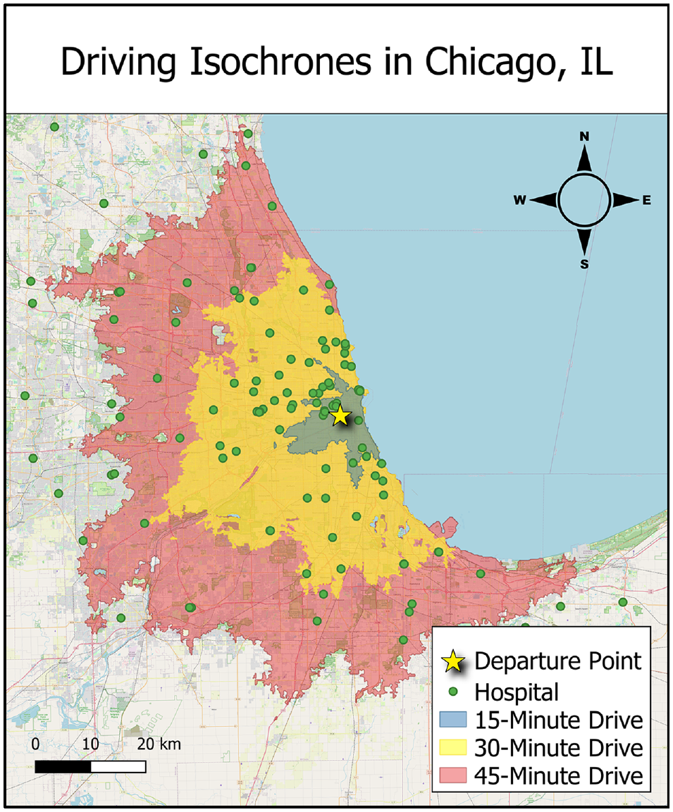
Map of Chicago, IL with driving isochrones of 15, 30, and 45 min and hospital locations starting from city center.
In isochronic measures, all opportunities within a single time-cost band contribute equally to quantifications of accessibility, regardless of possible differences in their cost ( 8 ). The relative inconvenience of farther travel can be mitigated in the implementation of gravity-based measures, also known as potential accessibility measures, in which closer opportunities are considered more valuable than opportunities further away. An example of potential/isochronic accessibility measures is the Accessibility Observatory (University of Minnesota) Access Across America series, in which accessibility to jobs by walking, biking, transit, and auto modes is a calculated weighted average ( 9 ). An example of opportunity cost weighting is the Mobility Energy Productivity (MEP) model from the National Energy Renewable Laboratory, which considers energy consumption in its utility function, along with economic cost and travel time ( 10 ).
Geurs and Ritsema van Eck ( 11 ) describe four components important to the measuring of accessibility. They are the land use, transportation, temporal, and individual components, the first three of which are considered by isochronic measure. The individual component reflects the needs, abilities, and opportunities of individuals. Demographic factors have the potential to influence aggregate accessibility results as needs vary with household characteristics, abilities vary across individual physical conditions, and access to some opportunities can vary with income and level of education.
Cervero ( 12 ) observed that modal choice decisions were significantly influenced by systems of land use and their corresponding opportunity distributions, while the effects of urban design proved to be less influential. Depending on the built environment and infrastructure network, walkability may be impractical, necessitating travel by personal automobile. Areas fitting this description are further described as “car-dependent” by Weng et al. ( 13 ) in their study on neighborhood walkability, with nearly all daily trips relying on a vehicle—contrasted with “highly walkable” areas, where no daily trips require vehicle access.
For a given trip, the individual outcomes of travel time, flexibility, and comfort are dependent on the modal choice made by the traveler ( 14 ). The personal automobile is often the most practical and convenient mode of transportation, especially outside of metropolitan areas where travel distances to necessities are greater and non-auto modal alternatives fewer ( 15 ). However, it is also the most expensive mode of travel based on incurred vehicle fuel and operating costs, and the outcome of cost to the traveler must also be borne in mind. Regions with greater vehicle dependency not only incur higher household transportation costs, but also see increased public spending on transportation (likely for the upkeep of roadway infrastructure), and automobile-related deaths ( 16 ).
Historically, a lack of comprehensive data detailing the extent of the built environment has limited regional comparability for neighborhood walkability ( 17 ). In their analysis, Handy ( 18 ) observed that while neo-traditional neighborhoods made more trips by walking than neighborhoods with auto-centric designs, there was not an observable difference in the rate of vehicle trips between the two. The importance of travel-related attitudes should not be understated. Several authors have acknowledged the possibility that households may “self-select” neighborhoods whose land-use systems are more conducive to their preferred method of travel ( 19 ). This suggests a component of predisposition in household tendencies to travel by a given mode, functioning in tandem with the extent to which a region’s infrastructure permits mobility. Nordlund and Garvill ( 14 ) observe that personal norms as they relate to mode choice within the context of social dilemma presented by the environmental impact of personal car use also influence the mode choice of travelers.
This study quantifies isochronic accessibility metrics for multiple potential destinations for census tracts across the United States, using a newly generated database available for researchers ( 20 ). These measures for accessibility are then compared against community characteristics, including household income and vehicle miles traveled. From an energy use perspective, travel to closer opportunities minimizes vehicle miles traveled, which in turn reduces fuel consumption, particulate and greenhouse gas emissions, and vehicle operational costs. To address social equity, accessibility is also analyzed for communities previously identified as vulnerable communities by the U.S. Center for Disease Control (CDC) ( 21 ). We introduce a method to compare accessibility across all census tracts in the United States. Using this novel approach, we quantify correlations between access to three specific pairs of opportunities and local demographic characteristics. These sample case studies show subtle correlations that can be used to identify underserved communities.
Research Methodology
Argonne National Laboratory has generated isochrones for 72,740 populated census tracts in the United States for different travel modes, including walking, cycling, public transit, and driving, for travel times ranges from 10 to 60 min. These isochrones are generated using an API from TravelTime.com ( 22 ), which bases travel extents on a range of datasets including OpenStreetMap while accounting for area classification, road types, and physical road characteristics. Driving speeds were considered, accounting for both peak and off-peak traffic congestion. The dynamic isochrone can account for land topographies, traffic congestion during peak travel times, and real-time arrival predictions and vehicle positions published by public transit agencies ( 22 ). We find the travel speeds for the walking and cycling modes to be nearly constant at approximately 3 mph and 10 mph along mode-appropriate routes, respectively. For the public transit mode, TravelTime makes use of General Transit Feed Specification (GTFS) data based on scheduled travel; in our analysis, we consider travel at 8:30 on a weekday morning. According to TravelTime, additional time is allotted for entering transit stations and switching platforms. Included in the time budget parameters used in this analysis is a 15 min walking time limit from the origin to the first transit stop and from the final transit stop to the destination. The population centroids for each tract as computed by the U.S. Census Bureau were used as the representative starting points, after an adjustment to link these points to the roadway network ( 23 ).
This analysis uses census tracts as defined after the 2010 Census, as several demographic indicators and estimates of vehicle travel are based on these census tract boundaries. We have identified 40 different destination opportunities, in addition to employment data disaggregated by industry type and payband. The methodology behind data acquisition and processing is described in greater detail in a forthcoming report ( 24 ).
This study utilizes the raw count of these cumulative opportunity metrics, by which regional accessibility is described by the number of opportunities accessible within time-cost bands under the assumption that people will utilize those opportunities nearest them, and that more opportunities represents a greater variety of options from which they can choose ( 25 ). In general, the present study presents accessibility results based on 15 min travel time thresholds. A 15 min threshold was selected rather than longer time thresholds as being a reasonable distance to walk for a healthy individual ( 26 ) and to demarcate a greater distinction across tracts—at higher travel time budgets, local results become more homogenized. For comparison, we present similar analyses at 30 min and 45 min thresholds in the supplemental material available online with this article, as the typical commute in the United States is approximately 30 min ( 27 ). We acknowledge that the difficulty in determining appropriate decay factors for each of the several opportunities considered is not trivial and direct the reader to publicly accessible datasets produced by the Argonne National Laboratory ( 20 ). These datasets provide cumulative opportunity metrics by mode at different time thresholds from 10 to 60 min for 40 different opportunities and employment information at the census tract level.
We focus our analysis in this article on a few subsets of these opportunities. First, we consider a core set of six opportunities critical to physical and mental wellbeing, aligning with the concept of a “15-minute city”: grocery stores, public schools, daycares, primary care doctors, pharmacies, and parks. These data are sourced from publicly accessible data sources ( 28 – 33 ). Five of these six destinations were chosen to reflect the categorical trips-by-purpose of most frequent non-work travel destinations informed by the Federal Highway Administration’s National Household Travel Survey (NHTS) ( 34 ). These opportunities were chosen as representative of the destination categories for trips: School/Daycare/Religious, Medical/Dental services, Shopping/Errands, Social/Recreational, and Meals. Excluded from the analysis are religious opportunities, as they present the complication of understanding individual faiths. Included are parks, which have been shown to improve outcomes across a range of health indicators, including psychological wellbeing and reduced overall mortality ( 35 ). Secondly, to focus on potentially disadvantaged communities, we highlight six other opportunities which can be viewed as the foundation of a social safety net: homeless shelters, women’s shelters for protection from domestic violence, food pantries, libraries, vocational schools, and banks or credit unions ( 36 – 42 ). These destinations offer either temporary support or opportunities for future betterment. Finally, we examine three specific opportunities for demographic anomalies: banks/credit unions, daycares, and women’s health physicians ( 30 , 31 , 41 , 42 ). For all of these datasets, we consider only the presence of the opportunity, and do not consider the opening hours or the perceived quality of the location, because of the difficulty in evaluating the quality and supply of opportunities on a location-by-location basis.
Śleszyński et al. ( 43 ) utilize the population covered by a transportation service area as a basis for efficiency assessment. In this analysis, we adapt this concept to be the population of the area accessible within each isochrone, a quantity we refer to as “population catchment” for the remainder of this paper. Because of the wide range in population densities across the United States and the non-linear distribution across census tracts, we consider population by the percentile ranking of the population catchment. We similarly rank access to each of the above opportunities by census tract within the isochrone boundaries for a given travel time by a given mode, which we refer to as the “opportunity catchment.” We define the “difference from expected rank” (DFER) as the difference in the percentile ranking of the population and opportunity catchments for each census tract. Positive DFER values represent a higher ranking in population catchment than opportunity catchment, or a worse than expected level of access, the opposite being true with negative values. A value of zero would indicate that the tract ranks the same in both opportunity and population catchment or has exactly “expected” access. The census tract resolution of this analysis permits joining the DFER with demographic data to highlight variance in regional accessibility and its relationship to underlying socioeconomic factors. This approach enables analysis of a wide cross-section of communities simultaneously, including both high-density and low-density locations. The DFER is intrinsically a comparative value across locales, so this approach can be taken at the national level (as presented in this paper) or at more local geographies. Because this is not an absolute measure, we are careful not to distinguish if the existing number of opportunities is sufficient or excessive, just that there are more or fewer than would be expected for the population. We acknowledge that one shortcoming of this approach is that the densest urban areas will never have a higher opportunity access than expected, and that the sparsest rural areas will never have lower-than-expected accessibility, which limits the insights possible as a function of population density.
Using 15 variables from the CDC’s Social Vulnerability Index (SVI), we compare access to opportunities across vulnerable populations to highlight groups that could be targeted for support to overcome travel-related impediment in accessing opportunities ( 21 ). Data for the SVI comes from the American Community Survey, 2014 to 2018 (five-year) data and is disaggregated into four “themes”: socioeconomic status; household composition & disability; minority status & language; and housing type & transportation. Tracts in the top 10% in 15 different categories, that is, at the 90th percentile of values, are flagged to indicate high vulnerability.
In this analysis, we present data geospatially, showing the difference between the opportunity density and population density, and descriptively, showing raincloud plots with simple statistical comparisons across terms. Also employed is Student’s t-test, for a comparison of the mean accessibility of vulnerable communities with social vulnerability flags for the United States as a whole.
Results
Access to Opportunities for a “15-Minute City”
The “15-minute city” is an urban planning concept where neighborhoods should have access to a core set of opportunities representing all daily needs by non-auto modes of travel ( 44 ). The concept has variations, such as the “20-minute city” advocated by Da Silva et al. in their case study of accessibility in Tempe, Arizona ( 45 ). We have expanded our analysis to include the driving mode to develop insight into the differences in travel behavior between regions within 15 min thresholds across auto and non-auto modes.
We identify census tracts that have access to six key opportunities (grocery stores, public schools, childcare centers, primary care doctors, pharmacies, and parks) within a 15 min time threshold of travel by three modes (walk, public transit, and driving, including both peak and off-peak traffic). Figure 2 shows two county-level maps of the United States, showing the number of easily “walkable” or “drivable” tracts. The saturation of the color scale represents the fraction of census tracts in a given county that have access to all six opportunities within a 15 min walk or drive (maps at a 30 min threshold are presented in the supplemental material online). Comparing the graphics, we see that access to the driving mode greatly increases opportunities. We note that walkability presumes a level of physical human mobility that is not applicable to everyone, as environmental barriers can restrict the participation in activity of people with disabilities ( 46 ). We also note that specific walking patterns are dependent on the built environment, but that the modeled walkability is not constrained to sidewalks or other pedestrian-friendly infrastructure. Many rural tracts in the Western Great Plains and Rocky Mountain states show a comparatively large fraction of tracts which are deemed walkable; we attribute this to the presence of small urban clusters with centralized opportunities, along with the comparatively few tracts in total within the county.
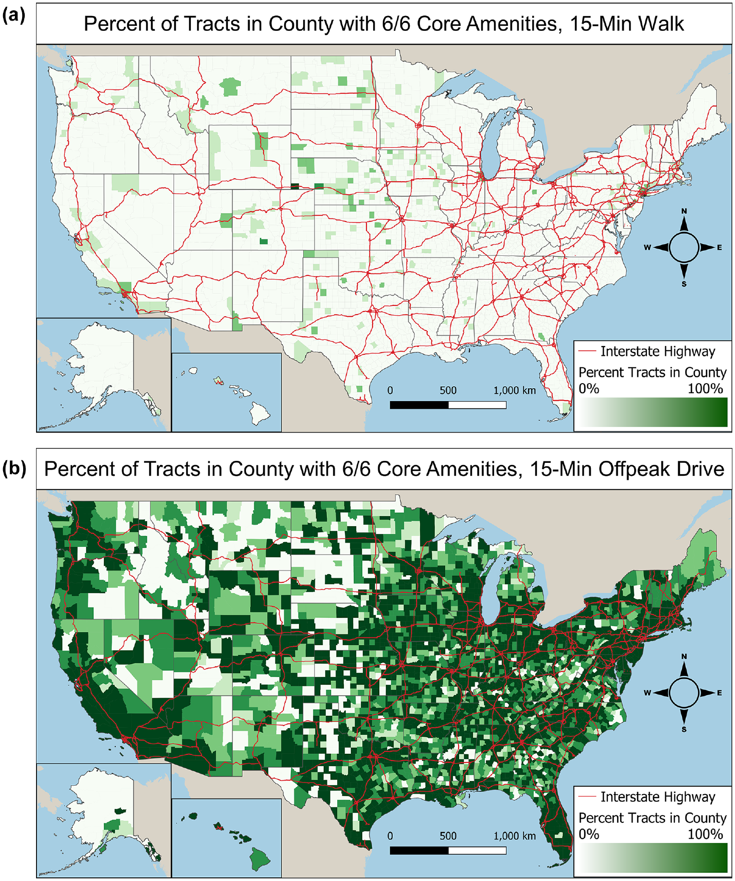
Percentage of tracts in county with access to core opportunities within 15 min by (a) walking and (b) driving modes. Counties that are darker green have a greater percentage of tracts with access to six of the key opportunities within a 15 min time threshold of travel by a given mode.
We are interested in the distribution of opportunities available by census tract for different transportation modes. Table 1 counts how many of the six amenities listed above are present within a 15 min isochrone (data for 30 and 45 min isochrones is presented in the supplemental information). A 15 min walk provided access to an average of half of the six key opportunities by type for the census tracts in this analysis, while the vast majority of tracts have all six amenities accessible by driving. Using public transit has a modest increase (2%) in the average accessibility relative to walking. This similarity arises in part because our analysis presumes that a traveler will walk up to 15 min as part of their transit journey, and so may choose to forego transit in favor of a direct walk. Driving at peak traffic times reduces accessibility by about 2% as well.
Tract Counts for Number of Core Amenities Accessible Within 15 Min of Travel by Mode
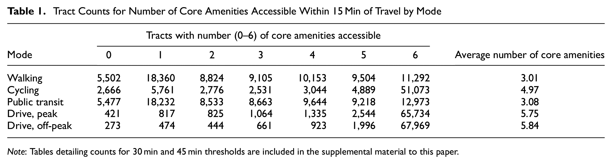
Note: Tables detailing counts for 30 min and 45 min thresholds are included in the supplemental material to this paper.
Table 2 shows the number of opportunities available by walking for communities that the CDC flagged as being in the top 10% of census tracts for each of the 15 SVI groups. The three flag categories with the highest average are those for households without vehicles (5.16), with limited English language skills (4.63), and with multi-unit housing structures (4.59). We note that many of these categories are correlated with population density, and that amenity access is strongly correlated with population density as well. Examining the average for tracts with social vulnerability flags by comparing Tables 1 and 2, we observe that all but three of the flag categories maintain above-average access to the key opportunities. The three flag categories with below-average access to key opportunities are those for populations aged 65 or older, those with disabilities, and mobile homes.
Number of “15-Minute City” Opportunities Accessible by Walking in Populations With Social Vulnerability Flags
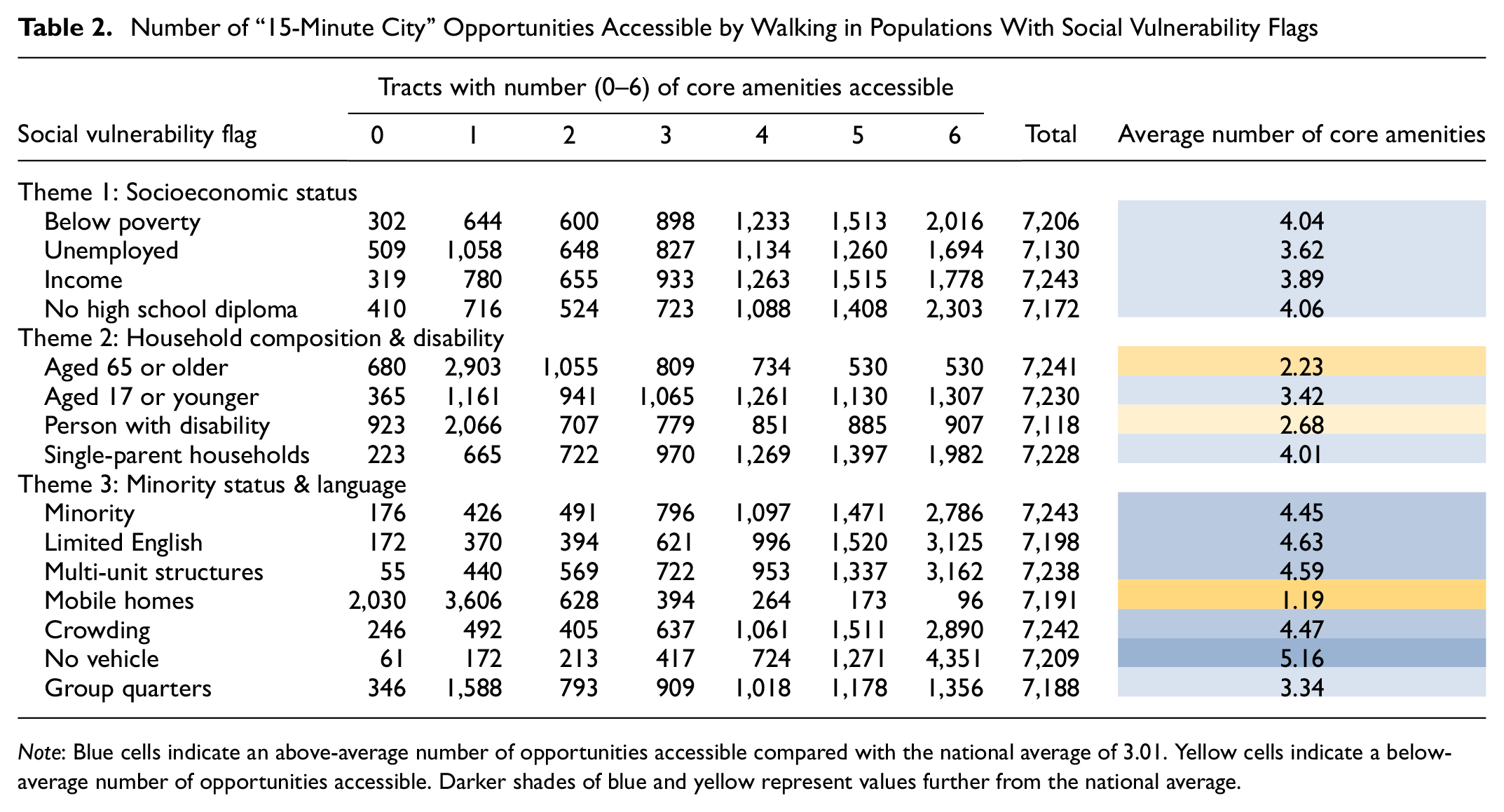
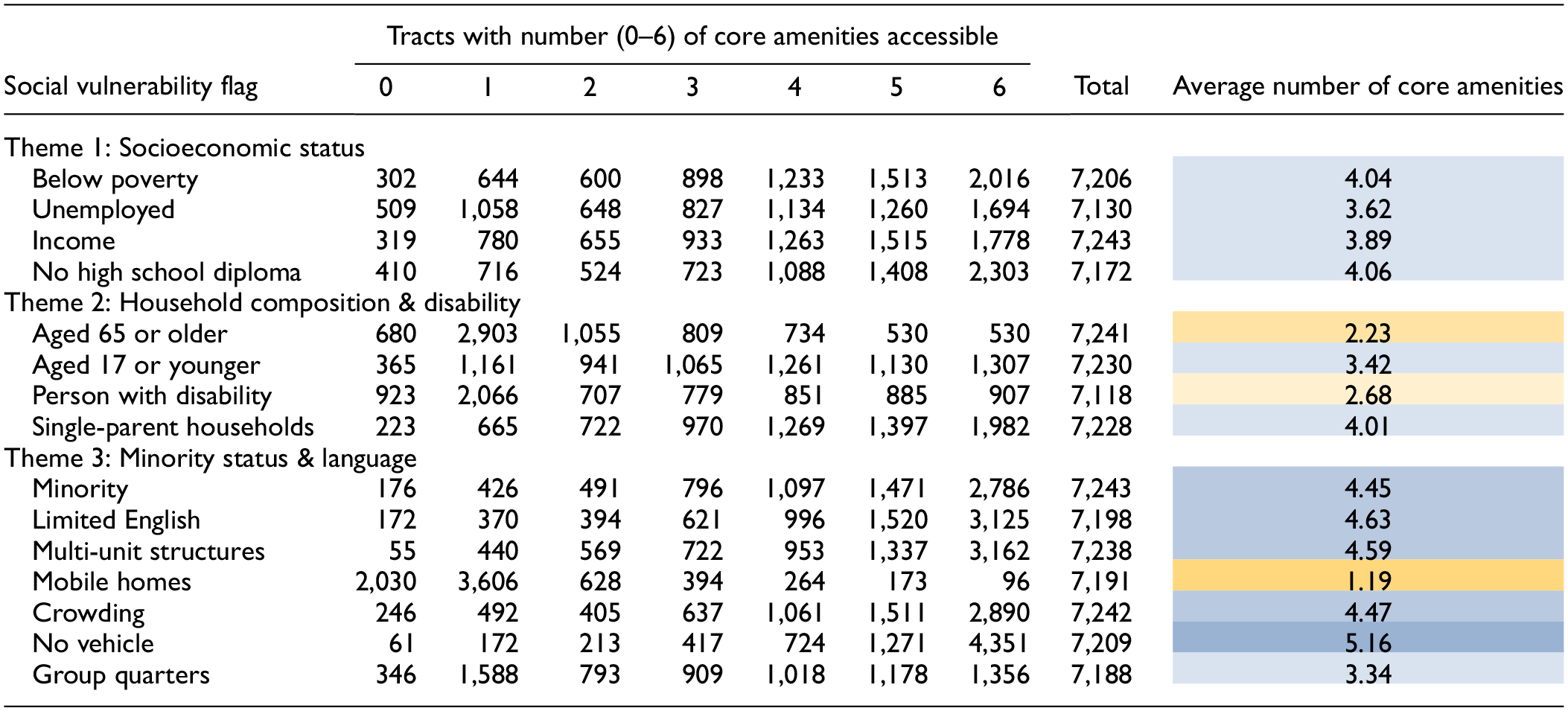
Note: Blue cells indicate an above-average number of opportunities accessible compared with the national average of 3.01. Yellow cells indicate a below-average number of opportunities accessible. Darker shades of blue and yellow represent values further from the national average.
Figure 3 compares the two housing-related SVI flags—mobile homes and multi-unit dwellings—where each dataset is for the 10% of census tracts with the highest share of these housing units. The data are represented in raincloud plots ( 47 ), where each grouping shows a population distribution of census tracts with a fixed number of available amenities, denoted in a different color, as shown on the horizontal axis. The vertical axis represents the total share of the population in each of these housing units for each tract. These two indicators of potential social vulnerability show opposing trends. Tracts with a high fraction of mobile homes have access to an average of 1.19 out of six core opportunities, while tracts in the 90th percentile multi-unit structures have access to an average of 4.59 out of six, compared with the national average of 3.01.
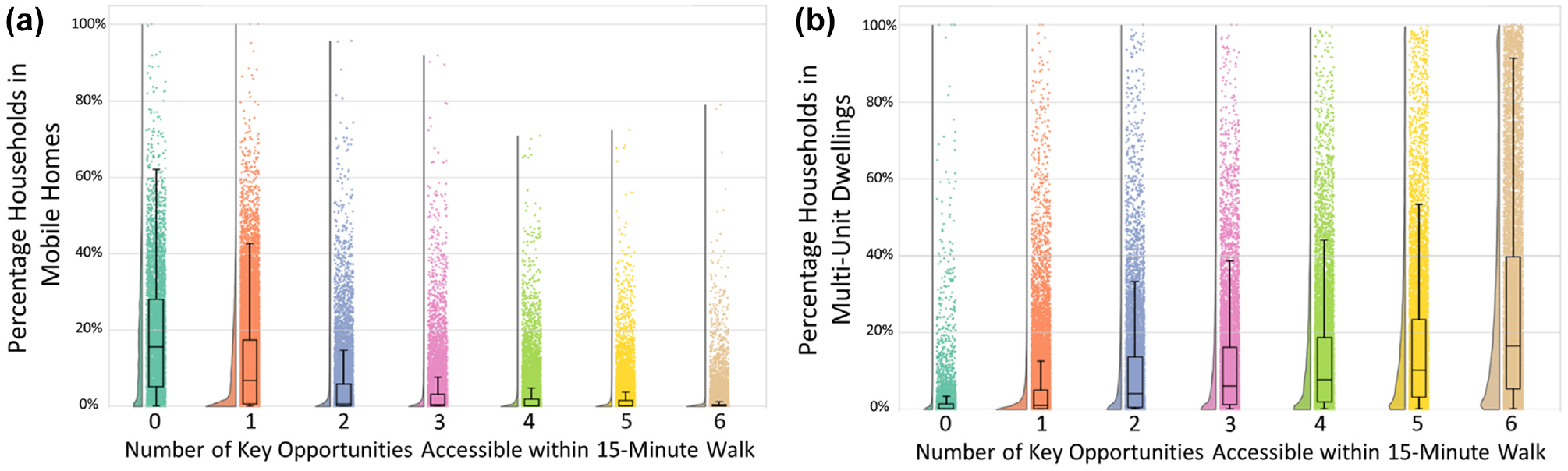
Distributions of census tracts by (a) mobile home share and (b) multi-unit dwelling share, binned by number of accessible amenities.
Correlations of Tract Walkability and Vehicle Ownership/Usage
We considered how vehicle miles traveled (VMT) may be affected by access to opportunities. This study identifies an observed decrease in household vehicle ownership in walkable tracts, as well as a decrease in VMT and vehicle trips per day by vehicle-owning households in the same tracts. Data on household annual VMT comes from machine learning projections made by the Argonne National Laboratory, which incorporate both demographic characteristics and geographic factors ( 48 ). Here we consider the walking mode for quantification of walkability, however, there is a very strong correlation between the walking and transit modes, as shown in Table 1. We exclude cycling because of lack of confidence in the underlying isochrone, as the calculated area does not appear to consider traffic or avoidance of roadways with high traffic stress ( 49 ).
As the number of key opportunities accessible from the tract population center by a 15 min walk increases, the average VMT and percentage of vehicle-owning households decreases. Figure 4 shows raincloud plots for average household VMT and for the share of households with vehicles for all census tracts nationwide. The data in Figure 4a shows the average estimated VMT of the households in that census tract that own vehicles. Average household VMT for those households that own vehicles decreases from nearly 15,000 miles per year for tracts with zero out of six of the “15-minute city” opportunities accessible within a 15 min walk to just over 10,000 miles per year for tracts with six-out-of-six of the opportunities chosen for this study. Figure 4b shows how the fraction of households with vehicles changes as a function of the number of accessible opportunities. Vehicle ownership also decreases in more walkable tracts, with an average of 93% of households owning vehicles in tracts with zero out of six of the “15-minute city” opportunities accessible within a 15 min walk, to 77% in tracts with six-out-of-six opportunities. Similar data is shown in the supplemental information for 15 min driving opportunities, which show no clear pattern in VMT or vehicle ownership, though 93% of tracts fall into the highest access bin.
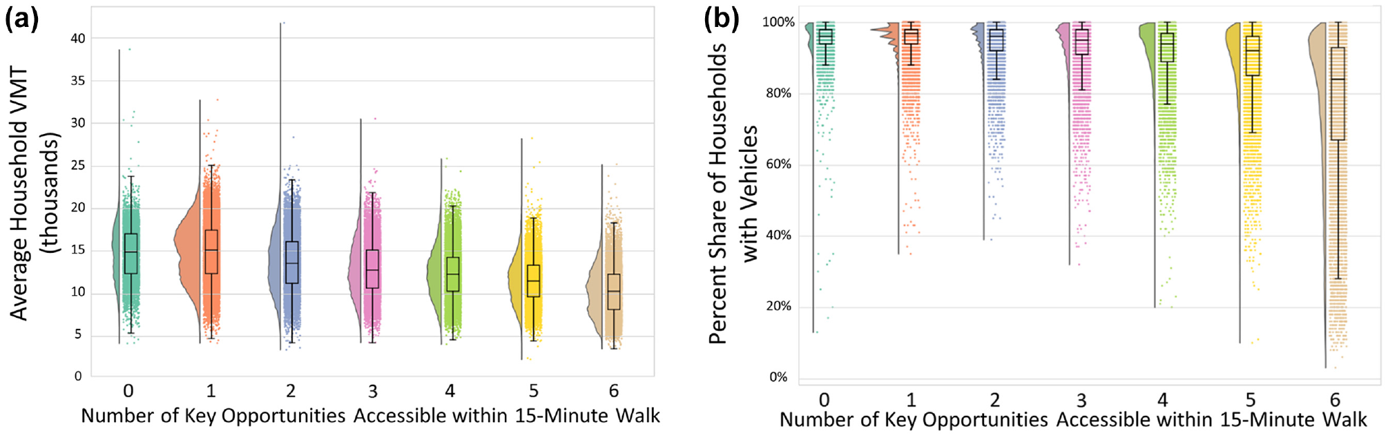
Distributions of census tracts by (a) average household vehicle miles traveled (VMT) and (b) by the fraction of households with vehicles, binned by the number of core amenities accessible within a 15 min walk.
Household trip information comes from LATCH ( 50 ), which is derived from the 2017 NHTS as in Zhou et al. ( 48 ). Estimated household vehicle trips per day similarly decrease from an average of 5.24 for tracts with zero “15-minute city” opportunities accessible by walking, to 3.94 for tracts with all six opportunities accessible, for a decrease of more than one entire vehicle trip per day. No tracts were observed to take fewer than one vehicle trip per day unless they had access to at least five of the six opportunities within a 15 min walk.
Access to Social Safety Net Opportunities
We identify tracts with access to six social safety net destinations (homeless shelters, women’s shelters, food pantries, libraries, vocational schools, and banks or credit unions) within a 15 min trip by several modes (data for 30 min and 45 min isochrones is presented in the supplemental materials). We compare access to safety net destinations across vulnerable populations to highlight groups that could be targeted for support to overcome travel-related impediments and ensure their inclusion in public aid programs. Table 3 shows similar information to Table 1 for this set of six amenities. The data show that a majority of tracts cannot reach any of these social amenities by walking, with an average of 0.8 accessible amenities. To compare, we find an average of 4.5 accessible safety net amenities within a 15 min drive.
Tract Counts for Number of Safety Net Opportunities Accessible Within 15 Min of Travel by Mode
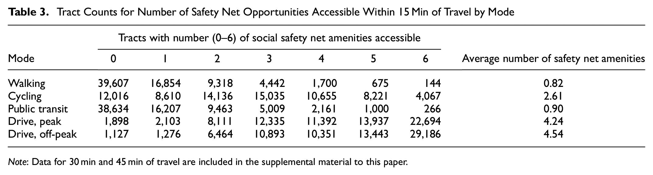
Note: Data for 30 min and 45 min of travel are included in the supplemental material to this paper.
While 40.1% of the 72,740 tracts have access to six-out-of-six safety net opportunities by a 15 min drive during off-peak traffic, they are mostly situated in urban areas and regions adjacent to the nation’s Interstate highway system. The percentage of tracts with access to the same opportunities by a 15 min walk drops precipitously to just over 0.1%. As an example, Figure 5 shows tracts in Illinois shaded by the number of safety net amenities accessible within a 15 min drive. Urban areas such as the Chicago area in the northeastern corner of the state have the greatest access to these amenities when driving. Other areas with higher access include small and midsize cities and college towns throughout the state. The analysis suggests that public aid programs risk excluding groups they are intended to help, especially rural populations and those without access to vehicles.
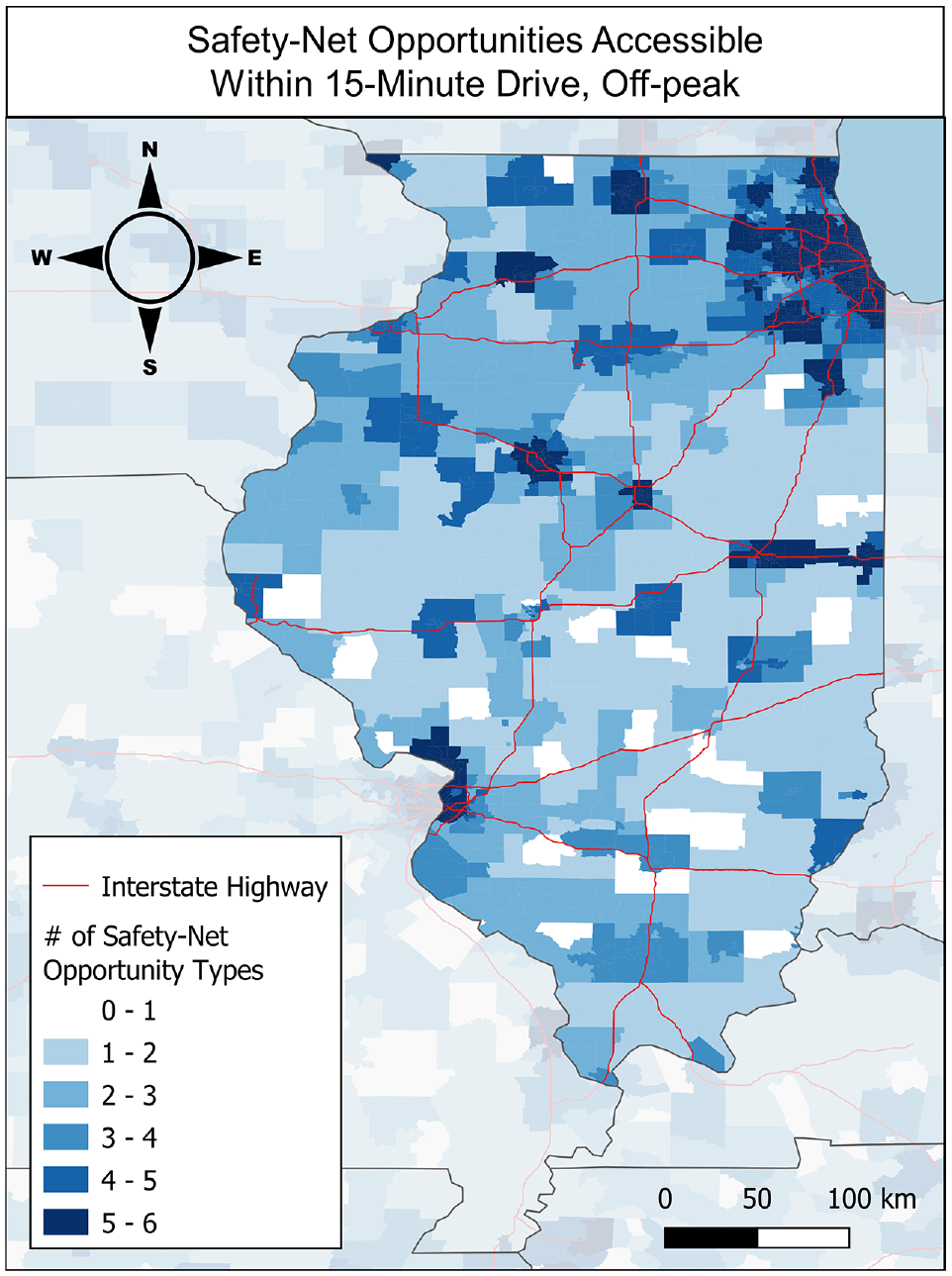
Number of safety net opportunities accessible by a 15 min drive during off-peak traffic per census tract in Illinois. The spatial distribution of tracts with more safety net opportunities accessible largely tracks with population density and the nation’s Interstate highway system.
Figure 6 shows a raincloud plot showing the distribution of the average per-capita income in each census tract, binned by the number of accessible amenities within a 15 min drive. In this case, there is little distinction between the populations by way of income, and median incomes do not notably shift across locales with access to more safety net opportunities.
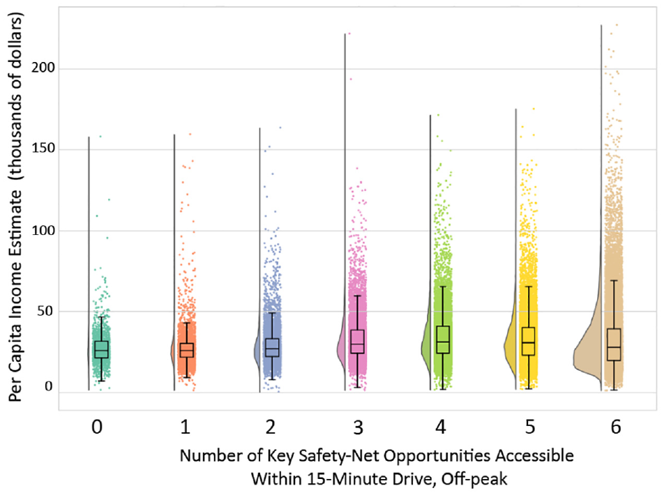
Relationship of per-capita income and number of social safety net opportunities accessible within a 15 min drive during off-peak traffic.
Example Application: Demographic Comparison of Specific Amenities
Access to Banking for Minorities and Limited English Communities
Figure 7 shows a map of the United States with the fraction of households that are minorities who speak English less than well, with darker shades of red indicating a higher percentile rank. These communities are most prevalent in the Southwest and the Southeast. For comparison, Figure 8 shows a map of the United States, showing the DFER for banks and credit unions based on 15 min driving isochrones. Tracts shaded in red have a positive DFER, indicating relatively fewer banks and credit unions accessible than would be expected by the population accessible, while those in blue (negative DFER) have more. There is a lack of banking opportunities relative to the expected value in similar locations. The Federal Deposit Insurance Corporation (FDIC) notes that patterns of banking behavior are trackable across populations. Black, Hispanic, and American Indian or Alaska Native households as well as low-income and volatile income households were more likely to rely on the financial services of bill payment, money order, and check cashing. Other observed patterns included a decreased likelihood of the same populations utilizing bank credit ( 51 ).
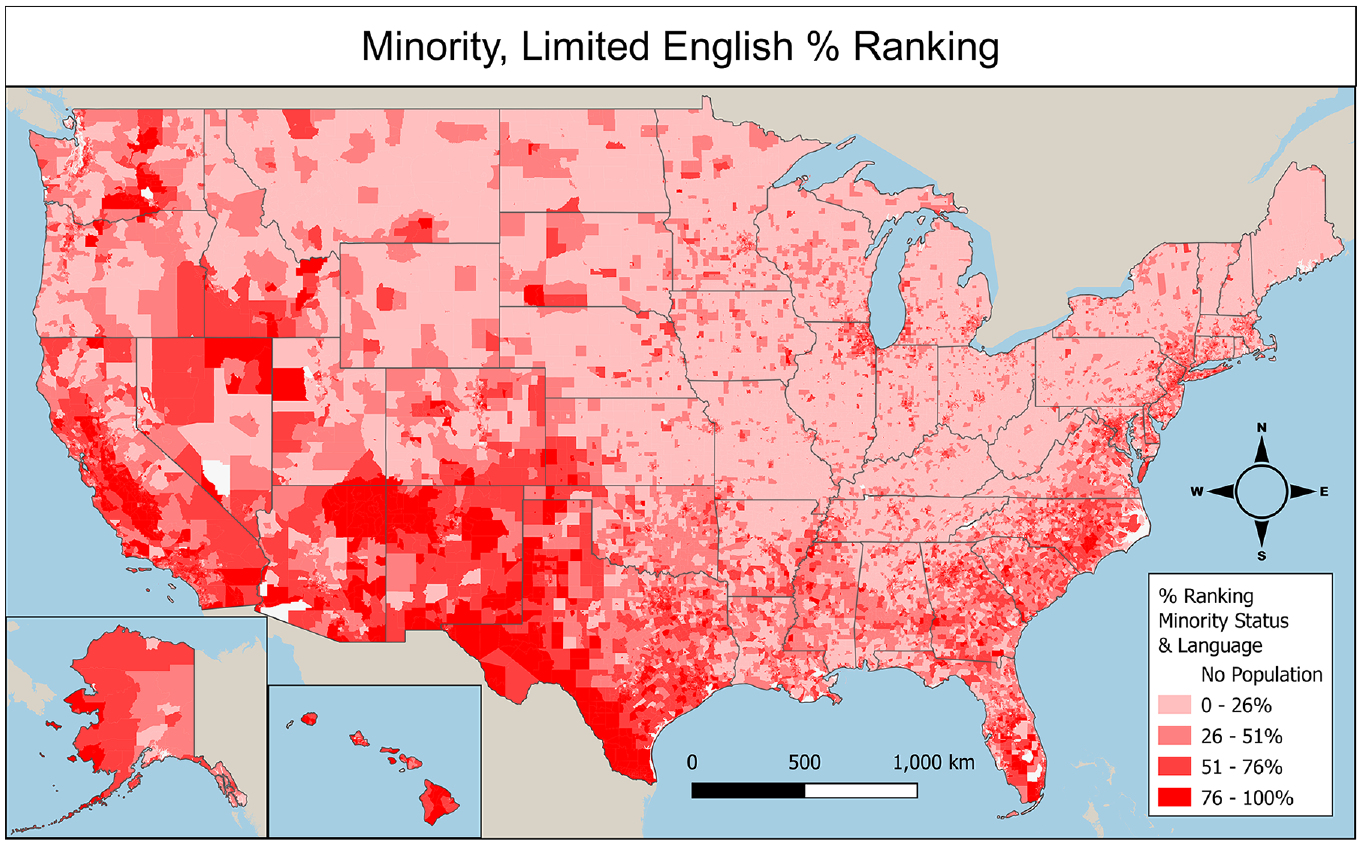
Census tract percentile ranking in U.S. Center for Disease Control (CDC) Social Vulnerability Index for Minority Status and Limited English.
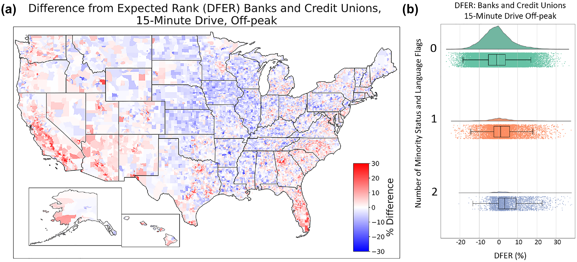
(a) Difference from expected rank (DFER) map comparing population and amenity catchments for banks and credit unions, 15 min off-peak drive. (b) DFER for banks and credit unions by the number of Social Vulnerability Index (SVI) flags for minority status and language. The vertical axis is the number of SVI flags (zero, one, or two flags), while the horizontal axis is the DFER in percentage. As the number of census tract flags for minority and limited English-speaking populations increases, the DFER also increases, indicating worse than expected access to banking opportunities by populations with a greater number of minority status and language SVI flags.
In addition to the spatial analysis, Figure 8b shows the DFER for banks and credit unions disaggregated by SVI flags for limited English and minority populations. Tracts with one flag have observed worse than expected access to banks and credit unions. We note that communities with either of the two flags show similar behavior for this DFER. The difference is even greater for census tracts with two flags, with an approximately 3% difference in the population and amenity catchment ranks. For all communities with and without flags for limited English and minority populations, a Student’s T-test returned a p-value of 0.00, less than a significance level of 0.05, indicating a statistically significant different distribution across populations. In contrast, Table 2 shows that these two populations have above-average expected access to most core amenities within a 15 min walk. This implies that the shortfall of banks and credit unions is likely not solely a result of population density.
Single-Parent Families’ Access to Childcare Centers
The Center for American Progress (CAP) has tracked “childcare deserts” since 2016, re-defining their criteria for the definition in 2017 as a census tract with at least 50 children, and either no childcare center or a ratio of three or more children under the age of five vying for every available childcare slot ( 52 ). Widener suggests a move away from the binary simplification of regions as opportunity “desert” and “non-desert,” but instead to incorporate the spatial definition into one more comprehensive that includes factors like cultural appropriateness and temporal availability ( 53 ).
Figure 9 shows the availability of childcare centers, also known as daycares, relative to the overall population. Tracts shaded in red have relatively fewer childcare centers accessible than would be expected by the population accessible, while those in blue have more. Access to childcare appears to follow state boundaries in many cases. The State of Vermont, with its blue color on the map indicating better-than-expected access to childcare centers, is the state with the most childcare centers per person, with one for every 999 people. Idaho, Utah, and Nevada suffer worse than expected access to daycare compared with other states. Michigan, Ohio, Indiana, Illinois, and West Virginia also exhibit lower access to daycares than their immediate neighbors. This apparent dearth in childcare is observed by CAP in its 2018 report on childcare deserts, noting that childcare deserts were prevalent in 75% of Utah neighborhoods as compared with just 23% of Maine neighborhoods ( 52 ).
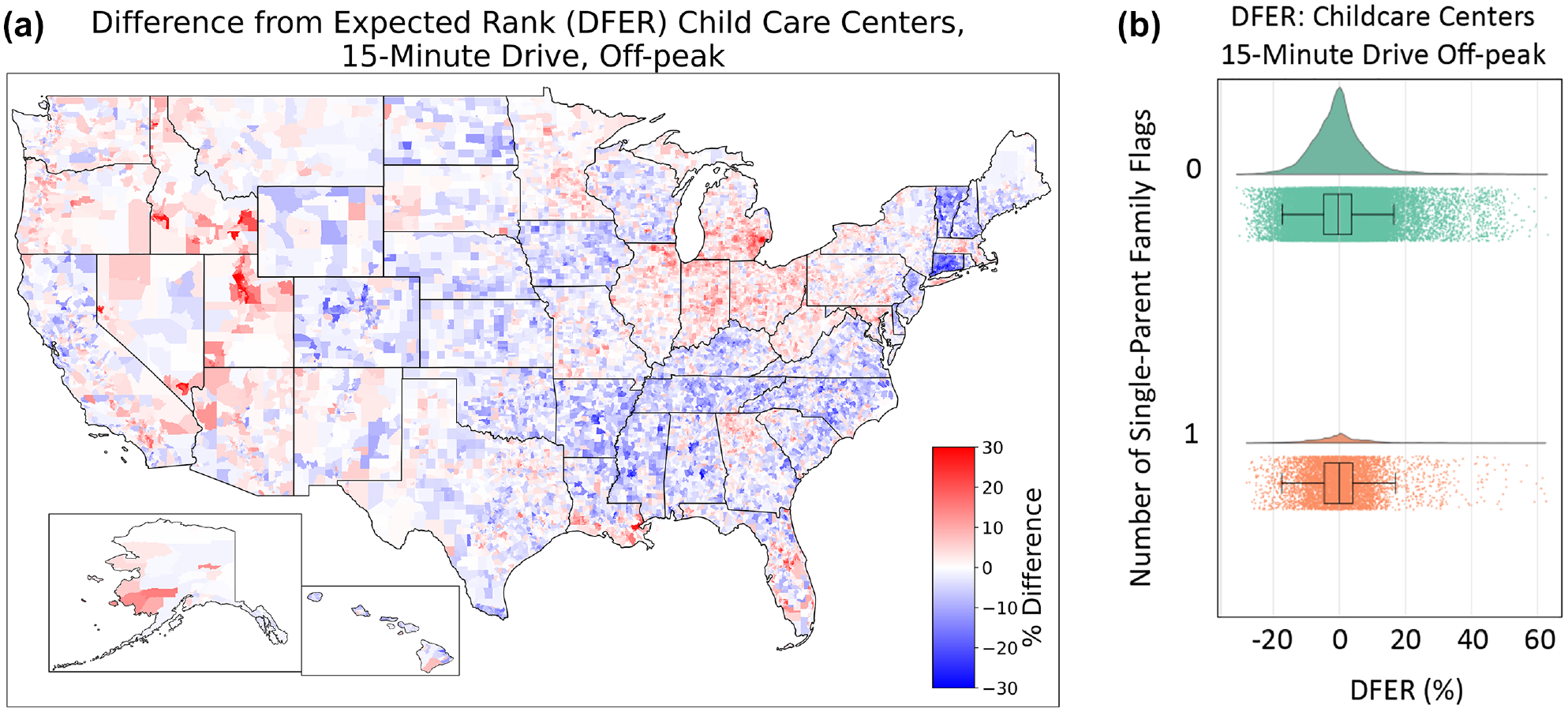
(a) Difference from expected rank (DFER) map comparing population and amenity catchments for childcare centers, 15 min off-peak drive. (b) Raincloud plot of accessibility to childcare centers, binned by the fraction of single-parent families in the census tract.
Part of the differences by state may be the result of regulations. Childcare regulations are determined by each state ( 54 ). Hotz and Xiao ( 55 ) have noted that the supply and quality of care are both affected by state regulations, with reduced number of childcare centers in locations with more stringent regulations, though these were also determined to be higher quality on net evaluation. Data for childcare centers comes from HIFLD (Homeland Infrastructure Foundation-Level Data) and includes only center-based locations as acquired from state databases and their open-source websites. This study acknowledges that the inclusion of group, home, and family-based childcare locations may present as more comprehensive, but is outside of the scope of this study. However, part of the cause may also be cultural: Utah, Idaho, and Nevada are among the states with the highest fraction of Mormon households, who tend historically to rely on family networks to provide childcare ( 56 ).
One demographic with a disproportionate need for childcare is single-parent households. In single-parent families, dependency on childcare exceeds that of two-parent families. According to the U.S. Department of Education’s National Center for Education Statistics ( 57 ), 65% of children in single-parent families were in weekly childcare in 2019, compared with 58% from two-parent families. Children from single-parent families spent four more hours per week in childcare than children from two-parent families (34 versus 30 hours per week), and a higher percentage of children in single-parent families had multiple types of childcare (e.g., care from a relative and from a daycare center) than did children from two-parent families (26% versus 17%).
Figure 9b considers the potentially greater need for childcare in neighborhoods with a large proportion of single-parent households. We calculate DFER for each census tract, separating census tracts in the top 10% for fraction of single-parent households. We find that single-parent households are not a significant predictor for the availability of childcare when quantified by census tract level averages. For communities with and without SVI flags for single-parent family population, shown in Table 2, a Student’s T-test returned a p-value of 0.326, greater than a significance level of 0.05, indicating that there is no statistically significant difference between the distribution across populations. The analysis suggests that single-parent families do not necessarily experience diminished access to childcare. We note that the characteristic remains an important indicator of need, and should be incorporated in assessing the equity of childcare center accessibility.
Access to Women’s Healthcare for Black and African American Women
Present-day health disadvantages of non-Hispanic Black women, especially related to the accessibility of gynecology, originate in Black enslavement. Chinn et al., in the Journal of Women’s Health, described the historical context of diminished access to women’s health care opportunities experienced by Black women as one in which little or no self-agency was given to women who were forced to procreate as a means for slave-owners’ economic gain ( 58 ). Racial inequities in the accessibility of women’s healthcare resources persist, as do disparities in the health outcomes of non-Hispanic Black women. The American Journal of Public Health observes that the maternal mortality rate for non-Hispanic Black women was 3.55 times that of the rate for non-Hispanic white women ( 59 ). In scenarios of policy change related to abortion, Black women suffer disproportionately as compared with all women. According to a study from the CU Population Center at the University of Colorado Boulder, a nationwide abortion ban would result in an increase in pregnancy-related deaths for all women by 21%, and a 33% increase among Black women as compared with 2017 rates of mortality ( 60 ). Understanding the spatial distribution of women’s health care resources and the experienced access of Black women to these opportunities is an important component of addressing the racial inequities in maternal health outcomes.
Data for women’s health care comes from the American Medical Association (AMA) Workforce Mapper. Women’s health resources (obstetrics, gynecology, and maternal and fetal medicine) for both physicians and nurse practitioners in the relevant fields are included, for a total of 73,020 specialists nationwide, with locations mapped at the census tract level ( 31 ). For each census tract, we find the percentage of the population of Black or African American women of approximate childbearing age (between the ages of 15–54 years) using data from the American Community Survey ( 61 ). Following the methodology for identifying vulnerable communities from the SVI, we flag the 10% of census tracts with the highest fraction of Black women of approximate childbearing age. Figure 10a shows the availability of women’s health resources relative to overall population. Tracts shaded in red have relatively fewer women’s health centers accessible than would be expected by the population accessible, while those in blue have more. Figure 10b shows a raincloud plot that separates those census tracts in the top 10%.
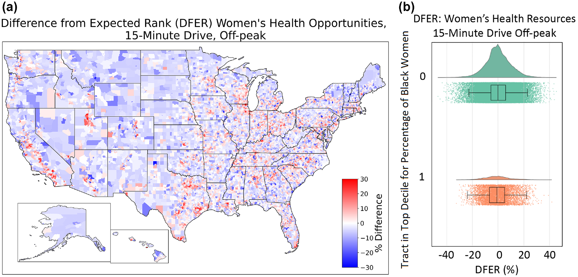
(a) Difference from expected rank (DFER) map comparing population and amenity catchments for women’s health resources, 15 min off-peak drive. (b) Raincloud plot of accessibility to women’s health resources, binned by the fraction of Black women in the census tract.
The absolute magnitude of the difference between the two demographic groups is small but statistically significant for both driving and walking modes. For the DFER for walking in both communities with and without flags for tracts in the 90th percentile of Black women of approximate childbearing age, a Student’s T-test returned a p-value of 0.00, less than a significance level of 0.05, indicating the different distribution across populations, and an associated diminished access to women’s healthcare resources shared by Black women. Interestingly, the opposite findings hold for the driving mode, where communities of Black and African American women have slightly better access than would be expected by population density alone. This may indicate access which is adequate in rural communities but lacking in urban locations.
Summary of Accessibility Results
This study utilized cumulative opportunity metrics derived from isochronic accessibility measure to assess the level of access of census tracts to six key opportunities within 15 min of travel by several modes, and observed notable decreases in VMT and vehicle ownership in tracts that were comparatively more walkable. Only tracts with access to at least five of the six core opportunities within a 15 min walk were observed to take fewer than one vehicle trip per day. The analysis identified access to these six opportunities within 15 min of travel was diminished for census tracts with many persons with disabilities, elderly populations, and populations residing in mobile homes. Nationwide, an average of 3.01 out of six of the key opportunities were accessible within a 15 min walk from the population centers of 72,740 census tracts. This average fell to 2.68, 2.23, and 1.19 opportunities for persons with disabilities, elderly populations, and populations residing in mobile homes, respectively. Accessibility to social safety net opportunities was also diminished for these populations, as the spatial distribution of these opportunities largely tracks with urban cores and the nation’s Interstate roadway network.
Narrowing the scope of analysis to individual amenities, we examine access to the specific opportunities of banks and credit unions, childcare centers, and women’s healthcare resources by populations predisposed to social vulnerability. Access of minority and limited English speaking populations to banks and credit unions is diminished as compared with nationwide levels of access to the same opportunity and is statistically significant. Similarly, Black women experience diminished access to women’s healthcare resources as compared with nationwide levels of access to the same opportunities. The same statistical significance was not observed in the accessibility of single-parent families to childcare centers; however, the study acknowledges this subgroup as being especially susceptible to disproportionate need for access to childcare centers.
Conclusion
The study considers access to specific destinations as a determinant of need for assessing accessibility through a lens of social equity. This analysis works to identify vulnerable populations. For example, access to safety net opportunities is lacking in rural regions far from urban cores. On the other hand, walkable urban locations have nominal access to opportunities, but tend to have fewer vehicles to access more distributed amenities. Likewise, spatial and quantitative analysis show that some places lack key opportunities critical for robust community development. For instance, this data demonstrates that some locales may be under supplied with banks because of lack of nearby government-insured banks and credit unions, especially among Hispanic communities in the Southwest.
Effective action to improve equity requires satisfactory metrics to measure existing inequity. Our development of the DFER metric is useful because it allows for both nationwide and local comparisons across wide ranges of population density. This analysis provides data to help identify locations in potential need of geographically-targeted aid programs.
While the DFER presented here uses an independent variable based on population density, it could be adapted to individual case studies with the addition of more focused demographic data to align with the expected need of the amenity. For example, rather than quantifying ranks with the total population, the estimated number of school-age children could be used when considering the relative availability of educational and childcare opportunities. There is need for further study on inequitable accessibilities. The DFER metric and the techniques and data presented here can be of use to other researchers to identify and remediate injustice effectively.
Supplemental Material
sj-pdf-1-trr-10.1177_03611981231168861 – Supplemental material for Incorporating Social Vulnerability Variables in Measures to Quantify Access to Opportunities
Supplemental material, sj-pdf-1-trr-10.1177_03611981231168861 for Incorporating Social Vulnerability Variables in Measures to Quantify Access to Opportunities by Michael Sansone, David Gohlke and Yan Zhou in Transportation Research Record
Footnotes
Author Contributions
The authors confirm contribution to the paper as follows: study conception and design: D. Gohlke, Y. Zhou; data collection: M. Sansone, D. Gohlke; analysis and interpretation of results: M. Sansone, D. Gohlke, Y. Zhou; draft manuscript preparation: M. Sansone, D. Gohlke. All authors reviewed the results and approved the final version of the manuscript.
Declaration of Conflicting Interests
The author(s) declared no potential conflicts of interest with respect to the research, authorship, and/or publication of this article.
Funding
The author(s) disclosed receipt of the following financial support for the research, authorship, and/or publication of this article: This research was supported by the U.S. Department of Energy, Office of Energy Efficiency and Renewable Energy, Strategic Analysis Team.
Supplemental Material
Supplemental material for this paper is available online.
References
Supplementary Material
Please find the following supplemental material available below.
For Open Access articles published under a Creative Commons License, all supplemental material carries the same license as the article it is associated with.
For non-Open Access articles published, all supplemental material carries a non-exclusive license, and permission requests for re-use of supplemental material or any part of supplemental material shall be sent directly to the copyright owner as specified in the copyright notice associated with the article.