
Abstract
Environmental visualizations can improve the publics’ understanding of spatial information and enhance dialogue during community engagement. By interviewing and surveying planning and design professionals, this study examines motivations for using environmental visualizations in community engagement. Professionals recognize the communicative benefits of environmental visualizations, but also acknowledge that they are sometimes used to constrain public debate by enhancing project imagibility. This article contributes to a critical assessment of the ethical use of environmental visualization by exploring techniques and practices that can create misinformation within community engagement. Overall findings contribute to a clearer understanding of environmental visualizations as a form of design marketing.
Introduction
Seeking to engage her community, the contemporary planner has access to an enviable suite of techniques and technologies. This spectrum includes conventional modes of engagement like a town hall–style forum, where posters might convey information to a gathering of community members, but also a rapidly expanding suite of unconventional strategies like gamification, where a smartphone app might borrow the reward system of a popular board game to incentivize digital participation (Gordon and Baldwin-Philippi 2014; Tobias, Buser, and Buchecker 2016). Specific examples of engagement strategies like these will inevitably vary in terms of the media they use, the goals they hold, and the relationship that they promote between planner and public. However, one important consideration that spans the continuum of engagement techniques and technologies is whether a chosen strategy can help a diverse group of experts and nonexperts envision a common future for their community, neighborhood, or a valued public space.
For much of the planning profession’s history, planners have utilized environmental visualizations to address the challenge of creating shared visions of the future (Bosselmann 1984). Broadly speaking, this has meant first creating visual representations that depict potential future characteristics of a landscape, and then using these representations to promote dialogue about this possible future. While the state of the art in environmental visualization once involved capturing a video of a large physical model using a gantry system and a ground level video camera (Bosselmann 1984), the technique has been dramatically transformed by the advancement of computer hardware and software (Sheppard 2001; Lewis, Cassello, and Groulx 2012).
Among the range of contemporary environmental visualization techniques, powerful off-the-shelf software packages like AutoDesk’s 3DS Max now allow planners to create and present a seemingly limitless range of possible futures in highly realistic digital three-dimensional (3D) environments. The combination of digital software and 3D modeling is only one approach to creating environmental visualizations, but it is an option that we focus on here given its growth in popularity, which has been spurred by the proliferation of low-cost software packages like Trimble (formerly Google) SketchUp.
From a community engagement standpoint, creating environmental visualizations is hardly a good use of time if there is no way to share these creations with an audience. The potential to enhance engagement through this visual medium has therefore also benefited greatly from the expansion of communication channels that facilitate the display and exchange of environmental visualizations. To this end, expensive and cumbersome theatre and CAVE-based display technologies are rapidly being eclipsed by highly portable and interactive technologies that utilize smartphones and tablets to display traditional images and videos, or immerse viewers in a virtual or augmented environment. Rather than requiring the public to come to a fixed and pre-defined location, these new distributed visualization systems allow members of the public to connect with the planning process where and when they want, and in an immersive format that more closely mimics their day-to-day experience of the landscape (Gill and Lange 2015).
Technological advancement has unquestionably increased the accessibility and sophistication of environmental visualization as a public participation tool. Focusing on individual information processing and decision making, research also suggests that increased use of environmental visualizations has the potential to facilitate a greater understanding of complex spatial information among the public (Gill and Lange 2015; Tobias, Buser, and Buchecker 2016). Whether or not this technological advancement supports other central purposes of engaging a community, such as building trust, tapping into local knowledge, or enabling greater democracy in local decision making, is less clear. Drawing on Sheppard’s (2001) notion of visualization bias and MacFarlane et al.’s (2005) discussion of visualization preparers’ positionality, recent research has sought to examine whether and how environmental visualizations might shape communicative outcomes. Rather than focusing on the cognitive benefits of visual information, this work examines potential influences of the technology on the participatory process itself. Numerous studies illustrate a range of positive outcomes, including increased dialogue, more effective consensus building, and greater public support for proposed actions to address environmental issues (Lange and Hehl-Lange 2005; Schroth, Pond, and Sheppard 2015). However, findings also suggest that visualizations can contain ad hoc aesthetic decisions made by preparers (e.g., lighting choices), and show that such choices can impact whether viewers judge a project to be desirable for their community (Wergles and Muhar 2009; Lewis 2012). Recognizing that the communicative capacity of environmental visualizations depends very much on how they are created and deployed, we explored how misinformation finds its way into visualizations used in public participation by asking:
What motivations do practicing planners and designers have for using environmental visualizations in community engagement processes?
Do practicing planners and designers recognize any identifiable environmental visualization practices that are used to unduly enhance public preference for projects, and if so what are these practices?
The following section of our paper reviews the communicative benefits and limitations of environmental visualizations in more detail. The article then presents methods and results from a study that surveyed and interviewed Canadian planning and design professionals to explore why visualizations are used in community engagement, whether misinformation is sometimes intentionally part of the environmental visualization process, and why such misinformation might be employed.
Literature Review
The Communicative Benefits of Environmental Visualizations
The term environmental visualization refers to an extensive range of visual media. Traditional pen-and-paper sketches, hand-drawn or computer-aided plans, expert-created GIS maps, co-created PPGIS maps, and physical models are all forms of environmental visualization (Gill and Lange 2015; Sieber 2006; Slotterback 2011; Wissen-Hayek 2011). While recognizing this diversity, our study focuses on representations that are associated with a narrower range of computer-based visualization technologies that have captured the attention of the planning field (Paar 2006; Lewis, Cassello, and Groulx 2012). Gill et al. (2013) recently noted that the software used to display 3D environmental visualizations can be classified into two types, including computer-aided design and geographic information system software, and first-person video game based software. In this article, we use the term environmental visualization to refer to representations of the landscape that are rendered from computer-based 3D modeling software, including static renderings, dynamic animations, and increasingly real-time virtual and augmented environments (Tobias, Buser, and Buchecker 2016). Our use of the term also refers to imagery, video, or real-time environments that re-create or attempt to re-create photorealistic conditions, although abstract visualizations that do not seek photorealism also exist and play an important role in supporting planning decisions (Pietsch 2000). To promote clarity in our discussion, we also use the broad terms environmental visualization process and environmental visualization technology to describe the tasks (e.g., locating 3D elements and lighting a virtual environment) that go into the creation of environmental visualizations and the numerous types of software and hardware that can be used to create and display them (Gill et al. 2013).
A significant body of research has examined the communicative potential of environmental visualizations across a wide range of land use contexts. Lewis and Sheppard (2006), for example, used environmental visualizations to engage members of a British Columbia First Nation in discussions about land management options (e.g., forest harvesting). They found that compared to mapped information, visualized scenes allowed community members to more clearly identify their preference for different management scenarios. Taking a similar participatory focus, Lange and Hehl-Lange (2005) used real-time virtual environments in a multistakeholder workshop to explore and generate dialogue about the siting of wind turbines and illustrated that they can help identify conflicts between proponents and opponents during early stages of the planning process. A number of scholars are even employing environmental visualizations to put a meaningful local face on the abstract issue of climate change. Although focused on different impacts (agriculture, snowline retreat, sea-level rise, etc.), studies consistently show that depictions of potential climate futures can improve stakeholders’ grasp of the implications of climate impacts and can even generate a higher level of concern and support for action (Bishop et al. 2013; Schroth, Pond, and Sheppard 2015; Groulx et al. 2017).
A key driver behind the communicative benefits of environmental visualizations is their ability to present spatial information with a clarity and sense of realism that fosters experiential reasoning (Sheppard 2001). When Gill et al. (2013) compared a range of presentation types (e.g., 2D maps and interactive 3D environments) in a participatory workshop, they found that stakeholders engaged most with 2D plans and first-person–style interactive 3D virtual environments. Both Orland, Budthimedhee, and Uusitalo (2001) and Paar (2006) relate the appeal of interactive 3D environments to the fact that they present spatial information using an egocentric perspective. Traditionally, planning information has been communicated in maps and plans using an exocentric perspective, where a viewer’s sense of location and movement does not align with the everyday bodily experience of their surroundings. Few of us see or experience our communities from the bird’s-eye view presented in plans and maps, and when we do, it is typically under circumstances that are not part of our daily routine (e.g., during a flight). By presenting realistic, ground-level views of a landscape, environmental visualizations capture an egocentric perspective that mimics the sense of location and movement that we experience in the daily navigation of our neighborhoods, communities, and public spaces. In doing so, they act as a communicative bridge between the exocentric and spatial perspective that underpins expert planning knowledge, and the egocentric and experiential perspective that often informs local community knowledge (Wissen-Hayek 2011).
In addition to examining environmental visualizations as a visual product, research has examined the impact of environmental visualizations on the planning process. The literature suggests that the use of environmental visualizations in the planning process is predicated on a motivation to relay complex information in a visually intuitive manner, rather than to predict uncertain future outcomes (Bishop and Rohrmann 2003; Lange 2005; Orland, Budthimedhee, and Uusitalo 2001). Planning professionals and academics recognize the value of realistic depictions of environmental change as a means of translating “technocratic information” into a common graphic language that facilitates dialogue and decision making among technical experts, policy makers, and affected stakeholders (Pisarski 2007; Lewis, Cassello, and Groulx 2012) (see Figure 1). Wissen et al. (2008, 194) attribute this participatory potential to the promotion of “information processing by raising awareness, contextualizing information, and encouraging a critical comparison with one’s personal perception.” Indeed, when environmental visualizations have been employed in participatory workshops exploring the issue of climate change, they have been shown to improve understanding about the local implications of climate related impacts (Bishop et al. 2013), and to contribute to richer community dialogue about the necessity for climate action (Schroth, Pond, and Sheppard 2015).
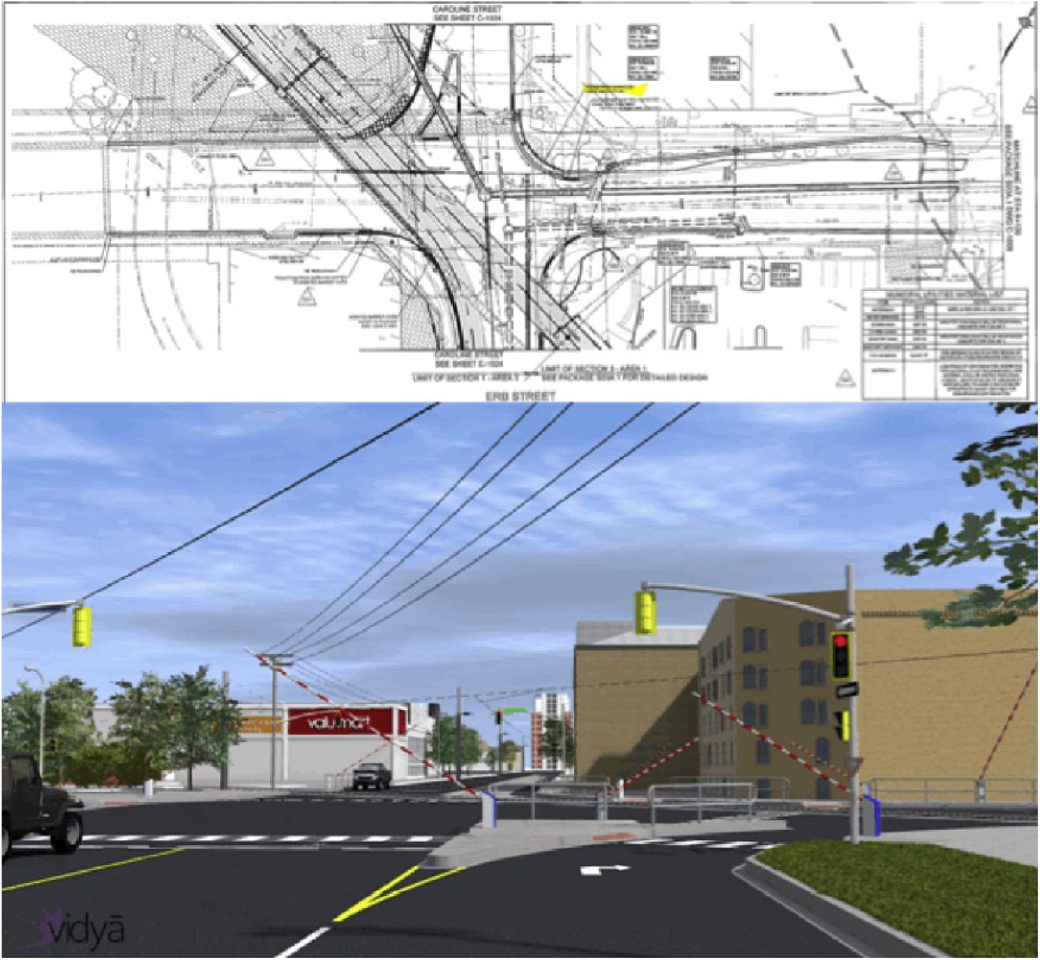
An example of visualization use to convey complex technical information. The CAD drawing was presented to a local Region of Waterloo Council to explain the alignment of a proposed light rapid transit right-of-way. The CAD drawing precluded effective discussion of the alignment until a photorealistic rendering and animation was prepared and presented to the Council.
Ultimately the potential of visualizations to clarify complex technical information gives voice to those involved in planning decision making and, in turn, enhances participants’ perceptions of self-efficacy and the fairness of the decision-making process (Carroll, Rosson, and Zhou 2005; Heuer, Penrod, and Kattan 2007; Terwel et al. 2010). While such perceptions are held individually, the collective experience of participation can also bolster a shared sense of empowerment and community, and deeper levels of participation in neighborhood organizations and initiatives have been linked to higher levels of self-perceived leadership competence and capacity to influence government policy (Ohmer 2007). As Gordon, Schirra, and Hollander (2011, 506) suggest, community engagement in decision making is “not a simple solution for better democracy.” It can, however, promote learning between experts and citizens that broadens the knowledge base that decisions are based on, contributing to outcomes that are better aligned with community needs (Fischer 2000; Gordon, Schirra, and Hollander 2011; Ohmer 2007). The significance of the potential for environmental visualizations to contribute to these outcomes is not lost on planning professionals, as Paar (2006) found that most planners (91 percent of 311 respondents) believed that the primary benefit of environmental visualizations was their capacity to improve communication between experts and the public.
The Communicative Limitations of Environmental Visualizations
Environmental visualizations demonstrate clear communicative potential, but there is an ongoing need to examine what communicative outcomes might be expected when they are used within a complex and often political planning process (Lovett et al. 2015). Despite being more usable and affordable than ever, visualization software still remains largely in the hands of technical experts (Lewis, Cassello, and Groulx 2012). This is partly due to the fact that the costs (in terms of finances and time) of developing the technical skill needed to produce environmental visualizations act a natural barrier to the adoption of the technology (Lange 2005; Paar 2006; Slotterback 2011). To some extent, the relationship between planners, the public, and visualization technology, wherein planners act as a facilitator of the process, is also an extension of the planners’ role in guiding a community through a discussion about possible community futures. Still, there are several reasons why we may wish to challenge the continued expert dominance over the production and use of environmental visualizations in community engagement.
First, there is a pragmatic question of whether inserting environmental visualizations into a participatory planning process necessarily opens up greater dialogue among stakeholders. Environmental visualizations have been shown to enhance dialogue when they are used in controlled processes where academics are often creating and evaluating their communicative potential. Yet most environmental visualizations that are used in community engagement are not created under these ideal conditions. When they are created by a party that the public may perceive to have an agenda (e.g., their local government), there is a possibility that rather than being a conduit for open dialogue, environmental visualizations may act as a lightning rod for skepticism, throwing the credibility of the entire participatory process into question. This is particularly true when the technology is a “black box” to all but a few experts who understand the data, decisions, and assumptions that go into the visualization process (Wissen-Hayek 2011).
When the visualization process is largely expert driven, visualization products (and by extension the dialogue they promote) also remain linked to the values and interests of technical experts (MacFarlane et al. 2005). Adopting Castell’s notion of communication power, Innes and Booher (2015) argue that in an increasingly networked society, power in the planning process is not derived from rights given by the state, or from the financial capacity of any particular actor in the planning process. Instead, the ability to influence planning outcomes is drawn from the capacity of technical and political actors to direct the focus of public discourse, frame issues that warrant attention, and through the emotional power of evocative imagery, incite collective action. Without direct access to the reins of a visual communication medium that has been shown (under certain circumstances) to facilitate consensus building, the ability of public stakeholders to empower themselves through the use of visualization technology is greatly diminished.
Finally, Wissen-Hayek (2011) presented evidence from a workshop that suggests there may also be potentially unrecognized limits to the communicative capacity of the medium itself. Using abstract and realistic representations, Wissen-Hayek explored a range of land management scenarios for the Entlebuch UNESCO Biosphere Reserve with stakeholders. Results were consistent with past research in showing that visualized scenes (particularly highly realistic ones) influenced individual perceptions by catalyzing reflection on attitudes and local knowledge regarding predefined management scenarios. However, the same scenes were ineffective at generating new ideas for management approaches, and may have even constrained the ideation process. The group facilitator suggested that “3D visualizations are not necessarily required in the brainstorming phase; they are even rather destructive in effect” (Wissen-Hayek 2011, 930). If a central motivation for promoting collaboration around complex planning issues (e.g., climate change) is the desire to foster dialogue and knowledge sharing that leads to innovative solutions, the potential for environmental visualizations to constrain ideation must be weighed against other benefits of their use.
Positionality and the Communicative Capacity of Environmental Visualizations
A final concern with the use of environmental visualizations, which is perhaps the most central to the focus of our paper, addresses the question of whether there are motivations for using environmental visualization other than enhancing communication and dialogue. While research has shown that environmental visualizations can enhance community engagement, positive outcomes like greater comprehension and increased dialogue are not a given. These outcomes are a function of the capacities that environmental visualizations have as a visual communication medium, but whether or not these capacities are accessed depends on why and how a company, local government, or other group decides to use them. Unfortunately, there are examples where rather than promoting greater dialogue; the technology has been used merely to support the likelihood that a project proponent can gain public and council approval without dissent or debate (Lange and Hehl-Lange 2005).
Reflecting on this issue, Appleton and Lovett (2005) interviewed a range of planning professionals and revealed a shared belief among respondents that since environmental visualizations were not a requirement of the planning process, developers must use them because it suits their ends. Lange and Hehl-Lange (2005) also note this instrumentality, and suggest that it is directly linked to the practice of using the communicative influence of visualization products to rally public support behind forgone decisions. As they put it, representations are used as “icing on the cake with no intention of changing a proposal” (Lange and Hehl-Lange 2005, 836). Returning to the notion of communication power, this form of environmental visualization use could be seen as a strategy on the part of already politically and economically privileged actors within the planning process to attain further power for their agenda through the ability to effectively communicate and construct shared social meaning.
Whether communicating a decision or facilitating deliberations, planning and design professionals should recognize that environmental visualizations are not created in a social vacuum and are seldom objective or value-neutral products (Lange 2005; MacFarlane et al. 2005). They are the end product of a process that is influenced by external social, political, and economic forces, including strained project budgets, short timelines, and client expectations. None of this would be a problem if members of the public and local councilors had a proven ability to see past the way a project is presented to engage with the elements that make it desirable or undesirable for their community. Unfortunately, several studies illustrate the contrary. Both Neto (2006) and Wergles and Muhar (2009) demonstrate that one risk in using highly realistic and visually engaging representations is that judgments about the desirability of a project will be based on the quality of the representation, rather than the quality of the design. In a similar study, Downes and Lange (2015) compared pre-construction visualization products to post construction photos and found that representations contained a host of inconsistencies that trace back to choices made by the visualization preparer. The authors found that this can include the removal of aesthetically unpleasing elements like tramlines, the partial or complete removal of vehicular traffic, the misrepresentation of tree species and maturity, and/or the presentation of projects using only late spring or summer seasonal conditions. While Downes and Lange (2015) did not suggest that these inconsistencies were intentional, Lewis (2012) has shown that such misrepresentations can significantly enhance the perceived imagibility and desirability of a project, making it easier for proponents to attain approval without significant public scrutiny.
Discussions about the potential for environmental visualizations to introduce communicative distortions into participatory processes are now decades old. Despite this, the current understanding of this issue is still incomplete (Lovett et al. 2015). Studies have documented support for the communicative benefits of environmental visualizations (e.g., Paar 2006), but to the authors’ knowledge no empirical study has interviewed planning and design professionals to document direct and explicit evidence showing whether misinformation that has been identified in visualization products (e.g., Downes and Lange 2015) results from a lack of rigour in the visualization process, or is incorporated intentionally. This gap has contributed to a persistent misunderstanding of why environmental visualizations support open dialogue, citizen empowerment, and a stronger incorporation of local knowledge within the planning process in some instances, while in others they serve to limit dialogue and debate. The objective of this paper is to inform this understanding by presenting findings from a study that surveyed and interviewed planning professionals on how and why they use environmental visualizations in community engagement.
Methodology
We addressed our research questions using a mixed methods research approach that included a survey and in-depth interviews. No study that we could find had explicitly surveyed and interviewed planning and design professionals to identify both the range of motivations for using environmental visualizations and the potential visualization practices that might be used to enhance the public preference of a project. As such, we approached the research in an exploratory fashion. This means that we did not seek to collect quantitative data that would allow us to generalize about environmental visualization use across Canada, or beyond (e.g., in terms of software use and data sources). Instead, we adopted a qualitative approach that would promote analytic generalizability, wherein our findings might bear upon the current theoretical understanding of environmental visualization use and shape future case study, large-scale survey, or experimental research (Miles and Huberman 2014; Yin 2009). For example, past large-scale survey studies have documented aspects of environmental visualization use (e.g., Paar 2006), and given the rapid evolution of visualization technology and social media since these surveys, our study could inform a much-needed reexamination of this topic.
Following the mixed method research principle of complementarity, we employed two data collection techniques with the specific intention of using one set of results to elaborate, enhance, and clarify the results of a second (Greene, Caracelli, and Graham 1989). A survey containing qualitative and quantitative questions was constructed based on known assessments of professional attitudes to environmental visualization use and the existing literature on the communicative benefits and limitations of environmental visualizations (Appleton and Lovett 2005; MacFarlane et al. 2005; Paar 2006; Sheppard 2001). We report only on the qualitative portion of this survey here. To extend and deepen findings from this survey, we also conducted a subsequent round of in-depth interviews with planning and design professionals. The qualitative section of our survey and our interviews covered the same series of topics within two general themes (see supplementary materials for specific interview/survey topics):
Motivations for using environmental visualizations in community engagement.
Processes and choices that are followed to create environmental visualizations.
Data Collection
Our professional experience and the results of past studies (e.g., Paar 2006) suggested that despite the growing interest in environmental visualization technology, comparatively few planning and design professionals would have hands-on experience preparing environmental visualizations, or using them in community engagement. Rather than defining a random, but potentially uninformed, sample, we focused on a smaller set of “unique cases” with known firsthand knowledge of the topic (Teddlie and Yu 2007). This form of purposive sampling is common when pertinent information is contained in a group of key informants, or when a complete sampling frame cannot be created (Schensul, Schensul, and LeCompte 1999). Our sample was limited to municipal planning and design staff, and planning and design consultants working in the private sector. To ensure our survey/interview questions were appropriately framed, we conducted a pretest with three practicing planners to assess the clarity, comprehensiveness, and practical relevance of our data collection instruments. Several wording changes and additions were made to clarify key concepts. For example, a definition of environmental visualization that reflected the focus of our project was added.
The first step in our data collection process involved a survey that was sent to all midsized and metropolitan Canadian municipalities. Smaller municipalities were excluded because anecdotal evidence and previous research (Paar 2006) suggested that they would be far less likely to contain planning and design staff that had hands-on experience with environmental visualization use. To ensure a professional with relevant experience completed our survey, our contact e-mails asked for our invitation to be passed on to someone within the municipality who had experience preparing environmental visualizations or using them in community engagement. We acknowledge that this sampling strategy, particularly the choice to exclude small municipalities, may have overlooked some hard-to-detect key informants who are using environmental visualizations in a participatory fashion. This is a potential gap for future research to address. In total, fifty-four surveys were e-mailed to municipalities across Canada, and a hardcopy of our survey was resent to nonrespondents after four weeks. Of these, nineteen returned a completed copy, for a 35 percent response rate.
The second step in our data collection process involved in-depth interviews with practicing planning and design professionals. During this step, we purposefully expanded the scope of our sample to include professionals in the private sector. This expansion of the sample allowed us to tap into a new group of knowledge holders and potential findings. The use of in-depth interviews as a complementary data collection technique also allowed us to elaborate on survey results (Greene et al. 1989). As the information relevant to our study was contained in isolated cases, a purposive chain sampling technique was used to identify key informants (Teddlie and Yu 2007). Interviews included a cross section of mostly (seven of nine) private sector professionals, including one urban planner, two urban designers, two landscape architects, two architects, and two environmental visualization preparers. While an interview guide was used, interviews involved open discussion that often explored emergent themes (Charmaz 2014). Interviews were conducted face-to-face and by telephone, lasted approximately 50 minutes on average, and were tape recorded to support accuracy in data analysis.
Data Analysis
We analyzed the qualitative data from our professional surveys and interviews (n = 28) using a latent content analysis approach that is described by Charmaz (2014). Where applicable, we also developed simple quantitative summaries to support interpretation. To facilitate analysis, we first transcribed all interview recordings and textual survey data, assigned each interview or survey a pseudonym to protect participant anonymity, and then coded these transcripts by hand in an iterative fashion. To begin the iterative coding process, we completed an initial phase of open coding that broke the data set into a small number of general domains. Open coding relied on our survey/interview topics to create these general domains (e.g., benefits of use and types of misinformation), and could therefore be classified as a deductive exercise. Within each general domain, a second phase of axial coding relied on the content of the data to inductively deconstruct the textual material into as many discrete, yet holistic, themes as possible. In the final phase of coding, these discrete themes were reconstructed into a final set of conceptual categories that provided insight into the use of environmental visualizations as a participatory tool.
Latent content analysis is often critiqued as being too open to the subjective interpretation of coders to yield reliable results. Adopting the concept of intersubjective convergence, we had multiple coders analyze, evaluate, and discuss samples of the data set. The coding process and the themes that it produced were considered to be reliable once, after several coding iterations, multiple coders were able to identify and agree on the presence of key themes within the data, despite the fact that their interpretations were informed by distinct cognitive schema (Potter and Levine-Donnerstein 1999).
Results and Discussion
Although research indicates that environmental visualizations can enhance comprehension and dialogue in community engagement, there is also evidence that their use may bolster power imbalances within the planning process and prevent the public from having a meaningful influence on planning outcomes (Downes and Lange 2015; Lange and Hehl-Lange 2005; Senbel and Church 2011). In this section, we draw on survey and interview data to explore our research questions, which asked why environmental visualizations are used as a participatory tool, and whether professionals recognize any practices in the production of environmental visualizations that speak to concerns identified within the literature. Couched within the context of participatory planning, our results and discussion are organized around three themes covering
motivations for environmental visualization use;
practices in creating environmental visualizations; and
professional views on controlling environmental visualization use.
Motivations for Environmental Visualization Use
All planners and designers who completed a survey or were interviewed saw value in using environmental visualizations, particularly for the purpose of communicating policy and project outcomes to the public. This result is similar to past studies (Hanzl 2007; Paar 2006; Pisarski 2007). As Figure 2 shows, consistent with our rationale for targeting larger municipalities, four of the smallest municipalities who responded had not specifically used environmental visualizations in community engagement, but agreed that they offer significant communicative benefits.
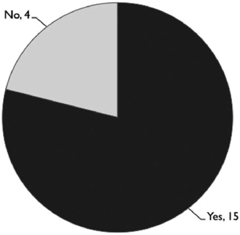
Surveyed municipalities that have used environmental visualizations to support community engagement.
Respondents from municipalities without visualization capacity unanimously noted that being able to create visualizations in house would be desirable, but similar to research examining the adoption of information technologies within the planning profession (Slotterback 2011), participants suggested that “the amount of training and cost of the software” (Joan, urban planner) were barriers to its adoption.
It allows council and the community to better understand planning and development proposals. Few people outside the planning, architecture and engineering professions have the ability to translate two-dimensional plans and get a sense of what a development may look like. 3D computer visualization greatly enhances the ability to communicate what a proposed development may look like. (Handel, urban planner) I think a lot of the public, and even professionals to be honest, have a problem reading plans, and visualizing in three dimensions. We look at a plan that’s 2D sitting on a table and there might be a grade change on the site, let’s say fifteen meters, and people have a hard time visualizing what that is in reality. (Phil, landscape architect)
As several respondents noted, developing the technical capacity to produce environmental visualizations in house can be a significant hurdle for resource-constrained municipalities. While Joan, an urban planner from one of the smaller municipalities we surveyed, discussed the upfront cost of training, there are also ongoing personnel costs associated with the time that goes into producing environmental visualizations, which can be substantial even for small site-specific projects. It is surprising, however, that multiple respondents also stated that the high cost of obtaining software was a barrier. We would have expected this concern when expensive, proprietary applications dominated the marketplace, but low-cost (e.g., SketchUp) and open-source (e.g., Blender) software have proliferated and can be run on almost any modern desktop or laptop. This persistent perception may result from the de facto status of “industry standard” packages that have a long history of use in planning and design fields (e.g., software from AutoDesk), or from the fact that respondents simply are not yet aware of low-cost or open source options.
While the benefits of environmental visualization as a communicative tool were universally recognized, several participants also discussed a clear instrumental agenda that can be associated with their use. As one respondent suggested, a key benefit of producing environmental visualizations is the flexibility of the end product. In addition to serving a crucial role in communication, visualized scenes can also “become a marketing product” (Mandeep, urban designer). John, a practicing urban planner, argued further and suggested that the marketing potential was in fact the main driver behind the use of the tool: It’s a selling tool, that’s what it is in this business, and I’m sure that 3D modeling and animations, I’m sure that has sold more than a few people on projects. (John, urban planner)
Comments about the marketing function of environmental visualizations reflect concerns expressed by MacFarlane et al. (2005) that environmental visualization technology provides influence to those who have both the means to adopt it and an agenda to use it in a particular fashion. Still, other professionals painted a much clearer picture of how environmental visualizations might, as Lange and Hehl-Lange (2005, 836) put it, be used as “icing on the cake with no intention of changing a proposal.” Speaking to her role as a landscape architect, Sara noted that something seemingly as ad hoc as the choice of how a scene is lit or what viewpoint a project is shown from can be helpful in overcoming the deficiencies of a poorly designed, potentially undesirable project. Along these lines, Terrance, an architect practicing at a large international consultancy, argued that a key role for environmental visualization was in fact the preemptive management of public opposition to a project, a practice that he referred to as “design marketing” (Terrance, architect): I think you want to show the public as much as possible, just showing flat elevations, front elevations, back elevations, side elevations is not enough sometimes for them to fully understand it. But you show them an isometric, sometimes that can wow them. . . . For advertising you can make a building look pretty glamorous when at the end of the day it is not. (Phil, landscape architect) Anytime you are dealing with the public you know that visualizations are going to be important, because it’s the easiest way to communicate what you are trying to do. Now there is a dark side to this. You can always use visualizations to your benefit. So if you’re on the side of the developer, unfortunately, and if the developer wants to do something he or she knows that the public is not going to like, you can always use visualizations to kind of sell them on something that might not be realistic. (Terrance, architect)
Practices in Creating Environmental Visualizations
If environmental visualizations are sometimes used as design marketing to intentionally enhance the public image of a project, then there should be evidence of identifiable marketing strategies within visualization products. Interestingly, Downes and Lange (2015) presented exactly such evidence in a content analysis of real-world visualization products, and Lewis (2012) showed that these strategies can significantly influence evaluations of a planning project. Similar to techniques discussed by Downes and Lange (2015) (e.g., selective decluttering or the use of overly mature foliage), our interviewees discussed specific techniques that a visualization-preparer might employ to sell a project to a public or council who might need convincing. Discussions around this particular topic revealed a mix of seemingly dissonant beliefs. On one hand, respondents seemed reluctant to openly accept that such willful use of misinformation existed, because according to Wanda (an urban designer), such behavior “tends to come back to haunt you.” At the same time, after offering an initial moral caveat, all interviewees were able to recall numerous instances where misinformation found its way into a visualized scene, largely to the benefit of a project’s appeal. Some individuals even admitted that they had intentionally misrepresented a project to make it more palatable to the public.
So if your client comes in with a thirty-story condo tower in this neighborhood that has no buildings, you are going to have a lot of resistance. You know that the client knows that too, so what do you do at the public meeting? You have to reduce that and mitigate that and you have to go in without offending too many people and try to ease them into it. Now how does visualization help? It’s extremely important because you don’t show up with a bunch of floor plans and elevations and show this huge tower and show little houses next to it. People will just freak out. So what you do is you show them a rendering of their street where you see the houses and you see the tower in the background. Then you put people walking their dogs and you put like kids playing, very different from the condo rendering. When people see that, subconsciously they say, oh look at that old nice couple walking their dog. It’s like commercials, it’s all subconscious. Subconsciously they are accepting what they see. They will still consciously argue about the height, but you are already starting to convince them deep inside. They will still argue, but it’s easier for them. They will say you know it’s not that bad, but what they are looking at is something that they probably wouldn’t see, you know, it’s not real. (Terrance, architect)
Insights from planning and design professionals further revealed that the use of misinformation to support design marketing does not follow a set of codified rules. In fact, what might enhance the imagibility of a downtown condo scene is likely to be highly objectionable to viewers that are trying to picture themselves in a serene suburban landscape. Context matters when deciding on how to use environmental visualizations to enhance the imagibility and perceived desirability of a project, and the ideal presentation of a project is achieved through the iterative application of a loose repertoire of stylistic choices. Our key informants referenced a range of ways they have seen visualizations manipulated to enhance the aesthetic quality of a project being shown. While we recognize that such techniques could be categorized in many different ways, we identified and named three groupings that are similar to findings from a content analysis conducted by Downes and Lange (2015):
Screening and greening: Manipulating the size, position, and species of vegetation to screen undesirable landscape elements or to fill the scene with lush vegetation.
Playing to the crowd: Tailoring entourage elements by excluding unsightly clutter or matching the race, age, and identity of human billboards/models to that of expected audiences.
Setting the scene: Stylizing ephemeral conditions by using overly soft or vivid scene lighting and/or sky conditions.
Professional Views on Controlling Environmental Visualization Use
In both our survey and interviews we asked participants about the potential need to clamp down on misinformation. Compared to other topics, attitudes toward guidance or control over the visualization process were highly divided. As Figure 3 shows, only one of the surveyed municipalities who use visualizations perform any sort of documented assessment.
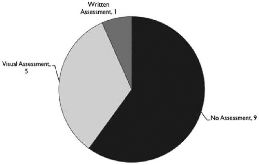
Approach to assessing environmental visualizations that are used in community engagement.
When asked to explain their stance, those who supported the notion of some sort of guidance or control were much more likely to see the use of misinformation as a broader threat to the ethics of the profession, and to the rigor of the decision-making process. For instance, Talia, an urban planner working for a municipality, argued that “there should be guidelines to ensure that the subject matter is being depicted fairly, accurately and consistently. Failure to adhere to prescribed standards could unduly influence perception.” Despite a belief among some that a more rigorous visualization process is necessary, few respondents were able to articulate an approach to address the issue of misinformation. One exception was a private sector landscape architect who suggested that while guidelines would be a step in the right direction, they might ultimately be insufficient. He argued that guidelines rely on each visualization-preparer to interpret rules in light of a given context, and that within the realm of planning there can be motivation for a loose interpretation of standards.
Personally, I’d have to be in there [i.e. in the 3d model]. I’d have to see for sure. It’s like labeled dimensions on a drawing, it might say 1.2 meters, but you get into the drawing and its .99 meters. Those types of things happen. There are professional standards, but sometimes developers will ask consultants to cheat here and there. (Phil, landscape architect)
Despite the recognition that misinformation is sometimes used to intentionally influence public opinion, not all participants agreed with the need for guidance over the visualization process. Some suggested that attempts to provide guidance would merely be another layer of unnecessary bureaucracy, or would impinge on the planner or designer’s artistic license. There was also a broader agreement in this group of professionals that environmental visualization technology (as defined here) is the same, in principle, as traditional representation techniques, and therefore should not receive special treatment.
The application of 3D visualization in planning and design is not a new thing at all, though the computer-aided 3D visualizations are. Planners and urban designers have been using it for decades, if not centuries. So before we are going to develop guidelines and code of conduct, we should ask why now? Why do we need guidelines and code of conduct for the computerized 3D and not the traditional one. (Cass, urban planner)
The question of whether to seek greater rigor in how environmental visualizations are used as a public participation tool is both a practical and an ethical matter. If attempts to employ misinformation are merely wasted on a critical public who can easily look past potential marketing treatments to engage with the more central issues of a project, then there is little justification for additional bureaucracy. However, if recent research is accurate, and the attempts to mislead the public that are documented here can in fact influence judgments of a project (see Lewis 2012), then the need to address this issue is a question central to the promotion of an ethical profession. In Canada, the Ontario Professional Planners Institute (2012) may be the clearest on this point, stating in their Standards of Practice that a planner must “carry out tasks with honesty, provide accurate captions and never intentionally distort the truth” (emphasis added).
Conclusion
Planning for the future of our communities means dealing with a host of complex problems that link social and environmental spheres at multiple scales. Such planning arguably requires a collaborative approach that can tap into nonconventional knowledge bases, reveal innovative solutions, and create new sources of power that open up novel pathways for change (Healey 1997; Innes and Booher 2015). Given that power sharing and accessing local knowledge will not always be a desired end for all actors in the planning process, we must consistently question and examine how deeply the capacity of environmental visualization technology to enhance community engagement is tapped when financial and political interests provide motivation to intentionally distort the truth (Senbel and Church 2011; Slotterback 2011).
To this end, we have presented data documenting how and why misinformation can find its way into environmental visualizations, and ultimately into the participatory processes that environmental visualizations are supposed to enhance. The exploratory nature of our study negates our ability to make broad generalizations about the extent of the practices documented here. However, findings from our surveys and interviews with practicing planners and designers are consistent with recent findings from a content analysis of real-world visualization products (Downes and Lange 2015). Perhaps more troublingly, our findings show that the range of distortions that Downes and Lange (2015) identified can in fact stem from the intentional incorporation of stylistic techniques that are an attempt to unduly enhance public judgments of a project—a process one of our participants labeled as “design marketing.”
For almost three decades, the visualization field has argued that greater control over the visualization process may be necessary to remove sources of misinformation from the sphere of community engagement (Sheppard 1989, 2001; Wissen-Hayek 2011). This is a course of action that some, but certainly not all, of the practicing planners and designers we spoke to agreed with. We lament the fact that our findings did not reveal more concrete strategies to address the potential negative impacts of misinformation on both individual decision making and shared dialogue. The challenge of identifying effective solutions to this problem is emblematic of the pervasive nature of design marketing, and clear evidence of the need for future research.
Finally, although tighter controls and guidance over the production of environmental visualization offers one approach to dealing with misinformation, the concept of communication power reveals drawbacks to this command and control course of action. Guidelines and controls could (in theory) reduce some sources of misinformation and the risk that environmental visualizations might contribute to planning outcomes that poorly reflect community expectations and needs. However, this same approach might also entrench any existing imbalance of power within the planning process by privileging the access of certain actors (e.g., developers) to a technology that can build consensus for their vision of the future. In cases like the Challenge Navitus campaign, citizen groups have demonstrated that their use of evidence-based visualizations can not only enhance their voice and standing in the planning process by telling their story in a compelling way, but can also offer an important source of information that is highly credible and relevant to development decisions (Challenge Navitus 2015; Lee 2017). Promoting a more standardized process that might indirectly exclude representations from such actors, while well intentioned, might actually push the use of environmental visualization technology further into an expert paradigm, limiting access to knowledge sources shown to be key to sound decision making.
Footnotes
Declaration of Conflicting Interests
The author(s) declared no potential conflicts of interest with respect to the research, authorship, and/or publication of this article.
Funding
The author(s) received no financial support for the research, authorship, and/or publication of this article.
Author Biographies
References
Supplementary Material
Please find the following supplemental material available below.
For Open Access articles published under a Creative Commons License, all supplemental material carries the same license as the article it is associated with.
For non-Open Access articles published, all supplemental material carries a non-exclusive license, and permission requests for re-use of supplemental material or any part of supplemental material shall be sent directly to the copyright owner as specified in the copyright notice associated with the article.