
Abstract
This report details the second phase of an ongoing research project investigating the visual invention and composition processes of scientific researchers. In this phase, four academic researchers completed think-aloud protocols as they composed graphics for research presentations; they also answered follow-up questions about their visual education, pedagogy, genres of practice, and interactions with publics. Results are presented first as narratives and then as topologies—visualizations of the communal beliefs, values, and norms (topoi) that connect the individual narratives to wider community practices. Results point toward an ecological model of visual invention and composition strategies in the crafting of research graphics. They also suggest that these strategies may be underrepresented in scientists’ education. More explicit attention to them may help improve STEM visual literacy for nonexperts.
As they have coped with changing technologies and practices, writing-studies scholars have expanded their view of writing to include multimodal inscription practices—primarily material/physical practices (handwriting, keyboarding, eye movement), but also networked, spatial, and visual practices. This trend is apparent from a glance at the table of contents of Written Communication: In 2007, for example, research articles on multimodal inscription practices made up 15% of the contents; in 2017, their representation has more than doubled, to 38%.
Research on visual inscription practices in particular is finally building momentum after a long lag behind other communication-studies fields—perhaps because there was something initially about visual communication that seemed by definition to fall outside writing studies. But our field can now boast a substantial body of work on visual inscription, particularly in the arena of science, technology, engineering, and math (STEM) writing, where graphics dominate the page/screen. We have rhetorical analyses of how STEM graphics interact with verbal arguments in textbooks, research articles, and museum exhibits; we have accounts of how some of these graphics are interpreted by viewers; and we have initial proposals for theories of visual/verbal interaction in STEM argumentation.
To date, however, we lack a rich account of the process of creating STEM graphics. From its inception, writing studies made process a focus of writing research and pedagogy. Process is no less essential to a full account of STEM visual inscription. Further work on visual invention and composition will positively impact STEM visual literacy for novice students and for the wider public (Barton & Barton, 1993; Messaris & Moriarty, 2005; Reeves, 2011; Trumbo, 2006).
Accordingly, this essay presents the second phase of an investigation into research scientists’ visual invention and composition practices. The first phase employed a standard communication method—a survey—to achieve an initial overview of graphical education and practice for 144 STEM researchers in nine fields ranging from computer engineering to biology. This phase adopts a standard writing-studies approach—think-aloud protocols and interviews—to drill down into the invention and composition processes of four researchers from physics, neuroscience, and the geosciences—all fields whose research regularly attracts a public audience. The resulting individual narratives of process are connected to wider communities of practice, and to principles of literacy, via topology—a visualization of the communal beliefs, values, and norms (topoi) that constitute a community’s attitude toward recurrent rhetorical situations. As with critical approaches, a topological approach aims to reveal the political dynamics shaping a given rhetorical situation. A topological approach is not only hermeneutic, however; it’s also heuristic—meaning the topoi that it reveals also serve as a toolkit that novices can use to acquire the dominant discourse, and activists to change it. The assembly of this toolkit for STEM research graphics is the ultimate goal of this study.
Background
The bulk of the research on visual communication has taken place in communication departments, following a call in the 1971 “Wingspread Report” from the Speech Communication Association. This literature draws primarily from theories in psychology, sociology, and philosophy, but also from rhetoric and critical theory (see Walsh & Ross, 2015, for a list of key references).
Writing studies began to take visual inscription seriously in the 1990s when (a) key monographs in visual rhetoric appeared and (b) digital technologies defamiliarized the visual and material aspects of writing. The first research article in Written Communication to focus on visual inscription was Tebeaux’s (1991) study of Ramus’s page design, which she followed up with a pathbreaking 1997 monograph on the visual aspects of Renaissance technical manuals. Other key texts from the decade include Barton and Barton’s (1993) Foucaultian analysis of synoptic and analytic technical graphics, Kostelnick’s (1994) study of the effects of laser printing on argument and text design, and Thralls’s (1991) examination of the effectiveness of training videos in procedural writing pedagogy.
Beginning in 2000, work on visual inscription in writing studies gained real momentum. We now have rhetorical analyses of information graphics that reveal their political effects, many of which work against nonexpert viewers (cf. Brasseur, 2003; Dragga & Voss, 2001; Kimball, 2006). We have theories of verbal/visual interaction in the argumentation of textbooks and STEM journal articles (cf. Fahnestock, 2003; Gross, 2009). We have studies of how visual genres encode norms of practice within STEM communities (cf. Graham, 2015; Kostelnick & Hassett, 2003). And we have both historical and contemporary accounts of how novices are disciplined to view STEM visual genres (cf. Fountain, 2014; Jack, 2009).
This body of work is an impressive complement to visual-communication scholarship. But ironically, writing studies scholars have done comparatively little to date to investigate inventional and compositional processes, which have formed the raison d’être of the discipline since its inception. Two contributions stand as notable exceptions. Northcut’s (2004) study of paleontological illustrators combined interviews and participant observations to discover that a model of collectivist invention obtained, which brought to bear on participants’ practices a range of constraints—chief among these facts from the paleontology literature, disciplinary conventions, and audience expectations. Wickman’s (2012) ethnography studied the rhetorical purposes to which experimental physicists put the graphics they created in the course of their research and discovered an interesting tension or paradox: At first, researchers created graphics to reduce the technical complexity of lab work so they could conceptualize results from it; but later, researchers used graphics to impress upon colleagues the technical complexity of their work, in order to argue for its novelty and validity. This work laid the groundwork for additional observational studies that can provide a richer account of the actual inventional and compositional processes that go into making research graphics.
Building on this scholarship, I designed a multiphase investigation of STEM researchers’ visual practices. In the first phase, my coinvestigator and I conducted a survey of 144 STEM academic researchers from nine disciplines regarding their education in visual invention and composition, the genres they used most often, the principles they valued, and how they applied them while making graphics (Walsh & Ross, 2015). The chief result, from the perspective of writing studies, was a preliminary rhetorical topology of the professional discourse about graphics for research articles; that is, we looked at the dominant topoi raised by participants in responses to open-ended survey questions and configured them in various ways to discover useful patterns.
Rhetorical topology is an emerging method in writing studies that takes insights from the spatial turn in the humanities and returns them to their historical footing in classical theories of rhetoric (Walsh & Boyle, 2017). The spatial turn treated social phenomena as transductive, 1 that is, as networks of association among actors rather than as the deductive effects of “society,” “hegemony,” or some other totalizing actor; in this way, spatial theories helped catalyze the post-critical movement, which seeks not only to diagnose political problems, as critical theory does, but also to invent solutions or alternatives. In short, the spatial turn has shifted the emphasis from intervention to invention. This shift lines up nicely with the resurgence within writing studies of interest in the classical topoi, which form the cornerstone of classical theories of invention. 2
A rhetorical topology thus generates a snapshot of the rhetorical “landscape” of discourse in particular situation by articulating the topoi (communal beliefs, norms, values, and commonplaces) that shape the discourse, as well as noting spaces where certain topoi or actors may be being silenced or marginalized (Walsh & Boyle, 2017). For example, a topological analysis of the Mexican Gray Wolf Reintroduction debate in the early 2000s revealed a dystopia (mismatch) between the topologies generated by administrators and by landowners: Administrators privileged federal rules and downplayed landowner rights, while landowners did the opposite. The study went on to show how landowners leveraged this rhetorical dystopia to create a political dystopia—in which they figured themselves as a resistant community standing against the hegemonic power of the federal administrators. These results were shared with project administrators, sparking discussion about ways to reduce the rhetorical dystopia by signaling support for landowner safety and property concerns (Walsh, 2009, 2013).
This example points up the two strengths of rhetorical topology as a method: First, just as the topoi have always been, a topology is both hermeneutic, for the purposes of analyzing a community’s practices, and heuristic, for the purposes of (re)inventing them; second, since topoi are communal property leveraged by individuals (i.e., idiosyncratic expressions of belief do not count as topoi; they must be picked up and reiterated by other community members to function topically), they provide a valid way to move back and forth between these two levels of practice.
In the case of the study at hand, Phase 1 yielded a preliminary topology of the common topoi of STEM visual invention and composition, just as previous work in writing studies has identified common topoi of STEM verbal invention and composition (Prelli, 1989; Walsh, 2010). This topology revealed a dystopia between discourses of pedagogy, which stressed usability and design principles, and practice, which stressed argumentation and the selection of persuasive visual genres (in addition to, naturally, process-related topoi; see Figure 1).
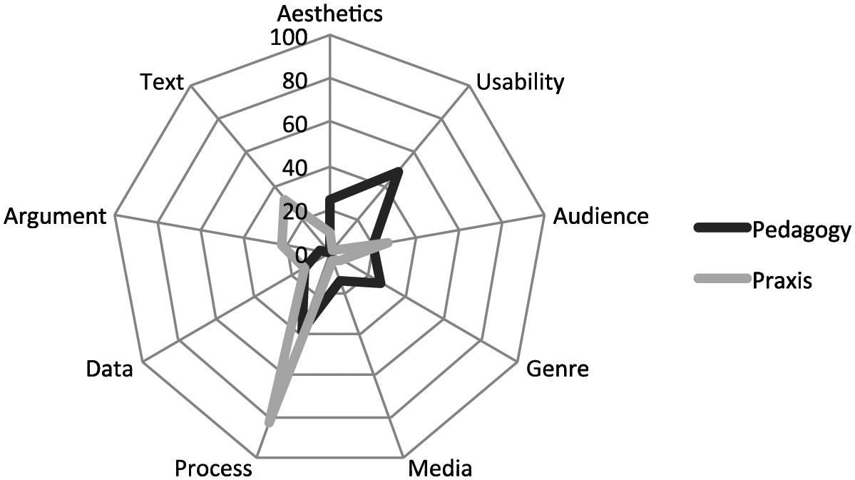
A comparison of the topologies of survey participants’ response to questions about pedagogy (190 segments) and practice (199 segments).
That participants’ practice hinged on techniques of persuasion that were largely left out of their education reinforced concerns that STEM graphics are treated by practitioners and nonexperts alike as transparent windows through which to view nature and natural facts (Latour, 1990; Walsh, 2014). This misconception has consequences for both STEM pedagogy and public STEM visual literacy efforts.
Phase 2 of the project, presented here, sought to further investigate this dystopia in the invention and composition processes of STEM researchers. The framing research questions were as follows:
Research Question 1: How are the Phase 1 topoi operationalized during the process of STEM researchers’ composing graphics for publication? Since Phase 2 participants were also Phase 1 participants, it was reasonable to assume that portions of the Phase 1 topology would be visible in their practices.
Research Question 2: Is the dystopia between STEM visual pedagogy and practice in Phase 1 results also evident in Phase 2 procedural results? This dystopia would appear, if at all, in differences between the ways researchers talked about education in interviews on the one hand and the ways they talked about and actuated their practices on the other.
To answer these questions, I employed a combination of interview methods, as did both Northcut and Wickman, and think-aloud protocols, which built off the observational approaches of these two studies to elicit more data specifically on researchers’ visual invention and composition practices. These data will help raise our understanding of visual inscription processes toward the level of our understanding of verbal invention and composition. They should also assist visual literacy efforts with STEM novices—both students and public stakeholders. We know that critical visual literacy includes, in part, an understanding of the principles that were used to generate graphics (Chilvers, 2013; Messaris & Moriarty, 2005). By transducing these principles across the practices of experienced scientific researchers, we are better prepared to support stakeholder literacy in public policy debates.
Method
To investigate the Phase 2 research questions, think-aloud protocols were combined with follow-up interviews (IRB exemption 508973-4). Participants were volunteers from the Phase 1 participant pool; all are academic researchers who have published at least 10 peer-reviewed research articles. They are all also scientists (as opposed to engineers or mathematicians). In exchange for roughly two hours of their time, Phase 2 participants were offered an equal amount of article-editing services or visual-rhetoric instruction for their graduate students via Skype.
For the think-aloud protocols, I asked each research participant to “work on a graphic for a research article”: This request catalyzed activities that ranged from the creation of graphics from raw data to the composition of text describing the graphic in drafts of research presentations. Participants were asked to vocalize their thought process as they worked, and I recorded their computer screen and verbalizations remotely using Skype and EComm Call Recorder.
Think-aloud protocols, both formal and informal, have constituted the methodological standard in science-writing observational studies for nearly three decades (Berkenkotter & Huckin, 1995; Charney, 1993; Northcut, 2004; Rymer, 1988). While they have incurred some criticism, this has been aimed primarily at the assumption that the think-aloud protocol provides direct access to cognitive processes, a tenet maintained by the Information Processing tradition of cognitive psychology (Ericsson & Simon, 1993). In response, Smagorinsky (2001) has argued persuasively that writing-studies scholars have in general understood the method to elucidate socially inflected composition processes, not cognitive processes. STEM visual invention and composition, activities shaped by social pressures (Northcut, 2004), are thus good candidates for protocol analysis.
In order to use think-aloud protocols rhetorically, I presented the method to participants as a joint activity between us (Clark, 1996). They directed this activity; however, if they asked me for information or feedback, I responded, and if I wanted more detail about what they were doing, I asked for it. During the protocol, I tracked three channels of communication—verbal (speech and text creation), visual (image presentation and manipulation), and gestural (deliberate gestures with the computer mouse)—as we have evidence that all three can carry topoi (Fahnestock, 1999; Newman, 2009; Prelli, 1989).
There is not a standard coding scheme in writing studies for multimodal think-aloud protocols. I therefore adapted Clark’s (2005) “affordances” scheme, which analyzes joint activities—such as buying coffee at a café or instructing someone how to assemble a Lego figure—into “placing for” and “directing to” units. A “placing for” unit begins with the intentional moving of an object for joint operation into view of both parties; a “directing to” unit initiates when one party uses gestures and or verbalizations to direct the other’s attention to some aspect of the object for joint operation. Since participants were “showing” me how they created graphics for research articles, Clark’s analysis scheme worked well to return codable segments of the protocols.
Since one of my research questions asked how Phase 1 topoi were operationalized in visual invention, the “directing to” segments resulting from Clark’s scheme were coded using the Phase 1 codebook as a starting point, with expansions as required to describe participants’ actions. Table 1 presents illustrative examples of how participants’ joint actions were coded for topoi.
Examples of Segments of Think-Aloud Protocols With Topical Codes.
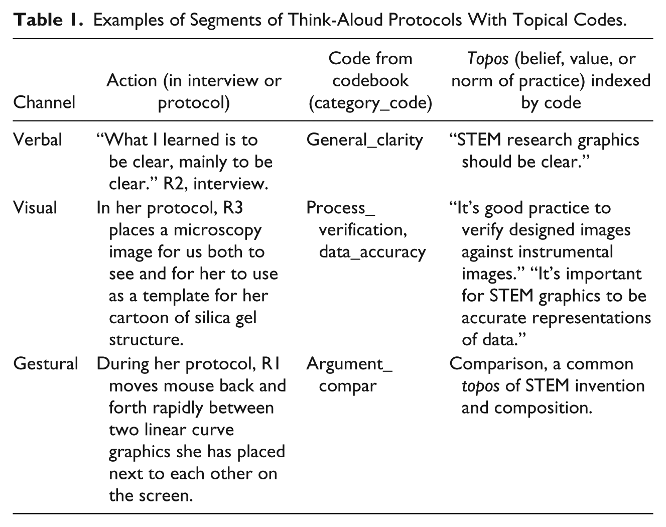
As is apparent from the examples in the table, a codable segment could index one or multiple topoi, which participants sometimes made explicit but were more often indexed by key phrases/gestures or via the logic holding together claims and the reasons given in support of them (i.e., the warrants of arguments, which Aristotle called endoxa). 3
A related coding regime was used for the interviews, which yielded open-ended responses to questions about pedagogy, disciplinary conventions, and public engagement (see the appendix). These responses were coded sentence by sentence using the same methods as in Phase 1; since this was an established method, rather than the exploratory one applied to the protocols, a second coder was employed and interrater reliability calculated using Cohen’s kappa. The final codebook in Phase 2 comprised 101 unique topoi organized under 12 categories according to their theme: General, Aesthetic, Usability/Design-related, Audience-related, Disciplinary, Ethical, Genre-related, Media-related, Process-related, Argument-related, Data-related, and Text-related concerns (full codebook available upon request). Interrater reliability was calculated at the category level after initial norming (.91) and halfway through independent coding (.80).
Results from protocols and interviews were initially composed into a narrative of each participant’s practice, as is standard in the field. To move from individual practice to community practice, topologies were constructed.
There are many ways to construct a rhetorical topology. The most common is a graph or table showing the frequency with which participants raise repeated topoi (see, for example, Hartzog, 2017; Walker, 2016). There are also network diagrams that visualize how topoi are connected to each other in the discourse (Hart-Davidson & Omizo, 2017; Jack, Appelbaum, Beam, Moody, & Huettel, 2017), “filters” showing the relative force of various topoi on participants’ interpretive judgments (Walsh, 2013), and verbal narratives of dominance and silence (Eberly, 2000; Teston, 2017; Wilder & Wolfe, 2009).
Since Phase 1 utilized frequency-based rose diagrams, I chose the same technique for Phase 2 data, to facilitate comparison. However, Phase 2 data also permitted the construction of partial filters, since participants’ discourse indicated some competition between topoi. Filters rank topoi by wins and losses as they compete in participants’ decision-making process (Walsh & Ross, 2015). Thus, they add nuance and power to frequency-based claims about topical dominance in a discourse.
Results
Participants generated protocols ranging between 18 and 80 minutes in length, for a total of 184 minutes of data (243 coded segments containing roughly 9,000 words, 50 images, and 78 deliberate gestures). Interviews were 21 to 45 minutes in length, generating a total of 125 minutes of data (413 coded segments containing roughly 13,000 words).
What follows is a narrative account of each participant’s visual invention and composition practices as represented both in the think-aloud protocol and in follow-up interviews. After these narratives, topologies of common topoi are constructed and compared.
Researcher 1 (R1): Weighing Disciplinary Conventions Versus Usability
R1 is a neuroscientist at a North American university. She studies human vision using blood-oxygenation-level-dependent functional magnetic resonance imaging (BOLD-fMRI). In her interview she reported receiving no explicit training in visual invention and composition, rather teaching herself by imitating examples from field leaders. She added, “[O]f course somebody told me to read Tufte’s book, which I bought and did not read,” referring to statistician Edward Tufte’s publications on infographic design. In response to this experience, R1 now teaches a graduate seminar on visualization in neuroscience, in which she has students read literature in design and technical communication, and critique research graphics in neuroscience publications.
R1 has had some experience presenting to nonexperts, mostly general findings of cognitive science rather than her work in particular. For instance, she has presented to a group of guardians ad litem on concepts of change blindness and bias relevant to their work. She reported that in situations like these, she often finds herself correcting impressions of the certainty of neuroimaging: “. . . All of my research is on why those bright spots don’t actually mean what you think they mean.”
The visual genre that R1 reported composing in most frequently is the linear regression (scatter plot). During her think-aloud protocol, she revised a multipanel graphic for a research article presenting new experiments in support of a computational model for the interaction of attention, contrast, and orientation in the processing of visual stimuli in human cortical areas V1 and V2. The panels of this graphic were mostly linear regressions plotted on logarithmic-logarithmic or logarithmic-linear scales; there was also a cartoon illustrating gain control in visual cortex (showing now neurons excite and inhibit each other in order to generate complex processing effects). During her protocol, R1 worked back and forth between several windows on her computer: a Word document containing the graphic for revision; a grant that contained an earlier version of the graphic as well as the cartoon; a Python terminal that contained her computer code and generated raw figures for inclusion in the final graphic; and a Google window to search for help with Python.
It was clear from R1’s comments and actions that she makes graphics not just to present her results to others but to actually discover them from the data, and to evaluate the validity of her methods. For instance, as she fit a dataset to a log-log regression, she remarked: “Any time I see a bunch of points from a bunch of different experiments, and they all follow a curve, I believe I have done something right.”
During much of R1’s protocol, she navigated competing constraints—primarily between disciplinary conventions and software defaults on the one hand and considerations of viewer usability on the other. For R1, these conflicts came to the forefront as she began work on the gain-control cartoon panel. She wanted to give viewers a more intuitive understanding of the gain-control process than was provided by the standard graphic designed by Dr. X, a field leader. However, in order to represent all the key factors of gain control, so many visual elements were required that R1 wondered aloud if she shouldn’t just use Dr. X’s cartoon. While “it didn’t do anything for me,” she opined that using it would generate immediate recognition among readers familiar with Dr. X’s work; thus, it would boost R1’s own ethos with readers: “At a glance this figure says, that’s [Dr. X], and so people trust it.” Ultimately, she stuck with her cartoon, believing it to be the better explanation of the gain-control phenomenon.
R1 also spent significant time defeating the default settings of her graphic software in order to style her fonts according to her preferences and consistently between axis labels and titles: “This is how I spend my life,” she quipped as she searched the Internet for help with default fonts in Python; and indeed, the task occupied nearly 10 minutes of a 45-minute protocol.
This aesthetic prioritization of similarity across diverse graphical elements was echoed by the argument topoi that R1 raised during her protocol, which included topoi of comparison, significance, flow, and persuasion. As much with mouse gestures (i.e., “scrubbing” the pointer back and forth between graphical elements) as with verbalizations, R1 drew my attention to things that looked different that she thought should look the same (e.g., fonts, axis styles, deviations from trend lines, etc.). It was clear she believed that visual similarity created better “flow” through the graphics, which in turn scaffolded the logical flow of her argument about the validity of her computational model.
This desire for good flow eventually came into tension with data accuracy and ethical principles. While exploring the changes to line slope that various Y-axis scalar changes created, R1 expressed a tension between “being honest about the differences from the real data” and creating neat curves that “at a glance are going to convince the reviewer that we have something slightly more important than a phenomenological model,” a reviewer criticism of an earlier draft of the article. She encountered related issues with the plot abscissa, which conventionally holds a 0,0 value, but as there are no zero values on logarithmic scales, she struggled with how to visually compose this corner of the graph without (a) making it too visually complex and (b) signaling a “broken scale,” which was technically not accurate. She tried a few solutions before ending her session to go teach class.
Researcher 2 (R2): Text and Graphics in Dialectic
R2 is a seismologist at a European university. She studies crustal movement in the Pyrenees and surrounding regions. She learned how to create graphics from her PhD advisor, who instructed her in the use of graphing programs and taught her the best visual genres for particular datasets; he also gave her criticism on draft figures, primarily relating to the legibility of labels and the visibility of boundaries between contiguous map contours. In terms of principles she gleaned from this education, she summed them up with the statement: “To be clear. Mainly how to be clear.” She also remembered “reading somewhere” that all information necessary to a graphic’s interpretation should be displayed within the graphic itself, so that it is still coherent if it gets duplicated outside its textual context. She reported that her colleagues tease her for spending so much time on her graphics, but she considers them the centerpiece of her research argument, so she doesn’t think this is a problem with her process.
R2 has supervised master’s students occasionally and replicates with them the pedagogy she received from her advisor, passing on “guidelines for making it clear [for viewers] how to extract information from the figure.” She hasn’t interacted much yet with the public regarding her work but is worried about the prospect given increased public attention to the seismic effects of injection gas storage projects in the region. In her interview she wished for a new topos that could make seismic probabilities more intuitive for nonexperts: “We need something like in meteorology where they have probabilities of precipitation: OK, 90% probability [for this region] on the map; OK, 60% probability [for this region]. . . . Maybe if the general population can understand that kind of map, maybe in seismology they can understand something similar to that.”
Maps are indeed the visual genre R2 works in most often. During her think-aloud protocol, she generated a cross-section of crustal velocities that would accompany an overview map in a research article that presented a new seismic model for the Pyrenees. Her protocol produced the most interaction between textual and visual composition of any participant. As R2 worked, she toggled back and forth between a Linux code window and Generic Mapping Tools; an Adobe Illustrator document that combined four maps and a cross-section into one figure; and a Word document that contained the draft of her research article.
R2 raised topoi of method, validation, significance, and citation as she moved back and forth between her graphics and her text. After she generated her cross-section and map, she zeroed in on their visually salient features—blue high-velocity regions—and selected shallow ones she anticipated would attract readers’ attention. As she composed a paragraph describing these significant areas, she used the topos of degree to align her textual description with the cross-section, describing velocities at 5 km depth, 10 km depth, 15 km depth, and so on.
As she worked in this way, a very small area of anomalously high velocity caught her attention. She commented that “it was probably a pixel,” meaning a false result generated by model algorithms; this prompted her to compare her map to previously published studies of the same area, which would provide a logical rationale for smoothing (i.e., removing) the pixel in her model later.
After some text generation along these lines, she returned to scrutinize her cross-section, thickening dividing lines between velocity contours so these boundaries would be salient for viewers. She also enlarged the font of labels that oriented viewers to the cross-section by locating landmarks along the surface. She noted that she had to invert the default color scales in Generic Mapping Tools to conform to the conventions of seismology, which assigns cool colors to high velocities and warm colors to low ones. At this point, she concluded her session.
Researcher 3 (R3): A Tension Between Aesthetics and Data
R3 is a structural geologist at a North American university. Her work involves nonlinear molecular-scale changes in crustal rocks under high pressures—such as those generated at strike-slip fault boundaries during earthquakes. She reported learning about visual invention and composition from reading blogs about graphic design and from another graduate student in her advisor’s lab who was particularly good with Adobe Illustrator. When asked what principles she took away from this education, she talked about the role of artistic impressions in structural geology: I started to look at how other people’s diagrams worked and look at sort of . . . the curvature of things because a lot of what we do in geology is making cartoons, but there’s a difference between making something . . . that looks all bubbly versus like, following a line . . . that’s natural and looks rigorous but isn’t any more constrained by actual data than the bubbly cartoon, you know? It’s just . . . a way of interpreting the style of things that’s more naturalistic.
R3 carries these aesthetic principles into the courses she teaches very explicitly. For example, in her field-mapping course, among other pedagogical exercises, she brings in an architect to teach her students about point of view, perspective, and salience before they go into the field. She has had some experience presenting to nonexperts on seismic hazards, and she finds in those situations a tension between technical accuracy and understanding: She says she has shown a video that dramatizes from above a seismic wave rolling through the Bay Area; the wavelength and extent are realistic, but the amplitude is exaggerated for effect. When people question her about this exaggeration—because the wave would be dozens of meters high if literally transposed to the landscape—R3 finds herself having to justify its use in the video because even catastrophic groundwaves would be functionally invisible to the human eye.
In her protocol, R3 spent a lot of time ruminating about these sorts of necessary fictions in the visualization of invisible geological and chemical processes. Although log-log plots are the visual genre she works in most often, cartoons—schematized depictions of processes and structures—are the second-most frequent. And during her protocol she was engaged in creating a cartoon illustrating the hydration and stabilization of silica molecules at fault boundaries during periods of stasis; this graphic was to become part of a conference poster. As she worked, she navigated a striking number of windows on her two computer monitors: for reference, several old posters composed in Adobe Illustrator and graphics contained in articles authored by others; electron micrographs; a working Adobe Illustrator window in which the new poster was being composed; and Google windows to look up standards from technical societies.
R3 began her session with a “storyboard” for her poster, typing phrases that represented phases of the silica healing process and positioning them to frame a narrative. In explaining the importance of this narrative frame, she related a brief anecdote about presenting a poster at a conference for a friend of hers who had fallen ill. She hadn’t known what to say to visitors because the poster was just a collage of pictures with no obvious through-line. After the conference, R3 cut the fabric poster apart and sewed “some really good looking pencil bags,” implying what she thought of the utility of STEM visual arguments that lacked a strong narrative line.
As R3 began to work on the content of her poster, she concentrated on a frame that would show silica healing at fault boundaries after strike-slip movement, and questions of accuracy and disciplinary convention quickly came to the fore. She searched online for the standard chemical colors for oxygen and silicon but rejected the combination of purple and red because she was “opposed to anything that’s, like, the women’s Patagonia line.” After several attempts to desaturate the colors and shade the cartoon molecules more realistically, she contemplated inserting actual micrographs in her cartoon of silica healing. After reviewing a few micrographs, however, she rejected the option as too visually “messy.” At the conclusion of her protocol, however, she worried she had oversimplified her graphic. “That’s going to take some explaining,” she commented, concerned about the usability of a poster that was going to stand unattended for much of the conference.
Researcher 4 (R4): Aesthetics as Method
R4 is an atomic, molecular, and optical physicist at a North American university. His research centers on creating experimental conditions in which quantum properties of atoms can be measured reliably at low temperature. He reported learning how to create research graphics largely by trial and error from his advisor and postdocs in his lab, having them “look over my shoulder . . . and say change this, this, and this.” From these experiences he induced disciplinary conventions such as graphing transmission on the Y axis and time on the X axis. He told a story about feeling lost in an atmospheric science talk because those researchers, even though they were also physicists, didn’t observe the same graphical conventions. In terms of how he instructs his own students, R4 reported that between the data acquisition program that he wrote and Igor Pro, much of the process of visual invention and composition is “automated.” He said he iterates with his students through drafts, having them try different combining series or separating them on multiple plots, or revising scales to make the characteristic shapes of polarization curves more intelligible.
R4 has had experience presenting to novice physics students; in these presentations he tends to use his technical research graphics but to give a narrative explanation of the processes they depict. He uses cartoons of smiley and frowny faces to emphasize positive and negative results and to inject some humor into the lecture.
The genres of these graphics are often spectra, but R4 also frequently creates polarization graphs that show die-off in the polarization of a crystal over time after being energized with a laser. This was the type of graphic he was working on during his protocol, revising it for a research article reporting recent experiments in polarizing argon-rubidium crystals. As he worked, he switched between an Igor Pro coding window and graphing window, and a Word document that contained the draft of the present article.
As he worked, R4 focused on the continuity of his polarization graph. He spent the first seven minutes of his protocol toggling back and forth between coding and graphic windows to remove a series of spikes caused when the tracing laser pulsed off. After this processing, he inspected the resulting linear curves. The experimental run they visualized had been conducted to remediate a design problem with an earlier experiment (in which a laser stayed on between traces, causing curvature in the control baseline). While R4 was relieved to see that problem had been corrected, he concluded, “I’m not happy . . . the data’s noisy—see these bumps?” He speculated about the source of the noise—vibration in the lab, perhaps, or a defect in the structure of this particular rubidium-argon crystal. R4 opened up his article draft and compared the new graphic to the one it was meant to replace, Figure 3. He expressed frustration that the three-times-bigger signal represented by the new graph looked “three times worse.” Although the new figure clearly demonstrated that the crystal maintained polarization for tens of seconds—the desired result—nevertheless, R4 felt that the new figure did not demonstrate it sufficiently: “I mean the running joke in the . . . talks or whatever, is that people always put up graphs of their typical, quote-unquote, data, and generally the data that’s put up . . . is the best looking piece of data they have. No one’s putting up there their average run of the mill whatever.” For R4, these aesthetic judgments triggered a decision to return to the lab, grow another crystal, and collect more data. He elaborated later in the interview on how these issues impacted his research argument: One of the things about making a useful system is not only that the system has good properties, but you can read out those properties well. And so, if I have a big signal and a small noise that’s showing clearly so that I can read [the information] out relatively well . . . you know, I’m thinking okay, if I work on this I can improve the signal to noise, but the reader might think, well this is what they published; they probably took a long time to get the signals good, and so the system stinks—I am not interested in reading papers about this system.
Topologies
A topology provides an overview of these participant narratives, connecting them to each other and to the wider community of practice. The 246 codable segments from interviews and protocols yielded a total of 442 expressions of 101 unique beliefs, values, and norms (topoi). Configuring these topoi by frequency and by strength in decision making provides some answers to Phase 2 research questions:
Research Question 1: How are the Phase 1 topoi operationalized (verbally, visually, and gesturally) during the process of STEM researchers’ composing graphics for publication?
An initial approach to this question can be framed by comparing the overall topologies of Phase 1 and Phase 2 results (Figure 2).
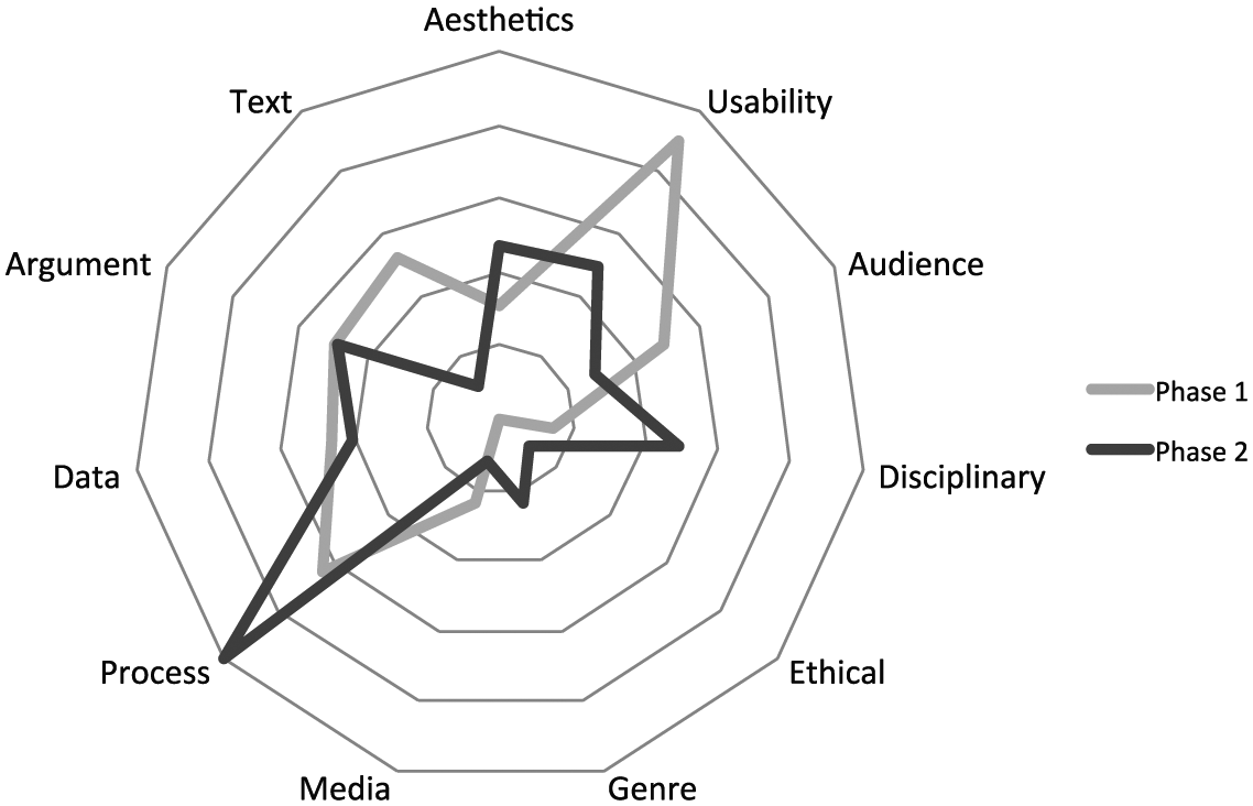
Topologies generated from Phase 1 surveys and Phase 2 interviews and think-aloud protocols compared by category. Phase 2 topology (432 total coded topoi) proportionally scaled to match Phase 1 (1,054 total coded topoi). General (ideographic) topoi (16) not shown on graph.
Unsurprisingly, we see significant overlap in the discourse “landscape” of Phase 1 and Phase 2. But some differences stand out: chiefly, that Disciplinary conventions dominated Phase 2 (process) discourse as opposed to Phase 1 (general). Further, Ethical issues emerged as a new category in Phase 2, and Genre issues figured more noticeably. Aesthetic concerns also received more emphasis.
Conversely, Text-related topoi and Usability-related topoi dominated Phase 1 discourse much more than Phase 2—partly because two Phase 1 survey questions explicitly asked respondents to describe how they worked back and forth between textual and graphic modes.
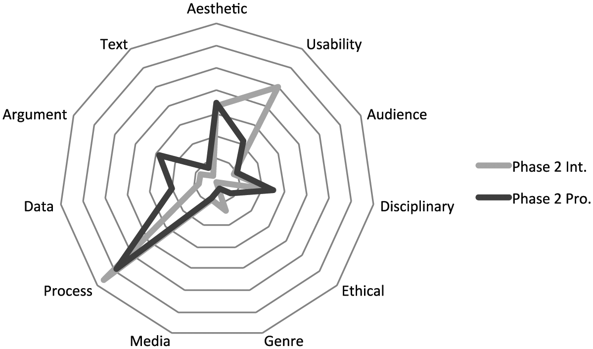
To investigate Phase 2 results more closely, we can begin by comparing the four participants’ topologies generated from the think-aloud protocol (interview topologies looked very similar due to the scaffold of the interview questions) (Figure 3):
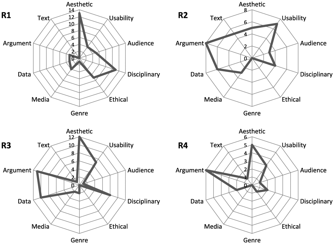
Comparison of the relative frequencies of topical categories expressed verbally, visually, and gesturally by each participant during think-aloud protocols—minus Process topoi.
Removing the big spike toward Process that unsurprisingly dominated the discourse allows us to better discern other similarities and differences in participants’ topologies of practice. Aesthetic, Usability, and Disciplinary issues were important to everyone at some level; meanwhile, the Genres and Media of composition received relatively less attention across the board. Significant differences are apparent as well, however: R3 was unusually preoccupied with Text-based issues, and R1 with Ethical ones. R1 mostly ignored topics concerning Argument and Data that proved significant to the other three participants. And R1 and R2 worried more about how Audience-related factors would impact the interpretation of their graphics than R3 and R4 did (outside formal principles of design and usability).
To move from individual practice to communal practice, we can focus on the topical contours that all four participants shared—namely Process, Aesthetic, Usability, and Disciplinary concerns. I will use these to articulate commonalities across the participant narratives. I will also address Argument principles since they figured heavily in three of four participants’ discourse, and since this category contains many of the common topoi of STEM discourse that may prove useful to a toolkit for STEM visual literacy later on.
Process concerns: Discovery and the black box of software
Participants’ interview responses and protocol practices made it plain that making graphics was a significant part of their process for constructing results from data. They all worked iteratively here, cycling among datasets, visualizations of those data, text about those visualizations, and graphics/texts authored by previous researchers; two of the four participants (R2 and R4) decided to refine experimentation in some way as a result of these iterations; the other two were prompted to ruminate on the validity of their models and how best to defend them to colleagues.
Participants cast their processes as heavily influenced by hardware and software. Software, in particular, has design and visual choices preprogrammed into it—default visual genres, axis arrangements, scales, color scales, and fonts. Participants ranged from ignoring these defaults as black boxes (Latour, 1987), to expending significant effort to defeat software defaults in the service of aesthetic or argumentative goals—on a continuum that proceeded roughly R4, R2, R3, R1.
Aesthetics: A preference for holistic, streamlined impressions
Participants in general foregrounded Aesthetic topoi stressing elegance, spacing, closure, continuity, and lack of clutter. These topoi sometimes came into conflict with other topoi in participants’ processes, particularly Data-related concerns about comprehensiveness and accuracy: The narratives of R1, R3, and R4 all display this tension.
Usability: Paired concerns with consistency of visual codes and saliency of key features for viewers
Participants all took pains to ensure that their graphics—particularly trend lines, scales, and labels—would be intelligible for viewers. R1 and R4 were concerned about the saliency of characteristic curves; R2 made efforts to draw boundaries through essentially continuous velocity information to help viewers discriminate important distinctions; and R3 wanted to make sure she was using conventional color codes and molecular arrangements so that viewers with a chemistry background would not be disoriented.
Disciplinary conventions: Tension between convention and novelty
All four participants commented at some point in interviews that they did not know why certain visual conventions were in place (such as the assignment of time to the x- rather than y-axis in fever charts); nonetheless, they presented them as powerful constraints on their visual invention and composition processes. For R1 this issue manifested in her struggles to reconcile log-log scales with the visual display of the abscissa; R3 spent significant time navigating between convention and novelty in trying to create “good-looking” graphics; and R4 dramatized this concern in his narrative about feeling lost at atmospheric physics lectures because of different scalar conventions.
Visual argument: Telling a story about the work and fitting it into the larger story of the field
The visual arguments participants were trying to make naturally depended on the genre they were working in. Despite this variety, all participants used “significant,” “striking,” or “salient” elements of their chosen genres as topoi on which to pivot from graphical invention to arguments about the significance of research results. Overall, participants emphasized the continuity and flow of their graphics in order to forward the strongest Argument possible for the validity and significance of their results; but concerns with Data accuracy and Ethics set bounds on these efforts.
Filters: The relative dominance of topoi in participants’ practice
The tensions expressed above among topoi may be better expressed using a second form of topology: a filter. As mentioned in the Method section, filters may be constructed when topoi come into conflict with each other in the course of an individual’s decision-making process, as they did when R3 weighed including microscopy Data in her cartoon against Aesthetic concerns about clutter and ultimately decided to leave out the microscopy. As a filter, her decision would be represented “Aesthetic_no-clutter>>Data_comprehensive,” which expresses the expectation that a norm promoting visual elegance will likely defeat the desire to include as much data as possible in a graphic, if the two topoi come into conflict. By reconciling all of the moments of topical competition in participants’ practices, it is possible to assemble filters that are provisional expressions of communal attitudes toward making research graphics:
Usability, Audience>>Disciplinary, Data (accuracy, limits)>>Aesthetic, Argument>>Data (comprehensiveness, detail)
Media>>Process, Argument
Ethical>>Aesthetic
Filter 1 expresses the expectation, based on participant responses, that they will produce the most persuasive and beautiful graphics possible within the limits imposed by Disciplinary standards and fidelity to Data. Disciplinary standards are violated only if audience comprehension is at stake. Further, data will be left out if its inclusion results in cluttered or inelegant graphics. Filter 2 expresses the pressure that media constraints (page size, color printing charges, etc.) place on participants’ compositional processes (including software defaults) and their argumentation goals. Filter 3 expresses the expectation that Aesthetic preferences will yield to Ethical strictures, particularly where the accuracy of data is concerned.
These filters add power to the frequency topologies by allowing us to pose focused, testable hypotheses about wider communities of practice: For instance, would a larger group of structural geologists also privilege Aesthetic values over Data comprehensiveness if these topoi came into conflict during their visual invention practices? And if so, would a change of audience (say nonexpert to expert) cause any changes to this ranking? Filters as expressions of community attitudes are persistent, but as they are always in tension with kairos, parts can change in response to situation, and large-scale changes certainly accrue over time.
Filters also remind us that frequency is not a complete index to dominance in rhetorical topology. For instance, Media and Ethical concerns were not raised frequently at all by participants in Phase 2, but when they appeared, they dominated more frequent concerns. Filters help elucidate the relative strengths of topoi in community attitudes and thus serve as a helpful complement to frequency-based topologies.
Research Question 2: Is the dystopia evident between STEM visual pedagogy and STEM visual practice in Phase 1 survey results also evident in Phase 2 procedural results?
There are at least two ways to investigate this question topologically given the data at hand:
Compare Phase 1 and Phase 2 topologies overall
Compare the Phase 2 interview topology concerning pedagogy (received and delivered) with the Phase 2 topology of practice
For (1), returning to Figure 2, we can see that the meta-discourse about STEM research graphics (Phase 1) differs from the discourse of actually making graphics (Phase 2); specifically, Usability concerns seem to flatten out in practice, and Aesthetic, Disciplinary, and Argument concerns come more to the fore. We can sharpen the picture by comparing the topology of pedagogy-related questions from Phase 2 interviews against the Phase 2 protocol topology (Figure 4).
Comparison of topology of pedagogy from interviews with topology of praxis from think-aloud protocols (frequencies from interview questions [81 segments] scaled proportionally to match frequencies from protocol [224 segments]).
In this view Disciplinary differences between pedagogy and practice disappear, but differences in Usability and Argument are larger, with pedagogy emphasizing Usability and practice emphasizing Argument. These results echo what we discovered in Phase 1: that participants characterized the visual education they received, if they received one at all, as centering heavily on perceptual principles related to Usability and design—for example, being aware of color-blindness, making scales and legends legible, using multiple cues to distinguish data series, and so on. Almost never did participants report—in Phase 1 or Phase 2—learning as novices that graphics make arguments, or learning techniques of visual argumentation. By contrast, participants’ processes as mature researchers were deeply invested in Argument practices such as highlighting the novelty of results, creating a clear logical flow through multipanel graphics, and indicating significance by heightening contrast or continuity, as appropriate. This mismatch or dystopia between pedagogy and practice has implications for STEM visual education and STEM visual literacy for nonexperts.
Discussion
Participants’ interviews and protocols revealed strikingly complex visual invention and composition practices: We see scientists framing narratives, mastering a range of graphic design software (and writing their own in some cases), teaching themselves design criteria from blogs, using aesthetics as a rubric for evaluating methodology, exercising sophisticated drafting skills, applying principles of gestalt psychology, imitating graphs made by others, critiquing graphs made by others, worrying about audience reception, and providing art lessons for their students.
Despite this impressive complexity, common beliefs, values, and norms across participant practices make it possible to articulate them. My first research question asked if and how the common topoi of STEM visual invention and composition transduced in Phase 1 were operationalized by STEM researchers in Phase 2 practices. The results yield at least two answers to that question:
Frequency-based topologies suggest Process topoi understandably dominated participants discourse of practice in Phase 2, followed by Usability, Aesthetic, and Disciplinary concerns. Argument and Data topoi made a moderate showing for all but one participant. Concerns with Genre, Ethical issues, Media, and Text (for all but one participant) played the smallest roles. Ethical issues were not present in the Phase 1 topology.
Filter-type topologies roughly replicated the frequency-based ranking but suggested that Ethical and Media-related concerns may be higher priority than their frequency would suggest, at least for some STEM researchers in some situations.
These findings corroborate Northcut’s (2004), who called the invention practices of paleontological illustrators “collective” and noted very similar sources of dominant constraints—aesthetic, disciplinary, data-related, and audience-oriented. Further, participants’ use of graphing practices to reduce the “messiness” and “noise” of raw data to contours that are aesthetically elegant and also count as significant scientific results—this finding echoes Wickman’s (2012) account of the laboratory graphing practices of his physicists; similarly, the tension some participants reported (R1, R3, and R4) between aesthetic simplicity and the need to convince colleagues of the comprehensiveness and accuracy of their data resonates with Wickman’s account of how his participants used their graphs outside the lab.
The combination of topology and think-aloud protocol also confirmed previous research that has found traces of topoi in verbal, visual, and gestural documents. Phase 2 documented the common STEM topoi of change over time, comparison, and degree in all three channels of practice: as one example, the topos of comparison was coded verbally in R4’s comment drawing my attention to the different icons marking out two data series, “See? Solid circles . . . open circles”; it was coded visually in R2’s opening her map and a draft cross-section on the screen together so that I could see for myself that the range of the two didn’t match; and, it was coded gesturally in R1 scrubbing her mouse over two curves to show me they looked different when they should look the same. This finding contrasts with Gross and Harmon’s (2013) dual-coding theory of STEM graphical composition, which holds that the visual and verbal constitute separate channels and thus predicts that the topoi, as techniques of verbal invention, could not be coded in visual or gestural channels. If further protocol research confirms the multimodality of topoi, this result would pose a challenge to the Gross and Harmon theory of visual invention.
Along similar lines, interesting articulations emerged in participants’ practices across topical categories. For example, participants’ drawing my attention to Aesthetic contrast was often followed by Usability concerns about viewers’ ability to distinguish these contrasts, which were in turn connected to comments about sufficient resolution of images in Media in order to make an Argument of comparison to demonstrate the novelty of results. Similar layers or collocations accrued around topoi of similarity, scale, and sequence. These articulations suggest that the processes of visual invention and composition are fundamentally continuous and are scaffolded on top of basic cognitive operations. With a larger dataset, it would be possible to test this hypothesis by creating a network topology that could demonstrate articulations among Aesthetic, Usability, Media, Disciplinary, and Argument topoi along the lines of Hart-Davidson and Omizo’s (2017) topological “loops.” If robust loops emerged, that finding would support ecology theory, which holds that visual logic and argumentation are scaffolded on basic perceptual and intermediate cognitive processes (Dünkel, 2015; Golley, 1993; Newton, 2005).
In answer to the second research question, concerning a replication of the Phase 1 dystopia between pedagogy and praxis, this dystopia did persist in Phase 2: Discourses of pedagogy still hovered around Usability concerns; meanwhile, discourses of practice were preoccupied with Argumentation. This dystopia continues to be a concern as scientists’ efforts to design effective and appealing visual arguments are read as illicit “tricks” (Walsh, 2014). Corroborating this finding, “clarity” continued to be a General commonplace to which participants frequently defaulted when asked about norms and values for graphics; this commonplace reinforces the myth of research graphics as transparent windows onto nature and reality. 4
In spite of the continued dystopia between pedagogy and practice in Phase 2, it bears noting that participants varied significantly in their willingness to question software defaults and to teach STEM graduate students to think critically about the design of research graphics; these are hopeful signs for eventually closing the gap between pedagogy and practice when it comes to the Argument principles that underlie STEM visual literacy.
Conclusion
Phase 2 created a rich record of participants’ visual invention and composition processes that yielded the following insights:
Participants strove to create the strongest visual arguments for the novelty and validity of their results as possible, within the limits of disciplinary convention. Only concerns about intelligibility to audiences appeared capable of overriding these conventions. Constraints from ethical principles, media formats, and hardware/software processes also significantly shaped participants’ visual arguments.
Closely related topoi appeared to layer or articulate across categories—Aesthetic, Usability, Disciplinary, and Argument categories in particular—which suggests an essential continuity to invention and composition and an ecological model of STEM visual practices.
Combining forms of topology—such as frequency-based and ranked-filter—adds depth and predictive power to a topical analysis.
The action of topoi can be observed in gestural, verbal, and visual channels of practice.
Participants’ rich argumentation practices during their invention and composition protocols were not mirrored in their discussions of education and pedagogy. Notwithstanding, at least two participants stressed their attempts to significantly deepen their graduate students’ visual education—particularly in the areas of Usability and Aesthetics.
As discussed above, several of these findings suggest intriguing directions for further study. Since this project was designed to develop a STEM visual literacy toolkit for use by nonexperts, the immediate next step will be a study of the uptake of dominant Phase 2 topoi by nonexpert audiences in public discussions of STEM research graphics relating to seismic and weather hazards. The goal is to identify dystopias between expert and nonexpert discourses and recommend a core set of common visual STEM topoi that can be tested for its ability to remediate these dystopias in educational and outreach settings—much as Wilder and Wolfe demonstrated for a core set of literary-critical topoi in an undergraduate literature classroom. In these and other ways suggested by this study, writing-studies scholars can continue to enrich the literature on visual invention by contributing a much-needed empirical attention to process, and a critical focus on pedagogy.
Footnotes
Appendix
Acknowledgements
The author wishes to acknowledge the able assistance of Cassie Sander in the coding of participant interviews.
Declaration of Conflicting Interests
The author declared no potential conflicts of interest with respect to the research, authorship, and/or publication of this article.
Funding
The author disclosed receipt of the following financial support for the research, authorship, and/or publication of this article: Partial funding for this project was provided by the Summer Research Assistantship program in the English Department of the University of Nevada, Reno.