
Abstract
The diagrammatic slideshow constitutes a crucial communicational instrument in management consulting. However, its semiotic implications remain poorly understood. How do consultants create slides that they deem significant? How do they recognize a good slide or an effective diagram? What practical criteria do they use? To tackle these questions, we develop a pragmatist approach based on the theory of signs of Charles S. Peirce. Drawing from data collected through ethnographic participant observation, our study analyzes how a team of consultants drafts a single slide intended to represent the problems of a client organization and assesses the evolving strength of the document. We identify three recurrent conditions of robustness—impact, accuracy, and layout—and discuss them in the light of Peirce’s distinction of iconic, indexical, and symbolic capacities in signification.
Keywords
For management consultants, the need for robust signification—for example, illustrating problems or solutions in a clear and compelling way—is an everyday concern. The signification of what consultants say is often fragile, subject as it is to critical scrutiny and demanding organizational circumstances. Hence, consultants become preoccupied with the need to produce adequate signs, that is, those that are fit for circulation, faithful to reality, “sticky” enough to be adopted, and useful as a basis for clients’ actions. Social research has examined the efficacy of communication in management consulting from many angles. However, little attention has been paid to the role of the proverbial consultancy slideshow: The electronic visual document often referred to as a “PowerPoint deck,” in reference to the graphic presentation software developed by Microsoft. In this study, we examine the craft of signification in management consulting, using in-depth ethnographic material on the composition of a consultancy slide in the context of a restructuring assignment. We isolate and analyze three fundamental traits that consultants use to assess the semiotic solidity of their slide—layout, accuracy, and impact—using a triadic key of iconic, indexical, and symbolic aspects as suggested by Charles S. Peirce.
The Semiotic Problems of Management Consulting
The cultural features of management consulting have been extensively investigated from the perspective of representational artifice. In a context where knowledge is ambiguous and contested (Alvesson, 1993), consultants are often depicted as lacking qualified judgment, favoring insubstantial froth over sound expertise, and concentrating on persuasion. Many feel that consultants use rhetorical tactics such as storytelling (Clark & Salaman, 1996b), dramatization and theatrical performance (Biehl-Missal, 2011; Clark, 2008; Clark & Salaman, 1996a; Mangham, 1990), packaged discourses and instruments (Legge, 2002; Whittle, 2008), branding (Kärreman & Rylander, 2008), managerial myths (Berglund & Werr, 2000), and managerial fashions (Abrahamson, 1996; Clark, 2004) to signal and determine what is real, efficient, valuable, or problematic (Alvesson, 1993; Clark, 1995; Clark & Fincham, 2002; Fincham, 1999; Puyou, Quattrone, McLean, & Thrift, 2012; Villette, 2003; Whittle, 2006).
Consultants’ difficulties with the requirements of substantiality are not viewed in this study as a symptom of sketchy professionalism or amoral opportunism. Rather, we approach the phenomenon via the inherent fragility of the signification process. To be significant in management consulting is no easy matter; this difficulty results from practical conditions that need to be investigated as such. To do so, we focus on the documents produced by consultants in the course of their assignments.
An important body of literature on graphic design in organizational settings has dealt with PowerPoint—the software package itself, the documents it produces, or the genre of presentations it has engendered (Yates & Orlikowski, 2007)—by focusing on scope and limits, or pros and cons (for an overview, see Beaudoin, 2008; Gabriel, 2008; Kaplan, 2011; Knoblauch, 2013). Critics commonly argue that the features of PowerPoint impose a cognitive style that reduces the analytical depth of presentations and enforces uniformity (Gabriel, 2008; Parker, 2001; Tufte, 2003). Apologists, for their part, usually suggest that PowerPoint is merely a tool that can be used for good or ill, like a knife. They also point out that slideshows are intended to support oral presentations and should not be compared so freely to stand-alone document formats (Atkinson, 2011; Doumont, 2005; Farkas, 2006; Stark & Paravel, 2008).
We suggest that people use PowerPoint to construct representations that have the power to generate effects in a complex setting. In this respect, our analysis comes close to recent research on the power of writing in organizations (Fayard & Metiu, 2012), the communicative genre of PowerPoint (Yates & Orlikowski, 2007), the role of PowerPoint in the epistemic culture of strategy (Kaplan, 2011), and, more generally, on the organizational dimension of corporate writing (e.g., Delcambre, 2010; Huët, 2010; see also Bloomfield & Vurdubakis, 1994, 1997). Our study augments this literature by proposing a pragmatist understanding of the production of signs, aligned with the semiotic materialist approaches that have contributed to the renewal of organization studies in recent decades, especially through developments in actor-network theory (e.g., Czarniawska & Hernes, 2005) and studies in the organizing role of communication (e.g., Cooren, 2000; Cooren, Taylor, & Van Every, 2006; Taylor & Van Every, 2011).
A Pragmatist Approach to the Production of Signs
There are several ways to consider what signification consists of and what semiotics, the study of signification, is about. We opt for an angle that we term “pragmatist,” insofar as it is inspired by the views of Charles S. Peirce, the originator of pragmatism in the philosophical sense (as opposed to “pragmatics” as a branch of linguistics). In particular, we rely on Peirce’s understanding of signification as a process of semiosis. This understanding can be drawn from a number of Peirce’s philosophical writings, available in his Collected Papers (Hartshorne & Weiss, 1931) and other editorial compilations (e.g., Buchler, 1955; Hoopes, 1991). We also draw from the use of this perspective in organization studies (Lorino, 2014a; Robichaud, 2006; Taylor & Van Every, 2011, 2014). We acknowledge, in addition, the complications of Peirce’s vocabulary and limit its use here to a basic relational interpretation of the sign.
From Peirce’s perspective, signification is literally an action—the action of the sign, or semiosis—which amounts to the establishment of a relation (Buchler, 1955). This relation is neither between “things” and “signs,” nor between a “signified” and a “signifier.” Instead, it is a triadic relation between the representamen (i.e., that which signifies), the object (i.e., that which is signified), and the interpretant (i.e., that which makes the representamen signify the object). In other words, the interpretant is what allows the sign to make sense, the representamen is what provides the sign with a material ground, and the object is what the sign becomes a sign of. If we consider a management consultant’s PowerPoint slide in this light, we can conjecture that the representamen is the set of arrows, boxes, and keywords displayed on the luminous surface; that its object is a problem within the client organization; and, that the interpretant is the professional custom that allows us to see a box as a department, an arrow as an effect, or a keyword as a problem.
Achieving signification depends on the particulars of this triadic relation. Among the classifications that Peirce provides in this respect, the distinction between icon, index, and symbol is particularly useful (Buchler, 1955). An icon signifies principally by virtue of its representamen; it makes sense because of its formal or physical resemblance, even if it does not stand for any actual object. An index signifies by virtue of its object; it is an existential trace of the object, even if the clues to its origin are obscure. Finally, a symbol signifies by virtue of its interpretant; signification flows from a set of conventional rules of interpretation. In practice, iconic, indexical, and symbolic styles of signification can intermingle.
We argue that the consultant’s PowerPoint slide signifies on all three fronts. It is iconic in its use of colors, shapes, pyramids, quadrants, and cycles, but is also indexical in that it reports on findings from an investigation, and symbolic because it signifies through its involvement in an organization. We suggest that management consultants grapple with the complicated task of making these three aspects—iconic, indexical, and symbolic—hang together. We also suggest that the outcome of this process is fragile. When signs work on one ground, they can often be criticized on another. We think that this tension—this semiotic awareness—is an inherent part of the consultant’s habit.
Ethnographic Participation
This study is based on participant observation carried out by the first co-author at Effictio Consulting, a consulting company based in France that employs 150 consultants and operates in a variety of sectors. (For the sake of confidentiality, all personal and company names have been replaced by pseudonyms.) The first co-author worked for the company for almost 3 years—from October 2009 to June 2012—as a junior consultant in the context of industrial doctoral research. Work consisted in participating actively in ordinary consultancy assignments, with the possibility of applying ethnographic material in an academic context independent of the company’s agenda.
Effictio Consulting was commissioned to conduct a restructuration assignment for Aeger Hospital, a health care institution created by the merger of two hospitals. The assignment was led by Camille, a senior consultant, and Thomas (the field investigator and first co-author), who held a more junior position. The team was supervised by Paul, a partner at Effictio Consulting. The post-merger situation at Aeger Hospital was prompting organizational tensions and managerial politics with which the Effictio team had to cope. The team was also required to collaborate with a competing consultant, Jacques, who was leading strategic planning for Aeger Hospital and was used to working closely with the organization’s CEO.
The mission included 3 months of data gathering (50 semi-structured interviews with executive managers and a literature review of best practices of operational management in health care) and the preparation of a consultancy report. By the end of this process, the consultants had reached a consensus on the main dysfunctions of the organization. The inefficiency of administrative management processes was a core issue, along with flaws in the human resources department, and an overall lack of governance. The team now had to formulate this problem in a communicable way. Drafting the report took 1 month and resulted in the production of a 120-slide PowerPoint deck. However, we concentrate on the drafting of one particular slide: a diagram intended to play a crucial role in demonstrating the problems of the organization.
Empirical materials were gathered through document collection (including emails, notes, and reports) and participant observation in meetings and conversations. Field notes were gathered through techniques comparable with the ones described by Whittle (2008) in her study of consultants’ discourse, using a form of “ethnographic fiction science” (Watson, 2000, 2003) that relies on the creative reconstruction of ethnographic experience. Autoethnography (Chang, 2008; Ellis & Bochner, 2000; Reed-Danahay, 1997) has the advantage of providing researchers with full access to data in contexts where secrecy is usually the rule (Sturdy, Handley, Clark, & Fincham, 2009; see also Czarniawska & Mazza, 2003). We believe that autoethnography need not necessarily be “evocative” (Ellis, 1997) or “political” (Denzin, 2003; Reed-Danahay, 1997), and can serve an analytical approach well (Alvesson, 2009; Anderson, 2006; Anteby, 2013).
Data for this study were initially gathered in an exploratory manner over a period of several months, as part of a wider investigation (Bourgoin, 2015). It became clear that we could achieve more heuristic power by developing a purposeful ethnographic analysis of the drafting of a single slideshow. We chose one particular slide on the basis of its centrality in a consultancy assignment and the richness of the empirical material. We focused our analysis on a series of occasions on which the robustness of the slide was discussed, asking in each case how signification was considered, or with what it was concerned.
Building a Consultancy Slide
A Diagram to Prompt a Systemic View
The development of our focal slide started with Camille giving Thomas a few instructions:
You should start with the merger, insisting on the fact that the merger is not over yet. No one will complain about that, or deny it. The result is that boundaries are fuzzy for each department, and the organization suffers from a lack of direction. (Field notes, January 2010)
Thomas had to devise a layout that would clearly present the merger. He made a first draft, presenting an approach that he called “systemic,” which he then discussed with Camille. Several comments were handwritten on a printout during this discussion (Figure 1a). Camille found this first proposal interesting:
I like this approach, because we need to show that problems are systemic. It’s a good way to avoid getting trapped in “silo”-type modeling, without a view on overall issues of governance. But we also need to show that the organization did not capitalize on good practices throughout the merger; what was good in each structure was not re-used. (Field notes, January 2010)
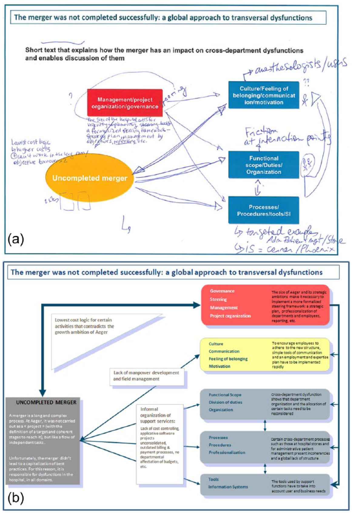
(a) First and (b) second drafts of the slide.
On this first draft of the diagram, the mention of “uncompleted merger” is highlighted to comply with Camille’s instructions. Top management is also given a central position. In doing this, Thomas wanted to emphasize that top executives should be held accountable for the failure of the merger in terms of systems integration and corporate culture. Camille expressed concern over the level of detail and the evidence backing the diagram’s assertions. She asked Thomas to provide concrete examples for each box, which he handwrote on the page. Camille herself advanced the analysis using the document as a thinking aid (Figure 1a). She provided details on what she had come to see as the inadequacy of top management.
Camille and Thomas also questioned the causal relations between the elements, as the multiple hand-drawn arrows show. They tried to distinguish “real causes” from “symptoms,” but they also repeatedly asserted that “everything links to everything else,” and that “there is always something artificial about this kind of ordering” (field notes, January 2010). They spent some time discussing the position of the elements on the page, the appropriateness of titles, and the actual interactions between these elements. Camille, concerned by this interpretive dimension, suggested the inclusion of a new box for “structure” in which issues of managerial decentralization would be described. More and more convinced by this “systemic approach,” she asked Thomas to come up with “better-defined” titles. The meeting ended with a parting shot from Camille:
I know this is important to you. But it would be counterproductive to point the finger at top management too directly. I’d rather you put this red box [“Management/project”] back in the ranks, on the same level as the others. (Field notes, January 2010)
A Diagram of Attribution
Thomas drafted a new version of the diagram taking into account Camille’s comments (Figure 1b).
Now, causal relations were more specific and text was more explicit. The “governance” box was less salient, as requested by Camille, even though its color, its elevated position, and the causal relations represented by the arrows (on the right) still explicitly pointed to the responsibility of top management. Camille welcomed the new draft:
It’s much better . . . Leading with the merger is an ideal way to signal the hospital’s flaws without stigmatizing anyone . . . Frankly, there’s no doubt that once the merger is fully completed, things are going to be much easier at Aeger Hospital. (Field notes, January 2010)
The difficulty here lay in attributing responsibility for problems without overburdening or upsetting particular individuals. In “the merger,” Camille saw the ideal way to get a handle on accountabilities. Signaling this impersonal process as the prime cause of dysfunction was a way to “gently get the message across” (field notes, January 2010).
Publics to Be Affected
Effictio Consulting’s assignment had to align with the work of another consultant, Jacques, a long-time collaborator of Aeger Hospital. Camille, the senior consultant, and Paul, the Partner at Effictio, met with Jacques to discuss the reorganization. Camille alerted Thomas to the implications for their diagram:
We need to arrange it to make sure Jacques’s input is taken into account. Otherwise he’s going to challenge us . . . Jacques is saying that we have to go beyond symptoms and start addressing human resources, processes, organization, and tools [. . .]. (Field notes, January 2010)
At this stage in the drafting process, language and shape had to shift once again. The slide had to accommodate Jacques’ preferred vocabulary and adopt his boxes: “human resources” (for skills, capabilities, size), “processes” (issues of fluidity and clarity), “organization” (who is responsible for what), and “tools” (information systems and work methods). To protect the signification process, the diagrammatic representation functioned as a ground for settlement and compromise between alternative managerial interpretations.
Diagrammatic Mimesis
Camille asked Thomas for further improvements in the diagram:
We’ll do some more work on the boxes to make sure they are right and fit Jacques’ analysis. But the diagram isn’t very nice—it’s actually quite clunky. We know everyone in the hospital is going to read this one slide: it’s a global diagram on dysfunctions at Aeger Hospital, so it really needs to be a killer. (Field notes, January 2010)
At this stage, the senior consultant’s remarks shifted the focus to aesthetic aspects, moving from the realm of precautious attribution and interested collaboration to that of graphic properties. Now, the emphasis was on building a “killer” slide: achieving strong visual impact and becoming a point of reference. Thomas looked for sources of inspiration to make the presentation more aesthetically fit. He searched templates in Effictio Consulting’s archives and also perused PowerPoint examples obtained from a colleague at another consultancy company. Figure 2a illustrates the outcome of this search.
(a) Third and (b) fourth drafts of the slide.
Camille’s reaction was mixed. It was nice, but she felt it looked too “consultant,” that is, “difficult to swallow for the Board and CEO.” She forwarded Thomas another model “much simpler in terms of form, . . . basically a circle in the middle with several boxes around” (Camille, field notes, January 2010). The model’s content had hardly anything to do with the assignment. A common criticism of consultants is that they use the same slideshow models over and over, irrespective of the context and content of the analysis. True, Camille saw the model as “a source of inspiration” that could organize thoughts regardless of object. But for her, this was about prompting an aesthetic sense of composition not relying on an analytical framework.
Tinkering With Arrows
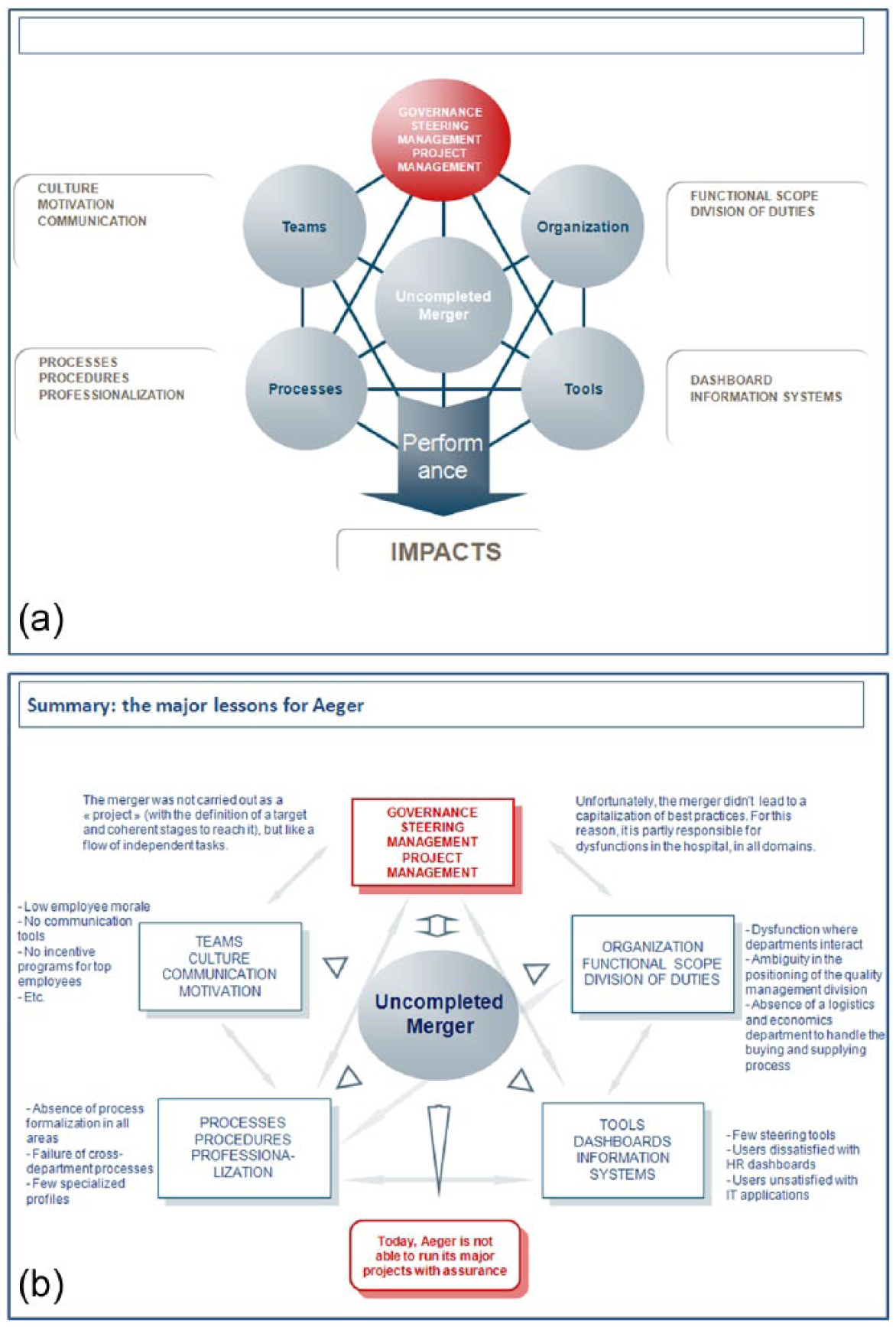
On the basis of this example, Thomas drafted a new version of the diagram (Figure 2b). He placed “uncompleted merger” in the center and used Jacques’ analytical categories in the boxes, adding bullet-point explanations alongside to back the assessment empirically. Camille realized that all the arrows linking boxes to each other were “confusing,” and asked Thomas to abandon the figuration of causal relations in favor of a circular, all-encompassing structure that ought to “speak for itself.” Unnecessary text also had to go, for the sake of simplification (Figure 3a).
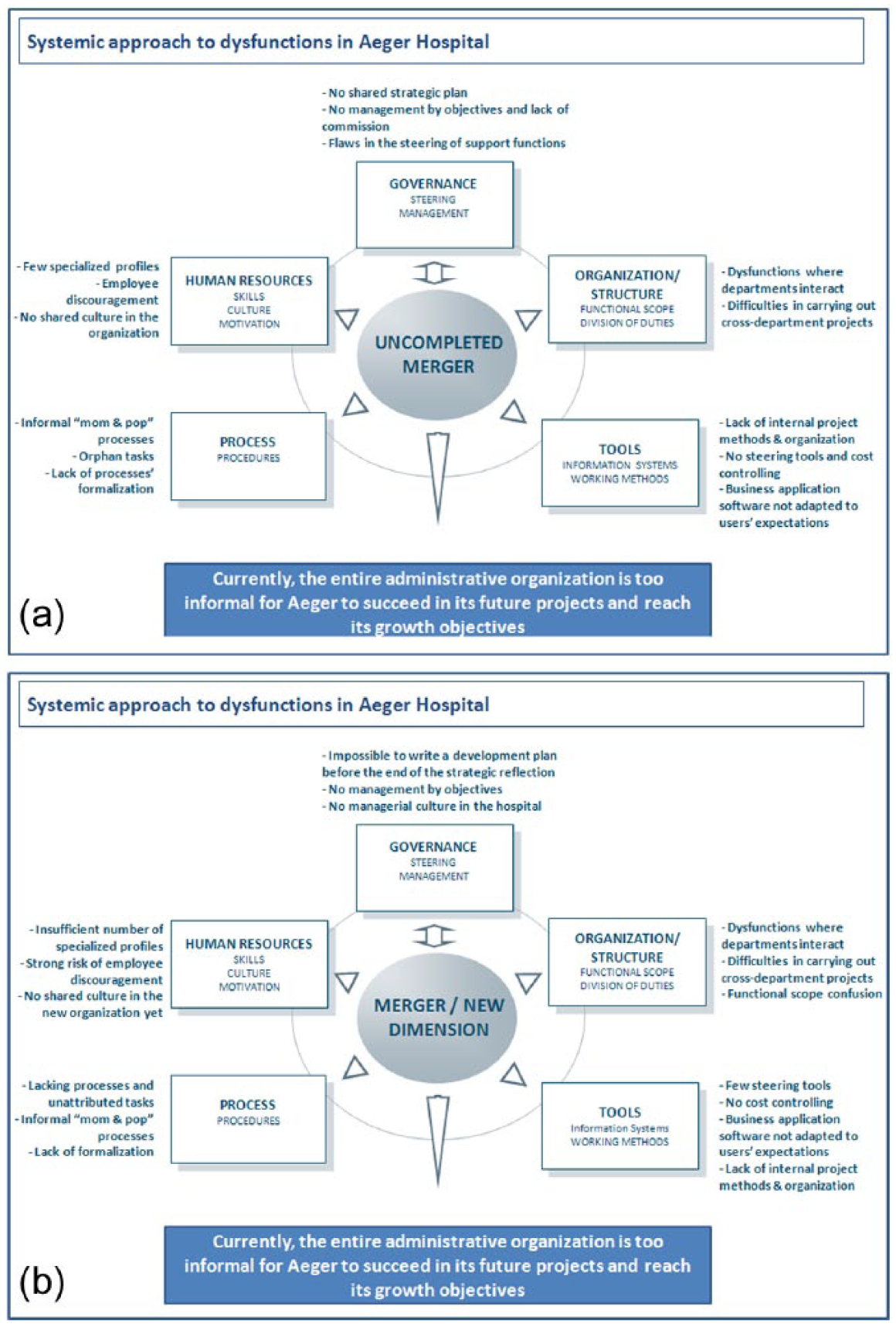
(a) Fifth and (b) sixth drafts of the slide.
The Art of Wording
Camille scheduled a meeting with Paul to run the latest draft of the diagram past him. He found it interesting but objected to the wording. The diagram, as he said, had to be a “stand alone” that made sense without verbal explanation. He also noticed that there were too many “negative” words. As Camille explained,
Paul finds the report way too confrontational . . . Either we say “This is lame, you’re all no-hopers,” or we use the managerial approach, which means we say “You’re good, but you still have areas of improvement to consider.” . . . We have to decide how prepared we are to deal with the fallout of using such violent language. (Field notes, May 2010)
The client had to be gently steered toward positive change and, as Paul explained, this had to be done diplomatically. Indeed, consultants are closely associated with the effects their consultancy might produce; ultimately, they have to protect themselves from a client who might feel overchallenged.
Attaining a “Rock-Solid” Diagram
The diagram was duly amended. For example, “few specialized profiles” was replaced by “insufficient number of specialized profiles,” “employee discouragement” by “strong risk of employee discouragement,” and “no shared culture in the new organization” by “no shared culture in the new organization yet.” The term “uncompleted merger” at the center of the page, Paul indicated, had a “bad connotation” and needed to be replaced.
Both Thomas and Camille were satisfied with the final version (see Figure 3b). As Camille remarked, “Our diagram really shines . . . it has to be said, it was a ‘two-man-day’ diagram, but at least now it’s rock solid” (field notes, May 2010). For the consultant, perceiving the diagram as “rock solid” was the outcome of a series of iterations and compromises in the process of semiosis. The diagram had to promote a systemic approach to dysfunctions, emphasize the merger without stigmatizing anyone, display an aesthetic layout with coherent causal relations, be thorough in its analysis, provide in-depth and well-structured examples, enable productive discourse and challenge the client, and secure the consultants’ mission.
A Triadic Understanding of Signification
Symbolic, Indexical, and Iconic Capacities
The consultancy slide is not a blank representation. What it says has to be understood in relation to a set of semiotic concerns: angles through which the production of signification is gauged and adjusted. Our analysis identifies three ensembles of such angles. The first is symbolic: It reflects the need to rely on a set of localized habits and compromises and to create an appropriate effect on the public to whom the slide is addressed. The second is indexical: The slide must operate as a report and provide evidence of accurate reference to the reality of the consultancy inquiry. The third is iconic: It deals with the attainment of a formal coherence of the graphic composition and focuses on aesthetic fit. Of course, these three aspects are intertwined in practice. For example, if the consultant deletes an arrow from the diagram for the sake of graphic symmetry, an explanatory link is also removed from the analytical edifice, and a managerial responsibility is no longer addressed. These three aspects may be indivisible in practice, but they can still be distinguished analytically.
In Peircean terms, attention to the symbolic process means focusing on the interpretants, that is, on the conventional sets of rules that organize agency, authority, and responsibility within a particular setting. In our case, the conventions at play were mostly those governing client–consultant relationships. The consultants were indeed acutely aware of the “political” impacts of their recommendations, not least because their message ascribed responsibility for managerial shortcomings. They tried to avoid formulating agency in intentional and individual terms and did not point directly toward the responsibility of individual managers. They also considered the potentially counterproductive effects of their message in terms of their own image within the client organization or their position in relation to the competing consultant. But Thomas and Camille had to also test their mastery of the codes of symbolic interpretation in the client organization itself, especially through continuous interaction with Paul and Jacques. For instance, they made sure that their message’s wording could find its way into the specific cultural codes of the hospital.
Peirce’s notion of thirdness, which encapsulates the mediating part played by the interpretant in the triadic process of signification, could indeed correspond to what we call an “organization,” as suggested by Taylor and Van Every (2011, 2014) and Lorino (2014a, 2014b). Getting the slide right means drawing on the right organizational relations as required for semiosis. The consultants’ concerns over “stigmatization” illustrate the embeddedness of the sign in a hierarchical system of authorization (Bencherki & Cooren, 2011; Taylor, 2014; Taylor & Van Every, 2014). Consultants work as active mediators in the crafting of a message that is intended to enroll several groups of competing actors and produce contextual effects (Whittle & Mueller, 2008; Whittle, Suhomlinova, & Mueller, 2010). Echoing the findings of Mueller, Whittle, Gilchrist, and Lenney (2013), we observed that political issues played a particular role in the process—not only as the potential outcome of an artifact that attributes positions and responsibilities but also as a symbolic medium of intellection through which consultants make sense of their situation and their effect in the client organization.
However, the consultants also sought accuracy, in the sense that they explicitly aimed at creating signs that were truthful and exact, accurately reflecting what they considered to be the reality of the client organization. The construction of the diagram resulted from iterative back-and-forth between the consultants’ conclusions and the diagram that had to represent them, for instance, through the use of consistent categories and vocabulary. The indexical process is visible in the consultants’ commitment to “exhaustive” analysis; in their reference to “detailed” and “concrete” examples that could back up their assertions and testify for the fact that they “went on site”; or in their focus on the appropriate titles for each box in the diagram. At no point was the veracity, exactness, or validity of the slide questioned by Camille or Thomas. One could claim that there is nothing in the surface of the slide that stands as a material mark of the object of signification, as canonical examples of the Peircean index would require, like footprints in the snow. But if the object is the consultancy inquiry as such, then the PowerPoint deck aims at reporting from it, providing palpable indications of the fact the consultancy assignment happened.
The issue of indexical capacity echoes discussions on the anthropology of the scientific reference, especially those initiated by Latour (1999). Science, as Latour argues, does not mirror the objective world: It produces signs that actually build the objectivity of the world. Reference is not merely the reflection of a reality that exists in itself, but an active indexical work, a chain of transformations that are necessary to transpose a viable sameness (Latour, 1999). The indexical angle that we identify in the craft of managerial signification is also in tune with the referential ideal seen in the “classic stance” of organizational theory (Du Gay & Vikkelsø, 2014). True, progress in the scholarly appraisal of organizational reality may have led to an overemphasis on symbolic and iconic angles. But the notion of management as a “practical science” operates, although certainly not alone, in the semiotic complex of management consultancy. Peirce’s notion of index captures well this prevalence of the object of signification in the process of semiosis.
Finally, our analysis demonstrates that consultants care about visual consistency in the production of the slide—that is, about neatness, proportion, and harmony. The attention to symmetry and scale in the arrangement of boxes, titles, arrows, words, and colors certainly provides striking evidence of the importance of this aspect. Camille, Thomas, Paul, and Jacques do not delve into these visual aspects to pursue a strategy of maquillage or decoy. On the contrary, they bring such concerns in line with their primary semiotic aim, which is to signify the organization.
Iconic processes are integral of what has been termed “organizational aesthetics” (Hancock, 2005). The prevalence of an iconic dimension in organizational communication is critical for information design (Tufte, 1997) in which the practice of diagrammatic display is crucial. Simplification, clarification, and ordering make the diagram appropriable. In such business schematics, critics see a form of oversimplification that “perpetuates confusion between the register of science and the register of the aide-mémoire” (Pinto, 1987, p. 93, our translation). We observed, however, that the iconic element rather corresponds to a rule that governs the rigor of analysis-qua-communication in the consultancy forma mentis. When Camille and Thomas orient the visual traits of the PowerPoint slide, they certainly want it to look nice. But “niceness” here amounts to significance that is subordinate to the representamen; that is, iconic significance. In the Peircean understanding, iconic signification is said to operate by virtue of the representamen’s resemblance to the object of signification. But what does an organizational dysfunction look like? For consultants, getting the semblance of the organization means grappling with this iconic angle.
Management Consultancy and Triadic Awareness
When Camille and Thomas work with this threefold concern in mind, they accentuate the interpretation of the organization’s problems. As the slideshow is certainly open to critique, they need to cover its strength from all possible angles. What they provide needs to stand as a symbol, and hence initiate paths of interpretation, including, as we have seen, in terms of the assignment of agency and the identification of responsibility. But when Camille and Thomas temper this concern with a call for a quasi-scientific care for the reference to their investigation and emphasize the logic of “diagnosis” (as they say), they are actually embracing an indexical preoccupation. When concern shifts to visuals, the iconic dimension comes to the fore, with signification occurring principally by virtue of the interplay between the elements that appear on the surface of the screen. All this constitutes the slide, and there is no way—like in the onion metaphor—of peeling out any layer to leave a core of “true” signification. The PowerPoint slide signifies through all those things at once.
Our study shows that this triadic awareness is a concern with which consultants must cope. It also shows that a “good” consultancy slide, in pragmatist terms, is one that diligently nurtures the solidity of the ongoing signification process on all three fronts. Indeed, it is as though consultants envisage signification not as a state of adaequatio rei et intellectus but as an ongoing, tactical accomplishment. This is consistent with their performative ethos: Signifying the organization is about realizing, problematizing, and transforming it. Consultants certainly do not rely on a univocal idea of how managerial reality should be signified but are instead able to navigate within a plurality of semiotic strategies.
How far is our picture compatible with the idea of the management consultant as a producer of “impressions” (Clark, 1995; Clark & Fincham, 2002)? Talking about consultants manipulating “signs” could be read as a contribution to a critical perspective that emphasizes the lack of a proper account of “things” in management consulting. Neither is the position to which our study leads. If our approach is critical, it is more in the sense of considering signification from all possible angles rather than signaling its presence or absence. What we suggest is that management consultants routinely envisage signification as a tension.
Signification relies on the combination of several semiotic elements rather than on a binary criterion of fit or misfit between reality and representation, and this is very applicable to management consulting. The consultancy sign interprets the organization, in a very Peircean sense of that verb. And by doing so, it aims to fit it for symbolic manipulation. We conjecture that consultants display a quite distinctive semiotic style, one certainly marked by their professional fixation with the demonstration of value (Bourgoin, 2015) and also by their position external to the client organization. We also know that the communicative fate of the signs they produce is controlled by multiple factors and circumstances. But a sense of semiotic strain is indubitably at work in the way they attempt to signify managerial problems and solutions.
Footnotes
Acknowledgements
The authors thank Nicolas Bencherki, Cristiano Busco, François Cooren, Zhang Hui, Paolo Quattrone, Daniel Robichaud, and three anonymous reviewers for their comments and remarks on this work. They also thank colleagues at Effictio Consulting for their valuable feedback.
Authors’ Note
A previous version of this article was presented at the Second Workshop on Imagining Business (European Institute for Advanced Studies in Management (EIASM), IE Business School, Segovia, May 19-20, 2011) and at the Research Symposium on New Perspectives in the Sociology and Anthropology of Business (East China Normal University, Shanghai, April 18, 2014).
Declaration of Conflicting Interests
The author(s) declared no potential conflicts of interest with respect to the research, authorship, and/or publication of this article.
Funding
The author(s) disclosed receipt of the following financial support for the research, authorship, and/or publication of this article: The research on which this article is based has benefited from funding from the Association Nationale de la Recherche Technologique (Convention Cifre No. 516/2009) and from the European Research Council (ERC Starting Grant 263529).