
Abstract
Design principles for survey questionnaires viewed on desktop and laptop computers are increasingly being seen as inadequate for the design of questionnaires viewed on smartphones. Insights gained from empirical research can help those conducting mobile surveys to improve their questionnaires. This article reports on a systematic literature review of research presented or published between 2007 and 2016 that evaluated the effect of smartphone questionnaire design features on indicators of response quality. The evidence suggests that survey designers should make efforts to “optimize” their questionnaires to make them easier to complete on smartphones, fit question content to the width of smartphone screens to prevent horizontal scrolling, and choose simpler types of questions (single-choice questions, multiple-choice questions, text-entry boxes) over more complicated types of questions (large grids, drop boxes, slider questions). Based on these results, we identify design heuristics, or general principles, for creating effective smartphone questionnaires. We distinguish between five of them: readability, ease of selection, visibility across the page, simplicity of design elements, and predictability across devices. They provide an initial framework by which to evaluate smartphone questionnaires, though empirical testing and further refinement of the heuristics is necessary.
Introduction
Smartphone surveys are playing an increasingly important role in online research. The large numbers of people choosing to use their smartphones to take web surveys combined with the increased use of mobile applications for collecting new kinds of data have been key factors driving this change (see, e.g., Link et al., 2014).
However, design conventions for survey questionnaires viewed on PCs (desktop and laptop computers) are increasingly being seen as inadequate for the design of questionnaires viewed on smartphones. This is because smartphones change how respondents view and interact with questionnaires in several ways. The small and narrow screens on smartphones limit the amount of content that can be displayed and respondents may need to scroll to read a question and all of its response options. Touchscreen interfaces could make it difficult for respondents to enter their responses without making tapping errors. Another concern is that different sized devices with diverse operating systems (e.g., iOS, Android) and browsers can display the same questionnaire in different ways. Finally, smartphones tend to be used in short sessions (Budiu & Nielsen, 2015) and in a wide variety of circumstances and environments (e.g., standing in line, commuting) and this could affect the amount of time and attention paid to smartphone surveys.
Perhaps for one or more of these reasons, respondents using mobile devices tend to take more time and to breakoff (i.e., starting but failing to complete a survey) at higher rates than those using PCs (Couper & Peterson, 2017; Mavletova & Couper, 2015a). This is even the case when those surveys are “optimized” for smartphones (this will be described later in more detail).
It is in this context that survey researchers are striving to design effective questionnaires for smartphones. But the empirical research on this topic is spread out across different sources such as conference proceedings, industry reports, and peer-reviewed journals. Efforts to consolidate and summarize research on smartphone surveys (see Couper, Antoun, & Mavletova, 2017; Wells, 2015) have not focused specifically on questionnaire design. Further, there are no established design principles for smartphone questionnaires.
Hence, the goals of this article are twofold. The first is to report on a systematic literature review of empirical research on smartphone questionnaire design. We focus on questionnaire design features rather than question wording, because effective wording is essential across all types of surveys. We also focus on questionnaires viewed on smartphones rather than on tablets because smartphones appear to pose a greater challenge to survey designers due to their smaller display size, though screen size is unlikely to be the sole factor that affects response quality.
Our second goal is to identify design heuristics, or general principles, for creating effective smartphone questionnaires. We call them heuristics—in the spirit of Jakob Nielsen’s heuristics for website design (Nielsen, 1995)—because they are intended to provide simple rules of thumb that are sufficient for effective design rather than a comprehensive set of recommendations for optimal design. In this way, they are a useful tool for survey designers faced with the task of designing and evaluating smartphone instruments.
In the next section, we describe our review methodology. This is followed by a description of the literature and the design heuristics.
Review Methodology
We searched for studies that were either published in scientific journals or presented at research conferences between 2007 and 2016. We chose 2007 as the starting point because that is when touchscreen smartphones such as the iPhone became widely available. We conducted our first two searches in www.websm.org, a web survey methodology bibliographic database containing over 7,600 records. The first search was conducted on December 29, 2015 and the second search was conducted on March 23, 2017 for studies published or presented in 2016. Following Mavletova and Couper’s (2015a) search strategy for finding mobile web studies, we focused our searches on entries that contain the terms “mobile web,” “smartphone web,” “mobile web surveys,” or “smartphone web surveys.” These two searches revealed 217 studies. A third search was conducted in Google Scholar on April 17, 2017—focusing on “mobile web surveys” or “smartphone web surveys.” This search revealed 89 studies that were not in the earlier searches.
We reviewed abstracts to decide whether the studies were relevant for our purposes. The large number of results made it impractical to review full papers and abstracts generally provided us with enough information to make a decision. We rated the studies as relevant if they met these two selection criteria: (1) they report on a smartphone survey and (2) they empirically examine the effect of questionnaire design features on indicators of response quality. Note that we did not try to find research on web surveys designed for larger devices (for extensive reviews, see Couper, 2008; Tourangeau, Conrad, & Couper, 2013). In total, 52 studies were rated as relevant.
We were unable to obtain eight conference presentations because the proceedings were not available or because the lead author did not reply to our e-mail request, which left us with 44 studies. While searching for the selected studies, we found 11 additional studies in various conference proceedings and in a special issue of Methods, Data, and Analysis on mobile web surveys (Volume 9, 2015) that met our selection criteria. They were not included in the initial search probably because they were not in the databases that we searched or did not contain our search terms. Thus, our final sample included 55 studies.
Findings
Descriptive Results
The earliest reviewed study was presented in 2009, and it was one of only four studies released between 2009 and 2012, which highlights that questionnaire design for smartphones is a relatively new topic. The number of studies published or presented has increased since that period with 11 in 2013, 7 in 2014, 19 in 2015, and 14 in 2016. Approximately, half of the studies were reported in conference presentations (45% of the studies) and the rest were reported in journals (48% of the studies) or other sources (7% were from reports, book chapters, or dissertations). The settings of the research were divided between non-probability-based online panels (36%), probability-based online panels (29%), and surveys conducted outside of panels using samples of students or other specialized populations (35%).
Review of the Literature
We organize findings from the studies around two central issues for survey designers: overall screen layout and question formatting. We focus on topics that have been examined in the reviewed studies. We also try to identify critical gaps in the research.
Overall screen layout
Smartphone survey designers face several decisions that affect the way in which their questionnaires will appear on respondents’ smartphone screens. One of the first decisions is whether they will implement their survey as an online questionnaire (accessed via a mobile browser) or as a questionnaire embedded in a mobile app that respondents are required to download. Given that similar design elements can be used with either browser-based or app-based surveys (see, e.g., Čehovin & Vehovar, 2013), there is little reason to expect that this decision will have a large impact on response quality. However, it seems that apps can more reliably deploy advanced features (e.g., images, streaming video, flash content) than browser-based surveys (see, e.g., Buskirk & Andrus, 2012).
Only one of the reviewed studies directly compares the two approaches. Peterson, Mechling, LaFrance, Swinehart, and Ham (2013) examined a survey app and several browser-based surveys. There was no consistent effect of the app on measures of response quality. However, satisfaction ratings for the app were slightly higher than for the browser-based surveys. Whether this means that apps improve respondent satisfaction or that respondents who go through the extra step of downloading the app are more engaged is a topic for future research.
With browser-based surveys, particularly ones that were designed for PCs, researchers face another decision: whether to display the original “non-optimized” version or an “optimized” version that is adapted for smartphones. Following Toninelli and Revilla (2016), we refer to the two options as “smartphone-not-optimized” (SNO) and “smartphone-optimized (SO).” Figure 1 presents examples of a SNO and SO design for the same survey.

Examples of “non-optimized” (left) and “optimized” designs (right) taken from questionnaires (in Spanish) used by Revilla, Toninelli, and Ochoa (2017).
Several experiments have examined the use of SO surveys. Table 1 summarizes the results of these experiments. Perhaps, the clearest finding is that SO surveys improve respondent satisfaction. All six of the studies that collected satisfaction ratings report higher ratings with SO than SNO surveys. For example, respondents were more likely to rate the SO surveys as “visually appealing” (Borger & Funke, 2015) and “easy to complete” (Tharp, 2015).
Studies on Smartphone-Optimized (SO) Versus Smartphone-Non-Optimized (SNO) Web Surveys.

Another consistent finding is that optimization reduces the time it takes for respondents to complete surveys. Of the eight studies that report completion times, five of them report shorter times in the optimized versions. For example, McGeeney and Marlar (2013) tested one open-ended question and a set of (6 or 12) closed-ended questions in SNO and SO surveys. Respondents took 10% less time in the SO conditions than in the SNO conditions. Sarraf, Brooks, Cole, and Wang (2015) compared SO and SNO versions for a longer survey (over 100 questions). Completion times were 18% shorter in the SO than SNO surveys. These finding are typically attributed to the optimized versions allowing respondents to easily read questions and select responses without having to zoom or switch the smartphone orientation.
Moreover, optimization can have positive effects on response quality. SO surveys may reduce missing data and measurement error (e.g., less straightlining for questions in a set). The studies are less clear about the impact of optimization on breakoffs. Three studies report fewer breakoffs with SO surveys but four other studies report no significant effects. The mixed findings are likely to be related to a number of study-specific factors, including sample size, questionnaire length, types of questions used, type of design changes to the SO survey, whether respondents using tablets were included in the study, and whether respondents were instructed to use mobile devices for the study.
Thus, there are advantages to using SO surveys, but with this approach, the survey designer still faces decisions on basic screen layout. Unfortunately, the reviewed studies do not isolate the effect of specific layout features because they make several changes to the optimized survey at once. Across the review studies, the three consistent features (that we will discuss further in the section on design heuristics) are larger fonts that are responsive to screen size (see, e.g., Arn, Klug, & Kołodziejski, 2015), larger response options (sometimes as wide buttons), and content that is fit to the width of the screen. There may be advantages to using other features that not consistently applied. For example, relatively narrow banners with small survey sponsor logos might reduce page-load delays. The use of icons and symbols can conserve screen space (e.g., “hamburger menu” in place of the word “menu;” “<” and “>” in place of “previous” and “next”). The reviewed studies generally made modest changes to the SO surveys; they did not adjust features such as typefaces, color contrast between foreground (text) and background, or interactive elements such as progress indicators. Future research is needed to determine the combination of features that produce the positive effects of optimization and to identify other effective features that would yield further improvements.
Another issue for SO surveys relates to the design and release of different layouts in response to the size of the respondent’s screen or web browser. The discussion so far has focused on adapting a questionnaire designed for PCs into a single optimized version for smartphones; but it is important to note that several studies used a responsive design where several versions of the questionnaires were displayed, with the implicit goal of improving response quality within each version (see, e.g., Amin, 2016). This practice has been adopted from web design where a large number of different visual designs and layouts for a single website are deployed (e.g., for small smartphones, large smartphones, small tablets, large tablets, small desktops, and so forth). What is unclear is whether this approach is also effective for surveys where standardization across layouts is a higher priority. A concern is that variations in a particular layout can affect responses (see, e.g., Smyth, Dillman, Christian, & Stern, 2006). Thus, responsive design calls attention to the need to promote comparability across versions, on the one hand, and to minimize error within each version, on the other.
Whether optimization is binary or responsive to a continuum of screen sizes, another issue is whether to design for the biggest or smallest devices first. Almost all of the reviewed studies started from the point of an existing survey that is designed for PCs and then adapted for smartphones. While this approach may prevent major usability problems in the smartphone survey, it does not necessarily produce an optimal design for smartphones (as the word “optimized” implies). Because the smallest screens appear to pose a greater design challenge, the “mobile first” approach may be desirable to the extent that it does not have negative effects on the version of the questionnaire displayed on larger browsers (see, e.g., de Bruijne & Wijnant, 2013a; Tharp, 2015). Future research on the effect of responsive design, with and without a mobile-first design philosophy, is necessary before any firm conclusions on these different approaches are drawn.
Question formatting
Beyond screen layout, the central issue for the survey designer is question formatting. This involves the types of questions that are used and how they are presented on the screen. There is an emerging body of research about the relative merits of different question types in smartphone surveys. Most of these studies compare responses provided on smartphones to those provided on PCs (as a benchmark). In terms of research methodology, the studies are mostly split between experiments carried out using random assignment to device or observational studies carried out using self-selection by respondents to their preferred device. Some other studies make within-subjects comparisons of response behaviors when using different devices. When interpreting study results, our assumption is that a question type is not particularly effective in smartphone surveys when it produces lower quality responses on smartphones than PCs.
Despite the design differences across studies, the results are largely consistent for most types of questions. Table 2 summarizes the research about the effectiveness of five common question types. The findings generally point to the idea that simpler question types—with respect to deployment (e.g., without technical glitches) and answering (e.g., without extra touch gestures)—are more effective than more complicated question types on smartphones.
Summary of Research on the Effectiveness of Different Types of Questions in Mobile Surveys.
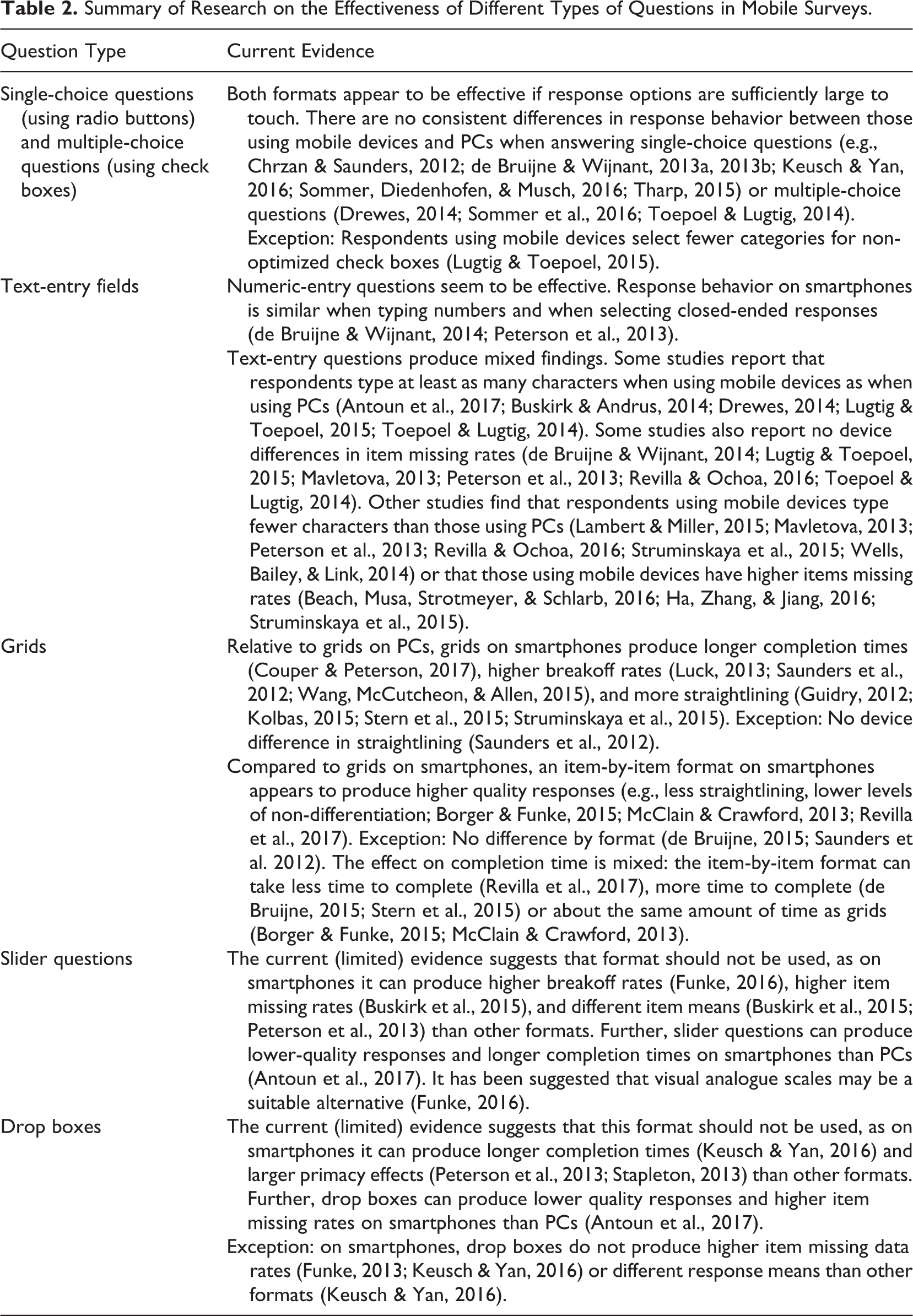
The most popular and the simplest question types—single-choice questions and multiple-choice questions (i.e., mark-all-that-apply questions)—seem to function well when the response options are sufficiently large to touch. For example, Keusch and Yan (2016) compared the response behavior to single-choice questions (mostly 5-point Likert-type scales) among respondents using iPhones or PCs. They found no consistent differences in response means or in any of their measures of response quality by the type of device used, regardless of scale direction (low to high vs. high to low) and scale alignment (horizontally vs. vertically). In another study, Sommer, Diedenhofen, and Musch (2016) contrasted the response behavior to longer single-choice formats (11-point Likert-type scales) as well as multiple-choice questions among respondents using mobile devices or PCs. They found no consistent device differences in any of their measures of response quality (scale reliability, concurrent validity, and predictive validity). The fact that longer scales function well, at least when vertically oriented, is attributed to respondents willingness to scroll vertically to view the options that are initially invisible (below the fold). For example, de Bruijne and Wijnant (2014) compared responses for a long question (11 scale points) among those who could see the full scale without scrolling and those who could not. They found no differences in response means between the two groups.
Numeric entry questions, which are space-saving in that they minimize the need for response options, also seem to be effective formats in smartphone questionnaires. Two studies have compared responses entered using either this format or closed answer scales among respondents using smartphones (de Bruijne & Wijnant, 2014; Peterson, Mechling, LaFrance, Swinehart, & Ham, 2013). Neither one of the studies report significant effects by question type. For example, Peterson et al. (2013) compared SO questionnaires with either 11-point answer scales or open answer fields. They found no significant differences across six measures of respondent engagement (or satisficing). However, they did find that respondents in the numeric entry condition took more time and provided lower satisfaction ratings, suggesting that they found typing a response to be harder than selecting their response from a set of response options.
It stands to reason that open questions for text entry will also be burdensome for respondents using smartphones. Research findings are mixed on this question. Five of the reviewed studies (three experimental and two observational) report that respondents type at least as many characters when using mobile devices as PCs (see Table 2 for references). In addition, six studies report that respondents are as likely to answer text-entry questions (i.e., not skip them) when using mobile devices. This is attributed to respondents becoming relatively comfortable and familiar with typing on virtual keyboards or to the fact that the keyboards adapt to the orientation of the screen, becoming larger when the phone is turned sideways (if permitted by the survey).
However, six other studies (four experimental and two observational) found that respondents type less (fewer characters) when using mobile devices than PCs. In addition, it has been reported that respondents take more time per character typed (Revilla & Ochoa, 2016) and drop out at higher rates when encountering such questions (Luck, 2013) on smartphones than PCs. The inconsistent findings across studies with respect to answer length might be attributable to differences in the study participants’ level of familiarity with smartphones and whether the questions solicited short responses or longer narrative-style responses, among other factors.
Grids (i.e., row and column matrices), which are typically used for grouping together several questions that share the same response options, are another commonly used question type that are starting to be examined in smartphone surveys. It is clear that large grids (e.g., 7 columns × 9 rows) create several design problems when working under the space constraints of a smartphone screen. If they are displayed at full size, then some of the columns are partially hidden from view. If they are shrunk to fit the screen width, the text becomes difficult to read. With either approach, if grids display the response scale labels only on top, then the labels become hidden from view when scrolling to view the lower rows and this could strain respondents’ short-term memory.
In light of these issues, researchers are starting to test alternative versions of grids (see, e.g., Thomas, Barlas, Graham, & Subias, 2015). Several of the SO surveys reviewed earlier display grids as individual questions (where response options and their scale labels are shown underneath each question stem). The clearest finding is that grids can have negative effects on response quality in smartphone surveys. Of the five reviewed studies that report a measure of non-differentiation (e.g., straightlining), three of them find higher levels non-differentiation in the grid condition than the item-by-item condition (Borger & Funke, 2015; McClain & Crawford, 2013; Revilla, Toninelli, & Ochoa, 2017) and the other two studies report no significant effects (de Bruijne, 2015; Saunders, Chavez, Chrzan, & Brazil, 2012). For example, Borger and Funke (2015) compared responses for two sets of questions presented as either grids or as individual items on mobile devices. More respondents straightlined in at least one of the sets of questions in the grid condition (17%) than in the item-by-item condition (9%). In a crossover experiment, Revilla, Toninelli, and Ochoa (2017) compared the response behavior of respondents using smartphones for two sets of questions presented as grids (10 columns × 14 rows; 5 columns × 14 rows) or individual questions. Respondents provided lower quality responses (more non-differentiation) in both the grids than the individual questions. There were no significant differences in inter-item correlations between the two conditions.
However, the research is less clear about the impact of grids on completion time in smartphone surveys. Two of the reviewed studies report shorter completion times with grids (de Bruijne, 2015; Stern et al., 2015), one study reports longer completion times with grids (Revilla et al., 2017), and two others report no significant effects (Borger & Funke, 2015; McClain & Crawford, 2013). The mixed findings are likely related to a number of factors, including grid size and visual complexity and whether respondents using tablets were included in the study. In general, there seem to be disadvantages to using grids in smartphone surveys (high levels of non-differentiation). However, grids can take mobile respondents less time to complete than questions presented individually, as is the case with PC web respondents (Tourangeau et al., 2013).
Slider questions, which allow respondents to choose from a range of values by moving a slider handle, are another type of question starting to be used in smartphone surveys. Three of the reviewed studies compare response behavior to these questions among respondents using either mobile devices or PCs. All three report differences by device that suggest that sliders are problematic in smartphone surveys (Antoun, Couper, & Conrad, 2017; Buskirk, Saunders, & Michaud, 2015; Funke, 2016). For example, Funke (2016) reports higher breakoff rates among respondents using mobile devices. Antoun, Couper, and Conrad (2017) evaluated response accuracy to a slider question (by comparing the age of the respondent recorded using a slider to their actual age) among respondents using smartphones and PCs. Respondents made more errors and took more time when using smartphones. This is the attributed to the drag and drop touch gesture being difficult and the length of the scale being shorter on a small screen.
The final type of question we consider are drop boxes (or drop-down menus). On smartphones, they are typically rendered as “picker” wheels (the default on Apple devices) or as “spinner” lists (the default on most Android devices). Two of the reviewed studies compare response behavior to drop box questions among respondents using either mobile devices or PCs. Both report device differences that suggest that there are disadvantages to using drop boxes in smartphone surveys either in the form of longer completion times (Antoun et al., 2017; Keusch & Yan, 2016) or higher item missing rates (Antoun et al., 2017). Two other studies compared drop boxes to single-choice questions with radio buttons in smartphone surveys and both report that drop boxes produce larger primacy effects (Peterson et al., 2013; Stapleton, 2013).
Why are drop boxes difficult to use on smartphones? It seems that this question type presents at least three usability issues when rendered as pickers: the wheel is not immediately visible to some respondents because it appears on the bottom third of the screen, long response options get truncated (e.g., “Neither agree nor dis…”), and the first response option follows the last one on the wheel, making it difficult to know when the entire list has been viewed unless it follows a natural order (e.g., digits from 0 to 12; Budiu & Nielsen, 2015). Whether spinner lists that resemble traditional drop downs are more effective is a topic for future research.
After choosing questions, survey designers face a decision about how to present them on the screen. Specifically, they must choose whether to display questions together on a single long screen (scrolling) or display them on separate pages (paging), or something in between. Two of the reviewed studies examine this issue. De Bruijne and Wijnant (2014) compared response behavior to six questions for respondents using mobile devices in either a scrolling design or paging design. Respondents took about 27% less time (based on median completion times) in the scrolling condition than in the paging condition. They concluded that “…loading each new page is likely to require more time on smartphones than scrolling down the page” (p. 957). In another experiment, Mavletova and Couper (2014) contrasted a scrolling and paging design in a mobile web survey for a longer set of questions (14). They report no significant difference in breakoff rates or missing data rates between the two versions. However, respondents took 51% less time and reported higher levels of satisfaction when completing the scrolling version.
Thus, there seem to be advantages to using scrolling designs. According to one study, however, their effectiveness may depend on factors such as the number of questions presented per page and whether the survey has skips from one question to the next. Mavletova and Couper (2015b) compared scrolling designs with a small number of items (5, 10) and a large number of items (30) on a page in a survey with skips and without skips. They report shorter completion times in the long-page condition (30 questions) than shorter page conditions (5, 10 questions); however, the more items that were presented on the screen, the higher the item missing data rate was. In the survey with skips, respondents made more errors following instructions (specifically, they skipped more questions that they were supposed to answer) in the long-page condition than shorter page conditions.
Overall, the current literature on question presentation in smartphone surveys suggests that using simple types of questions and presenting more than one question per page is an effective design strategy.
Design heuristics
Based on our review of this emerging literature, we have extracted general design heuristics for effective smartphone questionnaires. Our goal was to identify a framework, that is, on the one hand, general enough to have wide applicability across smartphone surveys with different objectives and populations, and on the other, specific enough to serve as standards for the design and testing of such questionnaires. A heuristic was selected if it meets these criteria and if it can be expected to prevent any of the major usability issues (e.g., missing data, breakoffs, errors, long completion times, low satisfaction ratings) reported in the reviewed studies. Thus, we opted not to select heuristics that were specific to one question type (e.g., how to display grids) or that were too general to be of practical use (e.g., “make questionnaires user friendly”; “make questionnaires visually appealing”). Given all of this, the heuristics are not an exhaustive list of design recommendations. Furthermore, they are tentative because they are based on an emerging literature; findings from future studies will necessitate updates to the heuristics.
After consideration of these factors, we settled on five heuristics (Table 3). They are as follows: (1) Readability, (2) Ease of selection, (3) Visibility across the page, (4) Simplicity of design features, and (5) Predictability across devices. We will discuss each one in turn.
Five Design Heuristics for Smartphone Questionnaires.

1. Readability
Text should be large enough to promote easy reading. Small text forces respondents to zoom and scroll to read the questions (Nichols, Olmsted-Hawala, Horwitz, & Bentley, 2015; Olmsted-Hawala, Nichols, Holland, & Gareau, 2015). The minimum readable font size according to smartphone industry guidelines is about 17–18 digital pixels (Android Developer’s Guide, 2016; iOS Human Interface Guidelines, 2016), which is equivalent to 13 or 13.5 point font in print or that has a height of 4.6 mm.
2. Ease of selection
Touch targets should be large enough to tap accurately. Small targets force respondents to zoom or make extra taps to record their answers (Olmsted-Hawala et al., 2015). Studies on mobile interface design and smartphone industry guidelines suggest that targets should be 6.7–8 mm in length and width (or diameter) to promote accurate touching without taking too much screen space (Android Developer’s Guide 2016; Henze, Rukzio, & Boll, 2011; Park, Han, Park, & Cho, 2008).
3. Visibility across the page
All content should fit the width of the screen so that it is visible without horizontal scrolling. Response options on the right side of the page that are not initially visible may not be noticed by respondents (Peytchev & Hill, 2010) and could skew response distributions in favor of the initially visible options (Lattery, Park Bartolone, & Saunders, 2013; Stapleton, 2013; Struminskaya, Weyandt, & Bosnjak, 2015). Given a minimum font size (heuristic 1) and touch target size (heuristic 2), the more response options in the question, the more likely it will need to be displayed vertically.
4. Simplicity of design features
Design features should be simple both for researchers to deploy and for respondents to use. Deploying complicated features (sliders, pickers, questions with embedded video) can increase the occurrence of technical problems (Funke, 2016; Mendelson, Gibson, & Romano-Bergstrom, 2016). Even without glitches, complicated features can increase missing data or harm data quality if some respondents do not understand or are not able to learn in real time how to use the features. For example, two studies compared an auto-advance function for single-choice items (i.e., the next page loads when answer is selected) to conventional next and previous buttons. The auto-advance feature did not seem to reduce completion times (Arn et al., 2015) and produced more missing data because “some respondents seemed not to understand that the survey had automatically moved on to the next item” (de Bruijne, 2015, p. 129). While some enhanced features (e.g., swipe-based gestures for navigation) might work for repeatedly used mobile apps that allow for learning over time, they can be problematic for one-time smartphone surveys.
5. Predictability across devices
Questionnaires should function in a predictable way across different devices. A major concern is that questions will be rendered differently across different types of platforms (e.g., pickers vs. spinners). Another concern involves different screen sizes. Touch targets and font sizes may meet design standards on big devices (e.g., 6-in. displays) but not on smaller devices (e.g., 4-in. displays). Tests of these and other features conducted on a wide range of devices—varying in size, type of platform, and type of browser (if the survey is browser based)—make it possible to identify problems during the development process.
Discussion
The aims of this article were to provide a comprehensive review of the research on questionnaire design for smartphone surveys and to develop a set of relevant design heuristics. Overall, the evidence suggests that survey designers should make efforts to “optimize” the layout of their questionnaires to make them easier to complete on smartphones. They should choose simpler types of questions (single-choice questions, multiple-choice questions, text-entry questions) over more complicated one (large grids, slider questions, drop boxes) and consider displaying more than one question per page.
Based on these results, we identify five design heuristics for effective smartphone questionnaires. First, text should be large enough to promote easy reading (readability). Second, touch targets should be large enough to tap accurately (ease of selection). Third, all content should fit the width of the screen so that it is visible without horizontal scrolling (visibility across the page). Fourth, design features should be simple to deploy and use (simplicity). Finally, questionnaires should function in a predictable way across different devices (predictability across devices).
What are the practical benefits of these heuristics? They could serve as a set of principles within which a smartphone questionnaires is designed. They could also serve as principles for usability testing; specifically a heuristic evaluation to judge whether a questionnaire conforms to the heuristics. This type of inspection method is generally considered to be fast and inexpensive because researchers can carry out the evaluation themselves without recruiting survey respondents. Finally, the heuristics could serve as the building blocks for more detailed standards. For example, a more specific version of the readibility heuristic might be that “The height of the text (from peak to valley) is at least 4.6 mm.” A more specific version of the ease of selection heuristic might be that “Targets sizes are at least 7.6 mm high and wide.” Such guidelines could be tailored to the specific populations being surveyed.
Still, the heuristics are only a starting point. There are several design issues for smartphone surveys that have received little or no research attention and are not addressed here, including spacing and alignment of design elements, prompts for missing data, screen reader compatibility, question order, and questionnaire length. Thus, we believe that these heuristics should evolve over time. Findings from future studies should be used to modify and add to the heuristics as necessary. Changes in smartphone technology and interface design conventions will also necessitate updates to the heuristics.
There are several limitations of this article worth noting. First, only about half of the studies that we reviewed were published in peer-reviewed scientific journals. Second, we were not able to use a quantitative approach for summarizing the results (e.g., meta-analysis) because of the limited number of studies on each topic of interest. Third, we relied on two databases for our searches that may not have been exhaustive (e.g., they did not capture many unpublished reports from online survey companies). Fourth, our heuristics were generally designed for the process of adapting a survey designed for PCs screens to smartphones; a set of heuristics designed for creating a stand-alone smartphone survey could be different from those described here. Lastly, our heuristics are tentative because they were developed using an observational approach of looking for patterns and because they were not empirically tested. Nonetheless, this can serve as a first review and first attempt to develop useful design principles for smartphone questionnaire design.
In summary, researchers are making advances in how to design surveys for smartphones. We were able to summarize their research and generate a set of initial design principles, but the mobile landscape is rapidly evolving. Smartphones are changing both in terms of their functionality and their size with a trend toward larger screens. Software for web design is changing with a trend toward a “Device–agnostic” layout that automatically adapts to any sized device. At the same time, the demographic profile of a typical user is likely to change as more people use smartphones. These changes call for even more targeted research both by survey methodologists and mobile usability researchers on all aspects of smartphone questionnaire design.
Footnotes
Authors’ Note
The views expressed here reflect the opinions of the authors and not those of the U.S. Census Bureau. The authors thank Elizabeth Nichols and Erica Olmsted-Hawala for helpful discussions. The author also thank Mick Couper, Yazmin Garcia Trejo, Rachel Horwitz, Florian Keusch, and Joanne Pascale for their comments on earlier versions of this paper.
Declaration of Conflicting Interests
The author(s) declared no potential conflicts of interest with respect to the research, authorship, and/or publication of this article.
Funding
The author(s) received no financial support for the research, authorship, and/or publication of this article.