



Abstract
Twitter is an important object of research in social science studies, and the emergence of numerous Twitter software tools has provided researchers with the possibility of gaining insights into Twitter data; however, at the same time, early stage researchers may experience difficulties in selecting the most suitable tool for their own projects. Due to personal or institutional financial constraints, the purchase of commercial software is not a wise investment for all researchers. Hence, this article aims to provide a review of nine different free-of-charge and low-cost software tools for studying Twitter and highlights their advantages and disadvantages, in order to serve as a guide for social science scholars. This review is divided into two parts: background information and data retrieval features of the software tools, and their data analysis features. At the end of the review, several recommendations and suggestions are made for the use of these tools.
Twitter is an important academic data resource and object of research for social scientists (Burnap et al., 2015; Golder & Macy, 2012; McCormick et al., 2017). A single tweet can contain various types of information, including a username and biography, a hashtag, the content of the tweet, the time and location of posting, language, and so on. Based on these elements, several kinds of Twitter analyses have been developed in recent years. Roenneberg (2017) carried out a user analysis of the Twitter account @realdonaldtrump, analyzing the account owner’s preferences regarding the use of an electronic device and the main user’s chronotype, based on his tweeting time line. Barnard (2017) studied the hashtag #Ferguson using user network analysis and link analysis and examined how journalists and activists used Twitter to identify changes in field relations and practices. Bollen et al. (2011) analyzed Twitter text content using two types of sentiment analysis (positive vs. negative) and carried out mood measurement using six dimensions (calm, alert, sure, vital, kind, and happy). These authors cross-validated the sentiment time series of Twitter content with the closing values of the Dow Jones Industrial Average and provided a potential method for predicting the stock market using the mood of Twitter content. Wilson and Dunn (2011) examined the language usage and user geolocation distribution of tweets containing the hashtag #jan25 during the 2011 Egyptian revolution and found that although the revolution occurred in an Arabic-speaking country, English dominated the language usage of the collected data set since the majority of powerful users were from Western countries. Their research showed that Twitter provided a transnational sphere for public dialogue that helped to enlarge the Egyptian revolution.
As in most empirical studies, one of the most significant elements during the research process is the selection of tools for both the data collection and data analysis steps. In other types of studies, there may be fewer options (or more standard tools); however, in Twitter analysis, we have a wide variety of possibilities when choosing a suitable software application. For example, Brooker et al. (2016) used the Chorus tool to provide a new methodology for Twitter data collection and analysis, allowing the user to explore the construction of developed phenomena through social media. Thelwall and Cugelman (2017), using the Mozdeh tool, proposed the “resonating topic method” to monitor an international organization’s Twitter strategy and to provide new propaganda strategies. Himelboim et al. (2017) used the NodeXL tool to classify Twitter topic networks into six different structures of information flow, which can be useful in evaluating Twitter activities and constructing strategies for Twitter and other social media spaces. Blaszka et al. (2012) used DiscoverText to collect tweets related to #WorldSeries, and their study examined the use of this hashtag during the 2011 World Series.
A large number of these tools are commercial software (e.g., DiscoverText), and although these tools have been proved to be powerful options for social science research projects, some social science scholars are not able to purchase these software programs due to financial constraints. Thus, free, freeware, or low-cost (we define low cost as no more than US$100) software tools are an indispensable option for these users. Different from free software, freeware refers to software that is available free of charge, while free software means that the users have the freedom to run, copy, distribute, study, change, and improve the software (“What is free software?,” 2018). On the other hand, Freeware and low-cost software tools have also shown good performance in retrieving and analyzing Twitter data (e.g., DMI-TCAT, Mozdeh) and in some cases, even better (Blaszka et al., 2012). This article aims to provide an in-depth review of free-of-charge and low-cost Twitter software tools for social science research, highlighting their advantages and disadvantages in academic use and offering an easy method of software selection for researchers studying Twitter.
Ahmed (2019) has listed more than 20 different software tools that can be used for Twitter research. According to the author’s description, seven of them are completely free of charge (Chorus, COSMOS, Mozdeh, TAGS, Webometric Analyst, Gephi, and DMI-TCAT). In this review, in addition to the abovementioned freeware, we select three low-cost software tools (NodeXL, Netlytic, and SocioViz) which we consider affordable for Twitter study beginners. Despite the fact that all these three software tools (including many other software tools which Ahmed mentioned) provide short-term free trial or limited free services (e.g., limited data samples, limited data retrieval time spans), the free trial version tools are considered inadequate for academic research. During our testing period, Chorus could not provide a stable performance on our computers, hence discussions about this software tool are excluded from this review. On the other side, although there are tools like R or Python packages that contain more flexible data analysis functions, all the software included in our review do not require programming skills.
General Twitter analysis consists of two steps: data retrieval and data analysis. In the following sections of this article, we first present the background and the data retrieval features of each selected tool, then we discuss and compare the data analysis functions of these tools, using several small-scale case study examples (data retrieval strategy based on the #MeToo hashtag).
Three important limitations should be mentioned. First, in addition to the software tools reviewed by Ahmed, there are still numerous Twitter analysis software applications (e.g., Social Media Data Stewardship, 2018) that have been shown to be powerful for Twitter research and are free of charge. Due to the limited length of this article and institutional financial constraints, it is not possible to review all the free and low-cost Twitter study software tools at this time. Second, no guarantee can be made about the quality of our study objects, therefore using the reviewed software tools (and the collected Twitter data) should be at the users’ own risk. Third, it will be helpful to do a deeper analysis about the types of social science research methods that the tools would support; although it is out of our actual scope, it would be interesting to be developed in the future.
Background Information and Data Retrieval Features of Software Tools
Application programming interface (API) and Twitter’s data collection policy
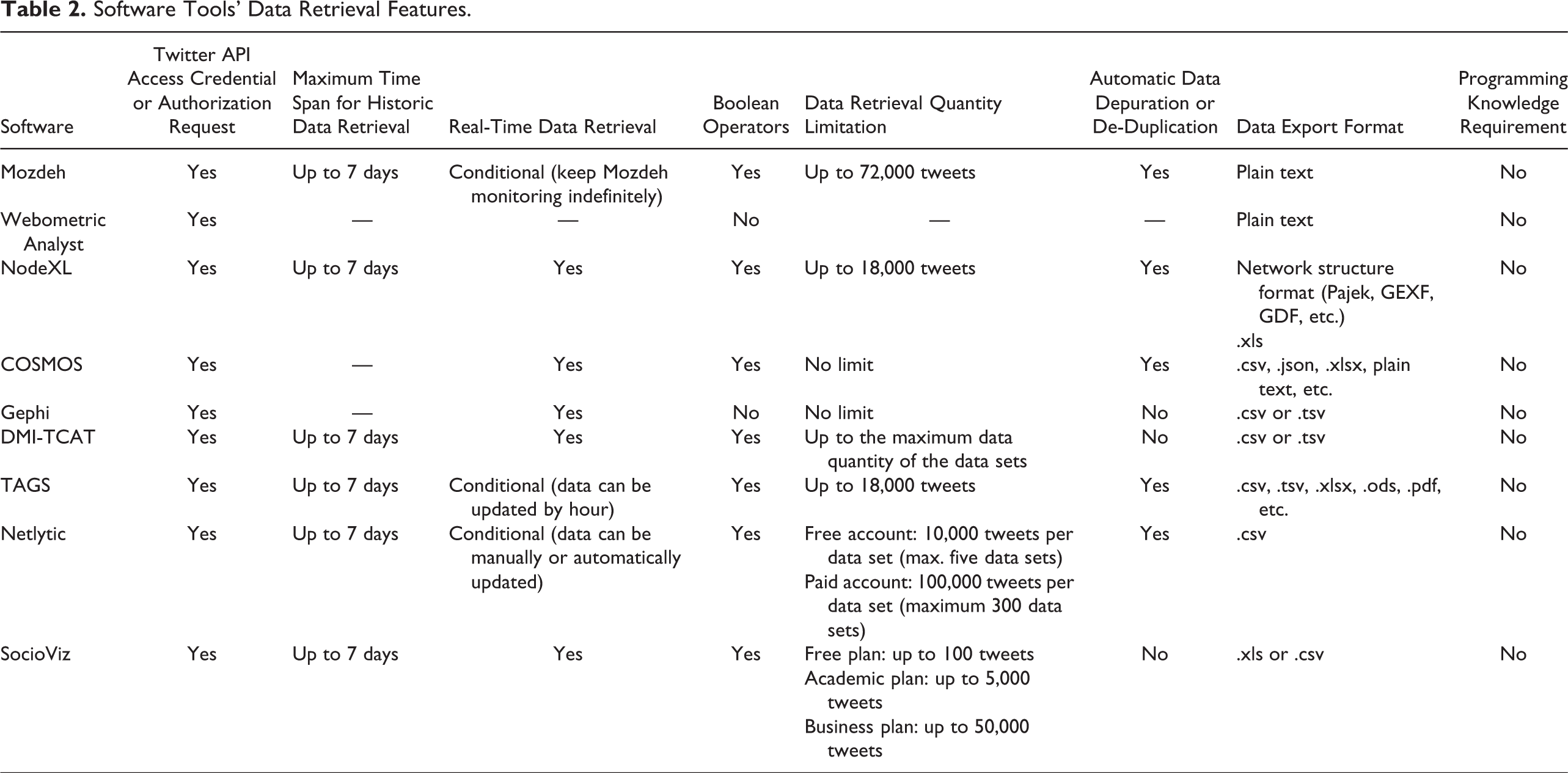
All the abovementioned software tools require Twitter API (https://apps.twitter.com) access credentials or authorization before collecting Twitter data. Since a huge number of Twitter analytic tools require a manual authorization (not only our selected tools), scholars are strongly recommended to register at least one API before using these tools. There are two kinds of Twitter API: representational state transfer (REST) API and streaming API. REST API is mainly used to download historical Twitter data and user profile info. Streaming API is for real-time data collection.
Retrieving Twitter data should follow the guidelines and policy of the company; there are several official limitations, and here we present what we consider the most important (detailed information is available at https://developer.twitter.com/). The totally free-of-charge data collection option is called “standard search API” (consisting of both REST API and streaming API), which supports up to 7 days of historical data collection. Twitter data analyzers may collect tweets by both key word(s) and @username(s); in this last case, gathering tweets by certain @username(s) can only get the most recent 3,200 tweets of each Twitter user. In retrieving streaming tweets, a random 1% sample is allowed. In addition, Twitter has established data collection rate limits, which are divided into 15-min intervals (Twitter, n.d.). However, within the permitted data collection policy, there are still several differences among our selected software tools.
Windows tools
Mozdeh (http://mozdeh.wlv.ac.uk/; Thelwall, 2018b) and Webometric Analyst (n.d.; http://lexiurl.wlv.ac.uk/) are two desktop software tools that can be run only on Windows systems. Mozdeh is a free program for key word, issue, time series, sentiment, gender, and content analysis of social media texts (Thelwall, 2018a). Webometric Analyst was programmed by the same developer and institution as Mozdeh; it is a free program for gathering and analyzing web data and can be used for social web analysis, altmetrics, citation analysis, and link analysis (Thelwall, 2009, 2018a).
Regarding the data collection features of Mozdeh, this tool is able to retrieve historical tweets by key word(s) or Twitter username(s); both these data retrieval strategies allow to collect a maximum number of 72,000 tweets per hour. In the case of retrieving real-time data, a possible method is to keep Mozdeh running indefinitely; the retrieved data set is renewed every 15 min. Mozdeh is one of only two reviewed tools that can collect tweets by specific language (the other one being SocioViz). Boolean operators such as AND or OR can be added while formatting data retrieving queries. All retrieved data are saved automatically in local files into plain text format.
In the case of Webometric Analyst, as they are written by the same developer and institution, a data set retrieved using Mozdeh is compatible to this tool. Although developers suggest that it is better to use Mozdeh rather than Webometric Analyst to search for and download tweets (“Twitter—Webometric Analyst,” n.d.), Webometric Analyst can be used to obtain Twitter user information from user IDs.
NodeXL (https://www.smrfoundation.org/nodexl/; Smith et al., 2010) is an add-in for Microsoft Excel (2007, 2010, 2013, 2016), available only for Windows Office (Mac MS Office users interested in this software tool may use a Virtual Machine). NodeXL provides both a gratis version (with limited functions) “NodeXL Basic” and a paid version (with full functions) “NodeXL Pro.” NodeXL Pro offers a student/academic purchase plan. In the next sections, discussions about NodeXL refer to NodeXL Pro.
Comparing to Mozdeh, the data collection logic of NodeXL is different; given that NodeXL defines itself as a social network and content analysis tool (Smith et al., 2010), in addition to the Twitter content information, it also retrieves Twitter network information (relationships between users from replies and mentions). The main collection results are divided into two worksheet pages: “edges” and “vertices.” The edges consist of the relationship contained in a tweet, which includes mentions, replies to, retweet, and tweet. The vertices are the nodes in the network, which refer to the Twitter users involved in the relationship. The edge page also contains tweet content information (e.g., tweet text, tweet time, original tweet link), while in the vertices page, it provides Twitter user information (e.g., total number of tweets, total number of followers, user description).
NodeXL is able to collect up to 18,000 tweets in the same interval. By default, it downloads historical data; in the case of retrieving streaming data, the Connected Action Graph Server Importer should be installed to connect to the streaming API. Like Mozdeh, Boolean operators are also applicable in formatting the search query. The retrieved data set can be saved and exported in both spreadsheet formats and network structure formats (e.g., pajek, gexf).
Multi-Platform Tools
COSMOS (http://socialdatalab.net/cosmos; Burnap et al., 2015) and Gephi (https://gephi.org/; Bastian et al., 2009) are developed in Java. COSMOS (n.d.) is available at no cost to academic institutions and not-for-profit organizations; the developers have suggested that it runs best on Mac OS X and Linux Ubuntu, and installation in Windows is not recommended except in the last resort. Gephi is a free, open-source software for graph and network analysis. It can be used for Twitter research once the Gephi Twitter Streaming Importer plugin is installed.
Both of them can retrieve as much real-time data as the Twitter official policy allows. COSMOS allows formatting search queries by Boolean operators and provides an automatic data depuration function, while Gephi does not. COSMOS can export collected data in spreadsheet, plain text, and JavaScript Object Notation (json) format; Gephi can export data in spreadsheet formats (csv and tsv) and network structure formats (e.g., gexf, gml). While collecting data, COSMOS automatically generates tweet sentiment (range from −5 to +5) and tweeter gender information.
Similar to NodeXL, Gephi is mainly featured in network analysis. It is able to retrieve Twitter data by three categories: key word, username, and location. There are five types of networks that Gephi can collect: full Twitter network (represents all entities, including user, tweet, hashtags, URL, media, symbol, and so on), user network (that will allow to represent relations between users from mentions or retweets), hashtag network, emoji network, and Bernardamus projection (represents user network via hashtag present in tweets). Gephi retrieves edges and nodes; edges are relationships between the nodes; each of the nodes represents an element (e.g., user, hashtag, emoji) involved in the network.
DMI-TCAT (https://github.com/digitalmethodsinitiative/dmi-tcat; Borra & Rieder, 2014) is a software tool designed by researchers at the University of Amsterdam. It is written mostly in PHP and runs in a webserver (LAMP) environment; it is recommended to be installed on Linux distribution Ubuntu and Debian rather than on Windows and/or the Mac OS system.
DMI-TCAT is able to collect both historical and real-time Twitter data with Boolean operators. It collects not only tweets information but also the tweeter’s profile information. All retrieved data can be exported in csv and tsv format. There is no data depuration function in DMI-TCAT; however, different from other selected tools, it provides a wide range of data selection filters. Users are able to choose the most suitable sample from the retrieved data set by various parameters such as startdate, enddate, tweet language, from user, exclude user, and so on.
Web-Based Tools
TAGS (https://tags.hawksey.info/) is a free Google Sheet template that allows the user to set up and run an automated collection of search results from Twitter (TAGS—Twitter Archiving Google Sheet, n.d.). Netlytic (https://netlytic.org/; Gruzd, 2016) and SocioViz (n.d.; https://socioviz.net/) are two commercial software tools; users must register their own account on the website and link it to Twitter before using these tools. Both of them provide free trial version with limited sample size; however, they also offer a low-cost advanced service for student/academic use.
TAGS can be used to retrieve historical data with Boolean operators; it can download up to 18,000 tweets. To retrieve real-time tweets, users can activate the “update archive by hour” function. There are three types of data collection strategies in TAGS: search and download historical tweets by key word, extract favorite tweets, and extract user time line or status updates by entering a screen name. TAGS also allows users to delete duplicate data. The retrieved data set can be exported into spreadsheet, pdf, and html formats.
There are three tiers of Netlytic account: The Tiers 1 and 2 accounts are free, and the Tier 3 account requires payment. Tier 1 users are able to freely upgrade to Tier 2 by filling out a simple form. The free account can save up to five data sets; each of them contains a maximum of 10,000 tweets. The Tier 3 account can save up to 300 data sets, and each of them contains a maximum of 100,000 tweets.
Netlytic can collect historical data with Boolean operators; in order to get real-time data, users should manually (free plan) or automatically (purchase plan) update their data set every 15 min. The retrieved data set can be filtered by four fields: link, pubdate, author, and title. It contains an automatic data cleaning function, which allows users to remove quoted text from all messages in the data set. All retrieved data are able to be exported in csv file.
SocioViz is able to collect both historical and real-time streaming data. Users can easily define the time range of the target data in the searching interface; three result types are available: most recent results, both popular and real-time results, and most popular results. However, neither data cleaning/depuration nor filter functions exist in SocioViz. Retrieved data can be exported in spreadsheet formats.
The information on downloaded data is slightly different among these three webpage-based tools. When searching and collecting data by key word(s), the tweeter’s profile information retrieved by TAGS and Netlytics is more detailed than in SocioViz. Data gathered by TAGS and SocioViz include geographic coordinate information (although there is only a small percentage of tweets that have such information), while in Netlytic, geographic information cannot be collected. In SocioViz and Netlytic, information about the language of the tweets is contained within the exported file, but in TAGS, there is no such variable.
Tables 1 and 2 are cheat sheets with details of the background information and the data retrieval features of our research objects.
Software Tools’ Background Information Table.

Software Tools’ Data Retrieval Features.
Data Analysis Features of Software Tools
Data retrieval and preparation strategy
In order to achieve our research objectives and to enable a comprehensive comparison of the data analysis functions of the selected software tools, several similar small-scaled case studies are analyzed. We used each of the software to collect tweets based on the #MeToo hashtag (Date retrieved: October 17, 2019).
Since the number of recovered tweets is different in each case, we used different selection strategies and a filter to homogenize the size of each data set. As a result, we selected approximately 1,300 tweets with each of the selected tools; however, there are several exceptions: For NodeXL and Gephi, as they both retrieve edges and nodes as main information, we controlled the total number of nodes to be 1,300. For Webometric Analyst: Following the advice of its developer, “To search for and download tweets, please use Mozdeh rather than Webometric Analyst” (“Twitter—Webometric Analyst,” n.d.), we did not collect data with this software tool; in the next data analysis section, data used in Webometric Analyst were retrieved from Mozdeh. SocioViz: A total number of 5,000 tweets were retrieved from October 16, 2019, at 07 hr 26 min 28 s, to October 17, 2019, 12 hr 59 min 53 s; however, there is no possibility to filter or select a practical sample with our data, so in the case of this software tool, we decided to analyze the whole retrieved data set.
Mozdeh
Mozdeh contains the following analysis functions: searching for specific texts within the collected data set by key word queries; sentiment strength and gender of the author; measuring the average sentiment for extracted or refined tweet contents or finding terms associated with positive or negative sentiment; drawing time series graphs of tweet activity or sentiment-based time series graphs of the whole data set or refined contents; creating a time line of Twitter activity for an individual user; mining word associations; finding gender differences in the texts; generating statistics including average retweets, citations, or number of likes; creating networks of users; and detecting spikes in key words (Thelwall, 2018b). However, before carrying out data analysis in Mozdeh, using the spam filtering function to mark and remove spam can make the research results considerably more efficient.
The minimum time interval unit in Mozdeh is an hour, thus Mozdeh’s time series graph function requires a large data set, and a pilot test data set may not be sufficient to build a graph.
The “mine word associations” function can be used to study the connections between words and to gain insights into important issues within the collected data set. There are three types of word association analyses that can be applied to the retrieved data: a key word query and/or filter, a single key word query and/or filter against another key word query and/or filter, and a comparison of the whole project to a reference set of text (Mozdeh Big Data Text Analysis, n.d.). Table 3 shows the top 10 words most closely associated with the query “harassment” in our collected data set, with words listed in descending order of statistical significance. Mozdeh uses the Benjamini–Hochberg significance (Benjamini & Hochberg, 1995) where three stars *** represent 0.1% significance, two stars ** represent 1% significance, one star * represents 5% significance, and words with no stars are ignored for this test. NoMatch gives the percentage of texts that do not match the search but do contain the word (Thelwall, 2018b).
Mozdeh Word Association Analysis.
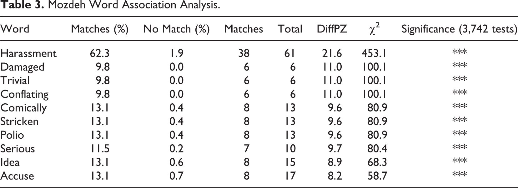
Table 4 and Figure 1 present the sentiment analysis of the whole retrieved data set, where scores of 1 and −1 represent no positive and no negative (Thelwall, 2018b; Thelwall et al., 2010). It is believed that Twitter users who posted about #MeToo showed a stronger negative sentiment than positive sentiment. As a plus, since the data set can be refined in Mozdeh by gender, key word, and so on, the results of other related analyses could be further explored, for example, a sentiment analysis based on gender differences.
Mozdeh Sentiment Analysis Results.


Mozdeh sentiment analysis bar and bubble charts (all data sets).
Mozdeh developers recommend that when creating user networks, it is better to use Webometric Analyst rather than Mozdeh. This function will be discussed in the section on Webometric Analyst. However, the detection of a key word spike requires a large-scale data set, and a pilot test will not be able to provide useful results.
Webometric Analyst
Webometric Analyst can use data retrieved from Mozdeh and allows the user to analyze Twitter users’ time lines and create networks from Twitter. The users’ time line is created along with the users’ tweet retrieval and can be saved automatically as a plain text file that can be viewed or processed using a spreadsheet or other related software tools (e.g., Mozdeh). In Webometric Analyst, the generation of networks from Twitter includes the creation of a Twitter conversation network and a following/follower network.
Twitter conversation networks are of two types: co-mention networks for retrieved Twitter users and direct tweet networks of retrieved Twitter users (i.e., who tweets whom). Figure 2 shows the direct tweet network for the data previously collected via Mozdeh (to make the figure clearer and more understandable, here we only take a random 100 of the 1,278 original tweets as a test sample). Based on this network graph, we can easily identify the main line of conversation and the main Twitter users in this retrieved sample.

Webometric analyst Twitter conversation network.
In Webometric Analyst, there are three types of following/follower network analysis: following networks, follower networks, and following/follower networks. Using Figure 2, we selected three conversationalists from the data set and created a user list as follows: @FcPzEX1oRPHT587, @dana81499419, and @panayiotab. Figure 3 shows the following/follower network for these three Twitter users (sample size: randomly 100 nodes). This function provides users with a more comprehensive understanding of the sociodemographic connections between Twitter users and the possibility of discovering the interpersonal connections behind a specific research topic.

Webometric analyst following and follower network.
NodeXL
The data depuration process implies the elimination of the duplicate edges; it is necessary to do so in some types of analysis, but in the case of Twitter data, researchers must be careful because the default configuration of NodeXL interprets duplicate cases where there is a match between a pair of nodes, which implies that if two users have more than one relationship (e.g., if User #1 mentions two different tweets of User #2, NodeXL would interpret it as a duplicate).
Given the features of the collected data, NodeXL allows only analysis of the network relationship between users; in other words, in the relationships tab, the nodes are only and exclusively users who can be related from mentions, replies to, or retweets (the relationship “replies to” is established only with the first person mentioned in a tweet).
The analysis can be started by performing metrics calculations at the node level. NodeXL offers a wide variety of metrics, including the most common centrality (degree, betweenness, and closeness) along with others such as PageRank or clustering coefficient. Network metrics such as graph density and graph reciprocity can also be calculated. Node-level calculations are included in their corresponding columns on the vertex sheet, while those related to the entire network will appear on the overall metrics sheet. In order to detect clusters or communities (on the groups tab), three algorithms can be chosen: Clauset–Newman–Moore, Girvan–Newman, or Wakita–Tsurumi.
The results can be viewed in the groups and group vertex sheets. The first one offers information about each one of the groups (metrics and visualization options), while the second one shows the information about which (identified) group each node belongs to. A new “group edges” sheet is also generated showing the number of present relationships in each of (and between) the groups.
Once the calculations are done, we can visualize and adjust the aesthetics of the network graph. As in other programs, we can use the calculated metrics to, for example, modify the size, color, or shape of the nodes (for the properties of the nodes, we can use the metrics of the vertices or groups sheet), lay out the network (e.g., Fruchterman Reingold, Harel–Koren Fast Multiscale). Finally, by applying filters, the number of nodes and edges can be controlled.
Figure 4 shows an example in which the visualization option “Lay out each of the graph’s groups in its own box” (Treemap) has been used, in which each group is distributed in an individual virtual grid. A filter has been applied to show only the five groups with the highest number of members, and at the level of nodes, only those that have an in-degree value greater than 1 are displayed.

NodeXL network analysis treemap.
One of the features that differentiates NodeXL from other software tools focused on network analysis is that it also allows content analysis of the tweets. With the option “network top items” (in metrics), the most frequent hashtags or URLs in the data set (and also previously calculated groups) can be easily obtained. Finally, NodeXL offers the possibility to perform a (limited) sentiment analysis, adding two new sheets (“words” and “word pairs”) in which it offers a list of words (or word pairs) with their positive or negative sentiment characterization.
COSMOS
After we retrieved our data, a tweet frequency analysis was first applied to monitor the Twitter activity on a specific topic. Figure 5 shows the tweet frequency of our sample. Unlike the time line functions of the other software tools, the COSMOS frequency analysis panel contains three categories: day, hour, and minute.

COSMOS frequency analysis.
In addition to the tweet frequency time line, COSMOS can build a word cloud (Figure 6), with a view to identifying the most closely related and frequent key words in the sample by sizing textual and numeric data according to their frequency.

COSMOS word cloud.
In the same way as the other software tools, COSMOS is able to build retweet networks and mentions networks. This provides researchers with the opportunity to discover the interactions between the Twitter users within the sample. In the geolocation analysis, COSMOS provides both an OpenStreetMap of the world, which is zoomable to street-level detail, and Environment System Research Institute ShapeFiles for the UK. COSMOS users can easily find the core location of their research topic. However, a previous study has shown that the majority of Twitter users do not have location services enabled, and only 3.1% have been geotagged (Sloan & Morgan, 2015). When researchers are carrying out geolocation Twitter analysis, the sample size should be carefully considered. COSMOS can display a gender analysis in pie chart format (Figure 7), which may allow researchers to do Twitter research from a gender perspective.

COSMOS Twitter gender analysis pie chart.
COSMOS can also carry out Twitter sentiment analysis using sentiment scores by SentiStrength (Burnap et al., 2015; Thelwall et al., 2010). Sentiment criteria are scored from −1 (no negative) to −5 (extremely negative) and from 1 (no positive) to 5 (extremely positive). The COSMOS sentiment analysis is visualized using a line chart in which the x axis represents the tweet time and the y axis represents sentiment values. Figure 8 shows the sentiment analysis of the retrieved data set. It can be observed that within the period of our data sample, a negative sentiment dominates the retrieved #MeToo tweets.

COSMOS sentiment analysis line chart.
Gephi
Gephi has three tabs: overview, where we can work interactively with the graph; data laboratory, where we find two tables with node and relationship data; and preview, where the user can see an improved version of the graph. Although it is mainly featured in network analysis, like the other abovementioned software tools, Gephi can also create Twitter activity time lines.
Regarding the retrieved network, to display the graph, several kinds of layouts (e.g., ForceAtlas, Fruchterman Reingold) are supported in Gephi. Network metrics (e.g., degree, centrality) can be easily calculated and adjusted through the “statistics” window. Community detection can be realized by using different algorithms such as Louvain, Girvan–Newman, or Leiden (the last two need plugin installation). All calculations performed and corresponding information can be viewed and manually edited in data laboratory.
Network graphs can be further processed in the appearance window (to adjust the appearance of the nodes and edges) and filter window (to filter the original network by different criteria/variables). Figure 9 shows a user network of our collected data (main parameters: layout = Fruchterman Reingold, community detection algorithm = Louvain, and min degree = 2).

Gephi network analysis visualization.
Since Gephi was not specifically created for Twitter analysis, fewer Twitter data analysis functions are available in this software; however, all collected data can be exported for analysis with other software.
DMI-TCAT
DMI-TCAT is able to do many different types of data analysis. For the time line of tweets, DMI-TCAT provides three kinds of resolutions: by day, hour, or minute. Figure 10 shows the time line of the tweets by minute.

DMI-TCAT tweets time line by minutes.
DMI-TCAT can offer a great variety of Twitter statistics and activity metrics including tweet statistics, user statistics (overall or individual), hashtag frequency, mention frequency, and so on. All reports are generated as .csv files, and the statistics can be grouped by minute, hour, day, week, and so on. Researchers can also define custom categories for statistics and activity metrics.
DMI-TCAT can generate different kinds of network analysis, described as “social graph by mentions,” “social graph by in_reply_to_status_id,” “co-hashtag graph,” “bipartite hashtag-mention graph,” and so on. All networks are generated as .gexf or .gdf files, which can be opened in Gephi or similar software.
There are several experimental data analysis functions: Cascade can be used to explore temporal structures and retweet patterns; “The Sankey Maker” produces an alluvial diagram that can be used for plotting the relation between various fields such as hashtags, sources, languages, and so on; and the associational profile is used to explore shifts in hashtag associations. Figure 11 shows the relation between the sources and hashtag of the retrieved data (cutoff = 10). In this figure, several interesting findings can be highlighted: Hashtags related to #MeToo have been presented; the Twitter Mobile App made up almost half of the tweet sources; paper.li and ifttt were the most popular nonofficial software in #MeToo tweets.

Relation between tweet sources and hashtags of the captured hashtag.
TAGS
The tweet analysis in TAGS mainly consists of three functions: the TAGS Summary Sheet, the TAGS Dashboard Sheet, and the TAGS Explorer. The first two of these are built based on Google Spreadsheets, and the TAGS Explorer uses external sources to visualize replies to tweets, mentions, and retweet networks.
The TAGS Summary Sheet displays statistical results for the collected sample. It contains a set of general statistics within the sample data, such as the number of links, number of retweets, number of tweets, tweet rate, and so on. In addition, it can provide each tweeters’ mention and retweet activities as well as the tweeters’ link. The TAGS Dashboard Sheet contains four main modules: top tweeters, Twitter activity, tweet volume over time (max 60 days), and a sheet of tweets with the most retweets from the last 1 or 2 days.
A tweet replies network was built in the TAGS Explorer (Figure 12), and from this network, we can identify the connections between the tweeters and the key player in this sample. Researchers can also visualize mention and retweet networks by changing the custom variable of the networks. However, in mapping network, TAGS Explorer does not provide a sample selection function nor can the network layout be switched.

TAGS Explorer tweets replies network.
The “top tweeters,” “top hashtags,” and “top conversationalists” rankings can be generated on the TAGS Explorer page. These are shown in bar graph format, which can provide researchers with a comprehensive view of the key information. The “search archive” function can be found alongside the “top conversationalists.” Two archive searching methods are available in this function: The first delimits the time interval, allowing the user to find a specific tweet archive(s) by its post time, and the second allows archive(s) to be searched by filter (tweet key word, screen name). Figure 13 shows the “search archive” panel.

TAGS search archive function panel.
Netlytic
There are mainly two kinds of analysis in Netlytic: text analysis and network analysis. Two functions are contained in text analysis: “key word extractor” and “manual categories.” Key word extractor can be used to identify popular topics of the data set by word frequency. “Word cloud” and “stacked graph” are the two options to visualize the results of key word extractor. Stacked graph is able to show the word frequency (y axis) over time (x axis); a maximum of 100 top topics (represented as key words) can be displayed. “Manual categories” aims to classify broader concepts of the text data (e.g., emotion detection) and can be visualized as an interactive Treemap; however, this function is not fully automated. Figure 14 shows the stacked graph (top topics = 100) of key word extractor; key word evolution alongside time series has been clearly presented. This analysis result can also be exported as a comma-separated values file.

Netlytic key word extractor stacked graph.
There are two functions in network analysis: “name network” (who mentions whom) and “chain network” (who replies to whom). Both of them contain three kinds of layouts: “Fruchterman Reingold,” “DrL layout,” and “LGL layout.” Clusters (FastGreedy Algorithm) are automatically generated and represented in different colors. Mapped networks are zoomable and can be saved. Figure 15 shows the name network of our data set; @taranaburke received the most mentions in its cluster and can be identified as a key player in the whole data set. The mapped networks can also be exported to csv, gexf, and GraphML formats.

Netlytic name network.
Finally, Netlytic contains a report panel, which includes several kinds of statistics about the collected/imported data set, such as geographic posts (shown on a world map, map data: OpenStreetMap), top 10 posters (in pie chart), number of posts over time (time line), top 10 most frequently used words (in bar chart), the results of text analysis manual categories, top 10 posters mentioned in messages (in bar chart), and so on. All saved network images in network analysis can be found and downloaded in this panel.
SocioViz
There are eight panels in the SocioViz data analysis interface: overview, tweets, users, words, words network, emoji network, users network, and hashtags network. Overview shows the tweet and retweet time line and the ranking of top hashtags. The user panel contains the ranking of most active (by the number of tweets) and most influential (by retweet/mentions received). The words panel provides the statistics of top words and top emoji. Analysis results can be exported in various formats. Figure 16 presents the tweet and retweet time line of our retrieved data set.

SocioViz tweet and retweet time line.
Except for the variables, the four kinds of network analyses are the same. They all contain four types of layout: Force Atlas 2, Barnes Hut, Repulsion, and Hierarchical Repulsion. Finally, all the results can be exported as png, gml, and gexf formats, which may give users the possibility to further explore the network with other software. Figure 17 provides the hashtag network of our data set, in which several clusters are clearly displayed.

SocioViz hashtag network.
Table 5 presents a detailed comparison of the main data analysis functions of the nine software tools.
Software Tools’ Data Analysis Features.

Discussion and Conclusion
The data retrieval features of each software tool are different; COSMOS and Gephi can only retrieve real-time data. While the other abovementioned software tools can retrieve both historic and real-time data, it should be mentioned that DMI-TCAT, Gephi, and SocioViz do not offer automatic data depuration or de-duplication functions, meaning that after retrieving Twitter data, researchers need to clean their data manually (or using other software tools). The majority of these software tools allow the use of Boolean operators when searching for Twitter data, which offer the possibility of retrieving more specific data. This provides an easy way of selecting the right data retrieval tool.
Mozdeh and Webometric Analyst can be seen as twin software tools. Both of these rely on each other; however, for data collection, it is recommended to use Mozdeh rather than Webometric Analyst, while for building networks, Webometric Analyst has a more important role. As stated on its official webpage, Mozdeh is a big data text analysis tool, and the most powerful feature of this software is its word association analysis (Thelwall, 2018b). However, several limitations should be mentioned: Tweet time line analysis with Mozdeh requires large-scale data, and small data sets are not sufficient to build a time line, meaning that Mozdeh is the best fit for large Twitter data sets. During our research, we found that the data collection efficiency of Mozdeh was lower than that of other software, although this is still a powerful tool for Twitter research.
During our test and experiment period, NodeXL showed a stable performance. It offers a great variety of options to optimize Twitter network analysis. For less experienced scholars, it also provides a friendly way to explore Twitter networks with the “automate” function. As NodeXL runs on Microsoft Excel, it may be able to employ more types of statistics than other network analysis software tools. Being one of only two programs that mainly focused on network analysis in this review (the other one being Gephi), NodeXL can also do some content analysis, while Gephi cannot. However, several cautions or limitations should be recognized while using this program. First, as we have discussed, the data depuration function of NodeXL may contain the risk of inaccuracy while removing duplicated edges. Second, NodeXL is only able to realize user network analysis, and compared to other tools, it lacks the ability to analyze the relationship of other elements (e.g., hashtags, emojis).
COSMOS gives good performance in both the data retrieval and data analysis phases. It also includes various types of analysis functions, one of the most notable of which is its geolocation analysis. This makes COSMOS one of only two applications (the other one being Netlytic) of the nine applications studied here that can carry out this type of analysis. However, its limitations are also important, since by default, COSMOS only provides a UK map in its geolocation analysis, and further geographical information needs to be added externally. Moreover, it also lacks several important data analysis functions such as cluster detection and hashtag networks.
Gephi was not created exclusively for social media analysis, but its powerful visualization function offers various kinds of layouts and algorithms for building networks and detecting clusters, which can greatly improve the quality of data visualization. Compared with NodeXL, Gephi is simpler, but it is more flexible in the sense of network types. Due to its nature, it can rarely be used as a primary tool for Twitter research, but as the network analysis results of other software can generally be exported as gexf or gdf or gml formats, it is recommended as a secondary tool in related studies.
DMI-TCAT showed good performance in both the data retrieval and data analysis phases. Compared to other software tools, the data visualization function of DMI-TCAT is one of the best in terms of aesthetics. It is the only tool that can carry out tweet source analysis. However, although it offers various kinds of data analysis functions, DMI-TCAT does not have certain important functions such as content sentiment analysis, cluster detection, and so on.
The three web-based software tools may be much easier to master than other software tools, but they all have limitations. TAGS (and SocioViz) provides very limited data set storage, meaning that large academic projects are difficult to realize. For TAGS, the network analysis does not provide data selection function; scholars who want to control visualization sample size must reduce data from the original data set. Furthermore, unlike Netlytic and SocioViz, TAGS users cannot configure network parameters nor can the network layout be switched. Its very limited types of analysis functions mean that it is difficult to provide in-depth insights. However, for small-scale data analysis (e.g., a pilot test), TAGS can be considered an efficient tool for quickly scanning a specific research theme, and especially for beginning Twitter researchers.
Netlytic is able to provide a much larger data set; it is also the only web-based software tool that can carry out sentiment and geolocation analysis. Although it cannot provide hashtag networks, it is still the most competitive web-based tool regarding rich kinds of data analysis functions. The only problem remains on the manual categories of text analysis, which may require researchers to invest more time on it.
SocioViz is the only tool that contains neither automatic data depuration/de-duplication function nor data import function; this limitation makes SovioViz data the least manipulable. Given that the text analysis of this tool provides only simple statistics, no in-depth insights can be reached. In network analysis, one inconvenient point is that users are not able to change the node label size, which makes it difficult in zoomed networks to identify key values (users, hashtags, etc.). Regarding the important limitations, SocioViz is perhaps the least flexible software tool for Twitter studies in this review.
Footnotes
Authors’ Note
This work was carried out within the framework of the doctoral program entitled Person and Society in the Contemporary World at the Autonomous University of Barcelona/Este trabajo ha sido realizado en el marco del programa de doctorado en Personas y Sociedad en el Mundo Contemporáneo de la Universitat Autònoma de Barcelona.

Declaration of Conflicting Interests
The authors declared no potential conflicts of interest with respect to the research, authorship, and/or publication of this article.
Funding
The authors received no financial support for the research, authorship, and/or publication of this article.