
Abstract
The design of online interactive visualizations is an ongoing area of research within technical communication, with recent work focusing on visualizations in risk-based contexts. This article shares the results of a large-scale user experience study on a popular interactive sea-level rise viewer aimed at facilitating decision making for individual users in coastal communities. Using this viewer, participants performed three major tasks related to individual property, community impacts, and future projections and gave feedback on the design, use value, and functionality of the tool. The participants were assessed on their ability to complete the three major tasks. The author discusses the implications of these results on the continued design of interactive risk visualizations and argues for a vision of user agency that is more constrained within the larger ethical paradigms of environmental communication.
Keywords
In his book The Design of Everyday Things, Norman (1998) offered seven principles for designers of all stripes to consider. One principle explains that when attempting to transform difficult tasks into simple ones, designers should “exploit the power of constraints, both natural and artificial” (p. 189). Using a Lego toy motorcycle as an example, Norman argued that designers should leverage all types of constraints—physical (size of the Lego pegs), semantic (drivers face forward), cultural (red lights go on back), and logical (all pieces must be used)—to reduce the number of alternatives and ensure user success. Through this example, he promoted the idea that designers can mitigate user error by building fences that users cannot jump; in other words, they can “use constraints so that the user feels as if there is only one possible thing to do—the right thing, of course” (p. 199). User agency, at least in Norman’s world of everyday things, is a conceptual and practical force for designers to guard against, delimit, and constrain.
Now, for better or worse, we are not all Lego designers. The things we use and design do not necessarily presume one final, “right” use, and the user experience (UX) of the tools that we typically work with in business and technical communication is most likely more complex than that of a toy Lego motorcycle set. What we are more likely to encounter, however, are designers concerned with not erecting but tearing down fences in order to increase the degree of user agency and pathways for engagement. Norman’s principle and even spirit of constraint seem to contrast significantly with the broader cultural allegiance to what Mosco (2014) and Fuchs (2017) have called “digital positivism,” in which designing digital tools and platforms for increased levels of interactivity—and by extension, user agency—is considered “good” because the approach generates more data points and opportunities for analytics. Advances in interactive software and technologies combined with the ideological embrace of big data have increasingly placed users in the rider’s seat, saddling them with higher degrees of freedom and decision making and rewarding them with more personalized information or products. User agency, within the ideology of digital positivism, is a conceptual and practical force for designers to unleash, a drive for them to pave, a power for them to concede to.
To technical communicators and information designers, these broad caricatures of approaches to user agency are just that: caricatures. The expansion of the ideology of digital positivism has—perhaps not coincidentally—run both parallel and intersectional with technical communication’s decadelong idée fixe with agency. Working within a variety of contexts, researchers in the field have admonished scholars and practitioners to attend more closely to the networks (Spinuzzi, 2008), character (Miller, 2007), value (Henry, 2009), justice (Jones, Moore, & Walton, 2016), cultural contexts (Sun, 2012), praxis (Moore & Richards, 2018), and theoretical critiques (Mara & Hawk, 2009) of agency in sociotechnical systems, revealing a relatively stable framework for viewing user agency not as something to either unquestioningly delimit or unabashedly champion but as a dialogic property (Salvo, 2003) of the interaction itself. As such, agency is conceived as: inevitably situated, an emergent property resulting not essentially from within the individual but from the intersections of access, power, and potentiality; invariably contingent on the positionality of the user, the purpose of the task, and the nature of technology; and irrevocably connected to “the possibility of action” (Herndl & Licona, 2007, p. 133) coursing through and across different spaces, especially (but not exclusively) digital, natural, and political spaces. A technical communicator working under the shadow of digital positivism might cherish agency but might also become wary of uncritical, unconstrained visions of user agency that are detached from the technology’s usefulness.
In environmental risk communication, specifically sea-level rise, for example, technical communicators and designers face the evergreen challenges of informing the public of, maintaining awareness about, facilitating engagement with, and generating meaningful action toward a large backdrop of risks to personal well-being, community safety, and public health. Researchers have confidently ascertained that simply making the public aware of the issue is not enough to spur what many deem to be necessary social and political action. Rather, specific messaging efforts using audience-centered engagement—be it through textual, oral, or visual appeals to place (Scannell & Gifford, 2013), to experience (Bradford & O’Sullivan, 2011; Whitmarsh, 2008), to relevance (Green & McFadden, 2007), or to visual (Hullman & Diakopoulos, 2011) or moral frames (Nisbet, 2009)—have proven more effective in connecting the public to issues of environmental risk and vulnerability.
That said, those successful efforts were mainly localized case studies, which are difficult to replicate and time-consuming to implement. Further, the lack of wholesale progress made in cutting carbon emissions and mitigating the effects of sea-level rise along coastal communities paints a picture of a populace left unspurred to action. Facing an ever-shortening time line within an ever-expanding digital landscape, many nonprofits, governmental agencies, and community-based groups have developed interactive digital technologies aimed at engaging the public in more immediate and potentially productive ways. Examples of such technologies include projects in volunteered geography (Goodchild, 2007), such as mobile apps that allow users to upload images of the affected spots of their community (Wetlands Watch’s Sea Level Rise App), interactive flood risk maps that enable users to explore data on flooding and sea-level rise (National Oceanic and Atmospheric Administration’s Digital Coast), and video-recorded oral histories of flooding events that expose users to humane facets of risk and vulnerability (Tumblr’s Flood of Voices). These technologies—which afford a flooding of agency—reflect a larger shift in how the Internet has changed the way science gets communicated (Buehl, 2016), helping to establish new forms of digital rhetoric that, while relying at times on well-established analog communication strategies (Wynn, 2016), bring to the fore new “ethical fine lines” (Kostelnick & Kostelnick, 2016, p. 186) that must address the shifts in visualization capabilities and epistemic disruptions. The belief that seems to drive this technology development is that increases in user agency, namely through contribution, open exploration, and personalization, might engender forms of action that more concretely link engagement in digital contexts to practiced agency in natural and political ones.
But is there evidence to support the belief that increases in user agency help address the problem of environmental engagement? Or even more broadly, and more foundationally, what type of evidence is needed to support the belief that increased user agency within a digital tool produces more concrete public engagement or action? Efforts in environmental risk communication seem equally susceptible to the lure of digital positivism, evidenced by the striking cacophony of countless digital tools and apps versus the relatively unanswered calls for more empirical user-centered research on digital resources such as interactive flood-risk maps (Kostelnick, McDermott, Rowley, & Bunnyfield, 2013). This imbalance, while giving the impression of a substantial uptick in environmental engagement, produces an ethical problematic wherein an unmitigated infatuation with user agency might favor public engagement with technology over the technology’s usefulness and even its accuracy for a broader, increasingly vulnerable public. Thus, these new forms of science communication need new—and more—testing.
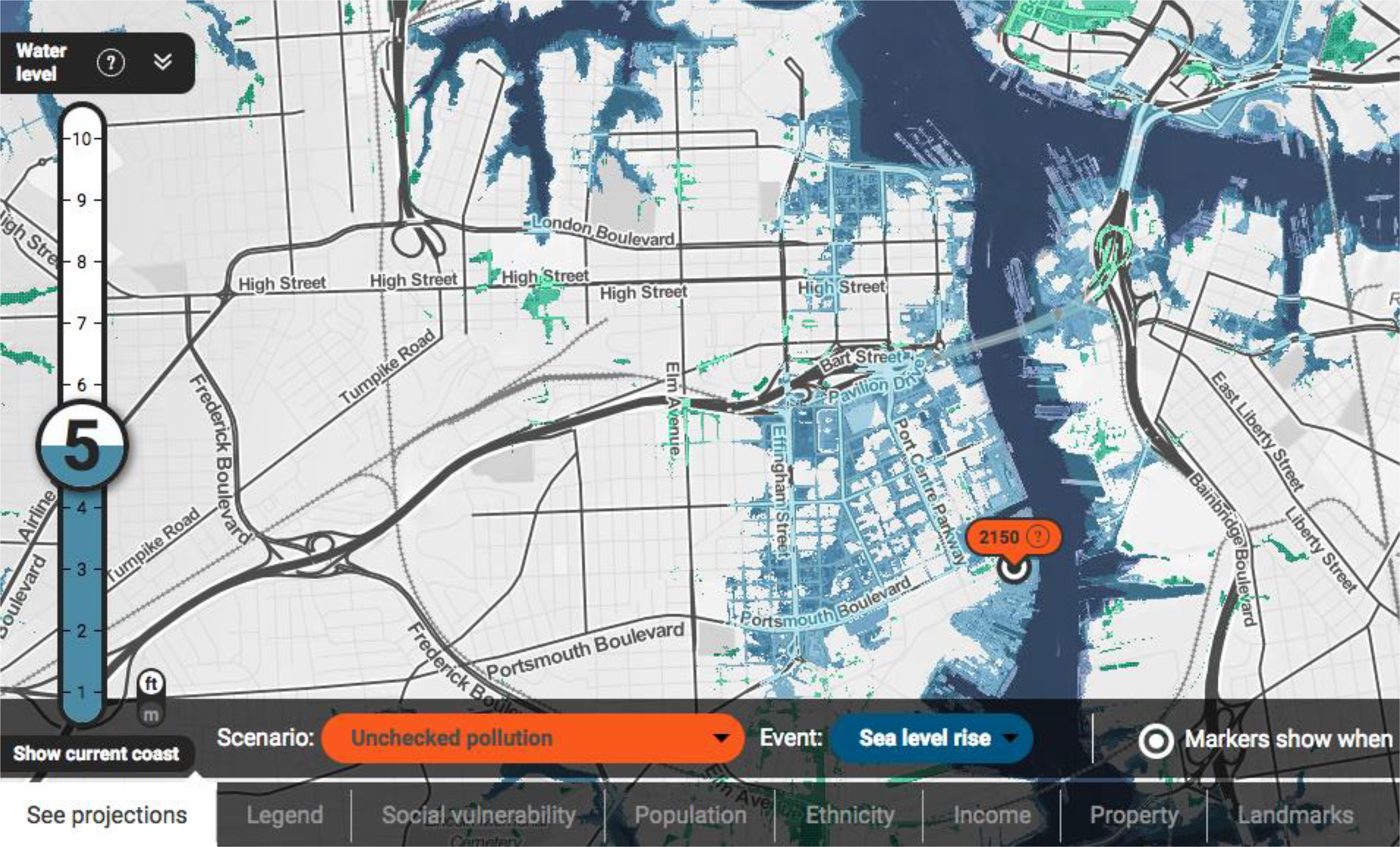
To help counter this imbalance, I center here on one specific interactive technology aimed at facilitating engagement through promoting user agency: Climate Central’s Risk Zone Map. The Risk Zone Map is a popular and well-known interactive sea-level rise viewer (ISLRV; see Figure 1). Climate Central describes this tool as a decision-making aid, so it is highly interactive and, compared to others of its kind, has a hefty degree of complexity and choices, given that its user base includes city planners, coastal managers, and real estate agents. While visually persuasive and adaptable to many media for myriad purposes, the Risk Zone Map, which allows open-data exploration to aid in decision making, seeks to give users an understanding of the risk, vulnerability, and issues related to a given region according to how water inundation in that region intersects with property value, demographics, and projections. It aims to help personalize or localize global data for a variety of purposes and platforms, from personal decision making, to coastal management, to city planning. In this way, the tool helps satisfy the increasingly common drive that individuals have for interactivity in environmental risk communication. And as an open-data exploration tool with ample localization features, it offers users high degrees of agency. Many governmental (e.g., planning) and corporate (e.g., real estate) stakeholders need to use the tool for different reasons, so flexibility and openness is a key feature of the tool.

Screenshot of Climate Central’s (climatecentral.org) Risk Zone Map, showing how water rising 8 feet would affect the neighboring cities of Portsmouth (left), Norfolk (top), and Chesapeake (bottom right).
Yet, as a publicly accessible platform, flexibility and openness might pose significant problems when lay users begin to interact with it. The opportunities that provide users with flexible agency across coastal communities and assessment contexts come at a significant cost if the public, to whom the tool is promoted and exposed, cannot accomplish tasks that the tool’s design affords. From spending only a few minutes with the interface, a technical communicator can easily deduce that the design of this tool follows the larger trend of open engagement. To protect coastal communities, it allows a variety of stakeholders to make informed decisions about planning and livelihood.
In pondering the trend of open-data exploration against the need for public social action, specifically the translatable connection between agency within a tool (“primary space”) and agency in social settings (“second space”), Stephens (2015), who has written extensively on ISLRVs (see Stephens, DeLorme, & Hagen, 2014, 2015, 2017), posed the following question: Is there such a thing as “too much user agency?” While more agency might seem to be a good thing, in certain interactive contexts, such as individual decision making based on risk, too much agency might have negative consequences beyond merely cognitive overload (Slocum et al., 2001)—not the least of which are inaccurate risk assessments and poor decision making. For ISLRVs and other interactive risk technologies, the shift in user—from expert to public—could mandate not only a new design framework (Albers, 2003) but also an ethical framework, especially given our field’s concern to cultivate productive public participation in environmental issues (Simmons, 2007; Zoetewey & Simmons, 2012). Should designers and technical communicators, then, adopt more of an ethic of constraint within such a tool to ensure more prudent user agency outside of it? To provide concrete insight into this question, I share the results of a large-scale UX study that observed the public use of Climate Central’s Risk Zone Map, couching these results within a larger paradigm of environmental risk communication and how agency functions therein.
First, I review the research on ISLRVs (tools that provide fruitful research sites for agency, decision making, and risk-visualization design), situating these tools within the larger scholarly conversation about ethics and risk in technical communication. I then outline the methods I used. Consisting of 41 participants recruited through UserTesting (usertesting.com), this UX study tests the degree to which lay users were able to use this publicly accessible tool to make decisions and risk assessments regarding personal property, community vulnerability, and future projections of the effects of sea-level rise on a region of their choosing. Next, I describe the results of the 36-question UX test, which add a missing layer of understanding to how general public users approach complex risk-visualization tools, specifically their reactions to the design and nature of the tool and their strategies for generating meaningful statements, conclusions, and assessments about a given coastal region of their choosing. I frame my analysis of the results in terms of the users’ ability to complete risk assessment tasks related to the self, the community, and the future. Finally, I conclude with a discussion of and recommendations for moving forward in designing risk visualizations for decision making. More than just revealing the importance of the role of technical communicators in the continued development and testing of these tools (see Richards, 2015), I suggest pathways forward to better designing risk-visualization technologies for a broader audience and usage, advocating for a renewed vision of exploiting the power of constraints in risk-based contexts and tempering the vision of agency as an inherent good.
User Agency in Risk-Visualization Contexts
The Risk Zone Map is but one example of an emerging type of risk visualization, what Stephens, DeLorme, and Hagen (2014) categorized as ISLRVs. ISLRVs seek to engage users in a more illuminative and engaging way by rendering a visual of a geographical region under likely future conditions wrought by sea-level rise. The Risk Zone Map, like other ISLRVs, often matches its complexity of data with its complexity of use, leaving many users with a high learning curve for understanding the context of the data and the usability of the tool (Wong-Parodi, Fischhoff, & Strauss, 2014). As such, ISLRVs have pushed the bounds of what users can do with data. As a risk visualization, they offer pathways forward in promoting participatory engagement, user-generated rhetorical messaging, and localized data sets—all of which should excite technical communicators.
In particular, risk visualizations in health contexts have already been shown to facilitate positive outcomes in both communicative (Herring, VanDyke, Cummins, & Melton, 2017) and decision-making (Garcia-Retamero & Cokely, 2017) domains, respectively. When applying these ideas to ISLRVs, we can see how such tools can both help users ascertain how many feet of water it would take before their home is affected by storm surge and persuasively display the visual elements of realism, color, landmarks, and social and demographic data in order to offer greater communicational intentionality of design. ISLRVs represent a convergence of communicative and decision-making domains, offering a nuanced function of agency that positions the user as both decision maker and audience.
The research on ISLRVs to date shows the inextricability between their communicative and decision-making properties. Borrowing Rawlins and Wilson’s (2014) phraseology on interactive data displays (IDDs), the “agential scripts” of ISLRVs often imply that users will find their own location on a map (zoom and pan) and visualize the effects of sea-level rise, storm surge, nuisance flooding, or hurricanes on their region. ISLRVs imply the narrative of projected risk so that users can better understand their future—their risk narrative—using such tools.
For example, in their content analysis of over 20 ISLRVs currently open and accessible to the public, Stephens et al. (2014) argued “that attention to narrative-building features in ISLRVs can improve communication effectiveness by promoting user engagement and discovery” but also suggested “that a strongly narrative-oriented design might be inappropriate for certain ISLRVs (e.g., those designed solely for scientific analysis) but appropriate for others (e.g., those with a public communication or community planning focus)” (p. 695). Armed with research indicating that narrative building enhances engagement with environmental issues (Daniels & Endfield, 2009; Hinyard & Kreuter, 2007; Vervoort, Kok, Van Lammeren, & Veldkamp, 2010), Stephens et al. build their case that attention to the narrative-building features of ISLRVs is an important part of the agential script for a more public audience but not necessarily for decision makers looking for applicable data. Thus, given the potential disparity in domain knowledge or technical expertise between scientists and public users, the public-facing ISLRVs must be extensive enough for open-data exploration but constrained enough for lay storytelling—a difficult negotiation for designers.
Of course, writing one’s own story in scientific contexts means being granted significantly less agency than is given to writers of fiction. The narratives afforded to users must, invariably, be steeped in accuracy. In evaluating the design features of 19 ISLRVs, Stephens, DeLorme, and Hagen (2017) argued that when thinking about the design features to lead users through usage, a “mental models” (Liu & Stasko, 2010) approach to risk communication is best, largely because it ensures that the tool is designed with a common model in mind so that the visualizations, in this case, the ISLRVs, can enhance the precision of the mental model. Mental models, specifically as they pertain to climate change (Bostrom, 2017), are shorthand simplifications of how people perceive causal relationships, which in this case apply to the causal connections between pollution, sea-level rise, and vulnerability. But Stephens et al. (2017) explained that such mental models can have mixed consequences: Communication products that facilitate audience formation of accurate scientific mental models can improve risk understanding (Fischhoff, 2013), while inaccurate mental models can lead to decisions based on incorrect premises. For example, inaccurate understandings about atmospheric accumulation of carbon dioxide may lead individuals to defer action on reducing carbon emissions (Sterman, 2008). (p. 249)
In an earlier case study on an internally developed ISLRV, the Mapping Interface for Research Applications–Coastal Dynamics of Sea-Level Rise (MIRA–CDSLR), that was part of a larger interdisciplinary project focusing on the northern coastline of the Gulf of Mexico, Stephens, DeLorme, and Hagen (2015) gave empirical findings on the importance of integrating early stakeholder feedback when designing interactive risk visualizations. Underlying their study is a philosophy of public engagement in that while the idealized pure dialogism between scientific and public communities is the hope, it is not often the reality; however, ISLRVs might act as a minimal but significant means of interaction between experts and users in a space of shared agency. The MIRA–CDSLR, like other ISLRVs, has multiple audiences: coastal resource managers (to support their decision making) and nonspecialist audiences (to provide general communication). In the study on early stakeholder feedback, several users even noted how difficult it would be for a layperson, or those inexperienced with interactive mapping tools, to use the tool as it was currently designed. This feedback highlights, in the vein of multidimensional audience analysis (Albers, 2003), the importance for designers to keep their target audiences in mind and understand deeply their technical abilities and mental models (Charriére, Bogaard, & Mosert, 2012). Stephens et al. (2015) argued that with “risk visualizations in particular, designers should consider the effects of cognitive load on understanding information quantity (Peters, 2008) and the potential social implications of visualization choices (F. Roth, 2012)” (p. 315). Their study points to the need for future research exploring how to best “balance the shared agencies” (pp. 337–338) between user and designer that considers the larger social implications. The UX study outlined here is positioned to do just that.
Despite the participants’ observation in Stephens et al.’s (2015) study about how lay users would struggle with ISLRVs, I found, in perusing research literature on ISLRVs, one glaring issue concerning the use of these tools: The general public is largely excluded from design, user testing, and feedback. While some claim that the general public is a key secondary audience, for the most part ISLRVs are designed by and for expert audiences—city planners, coastal managers, floodplain oversight committees—so by leaving these tools in publicly accessible online spaces, lay users are drawn in through the built-in narrative features but might not be able to distinguish between accurate and inaccurate risk assessments. Given that previous research on these tools reveals their inherent complexity and difficulty of use and that they are almost exclusively tested by participants who are equipped with ample backgrounds (e.g., coastal planners and city planners), research is needed on how lay users drawn from the general public use ISLRVs, especially given the social implications of accurate risk assessments, and on how designers can better calibrate the appropriate degree of user agency for those with less expertise and different concerns. Are lay users able to make accurate risk assessments about their own concerns? If not, how can we in technical communication contribute to developing such tools that are more inclusive of the public in their design processes? And given what is at stake in terms of property and livelihood, how can we ensure that a problematic conflation between user agency and potential engagement does not bring about detrimental effects for public audiences and their needs?
As Grabill and Simmons (1998) have argued, situating knowledge making and public audiences within risk communication practices addresses the increasingly untenable divide between experts and the public in a way that not only includes but perhaps even foregrounds the concerns and needs of vulnerable residents. Implementing what Grabill and Simmons called a “critical rhetoric of risk communication” means that local coastal regions would ensure not only that risk materials are easier to use but that the vulnerable bodies populating shorelines and cities are themselves a vital part of how risk gets communicated (via mental models) and assessed (via shared epistemologies). This implementation, then, would help serve as the antidote for the expert–nonexpert and assessment–communication binaries that, according to Grabill and Simmons, have long hamstrung risk communication practices. From an ethical standpoint in technical communication, implementing a critical rhetoric of risk communication means including the vulnerable public in the design and testing of risk materials and seeking a more calibrated balance between encouraging agency within the tool and facilitating prudential agency outside of it.
But instead of being the antidote, ISLRVs like the Risk Zone Map, as my research study reveals, have the potential to reinforce the expert–nonexpert binary paradigm by introducing a new one: agency–error. That is, as my findings reveal, expert users experience high degrees of agency while lay users experience ample degrees of error. Although user agency is not an inherently positive or negative quality, too much agency—circling back to Stephens’s (2015) initial question—can bring about negative consequences that directly counteract the intended use of the tool: productive decision making in the face of impending risk.
Within the usability framework of usefulness (Mirel, 2003; Zoetewey & Simmons, 2012), increased user agency does not necessarily positively correlate with usefulness or productivity; thus, any critical attempt by designers to conceive of user agency in digital contexts as something to be negotiated against a larger backdrop of social action is a practice of what might be called an ethic of constraint. Constraint in this context is neither a pejorative nor a synonym for wayfinding. In this framework, I argue here, constraint of agency is driven by a practical reverence for the propensity of user agency and intentionally seeks to generate and channel the appropriate amount of and directions toward possibilities for action. Given that the “appropriate” amount of user agency and directions toward its practice are determined by the designer in the context of the issue at hand, any pattern of constraint must also then be an ethic.
Within the framework of risk communication, increased user agency, to a certain degree, teeters on the brink of a breach of ethics between the scientific community and the public. But what is that certain degree? Until testing on ISLRVs more fully includes the public, discussion surrounding them is missing a critical ethical layer. This study is a modest attempt toward including that layer.
Method
To demonstrate the effectiveness of Climate Central’s Risk Zone Map in aiding decision making and risk assessment for a general public audience, a UX test was designed in which users from the continental United States were recruited through UserTesting’s online platform and participant pool. The study employed think-aloud protocol, numerical ratings, and task-completion-rate analysis to develop its findings. Since increases in complexity correlate with risk of usability failure (Mirel, 2003), this study focuses primarily on task analysis and should be read as an argument for how we might conduct UX testing on ISLRVs.
Tool Selection
While there are dozens of ISLRVs open to the public, I selected Climate Central’s Risk Zone Map for its emphasis on facilitating decision making through personalization features (e.g., search by location, landmarks). As a reputable nonprofit organization for climate communication and research, Climate Central has worked fastidiously to provide key stakeholders, government workers, and the general public with the information and tools needed to support policy and decisions at the personal, local, and governmental levels. Its risk visualizations have a considerable public reach, having been covered by major news networks (Weather Network, 2017), integrated into important public articles by key stakeholders (Holder, Kommenda, & Watts, 2017), and spread widely on social media, particularly its hyperrealistic visualizations of recognizable landmarks submerged under various levels of water (Ward, 2017).
Participants and Context of Use
I recruited participants for this study through UserTesting.com, a digital platform providing design, usability, and marketing solutions for any type of company or product. 1 Users, freestanding, registered individuals who can take any submitted test for payment, select tests based on their interest and availability. Although the average time for taking the tests is encouraged to be no longer than 15 minutes, the average time it took to take this test was 27.2 minutes. While some users sought to finish the test quickly within 15 minutes, many other users explored the tool carefully without concern for time; one user, who was fascinated by the possibilities that the tool offered, explored it for 57 minutes. In all, 44 users participated in the study, with 41 completing the test; only those who completed the test are included in the findings and analysis I discuss here. The total amount of user-generated video analyzed was 18.5 hours.
Of the 41 participants, 8 identified themselves as male (19.5%) and 33 identified themselves as female (80.5%). Participants’ average age was 30.3 years, with a range of 21–61 years. No information on educational background was collected. Of these 41 users, 21 took the test on a state in which they did not reside whereas 20 took the test on their home state (for a more detailed analysis on whether geographic place played a factor in use, see Richards, 2017). All 41 users rated their Web expertise as average on a scale of low, average, and high. Although not all users lived in coastal states, all users were asked to explore a city or region in a coastal state with which they were familiar. As users interacted with the Risk Zone Map interface, their navigation was recorded by the screen-capturing software built into UserTesting.com. Users were asked to think aloud while they completed all questions and tasks, and their speech was transcribed. Quantitative data were collected afterward about their rating of the tool itself.
Although I did not draw participants from any specific states, all but four coastal states (Alabama, Mississippi, Maine, and Delaware) are represented in this study. In all, the participants represented 27 states (54%). Users selected the test based solely on its timing and title (Risk Zone Map, Climate Central). That is, UserTesting asks its user base to respond within an hour to the test. Since 44 tests were made available over the course of a 3-week period, responders were those who were logged into UserTesting during that release period. No previous context was given to users other than what they read in the title because the research was seeking the type of responses to the tool that users might give if they just stumbled across the site on their own.
Procedure and Test Design
This study conducts a UX test on an interactive sea-level rise visualization that uses data projections of climate change and associated sea-level rise on a mapping interface in order to gauge the effectiveness of the tool in engaging users in the environmental threat and enabling them to make accurate risk assessments about their own property, their community, and the future. Thus, the test was designed around the key domains of the tool itself—personal property (individual), social impact (community), and risk projections (future)—each of which offers distinct “possibilities of social action,” or user agency (Herndl & Licona, 2007). In all, there were nine segments of the test (see Appendix), consisting of scaffolding and practice activities, major tasks, public concerns and mental models (specifically, the effect that tool use had on both), and usability feedback. Albers (2010) explained the complexity of designing such tests: The usability of complex information is itself a complex problem and not one that lends itself to easy answers. Yet, many people do try to address the issues with a simple-information and easy-answer mentality. As a result, they try to reduce the scope and avoid confronting the complex information usability issues head-on. For usability test results to reflect the real-world operation of a system, the complexities of the design, the information, and the human–information interaction must all be considered and made part of a usability test’s evaluation, data analysis, and design change recommendations. (p. 15)
Once users became familiar with the search and slider functions of the tool—again, both critical to effective use—they were asked to complete three tasks related to the individual (Task 1, or T1), community (Task 2, or T2), and future (Task 3, or T3). The first major task (T1) asked users to find a specific location and assess how many feet of water it would take for that location to be inundated or affected by rising waters. The second major task (T2) asked users to explore the data layers along the bottom menu, which included ethnicity, income, property value, and social vulnerability (i.e., ability of communities to prepare for and respond to hazards), and then assert why these data are “meaningful.” The third task (T3) asked users to make an “overall interpretation or assessment” of their region in the future, using the projection data that the tool offered.
The remaining 16 questions were not tasks but focused on the tool’s influence on user perceptions and users’ familiarity with similar technology, their unaddressed concerns, and their feedback for tool improvement. The question about user perception served to indicate the persuasive influence of the tool in the users’ current mental models. The two questions about familiarity with technology served to indicate a controlling variable for task completion (i.e., lack of experience with mapping interfaces might contribute to inaccurate or incomplete task completion). The questions about users’ unaddressed concerns and their feedback for tool improvement provided Climate Central with productive input for their iterative design process. Thus, these design questions that were supplemental to the three major tasks served to directly engage users in dialogic, public-oriented participatory design so that the development and design team at Climate Central could continually improve the Risk Zone Map and related tools.
Results
The task completion rate was analyzed differently for each of the three major tasks because the design of the Risk Zone Map has different features with which users accomplish the different tasks. For T1 (Questions 9–12), the task completion rate (T1-CR) was measured according to users’ accuracy in identifying how many feet of water inundation it would take for their specific location (either where they themselves live or a coastal location they have chosen) to be affected by rising waters. The users were scored as accurate (precise number), somewhat accurate (within + or −1 ft of number), and not accurate (at or beyond + or −2 ft of number). The slider does not allow for half-feet measurements. Of the 41 users, 27 (66%) completed the task as accurate, 4 (10%) completed the task as somewhat accurate, and 10 (24%) were deemed not accurate due to either technical issues (e.g., Internet lagging) or lack of understanding. Only those who accurately completed the task counted toward the rate, so the T1-CR was 66%. Here is an example of a think-aloud transcription for an accurate user assessment: OK let’s drag [the slider] down completely. So, if I’m looking here on Surf Drive, three feet and things gets more interesting. Four feet, definitely. It takes four feet of water for my cottage to be underwater; this was easy to determine.
For T2 (Questions 13–16), the completion rate (T2-CR) was measured more broadly and qualitatively because users were asked to make a meaningful statement about the relationship between sea-level rise and the community-oriented data layers (e.g., ethnicity, social vulnerability, income). T2 was marked as complete if the user (a) identified at least one social data layer and (b) made a statement that was supported by the data. T2 also analyzed the think-aloud content produced by the users in which they discuss these layers more broadly—not all users found these layers meaningful, and further exploration of this task might be of interest, particularly as it relates to environmental and social justice. The completion rate of this task is more complicated not only because users had to select a data layer and make a broad but meaningful, data-supported statement but because what is considered meaningful is rather subjective. In total, the T2-CR was 39%, with 16 of the 41 users completing this task, but this CR was based on my understanding of what was meaningful. Take, for example, this think-aloud excerpt from a user during the T2 segment: [The layer] kind of shows what kind of, like income, it shows richer or poorer areas. This area seems solid lower middle class, middle class area; wow, kidding, higher class area if its orange, and then the ethnicity [layer] doesn’t really show me anything cause there’s no other key to how many people. There are a variety of people of all ethnicities, which in some areas over here are mainly white, mainly white here, mainly black there—well, not mainly but that’s where they live. So, interesting to see the area especially if you don’t know the area yourself what kind of people live here, who would be affected, what homes would be destroyed by hurricane or tsunami. (User 23)
The main issue with the tasks that the users worked on around the layers along the bottom of the tool (e.g., ethnicity, social vulnerability) was that they did not make the connection between the rising waters and the changing colors. They expected the data to be all over the map instead of only “showing up” or being revealed when the slider tool moved up and down. Some users did not get to see any data layers because their location had no inundation under 10 feet. As such, they thought the layers were not working. They struggled mightily, for example, to see that rising the slider is what visualized the layers of ethnicity and income. This feature, then, was very unclear to them.
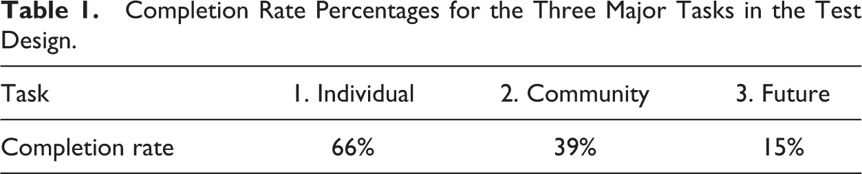
For T3 (Questions 17–20), I measured the completion rate (T3-CR) by degree, along a spectrum of specific to broad. While some broad conclusions might be accurate (i.e., Virginia Beach is in danger in the future), I designated as complete only those tasks in which the users made specific statements about vulnerability in the context of a specific time line (100 years, 200 years, etc.). Of all the features of Climate Central’s Risk Zone Map, the Projections feature is by far the most complicated to use. If at any point in the four-question sequence a user made a data-supported assertion with a time line, I marked the task as complete. Users were given time to explore the complex projections tab and then use the feature to establish some sort of time line concerning vulnerability in the future. The time lines can only be established through the tide gauge markers in the region. These indicate where 5 feet of water would be and when. For example, the water would hit the same spot in 2200 with extreme carbon cuts as it would in 2150 with unchecked pollution (see Figure 2). Many users did not know the meaning of the terms carbon cuts or accrued risk. Also, not all locations had a marker letting users know the time-line points, and even some locations that did have markers showed N/A instead of the year. Of the 41 users, 5 experienced no dates on their markers. Users showed an ability to combine their visual of their place being inundated with the assumption that “things will get worse,” to quote one user, an assumption that was representative, as most users just made broad assertions without specifically using the projections feature. In all, the T3-CR was 15%, with 6 of 41 users completing the task.
Screenshot of the projections feature in Climate Central’s (climatecentral.org) Risk Zone Map, with which scenarios ranging from unchecked pollution to extreme carbon cuts can be explored in the event of either sea-level rise or flood. This screenshot shows that 2150 is the year in which the 5-ft rise in water would, with unchecked pollution and sea-level rise alone, reach the marker (tide gauge).
Establishing projections overall was a struggle for users, as the vast majority of them were not able to make a specific assessment about time lines moving forward—sometimes because there were no markers in their chosen area or their area markers showed N/A instead of the year. Users also struggled to make sense of the scenarios at the bottom, with many thinking that scenarios meant types of inundation (e.g., hurricanes, storm surges) and not carbon cuts. No user understood what accrued risk was, and only a handful of the 41 users could even come close to seeing differences in the years shown by the markers as they moved up and down the carbon cuts, from extreme to none.
After attempting the three major tasks, users were then asked questions in order to better understand how the tool operated within their existing mental models and to collect their feedback on how the tool, or similar tools, might be more useful and productive for them. User responses to the question “How did the Risk Zone Map support your understanding of sea-level rise?” (Question 21) were categorized as follows, with the numbers in parentheses indicating how many users fell within each category: helped visualize (15) confirmed existing knowledge (8) provided no or vague statement (6) learned more than before (5) acknowledged usefulness, but needed more time with tool (4) related it to property or population decisions (2) found useful for projections (1)
By and large, most users did not encounter any challenges to their extant mental models but described, accurately or not, how the tool added a visual supplement to their existing understanding of sea-level rise and flooding. In terms of technical proficiency, the vast majority of users (98%) claimed to be familiar with interactive maps such as Google Maps. When asked if they have ever used a tool similar to the Risk Zone Map before, 7 of the 41 (17%) answered yes although only one of these positive responses included ISLRVs (the others were hurricane maps, census data, or flood-insurance zone maps). So with only one user claiming to not use Google Maps or a similar technology, I am confident that issues in toggling, zooming, and scrolling played little or no role in the users’ ability to complete the tasks.
I analyzed and categorized the remaining questions in a way that is useful to developers and designers of similar tools; this information was shared with Climate Central, but it might also have relevance for other organizations designing similar tools. For example, when asked “What types of decisions related to sea-level rise, property, and community would you like this tool to help you with in the future?” and “What would you like to do with a tool like this that you cannot currently do?” the participants provided valuable insight into what types of scenarios that they would like the tool to enable. Their responses were categorized as follows: flood insurance effects, more specific property maps more interplay with street view on Google Maps, more zoom school effects buying property feature simpler projections past events, historical context real-time conditions and mobile updates vacation timing evacuation routes and areas, resources more specific scenarios (i.e., apply Hurricane Sandy to their region)
Although some of these tasks would require redesigning the tool from scratch, users were generally more concerned with receiving concrete scenarios to help contextualize the data and features that allow for more current rather than long-term risk assessment. This might help explain why users rated the questions about whether the site information content met their overall needs and about whether the site provided sufficient information an average of 3.7 and 3.6, respectively, on a scale from 1 (strongly disagree) to 5 (strongly agree). They rated the question about whether they were likely to recommend this tool to other people an average of 7.79 on a scale of 1 (highly unlikely) to 10 (highly likely).
Discussion
The complexity of the Risk Zone Map is matched by the complexity of the analyses that followed from observing the public’s use of a risk visualization originally designed for expert user groups. Despite calls by major scholars for more empirical research on risk visualizations (Kostelnick et al., 2013), such research on ISLRVs is still in its relative infancy. The results—namely the task completion rates (see Table 1)—clearly show that more research is needed that investigates not only just how the general public uses tools such as these and how they might want to use them but also the ethical ramifications involved in designing such risk visualizations for public decision making, which might involve a more concerted ethic of constraint pertaining to user agency.
Completion Rate Percentages for the Three Major Tasks in the Test Design.
The following discussion focuses on how the completion-rate results for the three broad task categories (individual, community, future) connect to both larger themes that I observed in the participants’ UX with the Risk Zone Map and the way that agency is framed at the beginning of this article—as not inherently good but a dangerous lure that might redirect designers away from more productive and accurate public engagement. I also make connections between these interpretative observations, the empirical results, and the larger conversations, issues, and research conducted in the area of risk visualization. The three categories, centered on the three major tasks, are based on the design features of the Risk Zone Map itself because design features play major roles in the types of decisions and tasks available to users (Stephens et al., 2017).
Individual: The Ethics of Accuracy
While it might be tempting to look at the overview of completion rates in Table 1 and cynically make a general assessment that the task completion rate was higher in the individual category because users—and people in general—are better at thinking about themselves, a closer look at the Risk Zone Map suggests that perhaps this task was most successful for users because of the lack of design features in their way. That is, this task did not require selecting any of the layers on the bottom (social layers or projections): It only required that users find themselves on the map and use the slider to ascertain the appropriate height of water inundation that would affect them or their property. This is also the task in which users spent the most time. Many users “got distracted” and began looking up other locations—their children’s schools, old apartments in which they used to live, loved ones’ workplaces, favorite destination spots, and common commute routes. Users saw the map similarly to how users see Google Maps, but with the added feature of the visualization of water inundation, they were interested to learn more about how rising waters would affect other aspects of their lives—almost as if they were trying to piece together some sense of coherence about the states of the locations important to them. Starting with a place of personal relevance, as required, they then began to build a network of significant places. This pattern conveys a certain degree of trust in the tool itself, as well as a significant property of public engagement.
That said, only two thirds (66%) of the users were able to complete the task of locating a place in a coastal state and identifying, using only one design feature, how much water inundation it would take to affect that place. To return to the trope of balance as it pertains to shared agency between the designer and the user, the main issue here is allowing users to locate places of meaning to them while providing enough structure for them to make accurate risk assessments about those locations. What is the value for users in finding their own location using an open-exploration mapping interface if there is a distinct possibility that they will make inaccurate risk assessments? How narrow or broad, then, do designers craft the framing, messaging, and scenarios of ISLRVs without compromising users’ ability to engage in effective decision making or their ability to locate specific places of residence that are significant to them?
To frame these types of questions, Stephens (2015) argued that we must think of agency with ISLRVs as occupying two spaces. For Stephens, the “primary space of agency for data visualizations that is discussed in the literature is the space that users experience while actively interacting with visualization tools.” This space refers to the actual rhetorical interaction that those using the tool have with the designer. The second space of agency, according to Stephens, “differs from the first in that it is primarily defined for making real-world decisions rather than exploring a dataset” (n.p.). Stephens was concerned that too much constraint in the interactive portion will in turn constrain users’ level of agency within the second space in making decisions with the information they have gleaned from the tool.
What we see in observing public use of the tool, however, is that while higher degrees of agency in the primary space theoretically afford users more choices, this high degree of agency can lead to inaccurate risk assessments that might negatively affect the decisions made in the second space (e.g., property decisions, relocation). Although users enjoy being able to navigate around the map, zooming in and out and toggling left and right to find relevant locations in order to see how the water-level slider affects their areas of concern, this type of open exploration has downsides. For instance, User 16 gave this answer when asked to make a risk assessment (see Appendix, Question 7): OK, so [raises slider up to 10ft; nothing happens] it looks like 10 feet [seeing isolated water areas], well looks like 4 feet or 5 feet some street ways will be affected, and it actually branches out to outside the areas when at 10 feet, but it would start at 4 feet. Maybe I am blind, but not seeing any hospitals—that is kind of crazy. I know there should be a school or college because I have been there but I cannot find it…maybe they are covered in the water? I cannot find a hospital…therefore I do not like this tool. I don’t know if it is inaccurate or they’re inaccurate or I am blind.
The open-exploration nature of the tool also compromises users’ sense of context. For example, even if users are able to make an accurate assessment of a flooding event, they do not know the context that would cause such an event; for example, 4 feet of water inundation would affect a residence, but what causes the 4 feet of inundation? And when? As User 21’s comments suggest, not having the context can be frustrating: Where I live is fine, but Seattle would be at risk. But, um, yeah, I don’t know how I get this to go further; how do I get further? When would this happen? Like would this be 10-50 years, then it would be at risk? What amount of years would it be until the house I live in now would be at risk.
These examples—inaccurate assessments, reliability issues, and lack of predetermined contexts or scenarios—all illustrate the problems that can occur from the high degree of agency that, by design, is granted to users in the Risk Zone Map tool. While sea-level rise is a type of risk that lends itself well to visualization (Stephens et al., 2015), such maps are still difficult to use (Kain & Covi, 2013)—perhaps even more so in interactive settings. The main ethical issues arise when transferring between the first and second spaces of agency. Many users thought that the tool was confirming their knowledge of the area, or at least visualizing what they already knew, raising ethical questions such as these: What are the ramifications of allowing for user error or erroneous assessments? Does allowing a broad user base to openly explore the maps and control for water levels have the negative function of causing users to falsely assess their risks? How do designers remain committed to user engagement and interaction but still protect users from making erroneous assessments in critical areas of decision making for themselves and their families?
Here, we might circle back to Stephens’s (2015) question: Is there such a thing as too much user agency? Stephens asked this question in a discussion of first and second spaces of agency. The first space is use of the tool, and the second is action. For those in environmental risk communication, being able to bridge these two spaces is critical to user engagement and action—in essence, actually getting people to do something actionable. If designers of tools such as the Risk Zone Map seek to spur public engagement and action through knowledge, then most certainly they should equip those citizens with accurate assessments. In agency’s second space, more agency is inherently good. The more power that people have to do more things, the better. Agency’s first space, however, is more about usability, about designing tools that afford a wide number of people a wide variety of opportunities for engagement. Trends in citizen science, for example, have helped reveal the type of interactive visualizations possible. Agency in this space refers to the property of a given tool that either enables users to choose, tailor, or localize or constrains them from doing so. The connection between these two spaces is critical because the more agency that users have in the first space, the more they will have in the second; that is, the more opportunities that users have to localize the site, the more opportunities they will have to engage with it and do something actionable. Stephens’s question turns this connection on its head. She is concerned that too much agency in the first space would have a negative, or inverse, effect on a person’s ability to harness or experience agency in the second.
In the context of ISLRVs, although these tools are intended to facilitate public engagement and promote social action—even social justice (more on that later)—they might leave users with an experience of agency that has negative effects. The sheer openness of this open-data exploration tool might communicate a sense of reliability but inadvertently facilitate poor decision making. Not only, then, could higher degrees of agency in the first space lead to inaction; it might lead to adverse action. Most research on these tools, however, has focused on higher level stakeholder engagement rather than broader public usage, which is problematic, given the public accessibility of these tools and their ability to contribute substantially to the work of social justice.
Community: The Ethics of Race and Responsibility
Given that only two thirds of the users were able to complete the simplest of the three tasks, it is not surprising that asking users to complete a similar task but with an added data layer resulted in a lower task-completion rate (39%). This task asked users to make a meaningful statement about sea-level rise as it related to one of the categories on the lower menu of the Risk Zone Map, which includes data layers for income, property, social vulnerability, ethnicity, and population (see Figure 3). Users’ most common response in this task was to ask what social vulnerability means. In many cases, this question led users to look into the supplemental About sections; in response to follow-up questions, many users suggested that Climate Central integrate “hovering” or “mouse-over” explanations over each layer. The main purpose of this task, however, was to get users to use aspects of the tool to make projections beyond their personal property to their community more broadly.
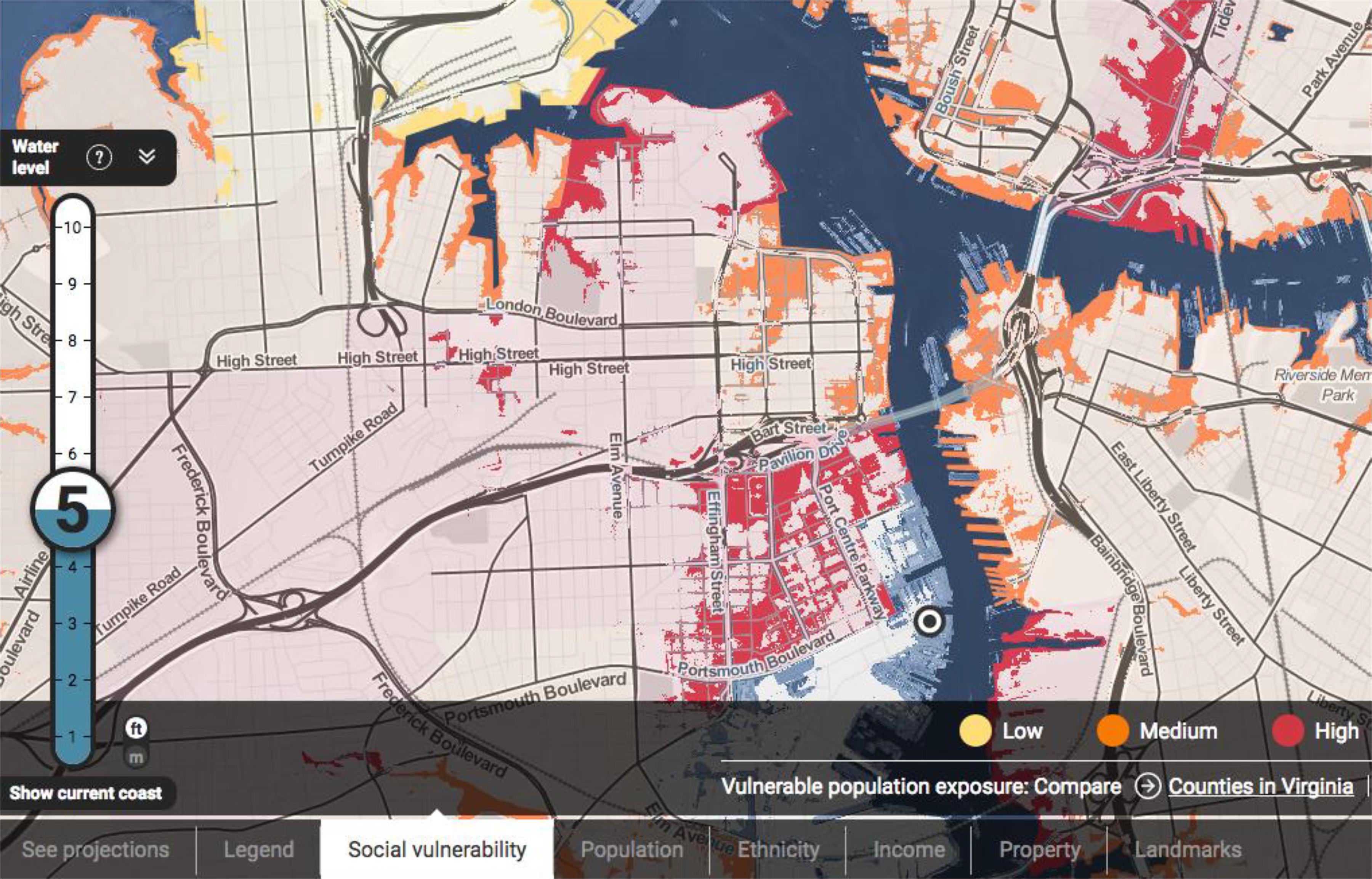
Screenshot of the social vulnerability feature in Climate Central’s (climatecentral.org) Risk Zone Map. The color appears as users raise the slider. The color red, indicating high social vulnerability, is prevalent in the eastern part of Portsmouth (center of image) and the southern, downtown part of Norfolk (top right of image).
Climate Central integrates the latest census data to help city planners and other high-level stakeholders draw meaningful correlations between the risk of water inundation and social data. While participants were not asked to give detailed demographic information about their own race, ethnicity, or personal income, research has shown that class has been found to be a strong predictor of flood awareness for local regions (Burningham, Fielding, & Thrush, 2008). Further, research has outlined strong correlations between vulnerability and race, between risk and class, showing that unmitigated capitalist enterprises cause ecological harm that disproportionately affect the poor (Nixon, 2011). Thus, Task 2 asked public users to make a “meaningful” statement about the relationship between rising waters and census data of any kind, encouraging them to draw connections between risk and community makeup.
But a particular problem in using these features makes it difficult for users to draw such connections. When users select a census data layer, say ethnicity, on the map and then use the slider tool to see where the water will go, the portions of color that reveal ethnicity only show up when the water level gets there. That is, users will not know what ethnicity lives where until the water-level slider is raised high enough to reveal the data layer. The tool likely works this way in order to accentuate the visual of seeing the effects of water on a given data set, but as User 19 noted, “you have to do lots of interpreting for yourself.” The lower completion rate, then, was likely the result of the complexity of this task.
But what does this problem mean in terms of framing the balance of agency? The users were asked to complete a complex task without much direction, but should designers do more to ensure that users are able to make meaningful statements about social data as they pertain to the risk of rising waters? Should designers feel obligated to do so, given that sea-level rise can be viewed as a social justice issue? Take User 10’s response, which was not atypical: I’m sure [the data layers] could be meaningful for research[, but] as far as ethnicity, I’m not sure why that would be meaningful to the average person. I am not sure what the relevance is, maybe it has some relevance for, I’m not sure…teachers? scientists? sociologists? For me, looking to see what flood risk is, this info is not relevant. The ethnicity layer [in this area] clearly has more black people so that is kind of saying that more black people are living closely together. Let’s also look at social vulnerability in that same spot. Oh, it is low licks on population. Interesting to me that more people of color live together. How about income? OK, this is in the middle 60-80 percentile, higher actually. I would expect that the vulnerability would be lower though if more people were living together. …over here mainly white, mainly white here, mainly black here, well not mainly but that’s where they live, so, interesting to see the area especially if you don’t know the area yourself what kind of people live here, who would be affected, what homes would be destroyed by hurricane, tsunami. (User 31) You’re going to pay for it in the end when rising sea level forces you to make drastic changes to your lifestyle. I don’t imagine seas gaining 5-10 feet anytime quickly, it will take years and decades, but the writing will be on wall. That’s going to be my interpretation of price per acre data layer, as I said you’ve paid for the right to be more at risk because of the views. (User 26) In the Long Beach area; it is alarming, and I think that more people who have homes were aware they would be affected by even 1 foot of water level rising, then perhaps they’d take it more seriously to not believe in global warming. (User 28)
Users have the agency to explore any coastal area, but the issues of race, class, and social vulnerability vary by each geographical location. Do designers have a more explicit obligation to include a feature that highlights how these issues vary? The types of interpretations offered by the users quoted here illustrate the potential for such a feature to be valuable, specifically in relation to community awareness: When you hear water level rising and places going deeper in the water, you don’t think about entire cities being in water; not sure why, you really think of it as [an] abandoned area…but looking at this and how little water level would affect an area with almost 10,000 people, it puts things in perspective. Even small amount can affect [a] large group of people. (User 28) Looks like in this area flooding disproportionally affects the poor, here it hits the middle class real hard. Right here by the beach, it doesn’t discriminate. Flooding area doesn’t target particular population or economy or income, looks like everybody is going to get hurt, looks like middle class gets hurt more than anybody other than rich hotels on the beach; that is interesting, I guess the wealthy would hurt first and the worst on Virginia Beach, at least on that side…flooding areas aren’t delegated to the poor, what it sort of looks like, everyone is same boat if you will. (User 4) Middle class is along flood zones, really bad flooding, looks like middle upper class would hit worst [deemed correct] meaningful because in some areas, the poor are more delegated to lower lands, are more risky, interesting to see how people settle in. Shows trends in city but I’m not qualified to talk about that, rich gather towards water near to danger, more apt to recover though, poorer look to be in safer spots, don’t see any below 100 K property in flood regions, not sure what meaning it has, someone smarter than I could tell me. (User 4)
More important, User 4’s think-aloud comments highlight what might be possible with the productive and accurate use of the Risk Zone Map. If, as many believe, ISLRVs can operate as useful decision-making tools in regard to personal health and safety, might they also be envisioned to operate in the same way for the larger community? If, as Chisnell (2016) argued, democracy does not just have a design problem, democracy is a design problem, are the designers of such tools obligated to afford and facilitate more astute understanding of the social implications of risk? Should designers be tasked with showing why the information on demographics is meaningful, or is it up to the user to decide whether attending to ethnicity and class in regard to sea-level rise is relevant? To what extent might or should designers add in constraints to display a specific narrative outside of the highly individualistic narratives already implied by its design? For the time being, users would have at least had a better understanding of the layers if the designers had just included boxes that pop up when the cursor hovers over the labels, such as a box that explains social vulnerability and maybe even links to studies providing further explanation of the term.
Future: The Ethics of Storytelling
High degrees of agency also allow users to create their own narratives of a given situation. That is, rather than designers creating preset narratives, users create their own personalized ones. But in the end-use feedback, many users said they would like more specific contextual entry points based on actual typical scenarios. What would a category four hurricane look like, for example? What if Hurricane Sandy hit Virginia? Users sought preset scenarios, indicating that being able to write their own narrative is difficult without proper constraints.
Stephens et al. (2014) described interactive visualizations as “narrative builders,” arguing that continued attention to the narrative-building features of ISLRVs could improve their communicative effectiveness and user efficacy, leveraging our natural way of seeing storylines develop (Hullman & Diakopoulos, 2011) by having users operate within the “agent function” (Herndl & Licona, 2007) in their own processes of narrative building. And while Stephens et al. conducted mostly a content analysis of 20 ISLRVs, their inclinations about observed use were correct: Users do engage in narrative-building tendencies, even without prompting, as I found in the first, in-person iteration of my user-experience research on Climate Central’s Risk Zone Map, then called the Risk Finder (Richards, 2018). The users largely wanted to discuss narratives, already bringing with them their own story. Take, for example, how User 4 has built his own narrative: Looks like under extreme carbon cuts, rising sea level past the year 2200 this area will be devastated if information holds up. Not a good place to start my dynasty [emphasis added]; in 200 years unless something is done we will be underwater according to data here…surprised more not under water now…safe for 140 years or so, 150, before problems. Not an awful lot of risk from water there in Virginia Beach, maybe in 200 years, my ancestors [emphasis added] would have beach front property and Norfolk would be gone, immediate future I’m fine even with unchecked pollution, carbon cuts not making that big difference, would take 200 years to get 5 ft over with extreme carbon cuts, spot will be fine. [ISLRVs] allow users to explore data sets and construct alternative interpretations of information (Segel & Heer, 2010), thereby participating in the story-building process. Nevertheless, they also incorporate narrative-building features that communicate messages, constrain usage and interpretation, and frame the developing story line (Hullman & Diakopoulos, 2011). (Stephens et al., 2014, p. 676) Say I picked one spot here [close to coast]; 1 foot of water, I am safe; 2 feet of water, I’m screwed. That’s it. That’s all I know. If I know I’m getting 2 feet of water, then I know that if I lived in this area, I would have issues, but it doesn’t give me how long it would take for this to happen. Overnight? Immediately? Rain? I wouldn’t know how long it would take for it to happen; very quickly or not at all? It is not giving me any tool or indication of how long it would take. (User 32) Let’s go down to 6 feet; it shows right here the year in which anything is happening…a water level of 1 foot is already coming in the next 20 years, very scary, steady rise [not using gauge years right though]. I would be slightly OK in these years but in about 100 years I would be completely submerged. (User 12)
For example, Rawlins and Wilson (2014) proposed the phrase “interactive data display” (IDD) to encompass the interactive space in which the designer and the user “share agency” in coconstructing meaning, both during the process of using an interactive tool and in creating a visual product. In broaching the challenging transition from evaluating static to evaluating interactive data visualizations, Rawlins and Wilson found that our traditional allegiances to genre typologies could not address all at once the technical capacity of interactive data-visualization tools, the options and constraints granted by the designer, and the strategies employed by the user because “the moments where a user, an online tool for creating graphics, and the designer of that tool [come together] are difficult to characterize” (p. 303). Thus, Rawlins and Wilson introduced a two-dimensional typology (see Figure 4) to articulate the gradations of agency afforded to IDD users. They used the imagery of “balance” to explain data visualizations as ranging from being, on one extreme, static and uninteractable to being, on the other extreme, unconstrained and interactable in their messaging and displays.
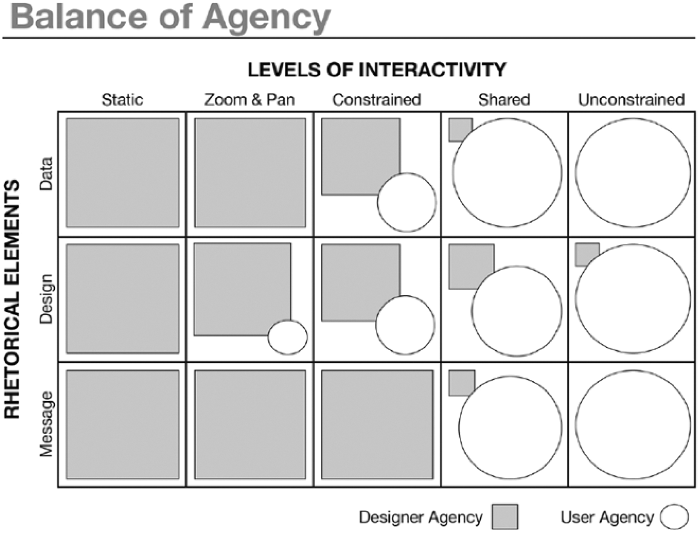
Balance-of-Agency typology from Rawlins and Wilson (2014). Reprinted by permission of the Association of Teachers of Technical Writing, www.attw.org.
The gradations in between reveal the nuances of the degree to which and the aspects about which the users and the designer share control—or agency—over the visualization, which, in the case of ISLRVs, can also mean narratives. The trope of balance is significant because unlike struggle, which might evoke a tug-of-war vision, balance indicates a sense of rhetorical calibration in which certain IDDs are more apropos than others, given that each have their own rhetorical scripts, so to speak: It may appear to be a mere tool. Yet, the IDD has been imbued with certain agential scripts and seeks to place the user in a position of efficacy in ways intended by the designer, who is no longer present. (Rawlins & Wilson, 2014, p. 319)
Agential scripts, as Rawlins and Wilson (2014) theorized them, therefore inscribe a larger story about the relationship between the designer, the user, and the artifact, especially as the relationship pertains to how user agency is balanced. With the prevalence of digital positivism, agential scripts are more and more often written for the “personal good” of the user, revealing a consistent move toward a philosophy of individualism, of unmitigated user agency being championed seemingly above all else. Thus, in applying Rawlins and Wilson’s typology of the balance of agency specifically to the use of ISLRVs, I ask these questions: Are there IDDs in which individual user agency might need to be constrained for the good of others, perhaps for the public good? That is, what ethical frameworks, consciously or not, drive or should drive decisions about what is the appropriate balance of agency between designer and user? Are there contexts in which the championing of user agency might need to be tempered by more attention to the consequences of unrestrained user agency? What forces are currently at work to ensure that the privileging of user agency is not compromising an ethical principle that our field holds dear? Put another way, might our field need to add a third dimension (see Figure 5) to Rawlins and Wilson’s two-dimensional typology of balancing user agency?
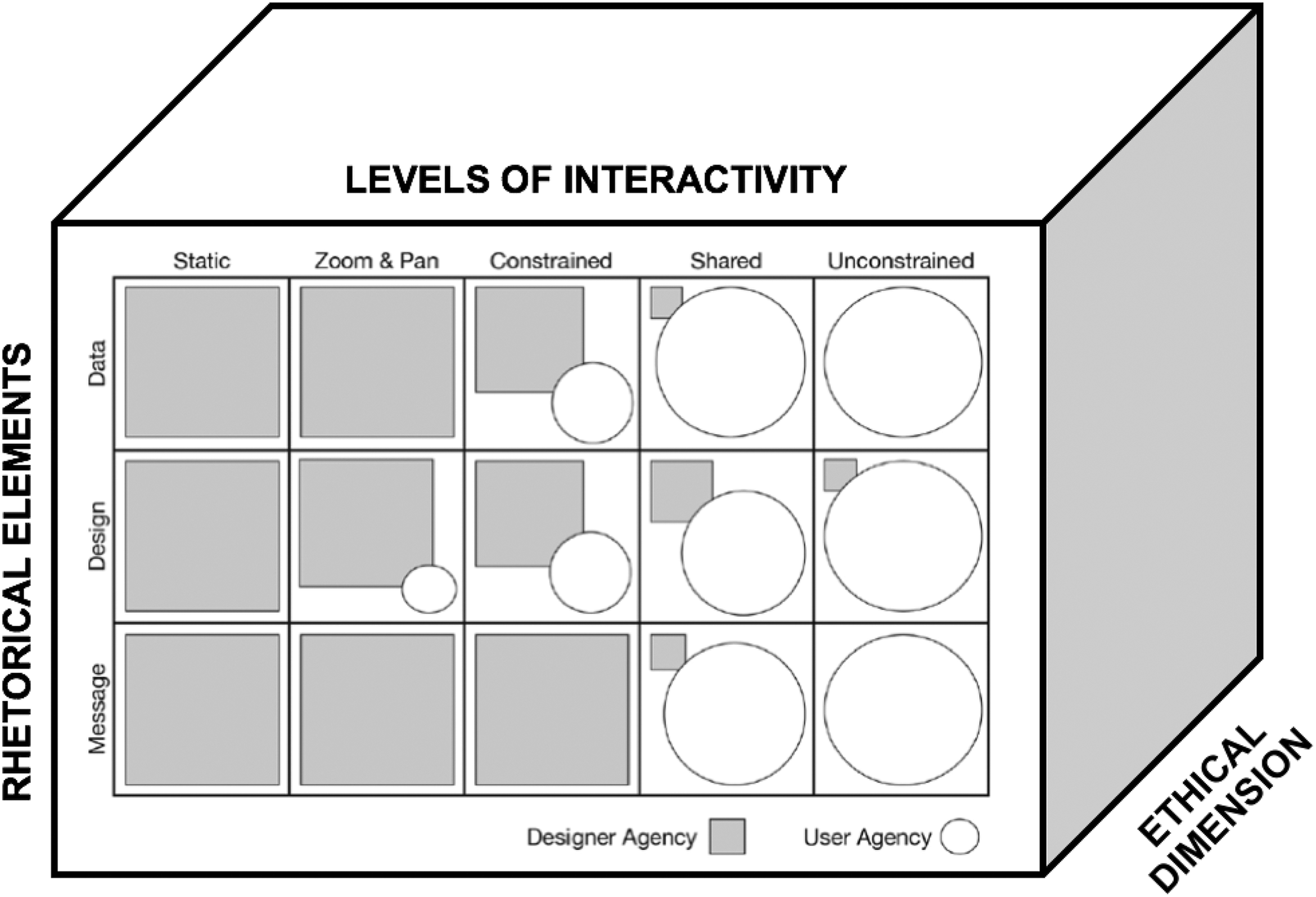
Balance-of-Agency typology (Rawlins & Wilson, 2014) with an extended ethical dimension.
I argue, then, that there is an ethical dimension—perhaps appropriately, a gray one—on IDDs that is not explicitly covered in Rawlins and Wilson’s (2014) typology but that looms behind decisions designers make. While Rawlins and Wilson touch on the ethical presentation of data in terms of avoiding deception (Kienzler, 1997) and promoting humanity (Dragga & Voss, 2001), the ethical question regarding ISLRVs and risk visualizations more broadly continues to center on agency in environmental ethics and action. The ethical paradigm that designers acknowledge inevitably directs where designer agency falls on the balance-of-agency map; thus, gradations of agency, acknowledged or not, might emerge along the third (ethical) dimension as well. Design decisions about user agency (how much to give, to whom, and for what ends), then, ultimately must go beyond considering mere task-completion success rates to engage in a larger ethical dimension about constraining (or not) the possibilities of rhetorical action toward a given political space. By providing more data, more navigational options, more features in ISLRVs, designers, while giving a semblance of increased opportunities for engagement and personalization, might very well be engendering inaccurate projections, unproductive actions, or risky inactions by the public. Thus, for designers to consider the ethical ramifications of such degrees of apparent agency in order to make decisions aimed at mitigating exploration errors, they must question the limitations of agency, critique the assumptions of digital positivism, and, ultimately, engage in an ethic of constraint.
Conclusion: Agency and Error in Visual Risk Literacy
The move from static to interactive risk visualizations has certainly brought with it different genres and conventions that users must acquire. We might call it a different sort of “visual risk literacy” (Garcia-Retamero & Cokely, 2017). In technical communication, we understand static maps of our environment and natural ecologies as rhetorical (Propen, 2007), ideological (Barton & Barton, 1993), emotional (Kostelnick, 2016), and epistemological (Welhausen, 2015), but we perhaps have less understanding about these facets of critical cartography (Barney, 2009) once the visuals become immediately interactive, changeable, and moldable. How much does our accumulated knowledge about the rhetorical nature of maps translate to interactive maps? The recent surge in the development and research on ISLRVs has highlighted that risk visualizations are powerfully symbolic cartographical renderings, without a doubt, but are also decision-making tools for helping communities and individuals live safer lives.
While persuasion (Herring et al., 2017), localization (Moser, 2010; Weber, 2006), design choices (Kostelnick et al., 2013), and representation remain important considerations for the effective design of interactive risk visualizations, more empirical, user-centered research is needed to determine how well such tools can actually help residents make informed decisions. Newer, interactive visions of visual risk literacy require an understanding of how to apply large data sets to more granular, personal decision making while simultaneously attending to aspects of symbolism, representation, and space that are irrevocably embedded in the mapping interfaces. In studying these tools that blend communicative and decision-making domains, we need to be careful and particular about what we are studying and what type of data we can glean from observed use. Our vision of what a visual risk literacy might look like will depend on the user and the context of use.
This research study—my modest contribution to the larger drive toward more clearly outlining the contours of visual risk literacy—tempers our field’s fixation on agency by positioning it as a contrary force to accuracy, responsibility, and personal and community well-being in the context of environmental risk communication. To answer Stephens’s (2015) question simply: Yes, the Risk Zone Map might grant users too much agency, and if so, designers face the ethical imperative to do something about it. And with our field’s concern to cultivate prudent rhetorical action in the face of risk and vulnerability, this imperative poses a problem that is not insignificant. My UX test was designed specifically to better ascertain the degrees of agency that public users experience while using such complex risk-visualization tools. I hope that their use of the tool and my subsequent analysis of their use will influence designers to better balance the drive for user agency with an ethic of constraint.
Footnotes
Appendix
Acknowledgments
The author would like to thank the group of Old Dominion University graduate and undergraduate students who helped to execute this project: Daniel Hocutt, Matthew Beale, Sarah Johnson, Erin Jacobson, Kimberly Goode, Ashley Hamouda, Cassie Book, Megan Boeshart, Megan McKittrick, Kathryn Mitchell, Suzanne Sink, Phoebe Richards, Adrienne Kubat, and Corey Baden. The author would also like to thank Climate Central and Dan Rizza, in particular, for their support and guidance on the public evaluation of their tool and UserTesting for generously providing access to the testing participants. Finally, the author would like to thank the reviewers and editors of this journal, specifically Lori Peterson, for their role in the writing and development of this article.
Declaration of Conflicting Interests
The author declared no potential conflicts of interest with respect to the research, authorship, and/or publication of this article.
Funding
The author received no financial support for the research, authorship, and/or publication of this article.