




Abstract
What expectations should professionals and the public place on visuals to communicate the uncertainties of complex phenomena? This article demonstrates how charts during the early months of the COVID-19 pandemic articulated visual arguments yet also required extended communicative support upon their delivery. The author examines one well-circulated chart comparing COVID-19 case trends per country and highlights its rhetoric by contrasting its design decisions with those of other charts and reports created as the pandemic initially unfolded. To help nonexpert audiences, the author suggests that professional communicators and designers incorporate more contextual information about the data and notable design choices.
The COVID-19 pandemic has forced media analysts and the public to confront a long-standing issue about visualized models: They are neither objective reflections of reality nor determinants of it. The renowned statistician Box and colleagues (2009) warned that objective truth is never the aim of any model; instead, professionals must emphasize its assumptions to make it useful for the particular situation (p. 61). As COVID-19 crossed the globe, S-curve models grew in popularity alongside the phrase “flatten the curve.” S-curves illustrate when the exponential growth between two variables taper off, which can be a result of the virus infecting everyone or of measures taken by leadership on account of the models. But S-curves provide little insight into uncharted, developing situations because they do not emphasize changes in trends visually as they occur. Trendlines mark the general direction of cases over time whereas S-curve patterns emphasize the when of a result after the fact. In sum, the former plots significant and concurrent changes in case rates whereas the latter emphasizes patterns of case counts, which might indicate a potential trend with enough collected data, but not by design. Most audiences and perhaps some professionals are not likely aware of how this difference should guide their design choices. Consequently, how do design choices require elaboration before and upon delivery?
I examine here the implicit design decisions informing the widely circulated Financial Times (FT) trendlines chart (see Figure 1), which facilitated much of the public discourse about the efficacy of particular countries’ lockdown efforts. I also examine how its designer, Burn-Murdoch et al. (2020), and designers of similar charts (Hasell et al., 2020), elaborated on their design decisions to potentially clarify their tacit expert knowledge that is likely unknown to nonexpert audiences. Then I compare the FT chart against a Fox News affiliate’s localized S-curve chart ( COVID-19 Cases in Colorado, 2020) to consider how certain visual claims can help, hinder, or even misrepresent uncertain situations.

Logarithmically scaled chart tracking case trajectories and the efficacy lockdown measures (Burn-Murdoch et al., 2020).
What Is Rhetorical About Visualized Models?
Rhetoricians and technical communicators have long been theorizing how the delivery of facts are constrained by the available information, as well as by visual design choices. Perelman and Olbrechts-Tyteca (1969) theorized the selection and representation of data as the act of presence, which reduces phenomena to amplify particular properties about it for audiences. Roundtree’s (2013) study of scientists’ development of supernova simulations found that the most useful simulations helped scientists hypothesize phenomena by deliberating about “the uncertainty and gaps” (p. 108) in the available data. Roundtree positioned visuals as arguments riddled with assumptions that are not easily rendered salient without deliberation. Wolfe (2015) expanded on presence directly with her concept of interpretive levels (ILs), which involves decisions about how to represent variables. Consider how simple decisions between “averages versus percentages or raw counts” (p. 346) highlight the bandwidth of representation mediated by visuals. Accordingly, IL design choices presence some insights at the expense of others. Moreover, designers rarely communicate the assumptions that inform these choices. I will now examine the consequences of several presencing acts across visual models about COVID-19 cases.
Interpretive Levels: Scales and Variables
Interpretive levels can alter a chart’s visual argument. The rate of growth in coronavirus cases can be represented either linearly or logarithmically. Linear scales use a series of consistent intervals: 10, 20, 30, and so on. Logarithmic scales use a series of multiples of 10: 10, 100, 1000, and so on. Designers (Burn-Murdoch, 2020; Hasell et al., 2020) explained how their logarithmically scaled y-axis presence the changes in growth-rate trends as opposed to how linear scales presence the potential exponential or S-curve pattern of cases. The FT chart (see Figure 1) enacts a directional approach by plotting cases per country logarithmically (y-axis) against the number of days since the 100th case (x-axis). This approach straightens exponential growth into a diagonal line, which fluctuates vertically as the rate changes. Burn-Murdoch remarked how he could then add useful “context” by comparing each country against dashed, gray trendlines and annotating lockdown measures for countries on a downward trend so that audiences could compare countries.
In contrast, linear scales do not necessarily presence trends with relational patterns. The Fox News affiliate’s chart (see Figure 2, top half) attempts to plot raw counts of cases in Denver County, Colorado, linearly (y-axis) per day (x-axis), which works if it is emphasizing patterns. Yet the chart’s y-axis intervals are irregular: 30, 60, 90, 100, 130, 160, 190, 240, 250, 300, 350, 400 (see Figure 2, top half). But these intervals are the least of its issues. In the bottom half of Figure 2, some totals do not match the available primary sources ( Colorado COVID-19 Case Data, 2020; Johns Hopkins University, 2020) and omit approximately 45% of the available timeframe, all of which result in an inaccurately scaled linear line that obfuscates the exponential spike in cases. Even if unintentional, the design obfuscated the evident exponential growth pattern, and these professionals, the designers and reporters, should have verified their data and contextualized their axes.
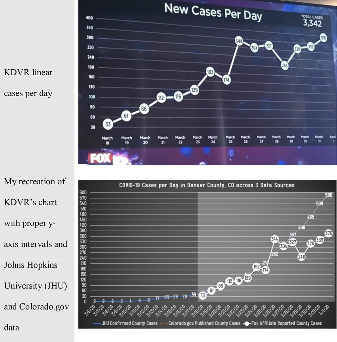
Designers circulate an image of KDVR Fox News affiliate’s chart (top half), which does not clarify its provenance, confirmed context, or skewed y-axis (Obasanjo, 2020). In the bottom chart (bottom half), I contrast KDVR’s reporting timeframe (gray box) against the complete data and variation in case totals.
Knowing the Data: “Cases” Versus “Confirmed Cases”
Models depend on available data, so presencing data collection and provenance is essential. Because no unified testing plan was available, media analysts negotiated specious data collected from around the globe. Burn-Murdoch (2020) published an explainer video in response to questions about the FT chart, which emphasized issues of collection. He noted how he originally labeled the y-axis as “cases” but quickly edited it to how the data were “confirmed cases” because every country’s testing differed. Data journalists Hasell et al. (2020) elaborated beyond their charts how confirmed cases is one of three standardized categories of disease-testing practices: the only practice backed by laboratory testing. The other two testing practices include suspected and probable cases: someone showing symptoms versus someone showing symptoms with an epidemiological link. By using confirmed data, designers ensure more reliable data across countries. Furthermore, Figure 3 illustrates how data collection influences models. The first column compares South Korea’s testing efforts, which far exceeded those of both Japan and the United States, during the latter half of March whereas the second column compares the same timeframe of “confirmed” cases. The figure also shows how the United States experienced a spike in confirmed cases in tandem with its increased testing.

Parallel comparison about how testing influences data collection and the reporting of confirmed cases (Hasell et al., 2020).
The omission of data provenance and collection can create conditions of oversight and lead to drastic misrepresentations. KDVR’s chart (see top half of Figure 2) failed to distinguish case types, in either its chart or its web-based report (COVID-19 Cases in Colorado, 2020). Recall how the chart and the report showed suspiciously different totals and omitted the initial 12 days of available case data without providing a contextualized label akin to the FT’s x-axis: “number of days since 100th case” (see Figure 1). If professionals would learn the importance of verifying data provenance and contextualizing the situation, they would more carefully design charts that consider what contextual insights should also be elaborated beyond it.
Lessons on Delivery
What can professional communicators and designers learn about visual arguments and their delivery? First, data are not an objective representation of reality, and visuals do not explain themselves. Designers can presence certain elements to guide their audiences. Yet designers must also account for composite audiences who might not share their insight into data and statistical assumptions by better integrating their design choices. Second, designers should recognize their position to shift public discourse beyond the chart by presencing a chart’s known unknowns, such as data provenance and collection. The KDVR chart embodies the dangerous consequences of mistakes made prior to its delivery that resulted in a misleading report of the situation. Reporting an unfolding global issue is complex, especially during its initial months of data collection. But professionals must advocate for overlooked angles and assumptions central to more ethical visuals before and upon delivery.
Footnotes
Declaration of Conflicting Interests
The author declared no potential conflicts of interest with respect to the research, authorship, and/or publication of this article.
Funding
The author received no financial support for the research, authorship, and/or publication of this article.