
Abstract
The prevalent paradigm for understanding what constitutes a ‘good’ data visualization, and what we are likely teaching business students, relates to a conventional wisdom of efficiency, clarity, transparency, and faithful representation of truth. Teaching about the ethics of visualizations seems to be largely absent from business school curricula. This paper suggests that business students who make and use visualizations should be taught to use a code of ethics for visualizations based not only on conventional wisdom, but also on ideas from the Machine Learning/AI and ‘ethical visualizations’ communities. Elaborating on Sheppard’s code, the code suggested here incorporates ideas about bias, transparency, user agency, and privacy. Ethical awareness and practice become even more important as more data collection, processing, and visualization is shifted to Machine Learning and Generative AI. A threshold model is adapted to understand when visualization decisions require more scrutiny. Ideas from the code and the threshold model are used to analyze choices made by the CDC’s COVID-19 Rapid Response Team for an early pandemic visualization that circulated widely beyond the initial report in which it appeared. This and other examples underscore the need for business professionals to consider their visualizations from the perspective of the code.
In the March 27, 2020 issue of the CDC’s Morbidity and Mortality Weekly Report early pandemic data was presented that caused major media headlines. Although the report text affirmed that older COVID-19 patients were much more likely to be hospitalized, put into intensive care units, or die, a data visualization (Figure 1) seemed to show that younger patients were also being hospitalized in high numbers, with the 20 to 44 years range being almost as high the 65 to 74 years range (Bialek et al., 2020). By June 2020 the report had found its way to the press (543 news reports), to online outlets (59 blogs), and to social media (10,387 Twitter posts (now X), 19 Facebook posts, 14 Reddit posts; Bialek et al., 2020), from where it could easily be reshared (Shaffer et al., 2020). Headlines appeared such as:
• The New York Times: “Younger adults make up big portion of coronavirus hospitalizations in U.S.” (Belluck, 2020).
• The Washington Post: “Younger adults are large percentage of coronavirus hospitalizations in United States, according to new CDC data” (Cha, 2020).
• Business Insider: “Nearly 30% of US coronavirus cases have been among people 20 to 44 years old, the CDC says—showing that young people are getting sick, too” (Sonnemaker & Kiersz, 2020)
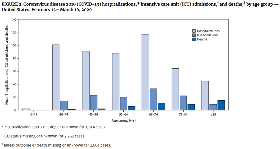
Original CDC graph.
A critical caveat with these data, along with other deficiencies, was clearly noted in the original report. Age group was known only for 2,449 of 4,226 reported cases, and of these 2,449 cases hospitalization status was known only for 508 cases (Bialek et al., 2020). The New York Times was most cautious, recognizing the limitations of the data, providing a link to the original article, and not reproducing the graphic (Belluck, 2020). The Washington Post reproduced Figure 1 without its explanatory footnotes but did warn more generally of data unreliability (Cha, 2020). Business Insider wrote “The CDC cautioned that it still doesn’t know the ages of many patients. . .” (Sonnemaker & Kiersz, 2020). But it ran a graphic that was egregiously misleading and could easily be reposted (Figure 2), contributing to a flood of COVID-19 misinformation (Ball & Maxmen, 2020).
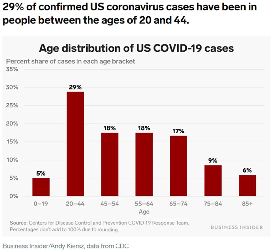
Business Insider recasting of CDC data.
These examples underscore that the same visualization may give rise to multiple, possibly conflicting, interpretations in differing online contexts (Cummins, 2022). Technical data presented in a scientific context may be inscrutable to lay viewers, confounding their interpretive frameworks (Kostelnick, 2008). Was it “wrong” for the authors (the CDC COVID-19 Response Team) to present Figure 1? They were a scientific group writing for health practitioners, epidemiologists, and similar professionals (Zhang et al., 2021). In this sense they are similar to knowledge workers in corporations or organizations addressing their peers, subject to the “usual” ethical standards for visualizations.
Of course the SARS-CoV-2 pandemic was anything but usual. It gave rise to a host of “crisis visualizations” with purposes of informing about severity, and communicating risk, vulnerability, and equity (Zhang et al., 2021). The pandemic was an example of what may be called a “wicked problem,” “grand challenge,” or crisis, with uncertain dimensions and characteristics, and subject to differing evaluations depending on the moral and ethical perspectives of professionals trying to grapple with them (Shantz et al., 2023). Does this mean we cut the response team some slack or hold them to higher standards? I will argue that they did fall short of their ethical responsibilities for clarity and transparency for this visualization.
Examinations of misleading COVID-19 visualizations often assumed they were unethical with no further elaboration (Atherton, 2021; Brennen, 2021; Doan, 2021; Hardesty & Hardesty, 2020). What principles should we encourage our students to observe so that they create ethical visualizations, especially when it is so easy to sever a visualization from all its accompanying caveats and textual context? The emerging use of machine learning/artificial intelligence (ML/AI) algorithms in all aspects of visualizations, from data acquisition to analysis and representation, poses new questions about these principles. Akin to the emergence of “deep fakes,” visualization tools may become so powerful that they make irresistible visualizations—even if they are wrong.
It is hard to find “ethics of visualizations” as a major concern in business curricula. Visualization courses surveyed by Kong (2020) rarely included modules on ethics. Woodside (2020) found a gap between learning goals in AACSB-accredited programs and the need for “visual communication” skills. The theme of visualization did not appear in a bibliometric review of the business ethics education literature (Jaganjac et al., 2024).
In business schools, besides explicit visualization courses, the primary home of teaching visualization techniques may be in communications courses (Wolfe, 2015). Students may learn about them supplementally in courses about ICT/technology and data analytics, economics, accounting and finance, or marketing (Amblee et al., 2023). A recent survey of the presence of moral awareness themes in courses by discipline found them to be present in only 6 of 79 communications courses, and in negligible numbers of the other subjects I have mentioned (Shantz et al., 2023). It is likely that ethical considerations are taken for granted when business students are asked to make visualizations of data. How many educators encourage their students to take the proposed “Hippocratic Oath” for data visualizations (Cipan, 2023)?
The purpose and contribution of this paper is to encourage educators to explicitly focus on the ethical elements of collecting and portraying data, especially considering the growing reliance on ML/AI algorithms. A focus on algorithms is especially important for business students, who are or will soon be producers and consumers of analyses that rely heavily on ML/AI (Singla et al., 2024; Ukhalkar et al., 2023; Valcea et al., 2024). Since it is quite likely they already take a business analytics course, the ethical principles outlined here can be folded into modules and training that emphasize visualizing outcomes. Most authors who have written about the ethics of visualizations have focused more on social justice and less on ML/AI (Gouge & Carlson, 2022; K. Hepworth & Church, 2018; Loukides et al., 2018; Mahmud et al., 2017; Welhausen, 2022). Framing the creation of visualizations as something that can be subject to a code of ethics opens the conversation to ethical considerations that are already being discussed in the ML/AI community, such as bias, transparency, agency, and privacy.
I begin by reviewing the conventional wisdom about making ethical visualizations as embodied in a code offered by Sheppard (2001). It is my starting point because it was the only explicit code I could locate in the literature. I then apply work done on the ethics of algorithms to deepen our understanding of ethical considerations for visualizations. I outline the proposed additions to Sheppard’s code, add a threshold model to guide levels of scrutiny, and apply these insights to the COVID-19 case in Figure 1. I hope the enhanced code will help managers to “critically reflect on their decisions regarding the relevance of data, what constitutes objectivity, and what is considered to be worthwhile” when making and publishing visualizations (Shantz et al., 2023, p. 299).
Conventional Ethical Standards for Visualizations
Several decades ago S.R.J. Sheppard (2001), whose home discipline is landscape and forestry management, proposed an explicit code of ethics for visualizations. Summarizing key points, visualizations should be:
• Honest and neutral (not intended to provoke biased responses)
• Accurate in depicting what they are trying to portray
• Representative (they do not focus only on extreme cases but paint a realistic picture of the landscape)
• Appropriate for and accessible by the intended audience
• Engaging and fostering interest without unnecessary “dazzle”
• Visually clear
Furthermore, ethical conduct by creators involves establishing the legitimacy and defensibility of visualizations by estimating and disclosing “the expected degree of error and uncertainty of the data being shown,” and including “important non-visual information” (Sheppard, 2001, p. 196). They should “provide information describing how the visualization process was conducted and key assumptions/decisions taken” (Sheppard, 2001, p. 196). Sheppard (2001) argues that creators should be qualified to make their visualizations and should engage with the affected community in multiple ways.
Background of Sheppard’s Code
Sheppard’s list is firmly grounded in the insights provided by founders of the visualization field (Bertini et al., 2020; Friendly & Wainer, 2021). Sheppard’s code emerged from providing visualizations of the outcomes of potential landscaping and public development projects. As such, it aligns with an underlying consequentialist or utilitarian framework—for example, we should tell the truth in visualizations because an informed public leads to greater happiness for society (Cairo, 2014; Stanford, 2022). Efficiency takes precedence over representing uncertainty and the possibility of varying perspectives and interpretations (Shantz et al., 2023, p. 299). Many of the messages conveyed by COVID-19 “crisis” visualizations were utilitarian in nature (Zhang et al., 2021).
Sheppard’s ideas also reflect the strong influence of Edward Tufte, who comes from the disciplines of political science, computer science, and statistics. He articulated core principles such as:
• “[Graphical excellence] consists of complex ideas communicated with clarity, precision, and efficiency” (Tufte, 2001, p. 13), for example by maximizing ink devoted to data while minimizing extraneous ink and “chartjunk” (Tufte, 2001);
• “[Graphical excellence] gives to the viewer the greatest number of ideas in the shortest time with the least ink in the smallest space” (Tufte, 2001, p. 51), for example by using sparklines as a compact way to compare numerous trends and using small multiples to achieve an overall (gestalt) view of the data while maintaining legibility (Tufte, 2006);
• “[Graphical excellence] requires telling the truth about the data” (Tufte, 2001, p. 51), for example by ensuring that proportions of objects on graphs are consistent with underlying proportions in the data (“the lie factor”; Tufte, 2001).
In elevating telling the truth to the highest good, Sheppard’s principles and Tufte’s maxims may also be seen to stem from a deontological philosophical tradition, that is we should take actions because of a duty to moral good in and of itself (Britannica, 2024). They may also be based on ideas of virtue ethics, whereby truth-telling stems from cultivating the virtue of honesty (Britannica, 2023).
In this paper, I do not stipulate that the code of ethics I am advocating arises from any single ethical framework. One may arrive at the conclusion that ‘telling the truth about the data’ is necessary because of consequences, a duty to principle, or a desire to be virtuous. I adopt the approach of the pedagogical movement in business ethics education known as ‘Giving Voice to Values,’ which assumes that most people want to act on their ethical principles but need practical means to do so effectively (Gentile, 2017). This approach is akin to virtue ethics, where students are equipped with practical wisdom to prevent ethical lapses stemming from a lack of understanding of what is beneficial and harmful (Stanford, 2022). Giving Voice to Values emphasizes taking action to implement analyses and conclusions about ethical choices. When teaching how to create visualizations, we should also emphasize the concomitant necessity of ethical analysis, for which a code of ethics provides a practical means.
An Example of a Business Visualization
Emphasis on the clear communication of messages in visualizations is part of teaching students to persuade others and defend their decisions. Sheppard’s code is not controversial; elements of it certainly appear in visualization pedagogy. Before any other concerns, “telling the truth” requires 1) full understanding of accurate data and its sources and methods of collection, and 2) algorithmic manipulations of the data that do not contain errors (K. Hepworth & Church, 2018; Loukides et al., 2018; Mahmud et al., 2017). It is easy enough to accidentally use incomplete or inaccurate data; fail to understand what the meaning is of various data fields (or fail to track them down); or make errors in joining data from various sources—to name a few. Typical users, including my students, have poor skills in discerning visualization errors (Hardesty & Hardesty, 2020; Hopkins et al., 2020). For example, an assignment I have given to various classes involved finding out which brands (here replaced by generic letters) delivered positive or negative gross profit margins, reported as “Gross Margin Percentage” (GMP). Figure 3 seems to meet conventional minimalist standards for efficiency and clarity (Parsons & Shukla, 2020).
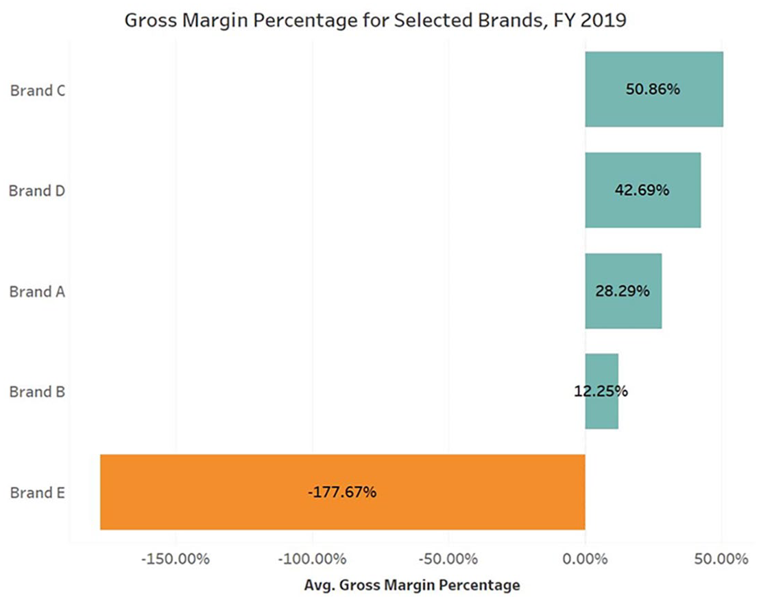
Average gross margin example.
Could Brand E really be doing that poorly? The only clue about the accuracy of this visualization may be the term “Avg.” on the X axis; since GMP is already a ratio, taking its average is suspicious. Figure 3 actually shows the average of the GMP of every individual sale (line-item average). A few sales with extreme GMPs have distorted the overall results. (Those familiar with Tableau may recognize that the “sum” operator was omitted from the calculations.) Aggregating sales and costs first and then dividing the difference by the number of sales yields the weighted average. Making this change shows that GMP for Brand E is far less bad than thought, and the ranking of the other brands has shifted (Figure 4).
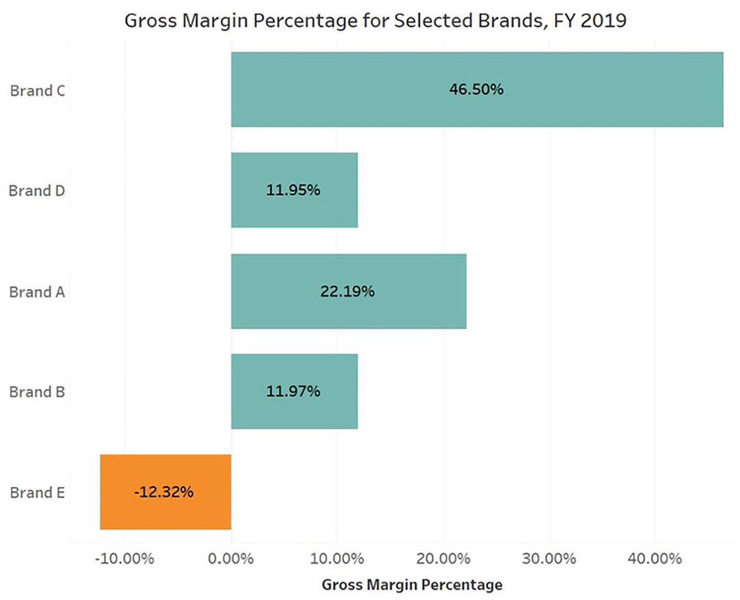
Gross margin example.
If an analytical group wants the line-item average then this visualization may pass muster provided “Per Transaction” is added to the caption with an explanation. Figure 3 as is could be interpreted correctly within this group, but outside of it, or over time as the users of the visualization change, erroneous interpretations may ensue. If the weighted average was intended, then Figure 3 appears to violate the norm of accuracy and decisions made on its basis may be disastrous. Would our students recognize that making such an error could be considered an ethical lapse once they are in responsible organizational positions? Firms encode thousands of business rules into information systems (Ross et al., 2013). Without knowing the correct underlying business rules, evaluating data quality is more difficult (Caballero et al., 2022). As we shall see, visibility becomes more difficult once ML/AI algorithms are added to the mix.
Challenges to Sheppard’s Code
This example illustrates the idea that clarity is not as straight-forward as it seems, even for a typical business graph. Teaching our students how to make visualizations that look good is not enough—the most efficient visualizations may not be most effective (Bertini et al., 2020). We first need to examine what seems to be a simple idea, that visualizations can be “honest and neutral.” This proposition has been challenged within the visualization community by the “ethical visualization” movement, and within the AI/ML community by those that are concerned about the nature of algorithms and the biases that may be inherent in them.
Challenges to “Honest and Neutral”: The Ethical Visualization Perspective
Many believe visualizations may need a pathos appeal and should tell stories (Knaflic, 2015; Kostelnick, 2016; Parsons & Shukla, 2020). Clarity should be understood as a construct that depends on audience, purpose, situational context, discourses, social conventions, cultural values, and power relationships (Kostelnick, 2008). In this example GMP may not be the most suitable Key Performance Indicator from a social justice perspective if its use allows decisionmakers to obscure negative externalities and environmental impacts for affected (and possibly minority) communities (Welhausen, 2022). Researchers argue that hidden impacts should be made visible (Correll, 2019). This example may be seen as an unethical, deliberate attempt to emphasize or hide negative information (Corbin, 2023).
Some take what seems to be a radical point of view, expressed by K. J. Hepworth (2020), that we should deliberately bias visualizations to maximize their benefit and ensure that they “do no harm.” Again, this can stem from a consequentialist view of looking at end results, from a deontological view of a duty to not harm, and from the cultivation of the virtue “noninjury” (Britannica, 2023). In the COVID-19 example from the Introduction, incompetence and/or the desire to attract clicks may have guided Business Insider, but their data misrepresentation may have helped warn a generation that may have been oblivious to the risks of infection at that time.
This “ethical visualization” paradigm arises from the conviction that visualizations are never neutral because creators of visualizations can (and do) manipulate many aspects of what is viewed (Correll, 2019; Segger, 2022). Visualization creators can make conscious choices about what to show and tell users, and how to strike a balance between minimalism and embellishment (Parsons & Shukla, 2020). Examples of guidance along these lines include Loukides et al.’s (2018) checklist, Correll’s (2019) maxims, the self-reflexive questions of Mahmud et al. (2017), the heuristics of Welhausen (2022), the workflow of K. Hepworth and Church (2018), and the tutorial of Gouge and Carlson (2022) (see Appendix).
Challenges to “Honest and Neutral”: The ML/AI Algorithms Viewpoint
As we know, algorithms include sets of instructions to acquire data, transform-and-load or load-and-transform it into data repositories, and perform many calculations, many using techniques from ML/AI. Both algorithms and visualizations transform inputs into outputs. If the creator has done his or her work effectively, they should work correctly and efficiently, and therefore present an objective reflection of reality, eliminating human bias and frailty (Martin, 2019b). This is the idea behind the rational cognitive-perceptual perspective handed down from the “parents” of the field such as Cleveland, Tufte, etc. (Kostelnick, 2008).
Few would now agree that algorithms are inherently neutral. Rather, algorithms express values and biases that are “specified by developers and configured by users with desired outcomes in mind that privilege some values and interests over others” (Mittelstadt et al., 2016, p. 1). O’Neil (2017) provided numerous examples including biases in job searches and resume processing, targeted online advertising, credit and insurance approvals, bail and other judicial decisions, and civic life. Yan et al. (2024) found that consumers react negatively to what they perceive as unethical uses of algorithms in HR decisions.
Unintentional Bias Due to Feature Selection
Martin (2019a) discusses instances where algorithms yield correct answers by utilizing questionable means. For instance, an algorithm determining parole eligibility could consider parental substance abuse history, which raises concerns about fairness, prevailing community norms, and the social construction of the data (Gouge & Carlson, 2022). Treating a relative’s alcohol abuse as a decisive factor may disregard the capacity of individuals to overcome negative influences. Evaluating feature relevance and fairness depends on understanding the community in which a visualization is situated (K. Hepworth & Church, 2018) and concomitant historical reference points (Martin, 2019a). Companies that use morally dubious factors such as race in algorithmic decision-making suffer diminished perceptions of legitimacy even when outcomes are good (Martin & Waldman, 2023).
We can apply the same ideas to visualizations. In my Business Intelligence class, I build some assignments around crime data in Chicago, Illinois (the rationale for this is discussed in the section Conclusion-Implications for Teaching Practice). In a visualization I prepared for this class in 2018 (Figure 5), I first grouped the 77 Chicago community areas into five clusters using demographic variables with K-means clustering, then correlated those clusters with Crimes per 1,000 persons. Do all variables I used pass ethical muster? Education, age, employment, housing, household income, ethnicity—all have incredibly complex relationships with incidence of crime.

2015 Crime per 1,000 persons in Chicago, Ill. community areas.
If the goal of Figure 5 is to uncover a pattern that leads to further research and possible remediation, it could be that the inclusion of these variables does no harm. If you accept the premise that the darker (greyer) areas represent lower socio-economic status (SES), the correlation stands out rather well from an efficiency viewpoint. Pairs with larger circles (higher crime) and darker community areas (lower SES) show positive correlations. But some would argue that the mere inclusion of race as a variable in this visualization is wrong in and of itself, because it implies that ethnicity necessarily influences propensity to commit crimes. The problem, of course, is that even though we pay lip service to the idea that causation is not correlation, when we look at a visualization like this, we may see causation. Individuals in the group may find themselves labeled, which may lead to a variety of negative personal and/or professional outcomes.
Harm From “Disparate Portrayal.”
A concept from algorithms about how they can harm certain communities is disparate impact. Training machine learning algorithms with flawed or incomplete data can perpetuate biases, thus producing disparate impacts on some groups. The algorithm itself is “working as designed” (Martin 2019b), but the design dictated by underlying data is flawed. A way to express the harm from a visualization like Figure 5 is the term “disparate portrayal.” As noted, it seems that areas with lower SES have more crime. An absence of policing may have led to underreporting or lack of detection of certain crimes in certain parts of Chicago with higher SES, making the data inherently biased against the lower SES communities. The bias then extends to ethnic minorities, as they are more concentrated in lower SES areas. The visualization appears to be doing everything right, but in fact is manipulating the audience to a conclusion that may be incorrect. Fewer resources and opportunities may be allocated to victims of disparate portrayal. Or they may get “affirmative treatment” that is perceived by other groups as hurting them.
Challenges to Transparency
Sheppard (2001) defined transparency as “the extent to which errors become self-evident under ordinary visual inspection.” But is this a sufficient definition of transparency? He already foresaw certain trends, noting that “. . .the increasing sophistication of visualization methods increasingly masks the uncertainty and potential for misleading viewers; the degree of realism, the apparent basis in data, and the level of complexity itself may prevent viewers from understanding the limitations of the imagery shown” (p. 190).
Lack of transparency in Figure 5 exacerbates the ethical problem of using ethnicity. Beyond what is mentioned in the text to the right, the viewer has no way of delving into this visualization to find out for himself/herself exactly what the clusters mean. The visualization alone does not explain how a cluster was assigned a darker color of grey. Does it fit a stereotype of residents who are younger, less educated, non-white, unemployed? How much weight is given to each variable? Furthermore, in Figure 5 the user has no capability to alter assumptions that underlie the clusters or crimes included (since this is a simple count, homicide is given the same weight as petty larceny or reckless conduct). They may not examine the underlying data. Errors are not self-evident, and the user has no agency with respect to the ability to correct them.
The reality we experience through visualizations is already a mix of “technical and human curating” (Dwork & Mulligan, 2013); almost everything that flows to us is already highly curated (Correll, 2019). Creators may also not have visibility into the data they are using, including its provenance, cleanliness, completeness, etc. They will have difficulty providing it for their viewers (Sorapure, 2019).
The more the computer takes over from the human, it is thought, the greater the potential for lack of transparency and ability to understand how the algorithm made its decision. It may be impossible to tell whether the results are erroneous, encoding biases, or violating other social (let alone legal) norms (Fischer et al., 2022; Gouge & Carlson, 2022). We may not even be aware of the existence of the algorithm itself (Pasquale, 2015). The result may be inscrutable and potentially harmful decisions (e.g., Robbins, 2020). Adding a transparent capability to explain how algorithms reach certain results has been recognized as an essential precursor to scaling ML/AI for widespread use (Kale et al., 2023, Someh et al., 2022).
Once the curation is being done in part or in whole by ML/AI algorithms, providing “automatic insights” (Correll, 2019), the conventional wisdom that creators can control all the elements they use to make visualizations is nullified. Vendors such as Tableau (acquired by Salesforce in late 2019) are adding capabilities to their software whereby visualizations are made automatically based on some criteria given by the users, and/or characteristics in the data. A description of Tableau Pulse at the end of 2023 brings home the scope of what is being done and will be done with AI and visualizations. Tableau is introducing “headless BI [Business Intelligence],” in which metrics are defined once and used across the enterprise. An “Insights platform” generates and ranks insights, summarizing them using generative AI. This “lowers the barriers” to data (Sherman, 2023). Can we be sure that conversations with generative AI chatbots will provide the needed transparency?
Challenges Based on User Agency
Sheppard (2001) argues that visualizations should be appropriate for their audiences, in part because of the power they may have to manipulate. Visualizations contain within them assumptions about how they will be viewed and used. “[T]echnology’s script. . . endure[s] to influence the behavior, acts and beliefs of individuals” (Martin 2019b, p. 840). For visualizations, these scripts could be thought of as a series of “commands” based on pre-attentive characteristics that force us to look here, see this, don’t see that, etc. Creators are “programming” responses. They are encoding interpretations into the visualization (Mahmud et al., 2017; Munzer, 2014). Visualizations have the ability to “reconfigure” our reality (Possati, 2021). Quantification itself can be seen as a means of excluding alternative understandings (Islam, 2022).
When a visualization delivers its intended message, that is, the encoded interpretation is made, and the expected decision is taken in accordance with the insights from the visualization, then it appears to be (using Martin’s [2019b] language) a fait accompli. A perception that the visualization looks good may engender uncritical acceptance, ceding power to the visualization creator (Kostelnick, 2008). By presenting, encapsulating, summarizing, and revealing information, perhaps providing a single source of truth for the decision-makers—visualizations simplify the decision-making process (Dimara & Stasko, 2022). Part of the task of decision-making has thereby been assigned to the creator of the visualization, undercutting “the autonomy of decision makers” (Helbing et al., 2017). Viewers “collectively delegate power to data displays that may serve their own self-interests (e.g., by perpetuating the status quo), or they might unwittingly cede their own power by acquiescing to forms that they lack the pragmatic, intellectual, or cultural authority to resist” (Kostelnick, 2008, p. 122).
Challenges Based on Privacy
“Differential privacy” is a concept from algorithms holding that “no outside observer (regardless of what extra information they might have) should be able to determine better than random guessing . . . any properties of that individual’s data that are idiosyncratic to them” (Kearns & Roth, 2020, para. 10). For visualizations this could involve, for example, waiting until a sufficient number of cases has accumulated before publishing, or using more exotic techniques to add noise to data that does not change its statistical properties but disguises underlying specific sources. In Figure 6, it would take little additional information to tease out which international student flunked the exam (especially if a legend is included that confirms that the first bar represents one student). This could easily be rectified by combining all the bins under 80%.
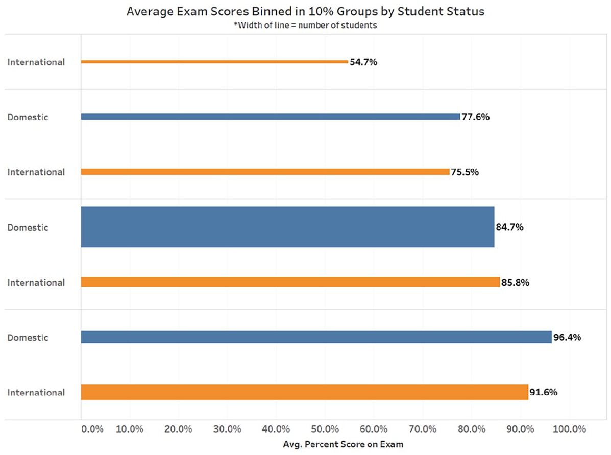
Exam scores related to student type status.
Updating Sheppard’s Code
There is no doubt that Sheppard’s code provides a highly valuable list of issues to consider. It does not fully address the problems posed by new insights from the field ML/AI algorithms and those in the “ethical visualizations” community. I propose the following updated code.
Visualizations should be:
• Honest and neutral (not intended to provoke biased responses)
• Accurate in portraying what they are trying to portray
• Representative (painting realistic picture, not focusing just on the extreme)
• Visually clear, engaging and fostering interest without “chartjunk”
Visualization creators should provide sufficient transparency:
• Describe the process of making the visualization, including key assumptions and decisions made
• Include necessary contextual non-visual information
• Disclose risk assessments and limitations related to data provenance, data uncertainty, and expected error degree
• Disclose the use of machine learning algorithms and generative AI to produce data used in visualizations, to make the visualizations themselves, and associated uncertainty and risk
Visualization creators should also:
• Ensure visualization are appropriate for, accessible by, and suitable for engagement with the intended audience in multiple ways, and suitable for the decisions they may influence
• Self-reflect about their qualifications to make their visualizations and what biases may be unavoidable in the data they are using and portraying.
• Ensure that variables (data, features) used to create visualizations are justifiable as directly related to the purpose of the visualization and do not produce unintentional bias
• Ensure that visualizations are not based on flawed, incomplete, or biased data that may lead to “disparate portrayal/harm” for some groups
• Avoid making visualizations that manipulate viewers or remove agency from them
• Ensure that personally identifiable information cannot be discerned from their visualizations
The first group of bullet points is based directly on Sheppard (2001). The second group echoes Sheppard but expands transparency with the ML/AI perspective. In the third group, the first two bullets relate mainly to the ethical visualization perspective, and the others are derived from the “challenges” sections that appear before the updated code.
Greater transparency is particularly important. Creators should trace the provenance of the data, including where it has been produced or manipulated by ML/AI algorithms or subject to some (potentially out-of-date) business rules. Data cards, similar to nutrition labels on food, may help to show this (Pushkarna et al., 2022). They should strive to understand and indicate to what extent the package itself has made decisions about data acquisition, manipulation, and/or portrayal. Viewers should have all the information needed to fairly understand and weigh what they are seeing so that they have agency and are not being manipulated or forced into a situation where users will have no choice but to use the results of the visualization (decision power removed). Shah et al. (2024) found that both confidence in data collection practices and algorithmic transparency are needed to engender trust in algorithms.
This code more fully addresses issues of bias by stressing that all visualizations contain assumptions that represent certain points of view. It prompts creators to investigate whether unjust biases exist in the acquisition and construction of the data sets used to make the visualization. They should examine historical and community reference points that inform fairness and appropriateness for including or excluding features for the visualization. They should try to anticipate how visualizations could be used to bias decisions. Creators should not deny reality but should avoid “disparate harm” in the way certain groups are portrayed.
It may not be necessary to be quite as rigorous in cases where there is likely to be little harm or impact from visualizations. To assist users and developers in reflecting on the extent of harm that may ensue from algorithms, Martin (2019a) developed a means for understanding the severity of ethical lapses (Figure 7). It balances the extent to which an algorithm or in our case, a visualization, plays a key role in decision-making (Y axis), and how important the decision is to society (X axis). Figures 3 and 4 have little societal importance but may have substantial importance in business decisions. They may entail heightened scrutiny by being toward the upper left of Figure 7. The average exam scores visualization in Figure 6 would probably be relegated to the lower left of Figure 7. Figure 5 could fall somewhere in the middle.
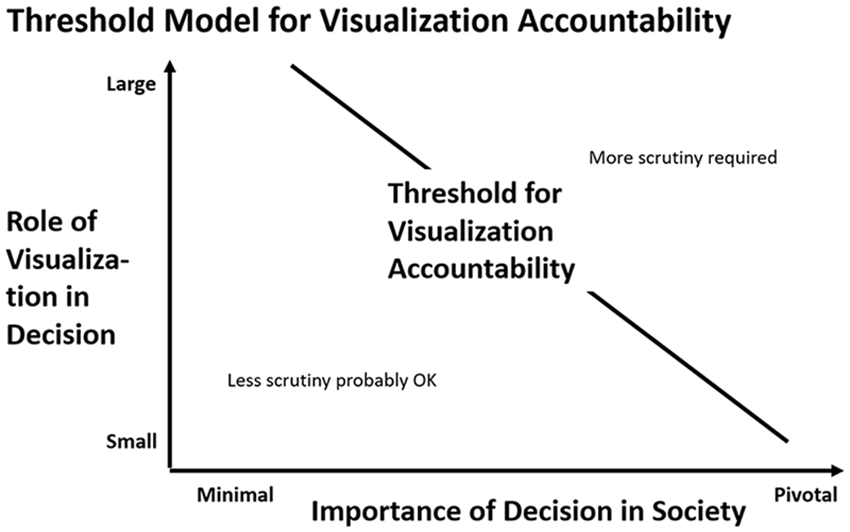
Martin’s threshold diagram.
Evaluating the CDC Visualization
Did the authors of the CDC visualization act unethically? Bar charts were typically used by governmental agencies to present this type of data (Zhang et al., 2021). It was in the public interest to report what was known. Bialek et al. (2020) reported five important limitations of the data. Within this knowledgeable scientific community, presenting incomplete data at this stage in this manner was probably an acceptable practice. Since the data was aggregated, there was no chance of violating privacy. The visualization itself, however, was not accurate due to missing and therefore unrepresentative data. It fell short on the traditional measures of clarity and transparency.
Under the standard of clarity, Figure 1 could easily be misinterpreted, especially once it made its way “into the wild” and was divorced from the accompanying text. As Shaffer et al. (2020) pointed out, the eye is immediately drawn to the two largest bars, for the age groups of 20 to 44 and 65 to 74 years. The viewer may miss the expanded range of the younger group, even if this is typical for the epidemiological community privileged in this way (Shaffer et al., 2020).
The story being told here is that anyone 20 to 44 years has about the same chance of hospitalization as the 65 to 74 years group. A typical viewer assumes that a bar chart labeled in this manner is presenting complete population data. However, we know age group in just 58% of the cases, and hospitalization status in just 64.2% of the cases. The footnotes do not disclose the overall N, and it is hard to relate the small numbers on the Y axis to the larger numbers in the footnote. It suggests a correlation between the age group 20 to 44 years and elevated hospitalizations that may not have been accurate, a disparate portrayal that could harm other groups that were not allocated sufficient resources. Regarding transparency the viewer has no way of seeing for himself/herself what the actual underlying base numbers are.
Doing some sleuth work from another table in the article, we know both age group and hospitalization status for just 38.3% of the cases. For the known cases in the 20 to 44 years range, we have 101 cases/486 people in age group = 20.8%. If we assume the remaining 219 in this age group were not hospitalized, we have 101/705 = 14.3%. Why not depict these values with a dumbbell chart to express the relative frequency of hospitalizations by age group, representing a degree of uncertainty, even for this scientific community?
Figure 8 portrays one way this might be done. Not only does it put the 20 to 44 years age group back in its relative place, it also provides a “Warning card” within the frame of the chart that would be difficult to ignore. It discloses the extent of missing data directly. It partially addresses the potential of disparate harm by noting that the data may not include cases for historically under-reported groups (something recognized more extensively later in the pandemic [Atherton, 2021]). Further succinct warnings could be developed from the article text regarding data provenance or the use of algorithms in data preparation, if appropriate.
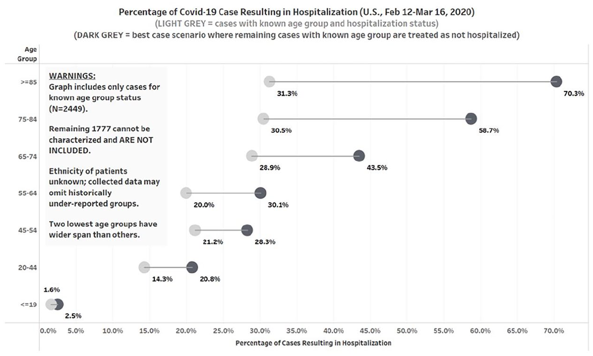
Reworking of CDC visualization using percentages and estimates.
Application of the threshold model (Figure 7) suggests that more scrutiny should have been given to this visualization. Clearly the information, especially at that moment in time, was of pivotal significance for society. Given the newness of what was being reported about age, the role of decision making of the visualization could be large, although it seems that stakeholders were not forced to make decisions on the basis of Figure 1. One might justify the absence of further scrutiny if this took place in the interest of getting out what was known as fast as possible. However, minor errors in the report were subsequently corrected, but this visualization remained as published.
Given the gravity of the situation (a “grand challenge”), we cannot cut the authors too much slack: they had a heightened ethical responsibility to take more care in creating a visualization that could tolerate public scrutiny if viewed by itself. They could have known about the potential for this information to go “viral,” because social media citation counts were already being included with this type of CDC report. They could have followed the lead of the New York Times and omitted this visualization from the report. Or they could have reworked the visualization, including a warning card similar to the one in Figure 8, to better ensure that the intended message was communicated. As it was, it simply depicted the raw numbers they were able to collect at that point. We could label the visualization they made as a “minimal viable visualization.” Ultimately, they were not responsible for how journalists then used or misused their work, but by establishing a more bullet-proof starting line, they would have made it more difficult for innocent or sensationalist misinterpretations to occur.
Limitations
This paper presents visualizations of data which are essentially limited to only two axes and perhaps a few more dimensions depicted with color, size, and overlays. However, as the complexity of the visualization increases, larger amounts of data are reduced for depiction, and elements such as motion or 3D representations are added, the sequence of choices from data to final visualization may increase. This may increase possibilities for questionable ethical choices (Zhang et al., 2021). While this paper does offer concrete suggestions about how to help our students consider and incorporate ethical viewpoints in their visualizations, it is not intended to review or test competing pedagogical methodologies about how to teach ethics (e.g., Gentile, 2017; Ohreen et al., 2022; Sholihin et al., 2020).
Conclusion: Teach Toward Ethical Visualizations
This paper highlights key elements students and professionals should consider when making visualizations. The simplicity of use, incorporation of very sophisticated ML/AI-based assistance, and spectacular results from tools such as Tableau make it easier than ever to overlook ethical considerations in visualization construction. Rather than tacitly viewing visualizations as neutral, we should explicitly teach our students that constructing a visualization can, in and of itself, pose ethical questions (Schwartz, 2017).
Sheppard’s (2001) code is an excellent starting point to ensure that visualizations “tell the truth” with clarity, precision, and efficiency. The additions proposed here build on this foundation. They pose questions not only about inputs to visualizations, but on the effects and outcomes of their use. As ML/AI algorithms become pervasive, it is useful to consider the ethical issues raised by algorithms in the visualizations created on their basis. Incorporating these ideas as an integral part of visualization construction may help students avoid making egregious errors. Errors may be accidental, but the absence of governance surrounding them is not (Martin, 2019a).
Business students can benefit from this paper by first recognizing that they should follow a code of ethics, with an enhanced view informed by the rise of ML/AI algorithms, when they make visualizations. Ones they make “on the fly” may sprout unanticipated wings, especially under circumstances of crisis. But even an ordinary visualization such as “Gross Margin Percentage” may require heightened scrutiny. Stopping at the “minimal viable visualization” should not be the standard we set for them. Almost any visualization can be improved with a few more clicks.
Implications for Teaching Practice
My approach to teaching ethics of visualization in my Business Intelligence MBA-level course is grounded in providing students with examples such as Figures 1 and 5, and asking simple questions about whether they pose any ethical challenges. I sometimes assign Tufte’s (1997, 2006, 2020) analyses of the two space shuttle disasters: Challenger (1997), and Columbia (2006) and other examples explored by him.
I give my students the publicly available data set for crimes in Chicago, they create various visualizations, and then we spend a considerable amount of class time comparing and contrasting their results (McHenry, 2022). Police departments, governmental units, and the public in general are interested in the KPIs that crime rates comprise, illustrating a broader view of what constitutes “business intelligence” that I hope they will apply in their business and management careers. It does not require that students have specialized business knowledge, as would an assignment concerning pricing analytics, for example. The assignment leads naturally to blending external data. It provides a platform to discuss both the technical issues of visualization creation (e.g., Camm et al., 2017) and ethical implications for various audiences.
Students are usually amazed at how the same data can give rise to quite different visualizations. I emphasize how better and more ethical approaches are often just a few more clicks away. My approach is similar to that of Giving Voice to Values (Gentile, 2017): I hope to empower my students to make ethical choices by raising their awareness and giving them the tools to do so. I readily admit that part of the genesis of this paper was my students’ criticisms of Figure 5, which I created to illustrate a better visualization than the ones they were making.
Implications for Organizational Practice
I also emphasize that the application of this and related checklists can be of use in an organizational governance process. Oversight can provide the possibility of preventing or correcting ethical lapses. Tableau, for example, now enables users to include explanatory comments with visualizations and easily share them with other users using @ references, which could complement governance mechanisms. Feedback mechanisms invest users emotionally in visualization design, build community, and enhance understanding and interest (Kostelnick, 2016). The software firm Mozilla uses a robust, culture-building governance procedure for publishing visualizations on its internal portal, with three levels of assurance: unreviewed, reviewed by data stewards, and certified by originators and reviewers (Watson et al., 2017). Business rules underlying them need to be reviewed, as does their relevance, accuracy, and clarity when their data is updated. This paper suggests an expanded set of criteria for visualization review which may help managers better operationalize what is necessary to manage effectively, with integrity (Audebrand & Pepin, 2022).
Unilever has adopted a strong set of governance principles for the use of ML/AI. Included is the idea that human review should always be present for decisions that have a huge impact on the lives of individuals. This entails systematic and periodic review, including review of the work of outside contractors (Davenport & Bean, 2023). Reviews can then be folded into more established compliance procedures. Why not adopt similar standards for visualizations?
It is conceivable that ML/AI algorithms may be taught to audit visualizations (Hopkins et al., 2020). For some Key Performance Indicators, Mozilla is trying to use software to “automatically detect problems and anomalies in data before the data is published to the dashboard” (Watson et al., 2017, p. 11). Although well-meaning in purpose, one could imagine cases where humans do not feel any necessity to check or challenge data if it has passed this process, even if it seems suspicious. We will need as much ethical awareness as we can muster in the face of less and less transparency. Using AI/ML itself to trace provenance is emerging as viable (Kale et al., 2023).
It is unlikely that the creators of Figure 1 anticipated its wide circulation among communities ill-equipped to grasp its limitations. By teaching our students to move beyond minimal viable visualizations and create visualizations capable of withstanding unanticipated circulation, we can encourage them to uphold standards that enhance the effectiveness of their visualizations for intended audiences. This proactive approach could prevent situations like that faced by the CDC Response Team. As Tufte (2006) stresses, “To maintain standards of quality, relevance, and integrity for evidence, consumers of presentations should insist that the presenters be held intellectually and ethically responsible for what they show and tell” (p. 141). As educators and frontline consumers of our students’ work, we should do the same.
Footnotes
Appendix
In the following table, which is divided into two parts so that it will fit, it is possible to see how Sheppard (2001) addressed many of the concerns articulated in this paper, but not in a manner that considers the ML/AI and ethical visualizations perspectives discussed by others about bias, transparency, user agency, and privacy, which are detailed in the updated code in section Updating Sheppard’s Code.
Declaration of Conflicting Interests
The author declared no potential conflicts of interest with respect to the research, authorship, and/or publication of this article.
Funding
The author received no financial support for the research, authorship, and/or publication of this article.