




Abstract
This study explored responses to categories of images relevant to an environmental management issue—stormwater management—across three dimensions that influence engagement: emotional response, personal relevance, and topic congruence. Although images of oceans elicited positive emotions, most participants did not perceive such images as relevant to the topic. Images of traditional stormwater infrastructure evoked negative emotions and were perceived as topic congruent but not personally relevant. Images of flooding were ranked highly across all three dimensions. These findings have implications for the development of communication materials that appeal to the broader public.
Images can be a powerful mechanism for engaging people with complex topics (Nicholson-Cole, 2005; O’Neill, 2013; Smith & Joffe, 2013). Furthermore, the use of images is predicted to increase in importance with the growth of new media (i.e., websites and social media), which are heavily image focused (Anderson, 2015; Lazard & Atkinson, 2015). Yet in the fields of science and pro-environmental communication, images are often treated as an add-on element with little attention given to how people process or decode them (Hansen & Machin, 2014; Lazard & Atkinson, 2015). This oversight has drawn attention to the need to identify the characteristics or dimensions of images that influence engagement (Anderson, 2015; O’Neill, 2013; O’Neill & Hulme, 2009; O’Neill & Nicholson-Cole, 2009; Smith & Joffe, 2013).
The current study explores these issues in the context of sustainable urban water management (SUWM; Wong & Brown, 2009). The transition away from traditional stormwater management practices is being driven by a range of concerns, including the impact of increasing extreme rainfall events associated with anthropocentric climate change (Christidis, Stott, Karoly, & Ciavarella, 2013; Sun, Solomon, Dai, & Portman, 2007) and the impact of polluted stormwater on catchments (Walsh, Fletcher, & Ladson, 2005). In Australia, the delivery of SUWM to the wider Australian community has been hampered by poor communication and limited community engagement (Brown & Farrelly, 2009). Given the important socioenvironmental implications, there is a need to identify ways to increase community engagement with this topic (Brown & Farrelly, 2009). Establishing evidence-based guidelines around which types of images best engage communication message recipients (Corner, Webster, & Teriete, 2015; Nicholson-Cole, 2005; O’Neill, 2013) offers a pathway forward for practitioners. Accordingly, the current study focuses on different categories of SUWM images and how engagement with these images varies. Although the term engagement can be defined in different ways (Bauer & Jensen, 2011; Deiuliis, Donaldson, Herring, & Maglalang, 2011), we define it as a “personal state of connection with the issue . . . concurrently comprising cognitive, affective and behavioural aspects” (Lorenzoni, Nicholson-Cole, & Whitmarsh, 2007, p. 446). This definition has been used in previous pro-environmental engagement research (Lorenzoni et al., 2007; O’Neill & Nicholson-Cole, 2009), including SUWM engagement (Dean, Lindsay, Fielding, & Smith, 2016).
To date, however, pro-environmental image research has typically focused on the context of climate change. Furthermore, the main body of research has largely looked at only two dimensions of how images can influence engagement: issue salience (i.e., whether the image makes people feel like climate change is important) and self-efficacy (i.e., the extent to which an image makes people feel like they can do something about climate change). For example, O’Neill and colleagues (O’Neill, 2013; O’Neill, Boykoff, Niemeyer, & Day, 2013; O’Neill & Nicholson-Cole, 2009) established that although familiar images of climate impacts (e.g., a polar bear on melting ice) engender high salience, they are also linked to decreased feelings of self-efficacy. Conversely, images of climate solutions (e.g., houses with solar panels and wind turbines) were found to elicit higher levels of self-efficacy (Hart & Feldman, 2016; O’Neill et al., 2013; O’Neill & Nicholson-Cole, 2009). Although this pattern of findings was replicated in a large, cross-national study (Metag, Schäfer, Füchslin, Barsuhn, & Kleinen-von Königslöw, 2016), Chapman, Corner, Webster, and Markowitz (2016) found that images of climate solutions were the least engaging in terms of motivating personal behavior change and support for government policy. Instead, they concluded that the images most likely to influence viewer engagement were of climate impacts. Overall, though, the weight of evidence suggests that the images used most frequently in the media (i.e., images of climate change impacts) are associated with increased issue salience but not self-efficacy (Metag et al., 2016).
Importantly, some studies have gone beyond assessing the salience and self-efficacy of climate change images to examine the role of other dimensions such as personal relevance and affective/emotional responses to imagery (Chapman et al., 2016; Leviston, Price, & Bishop, 2014; O’Neill & Hulme, 2009). Building on this research, as well as other studies from psychology and communication literature (described below), we explore three important ways that environmental images can influence engagement. Specifically, we argue that people exposed to an image are more likely to feel a sense of engagement with the issue being communicated when the image (a) evokes an emotional response, (b) is perceived to have personal relevance, and (c) is perceived as congruent with the topic being communicated. We examine these influences in the context of images commonly used in the hitherto unexplored topic of SUWM. In the following section, we discuss the relevant literature that establishes the relationship between each of the three proposed dimensions and engagement (i.e., cognitive, affective and/or behavioral engagement).
Emotional Response
Given that images are effective at eliciting emotional responses (Domke, Perlmutter, & Spratt, 2002; Jarreau, Altinay, & Reynolds, 2017) and are the first thing people focus on when looking at communication materials (Enser, Sandom, & Lewis, 2005), it is feasible that the emotions elicited by an image could influence how emotionally engaged the viewer is with the overall message. Indeed, it is well established in social psychology that emotions serve a primary role in the construction of attitudes (Neuman, Marcus, Crigler, & Mackuen, 2007; Zajonc, 1984). Essentially, an image can influence affective engagement with a communication message before it is even cognitively processed (Jarreau et al., 2017). For instance, empirical research has established that people are capable of processing visual stimuli so quickly that processing can occur at subliminal levels and still influence subsequent attitudinal judgments (Bornstein, Leone, & Galley, 1987).
Empirical research also suggests that emotional responses to imagery can influence cognitive engagement with pro-environmental policy and science (Cass & Walker, 2009; Meijnders, Midden, & Wilke, 2001; Sleenhoff, Cuppen, & Osseweijer, 2015). Meijnders et al. (2001), for example, used the elaboration likelihood model of persuasion (Petty & Cacioppo, 1986) to explore the effect of a negative emotion (fear) elicited by watching a short video of climate change impacts on support for the use of energy-efficient lightbulbs. Their results demonstrated that increased fear led to more in-depth processing of the accompanying written message, and this led to a more favorable attitude toward the use of energy-efficient lightbulbs (Meijnders et al., 2001). This is perhaps why using emotion-eliciting images to engage people with a topic is a common communication tactic. For example, Greenpeace, arguably the world’s most influential environmental organization (Doyle, 2007), has successfully used highly emotive images of activists confronting looming whaling boats to galvanize public support for international whaling treaties (Mathiesen, 2015).
Taken together, the aforementioned body of research emphasizes the importance of considering the emotions elicited by images as a key determiner of engagement with pro-environmental issues. Subsequently, this study seeks to explore the ability of different image categories commonly used in communications about SUWM to consistently elicit a positive, or otherwise, emotional response.
Perceived Topic Congruence
Research suggests that the perceived ease with which a person processes information influences their motivation and ability to cognitively engage with a message (Smith & Shaffer, 2000; Winkielman, Schwarz, Fazendeiro, & Reber, 2003). Given that images have strong mental imagery–evoking capabilities (Childers & Houston, 1984), an image that accurately matches the viewer’s mental imagery of a particular topic may have a facilitative effect on processing fluency and, therefore, cognitive engagement. That is, when an image primes matching or congruent information stored in memory, it creates a feeling of fluency that leads to increased cognitive engagement (Smith & Shaffer, 2000). Conversely, incongruent images are likely to undermine cognitive engagement because they prime thoughts irrelevant to the message content. In other words, noncongruent images become a distraction and undermine the person’s motivation and ability to engage with the message content (Frey & Eagly, 1993; Smith & Shaffer, 2000). For example, a study assessing the effectiveness of images used in slideware presentations found that slides with incongruent images (i.e., images that were not perceived as relevant to the target information) resulted in lower recall of the presentation content when compared with slides with congruent images or slides with no images (Tangen et al., 2011). Similarly, Corner et al. (2015) found that climate imagery perceived by individuals to be congruent to the topic (e.g., polar bears, smokestacks, and deforestation) were rated more highly in terms of their capacity to motivate behavioral change and support for policy. It is important to recognize, however, that further qualitative research conducted in this area by both Chapman et al. (2016) and Leviston et al. (2014) identified that a backlash effect can occur when a highly congruent image becomes “iconic” and is perceived to be “clichéd.” That is, iconic images can have a negative effect on engagement “precisely because of their familiarity and over-use” (Chapman et al., 2016, p. 175).
Overall, however, there is support for the notion that the perceived congruence between an image and the topic being communicated can influence cognitive engagement. Furthermore, when communicating complex and not easily visualized topics, such as SUWM, the potential for message recipients to not perceive the imagery used as being congruent to the target topic is high. It is therefore important that practitioners gain an understanding about which categories of images can positively or negatively affect processing fluency and, therefore, cognitive engagement with the underlying message. Accordingly, this study assesses the degree to which community members felt images were relevant to the topic (i.e., perceived topic congruence).
Perceived Personal Relevance
According to the elaboration likelihood model of persuausion, “The most important variable influencing a person’s motivation to think is the perceived personal relevance or importance of the communication” (Petty & Wegener, 1998, p. 6). This being the case, it seems reasonable to argue that people perceiving an image to be personally relevant will have increased motivation to engage with the overall message content (Leviston, 2013; Vries, Terwel, & Ellemers, 2014). Support for this contention comes from research conducted by O’Neill and Hulme (2009) in the context of climate change. These authors found that the most engaging images were those that the participants felt they could personally relate to. Interestingly, the more iconic images used in the context of climate change communication (e.g., polar bears and smoke stakes) have been criticized for lacking personal relevance, which is seen as counterproductive to “meaningful engagement” (Manzo, 2010; O’Neill & Nicholson-Cole, 2009).
Beyond the climate change context, the importance of perceived personal relevance was established by Manning et al. (2013) in their evaluation of the communication materials used for a local government water conservation initiative (i.e., the Townsville City Council Dry Tropics Water Smart program). Specifically, they found that individuals who did not personally relate to the images included in the posters were less likely to act upon the message (i.e., exhibit behavioral engagement; Manning et al., 2013).
Taken together, these findings suggest that the degree to which a viewer perceives an image as being personally relevant can influence his or her level of cognitive and/or behavioral engagement. What remains unclear, however, is whether perceived personal relevance differs across different categories of images and how consistent community members’ responses are. Therefore, this study assesses the degree to which community members perceived images commonly used in communications about SUWM as being personally relevant.
The Present Study
As noted previously, past research has focused on two main dimensions of environmentally related images: issue salience and self-efficacy. The current research contributes to this literature by investigating three additional ways in which images can influence engagement—namely, emotional response, topic congruence, and personal relevance.
We also explore the degree to which community members’ reactions converge and diverge. That is, we seek to examine whether different categories of images elicit the same degree of emotion for all community members, whether all community members perceive certain categories of images as congruent to the topic, and whether certain images are personally relevant to all participants. Knowing how people react to different types of images, and whether their reactions are the same or different, is of practical importance to practitioners seeking to improve the way in which they communicate with their constituents.
Although there is increasing recognition of the importance of images for connecting people to critical environmental issues (Hansen & Machin, 2014; Lazard & Atkinson, 2015), no research, to the best of our knowledge, has examined community members’ reactions to categories of water-related images broadly or with specific reference to SUWM. The categories of images used in this study and reported on below include traditional stormwater infrastructure (i.e., drains and outlets), stormwater management innovations (i.e., artificial wetlands and raingardens), flood events, and oceanic environments. Due to space limitations, not all categories of images used in the study are reported on below. The included image categories were selected because they encapsulated the types of images most commonly used to communicate about SUWM.
The insights gained from this study have the potential to inform the way in which images are selected for future SUWM campaigns and represents a novel integration of theory to address the critical real-world issue of using images to engage people with an important pro-environmental initiative.
Method
The study draws on an image-sorting Q-method technique that has been used by past research investigating which images engage people with pro-environmental issues—for example, climate change (O’Neill et al., 2013; Sleenhoff et al., 2015; Swaffield & Fairweather, 1996) and windfarms (Beckham Hooff, Botetzagias, & Kizos, 2017). Q-methodology allows for the study of complex issues from the subject’s point of view and is therefore well suited to examine peoples’ subjective reactions to visual stimuli.
The key strength of Q-methodology is that it clusters peoples’ reactions to different types of stimuli (van de Velde, Verbeke, Popp, & van Huylenbroeck, 2010), which aligns with our goal of identifying whether community members will react the same or differently to images. Q-methodology elicits peoples’ reactions through a process of one-on-one interviews (called Q-sorts) whereby participants sort and rank items in response to a guiding question or statement, thus producing quantitative data. The ability to quantifiably identify distinct patterns of responses among subsets of participants is not easily achieved using focus groups or surveys (Donner, 2001). Furthermore, given that participants verbalize their decision-making processes during the Q-sort, the methodology combines the benefits of having a standardized procedure that produces quantitative data with the benefits of qualitative research (Donner, 2001; Sleenhoff et al., 2015). The qualitative data are used to understand participants’ rationale for their sorting process (O’Neill & Hulme, 2009). A further strength of Q-methodology is that, in comparison to focus groups or surveys, a large number of stimuli can be assessed by a small number of participants (Brown, 1980). In this case, 23 participants were asked to perform three Q-sorts of 70 images in total.
The images selected for use were identified through an audit of communication materials targeting the wider public with information about SUWM. The audit collected 460 images drawn from websites, newsletters, online fact sheets, social media pages of government agencies and community groups involved in SUWM policy and practice. Where publication dates were provided, the search was limited to communications from within the preceding 12 months to ensure that the most up-to-date content was being considered (May 2014 to May 2015).
Consistent with past Q-methodology research (Sleenhoff et al., 2015), two researchers (including the first author) independently selected a sample of 80 images that were considered to be broadly representative of the overall collection. Images selected by both researchers were automatically included in the final set (n = 40). Images not selected by either of the researchers were discarded. Images selected by one researcher but not both were then subject to a separate audit undertaken by a third researcher (the second author), maintaining the goal of achieving a final sample of representative images. At the conclusion of this process, 70 images were selected. 1 The size of the final pool of images aligns with Watts and Stenner’s (2005) recommendation that 40 to 80 items are needed to maximize the stability and reliability of a Q-sort factor analysis. The images were printed in color on 6 cm × 9 cm photo paper.
Q-methodology does not require a large sample of participants (Brown, 1980). Indeed, the sample size should not total more than one third of the number of Q-sort items (Webler, Danielson, & Tuler, 2009). Given the sample of 70 images, 23 participants were therefore recruited by an external social research company from across Brisbane, Australia, and paid $70.00 each for their participation. Participants’ ages ranged from 19 to 66 years (M = 43.30, SD = 16.00; see Table 1 for further sociodemograhics).
Individual Characteristics of Study Participants.

Given Q-method studies require a diverse range of viewpoints on the focal issue (O’Neill, 2013; ten Klooster, Visser, & de Jong, 2008; Webler et al., 2009), a short survey was also administered in order to assess the diversity of participants’ knowledge, attitudes, and behaviors with regard to water. The survey items were drawn from a national study of water literacy undertaken in Australia (Dean et al., 2016). Although participants’ attitudes were somewhat similar, their knowledge and behavior toward water varied. For example, participants differed in the extent to which they used their local waterways for recreational purposes, and less than 50% understood that (in Australia) stormwater is not treated before it enters waterways. 2
The one-on-one interviews were undertaken in public libraries located across Brisbane, Australia, and took, on average, 70 minutes to complete (range 30-105 minutes). Participants were given a randomized set of the 70 images and asked to sort them onto an A0-poster with a normally distributed sorting grid (see Figure 1). Participants undertook three Q-sorts requiring them to sort and rank the images by each of the three dimensions in turn (the order was counterbalanced to control for potential order effects). Specifically, the images were sorted and ranked by the degree to which they were consistent with each of the following statements: (a) “This picture makes me feel positive. It brings to mind good feelings” (emotional reaction); (b) “This picture is of something relevant to stormwater in cities and towns” (perceived topic congruence); and (c) “This picture is of something relevant to me. I can personally relate to this picture” (perceived personal relevance). The degree to which an image was consistent with each statement was ranked from “least” (−6) to “most” (+6). Participants were also asked to verbalize their decision-making process during each Q-sort, and approximately 27 hours of audio data were collected and transcribed.

The normal distribution layout of the Q-sort board used in the current study. The scale spans low consistency (−6) through to high consistency (6).
Results
In the first section, the results of the inverted factor analysis of the Q-sort data are presented to identify the subgroups of participants for each dimension. Each subgroup comprises participants who reacted similarly to the images in terms of those that elicited positive emotions, were perceived to be highly congruent with the topic of stormwater management, or were perceived to be highly personally relevant. In the second section, we describe the pattern of responses across the different image categories and identify areas where the subgroups’ reactions to the images converged or diverged.
Identification of the Subgroups for Each Dimension
Data collected from Q studies are analyzed using inverted factor analysis (Donner, 2001). Inverted factor analysis is the statistical basis of Q-method (Van Excel & de Graaf, 2005) and the data collected via Q-methodology is not suitable for normal factor analysis (ten Klooster et al., 2008; Watts & Stenner, 2005). For this study, we used the PQ Method computer software program to run the analyses (Schmolck, 2014). As is common with Q studies, centroid factor analysis was used for factor extraction and factors were rotated using varimax rotation (McKeown & Thomas, 2013). A separate inverted factor analysis was undertaken for each focal dimension (i.e., emotional response, perceived topic congruence, and perceived personal relevance). The analysis is considered “inverted” because it looks for patterns among participants rather than variables, thus allowing for the identification of distinct subgroups of people whose responses are highly correlated (Sleenhoff et al., 2015; Watts & Stenner, 2005). As such, the factor analysis provides information about similarities and differences in participant subjective reactions for each dimension.
Two distinct subgroups emerged in relation to the emotional responses to the images: Emotion Group A (n = 14) and Emotion Group B (n = 7). The Q-sorts from two participants were removed from the analysis as they failed to load onto a single subgroup. Combined, these groups explained 61% of the variance in the Q-sorts. It is worth noting that in social science and humanities research the explained variance for factor analysis is commonly between 50% and 60% (Pett, Lackey, & Sullivan, 2003). The individual factor loadings for each of the participants can be found in Table 2.
Factor Loadings of the Subgroups for the Emotional Reaction, Perceived Topic Congruency, and Personal Relevance Dimensions.

Note. ‘X’ indicates which sub-group each participant’s Q sort aligned with.
Two distinct subgroups also emerged in relation to the perceived topic congruency: Topic congruence Group A (n = 17) and Topic congruence Group B (n = 5). The total explained variance was 55% (see Table 2). One participant’s Q-sort was removed as it failed to load onto a single subgroup. See Table 2 for the individual factor loadings of the participant.
The image rankings with respect to personal relevance, however, produced highly variable responses, as evidenced by the emergence of five subgroups with a total cumulative percentage of variance explained of 54%. The largest subgroup had eight participants (Personal relevance Group A), with the remaining four subgroups (Personal relevance Groups B, C, D, and E) containing three participants in each (see Table 2). Three participants, whose image Q-sorts failed to load onto a single group, were excluded.
While identifying whether community members’ responses to the image categories converged or diverged was a clear aim of the study, we were unable to draw any conclusions about the antecedents to their differing response. For each dimension, no statistically significant differences were identified between any of the subgroups in terms of their sociodemographics, knowledge, attitudes, and behavior (ps > .05). Furthermore, as can be seen in Table 2, there was not a clear overlap between the subgroups across the three dimensions. That is, participants who reacted similarly to the images in terms of perceived topic congruence often reacted differently in terms of perceived topic congruence and personal relevance.
Patterns of Responses for Subgroups According to Image Category
For each subgroup identified within each of the three dimensions, every image was given a normalized factor score (ranging from −6 to 6). This “idealized sort” represents a distinct pattern of preferences among the subgroup for that particular dimension. With respect to the emotional response dimension, images with high factor scores (i.e., with factor scores ≥4) elicited the most positive emotion response, while those with a high negative score (≤−4) elicited the least positive emotional response. In terms of the topic congruency dimension, images with high positive factor scores were perceived to be highly congruent with the issue of stormwater management, whereas those with a high negative score were perceived as having low topic congruency. Finally, for the personal relevance dimension, a high positive factor score indicated that people could personally relate to the image, whereas, a high negative factor score denoted a lack of personal connection with the image. The ranking of each image for each dimension, based on the factor scores for each subgroup’ inverted factor analysis, can be seen in Table 3. 3 The table highlights the overall degree to which categories of images aligned with the dimension in question for each of the related subgroups. For example, how the two emotion subgroups were similar or different in their emotional responses to the four categories of images. In the section below, we describe the results and use the qualitative responses to guide our understanding of why the subgroups emerged.
Image Factor Scores for Emotional Response, Perceived Topic Congruence, and Personal Relevance Q-Sorts.
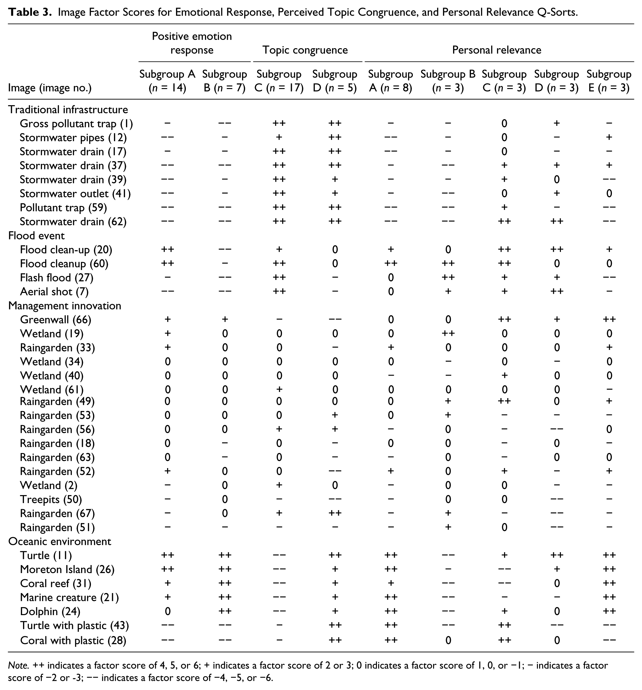
Note. ++ indicates a factor score of 4, 5, or 6; + indicates a factor score of 2 or 3; 0 indicates a factor score of 1, 0, or −1; − indicates a factor score of −2 or -3; −− indicates a factor score of −4, −5, or −6.
Images Depicting Traditional Stormwater Infrastructure
This category of images depicted stormwater drains, outlets, pipes, and gross pollutant traps (see Figure 2). No people or animals were visible. For both the emotional and topic congruency dimensions, images of stormwater infrastructure elicited a similar response from all identified subgroups (see Table 3).
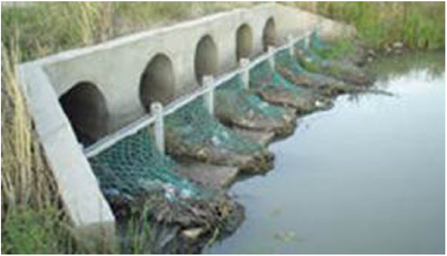
Gross pollutant trap (supplied courtesy of Bendigo City Council).
First, in terms of emotions, the images elicited very low levels of positive emotions across both emotion subgroups and indeed the qualitative comments suggested the presence of very negative emotional reactions. For example, one participant summarized their feelings toward this category of images as, “I think they are negative because they have a lot of rubbish in them” (ID16). The dominant emotion elicited by the images was disgust, with typical responses including “yuck,” “ugly,” “disgusting,” and “revolting.” For example, when presented with an image showing a gross pollutant trap (see Figure 2), one participant stated, “Unpleasant . . . the system is kind of working in that we have something in place to trap rubbish, but the rubbish is still there” (ID3).
Unsurprisingly, stormwater infrastructure images were perceived to be highly topic congruent by both of the subgroups, with participants commenting that images depicting drains were “most relevant” (ID17). Furthermore, many participants were cognizant of the fact that the stormwater infrastructure was designed to minimize the risk of flooding as evidenced by this comment: “Good drainage is important in cities and towns so you don’t get flooding” (ID11).
It was only in terms of perceived personal relevance that differences between the subgroups were evident. For example, for three of the subgroups for this dimension (Personal relevance Groups A, B, and E), images of traditional stormwater infrastructure dominated those images ranked as being least personally relevant. Comments such as “I can’t see any relevance to my life” (ID14) were common. Conversely, for the remaining two smaller groups (Personal relevance Groups C and D), some of the infrastructure images fell above the midpoint for personal relevance. For these participants, their personal familiarity with the infrastructure seemed to drive their responses. For example, when presented with an image of a roadside stormwater drain (Image 62), one participant commented, “It’s things that you see a lot in the inner city, which is drainage grates full of rubbish” (ID11).
Images Depicting Flood Events
The flood images included an aerial shot of a major flood event and an image of a flash flood at a sporting field (see Figure 3). Two other images depicted people engaging in flood cleanup activities. As can be seen in Table 3, two of the flood-related images (Images 7 and 27) elicited negative emotional responses across both emotion subgroups, with the dominant emotion being sadness. To illustrate, a participant stated, “Flooding is no good for anybody, people lose so much through that, their homes, their memories, their photos, so it’s unpleasant” (ID14). In contrast, the two images depicting post–flood cleanup events (Images 20 and 60) received mixed emotional responses. For the majority of the participants (Emotion Group A), the images elicited a very positive emotional response—for example, “Positive because it shows people working together to clean up the environment” (ID8). Conversely, the smaller subgroup (Emotion Group B) continued to have a very negative emotional reaction to the images, as exemplified by the statement, “Makes me feel pretty sad about all that” (ID7).
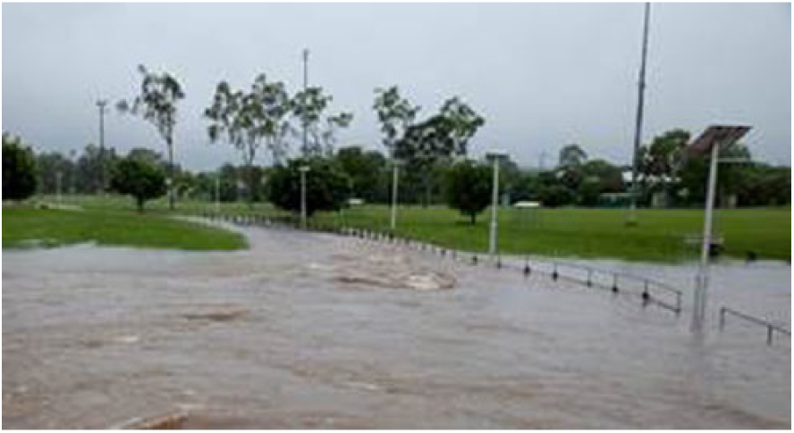
Flash flood (supplied courtesy of Brisbane City Council).
With regard to topic congruency, flood images were ranked highly by the majority of the participants (Topic congruency Group A). Participants from the smaller subgroup (Topic congruency Group B) indicated that they felt images of ocean environments better reflected the importance of managing stormwater for catchment health (refer to following section). This was despite indicating that they also understood the relevance of flood images to the topic—that is, “That’s relevant in its own way” (ID6).
Across all the image categories described in this report, flood images elicited the most consistently positive response in terms of perceived personal relevance. Images that consistently scored above the midpoint for personal relevance were rare and, excluding one small subgroup (Personal relevance Group E), all four flood images were ranked above or near the midpoint for personal relevance. However, it is important to note that this is likely because residents of Brisbane experienced a major flooding event in 2011, as evidenced by this comment: “Got caught in the floods, pretty relevant” (ID16). For those participants without firsthand experience of flood events, the resonance came from an appreciation of people’s efforts. As one participant noted, “I like these because at least they are trying to do something” (ID10).
Images Depicting Stormwater Management Innovations
This category of imagery encapsulated innovations in stormwater management infrastructure, including constructed wetlands (see Figure 4), raingardens, tree pits, and greenwalls. The ranking of the images can be seen in Table 3. In terms of an emotional response, these images tended to elicit neutral emotional responses across both subgroups. This reaction was exemplified by one respondent who noted, “Getting towards neutral [feelings]—these [images] are just more it’s nice to be able to go for a walk in the urban space” (ID8). Interestingly, of the four images in this category to receive moderately positive responses from Emotion Group A, three depicted a person in the image (Images 19, 33, and 52).

Constructed wetland (supplied courtesy of Healthy Waterways).
Similarly, the large majority of images included in this category failed to receive high positive scores in terms of topic congruency. Participants generally failed to identify that the infrastructure had a purpose in terms of managing the impact of stormwater. With respect to greenwalls (Image 66), one participant noted, “I’m not sure whether greenery growing up a wall is actually relevant” (ID6). An image of a raingarden received a similar response: “It’s just a bit of raised [garden] bed . . . don’t think that affects the waterways in any way” (ID2). These responses suggest that the low levels of topic congruence may emanate from poor knowledge about these structures. Images in this category that scored above the midpoint for this dimension were those that included visible traditional stormwater infrastructure. For example, in response to an image of a raingarden one participant stated, “I can see a drain, so that is relevant” (ID2).
Consistent with the pattern of responses for the emotional response and topic congruency dimensions, images of stormwater management innovations generally failed to score highly in terms of the personal relevance dimension. For each of the subgroups, however, a very small number of images did score highly (see Table 3). An examination of the qualitative comments indicated that perceptions of value and familiarity may have been responsible for these rankings. For example, an image of a raingarden aroused a value-based comment: “Talks to my sense of the environment and city living and what we should do to make it more habitable, not only for us but for birds and bees and for the environment in general” (ID6). Another participant responded to a raingarden image in terms of familiarity: “Less relevant, but still familiar, just things that you don’t see every day” (ID3). The only two images ranked above the midpoint by the largest subgroup (Images 33 and 52; Personal relevance Group A) were those that included a person visible in the image.
Images Depicting Bodies of Oceanic Environments
This image category included ocean environments with living creatures present in some but without any visible people, buildings, or boats (see Figure 5). There was a high degree of similarity across the two emotion subgroups with respect to oceanic images. As can be seen in Table 3, pictures of pristine ocean environments consistently elicited high levels of positive emotion. Across all image categories, the image of a turtle swimming in the ocean (Image 11) was the most highly ranked in terms of positive emotions, followed by an aerial shot of an island (Image 27). The images were commonly described as “beautiful” or “calming.” For example, “Beautiful setting. Looks very relaxing. I’d like to be there” (ID 3).
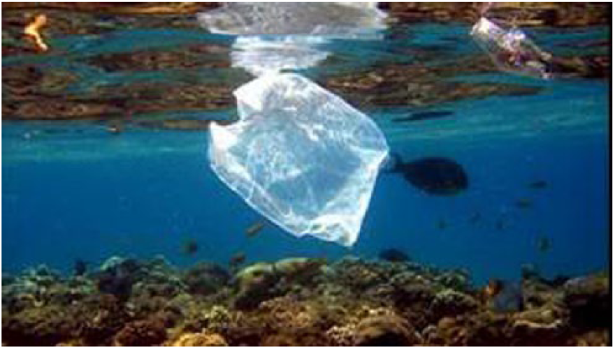
Plastic bag (supplied courtesy of Healthy Waterways).
Conversely, the two images depicting pollution in ocean environments consistently elicited very low scores and highly negative verbal emotional responses. For example, an image of a plastic bag floating near a coral reef (Image 28, see Figure 5) had the lowest factor score across both the emotional engagement subgroups. The dominant emotions elicited by images of oceanic degradation were reported as sadness and distress, as highlighted by this response to an image of a turtle ingesting a plastic bag: “I want to cry when I look at that, it’s terrible, it shouldn’t happen” (ID2).
However, with regard to topic congruence, the two identified subgroups had very different responses (see Table 3). The larger of the groups (Topic congruence Group A) perceived images of ocean environments as having little relevance to stormwater management. An indicative response was “The ocean’s always been around and I don’t necessarily associate it with stormwater” (ID17). In contrast, images of ocean environments were perceived to have high topic congruence for the smaller subgroup (Topic-congruence Group B). For instance, one participant commenting on the plastic bag in the ocean image noted, “It’s relevant in the sense that it gets into the stormwater drains and then goes out to sea” (ID6). This response suggests that members of the smaller subgroup may have had a more nuanced understanding of the dynamics of stormwater management.
In terms of personal relevance, the oceanic images received mixed results, with the largest subgroup for this dimension (Personal relevance Group A) as well as Personal relevance Groups C and E ranking such images as highly personally relevant (see Table 3). Again, the qualitative comments indicated that familiarity was highly influential in the ranking for this dimension. As one participant noted, “I grew up in North Queensland, so the coast and the environment are important to me” (ID6). Furthermore, participants from the other subgroups (Personal relevance Groups B and D) stated that it was a lack of familiarity that explained why they did not consider these images as highly personally relevant. To illustrate, “I am not a beach person, all these open ocean type images are not part of my normal experience” (ID3).
Across all five subgroups, however, oceanic images that included an animal tended to be ranked higher in terms of personal relevance. For example, all of the subgroups bar one (Personal relevance Group B) ranked an image of a turtle above the midline for personal relevance. One participant stated, “[These] are very impactful and hard hitting, it’s animals being directly affected by pollution” (ID11). Indeed, for the largest subgroup on the personal relevance dimension, six of the highest ranked images were of animals in natural settings.
Discussion
This study sought to extend previous research on how images engage people with environmental issues by identifying which categories of images (a) evoked an emotional response; (b) were perceived to be congruent with the topic, and (c) were perceived as personally relevant. These aims were explored in the context of SUWM.
Two groups were identified in terms of which images were likely to elicit either positive or negative emotions, with a large majority of participants forming a single group (n = 14 vs. n = 7). Despite the emergence of two groups, there was a high degree of consensus. Looking across the image categories, the images that consistently elicited the strongest emotional responses were the oceanic images. For images of clean and pristine ocean environments, the dominant emotion elicited was calmness/serenity. Conversely, strong negative emotional responses were evoked by images depicting pollution in ocean environments; with the dominant emotion being sadness. Images of traditional stormwater infrastructure also elicited negative emotional responses. The qualitative data indicated that the dominant emotion was disgust. Differences between the two emotion subgroups were evident only when considering the images of flood cleanup events, whereby this type of imagery elicited a very positive emotional response from the larger subgroup but a negative emotional reaction from the smaller subgroup. The qualitative comments indicate that the majority of the participants were able to shift their focus away from the flood itself, which consistently elicited feelings of sadness, to instead focus on the people depicted in the picture, reporting that they felt a sense of community and pride in the actions of others. Understanding the specific emotions, like sadness or pride, elicited by different images is important as there is growing evidence that different emotions lead to different outcomes. For example, a study by Kühne and Schemer (2015) found that when readers of a news article that discussed proposed public policy measures designed to increase road safety were induced to feel angry, they expressed a preference for punitive measures. In comparison, readers induced to feel sadness expressed a preference for more remedial measures.
Two groups were also identified in terms of judgments of the congruence of the images to stormwater management. Again, the large majority of participants formed a single group (n = 17 vs. n = 5). While images of traditional stormwater infrastructure and flood events were perceived as having high topic congruence across the two subgroups, images of oceanic environments received a mixed response. The smaller subgroup (Topic congruence Group B) for this dimension ranked ocean images as highly congruent, whereas the larger subgroup (Topic congruence Group A) ranked the images as highly incongruent. It was evident that the discrepancy was largely driven by the larger group’s inability to understand the impact of stormwater on ocean health. Furthermore, both of the subgroups failed to recognize more recent stormwater management innovations, such as raingardens and greenwalls, in terms of their role in managing the impacts of stormwater. These findings suggest that the use of either oceanic images or images of new stormwater management innovations could potentially undermine peoples’ ability to engage fully with a communication message because the images are not perceived as congruent with the issue (Smith & Shaffer, 2000; Tangen et al., 2011). The findings also indicate that community members can hold a very shallow understanding of stormwater management that does not extend past flooding and traditional stormwater infrastructure. This is perhaps not surprising given the low levels of stormwater-related knowledge reported by the participants in the post Q-sort survey, and it suggests a need for future education campaigns that address the identified gaps in their knowledge.
Interestingly, irrespective of image type, images ranked as being highly topic congruent were also more likely to evoke negative emotions, and vice versa. For example, images of stormwater infrastructure were judged as both congruent and unpleasant, whereas images of oceans were judged as beautiful and calming but largely incongruent (by the majority of participants). A similar juxtaposition between emotion and perceived topic congruence is also evident in research on climate change imagery (O’Neill & Nicholson-Cole, 2009), where images ranked as unrelated to climate change were those also noted as being positive (e.g., sunflower crops and trams). This presents a unique challenge to communicators of pro-environmental messages in terms of identifying images that are both congruent with the topic and elicit the desired emotion.
The ranking of the images with respect to personal relevance resulted in highly variable responses, as evidenced by the emergence of five distinct subgroups. Although the subgroups nominated different images as being personally relevant across the different image categories, the reasoning given for their selection was very similar; images that were familiar to the participants were perceived as having high personal relevance and this held across all the different image categories. Similarly, O’Neill and Nicholson-Cole (2009) and Leviston (2013) both reported that localized images resonate strongly with viewers. Drawing on these findings, practitioners should consider using visual imagery depicting localized content when devising pro-environmental communication campaigns.
Beyond familiarity, the category of images depicting bodies of oceanic environments were ranked as the most personally relevant by the largest of the subgroups for this dimension (Personal relevance Subgroup A) as well as two of the smaller subgroups (Personal relevance Groups C and E). In particular, the images of a turtle (Image 11) and, to a slightly lesser extent, that of a dolphin (Image 24) were consistently ranked as highly personal relevant by the majority of the participants. This is not surprising given peoples’ tendency to anthropomorphize animals (Epley, Waytz, Akalis, & Cacioppo, 2008), which in turn could influence their ability to relate to the image.
Although a large number of images (N = 16) of new stormwater management initiatives (e.g., raingardens, greenwalls, and artificial wetlands) were included in the Q-sort, this category of images did not rank highly across any of the three focal dimensions—that is, these images did not consistently elicit a strong positive emotional response, were not considered highly congruent to the topic of stormwater management, and were not perceived as highly personally relevant. Interestingly, the few images in this category that received moderately positive responses were those that depicted a person in the image (Images 19, 33, and 52). This finding highlights the value of depicting people in images as a way of increasing their engagement and closely aligns with research conducted in the climate change context (Braasch, 2013; Chapman et al., 2016; Nicholson-Cole, 2005).
Interestingly, images that ranked highly in terms of positive emotional responses were often ranked highly in terms of perceived personal relevance. For example, an image of people cleaning up flood-induced stormwater after the Brisbane 2011 floods elicited a strong positive emotional response for the largest subgroup and was also ranked highly by three of the five subgroups on the personal relevance dimension. On the other hand, images that were consistently ranked highly in terms of topic congruence (i.e., images of traditional stormwater infrastructure) failed to rank highly in terms of personal relevance for the large majority of the participants. Indeed, this category of images was consistently the lowest ranked for perceived personal relevance of all the included image categories. This tension between personal relevance and topic congruence is also prevalent in climate change communication. For example, research conducted by Corner et al. (2015) found that images depicting peoples’ everyday lives (i.e., images that would be perceived as having high personal relevance) were not perceived as being relevant to the topic of climate change. This presents a challenge for practitioners seeking to find the balance between images that appeal to the broader public and are understood as congruent with the topic being communicated.
Our findings suggest that perhaps the greatest opportunity for the communication of SUWM initiatives are images depicting flood-related events, as this category of images was consistently ranked highly across all three focal dimensions. That is, the images in this category tended to elicit a strong emotional response (either negative or positive), were perceived as congruent to the topic, and, more so than any other set of images, were ranked above the midpoint in terms of personal relevance. This finding is not surprising given that the study location (Brisbane, Australia) experienced a major flooding event in 2011. The finding suggests that practitioners seeking to bolster message engagement through imagery would do well to identify a localized, historic event that speaks to the issue at hand. It is also worth noting that two of the images (Images 20 and 60) depicted people, and this further highlights the importance of including human elements in images (Braasch, 2013).
As with all research, the current study had limitations that may limit the generalizability of the findings. First, it is unclear how the results of this study would generalize outside of the context of communications about SUWM and beyond the specific geographic location of the study (i.e., Brisbane, Australia). Further research is needed to confirm the reliability and validity of our findings across different geographic areas and in other environmental contexts. Furthermore, no statistical differences were identified between the subgroups in terms of their sociodemographics, knowledge, attitudes, or behaviors. Therefore, beyond identifying that the subgroups often differed in terms of how they reacted to the images for each of the three dimensions, the study was unable to infer key antecedents for their differing responses. This suggests that other factors not considered by the current study may be driving the differences in subjective reactions to the sampled images, as the qualitative data suggest. It is worth noting, however, that this is a common limitation in Q-methodology research as “Q-method does not result in data that is interpretable in relation to the proportion or characteristics of people holding a particular view” (Beckham Hooff et al., 2017, p. 719). As such, although the identification of the subgroups provided important insights into the convergence and divergence of responses across the image categories, more research is needed to supplement our understanding of the psychosocial profile of the subgroup members. Last, as this was an exploratory study, the causal effect of the images on engagement (i.e., knowledge, attitudes, and behavior) was not assessed. Future research is therefore needed to empirically assess the capacity of the images categories identified in this study as having strong engagement potential, images of localized impacts for example, to positively influence attitudes, cognitions, and behaviors more broadly.
Conclusion
The current study contributes to research exploring how different types of images can connect people with scientific and/or pro-environmental issues. At a practical level, the research findings will be beneficial in guiding the development of future SUWM communication materials likely to appeal to a broad base of community members. Taken together, the findings illustrate the need for greater focus on selecting imagery that matches the goals underpinning the message. If, for instance, the goal is to have message recipients feel good about a SUWM policy, then embedding imagery of stormwater infrastructure may be counterproductive. Conversely, such imagery may be helpful if the goal is to help message recipients recognize the connection to stormwater management. Finally, the results suggest that if the goal is to increase the personal relevance of SUWM, then including images of familiar landscapes and/or people and animals would be beneficial to achieving this aim.
At a theoretical level, this research builds on, and extends, past research exploring the ways in which images can engage people with pro-environmental and scientific issues. It contributes to the nascent research in this area by exploring an image’s ability to create an emotional connection, to be perceived as congruent to the topic, and to have personal relevance; which are important determiners of engagement with pro-environmental imagery in addition to self-efficacy and issue salience.
An important next step will be to extend the current research to explore the impact of pairing different image categories with text, as images are most often situated within text-based communications (Hart & Feldman, 2016). Indeed, within the context of climate change communication, Hart and Feldman (2016) found that pairing images of climate solutions with matching text increased engagement (i.e., individuals’ perceptions of self-efficacy). Accordingly, the results of the current research are being used to guide the development of experimental research to test the impact of different discrete emotions identified during the Q-sort (i.e., disgust, sadness, and calmness; see Scherer, 2005) on how people process and engage with written communication messages about SUWM.
Footnotes
Acknowledgements
Thanks are due to the Brisbane City Council, City of Greater Bendigo Council, Healthy Waterways, City of Melbourne Council, and New Water Ways for approval to use the images included in this study.
Declaration of Conflicting Interests
The author(s) declared no potential conflicts of interest with respect to the research, authorship, and/or publication of this article.
Funding
The author(s) disclosed receipt of the following financial support for the research, authorship, and/or publication of this article: This research was supported by an Australian Government Research Training Program (RTP) Scholarship and the Cooperative Research Centre for Water Sensitive Cities, Commonwealth of Australia.
