



Abstract

Computer use in education has progressed through three distinct stages over the past quarter century (Valdez et al., 2000). During the first phase of technology use in the classroom, computers were an opportunity to automate print, most frequently as self-correcting worksheets. Drill and practice and tutorial programs abounded. Students enjoyed the game-like format, and educators often used the technology to reinforce basic skills. Although these innovations in the early 1980s decreased a teacher’s burden of correcting papers and provided students with immediate feedback, they did little to promote higher level thinking skills and problem solving.
“Through the process of data interpretation with graphs, educators provide their gifted students with opportunities to further develop the problem-solving and critical-thinking skills they love to use.”
In the 1990s, a shift occurred in technology use in education. Driven by the proliferation of productivity tools for business and improvements in ease of use, educators embraced software productivity suites such as Microsoft Office. Word processing was the first of these tools to become a staple of educational computing. Spreadsheets and presentation tools soon followed, and the emergence of the Internet began to change the process of information collecting and communication. Tools surfaced for developing more professional-looking and innovative products. These involved sound and video as well as desktop publishing and webpages. They opened opportunities for students to apply their creativity and share their ideas. Students began to be able to collect information from a variety of online sources, analyze and organize their information, and create impressive multimedia projects that communicated their understanding of the material (Siegle & Mitchell, 2011). Students began to use technology in ways that practicing professionals used it. Taking the role of a practicing professional is one Renzulli (1982) has strongly advocated for gifted students for almost four decades. These technology developments began to erase the gap between the quality of the products professionals and amateurs created. For example, elementary students could now publish professional-looking books or record, edit, and present video productions that matched those of practicing professionals.
We are still in the infancy of a third phase, which Valdez et al. (2000) call, “Data-Driven Virtual Learning.”
This complicated title is intended to communicate that leading-edge technology users have begun to use the vast resources found on the Internet (virtual learning) and the multimedia presentation capabilities of very powerful computers to address data-driven issues and opportunities that are the concerns of policymakers. Data-driven practices also are supported by the expanded capabilities of relational database programs that can produce applications that users can run over the Web or on an Intranet within a school. These Intranets offer places where teachers, parents, and students can access customized, personal progress data on a just-in-time basis for informing instructional decisions. (p. 16)
Stated more simply, this involves using data from a variety of sources to focus on solving specific problems. Although Valdez et al. (2000) applied it to educators creating unique learning situations customized to students’ needs, educators can mimic the process and teach students the process of interacting with data environments to better understand the world around them. Students can learn to locate and analyze pertinent data to solve problems or better understand situations and events. In doing so, they are honing a number of 21st-century skills.
Using large-scale data sets to address problems is a popular trend in business (Satell, 2013). Many academic fields have already embraced this movement through their analysis of big data in creative ways. For example, social scientists have been able to better understand rates of depression by measuring what proportion of Google searches across time and from different regions of the country include the word depression. On the basis of meaningful patterns that emerged from the large Google search data set, these researchers have been able to infer the following:
Depression is highest on Monday and lowest on Saturday
Depression is highest on February 27 and lowest on December 25 with depression highest in April
Increases in unemployment in an area are associated with increases in depression
Lower temperatures are associated with higher levels of depression
Having more college-educated people in an area is associated with lower depression (Stephens-Davidowitz, 2013).
Nate Silver was able to develop sophisticated statistical models based on large data sets that enabled him to successfully predict the 2008 presidential election outcome in 49 of 50 states and 50 out of 50 states in the 2012 presidential election (Wikipedia, 2016). The amount of digital data in the world doubles every 2 years; however, only about 0.5% of all data is currently being analyzed (Browning, 2015). This represents a large untapped treasure chest, much of which is available free on the Internet.
The United States needs 140,000 to 190,000 more workers and 1.5 million more managers with analytic expertise in addressing problems with data (Lohr, 2012). Gifted and talented students enjoy the types of thinking and activities that these positions require. At an early age, gifted students often demonstrate their fascination with the world around them. They can spend hours observing a ladybug traverse a blade of grass or be mesmerized by the colors and patterns on a simple rock. They naturally seek patterns and notice anomalies. This natural interest in patterns and the need to make meaning out of randomness that gifted students frequently exhibit appear to be hardwired in brains.
. . . [B]rains are belief engines: evolved pattern-recognition machines that connect the dots and create meaning out of the patterns that we think we see in nature. Sometimes A really is connected to B; sometimes it is not. When it is, we have learned something valuable about the environment from which we can make predictions that aid in survival and reproduction. . . . This process is called association learning, and it is fundamental to all animal behavior, from the humble worm C. elegans to H. sapiens. (Shermer, 2008, Para. 2)
One way to capitalize on this fascination to observe, find patterns (or lack of them), and make meaning is to encourage students to ask questions that can be investigated through existing data sets or data they can collect (Renzulli, Heilbronner, & Siegle, 2011; Siegle, 2005). An easy way to introduce the power of data is by exposing students to the variety of ways data can be represented graphically and observing patterns that appear. Most schools introduce students at an early age to pie charts and picture, bar, and line graphs. Young people should also be introduced to scatterplots, which are used to graph relationships (Siegle, 2005). Scatterplots are two-dimensional graphs with one variable plotted on the x-axis and one variable plotted on the y-axis. The more closely the data points cluster along a line, the stronger the relationship. Figure 1 represents no relationship, and Figure 2 represents a strong relationship. In addition to having strengths, relationships also have direction. When there is a positive relationship (measures that tend to be above average on one variable tend to be above average on the other variable, and measures that tend to be below average on one variable tend to be below average on the other variable), the pattern progresses in an upward path (see Figure 3). A negative relationship (measures above average on one variable tend to be below average on the other variable) has a descending pattern (see Figure 4). Readers can download a free PowerPoint that describes creating and interpreting scatterplots from http://researchbasics.education.uconn.edu/wp-content/uploads/sites/1215/2015/02/CorrelationShow.pps to learn more about this.
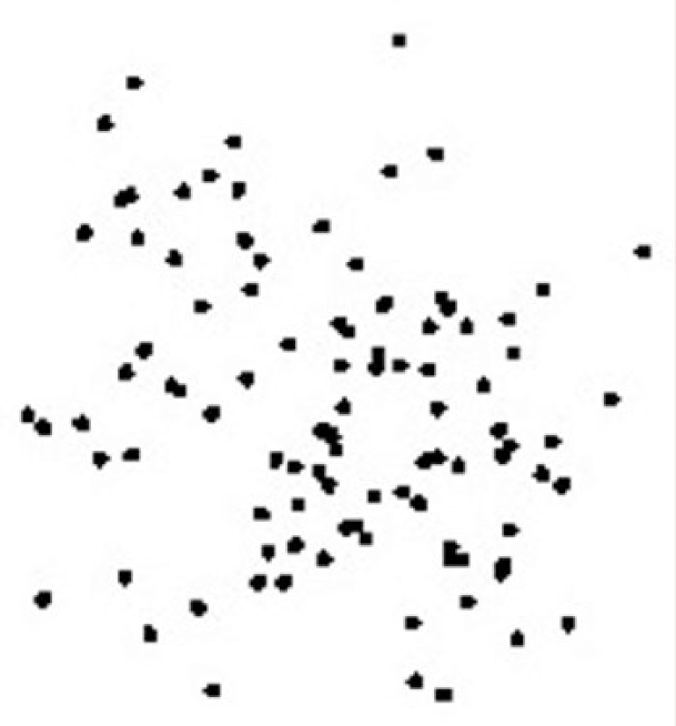
The data points do not form a pattern when two variables have no relationship.
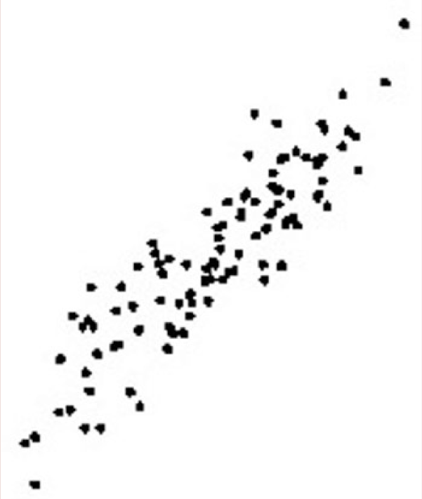
The data points cluster close to an imaginary line when two variables have a strong relationship.
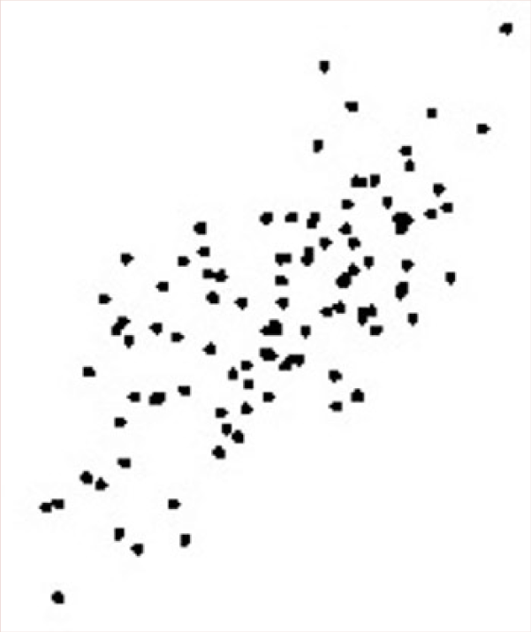
The plotted points show an upward pattern with a positive relationship.
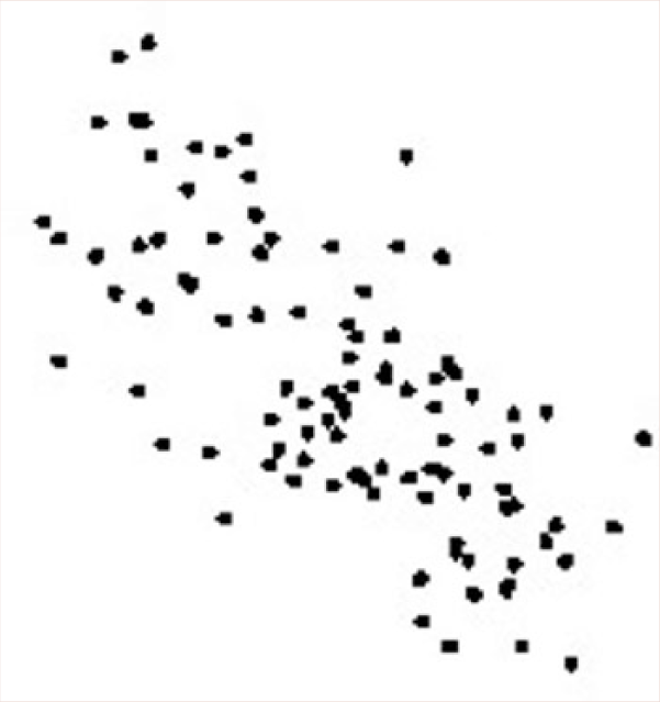
The plotted points show a downward pattern with a negative relationship.
Educators should caution students that correlations only describe the relationship; they do not prove cause and effect. Correlation is a necessary, but not a sufficient condition for saying one variable causes another. A third, unaccounted for variable could be related to both variables, and it could be creating the observed relationship. However, not having a relationship does mean that one variable does not cause the other.
Gapminder (http://www.gapminder.org/world) provides an excellent interactive tool for examining how the relationship between variables can change over time using scatterplots. The site has collected data on hundreds of variables from most countries in the world across a span of years. Students select the variables they wish to compare by clicking on the x- and y-axis labels of the default graph (see Figure 5). A scatterplot automatically forms on the screen with the data for each country represented by plotted color points. Students can place the cursor over any point on the graph to learn the name of the country and the value of the two variables being plotted. The size of the plotted point is determined by the population of the country.

Students select variables from a variety of categories that are available on the x- and y-axes.
If data are available for multiple years, students select the Play option to see a progression of scatterplots across time. When students select a country from the Select box on the right prior to selecting Play, all of the data points for that country will remain plotted across time. The default graph on the site shows the relationship between life expectancy and income per person from 1800 to 2015 across countries. Figure 6 shows that relationship across time for the United States. At three points since 1800, the life expectancy pattern dramatically fell while income held or rose. The arrows mark those years (1864, 1918, and 1943). Observant students will notice the changing pattern during those three periods. On further investigation, students will discover that each of the years is associated with a major war involving the United States.
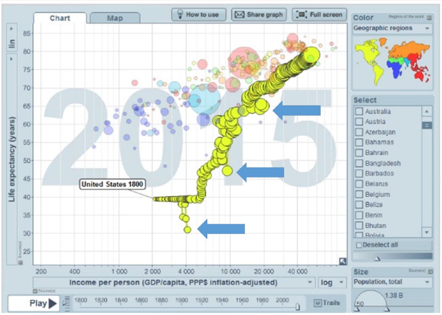
The arrows indicate years when the U.S. life expectancy fell below expected values.
The Gapminder site also includes teaching ideas and instructions for educators on how to use the site. More adventurous educators may wish to search the Internet for other data sources that students would find interesting. For example, the Statistics tab at the top of the http://www.baseballprospectus.com/ provides a plethora of baseball data that sports enthusiasts will enjoy exploring. The federal government (http://www.data.gov) also offers access to thousands of government collected data sets (see Figure 7).
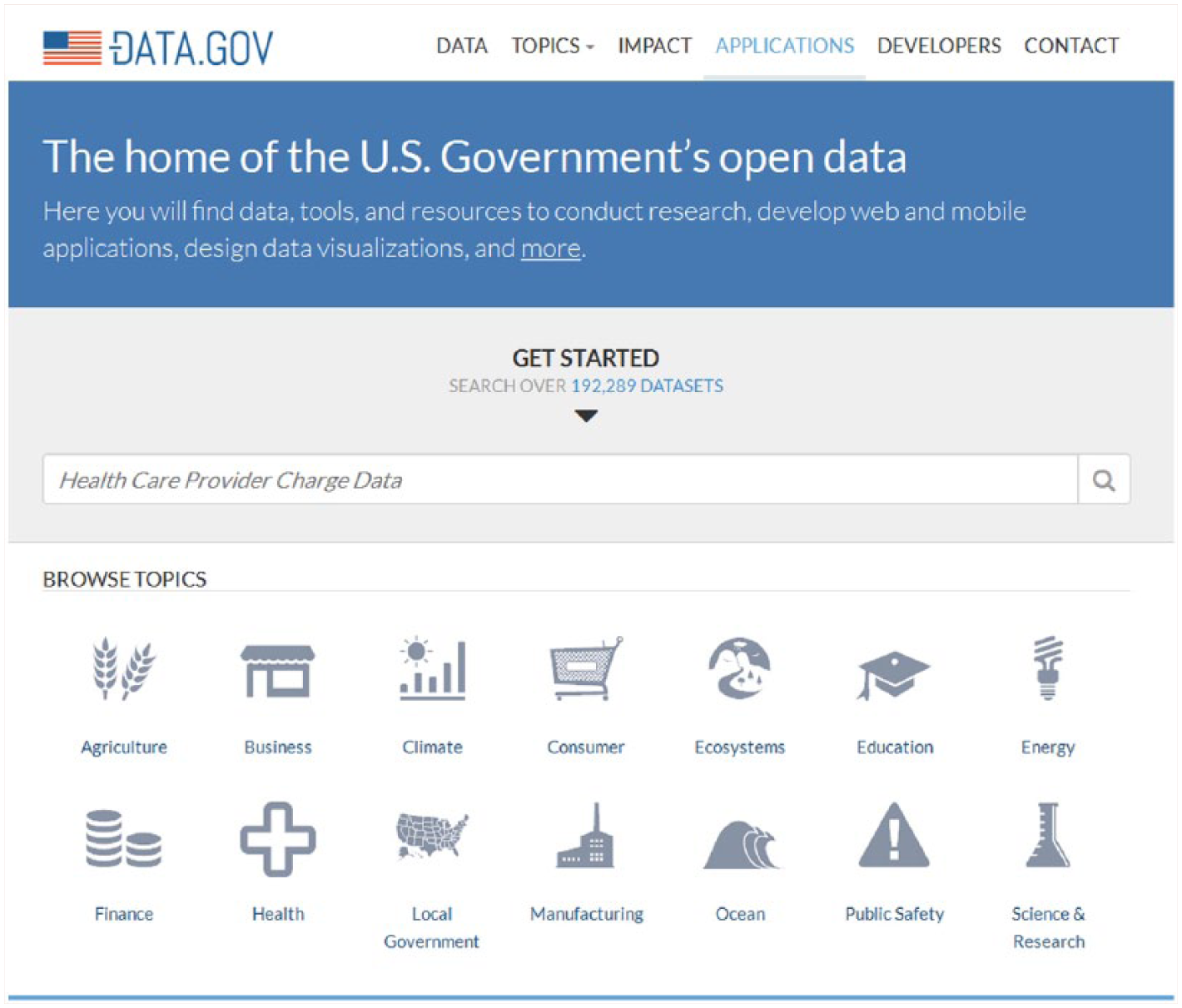
More advanced students will enjoy exploring the federal government’s vast online data set.
Data analysis is crucial to the development of theory and new ideas. By paying close attention to patterns, the stories behind outliers, relationships between and among data sets, and the external factors that may have affected the data, students may come to have a deeper understanding of the crucial distinction between theory and evidence (TeacherVision, 2015).
Through process of data interpretation with graphs, educators provide their gifted students with opportunities to further develop the problem-solving and critical-thinking skills they love to use. These students will grow up to become better consumers of information and ultimately more responsible and thoughtful citizens.
Footnotes
Conflict of Interest
The author(s) declared no potential conflicts of interest with respect to the research, authorship, and/or publication of this article.
Funding
The author(s) received no financial support for the research, authorship, and/or publication of this article.
Bio
Del Siegle, PhD, is the head of the Educational Psychology Department in the Neag School of Education at the University of Connecticut and past president of the National Association for Gifted Children. He directs the Three Summers and online master’s degree programs in gifted education.