



Abstract
One of the most widely used communication tools in evaluation is the logic model. Despite its extensive use, there has been little research into the visualization aspect of the logic model. To assess the impact that design modifications would have on its effectiveness, we applied established visualization principles to revise a program model. Participants were randomly assigned to one of the six conditions to examine the effectiveness (i.e., visual efficiency, comprised of accuracy, response time, and mental effort; credibility; aesthetics) of variations to a logic model. The results demonstrated that the revisions to the model increased accuracy, perceived message credibility, and were considered more aesthetically pleasing; furthermore, revisions decreased mental effort and reduced the amount of time taken to review the model. Together, the findings from the study support the claim that visual efficiency can be improved by modifying a logic model’s formatting and design.
Information is inherently related to its visualization, as noted by Manovich (2005) concerning visual aesthetics, “something simple but nevertheless quite significant: the word ‘information’ contains within it the word ‘form’” (p. 1). It is in this ‘form’ of presenting information that the current paper seeks to understand how to improve one of evaluation’s most fundamental and widely used tools: The Logic Model.
One such evaluation tool is the logic model (Chen, 2014; Kaplan & Garrett, 2005). This widely used tool has many uses, which include the ability to visually summarize and describe the main program activities and how those activities lead to program outcomes (Knowlton & Phillips, 2012). The logic model’s usefulness can be enhanced if the model is designed well; however, there are few actual guidelines about how to increase the effectiveness of the logic model through design. This is an important consideration because as Brigham (2016) states, “Poorly designed visuals or images can actually create more confusion than clarity. Colors, fonts, clutter, or lack of storyline can severely detract from the goal or message of an image, visual, or infographic” (p. 218). As such, there has been a call for empirical research on the common visualization guidelines (Hegarty, 2011). Equally, as the audience for evaluation broadens to include varying stakeholder groups, the need for an empirical understanding of the effectiveness of visualizations (e.g., logic models) is paramount. The purpose of this study is to test how design modifications to a logic model affect the effectiveness of the logic model.
Visualization
While there are varying practical usages and definitions of visualization, for this study, we have chosen to utilize the broader term of visualization which includes data visualization. In the field of evaluation, the definition of data visualization put forth by Azzam, Evergreen, Germuth, and Kistler (2013) states that, “Data visualization is a process that (a) is based on qualitative or quantitative data and (b) results in an image that is representative of the raw data, which is (c) readable by viewers and supports exploration, examination, and communication of the data” (p. 9). We believe that this definition captures many of the core elements of what visualization is and how it is used in evaluation.
The field of evaluation has also seen a marked focus on visualization and its applications. This focus had its beginnings with a New Directions for Evaluation volume by Henry (1997) on effective graphic solutions for data, continuing with the American Evaluation Association’s inclusion of the Data Visualization and Reporting Topical Interest Group in 2010 and with the two-part issue series featured in New Directions for Evaluation dedicated to the topic of Data Visualization in Evaluation (Azzam & Evergreen, 2013a, 2013b). The volume showed the multifaceted uses of visualization in evaluation and covered topics including enhancing programmatic communication and understanding, collection and analysis of data, and dissemination of findings (Azzam, Evergreen, Germuth, & Kistler, 2013). Evergreen’s (2011) study was also instrumental in highlighting the need for increased attention to visualization in evaluation because a large proportion of visualizations in evaluation reports created more confusion due to violations of visualization principles that ultimately increased the potential for erroneous conclusions.
One way to address this issue is to better understand the criteria for “good” visualization. For example, Heer, Bostock, and Ogievetsky (2010) believed that good visualizations are those that make “data more accessible and appealing” (p. 1), concluding that using visualizations enables a more diverse array of audiences to access information. Still others have surmised that the “main difference between effective and ineffective data displays is their ability to communicate the evaluator’s key message in a clear and straightforward way such that it does not overload a viewer’s working memory capacity” (Evergreen & Metzner, 2013, p. 6). Conversely, poorly designed visualizations can affect perceptions of credibility and topical expertise (Tufte, 2006) and lead to confusion (Brigham, 2016; Renger & Titcomb, 2002) and flawed decision-making (Freedman & Shah, 2002; Tufte, 1997). For example, Tufte (1997, 2006) argues that the Challenger and Columbia Space Shuttle Disaster could partially be blamed on faulty inferences made from flawed data presentations, which resulted in decisions that led to catastrophic consequences. Although this is a dramatic example, it highlights the importance of using effective visualization and the need for evaluators to develop and hone this tool.
Adding to the Toolbox: Visualization as an Evaluator Tool
One visual aid that is widely used in evaluation is the logic model. Defined by Chen (2014) as a “graphical representation of the relationship between a program’s day-to-day activities and its outcomes” (p. 58), the logic model is often a staple in evaluation work with many funding agencies requiring their creation (Chen, 2014; Kaplan & Garrett, 2005). Providing a supply to this demand, a multitude of resources have been developed that offer guidance on how to create a logic model. These include the United Way’s Measuring Program Outcomes: A Practical Approach, 1 University of Wisconsin Extension, 2 and the W.K. Kellogg Foundation’s Logic Model Development Guide. 3 We consider logic models to be examples of visualization because their goal is to take complex connections and ideas and attempt to communicate them in a manner that is cognitively efficient and evokes the premise of storytelling through visualizations.
This prevalent use of logic models is paralleled by a substantial body of literature that is devoted to guiding their creation (Funnell & Rogers, 2011; Gugiu & Rodriguez-Campos, 2007; Kaplan & Garrett, 2005; McLaughlin & Jordan, 1999; Millar, Simeone, & Carnevale, 2001; Rush & Ogborne, 1991). Yet despite the ample literature concerning the development of logic models, the focus tends to be on explaining the components (e.g., inputs, outputs, outcomes), development process (i.e., how to go about creating the logic model with stakeholders), application (e.g., developing evaluation questions, clarifying program goals), and narrative of such models (Center for Disease Control, 2018; Chen, 2014; Julian, Jones, & Deyo, 1995; Knowlton & Phillips, 2012; McLaughlin & Jordan, 1999; Renger & Titcomb, 2002). Little attention has been paid to the graphic design aspects or aesthetics except in passing. For example, Renger and Titcomb (2002) developed a method of teaching students to create logic models called ATM (i.e., antecedent conditions, target activities, measurement issues). Their ATM method focuses on the components of a logic model and their placement rather than visual aesthetics. This gap in our understanding of how to effectively visualize logic models is the main focus of this study and will be explored through the application of various graphic design principles to logic model creation.
Data and Information Design
The importance of design should not be underestimated. Researchers studying the cognitive aspect of visualizations have repeatedly found that while different visual displays may contain equivalent information, they may not be equally interpreted (Hegarty, 2011). These findings highlight the notion that visualization should be both concerned with the information that is being conveyed and the understandability of the message. For instance, one of the most challenging aspects of creating effective visualizations is ensuring that they are accurate representations of the information while remaining engaging to the audience (Heer, Bostock, & Ogievetsky, 2010).
Over the years, various individuals have contributed their insight into our current understanding of how to achieve this balance and create effective visualizations. We have Bertin’s (1983) principles of data display and design, Cleveland’s (1993) incorporation of Gestalt principles and color schematics, Tufte’s (2001) principle of minimizing of visual noise, Freedman and Shah’s (2002) information chunking (i.e., grouping of information), Friendly’s (2008) historical recounting of the developments and milestones in the field, and Few and Edge’s (2008) focus on visual processing and cognition in data displays. Although the current article is unable to fully dive into the depths of the aforementioned approaches, these various principles act as a guide for visualization design. Largely, effective visualizations are aligned with the principles of visual perception (e.g., Bertin, Few, and Tufte) and cognitive functioning (e.g., Cleveland, Freedman, and Shah) in that these visualizations are clear, useful, and memorable; support audience understanding; reduce cognitive load; and organized in chunks of information that facilitate processing by the working memory (Evergreen, 2014).
Defining Effectiveness
Effective visualizations provide a medium where the central message is communicated in a way that works within the cognitive bounds of working memory (Evergreen & Metzger, 2013). These visualizations provide a focused, clear, and coherent message by minimizing background noise that distracts from the intended takeaway. However, what defines an effective visualization is still a matter of debate. One visualization expert argues that, “we should always judge a visualization’s merits by the degree to which we can easily, efficiently, accurately, and meaningfully perceive the story that the information has to tell” (Few, 2014, section 35.2). Others (e.g., Tufte) stipulate that the most effective visualizations are those that minimize non-data ink noise (i.e., graphical additions that do not add to the information being presented), yet others are skeptical of this principle due to lack of empirical evidence (Zhu, 2007).
In the fields of cognitive and visualization science, effectiveness is assessed from a cognitive load perspective. This perspective describes an effective display as one that “decreases the processing load by increasing the automatic construction and decrease the effortful integrative processing” (Freedman & Shah, 2002, p. 22). This process is clarified by Huang, Eades, and Hong (2009) who examine effectiveness through the construct of visual efficiency. By taking a cognitive load (i.e., mental exertion required to perform specific tasks) approach to address effectiveness, Huang and colleagues view effectiveness as cognitive gain relative to cognitive cost through the equation of:

In their equation, efficiency is calculated by determining RA (i.e., performance or how accurately they interpreted the visualization) when accounting for the RT (i.e., time taken to complete the task) and ME (i.e., perceived mental workload).
Another burgeoning area of research in visualization, although often overlooked, is aesthetics. Many researchers within the field of visualization speculate that displays that are considered more aesthetically pleasing are more effective (Cawthon & Moere, 2007; Moere & Purchase, 2011; Norman, 2002). Therefore, including an aesthetic measure was viewed as a potentially important construct to measure aspects such as perceived beauty, clarity, simplicity, enjoyability, and engagement.
Relatedly, evaluators have long been interested in how their communications affect perceptions of credibility (Azzam, 2010; Brown, Braskamp, & Newman, 1978; Donaldson, 2001; Patton, 1999), and an oft-touted outcome of bad visualization is the reduction of this perceived credibility (Evergreen & Metzner, 2013; Tufte, 2006). For example, Azzam et al. (2013) stress the importance of accurate graphic recording within the context of data visualization and transferring program theory into a comprehensible logic model. As such, to contribute to this debate, we also explored the effects of design on credibility as it pertains to the logic model and included a measure of message credibility to help us better understand its effectiveness.
Research Questions/Central Focus
Despite the evaluation field’s extensive use of logic models, there have been limited empirical studies conducted on their visual effectiveness. As practicing evaluators who often use logic models, we wanted to thoroughly understand whether the application of visualization principles could improve the effectiveness of logic models. More specifically, we wanted to determine whether simple modifications of a logic model would affect: visual efficiency and its components RA, RT, and ME, perceived message credibility, and perceptions of aesthetics.
Therefore, the current study examines the effectiveness of variations to a logic model on accuracy (e.g., understandability and interpretation of logic models), RT, ME, aesthetics, and perceptions of credibility. Using a publicly available logic model of a tobacco prevention program (see Supplemental Appendix A), the logic model was revised based upon graphic design principles (Few & Edge, 2008; Freedman & Shah, 2002; Tufte, 2001). To understand the potential effects of logic model variation, several conditions were created that varied the absence or presence of certain graphic design principles, the use of color, minimization of non-data ink, and whether a narrative description was included.
Method
Research Design and Procedures
A convergent mixed-methods experimental design was used to test the hypothesis that visualization techniques can enhance the effectiveness of a logic model. In the study, participants were randomized into six different conditions, with each condition containing a unique variant of a logic model. The chosen logic model was selected for the study because it contained most of the elements used in logic models as described by the Kellogg Foundation’s handbook on logic models (W.K. Kellogg Foundation, 2004). The topic of youth tobacco prevention program was also selected because it appeared relatable and relatively easy to understand.
The survey was programed using Qualtrics and administered to respondents via Amazon’s Mechanical Turk (MTurk), an online crowdsourcing service that provides researchers access to the general public. Crowdsourcing is “the paid recruitment of an online, independent global workforce for the objective of working on a specifically defined task or set of tasks” (Behrend, Sharek, Meade, & Wiebe, 2011, p. 2). Previous research suggests MTurk samples are generally representative of the U.S. population and produce comparable data to other online or face-to-face interviewing techniques (Buhrmester, Kwang, & Gosling, 2011; Casler, Bickel, & Hackett, 2013). However, it is worth noting that MTurkers tend to be younger, more educated, and more politically liberal than the general population (Cooper & Farid, 2016; Paolacci & Chandler, 2014).
The study procedures are displayed in Figure 1. Participants were randomly assigned to one of six conditions. The six experimental conditions included the original logic model without narrative (Condition 1), original logic model including narrative (Condition 2), revised logic model without the narrative (Condition 3), revised logic model with the narrative (Condition 4), a black-and-white (B&W) version of the revised logic model (Condition 5), and the narrative without a logic model (Condition 6). Conditions 5 and 6 were added to test two additional characteristics beyond the simple 2 (original vs. revised) × 2 (narrative vs. no narrative), namely, whether the color of the logic model affects visual efficiency and how a narrative only condition compares to logic model or combined conditions. The modified logic model utilized the following principles in the revision: (1) color: The colors were included (and gray scale in the B&W version) to denote the different columns, indicating to the reader that each column was unique without the need to add any additional lines, (2) proximity: We placed items that were connected between the columns close to each other to show that they are connected or flow into each other; this allowed for a simpler visual flow from left to right as you look at the links between the different columns and also allowed us to reduce the emphasis on the arrows (which can be distracting) without compromising the connections, (3) reducing non-data ink: Non-data ink refers to any visual elements that can be de-emphasized or removed that are not directly related to the most important information in the visualization; after reviewing the original document, we determined that the black lines around each of the boxes were a distraction and then we removed them and used the principle of enclosure (using colors or gray scale) to emphasize the size and location of each box without the need for a black box. After reviewing the program depiction (i.e., variation of logic model and/or narrative), participants were asked to respond to an open-ended question that asked them to describe the “story” of the youth tobacco prevention program. Next, participants rated their perceived ME and were asked to justify their rating with an open-ended question. Participants then responded to accuracy questions, using the program depiction as a reference. Aesthetics and credibility questions were presented next, with the order of these two measures randomized to avoid order effects. Lastly, participants were asked to provide overall thoughts about the program and the survey before answering demographic questions including their age, gender, ethnicity, education, and any visual impairments.
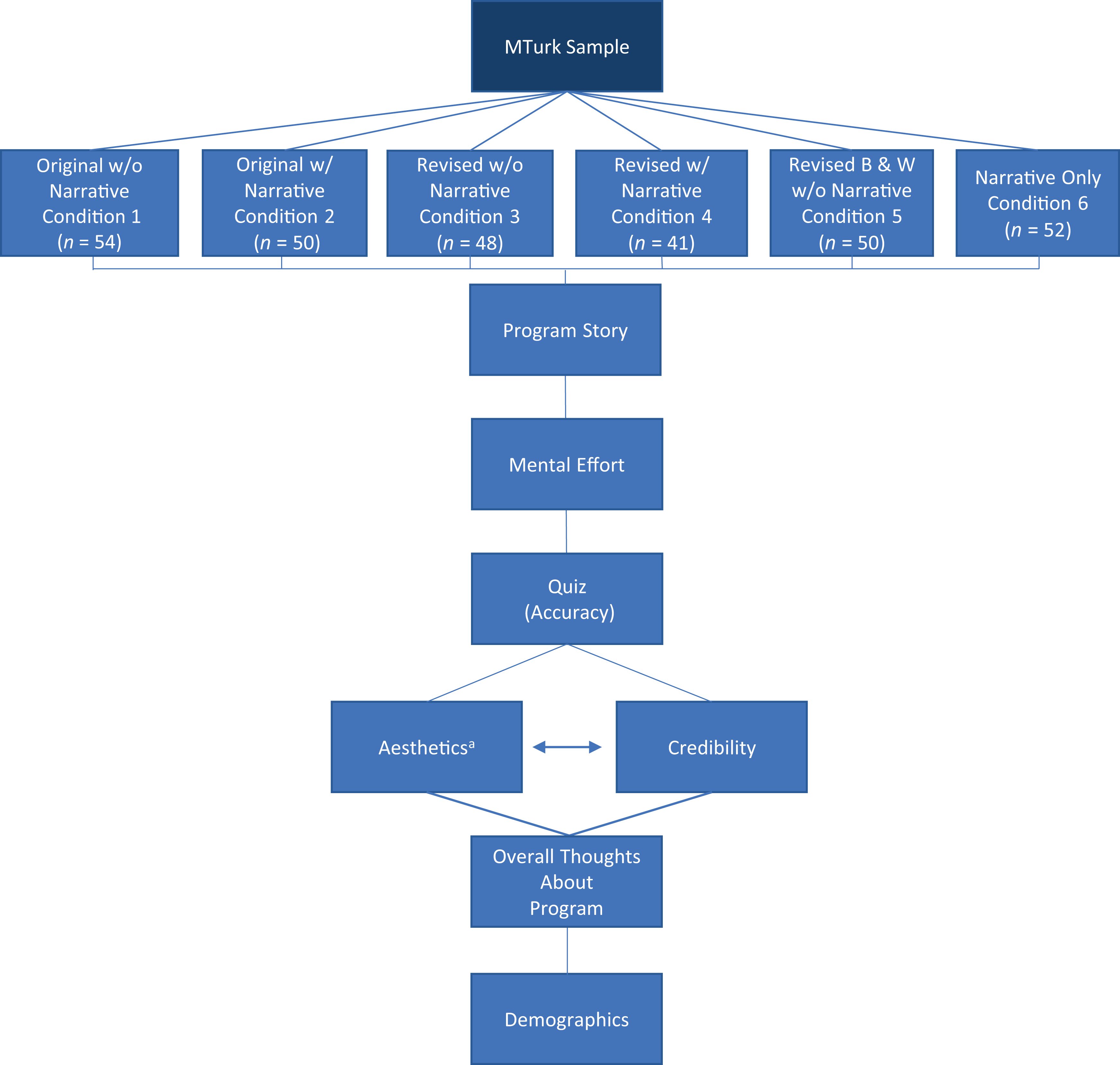
Study procedures.
A pilot test with 100 respondents was first implemented to test out issues (i.e., clarity, ease of presentation, understandability) with the visualizations, as well as the logistics and validity of the survey items. Based upon feedback received from the survey, additional qualitative questions were added (e.g., What is the story of the program? What were the factors that influenced your ME score? What are your overall thoughts about the program?). Participants were paid US$1.25 for completing the first pilot and US$1.50 for the final survey.
Participants
A total of 300 participants were recruited via MTurk. Participants were included if they were adults, over 18 years old, located in the United States, reported no visual impairments, correctly answered the attention check, and completed the survey. For the attention check, a “trap question” was used where participants were given a list of titles and were asked to select the correct one, with the incorrect titles being obvious (e.g., Saving the Baby Seals). Five participants were removed for not meeting the inclusion criteria, leaving a final sample of 295 participants.
Demographics
Of the 295 participants, 52% identified as male, 48% identified female, and 1% identified as a different gender. Participants ranged in age from 19 to 73 (M = 34.7, SD = 9.97, median = 33.0). Three quarters of participants (74%) identified as White or Caucasian, 9% as Black or African American, 8% as Asian or Pacific Islander, 7% as Hispanic or Latino, 1% as Native American or American Indian, and 1% as a different ethnicity. When asked about their highest level of educational attainment, 41% said they had received a bachelor’s degree, 39% said they had attended at least some college, 13% said they graduated high school, 6% said they had received a master’s degree, and 1% said they are working toward or have completed their doctoral degree.
Measures
Visual efficiency
Visual efficiency, defined by Huang as “the extent of cognitive gain relative to cognitive cost,” was computed from the following equation including the standardized scores for accuracy, ME, and RT (Huang, Eades, & Hong, 2009, p. 142):

Accuracy was measured using seven randomly ordered questions (multiple-choice and true or false) about the program and causal relationships depicted in the logic model. There was also an attention check item embedded within the accuracy items to test participants’ degree of attention; this item was not included in the final accuracy score but was used to drop participants for insufficient attention paid to the study. ME (i.e., the level of attention required to interpret the logic model and answer questions about the program) was measured using a single-item Likert-type scale ranging from 1 (low ME) to 9 (high ME; Paas, 1992). This single-item approach to ME is commonly used and accepted in the cognitive literature (Huang et al., 2009). RT was measured by total time spent answering accuracy questions.
Message credibility
Credibility was assessed using Flanagin and Metzger’s (2003) measure consisting of the following items randomly presented: believable, accurate, trustworthy, biased, and complete, presented in random order (α = .900). Participants were asked to rate each item using a Likert-type scale ranging from 1 (not at all) to 7 (extremely).
Aesthetics
A Semantic Differential Rating Scale was developed to measure aesthetic perceptions. Participants were asked to rate the program depiction on a 7-point continuum of polar adjectives (ugly to beautiful, confusing to clear, boring to engaging, complex to simple, and frustrating to enjoyable), presented in random order (α = .799). Adjectives were selected based on the intended purpose of the logic model and previous literature on information aesthetics (Moere, Tomitsch, Wimmer, Christoph, & Grechenig, 2012).
Analytical Procedures
Quantitative analysis
Preliminary data cleaning was performed to remove participants who did not meet inclusion criteria. Visual efficiency scores were calculated using standardized scores of (1) the amount of time it took for participants to finish the quiz, (2) the accuracy of the quiz responses, and (3) a self-rated ME score. All variables were examined for outliers; RT and accuracy had outliers greater than ±3 SDs from the mean and were winsorized to the next highest value. Statistical analyses were performed to compare mean differences across the six conditions. First, one-way analyses of variance (ANOVAs) were performed with condition as the independent variable and measures of visual efficiency (i.e., RT, accuracy, and ME), credibility, and aesthetics as dependent variables. Two-way (2 × 2) ANOVAs were performed to examine the main effects and interaction effect between two independent factors (narrative vs. no narrative and original vs. revised) on the same dependent variables. Independent t-tests, correlations, and one-way ANOVAs were conducted to identify significant differences among demographic variables.
Qualitative analysis
Content analyses were performed on the qualitative data to identify salient patterns in responses across the various conditions. Three initial coders were used for the qualitative coding; themes were allowed to emerge and then discussed. Final themes were discussed among the researchers and finally quantized. No quantitative measure for interrater reliability was used, as the qualitative portion was designed as a supplement to the quantitative aspect of the study. These trends were contextualized within the framework of the hypotheses and quanticized according to emergent themes (Creswell & Clark, 2017; Huberman & Miles, 1994; Wolcott, 1994).
The quantitative data were prioritized in the convergent, mixed-methods design, and the qualitative results were used to confirm quantitative findings. Each strand of data was analyzed independently and integrated in the interpretation of results.
Results
Visual Efficiency
There was a significant difference in visual efficiency scores across the six conditions, F(5, 289) = 5.45, p < .001. Both the revised without narrative and revised B&W without narrative conditions had greater visual efficiency than the other four conditions; furthermore, the revised B&W without narrative condition had greater visual efficiency than the original with narrative condition (see Table 1).
Average Visual Efficiency, Response Time, Mental Effort, and Accuracy Across Conditions.

A 2 (original vs. revised) × 2 (narrative vs. no narrative) factorial ANOVA was also conducted with the first four conditions on visual efficiency. Both main effects of revision and narrative were significantly related to visual efficiency, but there was no significant interaction effect, F (1, 189) = 2.68, p = .103. There was a significant main effect for revision such that conditions with a revised logic model had significantly higher visual efficiency scores (M = .20, SD = .94) than conditions with the original logic model (M = −.21, SD = .85), F(1, 189) = 9.65, p = .002. There was also a significant main effect for narrative such that conditions with a narrative had significantly lower visual efficiency scores (M = −.23, SD = .92) than conditions without a narrative (M = .17, SD = .87), F(1, 189) = 10.65, p = .001.
RT
There were no significant differences in RT across the six conditions, F(5, 289) = 1.62, p = .155. However, pairwise comparisons across conditions revealed that the revised without narrative condition had significantly lower RTs than both the original with narrative and original without narrative conditions. In the two-way ANOVA, there was a significant main effect for revision of the logic model such that conditions with a revised logic model had significantly lower RTs (M = 160.2 s, SD = 91.5) than conditions with the original logic model (M = 191.8 s, SD = 92.9), F(1, 189) = 5.24, p = .023. The main effect for inclusion of a narrative, F(1, 189) = 0.81, p = 370, and the interaction effect, F(1, 189) = 1.04, p = .309, were not significant.
ME
There were no significant differences in perceived ME across the six conditions, F(5, 289) = 1.32, p = .258. However, pairwise comparisons across conditions revealed that the narrative only condition had significantly lower perceived ME than the revised with narrative condition. In the two-way ANOVA, the main effects for revision of the logic model, F(1, 189) = 0.28, p = .600, and inclusion of a narrative, F(1, 189) = 1.32, p = .252, as well as the interaction effect, F(1, 189) = 0.76, p = .383, were not significant.
Despite nonsignificant differences, the qualitative responses provided contextual information regarding model narratives and the ME associated with participants’ comprehension. When looking through participants’ open-ended responses asking the rationale for their ME scoring, the highest occurring themes that emerged were that participants easily understood the information provided to them (24%), there was a large amount of information to retain (20%), and that the logic of the information was difficult to follow (13%) which was more commonly mentioned in the conditions with the original model (see Table 2).
Highest Frequency Theme and Example Quotes of Mental Effort Across Conditions.

Of the participants who rated ME as high (i.e., score ≥ 6), their associated comments overwhelmingly mentioned the amount of information (n = 54). For example, one participant stated, “It took a lot of mental effort because there was a lot of reading.” Participants who rated ME as high also frequently mentioned the complexity of the diagram. For instance, one participant commented, I rated it slightly higher than medium because I had a hard time grasping it at first glance. When I studied it closer it became apparent what the program was trying to tell me. I understood more the longer I spent reading it. It became clear to me that there is a process involved, from beginning to end. The reason why I rate it a ‘6’ was simply because I didn’t completely understand it at the beginning.
Accuracy
There was a significant difference in accuracy across the six conditions, F(5, 289) = 5.34, p < .001. The revised without narrative condition had significantly higher accuracy than the original with narrative, revised with narrative, and narrative only conditions. The revised B&W without narrative condition had significantly higher accuracy than the original with narrative and narrative only conditions. Furthermore, the original without narrative condition had significantly higher accuracy than the narrative only condition.
In the two-way ANOVA, there was a significant main effect for inclusion of a narrative such that conditions without a narrative had significantly higher accuracy (M = 64.4%, SD = 19.8) than conditions with a narrative (M = 55.3%, SD = 22.1), F(1, 189) = 9.19, p = .003. The main effect for revision of the logic model, F(1, 189) = 3.50, p = .063, and the interaction effect, F(1, 189) = 0.43, p = .512, were not significant.
As part of a manipulation check, participants were asked, “What is the story of the program? That is, what does the program do?” Participants provided varying levels of detail to this open-ended question. The level of detail was assessed through a qualitative coding process that sorted responses into three categories: low, medium, and high. Those with short response (e.g., “The program attempts to delay and reduce tobacco usage among teenagers and youths.”) were considered to be low detail, while those who provided further detail but stop short of providing numerous details (e.g., “The goal is to reduce tobacco use among youths by focusing efforts in three areas. These areas are limiting access, increasing advocacy and increasing prevention programs.”) were classified as medium, and all those who provided detail above the medium amount (e.g., “Basically it is a three step program to reduce tobacco use to the youth. The first step consists of increasing awareness to the youth, and to decrease access to minors. Second, have more activities for the youth. Give them a positive platform to build their sense of security from within their community. Third, if these policies are taught within school these children will grow up healthy and not have obesity and mortality.”) were classified as providing a high level of detail.
Participants who provided low levels of detail (M = 54.17, SD = 21.34, n = 132) and medium levels of detail (M = 59.36, SD = 21.87, n = 73) had significantly lower levels of accuracy than participants who provided high levels of detail (M = 64.42, SD = 21.76, n = 89), F(2, 291) = 6.18, p = .002. Additionally, participants provided varying levels of correctness to this open-ended question. Participants who provided an inaccurate description of the program (M = 52.6%, SD = 17.44, n = 26) or partially inaccurate description of the program (M = 55.7%, SD = 22.43, n = 73) had lower levels of accuracy than participants who provided accurate descriptions of the program (M = 58.56%, SD = 21.86, n = 195), but these differences were not statistically different, F (2, 291) = 2.35, p = .097.
Credibility
There was a significant difference in credibility across the six conditions, F(5, 289) = 6.91, p < .001 (see Table 3). The narrative only condition was rated as significantly less credible than all the other conditions; furthermore, the original with narrative condition was rated significantly less credible than the revised B&W without narrative condition. In the two-way ANOVA, the main effects for revision of the logic model, F(1, 189) = 0.95, p = .332, and inclusion of a narrative, F(1, 189) = 0.20, p = .654, as well as the interaction effect, F(1, 189) = 1.81, p = .180, were not significant.
Average Credibility and Aesthetics Across Conditions.

At the end of the survey, participants were provided with an opportunity to leave comments or feedback for the researchers. Many participants perceived the purpose of the study was to get feedback on a future program and provided positive feedback (55%). For example, one commenter stated, I think the program is comprehensive yet concise. It gives a thorough look into the practices that are needed and the consequences that occur once given practices are put into effect. Overall the program makes sense and does seem like a credible source given the information I have.
Aesthetics
There was a significant difference in aesthetics across the five conditions that had a logic model (i.e., all conditions except for the narrative only condition), F(4, 238) = 2.72, p = .030. The revised conditions were rated as significantly more aesthetic than the original without narrative condition. In the two-way ANOVA, there was a significant main effect for revision of the logic model such that conditions with an improved logic model had significantly higher aesthetics (M = 4.06, SD = 1.54) than conditions with the original logic model (M = 3.41, SD = 1.44), F(1, 189) = 8.91, p = .003. The main effect for inclusion of a narrative, F(1, 189) = 0.60, p = .441, and the interaction effect, F(1, 189) = 0.37, p = .546, were not significant.
These differences in perceptions between the original, revised, and revised B&W conditions were also supported by participant commentary and feedback at the end of the survey. For instance, some participants suggested that “some color and other design choices could’ve helped that presentation,” and “the chart might be improved by using more diverse colors and symbols, so as to more easily differentiate the various parts and lead to a quicker processing of the information as given.” Additionally, one participant reflected that “There’s a lot to read, yet I find it very well organized. Even though there is a lot to go through, things like color coding and organization make it simple and effective.”
Relationships Between Visual Efficiency, Aesthetics, and Credibility
Correlations between visual efficiency and its components (i.e., RT, ME, and accuracy) with aesthetics and credibility were performed to examine whether greater visual efficiency was related to higher ratings of credibility and aesthetics. Visual efficiency was positively correlated with credibility (r = .164, p = .005) but not aesthetics (r = .060, p = .305). RT was not correlated with either credibility (r = .054, p = .352) or aesthetics (r = .108, p = .064). ME was strongly negatively related to both credibility (r = −.253, p < .001) and aesthetics (r = −.410, p < .001) such that lower credibility scores and lower aesthetic scores were related to higher ME scores. Accuracy was not correlated with credibility (r = .052, p = .372) but was negatively related to aesthetics (r = −.210, p < .001) such that participants with greater accuracy also rated the logic models with lower aesthetic scores. Furthermore, credibility was positively correlated with aesthetics (r = .300, p < .001).
Demographic Differences
Demographic differences were also explored to determine whether education, gender, or race/ethnicity played a role in ratings of outcome variables (i.e., visual efficiency, RT, ME, accuracy, credibility, and aesthetics). Participants with higher education levels rated their levels of ME in the tasks higher than participants with lower education levels, F(4, 290) = 3.16, p = .015. On average, male participants had higher accuracy than female participants, t(291) = 2.11, p = 035. White participants had on average a higher accuracy score, t(293) = 2.32, p = .021, and lower ratings of aesthetics, t(293) = 2.03, p = .044, than non-White participants. Lastly, age was positively correlated with RT (r = .24, p < .001) such that older participants took longer to respond to the accuracy questions than younger participants.
Discussion
This study attempted to determine if applying visualization guidelines to a standard logic model would improve the effectiveness of the model as a programmatic communication tool. The premise was to see if simple modifications to the formatting and design of a logic model, based upon previously established visualization principles, could improve its ability to accurately communicate the program’s story in a relatively quick manner. This concept was captured through our use of the visual efficiency score, which was composed of (1) the amount of time it took to review and respond to questions about the logic model, (2) the amount of ME it took to understand the logic model, and (3) the degree of accuracy (as measured through a quiz about the logic model content) that participants were able to attain after viewing the logic model. The overall results support the claim that visual efficiency can be improved by modifying the logic model’s formatting and design.
These modifications reduced the amount of time it took for participants to review the logic model, increased the RA, and, to a lesser extent, reduced the amount of ME it took to understand the logic model. Additionally, the revised logic models (i.e., those adhering to visualization principles) also increased the perceived message credibility and were viewed as more aesthetically pleasing. These findings were also supported by the observations and qualitative feedback received from the participants.
These findings are encouraging because they contribute to the renewed attention to visualization in evaluation. We also hope that this study offers a template for testing assumptions about the effectiveness of visualization in evaluation, as this is one of the first studies in the evaluation literature to focus on the design of logic models. The findings also highlight the impact that visualization can have on our ability to communicate complex ideas and concepts to a broad audience. This is particularly relevant to evaluators since researchers studying the cognitive aspect of visualizations have found that different visual displays may contain equivalent information; however, they may not be equally interpreted (Hegarty, 2011) and how we approach the display process can enhance or reduce our ability to communicate complex connections and ideas such as those programs often try to communicate through logic models. The credibility of the visualization is also a relevant reason to consider good design, as the study showed that the credibility of the revised logic model was highest when compared to the other conditions. This relationship between good design and credibility has also been observed by others in the visualization field (Tufte, 2006) and highlights the potentially critical role that visualization can have on our own practice as evaluators. Some researchers have argued that more aesthetically pleasing information visualizations improve accuracy or usability, and some research supports this notion (Cawthon & Moere, 2007; Kurosu & Kashimura, 1995; Salimun, Purchase, Simmons, & Brewster, 2010; Tractinsky, Katz, & Ikar, 2000). However, much of this research examines the aesthetics of visualizations and the relationship of the visualization with accuracy, not the individual perceptions of aesthetics and its relationship with accuracy for that individual. This suggests there may be individual variability in how aesthetics relate to accuracy even with the same types of information visualizations and that while more aesthetically pleasing visualizations may improve accuracy that for the individual more aesthetically pleasing visualizations actually decrease accuracy (e.g., Simpson’s paradox).
We hope that the prospect of focusing on visualization is not an overwhelming prospect for evaluators. This is why we kept our modifications simple. These modifications took less than 30 min to complete, using commonly available software (i.e., Microsoft Powerpoint), and included changes to the colors, the formatting of the boxes containing the activities and outcomes, and presentation of arrows. These modifications utilized common guidelines in visualizations including the gestalt concepts of enclosure, 4 proximity, 5 and continuity 6 (Cleveland, 1993; Few & Edge, 2008; Freedman & Shah, 2002). We wanted to test how these visualization guidelines translated to an evaluation-specific context and show how simple changes can improve our ability to communicate with stakeholders. We hope that this study spurs other investigations about common visualization assumptions and guidelines and lead to better evaluation products and tools.
For instance, there are other visualization techniques that still need to be studied and would be very relevant to the development of logic models. One of these main visualization techniques to explore is the degree of complexity represented in logic models. For example, how does the number of boxes and arrows affect understandability, and how does this complexity vary by the audience’s familiarity with the program? This line of research can help us determine an appropriate degree of complexity to represent in a logic model for various stakeholders who have different roles and levels of involvement in the evaluation. The visual complexity can also represent the type of representations used in logic models, such as the classically linear model with arrows all pointing in the same direction (as used in this specific study) or the more nuanced models that also show double-sided arrows to illustrate reciprocal relationships. We believe that these latter models are inherently harder to understand due to added connections and the relations that they imply; however, they can often be more effective representations of the program and how it is actually functioning especially when we start to consider a systems approach to representing how a program contributes to achieving a specific outcome.
Future studies could also examine if the degree of complexity in logic models could be made easier to understand by creating legends for activities and outcomes (e.g., circles for activities and rectangles for outcomes) or by developing a notation system to communicate the strength/type of the relationships between the various logic model components or a brief explanation on how to read logic models before presenting them. There are also future opportunities to examine whether interactive logic models or presenting logic models interactively provide better understanding and accuracy or simply add more confusion to the process. Our aim in the current study was to examine whether relatively minor visual changes to a logic model would improve the visual effectiveness of the logic model, and we believe that we have found supporting evidence for this claim. This opens up various opportunities to explore how logic models and program theories can be improved to enhance their potential impact and utility in evaluation practice.
There was also an interesting connection between credibility, aesthetics, and visual efficiency such that credibility and aesthetics were inversely related to ME (i.e., higher ME was related to lower credibility and ratings of aesthetics). Furthermore, there was also an inverse relationship between aesthetics and accuracy (i.e., higher accuracy was related to lower ratings of aesthetics). We are uncertain as to why these relationships between credibility, aesthetics, and visual efficiency exist and think that it would be worthwhile to explore this connection to better aid evaluation researchers and practitioners alike in developing effective visualizations.
Limitations
The limitations of the study focused on the potential generalizability of the findings because the participants were derived from a broad population who had no prior knowledge of logic models, the program, or how and why the logic model was created. This is a potential limitation because, in most cases, the logic model is developed with stakeholders who have a better understanding of the program and may have been involved in the initial development of the model. Thus, we do not know if the visual changes that we made would affect stakeholders who were involved in the program and the logic model development process in the same way as they affect an audience with no prior involvement or familiarity with the program. We were also unable to control the type of screen or resolution that was used to view the logic model and how that may have influenced our findings.
Conclusion
We hope that this novel study inspires future efforts by those in the evaluation field to study the assumptions and suggestions made about how to improve the visual effectiveness of the information that we communicate. As the visualization field continues to gain momentum and broad interest within our evaluation community, we believe that there will continue to be evaluation-specific studies conducted to help ensure that we are harnessing and verifying the power of visualization techniques in the most effective manner.
Supplemental Material
AJE824417_Supplemental_Appendix_A - Enhancing the Effectiveness of Logic Models
AJE824417_Supplemental_Appendix_A for Enhancing the Effectiveness of Logic Models by Natalie D. Jones, Tarek Azzam, Dana Linnell Wanzer, Darrel Skousen, Ciara Knight and Nina Sabarre in American Journal of Evaluation
Footnotes
Declaration of Conflicting Interests
The author(s) declared no potential conflicts of interest with respect to the research, authorship, and/or publication of this article.
Funding
The author(s) received no financial support for the research, authorship, and/or publication of this article.

Supplemental Material
Notes
References
Supplementary Material
Please find the following supplemental material available below.
For Open Access articles published under a Creative Commons License, all supplemental material carries the same license as the article it is associated with.
For non-Open Access articles published, all supplemental material carries a non-exclusive license, and permission requests for re-use of supplemental material or any part of supplemental material shall be sent directly to the copyright owner as specified in the copyright notice associated with the article.
