



Abstract
Data-driven journalism can be considered as journalism’s response to the datafication of society. To better understand the key components and development of this still young and fast evolving genre, we investigate what the field itself defines as its ‘gold-standard’: projects that were nominated for the Data Journalism Awards from 2013 to 2016 (n = 225). Using a content analysis, we examine, among other aspects, the data sources and types, visualisations, interactive features, topics and producers. Our results demonstrate, for instance, only a few consistent developments over the years and a predominance of political pieces, of projects by newspapers and by investigative journalism organisations, of public data from official institutions as well as a glut of simple visualisations, which in sum echoes a range of general tendencies in data journalism. On the basis of our findings, we evaluate data-driven journalism’s potential for improvement with regard to journalism’s societal functions.
Keywords
Introduction
The emergence of data-driven journalism (DDJ) can be understood as journalism’s response to the datafication of society. In fact, the phenomena of ‘big data’ and an increasingly data-driven society (Nguyen and Lugo-Ocando, 2016) are doubly relevant for journalism: First, it is a topic worth covering so that the related developments and their consequences can be understood in context and public debate about them can be encouraged. Second, the ‘quantitative turn’ (Coddington, 2015) has already begun to affect news production itself and has given rise to novel ways of identifying and telling stories (Lewis and Usher, 2014). As a consequence, we are witnessing the emergence of a new journalistic sub-field coined ‘data journalism’ (Appelgren and Nygren, 2014) or ‘data-driven journalism’ (Borges-Rey, 2016: 840), acronymously known as ‘DDJ’.
The extensive attention that practitioners pay to DDJ has also fuelled ‘an explosion in data journalism-oriented scholarship’ (Fink and Anderson, 2015: 476), at first concerned with defining what DDJ involves and implies, now increasingly producing empirical data by, for instance, interviewing actors in the field or analysing data-driven content (for an overview of empirical studies cf. Ausserhofer et al., 2017). However, most of this empirical research is restricted in spatial or temporal terms and/or focuses on particular case studies. Against this backdrop and in order to advance our understanding of DDJ as an ‘emerging form of storytelling’ (Appelgren and Nygren, 2014: 394), we aim to complement this body of work with an analysis that spans a broad geographical scale and several years of what may be considered the ‘gold-standard’ of DDJ: projects nominated for the Data Journalism Awards (DJA) from 2013 to 2016. We examine the new reporting style’s key components (e.g. data sources and types, visualisation strategies, interactive features), if these elements change over time and differ between award-winning projects and stories only nominated, compare our findings to previous research into DDJ, and discuss potential avenues for innovation and improvement with regard to journalism’s societal functions.
Previous work: Definitions, actors and output
Scholarship on DDJ, so far, has been dominated by three particular areas of study.
A first strand of studies is concerned with defining data journalism and clarifying if and to what extent it actually is a novel reporting style in its own right, and how it is similar to and different from investigative journalism, computer-assisted reporting, computational journalism and the like (e.g. Coddington, 2015; Royal and Blasingame, 2015). Against this backdrop and based on cursory observations of the field and example projects, scholars have come more-or-less consistently to the conclusion that the following elements are typical of the majority of DDJ:
It usually builds on (large) sets of (digital) quantitative data as ‘raw material’ that is subjected to some form of (statistical) analysis in order to identify and tell stories (Coddington, 2015; Royal and Blasingame, 2015);
Its results ‘often need visualization’ (Gray et al., 2012: n.p.; emphasis added), that is, they are presented in the form of maps, bar charts and other graphics (Royal and Blasingame, 2015; Young et al., 2017);
It is frequently ‘characterized by its participatory openness’ (Coddington, 2015: 337) and ‘so-called crowdsourcing’ (Appelgren and Nygren, 2014: 394) in that users help with collecting, analysing or interpreting the data (Borges-Rey, 2016; Boyles and Meyer, 2016; Karlsen and Stavelin, 2014) although, for example, Borges-Rey’s (2017: 11–12) interviewees from regional media stated they largely abandoned crowdsourcing because they ‘fail[ed] to attract numbers significant enough to deem the practice useful’;
It regularly adopts an open data and open source approach and the related ‘ideals of transparency and openness’ (Borges-Rey, 2017: 12), meaning, among other things, that it is regarded as a quality criterion of DDJ that journalists publish the raw data a story is built upon (Gray et al., 2012).
Second, scholars tend to focus on the actors involved in the production of data journalism. As a consequence, qualitative interviews are the most common method applied in empirical research on DDJ (Ausserhofer et al., 2017: 11), that often focuses on a single country. Data journalists in Belgium (De Maeyer et al., 2015), Canada (Hermida and Young, 2017), Germany (Weinacht and Spiller, 2014), Norway (Karlsen and Stavelin, 2014), Sweden (Appelgren and Nygren, 2014), the United Kingdom (Borges-Rey, 2016, 2017; Hannaford, 2015) and the United States (Boyles and Meyer, 2016; Fink and Anderson, 2015; Parasie, 2015; Parasie and Dagiral, 2013) have been interviewed in relation to their journalistic self-understanding and work in the newsroom. Uskali and Kuutti (2015), as well as Felle (2016), looked across national borders by interviewing data journalists in 3 and 17 different countries, respectively. These actor-centred studies provide valuable insights into the production of DDJ, in particular, that it is commonly carried out by cross-disciplinary teams characterised by a division of labour into data analysis, visualisation and writing (Hannaford, 2015; Tabary et al., 2016; Weinacht and Spiller, 2014). In contrast, Young et al. (2017) found that Canadian finalists for DDJ-awards were produced predominantly by one or two authors. In this context, De Maeyer et al. (2015: 440–441) differentiate between ‘“ordinary” data journalism’ that ‘is manageable by one individual [and] can be done on a daily basis’ and ‘“thorough” data journalism’ that is produced by teams with ‘a range of skills’ (cf. also Borges-Rey, 2016; Fink and Anderson, 2015; Uskali and Kuutti, 2015). Additionally, Borges-Rey (2017) in his research into DDJ in the United Kingdom’s devolved nations notes that journalists also pursue collaborations with programmers or graphic designers from outside the newsroom to make up for ‘the absence of certain advanced computational skills’ (p. 12).
A third strand of research analyses the actual data-driven content that is produced. These studies focus on the topics covered as well as (a selection of) the above-mentioned elements and affirm their status as key characteristics of a data journalistic reporting style: Parasie and Dagiral’s (2013) study refers to pieces from one Chicago outlet published before March 2011; Knight (2015) analyses articles published in 15 UK newspapers over a two-week period in 2013; Tandoc and Oh (2017) turn to 260 stories published in The Guardian’s Datablog between 2009 and 2015; Tabary et al. (2016) examine projects produced between 2011 and 2013 by six Québécois media outlets; Appelgren (2017) explores 31 submissions to the Nordic DJA between 2013 and 2016; and Young et al. (2017) study 26 Canadian projects that were finalists in national and international awards, including the DJA.
One striking finding of this line of work is that data journalism exhibits a ‘dependency on pre-processed public data’ (Tabary et al., 2016: 75; cf. also Borges-Rey, 2017; Young et al., 2017), for example, from statistical offices and other government institutions. The use of data that media collected by themselves–for example, through their own survey or by searching their archives–is much more uncommon: for instance, only 18.5 percent of stories in Tandoc and Oh’s (2017) study of The Guardian’s Datablog build on such data, and only 7 percent in Knight’s (2015) analysis of British newspapers.
Nonetheless, data journalism has been linked repeatedly to investigative reporting (Parasie, 2015; Royal and Blasingame, 2015), which has ‘led to something of a perception that data journalism is all about massive data sets, acquired through acts of journalistic bravery and derring-do’ (Knight, 2015: 64). Accordingly, Borges-Rey’s (2017) interviewees stress the importance of Freedom of Information requests for obtaining data. However, other ‘investigative’ methods for gathering information don’t seem as common as one might assume: Knight (2015), Tandoc and Oh (2017), and also Young et al. (2017), in their analysis of Canadian finalists of different DDJ-awards, found only small portions of leaked and self-generated information.
Concerning the topics covered, content analyses identified a preponderance of political pieces (Tandoc and Oh, 2017), considerable coverage of societal (Knight, 2015; Young et al., 2017), business (Parasie and Dagiral, 2013) and health issues (Young et al., 2017), as well as only small proportions of sports and culture stories (Knight, 2015; Tandoc and Oh, 2017).
If we think of data journalism as a distinct style of reporting, one of its most characteristic elements is visualisation. As Knight (2015) concludes in her study of British newspapers, data journalism is ‘practiced as much for its visual appeal as for its investigative qualities’ (p. 55). In this regard, Appelgren (2017) observed a prevalence of a type of visualisation that is not data-related, but common for any kind of news content – images. With respect to visualisations that actually depict the data a story is based on, other studies conclude that charts and maps are ‘the most common form of data information presented’ (Knight, 2015: 65; cf. also Appelgren and Nygren, 2014; Parasie and Dagiral, 2013). Young et al. (2017) suggest that these visualisations are popular because they can be easily produced often using free software that many practitioners turn to due to financial and time constraints.
Another presumed ‘key characteristic’ of data journalism, often related to visualisation, comprises elements that allow users to interact with the data on show (e.g. Coddington, 2015; Gray et al., 2012). 1 Appelgren’s (2017) and Young et al.’s (2017: 10) studies of DDJ-award submissions indicate that the most frequent interactive features are ‘the functionality of zooming inside an interactive map’, features that let the audience ‘inspect one data point in more detail by clicking on it and accessing more information’, as well as filters through which users can refine the provided data with respect to different variables (e.g. to only select voting results from one state or one year). Young et al. (2017: 13) argue that, just like simple visualisations, these ‘simplest interactive techniques’ are most prevalent in part because ‘[t]hey are also the most commonly available [or default] functions of the free software tools and platforms [such as Google Maps or Tableau] used by the journalists’ (p. 9). On the contrary, more sophisticated features that require hand coding are rarely offered.
It is clear that a reporting style that can make sense of data is only a logical step in journalism’s adaptation to the ‘increasingly ubiquitous digitization of information’ (Coddington, 2015: 331). Consequently, scholars and practitioners alike have claimed that DDJ ‘improves the way journalism can contribute to democracy’ (Parasie and Dagiral, 2013: 854). However, research reveals that, so far, this potential is substantially limited by a lack of funds, time, manpower and legal support that can, for instance, lead journalists to avoid relevant but labour-intensive topics, data sets, visualisations and so on (e.g. De Maeyer et al., 2015; Fink and Anderson, 2015).
Research questions
The literature review has shown that research offers various insights into the reporting style of data journalism. We aim to complement this body of research with an analysis of the nominees for the DJA 2013–2016. While previous studies are limited either to a certain country, sometimes even to a city or a single news outlet, or to a rather short time frame, this group of projects represents an international sample covering 4 years. To ensure the comparability of our findings, our research questions address the key aspects that other studies have identified and, partly, investigated empirically (e.g. Young et al., 2017, who in their work refer to the results of the first 2 years of our on-going analysis):
RQ 1. Who are the actors producing DJA-nominated data journalism (media organisations, in-house teams, external partners)?
RQ 2. What topics are covered in DJA-nominated projects?
RQ 3. What data (type, source, analysis) are DJA-nominated stories based on, and what visualisations and interactive features do they provide?
Importantly, concerning each of these questions, we seek to identify substantial differences and similarities between award-winning projects and those merely nominated, consistent developments over the 4 years and interrelations between different aspects of the content under review (e.g. between certain topics and particular types of data).
Method
To answer our research questions, we conducted a standardised content analysis (e.g. Krippendorff, 2013) of data journalism pieces nominated for the DJA – a prize awarded annually by the Global Editors Network 2 – in 2013, 2014, 2015 and 2016 (Table 1).
Dataset overview. a
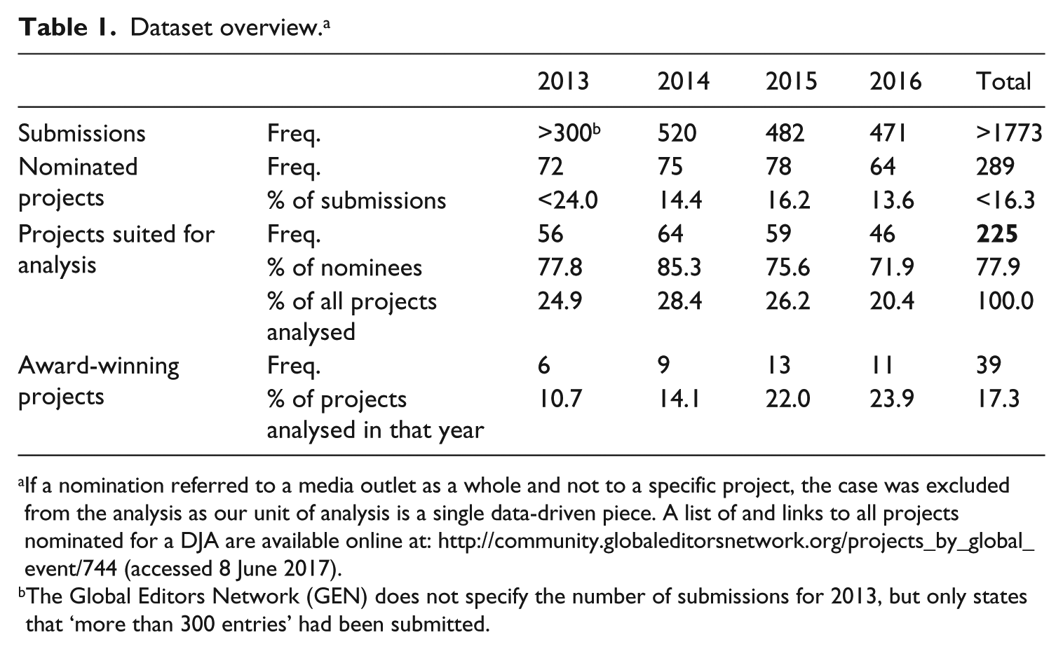
If a nomination referred to a media outlet as a whole and not to a specific project, the case was excluded from the analysis as our unit of analysis is a single data-driven piece. A list of and links to all projects nominated for a DJA are available online at: http://community.globaleditorsnetwork.org/projects_by_global_event/744 (accessed 8 June 2017).
The Global Editors Network (GEN) does not specify the number of submissions for 2013, but only states that ‘more than 300 entries’ had been submitted.
We chose this sample for a number of reasons: First, submissions to DJA have already proven useful objects for analysing DDJ (Appelgren, 2017; Young et al., 2017). Second, data journalism is not only a ‘diffuse term’ (Fink and Anderson, 2015: 470) but also a phenomenon with various specifications which makes it difficult, or rather preconditional, to identify respective pieces for a content analysis. We, therefore, decided to take this pragmatic and inductive approach that avoids starting with a top-down definition of data journalism that could have been either too narrow or too broad. Instead, our sample seizes on what the field itself considers to be significant examples of data-driven reporting. Third, award nominees are ‘relevant for studies’ (Appelgren, 2017: 8) in DDJ because they are likely to influence the development of the field as a whole since ‘[t]hrough transferring the capital that awards bring, certain sectors of the media can […] shape professional standards’ (Jenkins and Volz, 2016: 16) and over time turn the ‘gold-standard’ into mainstream practice. Additionally, while the samples of previous content analyses are restricted either in their geographical scope or the time-span they cover, our selection offers both a longitudinal perspective and – taking the examples above into account – represents a further step to overcome the ‘current academic emphasis on national analyses’ in DDJ research (Borges-Rey, 2017: 2). Although our sample allows us to track changes over time, we will interpret year-to-year differences with caution because they may just be the result of different judges or may be mitigated by the long production times that often characterise data-driven projects: The production of some 2015 nominees, for example, may overlap with that of some 2014 pieces and because of this, the lines between the years can become blurred. Additionally, since DDJ is still an emerging genre, we expect to observe the field moving back and forth in a trial-and-error manner rather than consistently developing in a linear direction.
We must, however, take into account that our sample is doubly biased: First, the pieces analysed are based on self-selection as any data journalist can submit her or his work to be considered for nomination by the organising committee. Second, as works deemed award-worthy, DJA-nominees are unlikely to represent ‘everyday’ forms of data journalism described in the literature review, but rather the ‘extensive’ type. Moreover, research has shown that awards tend to favour nominees who already enjoy a high status in the field (Jenkins and Volz, 2016).
Most variables in our codebook 3 and their assigned values were developed inductively, based on an explorative analysis of a subsample from 2013 when we started our on-going research. Some categories were inspired by Parasie and Dagiral’s (2013) study, the only content analysis of data-driven pieces available at the time. Other categories were suggested by fellow researcher Julian Ausserhofer and data journalist Lorenz Matzat. A pretest was conducted with two coders and a subsample of 10 percent of cases from 2013 to 2014. All variables reached an intercoder reliability coefficient (Holsti or Krippendorff’s Alpha) equivalent to or higher than 0.7, which is generally considered sufficient for exploratory research (Krippendorff, 2013). Due to a change in coders, a further test for intercoder reliability was conducted with 13 percent of cases from 2016. This resulted in coefficients larger than 0.7 for all but two of the variables addressed here (type of medium; other visualisations) that only reached a Holsti-score of 0.67. To further improve consistency, the student coders, whenever uncertain about a categorisation, engaged in consensual coding and consulted one of the authors.
It is notable that over the years we did not have to change or add variables or values to capture new kinds of data, visualisations or other elements; the only exceptions being audio files and virtual reality visualisations which were first used in 2015 and 2016, respectively, and were added to the codebook for the subsequent years. These variables, however, will not be addressed in this article.
Results
In what follows, we present our findings in relation to the research questions above, starting with the actors who produce DJA-nominated projects.
Actors producing DJA-nominated stories
Over the four years, newspapers represent by far the largest group among all nominees as well as among the award-winners (total: 43.1%; DJA-awarded: 37.8%). Another important group comprises organisations involved in investigative journalism such as ProPublica and The International Consortium of Investigative Journalists (ICIJ), which were awarded significantly more often than not (total: 18.2%; DJA-awarded: 32.4; only nominated: 15.4). Print magazines and native online media (8.4% each), public and private broadcasters (5.8 and 5.3%), news agencies (4.4%), non-journalistic organisations (4.0%), university media (3.1%) and other types of authors (2.7%) are represented to much lesser extents. Interestingly, stories by print magazines, news agencies and non-journalistic organisations have not been awarded at all.
The distribution of media types very much resembles that in Young et al.’s (2017) study of Canadian finalists of different DDJ-awards with the exception that investigative organisations were not represented in their sample. Furthermore, those players often referred to as prime examples in the literature (e.g. Anderson, 2013; Coddington, 2015) have also been nominated most often for a DJA: ProPublica (17 cases), The Guardian (14 cases), The New York Times, ICIJ, Wall Street Journal (10 cases each), US magazine Mother Jones (9 cases) and Argentinian newspaper La Nación (8 cases).
Our results also show that data journalism is usually a collaborative and resource-/personnel-intensive endeavour. The projects containing a byline (n = 192), on average, name just over five individuals as authors or contributors (M = 5.03, standard deviation (SD) = 4.01). 4 This is probably due to the division of labour into data analysis, visualisation and writing, which several of the above-discussed studies have found to be common especially for rather complex projects. Correspondingly, the average team size of awarded projects is even larger than that of pieces only nominated (M = 6.31, SD = 4.7 vs M = 4.75, SD = 3.8). 5
According to the project descriptions that authors provide when submitting their work to the DJA, nearly a third (32.7%) of all projects were realised in association with external partners who either contributed to the analysis or designed visualisations. This reflects Borges-Rey’s (2017: 12) finding from the United Kingdom’s devolved nations where journalists ‘pursue extra- or intra-newsroom collaborations’ with programmers or graphic designers to make up for ‘the absence of certain advanced computational skills’.
Nearly half of the nominees come from the United States (47.6%), followed at a distance by Great Britain (12.9%) and Germany (6.2%). However, data journalism appears to be a global phenomenon because the number of countries represented by the nominees as a whole grew with each year, reaching 33 countries from all five continents in 2016.
Additionally, it appears that journalists increasingly wish to appeal to an international audience as bi- or multilingual projects (15.1%) are the second most frequent (after English-language projects with 67.1%). In all but one of these 34 cases, the projects are published in English and in the producers’ native language.
Topics
DJA-nominees, by and large, display the same topical preferences identified in the previous studies summarised above: Almost half of the analysed pieces cover a political topic (48.2%; multiple coding possible), more than a third deal with societal issues (census results, crime reports, etc.; 36.6%), more than a quarter focus on business and the economy (28.1%) and more than a fifth are concerned with health and science (21.4%). Culture, sports and education attract little coverage (2.7% to 5.4%). Furthermore, data-driven stories appear to have a clear thematic focus: More than 60 percent of projects deal with only one category of topic (61.3%), while only less than 40 percent spread into two or more different topical areas (e.g. political decisions and their societal impact by investigating how weapon laws influence the number of mass shootings).
Looking at the development over time, we found that – except for some peaks and lows in individual years – the shares of the different topics remained relatively stable. The only more-or-less continuous trend was that the proportion of business stories grew significantly from around one-fifth of nominees in 2013 and 2014 (21.4% and 18.8%, respectively) to 30.5 percent in 2015 to 46.7 percent in 2016. 6
Data-driven stories in the predominant category of politics deal, for instance, with elections, which tend to generate vast amounts of quantitative data (25.9% of 108 political projects). In several cases, political pieces distinctly take on a watchdog role and, for example, check the validity of politicians’ statements based on statistical data (3 cases), analyse how government institutions spend their budgets (8 cases) or present connections or payments between parties or politicians and companies or lobby groups to reveal potential conflicts of interest (11 cases). In general, data journalism often assumes a critical position, since we found elements of criticism (e.g. on the police’s wrongful confiscation methods) or even calls for public intervention (e.g. with respect to carbon emissions) in more than half of the pieces analysed (52.0%). This share grew consistently over the four years (2013: 46.4% vs 2016: 63.0%) and was considerably higher among the award-winners (62.2% vs 50.0%).
Data sets, sources and analysis
The data journalism we analysed relied, to a large extent, on geodata (47.3%) and financial data (45.0%) (Table 2). Other frequently analysed types of data are measured values gathered by sensors, with measuring tools or through written tests (38.3%; e.g. aircraft noise, carbon emissions as well as IQ or personality traits), sociodemographic data (35.1%) and personal data (30.2%). Metadata (15.6%; i.e. ‘data about data’, for example, information about individual instances of application use) and data from polls and surveys (12.6%) are used least frequently.
Kind of data (multiple coding possible, n = 222).
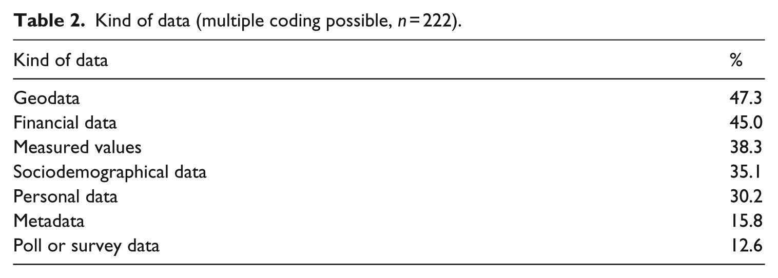
Some kinds of data are used significantly more often in pieces dealing with particular topics. For instance, the above-mentioned information from polls/surveys is included more frequently in political stories than in non-political ones (19.4%, n = 117, vs 6.0%; n = 92; Fisher’s exact test: p < .01). Economic and business pieces draw on financial data more often than other stories (85.5%, n = 62, vs 29.0%, n = 162; Fisher’s exact test: p < .001). In turn, work on societal topics is more likely than non-societal coverage to contain sociodemographic information (59.8%, n = 82, vs 20.3%, n = 143; Fisher’s exact test: p < .001), while measured values appear much more often in pieces that deal with health or science (75.0%, n = 48, vs 27.8%, n = 176; Fisher’s exact test: p < .001).
Only about a quarter of the pieces rely on just one type of data (23.1%) while most stories refer to two (41.8%) or three (23.6%) different kinds. Furthermore, the average number of different types of data used has grown only slightly, but consistently over the years (2013: M = 2.16, SD = 0.93 vs 2016: M = 2.41, SD = 1.09; the increase isn’t statistically significant, though). Most frequently, geodata was combined with sociodemographic information (21.8%), measured values (20.4%; e.g. radiation levels or noise exposure) or financial data (17.8%). Except for the increase in different data types per story, there are no clear developmental trends over time. Instead the shares – especially of geodata, measured values, sociodemographic as well as poll and survey data – vary considerably between years.
It is considered a quality criterion in data journalism that data sources should be cited (Gray et al., 2012). Yet, 7.1 percent of the apparently best practice cases we surveyed did not indicate where their data were from (Table 3). However, this is the case for only one of the award-winning pieces, and the portion in our sample is much smaller than the 40 percent share that Knight (2015: 65) found in data-driven stories from UK national newspapers.
Data source (multiple coding possible, n = 225).

By far, most pieces in our sample use data from official institutions like Eurostat and other statistical offices and ministries (68.4%) – confirming once more that data journalism exhibits a ‘dependency on pre-processed public data’ (Tabary et al., 2016: 75). The second largest group consists of pieces that use data from other non-commercial organisations including universities, research institutes and non-governmental organizations (NGOs) (41.8%). Comparable to Tandoc and Oh’s (2017) finding, roughly 20 percent analyse data that the respective media organisation collected by itself, for example, through its own survey or by searching its archives (‘own source’). Another fifth report on data from private companies, a type of data that has consistently gained prominence over the years (2013: 14.3% vs 2016: 28.3%). Interestingly, DJA-nominees do not regularly combine or contrast data from different sources, as the average number of different sources a story is based on is only 1.51 (SD = 0.76).
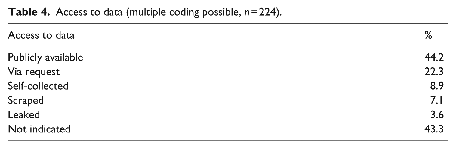
As far as access to data is concerned, our findings, for the most part, are in line with the results of other studies outlined in the literature review: Most of the analysed pieces that provide the respective information rely on data that are publicly available; another important way of obtaining data was via requests, for example, Freedom of Information requests which were sometimes explicitly mentioned in the additional information about the data (Table 4). The shares of self-collected, scraped, leaked as well as requested data are slightly larger than those found in analyses of other DDJ samples (Knight, 2015; Tandoc and Oh, 2017; Young et al., 2017). Yet, they also do not appear as substantial as the link that scholars and practitioners often establish between data journalism and investigative reporting suggests (Parasie, 2015; Royal and Blasingame, 2015). However, data obtained through requests, own collection or leaks are utilised much more often in the award-winning pieces from our sample (32.4%, 16.2% and 8.1%, respectively), and stories with requested or leaked material were significantly more likely to have a critical edge or include a call for public intervention. 7 It is surprising that, despite data journalism’s often-cited association with openness and transparency (Coddington, 2015), in over two-fifths of pieces, journalists did not indicate at all how they accessed the data they used.
Access to data (multiple coding possible, n = 224).
The data analysed in the stories refer to a range of geographical scales: Nearly two-thirds of pieces present figures compiled on a national level (64.0%), about a third each report on regional (33.3%) or international information (29.8%), nearly a quarter present local data (24.0%) and a tenth contain hyperlocal numbers (10.2%).
In the majority of cases (85.3%), the data are analysed with a focus on comparing values (e.g. to show differences between men and women or neighbourhoods) and nearly half of the pieces (48.4%) show changes over time (e.g. regarding global warming Climate Change: How Hot Will It Get in My Lifetime?). Connections (e.g. between a particular group of lawyers and the US supreme court) and flows (e.g. where Egyptian tax money went to) are illustrated in about a third of all projects (31.6%). The average number of different foci of analysis included in a story ranged from 1.43 (SD = 0.62) in 2016 to 1.81 (SD = 0.68) in 2015.
Visualisation
With regard to DDJ’s most notable presentation form, visualisation elements, DJA-nominees again do not differ very much from data-driven stories analysed previously: Table 5 shows that projects in our sample, too, mainly include images (which do not actually depict the data of a story; 66.7%), simple static charts (60.0%) and maps (49.8%), while tables (31.6%), static diagrams that combine information of at least three variables (e.g. a grouped bar chart showing the average income of men and women in different regions) and animated visualisations are less common.
Visualisation (multiple coding possible, n = 225).
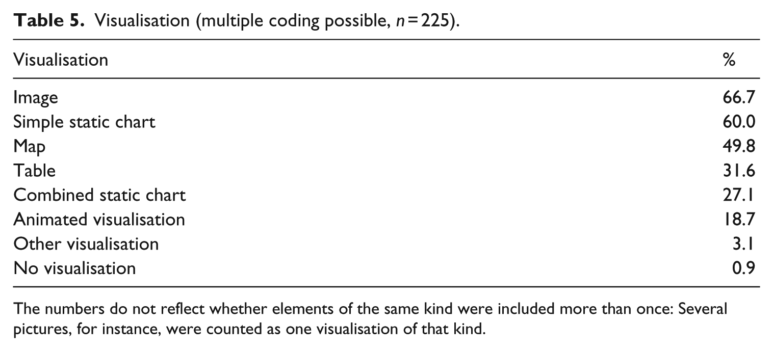
The numbers do not reflect whether elements of the same kind were included more than once: Several pictures, for instance, were counted as one visualisation of that kind.
The share of most types of visualisations is quite stable over time, except for peaks and lows in single years which may indicate short-term ‘fads’ in the field. The proportion of simple images as well as of sophisticated animated visualisations, however, has increased substantially and rather continuously. 8 These two kinds of visualisations are also used significantly more frequently in awarded projects than in those that were only nominated. 9
On average, the pieces contain more than two different kinds of visualisations (M = 2.57, SD = 1.16). This number grew consistently and significantly over the years from 2.09 (SD = 0.92) in 2013 to 3.00 (SD = 1.23) in 2016. 10 Moreover, with just over three different types of visualisations on average, awarded projects’ visual appearance is significantly richer in variety than that of pieces only nominated (M = 3.03, SD = 1.19 vs M = 2.48, SD = 1.14; t = 2.656, df = 223, p < .01). Typical combinations of visualising elements include images with simple static charts (40.0% of all cases) or with maps (32.4%) as well as maps coupled with simple static charts (31.1%).
Interactive features
As reported in the literature review, elements that allow users to interact with the data presented are often discussed as another ‘key characteristic’ of data journalism. However, in our sample, 17 percent of cases offer no data-related interactive functions at all (Table 6). Yet, the average piece contains 1.66 different interactivity features (SD = 1.11), and only two of the award-winning projects include no interactive feature at all. This leads us to speculate that interactivity is, nonetheless, considered a quality criterion.
Interactive functions (multiple coding possible, n = 224).

The interactive features most often integrated into DJA-nominated articles are the same that previous analyses have already found to be most prominent in data journalism: zoom functions for maps and details on demand (e.g. the number of victims for each case of a reported school shooting) as well as filtering functions that allow the user to filter the provided data with respect to different variables (e.g. to only select voting results from one state or from one year). Hence, Young et al.’s (2017) argument that these ‘simplest interactive techniques’ are most prevalent in part because, by default, they come with the free software and platforms data journalists often use might also apply to DJA-nominees (p. 13). Correspondingly, more sophisticated features are much less common in our sample: Personalisation tools that allow the user to enter personal data like their ZIP code or age to tailor the piece with customised data are rare, and only nine projects in the 4 years analysed include a gamified interaction opportunity (e.g. Heart Saver, a game in which the user must send ambulances as fast as possible to fictional characters having a heart attack). Looking at the development over the years, we find that, just like with most of the other variables, the shares of all interactive features each exhibit one erratic peak or low in a single year but otherwise remain rather stable.
In summary, our results are in line with others’ observations of a ‘lack of sophistication’ (Young et al., 2017: 13) in data-related interactivity: While ‘data journalistic projects have initially been created with a high level of interactivity’ (Appelgren, 2017: 2), now they often include only ‘limited possibilities for the audience to make choices’ (p. 14) or ‘minimum formal interactivity’ (Tabary et al., 2016: 67) simply ‘for interactivity’s sake’ (Young et al., 2017: 13).
Conclusion
To advance our understanding of the emerging reporting style of DDJ, in this article, we investigated what the field itself considers the ‘gold-standard’ in DDJ: pieces nominated for the DJA in the years 2013 to 2016 (n = 225). Through a content analysis of data-driven pieces we identified the actors producing ‘high-quality’ DDJ, the topics they cover and, in particular, the means they employ to do so, that is, the data sets and analysis, visualisations and interactive features.
Results show that the analysed ‘gold-standard’ of DDJ is dominated by legacy print media and their online departments. The only other major players are investigative journalism organisations like ProPublica or the ICIJ. First, this might reflect the inherent bias of awards towards established, high-profile actors (Jenkins and Volz, 2016) and the idea that newspapers’ institutional imperatives place a greater value on submitting work for major awards than more upstart outlets. 11 Second, it echoes the finding from previous research that DDJ in general appears to be an undertaking for larger organisations that ‘tend to have both the resources and editorial commitment to invest in cross-disciplinary teams’ (Young et al., 2017: 14) composed of, for instance, writers, programmers and graphic designers, while ‘small local news organisations remain incapable of affording [such] a practice’ (Borges-Rey, 2017: 14). This seems particularly true for award-winning projects that our analysis found were produced by much larger teams than those only nominated.
With regard to the data used, we found a strong dependence on information from official institutions or other non-commercial organisations such as research institutes, NGOs and so on, which is publicly available or can, at least, be requested. The shares of leaked or self-collected data, however, are small. These results are also consistent with prior studies of DDJ in general.
Looking at the number of countries represented by the nominees, which grew with each year, it appears that data journalism is progressively spreading around the world. However, projects from the United States and, to some extent from the United Kingdom, consistently make up the largest proportion of nominees, likely influenced by the fact that data journalism has a longer history in anglophone countries, that the DJA are issued by a global network of editors with English as their lingua franca, and that the awards website is in English. Many non-English stories are published in two or more languages (one of them usually being English), suggesting that data journalism tries to serve an international audience. Cases like the ‘Panama Papers’ demonstrate that some topics do indeed concern a global audience and need to be based on international data. Yet, we found that the majority of stories build on data gathered on a national scale or one even narrower, which might not be of great interest to users from other countries. This leads us to believe that DDJ does have the potential to foster the internationalisation of journalistic coverage and its distribution, but at present cannot fully exploit it. We will probably see more international collaborations between various media organisations, like the one that produced the ‘Panama Papers’, because they proved viable for covering such large stories without stretching newsrooms’ resources.
In terms of topics covered, DJA-nominees are characterised by an invariable focus on political, societal and economic issues. The small share of stories about education, culture and, especially, about sports – although in line with other studies – might be unrepresentative of data journalism in general, but instead result from a bias towards ‘serious’ topics inherent in industry awards.
In general, the set of potential elements like topics, data types, sources, visualisations and interactive features appears to be rather stable: Over the years, we had to add only two new variables to our initial codebook developed in 2013 to make sense of novel components (i.e. audio elements and virtual reality visualisations in 2015 and 2016, respectively). This finding might, of course, be induced in part by the method we used to produce it: quantitative content analyses are designed to reduce the complexity of their objects of investigation and are unable to detect developments that occur ‘below the radar’ of the variables and categories used. Here, further qualitative analyses could draw a more nuanced picture.
Despite the constancy of the set of potential elements, our results highlight the fundamental flexibility of the data journalistic reporting style: Different types of data, analyses, visualisations and interactive functions are combined in various ways, but our analysis also suggests that some compositions have already stabilised into ‘typical combinations’ as they reoccurred frequently over the years. For instance, political stories are based significantly more often on polls and surveys than non-political pieces, while business and economy topics are correlated with financial information, societal issues are covered using sociodemographic and geodata, and health and science reports draw on measured values. Furthermore, projects based on leaked and requested material are more likely to include criticism or a call for public intervention, which points to the investigative and watchdog-potential of information gathering that requires more effort.
A summary of the developmental trends over the year shows a somewhat mixed pattern as the shares and average numbers of the categories under study were mostly stable over the years or, if they changed, did not grow or decrease in a linear fashion. Rather, we found erratic peaks and lows in single years, suggesting the trial-and-error evolution one would expect in a still emerging field like data journalism. As such, we only found few consistent developments across the years: a significantly growing share of business pieces, a consistently and significantly increasing average number of different kinds of visualisations and a (not statistically significantly, but) constantly growing portion of pieces including criticism or even calls for public intervention, that reached nearly two-thirds of nominees in 2016.
The comparison of award-winners and projects merely nominated only reveals a few statistically significant differences: Award-winning projects are more likely to provide at least one interactive feature and integrate a higher number of different visualisations, which more often include images, that is, a very simple form of visualisation, as well as animations which are one of the most sophisticated visualisation types. Moreover, projects by investigative organisations are awarded significantly more often than not. Other categories do show substantial differences which, however, were not statistically significant. Most notably, award-winning stories build on requested, self-collected and leaked data more frequently, and are, on average, produced by larger teams. In sum, these findings suggest that awarded projects are slightly more sophisticated and oriented towards fulfilling journalism’s watchdog role through investigation and scrutinising those in power.
Although DJA-nominees can be considered the ‘gold-standard’ in DDJ, our analysis points to some potential for improvement and innovation: Even at an award-worthy level and in larger newsrooms, time constraints and limits on personnel and financial resources appear to be at least one reason that DDJ relies heavily on ‘readily accessible sources of data’ (Young et al., 2017: 13) – also affecting which topics can be covered – and that data journalists apply easy-to-use and/or freely available software solutions – which results in less sophisticated visualisations and interactive features that do not necessarily support storytelling nor journalism’s explanatory function in the best way possible, but serve simply to create ‘visual appeal’ (Knight, 2015: 55) and an ‘illusion of interactivity’ (Appelgren, 2017: 15). Consequently, even ‘best practice’ data journalism does not always tap the potential of ‘interactivity tools [which] can allow a potentially limitless number of stories to be told’ (Felle, 2016: 92), granting users the possibility to customise stories and see how the issue covered affects them personally. However, the trend towards rather limited interactive options might also reflect journalists’ experiences with low audience interest in sophisticated interactivity (Young et al., 2017: 4). For instance, De Haan et al. (2017) found that users perceive visualisations ‘as confusing and distracting’ if they are not coherently integrated into the news story and serve a function that can be easily understood – an impression that complex interactive visualisations can convey all too easily (p. 12).
Furthermore, the investigative and watchdog function of DDJ could be strengthened by increasing in-house data collection efforts (cf. also Tabary et al., 2016: 81). In addition, we found that even DJA-nominees rarely combine or contrast data from different sources (e.g. from government institutions and NGOs) or look at data from two different societal angles (e.g. analyse political decisions with regard to their societal as well as economic impact). Doing so, however, could help draw more substantial pictures of social phenomena and strengthen DDJs analytical and watchdog capacity.
Overall, our findings challenge the widespread notion that DDJ ‘revolutionises’ journalism in general by replacing traditional ways of discovering and reporting news (Fink and Anderson, 2015; Gray et al., 2012): First, data-driven reporting itself appears to be evolving at a slow pace and not in a consistent, linear way. Second, it appears to be resource and personnel-intensive and, even on the level of award nominees, reliant on the availability of data. As such, it cannot instantly react to breaking news at the moment, although real-time data journalism, like WNYC’s coverage of Hurricane Sandy (Keefe, 2012), will probably become more relevant over the coming years. Due to its dependence on data, DDJ also appears to neglect those social domains in which data are not regularly produced. Lacking those important characteristics of journalism – currentness and thematical universality – data journalism is more likely to complement traditional reporting than to replace it on a broad scale.
However, given the pace of innovation in the field, these observations are not much more than a snapshot: First, the ‘everyday’ data-driven piece is increasingly easy to produce as more tools become available to help journalists get started. 12 More importantly, DDJ’s relevance and proliferation will certainly co-evolve with the increasing datafication of society as a whole. The more the social domains that journalism is supposed to observe and control are themselves datafied – that is, the more their social construction relies on data, and the more actors in these social domains ‘make efforts to hide data that might work against their interest and reputation’ and underpin their claims with data that are ‘inappropriately produced or improperly interpreted’ (Nguyen and Lugo-Ocando, 2016: 4–5) to influence public communication, the more journalism itself needs to be able to ‘make sense of data’ to fulfil its functions.
Footnotes
Funding
The author(s) received no financial support for the research, authorship and/or publication of this article.