
Abstract
This article zooms in on the daily practices of newspaper production journalists. In three semi-structured interviews with sub-editors employed by a Belgian newspaper, I test the practical application of the ‘production values’ I formulated, that is, guidelines that help them ensure accuracy, readability, appeal and credibility of their newspaper. By not only ‘member checking’ previous findings with sub-editors but also including the layout designers’ input on their collaborative process, I re(de)fine my original set of production values. My data suggest that in this particular newsroom the layout designer’s voice can be heard louder than ever. By ‘designing’ the news, sub-editors and layout designers add all-important journalistic value to their publications.
Introduction
Newswriting, ‘the production of true, relevant, readable, understandable, reliable and interesting information’ (Grunwald, 2005: 65), is a team effort practised through ‘institutional patterns of collaboration’ (Perrin, 2013: 12). The fact that news is ‘constructed’ (Molotch and Lester, 1974; Tuchman, 1978) ‘suggests that it is socially constructed, elaborated in the interaction between the newsmaking players with one another’ (Schudson, 1989: 275). Research has shown that the collaborative production procedures of newsmaking are ever prone to change. Convergence between print and digital media production (Boczkowski, 2004; Hay and Couldry, 2011; Undurraga, 2016), the changing role of news agencies (Boyer, 2011, 2013), growing commercial pressures in media organisations (Benson and Hallin, 2007; Klinenberg, 2005) and citizen input in newsmaking via social media (Usher, 2014) have altered journalistic practices in the Internet age. It therefore continues to be useful for journalism researchers and practitioners to map out what happens to journalistic texts between news desk and newspaper. In this study, I focus on the printed newspaper, which – although a ‘traditional’ medium – continues to bring us most news and generates more sales than online news (Rogers, 2017).
Linguistic approaches to the analysis of professional language use identify newswriting research as a gap (Cotter, 2010; NT&T, 2011; Perrin, 2013). Scrutinising the linguistics of newswriting equals ‘challenging and unpicking of journalists’ “common sense” explanations of their craft’ (Harcup, 2011: 33). This also benefits practitioners as they increase insight into their craft and are encouraged to ‘think critically’ about their process (Zelizer, 2009: 38).
Journalism studies tend to concentrate on reporters as the drivers behind the news production process, whereas journalists operating behind the scenes are often overlooked in research, by the reader, and even in the newsroom (Vandendaele and Jacobs, 2014). This article focuses on the unseen ‘production journalists’ (National Council for the Training of Journalists, n.d.; Ursell, 2004: 45), that is, sub-editors and layout designers, whose distinct yet inextricably connected newsroom practices are the engine room of the newspaper. 1
Sub-editors hold a position of substantial power, as they are the ‘final frontier’ before news reaches the reader. They edit articles, write headlines and captions, and enforce their newspaper’s style. They are, in effect, the reader, seeing copy through their eyes. Layout designers, on the other hand, are responsible for designing the format of their newspaper and assembling text, photographs and other content in an aesthetically pleasing and easy-to-read manner. Together they represent the heart of production at a newspaper.
The production journalists’ practices are particularly interesting to look into today, in a changing news media landscape which sees newsrooms dismantling copy desks, centralising sub-editing and design functions in a single (overseas) ‘sub hub’ and eliminating traditional sub-editing for online news (Channick, 2011; Keith, 2009, 2015; Lypny, 2013; Myers, 2012).
In her 2015 study of the ‘largely unsung’ material artefacts of 20th-century newspaper journalism – the U-shaped copy desk, stylebooks, pica sticks, proportion wheels and paper dummies – Keith illustrates the power shifts between three crucial players in US newsrooms. Whereas from the 1920s to the 1970s the copy desk (the sub-editor) was in charge, this faded over the decades. Power shifted to the writer (reporter) from the 1970s to the 1980s and to the (layout) designer from the late 1980s to the 21st century. Keith concludes that the era of the designer recently ended and suggests that the second decade of the 21st century might be the era of news crafters connected with newspapers’ online or mobile entities.
I investigate the situation in the newsroom of a Belgian newspaper in the second decade of the 21st century. I zoom in on the ‘production values’ at work in the final stage of the news production process (Vandendaele, 2017b), that is, guidelines sub-editors use when altering an article: (1) Keep it short and simple (KISS), (2) Get it right ((a) language accuracy and (b) facts and sources), (3) Be the reader’s guide ((a) Clarity and (b) Flow), (4) Know your newspaper (Style), (5) Know your audience (Reader appeal) and (6) Make it look good (Design). In three interviews with pairs of sub-editors and layout designers, I test the workability of the proposed production values. With the practitioners’ input, I aim to re(de)fine the original set.
By observing and questioning the sub-editors’ and layout designers’ community of practice (Lave and Wenger, 1991), I want to uncover the tacit knowledge (Nonaka, 1991) they share. Guided by the idea that critical inquiry and research can lead to ‘better journalism’ (McChesney and Scott, 2004), this study hopes to contribute to both journalism research and practice. As a freelance sub-editor myself, my underlying motivation is to not only improve editorial practices but also enhance my own production.
This article is structured as follows. First, I situate it in my previous research and explain the current focus. Second, I describe my methodology. Next, I go over the interviews about the original production values in practice. I then discuss the main findings and revisit the production values. I conclude this article with this study’s implications and suggestions for future research.
Previous research and current focus
Initially, we looked at the sub-editors within their natural habitat, the newsroom and how its layout influences the process of sub-editing (Vandendaele and Jacobs, 2014). Being a sub-editor, I was not only confronted with the benefits of a practitioner background but also faced difficulties when conducting research within the newsroom (Vandendaele, 2017a). We then focused on what happens in the sub-editing stage by analysing a corpus of articles – collected at a Belgian newspaper in fall 2013 – before and after sub-editing (Vandendaele et al., 2015). The articles were divided into six different types (front-page, headline, long, medium, short news articles and newswire articles), depending on genre, design, source and length. After comparing both versions, we identified four ‘Interventions’ in the sub-editing stage: Deletions, Additions, Replacements and Translocations. We discovered that not only more is added than deleted during the sub-editing phase, but what is added (headlines, captions, streamers) is read the most. We concluded that the sub-editor plays an important part in actually ‘selling’ the paper, which warrants their closer scrutiny in today’s media landscape.
In a follow-up study (Vandendaele, 2017b), I wanted to identify the rationale behind sub-editors’ interventions. I took the lead from Östgaard’s (1965) ‘factors influencing the flow of news’ and from the much-explored concept of ‘news values’ (Bednarek and Caple, 2017; Galtung and Ruge, 1965; Niblock and Machin, 2007; Palmer, 1998; Westerståhl and Johansson, 1994). Since research on news values is mainly text-focused, I link the specific practice of sub-editing and the study of news values to the work of scholars who studied news values in a production context (Bell, 1991; Cotter, 2010). Looking at the sub-editors at work in newsrooms in the United Kingdom, Belgium and the Netherlands, as well as the articles in various stages of production, and informed by (retrospective) interviews, I compiled a list of six production values (Table 1).
Production values in sub-editing.
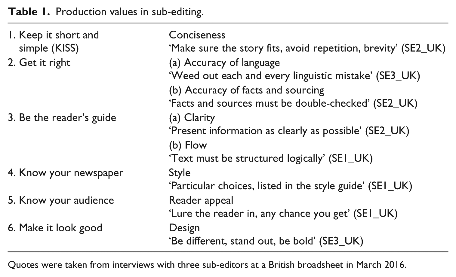
Quotes were taken from interviews with three sub-editors at a British broadsheet in March 2016.
These production values are aimed at improving reader experience, by getting the language correct, trimming superfluous text, making sure a story is factually correct and unambiguous, or an attractive read. I concluded ‘Reader appeal’ could be interpreted as the sub-editors’ overarching production value. Hence, sub-editors can be considered as their newspaper’s best brand ambassadors.
In this study, I confront both sub-editors and layout designers, that is, the main players in the sub-editing stage, with those production values. Relying on their perspective on the existing coding system, I aim to fine-tune my production values and re(de)fine where necessary. My research questions are as follows:
How do newspaper sub-editors and layout designers respond to the production values I deduced?
Do these production values hold their own within their community of practice?
What does this reveal about this stage in the news production process?
Methodology
Studying newswriting often implies analysing written products only. In fact, ‘investigating text production processes in media workplaces remains a gap in […] writing research, journalism studies, and applied linguistics’ (Perrin, 2013: xi). In my study of sub-editing, I have therefore consistently combined ethnographic methods (participant observation, interviews) with comparative linguistic analysis of journalistic texts.
First, I collected 36 articles during a week of fieldwork at a Belgian newspaper in February 2015. This newspaper is owned by a Belgian publishing company with media assets in Belgium, the Netherlands and Denmark. The paper (headquarters near Brussels) is known for being independent and progressive. According to its publisher’s website, it is aimed at ‘a young and highly educated audience looking for quality reporting, background information and interpretation of the news’. The production journalists at this newspaper are bound by a collective professional identity, which generally concurs with the mission of the publishers: Fieldwork indicated that they have a clear idea of their readership, which is ‘generally left of centre and liberal’.
I coded all Interventions carried out in the sub-editing stage (Vandendaele et al., 2015) in Excel. Contrary to previous work (Vandendaele, 2017b), I did not code the production values the sub-editor(s) identified. Instead, I did so myself, informed by earlier research and my own experience as a sub-editor. When I felt two production values guided the Intervention, I coded both and labelled one ‘dominant’ and the other ‘recessive’. 2
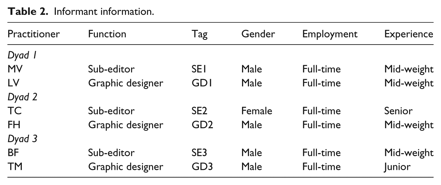
I then organised three semi-structured interviews with pairs of sub-editors and layout designers employed by the same newspaper. These set-ups, in which a single researcher interviews two participants of equal status, are known as dyads (Anderson, 1994; Lindgreen, 2001). My experience as a sub-editor in that newsroom provided me with ample insight into the substantial role designers and sub-editors play. This was confirmed during my fieldwork, when I observed the (physical) interventions of both practitioners in each article and their close collaboration. (For example, the design of each individual page is up to the layout designer and sub-editor in charge of that page, closely monitored by the art director and production editor.)
To find informants, I emailed several production journalists and introduced the study. I knew them through fieldwork and as my colleagues since they worked at the same newspaper. Three sub-editors and three layout designers were willing to participate. One of the sub-editors was female; all five other practitioners were male, which reflected the gender balance among production journalists in that newsroom in 2015. Their experience (in this particular position, but not necessarily at this newspaper) ranged from ‘junior’ (0–3 years) to ‘mid-weight’ (3–5 years) and ‘senior’ (5+ years) (Table 2).
Informant information.
I actually engaged in ‘member checking’, a technique for exploring the credibility of results, also known as ‘participant validation’. I confront participants, who were previously involved in this study, with data or results to check for accuracy and resonance with their experiences (Birt et al., 2016). The interviews took place at the university in November–December 2016. The participants were guaranteed anonymity. 3
All informants, myself included, sat at a desk, facing a computer screen. Each practitioner was given a handout containing a schematic overview of the coding system (Vandendaele et al., 2015) and a brief explanation of the production values (Vandendaele, 2017b).
When the production journalists noticed the numbering of the production values, they inferred the existence of a hierarchy, which they opposed to. I explained the order – if any – was up for discussion. The interviewees then indicated a hierarchy does exist, but not necessarily the suggested one.
Next, the practitioners were handed printouts of the six articles, one version pre- and one version post-sub-editing. The informants were then shown an abbreviated version of the spreadsheet on screen, containing one coded article per article type. The practitioners were never confronted with their own work, as this might tempt them to reconstruct events or trigger a defensive stance.
All documents were clarified at the start, and questions were answered as they arose. In order to avoid loss of focus, I had defined a number of questions beforehand. During the sessions, each practitioner was asked to comment on the coding of 20 separate cases, selected in advance because I found the production values problematic.
The interviews lasted 2 hours on average. Because the informants were familiar with one another, the ambiance was conversational. They were audio-recorded in order to ensure reliability and transcribed at a later stage to allow analysis. 4
Reflecting on these set-ups, I conclude that instead of dyads, they were actually triads, that is, three-person social groups. I found myself participating as a sub-editor and speaking from my own experience. From a research perspective, this proved beneficial: each interviewee disclosed how they enjoyed discussing their craft and did not feel like ‘an object of study’.
Production values to the test
In this section, I will go over a selection of cases to illustrate where, after ‘member checking’ with the practitioners, I had to alter the original production values. The cases I discuss pertain to the production values: KISS, Be the reader’s guide (Clarity and Flow), Know your newspaper (Style), Know your audience (Reader appeal), and Make it look good (Design). 5
KISS
In the body text of a front-page article, or ‘splash’, both an article and a sub-clause had been deleted (Table 3). 6 I had identified the underlying production value ‘KISS’, meaning the items had been deleted for lack of space. However, SE3 disagreed. He explained that a definite article in front of a political party’s name was considered ‘coarse’ and felt as if ‘written in a dialect’.
Deletion of article and sub-clause.
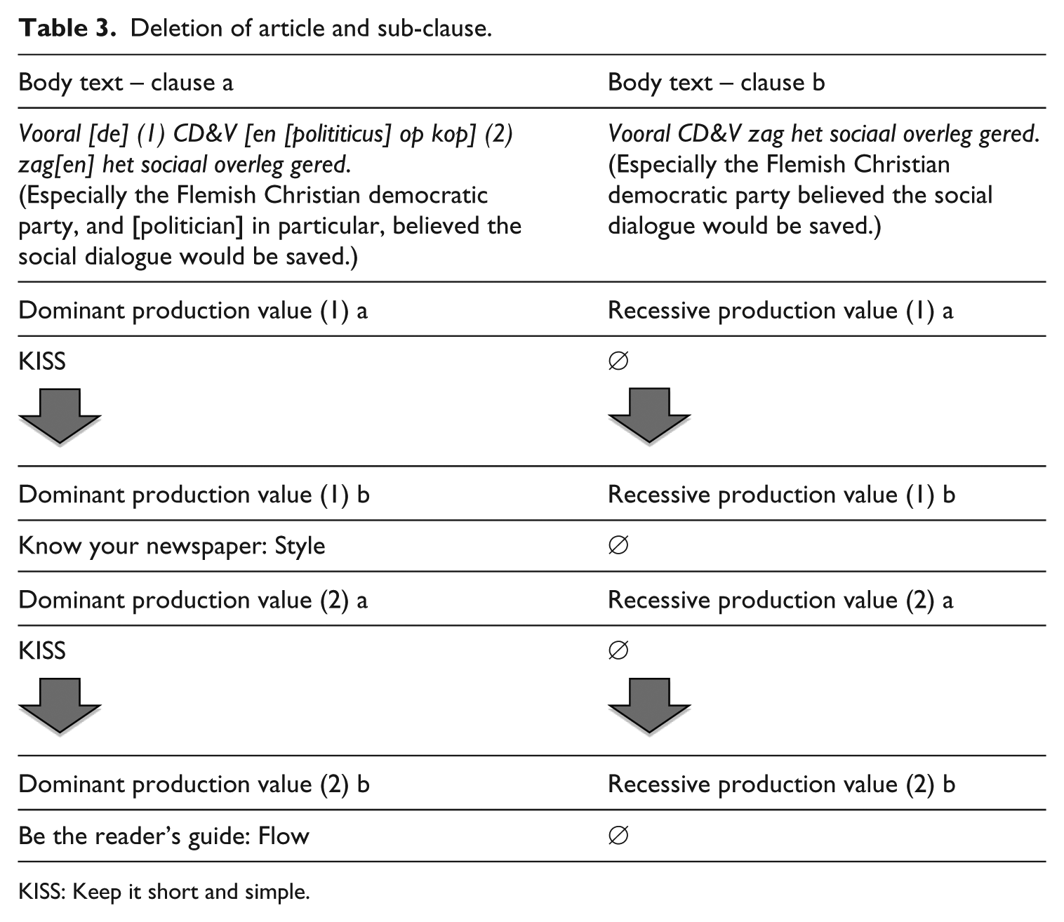
KISS: Keep it short and simple.
Although actually generally accepted, at this newspaper they would avoid this. SE3 therefore considered this an internal agreement and coded it ‘Know your newspaper: Style’.
When confronted with the same sentence, SE2 said the sub-clause was removed because it ‘just didn’t add anything’, rather than it being too long: ‘It’s unnecessary to bother the reader with this information up front’. She proceeded to label the deletion ‘Be the reader’s guide: Flow’, as including it would hamper reading.
The sub-editors did agree that ‘trimming the fat’ (Vandendaele et al., 2015), or cutting text, is an important part of their job. LD2 and SE2 commented as follows:
If it were up to the reporters, they would fill a page to the brim with text; they want to say as much as possible. (LD2) They want to show off their journalistic skills, the extent of their knowledge. (SE2)
But the majority of cases I coded ‘KISS’ was labelled differently by the respondents: ‘for reasons of textual flow’, ‘addition of a graph or illustration’ and so on. When discussing length, the practitioners were adamant: ‘KISS: Keep it short and simple’ is never a production value as such:
To be frank, I don’t think ‘KISS’ is actually ever the real reason for intervening; there’s always something behind it: better flow, clarity, too much information, repetition, and […] often […] layout forces me to ask the subs to cut back. (LD3)
Be the reader’s guide
Clarity
In the same front-page article, the sub-editor had altered the reporter’s headline and added a subheader (Table 4). I had labelled the dominant production value behind that addition ‘Know your newspaper: Style’, meaning the subheader was included based on an internal agreement: a front-page article in this newspaper must have a subheader. I coded the recessive production value ‘Be the reader’s guide: Clarity’, as the subheader provides additional information.
Addition of subheader.
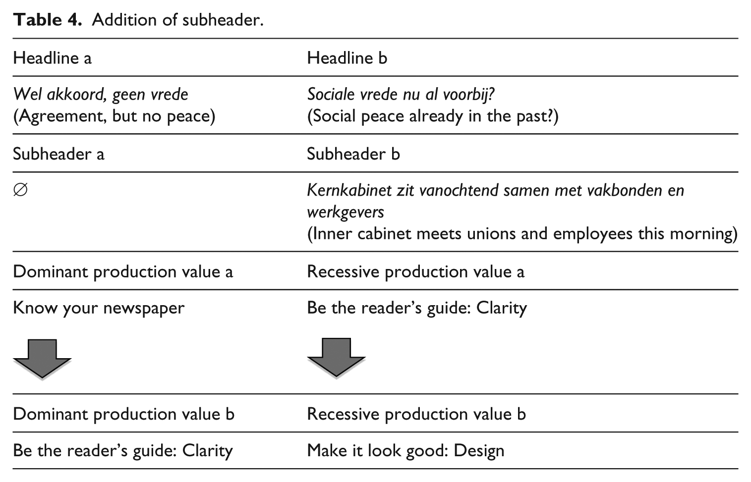
LD1, however, commented that a splash is not required to have a subheader. According to him, the headline alteration and addition of a subheader were motivated by pagination, that is, the design of the page on the screen: the first headline simply would not fit. This loss of information needed to be made up for in a subheader.
SE1 explained that a subheader should always provide more information and answer ‘why should I read it now?’ LD1 and SE1 agreed that in this case the production values were ‘Clarity’ and ‘Design’. The weight of ‘Design’ was illustrated numerous times, pointing towards the significance of this production value. Moreover, this intervention illustrates the close interaction between the practitioners.
When SE2 and LD2 were confronted with a completely re-written lead, ‘Clarity’ was again cited as the main drive:
This original intro scares people away […] You should say this in a much more ‘human’ way. (SE2) It’s too highbrow – it starts off way too scientifically. (LD2) You cannot make it too clear though, because then you’re treating your readers like a bunch of toddlers. (SE2)
From numerous exchanges in the sessions, it became clear that for the production journalists ‘Clarity’ was synonymous with the reader.
Flow
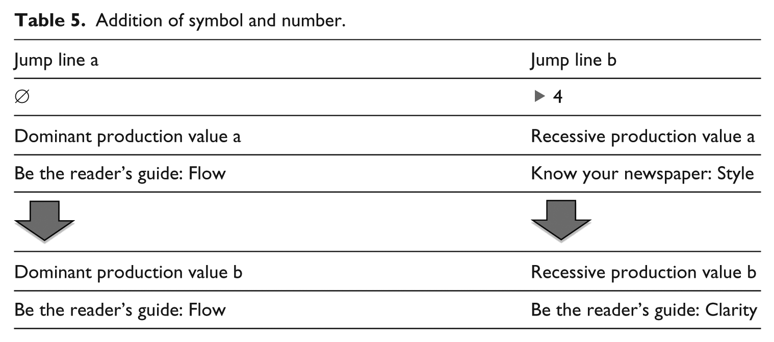
I asked the respondents about the addition of a jump line, that is, a line at the bottom of a column that directs the reader to a later page (Table 5). Since this refers to the article’s structure, I originally coded this ‘Be the reader’s guide: Flow’. As this happened every time a topic was continued on a later page, the recessive production value was labelled ‘Know your newspaper: Style’. The practitioners agreed on the dominant production value. Interestingly, they all referred to the reader explicitly in this context. SE2 and LD2 termed this ‘a service to the reader’, that is, a way of helping their ‘customer’ find out more.
Addition of symbol and number.
‘Flow’ turned out to be one of the more important production values, to sub-editors and, especially, layout designers:
When you use the term ‘flow’, I immediately think of design. (LD1) The newspaper has to flow nicely. (LD2)
Far from it being a mere textual phenomenon pertaining to well-ordered sentences and logically structured stories, the flow of the newspaper proved to be one of the layout designers’ main priorities. Based on their input, this production value clearly needs re-assessing.
Know your newspaper: Style
Although this newspaper does not have a published style guide, they do have ‘internal agreements’, listed in a regularly updated online document. The sub-editors stress that avoiding jargon and ‘journalese’, and a preference for short sentences, as well as clear and simple writing, is instilled in them from the get-go, but not captured in an ‘official rule book’ (SE1). The tone of the newspaper is summarised as ‘professional, impartial, and to the point’. However, they should always strive for variation in order to ‘keep it exciting’ (SE3).
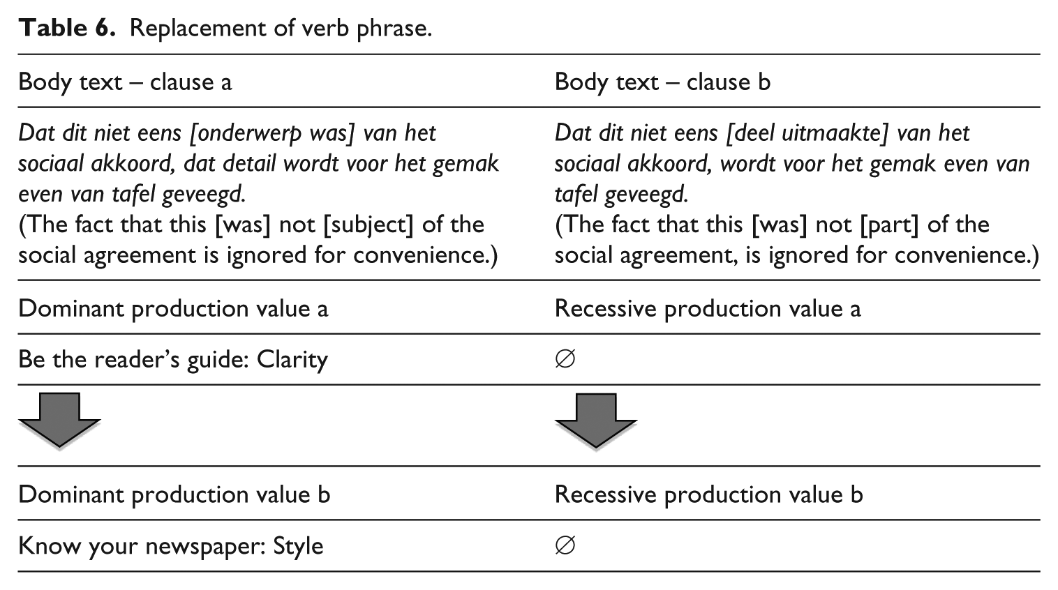
In a front-page article’s body text, the verb phrase ‘onderwerp was’ (‘was the subject of’), was replaced by ‘deel uitmaakte’ (‘was part of’) (Table 6). I experienced this as problematic, as both expressions are linguistically correct. At 13 and 14 characters in length, respectively, this could not have been a space issue either. I labelled it ‘Be the reader’s guide: Clarity’ since a reader might interpret the second expression more easily.
Replacement of verb phrase.
When asked about this, SE1 and LD1 commented as follows:
I think that ‘onderwerp’ sounds a bit wooden. […] this is a matter of style. However, it doesn’t really bother me. I actually think I would have left it like that, but I do kind of get it. (SE1) I think option two reads much more easily. (LD1)
With some difficulty, they decided on ‘Know your newspaper: Style’, but stressed this was a highly individual language-based change.
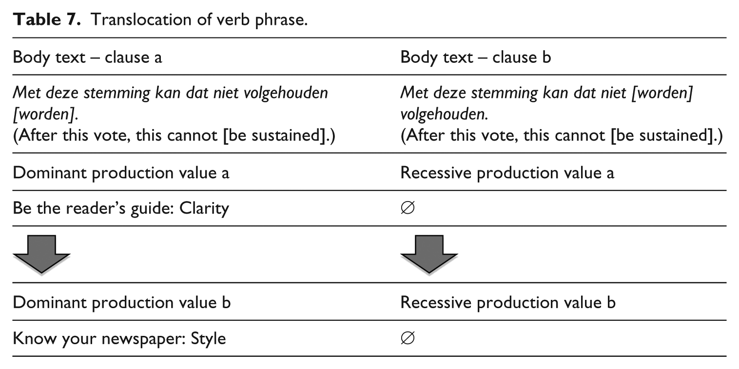
The issue of ‘personal preference’ was flagged up again discussing the case of a Translocation (i.e. move) of a verb in a verb phrase (Table 7): ‘volgehouden worden’ (‘be sustained’) became ‘worden volgehouden’. Grammatically, neither of the options is wrong, nor does the switch influence meaning.
Translocation of verb phrase.
The sub-editors conceded this was most likely due to personal taste, especially when they noticed the same change a few times in the same article:
It’s probably just personal style. I used to have a colleague who preferred to put past participles at the end of sentence because he thought it made for a smoother read. (SE1)
The discussion about ‘Style’ as either a general or personal set of choices kept popping up, indicating that this distinction should be reflected when revising the existing production values.
When a bolder type replaced the font of the article’s lead in the sub-editing phase, I coded it ‘Know your newspaper’, as this suggests an internal agreement. I labelled the recessive production value ‘Be the reader’s guide: Flow’, as the reader can use the font as a visual clue indicating the lead.
When asked who was responsible for this essentially layout-driven alteration, both layout designers and sub-editors said they did it. They decided on ‘Know your newspaper’ as the main production value. However, they did not agree with the suggested ‘Be the reader’s guide: Flow’ as the recessive one:
‘Know your newspaper’ and ‘Clarity’ often go hand in hand, as they do here […] You simply must have a lead, but the sub-editor determines its contents, with the reader in mind. (LD1)
I took this opportunity to ask the informants about the font in newswire articles, which is consistently altered: the font used is lighter, leaving more space between characters. In unison, the practitioners identified the main production value as ‘Flow’, but ‘on a graphic level’:
When you have a column of short newswire-type articles on one side, this font helps ‘break up’ that solid block of text. That’s also why we align the text on the left-hand side, leaving the right-hand side ragged. (LD1)
The other production value they identified was ‘Know your newspaper’:
This is an internal agreement […]. Every newspaper has their own specific design rules. (LD1)
It seemed that ‘Know your newspaper: Style’ can actually be split into two production values. On the one hand, there is ‘Style’ related to (individual) language choices; on the other, there is the specific newspaper’s ‘Style’, which covers mainly linguistic choices but might also have an effect on decisions regarding layout.
Know your audience: Reader appeal
The few times ‘Know your audience: Reader appeal’ was identified as the dominant production value, the practitioners tended to label another production value behind it. They experienced this production value as problematic: every intervention is actually for the benefit of the reader. I previously (Vandendaele, 2017b) suggested ‘the reader’ could be labelled the overarching production value: he or she is the driving force behind every other guideline informing changes during sub-editing.
During my time spent in the field, it became clear that the reader is top of mind, although not often mentioned explicitly. The production journalists agreed: discussing the reader is kept to a minimum, yet terms such as ‘ease of reading’, ‘readability’ and ‘legibility’ were repeated time and time again:
Keeping the reader in mind happens automatically. (SE1) Thinking of our readers is instinctive behaviour. (LE1)
During the interviews, the reader was mentioned most in relation to ‘Be the reader’s guide: Clarity’, as they ‘think you should never assume the reader knows a lot’. A prime example of this, according to LD1, is his production chief:
He will send an article back to the copy desk because, as he says: ‘I don’t get that’. But of course he gets it!
Doing this – becoming the reader – he suggests that the reader might not, thus reminding his production team of their ‘customers’.
Make it look good: Design
Bringing in the layout designers to reflect on the sub-editing stage proved to be especially helpful when it came to production value ‘Make it look good: Design’. When faced with problematic cases, layout and design turned out to have considerable power.
One example is headline length. Every article type is linked to a specific headline type (i.e. font and font size). These are all part of the newspaper’s design, thought out by the art director. Together with the editor-in-chief, he or she decides on the newspaper’s look. A perfectly good headline might have to be altered, simply because it is too long or not long enough:
Design often trumps internal agreements. (LD2)
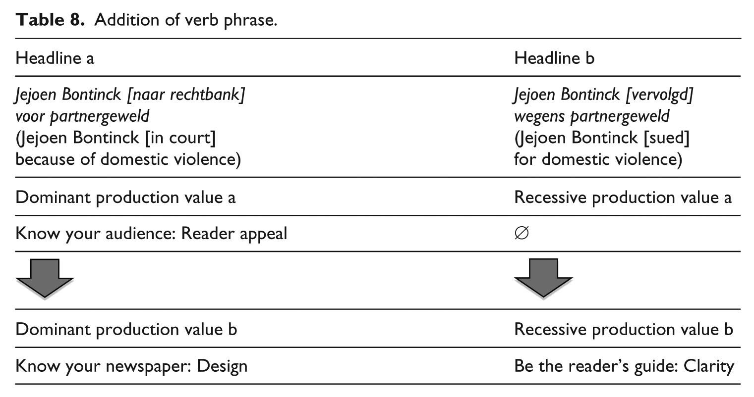
This was illustrated by a newswire article headline. These short articles, provided by a news agency, arrive with a headline in place. Sub-editors avoid passives in a headline, as they ‘slow down the story from the very start’ (SE1). However, among layout designers, it is agreed that these types of article are presented in a narrow column on the side of the page, each with a headline spread out over three lines. In this example, the headline had been altered to include a passive verb to make the lines fill out and to avoid having to split words over several lines (Table 8).
Addition of verb phrase.
While discussing this, other layout examples were given that may force the sub-editor to ‘break internal laws’ (LD3), cut back, rephrase or even alter content: ‘orphans’, that is, the first line of a paragraph appearing on the last line of a column of text should be avoided, as should ‘widows’, that is, the last line of a paragraph appearing on the top of the next column.
Discussion
Personal preferences
In a number of cases, the production journalists were not able to thoroughly explain why an alteration had been made, as the original version was (linguistically and/or stylistically) correct. As soon as the layout designers had been able to rule out graphic issues or space limitations, I probed the sub-editors about possible internal stylistic agreements. Occasionally, they could not offer any other explanation than ‘personal preferences’. According to the informants, an individual’s aesthetics can be counted as a production value, that is, an underlying motivation for change:
No doubt a certain amount subjectivity comes into play […] I for one don’t like headlines phrased as a question: That’s just click bait, pure and simple. As a sub you then don’t make any effort to draw the reader in, but you force him to read on. I don’t think that’s interesting – I prefer to tease someone into reading on. (SE1)
SE1 confessed that when it comes to headlines in particular, personal preferences will come into play:
Earlier this week my production editor forced me to change my headline […] whereas I preferred my own. In that case you just resign yourself to your production editor’s opinion. […] you sometimes just have to put your own convictions aside, and give in.
Independent of one another, the sub-editors described what one of them termed the ‘obsessive-compulsive corrector’. A sub-editor should never be overly censorious, as you are then ‘forcing your own style upon a text’ (SE1). This is regarded a mistake: individual writer’s voices should be heard throughout his or her newspaper.
Form and content inextricably linked
On the craft of writing news stories, McKane (2013) said, ‘Presentation matters enormously’ (p. 142). All three interviews confirmed that graphic design plays a huge part in the newspaper production process. Each informant stressed the powerful link between layout designers and sub-editors in their newsroom:
Language and design are very much in sync at our paper – it’s almost impossible to look at them separately. (SE1) Exactly. Language and whether a text fits are on a par with graphic design. (LD1)
I witnessed this in the close collaboration between the layout designers and the sub-editors in the newsroom. Even their seating arrangements – next to the designer or sub-editor who they would be working on a page with – proved this.
Although newspaper layout remains in the hands of the layout designers, the sub-editors are equally encouraged to ‘increase’ their newspaper’s ‘liveliness’ (SE3). They report being told to always look for new ways of presenting a story:
Why one long story, when you can cut it into five? Think of text boxes, combining text with a picture, highlighting numbers, graphics, illustrations etc. Why choose a picture if an illustration is better? [This should] result in an exciting newspaper that’s hard to put down. (SE2)
The layout designers focus not only on designing a single page but also on designing the entire newspaper: it all boils down to the flow. My time spent in this Belgian newsroom taught me how, from very early on in the news day, the chief of layout design was involved. As soon as ideas about news content were pitched during the morning story meetings, he (or his deputy) and his team went to work to visually support each story. This means that layout designers in this newsroom take reading each story that will feature on their pages for granted:
I take pride in actually reading every article on my pages. (LD2) It’s what any self-respecting layout designer should do, although I know it is not the case at every publication. Of course, when it comes to deleting an obsolete comma, this is not part of the layout designers’ tasks. We never go that deep into a text. (LD3)
The layout designers’ input does not stop at the choice of font or type colour, but they regularly have a say in the ‘Holy Quaternity’ – headline, lead, quote and photo caption – which together sell the story. 7 They even claimed they had a better overview of the entire paper, which the sub-editors, who tend to focus on one page at a time, confirmed. This was corroborated in the newsroom where I witnessed layout designers pointing out inconsistencies, repetitions or blatant mistakes to the sub-editors. The layout designers’ focus on visual (news) storytelling was further reflected in the need to compare and contrast each page, leading to a clearer understanding of the entire paper. A constantly updated series of large whiteboards displaying a mock-up of every page assisted them.
The reader as overarching production value
The interviews confirmed (Vandendaele, 2017b) that the reader is the overarching production value, ever present yet unseen in this final stage of the news production process. On the subject of the reader, a number of things are worth mentioning. First, sub-editors and layout designers value personal fulfilment in their job:
Although I’m very much aware of the reader, in the end I’m kind of in this for myself: I write a wonderful headline for my own satisfaction – I don’t think: ‘the reader will enjoy this’, but rather: ‘have I been able to do something great with what I was given?’ (SE1)
Second, several practitioners commented how they refused to ‘give the reader a break’ (SE2); he or she needs to be challenged and persuaded into reading.
Finally, the practitioners admitted that thinking about the reader becomes instinctive as you gain experience. Junior colleagues will be drilled into ‘making things clear’, but ‘after a year or two you do this automatically’ (SE3). They do stress it is important to constantly keep the readership in mind, especially, when it comes to design:
There are definitely layout designers who will simply never have that skill, […] who will get so lost in their own designs, that they produce things that are just too weird and complicated. (LD1) You really have to be able to one thing as a production journalist: look at your work from a distance. (SE1)
Production values revisited
Based on the insights mentioned above, re-assessing the initial proposed set of production values seemed necessary. Both sub-editors and layout designers initially struggled with the concept of a set of permanently fixed production values and admitted they often struggled to identify just one or two production values. The practitioners suggested compiling two sets of production values: one set of ‘design values’ and another for sub-editors. This idea was discarded quickly, as all agreed the sub-editing phase is an intense collaboration between both types of practitioners. I therefore chose to uphold a single set of production values. Below, I propose some alterations.
Revaluation of production values
KISS was never identified as a production value as such: in this newsroom, reporters are given a certain amount of characters to write in story meetings, depending on the story’s news value, urgency and placement on the page. The sub-editors should have ‘enough copy to give it a really good show’ (McKane, 2013: 141), but not too much. The sub-editor’s job is ‘necessarily quantitative, reducing the amount of information available to a sum that fits the size of the paper’ (Schudson, 1989: 265).
Clearly, sub-editors will have to cut back when this is not respected or breaking news demands a complete reshuffle of the page. The underlying reasons they gave were clarity, design (space restriction), style and language.
2. ‘Be the reader’s guide: Flow’ is appropriated by both layout designers and sub-editors, but differently. Layout designers will focus on the flow of the page and newspaper, whereas sub-editors are interested in textual flow. According to the interviewees, ‘Flow’ and ‘Design’ are intertwined and hard to separate. I therefore suggest using the production value ‘Structure’ (within the sentence, the article) when discussing alterations for reasons of textual flow and to uphold ‘Flow’. This production value should encompass design.
3. ‘Make it look good: Design’ and the newly introduced ‘Flow’ need to remain separate production values:
When I started at this newspaper, ‘Make it look good’ was not related to ‘Design’ at all. Our art director had designed the look of the newspaper, and the team of layout designers had to make sure the newspaper’s flow was right. […] Nowadays this is different. Layout designers are asked to make illustrations themselves, but to me this is quite different to ‘flow’. We have to make things look good with nice graphics, but we also have to make sure the pages ‘flow’, that there is enough variety between the types of articles. (LD1)
Consequently, I relate ‘Make it look good’ to newspaper design, allowing for a certain level of creativity and personal input from the layout designers. ‘Flow’, then, is linked to the ‘rhythm’ (LD3) of the page and the complete newspaper.
4. The sub-editors’ and layout designers’ input lead me to redefine ‘Know your newspaper’. As of now, it includes, on the one hand, internal agreements specific to a newspaper. On the other, it includes style: linguistic choices, allowing personal preferences. This could prove problematic as it suggests some relativity. However, when a certain intervention takes place throughout the article – although the term originally used by the reporter was correct – this points to consistency and reveals the sub-editor’s voice.
Ordering production values
When asked about a possible hierarchy among the production values, there seemed to be agreement among the interviewees about the more important production values:
Language comes first. Always. Then you ask yourself: does it fit the assigned space? (SE1)
SE2 added, ‘Obviously, all facts must be correct’. In sum, the bare minimum from the sub-editors’ point of view is a thorough spellcheck, making sure facts are accurate and superfluous text is cut back.
Perhaps unsurprisingly, the layout designers put ‘Flow’ and ‘Design’ first:
We make a visual newspaper […] I’m a designer first. (LD3)
All three interviews confirmed that ‘design wins’ (LD1). Although language accuracy is crucial, both sub-editors and layout designers agree:
I feel most satisfied about the job I’ve done when a page makes sense. (LD1)
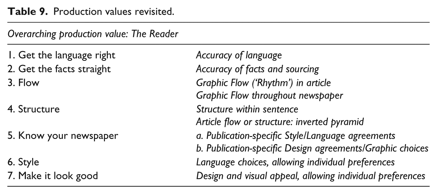
Based on these insights, I have re(de)fined the original six production values into a set of seven and describe them in (Table 9).
Production values revisited.
Conclusion and future research
This article focused on the production values at work in the sub-editing stage (Vandendaele, 2017b) and ‘member checked’ their validity with sub-editors as well as layout designers. Based on their community of practice, I wanted to find out in which ways these should be modified and gain a better understanding of this stage of the news production process.
My data show the significant impact that ‘design and the layout designers’ have on their newspaper. By including layout designers, I illustrated the collaborative character of the news production process and their close association with the sub-editors during the sub-editing stage. Keith’s (2015) claim that the designer era is a thing of the past is contradicted in this study: whereas in many newsrooms text is the sub-editors’ domain, I conclude that at this newspaper the layout designers are extremely involved. Design will influence story placement, choice of visuals and at times drive content. The interviews confirmed how each layout designer possessed a strong awareness of content and flow of the entire newspaper, sometimes even more so than the sub-editors. The high regard in which design is held in this newsroom as a tool to not only illustrate the news but also to enhance it and visually appeal to the reader, as well as to stand out from the competition, was rewarded in 2015: the newspaper was chosen as the World’s Best Designed Newspaper by The Society of News Design. This suggests that the importance of news design might prove to be a clever move in an age when many newspapers are in dire straits. LD3 summarised it best:
We (layout designers) will make you read.
Both groups of practitioners proudly label themselves the ‘producers’ (SE1) of the newspaper – sub-editors by employing their linguistic and narrative tools and layout designers by using design skills to build a visual news narrative.
Guided by the practitioners’ views, I have proposed a redefined set of seven production values. I categorised ‘the reader’ as the overarching production value, the driving force behind every intervention. This altered set allows for some subjectivity, concerning certain stylistic preferences of the sub-editors and of the layout designers. The production values now reflect the presence of the powerful designer voice in the sub-editing phase of newswriting at this particular newspaper.
It is important to point that the important role of the layout designer is typical for this newspaper. Other European newsrooms need to be investigated in order to make wider claims. Moreover, newspapers working with a fixed style guide might diminish the influence of ‘personal preferences’ as a production value.
I believe that both the fields of linguistics and that of professional newswriting gain value by capturing seasoned practitioners’ unspoken understanding and tacit knowledge of their craft and translating it into applicable theories about the language of journalism. In time, this could help devise a model for teaching production journalism as a critical practice.
This article opens doors to future research. First, it would be valuable to explore whether there are links between certain production values and particular interventions by the sub-editors: Are some production values translated more often in specific (textual) transformations? Second, more research is required into ‘what makes a page work’: Do the sub-editors’ and layout designers’ ‘gut feeling’ about a successful page resonate with the reader? Herein lies an interesting opportunity for multimodal analysis: considering underlying production factors, how does the production journalists’ telling of the same news story using different ‘modes’ (varieties of, for example, page layout, headlines, streamers, pictures, colours and font) affect the readership? Third, the online version of newspapers reaches a much larger audience much faster. Recent developments in (the organisation of) online sub-editing offer an interesting opportunity to compare sub-editing of the online version of an article with the printed version.
In conclusion, in an age in which many newspapers struggle to survive and production journalists are often first to go, sub-editors and layout designers remain valuable players in the newsroom: by ‘designing’ the news, they add all-important journalistic value to their publications and continue to ‘make you read’.
Footnotes
Funding
The author(s) received no financial support for the research, authorship and/or publication of this article.