
Abstract
In recent years, various elaborate visual methods have been introduced for carrying out empirically controlled sociological studies. However, in contrast to other sociological sub-fields, research on protest events or social movements rarely employs visual analytic procedures. In this article, a research sample of visual protest material is taken to show how applied visual methods can increase the outcome of protest or social movement research. This study highlights how visual analysis provides extra information for supporting or rejecting interpretations, thus demonstrating that visual methods are an important tool in the triangulation of empirical methods.
Keywords
The rising awareness of the significance of images, which extends linguistic and textual approaches to the world, was summarized in the early 1990s by the notion of a ‘pictorial turn’, a phrase adopted by William J.T. Mitchell (1994). Since then, cultural and theoretical reconfigurations have included images and become more and more influenced by them.
In sociology, various fields have adopted the term ‘visual turn’ (Burri, 2009). Sub-fields, such as the sociology of media and communication, the sociology of knowledge or the sociology of science and technology, seem to be particularly attracted to visual cultures and interpretations. In the sociology of media and communication, images are analysed in terms of how they influence the understanding, presentation or construction of reality. In the sociology of knowledge, a growing interest in images is based on the relevance of images in social processes for constituting, proliferating or possessing knowledge. A different approach to images is chosen by social scientists who relate to science or technology. They focus on social practices and how images are constituted, interpreted and employed in scientific and social contexts.
In contrast, social scientists studying protest events or social movements rarely recognize visual methods. However, images related to different protests and social movements have always been documented and represented in illustrative articles and books (e.g. MacKay, 2002; Mandal, 2005; Schwartz, 2002). There are also publications that focus on protest images or logos and their symbolic meaning: for example, those involved in the Peace Movement (Mann, 2004; Ziemann, 2008), in the environmental justice movement (Kurtz, 2005), in ACT UP groups (Reed, 2005) or in the precarity movement (Mattoni and Doerr, 2007). However, what they all share in common is their use of images as illustrations or documents. In general, these studies of protest or social movement more or less describe the images presented and, if the studies are more sophisticated, explore the (symbolic) meaning of the protest logos and their various elements.
This situation may change as, recently, different elaborate and theoretically embedded visual methods have been developed that can be applied to protest research. Thus, in this article, I focus on the methodical techniques of visual methods, exploring how far they can enrich our empirical data and at the same time provide a methodically controlled interpretation. In order to show the benefits of visual analytic procedures, I refer to earlier research examining protest material presented during demonstrations against the neoliberal re-structuring of the German welfare system in late summer 2004. The aim of collecting protest banners and posters was to reconstruct differences concerning orientation and disposition among the protesters (Philipps, 2005).
The article starts with a presentation of the semantic analysis of the collected protest material and its results. Based on the findings, it goes on to show how further aspects of the research material can be scrutinized if one employs visual analytic procedures. For this purpose, specific visual methods are selected, used and mixed to support the findings.
Demonstrations Against the ‘Hartz IV Reform’
Empirical data in the form of banners, posters, sculptures, etc. were collected during demonstrations in the German city of Leipzig in 2004. The protest events need to be set in context – they were the result of the German Government’s programme entitled ‘Agenda 2010’. Under the terms of this programme, certain welfare sectors, such as the health sector, the labour market and pension plans were restructured. From the government’s viewpoint, Agenda 2010 was a programme developed to sustain the welfare state, to provide more jobs and to improve Germany’s position in the global market. In 2004, under the name ‘Hartz IV’, the government announced the reform of the labour market. The official purpose of the reconfiguration of the unemployment support scheme was to introduce incentives that would force the unemployed to take up work. On the one hand, the government proposed creating low-paid job opportunities in public institutions or municipalities and, on the other hand, it drastically shortened the time that unemployment benefits are paid. The reform granted social benefits only when an unemployed person has exhausted his or her assets, such as property, savings, etc. The reform also reduced payments offered to the long-term unemployed and introduced a new type of payment for state-supplied jobs – the so-called 1€-jobs. For all these reasons, the reform was heatedly debated and became a precipitating event of the protests.
The first demonstration took place in Leipzig on 9 August 2004. More than 10,000 people joined the protest march through the city. The number of participants increased during the following weeks until, at the peak of the protest, there were more than 20,000 demonstrators joining the march and listening to the speeches. In September – less than a few weeks later – the movement suddenly collapsed to less than 1000 participants. The protest continued in the following months and years but with a rapidly declining number of participants. After more than a year, an average of 25 protesters still appeared at the demonstrations each Monday, but without any resonance in the media (Rink and Philipps, 2007).
A survey based on the participants of the demonstration on 13 September 2004 in the four German cities of Leipzig, Magdeburg, Berlin and Dortmund provided some information about the protesters. They all seemed to be older than 50 years, were well educated and left-wing oriented and at least 40 per cent were unemployed. Nonetheless, one-third of all participants said that they were active in political or social organizations (Rucht and Yang, 2004).
However, voluntary surveys are limited due to their restrictive coverage. For example, the survey covered only 6 per cent of all the protesters in Leipzig and almost the same percentage rejected any participation in the survey – therefore there are no data available on those who refused participation.
Visual Protest Material Recording the Demonstrations
In contrast to traditional surveys, observers can take photographs of posters and banners while watching demonstrations, which gives them a closer look at the protesters. However, they often use written protocols formulated by the researchers themselves which means that the interpretation of data depends on subjective observations and descriptions. There are various strategies for reducing observer bias, such as prolonged engagement in the field, negative case analysis, interviews with a wide cross-section of people, variations in the type of interviews, collecting quantitative data and critical reflection on one’s own participation (Adler and Adler, 2000; Lüders, 2004). Thus, only precautions in the form of different methodical strategies can ensure comprehensible and methodically controlled interpretations.
Another methodical approach that can improve comprehensibility and controlled interpretation is the accumulation of visual protest material. On the one hand, a collection of such material can be saved in an archive and is therefore open to different interpretations by different researchers. On the other hand, the visual protest material itself is independent from the subjective perception of a single researcher because the protesters are the creators of such material. Thus, one is able to analyse the visual protest material as realizations of the protesters’ disposition and orientation.
Since protest events are the rare occasions where these visual materials are shown, researchers may find themselves able to collect visual protest material only by participating in the protests. Some of the posters and banners may be kept for the next demonstration, but others may be thrown away after initial use. In this case, collecting visual protest material should be part of the observations. However, there are also other opportunities for collecting visual protest material such as analysing printed and online publications but this is of course restricted to organized protest groups. Sources such as publications require a certain level of organization and are not available to all protest participants. For example, there are many differences in the level of organization and resources between social movements and local initiatives. Local initiatives tend to be particularly restricted in their focus and protest resources (Shemtov, 2003).
During the observations of the Anti-Hartz IV demonstrations, 163 photographs were taken of 166 different protest materials, such as protest banners, posters, flags, shirts, sculptures and an umbrella with a digital camera. The intention was to use the collected photographs as a complete database of all the various protest material. The strategy involved taking close-ups of the protest material and photographs at the front of the demonstration as the protesters passed by. When speeches were being held at the end of each demonstration, I looked for any protest material I had missed, which may mean that I overlooked some of the protest material that had been taken away by the organizers of the demonstration before passing the point of observation. In the sample, the only photographs that were kept were those that represented the broad variety of protest material. Duplicates or copies of similar protest material were eliminated. Finally, visual protest material was collected at six demonstrations in Leipzig every Monday between 30 August and 4 October 2004. The collection stopped when, owing to the decreasing numbers of protesters, there was no new visual material.
Methods
Summarizing content analysis
For semantic analysis of the visual protest material, a summarizing content analysis (Mayring, 2004) was employed paraphrasing and summarizing the protest messages on a higher level of abstraction. Finally, all the messages were divided into two abstract groups: (i) progressive protest messages such as social justice, smash capitalism or equality; and (ii) protest messages claiming the reconstitution of the status quo. Protest messages in the second group were usually accompanied by moral reproaches and emotional outbreaks.
The progressive themes are more general. The ultimate goals were social justice and equality or the abolition of capitalism. Such goals included utopian and revolutionary ideas such as:
EVERYTHING FOR EVERYONE AND THAT FOR NOTHING
1
Dispossession of the companies rather than dispossession of the poor NO ALTERNATIVE?! BASIC INCOME NOW!
In contrast to the progressive themes, claims for reconstitution of the status quo did not propose a vision that went beyond the demand to withdraw the reform. Most often the banners read, something like:
Away with Hartz IV! STOP HARTZ 4! DOWN WITH HARTZ IV!
There were frequent calls for employment, claims for dignity despite undesired unemployment or moral accusations directed against the government who failed to defend the weak and powerless against the capitalists and the well-off. These protesters demanded: ‘GIVE US WORK’ or asked ‘Where is work?’ They accused the government as follows: ‘They have NO courage to take from the rich, therefore they bleed the weak!’
At this level of analysis, there are reasons to believe that the demonstrations were joined by different groups of protesters because the two protest topics are radically different. This primary assumption is that there are associations between certain protest orientations, dispositions and strategies. Furthermore, during protests of the unemployed in 2004, different protester milieus were identified by Della Porta (2008: 286). According to her analysis of media reports, there were two distinct groups joining the protests. There are ‘often splits within the “protest milieu” between the previously employed, looking for reinsertion into the labor market, and a new generation, often of juvenile unemployed, who refuse the work ethic.’
Visual analytic procedures and methods
Visual methods can add insight to the analysis of text-based protest messages. With protest statements and assertions, we have a primary indication that the observed demonstrations were joined by different protest groups. As we can see, distinct protest orientations allow differentiation between progressive claims and those asking to reconstitute the status quo. However, can a visual analysis of formal characteristics of the protest material support the interpretation? Is it reasonable to speak of distinct protest groups who have different dispositions and orientations? How can a visual study analytically prove this to be true?
Owing to the fact that the main characteristic of the visual protest material is its textual structure, there are only a few posters that consist mainly of images. Rather, the banners and posters are dominated by written words. Thus, one may question whether the visual method is the best method of analysing this kind of protest material. However, it is possible to apply visual methods to images as well as to texts. A text is structured and represented in a specific way; thus, the representation and reception of a text is influenced by its composition, the size of the letters, the space between lines, the type of letters, etc. For example, Robert Marichal obtained different types of copyists’ habitus from the design of books (see Bourdieu, 1974: 146ff.). Therefore, an examination of visual protest material should take into account how it is designed.
If one suggests employing sociological visual studies, one is confronted with different methodical techniques. Most visual research focuses on the intended meaning of images – their symbols and signs and how these are perceived by their creators and their audience. Only a few visual methods go beyond this level of interpretation when they analyse the formal composition of an image, the techniques and principles employed in order to reveal the image creators’ habitual formations or dispositions.
An elaborate visual method is provided by Gillian Rose (2007) in her discourse analysis. With reference to Foucault and his work on discourse, discourse formation and power, Rose is interested in the productivity of discourses, especially how visual images produce accounts of the social world: ‘In particular, discourse analysis explores how those specific views or accounts are constructed as real or truthful or natural through particular regimes of truth’ (pp. 146–7). Discourse analysis examines how a particular discourse produces a particular kind of knowledge, i.e. social differences, in relation to visual images. The methodical steps of discourse analysis suggest approaching the material of interest with ‘fresh eyes’ or, in other words, right from the beginning one should suspend pre-existing contextual knowledge. According to Rose, one should become familiar with one’s material with an open mind because this procedure allows the identification of key themes. Most essential to discourse analysis is the question of how an image works to persuade. Which visual and textual devices, claims, contradictions or absents are exploited to produce effects of truth?
Visual methods, which include interpreting formal aspects of images, such as techniques, perspectives or compositions, start from the distinction between iconography and iconology coined by the art historian, Erwin Panofsky (1955). According to Panofsky, iconography describes images and gives meanings to the objects and scenes represented in a photograph. Iconology, in contrast, is an intuitive interpretation of the intrinsic meaning based on comparing ‘formal arrangements and technical procedures’ in different pictures (p. 38). According to this concept, comparing pictures or groups of pictures reveals political, poetical, religious, philosophical and social tendencies, expressed by specific themes and concepts during a specific time period, among a definitive group of people or, in particular regions. Panofsky assumes that technical procedures and operations employed by artists as specific dispositions are symptomatic of certain ‘mental habits’ (Panofsky, 1951: 35). Thus, how images are produced is influenced by theological, philosophical or political ideas, intentions and dispositions of artists or patrons of art. Rose (2007) stresses that Panofsky’s visual interpretation is intuitive. Intuition is seen as methodically less controlled. However, Panofsky’s visual interpretation is based on comparing functional aspects in different pictures. The identification of differences is intuitive but these are only comprehensible because the interpretation process relies on comparative contrasting.
The concept of a relationship between certain visual technical procedures and operations and a specific habitus can also be found in the work of Pierre Bourdieu (1996, 1974). Bourdieu’s study of amateur photography is a good example of such types of visual interpretation. In his book Photography: A Middle-Brow Art (1996), Bourdieu describes photography as a less ambitious cultural practice that needs no specific education, apprenticeship or trained skills. Automatic cameras make photography easy and accessible to everyone. However, producing an image with a fully automatic camera depends on a selection of what is within the photograph. Every individual will choose a definite and limited assortment of possible objects, genres and compositions. Thus, a photograph represents the world as the photographer has seen it according to the logic of his world view. As other people with the same world view find their own standards and conventions in accordance with the images displayed, the representation in the photograph seems to be objective.
On this basis, Bourdieu examined the selection of objects, places and persons taking a photograph and how these images were composed in order to reveal implicit photographic conventions and norms of how to see the world. This concept of photography is widely accepted nowadays, especially since post-modernist critique declares that ‘all images, despite their relationship to the world, are socially and technically constructed’ (Harper, 1994: 406).
Under the structural–hermeneutic interpretation label, Stefan Müller-Doohm (1997) introduced a visual method for understanding the cultural meaning of an image. He provides a guided interpretation procedure as a combination of textual and visual analysis, and argues that, on the one hand, one has to understand the meaning of symbols and signs, and on the other hand, also has to analyse the iconic characteristics of an image with reference to Imdahl (1994). Imdahl’s interpretation focuses on the inner relationship and formal composition of an image. For his visual method, it is necessary to draw a distinction between text and images. According to this difference, images are iconic signs or symbols that provide their information not like texts, i.e. one after another, but with all the information coexisting within an image frame. As a consequence, iconic interpretation has to analyse the whole image because its formal composition constitutes the image. One can only reveal the specific iconic meaning of an image if one studies the constellation of single elements in the image and their relationship to each other, especially as the formal composition of an image instills meanings into an image that go beyond the abilities of language.
Therefore, a crucial part of Müller-Doohm’s (1997) visual interpretation is his analysis of how pictures, photos or films are designed (i.e. configuration of represented objects and individuals, contrast, perspective, colour, etc). The interpretation process itself is differentiated into four steps. First, a first impression analysis is recommended in order to systematize heterogeneous visual material. On this level, visual material should be categorized according to: (a) primary messages; (b) represented objects and individuals; (c) employed style elements; and (d) the type of production (Inszenierungsmachart). The purpose of the first impression analysis, as a second step, is to identify prototypes of different visual materials that share specific characteristics. In the third step, one or more prototypes will be selected. The fourth and final level of visual interpretation, analysing the prototypes includes three further operations. First, one has to describe all visual and textual elements properly. Next, one has to reconstruct the meaning of single visual and textual elements that should constitute an integrated overall visual-text meaning; the provision of different interpretations is typical of a hermeneutic interpretation. The interpretation process finishes with identifying a specific cultural orientation or expression, if all particular meanings of visual and textual elements are coherent with each other.
The main purpose of Ralf Bohnsack’s (2008) visual method is the identification of associations between the picture composition and the habitus of the picture producer:
It is the main concern of iconological and documentary interpretation to gain access to the space of experience of the picture producers. And a central element of this space of experience is the individual or collective habitus. (p. 20).
In order to provide visual interpretations related to social science, Bohnsack’s method relies on Panofsky’s understanding of iconology, Imdahl’s iconic interpretation and Mannheim’s documentary method. The main contribution of the documentary method is the concept of the ‘(conjunctive) space of experience’ (Mannheim, in Bohnsack, 2008: 20). This is the case if the representing picture producers and the represented (scenes or people) belong to the same epoch or milieu. For that reason, Bohnsack’s visual interpretation not only asks what meaning social phenomena have, rather it is ‘the change from the question, what cultural or social phenomena are all about, to the question, how they are produced’ (p. 15).
To gain access to the space of experience, Bohnsack provides an elaborate procedural model of visual as well as text analysis. In his qualitative interpretation process, he distinguishes between the pre- and iconographic level of interpretation and the reflexive interpretation (Bohnsack, 2008; Bohnsack et al., 2010). The pre-iconographic description includes depicting represented objects, persons, colours, positions, etc. in both foreground and background. The iconographic interpretation would usually involve a mental construction of actions and stories that might have taken place in the picture. This case-specific knowledge is suspended in Bohnsack’s visual method. On the iconographic level, he includes only common-sense knowledge about institutions and roles in general. On the next level, the reflexive interpretation, all links to connotative meanings are avoided. The interpretation of the picture is purely based on the formal composition of a picture. With reference to Imdahl, Bohnsack (2008: 41) differentiates three dimensions in the reflexive interpretation process: the planimetric structure, the scenic choreography and the perspectivic projection. He writes:
Perspectivity has its function primarily in the identification of concrete objects in their spatiality and corporality. Perceptivity is thus orientated to the regularity of the world which is presented in the picture, to the world outside and within the environment of the picture. With reference to scenic choreography, the same is true for the social scenes in the world outside. In contrast to that, the reconstruction of the planimetric composition, of the picture’s formal structure as a plane, leads us to the principles of design and to the inherent laws of the picture itself.
The interpretation process ends with a comparative analysis (Bohnsack et al., 2010). Comparing different images in the iconic interpretation process helps to recognize and reconstruct differences in the formal composition of images.
Applying visual methods to protest material
The following study of visual protest material relies on the visual interpretation processes introduced by Müller-Doohm and Bohnsack. The main principles interpreting the protest material follow Bohnsack’s (2008) visual interpretation. Following his method, he strictly separates the interpretation of the common-sense meanings from the interpretation of the formal composition of an image. Attention should be paid to perspectivity or scenic choreography. In contrast, Müller-Doohm’s (1997) visual method is less clear in his differentiation between the semantic and formal interpretation of images. However, Müller-Doohm’s first impression analysis offers a guideline for dealing with a large corpus of data and the selection of prototypes is therefore based on this procedure.
Due to the notable data sample of 166 banners and posters, the analysis of the visual protest material started with the first impression analysis (Müller-Doohm, 1997). Consequently, visual protest material according to its primary messages (see earlier with regard to summarizing content analysis), its represented objects and individuals, its employed style elements and its type of production was identified and categorized. After several cross-examinations and re-groupings, different striking attributes of the visual protest material emerged. The first category is message content which is divided into progressive and status quo demands. Using layout, it classifies whether the protest material is in proportion and indicates a high degree of accuracy, or whether it displays inaccurate proportions and irregularities. The size category reflects differences such as smaller or larger than 40 x 30 cm. The design category distinguishes between the way the protest material was produced: printed or hand-written. Then the protest material is grouped according to the ability to read its message from a short- or long-distance range and is named visibility. Finally, in the organization category, the signs or logos of political groups or organizations are registered, if placed on the protest material, distinguishing between protest material with and without shown connections to political organized groups.
Based on the abstract attributes (categories) of the visual protest material, two objects were selected as prototypes. Most protest material consists of texts in the form of words and phrases. Only a few objects include images such as signs or logos. Therefore, the content and type of text production on the selected material are interpreted. Apart from similarities, one example of the protest material is small, irregular and hand-written and the other relatively large with well-proportioned and printed texts. Thus, the opposite attributes provide a maximum contrast in order to comparatively examine alternative visual protest material compositions.
The following visual analysis and interpretation of the single prototypes itself relies on the documentary method (Bohnsack, 2008; Bohnsack et al., 2010). The general principles of the documentary method allow an analytic procedure and interpretation of text as well as images.
The first selected photograph (Figure 1) was taken during the demonstration on 30 August 2004 in Leipzig. On that day, more than 20,000 protesters had been mobilized – the peak of the protests in Leipzig.
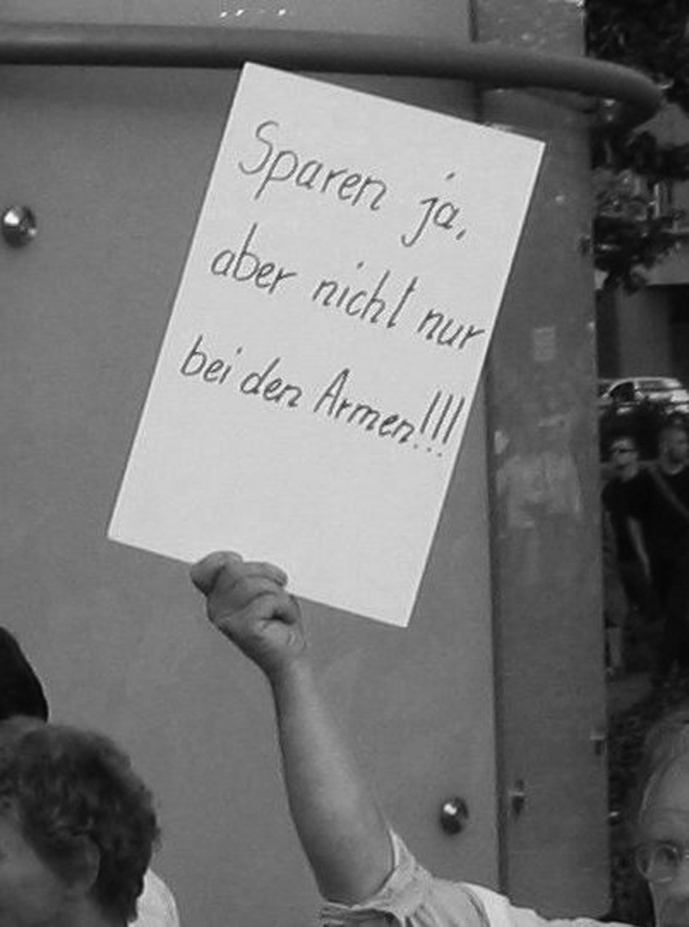
Sparen ja, aber nicht nur bei den Armen!!! (Yes to reductions but not just relying on the poor!!!)
Pre-iconographic description: looking at the photograph, one can see that the visual protest material was held up by a hand. In relation to a hand, the poster has a size of more or less 30 x 40 cm. The poster is all white and there are eight black words in three lines. The words constitute a sentence and finish with three exclamation marks: ‘Yes to reductions but not just relying on the poor!!!’ The three lines cover two-thirds of the upper part of the poster. The lower part is left free.
(Iconographic) interpretation: there are no images. For that reason, I focus on the common-sense meaning of the text. The sentence ‘Yes to reductions but not just relying on the poor!!!’ consists of two parts. In the context of demonstrations against the re-structuring of the German welfare system, especially unemployment benefits, the first part ‘yes to reductions’ approves the state-proclaimed necessity to reduce state expenditure. In view of the fact that no alternative to the governmental course of action is formulated, it seems the poster producer is confirming this policy. However, in the second part of the sentence – ‘but not just relying on the poor!!!’ – the protester informally expresses his/her anger (three exclamation marks) that, from his/her point of view, necessary cost reductions should involve everyone and not ‘just the poor’. In this particular case of protest, ‘the poor’ includes those who are on unemployment or on welfare benefits because these groups would be affected by the then proposed reform. In a broader sense, ‘the poor’ could mean the powerless ‘man on the street’ as a social group in opposition to those in power. Due to their weakness, ‘the man on the street’ is seen as those who have to bear the burden of societal change.
Reflexive interpretation: this interpretation usually includes the analysis of ‘planimetric structure’, ‘scenic choreography’ and ‘perspectivic projection’. Due to the lack of represented persons and objects on the visual protest material, I focus on the planimetric structure of the poster. All connotative meanings are suspended for the poster’s formal composition analysis.
The poster has a rectangular structure. Its designer used the portrait format for the wording, which is the most common format in everyday life (i.e. letters, newspapers, documents). As a consequence, fewer words fit into one line but there is more space to highlight single words or groups of words. However, only two-thirds of the upper section of the poster is actually used for the writing.
A closer look at the layout of the poster discloses, on the left-hand side, a small margin of a few centimeters. All lines start at the same invisible left border. In contrast, on the right-hand side there is hardly any margin. The lines come very close to the outer right edge of the poster.
The letters on the poster are thin and hand-written. The writing shows irregularities. First of all, the letter sizes differ; for example, the letters in the first line are bigger than in the last. Second, the lines of writing are not parallel to the upper or lower outer edges of the poster. Some letters transgress or are detached from the invisible line beneath the words; for example, the letters in the word nur (‘just’, second line) vary in their positions, and the beginning and end of the word Armen’ (‘the poor’, third line) are on different levels.
The person who created this poster seemed to spontaneously use what was at hand. He or she had not spent much time thinking about visibility (no stick to hold it up high, and small thin letters) or layout (irregularities). Therefore, I would argue that the poster was prepared shortly before joining the protest.
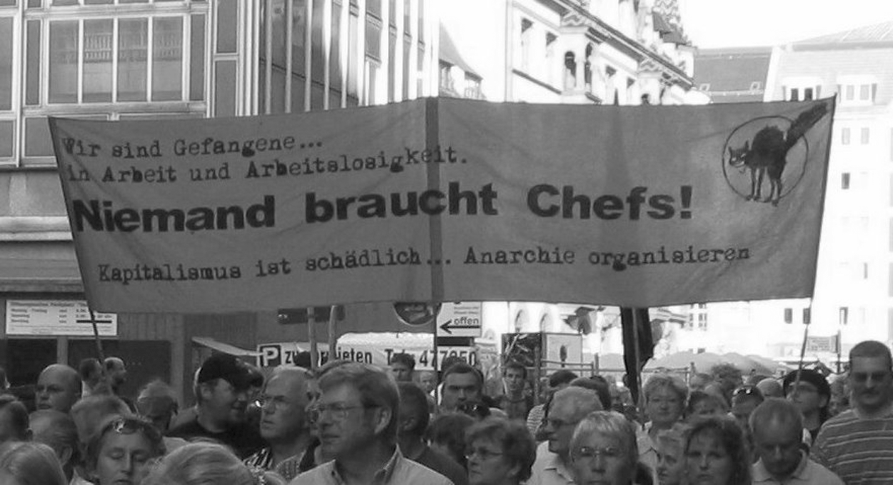
Niemand braucht Chefs! (Nobody needs bosses!)
The other selected photograph (Figure 2) was taken on 6 September 2004. On that Monday, more than 12,000 protesters participated in the demonstration. In the following weeks, the number of participants rapidly dropped to a few hundred.
Pre-iconographic description: the photograph shows a rectangular protest banner, approximately 4 meters long and 1.5 meters high. It is supported on the long side by three sticks which enable the banner to be held above the heads of the protesters. The banner consists of two colours, orange and black (not indicated in the black/white image). From the left- to the right-hand side, the greatest part of the space is covered with 15 words of different shapes and sizes. The first line says Wir sind Gefangene … (We are prisoners …) which is finished by the second line with Arbeit und Arbeitslosigkeit. (‘employed and unemployed’). The words are written in the style of a typewriter print with serif letters, similar to the fourth line which states Capitalismus ist schädlich … Anarchie organisieren (‘Capitalism is bad … let’s organize anarchy’). The third line states Niemand braucht Chefs (‘Nobody needs bosses!’). The sentence is finished with an exclamation mark. In contrast to the first two lines – and indeed the last line – the letters are simple, bold and in a sans serif style. The letters are larger than the rest. In the upper right-hand corner, there is a furious black cat surrounded by a circle, overlapped by the cat’s rear legs and tail.
Iconographic interpretation: the logo in the upper right corner of the banner is the symbol of the German anarcho-syndicalist trade union, FAU-IWA (Freie ArbeiterInnen Union) and depicts a furious black cat in a circle. In German mythology, cats are sinister demonic animals and black cats, in particular, are seen as messengers of misfortune (Güntert, 2006). From this reading, one can say that a black cat poses a threat. A furious black cat (as a symbol of the FAU-IWA), in particular, is a menace to those who cause trouble to the cat/the FAU-IWA.
The anarcho-syndicalist trade union is a member of the International Workers’ Association (IWA). The FAU aims to establish a libertarian and class-free society in which all people enjoy a life that meets their needs and abilities. Their vision is supported by the text on the banner. In the first line, they declare ‘We are prisoners …’. Prisoners are kept in controlled and confined spaces – they are not allowed to move freely at any time. According to the banner, all humans are prisoners as they are not able to act freely and without constraint. In the second line, the sentence is finished and relates to employment and unemployment. Its meaning is that humans are neither free when working nor when unemployed. In the last line, the producers of the banner assert another diagnosis; they say ‘capitalism is bad …’ – thus the positive effects of capitalism are denied. The creators of this banner prefer to react to this diagnosis with their alternative ‘let’s organize anarchy’. By anarchy, they mean a society without state rulers and enforced state authorities. The establishment of the capitalist order and administrative organs would be replaced by a system of free and self-organizing councils without subordination to any authority or political party. The main message on the banner (third line) supports this idea: ‘Nobody needs bosses!’ – in an anarcho-syndicalist world, there is no place for rulers or leaders with recognized authority.
Reflexive interpretation: the banner is rectangular and in a landscape format, which makes it possible to write in one line long sentences or fragments that make up a single message. The banner is big enough to be read from a distance. The space on the visual protest material is used to position the main message in the centre. Supporting text and the signature (logo) surround it; the text lines are accurate and placed with care.
The designers of the banner employed different letter sizes and styles. First, based on the size of the letter, one can differentiate between the main and the supporting message. The main text ‘Nobody needs bosses!’ is written three times larger than the rest. Second, at the same time, the letters of the main message are simple, bold and in a sans serif style. The letters of the supporting text are in a typewriter style, which typifies (former) official documents and is therefore associated with facticity. In contrast, the style of the main message appears modern and demanding.
The design of the anarcho-syndicalist trade union FAU-IWA’s logo supports the progressive message on the visual protest material. The cat is shown within a circle. The line of the circle could be the border of the logo and if we imagine the cat sleeping, it would be within the circle, which would be perfect and self-containing. Instead, the cat is furious and, in this situation, overlaps the circle line and thus the imagined (b)order.
All in all, it looks like the designer has invested time and thought in creating the banner, producing a printed banner that makes use of objects such as fabric and sticks. The styles and sizes of the letters are used to support the designer’s statement. The protest material is clearly visible from far away and is also reusable in other protest contexts.
Iconological–comparative interpretation: If the selected banner and poster are comparatively contrasted, there are observable variations. Most obvious are the differences in layout and design. The writing on the banner is printed and therefore accurate and in a straight line; in contrast, on the poster there are hand-written letters that show irregularities in their position to the lines and in their shape. The letter sizes vary in both visual protest materials; the letters on the banner are so big that they can be read from a relatively long distance. The good visibility of the banner is supported by its size and the use of sticks. In the case of the poster, its small size with no supporting stick is combined with letters that are small and thin, which means it is difficult to capture the message beyond a distance of a few meters.
Both prototypes are different in many respects, yet they also share a view. They differ in layout, design, size and visibility. On the one hand, they consist of well-printed material that could be read from a distance; on the other hand, they are less accurate, hand-written and difficult to read. However, they also have similarities in that all protesters use analogous instruments such as banners or posters. Only a few had created sculptures or used an umbrella. Maybe there are differences in layout or design, but all the visual protest materials are made of similar materials such as wood, textile, cardboard or paper.
To sum up, the protesters seem to share the knowledge and understanding of what visual protest material should look like and which materials are suitable. Or, in other words, they borrow their knowledge from similar cultural ‘tool kits’ (Swidler, 1986). At the same time, there are well-designed, professionally made protest materials that contrast with other material that displays amateurish irregularities.
Supportive quantitative analysis
Due to the relatively large quantity of protest material and the bipolar categories, I was also able to use statistical analytic tools to support my interpretation. In my case, I operated a cluster analysis grouping of the data. Cluster analysis is a tool designed to assign cases to a fixed number of groups (clusters). Usually the k-mean cluster analysis functions with metric data, but can be employed with nominal values when they are bipolar. Based on the cluster analysis, it is statistically possible to speak of two groups of protest material (see Table 1).
Two clusters of the visual protest material
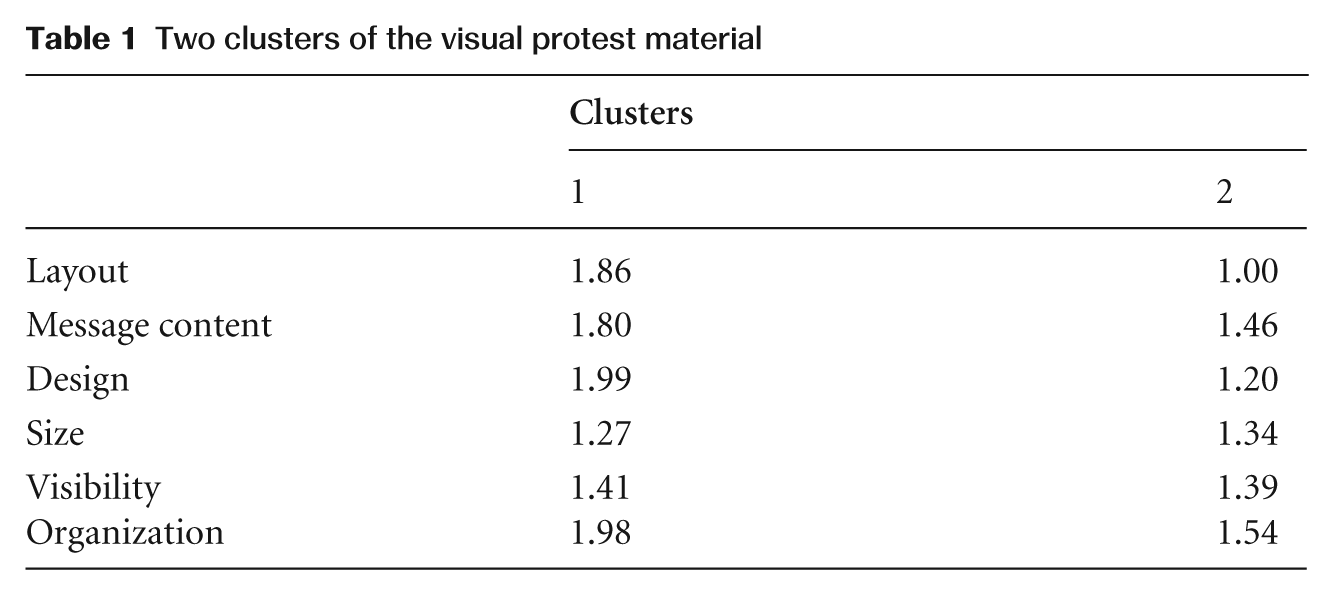
Apparent differences show the message content, layout, and design variables. Therefore, we can say protest material that belongs to the first cluster (1) tends to articulate moral reproaches and claims to maintain the status quo. This material is hand-written and often displays irregularities and inaccuracy. In addition, it is unlikely that political organizations or groups would belong to this cluster. In contrast, the second cluster (2) tends to display printed, accurate and precisely composed protest material. In their messages, the examples in this cluster have a tendency to demand progressive changes such as social justice or equality.
Based on a further analysis, we can say that the degree of association of nominal values between message content and layout is moderate to strong and highly significant (C = .231 [contingency coefficient]) (**). Thus, the statistical proof of an association between message content and layout supports the identification of two groups of protest material.
There are two reasons that have to be taken into account when evaluating the distinctiveness of the clusters and the degree of association. First, software programs on personal computers make it easy for everyone to produce accurate and precise protest material. Therefore, even protesters who joined the protest to fight for the withdrawal of the re-structuring process were able to create well-designed protest banners or posters. However, this protest material was often small in size or used small letters. Second, during the observed demonstration, radical left- and right-wing organizations and parties tried to mobilize new supporters and adherents (Rink and Philipps, 2007) and employed two strategies for this mobilization: (1) they joined the protest with their symbols in the form of flags or presented their political aims (e.g. general social justice and equality, or stop capitalism) on banners or posters; and (2) these groups sometimes relinquished their general demands and only fought for the withdrawal of the reform in the names of their respective political organizations. However, in contrast to social justice or equality, the withdrawal was only intended to maintain the status quo – this being far away from their usual political aims; with their professional equipment and knowledge, they were able to produce accurate and precise protest materials supporting the reconstitution of the status quo.
Based on several analytic procedures (summarizing content analysis, iconological interpretation, cluster analysis) of the visual protest material, I would argue that the demonstrations against the re-structuring of the German welfare system in Leipzig were joined by different groups of protesters. They were distinct in their protest aims, orientations and techniques. The first group consists of ‘professional’ protesters, experienced demonstrators who have an alternative vision of societal conditions and are organized in political groups or parties. Their experience means that they are able to create precise protest material in text and visual design that is appropriate for different protest events and occasions. The other group of protesters is spontaneous and unorganized. They join existing protests when they are upset about social conditions or changes affecting their own lives. If these protesters participate in a demonstration, they spontaneously prepare visual protest material according to the restricted opportunities and time available. Further interpretations of the protesters’ ‘space of experience’ or sociocultural background is presented in Philipps (2005).
Conclusion
The purpose of my article was to show how techniques of visual methods can enrich the analytical outcome of empirical data and, at the same time, provide methodically controlled interpretations. Research examining visual protest material presented during demonstrations against the re-structuring of the German welfare system was used in order to show the benefits of visual analytic procedures. Based on these data and visual methods, the producers of visual protest material such as banners, posters, sculptures, etc. were identified and described.
As part of a triangulation of methods, visual studies can include objects and aspects that are not available in interviews, written documents or statistical outcomes (Harper, 2005: 748). Nonetheless, in terms of triangulation (Flick et al., 2004) a further research approach could be open interviews in combination with the taking of photographs of the visual protest material. Interviews with the protesters as an empirical source would have increased contextual knowledge that would have provided further insights and empirical data supporting or rejecting the interpretation.
However, aside from further proof of interpretations, the analysis of protest images or visual protest material can deepen the understanding of the producer. Thus, the way that protesters employ certain technical procedures and operations may reveal influential ideas, intentions and dispositions. Protest images give an insight into what the image producers expect to be relevant or not.
Finally, new forms of protest need new forms of methods. For example, demonstrations at the EuroMayday seem to consist of attributes that go beyond classical forms of protest. In particular, the transformation of the streets during demonstrations into ‘painted zones’, including template graffiti, political slogans, posters, stickers, suggestions for websites, labelled pedestrian crossings and contextualizing wall painting commented on here and there by performative actions as described in Raunig (2004), will need visual methods in order to be analysed appropriately.
Footnotes
Acknowledgements
The author wishes to thank Stefan Bauernschmidt, Helena Flam, Ralph Richter and the anonymous reviewers for insightful commentaries on an earlier version of this paper and Esther Kialka and Jane Price for their English editing.
This research received no specific grant from any funding agency in the public, commercial, or not-for-profit sectors.