
Abstract
This article considers the role of images in physics. Utilizing the Systemic Functional Linguistic dimension of field it shows that diagrams that present large classification and composition taxonomies as well as long sequences of activities can be overlaid upon graphs that show arrays of ordered data. Through an analysis using the concepts of semantic density and semantic gravity from Legitimation Code Theory, it is argued that this allows images to present large degrees of meaning in a single snapshot whilst also linking abstracted theory to specific instances of data. That is, the analysis shows that images play a significant role in developing technical physics knowledge through abstractions away from the empirical world. This article contributes to the growing body of research focusing on the structuring of knowledge and the non-linguistic semiotic resources used to organize it.
Keywords
Knowledge and the Discourse of Physics
‘Physics is the most fundamental and all-inclusive of the sciences’, declared Richard Feynman in his famous introductory lectures on physics (Feynman et al., 1964, 3–1). Such an assertion marks physics as something of an archetype of the sciences. Physics of course has its own object of study, its own ways of organizing its knowledge and its own ways of expressing this knowledge. In this sense, it is its own unique discipline. But this does not mark physics as different from any other academic subject; every discipline has its intricacies and idiosyncrasies, and every subject has its detractors and its devotees. Nonetheless, physics seems to be regularly positioned as an exceptional case in the academic world. If, like Feynman, we interpret physics as the most fundamental of the sciences upon which all others are based, this perhaps can be taken to mean that it shares many of the characteristics of the other sciences, but also maintains its own distinctive features. Biglan (1973), for example, classifies physics as a pure science, along with geology, chemistry and botany, but he positions it as the ‘hardest’ of the pure sciences. Kolb (1981) characterizes it as a reflective (non-applied) discipline, like geography, bacteriology and biochemistry, but he portrays it as the most ‘abstract’ of the reflective disciplines. Those following Bernstein (1999) identify it with other natural sciences as a ‘hierarchical knowledge structure’ that develops generalized theories and integrates empirical phenomena, but they regularly use physics as the exemplar of such a discipline (Martin, 2011; Maton and Muller, 2007; O’Halloran, 2007).
There is thus a sense that physics is both a natural science and, as such, shares many of the features of the natural sciences, but additionally that it is in some sense the most ‘sciencey’ of the natural sciences. Exactly how this recurrent characterization of physics arises, however, is not made clear. We might even ask whether it is truly the case that physics maintains a special position within the sciences? And, if so, what gives rise to this special position?
Questions such as these are not borne of idle curiosity. Rather, they go to the heart of the disciplinary organization of physics and hold strong significance for the development of educational programs that acknowledge and target disciplinary knowledge. If disciplines vary in the way they organize their knowledge, vary in the discourse they use to construe this knowledge and vary in the means of judging and comparing competing knowledge, the pedagogic approach for teaching these disciplines must take this into account.
In response to the disciplinary nature of knowledge, recent decades have seen an increasing concern with the underlying principles that coordinate disciplinary differences, and how these differences are expressed in each discipline’s discourse. What is clear is that the knowledge that is accepted as valid in one discipline is typically very different to that of another discipline. However, as Maton (2014) argues, despite knowledge-building being at first sight the raison d’être of education, educational research tends to have a blind-spot when it comes to actually seeing differences in knowledge; like discourse, knowledge in education is often taken for granted. This ‘knowledge-blindness’ means that the principles underpinning the various educational and literacy practices of disciplines have frequently not been made explicit for teachers and students.
This article examines how physics can maintain a highly complex and technical theory, whilst also relating this theory to the empirical world. As a first step, one of the most striking features of physics’ discourse is its heavily multisemiotic nature. Physics regularly involves the interaction of written and spoken language, mathematics, images, demonstration apparatus, gesture and innumerable smaller formalisms peculiar to the discipline. Indeed Parodi (2012), in his quantitative study of textbooks across multiple academic disciplines, found that, like other sciences, physics relies extensively on images such as graphs and diagrams to present information, and, of the basic sciences, it is by far the most reliant on mathematics. Based on these findings, Parodi suggests that physics is the most predominantly graphic-mathematical of the disciplines he studied. Parodi’s study supports Lemke’s (1998) survey of articles in the prestigious physics research journal Physical Review Letters. Within this corpus, Lemke found that, on average, around four images and equations occurred per page (2.7 equations, 1.2 images), which is higher than the rate of images and equations in the corresponding journals for the biological, earth and space sciences, Science, or, for medicine, Bulletin of the New York Academy of Medicine (Lemke, 1998: 89). 1 Images and equations are thus clearly a regular feature of the discourse of physics.
The role images play in building physics’ knowledge will be the particular focus of this article (for an investigation of mathematics in physics, see Doran, 2017; for a range of studies focusing on the language of science, including physics, see Halliday, 2004; Halliday and Martin, 1993; Lemke, 1990; Martin and Veel, 1998). Images permeate all levels of physics: they are used in primary schooling, are prevalent throughout high school and university, and form a critical resource in research. They are used to explain processes, report descriptive features and present raw data. They display a multifaceted functionality for organizing the technical knowledge of physics that complements the meanings made by other resources. It is thus reasonable to suggest that they play a significant role in the organization of physics knowledge.
To illustrate this, this article will examine the images used in physics from two perspectives. To understand the structuring principles that underpin the knowledge of physics, they will be examined from the perspective of Legitimation Code Theory (LCT), a sociological approach to analysing the varying forms taken by knowledge, and the principles that organize them (Maton, 2014). In particular, it will view physics from the LCT dimension of Semantics, which is concerned with how meanings associated with a discipline, text or social practice relate to their context and to each other. In order to more definitely relate this organization to the meanings construed by the images themselves, we will also view the use of images from the perspective of field within Systemic Functional Semiotics (Martin, 1992; Martin and Rose, 2007). A view from field offers an insight into the different types of meanings images can realize and the relations they can set up between technical elements in the discipline. Systemic Functional Semiotics and LCT have been increasingly used together to offer complementary perspectives on the same phenomena. This productive interaction has regularly given rise to greater explanatory power than that possible through one approach, but has also allowed for reflections on and refinements of both frameworks (Maton and Doran, 2017b; Maton et al., 2016). For this study, the interaction between the two frameworks allows for an intricate dissection of the meanings being made by the images of physics, as well as an interpretation of how these affect the knowledge structure of physics as a whole.
Within LCT, physics is regularly positioned as an archetypal knowledge code (as opposed to the knower codes associated with many of the humanities disciplines) (Hood, 2016; Maton, 2014). Knowledge codes are said to emphasize epistemic relations between the discipline and its object of study, meaning that physics maintains a cohesive and integrated theoretical organization and develops through accurately describing and explaining the physical world. By fostering strong epistemic relations with its object of study, physics can therefore develop ever more integrated theory that encompasses an expanding range of empirical phenomena. As with the other characterizations of physics mentioned at the beginning of this article, the difficulty with classing physics as a knowledge code lies with how we actually ‘see’ this in physics’ discourse. That is, what features of physics give rise to this type of knowledge structure and how does the discourse organize it? For this, we will turn to the LCT dimension of Semantics.
Semantics is concerned with the organization of meanings in disciplines and involves two variables known as semantic gravity (SG) and semantic density (SD). Beginning with semantic gravity, this variable conceptualizes the degree to which meanings depend on their context (Maton, 2014: 110). If semantic gravity is stronger (SG+), meanings are said to be more dependent on their context; if semantic gravity is weaker (SG–), meanings are said to be less dependent on their context. For example, in physics, a specific numerical measurement of an instance of a physical phenomenon (say a force), displays significantly stronger semantic gravity than a generalized theoretical principle holding across a range of phenomena (e.g. a generalized equation, F=ma). This is because the specific numerical measurement only holds for a specific instance (i.e. it is strongly tied to this particular context), whereas a generalized theoretical principle is applicable for a much wider range of contexts.
The second variable, semantic density, refers to the degree of condensation of meaning in an item (be it in a word, a symbol, an image, a concept, etc.). Stronger semantic density (SD+) indicates more meaning is condensed; weaker semantic density (SD–) indicates less meaning is condensed. Taking another example from physics, the technical term star holds relatively strong semantic density in the field as it contains a large degree of specialized meaning: a star is a spherical mass of plasma held together by gravity, it has multiple types that are classified by their effective temperature, absolute magnitude, luminosity and various other features, and the light from many of these stars arises from the release of energy during thermonuclear fusion of hydrogen into helium. In contrast, in everyday language, star is rarely used in relation to these meanings and rather refers to a shiny point of light in the night sky. For this reason, in everyday discourse, the term star has relatively weak semantic density (SD–). Maton and Doran (2017a) argue that the key marker of semantic density is the degree of relationality a meaning has. This involves the degree to which a meaning is multiply interconnected with other meanings in a field. In the case of the star in physics, the term resonates out to a vast interconnected network of meanings in the field and so involves a large degree of relations for those trained in the field. The everyday meaning of star, on the other hand, does not resonate out to such a large degree and so involves fewer relations and weaker semantic density.
In order to grasp and theorize the outside world, knowledge codes such as physics develop highly integrative and generalized knowledge, allowing for broad theoretical coherence that accounts for a wide range of empirical phenomena. At the same time, the discipline is not characterized by purely abstract theory, but rather maintains strong contact with its empirical object of study. This is most easily seen in the use of mathematics. Mathematics enables the development of generalized and abstracted theories in the form of equations, while at the same time enabling the quantification of those theories to predict and measure specific empirical instances. As we will see below, images strongly complement the use of mathematics by offering an alternative means of encoding large swathes of theoretical meanings, while allowing physics to move from specific instances back up to generalized theory. On this basis, this article proposes that a knowledge code’s ability to establish integrative and generalized knowledge that encompasses a large range of empirical phenomena depends in large part on being able to generate relatively strong semantic density. Similarly, its ability to link abstract theory to empirical instances arises from its potential for moving between a broad range of semantic gravity. Thus if we consider physics to be a knowledge code and images to be a crucial part of this, we should be able to see in its images the potential for strong semantic density and for movement between a large range of semantic gravity.
Images in Physics
Images play a crucial role in organizing physics knowledge. They can present large taxonomies, long sequences of activity, extensive arrays of data and a broad range of generality all in a single image. Indeed much of the power of images comes through the large degree of meaning that can be displayed in a single snapshot. This means they can scaffold the strong semantic density apparent in physics, and at the same time construe the range of semantic gravity that allows physics to link generalized theory to specific instances. The various meanings presented by images will be discussed through the Systemic Functional conception of field as they become relevant. This discussion will be developed in two main sections. First, we will consider diagrams of physics (broadly interpreted), to highlight the possibility of multiple structures in a single image. This will illustrate the strong potential of images for semantic density. It will also offer an insight into their utility for presenting overviews of these meanings. Second, we will focus on graphs (again interpreted broadly) to show how information can be organized into multiple arrays in ways not readily instantiated in other semiotic resources such as language or mathematics. 2 These arrays of information allow for the generalization and abstraction of patterns, and indicate shifts in semantic gravity between generalized theory and specific instances. We will thus see that images play a vital role in developing meaning and linking the theory of physics to the empirical world.
Diagrams in physics
Diagrams are regularly used in physics to illustrate, exemplify, explain, explore and present a large range of technical meanings. In many textbooks, for example, it is unusual for a page to go by without there being at least one diagram complementing the linguistic and mathematical text. Like language, diagrams present a range of field-specific meanings, such as taxonomies of composition and classification, and large sequences of activities and events (specific elements of field within the Systemic Functional framework will be introduced as they become relevant). As mentioned above, it is common for many of these meanings to be given in a single snapshot.
In their grammar of images, Kress and van Leeuwen (2006) are unclear as to whether an image can contain multiple structures of the same status. They do indicate that a single structure defining the image as a whole can recur in parts of the structure, but it is not clear whether an image can display multiple structures at the highest level simultaneously. For the purposes of this article, I will argue for treating physics diagrams as potentially containing many structures of the same status. This means that various elements in images can play different structural roles and therefore realize multiple field-specific meanings. Indeed the regular use of multiple structures in a single image is one of the most powerful features of images for construing the technical meanings of physics. We will gradually build up to these complex images by beginning with relatively simple images that construe only a single structure, and use these to introduce the Systemic Functional conception of field.
To begin, we can see that physics regularly utilizes narrative images (Kress and van Leeuwen, 2006) that construe events and their participants. From the perspective of field, these images realize what are known as activities (Martin, 1992). Narrative images realizing activities minimally involve a Vector that displays some sort of motion or direction, and may be accompanied by a number of participants. Figure 1, from a high school textbook, exemplifies a simple narrative image of this sort used in physics.
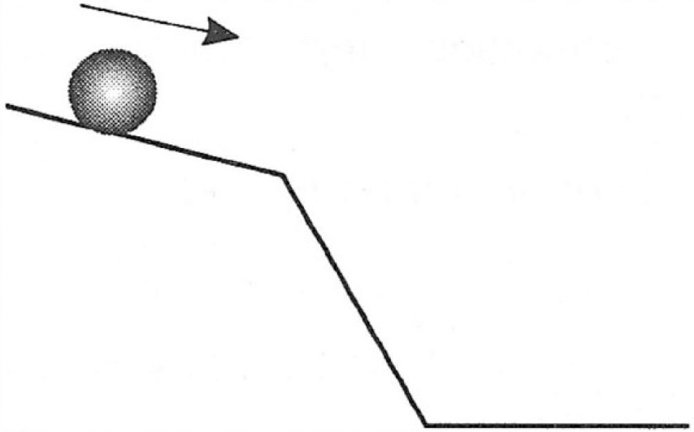
Image with a single activity (Warren, 2000: 141). © Pascal Press. Reproduced with permission.
The image illustrates a ball rolling down an inclined plane. The arrow above the ball is the Vector that makes explicit the direction of motion, while the ball itself is the Actor (the participant that moves). To analyse this and all following images, we will highlight the different elements according to their structural role. In the analysis in Figure 1(b), the Vector is highlighted in yellow and the Actor is in red.
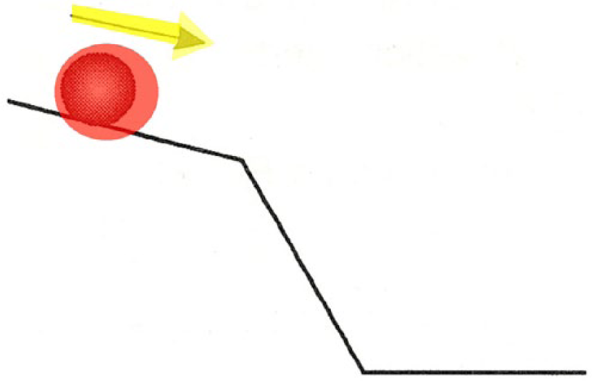
Analysed image with a single activity (Vector in yellow, Actor in red).
Figure 1 represents a relatively simple image with only a single structure 3 and realizes a single activity at the level of field. In contrast, it is common for images to display multiple Vectors in a sequence and therefore realize an activity sequence. Figure 2(a), from a junior high school textbook, for example, illustrates this (with the analysis in 2(b) following).

Activity sequence in an image (Mau, 1999: 8). © Education Services Australia, 2016. Reproduced with permission.
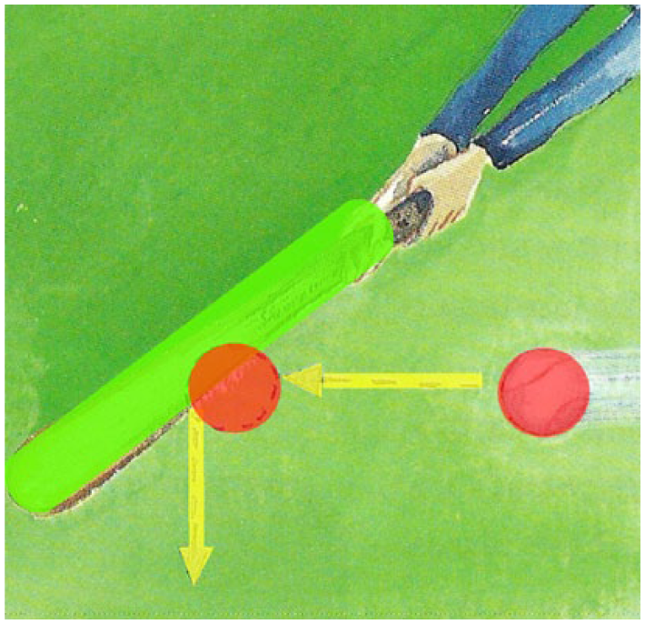
Analysis showing Actors (red), Vectors (yellow) and Goal (green).
In interpreting this image, the ball, functioning as an Actor, first moves toward the bat (the Goal, highlighted green). Its movement is indicated by a yellow arrow Vector. Once it has hit the bat, the ball changes direction and moves downwards. The dotted circle indicates the Actor from which the second Vector emanates. Interpreted along these lines, the image shows an activity sequence where one event, the ball moving to the left, is followed by another event, the ball moving down.
Activity sequences such as this can become quite complex, with long strings of Vectors emanating from a single Actor. This is demonstrated by Figure 3(a) that illustrates a nuclear chain reaction (from a senior high school textbook). To analyse this image, it is useful to make an addition to Kress and van Leeuwen’s (2006) grammar. This addition is to distinguish the participant from which the Vector emanates, but which itself does not move, from the participant that is actually moving. In Kress and van Leeuwen’s grammar, both of these are considered the Actor; however, for the purposes of the discussion in this article, the function of the Actor will be reserved for the participant that is moving, while the participant from which the Vector emanates (but which does not itself move), will be called the Source (and highlighted with pink).
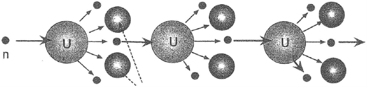
Long activity sequence (Marsden, 2003: 15). © Timesavers, 2016. Reproduced with permission.
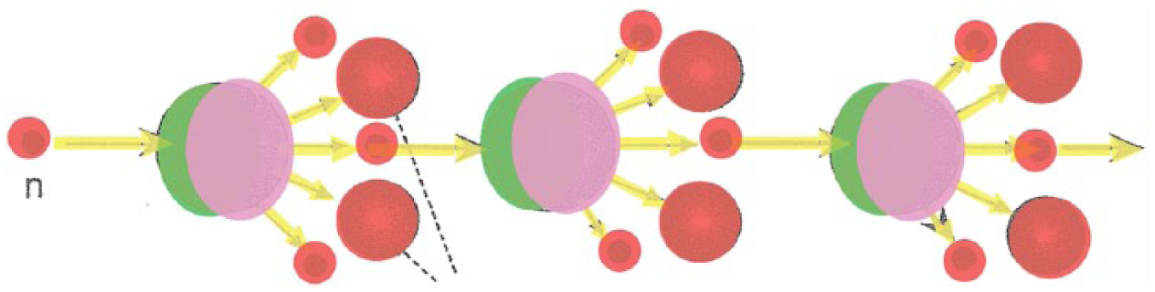
Analysis of long activity sequence (Actor in red, Vector in yellow, Goal in green, Source in pink).
In this image, the longer activity sequence begins with an Actor labelled n (on the left, representing a neutron), moving toward its Goal (in green), a uranium atom (labelled U), with the direction of motion indicated by an arrow Vector (in yellow). In addition to being the Goal of the initial Vector, this element also functions as the Source (shown by overlapping pink on the Goal’s green) from which five other Vectors emanate in different directions. Each of these Vectors in turn represents the motions of other particles, shown as Actors in red. One of these particles (also a neutron, but not labelled), moves toward the second uranium atom as its Goal, from which in turn five more Vectors emanate. This process is repeated once more, resulting in 19 Vectors and 19 participants being displayed, with three of the participants performing two functions (Source and Goal). In a single snapshot, this image realizes a very large sequence of activity. We will see, however, that this is by no means the upper limit in the degree of meaning that can be displayed in an image.
Before moving on to other structures, it is important to note that multiple activities may be represented in an image without any explicit sequencing between them. This is illustrated in Figure 4(a) from a senior high school textbook. This image shows a ‘free body diagram’ of the forces impacting on a car that is coasting without any pressure on the accelerator. For this image, only the Vectors representing forces have been highlighted.
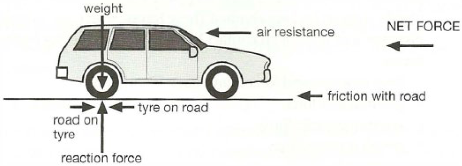
Free body diagram (Wiecek et al, 2005). © Oxford University Press Australia. Reproduced with permission.

Vectors (yellow) in free body diagram.
The image shows seven Vectors, however they are not sequenced in relation to one another. Each Vector construes its own relation to the car, without any indication of a sequence. Although in the field of physics the
In addition to realizing activity, images display a strong capacity for realizing delicate taxonomies of both classification and composition. Figure 5(a) presents a relatively simple composition outline of an atomic model, known as the Rutherford atom. Grammatically, this is an analytical image, constituted by a Carrier (the entire atom, shown in blue) and five Possessive Attributes (shown in purple) (Kress and van Leeuwen, 2006: 87). In terms of field, it realizes a two-level compositional taxonomy, with the highest level (the whole) being the atom itself, and its constituent being the electrons and the nucleus.
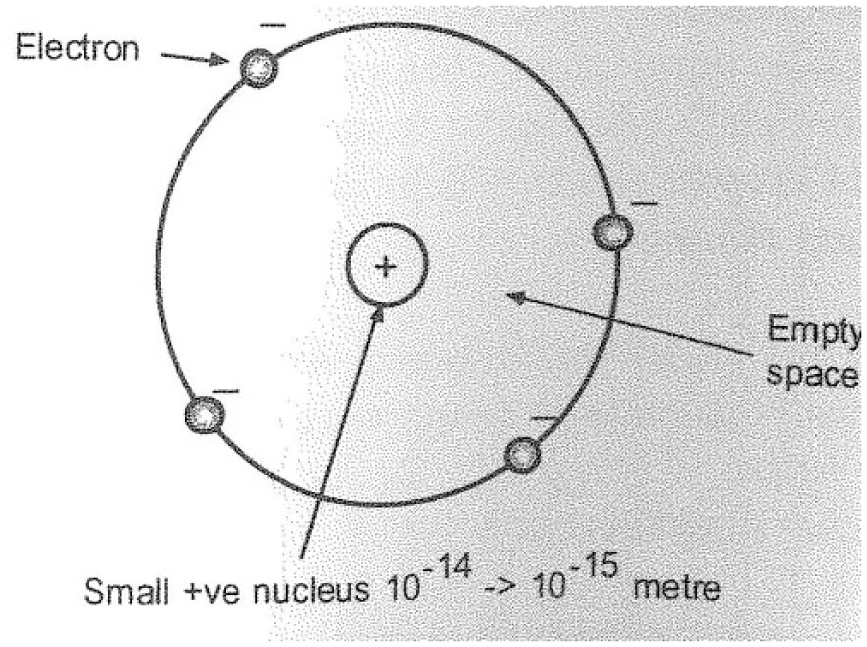
The Rutherford atom (Marsden, 2003: 2). © Timesavers, 2016. Reproduced with permission.
Compositional analysis of the Rutherford atom (Carrier in blue, Possessive Attribute in purple).
In contrast, Figure 6 presents a simple classification of types of matter, with the Superordinate shown in brown and the Subordinates shown in orange.

Types of matter (Warren, 2000: 155). © Pascal Press. Reproduced with permission.
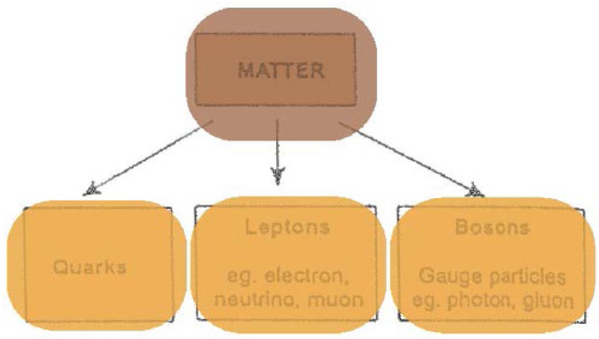
Classification analysis of types of matter (Superordinate in brown, Subordinates in orange).
Each of these images realizes a single dimension of field, either activity or taxonomy. The real power, however, comes through their ability to present multiple structures that realize multiple types of field-based meanings. This greatly expands the meaning potential of images and often results in elements performing multiple functions. Through this multifunctionality, different field structures can be related, allowing the interlocking meanings of physics to be displayed in a single snapshot. To illustrate this, we will focus on Figure 7(a), an image from a university textbook. This image outlines two experimental apparatuses designed to view patterns of light emitted from different sources (known as the emission line spectrum).
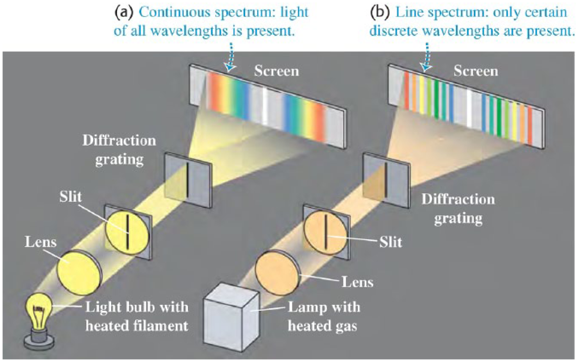
Experimental apparatus diagram (Young and Freedman, 2012: 1292). © Pearson Education, Inc. Reprinted with permission.
This image illustrates two examples of the same experimental set-up – one on the left and one on the right – that differ only in their source light (the light bulb with heated filament on the left and the lamp with heated gas on the right). Due to their set-up, and the similarity in their overall purpose, these two apparatuses are of the same type; they both illustrate subtypes of an experiment set-up known as a single slit experiment. At first glance, then, the grammatical structure of the image displays a covert classificational taxonomy involving two Subordinates (shown in orange in Figure 7(b)), but without explicitly showing the Superordinate (Kress and van Leeuwen, 2006: 87).
Classification analysis of experimental apparatus diagram (Subordinate in orange).
In terms of field, this image realizes a classification taxonomy whereby each apparatus is a subtype of the single slit experimental apparatus. If we look further, however, it is clear these classification relations are by no means the only structures in the image. The image can also be read as an analytical image, displaying part–whole relations between each apparatus and their components. Figure 7(c) highlights these composition relations: light blue indicates the Carriers (the wholes) and purple indicates the Possessive Attributes (the parts).

Composition analysis of experimental apparatus diagram (Carriers in blue, Possessive Attributes in purple).
The analysis shows that each apparatus contains five pieces of equipment: a lens, slit, diffraction grating, screen and light source. This similarity in composition justifies our previous analysis of the two apparatuses being of the same general type; indeed four of their components (the lens, slit, diffraction grating and screen) are exactly the same. The difference between the two set-ups comes from their choice of light source. The apparatus on the left utilizes a light bulb with a heated filament, while the apparatus on the right uses a lamp with heated gas. This difference in a single component distinguishes the two apparatuses as different subtypes. This image therefore relates two interlocking taxonomies in one go; their composition taxonomies justify the classification taxonomy and the classification taxonomy anticipates the composition taxonomy. It also shows that the apparatuses themselves function in both of these taxonomies as co-classes in a classification taxonomy and as wholes in two composition taxonomies.
As each apparatus is a different sub-type with a slightly different composition, the results of each experiment are different. This is encoded in the image through a narrative structure. This structure depicts the path of light from the source through each piece of equipment until it hits the screen. Figure 7(d) shows this narrative analysis (Source in pink, Vector in yellow, Goal in green and Resultative Attribute, see below, in dark blue).
Narrative analysis of experimental apparatus diagram (Sources in pink, Vectors in yellow, Goals in green, Resultative Attribute in blue).
The analysis indicates that the Vector emanating from the light Source moves toward the lens, functioning as a Goal. The lenses also function as Sources from which another Vector of light emanates. This pattern continues for each piece of equipment until the final Vector reaches the screen, i.e. the final Goal. This structure thus involves four Vectors for each apparatus, justified by the fact that after each piece of equipment, the shape and size of the light changes, indicating distinct Vectors, rather than one continuous Vector.
In addition, we can note the difference in the patterns on each screen, labelled as: ‘(a) Continuous spectrum: light of all wavelengths is present’ and ‘(b) Line spectrum: only certain discrete wavelengths are present’. These patterns are a result of the different narrative structures, in particular the different elements realizing the original Source (the light bulb with heated filament and the lamp with heated gas). The differences in these patterns are important as they effectively present the results of the experiment. In lieu of an appropriate function in Kress and van Leeuwen’s (2006) grammar that relates this pattern to the narrative analysis, we will consider these patterns to function as Resultative Attributes (analogous to Resultative Attributes of English, such as straight in he bent the rod
The image thus realizes two activity sequences – one for each apparatus – in addition to the classification and composition taxonomies shown previously. These activity sequences involve light moving from the light source of each apparatus to the lens, and then from the light source to the slit, and then from the slit to the diffraction grating, and finally from the diffraction grating to the screen, resulting in their particular light patterns (their spectra). The differences in the activity sequences (i.e. the different patterns on the screen) arise from the set-ups of the different apparatuses (i.e. the particular sub-type of apparatus and its corresponding composition). The particular activity sequences that occur are intertwined with the particular classification and composition taxonomies. Moreover, they are displayed in one image.
When analysed for each function impacting on field, the amount of meaning given in this single image becomes clear. By realizing multiple activity sequences and compositional taxonomies, and a classification taxonomy all from the same field, each dimension is explicitly related.
If we take a further step to include the dozen labels in the image, the number of meanings displayed increases further. Each label indicates a synonymous relation between the linguistic text and the imagic element being labelled. The effect of this is twofold. First, elements that share the same label are seen to be the same. For example, the two pieces of equipment labelled slit are specified as being the same type of element. This further confirms the compositional analysis given previously, and thus reinforces the unity between the apparatuses in terms of their place in the classification taxonomy. Second, the labels allow language and image to share meanings. The field-specific meanings associated with the linguistic technicality are linked with those associated with elements in the image. For example, the distinction between the continuous spectrum and the line spectrum as two-subtypes in a classification taxonomy of spectra are related to the patterns displayed on the screen of each apparatus. As we have discussed, these patterns are determined by the particular activity sequence in each apparatus. This activity sequence is in turn determined by the compositional taxonomy of each apparatus, which is similarly determined by the different types of apparatus in the classificational taxonomy. Therefore, from this single image, we can form an unbroken chain of relations between the separate classification taxonomy of spectra and that of types of apparatus, as well as the different activity sequences and composition taxonomies. This single image makes manifest an interlocking lattice of field-specific meaning.
This image is by no means unusual. It is in fact a relatively unremarkable image that would be easily understood by someone sufficiently trained in physics. In the following section, we will consider an image that shows all of these meanings plus those realized by graphs. Such is the pervasiveness of images like this – especially at the higher levels of physics – that a presentation of this amount of meaning is a common occurrence.
This potential to realize field-based meaning has significant implications for the semantic density of physics discourse. By explicitly relating multiple field structures of activity and taxonomy, images can indicate tremendously strong semantic density in a single ‘eyeful’. This allows the field of physics to be extended (if these relations had not previously been made explicit), and also offers an efficient method of displaying this meaning. Through images, relatively large components of the field can be illustrated in a small stretch of discourse. By sharing meaning with language, each resource can utilize its own affordances to build the expanding network of meaning that constitutes the knowledge code of physics.
Activity and taxonomy are not the only dimensions of field that images may realize. In the following section we will see that graphs bring forward further meaning potential that allows a more definite link between the theory of physics and its empirical object of study.
Graphs in physics
Graphs are regularly employed in physics to record measurements, illustrate patterns and highlight salient interrelations between technical meanings. They allow a broad range of empirical observations to be related along multiple dimensions and establish a means for these relations to be incorporated into theory. Graphs first become prominent in junior high school before becoming regular features in senior high school and undergraduate university, and are ubiquitous in research publications. Like diagrams, they display a rich and multifaceted functionality for organizing the technical knowledge of physics. However, the meanings they organize are of a different order to the taxonomy and activity we saw in the previous section. By virtue of their organization, graphs expand the meaning potential of physics by realizing a distinct dimension of field and offering movements in semantic gravity between empirical measurements and generalized theory. This section will be concerned with highlighting these affordances of graphs and characterizing their specific roles in constructing the knowledge of physics. First, it will show that graphs order technical meanings along axes in order to utilize the capacity of images for topological representation (Lemke, 1998). This establishes arrays of data with the potential for continuous gradation of empirical observations in terms of degree, quantity or amount. Second, it will highlight that, through these arrays, graphs enable patterns to be abstracted and generalized from empirical measurements, and in doing so allow the empirical object of study to speak back to the theory of physics. Finally, it will show that, like the diagrams discussed in the previous section, graphs can be added to other images to enrich the relations between field-specific activities, taxonomies and arrays. From this, we will see that the meaning potential of graphs complements that of diagrams (and other resources such as language and mathematics) to organize the knowledge code of physics.
Graphs exhibit a significant degree of variability. They can show single or multiple dimensions, they can arrange discrete points or continuous lines and they can specify precise measurements or relative degrees. Minimally, a graph is realized by a single axis that allows data points to be ordered along a single dimension. Figure 8 from a university textbook exemplifies such a one-dimensional graph. This graph presents an array of light wavelengths known as the Balmer series (that are emitted from a transitioning electron in a hydrogen atom). It arranges a set of discrete points along the horizontal axis, with the relative position of each point indicating its wavelength.
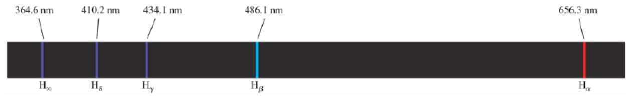
One-dimensional graph of the Balmer series (Young and Freedman, 2012: 1304). © Pearson Education, Inc. Reproduced with permission.
Looking from field, the labels Hα, Hβ, Hγ, etc. suggest that each point on the graph is related through classification. They are each subtypes of H-lines (standing for hydrogen), with the far right being the H-α line, the next from the right being the H-β line and so on. In addition, they are labelled numerically as 656.3 nm (nanometres), 486.1 nm, etc. This suggests that these points sit at a relatively strong level of semantic gravity; that is, they represent empirical instances that are specific to the individual lines, rather than generalized patterns. However, both the classification meanings and the relative strength of semantic gravity are indicated by the labels, not by the layout of the graph itself. Its spatial layout establishes a different type of relation that contrasts and orders the points in terms of their specific wavelength. Those to the right are construed as having a longer wavelength (also indicated by the larger number) than those to the left. Moreover, their relative distance apart specifies their relative difference in wavelength. For example, the larger gap between the Hα line (in red on the far right) and the Hβ line (one to the left in blue) indicates a significantly larger difference in wavelength than that shown by the smaller gap between Hβ and Hγ to its left. Although each point is a co-hyponym (co-type) in a classification taxonomy of emission lines, this spatial arrangement realizes a further relation. In terms of field, this relation can be interpreted as a field-specific array. Arrays organize technical meanings in a field along a particular dimension or gradable property. In this case, the emission lines are being ordered along an array of wavelength. More generally, graphs primarily realize arrays through the spatial ordering of points or lines along an axis. Due to their facility for displaying topological meaning (Lemke, 1998), images can in principle construe arrays with infinitely small degrees of gradation. This allows an indefinite number of terms to be related and, in the case of multidimensional graphs, offers the possibility for variation of both continuous lines and discrete segmented data points.
One-dimensional graphs such as Figure 8 are relatively infrequent in the discourse of physics. More commonly, graphs are presented with two intersecting dimensions. These graphs are known as Cartesian planes. Figure 9 illustrates a two-dimensional Cartesian plane used in an undergraduate university lecture (but originally sourced from an art project focusing on global warming, Rohde, 2007). The graph presents the range of wavelengths of light emitted by the Sun and arriving at the Earth. It arranges two sets of points, shown by the red and yellow bars. The yellow bars indicate the spectral irradiance emitted by the sun (crudely, the amount of sunlight) that hits the top of the atmosphere, while the red bars indicate the spectral irradiance that travels through the atmosphere and hits sea level.
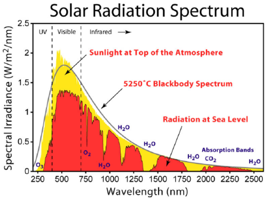
Solar radiation spectrum. © Rohde, 2007. Reproduced with permission.
The graph coordinates two axes, the vertical y-axis, labelled the Spectral Irradiance (W/m2/nm) and the horizontal x-axis labelled Wavelength (nm). By presenting two dimensions, each point is characterized by two variables: its spectral irradiance measured in W/m2/nm (read as Watts per square metre per nanometre) and its wavelength in nm (nanometres, a billionth of a metre). For example, the red bar at a 500nm wavelength has a spectral irradiance of ~1.4 W/m2/nm. As can be seen, each point in the graph shown by the red or yellow bars is miniscule. This means the array presents very small gradations in relation to each other and allows a great deal of precision to be captured in the field. In this particular field, this graph establishes an interrelation between the two arrays of spectral irradiance and wavelength. Thus, one of the realizations of the field of the solar radiation spectrum is that each value of the wavelength will have the specific value of spectral irradiance specified by this graph.
The arrangement of points into arrays directs us to the second feature of graphs that is significant for knowledge in physics: its potential for moving between empirical instances and generalized description. Both the yellow and red bars present empirical observations, i.e. relatively specific measurements of spectral irradiance for each wavelength based on tables published by the American Society for Testing and Materials (2012). In terms of LCT Semantics, they represent relatively strong semantic gravity as they indicate specific empirical instances, rather than generalized patterns that hold along a range of measurements. However, by arranging these measurements along an array, the graph abstracts a general pattern of change. Both spectral irradiances peak around 500nm wavelength, drop off quickly at lower wavelengths (on the left), but more slowly at higher wavelengths (on the right). The graph presents this general pattern in the form of a line, shown in grey and labelled 5250° Blackbody Spectrum. This line represents the spectral irradiance vs wavelength for a theoretical construct known as a blackbody (an object that both absorbs and emits energy without losing any energy). By fitting this line to the empirical measurements, the graph portrays the solar spectrum as approximating that of a blackbody (specifically, a blackbody at a temperature of 5250°C). It relates the empirical to the theoretical – the stronger semantic gravity measurements to the weaker semantic gravity theory – and, in doing so, offers the potential to abstract generalized theory from physical observations.
In addition, by overlaying the set of red points on the yellow points, the graph highlights a second dimension of generalization. As the graph states, the yellow bars represent the sunlight that hits the top of the atmosphere. On the other hand, the red bars represent the sunlight that makes it through the atmosphere to sea level. The difference in height (spectral irradiance) between the yellow and red bars signifies the amount of light that is absorbed or reflected by the atmosphere and thus does not reach sea level. Whereas the array of light at the top of the atmosphere (yellow) closely resembles the idealized line of the black body, the light at sea level (red) is much less smooth. The red displays gaps and bumps where the yellow does not. These gaps indicate wavelengths where the absorption is highest, i.e. where the atmosphere stops the most light. Importantly, these gaps are empirical differences born of observation. By layering the red and yellow measurements on top of each other, the graph compares the two by labelling the gaps absorption bands. Each absorption band is then given a specific classification (H2O, CO2, O2 and O3) that signifies the molecule that does the absorbing (H2O indicating water, CO2 for carbon dioxide, O2 for oxygen and O3 for ozone). The graph therefore groups empirical measurements and generalizes them into a classification taxonomy. In doing so, it again develops relatively weak semantic gravity relations in the field from relatively strong semantic gravity empirical observations.
As Figure 9 shows, graphs present opportunities for weakening semantic gravity. They allow arrays of specific measurements to be generalized into patterns, which then opens the path for these patterns to be abstracted into other field relations (such as classification). However, this is not to say that graphs only allow a movement from stronger to weaker semantic gravity. The nature of images is such that this reading path can be reversed; we could have begun at the generalized blackbody line and moved to empirical observations. But it does show that graphs offer the productive potential for moving between relatively strong semantic gravity empirical observations and relatively weak semantic gravity theory. It allows the theory of physics to reach towards its empirical object of study, and for the empirical object of study to speak back to the theory.
In terms of semantic density, the arrays in graphs allow an enormous set of measurements with indefinitely small gradations to be related along a single dimension. This supports relatively strong semantic density and bolsters the range of empirical phenomena that can be encompassed in a single image. Moreover, semantic density can be strengthened by the abstraction of field-structures such as taxonomies, as greater constellations of meaning are assembled. The fact that, like diagrams, graphs can be combined with other structures in a single image further expands the strong potential for semantic density. Series of activities, taxonomies and arrays can be presented in a single image, offering great power for integrating the knowledge structure of physics. To illustrate this, we will consider in detail Figure 10, an ‘energy level diagram’ from a university physics textbook. This image illustrates a set of possible energy transitions available to an electron in a hydrogen atom.
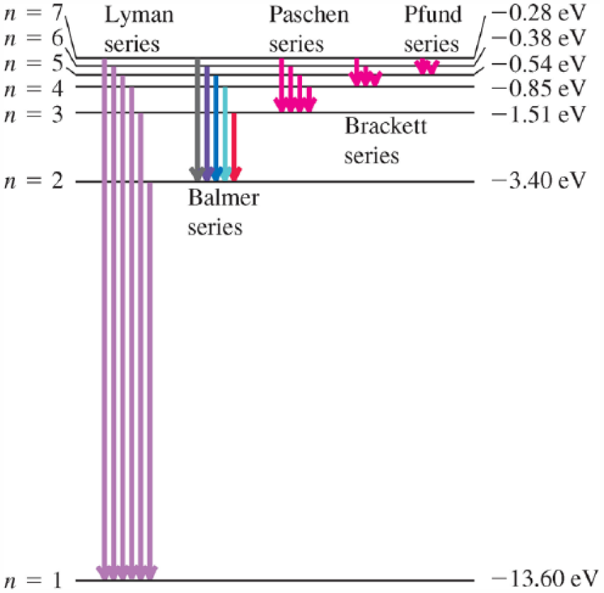
Energy level diagram for a hydrogen atom. © Pearson Education, Inc. Reproduced with permission.
First, this figure presents a one-dimensional graph. It arranges its points, shown by horizontal lines, along the vertical axis and measures them in terms of their energy (e.g. – 3.40 eV, – 13.60 eV). It thus construes an array of energy levels in the hydrogen atom. Figure 10(b) below highlights this by displaying the vertical axis with a red line and highlighting each point light blue.
Graph of energy levels in a hydrogen atom (Axis in red, Points in blue).
In addition, the figure presents a narrative image with the series of arrows indicating a number of Vectors. Each Vector arrow (highlighted in Figure 10(c) below) emanates from a point on the graph. These points thus function as Sources (highlighted in pink). Additionally, each Vector moves toward other points on the graph that function as Goals (highlighted in green). As all points except two (the top and the bottom) have both a Vector emanating from it and a Vector moving toward it, these function as both a Goal and a Source. Figure 10(c) illustrates this reading below.
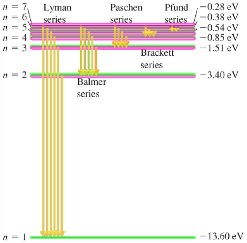
Narrative analysis of an energy level diagram of the hydrogen atom (Vectors in yellow, Sources in pink, Goals in green).
The 20 Vectors and their respective Goals and Sources in this image realize a large number of activities. Each activity corresponds to a transition from a particular energy level to another energy level. As there are 20 Vectors but only 7 points that a Vector can emanate from or transition toward, many activities share the same beginning or end point. This forms the basis for the image to present a classification taxonomy. Each Vector is grouped according to its end point (its Goal, n = 1, n = 2, etc.) and is labelled as a type of series. Those moving toward n = 1 are labelled the Lyman series, those moving toward n = 2 are labelled the Balmer series, those moving toward n = 3 are labelled the Paschen series, and so on. The end result is a classification taxonomy with three levels of delicacy. The most general superordinate arises from the fact that each arrow is structured the same way and is labelled as part of a series. It suggests that, at some level, all the transitions (arrows) are of the same type (i.e. they are electron transition lines). At the second level, the image presents five sub-types of transition lines according to their end-point, each of which is labelled. The five sub-types of transition lines are the Lyman transition lines, the Balmer transition lines, the Paschen transition lines, the Brackett transition lines and the Pfund transition lines. Finally, the third level within each subtype of transition line includes the specific transitions distinguished from their starting point. The Lyman transition series includes six lines, the Balmer includes five, the Paschen includes four, and so on. In all, the image realizes a three-level classification taxonomy that includes 26 nodes. This classification analysis is shown in Figure 10(d). In the interest of readability, only the second level groups of transition lines are highlighted.
Classification analysis of energy level diagram of the hydrogen atom (Superordinate in brown).
The three-level, 26-node classification taxonomy supplements the 20 activities realized in the images as well as the 7 points on the graph and the 19 labels. The image thus encodes a large degree of meaning for what may, at first glance, look like a relatively simple diagram. Such strong semantic density in an image is not unusual in physics. Images in physics provide a means to synoptically integrate meaning, with little extra information given that is superfluous to the technical meaning of the field. By presenting all of the meanings in one snapshot, images such as this offer a path through the relations in the field. In this figure we have just been considering, for example, the image allows the reader to move from the array of energy to the activities of transition to the classification taxonomy of different transition lines. The points on the array function as the beginning and end-points for activities involving electron transitions (although the electrons are not shown). 4 Through the similarity in end-points, the image organizes the arrows into a classification taxonomy. The different types within this taxonomy are then labelled, allowing these field-specific meanings to be discussed in language. By presenting an array, taxonomy and a series of activities, this image realizes much of the field-specific meaning associated with hydrogen atom electron transitions in a single snapshot.
Images and the Knowledge of Physics
This article has illustrated that images hold great power for organizing the knowledge of physics. In LCT terms, this offers physics the potential for relatively strong semantic density by allowing a significant proportion of phenomena to be encapsulated and vast swathes of technical meaning to be combined. Further, they offer a large range of semantic gravity. They can present empirical measurements or generalized theory, and illustrate a pathway between both. Finally, they can be labelled by both mathematics and language, thus allowing the meanings developed in one resource to be expanded in another.
Clearly, however, images are not the only semiotic resource used in physics. In addition to mathematics and language mentioned at the beginning of the article, physics regularly uses animations, gesture, demonstration apparatuses and numerous other resources. From the analysis in this article, we have seen that one of the crucial features of images is their ability to utilize their two-dimensional nature to arrange multiple structures in one single snapshot. This could offer insights into why other resources may be used. For example, animations maintain the potential of images by being able to bring together multiple field-specific meanings in one snapshot, but they also utilize the dimension of unfolding time to give further meanings. Similarly, gesture and demonstration apparatuses utilize the horizontal, vertical and temporal dimensions shown in animations but also bring another spatial dimension that gives depth. With each dimension comes another potential variable for meaning making, offering opportunities for ever increasing swathes of meaning to be captured in any instance.
It was not the intention of this article to trace the development of images throughout schooling. Rather, the examples used were illustrative of the potential images display for physics. It is thus not yet clear whether, as students progress through schooling, there is a steady expansion in meanings realized by images or whether there are distinct shifts as different components or levels of physics are introduced. Such an understanding would complement the many decades of research into the development of written language in science and would offer a firmer basis upon which educational programs could be developed that more specifically target the disciplinary knowledge of physics. However, in order to do so, a more fully developed model of images from the perspective of field is needed that links with grammatical organization of images. This article has taken a step toward this by expanding to a small extent Kress and van Leeuwen’s (2006) grammar to allow for distinctions in meaning made apparent through the field analysis. However, more importantly, to understand further how the knowledge of physics develops and changes over time, an integrated model of its multisemiotic nature is needed. From this, we can understand how the various semiotic resources of physics complement each other to develop generalized theory while maintaining contact with the empirical world.
Footnotes
Funding
This research was funded by an Australian Postgraduate Award and there is no conflict of interest.
Notes
Biographical Note
YJ DORAN is Research Fellow in the LCT Centre for Knowledge-Building and Lecturer in the Department of Linguistics at the University of Sydney who focuses on Systemic Functional Linguistics and Legitimation Code Theory as well as their contribution to the interdisciplinary fields of educational linguistics, multimodality, and language and identity. His research develops grammatical, discourse, register and genre-based descriptions of language and other semiotic resources including mathematics, images and academic formalisms. In addition, he considers the variation in values systems that organize communities of practice, the highly evaluative language that invokes these systems and the theoretical issues that arise from these for our understanding of language, knowledge and pedagogy.
Address: Department of Linguistics, The University of Sydney, A20 – John Woolley Building, Sydney, NSW 2006, Australia. [email: