



Abstract
This article focuses on the ways in which, after its successful bid to host the ‘mega event’ of World Cup 2022, Qatar is branded as a sports tourism destination in the online semioscape and linguascape of sports events. The promotional multimodal digital material that Qatar has already released to launch its ambitious sports-related projects in both its English and Arabic versions is analysed from a critical perspective of multimodal discourse analysis and social semiotics, focusing on image making. This includes the strategic use of symbolic and material markers that construct Qatar as a distinctive destination offering its visitors high quality sports while also being good value for money as it brings the world to its visitors through sports, inter alia. Finally, the argument put forward is that Qatar constructs a politically appealing and distinctive campaign, oscillating between tradition-driven utopia and the remarkably transformed modern landscape of the country.
Introduction
The implied reader of bilingual advertisements is not a national citizen but a transnational consumer. (Piller, 2011: 173, 180)
The State of Qatar is a small country in the Middle East bordering Bahrain, Saudi Arabia and the Arabian/Persian Gulf. As a former pearl-fishing and rather poor country, it has recently come under the spotlight and started being talked about in the global scene after its successful, albeit challenged, bid to host the 2022 World Cup. The country’s economy relies heavily on natural resources, primarily oil and natural gas.
Nowadays, however, due to the rapid fall of the price of oil and natural gas, and as part of the country’s National Vision 2030, there is a foregrounding of the need for diversification of the country’s economy by rendering it as a more knowledge-based and, resulting from this, service-based economy. As an absolute monarchy, all initiatives concerned with the country’s economy either stem from or need to be approved by HH the Emir of Qatar, Sheikh Tamim bin Hamad Al Thani. At the same time, Qatar is currently trying to put itself on the global map as a developing country and as an economy with one of the fastest annual growth rates in the world. 1 Against this backdrop, one of the sectors in which it has started investing exponentially is tourism, both international and regional, i.e. from within the Arab world and, more specifically, the Gulf region. In particular, after the country’s successful bid to host World Cup 2022, sports tourism campaigns figure prominently and these are the focus of this project.
Instances of Qatar’s sports tourism are evident, inter alia, in its actual, i.e. physical, and digital, i.e. virtual, semiotic landscape. By semiotic landscape, we mean ‘any (public) space with visible inscription made through deliberate human intervention and meaning making’ (Jaworski and Thurlow, 2010: 3). A landscape maintains its physical associations, e.g. with actual built landmarks (Salama and Wiedman, 2013), while at the same time presenting its viewers with a context for sociopolitical activity, which is characterized by a symbolic system of signifiers that social actors are invited to make use of and interpret (see Cosgrove, 2008: 34). In contemporary literature, a landscape is usually seen as a text or spectacle (Jaworski and Thurlow, 2010: 5), behind the construction of which there are objects and agents of semiosis that employ this landscape to present their (sports) tourism campaigns aimed at promoting the country. For us, as analysts, on the other hand, landscape is something we employ as our means of understanding and deconstructing the sociopolitical ideologies of the country in ways that are contingent upon our respective life experiences in Qatar coupled with our sociocultural backgrounds.
We understand tourism as ‘an industry which also serves as a platform of (inter)cultural production and exchange’ (Jaworski and Thurlow, 2010: Introduction). Such a Foucauldian take on tourism renders it as a socially constructed system of representations and knowledge about different aspects of reality associated with Qatar. As such, tourism is intricately interwoven with globalization, namely a cultural narrative that reveals and conceals the more tangible working of global capitalism and which, as such, can help us understand not only how the world is stratified but also the role of a country, in this particular case Qatar, in the international arena. Thus, tourism is discursively produced and can be seen as an amalgam of sociopolitical and financial ideologies whose values are semiotized through picture, motion and, of course, language.
This discursive production of tourism can be identified with ‘place branding’, namely the process of ‘establishing a stable link between a place and certain positive experiences’ (Hanna and Rowley, 2008; Theodoropoulou, forthcoming). To this end, our project aims to tackle the ways in which Qatar brands itself as a sports tourism destination. More specifically, the objectives of our project include the charting of the social semiotic and linguistic patterns found in the official material used to promote Qatar as a sports tourism destination, a comparative analysis of this material in both its English and Arabic versions and, finally, the interpretation of this material in terms of its tourist-related and sociopolitical functions.
In order to understand the nature and the functions of these patterns, we draw on social semiotics (Van Leeuwen and Kress, 2011: 109), namely the theory that deals with the material resources, such as image, colour and language, that are put together in order to construct meaning and the subsequent discourses, namely the ‘socially constructed knowledges about some aspect of reality’ (p. 113), that are constructed semiotically. We focus primarily on the design of the advertising materials that we have collected (see below) and we try to flesh out the ideologies that are conveyed semiotically. The dimensions of design that are of interest to us include the visual semiotics of the semiotic text (pp. 114–116), namely its horizontal and vertical polarization of the information values: the horizontal polarization indexes if something is given (left) or new (right), even though in the Arabic version of the semiotic text the reading might be the other way round due to the orientation of the Arabic writing system. On the other hand, the vertical polarization makes a distinction between something ideal (up) or real (down). In addition, the information values can be organized along the dimensions of centre and margins (Kress and Van Leeuwen, 2006: 194). We argue that the way the resources are brought together create an orientation vis-à-vis which sociopolitical ideologies are framed in the discourse of tourism in Qatar. With respect to ‘ideologies’, we concur with Van Dijk (2011: 383), who treats them as ‘fundamental, “axiomatic” beliefs shared by a group … derived from specific events, actions and situations’. These specific events or actions are the micro-texts of ads for Qatar-based mega-events that index the macro-level beliefs and values of the people living and working in Qatar. Against this backdrop, we investigate the ways in which Qatar is branded as a sports tourism destination in the online sociosemiotic linguistic landscape as well as the kind of ideologies that are indexed through the sports tourism landscape. Finally, we consider the goals of such branding for the country in terms of its regional and international relationships. However, before we analyse these dimensions, we briefly discuss our methodology and data.
Methodology and Data
For the purposes of this study, we collected different data from various genres (Jaworski and Thurlow, 2010: 21) of ads for sports events between 2006 to 2022 (see chapters in Cook, 2008) held or to be held in Doha, the capital of Qatar. This period was chosen because 2006 was the year of the organization of the Asian Olympic Games, the biggest sports event Qatar had ever witnessed until that time and can therefore be seen as the beginning of the shaping of the sports-related identity of the country, while 2022 is considered as a benchmark in the modernization of the country, as it highlights Qatar’s upcoming hosting of the World Cup. However, in the context of this article, due to space restrictions, only material from 2006 to 2015 is discussed. Table 1 provides a summary of our corpus:
Description of corpus.
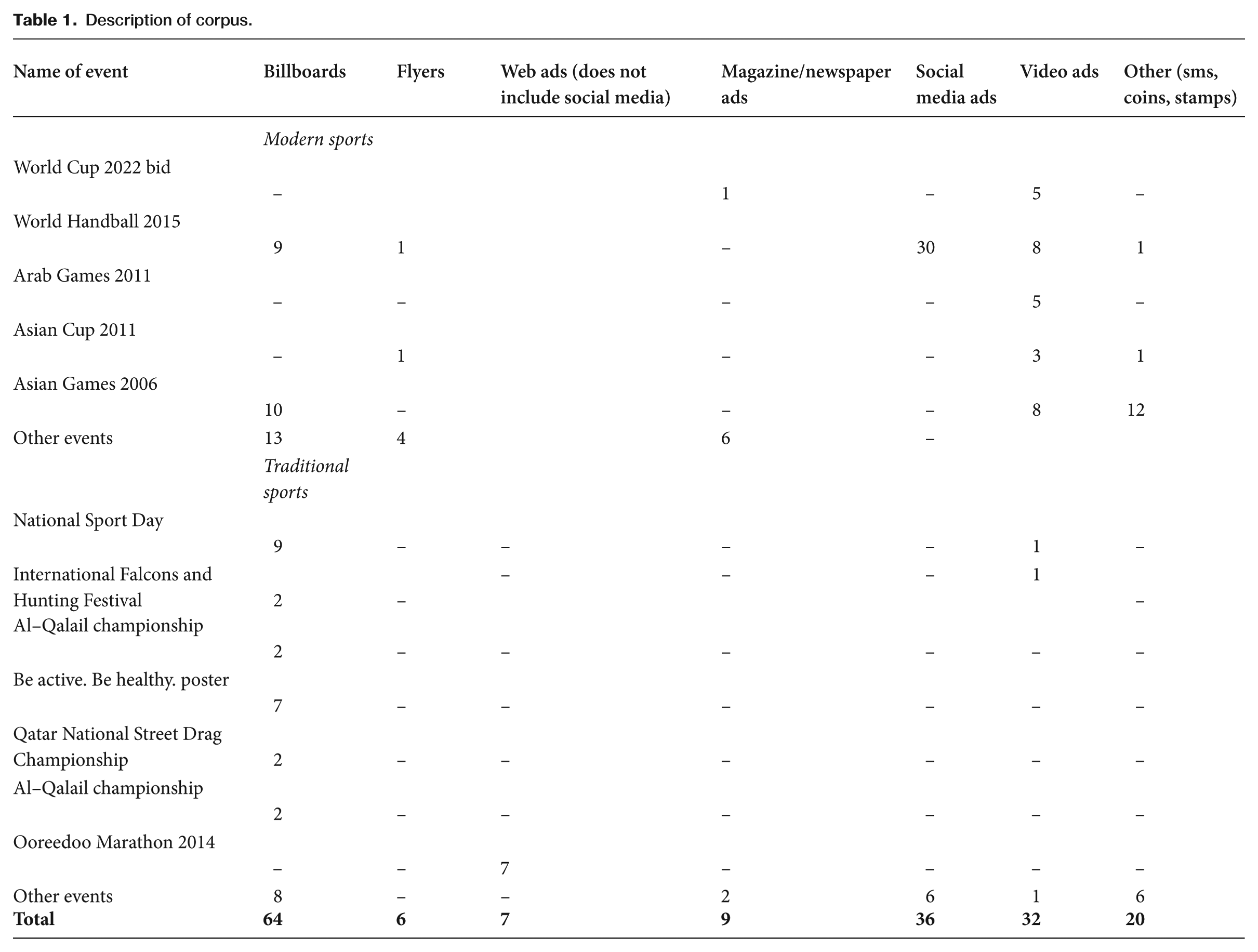
We divided the ads into different categories, including website ads, magazine/newspaper ads, audiovisual ads (including YouTube ads), roadside ads (found on billboards and on large flyers) 2 as well as SMS ads. In order to render our data sample balanced, we tried to collect the same number of ads for each category, that is, a minimum of 15 ads per category. Furthermore, as is always the case with ads in Qatar, we included ads that have Arabic/English translations in order to make comparisons between the two languages and understand the similarities and differences of identity construction in both languages. We believe that such an analytic focus can shed light on how Qatar brands itself locally, regionally and internationally, and help us explore the sports-related linguistic landscape. It is worth noting that we focused on ads for modern sport events, such as football, handball, tennis, basketball and golf, to mention just some of the most important sports events hosted by Qatar, since these are considered to be some of the most well advertised and (relatively) well-attended sports events. In light of this, they can be seen as vital for the country’s effort to promote itself as a world-class sports hub and subsequent sports tourism destination.
The data were mainly collected through the use of Google search engines, but we also went through some social media feeds (primarily on Facebook and Twitter). In addition, we visited a number of malls to get hard copies of advertising material from the booths of the sports events and drove along streets with billboards and flyers, as well as visiting ongoing sport events that took place during the data collection period, such as the International Handball Championship 2015. This material was used as complementary to the online source in the sense that it helped us contextualize some of the online data we collected. Due to the ancillary role of this material, only certain images (i.e. 13, 18 and 22) from it are analysed below. Keywords used in the search engine included ‘Qatar 2022’, ‘Qatar sports’, ‘Qatar football advertisements’, ‘Qatar Handball 2015’, ‘Qatar Arab Games 2011’, ‘Qatar Asian Games 2006’, ‘Qatar Arabic ads 2022’, ‘Qatar English ads 2022’, ‘FIFA 2022 Qatar’, ‘Qatar international sports’, ‘Olympic Committee Qatar’ and ‘Qatar Sports Day’.
The biggest challenge we faced was finding promotional videos of older events, such as the Asian Games in 2006. Since almost all ads were collected using the internet, it was not easy to locate the Arabic/English version of each ad, in the sense that the translated version was not always easily retrieved with the original version.
A total of 175 ads were collected, most of which were translated from English into Arabic and vice versa. In the following section, we document the sports event-related digital semiotic and linguistic landscape of Qatar and analyse the discursive strategies in which the branding of the country as a tourism destination takes place. Finally, we discuss the soft political ideologies at play that are indexed through these discourses.
Semioscaping Qatar as a Global Brand
Qatar is semioscaped, that is to say semiotically constructed and circulated, locally and internationally as a sports tourism destination. What is important to highlight is that, as analysts, we do not just view or read the landscape but, as subjects and potential consumers, we actively perceive the landscape implanted within its semiotic sphere (Chmielewska, 2010: 274). Our analysis tries to reflect our topo-sensitivity of artefacts in Qatar, namely their sociohistorical and cultural context along with their political and economic affordances.
Internationally speaking, Qatar Airways, as the national carrier of the country and a world-class airline, promotes sports through the designing of the planes’ exteriors and tailfins with visual ads related to Football Club Barcelona (henceforth FCB), as they are the club’s ‘global main partner’ Figure 1 epitomizes this idea of promotion by portraying a Qatar Airways Boeing 777 with its cabin covered equally by the logo of Qatar Airways and by the distinctive Barça scarlet and blue logo, or “Blaugrana” as it is known in Catalan. The equally dedicated space to both logos in the exterior cabin indexes the readiness of Qatar Airways and FCB to take their equal partnership to the skies. The Qatar Airways logo is also printed on the FCB players’ jerseys (Figure 2), which is obviously an act of entextualisation (Bauman & Briggs, 1990): something situated and transformed into a text (a representation) to be carried off somewhere else (in a football stadium or in an advertisement). Given that the logo is essentially worn and moved around by the players and the fans of the team all over the world, its related identities and ideologies achieve a global reach. Their promotional ads feature famous players, such as Messi, Neymar and Suarez, among others. Even though the promotions may appear to be for Qatar Airways, we argue that they indirectly promote Qatar and make it visible in the world sport scene through the extensive mobility of the Qatar Airways fleet as well as the fact that FCB’s games are broadcast all over the world. The digital omnipresence of the Qatar Airways logo establishes a strong correlation between Qatar and circulates its love and enthusiasm for sports all over the world.
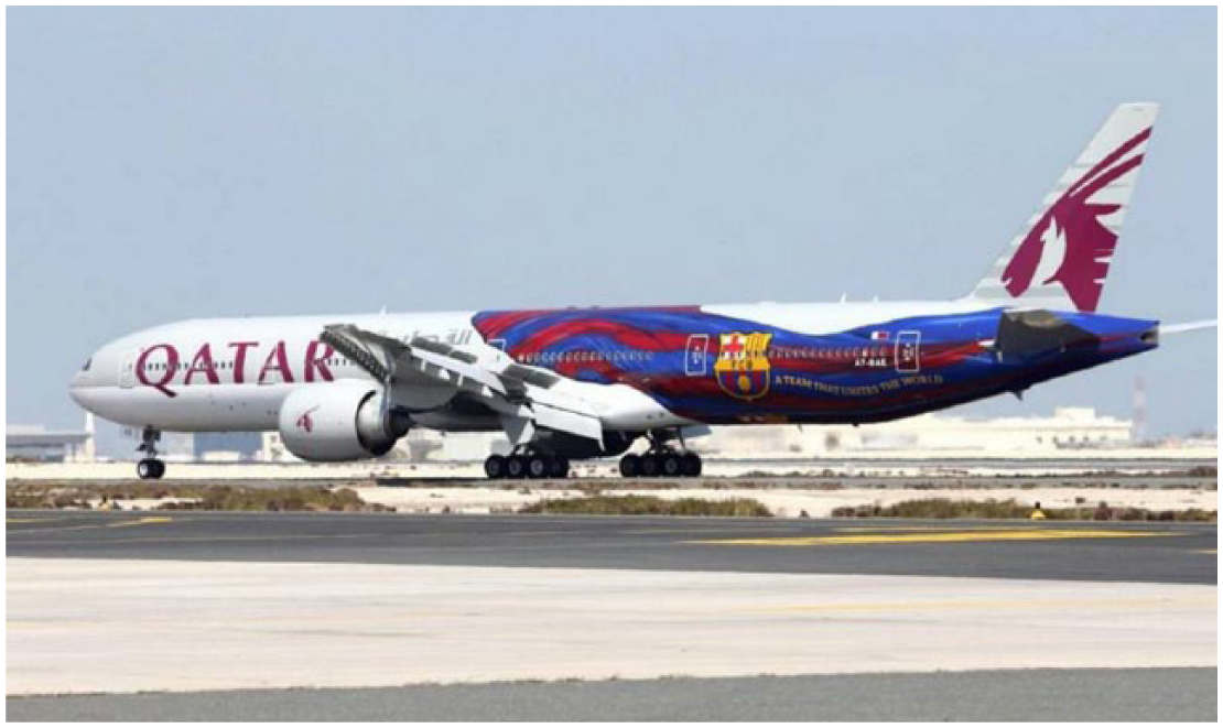
Qatar Airways aircraft.
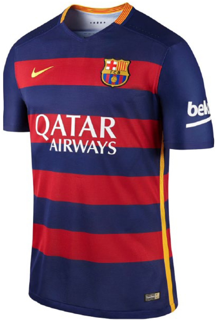
FC Barcelona jersey.
This internationalization of Qatar’s zest for sports and world-class players in all sports is further enhanced through the organization of annual world-class sports events in Doha, the capital of Qatar, such as tennis tournaments for women (Figure 3) and men (Figure 4). Less mobile than the previously mentioned ways of advertising but still widely circulating in the digital sphere, these tennis-related materials foreground superstar tennis players, both women and men, including Maria Sharapova, Simona Halep, Lucie Safarova and Victoria Azarenka, as well as Rafael Nadal, Roger Federer, David Ferrer and Juan Monaco, who through their international recognizability offer credibility and promotional value to the sport scene in Qatar. In addition, owing to their participation in these events, they honour and legitimate Qatar as a world-class sports tourism destination.
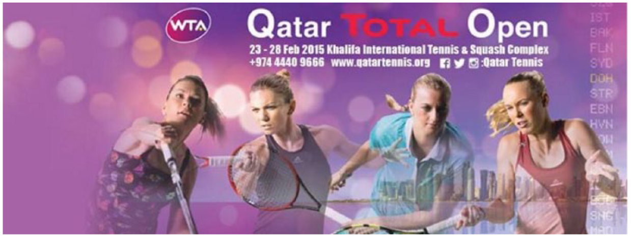
Qatar Total Open 2015 (women).
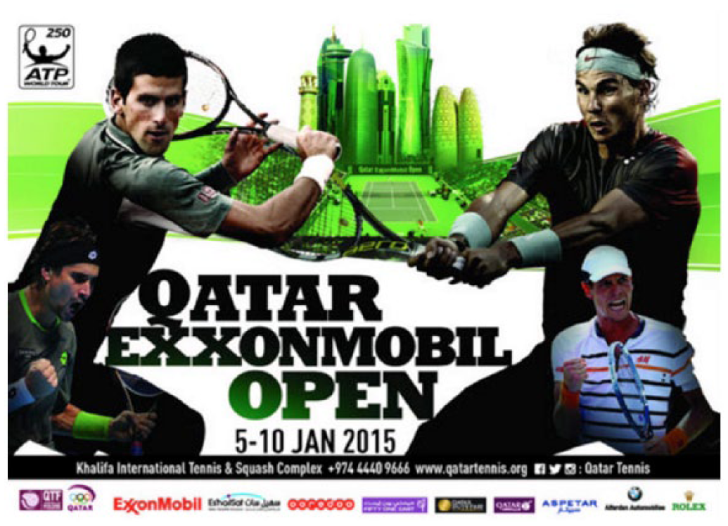
Qatar Exxon Mobil 2015 (men).
Equal representation of women and men is important here as Qatar tries to distinguish itself from neighbouring countries, such as Saudi Arabia where, due to very strict gender segregation, women are almost invisible in the public sphere. At the same time, the country tries to construct for itself an image of a modern country that embraces both women and men and can thus be seen as an ideal destination for hosting sports events and attracting male and female visitors from all over the world.
The emphasis on modernity is further enhanced by the background of Figure 4, where the Doha Corniche skyscrapers, some of the most iconic landmarks of the country, are depicted along with the more traditional towers of Qatar’s cultural village, Katara. These are actual buildings that, however, when depicted in a flash green colour – the colour of Islam and also the colour of eco-friendliness (see Kress and Van Leeuwen, 2002) – represent Qatar as an environmentally sensitized country that welcomes activities and people from modernity. 3 At the same time, Qatar adheres to its Islamic values and manages to balance these two seemingly opposing worlds and cultures.
In sum, through highly mobile double logos of Qatar Airways and FCB, coupled with less mobile billboards found inside Qatar but also distributed all over the world through their wide digital dissemination and circulation, Qatar tries to put itself on the international sports map by promoting its enthusiasm for participating in sports-related activities as diverse as funding world-class football clubs, such as FCB, as well as hosting sports events, such as tennis championships. In this way, Qatar secures its multifarious presence in the global sports scene and creates better chances of being recognized as a legitimate sports player in tourism.
Qatar and its Sports Lifestyle
Apart from the internationalization of its sports-related presence, Qatar also tries to promote some kind of internal sports tourism. Along with other two countries, namely India and Japan, Qatar is the only country to have a Sports Day, which is a national holiday celebrated annually and widely. In order to promote this event and healthy living in general for its citizens and expats alike, Qatar uses government-approved ads, such as the one found in Figure 5.
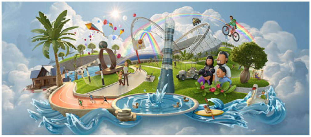
Qatar National Sports Day 2015 ad.
Here, various social segments of the Qatari population are represented, such as Qatari nationals and expats; the former are indexed through their national dress, namely thobes (for men) and abayas (for women). Children also feature very prominently, which hints at the investment of Qatar in younger generations for its sustainability; it is not accidental that the current Emir, HH Sheikh Tamim bin Hamad Al Thani, at the age of 37 years old is one of the youngest leaders in the world.
In terms of the orientation of this ad from an Arab reader’s perspective, which makes more sense here given that it was designed in Qatar (although the designer is unknown), there are interesting implicit meanings. We would argue that what is depicted on the right of the image is the relatively inactive (and almost verging on sedentary) life of the primarily Qatari population indexed through the Qatari family going for a walk, which gradually starts being portrayed as more active through the various sports that are depicted in the middle and towards the left of the image, such as kayaking, swimming, jogging and running. In this way, the meaning is a twofold one: on the one hand, people who live in Qatar are encouraged to adopt a more active and, hence, healthier lifestyle; on the other hand, the outsiders who may be viewing this ad are informed that Qatar’s lifestyle has started changing and, hence, the country wishes to stake a claim for being a sports tourism destination, not only for official sports events including professionals, but also for visitors of the country who want to spend some leisure time in Qatar.
With respect to the vertical axis of the design, at the bottom of the ad lie more grounded places associated with sports in Qatar, such as the lake found in Aspire Park, which is part of the Aspire Zone, while at the top of the ad lie rainbows, kites and a cyclist – symbols, in our opinion, of the happy, idyllic and (care)free image that the country is trying to construct for itself as a potential tourist destination. At the centre of the image lies Aspire Tower, the most iconic landmark of Aspire Park that can be seen from all over Doha. The greenery found in Aspire Park is also backgrounded here and thus renders the whole ad as a spectacular contrast to the arid land that characterizes Qatar. Overall, through this image, a healthy lifestyle coupled with the diverse activities that visitors of Aspire Park can engage in is promoted on the occasion of National Sports Day.
Along the same lines of promoting sports tourism framed as a move towards a healthier lifestyle, Figure 6 is an ad of the national telephone and internet company Ooredoo. In contrast to the previous one, in this ad there is a very evident foregrounding of the sociodemographic diversity characterizing Qatar, which is celebrated here against the usual background of Doha’s iconic West Bay skyscrapers landscape.
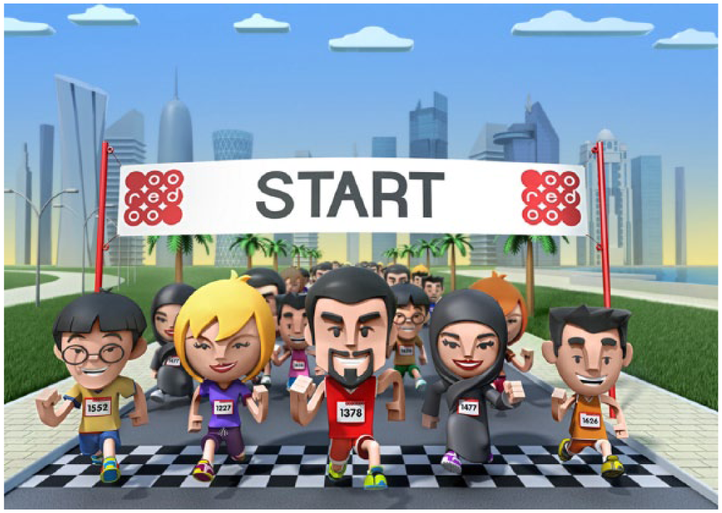
Logo of Ooreedoo Marathon 2015 (sociodemographic diversity).
In the past, there have been criticisms of the country for not being able to integrate diverse segments of the population of Qatar through encouraging them to participate in common activities due to its ghettoization of labour from the Indian subcontinent (see chapters in Kamrava and Babar, 2012) or the sharp gender segregation that is promoted in the country (see Theodoropoulou and Ahmed, forthcoming) or the sharp gender segregation that is promoted in the country. Nonetheless, this ad tries to overcome these stereotypes by portraying men and women, Muslims, Asians and Westerners running next to each other. Apart from the obvious harmonious co-existence between different social groups, Qatar is once again trying to construct for itself an image of a sports tourism destination, where everybody is appreciated and given the chance to participate on an equal basis in a symbolic sport, such as the Marathon, and win. The Marathon itself symbolizes the perseverance, effort and collaboration that runners need to show in order to be able to finish. Such an activity can be seen as symbolic of Qatar’s persistence and hard work in establishing themselves as keynote players in the global sports scene by bidding for and eventually winning the right to host mega sports events, such as the 17th IAAF World Championships in Athletics in 2019 and, of course, the 2022 World Cup.
Drawing on the same event but emphasizing different dimensions of diversity, Figure 7 portrays a gender-segregated take of the starting line in the Ooredoo Marathon by focusing on unhealthy and unproductive lifestyle activities that the participation in the Marathon is supposed to tackle, such as the consumption of junk food or the sedentary lifestyle associated with playing video games. The ad aims to promote a more active and, hence, more productive lifestyle targeted especially at its nationals. Interestingly, the ad stereotypifies Qataris by depicting them as engaging in the previously mentioned practices. This stereotypification of Qatari men, in particular, is portrayed not only semiotically, but also linguistically, as becomes evident in the following images.
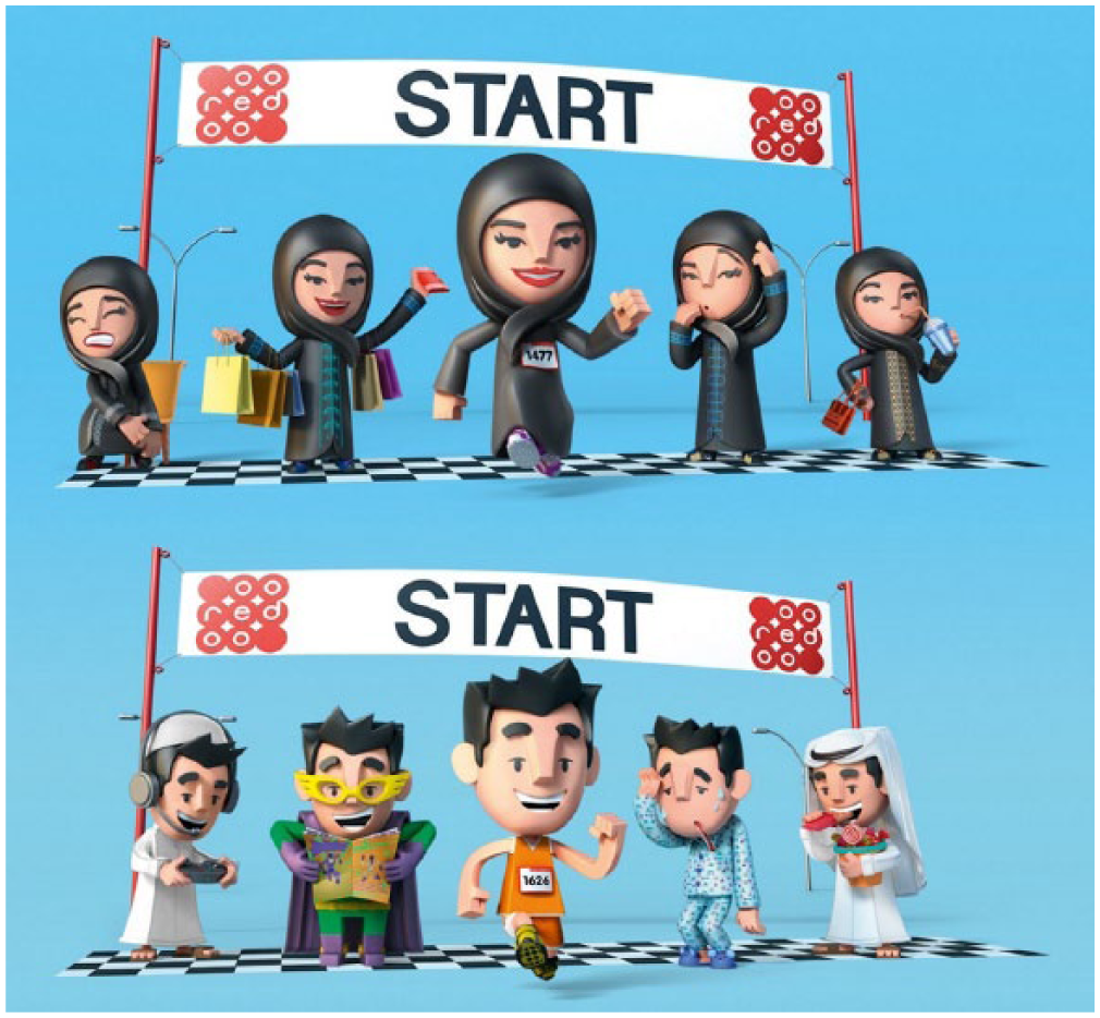
Logo of Ooredoo Marathon 2015 (lifestyle diversity).
The ad features five men dressed in traditional thobes, explicitly indexing the social identity of the Qatari middle-aged male. It employs socially recognized themes, such as social media addiction, unhealthy eating habits and workaholism, represented in a series of stereotypical images captioned with the tropes ‘the can’t disconnect’, ‘the junk lover’ and ‘the always busy’, respectively. As the ability to interpret a message is always a function of viewers’ cultural identity, readers must draw on their contextual knowledge to construct the intended message. Although these tropes could be said to apply to a similar extent elsewhere in the world – a sedentary lifestyle being a typical modern feature irrespective of the country – Figure 8 will strike a chord with locals who will most likely associate it with the ubiquitous awareness-raising posters addressing the high incidence of obesity and diabetes in Qatari society as a direct consequence of the lifestyle choices depicted in this ad. The image therefore draws an explicit connection between the place, Qatar, and an unhealthy lifestyle, but this message is presented in a light-hearted, non-confrontational caricature style that allows viewers to recognize themselves in the cartoon characters while, at the same time, predisposing them to be more willing to acknowledge the problem and be more accepting of the alternative.
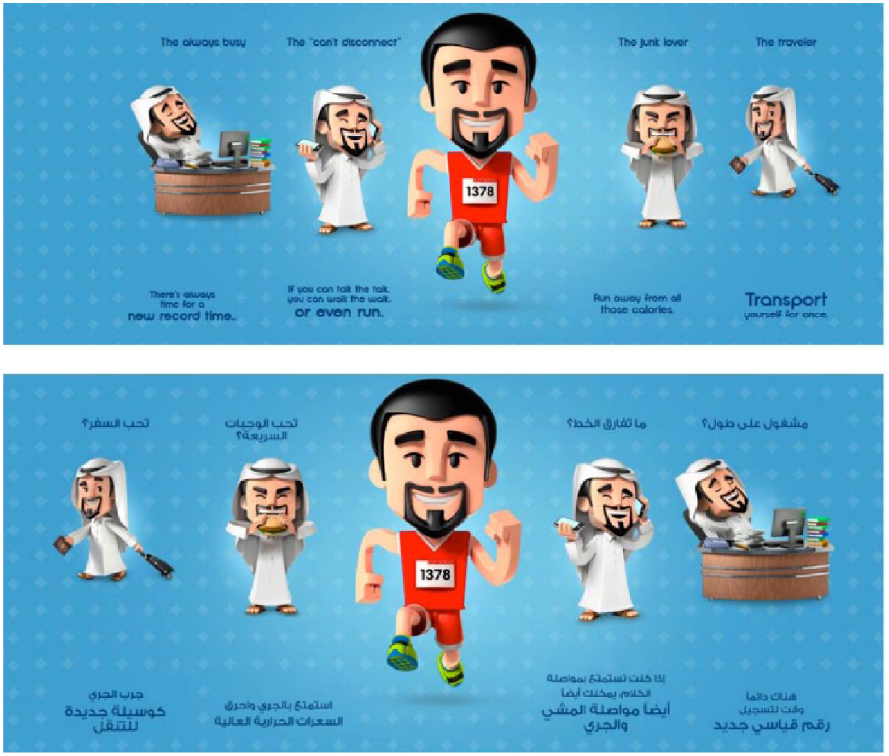
Ooredoo Marathon – Which sides of you are you running against? (English and Arabic versions).
The central image of a healthy-looking male running the marathon in a contrasting, eye-catching red kit, plays upon the insecurities of readers by presenting them with a more desirable alternative – an ideal to aspire to – that effectively dissociates them from the stereotype. In English, this alternative is expressed linguistically through, for example, the use of the well-known idiom ‘talk the talk, walk the walk’, and a parallel ‘there is always time for a new record time.’ Such rhetorical devices function by claiming common ground with the readership and emphasizing a shared identity through familiarity with the idiom. Similarly, parallelism functions as a mnemonic device, ensuring message retention, as in the case of slogans.
The corresponding Arabic ad features an example of register variation (Biber and Conrad, 2009: 6–10, 23–24) between the captions that signal the stereotype and those that present the alternative. In the former, the choice of rhetoric allows closer identification with the viewer as it employs a variety of colloquial Arabic spoken in the Arabian Gulf and addresses the male reader directly in a series of questions conjugated in the second person singular masculine. In contrast, the alternative healthier lifestyle comes in the guise of lecture-style expert advice, presented in a more detached formal register through the use of Modern Standard Arabic (MSA). As the language of books, newscasts, political speeches and religious sermons (Albirini, 2016; Bassiouney, 2009), MSA connotes moral authority and signals credibility and scientific expertise. The combination of informal and formal registers serves the function of the ad; the former attempt persuasion by appealing to emotions; the latter seek to persuade by addressing rational judgement.
Linguascaping Qatar through Slogans
Apart from the semiotic landscape of Qatar, which is employed as a resource for branding the country as a sports tourism destination, there are also attempts to do that through the employment of slogans in ads that target both Arabic-speaking and English-speaking audiences. These slogans are found in the ad texts and their translations (see Figure 9).
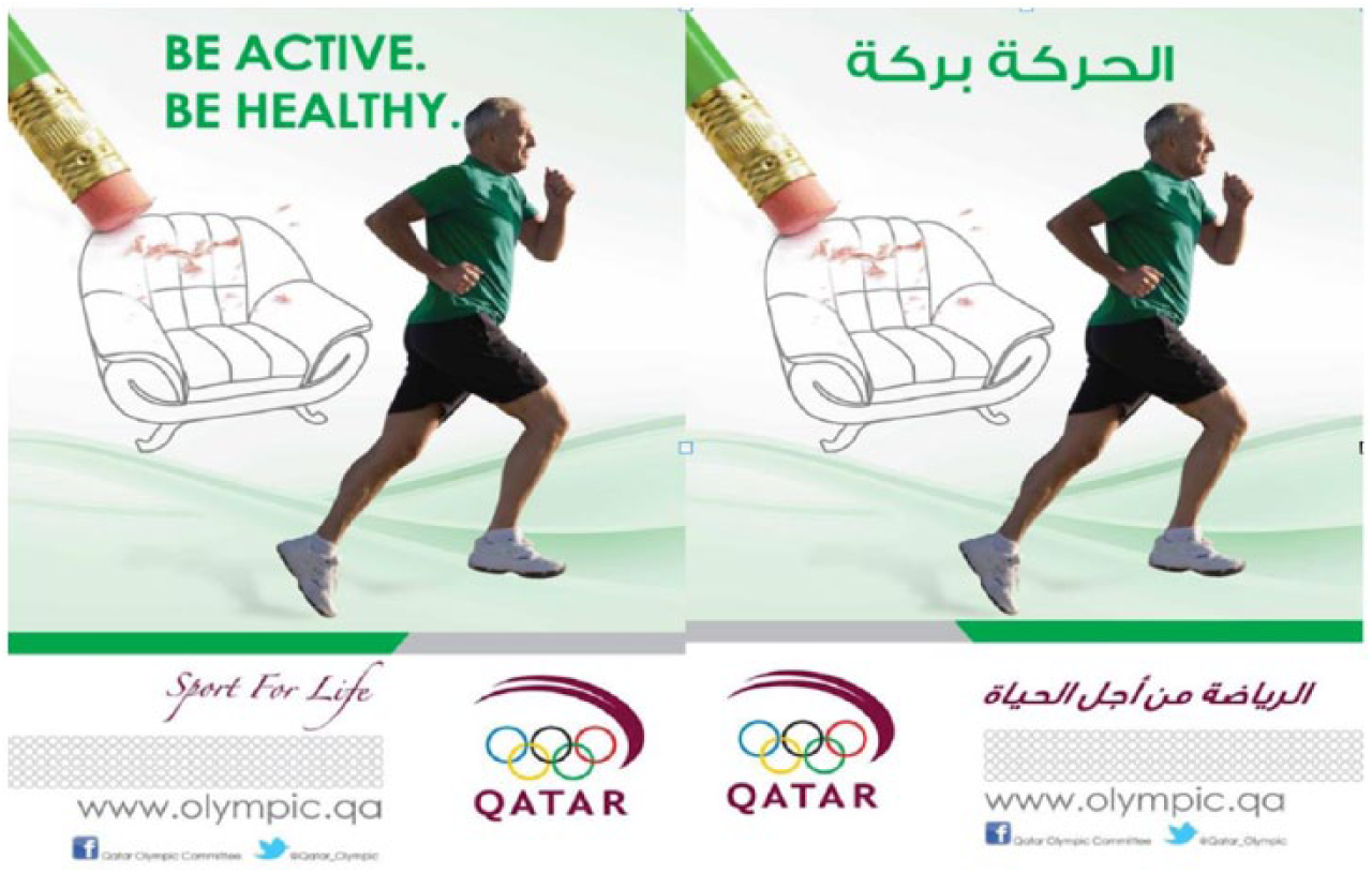
‘Be active. Be healthy’ campaign (English and Arabic versions).
The English ad features an instance of parallelism through repetition of words. While the addressee is left vague in the Arabic version, enhanced by an image of a man jogging, the English translation makes the addressee explicit through the use of the imperative verb ‘be’, which results in double exophora (Cook, 2001: 158) as it refers to both the ad viewer and the man in the picture.
Often found in slogans, parallelism is a regular feature of advertising discourse. The repetition of a linguistic pattern emphasizes the repeated element, enhancing retention of the message. Beyond aesthetics, the symmetrical arrangement of linguistic elements through parallelism also communicates meaning through the particular positioning of linguistic elements within the overall ‘graphological layout’ (Cook, 2001: 135). In other words, the semantic and pragmatic content of the advertising message becomes inseparable from its form. Here, the parallel is broken in the corresponding Arabic version as it avoids the repetition of ‘be’. Instead, the Arabic text features the very well-known rhyming idiom in Arab culture ‘al-haraka baraka’ (movement is good fortune). The rhyming pattern effectively recreates parallelism through rhyme, while at the same time enhancing identification with the message as it holds particular, culture-specific significance for its intended Arabic-speaking audience.
In Figure 10, the English text features an example of ellipsis. The message is encapsulated in a series of fragments that evoke the exciting ambience at a live international championship handball match. The use of ellipsis is reminiscent of an informal speech style, which in turn contributes to constructing an intimate relationship with the reader. Many parts of the text are left implicit, leaving it to the reader to deduce them from the context. Syntactically speaking, it is a deviation from standard English grammar, but this ‘purposeful use of non-standard language’ (Torresi, 2010: 121) ensures better recall of the ad by involving readers in the reconstruction of an implicit, indirect advertising message.
The Arabic version, in contrast, features a comparatively higher degree of explicitation, namely ‘the process of introducing information into the target language which is present only implicitly in the source language, but which can be derived from the context or situation’ (Vinay and Darbelnet, 1958: 8). Replacing ‘sneaker squeaks’ with ‘the passion of the players’, and the introduction of the sentences ‘these are just words’ and ‘reality is much more’ weakens significantly the mysterious effect created through the use of ellipsis, by making a more overt reference to the advertised sports event. The choice of making the translation more explicit in this instance is not a strict requirement of Arabic language as maintaining the elliptical construction would also have been grammatically acceptable.
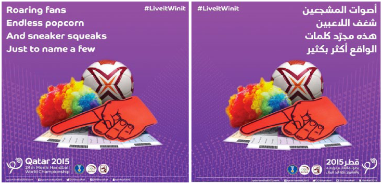
Men’s handball world championship (1) (English and Arabic versions).
In a further departure from the source text, the Arabic version omits the reference to popcorn, presumably because this is not a popular snack at sports events in the Arab world.Another slogan associated with the handball championship campaign is ‘nothing beats live’ (see Figure 11). The translated slogan can be glossed as ‘at the pitch it is different’, which suggests that attending a game live is a superior experience.
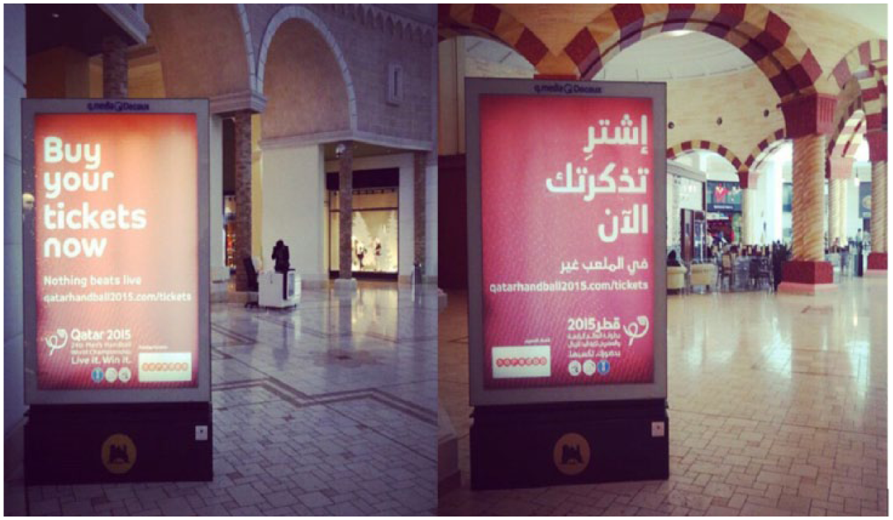
Men’s handball world championship (English and Arabic versions).
The text is in colloquial Arabic, which makes it more relatable to an Arabic-speaking audience, and preserves the catchy quality of the source text slogan. The translation in this instance takes into consideration the information–persuasion ratio of the ad (Torresi, 2008). In line with the functionalist view of loyalty in translation, since the slogan aims to persuade by appealing to the addressee’s emotions rather than their rational judgement, cross-linguistic adaptation is necessary and a non-literal rendering of the message seems more appropriate.
The following ‘Qatari volunteers open house’ ad (Figure 12) features interesting language choices such as the use of encouraging expressions to motivate Qataris to volunteer and promote Qatar as a successful sports destination.
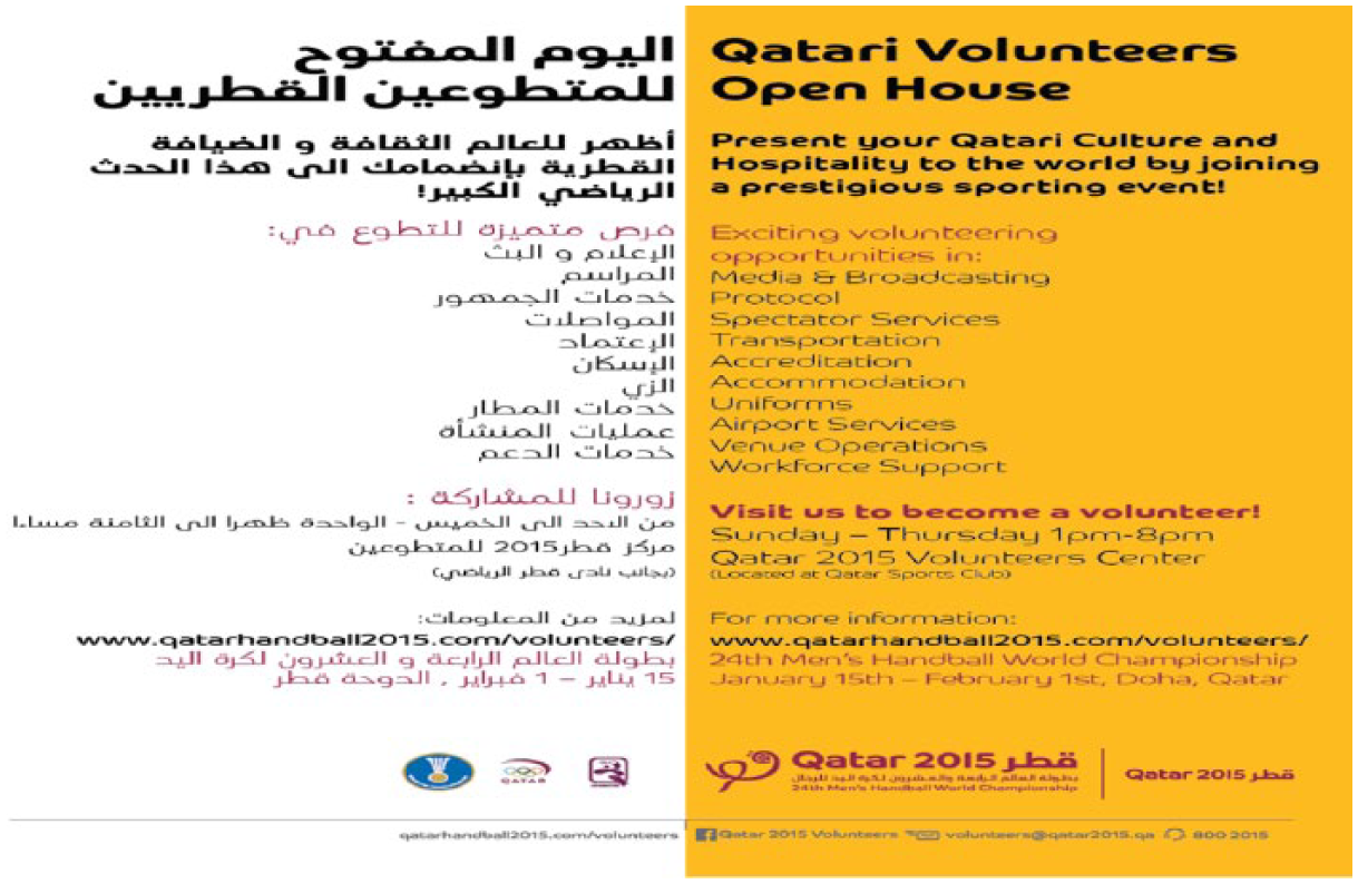
Men’s handball world championship – Qatari volunteers open house (Arabic and English versions).
Examples include ‘be a part of the success of an International Sporting Event’, ‘working alongside Sports Professionals’, ‘support Qatar as a country of Sporting Excellence’. Certain phrases (in italics) are capitalized, possibly for emphasis. Interestingly, the poster appears in Arabic and English even though, as the sentence ‘showcase the Qatari culture and hospitality to the world!’ clearly suggests, it targets only Arabic speakers. The purpose may be to present an image of Qataris to a non-Arabic-speaking audience as actively participating in international sporting events, especially since volunteering is beginning to gain popularity among young Qataris.
To sum up, through a strategic use of easily retrievable slogans from colloquial Arabic, the ads analysed above construct a linguascape that is appealing to Arab speakers, both nationals and residents as well as visitors, who may wish to become involved in sports activities in the country.
Between Modernity and Tradition: Mascots and Logos of Sports Events
Apart from graphic images and slogans, another pervasive and highly effective advertising strategy that Qatar employs to construct itself as a sports tourism destination is a wide range of mascots and logos, all of which draw on and have been inspired by Qatari culture. In this way, they introduce the visitors of the sports events to Qatari culture.
The most widely known mascot used in a sports event held in Qatar is Orry, which was used in the 2006 Asian Games and has remained since then as an iconic symbol and landmark of the landscape of Doha.
As a mascot, Orry is inspired by the Arabian oryx, one of Qatar’s famous animals. This desert deer is part of the Arabic environment and heritage since it is one of the main national animals (next to falcons) in Qatar. In its original form, Orry (Figure 13) was wearing a runner’s kit in yellow, blue and red, three very symbolic colours of the Qatari culture as they are associated with the desert (yellow), an omnipresent landscape in Qatar, blue (the colour of the sea and the sky, two important concepts associated with the lives of pearl fishermen in the past) and red, the colour of the sky at sunset.

Orry (also known as the ‘Mutant Rabbit’), the mascot of the Asian Games 2006.
The same colours are also employed in the logo of the event (Figure 14) designed as a more abstract figure of a runner. This logo symbolizes the desert sand and the sea, two of Qatar’s pervasive dimensions of its landscape. The sun, which is depicted as the head of the runner, indexes the hope that such Games can bring not only to the participants themselves but also to the peoples of the countries that participate(d) in this sports event held every four years. This more minimal – and hence more open to different interpretations – figure used as a logo might be argued to de-emphasize the local flavour of Orry and to render the event more inclusive of the other participating countries, with the ultimate goal of making each of these feeling welcome. By extension, this logo is argued to be employed in order to pave the way for the establishment of bilateral relationships between Qatar and its new – at that time to be – strategic allies, with whom they would do business together.
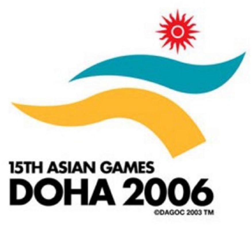
Logo of the Asian Games 2006.
In its contemporary form, the colours of the clothes in the logo are white and maroon, which are also the colours of the Qatari flag. This changing of colours might be argued to index a change in the shift of the focus of symbolism: when Orry was wearing the Qatari flag, the national team was playing so the function of the mascot was to support them but now that the tournament is over, Orry (Figure 15) represents the event as whole. It holds the torch that was used in the tournaments. The torch is also related to the famous Torch Tower in Aspire Zone, which is now another memento of the 2006 Asian Games. The mascot is still located in the Corniche, one of Qatar’s landmarks and tourist spots, and it is widely visible. It is a memento of the Asian Games 2006. Against this backdrop, it is reasonable to assume that Qatar uses its tourist spots to promote Qatar as a sports tourist destination. The pervasiveness and popularity of Orry is such that it gets resemiotized in logos of mega events, such as the logo of the Asian (football) Cup 2011, which is found in Figure 16.
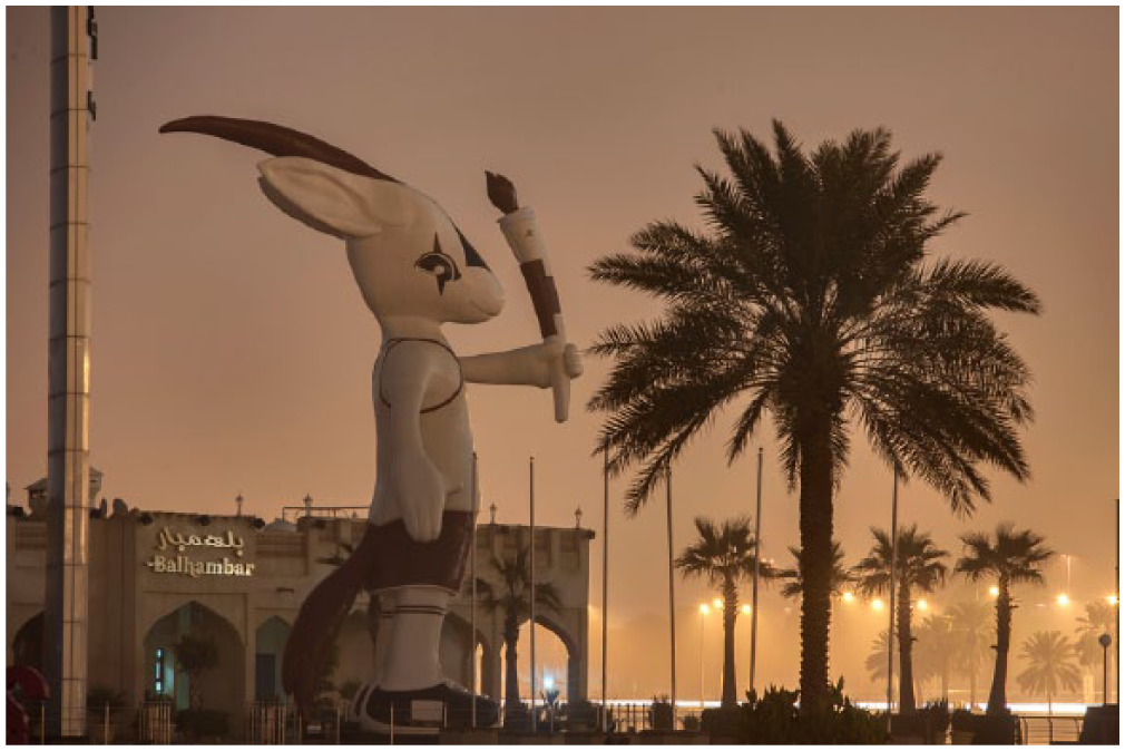
Orry in 2016.
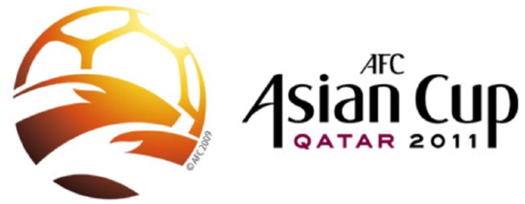
Logo of the AFC Asian Cup 2011.
The semiotic coupling of the head of Orry and a football all painted in a brown–yellow colour symbolizing the hot desert conditions that are found in abundance in Qatar juxtaposed with an explicit reference to Qatar as the host country can be seen as an efficient strategy for promoting the close relationship between tradition and modernity indexed through the oryx and the football, respectively, that characterize Qatar. What is foregrounded here is tradition, represented as existing against the backdrop of modernity; the latter is indexed through the football in the background. Reading the image from left to right, one could also argue that there is some sort of movement and mobility effect (Theodoropoulou, 2015) offered by the supposedly running oryx, a fact that shows how much ground Qatar has covered over the years in order to be able to improve its infrastructure (including its stadia) so that it can offer world-class facilities to its nationals, residents and visitors alike. This idea of movement is further enhanced through the colours of the ad, which create a sunshine effect and give a sense of energy and, by extension, enthusiasm to both the participants and the audiences of the 2011 AFC Asian Cup. This sense of energy, of course, hints at the fact that the main source of income for the state of Qatar and, by extension, for Qataris themselves, is their generation of energy through petrol and natural gas.
Apart from this logo, the 2011 AFC Asian Cup also had a family of mascots inspired by the Qatari culture, as seen in Figure 17. More specifically, this mascot, designed by the Qatari artist Ahmed Al-Maadheed, was inspired by an animal called a ‘lesser jerboa’, a rodent that lives in the Qatari desert. It is not just one mascot, but actually five members that represent a family. The choice of a jerboa family is not merely accidental – on the contrary, it is used to index and highlight the importance of family not only in Qatar and in the rest of the Middle Eastern Arabic-speaking countries that participated in the Asian Games, but also the currency this institution carries in Asian countries. This family has a mother, a father, an older sister and two young brothers. The characters, Tmbki, Freha, Zkriti and Tranaa, are named after different locations in the north, south, east and west of Qatar. In addition, a fair representation of the whole country not only in terms of its geographical span but also in terms of its demographic structure, i.e. both men and women, is achieved by including female characters as well, another effort on behalf of Qatar to stress the fact that women are welcome to participate in and watch the Asian Cup. Such a tendency echoes the analysis of Figures 3 and 6 above. Through its design choice, the ad tries to put forward the idea of promoting women and their rights, at least compared to other neighbouring Gulf countries.
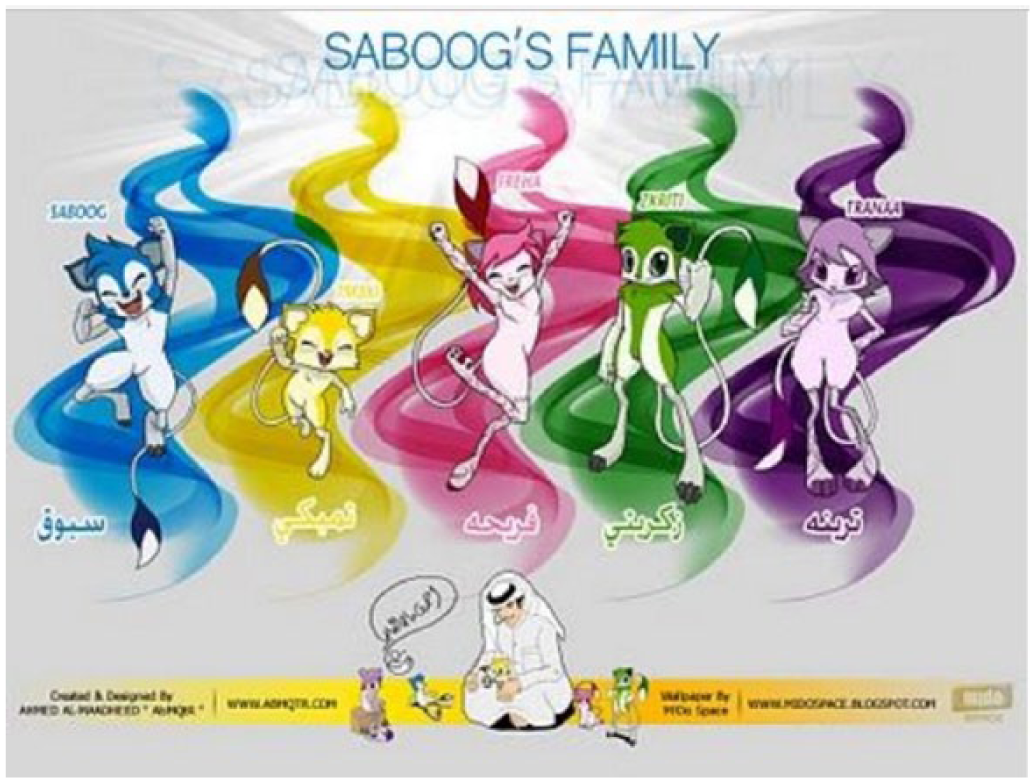
Saboog’s family (mascots of the Asian Cup, 2011).
Apart from this local flavour, the design of the mascots itself, namely the slim body lines coupled with big eyes, draws on the global recognizability of manga, the globally popular Japanese animations. In this way, the mascots are designed to Japanize and, by extension, Asianize the Qatari image, namely to frame it in an appealing way in order to attract sports teams and visitors alike from both Asian countries and the Arab world. Fortunately, Japan won the cup by beating Australia in the final game of the event.
Other aspects of the Qatari culture are highlighted in various other mascots that the country has mobilized over the years in order to promote its sports events. Wathnan (Figure 18), the white Arabian horse, whose name stems from the word ‘wethna’ ‘وذنة’, which is a breed of Arabian horses, has been used as the mascot of the 2011 Arab Games in Doha. Again, in alignment with the country’s emphasis on its traditional sports, such as horse riding, what is promoted here is the beauty, elegance and pride associated with Arabian horses as well as the culture of the country itself, in which horses figure prominently. More specifically, Wathnan can be seen as an indirect way for Qatar to honour the courageous war horses ridden by victorious Qatari knights of the past, and at the same time to ensure that the Arabian horse would continue to play a leading role in the cultural heritage of the Qatari people. The latter are embodied in the figure of the Qatari warrior riding Wathnan, who wears his traditional bisht, an attire that Qatari men wear on very formal occasions, such as weddings or parades, and his ghutra, namely the headscarf that is embroidered with subtle Arabic design patterns. Even though the bisht is usually black or navy blue, the bisht of this image has the colours of the Qatari flag, namely maroon and white, in order yet again to promote Qatar as a country and as a nation to the rest of the Arab world. This readily recognizable mascot can be argued to symbolize the spirit of competitiveness that the organizers of the event were hoping for participants to exhibit. At the same time, it indexes the bravery and courage of the Qatari people over the years.
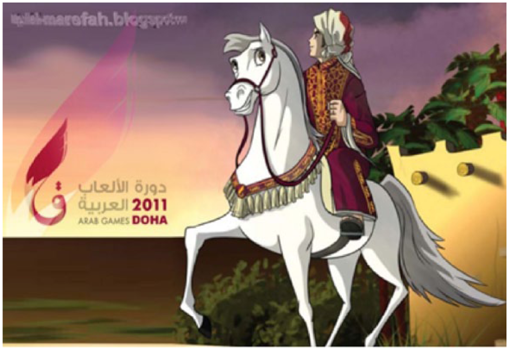
Wathnan (mascot of the Arab Games, 2011).
Along the same lines as the Qatari warrior, Fahed (Figure 19), whose popular Qatar name means ‘strength’, ‘speed’ and ‘fierceness’, was also used as a mascot of the 24th Men’s Handball International Championship that was held in Doha in 2015. Fahad is also the Arabic name of the cheetah, the fastest mammal on earth (representing the ‘game of fast’ and by extension the ‘country of the fast’, indexing again the lightning speed with which this country is transforming itself in terms of its infrastructure and its opening up to the rest of the world).
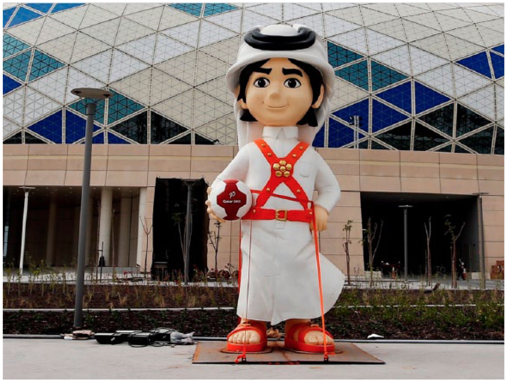
Fahed (mascot of the 24th Men’s Handball International Championship 2015).
Contrary to the previous warrior, Fahed, a design by the Qatari student Roda Al-Thani,
4
represents a 6-year-old Qatari boy (and, by extension, the Qatari youth, to which Qatar has invested heavily in line with the National Vision 2030) dressed in his national and traditional costume that we have seen above and also wearing brown sandals, which are very typical for Qatari boys and men, and his gunpowder belt. He symbolizes the love for adventure and excitement that he inherited from his father. He is very close to his family and is the youngest of five siblings. His brothers bring out the fun and competitive side of his personality, while his sisters love him for his playfulness, his natural charm, twinkling eyes and friendly smile.
By appealing to both schoolchildren in Qatar who represent the future of the sport as well as to adult handball players and fans, Fahed promotes the politics of the State of Qatar pertaining to sports: engagement of as many and as diverse as possible segments of the local, regional and international community. In addition, due to his young age, he represents the future of the country. Also, his defensive body posture in front of the goal could be argued to index Qataris’ attempt to protect their culture from external sociocultural influences, i.e. an attempt to retain their authenticity and originality.
During the opening and closing ceremonies, Fahed came to life in the form of a real Qatari boy! The success and impact of Fahed on Qatari society were so great that the meaning of the mascot was resemiotized (Iedema, 2003: 30; Theodoropoulou, 2016), namely it was transformed across different media as a successful mobile game app called ‘Go Fahed’ (Figure 20), whose format and design are similar to those of Super Mario. The game features characters representing some of the countries participating in the tournament. It has 24 levels, representing the number of times the championship has taken place so far.
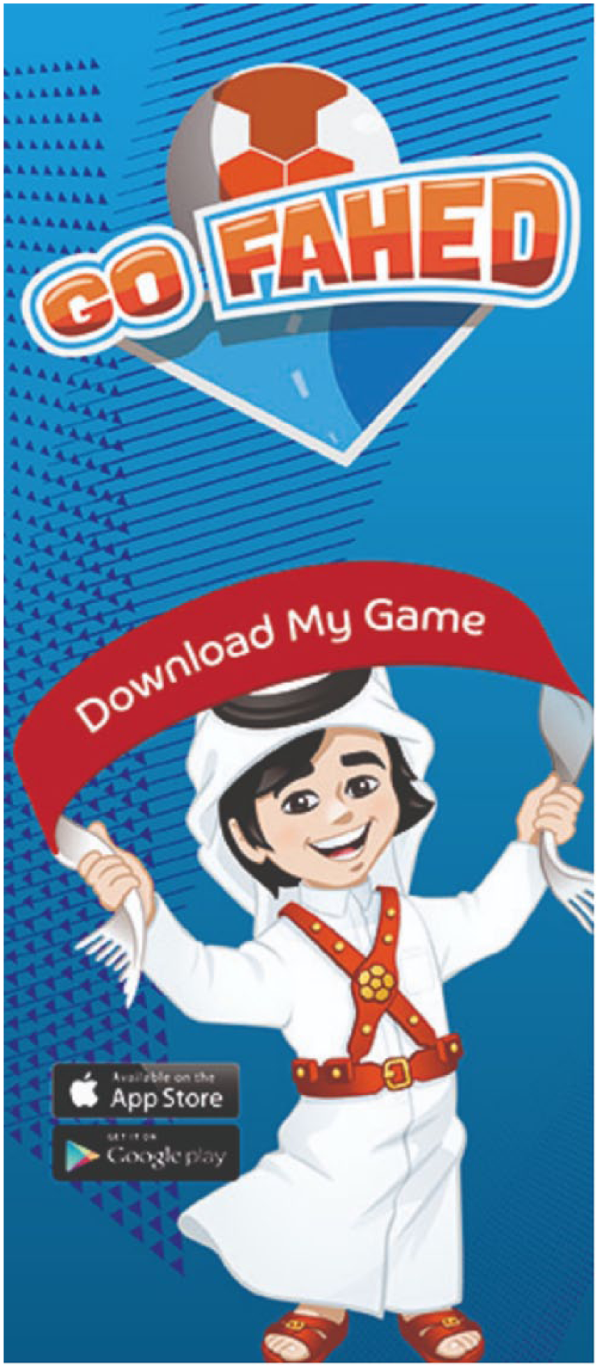
Go Fahed mobile phone application.
This resemiotized branding in the digital world, in which Qataris and residents of Qatar alike are very well versed, shows the country’s attempt to make itself visible by branding its culture in ways that would appeal to younger generations, who are avid fans and savvy users of mobile devices that have such apps. Such a branding strategy is also in alignment with Qatar Airways’ branding choice to have its name on FBC jerseys (see Figure 2) worn by the team’s superstars whose matches, in turn, are broadcast all over the world.
The foregrounding of Qatari culture is also pervasive in the event’s logo shown in Figure 21. The logo has the word Qatar scripted in Arabic calligraphy but is not translated in the English versions of the logo, most probably because the designers of the logo wish to promote the Arabic script so that non-Arabic speakers familiarize themselves with some of the Arabic letters and maybe want to start learning Arabic (in Qatar). There is a small handball inside the qaf ق. The word Qatar is designed in a way that resembles a figure throwing a handball, which is the ball inside the qaf. The colours (orange and red) – that we have also seen used in the logo of the AFC Asian Cup 2011 analysed in Figure 16 – index the excitement that Qatar wants to persuade its viewers the championship will bring with it. Hence, through this method, it is hoped that the ticket sales would be high.
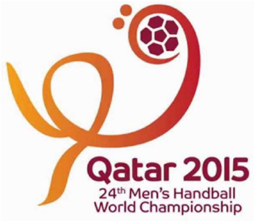
Logo of the 24th Men’s Handball International Championship 2015.
In conclusion, in this section it has been shown that, in terms of their choice of figures to be depicted, as well as their designs of mascots and logos associated with very important sports events held in Qatar (including the 2006 Asian Games, the 2011 AFC Asian Cup, the 2011 Arab Games and the 2015 Men’s Handball International Championship), the country has tried to paint an image of itself as a country that keeps a balance between tradition and modernity, and that should therefore appeal to both Arabs or people, in general, who prefer authentic Qatari cultural experiences as well as to those who just want to enjoy the more competitive and, hence, more spectacular aspect of the sport event itself.
In the following section, we discuss the reasons why Qatar has used this type of material to brand itself as a sports tourism destination.
Conclusion: Soft Politics Via Sports Tourism
The main argument forward in this article is that Qatar uses its professionally designed digital landscape to construct its ideal society and thus to promote its values and, in this way, to carve a niche for itself in the world tourism and sports market. More specifically, drawing on the concept of ‘utopics’ (Hetherington, 1998), which is used in the context of social movements, we argue that the branding strategy of Qatar with respect to its sports activities is employed to project its political agenda into a utopian vision of a good society, evident in images such as Figures 5 and 19. In this way, what is eventually constructed and circulated is the idea that travelling to Qatar to experience first-hand its sports events (and, by extension, what the country has to offer in terms of its culture and lifestyle) offers a route to new hybrid and unexpected identities (for example, the ones mentioned at the bottom of Figure 8, which will emerge if people get involved in sports) and intercultural understandings (for example, the one analysed in Figure 6), which in turn paint a utopian portrait of the country as certain spaces within the travelled space are presented as more perfect and authentic than the traveller is used to at home (see Davidson, 2005: 32–33).
Against this backdrop, we argue that sports tourism in Qatar is employed for generating political and not just economic gain (see Pezzullo, 2007). The internalization of sports-related activity of Qatar is done in such a way as to render it cosmopolitanizing (Jaworski and Thurlow, 2010: 222) through normative cosmopolitanism (Beck, 2006: 18), which promotes an ideal of international and intercultural harmony, as has become particularly evident in the analysis of Figures 1–4. In light of the above, it becomes evident that, through tourism, namely a cultural industry of otherness (Favero, 2007), Qatar tries to construct for itself a semiotic and sociolinguistic image of a fascinating sports tourism destination that caters for different tastes in sports, ranging from football to tennis and handball to track and field. Such an image is constructed as a distinction (Bourdieu, 1991), namely as an abstract, generalized difference between Qatar and other (neighbouring) countries that want to attract tourists, such as the United Arab Emirates. Such a difference is projected as favoured by the global capital and as alluding to privileged ‘global citizens’ (Lash and Lury, 2007: 187).
At the same time, a more in-depth reading of the country’s actual and digital semioscape and linguascape pertinent to its tourist-related sports events also reveals a deliberate carefully designed and professionally executed promotional strategy. More specifically, the country is presented as a forward-thinking Arab nation that welcomes competitive sports events and will also contribute towards the adoption on behalf of its nationals and residents alike of a healthier lifestyle. Along the same lines, and perhaps most importantly, the image that it projects to the outside world is that of a modern nation, which, without losing track of its more traditional sports, such as horse-riding, places emphasis on highly popular sports that are usually well attended all over the world. In this way, the country indexes its alignment with global trends in terms of lifestyle practices, which includes the watching of popular sports events and, in this sense, it tries to put itself on the map and convince other countries, such as the US and the UK that in the past have taken a rather antagonistic stance vis-à-vis Qatar’s successful bid to host the 2022 World Cup.
At the same time, this branding strategy is addressed to the insiders, namely the people who live and work in Qatar. The number, range and scope of sports events held in Qatar are aimed at instilling in the population a kind of healthy lifestyle. In this way, namely by combining the global outreach of the country with a more population-focused strategy, this material can be seen as an example of the ‘cosmopolitization of reality’ (Beck, 2006: 18), namely as an attempt to present reality in a global cosmopolitan veil, which promotes a balanced combination of international and intercultural harmony (see Jaworski and Thurlow, 2010: 225).
To sum up, the sports tourism-related material analysed here can be seen as a symbolic market, in which the agents of sports tourism (including the athletes, the audience and the people who are responsible for the concept, design, distribution and exhibition of this material) brand Qatar and its people (both nationals and residents alike) for foreign and domestic (sports-related) consumption in a way that is located between utopia and the actual landscape of Qatar, which has been remarkably transformed during the past couple of decades and, in this way, can be seen as an alternative sports tourist destination waiting to be experienced.
Footnotes
Acknowledgements
We would like to thank Dr Kaltham Al-Ghanim for her support. Many thanks are also due to our students Noha Selim, Naeema Al Yahari, Samira El Agha and Hedayh Al Hajri for their significant help in data collection.
Funding
This study has been funded by a Qatar University Center for Humanities and Social Sciences Seed Funding Grant (CHSS-SF-14-7).
Notes
Biographical Notes
 .
.
Address: Department of English Literature and Linguistics, College of Arts and Sciences, Qatar University, PO Box 2713, Doha, State of Qatar. [ email:
Address: as Irene Theodoropoulou. [ email: