
Abstract
Numerous measurement devices and computer simulations produce geospatial time series that describe a wide variety of processes of System Earth. A major challenge in the analysis of such data is the complexity of the described processes, which requires a simultaneous assessment of the data’s spatial and temporal variability. To address this task, geoscientists often use automated analyses to compute a compact description of the data, ideally comprising characteristic spatial states of the process under study and their occurrence over time. The results of such automated methods depend on the parameterization, especially the number of extracted spatial states. A particular number of spatial states, however, may only reflect certain spatial or temporal aspects. We introduce a visual analytics approach that overcomes this limitation by allowing users to extract and explore various sets of spatial states to detect characteristic spatiotemporal patterns. To this end, we use the results of hierarchical clustering as a starting point. It groups all time steps of a geospatial time series into a hierarchy of clusters. Users can interactively explore this hierarchy to derive various sets of spatial states. To facilitate detailed inspection of these sets, we employ the concept of interactive visual summaries. A visual summary is the depiction of a set of spatial states and their associated time steps or intervals. It includes interactive means that allow users to assess how well the depicted patterns characterize the original data. Our visual interface comprises a system of visualization components to facilitate both the extraction of sets of spatial states from the hierarchical clustering output and their detailed inspection using interactive visual summaries. This study results from a close collaboration with geoscientists. In an exemplary analysis of observational ocean data, we show how our approach can help geoscientists gain a better understanding of geospatial time series.
Keywords
Introduction
Geospatial time series describe a broad range of processes of System Earth, such as atmospheric circulation, animal migration, or river runoff, just to name a few. Typically, these data either stem from measurement devices, for example, satellite sensors, tide gauges, or global positioning system (GPS) sensors, or from computer simulations, such as environmental simulation models. In numerous applications such as risk assessment or civil engineering, it is crucial to understand the processes described by these data. Gaining this understanding is a challenging task because scientists need to assess the data’s spatial and temporal variability simultaneously.
In this article, we focus on time series where each time step represents a regular two-dimensional (2D) spatial distribution of scalar values, which we call a spatial situation. An important objective is to find spatiotemporal patterns that capture the data’s variability. To this end, scientists often apply automated analyses to, first, extract the characteristic spatial situations and, second, to assign the individual time steps to these situations. The result of this analytical procedure—a limited number of characteristic spatial situations and their occurrence over time—is used as a compact description of the time series. It allows scientists to assess the data’s spatial and temporal variability by focusing on the most important spatiotemporal information.
The outcome of such automated analyses depends on the applied algorithm and its parameterization. An important parameter is the number of spatial situations to extract from the data. A particular number of spatial situations, however, may only reflect certain spatial or temporal aspects of a geospatial time series. Hence, any analytical result should only be regarded as a proposal of characteristic spatial situations, a proposal that needs assessment by domain experts. They must be given the means to decide, based on their expert knowledge about real-world processes, whether the analytical result contains patterns that are important to the analysis task and which aspects need further refinement.
In this article, we introduce a visual analytics approach that allows scientists to extract and explore various sets of spatial situations to detect characteristic spatiotemporal patterns in the data. For this purpose, our approach uses hierarchical clustering to aggregate all spatial situations in a time series into a hierarchy of clusters; a cluster is a set of similar spatial situations. For each cluster, we compute a representative spatial situation. Users can interactively explore this hierarchy to derive different sets of representative spatial situations. To facilitate detailed assessment of these sets, we employ the concept of interactive visual summaries. A visual summary is the depiction of a set of spatial situations and their associated time steps or intervals. It includes interactive means that allow users to assess how well the depicted patterns characterize the original data. This approach results from close collaboration with geoscientists and a thorough task and requirement analysis.
We present a visual interface that facilitates both the extraction of sets of spatial situations from the hierarchical clustering output and their detailed inspection using interactive visual summaries. Users can interactively select clusters from the hierarchy and assess the corresponding spatiotemporal patterns in a visual summary. Exploiting the hierarchical structure of the clustering output, users can interactively split or merge any cluster in a visual summary and easily assess the resulting changes. We provide visualization components that let users decide whether a particular pattern in a visual summary represents important information, and which clusters should be refined via split or merge operations. This exploration process enables scientists to detect spatiotemporal patterns that they consider characteristic.
In particular, the contributions of this article are as follows:
We present a design study that is the result of a close collaboration with users and a thorough task and requirement analysis.
We introduce an analytical approach that allows users to explore and summarize a geospatial time series by extracting and refining different sets of spatial situations from the data.
We show that the exploration of visual summaries enables users to identify spatial situations that they consider characteristic.
We show that the exploration of visual summaries can lead to a better understanding of geospatial time series.
The rest of this article is organized as follows: After reviewing related study, we provide an overview of our concept and explain the design requirements for a visual exploration tool that facilitates extraction and exploration of spatiotemporal patterns in geospatial time series. Next, we provide a detailed description of the applied clustering algorithm, as well as the visual exploration tool and its visual encoding. We further demonstrate and discuss the utility of our approach in an exemplary analysis of observational ocean data. We conclude with a short summary and with potential future research directions.
Related study
In this section, we briefly discuss examples from the geosciences for the automated detection of spatiotemporal patterns and explain why we chose hierarchical clustering. We further review studies on interactive visualization for spatiotemporal data analysis because visualization has proven to be valuable for incorporating users’ domain knowledge and gaining insight into time series. 1 Since we use hierarchical clustering as an automated analysis step, we also discuss approaches that facilitate interactive visual exploration of clustering parameters and cluster hierarchies.
Analytical methods for detecting spatiotemporal patterns—examples from the geosciences
Geoscientists apply, and often combine, various computational methods to detect prominent spatiotemporal patterns in environmental time series. FEM-K-trends 2 and T-mode principal component analysis 3 transform or reduce the number of dimensions of geospatial time series. The basic assumption is that a limited number of principal components express enough of the spatiotemporal structure of the data. Gaussian mixture models and expectation maximization, 4 as well as clustering algorithms such as k-means or hierarchical clustering,5,6 sort observations into k groups such that the similarity is high among members of the same group and low between members of different groups. The identified clusters provide a condensed description of the original data (for further readings, please refer to studies by Jain et al., 7 Miller and Han, 8 or Han and Kamber 9 ). Another popular clustering and dimensionality reduction technique in the geosciences is self-organizing maps.10,11
A substantial problem with all these methods is the parameterization of the algorithms. A good parameterization should result in a few spatial situations that represent characteristic states of the process under study. An important parameter is the number of clusters. Choosing the number of clusters is a conceptual difficulty in clustering. This parameter is often specified a priori by users or determined with the help of statistical measures, such as the silhouette coefficient 12 or the Bayesian information criterion. 13
We chose agglomerative hierarchical clustering as the computational method for the automated analysis because it does not require specifying the number of clusters in advance. In our approach, the hierarchy of clusters is a starting point for exploring different sets of spatial situations extracted from the data. In a recent publication, 14 we demonstrated that hierarchical clustering can capture characteristic patterns in geospatial time series.
Interactive visualization for spatial time series analysis
Established techniques for visualizing spatiotemporal data are small multiples and map animation.15–17 While these techniques are effective for small time series, they do not scale well to larger time series due to limited screen space or perceptual and cognitive limitations such as change blindness.18,19
Interactive visualization allows for analyzing large time series by facilitating the information-seeking mantra: “Overview first, zoom and filter, then details on demand.” 20 Typically, one or several overview visualizations present the data in aggregated form, while multiple coordinated views allow users to formulate queries against the data and assess the results in detail. Clustering is a common means of creating a compact description of data and can serve as a starting point for interactive exploration. Many successful approaches combine clustering and interactive visualization to facilitate analysis of, for example, nonspatial time series data21–23 or time-varying vector fields.24,25
Approaches focusing on geospatial time series are less numerous. Bruckner and Möller 26 use density-based clustering to interactively explore spatiotemporal data. Their approach is tailored to visual effects design, a different application problem requiring other visualization and interaction techniques. Frey et al. 27 extract similarity lines from similarity matrices to assess and compare temporal behavior in (geo)spatial time series. They focus on the detection of recurring patterns, while we allow users to detect various types of characteristic patterns. More closely related to our research is the study by Andrienko et al. 28 The authors use self-organizing maps to cluster the spatial situations of a geospatial time series and link the results with interactive displays that visualize the extracted spatial patterns and their occurrence over time. Their concept facilitates exploration of spatiotemporal patterns in a single clustering result, that is, a single partitioning of the data into clusters. In contrast, our goal is to support exploration and assessment of many different partitionings of the data. We seek to help scientists arrive at an appropriate partitioning of the data into clusters that captures those patterns that they consider characteristic and important to the analysis task. This requires a different clustering approach as well as a different visualization and interaction concept.
Interactive exploration of cluster hierarchies
Depicting a hierarchy of clusters (dendrogram) is essentially a tree visualization problem. Herman et al. 29 provide a comprehensive survey of typical application areas and key issues from an information visualization perspective.
Many studies facilitate exploration of hierarchical clustering results. The Hierarchical Clustering Explorer30,31 integrates a dendrogram with color mosaics and 2D scattergrams for analyzing genomic microarray data. Kreuseler and Schumann 32 introduce an algorithm for computing an abstraction of a dendrogram. They also propose Magic Eye View as a focus + context technique to map the resulting hierarchy graph onto the surface of a hemisphere. Chen et al. 33 combine an abstract overview dendrogram with detail-view dendrograms and reorderable matrices to facilitate exploration of multivariate data. SpectraMiner 34 combines an interactive radial dendrogram with other linked views to analyze high-dimensional, nonspatial data. This approach is later extended in the ClusterSculptor 35 system to allow for interactive refinement of cluster hierarchies. MultiClusterTree 36 visualizes a cluster hierarchy in a 2D radial layout and combines it with circular parallel coordinates and other views.
The described techniques address nonspatial and/or nontemporal data. Analyzing hierarchical clustering results for geospatial time series, however, requires a combined assessment of the data’s spatial and temporal domain. To facilitate this combined assessment, our visualization design integrates techniques from geovisualization, time series visualization, and graph visualization. We use the dendrogram to let users derive different sets of spatial situations from the data, but the primary focus is on exploring and visualizing the spatiotemporal information in the corresponding visual summaries.
Concept and design requirements
In this section, we present a visual analytics concept that is the result of a close collaboration with Earth system modelers, hydrologists, and ocean modelers. We adopted a user-centered and task-centered approach 37 to derive a thorough understanding of the challenges that scientists face when they are studying geospatial time series. From the findings of our analyses, we derived the following twofold concept:
Hierarchical clustering. We use agglomerative hierarchical clustering to construct a binary tree that aggregates the spatial situations associated with individual time steps into a hierarchy of clusters. Users do not have to specify the number of clusters in advance but rather use the hierarchy as a means to extract and explore spatial situations from the data.
Interactive exploration. A visual exploration tool allows users to traverse the dendrogram from top to bottom to progressively extract varying sets of spatial situations from the geospatial time series and explore the associated spatiotemporal patterns using visual summaries. Since the dendrogram represents a hierarchy of clusters, a top-down traversal enables users to assess spatiotemporal patterns at different levels of detail. The interactive visual summaries allow users to identify clusters that represent characteristic spatiotemporal patterns.
We further identified the following design requirements (DRs) for a visual exploration tool that facilitates interactive extraction and exploration of spatiotemporal patterns in geospatial time series:
DR1: for a specific selection of clusters from the dendrogram, present the corresponding visual summary to users. To assess the spatiotemporal context of patterns, scientists must know what extracted spatial situations look like and when these situations occur in the time series.
DR2: enable users to gradually increase the level of detail of spatiotemporal patterns presented to them. Scientists do not have a complete understanding about which patterns are hidden in geospatial time series. Therefore, they prefer to gradually explore the spatial situations and their occurrence over time, starting with a rather coarse visual summary, and refining this summary in a stepwise manner.
DR3: provide information about the level of detail. To give scientists orientation in the exploration process, they need to be aware of the current degree of refinement.
DR4: allow users to assess the quality of a visual summary. Users want to know how well the clusters represent the original time series data and refine clusters where necessary.
DR5: allow users to visually detect periodic or quasi-periodic patterns. Recurring patterns can be an important aspect of geospatial time series. Scientists want to be able to visually detect and assess such recurrences in a visual summary.
In the following, we will describe the hierarchical clustering algorithm and our visual exploration tool.
Hierarchical clustering
In this section, we describe our experience with applying hierarchical clustering to geospatial time series, explain our choice of the linkage method, and discuss feedback from geoscientists.
Algorithm
Hierarchical clustering groups data objects into a tree of clusters. This grouping can be performed either by iteratively dividing the set of data objects or by agglomerating the data objects. In our approach, we apply agglomerative hierarchical clustering. It considers each item of a data set a single cluster. In each iteration of the clustering process, the two clusters p and q with the highest similarity are agglomerated into a new cluster
In our scenario, the dissimilarity between time steps is based on the dissimilarity of their associated spatial situations. We conducted several experiments to assess different dissimilarity measures and obtained the best results with the sum of squared errors.
39
Let i and j be two time steps, and let
In collaboration with geoscientists, we tested various agglomeration methods with respect to their applicability to geospatial time series. The test data sets differed in terms of spatial and temporal resolution, phenomenon described, and geographic area examined. On one hand, we applied the Lance and Williams 40 sorting strategy to these data to realize single linkage, complete linkage, average linkage, and minimum variance agglomeration. As an alternative to Lance–Williams, we used the Chameleon algorithm 41 as a representative for graph-based agglomeration strategies. It includes a preclustering similarity search that constructs a k-nearest-neighbor graph and partitions this graph into initial clusters. The agglomeration stage of this algorithm is based on the connectedness of cluster members and the proximity of clusters within the k-nearest-neighbor graph.
Based on the assessment by domain experts, we decided to use the average linkage method. We implemented the nearest neighbor chain (NN-chain) algorithm
42
because it is time-optimal for average linkage agglomeration. To find the closest pair of clusters, the algorithm constructs an NN-chain. Starting with an arbitrary time step i, an NN-chain is the sequence
Discussion
Our collaborators clearly favored the average linkage method because it yielded easily interpretable results and was able to capture characteristic patterns in geospatial time series; the output of the other methods was often nonintuitive and difficult to interpret. In their daily work, however, they noted that clusters that they consider as similar are sometimes placed in distant parts of the hierarchy. After discussing this issue with the users, we identified two potential reasons. When domain experts visually compare two clusters, they sometimes do not consider the entire geographic and data domain, but focus on specific geographic regions and/or data value ranges. Since our measure of dissimilarity considers the entire geographic space and data domain, the computed dissimilarity may differ from expert judgment in such cases. We also noted that the experts’ criteria for comparing any two clusters may change during the exploration process. Therefore, we cannot adjust the measure of dissimilarity to these criteria a priori. Another potential reason could lie in the strict nature of merge decisions during the agglomeration phase. However, our experiments with more flexible multiphase hierarchical clustering methods, such as Chameleon, have not led to better results. Our experience suggests that the reason for this lies in the complexity of the data. Geospatial time series may describe many different, often nonlinear processes, singular events, or recurring patterns. Each parameterization of the clustering introduces additional assumptions about the data and often emphasizes only a particular aspect.
To address this issue, our visual interface allows users to interactively rearrange clusters in the dendrogram. This provides domain experts with the flexibility to bring the depicted cluster structure in the hierarchy in accordance with their expert judgment. The rebalancing of the cluster hierarchy can be achieved using standard tree sorting algorithms. 43 Figure 1 illustrates this process and the resulting changes to the dendrogram.

Simplified example of a rebalancing of the cluster hierarchy. If users choose to merge clusters C4 and C7, a new agglomerative cluster C8—with C4 and C7 as its children—will be created to replace C4. Meanwhile, cluster C3 is removed and replaced by C6.
Interactive exploration
We propose five tightly coupled, interactive visualization components—hierarchy explorer, sequence view, sequence explorer, periodicity explorer, and spatial gallery. The specific coupling of the visual components facilitates extraction of various sets of spatial situations from the data and detailed inspection of the corresponding spatiotemporal patterns using interactive visual summaries. In this section, we will first give an overview of the components (Figure 2) and their visual and interactive coupling, before explaining the visual encoding in more detail.
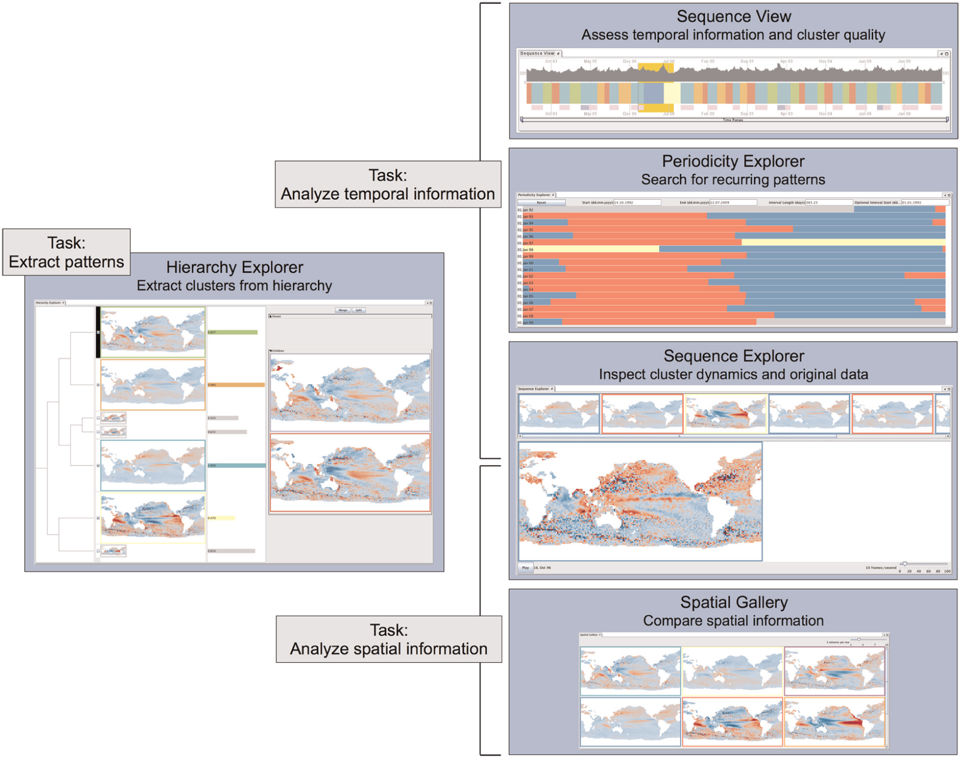
Overview of the five visualization components that are integrated into our exploration tool and the supported tasks. The components are visually linked through a consistent color coding of the cluster affiliation of time steps and the cluster representatives.
Overview
The hierarchy explorer allows users to extract different sets of spatial situations from the data via drill-down, roll-up, and rearrangement operations on the cluster hierarchy. It depicts the representative spatial situations of the clusters (DR1) and indicates their position in the dendrogram (DR3). Users can select individual clusters to inspect the representative spatial situations of its two child clusters and decide whether they would like to split the selected cluster, merge it with its sibling, or focus on a different cluster (DR2). In addition, users can merge any two clusters and, thus, manually rearrange the hierarchy. It also provides statistical information that gives hints on the overall quality of the cluster representatives (DR4). The hierarchy explorer allows users to focus on specific patterns of interest in the current visual summary by selecting a subset of the extracted clusters. This subset will be forwarded to the spatial gallery, the periodicity explorer, and the sequence view.
The sequence view concisely depicts the temporal information of a visual summary. It shows at which time steps the currently extracted spatial situations occur (DR1) and provides hints on how well they represent these time steps (DR4). When users select a specific cluster, the sequence view presents a preview of the potential changes in the cluster affiliation of time steps that would result from splitting this particular cluster (DR2). Additionally, users can select any time step or time period in the sequence view for further inspection in the sequence explorer.
The sequence explorer facilitates a more detailed assessment of spatiotemporal dynamics in the data. Users can inspect the temporal order of clusters in a visual summary (DR1) and compare the spatial situations associated with each time step with their respective cluster representative (DR4). The periodicity explorer focuses on recurrences in a visual summary by supporting visual detection of (quasi-)periodic patterns (DR5).
The spatial gallery, in combination with the sequence view, is an effective mechanism of presenting the (intermediate) results of the exploration process (DR1). It exclusively focuses on the cluster representatives in the current visual summary, summarizing the spatial information and facilitating comparison of spatial patterns. To establish a visual link between all five views, we use a color scheme that is consistent across all five visualization components to encode cluster affiliation of time steps and representative spatial situations.
We provide a flexible framework that allows free arrangement of the five visualization components. Depending on the available screen space or number of displays, users can choose to arrange the views in single windows, a flexible matrix layout, tabs, or any combination of these modes.
Visual encoding
Hierarchy explorer
The hierarchy explorer consists of two main components (Figure 3): an overview dendrogram, presenting the hierarchy of clusters at a user-specified level of detail (DR3) as well as providing information about the cluster quality (DR4), and a spatial preview, allowing users to preview the spatial information in the child clusters (DR1). Both components facilitate merge or split operations in the cluster hierarchy (DR2).
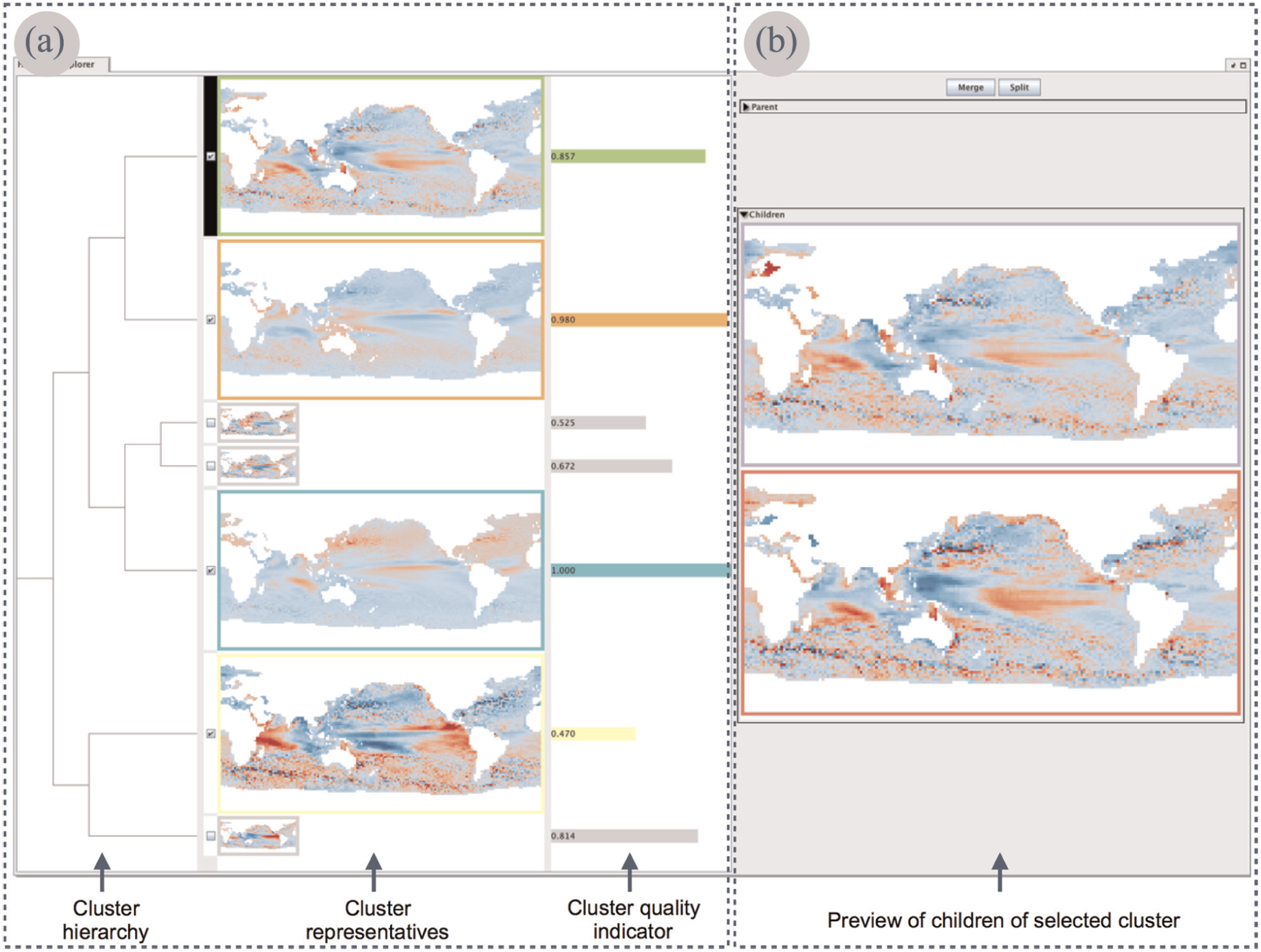
Hierarchy explorer and its two main components: (a) overview dendrogram and (b) spatial preview.
The overview dendrogram (Figure 3(a)) shows all clusters in the hierarchy, from the root down to a user-chosen level. We do not display nodes below this level to reduce the visual complexity of the exploration process. The leaves in the resulting dendrogram visualization show the spatial situations that are representative for the respective clusters. These spatial situations are depicted as cartographic maps that encode the data’s scalar values with diverging or sequential color schemes, depending on the data. To obtain a cluster representative, we compute an average spatial situation from all spatial situations in a cluster. The representative
For any cluster selected in the overview dendrogram, the spatial preview (Figure 3(b)) allows users to see the representatives of its two child clusters. After assessing the spatial patterns, users can drill down the dendrogram to split the selected cluster. Alternatively, they can either roll up the dendrogram and merge the selected cluster with its sibling or focus on a different cluster. The overview dendrogram and the spatial preview are vertically scrollable if screen space does not suffice.
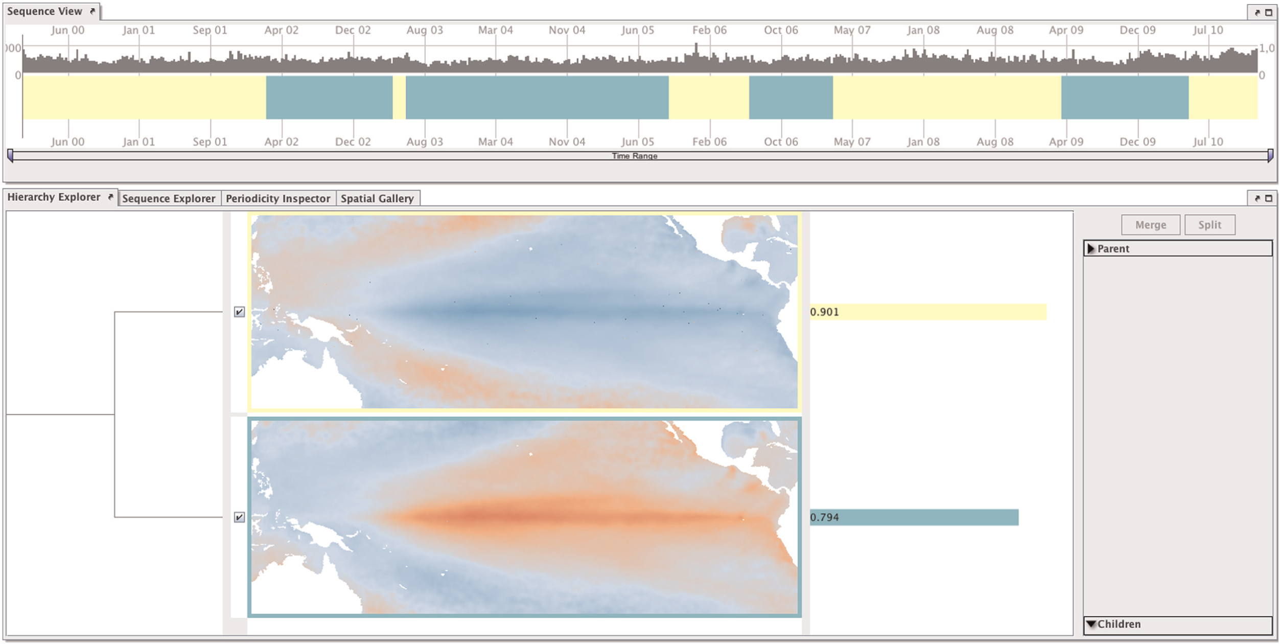
Sequence view
The sequence view comprises the following three parts (Figure 4(a)): a cluster timeline that presents the temporal order of clusters in a visual summary (DR1), a preview that supports gradual refinement of a user-selected cluster by showing potential changes in the temporal information (DR2), and a bar chart that provides hints on the quality of a visual summary (DR4).

(a) Sequence view and (b) sequence explorer.
The cluster timeline is a color-coded horizontal bar that represents the entire time series. Cluster affiliation of time steps is mapped to color. The bar chart above the cluster timeline depicts for each time step its dissimilarity to the associated representative spatial situation. To compute the dissimilarity, we use the same measure that was applied in the hierarchical clustering. Small values in the bar chart indicate time steps where the visual summary fits well; high values point to parts where a cluster representative is not an adequate description of individual time steps. Upon interactive selection of a cluster in the cluster timeline, the preview appears below the timeline. It presents a smaller masked version of the cluster timeline that contains only time steps that belong to the selected cluster and, thus, also visually marks the currently selected cluster. The time steps in the preview are color-coded as if the selected cluster was split into its two children. In addition, horizontal sliders allow users to zoom in time. A time brush lets users select time periods of interest for further inspection in the sequence explorer.
Sequence explorer
The sequence explorer (Figure 4(b)) contains two components that, for a user-selected time period, allow scientists to assess the spatiotemporal dynamics in the data (DR1) and compare the original data with the cluster representatives (DR4). In the horizontally scrollable cluster sequence, the representative spatial situations of clusters are arranged from left to right as they occur in the sequence view. Colored frames around the cluster representatives encode cluster affiliation. The animation depicts the original data. For small time periods, looking at the original data in an animation allows users to qualitatively evaluate the spatiotemporal dynamics in the data and assess the representativeness of certain patterns in the visual summary. We provide several visual aids to help users analyze the animated sequence. The cluster affiliation of the time step that is currently depicted in the animation is encoded in a colored frame around the animation window. In addition, the animation is visually linked to the sequence view. A vertical line in the sequence view locates the current time step, and a colored rectangle represents the selected time period.
Periodicity explorer
The periodicity explorer (Figure 5) helps scientists to visually analyze the data for various types of recurring behavior (DR5). It splits the cluster timeline into intervals of equal length. These intervals are then chronologically arranged in rows from top to bottom, resulting in a 2D array. Users can freely determine the interval length and interval start date. Since cluster affiliation is mapped to color, recurring phenomena become visible when the same color appears in multiple rows in roughly the same horizontal position.
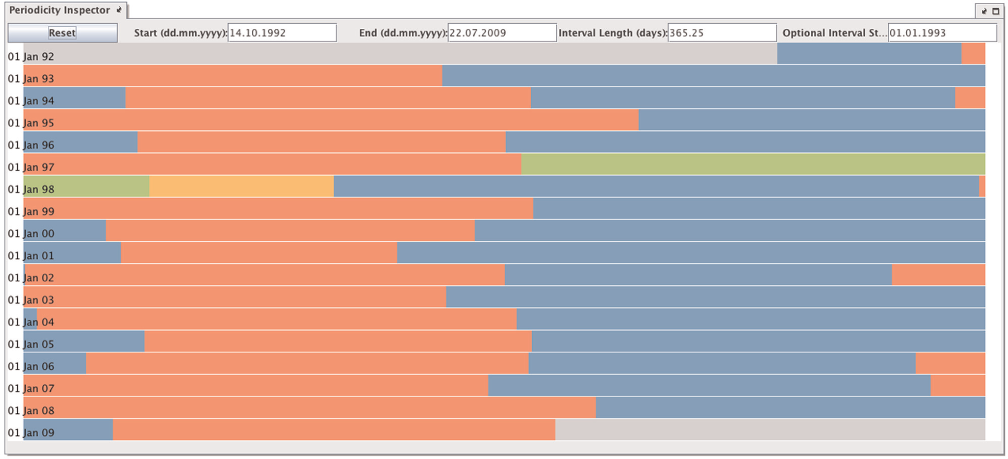
Periodicity explorer arranges the cluster timeline in a 2D array. Users can choose any interval length and interval start date to visually detect (quasi-)periodic behavior. This particular example shows the periodic Winter-Spring (red)/Summer-Fall (blue) cycle that can be observed in global sea surface height observations from 1992 to 2009. The outstanding green and orange clusters represent a very strong El Niño event in 1997/1998.
Spatial gallery
To present the (intermediate) results of the exploration process and allow users to compare the extracted spatial patterns (DR1), the spatial gallery provides a maximum of screen space to depict the cluster representatives (Figure 6). It arranges the spatial situations in a matrix layout. Users can adjust the size of the spatial patterns by choosing the number of columns in the matrix. The gallery is vertically scrollable if screen space does not suffice.

Spatial gallery depicts the cluster representatives of the current visual summary in a matrix layout. The slider allows users to choose the number of columns in the matrix.
Color coding
In our tool, the different views are visually linked by a consistent color coding of clusters. We assign a unique color to each cluster that users visit in the hierarchy. This approach requires a high number of distinguishable colors. To this end, we use one of ColorBrewer’s qualitative color schemes 44 as well as colors sampled from the CIELAB color space (please see Guo et al. 45 for a suitable sampling strategy). We chose the ColorBrewer colors to provide users with a carefully designed and easily distinguishable color scheme. If the exploration process requires additional colors, we use the CIELAB samples. This strategy yields a sufficient number of distinguishable colors. In addition, users can change the colors manually to adjust the color coding according to their preference.
Scalability
Two main factors influence the scalability of our tool: the number of time steps in the geospatial time series and the number of clusters extracted from the cluster hierarchy.
Our tool can display a large number of time steps, as long as the cluster affiliation of subsequent time steps yields visually coherent blocks in the sequence view. Regarding the number of clusters extracted from the cluster hierarchy, we observed that geoscientists focus on a rather small subset of patterns when exploring geospatial time series. They normally analyze between 10 and 30 clusters. Therefore, we specifically designed the hierarchy explorer to support such a focused exploration. Technically, the hierarchy explorer can depict a larger number of clusters due to its vertically scrollable components.
Application example
One cornerstone in the development of our tool was the intense collaboration with ocean modelers. The goal was to help ocean modelers in the analysis of observational data as well as output from model simulations.
We have already presented the initial results of our collaboration in our previous study 14 where we demonstrated that a static visual summary can capture various characteristic spatiotemporal patterns in geospatial time series. A static version of a visual summary, however, does not allow scientists to gain a more detailed understanding of the presented patterns. Scientists need to be able to extract different sets of spatial situations from the data and assess the corresponding visual summaries interactively to focus on patterns of interest and further differentiate these patterns into subtypes. Concurrently, they need to be able to eliminate other patterns that they consider insignificant or distracting.
Here, we present an example of how scientists used our interactive tool to identify and further distinguish different types of El Niño events. We also give a short example of how our tool helped scientists generate hypotheses about processes in the ocean.
Identification and differentiation of El Niño events
To evaluate our tool, one of our collaborators used it to identify and differentiate known El Niño events in ocean observational data. The data used were daily satellite observations of sea surface temperatures (SSTs) in the Tropical Pacific, including smaller sections of the Caribbean and Southeast Asia, covering a time period from 2000 to 2010. Since the seasonal cycle dominates the variability of the time series without being of interest for the present study, we deseasonalized the data by subtracting climatological monthly means. To focus on interannual variability, we further computed weekly mean SSTs. The result of these preprocessing steps was a time series of SST anomalies with 574 time steps and a spatial resolution of
The prominent processes in the described region are El Niño and La Niña events. El Niño events are irregularly (about every 2–7 years) recurring phases of anomalously high SSTs in the Tropical Pacific with implications on weather patterns worldwide. La Niña events, on the other hand, are characterized by cold SSTs in the Tropical Pacific. Two different El Niño types can be observed: An Eastern Pacific El Niño shows maximum positive SST anomalies close to the Ecuadorian and Peruvian coast; a Central Pacific El Niño shows the strongest positive SST deviations close to the date line. Occasionally, there are positive anomalies in both places; some authors have therefore defined a third, “mixed” type. 46
Since ocean scientists have identified three Central Pacific El Niños and one Eastern Pacific El Niños in the observed region between 2000 and 2010, 46 the task was to correctly locate and distinguish these events in the SST data. Our collaborator used our tool to create a coarse visual summary of the time series that describes the data with only two clusters. These two clusters already revealed the two dominant processes in the region (Figure 7). One cluster represented time steps that were somewhat influenced by La Niña, while the other represented time steps that were more influenced by El Niño. Further exploration focused on the latter. Relatively high SST values along the Equator in a cluster representative hint at El Niño events in this cluster. After selecting such a cluster and examining the spatiotemporal patterns of its two children, the ocean modeler decided whether splitting the selected cluster would reveal relevant information. Decisions to split or merge particular clusters were grounded on the information that our tool provides about the quality of the visual summary during the exploration process and on his knowledge about what typical El Niño situations look like. The goal was to separate El Niño phases from adjacent, rather neutral, phases that were assigned to the same cluster. After several split operations, our collaborator was able to identify all four El Niño events: three Central Pacific types and the only Eastern Pacific El Niño (Figure 8). To gain additional confidence in the result, he selected time periods associated with these events in the sequence view and examined the original data in the sequence explorer.
Initial stage of the exploration of sea surface temperature anomalies. Splitting the data into two clusters reveals the two dominant processes in the region. The yellow cluster represents time steps that are somewhat influenced by La Niña, while the green cluster represents time steps that are more influenced by El Niño.

Result of the exploration of sea surface temperature anomalies. After several split operations, our collaborator was able to identify all four El Niños. Two out of the three Central Pacific El Niños are represented by the blue cluster, and the other one is represented by the purple cluster. The only Eastern Pacific El Niño is depicted by the green cluster.
Discussion
In the described application example, the scientist was able to identify all three known Central Pacific El Niño events and the only Eastern Pacific El Niño. Although one would expect all three Central Pacific El Niño events to be in the same cluster, Figure 8 shows that the 2004/2005 event is located in a separate cluster. It is represented by the purple cluster, while the other two Central Pacific El Niño events are represented by the blue cluster. Our collaborator explained this with the event’s extremely low intensity. Please note that our tool was not specifically tailored to the identification and differentiation of El Niño events. Therefore, it is encouraging that such detailed patterns could be distinguished with our general purpose approach. Geoscientists normally combine a variety of methods to detect these events, for example, regression analysis, empirical orthogonal functions, and wavelet analysis. 6 They also often focus in their analysis on various indices that describe particular geographic regions with respect to a specific environmental process. 46 In contrast, our approach makes very few assumptions about the data and allows scientists to analyze a variety of patterns for large geographic regions without having to refer to specialized indices. Once our tool has pointed experts to interesting patterns, they can apply established quantitative methods for further testing and inspection.
Overall, our collaborators valued the intuitiveness of the interactive exploration. They appreciate the ability to progressively increase the level of detail of spatiotemporal patterns in the hierarchy explorer and value the permanent link to the corresponding original data in the sequence explorer. They confirmed that the tool supports detection of characteristic patterns as well as differentiation into their subtypes.
After applying our tool to different data in their daily research, scientists pointed out that it allows them to produce hypotheses. In one particular example regarding satellite observations of sea surface heights, our tool suggested a seasonal cycle in a geographic region where experts did not expect it. Our tool pointed scientists to this particular feature in the data, which will now be a starting point for further investigation.
Our collaborators also shared their thoughts on potential limitations. Regarding the hierarchical clustering, it became apparent that sometimes, a characteristic spatial situation is represented by several clusters on different branches in the dendrogram. This leads to redundant spatial situations in the visual summary. Here, our collaborators appreciated the ability to manually rearrange the hierarchy. The analysis of geospatial time series with very low temporal autocorrelation can be quite challenging with our tool. The resulting visual summaries are difficult to interpret since the cluster affiliation of subsequent time steps changes frequently and, thus, the sequence view does not display visually coherent blocks. To address this problem, scientists may use the periodicity explorer to create visually coherent blocks by rearranging the cluster timeline in a 2D array. This distributes the cluster timeline across multiple rows, providing more screen space. In addition, visually coherent blocks may not only become apparent along the horizontal axis, but also become apparent along the vertical axis. Another option is a more substantial preprocessing of the data, for example, by temporal or spatial filtering, to remove processes that are not of interest and that can be theoretically estimated.
Conclusion and future work
Close collaboration with geoscientists enabled us to identify and address a major challenge in geospatial time series analysis: the complexity of the processes described in the data, which requires a simultaneous assessment of the data’s spatial and temporal variability. To address this challenge, our approach supports users in the analysis of geospatial time series by extracting different sets of spatial situations from the data and exploring the corresponding visual summaries. We use the output of agglomerative hierarchical clustering of time steps as a starting point for interactive visual exploration. A thorough task analysis allowed us to elicit appropriate design requirements for the visual exploration tool. The tool comprises five visualization components that each focus on different aspects of the interactive analysis.
We received detailed user feedback at every stage of the development process, refining our approach with every iteration. Our tool is currently applied by geoscientists in their daily research. Their feedback suggests that it allows them to explore the data for a great variety of processes and patterns, leading to new hypotheses and eventually generating new scientific insight. The next challenge is to evaluate our approach in a longitudinal user study to gain an understanding of the conceptual limitations of our approach and identify roads for improvements in the visual encoding and analytical interaction.
We have identified several research directions to extend our approach. Since the segmentation of the data by means of clustering can be regarded as a symbolic representation of the time series, we plan to include motif mining techniques to facilitate automatic detection of periodicities and compute even more compact visual summaries of geospatial time series. Furthermore, we want to support comparison of clustering results for different geospatial time series. Finally, we would like to extend our approach to multirun simulation output. This is a challenging task since the visual encoding of multirun data is an open research question. We hope that building a visual exploration tool for multirun data will contribute to a better understanding of simulated processes in many geoscientific application scenarios.
Footnotes
Acknowledgements
The authors thank Tobias Rawald and Ralf Friedeman for their help in implementing the prototype.
Declaration of conflicting interests
The authors declare that they have no conflicts of interest.
Funding
This study was partially supported by the German Federal Ministry for Education and Research (BMBF) via the Potsdam Research Cluster for Georisk Analysis, Environmental Change and Sustainability (PROGRESS) (grant number 03IS2191A).