




Abstract
Analysts wish to explore different hypotheses, organize their thoughts into visual narratives and present their findings. Some developers have used algorithms to ascertain key events from their data, while others have visualized different states of their exploration and utilized free-form canvases to enable the users to develop their thoughts. What is required is a visual layout strategy that summarizes specific events and allows users to layout the story in a structured way. We propose the use of the concept of ‘storyboarding’ for visual analytics. In film production, storyboarding techniques enable film directors and those working on the film to pre-visualize the shots and evaluate potential problems. We present six principles of storyboarding for visual analytics: composition, viewpoints, transition, annotability, interactivity and separability. We use these principles to develop epSpread, which we apply to VAST Challenge 2011 microblogging data set and to Twitter data from the 2012 Olympic Games. We present technical challenges and design decisions for developing the epSpread storyboarding visual analytics tool that demonstrate the effectiveness of our design and discuss lessons learnt with the storyboarding method.
Keywords
Introduction
There are many situations where analysts wish to explore or explain key events of an unfolding story. These ‘stories’ occur either because they represent a human-based narrative or are created by an evaluator who is reasoning about an argumentation. Importantly, it is often through the telling of a story (or at least the creation process) that issues or logical errors with the discourse are ironed out. The narrative inquiry helps us make sense of the world. Bell writes, ‘Narrative inquiry rests on the epistemological assumption that we as human beings make sense of random experience by the imposition of story structures’. 1
Accounting for and evaluating how events evolve through time are important aspects of both the investigation and dissemination processes in visual analytics (VA). Both the foraging and sense-making loops of Pirolli and Card’s 2 model and especially the data frame model of Klein et al. 3 collate sets of structures together. These structures act as principal events. While some researchers have investigated how to algorithmically ascertain key events from data, other researchers have visualized different states of their exploration, and some others have used ad hoc methods (unstructured scratch pads to arrange the user’s thoughts), it is surprising that few researchers have focused on visualizing these specific events in a more structured way. Ideally what is required, for VA, is a visual layout mechanism that summarizes specific events and allows users to layout the story in a graphical way and also enables interaction to enable the user to explore different visual scenarios. To achieve this, propose using the concept of ‘storyboarding’ for VA.
Storyboards are used in film production as a pre-visualization technique, in order to help the director plan the film and try out different scene ideas and orderings of camera shots. They represent a sequence of (usually) sketched drawings, each on an individual sheet (or panel) that are pinned on a bulletin board for the director, screenwriters and colleagues to view and discuss. In this article, we develop this idea for VA investigation. We therefore draw upon the principles rather than mimicking their form exactly. In our prototype system, story panels consist of a number of different visualization and analysis components suitable for the analysis of microblogging data. Multiple panels can then be linked together on a timeline together with annotation to tell the story of a scenario in a way that also highlights the provenance of each section of the analysis and allows it to be reproduced. This storyboard design metaphor is discussed further in section ‘Principles of storyboarding for VA’.
Some data sets inherently lend themselves to storyboarding. In fact, the growth of microblogging sites presents an enormous opportunity to analyse events as they unfold and make use of the messages from different perspectives. Indeed, the short latency of these microblog ‘events’ can be used by disaster response agencies to help inform and direct effort effectively. 4 There is a wealth of information that is contained within these blogs, and the benefits of the analysis are huge. Researchers have access to real-time text commentaries at live events, from multiple perspectives. They give insight into the user’s sentiment, and the blogs provide (often honest) insight into the thoughts of the user. Although we discuss in detail some of the uses that have been made so far of this data source later in this article, we believe that the potential of these services is largely untapped. We have developed the storyboarding techniques for the visualization of microblog data, but the techniques should be widely applicable to other data domains.
We evolved the concept of ‘storyboarding scenarios’ while developing our solution to the VAST 2011 Mini-Challenge 1 (hereafter referred to as MC1). The challenge provides a cleaned microblog data set of over 1 million blogs, with injected ground truth. The storyboards were an invaluable part of our exploration phase and helped us refine which stories to include in the report. In fact, during the code development phase, each of the members of the team would use the (rapidly developing) tool to individually discover and sequence events. These ‘stories’ were then presented to the group meetings. Their presented panels were confirmed or bettered by the panels of other researchers and the ensuing discussion. Because each panel was dynamic, we could interactively adjust parameters to explore in real time the sensitivity or boundaries of specific events. This process engendered additional questions from the group, which were immediately explored during the meeting. If the tool could not be used to answer specific questions, then new solutions were designed. These features were prioritized, and the development cycle continued for that week. This SCRUM-like process directly led to new tool requirements, which were then developed over the subsequent days. 5 This created an agile and query-driven development cycle.
Through the development of epSpread for the MC1 data set, and subsequent presentation of our MC1 solution, our thoughts developed further. We started to consider the wider implications of using storyboarding in VA. What principles of storyboarding can be used in VA? What functionality is required? What lessons have we learnt? Can the technique be applied to other data sets (other than MC1)? and Would the techniques that we have developed be suitable for real data?
We explore these issues within this article. Our hypothesis is that visual storyboarding techniques can be used to help explain and present events. This can be applied in a crisis situation and allow analysts to explore different trending themes and to understand events as they unfold. Certainly, each user tells a story from their point of view, but by taking an overview of the information streams, it is possible to understand general trends or drill down into specific views. As a coherent set, the microblogs together form a polyphonic narrative of different points of view and voices. This approach can be used to explore representational states in multivocal discourses and can be used to present one or several parallel stories.
The contributions of this article are (1) the development of a set of design principles for storyboarding for VA, (2) a prototype tool built on these principles, and (3) two case studies, one that uses the tool with the MC1 data set to uncover ground truth and present it and a second study on Twitter data that was gathered during the London 2012 Olympic Games.
The remainder of this article is organized as follows. In the ‘Storyboarding’ section, we examine the use of storyboarding as a tool for narrative and storytelling, and we consider the specialized demands of visual analytic applications in the ‘Principles of storyboarding for VA’ section. In the ‘Microblogging, events, text analysis and visualization’ section, we consider other work in the field of microblogging, covering both text analytics and visualization. The implementation of our tool, epSpread, is described in the ‘Tool design’ section together with our text analysis approach. Two case studies on using epSpread to analyse the MC1 data set and Twitter messages about the 2012 Olympics are shown in the ‘Case study: VAST 2011 MC1’ and ‘Case study: London Olympics’ sections. Finally, the results are discussed, conclusions drawn and future work detailed.
Storytelling in visualization
One of the key elements of research agendas for VA is the requirement for the communication of results and analytic processes. Tools should allow analytic reasoning, note-taking, production, presentation and dissemination to take place at the same time. 6 They should provide support for documenting the analysis process, keeping provenance of finding, reporting and storytelling, 7 and the resulting information should be presented in a decision- or task-oriented way. 8
The difference between visualization and storytelling is discussed by Gershon and Page. 9 They highlight the benefits of stories as ways of communicating information in a short yet memorable fashion and discuss an example of how storytelling concepts can be applied to a hypothetical command-and-control situation. Segel and Heer 10 systemically review the design space for narrative visualization along three dimensions: genre, visual narrative tactics and narrative structure tactics. They define seven genres of narrative visualization – magazine style, annotated chart, partitioned poster, flow chart, comic strip, slide show and film/video/animation – and use them to characterize their examples with provision for overlap. These genres vary in terms of number of frames and ordering of their visual elements. For example, a comic may have many frames, while a magazine style will use only one.
The comic strip is particularly interesting in the context of storytelling. While Eisner 11 defines comics simply as ‘Sequential Art’, McCloud 12 expands this as ‘juxtaposed pictorial and other images in deliberate sequence’. Both of these definitions are notable because they imply an ordinal relationship over time, but not a quantitative one. In fact, comics offer greater flexibility in incorporating time compared to paintings, photography or even film, 13 since while the panel currently being read always represents the present, both the past and future are visible in preceding and subsequent panels at the same time.
Storyboarding
The concept of the storyboard 14 that is used in the film industry enables the production team to organize the action depicted in the script. Often, the storyboards include a central rectangle where the artist includes a sketch, a place for written description for that scene, a title and details of the artist (Figure 1). The British Broadcasting Corporation (BBC) in their ‘my place my space’ competition (bbc.co.uk/myplacemyspace) provided competition entrants with a suitable example of a storyboard (see Figure 2). In fact, the sketch need not be too detailed, and stick figures could be used to describe the scenes, but the panel does need to include enough detail to describe the scene and demonstrate camera positions.
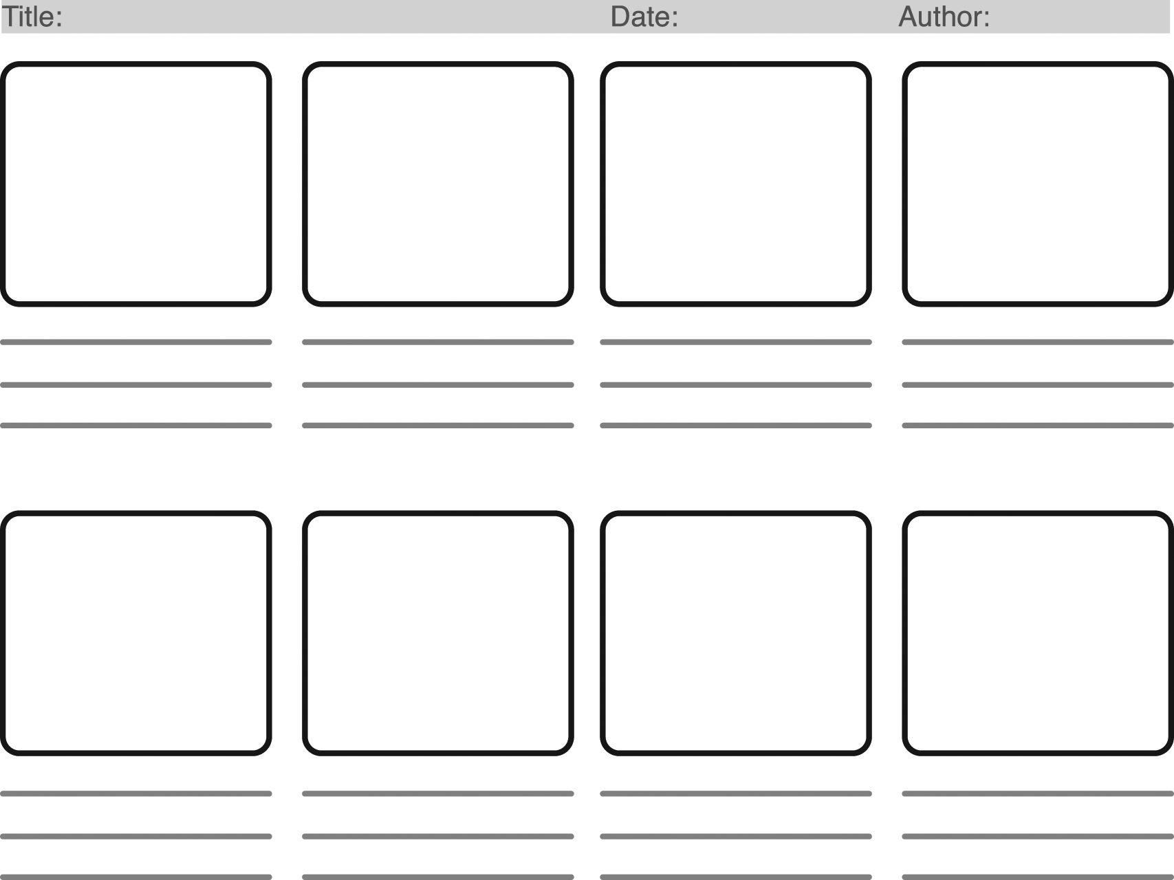
A typical storyboard template, with a rectangle for the sketches, lines for the text description of the scene and space for associated details such as a title.
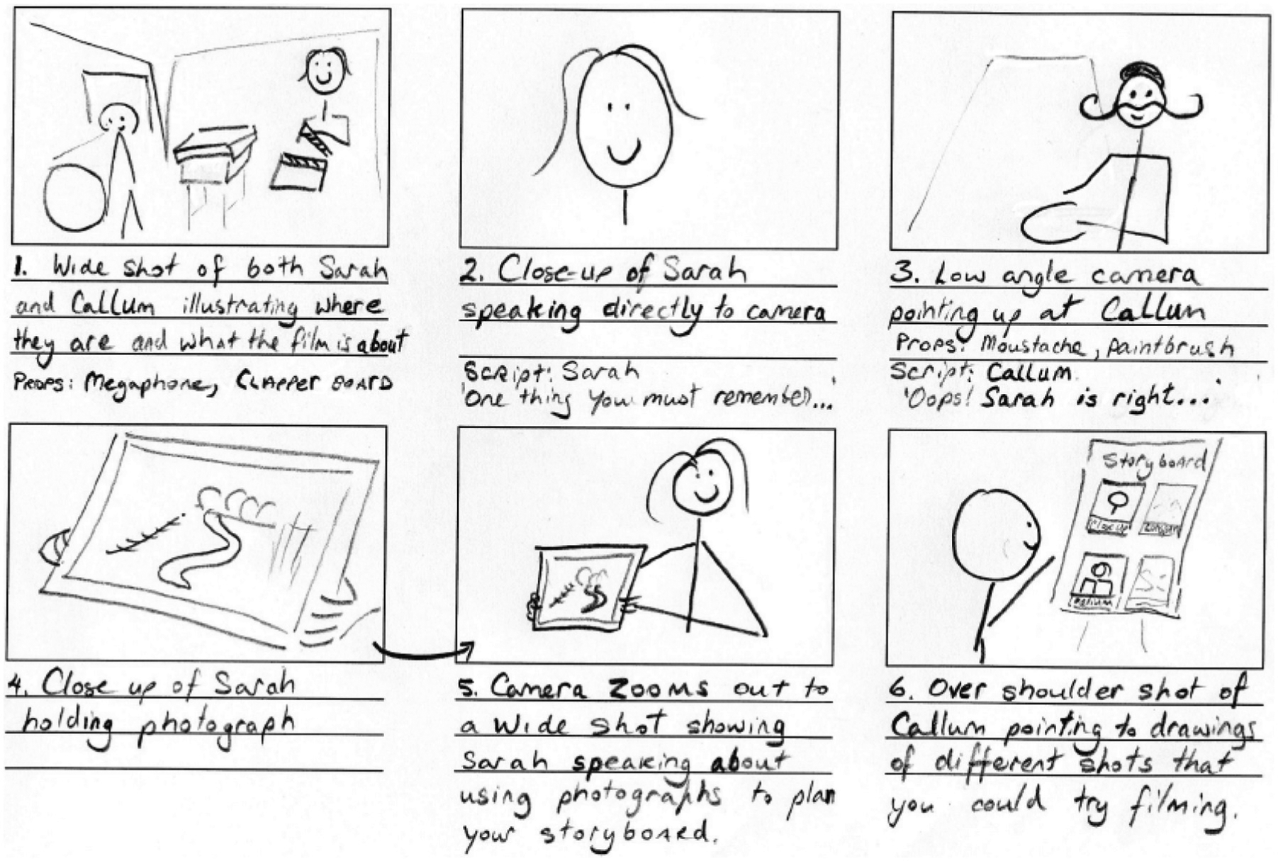
An example of a roughly sketched storyboard that was provided to entrants of the BBC’s ‘my place my space’ competition (bbc.co.uk/myplacemyspace). The information in the storyboard needs to be suitable for a director to follow and discuss and for the filming team to understand.
The challenge of providing concise visual explanations at an appropriate level is not unique to visual explanation. For example, the production of assembly instructions for furniture 15 can be viewed as a comic strip showing how the furniture is put together: the steps must take place in order, and the past and future of the object are visible. In human–computer interaction (HCI), storyboards are used to depict a user’s interaction with and reaction to system elements, 16 and tools exist to support storyboard development.17,18 Storyboards have also been used to summarize video – for example, Herranz et al. 19 produce comic-like summaries for videos in an automated fashion by employing scalable representations, while Goldman et al. 20 define the schematic storyboard, a single static image that is constructed from multiple video frames and annotation.
The storyboard metaphor matches well with visual analytic investigation and in particular fits with the visualization of microblogging data for several reasons. The microblogs are stories themselves and often describe a progression of events evolving through time; the boards can be used to display key moments in the story that is contained in the microblog; and importantly, the storyboards engender discussion. In particular, film directors and the production team of a movie view the boards and discuss the whole story, and they may change the plot after seeing the progression of the boards. Similarly, the stories that are contained within the microblogs can be described by a series of ‘key moments’. The visual storyboards can then be presented to analysts and used to discuss the progression of the ‘story’ or crisis.
Principles of storyboarding for VA
Film storyboards are a pre-visualization technique: they are used to set up shots and to determine lighting, set and prop requirements. Their role is to ‘illuminate and augment the script narrative’ 14 not to act as a replacement for it. Likewise, in HCI, storyboarding acts as a description of the use case or interaction scenario.
So what can we learn from storyboarding, and how can it apply to VA? Various authors talk about the ‘language of storyboarding’.12,14 The language covers (for instance) the type of shot and the progression from one shot to another. Importantly, there are three different components to the language: (1) those that explain what assets appear in the shot and how the frame is composed, (2) how the shot is taken (its viewpoint) and (3) how frames progress from one to another. Correspondingly, we divide the language into three parts. These are depicted schematically in Figure 3. Each of these three categories correspond directly to equivalent functionality in our storyboarding model for VA. However, the storyboarding techniques used in film tend to be static (and sketchy) representations of the film and are used as a pre-visualization technique. Subsequently, we add three more principles for storyboarding for VA: annotability, interactivity and separability. The six principles are shown schematically in Figure 4.
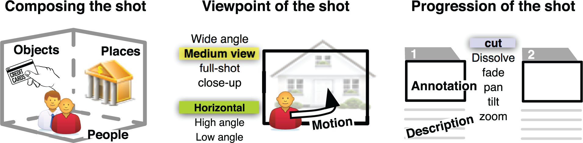
The language of storyboarding describes the composition of the storyboard; how people, place and objects appear in the viewpoint and how frames progress to other frames.

The six storyboarding principles for visual analytics.
Storyboard composition
The first set of phrases in the ‘language of storyboarding’ we categorize as the composition of the shot. Here, the artist needs to decide what information is included in the shot: which actors will appear, what will they be wearing, what props are there and what the scene looks like. Atasoy and Martens 21 consider the composition by People, Places and Objects. This is realized by creating an establishing shot, which provides an overview of the scene and sets the scene and tone of the film. For instance, if the establishing shot shows a road along (say) the Italian Amalfi Coast on a hot summer’s day, then the panels may imply that the film is a car commercial. The setting of the frames can be ‘established’ through various subtleties. For instance, an office scene may show a window; if the picture through the window shows high-rise sky-scrapers, then it would imply that the office is high-up, important and in a big city.
This set of composition tasks applies directly to VA. Users can compose their visualization from different visual components. These components could be maps, statistical views and charts, legends, titles and keys along with interaction widgets such as buttons and sliders. Choosing which components and how they are positioned in the visualization determines the visual appearance of the tool. The first storyboard panel could be used as an ‘establishing frame’ to demonstrate all the possible components of the system or could provide an overview that demonstrates the complete range of the data. Indeed, this concept fits well with Shneiderman’s mantra of overview first, zoom and filter and then details on demand. Similar to film storyboarding, there is certainly much subtlety that is contained within any visualization. These subtitles represent unwritten rules or objects that a user would expect (for a particular visualization domain or tool type). These subtleties can range from colour combinations to the layout and positioning of objects. Therefore, having the right combination of visual components is an important part of the design process and important to storyboarding for VA.
Storyboard viewpoint
Second, there are several aspects in storyboarding that control the viewpoint of the frame. Storyboard artists discuss the type of shot that is used for that frame. For instance, a wide-angle view would demonstrate an overview of the world and may include more people, places or objects and can be used to set up the scene. Often a wide-angle shot is used at the start of a progression, and through a series of storyboard frames, the observer is drawn from the wide view to a medium view and finally into a full-shot or close-up of an object. For instance, two people may be in conversation about a letter, and the frames move from one person to another as they discuss the letter and finally demonstrate a close-up shot on the letter. The angle of the shot is also important. Again, with a conversation between two adults, the angle of the shot should be the same for both adults (thus giving the impression that we are looking through the eyes of one converser and then the other). This represents a point-of-view (POV) shot, whereas a child looking up to an adult should have a low camera angle shot, which also makes the subject appear important. Correspondingly, a high camera angle makes the subject small and appear weak or diminutive. Motion in the shot is often determined through annotation. For instance, an arrow can be used to demonstrate the path of someone who is running. Annotation can also be used to describe special effects (such as fire or explosions), which grab the attention of the viewer. We believe annotation is an important aspect of storyboarding in VA and therefore include it as a separate principle.
These storyboarding techniques offer inspiration for VA analysis. Techniques of wide-angle, full-shot and close-up are similar to different zoom levels. The use of different projections enables the user to understand the data through different viewpoints. 22 A close-up view could be interpreted as being details-on-demand, while the different camera angles or POVs are similar to representing the data through different multiform views. Representing motion by static arrows (for instance) is used in fluid-flow visualization techniques, and it is an important technique that could be applied to non-fluid-flow visualization systems.
Storyboards in film production are usually sketched. There are several advantages of sketchiness: it implies an unfinished state, encourages discussion and is often beautiful in its simplicity. Likewise, there are several advantages to sketchy styled renderings for VA especially because they have been evaluated to increase the positivity of users about the visual depiction. 23 One advantage of sketched storyboards is that they focus on important aspects. In our work, we have used algorithms to summarize the data and aggregate the information in order to locate interesting information and features that can be visualized appropriately. We do not believe that sketchiness is necessary in storyboarding for VA, though it can be beneficial. We do believe though that the function of ‘summarization’ is more important for storyboarding. Following on from this idea, it may be possible to use the Document Cards 24 method with the storyboarding idea to provide summary views.
Transition between the storyboards
Finally, the artists describe how the frames progress and transition from one to another. The placement of these panels is important to determine how the order is organized. Often the storyboard panels are positioned side-by-side. Segel and Heer 10 explain that there are other layout styles, such as magazine or comic. However, progression of the panels is usually left to right and top to bottom. Annotations and descriptions of the scene are often added to frames to explain information that is drawn in the storyboard. There are several different transition styles, including cut, dissolve, fade, pan, tilt or zoom. For instance, the shots may demonstrate a conversation between two people: one frame shows the picture of one person, and then, the camera cuts to see the reaction shot of the other person. A cut can also be used to compress the time. For instance, a mother walking to the door may take several frames to complete; however, it could be possible to cut to an outside shot that shows the door and a kid standing outside with cookies and then cut back to the mother opening the door. This sequence not only allows time to be compressed but also allows the observer to understand the progression. In fact, the expectations of the viewer need to be considered, especially to determine continuity. A ball being hit from left to right of the frame would be assumed to be travelling left to right in subsequent shots; likewise, if a character is looking in one direction in one shot and the opposite direction in a subsequent shot, then continuity will be forfeited. Naturally, there is a line of action, in one storyboard, that enables the eye to understand the motion.
Many of the view layouts used in VA are ad hoc arrangements. Multiple views are often positioned by the user or may be positioned side-by-side. 22 Small multiple views may be organized in a tabular (matrix) format but they are often merely different projections of the same data. For instance, one view in a matrix of scatter plots represents a specific correlation between two independent variables. One progression that is suitable within storyboarding for VA is Shneiderman’s mantra of ‘overview first, zoom and filter and details on demand’. This could enact as a useful progression, where individual panels demonstrate specifically an overview, a zoomed view and so on in turn. However, such a set of panels may be difficult to understand because the transitions would cut from semantically different panels, and hence, continuity may be difficult to understand from one panel to the next. In fact, continuity is a useful consideration for VA. How does the user demonstrate the provenance of a specific view? This is particularly challenging in VA, but storyboarding techniques along with annotation could be used to tell the provenance story.
In the microblog data sets, in particular, time is an important variable to display. By visualizing time, the progression of specific panels may be more easily understood. In fact, we take this idea further in our interpretation of transitions between storyboard.
Our storyboard design follows a hybrid design strategy that is somewhat between the comic strip and the timeline. Instead of relying on labels on a timeline, events are denoted by the visualizations by which the analyst identified the event. In this manner, the storytelling advantages of the comic strip are combined with the strict temporal ordering of the timeline. The completed storyboard would represent not only the sequence of events that occurred but also the evidence that supports this line of argumentation. It could provide a useful collaborative analysis tool since storyboards could be prepared by multiple analysts and compared to discover alternative hypothesis or narrative sequences. We propose three additional principles to which visual analytic storyboards must adhere – annotability, interactivity and separability.
Annotability
While each storyboard panel will be composed of one or more visualizations, this alone is not sufficient to convey meaning. Different users might see different patterns or draw different conclusions from the same visual representations. When constructing panels, then, it is important to allow the analyst to annotate visualizations. In fact, this process can take place at two levels: within a panel, by adding one or more text notes directly on the visualizations to indicate important features, and at panel level, as a higher level summary of the event that the panel depicts. We term these two different notation methodologies annotation and captioning, respectively.
Interactivity
While storyboards can be constructed from static screenshots of visualizations, this positions a storyboard as the end product of an analysis. The construction of storyboard panels, their assembly into complete storyboards and changing or adding to panels should all be interactive processes. Panels and the visualizations they contain should be capable of interaction to explore the data in depth. For instance, we treat each of the panels as a zoomable interface, they have all the functionality of the large interactive windows, but they are merely smaller.
Separability
While the storyboard represents the complete analysis and its provenance in an interactive form, static images from the analysis are often required in other contexts, such as written reports. By separability, we refer to the reproducibility of a storyboard panel from just the elements that are visible on static images. Most notably, this creates the requirement for an explicit statement of time period in each panel, but also that searches, queries and filtering be represented visually. If this property is maintained, then any panel of the storyboard can be used separately.
Summary
Taken in combination, a VA storyboarding system that demonstrates these principles offers some considerable benefits. As well as performing exploratory analysis using the features and representations within each panel, an analyst can construct an overarching narrative connecting events by generating multiple, annotated panels that are then appropriately arranged temporally. Furthermore, by producing analyses in this fashion, the storyboard itself tracks the provenance of the hypotheses generated. With some simple functionality for storing and retrieving previously defined storyboards, comparison of hypotheses can be performed. Coupled with large-screen displays, visual analytic storyboarding applications can support collaborative analysis. Finally, individual panels can be used in a meaningful fashion in written reports.
Microblogging, events, text analysis and visualization
Microblogging is a form of blogging where users broadcast their microposts and exchange short posts that contain a few sentences, links, small images or links to other assets such as videos. Often, these microposts are created from mobile devices; hence, they can be tagged with geolocation (Global Positioning System (GPS)) information. Because of their small size, they are easy to create, and because there are many users, the frequency of the posts is high.
Microblogging services such as Twitter, Tumblr, Facebook and Google+ have exploded in popularity in the first decade of the twenty-first century. While traditional blogs are perceived as high effort, the lower requirements for microblogging content have led to much wider uptake of the medium. Twitter alone publishes 400 million messages per day from 140 million active users. Facebook has recently passed the billion user mark. Google+, despite a comparatively late start, claims 150 million users, and in China, Sina Weibo receives around 100 million messages per day from more than 300 million registered users.
However, making sense of such enormous quantities of data – identifying trends, extracting useful information and developing actionable insights – is a challenging task. Alongside the difficulties that arise from the quantity and scale of the data (which in fact is a challenge for the field of information visualization in general 25 ) are a range of new issues: the microblogging messages themselves are short, they often include abbreviated words or slang words, may include a picture and can provide a link to content elsewhere on the web together with a brief comment. This makes semantic analysis for these blogs more difficult compared to traditional document analysis. In addition, the social networks that link microblogs together can be complicated and hard to uncover, especially when the links stretch across different services.
But what the blogs do provide is a narrative. The user is telling a story through their microposts. The information that they record may be short in length but is still a journal of their experience and thoughts.
Microblogs, storytelling and unfolding events
Users utilize microblogs for different purposes: some use it as an aide-mémoire, to help the user remember what they were doing at a particular time, while other users keep in touch with their friends by letting them know what they are doing or provide a brief update of their personal lives and others use the information as a Rich Site Summary (RSS) feed to gather information that is relevant to their work or interests. 26
Users tend to post their blogs as an event is unfolding, and therefore, the microblogs can be used to inform other users of the current trends. This immediacy is supported by Oulasvirta et al. 27 who evaluated a 10-month usage of the Jaiko service. They report that 83% of the microblogs cover information about the present, while 7% of the blogs discuss the past and the remaining 10% discuss the future. The immediacy and dynamic nature of the posts therefore are relevant to disaster response agencies and help inform how to manage the crisis. 4 People update their microblogs with details of their current activity, and they broadcast this information to describe what they are thinking, reading or their current experience. 26
The informal nature of the microblogs allows participants to have opportunistic conversations that may enable people to feel that they are more connected. In fact, users are often very honest about their current situation, and therefore, their blogs provide useful insight into their current thoughts. Because of the personal nature of the blogs, sometimes, the information is biased towards the view of the user, such as sporting supporters biasing the information in their posts to the fortunes of their team. However, due to the huge number of posts, any biasing can be often balanced by alternative viewpoints. Analysing the microblog data can provide an understanding into trending topics or can summarize accidents, incidents or sporting events. 28
It is clear that the microblogs act as snapshots of events occurring, but with the informal nature of the posts, we should ask whether they are a reliable indicator. In a recent study, Kwak et al. 29 evaluate whether Twitter as a social network develops representative information similar to news media. Comparing trending topics from Twitter to topics in Google Trends to topics in the CNN Headline News coverage, all three were similar in content but the timings differed. For example, topics on Twitter were discussed for a longer period after the event in comparison with Google Trends, and although CNN was ahead of the reporting half the time, some news did break on Twitter earlier than on CNN. This shows that microblogging data can play an important role in providing up-to-date collective intelligence but needs to be analysed appropriately and presented to the user in a manner that emphasizes the significant features.
We therefore need appropriate ways to analyse and visualize the significant events. From one point of view, the information that is contained within the posts is already filtered and selected by the user to be interesting to them or worthy of posting. The important aspect of the microblogs is that they are generally posted by humans and are reactionary. They are posted when the participant believes that something may be ‘interesting’ or illustrative of an event. The user obviously felt that it was worth spending time to ‘tweet’ some information about an event (however small the microblogs are, it was significant to the user to make a record of the occurrence). The opposite view, however, is that the posts contain a lot of irrelevant information, and it can be difficult to understand the development of the crisis from the microblogs because of the diversity of the messages, the limited length of the message and the sheer volume of data that is being created overall by the substantial quantity of bloggers. 4 The content of the blogs is created from a wide range of individual users, and therefore, the information stream certainly contains misinformation and rumours along with the truth, but it is possible to estimate their reliability 30 to provide insight into unfolding events.
Event information is shared and distributed between users, who propagate the ideas. Therefore, trending topics appear when several users classify the information as important. It may be serendipity that causes a microblogger to use the same phrase or wording in their microblogs, but usually, it will be because they are observing the same event, have heard about it from an alternative source or are reading other microblog posts. Importantly, users amplify the trending topic by specifically replying to posts, mentioning information from other messages in their posts or retweeting other microblogs. The events unfold in a pattern of decentralized information diffusion. 29 Rogers 31 writes, ‘diffusion is the process in which an innovation [new idea] is communicated through certain channels over time among the members of a social system’. Especially, retweeting enhances the proliferation and amplification of an idea.
These diffusion networks communicate and enhance information but may not amplify the best or ‘correct’ information. These are ad hoc networks because they are formed by the users and generated by hashtags and by referencing other tweets; therefore, the propagation of the information is unknown or unobserved. Thus, we know the information on a particular node, but we do not always know the provenance of the information or where it specifically originated: ‘in case of information propagation, as bloggers discover new information, they write about it without citing the source’. 32 For instance, although these information channels are often viewed as having collective intelligence, even ‘collectives can be just as stupid as any individual’. 33 The event information evolves and is shared between users.
There are two ways to determine topic trends in microblogging data: either to analyse the text or to use visualization and allow the user to perceive the trends through the visual depiction. Most systems utilize both processes but tend to put emphasis into one or the other.
Text analysis
Analysing microblog data is difficult; the tweets are free form, often non-standard, contain highly irregular syntax and non-standard punctuation and grammar and are often noisy. From our experience, microblog text has some distinct properties that make the use of standard Natural Language Processing (NLP) solutions problematic. These include the following: the presence of multiple languages (not just English), the presence of hashtags where additional context and metadata have been added and the use of tweet-specific language unique to microblogs (such as abbreviations or slang). Standard NLP techniques such as part-of-speech (POS) tagging, named entity tagging and information extraction are problematical because there is not yet available a richly annotated set of large microblog training corpora that is the norm for other text domains that are required to build the statistical models for robust NLP. Also, the language structure is dynamic and changes over time.
One of the main areas of interest for this article is text summarization. Although again, many of the techniques that are used to analyse blogs are not suitable for analysing the quick update of microblogs. However, various researchers have investigated event summarization of microblogs, including Sharifi et al., 34 Chakrabarti and Punera 35 and Nichols et al. 28 Glance et al. 36 use interactive visualization techniques along with mining algorithms to analyse different online discussions that concern consumer products.
One analysis method follows a frequency-based technique. For instance, Sharifi et al. 34 generate a sentence from a set of microblogs, while Nichols et al. 28 generate multiple sentences for an event. Shamma et al. 37 use a frequency method that is based on the term frequency–inverse document frequency (TF-IDF) model 38 that evaluates the TF normalized by IDF, which is based on the total number of documents within which the term appears. Another concept is to use the unique identifier (UID) of a message post to analyse the frequency of the posts. There can be a surge of microblog posts when something becomes important. For instance, the software TwitInfo 39 utilizes a weighted moving average to evaluate the data for spikes. Another technique is to use Hidden Markov Models (HMM) to learn the vocabulary and the structure of the event; 35 however, it may not capture all the fine details contained within an event.
For MC1, Bertini et al. 40 used the Stanford Named Entity Recognizer (NER), Braunstein 41 the Illinois Named Entity Tagger, while with our submission, 42 we used the first three days as the reference corpus with a relative entropy–based metric. Further details on our approach are given in the ‘epSpread viewpoints’ section.
Microblog visualization
Although microblogging is a relatively recent innovation, and its visualization does not extend back very far, 43 there is already a wide body of work that covers their usage and analysis. We first focus on the visualization of Twitter data and then include some related areas of blogging, Usenet groups and discussion boards. Researchers have developed software to visualize microblogs, display information about the people who are tweeting and their relationships, timing and chronology of the posts, visualize topic trends and the location of GPS tweets.
Relationships have been depicted by various methods; Ho et al. 44 use a tree with the focus person at the route of the tree, surrounded by his or her followers in a circle. Similar relationship diagrams have been used in other online social networks, for example, Narayan and Cheshire 45 depict message threads by a series of connected squares in their system tldr. The primary interface of tldr visualizes an overview of all the messages using a histogram display where the activity is shown over time and a tree visualization to view the posts of a forum, and the user can drill down into specific threads. These message threads are visualized by a series of adjoined blocks, and the user can expand the messages as required. Other researchers, such as Biuk-Aghai, 46 show co-authorship networks in other social networks. Indeed, Biuk-Aghai presents associations in Wikipedia through three-dimensional graphs, Glance et al. 36 analyse social networks to derive market intelligence and other researchers analyse who is talking to whom 47 and derive visual signatures.48,49 Perer and Shneiderman 50 present interactive graphs to explore social networks, Heer and Boyd 51 present Vizster to visualize online social networks in large graphs and Hansen et al. 52 present a tool called EventGraph. They depict an example that shows Twitter data from VisWeek (with the tag #dcweek) with the node size mapped to betweenness centrality. It is worth mentioning that some researchers have investigated the relationships between followers and tweeters. For instance, Kwak et al. 29 depict these relationship by scatter plots, while Oulasvirta et al. 27 depict 845 interconnected members using a fisheye magnification technique. A beautiful visualization of relationships is shown by Kwak et al. 29 who visualize retweeting messages in trees that are aligned as small multiples. Finally, hierarchical trees are used by Smith and Fiore 53 to visualize conversations, and the hierarchical relationships of Usenet groups have been depicted by treemaps.54,55
Associated with relationships are topics. The topics change over time, as words become more frequent over time. There are three main styles of topic visualization: (1) a ThemeRiver 56 approach, where the timeline is modified to also include the frequency of the posts and the trending topics are annotated onto a timeline; (2) tag and word clouds and (3) trees. The Communication-Garden System 57 visualizes topic threads by a flower metaphor. Although different in its formation, their visualization design, however, is visually similar to the ThemeRiver visualization, with the number of threads being represented by the width. Dork et al. 58 present a multiple-view visualization system, where the principle view is a visualization similar to ThemeRiver and other views are keywords and pictures. Dou et al. 59 display the frequency of the microblogs – as bursts of information – along a timeline and allow key topics to be highlighted. Their visualization also contains two other associated views: a map and a tag cloud of topics. Word clouds are used by several developers to depict trending topics: Ramage et al. 60 present a vertical timeline with a series of topics in word clouds. Their word clouds are annotated along the timeline in a similar way to our visualization. The ThemeCrowds visualization 61 provides a multiresolution summaries of Twitter usage through tag clouds, while Bosch et al. 62 display word clouds that are local to a geographic position, which demonstrate localized events in geographical space. Finally, Yin et al. 63 use tag cloud representations to enhance emergency situation awareness and to demonstrate trending topics.
Along with relationships and topics, time and chronology are important factors for event analysis. Many visualizations utilize a timeline to represent the information. While the TweetTracker 64 tool uses static visualizations, others have attempted to add interaction. Marcus et al.65,66 present TwitInfo for monitoring Twitter data for certain keywords and used a timeline visualization to visualize a sudden increase in the frequency of chosen keyword as a peak that was annotated with the relevant keyword. Users could then select a peak in order to explore the event further. Information regarding geolocation, related URLs and any sub-events associated with that particular keyword were provided. The sentiment of the keyword (‘positive’ or ‘negative’) was also derived algorithmically and provided for each keyword. The intention of the tool is to give the user an overview of the event as it occurs, aggregating several pieces of information that may be of value in understanding the current status of the event and its background. But also other Twitter visualizations map information on a timeline: Itoh 67 displays three-dimensional visualizations of relationships between different Twitter users that is mapped along a timeline. The Truthy system 68 displays a small timeline alongside a diffusion network view. Seascape and volcano 69 visualize online discussions using animation and a point-based depiction. Space and time have been visualized together. Some designers have followed the space–time cube 70 design, such as Kim et al. 71 who use the timeCube three-dimensional representation to explore topic movements. Finally, some researchers have developed visualization design methods that display time, but not on a timeline. For instance, the PieTime 72 system depicts emails sent and received in a modified star plot, and Whisper 73 demonstrates a flower-inspired design to show information diffusion in real time.
With the increase in use of mobile devices, there has been a corresponding increase in microblog postings with location tags. This permits the posts to be plotted on a map. White and Roth 74 use geospatial location as a means of visually exploring information contained within microblog posts. They state that approximately 70% of the publicly accessible posts made to the Twitter service would therefore be capable of containing latitude/longitude coordinates, while at the time of publishing, only approximately 10% of public posts currently carry this information. White and Roth created software (TwitterHitter) that uses this information to create two visualizations for the user to explore: a timeline and a network graph for understanding connections between individuals in a particular area. Using a set of keywords, users may also view relevant posts plotted as points on a map or as a heat map. They state that this tool could be used for crime trend analysis within a particular area of interest. MacEachren et al. 75 discuss geospatial aspects of Twitter for crisis management. Indeed, most map-based visualizations are two-dimensional (2D) maps. For instance, Ho et al. 44 uses Google Maps, while Lohmann et al. 76 use a word cloud and a map to plot the microblogs.
In fact, several researchers use map-based displays to identify the location of outbreaks of influenza (and potentially other illnesses), including Singh et al.,
77
Cheong and Lee,
78
Achrekar et al.
79
and Kumar et al.
80
in their NIF-T system and Kumar et al.
64
in TweetTracker. In particular, Achrekar et al.
79
conducted an experiment to investigate how effective Twitter microblogs were to predict the location of an outbreak of influenza. They used keywords such as ‘flu’, ‘swine flu’ and ‘H1N1’ to search for posts that related to flu and investigated the posts over a period of 13 days. They also stored longitude/latitude information, when it was available from the posts; if it was not available, they used the location of the user in their profile. They compared the information contained within these posts with data released by the Center for Disease Control and Prevention (CDC) for influenza-like illness (ILI) cases. Using a Pearson correlation, the results indicated a strong correlation (r = 0.9846) between the locations of collected data and the locations reported in the ILI data. Culotta
81
conducted a similar evaluation and investigated 6.5 million posts for keywords that mention influenza-like symptoms, comparing the tweets to ILI data, and found strong correlations for several keywords such as ‘cough’
Tool design
As discussed before, we followed an agile programming methodology focusing on the VAST 2011 MC1 data set, which led to the design and development of our tool, epSpread. In this section, we discuss composition, viewpoint, transitioning, annotability, interactivity and separability of epSpread.
epSpread composition
Each storyboard panel is composed of a number of different components to allow examination of different aspects of the data. The principal panels are shown as an overview storyboard in Figure 5 and consist of a map interface for looking at geolocated patterns (Figure 5(a)), a querying interface to select sets of messages for display and analysis (Figure 5(b)), a word cloud to display the results of the textual analysis (Figure 5(c)) and a timeline (Figure 5(d)) and streamgraph to show tweet counts by time over multiple topics (Figure 5(e)).
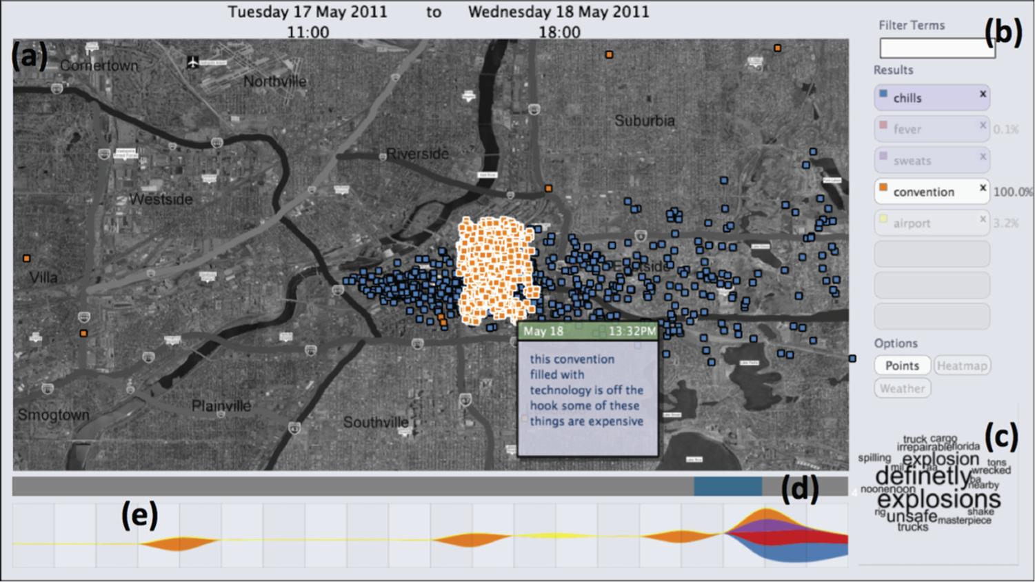
Some features of epSpread: (a) geographical view of two sets of messages, (b) querying interface with cross-query results as percentages, (c) word cloud for selected time period, (d) time range slider and (e) streamgraph visualizing query results over time. This figure shows the result of a cross-query between people at the convention in Downtown on 18 May and those who reported suffering from chills, fever or sweats. This query was performed entirely through selection on the available views.
In designing epSpread, we wished to balance a functionally rich interface with a simple design. We also developed other views including a more detailed streamgraph view and a message count view that showed the quantities of microblogs per region. However, for this article, we focus on the five principal views. We positioned the map panel in the centre to provide the main visualization, the streamgraph and timeline were positioned together such that they represent the same time range, and the word cloud is linked with the range slider on the timeline.
The map panel provides a geographical display to provide context – it gives a setting for other information to be overlaid in different forms. In the case of the MC1 data, the provided map was based on satellite imagery, with regions of the city drawn over in bright colours. The map was thus redrawn and desaturated to de-emphasise the map but to still provide context.
The map itself supports two types of overlay. A simple point-per-message geographic plot is useful for considering the overall spread and examining the contents of messages. But for large or dense message sets, over-plotting reduces the value of this technique. Therefore, the message set can also be shown as a heat map overlay on the map, by performing kernel density estimation using the M4 kernel 82 on the message set and visualizing the resultant 2D field. As well as avoiding occlusion issues, this has the advantage that additional information can be incorporated into the density calculations: for example, in the VAST 2011 MC1 data set, messages were weighted according to the population of the region of the city from which they were sent, at the time they were sent.
There is an obvious requirement for some mechanism for filtering messages for further analysis. Our query interface consists of a keyword search box that presents results in a result-stack interface. This enables eight searches to be included, which can be visualized separately or in combination, or deleted from the result-stack. The querying interface offers some additional functionality: regular expressions can be included in the query box to filter message blogs that are written in either first person or third person. This is extremely useful for analysing microblog data for disaster management as it can be used to reduce blogs containing hearsay.
In addition, the results panel displays statistics on the correlation between two selection sets. These selection sets are created by drawing a lasso selection region on the map. This lets us ask questions such as ‘how many people, who sent messages from or near the baseball stadium, later sent messages complaining about fever?’.
The distribution of search terms over time is shown using a streamgraph. Message sets retrieved using the querying interface are shown as they are produced. The streamgraph scales to reflect the number of occurrences thus also provides a mechanism for comparing the relative sizes of message sets.
epSpread viewpoints
We focus on two aspects of viewpoints: first, data-viewpoint and second view-projection (such as zooming).
Getting different views on the data is an important part of VA exploration. In this case, we wished to analyse the microblog data both to understand patterns held within it and to produce a manageable (reduced) set of data that can be visualized effectively. Many systems that deal with unstructured text rely on structured training corpora. However, microblog data do not work well with traditional techniques, where it is difficult to compare the unstructured, ‘messy’ and abbreviated form of words of the microblogs with a traditional formal corpus. In addition, another important aspect is that we wish to understand blogs that relate to first-hand experience, and which represent second- or third-hand experience.
In order to overcome the challenge of a lack of microblog training corpora, we used an alternative relative entropy–based approach that determined when ngram types (e.g. words, bigrams and trigrams) in a target window from the microblog corpus differed significantly in probability from the norm as represented by a reference corpus. 83 several reference corpora exist (such as the Brown Corpus) but most have been created on clean data and assume the grammar is good. This is not the case for microblog data that contain spelling mistakes, abbreviations and so on. 84 Therefore, we use the microblog data set itself as the reference corpus. For the case of MC1, we used the first 3 days, while for the Olympic data set, we took a subset of the real-world blog data.
Our method uses a simple naive estimate for the probability of each ngram based on its frequency of use in the particular microblog window or reference corpus. Let us define
Now, we can calculate a relative entropy–based distance metric used for ranking the ‘unusualness’ of each ngram
We name this measure codelength difference. From a compression perspective, this measure is merely the absolute difference in compression codelengths, where the costs of encoding the ngram are calculated using two different naive models: one trained on the microblogs window text and the other trained on the reference corpus text. The codelength is a measure of the ‘information’ (or surprise) for an ngram compared to the other ngrams. The codelength difference will be zero when the probabilities for the ngram in the two different probability distributions are the same.
We now iterate through a few examples using the word ‘fire’ and the MC1 data set. First, we can calculate the codelength (
In our analysis of MC1 data set, we first ranked all the unigrams in both the MC1 data set and the Brown Corpus by codelength difference after first converting all text to 27 characters (by case-folding and then collapsing all non-letter sequences to a single space). We found that the top five most ‘unusual’ unigrams from the texts ranked by this measure are as follows (codelength difference values are shown in brackets): wow (9.395), cant (8.742), chills (8.620), que (8.456) and spill (8.308). An analysis of bigrams was more revealing. The top five bigrams ranked by codelength difference were as follows: has caught (9.089), the chills (8.989), make me (8.669), on fire (8.512) and the flu (8.289). For trigrams, however, the picture was not as clear. The top five trigrams are as follows: come down with (9.358), the united states (8.685), to lose my (8.251), i was somewhere (8.247) and of the united (8.161).
This analysis importantly reveals some of the deficiencies of using the Brown data set as a reference corpus since it is a collection of samples of American English in the 1960s. There are further limitations of our approach. One challenge is called the zero-frequency problem, that is, the method can only be used for ranking ngrams that occur in both the target and reference data sets. For example, this is particularly noticeable using the Brown Corpus because none of the trigrams that contain the word ‘chills’ appear in the Brown Corpus. However, not withstanding these limitations, the codelength metric provides a beneficial summary mechanism for the microblogs. We can generate storyboards with salient information, and it helps us present key snapshots of the stories to present the development of stories in different storyboard panels.
To determine whether the blogs refer to the first–hand (or second– or third–hand) experience we analyse the text using a deictic analysis to investigate the types of words and where they are located in the microblogs. Our solution is explained further in Pritchard et al. 84 but is based on the Stanford log–linear POS tagger. This enables us to generate different viewpoints: first selecting blogs from the whole data, second of those in the first person, and finally those in the third—person.
Finally, several different view projections could be included, and the list of possible functions is endless. However, in epSpread, we enable the user to see several panels together or zoom into one particular panel. We utilize a GridBagLayout mechanism to constrain the panel components in the storyboard.
epSpread transition – constructing storyboards
We chose to construct the panels on a timeline. The order of the panels is therefore determined by the parameters of a particular panel. With each panel corresponding to either a specific instant or a period of time, the system is able to automatically arrange them chronologically along a timeline to form a storyboard. This situation was convenient for this data set because time was an important aspect of the decision-making. However, this would not always be the case, and therefore, this decision is solely a design decision for epSpread (for the given microblog data sets) rather than being a principle of storyboarding for VA. In this case, our belief that this was the right decision was borne out by the successful application of the tool to the VAST task.
Individual panels on the storyboard can be enlarged by double-clicking. This makes the chosen panel display in full-screen; during this mode, the user can adjust any parameters. This enables the user to focus on one panel and then return it to the storyboard view to show the whole story. If the time period or instant is adjusted when the panel is full-screen, then the panel will automatically return to the correct location on the timeline.
The process of producing a storyboard is typically iterative – panels are added and used to analyse particular events or trends. Perhaps initially, a single panel will show the results of multiple events or trends, but additional panels can be created if this improves the clarity of explanation. Figure 6 shows an example of constructing a storyboard that describes a sequence of conventions that take place in the MC1 data set. First, a single panel is used to identify, from the streamgraph, the days where many messages contain the term ‘convention’ (Figure 6(a)). Since these messages can be seen to be spread over a considerable time period, additional storyboard panels are created, and the time slider for each was adjusted to cover just a single convention (Figure 6(b)). Then, each panel is examined in more detail: the nature of the convention is determined from the textual analysis word cloud and examination of individual messages, and this is recorded as an annotation: additional queries are used to check for other occurrences of the convention subject in the data set, and cross-correlation is used to check for more than one convention on the same day (Figure 6(c)).
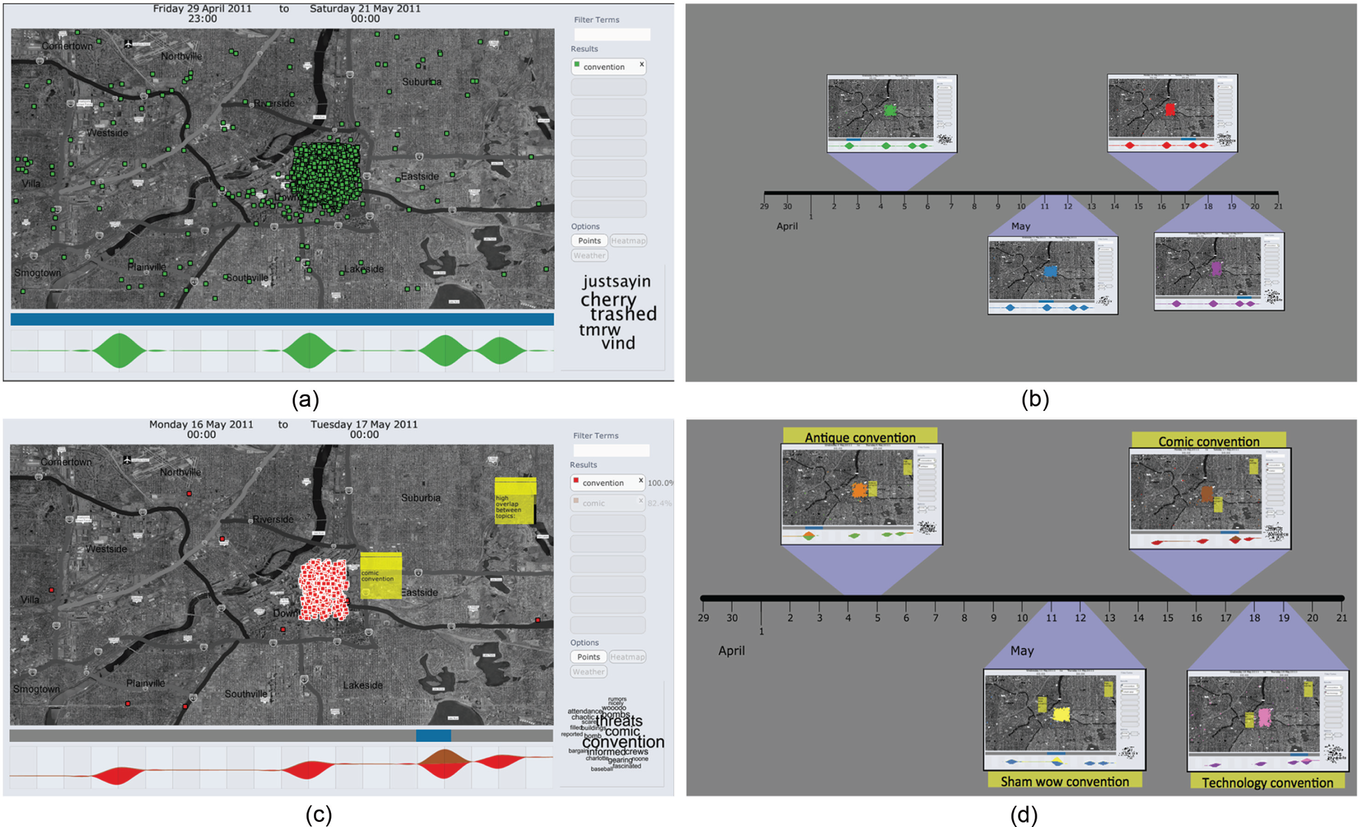
Constructing a storyboard for conventions in the MC1 data set: (a) identifying all conventions using the streamgraph, (b) creating a panel for each convention, (c) exploring, querying and annotating within each panel and (d) captioning panels on the storyboard with summaries. The completed storyboard can be used as an analytic product or stored for further exploration.
epSpread annotation
Panels can be annotated through the use of a simple Post-it note metaphor – short text notes can be placed anywhere on the panel to highlight important or interesting features shown in the individual visualizations. We not only consider annotation as a low-level task but also support higher level summaries as captions. Finally, each panel on the storyboard is captioned with a brief summary of the event it describes (Figure 6(d)). We distinguish captioning from annotation. Captions are designed to indicate the role the panel plays in constructing the story of the analysis and hence allows for a textual summary of the storyboard to be produced if required.
epSpread interaction
Interaction is provided through various means including: the user can choose what data to display through searching the data for different words, they can select different view options (such as the scatter plot view or the heat-map view) and they can select a subset of the displayed microblogs from the map view.
epSpread separability
epSpread has been implemented using Java and the processing libraries. We have used an extensible panel design. Each storyboard panel acts as a container for a number of different visualization and querying tools: this has the advantage that it allows us to wrap existing libraries and code, rather than develop from scratch. For example, to produce a streamgraph, we simply wrap the code supplied by Byron and Wattenberg.
While in our current implementation, each storyboard contains the same visualization elements, it is easy to see that for other data sets or tasks, different elements or combinations of elements might be required. Panels also need not all contain the same elements, as long as they still adhere to the design principles discussed in the ‘Principles of storyboarding for VA’ section and annotation could be made considerably more complex than the simple text notes currently supported, with a number of comic strip metaphors and devices that could be usefully applied. This could also be coupled with better support for storytelling within the tool.
Case study: VAST 2011 MC1
To demonstrate the use of storyboarding in epSpread, an example is presented here: analysis of the data for VAST Challenge 2011 (MC1). In this scenario, a fictional city, Vastopolis, is suffering from an epidemic. Symptoms reported are largely flu-like and include fever, chills, sweats, nausea and diarrhoea. Two data sets are provided. The first is a set of a million microblog messages covering a period of 20 days from 30 April to 20 May 2011. Each message includes a user ID, a date, a GPS location and a short text message. The second contains information about the city: population statistics, maps, weather data and so on. The tasks set in MC1 are as follows: first, to identify the origin of the epidemic and second, to determine its spread and transmission, with a view to directing emergency resources appropriately.
Identifying the origin through storyboard investigation
Our experience with the VAST Challenge 2011 demonstrated the benefit of collaboratively interacting with the storyboards. During our development period, group analysis sessions were built around the presentation of hypotheses by different group members. Figure 7 shows epSpread on the large display, to improve accessibility for the group discussions. Each hypothesis was mapped to a storyboard on a larger screen display and discussed by the group. Additional panels and annotation were added to clarify the ideas and sequence of events. In the time between meetings, group members could update their own storyboards to reflect their understanding of events. This discussion process resulted in a very refined narrative that was presented as our solution to the Challenge.
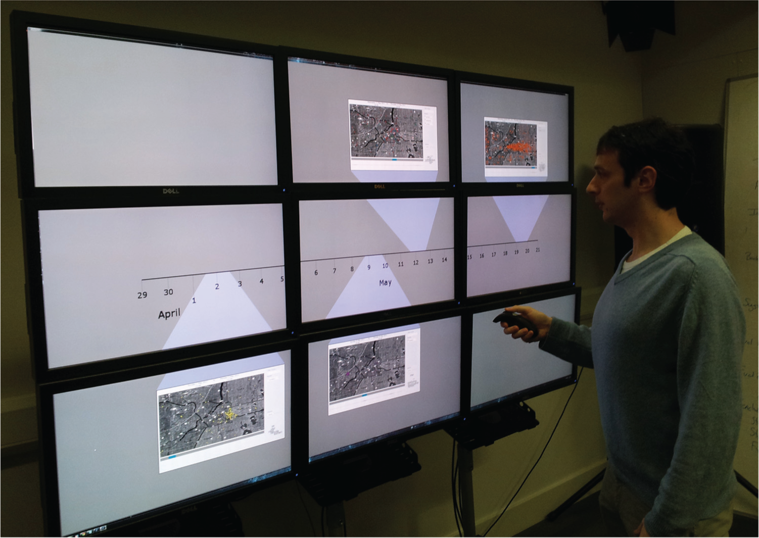
Using a large pixel display with epSpread. The resolution of the screen is 7600 × 4400, and storyboard panels are visible even when shrunk and placed on the timeline. Storyboarding with such displays may be more effective than on smaller, lower resolution screens.
While it is possible that the epidemic could cover the entire period, simply observing the word cloud to see important terms while dragging the time slider across the 20-day period reveals that this is not the case. In fact, the epidemic strikes over the last 3 days, from 18 May onwards, and this can be clearly seen from both the word cloud and by performing searches for the provided symptoms. Simple keyword searches for symptoms return a number of messages that are merely reporting on illness of someone else. Excluding these using the first-person filter discussed in the ‘epSpread Viewpoints’ section gives a much clearer picture, and by adjusting the slider to cover these 3 days and adding some annotation, this knowledge can be clearly displayed on our storyboard.
By searching for each of the symptoms given in the task description, we can see that there are two distinct patterns: fever, chills and sweats spread eastwards (which matches the wind direction), while nausea, vomiting and diarrhoea spread towards the south-west (which matches the flow of the river). Again, these patterns can be highlighted, annotated and displayed as storyboard panels.
However, determining a hypothesis for the cause of the epidemic engendered more discussion, over several different storyboard panels. Mapping the direction of spread backwards seems to indicate a possible common cause. Various storyboards were proposed and investigated during our team meetings. Indeed, swapping back and forth between the full-screen view and the storyboard view was beneficial to finding the correct hypothesis. If we look at the 17 May in more detail, we can see that terms such as ‘explosion’, ‘truck’ and ‘spilling’ occur more often than expected. If we search for each of these terms, we find mostly second-hand references to an explosion in one district of Vastopolis and to a truck accident on a bridge, where a cargo is spilt, at about 11 am. With several of our team independently coming to the same conclusion, and when the storyboards were investigated collaboratively, we came to the conclusion concerning the best hypothesis for ground zero of the epidemic.
The storyboards enabled us to discuss different scenarios, eliminate potentially wrong hypotheses and drill down into the detail of the hypotheses. Indeed, it is immediately noticeable, by looking at where the panels showing the two sets of symptoms are positioned on the timeline, that gastrointestinal symptoms are reported later, by a day or so. This implies either two separate illnesses (unlikely given they spread from the same source point) or two different means of spread. Given the weather conditions, it seems likely that the fever symptoms were spread by an airborne medium. The additional information provided for the task states that drinking water is sourced from the river (which flows north to south) and from nearby lakes. From several storyboards, the hypothesis then was that the gastrointestinal symptoms are a result of contaminated drinking water. Figure 8 shows a storyboard for the temporal patterns of the different symptoms.

Storyboard for the spread of the epidemic. Spread shown clockwise from top left: nausea, vomiting, diarrhoea and abdominal pain. While the spread pattern is the same, the temporal pattern differs and this is shown by linking each story panel to the timeline.
Establishing transmission and using different viewpoints
Again, the storyboarding techniques helped to locate potential transmission of the epidemic. Seeing different ‘viewpoints’ in different storyboards was an important feature. This enabled us to hypothesize about the spread of disease. With airborne and waterborne transmissions seeming likely, the final step is to check for person-to-person transmission of illness. As mentioned in the ‘Identifying the origin through storyboard investigation’ section, many microblog messages containing symptom keywords are third-person references –‘Mia has come down with a fever’. These messages are likely to be referring to friends or family members. We utilized different panels with different viewpoints, One querying just these third-person references and then another with messages reporting fever in the first person. Through these viewpoints, we can ask the question ‘Does anyone who talks about a friend or family member being ill later fall ill themselves?’ through the interface. In fact, there is no overlap at all between the two groups. This gives weight to our hypothesis that the illness is not transmitted between people.
Case study: London Olympics
Following the VAST Challenge, we extended the system to support real microblogging data from Twitter, collected a data set of messages about the London 2012 Olympics and analysed it. In this section, we first describe how the data were sourced and then consider how the geolocation of tweets was handled before showing some extensions to epSpread and presenting some examples of the type of analysis we performed on these data.
Twitter messages
Twitter allows access to its platform through a set of application programming interfaces (APIs), centred around four objects: Tweets, Users, Entities and Places. Two separate resources from the REST 1.1 API – Search and Streaming – are of most relevance to the data collection task. Each has constraints on its use: the Search API is limited to tweets up to 7 days old and returns only a maximum of 1500 tweets for query (100 per page over 15 pages). Search requests are limited to 180 queries per rate-limiting window (typically 15 min, but varies in times of heavy traffic), and complex queries may also be limited. Search queries can include geographic location as a parameter. Twitter states explicitly in the API documentation that not all tweets will be indexed or made available via the search interface.
The Streaming API provides only tweets as they are posted – there is no historical search capability. Once a connection is established, a feed of tweets is delivered without requirement for polling or for rate limiting. However, the Streaming API only allows access to a sample of tweets: typically around 1% of the total traffic. Firehose (100% of all tweets) access is restricted to selected commercial partners (largely search engines). Larger samples and historical tweets are also available through commercial partners such as Gnip and DataSift. We gathered data about the London 2012 Summer Olympics using both APIs. The same search terms –‘olympic’, ‘olympics’, ‘paralympic’, ‘paralympics’, ‘para-olympic’, ‘para-olympics’, ‘london 2012’, ‘london2012’ and ‘#games’– were used in both cases.
Geolocation with Twitter
The most recent version of Twitter’s location API has moved beyond merely reporting latitude and longitude to attempting to aggregate data into Places. A Place is a geographical area defined by a bounding polygon with information such as country, type of place (e.g. city) and a set of other optional attributes, which can give associated information such as a hierarchy of Place inclusion (city, county, country) and the street address. Location is disabled for users by default, and an explicit opt—in is required before any location information can be added to tweets.
When enabled, the default for tweets is to show only place information – latitude and longitude provided by the Twitter client are reverse-geocoded to a location – while Twitter stores the exact coordinates for 6 months to improve the accuracy of its geolocation systems. All past location data can be deleted by the account holder at any point. Even when opted in, users can choose whether or not to share location information on a per-tweet basis.
Twitter’s Search and Streaming APIs behave slightly differently with regard to geolocation data. If a location is specified as a filter on the search, to return all tweets in a specified area, then the Search API looks first at the latitude and longitude of a tweet, if provided, to see whether it falls within the area. If those coordinates are not provided but the Place field is populated, then any overlap between the bounding box of the place and the search area will result in a match. Finally, if neither coordinates nor place is provided, the location given in the user’s profile is considered, and the tweet returned if geocoding this location produces coordinates within the search area. The behaviour in the case of the Streaming API is the same in the first two cases, but user location is not considered, and hence, tweets without coordinates or place are never returned if the stream is filtered on location.
Collating locations
Tweets were collected for the period from 14 July 2012 to 25 October 2012, to cover both the Olympics and Paralympics and some of the aftermath. The Streaming API produced only a tiny number of tweets with geolocation, while using the Search API, we were able to gather a total of 2,399,516 tweets with some form of location using a criteria of ‘within 5000 miles of London’. Of these, just 42,750 had latitude and longitude specified explicitly, an additional 2584 had place information and 42,789 had latitude and longitude in the location field of the user’s profile, set by the mobile Twitter client. The remaining tweets had location information only as free text in the user’s profile.
Twitter’s geocoding API was used to retrieve the centre of the bounding box for the 910 distinct places contained in those tweets with only place information, and these were used as the coordinates. The GeoNames geographical database was used to geocode the 104,970 locations retrieved from profiles. By combining these, we were able to collate location information for a total of 211,583 tweets.
Extending epSpread
The core functionality of epSpread was extended in a number of ways to better support analysis of this new data set. The static map was replaced with a per-panel dynamic map using the Unfolding Maps library 85 for Java, using an appropriate low-contrast map provider, and annotations could be made to map points rather than simply screen positions. The word cloud now contains two mappings: text size still maps to the results of our text analysis codelength difference metric, but words are now coloured by frequency on that day. This helps to identify words that are surprising on a day simply because they are very infrequent words in the reference corpus, for which we used tweets sent in the first week. We also changed the behaviour of panels to allow more control over composition: an individual view (map, streamgraph, word cloud) can now be given prominence when the panel is shrunk back to the storyline.
Olympic overview
We used the updated epSpread system to analyse the Twitter data to explain message traffic during the London 2012 Summer Olympics in the context of the events taking place during the games. We began by constructing a panel that showed all tweets, by searching the message contents for the original search terms (since by definition, one or more of these terms is in the text for all messages). We then adjusted the time slider to restrict the view to only the period from 2 days before the Opening Ceremony (Friday, 27 July) to 2 days after the Closing Ceremony (Sunday, 12 August).
We then fixed this panel on the storyboard with focus given to the streamgraph to act as context while conducting more detailed work. From this panel, we could see that the broad pattern is that traffic spikes for the opening, then declines gradually until the closing ceremony, where again it spikes briefly. This pattern is as might be expected: different events are popular in different countries, but the opening and closing have universal appeal. However, alongside this, clear bulges in traffic can be seen on 31 July, 4 August, 7 August and 9 August.
Detecting events
For each of these dates, a panel was constructed and the word cloud examined to help determine the cause of the traffic. For 31 July, the word cloud view is most revealing – the swimmer Michael Phelps became the most decorated Olympian ever around this time, and this is reflected in messages on that day. For 4 August, the terms in the cloud indicate that the home nation had a successful day. The 6th indicates that the term ‘sprint’ is unusually popular on that day, and examining tweets shows that the 100 m final took place the day before. Finally, on 9 August, drilling down using the term ‘box’ from the cloud leads to the discovery that Team GB gained its first-ever women’s boxing gold medal.
While the process of discovery for each event is similar, the composition of panels into a storyboard differs: while the full panel maintains separability, the views displayed when the entire storyboard is shown are those that best summarize, in combination with the caption, the information on that panel. Figure 9 shows the storyboard constructed for this task. For 7 July, a word cloud is shown, while for 4 and 7 August, a streamgraph is displayed, and a map view shows the localized response on 9 August.
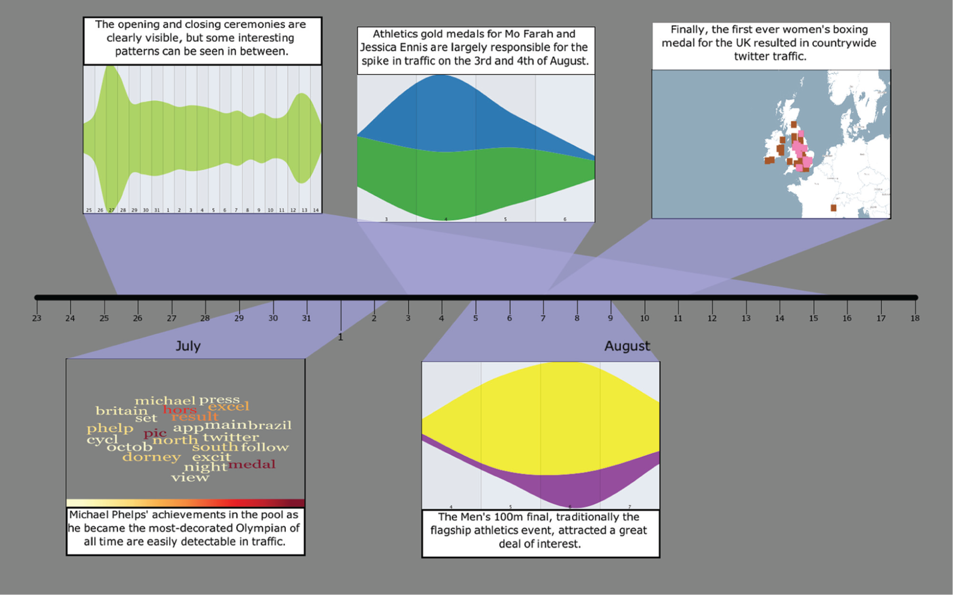
Storyboard for Twitter traffic during the London 2012 Summer Olympic Games. The spikes resulting from the opening and closing ceremonies are clear, but the period between shows a number of bulges indicating surges in traffic from events. Some of these events have been analysed, and summaries were presented using the most appropriate view. Double-clicking any panel brings it back to full size and shows the full views together with any annotations.
Discussion and lessons learnt
The storyboarding metaphor worked well in the two case studies that we used. It enabled a group of researchers to work together to analyse visually (in particular) the MC1 data set, discuss various hypotheses and agree on views that demonstrated specific answers. It certainly helped us as a team to create the correct answers for the VAST Challenge 2011 data set and organize the report material. In fact, our answer consisted almost entirely of panels from the storyboard visualization. Additionally, the storyboard structure enabled us to work both individually and collaboratively. The use of a large display helped us to discuss different scenarios as a group, and the use of the full-screen mode enabled us to focus on specific details (in the full-screen) and view the progression of different hypotheses (when docked in the storyboard configuration).
It was also useful to consider the storyboard concept from the point of view of its use in the film industry. This ideation guided our development and is summarized in the six principles of storyboarding for VA. One aspect that was fervently discussed as a group was the level of abstraction or simplification of the panels. While it is clear that film storyboards are typically sketchy representations that are hand-drawn, and act to demonstrate uncertain or unfinished decisions, the design goal of our tool was to learn from the idea of storyboarding rather than mimic every detail. While sketchy visualization renderings are possible with Processing, we do not believe that they are useful for every situation. In fact, our focus is on the challenge of achieving the right level of detail, rather than over its sketchy appearance. We found that by reducing the amount of plotted points (through filtering or cropping), the display would become clearer.
It was not always useful to include every component of the panel in the storyboard view. In the development of epSpread for MC1, we included every component in each of the panels. However, some components were more useful in the full-screen view because they provided context information and additional controls. But when docked in the storyboard, some of the components cluttered the visualization rather than adding value to the display. For instance, some words within the tag clouds were difficult to read when docked in the storyboard. Therefore, for the Olympic Games data set, we found that it was more beneficial to display fewer components in each panel. In fact, it was often more useful to display one component when displayed in the storyboard dock.
One aspect that also helped with the clarity of the view was summarization. We achieved different representations by using different viewpoints (such as swapping between first-person and second-person views of the microblog data). This helped to clarify the visual depictions because the first-person view held less data. It was therefore clearer to understand the trends of this subset. Furthermore, we believe that storyboarding would benefit from simplification techniques such as Document Cards, 24 which we leave to future work.
Another aspect of our implementation that was useful was the off-screen pdf Processing renderer. This enabled us to create high-quality screenshots to be saved directly from the screen and incorporated directly into the report. This idea could be developed further; again, this is part of our future plans.
We also found that it was useful to annotate and include captions on the panels. This enabled the storyboards to be named and this made the group discussions more specific. For example, rather than talking about ‘the panel with the group of red tweets’, we could provide the panel with an identity. However, through our development and SCRUM meetings, there were always several requests for additional annotation capability. These requests included functions to search annotations and to have separate lists of annotations.
However, there are some drawbacks to our design decisions. We took the decision to place the storyboards on a timeline. Although this was a useful feature for both the MC1 and Olympic Games data set, because it enabled us to discuss the specific order by which events occurred, we believe that this would not be useful for all data sets. We certainly found it advantageous to change the position of the panel merely by changing the time parameter, and it enabled panels with a wide time range to be easily discussed; however, on reflection, some of the team felt that it was often distracting and took up too much screen space.
Another feature that we developed into epSpread was that any interaction that could be achieved in the full-screen mode was available when docked in the storyboard configuration. Because the time slider in a panel determines the position on the storyboard, it is thus possible to interactively change the order of panel through moving a tiny slider. However, in practice, this was not used. It was difficult to interact with the interface when the panels were in the storyboard configuration, merely because the buttons and sliders were extremely small. Potentially though, this could be useful on an extremely large powerwall screen because the control sizes would be larger for an individual storyboard.
Although we found that the storyboard methods worked well in collaborative group settings, the interface was only operated by one user at any time. We used a wireless mouse to enable control of the interface to be exchanged between different participants, and we amicably handed over control to another collaborator. However, in practice, only a small subset of participants operated the tool in the group meetings. We believe that it would have been good to encourage more group members to operate epSpread in the collaborative environment by making it easier to collaboratively interact with the tool. A touch-table interface may be more accommodating for such group interaction, and although the wireless mouse was useful, other technologies may work well with the visual storyboard.
Conclusions and future work
In this article, we introduced a storyboard metaphor for VA. We introduced six key principles of design – composition, viewpoint, transition, annotation, interactivity and separability – and demonstrated how storyboards can help address visual analytic challenges through two case studies. The metaphor addresses the dual goals of visual analysis problems: performing the analysis and communicating the results of the analysis.
More broadly, conducting and presenting analyses through storyboards has the potential to improve sense-making processes. In intelligence analysis, the issue of provenance is becoming of greater importance – both for decision-making and for post-decision evaluation – and by forcing visual presentation of all steps in the analysis, storyboards map provenance as an implicit part of the workflow. Storyboards can also provide summaries at different levels of detail and classification: from a completed storyboard, text-only reports could be generated from captions or annotations; depending on data privacy or classification issues, the storyboard could be presented as a mixture of full panels and caption-only summaries. We anticipate that this multi-level presentation of analysis and analytic product could prove useful and important in the future.
Footnotes
Acknowledgements

Declaration of conflicting interests
The authors declare that there is no conflict of interest.
Funding
The work presented in this paper was supported by RIVIC (the Wales Research Institute of Visual Computing) funded by Higher Education Funding Council for Wales (HEFCW).