



Abstract

Last time you went to the doctor, how did you explain what was happening? What helped you remember the things you wanted to say? Perhaps you glanced through a list of things you had jotted down on a scrap of paper, or maybe you just relied on your powers of recall. Possibly, as you walked away from the visit, you suddenly remembered one of the most important things you had wanted to say.
For chronic patients, most of whom visit their doctors regularly but for a relatively short duration, it can be difficult to remember the highlights and questions that have come up over the 3 or 6 months since the last visit. Unless they bring detailed notes, there are few cues to help elicit this type of information; therefore, patients are left to recall what they can, in the moment, and answer whatever questions come their way. Clearly, this method of storytelling and recall is lacking. We can do better.
Recently, I have been using visual prompts during my doctor visits to help me better explain what is going on with me, and I have found this immensely helpful. Based on my own successes, I have come to believe that providing patients with visual means of personal expression can give them a new understanding of their health and help them tell a more effective story, which in turn increases understanding on the part of their care providers.
I would like to tell you a little about my own health story and the circumstances that led me to experiment with communicating in a more visual manner.
My health visualization story
For 23 years, I have managed life with two autoimmune conditions, Myasthenia Gravis and Sjogren’s Syndrome. Myasthenia Gravis, or MG, causes weakness in voluntary muscles and especially impacts my face strength—I sometimes have difficulty smiling or eating, I have bouts of double-vision, and sometimes an eyelid becomes so weak that it will close on its own. Sjogren’s causes a constellation of symptoms like dry eyes, joint pain, and heart palpitations. I have also experienced stomach problems for the past decade, which is also likely related to my body’s autoimmune response.
A few years ago, while I was living in New York City, my stomach symptoms became so severe that commuting to work became a daily source of anxiety. I was desperate, after visiting numerous providers, to find a solution for the source of my problems; until that time I had been given round after round of antibiotics, none of them being effective long-term.
I was referred to a doctor who was known for embracing alternative therapies, and I made an appointment. There was just one problem: he did not take insurance, and I would be spending at least US$500 of my own money on that first consultation alone. It was therefore imperative that I maximize my time with him and ensure that he unequivocally grasped my entire story.
Past experience told me that a free-form storytelling session in the doctor’s office would not suffice. I could not count on myself to remember all of the facts, and I worried that if he was in a rush (as many doctors are), he might not get the whole picture.
My design mind took over. As a User Experience Designer, it is my job, and my passion, to simplify the complex. I know that to solve a problem, you must first understand it. I have found in my work that visualizing a problem is usually the best way to wrap one’s mind around it, and so I decided that I would find a way to visualize my story so that I could better tell it and the doctor could better grasp it.
I started sketching out a visual timeline, which charted the progress of my MG since I was 13 years old not only the hard facts like the medications I was taking at the time but also the way I *felt* during those times and the degree of weakness I was experiencing. I created a separate timeline of the progression of my stomach problems over my lifetime, including the points in time when I took antibiotics (Figure 1).
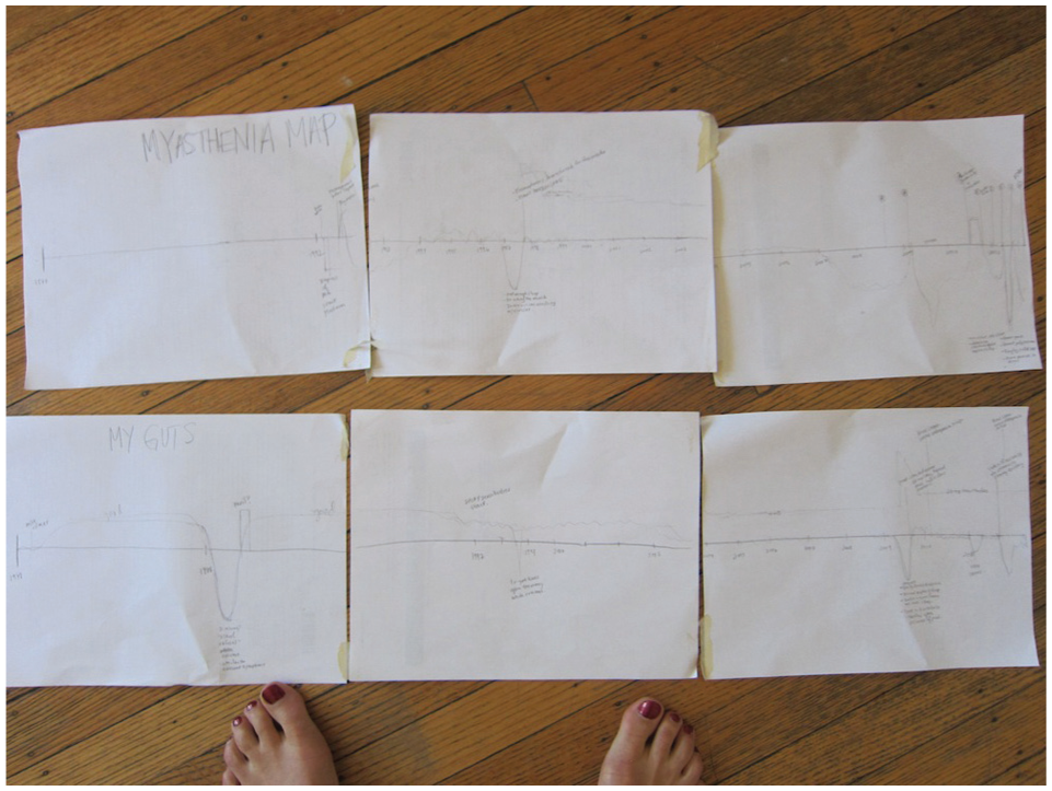
Initial sketches of my health timeline.
It is important to note that I created these timelines from memory. It was easy to recollect the key moments in my history when I felt very good or very bad—I could usually pinpoint those moments to a specific month and year, if not an exact date. All the time in-between I scored as “neutral,” meaning that I was sometimes doing well, sometimes not so well, but without any crises. I soon moved from a sketch into a graphics program (Adobe Illustrator) so that I could add finer details. When I felt satisfied with it, I printed the whole thing out and took it to my first visit with the new doctor (Figure 2).
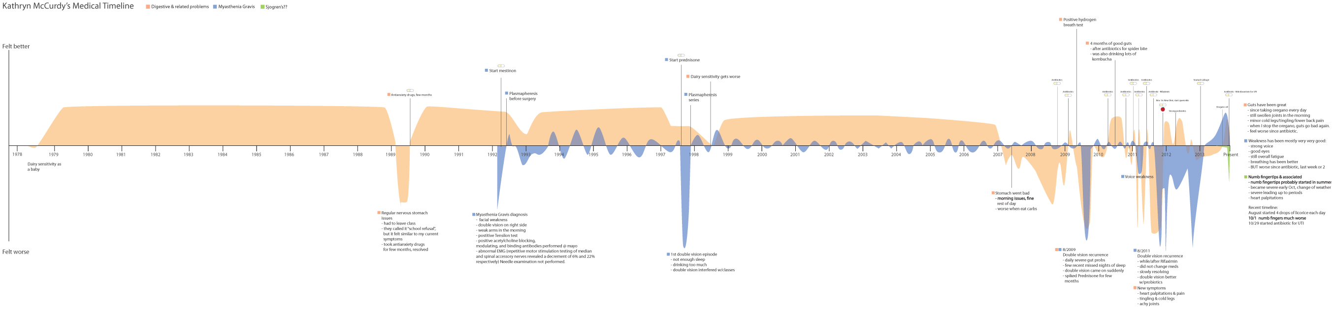
Full timeline that I initially presented to my doctor.
When I spread the taped-together timeline in front of the doctor and started talking, an ordered and coherent story unfolded. I talked quickly and deliberately, and I was able to point to certain phases of my history and explain what had been going on at the time. The result was a more structured conversation that allowed me to communicate my story more efficiently while saving the doctor from having to listen to—and parse—a more rambling narrative. Although the doctor did not seem too impressed and appeared a little impatient, when I asked what he thought of the timeline, he said it had helped. I considered the experiment a success (Figure 3).
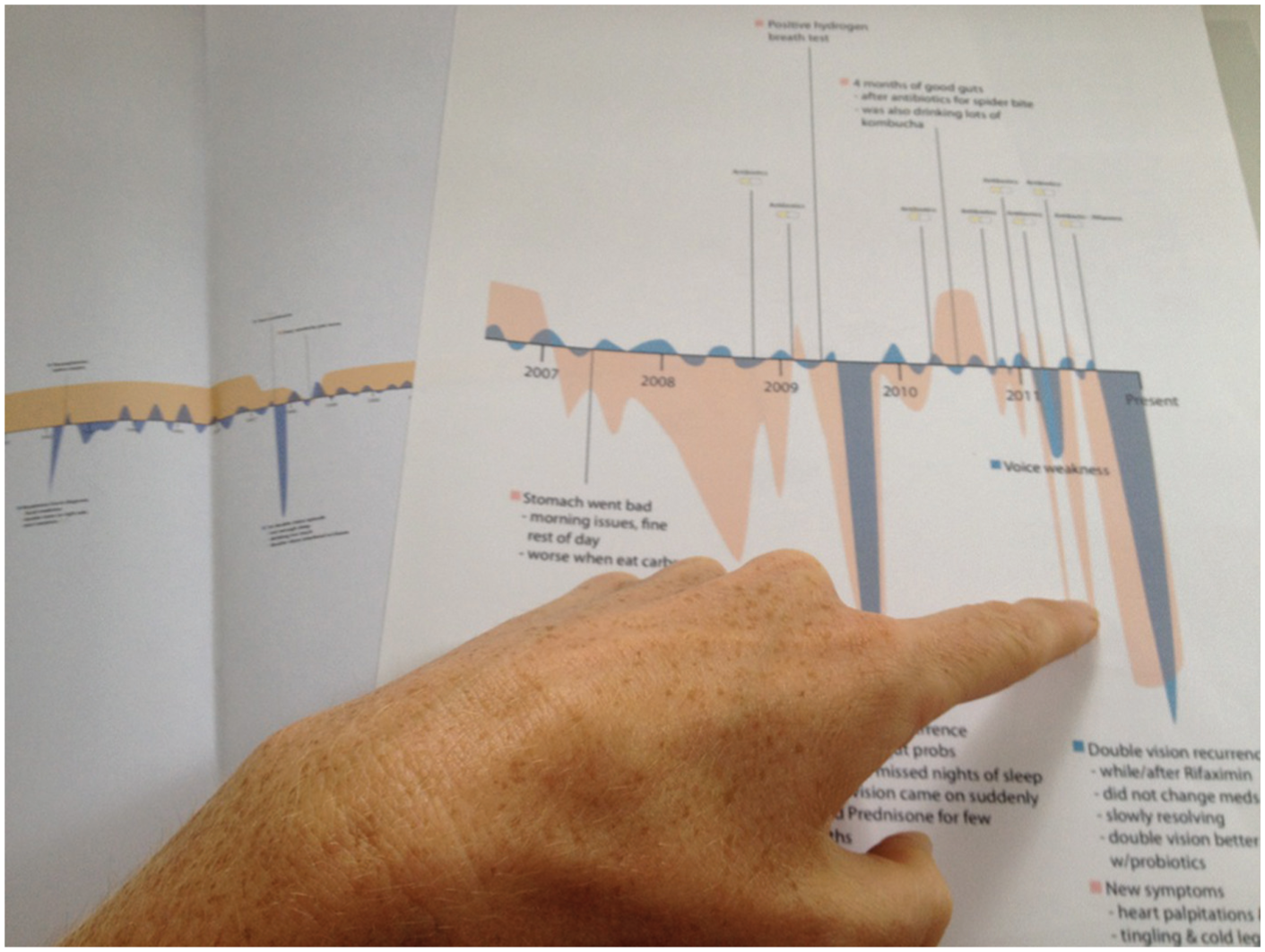
Using the timeline as a prop to tell my story.
I have since realized that clinical staff have their own systems for keeping notes and communicating with one another; throwing a big graph at them might be a little intimidating. I have spoken with clinicians who dread having to go through in-depth materials that some patients bring to them—like detailed graphs or spreadsheets—for a number of reasons. It is not always helpful, and time is limited in these encounters; even if the material is helpful, it takes the doctor time to learn and understand; the legibility of these artifacts is often left wanting.
Taking all of that into account, I have made improvements to my timeline and my in-person delivery of it. I have purchased my medical records from a number of institutions and added little notes to the timeline about when and how I was diagnosed, and when I received certain treatments. I have brought the timeline with me, either in printed form or as a PDF on an iPad, to about 10 more healthcare providers. Their response has been universally positive. I have heard the phrase “this is the coolest thing ever” at least twice. The timeline has allowed providers to internalize my story much more efficiently than if they had to dig through a multi-page chart. It has also allowed me to act as their assistant during the scarce minutes I have with them, pointing out the data points they are looking for (“here is how I was diagnosed”), which has helped me avoid unnecessary testing.
In addition to acting as a conversation and cognitive aid during my doctor visits, the timeline helped illuminate a few major findings that have changed the way I care for myself. A few visual trends stood out that would have been hard to understand without visualizing my information. First, I seemed to have weak episodes at the end of the summer or in early fall. Knowing this, I have been especially careful to get enough sleep and watch out for early symptoms at that time of year. I also observed that the antibiotics I had taken for my stomach issues seemed to only help for a short period, after which I would feel very bad again. This caused me to stop accepting antibiotics as a “solution” and start looking for ways to deal with the root cause of my problems (Figure 4).
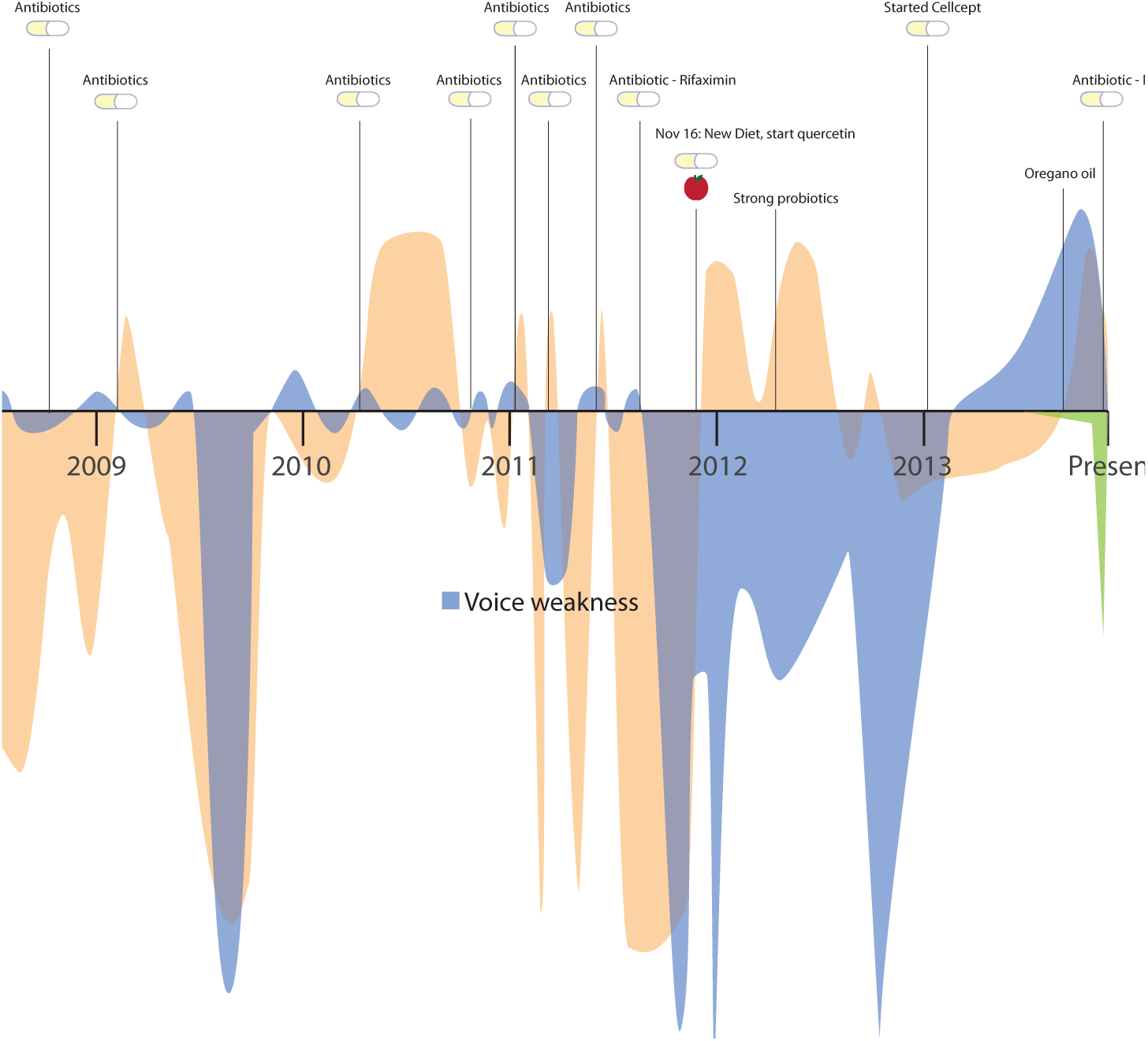
I could see that antibiotics were only a short-term fix; this helped me stop asking for them.
I have also dabbled with other ways of visually presenting my health, apart from the timeline. I have tried mapping out the different types of sensations I was feeling (often burning and tingling in my limbs, weakness in my eyes, or an upset stomach) on the outline of a human body, using colors and shapes to communicate how I was feeling (Figure 5). While it can be a little depressing to look at my symptoms collected all together, I have found that it helped me explain their range and severity. During one visit with my primary care doctor, I observed that she continually referred back to this symptom map and held it in her hand while we were talking. It seemed to help her externalize the work of remembering all of these seemingly disconnected bodily sensations. I took that as another success.
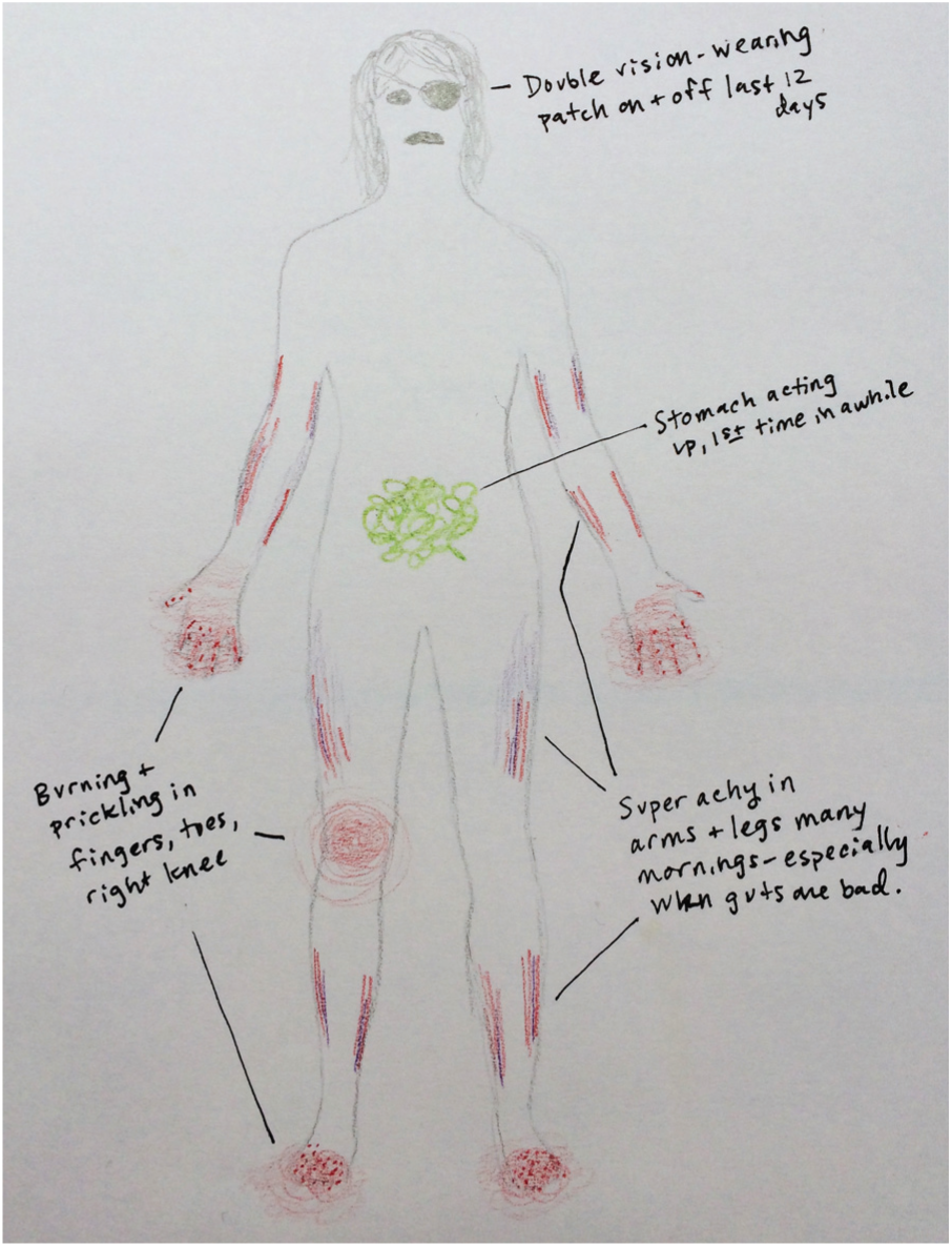
One way to help illustrate symptoms is to invite patients to draw them on a body figure; this example helped my doctor “get” my concerns at a glance.
Visualizing symptoms on a body figure is certainly not a new concept, but in all my years as a patient, I have rarely been asked to mark my symptoms on a body figure; and even then, it was in more of a cursory way. I believe there is great potential value in allowing patients to more fully express their symptoms in this manner.
Helping other patients visualize their stories
Clearly, my experience with visualizing and sharing my health information has been very positive. I would like to find a way to bring this capability to other patients, so that they can be empowered to take control of their stories and have a tool for more effective communication; this also would help increase providers’ understanding and make visits more productive.
How could we democratize this ability to visualize your health information? I have envisioned a few possibilities. One might be an interactive app that a patient could use to express his or her story visually, perhaps at the “point of care” in the doctor’s office. I have begun initial work on this sort of app, both individually and with the start-up Medical Avatar. But in the meantime, another answer might be a simple paper handout that guides people through the process of visualizing their information. I believe that each one of us, whether or not we consider ourselves “artists,” has the basic ability to draw; we all know how to use paper. I have put together a few sample templates for this purpose, and I am just starting to test them out myself and with other real patients (Figures 6 and 7).

An empty timeline template for a patient to complete.
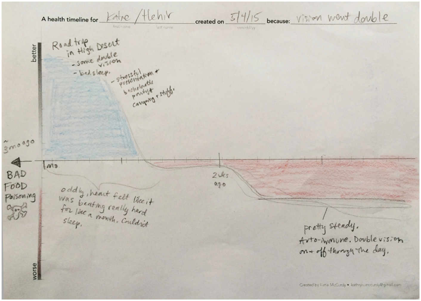
A timeline worksheet completed before the doctor visit.
The main drawback of using paper is, of course, that the data cannot be captured and manipulated in quite the same way as it can with a digital solution. I have had a few doctors scan and add my visuals into my medical record, but most often they are simply handed back to me at the end of the visit.
I am often asked about the possibility of automatically generating a visual representation—like a timeline—of the data that is contained within Electronic Health Records (EHRs). While that is a wonderful idea, and one that would certainly increase the efficiency and ability of both patients and care providers to understand the “EHR version” of a patient’s medical history, it does not capture the important story and perspective that a patient has to offer. Indeed, we see again and again that paying attention to only the EHR version of a patient’s story results in medical errors and misdiagnoses.
A great compromise might be a “collaborative health record” that welcomes both “hard” data points like medication dosages and procedures and “soft” data points like how the patient felt (physically, mentally, emotionally, and spiritually). This brings us closer to the end goal of having this information available to all members of the care team at all times. Such a collaborative space would require a way to input and display the type of visual information I have used in my visits; this would be a great improvement over the current records.
Promise of “soft data” visualization
What are the implications of visualizing “soft” data like memories, symptoms, feelings, and wellbeing? Again, my personal health graphics were not generated dynamically from any data set, but created by hand and meant to represent the information that was mostly in my head (and a few data points taken from my medical records).
This means of personal expression provides the opportunity for the creator to communicate things that would otherwise be difficult to articulate—for both emotional reasons (“it’s hard for me to say this out loud”) and cognitive reasons (“it’s hard to remember all the parts of the story”). In that way, this method is reminiscent of participatory design and research exercises, used in the design of systems and services, that draws out users’ mental models, ideas, and beliefs through the creation of physical artifacts and generative exercises.
Unsurprisingly, there are some drawbacks to visualizing “soft” information manually, and from memory. The information representation is imprecise; it is an approximation and is subject to fallacies of memory. For this reason, this method may not be appropriate for those who aim to track information in an ongoing manner (though there are plenty of tools that meet that need). Rating and scoring systems are also completely subjective (my “very bad” could be your “neutral”), so these types of ratings should not be taken as absolutes. Instead, trends over time will likely hold more meaning.
For a field steeped in the practice of visualizing and extracting meaning from large data sets, a conversation about visualizing memories and experiences may seem a little outside of the usual bounds. But I like to consider the complex interweaving of memories, facts, and feelings to be a highly interesting data set; if that information is visualized properly, it can tell a rich story about a person’s experience. I believe we have a great opportunity to use our skills to help patients and providers communicate and comprehend in a more visual way, to help patients act as expert witnesses, and to help providers connect the dots for patients who have lots of mysterious symptoms or who see many different doctors.
Footnotes
Acknowledgements
I would love to hear about your experiences or ideas about visualizing health information. Feel free to reach out to me directly at  . Special thanks to Joe Brin for recent feedback on the symptom timeline worksheet, to Virgil Wong for collaboration and inspiration about tracking symptoms on the body, and especially to Richard Anderson and Nina Gilmore for reviewing a draft of this commentary.