



Abstract
Understanding three-dimensional projections created by dimensionality reduction from high-variate datasets is very challenging. In particular, classical three-dimensional scatterplots used to display such projections do not explicitly show the relations between the projected points, the viewpoint used to visualize the projection, and the original data variables. To explore and explain such relations, we propose a set of interactive visualization techniques. First, we adapt and enhance biplots to show the data variables in the projected three-dimensional space. Next, we use a set of interactive bar chart legends to show variables that are visible from a given viewpoint and also assist users to select an optimal viewpoint to examine a desired set of variables. Finally, we propose an interactive viewpoint legend that provides an overview of the information visible in a given three-dimensional projection from all possible viewpoints. Our techniques are simple to implement and can be applied to any dimensionality reduction technique. We demonstrate our techniques on the exploration of several real-world high-dimensional datasets.
Introduction
Dimensionality reduction (DR) techniques are an important part of visual analytics solutions. DR techniques map, or project, datasets having tens or even hundreds of variables into a low-dimensional space (two-dimensional (2D) or three-dimensional (3D)), so that distance and/or neighborhood relations between data points—the so-called data structure—are preserved. Projected results can be next visualized by techniques such as scatterplots 1 and parallel coordinates. 2 DR methods have been used for the analysis of text documents,3–7 multimedia,8,9 text mining,10,11 vector fields, 12 and biomedical data.13–15
DR techniques have become very robust, precise, computationally scalable, and easy to apply. While 2D projections require less effort to explore,16–18 3D projections preserve better the original high-dimensional data structure.6,19–21 However, 3D projections output a 3D point cloud, typically shown as a scatterplot, whose interpretation is far from simple. 1 As users rotate the scatterplot to find a suitable viewpoint, several questions arise, such as how much of the original data structure has the projection preserved? What is the meaning of the 3D directions along which scatterplot points are spread in terms of original variables’ values and/or correlations? What are good viewpoints to look at the scatterplot from, given a set of questions on these variables?
We propose a set of interactive explanatory visualization techniques to help users answer the above questions for 3D DR projections. Our techniques work as add-ons to any DR technique, that is, do not depend on technical aspects of the DR algorithm being used. We keep their visual design simple, so that learning to use them requires limited effort. We integrate our techniques with classical 3D scatterplot views, so that they can be readily used to assist typical projection–exploration scenarios, or in other words, explain the projection. Specifically, we show how our techniques can aid detecting global correlations of variables, by suitably changing the viewpoint via 3D trackball-like rotations and by explaining which variables are best visible from a given viewpoint and which are not, due to occlusion or screen-space projection. We illustrate our visualization techniques by applying them to several data-exploration scenarios involving real-world multidimensional datasets and a set of recent DR projection algorithms.
The structure of this article is as follows. Section “Related work” presents related work on the computation and interactive exploration of DR projections and also outlines several goals supported by such exploration. Section “Explanatory visualizations” introduces our explanatory visualizations via a simple dataset. Section “Applications” illustrates how our visualizations can answer several questions on 3D scatterplots created by several DR techniques from real-world datasets. Section “Discussion” discusses our techniques. Finally, section “Conclusion” concludes the article.
Related work
DR
Given a dataset

which maps each point
where
Many DR methods are a special case of a wider class of techniques called multidimensional scaling (MDS). MDS methods compute f using only pairwise point distances. This avoids accessing the full dataset
DR methods can be classified by the techniques used to compute f:
14
spectral decomposition techniques project points along the eigenvectors having the largest eigenvalues of the pointwise distance matrix.
22
Local linear embedding (LLE)
23
and isometric feature mapping (ISOMAP)24,25 use numerical methods tailored to solve sparse eigen problems. Landmark MDS
26
and Pivot MDS
27
book further speed-ups by using classical MDS on a small set of sample points and projecting remaining points by local interpolation. Fastmap achieves linear complexity in the input point count at the cost of a less well-minimized stress
Explaining projections
Interpreting DR scatterplots is not easy. Refining the questions in section “Introduction,” we identify the following goals which we aim to address:
Assign a meaning to the m dimensions of the mD projection space in relation to the original n variables.
Assign a meaning to the inter-point distances in
Find a suitable viewpoint (for 3D projections) that best supports answering specific questions.
Compare the quality of projections for dimensions
Goal 1 can be addressed by biplots and their variations.41,42 Biplots are the multivariate analog of scatterplots. Instead of using the scatterplot idea of plotting observations along two orthogonal (Cartesian) axes mapping two variables, biplots approximate the multivariate distribution of a high-dimensional dataset in a few dimensions, typically 2 or 3, by superimposing representations of variable values on representations of the observations themselves. As such, they offer the possibility to easily see relationships between (1) individual observations and (2) observations and their variable values.
43
Graphically, biplots can be seen as a scatterplot generalization, in the sense that they have as many axes as there are variables, and these axes can take any orientation in the display. Biplot axes support goal (2) above by showing which are the directions of maximal variation in the original
Biplots and their axes are usually constructed as follows. Consider the

where
A different approach to Goal 1 is given in Broeksema et al.
45
Here, an nD categorical dataset is projected to
Goal 2, that is, assigning a meaning to the inter-point distances in
Goals 1 and 2 are also addressed jointly by other tools. The early VIsualization By Example (VIBE) system allows users to freely place in 2D space several so-called points of interest (POIs), each representing a sample of the nD space under study. 5 Points in this space represent documents along n dimensions encoding term frequencies. Actual documents are placed in the same 2D space so as to reflect their relative similarities with the given POIs. Conceptually, this can be seen as projecting both documents and POIs (variable values) from nD to 2D. However, this approach requires the user to manually create relevant POIs (samples of the nD space) and also place them suitably in 2D. ForceSPIRE, a document-exploration system, uses a force-based layout to construct a 2D projection of a set of documents represented as nD term vectors. 4 By dragging, pinning, and annotating documents, users can incrementally assign higher-level semantics to 2D inter-document distances. The “dust & magnets” technique extends the exploration power of ForceSPIRE and VIBE by allowing users to interactively drag magnets to discover how data points (dust) are attracted toward them in an animated fashion. 7 While we also use interaction to explain a projection, like Endert et al., 4 Olsen et al., 5 and Yi et al. 7 our focus is to explain projection-space distances in terms of the original nD variables, rather than showing similarities of projected points with a user-selected set of variable values or extracting higher-level semantics from variable values. As such, we will not modify the projection, as we consider it to be our “ground truth” and also give a key role to the nD variables in our explanation.
Goal 3, that is, finding a suitable viewpoint (for 3D projections) that best supports answering specific questions, can be addressed by multiple views, such as three 2D views linked with a 3D scatterplot by interactive selection, 52 or interaction and animation, for example, the scatterplot matrix. “Rolling the dice” (RTD) adds interactivity to improve navigation, 3D animated transitions to explore the visual space, and swapping the scatterplot-matrix axes to show variable correlations and disparities. 1 This idea was extended in Sanftmann and Weiskopf 53 by linking a 3D scatterplot with a 3D scatterplot matrix, improving navigation by using three axes and using one or two axes during visual transitions. A similar idea was used by Hurter et al. 54 to link 3D and 2D scatterplots. Claessen and Van Wijk 55 extend axis movement for scatterplot navigation, to allow users to interactively draw, place, and link axes on a canvas, thereby creating a continuous combination space of 2D scatterplots, scatterplot matrices, and parallel coordinates.
Goal 4, that is, comparing 2D versus 3D DR projections, to find which is more suitable for a specific context (and why), is still an open subject. 56 Several authors argue that 2D DR plots are better for visualizing text documents,16,18 and that 2D navigation is easier than its 3D counterpart. 18 For the specific task of cluster separation, Sedlmair et al. 17 argue that 2D DR plots are found to be as good as (interactive) 3D DR plots. 2D DR plots were also found better for search tasks 57 and for tasks involving distance assessment and spatial arrangements. 58 On the other hand, Jolliffe 19 argues that 3D projections are needed to “encode a realistic picture of what the data look like” when the intrinsic data dimension is 3 or higher. Dang et al. 59 show how 3D glyph stacking can overcome color coding problems in 2D plots. Additional cues such as illumination and depth are proposed in support of using 3D scatterplots. 60 Sanftmann and Weiskopf 53 argue that high-point densities in scatterplots are better handled by 3D scatterplots. Chan et al. 61 argue that 3D projections decrease information loss by allowing better discrimination between data elements. A discussion of contexts where 3D DR projections are preferable to 2D ones is given in Sanftmann and Weiskopf 62 . Poco et al. 21 compared 2D and 3D DR projections using LSP 6 both quantitatively (by stress metrics) and qualitatively (by controlled user studies). The quantitative comparisons showed a higher accuracy of 3D projections; the user studies showed that when augmented by suitable interaction tools, 3D projections were superior to 2D projections in terms of both confidence and satisfaction and argued for the further development of 3D interactive exploration tools.
Summarizing the above, with needed brevity, we argue that (a) 2D DR plots are generally found more effective for the specific tasks of cluster separation and searching and require less interaction; while 3D DR plots preserve distances better, but loose appeal due to navigation, orientation, and occlusion problems. As such, we argue that our goal of designing effective interactive exploration tools for 3D DR projections, which keep the benefit of higher 3D projection accuracy as compared to 2D projections, but decrease 3D interpretation costs, is worth investigating.
Explanatory visualizations
We next detail our interactive visualizations that support the explanatory goals in section “Explaining projections.” As running example, we use a dataset containing 2814 points, each representing the abstract of a scientific article (dataset
Figure 1 shows the 3D projection using a scatterplot, with points colored by their class attribute. Apart from seeing a few separated point clusters, which seem to capture the class attribute, this image does not tell us more: we do not know how variable values vary along the 3D space, or whether they correlate with the clusters or with each other, or how to choose a good viewpoint to examine the dataset. We next show how to answer such questions.
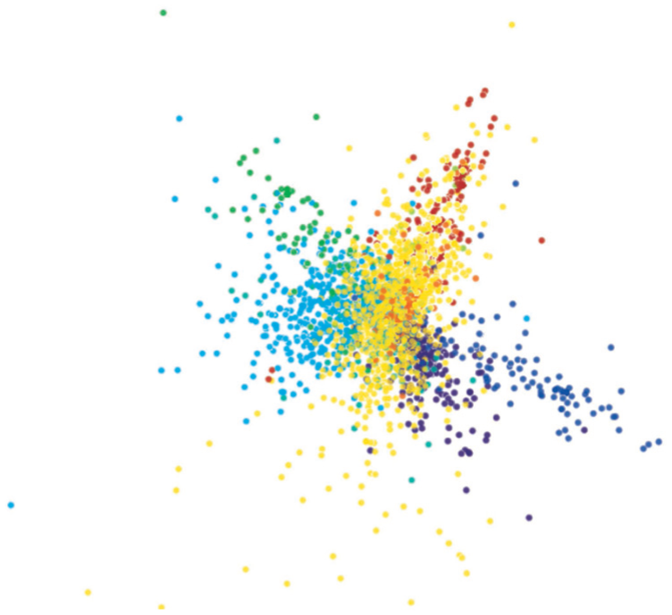
Document dataset shown by a 3D scatterplot.
Enhanced biplot axes
Standard biplots project the n variables into biplot axes in the low-dimensional mD space using SVD (equation (3)), as described in section “Explaining projections.” This has several problems. First, this assumes that DR is done using a uniform and linear transformation. This is not true for nonlinear DR techniques or techniques based on different local projection schemes (“Related work”). Second, this assumes that we know the internals of the DR method, such as the SVD matrices
We address these issues as follows. For each nD variable i, we create a set of

Adding curved biplot axes to the 3D projection in Figure 1: (a) LAMP projection and (b) FBDR projection.
Enhanced axis legends
The users can view 3D projections from any viewpoint, using a virtual trackball to rotate, translate, and zoom the camera. For such a viewpoint, we denote the screen axes x and y by
Construction
To explain the screen axes, we use three bar charts, or axis legends (Figure 3), one for each of the axes

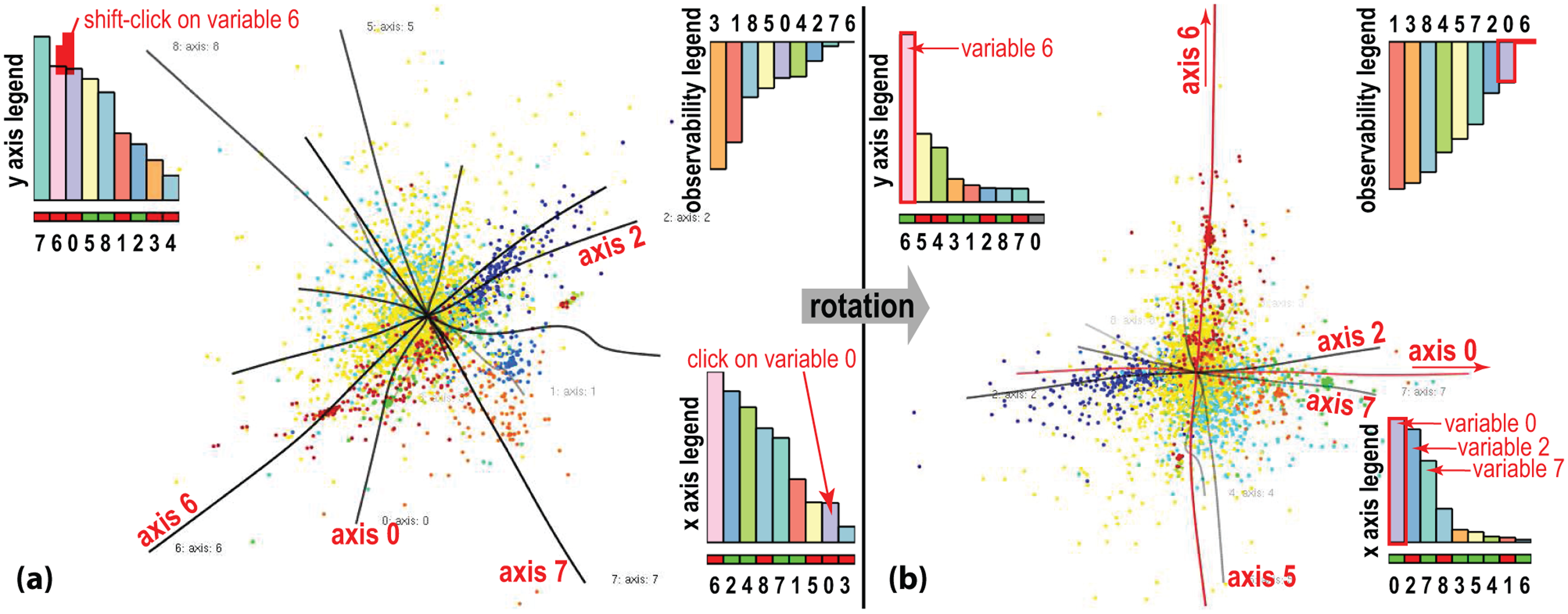
Axis legends. Two clicks in the left view will align variables 0 and 6 with the screen x- and y-axes, respectively, leading to the right view: (a) before alignment and (b) after alignment.
Here,
The sign of
Sorting legends
We provide two modes to sort legend bars left to right. The first mode sorts bars alphabetically on their variable names, so bars for the same variable
Linked views
We next use interactivity to support several exploration tasks. As the user changes the viewpoint, for example, by rotating the virtual trackball, axis legends dynamically change, so that one interactively sees how the viewpoint change affects what is mapped along the screen axes (see submitted video). Separately, we set the transparencies of the biplot axes
Viewpoint selection
We further assist users to choose a good viewpoint by interactive-and-iterative axis alignment, as follows. Clicking any bar i in the
Our approach is related to the legends in Broeksema et al., 45 which show the variation in the nD variables along the screen x- and y-axes and the variation in the view direction (thus, not visible from a given viewpoint). Yet, important differences exist. First, the legends in Broeksema et al. 45 are static, as their 2D projection is predefined by the SVD’s two largest eigenvectors. Our dynamic legends help reading the nD variables from an interactively user-chosen viewpoint in 3D. For example, the x and y legends in Figure 3(a) show that viewpoint does not clearly let us read individual variables along the x and y screen axes, since many bars are long in these legends. After alignment, the legends significantly change (Figure 3(b)), telling us that x maps mainly a mix of variables 0, 2, and 7 and y maps mainly variable 6. We also see this in the observability legend (Figure 3(b), top right): the bars for variables 6, 0, 2, and 7 are shortest (in this order), telling that these variables are indeed almost fully captured by the xy screen space. In contrast, the bars for variables 1, 3, and 8 are longest; this indicates that these variables are poorly observable in the xy screen space for the current viewpoint, since they spread mainly in the z-direction. Second, while Broeksema et al. 45 orient bars in all three legends upward, we chose to orient the observability legend bars downward. This is in line with the fact that long bars in the observability legend are undesirable (they indicate variables we cannot see), while long bars in the x and y legends are desirable (they indicate variables we can see). Third, the computation of our bar heights is different. In Broeksema et al., 45 these are the so-called loadings of the input n variables versus the two eigenvectors used for 2D projection. Computing loadings requires explicit knowledge of the DR method f used (SVD, in Broeksema et al. 45 ). In contrast, we treat the DR method as a black box when creating our biplot axes (section “Enhanced biplot axes”) and compute our bar heights separately as a function of the biplot axes’ positions given by the current viewpoint (equation (4)). Hence, our biplot axes can be straight lines or curves, depending on the (non)linearity of f. In contrast, Broeksema et al., 45 which uses the biplot setup in Abdi and Valentin, 44 assume a linear projection. Third, unlike Broeksema et al., 45 sorting legends allows us to tell which variables can be best read along x and y, or worst read (because being orthogonal to the xy plane); discover variable correlations; and make legends scalable for large n values.
Viewpoint legend
Dynamic axis legends help seeing which variables are visible along the screen axes from a given viewpoint and also choose a good viewpoint to examine a given variable pair. Our next question is as follows: given a 3D DR projection, which relations (between all variable pairs) can we see well if we had time to go through all viewpoints?
We answer this question by a new interactive widget: the viewpoint legend (Figure 4). The widget uses a sphere

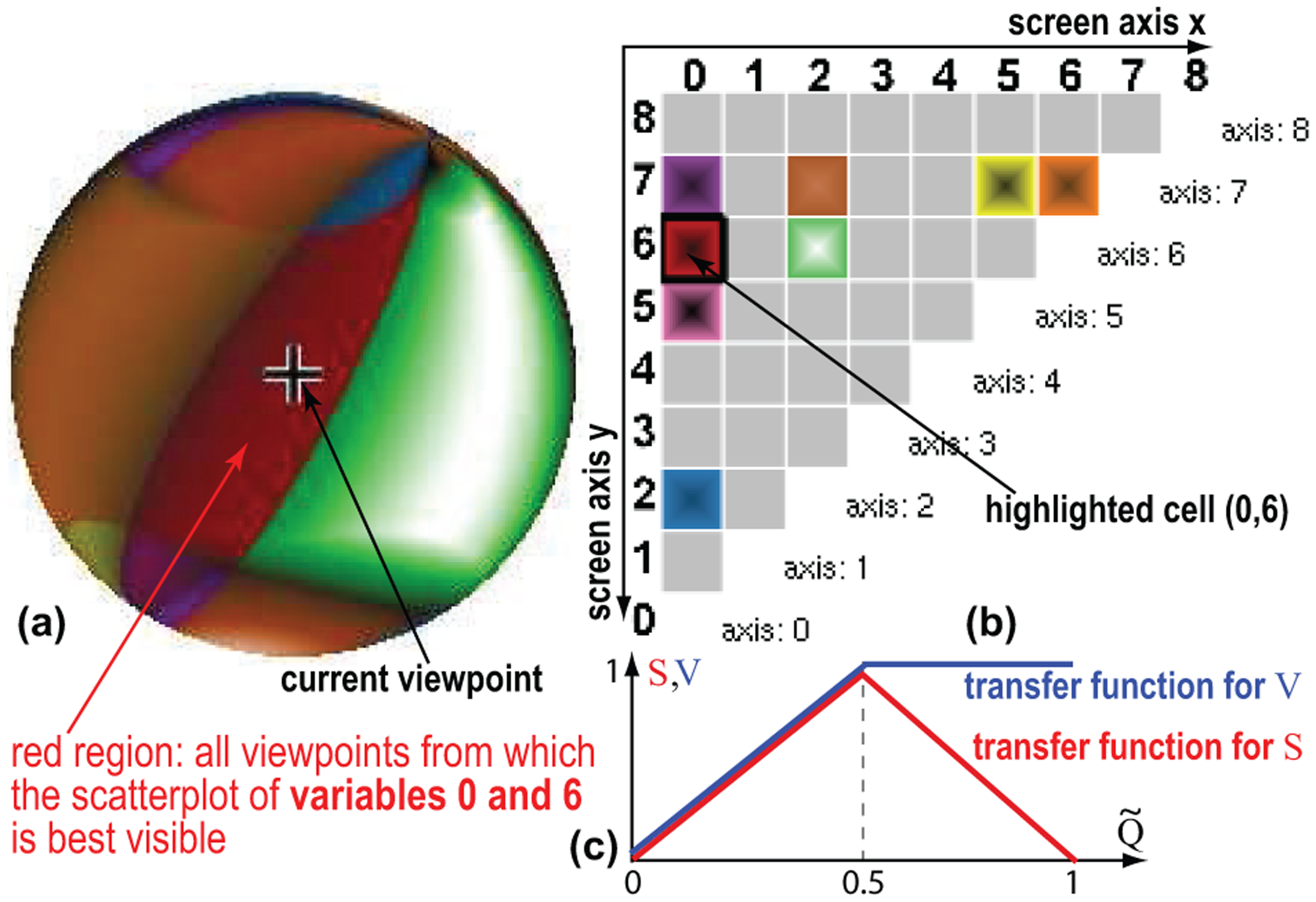
Legend for viewpoint shown in Figure 3 right: (a) Viewpoint sphere; (b) Matrix-plot view; (c) Transfer functions for color and luminance of the viewpoint sphere.
Intuitively, q tells how well we can see from
For each sample viewpoint

For all
To help interpreting the shaded sphere, we add a separate matrix-plot view (Figure 4(b)). Each variable pair
Figure 5 and the submitted video shows the added value of our viewpoint legend and matrix plot for our documents’ dataset. We explore the viewpoint space interactively, as follows. Rotating the sphere changes the current viewpoint, which in turn dynamically updates the axis bar charts (section “Enhanced axis legends”). Conversely, rotating the 3D scatterplot (either manually or by axis-alignment animation, see section “Enhanced axis legends”) turns the sphere in sync to show the newly selected viewpoint. The cell for the current viewpoint is highlighted on the matrix plot, so we can directly see which variable pair is best visible from that viewpoint, for example, (2, 6) in Figure 5. Clicking any cell (i, j) in the matrix plot smoothly rotates the viewpoint to one where the variable pair (i, j) is best visible, that is, goes to the viewpoint
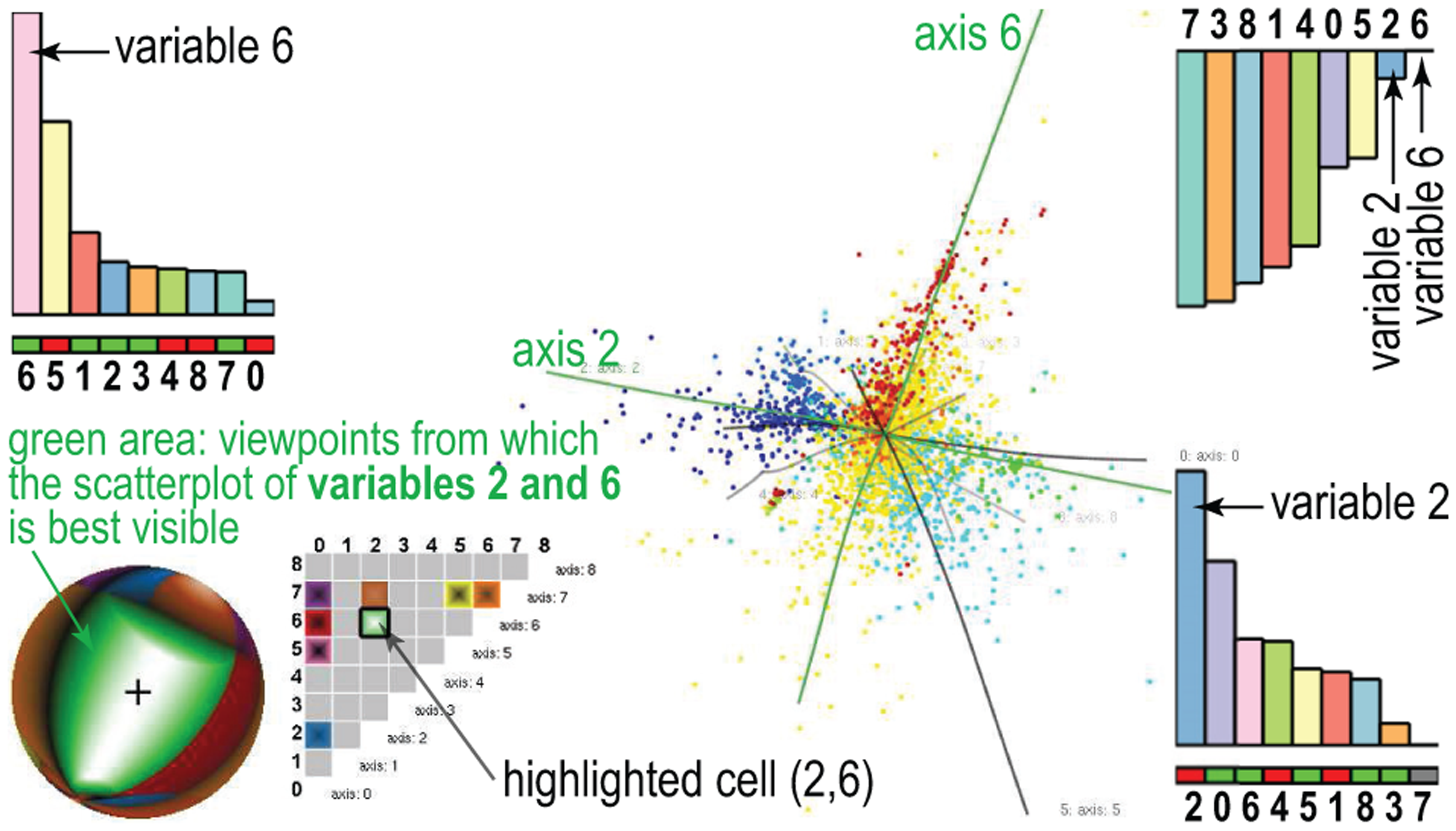
Selected viewpoint best showing scatterplot of variables 2 and 6.
The viewpoint legend helps answering several questions, all related to choosing informative viewpoints for 3D DR projections, as follows:
Where from should I examine pair
?
Large same-hue sphere zones, for example, the green one in Figure 5, show view-space areas from which the variable pair
Is there any good viewpoint for
?
Small color zones show that some variable pairs are hard to see, since only few viewpoints allow that. This tells users not to expect to “create” such scatterplots from this DR projection, as this is very hard or even not possible. In other words, if understanding the correlation of such variable pairs is important, one should first change the DR projection.
How easy is to examine
?
Large bright highlights in sphere zones show that the respective variable pair is easy to examine from many close viewpoints. Given our quality definition (equation (5)), this means that the spread of the values for these variables is large compared to other variables, and that the biplot axes’ angles for these variables are large. This tells that creating scatterplots for the respective two variables is very easy—just move anywhere in the respective highlight and you will get the desired scatterplot. Moreover, the matrix-plot cell brightnesses tell us how easy is it to examine their respective variable pairs from all possible viewpoints: Bright cells tell that there is at least one viewpoint from where the respective pairs can be examined well (selectable by clicking that cell); dark cells tell that no such viewpoints exist.
What can I see from a given viewpoint?
Highlights show viewpoints from where the variable pair given by the color around the highlight is best visible. Dark zones on the viewpoint sphere, like the ones just outside the green zone in Figure 5, tell that there is no easy-to-see variable-pair when looking at the plot from the corresponding viewpoints. This is so since the pair which is best visible from such viewpoints has a low quality, as indicated by the dark colors. Hence, such zones tell that their respective viewpoints are arguably not useful for any visualization task.
How to relate more than two variables?
Color-zone borders show viewpoints where the best visible variable pair changes for small viewpoint rotations. These are typically bad viewpoints to examine a single variable pair. However, as we shall see in section “Multifield dataset: explaining projection shapes,” these are good viewpoints to examine groups of three or more variables.
Applications
We next use our explanatory visualization techniques (enhanced biplot axes, axis legends, viewpoint legend) to explore 3D DR projections and aid in coarse correlations. They were constructed by three different DR methods, for four different datasets. By showing more datasets, we can easily explain how we address different kinds of questions with our tools, since each one has different data and, consequently, different questions related to it.
Wine dataset: finding good DR projections
This n =12 D dataset has 4898 points, each being a different sample of vinho verde white wine. 66 The variables include chemical properties, for example, acidity, sugar and sulfur contents, chlorides, density, pH, and alcohol percentage. The last attribute is a user-assigned quality level. The tasks for this dataset involve finding correlations of the first 11 variables on one hand, and the quality on the other hand, over specific subsets of points; if found, such correlations could be next used to design automatic quality predictors. 66 To use DR for such tasks, we first must decide which DR method is best suited. One way for this is to select the DR method that minimizes aggregated projection errors, also called aggregated stress. 20 Yet, many state-of-the-art DR techniques will yield quite similar error values, so such aggregate errors are not discriminatory enough.
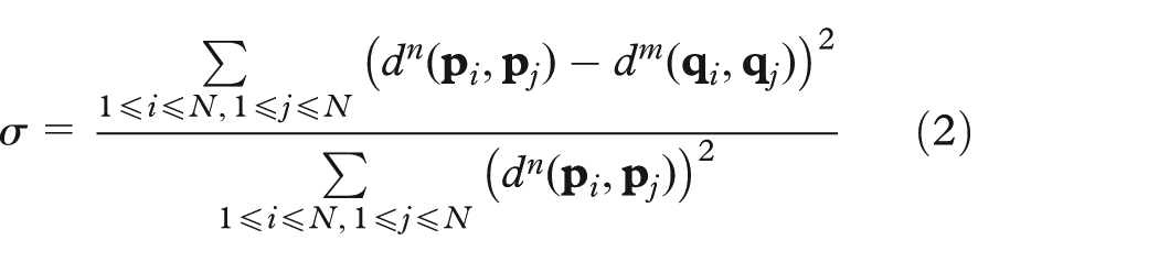
We consider here three DR methods: FBDR, 37 ISOMAP, 25 and LAMP 9 to project our dataset to 3D (other DR methods can be equally easily used). Figure 6 shows the obtained projections. For this dataset, these three projections yield very similar values for the normalized stress metric (equation (2)): 0.75 (ISOMAP), 0.81 (FBDR), and 0.83 (LAMP). Hence, how to say which DR method is best for discovering variable correlations? Showing our biplot axes helps us here (Figure 6). We see that FBDR and ISOMAP create, overall, quite twisted axes, unlike LAMP. Reading data values and/or finding if such axes are highly correlated (nearly parallel) or independent (nearly orthogonal) is clearly much easier if our axes are straight lines rather than curves. Our first finding is, thus, that LAMP is better for variable exploration in general.

Selecting the best projection among three DR techniques using biplot axes and axis legends: (a) FBDR, (b) ISOMAP, and (c) LAMP. See section “Wine dataset: finding good DR projections.”
However, the above does not imply that LAMP would be the best projection for more specific tasks, like exploring correlations of just two specific variables. Consider, for example, alcohol and acidity. We see that the alcohol axis is comparably straight for FBDR and LAMP—hence, we cannot yet rule out FBDR as a useful projection for this task. To study correlations against alcohol, we first click on the alcohol bar in the y legend to align it with the screen y-axis, in all three plots. Next, we use the same procedure to align acidity with the screen x-axis (one click on the acidity bar, x legend). For extra insight, we also color points by acidity values, using a blue–yellow–red divergent colormap. We now get several extra insights: First, we see that the x legend for FBDR has many bars of nearly equal size to acidity. Hence, either FBDR does not succeed in separating these variables during projection (which is bad) or we just discovered that these variables are highly correlated (which is a good finding). Yet, LAMP shows a clear exponential drop-off of the same bar lengths. Since LAMP’s projection error is roughly equal to FBDR’s, it means that the respective variables are not correlated; hence, the lack of separation in FBDR is a limitation of FBDR. Separately, we see that ISOMAP creates a twisted acidity axis and also shows a similar artificial correlation of variable projections along the x screen axis. Hence, we decide that LAMP is better than ISOMAP. Summarizing all above, we conclude that LAMP is the best of the three projections (LAMP, ISOMAP, and FBDR): it has a similar normalized stress metric, but succeeds best in creating straight, and well-separated, variable axes in 3D projection space.
Multifield dataset: explaining projection shapes
This n =10 D dataset, from the IEEE Vis 2008 contest, encodes a time step of a multifield simulation dataset describing the formation of the early Universe. 67 The variables encode matter density, temperature, and concentrations of eight chemical species at 200,000 sample points. By freely rotating the 3D DR projection of this dataset (Figure 7), done using LAMP, we notice that the projection appears to be locally a 2D saddle-like manifold (point-cloud surface). We next want to better understand the shape of this surface and find the variables that determine it.
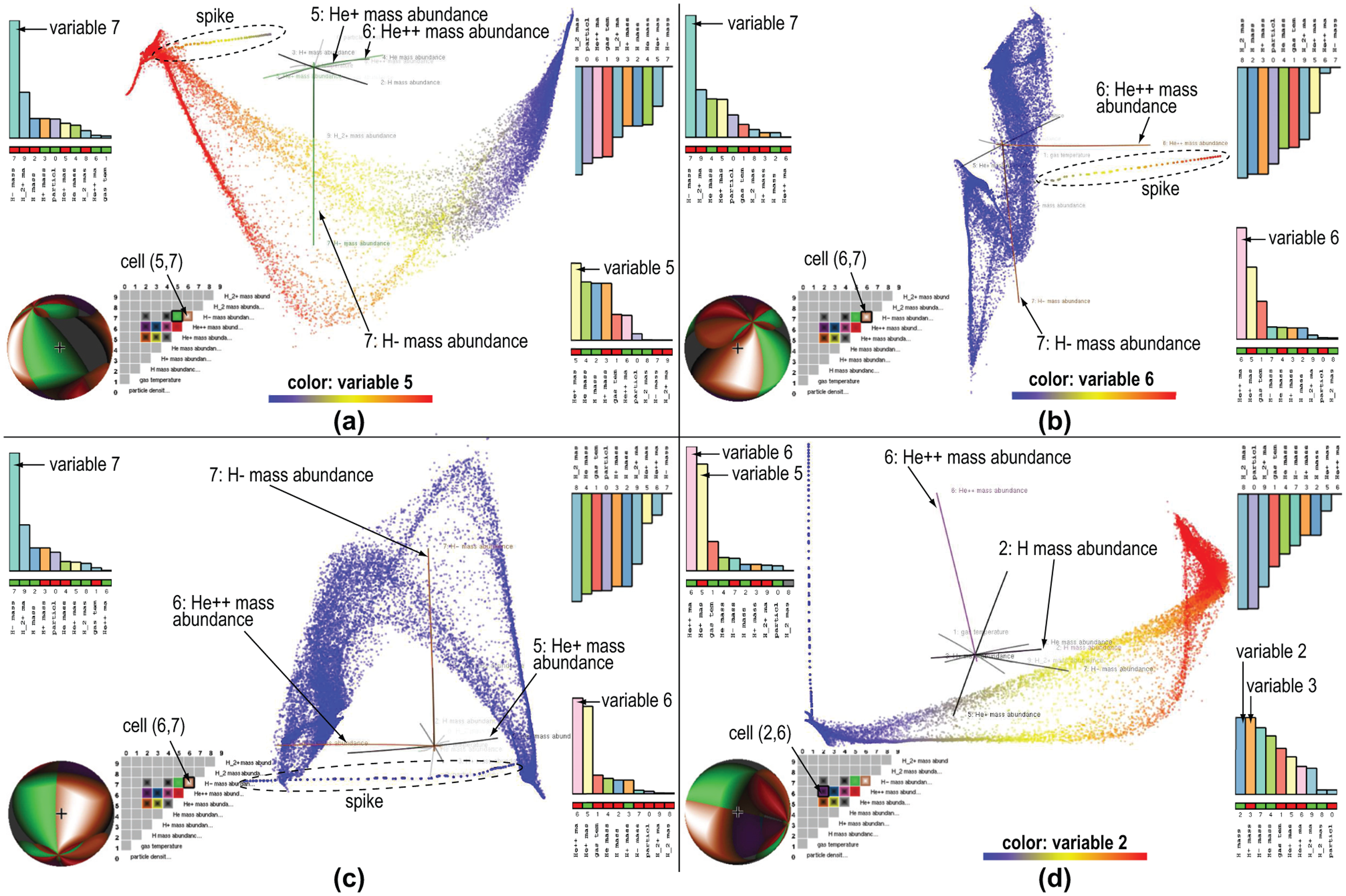
Explaining, in terms of variables, the shape of the 3D LAMP projection of 10-variate multifield simulation dataset (see section “Multifield dataset: explaining projection shapes”): (a) variables 5 and 7 aligned with screen axes x and y, (b) variable 6 aligned with screen axis x, (c) variables 6 and 7 aligned with screen axes x and y, and (d) variables 2 and 6 aligned with screen axes x and y.
To do this, we turn on our biplot axes. We immediately notice that axis 7 is by far the longest—so variable 7 is important for explaining the projection’s shape. Aligning variable 7 with the y screen axis shows that the projection appears to have a “saddle” shape (Figure 7(a)). We also see that axis 7 is nearly orthogonal to all other nine biplot axes. Hence, the y spread of the projection is mainly due to variable 7.
The viewpoint legend in Figure 7(a) shows next that variable 5 has a large variation which is largely independent on variable 7 (bright green zone on sphere; bright green cell in the matrix plot). To better explore the shape variation due to variables 5 and 7, we next color points by variable 5, via the same colormap as in Figure 6. The result (Figure 7(a)) shows that the x stretch of our saddle shape is well explained by variable 5, which is high to the left and low to the right, as shown by both the colormap and the red cell under the variable 5 bar in the x legend. In this figure, we also notice an interesting “spike” line-like outlier in the top-left area. We can explain how this spike, as a specific internal substructure, aligns with specific axes by looking at them and see that the spike aligns best with axes 5 and 6. Iteratively aligning the x-axis (click on variable 5 bar in x legend, then click on variable 6 bar) shows that the spike best aligns with axis 6, as the x bar for variable 6 is largest. Figure 7(b) shows this viewpoint, with points colored by variable 6. We can now easily explain the spike as the locus of points having large variable 6 values (yellow … red). Indeed, all other points (on the saddle shape, not on the spike) have low variable 6 values (blue).
The viewpoint legend in Figure 7(b) shows that there are many viewpoints from which variables 6 and 7 project as independent axes (large brown area with bright highlight on sphere; bright highlight in the selected matrix-plot cell). Hence, variable 6 is indeed independent on variable 7, which was found the most important for explaining the saddle shape. Aligning variables 6 and 7 with the x- and y-axes, respectively (two clicks in the x and y legends), shows both the spike outlier and the saddle shape in a single view (Figure 7(c)). This view also shows that axes 5 and 6 are almost parallel, so variables 5 and 6 are highly correlated. We see this also in the viewpoint legend: the current viewpoint, which best shows variables 6 and 7, is very close to the brown–green zone border on the sphere. Also, both brown and green zones have very large bright highlights, and the brown–green border is also bright. Hence, most viewpoints that best show variables 6 and 7 also best show variables 5 and 7. We thus refine our earlier explanation of the saddle: this shape is best explained by variable 7 (in one direction) and variable 5 or 6 (in an orthogonal direction).
To explore variable 6 further, we look at its row in the matrix plot, and click the purple cell, to show its variation against variable 2. This aligns variables 2 and 6 with the x- and y-axes respectively, yielding the view in Figure 7(d). The x- and y-axis legends show now clearly that variables 5 and 6, respectively, 2 and 3, are highly correlated, since they have nearly equal and almost maximal bars.
As a final point, let us consider the effort required to explain the spike and saddle shapes present in the 3D scatterplot when using only classical projection–exploration tools such as the virtual trackball for rotation and the ability to color all projection points by the values of a chosen variable. Rotating the scatterplot so that we best see the spike outlier, that is, with the spike nicely aligned with the y-axis, takes about 2–3 min when using the virtual trackball. In contrast, this takes just two clicks on the x and y legends, as explained earlier. Finding that the spike is best explained by variable 6, while the saddle’s spread in orthogonal direction to the spike is best explained by variable 2, requires, with standard tools, iteratively selecting each of the 10 variables to colormap the projection, detecting visually which is the strongest color gradient aligned with the spike, respectively, saddle, and memorizing this value. Using our tools, the color cycling is not required; we can directly see which variables align with specific scatterplot structures in terms of both biplot axes and axis legends.
Segmentation dataset: comparing 2D and 3D projections
Our third dataset has 2300 points with
Figure 8 shows this dataset using a 3D DR projection created by LAMP. By freely rotating this projection, with points colored by label values, we see that the longest biplot axis maps variable 0 (region-centroid-col). Aligning this axis with the y screen axis (click on region-centroid-col bar in the y legend) brings the viewpoint into a large red area on the viewpoint legend sphere. In the matrix plot, we see that red maps the variable pair
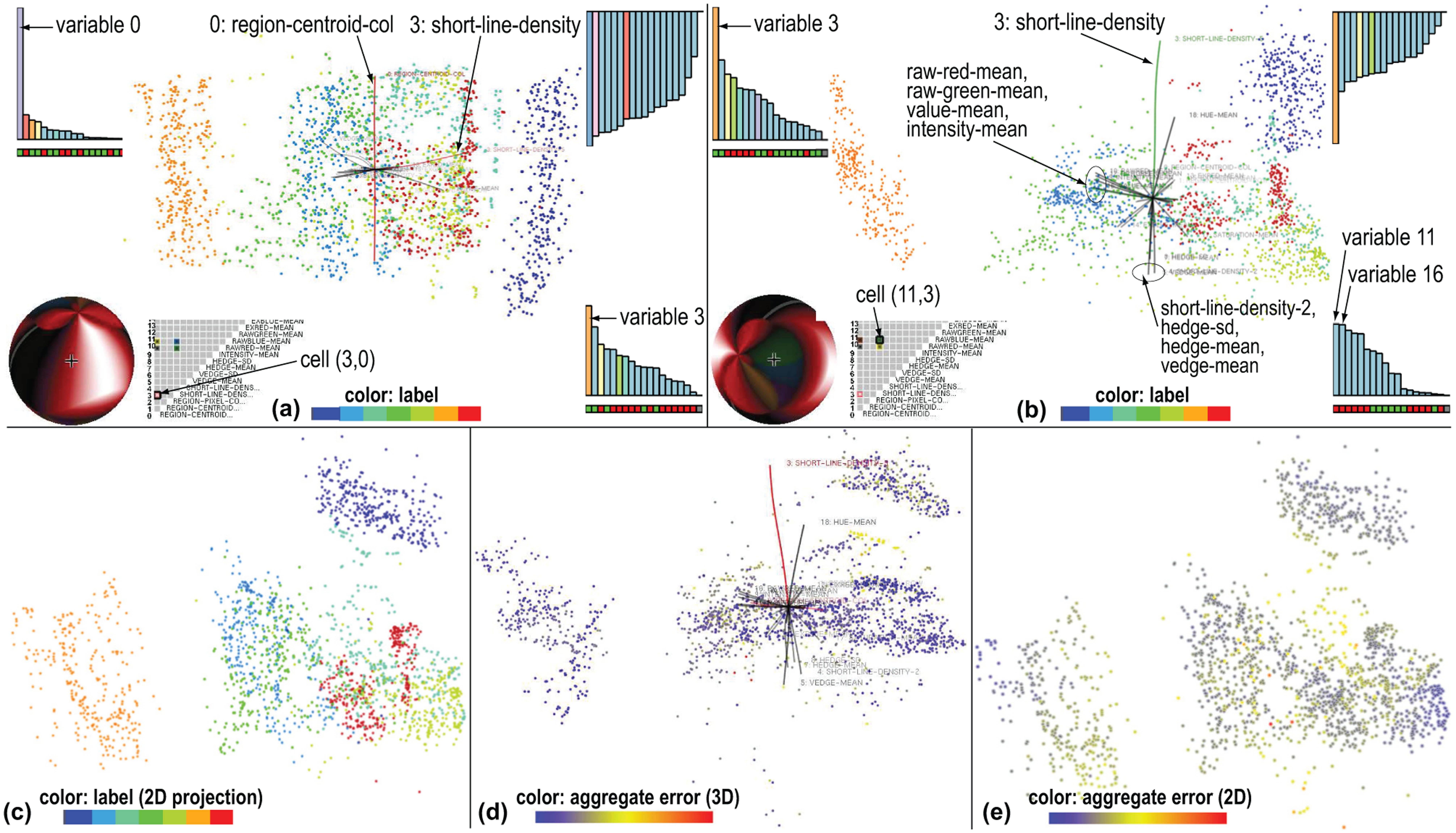
Visualization of 19-variate image segmentation dataset using (a, b, and d) 3D projections and (c and e) 2D projections. See section “Segmentation dataset: comparing 2D and 3D projections.”
To better understand the correlation of variables 1–18 with the label-ID, and thus get more insight into developing a classifier, we could next (a) remove variable 0 from the input dataset and redo the 3D DR projection (since we decided that this variable is not interesting), (b) view the current 3D projection from a suitable angle (to ignore the spread along axis 0), or (c) use a 2D DR projection rather than a 3D one (since Figure 8(a) suggests us that all interesting data variation occurs in a plane).
We examine next option (b). In the matrix plot in Figure 8(a), we see that all brightly colored cells are in columns 0 and 3, that is, the best viewpoints showing independent variable pairs always involve variables 0 and 3. The best such viewpoint (brightest red cell) maps variable pair
We next examine option (c). For this, we compute a 2D projection using again LAMP. Figure 8(c) shows the result, with points colored again by label-ID. The overall placement of clusters is quite similar, but not identical, to those in the 3D projection in Figure 8(b). To see which of these two images is a more faithful projection, we compute, for each point

Here,
Figure 8(d) and (e) shows the errors
Note that the use of our explanatory tools is very different in this use-case than in the one discussed in section ““Multifield dataset: explaining projection shapes.” Indeed, in section ““Multifield dataset: explaining projection shapes,” we used our tools to select a variety of viewpoints, which next helped us explain the projection’s shape in terms of variables. In the example here, we used our tools to decide that we can best explore the projection from a single viewpoint, and next to choose this viewpoint.
Software dataset: finding meaningful clusters
Our fourth and final example uses a set of 6733 open-source software projects written in C. The source code of each project was downloaded to compute 11 code quality metrics as averages over the project’s code files. A 12th metric gives the number of downloads of each project. 70 This yields a n = 12D dataset with 6733 points. While Meirelles et al. 70 explored the statistical correlation of project quality with download count, we want to get finer-grained insights of the types of projects involved in the studied code-base collection.
For this, we use a 3D LAMP projection of our 12D dataset (Figure 9(a)–(c)). We first find the best visible variable pair from any 3D viewpoint, by clicking the bright green cell in the matrix plot in Figure 9(a). This gives us variables 2 (ln-cof, or average coupling-factor, that is, the number of function calls between files 71 ) and 7 (ln-sum-tloc, or total number of lines-of-code). Next, we align axis 2, the longest of these two biplot axes, with screen x-axis (Figure 9(a)). We notice two well-separated point clusters (A and B), which spread orthogonally to biplot axis 2 (ln-cof). To understand what these mean, we color points by variable 2. This shows that clusters A and B contain points having two different ranges of ln-cof values: A contains low-coupling systems (such as libraries), while B contains medium-coupling systems (such as full applications). We also see here a third cluster (C) formed by very high ln-cof points. These points are also orthogonal to axis 7 (ln-sum-tloc). Hence, to check whether variable 7 explains cluster C, we next color points by variable 7 (Figure 9(c)): we now indeed see that nearly all points in C have low values of variable 7, and all points in A and B have high values for variable 7. Thus, cluster C contains highly coupled, small-scale software systems (small applications). Summarizing, we found that our 3D DR projection groups our 6733 software projects in three classes: large software projects (high values for ln-sum-tloc), further split by project type into libraries (A), and full applications (B), and C, containing small applications (low values for ln-sum-tloc). The entire 3D analysis requires just three clicks: one to align the screen x- and y-axes with the best separated variables ln-cof and ln-sum-tloc and two further clicks to color points by values of these variables, respectively.
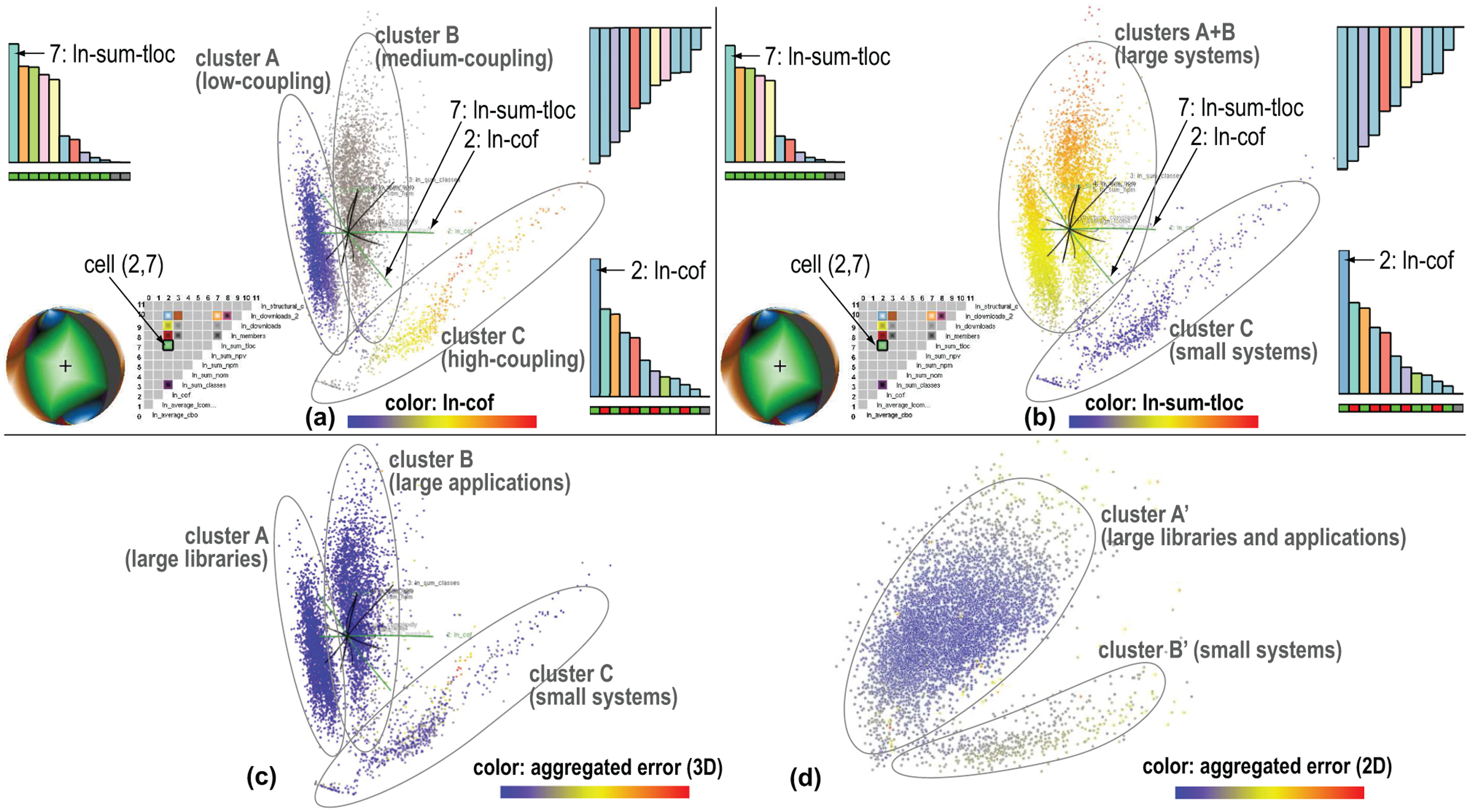
Visualization of 12-variate software metrics dataset using (a–c) 3D DR projections and (d) corresponding 2D DR projection. See section “Software dataset: finding meaningful clusters.”
As for the segmentation dataset (section “Segmentation dataset: comparing 2D and 3D projections”), we want next to see whether a 2D DR projection could give us the same insight given by our 3D DR projection, that is, that our 6733 software projects can be grouped into three distinct classes. For this, we first color our 3D projection points by their aggregated projection error
Discussion
Several points are relevant to discuss, as follows.
Scope
The effectiveness of our techniques depends, of course, on the quality of the DR projection and nature of the underlying nD dataset. If the projection captures distinct, well-separated, patterns in mD, our techniques will help explain the relationships of these patterns with the original n dimensions, and next choose good viewpoints to examine them. If the DR projection is suboptimally done, or if the input dataset does not exhibit any clearly segregated patterns, our techniques provide little additional insight in the data. So, our scope is to help users explain patterns, through in course correlations, the projected data in terms of the original variables, if such patterns exist in mD. If patterns are absent, one should use complementary techniques, outside the scope of our work, to improve the DR projection being used, for example, Martins et al. 20 Separately, if the nD data are clearly segregated into clusters and if one only wants to find such clusters, rather than the more fine-grained task of explaining spreads in the data or correlations of specific variables, then state-of-the-art clustering methods are the optimal tool.
Our key added value is for 3D DR projections, where viewpoint and navigation choices critically affect the obtained insights.6,17 Let us explain this. Our final 2D view can be seen as being created by “concatenating” an nD-to-3D DR projection (
Generality
Our techniques work directly with any (non)linear DR technique that projects n variables to
Scalability
Our methods are simple to implement and computationally scalable: we only need to apply the chosen DR projection to a small set of sample points distributed along the input variables (section “Enhanced biplot axes”). For a dataset of D variables, N data points, and a number of
Comparison
Our axis alignment and viewpoint legends have some similarities (and differences) with RTD. 1 Our axis alignment (section “Enhanced biplot axes”) and best viewpoint tools (section “Viewpoint legend”) resemble the scatterplot-matrix cells in the sense of selecting “interesting” variable pairs. Yet, while RTD defines these configurations as variable pairs mapped to Cartesian scatterplots, we define these as viewpoints in a 3D space given by the DR projection that can best highlight variable combinations of interest. Since we cannot control the DR projection, our viewpoints can show orthogonal biplot axes, and also slanted and/or curved axes of different lengths. Also, our viewpoints show, by construction, all projected axes, rather than a fixed subset of two. Finding a good data-exploration sequence is equivalent, in our case, to find a navigation path between highlights on the viewpoint legend sphere. The main added value of the viewpoint legend is that it shows all possible viewpoints in-between these highlights.
Technical details
Our categorical, continuous colormaps, and transfer function choices (section “Viewpoint legend”) are, of course, open. For instance, one can customize the categorical colormap used in the axis legends (section “Enhanced axis legends”) to mark specific variables of interest, which one needs to pay particular attention during the analysis, with salient colors or colors having an application-specific semantics. Alternatively, one could select an axis legend, colormap its bars using a sequential or ordinal colormap, and next compare this legend color-wise with the other two axis legends to reason about variable correlation or orthogonality. Yet other alternatives may exist for specific user groups and work domains. We used simple and well-known presets for these designs precisely to make it easier to separate our contributions from such specific design elements.
Evaluation
We evaluated the proposed techniques on nine datasets (300–200,000 points, and 6–25 variables). Learning to interpret the axes biplots, axes legends, and viewpoint legend was perceived to be pleasant and easy, mainly due to the fact that all these visualizations are interactive and dynamically change as the user rotates the viewpoint. Besides the selection of the variable used to color points, our techniques do not require any explicit parameter user setting. Compared to classical 2D scatterplots, our techniques need additional time to learn them (around 20 min, as observed by explaining them to nine users not involved in this work)—which is in line with learning times reported in Elmqvist et al. 1 and Broeksema et al. 45 for similar tasks and user counts. Users found the biplot axes easiest to understand and use, arguably due to the fact that similar axes appear in many types of plots. The interactive axis alignment described in section “Enhanced axis legends” was also found simple to understand and use, as it requires basically two clicks in the desired bars of the x- and y-axis legends. Using the viewpoint legend was perceived as the most complicated, as this widget requires memorizing the appearance of several large same-color areas on the surface of the sphere while interactively rotating the viewpoint. We acknowledge that these findings need more refinement and validation, for example, in terms of a controlled user study.
Limitations
Large 3D DR scatterplots inherently generate occlusion which, even with transparency and interaction, can be hard to disambiguate. Biplot axes for a few highly nonlinear projections (e.g. force-based methods31,37) are highly curved. Yet, such methods are not preferred, precisely because of their error rates and the difficulty of finding globally good viewpoints, and thus affect our overall proposal only marginally. Our tools do not aim to fully remove interactive trial-and-error exploration, such as brushing and viewpoint selection. Their added value is to make interaction more targeted toward a given goal—for example, when (slightly) changing a viewpoint, one immediately sees the effect on the axis biplots, axis legends, and viewpoint legend, and thus can better estimate what to expect to see when turning the viewpoint this or that way; when one wants to examine one or two specific variables in context, we allow doing this by just two clicks on the axis-legend bars for those variables. Separately, we note that our examples in section “Applications” do not imply that 3D projections are always bet for addressing all related tasks: rather, we show how 3D DR projections, if chosen for the sake of minimizing distance errors, can be made more effective as compared to raw 3D scatterplots.
Conclusion
We have presented a set of interactive visualizations that help users explore and explain 3D DR projections of high-dimensional data. Our methods, realized as linked views, explain the meaning of projected dimensions in terms of original variables; show projection nonlinearities and correlations (or lack thereof) for these variables; help finding good viewpoints from which given variable pairs can be best explored; and quickly show which variable pairs can be explored from any possible viewpoint. Globally, our techniques aim to help users interpret raw 3D projections in typical
Future work targets enhancing the insight given by our explanatory visualizations, by studying how the local nonlinearity of projections, and local projection errors, can be better and more intuitively conveyed for large 3D projections. Validating the value of our visualizations via user studies is a second important future work topic.
Footnotes
Acknowledgements
The authors also wish to acknowledge the Brazilian financial agencies CNPq and FAPESP (grants 2011/17925-1 and 2012/07722-9) for their support.
Funding
The author(s) disclosed receipt of the following financial support for the research, authorship, and/or publication of this article: This research was financially supported by the research project CAPES/NUFFIC 028/11.