



Abstract
Biologists are keen to understand how processes in cells react to environmental changes. Differential gene expression analysis allows biologists to explore functions of genes with data generated from different environments. However, these data and analysis lead to unique challenges since tasks are ill-defined, require implicit domain knowledge, comprise large volumes of data, and are, therefore, of explanatory nature. To investigate a scalable visualization-based solution, we conducted a design study with three biologists specialized in differential gene expression analysis. We stress our contributions in three aspects: first, we characterize the problem domain for exploring differential gene expression data and derive task abstractions and design requirements. Second, we investigate the design space and present an interactive visualization system, called VisExpress. Third, we evaluate the usefulness of VisExpress via a Pair Analytics study with real users and real data and report on insights that were gained by our experts with VisExpress.
Keywords
Introduction
Biologists are keen to understand the processes in cells in detail and how these processes react to environmental changes. Cells react to their environment, such as temperature, light, or food sources, by producing a variety of proteins. An understanding of the proteins and cell processes supports, for instance, detecting application points for drugs and is, therefore, a major interest and research challenge for medical care. However, the functions of many proteins are still unknown.
A way to address the challenge of analyzing hundreds of proteins with unknown functions is differential gene expression (DGE) analysis. However, quality is still an issue since the whole data generation process is error-prone and introduces biases and uncertainties in the measurements. After applying the state-of-the-art analysis tools and performing a comprehensive literature search, we found that currently no system meets the requirements of our domain experts. First, the research question of our domain experts is different from the state-of-the-art because of their demand to perform quality aware analysis to reduce false-positive findings. Second, since genes react differently to all environmental changes (different experiment conditions, e.g., different food sources), they demanded a data perspective that focuses on all pairwise condition comparisons (n:n) instead of a condition to reference comparison (1:n). This allows a comprehensive view on the data. An expressive overview and cognitively effortless recognition and interpretability of patterns were, furthermore, identified as major points for improvements of the state-of-the-art visual analysis systems for DGE data.
We, therefore, conducted a design study to build an interactive visualization system that covers all these points. During this study, a VIS team of four visualization experts collaborated with three domain experts to characterize the problem and to evaluate the system with a Pair Analytics study on a real-world data set. From the visualization perspective, this problem domain provides an interesting and complex data exploration and hypotheses generation problem since expert hypotheses and background knowledge need to be integrated in the analysis process. The challenges for information visualization and visual analytics 1 are scalability due to the large amount of complex data and the challenge of uncertainty due to quality issues of the underlying data.
In this article, we present VisExpress which is the outcome of our study. We present a gene fingerprint visualization which allows a recognition and interpretability of patterns by (n:n) comparisons of experiments with low cognitive effort. Furthermore, it integrates the data quality in the visual representation to address the uncertainty challenge. With an expressive treemap-based overview, we support the user to identify patterns, to reveal connections, and to generate new hypotheses in an overview. Thereby, we reduce the analysis complexity by a divide-and-conquer approach which addresses the scalability challenge of the large volumes of DGE data. The three participants of the Pair Analytics study mentioned that the analysis of the real-world data set would have required several days with the systems of their current use. With VisExpress, the domain experts got a comprehensive overview of the whole data set within an hour. Furthermore, they detected interesting findings and generated hypotheses for patterns that are easily overlooked by the state-of-the-art systems. They identified the intuitive, comprehensive, and quality aware overview as major improvements over the state-of-the-art.
We claim the following three contributions: (1) the problem characterization and abstraction for the visual exploration of DGE data; (2) a three-level staged visualization approach, to explore DGE data based on gene fingerprints; and (3) a Pair Analytics study and a discussion of biological results to evaluate VisExpress.
The remainder of the article is as follows: we discuss our design process in the following section. Section “Problem definition” defines and abstracts the domain specific problem and discusses the analysis tasks of users as well as the requirements for solutions. In the following, “Related work” is discussed and the “Architecture of VisExpress” is presented. Further we discuss why and how we visualize gene fingerprints (“Visualizing GAR patterns”), the “Components of VisExpress,” and the “Interaction design of VisExpress”. We present a Pair Analytics study with three real domain experts and a real data set in section “User assessment” and discuss the study findings as well as biological results in section “Results”. Sections “Discussion and lessons learned” and “Conclusion” conclude the article.
Design process
Deploying visualizations for real-world problems is problem-driven research. The aim of design studies is to abstract and/or generalize domain problems as well as designing visualization systems that are validated with real experts and real data. In this process, a collaboration with domain experts (real users) is vital. However, performing problem-driven research and working with domain experts can lead to many pitfalls. In order to avoid them, as well as to structure our design study project, we followed the nine-stage design study methodology framework of Sedlmair et al. 2 (see references therein for alternative approaches and a comparison of methodologies) which also lists 32 common pitfalls.
Precondition phase
This design study was conducted in the settings of a well-established, long-term cooperation between the first author (VIS expert) and a group of biologists. The whole design study team consisted of a BIO (three front-line analysts) and a VIS team (four VIS experts, including the first author). Just the first author (with a background in bioinformatics) had contact with the BIO team and acted as a Liaison between the BIO and the rest of the VIS team. 3 The Liaison role was introduced by Simon et al. 3 to bridge the gap between domain and visualization experts by fostering a richer communication and by mediating between domain and VIS experts, for instance, by abstracting domain problems to more generic VIS terms. 3
Core phase
Discover stage —- problem characterization and abstraction
Starting with interviews and observations of the current workflows of the BIO team, the Liaison (first author) subsequently collected relevant state-of-the-art systems based on her professional expertise as a bioinformatician and VIS expert. In the second step, the drawbacks of these systems were discussed and the problem characterization was refined. In the third step, the VIS team discussed these, concretized tasks and requirements, and improved the problem abstraction. The Liaison (first author) ensured in the whole process that the problem abstraction was still valid from the domain users’ perspectives.
Initial prototyping and expert feedback
The Liaison (first author) created a low-resolution prototype to receive feedback from the BIO team. This initial design enabled the Bio team to precisely point out important aspects that the system should cover which were translated and merged with the identified requirements.
Design refinements
Based on experts’ feedback, we stepped back to the design phase. In order to fully exploit the expertise of the four VIS team members, we took the following approach to create and implement design ideas: (1) every team member created a set of alternative solutions as paper mock-ups; (2) these solutions were selected, merged, and refined in a critique-and-creation round; and (3) we discarded or refined ideas by evaluating them against tasks and requirements. This entire process iterated until all VIS team members were satisfied. The matching of the mental model is one important point to support the gaining of insights with a visualization system. 4 The Liaison (first author), therefore, ensured in this process that the design matched the mental model of the domain experts.
Formative assessment and final design implementation
In this process, the VIS team improved design details based upon formative assessment conducted by the Liaison (first author) with one member of the BIO team. Functionalities of the system were explained and demonstrated. The constructive feedback led to design improvements and an optimized user interface to resolve some usability issues.
Summative assessment and design refinement
For the evaluation of our design, we performed a Pair Analytics study 5 with the BIO team in order to verify our design decisions for target tasks. Thereby, the Liaison (first author) acted as analysis partner in the collaborative analysis parts of the study. Based upon the evaluation results, we refined our system designs and reflected our findings.
Problem definition
The genetic information of organisms is encoded by thousands of genes. Genes encode proteins which perform a vast number of functions in cells. The protein hemoglobin, for instance, transports oxygen in vertebrates and the protein collagen is the main part of the connective tissue. Collagen is, therefore, responsible for skin strength and elasticity. Depending on environmental conditions, a different composition of proteins is produced. More hemoglobin is, for instance, needed and produced if oxygen content of the air is low, for example, in high altitude on a mountain.
An understanding of protein functions and their roles is of major interest for biologists. DGE analysis by next-generation-sequencing (NGS) technology is, thereby, an important technique which allows to (indirectly) measure in parallel the protein activity levels in cells under specific experimental conditions (see Figure 1). The relative comparisons of the activity levels between different experimental conditions allow biologists to generate and test hypotheses of the reaction of genes to experimental conditions. Therefore, the whole data set needs to be explored, relating the DGE data with metadata (e.g. the annotated function of a gene) and implicit domain expert knowledge (e.g. the “expected” reaction to the experimental conditions). The problem, thereby, is the large amount of data. Six tested experimental conditions for a bacterium with 5000 genes result in 75,000 DGE data values.
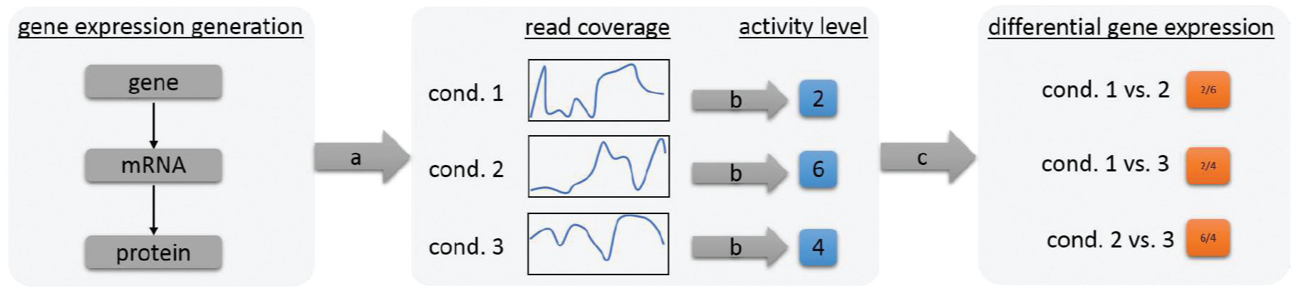
Gene Expression is the production of proteins. Depending on the experimental condition, a larger or lower amount of specific proteins is needed. (a) Next-generation-sequencing is a method used to indirectly measure the amount of proteins in cells, by measuring the intermediate step (mRNA). Due to biases, the measured signal (read coverage) of a gene is uneven. (b) For further analysis steps, the read coverage is expressed by a single normalized activity level. (c) The comparison of the gene activity levels is called differential gene expression and is expressed as the ratio (fold-change) between conditions. Biologist use differential gene expression to relate genes with unknown functions with potential functions.
Finding unexpected patterns in the data and relating DGE data of genes and metadata is, therefore, a challenge. In addition, (n:n) comparison of all experimental conditions is beneficial to reveal unexpected connections and patterns by providing a comprehensive view on the data. Providing (n:n) comparisons is in contrast to the state-of-the-art approach with (1:n) comparisons (reference to experiments).
As stated in the introduction, quality is also an issue. The whole sequencing process (by NGS technologies) is error-prone. Briefly, the technique is not able to measure the activity levels of proteins directly (see Figure 1). Instead, NGS machines transform fragments, of the intermediate step of the protein synthesis (messenger RNA [mRNA]), into (machine) readable units, so-called reads. Due to several bias sources in the whole data generation process, the distribution of reads over genes is imbalanced, 6 resulting in uneven read coverage line charts (see Figure 1—read coverage). Consequently, also the DGE analysis results are biased. It is, thus, necessary to inspect detected genes of interest in detail to avoid false-positive findings. Additionally, an awareness of quality issues on higher levels of data exploration is beneficial to reduce the number of false-positive pattern identifications which is not covered in state-of-the-art systems.
Data
For all genes
Tasks
Biologists want to study the functions of genes in organisms by their reactions on different experimental conditions. For generation and validation of hypotheses, biologists use DGE data. Genes with similar functions or roles are assumed to have similar reactions to different experiment conditions—similar GAR patterns. In order to examine and verify these functions and roles in detail, biologists require time-consuming and/or expensive experimental validation. A series of discussion between the first author and the BIO team revealed that biologists aim to solve the following tasks:
T1: Generate hypotheses about the function of genes. In this exploration task, biologists want to find new hypotheses about genes and their potential functions. To generate these hypotheses, they search for genes with unexpected functions in a set of genes with similar GAR patterns and similar functions.
T2: Test hypotheses about the function and reaction of genes. In this task, biologists make an assumption about the reaction of a gene to the experimental conditions. Through DGE analysis, they can confirm or reject their hypotheses, if genes with particular functions have an expected or unexpected GAR pattern. In addition, hypotheses can also consider the experimental conditions. For example, conditions 1 and 2 should reveal the same GAR to the other conditions for most of the genes. Remark: for this task, a (1:n) comparison is not sufficient since this involves the interrelation of all conditions. Therefore, a (n:n) comparison is required.
T3: Find genes related to a function. When biologists analyze a single function, they are interested in identifying genes yet unknown to be related to this function. To find these genes, they need to compare the GAR patterns of all genes with those already known to be related to the function. Genes with the most similar GAR pattern will become potential candidates for further investigations.
T4: Explore genes with unexpected GAR patterns. If unexpected GAR patterns exist in the data set, these genes need to be explored in order to examine their similarities to other known genes and their functions.
All tasks require a validation of the “expectedness” of insights which is ill-defined and depends on the task, the context of the insight, and the background knowledge of the domain experts. Biologists implicitly know whether a function is just surprising but explainable or whether this is really unexpected. This implicit background knowledge cannot be externalized. Furthermore, hypotheses generation cannot be automatized. Thus, a tight integration of the domain expert in the analysis process is vital.
Requirements
We use the multi-level typology of Brehmer and Munzner 8 to characterize the tasks and requirements. The main aim of the system is the generation and verification of hypotheses about the behavior of genes. As the locations of targets (interesting genes) are unknown, users have to search the data set by browsing and exploring. In order to discover new insights, users have to identify interesting targets and compare and summarize sets of targets. Based on this, we derived the following requirements for an interactive visualization system in order to solve the aforementioned tasks:
R0: Interpret GAR patterns of genes. Users need to identify the characteristics of the target genes which are expressed by GAR patterns. A GAR pattern is the change in the activity levels of a gene under different experimental conditions. The representation of the activity ratios of a gene needs to allow the identification of each pairwise (n:n) comparison between conditions to interpret the GAR pattern (T1, T2, T4).
R1: Compare GAR patterns of genes. The tasks (T1, T2, T3, T4) require the ability to compare the GAR patterns of genes. Comparisons between single genes, between groups of genes, and between a single gene and a group of genes must be possible.
R2: Summarize the functions of genes. The system should be able to summarize the functions associated with a gene or a group of genes. When users identify an interesting gene or find a group of genes with a similar GAR pattern, they need to know which functions are associated with them (T1, T2, T3, T4).
R3: Explore genes according to GAR patterns. The system should allow exploring the data to enable users to generate new hypotheses about genes (T1, T3, T4). The exploration should be guided by the GAR patterns to easily spot genes with similar behavior.
R4: Support different comparison measures. Different measures can be used to compare the activity levels of genes that are based on different properties. The analysis results are more trustworthy if different measures produce similar analysis results.
R5: Assess the trustworthiness of (automatic) results. Automatic analysis results are useful to get an overview and to quickly come up with hypotheses, but biologists do not trust them unconditionally. When they find an answer with the automatic evaluation, they want to assess the trustworthiness by analyzing the raw sequencing output and metadata by themselves, leading to several sub-requirements (see section “Detail: Gene Board”).
R6: Highlight the quality of activity ratios. According to our study, biologists do not trust automatic analysis results on one hand; on the other hand, they also want to reduce exploration space without loss of information. Therefore, they want to assess the quality of GAR patterns.
Related work
Gehlenborg et al. 9 provide a broad discussion of visualization systems for gene expression data. Many systems were established for (differential) gene expression data from DNA micro-arrays, for example, TM4 10 and Mayday. 11 DNA micro-arrays used to be the state-of-the-art for gene expression before the rise of NGS technologies and the possibility to sequence DNA in a cheap and high-throughput fashion without any pre-knowledge.
The state-of-the-art visualizations of (differential) gene expression data are heatmap-based visualizations (see Figure 2). Rows represent genes and columns encode experiment data or the comparison of experimental conditions. Thus, the data of one entity (gene) is represented in a linear fashion (as one row of the heatmap). Interactive heatmaps provide the possibility to select parts of the heatmap for further analysis (e.g. in INVEX 14 ). Mayday 11 uses an enhanced heatmap which integrates metadata to emphasize relevant genes by, for example, scaling of matrix rows and an additional color gradient. 15
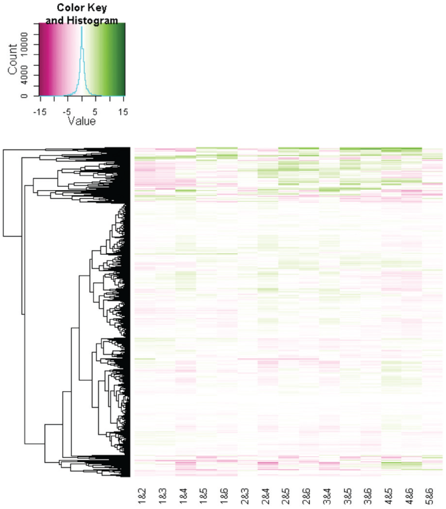
State-of-the-art heatmap of the differential gene expression data used in this study (created with the R function heapmap.2 12 ). Genes are depicted by means of the rows and experimental conditions are illustrated by the columns. The clustering of rows is indicated by a dendrogram. All genes are included (around 5000). Two large clusters at the top and at bottom stand out. However, no clear pattern that separates the clusters or conditions stands out, which increases the efforts of visual analysis. The colormap was adapted from ColorBrewer.org 13 (saturation: high gene expression ratio; white: low ratio; hue: direction).
Heatmaps are an appropriate and reasonable visualization as long as the relation between the columns of the heatmap is not relevant for the analysis. This is valid if independent experiment data are represented or if all experiments are compared to one reference (i.e., (1:n) comparison) which is the focus of many biological studies. However, the linear representation cannot appropriately represent relations between columns, for example, (n:n) comparison (see section “Visualizing GAR patterns”).
NGS technology advancements and decreasing costs lead to more and more complex experiment designs with (n:n) comparisons of different conditions. In this case, columns of the heatmap are related, for instance, all columns with a relation to condition 1 or all columns with a relation to condition 5 (see column names in Figure 2). Furthermore, the quality of the underlying data is not addressed sufficiently, if covered at all. Thus, a preprocessing or post-processing has to ensure quality. In our study, the analysis focuses on a quality aware (n:n) comparison (see section “Problem definition”). Therefore, the systems mentioned above cannot satisfy our requirements.
For gene expression time series data, parallel coordinates (profile plots) are often used to represent the changes over time. In order to analyze differences between clusters, these can be indicated by color-coding in one chart or by small multiples of parallel coordinates, such as in BiGGEsTS 16 and Mayday. 11 MulteeSum 17 supports the inspection of gene expression data not only over time but also in conjunction with the spatial cell location within an organism.
Clusterings are typically used in DGE analysis to group genes with similar patterns (e.g. TM4 10 , Mayday 11 and INVEX 14 ). Different clustering methods have been used and proposed on that account. In heatmaps, the clustering is mostly indicated by an ordering of the genes based on clustering results and along with a dendrogram next to the heatmap (see Figure 2). BicOverlapper 18 focuses on the visualization of biclustering results from gene expression matrices. Biclusters are represented as undirected complete subgraphs. Differential expression analysis and functional enrichments are added in BicOverlapper 2.0. 19
Functional enrichment (or gene set enrichment) analysis is often a subsequent step after the identification of a set of potentially relevant genes (see Hung et al. 20 for an overview). An enrichment search refers to finding pathways or networks where a set of genes is significantly over-represented. BicOverlapper 2.0 19 visualizes functional annotations of groups of genes as word clouds. Systems such as GENeVis 21 map gene expression data directly to networks. Gene expression is represented as bars inside network nodes (for an overview and alternatives, see Gehlenborg et al. 9 ). Pathline combines visualizations of multiple genes, time points, species, and pathways by introducing a linearized metabolic pathway representation and curve-maps representing the temporal expression data. 22 The data and focus of Pathline are different to our problem definition as we only analyze one bacteria species.
The pure visualization of a functional enrichment analysis or pathway analysis is not the focus of VisExpress. We focus on the visual exploration of DGE patterns in relation to gene functions, providing quality awareness and (n:n) comparisons with expressive overviews and visual representations that allow a cognitively effortless recognition and interpretability of patterns. An integration of functional enrichment analysis will be part of future work.
Architecture of
VisExpress
VisExpress is designed following the classical visual information seeking mantra of Shneiderman 23 “overview first, zoom and filter, then details-on-demand” in order to support a divide and conquer approach for exploration of multiple genes and also investigation into details for genes of interest.
VisExpress uses matrix fingerprints to provide a visual summary of a gene in order to make GAR patterns interpretable (R0; see Figure 3). The matrix layout enables to visualize conditions as rows and columns. Therefore, the matrix layout reveals the activity of genes in different experimental conditions (n:n comparisons). The first level of VisExpress (Cluster View) uses these fingerprints and word clouds to overview clusters of genes in a treemap. This reveals common characteristics of the clusters (R1: comparison) as well as their biological functions (R2). The second level (Gene Fingerprint View) visualizes all genes of a selected cluster in a scalable, space-filling layout for visual exploration of large amounts of genes (R3). The third level (Gene Board) provides details-on-demand for single interesting genes. This view reveals detailed information related to the gene’s functions as well as gene activity level trends and allows manual assessment of findings (R5). The intended workflow of VisExpress is illustrated in Figure 3.
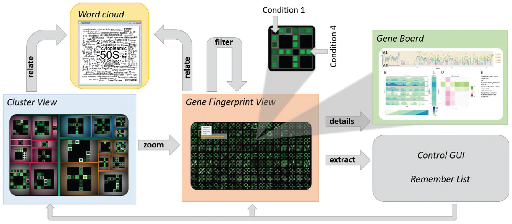
Schematic workflow of the three views in VisExpress (based on the visual information seeking mantra of Shneiderman 23 “overview first, zoom and filter, then details-on-demand”). A user can overview the whole data in the first level with a treemap that reveals the clusters in the data (Cluster View). By selecting a cluster in the treemap, the user can zoom to the second level which overviews all gene fingerprints in one cluster (Gene Fingerprint View). Users can further filter out genes of interest and open them in a new Gene Fingerprint View. The third level gives details-on-demand about selected genes (Gene Board). Furthermore, the user can extract interesting genes to a remember list for later analysis. In order to relate the gene fingerprints with gene functions, the user can open a word cloud of gene functions as a further details-on-demand view. The user is also able to switch between different designs that support different analysis foci in the control GUI (see Figure 12).
The three levels are seamlessly connected for smooth transition of analysis via a multiple view system. Each level can also be instanced multiple times with different data and settings. All instances are linked to a central instance which synchronizes the configuration of the designs and handles interactions between instances and levels (see also Figure 12). The system’s visual components were implemented with JAVA Swing Components. An interface to R 24 and Bioconductor 25 is used for preprocessing, statistical analysis, and machine learning algorithms.
The next sections will describe the following in detail: why and how we visualize GAR patterns (“Visualizing GAR patterns”), the “Components of VisExpress”, and the “Interaction design of VisExpress”.
Visualizing GAR patterns
Biologists aim to generate and verify hypotheses about the behavior of genes. The main information units are, thereby, the GAR patterns (focus of the tasks T1–T4). Heatmaps are the state-of-the-art for visualizing DGE data (see Gehlenborg et al. 9 for an overview). Thereby, GAR patterns are represented as rows in heatmaps (see Figure 2). GARs are represented as color-coded pixels. All comparisons are shown next to each other and all genes are stacked horizontally. However, this representation supports requirements R0 (interpretability of GAR patterns) and R1 (comparison of GAR patterns) only partially:
A linear representation of GARs does not allow to directly identify the involved conditions (R0; see Figure 4(a) and (e)).
A linear representation of GARs does not sufficiently capture salient patterns (compare (a) and (e) with (h) in Figure 4).
It is hard to compare and explore genes (see Figure 2), since single genes are hard to identify in a simultaneous representation of several thousand genes (R1, R3).

Design alternatives for gene fingerprints. All sub-figures illustrate the same data of pairwise comparisons of six conditions (black: low value, green: high value). (a)–(d) All 15 unique comparisons and (e)–(h) all 36 pairwise comparison of six conditions. (a, e) Linear ordering, (b, f) circular layout, (c, g) ring layout, and (d, h) matrix layout. In the illustrated data, condition 4 is different to all other conditions (which would be an important finding since this indicates that this gene and its function are related to this condition). From (a)–(c) and (e)–(g), the pattern is hardly readable. Even though (b) and (c) show a pattern (black–green–black–green), the pattern is not interpretable and not salient. The pattern (condition 4 is different to all other conditions) is most salient in (h).
Gene Fingerprints
Fingerprinting
Based on these considerations, we decided to represent the GAR patterns of each gene as a single entity (glyph-like) which we will name gene fingerprint. Our design goal of gene fingerprints is to provide a visual summary of a gene which can be used to compare the GAR patterns effectively (R1). The idea of fingerprinting is based upon the work of Keim and Oelke
26
of literature fingerprinting. Each gene consists of a tuple of a GAR
The quality could be handled by threshold-filtering and/or details on demand such that only GAR patterns with a high quality are visualized. However, the BIO team preferred to see all genes and to perform quality aware analysis (R6). Even patterns with low quality can be interesting and there is no fixed threshold that can define interestingness which rejects the idea of threshold-filtering. The challenge is to find visual metaphors that can encode both GAR value and quality and also satisfy R0, R1, and R3 (interpret, compare, and explore GAR patterns). In the following, we discuss design alternatives for gene fingerprints.
Design of gene fingerprints
Due to the exploration requirement (R3), the visualization design has to be scalable. Highly scalable techniques are pixel-based visualizations such as recursive patterns 27 or pixel bar charts. 28 Therefore, the VIS team discussed several alternatives to visualize GAR patterns with pixel-based or pixel-cell-based techniques such as circular, ring, or matrix representations. As in the linear arrangement of a heatmap, identification of the involved comparisons is not effective for circular or ring representations which violates the interpretability requirement (R0) (see Figures 2 and 4). Matrices support the identification of the involved conditions since the matrix element at row x and column y indicates the activity ratio value of the xth condition and the yth condition (see Figures 4 and 5). Biologists can, therefore, interpret the GAR pattern of a single gene by inspecting elements of a matrix (R0). Subsequently, they can compare the GAR patterns between multiple genes by inspecting the distribution of patterns across multiple matrices (R1).
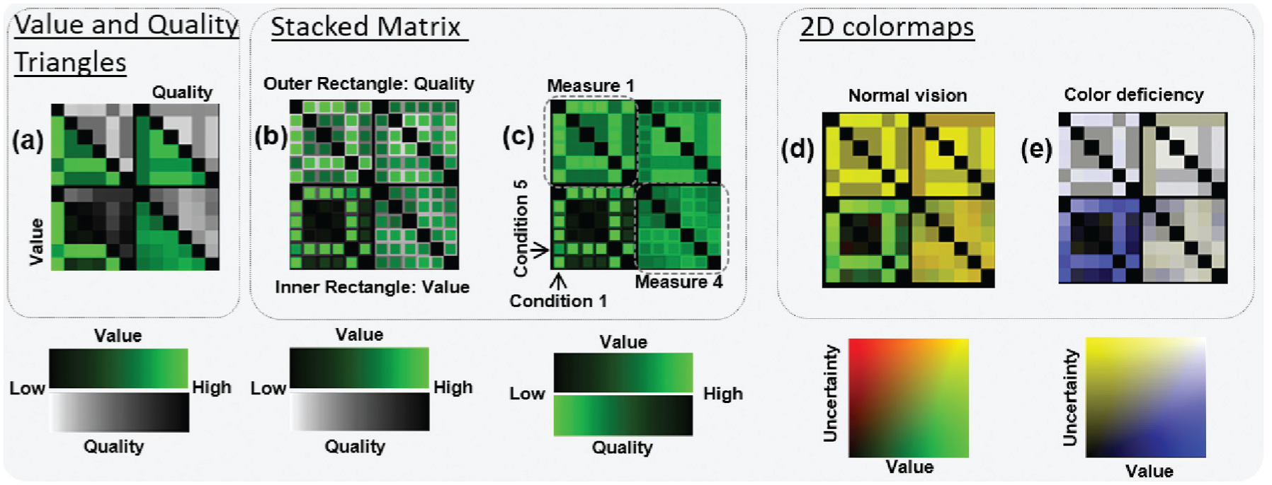
Design alternatives for matrix visualizations of gene fingerprints. Four different measures to characterize a gene are illustrated for each design (see (c)). (a) Two triangular portions in a matrix representing the value (bottom left) and the quality (upper right) of a gene. (b) and (c) Stacked matrices with inner and outer rectangles encoding value and quality, respectively. (d) and (e) Two-dimensional colormaps for normal and dichromatic visions, respectively. The color mapping in (c) highlights high values and low quality.
Design alternatives for gene fingerprint matrices
Each matrix has to represent a summary of a single gene’s activity ratio values and their qualities for different experimental conditions. Since there are several variants to encode the data with this visual metaphor, the VIS team came up with several design alternatives (see Figure 5) which will be discussed in detail in the following paragraphs.
Two symmetric or triangular matrices for value and quality
One solution is to visualize the quality of each gene as an additional matrix juxtaposed to the corresponding value matrix. Although this design may ensure more accurate perception of both values, there are some significant drawbacks: (1) it wastes valuable display space and (2) it is hard to visually align value–quality pairs. Therefore, this design does not guarantee effective inspection on the GAR and the quality (R6) by burdening biologists with cognitive efforts to find and check two locations for a single comparison. The VIS team, therefore, excluded this design.
Value and quality triangles
Similar to the aforementioned design, Figure 5(a) shows a design where each of two triangular portions represents the activity ratio and its quality, respectively. This solution was discussed among the VIS team and with the BIO team as well. We concluded that the cognitive efforts to find and check two locations for a single comparison are still a burden for the analysis.
Resizing matrix
A further possibility to encode the quality would be to encode the GAR ratio with color and quality with the size of matrix cells. However, this solution is not scalable and the saliency of patterns is highly dependent on the size and, thereby, on quality which might suppress important patterns in the data. The VIS team, therefore, excluded this design.
Stacked matrix
Another approach is to use a Stacked Matrix. This approach is inspired by work of Oelke et al., 29 where a stacked resizing matrix is used to represent user opinions on printers. The Stacked Matrices in Figure 5(b) and (c) use the outer rectangle for encoding the quality and the inner rectangle for encoding the value. The size of the inner rectangle is fixed. The Stacked Matrix with two different colormaps perceptually separates the inner and outer rectangles. This design is different from Oelke et al. 29 since the inner and the outer rectangle do not represent the same measure in our design and the size is fixed. The proximity between two values enables biologists to read the activity ratio and its quality accurately and, thus, it supports the interpretability (R0) and quality requirement (R6). However, this design may suffer when many fingerprints are shown in a small space. Thus, zooming and panning interactions should be used when the task requires exploration of many genes (T1–T4; see also sections “Limitations and future work” and “The size of gene fingerprints”).
Colormap design of gene fingerprints
In addition to the matrix structure, colormaps should be carefully selected because they encode the activity ratios and qualities in our design. The selection of colormaps impacts upon the performance of all tasks (T1–T4) because our visual cognition system is steered by several attention effects. Our vision tends to focus on strong contrasts especially when colors are fully saturated and intense on dark backgrounds. 30 Warm colors will suppress cold ones if they are spatially close. 31 Therefore, lightness, saturation, and temperature of colors must be considered. 30 For interpreting (R0) and comparing (R1) GAR patterns as well as to assess the quality, the analyst performs the elementary analysis task of comparing encolored values and qualities. Following the guidelines of ColorCAT 30 for specific, as well as combined, analysis tasks, we use perceptually uniform colormaps (value: black to green; quality: grayscale) for this elementary comparison task. This colormap choice supports to pre-attentively perceive value and quality differences. Furthermore, the values appear more prominently in comparison to the qualities which are encoded with a perceptually uniform grayscale.
One might also consider using the same colormap for activity ratios and qualities (see Figure 5(c) upper matrices). Due to the Gestalt Laws of Similarity and Pragnanz, we perceive regions of similar color as a whole large rectangle, instead of several stacked rectangles with different shades of green (see Figure 5(c)). This supports the detection of row and column patterns (R3) which are important in the tasks of building and associating groups (T1–T4). This design alternative of a Stacked Matrix has a higher scalability and can, therefore, be used in overviews with larger amounts of fingerprints.
Two-dimensional colormap matrix
Two-dimensional (2D) colormaps can also be used as illustrated in Figure 5(d) and (e). However, 2D colormaps are not suited for accurate value perception, 32 but these colormaps support the quick assessment of quality differences between different genes (R6) in data exploration (R3). Thus, it is recommended to use this where biologists want to quickly estimate values of multiple genes with a reasonable accuracy (R3). Furthermore, one should note that two-dimensional colormaps fail to function as intended for people with color vision deficiencies. Addressing this issue, we used opponent chromatic channels to encode the dimensions (normal: red-green, dichromatic: blue-yellow). As illustrated in Figure 5(d) and (e), the lower left matrix is clearly different from the other matrices. This is extremely useful to compare GAR patterns with the quality in mind (R6) which is only partially supported by other designs. Furthermore, this design is highly scalable in overviews of vast amounts of fingerprints (see Figure 14).
Triangle versus symmetric matrices and reordering
The Stacked Matrix and the Two-dimensional Colormap Matrix designs can be used with a full (symmetric) matrix or even a triangle matrix since half of the matrix comparisons are redundant. The advantage of a triangle matrix would be to save the space of redundant information. However, after a series of discussions among the VIS team and a consultation of the BIO team, we concluded that a symmetric matrix strengthens the visual saliency of patterns. The BIO team perceived the pattern in Figure 8(b), for example, less salient than that in (a) even though the two figures show the same pattern. Furthermore, some patterns might appear more interesting than others with the symmetric layout (e.g. the cross in (a) appeared more interesting than in (d) for the biologists on the first sight). However, the BIO team always reflected the meaning of a pattern and had no concern to realize that (d) reflects the same pattern as (a) (one condition is different to all others; condition 1 for (d) and condition 4 for (a)). The rows and columns represent specific experimental conditions which need to be maintained as references in order to assess other matrices. Therefore, the idea of the VIS team to use ordering emphasizing interesting patterns was rejected. Inconsistent ordering may confuse biologists to interpret the comparison of results between multiple genes (R0, R1).
The size of gene fingerprints
In order to estimate the limitations of the matrix design, we tested different numbers of conditions in a perceptual study with eight participants. Our goal was to estimate the number of conditions that can be effectively read from the matrix visualization to interpret the GAR pattern (R0). The task was to identify the involved (correlating and active) conditions in a GAR pattern which is the base for the analyst to generate and validate hypothesis about the functions of genes (T1, T2) as well as to explore genes with unexpected GAR patterns (T4).
One condition is harder to determine than several. Compare, for instance, sub-figures (a) and (b) of Figure 6. Although the pattern in (b) is more visually salient, the two involved conditions in (a) are easier to identify than the single condition in (b). The reason for this is that we can efficiently perceive one cell to the left and one cell to the right. In contrast, to determine condition 4 (b), we need to mentally count the three cells to the left. In this case, we cognitively process if rather three or four is the correct answer which needs more time. Since it is the hardest case to determine the concrete identity of one condition, we tested matrices in which only one condition deviates from the other conditions (see Figure 7).
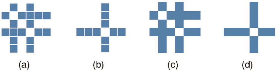
(a) and (b) Matrices with the stacked matrix design; (c) and (d) with the filled matrix design (2D colormap). In (a) and (c), conditions 2 and 4 are highlighted; in (b) and (d), only condition 4 is highlighted. It is easier to determine that conditions 2 and 4 are highlighted in (a) and (c), since the gaps have size 1. In (b) and (d), we need to count the cells to the left. Counting is easier in the stacked matrix design (a) and (b), since cells can be distinguished.

Stacked matrices with 12 conditions. In each matrix, a different condition is highlighted (a-1, b-2,…, k-11, l-12). One can count the number of cells left or right of the cross to determine the identity of the highlighted condition. For example, in (d) three cells to the left indicate that condition 4 is highlighted. In (j), two cells to the right indicate that condition 10 is highlighted (12 − 2 = 10). Clearly in (e) to (h), it is harder to determine the highlighted condition since the number of cells to the left and right cannot be perceived as intuitive and unconscious as in (a–d) and (i–l).

The perceptual differences between symmetric gene fingerprint matrices (a and b) and triangular gene fingerprint matrices (d–e). In (a) and (d), condition 4 is different from the rest, and in (b) and (e) condition 1. (c) The 2D colormap used for the sub-figures. The patterns in (a) and (b) are more salient than is (d)–(e). The pattern in (a) is, furthermore, more salient than the pattern in (b).
We used matrices with 4-8, 10, 12, 14, 16, 18, and 20 conditions. For each matrix dimension size, each condition was highlighted once. Since fingerprints are used for overviews and should be intuitive and efficiently read by the user, we limited the time frame a matrix was shown to the user in each trial to 300 ms. Within this time frame, the task was to determine the identity of the highlighted condition (see, for instance, Figure 7). We counted the number of correct and incorrect trials as well as how often participants were not able to give an answer.
The size of matrix cells is limited by the contrast sensitivity of our eye. Patterns with high spatial frequency (above 20 cycles per degree of the visual angle) cannot be detected by the human eye.
33
We selected the size of a matrix cell with 6 × 6 pixels (1.96 mm2) which accords to
The goal of the study was to estimate which numbers of conditions are accurately read by the participants. The study was within-subject designed; thus, each participant was shown matrices with a different number of conditions (in randomized order) and with different highlighted conditions (in randomized order).
For four to six conditions, participants answered all trials correctly (see Table 1). For up to 12 conditions, the accuracy is still above 80%. At 14 conditions, the accuracy drops to 64.29%. We assumed a relation between accuracy and the identity of the highlighted condition and had the hypothesis that conditions 1–3 and n-2 to n can be accurately identified (see (a–d) and (i–l) in comparison to (e–h) in Figure 7.) We, therefore, determined the accuracy per identity of the highlighted condition. Table 2 clearly confirms this hypothesis. Participants made most errors in case of condition 5 resp. n-4. For 6 resp. n-5, the accuracy decreases further, but participants mostly answered in these cases that they could not give an answer.
Summary of the accuracy and error rate as well as the percentage of no answers (counted as incorrect answer for the accuracy) for the tested number of matrix dimensions.

Summary of the accuracy and error rate as well as the percentage of no answers (counted as incorrect answer for the accuracy) per highlighted identity.

The number of trials shows how often a certain identity occurred in the experiment. For example, we highlighted 11 times the first dimension and 11 times the nth dimension, resulting in 22 cases for “1 resp. n”. “9 resp. n-8” includes the matrices 18 × 18 and 20 × 20 with condition 9 highlighted, as well as matrices 18 × 18 and 20 × 20 with condition 10 resp. 12 highlighted.
We conclude that users can read 6 × 6 gene fingerprint matrices error-free. However, gene fingerprint matrices up to 12 × 12 are still quite accurate, especially if we take into account that each matrix was just shown for 300 ms with a small cell size in our study.
Support of different comparison measures
One requirement (R4) is to “support different comparison measures” because multiple measures can increase the level of trust in findings and provide different views on the data set. Reasonable measures are the fold-change and the significance of the fold-change (see Supplement Material) since they are the state-of-the-art for DGE data. Further useful measures are, for example, the Euclidean distance (indicating the difference of activity levels) and dynamic time warping 34 (indicating the similarity of activity levels) adapted from time series analysis. We use small-multiples design and, thus, each matrix of a gene fingerprint represents one measure (see Figure 5(c)). This allows easy comparison within and between genes and, therefore, also satisfies R0, R1, and R4.
Components of VisExpress
VisExpress gives an overview of gene expression data with a Cluster View. The second level visualizes gene clusters with gene fingerprints (Gene Fingerprint View), whose design alternatives were discussed in the previous section. The Gene Board provides a detailed view of a selected gene (see section “Architecture of VisExpress” and Figure 3). In the following, we will introduce and discuss the design of the components of VisExpress.
Overview: Cluster View
Our overview aims to provide a snapshot of genes grouped with similar GAR patterns so that users can immediately grasp the pattern distribution across genes, select an interesting group of genes, and delve into details. Therefore, the system must provide a visualization that allows an overview of the clusters (GAR patterns) in the data set, thereby fulfilling R0, R1, and R3 (interpretability, comparison, and exploration). To account for R2, the overview should also show a summary of the gene functions of the clusters.
Alternatives for cluster overviews
In order to build sets of genes with similar GAR patterns, heatmap-based approaches such as used by TM4 10 , Mayday 11 , and INVEX 14 use clustering. Genes naturally form hierarchical clusters if the genes operate with the same regulatory mechanism (regulon). In heatmap-based visualizations, the hierarchical clustering is used to order rows and a dendrogram is visualized next to the heatmap (see Figure 2). However, this representation does not clearly show which different clusters exist in the data set since (1) clustering is ill-defined and, therefore, clusters are often not visually separable and (2) small clusters might be overlooked. Thus, these approaches do not fulfill the comparison and exploration requirements (R1, R3).
There are space-filling visualization techniques such as self-organizing maps (SOMs) or treemaps that can be used to overview gene clusters. However, SOM clustering does not preserve the natural hierarchy. Large clusters will span over large parts of the map, whereas small clusters are suppressed. Furthermore, the creation of cluster centroids will refine the centroids of big clusters; however, suppress centroids of small clusters such that interesting GAR patterns of small clusters are consumed. This violates R0, R1, and R3 (interpretability, comparison, and exploration).
Treemap overview
We choose to visualize groups of genes with a squarified treemap 35 showing the hierarchical clusters. The number of cluster items is encoded by its node size. This enables to assess the importance of clusters and also small clusters are preserved. Inside the treemap, either a centroid gene fingerprint of the corresponding cluster or a textual representation of the gene functions in this cluster is shown (see Figure 9). The representation of centroid gene fingerprints allows an overview of GAR patterns as well as their comparison (R1). The textual representation allows relating the GAR patterns with the gene functions (R2) and to relate clusters with hypotheses (T2).
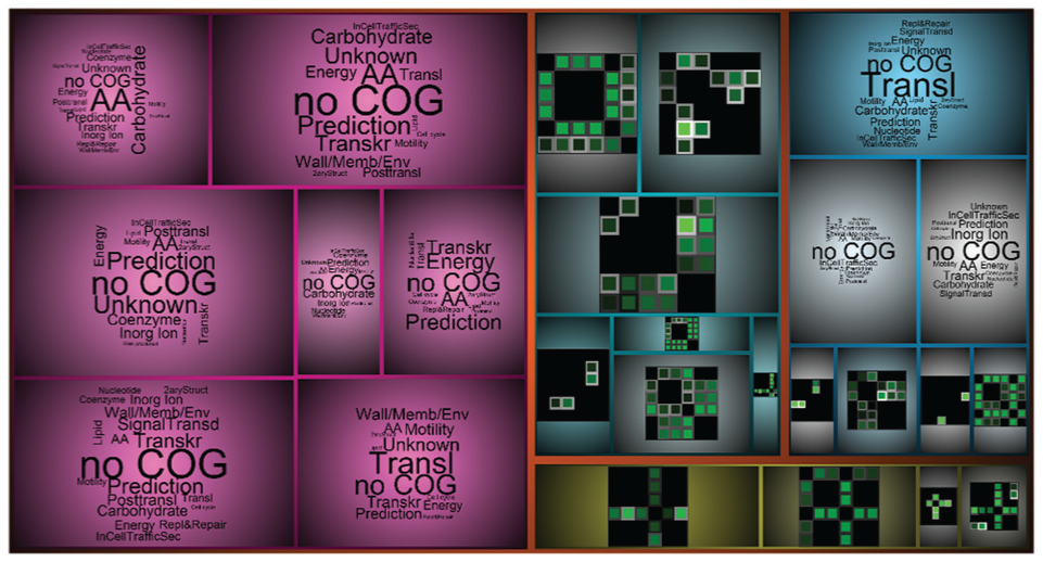
Treemap visualization for representing the hierarchical clusters of the genes. The clusters are either characterized by the centroid fingerprint or a word cloud of the functional categories of the genes (“no COG”: no functional categories assigned). The saturation of the cluster colors encodes how much variation exists within the cluster. Users can interactively drill-down the hierarchy or open the Gene Fingerprint View to explore one cluster.
A straightforward solution to visualize gene functions would be a list of words ranked by frequency. However, there is a large number of different functions in gene clusters which need to be summarized (R2). Therefore, a scalable approach is required. Word clouds are frequently used as visualization technique to aggregate and visualize textual data (e.g. see Wordle 36 or Bateman et al. 37 for guidelines). Furthermore, word clouds have already found their way in the biology domain.19,38 We use the R package wordcloud. 39 The BIO team preferred the encoding of the word frequency by size in word clouds as they could easily spot the most prominent words (functions) as well as get an overview of the distribution of functions (including outliers) which is important to derive a conclusion (R2).
The clusters and hierarchies are separated with categorical colors that share equal lightness and saturation based on guidelines of Healey 40 and Harrower and Brewer 13 to prevent any attentional steering effects. We also provide a linear blend around borders to offer cushions to guide users’ attention through the hierarchy according to van Wijk and van de Wetering. 41 In order to indicate the quality of the current clustering, we encode the variance within the clusters with saturation of the categorical colors. Saturated colors indicate high quality (low variance) and gray colors indicate low quality (high variance) which implies that these clusters should be refined. We enable the user to drill-down the cluster hierarchy interactively (see section “Interaction design of VisExpress”).
Explore: Gene Fingerprint View
The comparison and exploration of genes according to GAR patterns (R1, R3) requires inspecting sets of genes with similar GAR patterns (R0) and their functions (R2). Sets of genes with similar GAR patterns are given by the clusters in the treemap. The layout of the Gene Fingerprint View has to represent large volumes of gene fingerprints. Furthermore, to effectively scan through GAR patterns of a cluster to compare and explore genes (R1, R3), the cognition load needs to be minimized. Therefore, the layout has to use the display space effectively and also provide a structured view on the GAR patterns. Furthermore, quality issues need to be highlighted (R6).
Alternative layouts for gene fingerprint overviews
One way to structure the view is a sorting by interestingness function. For instance, by sorting gene fingerprints by their GAR values and/or their qualities, or the similarity of GAR patterns. The selection of the interestingness function depends on the analysis task and can be changed by the user on-the-fly (see section “Interaction design of VisExpress”).
Using an interestingness function allows several alternatives for a structured layout. The most straightforward alternative is, for instance, to layout fingerprints line by line according to the interestingness. However, this does not preserve local proximity (e.g. the two first objects of the first and second rows are spatially close but very distant in the interestingness or data similarity). Hilbert curves 42 preserve local proximity but cannot guarantee a globally ordered layout since curves might start and also end at the top depending on the number of objects. This violates intuition because intuitively all interesting genes are on the top and the least interesting ones are on the bottom.
Layout of gene fingerprints
We used the recursive pattern algorithm of Keim et al. 27 that is particularly suitable to arrange sorted data points in dense pixel displays. This algorithm lays out the pixels with recursive levels of arrangements (hierarchical “Z”-arrangements) that have specific widths and heights. Thereby, recursive patterns can preserve local proximity and global (intuitive) interpretation. Recursive patterns can guarantee to show the interesting GAR patterns on the top area and similar patterns in proximity.
As shown in Figure 10, the system arranges the fingerprints on the first level by four columns to the right, one row down, four columns left, one row down, and four columns right to complete the “Z.” This pattern is then repeated three times to the right and then three times to the left in the lower row. In each level, the ordering of the interestingness is preserved which preserves local proximity and (intuitive) interpretation of the whole layout (top: the most interesting ones; bottom: the least interesting ones). A disadvantage of the technique is that parameters of the algorithm have to be selected in advance. The problem is to find a good combination of widths and heights (e.g. four steps in the example above) for each recursive level. Keim et al. 27 suggest determining the arrangements by interaction. However, this would disturb the exploration process and we decided to determine the parameters automatically by applying an optimization algorithm to this combinatorial problem (see Supplement Material).

(a) Overview of gene fingerprints. Matrices are sorted according to the interest of the user and layouted in recursive patterns. 27 (b) Users can add interesting genes to a remember list for later inspection.
Detail: Gene Board
This level supports detailed information about a single gene for the manual assessment of the trustworthiness and a detailed inspection (R5). The design of the Gene Board was not the focus of this article but was highly tailored by the given application specific specifications (sub-requirements of R5) and closely coordinated with the BIO team (see Figure 11).

An example of a Gene Board is shown. (a) The trend of the gene activity levels for the gene (red arrow in (A2)) and gene neighbors (black arrows in (A2)), (b) the trend of the gene activity levels for the gene region with horizon graphs, (c) the normalized gene activity levels, (d) the GAR pattern, and (e) gene descriptions and gene functions. (b), (c), and (d) are closely arranged to set their data into context. In detail: (c) shows that condition 2 has the highest normalized activity level. Compared to other genes, this value is in a medium range (see color legend). (b) The activity level drops before the end of the gene (probably due to a technical artifact). (d) The horizontal green line indicates that condition 2 is up-regulated in comparison to the other conditions. However, (b) and (c) show that the gene is active in all conditions.
The baseline for the design was the activity level view and genome annotation information of a genome browser. Genome browsers often represent trends of the activity levels as line charts. A focus on ratios in the data representation improves the interpretability as the BIO team is mainly interested in the GARs between conditions (achieved by a log scaling). Position of the gene (red) and neighboring genes are indicated with arrows (see (A2) in Figure 11). As the strengths of the activity levels and their trend over the gene are major assessment criteria, we decided to additionally show the trend of the activity levels as horizon graphs. Horizon graphs are a visualization for sequential data that enable easy comparison between multiple conditions. 43 This enables the biologists to see at a glance which conditions have a high activity level and to easily assess the trend over the gene. Next to the horizon graphs, the normalized gene activity levels (Reads Per Kilobase per Million mapped reads [rpkm-values]) 44 are represented as color-coded pixels. We use a global color-coding to allow a comparison between genes. In this way, the trend of activity levels (horizon graphs (B)) can be set directly in context with the normalized gene activity levels (pixel-column (C)). The GAR patterns are shown as a matrix representation (D) next to the normalized gene activity levels. Thereby, biologists can easily relate the GARs with the strength of the gene activity levels. Gene descriptions and functions are shown as plain text (E).
Interaction design of VisExpress
In this section, we explain how we have implemented the requirements with interactions, classified according to the multi-level task typology of Brehmer and Munzner. 8 See Figure 12 for an overview of interactions. The numbers in brackets in the following sections correspond to the interactions in the figure; interactions according to Brehmer and Munzner 8 are set in italics.
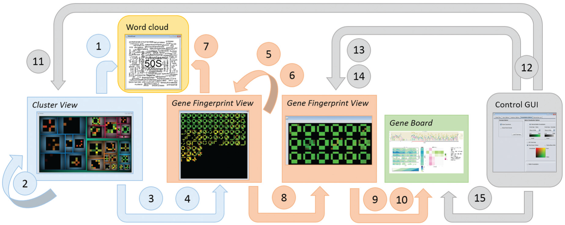
This figure summarizes the interaction possibilities with the three different views Cluster View (blue), Gene Fingerprint View (orange), and Gene Board (green), and the control GUI (gray), as well as the details-on-demand word cloud view (yellow). Interactions are indicated by arrows. Interactions are classified according to Brehmer and Munzner. 8 See section “Interaction design of VisExpress” for explanations of the interactions (numbers are mentioned in the text).
Interactions of the Cluster View
The Cluster View provides an overview of the data set by showing the GAR pattern of the cluster representative per default (see Figure 13(a)). In order to summarize the gene functions (R2) within a cluster and to compare these with the GAR pattern representative of one cluster, the user can navigate (details-on-demand) by mouse over to the corresponding word cloud (1) (see Figure 13). The quality of the cluster representative is encoded by the saturation of the colored surround to indicate whether a cluster should be refined. For identifying the corresponding subclusters and, thereby, to explore the data set for interesting clusters (R3), VisExpress enables the user to drill-down (navigate) the cluster hierarchy by right clicking on the cluster representative (2). In order to support the exploration of genes (R3) and to compare or identify interesting genes, users can navigate (zoom) to the Gene Fingerpint View showing all GAR patterns of genes by left-clicking on the cluster representative (3). Finally, we allow the user to call up Gene Fingerpint Views of several clusters in order to support a comparison between clusters and GAR patterns (R1) by arranging the Gene Fingerpint Views next to each other (4).
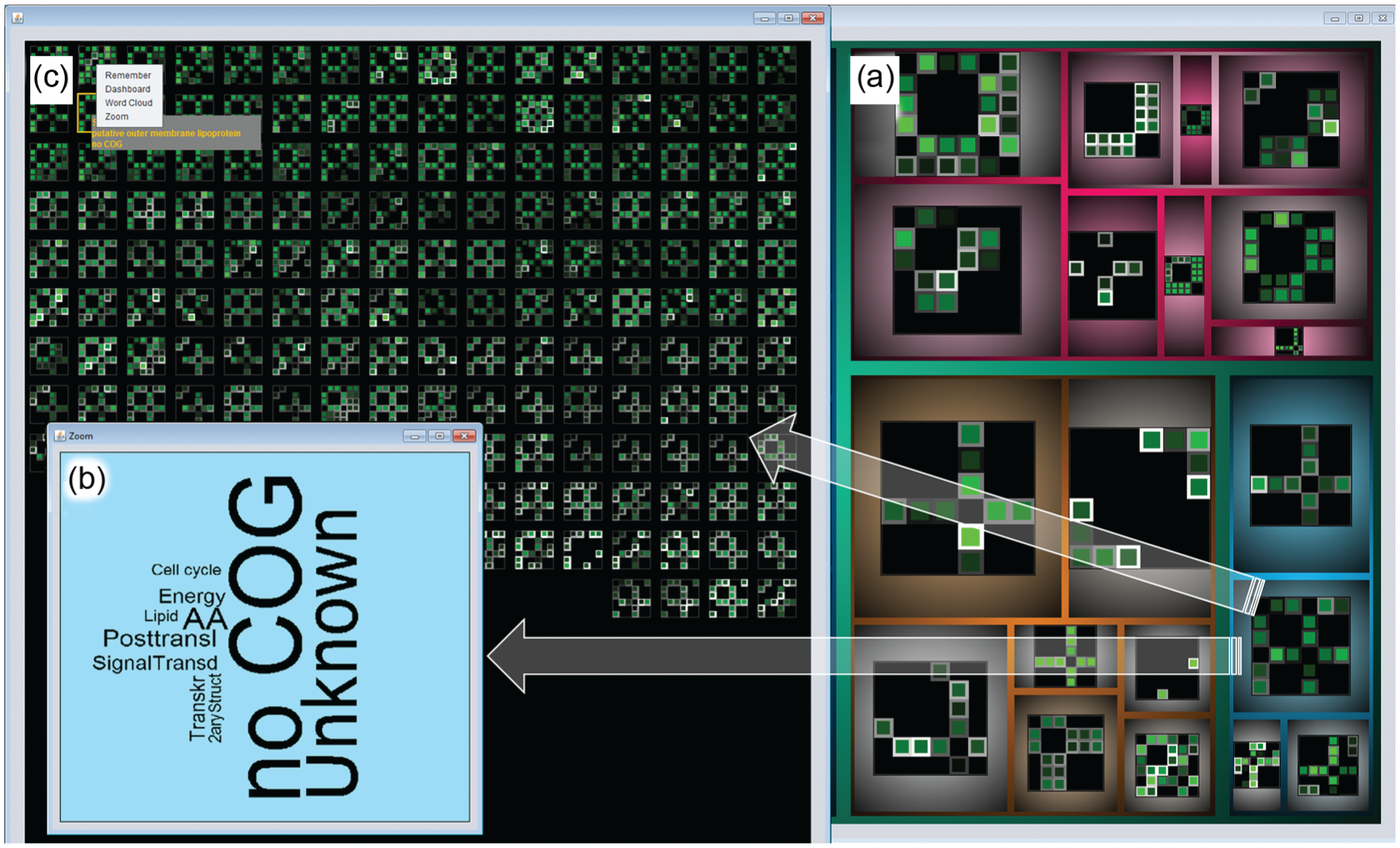
Annotated screenshot of VisExpress on Level 1 (Cluster View) and Level 2 (Gene Fingerprint View). (a) Treemap, showing all gene clusters with centroids represented by their fingerprints. (b) Hovering over a cluster shows a word cloud with functional categories of the genes in the cluster. In this example, no functional annotation is given for most genes (no COG and unknown). (c) A left click on the cluster in the treemap calls up the Gene Fingerprint View. In this cluster, conditions 1 and 4 are prominent. Hovering over a gene fingerprint matrix shows the gene product and the functional category in a tool-tip (top-left). Multiple gene fingerprint matrices can be selected (orange boarded). For selected genes, the detailed Gene Board can be called up, users can also zoom to selected genes, create a word cloud for a selection, or add them to a remember list. See also Figure 14 for another screenshot and Figure 12 for interaction possibilities.
Interactions of the Gene Fingerprint View
The Gene Fingerprint View visualizes all gene GAR patterns of the selected cluster (see Figure 1(c)). See Figure 12 for an overview; the numbers in brackets are numbers from the figure. In order to identify a gene of interest and to relate the GAR pattern of the gene with its function, details-on-demand (navigate) showing the gene name and function in a tool-tip (R3) are provided by mouse over (5). Right clicking on the gene will record it on a remember list in the control graphical user interface (GUI), where the gene fingerprint of the corresponding gene is saved with a thumbnail (see Figure 10(b)) (6). Users can also select a set of genes to summarize and relate the functions of the selected genes by navigating (details-on-demand) to the corresponding word cloud (see Figure 14) (R2) (7). Furthermore, users can filter to a set of selected genes by opening a new Gene Fingerprint View to compare and identify interesting genes in the selection (R3) (8). Allowing the assessment of the trustworthiness (R5), users can navigate to the Gene Board showing details of the read coverage and further summarized information about the selected gene (9). Finally, we allow the user to call up several Gene Boards. By arranging the windows next to each other, a comparison between GAR patterns (R1) and the underlying data is supported (10).
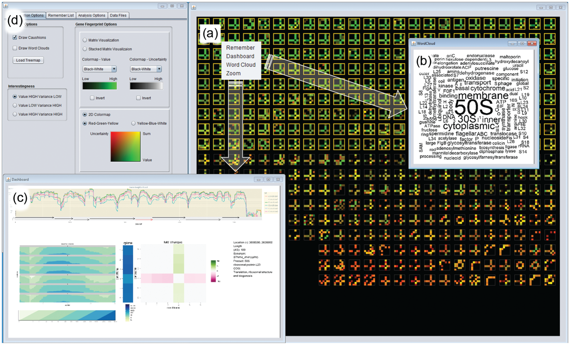
Annotated screenshot of VisExpress on Level 2 (Gene Fingerprint View) and Level 3 (Gene Board). (a) Gene Fingerprint View ordered according to high GAR value and high quality is shown in the overview with the 2D colormap (green: high value, high quality; red: low quality, low value). Green genes are selected and a word cloud is called up for the selection. (b) In the word cloud 50S is the most prominent word. 50S and 30S are prefixes of ribosomal RNA that identify an important function of this cluster. (c) The detailed Gene Board for one of the genes. It shows that this gene is down-regulated in condition 4. (d) The control GUI. It is used to switch between the design of the gene fingerprints and the colormaps, as well as interestingness functions. See Figure 12 for interaction possibilities.
Interactions of the Gene Board
So far no interactions are implemented for the Gene Board which can be interpreted as a static Dash Board. However, the user evaluation revealed a set of useful interactions which will be implemented for the next version of VisExpress. This includes browsing and zooming in the line chart representation as well as the possibility to call up Gene Boards of neighboring genes, by clicking on the arrows indicating the gene locations. As neighboring genes are of special interest, users also requested to show the location of clicked neighboring genes in the Gene Fingerprint View. Furthermore, the BIO team requested a direct link to the gene database entries at, for example, NCBI. 7
Control GUI interface
Since the BIO team had no issues with the different designs and understood their advantages and disadvantages, we decided to let the user freely configure the system to the analyst’s needs. All these adjustment possibilities give users the flexibility to adaptively test powerful combinations as they encounter different types of tasks. Additionally, visualizations can be further customized, for instance, by hiding specific conditions or enabling or disabling symmetric matrices (see Figure 14(d)).
Allowing a comparison of the gene functions between clusters the Cluster View can be changed to a treemap showing word clouds (see Figure 9) (R2) (11). To identify and compare interesting genes (R6, R1), users can change the visual design of the Gene Fingerprint View to best fit their current analysis task (12). This includes changing the color mapping as well as the design of the gene fingerprints (see Figure 5). Additionally, the gene fingerprints can be arranged (ordered) by different interestingness functions to sort the layout of gene fingerprints for different analysis interests (13). In Figure 14, a 2D colormap is used; the ordering is “value and quality high.” The recursive pattern algorithm layouts the genes in a way that high-value and high-quality genes are shown at the top-left and genes with low value and low quality are shown at the bottom right. The 2D colormap is well suited to separate “good” (green) from “bad” (red) genes. (Notice: we also provide a 2D colormap for people with color vision deficiencies.) To get a different perspective on the data, users can also add further measures to the Gene Fingerprint View (R4) (14). Users can import pre-calculated measures and add them to the Gene Fingerprint View (see Figures 5 and 10).
In order to allow the user to re-check genes saved to the remember list and to assess the trustworthiness (R5), users can navigate to the Gene Board showing details of the read coverage and further summarized information about the selected gene (15). The gene is always saved with the design that was active at the selection which allows the user to relate the gene to the reasons for the selection (see Figure 10). The remember list allows the externalization of findings which supports the exploration and verification loop of the knowledge generation model of Sacha et al. 45
User assessment
We conducted a qualitative evaluation with three professional molecular biologists. As VisExpress is intended to support a visual exploration of DGE data, we decided to conduct an open-ended exploratory study and to evaluate VisExpress with Pair Analytics 5 where a domain expert (biologist) and a visualization expert collaboratively explore a complex real-world data set and generate conversations about the domain experts’ analytic activities.
For the whole study, we captured screen activities and verbal reports using Camtasia Studio 46 and also filmed the screen to capture when participants pointed on the screen. We performed the Pair Analytics study with the three participants B1, B2, and B3 (domain experts; molecular biologists) and the first author as the experimenter and Liaison 3 (visualization expert with a bioinformatical background) (see also Supplement Material).
Data
The data set consists of six different conditions and over 5000 genes are annotated for the used Salmonella Typhimurium strain. The data set was already analyzed by B3 but was unknown by B1 and B2. We have chosen this data set to evaluate how well VisExpress is suited for an exploration of an unknown real-world data set (B1 and B2) as well as to evaluate whether B3 could rediscover findings from her previous analysis. See Supplement Material for more details.
Study procedure
The study was conducted according to the following procedure:
Instruction
Each participant entered the user study room separately which was reserved within experts’ workplace. The participant sat down next to the experimenter with a notebook and one monitor (24″ LCD). The experimenter provided detailed instructions through a slideshow presentation. Details such as visual representations, underlying data, measures, and interaction capabilities were covered so that participants could use the functions later on.
Introduction to the system
In the introduction, the experimenter asked a set of predefined easy questions for each level of VisExpress (Cluster View, Gene Finperprint View, and Gene Board) to make sure that the participants understood the views, graphical representations, and interactions. For example, the participants were asked “Which cluster has the largest GAR?” Furthermore, design adjustment possibilities were demonstrated. In this step of the study, the experimenter operated the system and participants were allowed to ask questions to clarify any uncertain areas. See Supplement Material for more details.
Open-ended exploratory part
After participants had completed all given tasks, we asked them to freely explore the data set which was the main part of the study. The participants were asked to verbally formulate, confirm, or reject hypotheses during the analysis process and to report interesting or unexpected findings along the way. The experimenter encouraged the domain experts also to focus on patterns which appeared interesting to her as a bioinformatician to facilitate a more collaboratively exploration of the given data and to generate deeper conversation about the biologists’ analytic activities, their reasons, and intentions. However, the experimenter made sure not to unduly influence the analysis by only suggesting a deeper look in a few cases and, otherwise, only acting as an active listener who did not initiate conversation unless she wanted to clarify unclear motivation or action (e.g. “why?” or “how?”). As participants had no issues using VisExpress and since user interaction was quite high, the experimenter decided to let the domain experts operate the system themselves.
Coding procedure
We followed a top–down and a bottom–up approach. Our goals were (1) to reveal the domain expert’s workflows with the VisExpress system, (2) to clarify expert tasks, and (3) to specify areas for improvements. First, the experimenter of the Pair Analytics study formulated findings from study impressions and verified them with corresponding clips of the video material. A second author checked against these findings with the corresponding clips. Second, the experimenter coded the whole video material. The video material was first annotated and split into clips according to the different used views (Cluster View, Gene Fingerprint View, Gene Board). For each clip, the experimenter coded the participants’ analytic and visualization activities. In particular, the attempt was to reveal the reason behind the participant’s actions and workflows that lead to findings. From this analysis, the experimenter formulated further findings. The findings were verified with the clips by the second author.
Results
Three domain experts (B1–B3) participated in this study. In addition, the managing director of the institute (professor for microbial ecology) gave feedback about the VisExpress system (B4). In total, 7 h and 41 min were recorded (see Supplement Material for a table with the study time per participant). We formulated the following findings from the study and verified them with video clips.
Biological findings—use case
In the following, we provide examples for some biological findings our BIO team made while using VisExpress in the Pair Analytics study with a real-world data set:
B1 discovered that membrane proteins are disseminated between different clusters
B1 started the analysis in the treemap Cluster View with the inspection of cluster centroids and the according word clouds (by hovering over the clusters one by one). Participant B1 observed many membrane proteins in cluster “condition 4 high” and cluster “condition 1, 5, and 6 high”. Such patterns (relations of different conditions) are strikingly visible with our gene fingerprints which are easily overlooked in the state-of-the-art representations where just (1:n) comparisons are shown. After looking for the gene product names by hovering over the gene fingerprints in the Gene Fingerprint View (see tool-tip in Figure 13), B1 concluded that in the cluster “condition 4 high” more transporter genes are present. Transporters are located in the membrane to transport, for instance, nutrients into the cell. An increase in transporters is reasonable since condition 4 is a stationary phase condition and, thus, nutrients are reduced in the medium run and it would be important for the bacteria to increase membrane transporters to get a better yield. In the cluster “condition 1, 5, and 6 high,” B1 observed more membrane proteins related to stress. This is an unexpected finding since condition 1 is the control/reference condition. B1 had no explanation why these membrane proteins should react as in conditions 5 and 6 but mentioned that it would be interesting to analyze this surprising fact in detail. To rule out false positives, B1 tried to reject the finding by inspecting the genes in the Gene Board (e.g. B1 tried to verify if the expression signal is just an artifact and the gene is not active under all conditions). Since this finding seems not to be an artifact, further analysis steps are required beyond VisExpress, for example, a literature analysis about the genes in this cluster to check whether such a correlation was observed before.
B2 quickly discovered low pH-responding genes
B2 discovered in the treemap Cluster View several cluster representatives with gene fingerprint patterns which indicate that several genes are similarly regulated in low pH (acidic) conditions but have no or negligible differences between other conditions (conditions 5 and 6 are low pH (acidic) conditions). By concentrating on this pattern, B2 discovered several genes annotated as “hypothetical” by browsing the tool-tips and GAR patterns of genes in the Gene Fingerprint View of the corresponding cluster. He added interesting representatives of this finding in each cluster to the journal for later inspection. His aim for further analysis was to examine these genes for their low pH (acidic) response. In order to rule out false positives, B2 analyzed the functions of genes with the same pattern (located in the same cluster) and inspected the genes in the Gene Board. In summary, the regulation of the acid-responsive genes appears to be more significant than expected by B2 based on today’s literature. The advantage of VisExpress for this finding was that the world clouds allowed an intuitive relation of the cluster to the gene functions. Thus, the word cloud allowed identifying that some genes in the cluster are annotated as “hypothetical” which was then analyzed further by B2 in the Gene Fingerprint View. The further required analysis step beyond VisExpress is a literature analysis to verify the finding of B2. Furthermore, a BLAST search could be performed to check whether related sequences in other species have been annotated with an acid-responsive function.
B3 rediscovered that there is a relation between experimental conditions 5 and 6 and iron
The data set has been analyzed by B3 before. One aim of B3 was to analyze which genes are influenced by supplement B (condition 5 vs. condition 6). In order to rediscover findings related to this supplement, B3 explored the treemap Cluster View for clusters with differences between conditions 5 and 6. By inspecting genes in the corresponding Gene Fingerprint Views, B3 discovered several genes related to iron. B3 reported that she had checked this correlation in the literature and found studies describing this correlation as well in Escherichia coli which is a species related to the analyzed species Salmonella Typhimurium. A relation to iron is reasonable since condition 6 is a stress condition which affects iron–sulfur cluster-containing proteins.
Ribosomal genes are enriched in a cluster with down-regulated GAR values in condition 4
This enrichment was observed by all participants. In the treemap Cluster View (see Figure 13), three clusters with a cross-pattern of condition 4 are revealed. By mouse over and inspection of the corresponding word clouds, the participants discovered that “Translation” stands out in one of the clusters. A closer inspection of this cluster in the Gene Fingerprint Views and the Gene Board revealed a down-regulation of a high number of ribosomal genes (belonging to the functional class “Translation”). This finding is not surprising because condition 4 is a stationary phase (see Figure 14). Bacteria move into stationary phase if their habitat does not allow a further increase in the population size due to space and low nutrient availability. In this state, bacteria slow their metabolisms to conserve energy. Consequently, less ribosomes are needed which produce proteins (encoded by genes). This cluster of down-regulated ribosomal genes could be excluded from now on, reducing the data set to more interesting and biologically relevant functions (other than growth speed).
Participants found several patterns they could not explain
B1 observed that several genes with the same function occurred in a cluster where condition, 1, 2, and 5 stand out. Detailed analysis with the Gene Board revealed that condition 5 is up-regulated, conditions 1 and 6 are slightly up-regulated, and condition 2 is down-regulated. The genes are related to a substance which is added in conditions 3, 4, and 6. The reaction pattern was, therefore, not explainable and surprising for B1. Such complex patterns were intuitively perceived by our experts due to the gene fingerprint design. Furthermore, VisExpress enables to inspect the functions of genes by demanding word clouds or the detailed Gene Board. The experts can query for a comprehensive view of such unexpected patterns more efficiently than in the state-of-the-art tools which would require the analyst to perform additional workflows. Such findings are especially interesting in an open-ended/hypotheses free data exploration because they are starting points for new hypotheses and further research.
Study findings
The used data set was new for B1 and B2. They remarked that they just got an overview during the study and would need more time to deeply analyze the whole data. Nevertheless, B1 and B2 and also B3 were impressed how fast they got an overview. B3 rediscovered several findings regarding groups of genes and single genes as well. We conclude the following points which also distinguish VisExpress from the state-of-the-art systems (all participants agreed on the quotes stated here):
The system is in line with the mental model of the biologists and easy to learn. Actually, we observed no learning curve at all for all participants. All participants answered the introductory tasks correctly and without much reflection. B2: “The system is straightforward.” B4: “I have not heard of these word clouds before but they are immediately comprehensible.” (fts—free translation(s)).
VisExpress helps biologists to get a fast overview of the data. B2: “I was astonished how fast I got an overview of this [bacteria] project.”; B1: “It is a very nice tool since I got an overview of B3s data set very quickly.” [The data set was not known to B1 and B2.] (fts).
Biologists integrated data quality in their workflow. B1: “I liked that I could skip many genes since their quality was low.” (ft).
VisExpress facilitates to generate hypotheses and to bring things into question. B2: “Based on the patterns, it is easy to generate hypotheses and it is quite fast.”; “One can click on a certain [cluster] pattern and look which [genes] belong to that cluster and in no time one can generate a hypothesis.” (fts). See also section “Biological findings—use case”.
General workflow of participants
We observed the same general workflow among the three participants. They started with the Cluster View and selected a cluster to analyze further. In order to decide for a deeper analysis of a cluster, the cluster representatives were inspected as well as the corresponding word clouds. In the Gene Fingerprint View, participants selected genes to analyze in detail with the Gene Board. Genes were selected according to their GAR patterns, their quality, and their functional category provided by tool-tips. With the Gene Board, participants assessed the trustworthiness of the GAR pattern. For example, if the pattern is surprising for the function, a closer look can reveal that the strength of the gene activity levels is too low to trust the GAR pattern. After the inspection of all interesting genes in the Gene Fingerprint View, participants switched to the Cluster View and looked for the next cluster for further exploration. The outcome of an analysis session is a list of genes of interest which can be checked with literature research and database comparisons. B2 states about next steps: “I would look up the genes at NCBI, Uniprot, perform a similarity search with BLAST and do a literature research” (ft). Consolidated hypotheses could then be verified by further experiments.
All participants used the quality to reduce the search space. They did not pay much attention to genes where all GARs had low quality after they were convinced that the quality is really an indicator for trustworthiness (checked with the Gene Board). However, they still inspected low-quality genes later on if the pattern was of interest.
Individual analysis processes and findings
The following paragraphs quote and describe different examples of the analysis processes and findings of each participant in detail.
B1 said: “I will successively look at all clusters.” The word clouds were used to get an idea about the included functional categories in a cluster. For example, B1 said: “In this cluster should be [supplement A] depended genes.” and for the corresponding word cloud: “Energy production and conversion stands out. This is reasonable. [Supplement A] is an energy supplier.” (fts). B1 also systematically checked gene functions by hovering over at least the first lines of gene fingerprints in each cluster (high-quality ones). B1 explained: “I am looking for the gene functions. It is striking that most genes have a functional annotation, this was not the case for some other clusters.” (ft). Genes with interesting functions were inspected with the Gene Board. B1 tried to gather findings for each cluster and explained whether he had expected them. For example, B1 said: “Many genes are related to the cell membrane. I interpret this as extrinsic stress. I am surprised that condition 1 and condition 5 and 6 are similar.” (ft; remark: conditions 5 and 6 are stress conditions but condition 1 is not a stress condition).
B2 built a hypothesis about the data set at the beginning and looked for the respective patterns. A hypothesis about, for example, only small differences between conditions 1 and 2 was rejected: “It is a surprising finding that [supplement A] has an effect on quite a number of genes. […] I have not expected this.” The word clouds were less frequently used by B2. After he had checked a few hypotheses, he checked random clusters with interesting patterns and /or interesting word clouds. B2 also compared similar clusters, by arranging the Gene Fingerprint Views of two clusters next to each other. In the Gene Fingerprint View, B2 randomly hovered over genes to get the functional categories; he tended to focus more on varying patterns. For example, B2 said: “These are the acid genes. However, this gene stands out. This is obviously a gene reacting on acid and [supplement B] stress only.” Genes with interesting patterns or functions were inspected with the Gene Board. B2 gathered findings for some inspected clusters and explained whether they confirm or reject his hypothesis. For example, B2 said: “I have no explanation for this pattern. Standard condition and a condition in stationary phase [1 and 4] behave similar. I have no idea what these genes should have in common.” and about the corresponding word cloud: “Ah … mostly no functional prediction. Thus, also others could not classify these genes.” (ft; see Figure 13).
B3 had analyzed the data set before. On one hand, she tried to rediscover her findings and on the other hand, she inspected clusters with an interesting pattern or an interesting word cloud. For example, B3 said for one cluster: “Here we have no difference between conditions 4 and 5 but between most others. I also realized that in my former analysis.” and for one gene in this cluster: “I found exactly this gene in my own analysis. A database and literature analysis revealed that this function has not yet been experimentally verified for this organism. The annotation is only based on a low sequence similarity.” B3 also looked more systematically at the genes in the Gene Fingerprint View and hovered over at least the first part of the genes in each cluster (high-quality ones) to check the functional categories.
Discussion and lessons learned
The problem-driven nature of design studies with real domain users generates synergy effects as stated by Brooks: 47 “Hitching our research to someone else’s driving problems, and solving those problems on the owners’ terms, leads us to richer computer science research.” In this section, we will share our lessons learned and discuss the limitations and future challenges that we identified during our design process.
Design discussions
Recursive pattern layout
The recursive pattern layout preserves a global ordering as well as local proximity. We found that local proximity was appreciated by the domain experts in the Pair Analytics study to search for neighboring genes with similar gene fingerprints. In these cases, participants browsed the names of all surrounding gene fingerprints of a gene of interest in spiral fashion. It was, therefore, intuitive for the biologist to search for the most similar gene fingerprints in the surrounding instead of browsing down the line in line-by-line layouts.
However, we found in our Pair Analytics study that participants often inspected all gene fingerprints or they inspected all gene fingerprints with good quality. The global ordering preserved by the recursive pattern layout helped the participants to concentrate on the gene fingerprints with a good quality. However, in the case that domain experts inspect all genes of interest sequentially, it is more intuitive to layout the gene fingerprints line by line than following similar neighborhoods in z-fashion. Therefore, we provide an option to arrange the gene fingerprints line by line such that the recursive pattern algorithm layouts the fingerprints sequentially to the right and on the next line sequentially to the left. This avoids that the analyst’s eye has to jump from line to line (right to left) and allows to sequentially browse the fingerprints.
Gene Board increases trust in the visualization metaphors
The direct integration of quality in the data analysis process was new to the participants. In order to assess the trustworthiness of the quality representation within the gene fingerprint matrices, participants inspected several Gene Boards in which the gene fingerprint matrix indicated low quality. Due to the detailed view of the raw sequencing data provided by the Gene Boards, participants concluded that the visual representation is correct.
Expressiveness of the evaluation
We evaluated the design of VisExpress with a Pair Analytics study with three domain experts and a real data set. This evaluation demonstrated the usefulness of the system. We claim, furthermore, that the results of the Pair Analytics study demonstrate that the design is in-line with the mental model of the domain experts. This comprises the general top–down workflow from treemap overview (Cluster View) to the detailed Gene Board view as well as the single visualizations. Especially, the specific request to add the functionality to drill-down further in the cluster hierarchy by clicking on a cell in the treemap showed how well the abstraction and aggregation of the Cluster View and gene fingerprints design was in-line with the mental model of the domain experts. From this point of view, the design is effective for our domain experts for whom the system was designed. However, we cannot claim that the design is effective in general since each domain has its own mental model.
Interrelations between BIO and VIS experts
Synergy effects
During this design study, the first author gained a deep understanding on the NGS data preparation process. She was able to estimate and formulate sources of errors from the computer science point of view that lead to data uncertainties. This understanding and description led to a biological research project proposal dealing with uncertainty introduced in the NGS data preparation process and is now funded the German Research Foundation. Furthermore, the VIS team had doubts about the common practice to calculate gene activity and gene expression values instead of analyzing the read coverage data directly (see Figure 1(b)). Here, for instance, methods for comparing time series could be applied which is again an interesting topic for VIS experts.
Do not underestimate biologists
Visualization experts often suggest fancy visualizations in the first place and have to realize in the end that a combination of state-of-the-art techniques is sufficient and gains a better acceptance by domain experts. However, a first refusal of sophisticated visualizations does not mean per se that everything should be simple. Domain experts can often surprise how well they also understand complex concepts. For instance, in a series of discussions, the first author realized that the BIO team had no issue with understanding the cluster hierarchy in treemaps; they even wanted to interactively drill-down in the cluster hierarchy and explicitly suggested splitting clusters on demand to identify interesting GAR patterns deeper in the cluster hierarchy (R3) (see section “Components of VisExpress”). This was surprising since even VIS students have often problems to understand the hierarchy in treemaps in the beginning. Furthermore, the experts demanded to sketch a GAR pattern to search for similar patterns. The first author had suggested a search by sketch functionality in another context. B2 remembered this and remarked he would like to look for patters that match his (sketched) hypothesis. B1 and B3 agreed that this would be a helpful functionality.
Find a good level of abstraction
To tackle complex problems, abstractions are needed. However, it is often hard to find a good level of abstraction. For instance, in this design study, we visualize GAR values with a green color scale. However, one biologist mentioned in the Pair Analytics study that a binary representation (green: any value, black: no value) would also be sufficient for some tasks. This would ease some analysis processes. However, after we had explained the bias of automatic thresholding, the domain expert saw the danger of this approach and withdrew the request. We, therefore, argue to work closely with domain expert to determine a good level of abstraction. One should ask for all parts whether a further abstraction is reasonable. However, one should also question abstraction requests for their meaningfulness since biologists sometimes tend to abstract too much. Furthermore, one should keep in mind that a reasonable abstraction level might also depend on tasks in mind.
A visualization expert with application domain knowledge helps to bridge the gap
Misunderstandings in the requirement analysis lead to high costs if they are recognized late in the design process. However, avoiding misunderstandings is challenging especially in design studies with molecular biology. The large knowledge gap between molecular biology and visualization leads to an interdisciplinary communication issue. 3 The language between both domains differs strongly, and to learn the language of the other domain to bridge the knowledge gap requires a lot of time. A cooperation partner with application domain knowledge can reduce learning time by directly abstracting and translating application problems to visualization terms. The Liaison role 3 of the first author highly reduced misunderstandings and development time in this design study and, furthermore, led to a comprehensive understanding of the problem domain. Moreover, the background knowledge of the first author was beneficial for the Pair Analytics study. She acted as an informed analysis partner, facilitating proficient discussions with the domain experts.
Limitations and future work
Dimensionality
We have applied VisExpress on a data set with a maximum of six experimental conditions resulting in six rows and columns in the matrices. This is a reasonable number but also data sets of experiments with a higher number of conditions exist. In these cases, it is harder for the analyst to determine which conditions form the patterns due to the high number of rows and columns. To test which number of conditions can still be distinguished, we performed a perceptual study in section “The size of gene fingerprints”. From this study, we can conclude that 12 conditions can still be distinguished with reasonable accuracy. For further conclusions, a more rigorous user study, including different patterns, matrix sizes and, for example, the influence of matrix cell borders, is desired. However, such a study is beyond the scope of this article. Alternatively, details on demand, revealing the involved conditions in the analyst’s focus, could be integrated.
Scalability
Regarding the limits of scalability of the Gene Fingerprint View, the existing interaction possibilities can reduce the number of gene fingerprints per Gene Fingerprint View. First, users can select gene fingerprints and open the selection in a new Gene Fingerprint View. Second, users can split large clusters in the treemap Cluster View (see Figure 12 arrows 2 and 8, as well as section “Interaction design of VisExpress”). Regarding perception, the readability of gene fingerprint matrices is reduced below a cell size of approximately
Analysis of gene function enrichments
We focused for this design study on the visual exploration of DGE patterns. The relation of GAR patterns to the functions of genes is revealed in VisExpress by word clouds. To further enhance the analysis of gene functions, we plan to integrate functional and gene set enrichment analysis (see Hung et al. 20 for an overview). Besides statistical analysis of “unexpectedness” of gene functions, this also requires a tightly integrated expert for justification with visual analysis tools since “expectedness” depends also on implicit domain expert knowledge and is, therefore, ill-defined. A similar problem and solution was presented by Mittelstädt et al. 48 that required a tightly integrated physician for adverse drug event detection.
Support of collaborative analysis
During our Pair Analytics study, we observed that some findings were interpreted and judged differently by the domain experts. A possibility to facilitate the individual differences is to capture, present, and communicate analysis results among the colleagues. This would also support the verification loop of the knowledge generation model for visual analytics. 45 Also the externalization of findings and insights in general plays an important role in knowledge generation.
Support for bottom–up analysis
Our design specifies a top–down analysis for exploration. Analysts start with a cluster hierarchy and narrow down the subject of analysis. Participants stated that they would also like to have the opportunity to start an analysis with a set of interesting genes, for example, genes that are known to respond on acid. The system should import a list of genes with a similar reaction (provided by the analysts) and expand this set of genes with new similar candidates. A similar approach was presented by Bertini et al. 49 to explore large chemical libraries and van den Elzen and van Wijk 50 to explore multivariate networks.
Conclusion
In this article, we presented the design rationales which led to VisExpress—an interactive visualization system to explore DGE data. VisExpress uses a gene fingerprint visualization that allows recognition and interpretability of patterns with low cognitive effort. Compared to the state-of-the-art systems, VisExpress provides (n:n), instead of (1:n), comparisons and an integration of the data quality in the visual representation. This allows a more comprehensive and quality aware overview.
The whole system was evaluated with a Pair Analytics study with three domain experts analyzing a real-world data set. Participants mentioned that the analysis with VisExpress was significantly sped up compared to their current analysis tools and they identified the intuitive, comprehensive, and quality aware overview as major improvements over the state-of-the-art systems.
Footnotes
Funding
The author(s) disclosed receipt of the following financial support for the research, authorship, and/or publication of this article: This work was partly funded by the German Research Foundation (DFG) under the grant SPP 1395 (Informations- und Kommunikationstheorie in der Molekularbiologie, InKoMBio), project “Finding new overlapping genes and their theory (FOG-Theory)” (SCHE316/3-1,2,3, KE740/13-1,2,3).
