
Abstract
The result of a visualization process depends on the user’s decisions along it. With the intention of accelerating this process and guaranteeing an appropriate visualization of the data, we are looking to semi-automatize the process to help the users with the decision-making along it. To contribute to this semi-automation, it is useful to have metrics that characterize different important aspects of the visualization techniques, such as data representation visibility. Besides, scatterplots are a widely used technique to visualize scalar datasets. In this context, this work presents a metric that evaluates data representation visibility considering glyph visibility in scatterplots. We defined a metric that estimates the proportion of glyphs that will be visible regardless of the drawing order, and it depends on the number of items in the dataset, the size of the window, and the size of the glyphs that will represent the data. To define and approximate the metric, we experimented with several random datasets for which both dimensions followed a normal distribution. This metric constitutes an alternative to characterize scatterplots and collaborates in the semi-automation of the user’s decisions along the visualization process.
Keywords
Introduction
The goal of visualization is to obtain a visual representation of a dataset; this representation should help the user to interpret the dataset correctly and achieve a proper and useful analysis.
Given the constant growing of the datasets in different application areas, the task of choosing the most suitable technique to visualize a dataset is not easy. Besides, the user’s decisions along the visualization process alter the final visualization: an unskilled user is prone to make wrong decisions that affect negatively the final visualization. Eventually, this may frustrate the user’s experience with the visualization.
In a drive to accelerate the process and guarantee a suitable visualization of the data, we are looking to semi-automatize the process by guiding the user in the selection of a visualization technique and the different parameters that configure the chosen one. This semi-automation partially depends on the existence of metrics that characterize different aspects of the visualization techniques and help to decide the most suitable one for a given dataset.
Both Tufte 1 in 1983 and Miller et al. 2 in 1997 set out the problem about measuring the quality of a visualization. In particular, Tufte 1 proposed measuring it based on the amount of consumed ink and the purpose of that ink; he stated that the majority of the used ink in a graph must represent information about the data. To reinforce the usefulness of metrics, Tatu et al. 3 presented a study to validate the hypothesis that quality metrics are able to simulate the selection of the “best” view according to human perception.
This work focuses on two-dimensional (2D) scatterplots. Scatterplots are a very useful technique widely used for bi-dimensional data visualization. Moreover, this visualization technique is extensible to multidimensional data and very appropriate for large data visualization.
The result of a visualization with scatterplots depends not only on the dataset but also on the particular characteristics of the visualization: how large is the visualization? How large are the glyphs? What is the shape of the glyphs? Our purpose is to introduce a new decision element in order to prevent the user from using a trial-and-error approach to get a good and useful visualization. Therefore,
We propose a metric that estimates the amount of always-visible glyphs in the scatterplot regardless of the drawing order.
We present a mathematical approximation of the metric as a function of the amount of data to visualize, the window’s size, and the glyph’s size.
We analyze how, within a specific context (data, technique, and maximum available space), the defined measure assists the user in the selection of parameters that result in the best possible visualization regarding glyphs’ visibility.
The remainder of the article is organized as follows. The next section briefly presents the limitations of scatterplots and the previous work on the definition of reference frameworks and specific metrics for scatterplots. Section “Metrics and prediction” presents the context in which this metric was conceived. Then, in section “A metric to quantify data visibility,” a metric to measure data visibility in a scatterplot and its mathematical model are defined. In section “How this metric helps the users with scatterplots configuration,” we present two theoretical examples to show the possible usages of the metric and a real-data case to show how it can help users along the visualization process. Finally, in the last section, we draw some conclusions and outline future work.
Previous work
Given the wide variety of visualization techniques, it is advisable to have metrics that help to decide which technique is the most suitable to visualize a particular dataset. Besides, the result of the visualization process depends on the selection of a technique and the associated parameters. Since this work is focused on a metric for 2D scatterplots, this section presents their limitations, reference frameworks for the definition of metrics, and finally, metrics particularly defined for scatterplots.
Scatterplots’ limitations
Scatterplots have two major limitations: the number of representable dimensions and the amount of data that are possible to visualize, in spite of the existing superposition:
Dimensionality
Even though scatterplots are inherently bi-dimensional, the concept is extensible to three-dimensional (3D) visualizations 4 . In both cases, it is possible to represent multidimensional data with complex glyphs instead of points5–7 or with multiple 2D scatterplot matrices, 8 one for every different pair of dimensions. Both alternatives are limited in terms of the number of representable dimensions. Very complex glyphs are able to represent a great number of dimensions, although this implies bigger glyphs and then, a reduced number of representable ones. On the other hand, scatterplot matrices are suitable for approximately 10 dimensions at most to avoid individual scatterplots to become too small on a single display.
Overlapping
When visualizing big datasets, scatterplots tend to present high superposition among glyphs. Depending on the visualization application, two cases are possible: the user needs to distinguish glyphs among them or the user is satisfied just identifying different densities of glyphs along the scatterplot. In both cases, the overlapping makes the visualization analysis more difficult. In the first case, it can be dealt with different glyphs (shape or color), distortion, 9 motion, 10 or multiresolution. In the second case, transparency, histograms, or binning are suitable solutions.
Reference frameworks
Several authors were focused on confirming the necessity and utility of metrics to characterize the behavior of different visualization techniques. In particular, some authors worked on the definition of conceptual frameworks to define metrics for techniques; among them, there are criteria for evaluating visualization techniques, 11 a first systematization of quality metrics, 12 and an analysis of quality metrics for multidimensional data visualizations. 13
Freitas et al. 11 defined four classes of criteria to evaluate the usability of a visual representation (completeness, spatial organization, codification of information, and state changes after user’s actions) and three classes of criteria to evaluate interactions (help and user orientation, navigation and browsing, and dataset reduction).
Bertini and Santucci 12 analyzed quality metrics and presented a first systematization. They proposed a classification based on three main classes of metrics: size metrics, visual effectiveness metrics, and feature preservation metrics. They also presented an outline of a methodology to define metrics for visual effectiveness and feature preservation.
To provide a common framework to analyze different quality metrics of multidimensional data visualizations, Bertini et al. 13 presented a systematic analysis of published metrics. They characterized metrics based on common factors: technique, measured aspect, where the aspect is measured, purpose, and interactions.
Metrics for scatterplots
There are several metrics defined on scatterplots. Even though these metrics are not focused on visual scalability, some of them measure aspects as occlusion or visual degradation which impact directly on the visual scalability of the technique.
Brath 14 proposed conceptual measures to help with the design and evaluation of static 3D visualizations, which are applicable to scatterplots:
Number of data points. Amount of discrete data values represented;
Data density. Ratio between the amount of data and the amount of pixels in the window (the window does not include toolbars, menu bars, borders, etc.);
Cognitive complexity. It includes the number of simultaneous dimensions, the maximum number of dimensions for each separable representation based on the task, and the effectiveness (represented by a point scheme that quantifies the effectiveness of a visual representation);
Occlusion percentage. Ratio (between 0 and 1) between the number of data points completely occluded and the total number of data points;
Percentage of identifiable points. Ratio between the number of visible and identifiable data points in relation with every other visible data point and the square of the number of data points.
Based on the measures of information content developed by Shannon,
15
Yang-Pelaez and Flowers
16
developed measures to evaluate the effectiveness of visualizations; these measures are related to information content covered by the data, information content of the data in the visualization, information capacity of a visualization, and topological information content. Each dimension contributes in
Bertini and Santucci17,18 focused on determining a correct data sampling to automatically guarantee quality parameters in a 2D scatterplot visualization with 1-pixel glyphs. They estimated the amount of active pixels (those that are distinguishable from background), the available free space, and the collisions because of the data sampling. The final visualization is divided into small areas of p pixels and several measures are calculated to evaluate different aspects of the quality of the image as degradation, density differences, and negative effects of the data sampling.
The previously introduced metrics on scatterplots are focused on measuring characteristics of already rendered visualizations. Besides, collision points ratio 17,18 considers only 1-pixel glyphs and excludes the analysis of one of the most important aspects that affects the superposition in scatterplots.
In the visual analytics research area, scagnostics (scatterplot diagnostics) were developed to interpret the information through visual representation. By scagnostics, it is possible to detect anomalies in the dataset through indices calculated over the visualization of big scatterplot matrices. For example, Dang and Wilkinson 19 worked with scagnostics to find anomalies and similar distribution among the scatterplots of a scatterplot matrix with more than 100 dimensions. However, scagnostics are focused on extraction and deduction of information about a dataset from a visualization, but not on the quantification of the characteristics of the visualization itself.
Metrics and prediction
The unified visualization model 20 (UVM) is a reference model that gives users and designers a unique mental model to express their needs. It defines a theoretical framework for describing the intermediate states and transformations of the data from its raw state in the application domain to the final view construction. From a dynamic point of view, the visualization can be perceived as a process that takes data from the user domain (i.e. the input data or raw data), processes them, and gives the view back. The UVM represents the different transformations that affect the dataset and the states that the data go through (see Figure 1).
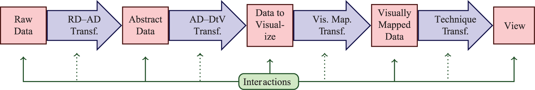
Pipeline of the unified visualization model (UVM). The different transformations that affect the dataset are colored in blue, the states that the data goes through are colored in red, and the representation of the interactions along the pipeline is colored in green.
The quality of a visualization could be measured along the different stages of the UVM. The view is the most straightforward stage to evaluate the result. However, an evaluation of the visualization in this last step implies the generation of the visualization, even if it is not going to be effective. Our goal is to predict the quality of a visualization before reaching the view, that is, before applying a particular visualization technique to the dataset. Previously, during the technique transformation, the dataset to visualize is already defined and the visualization technique to apply must be selected. In this last transformation, it is possible to evaluate measures that predict the result of the visualization of the dataset with a selected technique. In both cases, each technique must have its own set of measures to predict its performance with the given dataset.
Metrics can be used to guide the selection or the configuration of a visualization technique. It should be noted that unconstrained flexibility makes it difficult to choose appropriate or even optimal visualization techniques for a particular visualization goal. Given a dataset, we identified three different usages of metrics during the technique transformation:
Assisting the user in the selection of good parameters to visualize the dataset with a particular visualization technique;
Warning the user that a particular visualization technique is not advisable for the dataset despite the configuration;
Preventing the user from selecting a non-advisable visualization technique for the dataset. A semi-automatic system could expose only the potentially acceptable visualization techniques to the user for him or her to choose one.
The first usage of metrics should work in conjunction with and complement any of the other two. Moreover, this combined usage of metrics encourages the users to try out those visualization techniques that may result in potentially acceptable visualizations.
Metrics associated with each visualization technique are of great help when the user is selecting a technique to visualize a dataset. However, metrics are not enough since they may not consider the type or nature of the data to visualize. Therefore, when we propose the evaluation of a metric of a particular visualization technique with the given dataset, we are assuming that there exists a previous instance that has identified the technique as suitable for those data, for example, by using semantics. 20
A metric to quantify data visibility
An appropriate decision-making guidance for users along the visualization process depends partially on the existence of metrics. These metrics need to characterize distinct aspects of the techniques and help to configure them suitably for a given dataset. To accomplish this, it is necessary to define a metric that predicts how good the resultant visualization will be without rendering it. The ultimate goal is to reach a semi-automatic system that gives the user a visualization as a starting point for data exploration and analysis.
Given that superposition is an important limiting factor of scatterplots, it was defined a metric that expresses mathematically the concept of visibility, that is, the opposite concept of occlusion percentage, 14 and takes into account parameters of the visualization

In this section, the concept of visibility index is defined and it is formalized by a method for its calculation. According to the guides presented by Tatu et al., 3 an algorithm to calculate the visibility index of scatterplot visualizations was developed. Then, a mathematical model that approximates this index was defined. This model allows the prediction of data visibility in the resultant visualization.
Visibility index
The visibility index is defined as a specific metric for scatterplots. Given a scalar dataset and the window’s and glyph’s dimensions, it estimates the expected percentage of glyphs that are not completely overlapped with other glyphs (there exists at least one pixel of the glyph which is not overlapped with another glyph), that is, the expected amount of glyphs that are always visible despite the rendering order.
Adopting Brath’s 14 convention, window’s dimensions (height and width) include only the drawing area of the scatterplot, that is, it excludes menus, borders, buttons, supplementary visualizations, and so on. In the following analysis, only square windows are considered; then, only one value is enough to represent height and width (the size) of the window. As glyphs are also considered square, only one value is also enough to represent their size. In both cases, the side of the square is considered as the size of the window or the glyph.
Algorithm to calculate the visibility index
Algorithm 1 calculates the visibility index
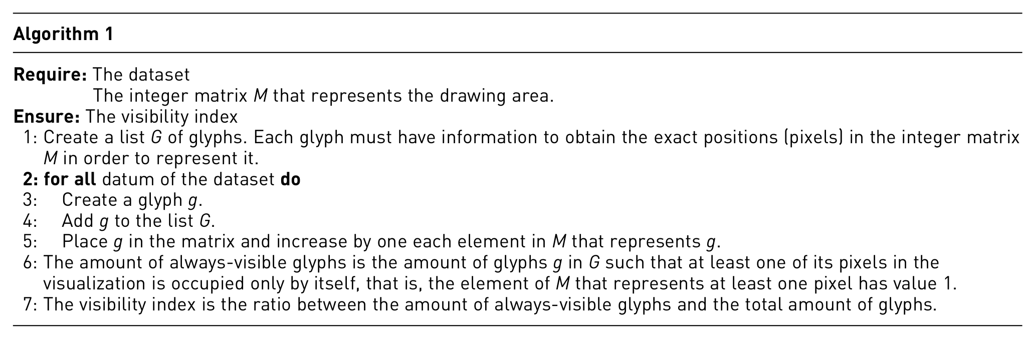
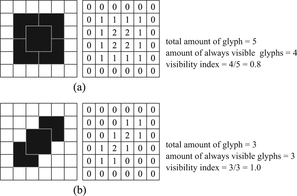
Two examples of glyphs placed in a 2D scatterplot and their respective integer matrix. (a) A case where the central glyph is visible depending on the drawing order: if it is drawn before all the other glyphs, it will be hidden behind them; but if the central glyph is drawn at last, it might be visible (depending, for instance, on the glyph or border color). (b) A case where, regardless of the drawing order, at least one pixel of each glyph is always visible.
Mathematical model for the visibility index
To analyze the behavior of the defined metric, the experiments with a total of 2760 datasets were conducted. The datasets were randomly generated following 16 different normal distributions for each one of the two dimensions and with 23 different dataset sizes (
Normal distribution was used to perform the experiments. This distribution is the most common one; it fits the most natural phenomena when the sample is large enough and the random errors are sufficiently small. 21
For each pair
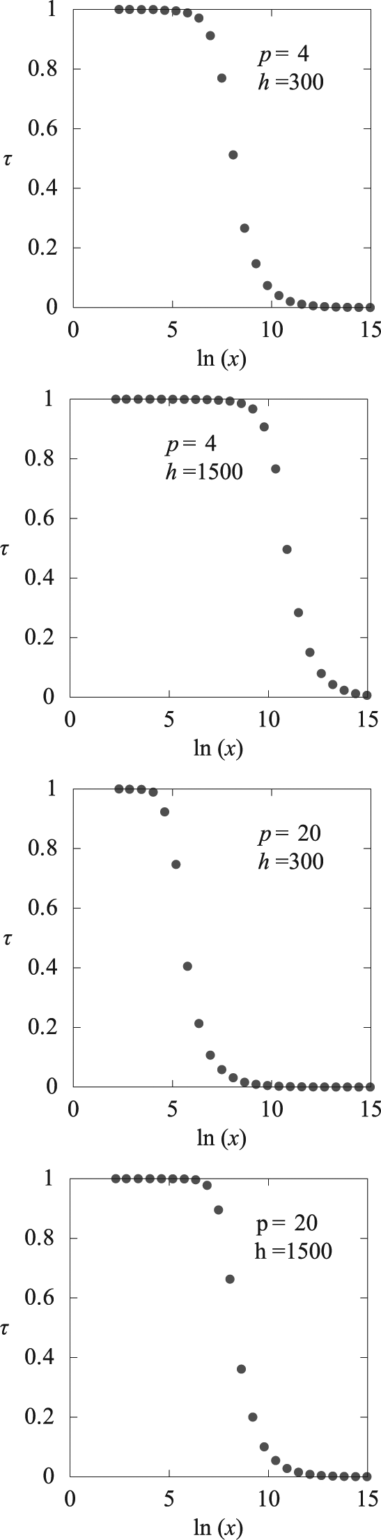
Behavior of the visibility index depending on the logarithm of the amount of data. p and h represent the size of the glyphs and the window, respectively, and x is the amount of items in the dataset.
Limits of the function f
Given the size of the window h, the size of the glyph p, and the size of the dataset x, and taking into account that h, p, and x are independent variables, the function f which approximate the visibility index
Definition of the function f
For each triple
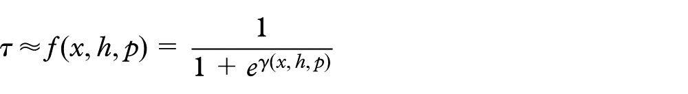
Then, in order for the function f to satisfy the previously enumerated conditions, function
If
If
If
If
If
If
Then, considering
In consequence, coefficients a, b, and c must satisfy

Note on f and γ
Even though from

In practice, the first expression for f gives better results than the second equivalent expression.
Approximation of coefficients a, b, c, and d
From function
Schematically, to perform the approximation, the function

Figure 4 shows the steps followed to approximate the
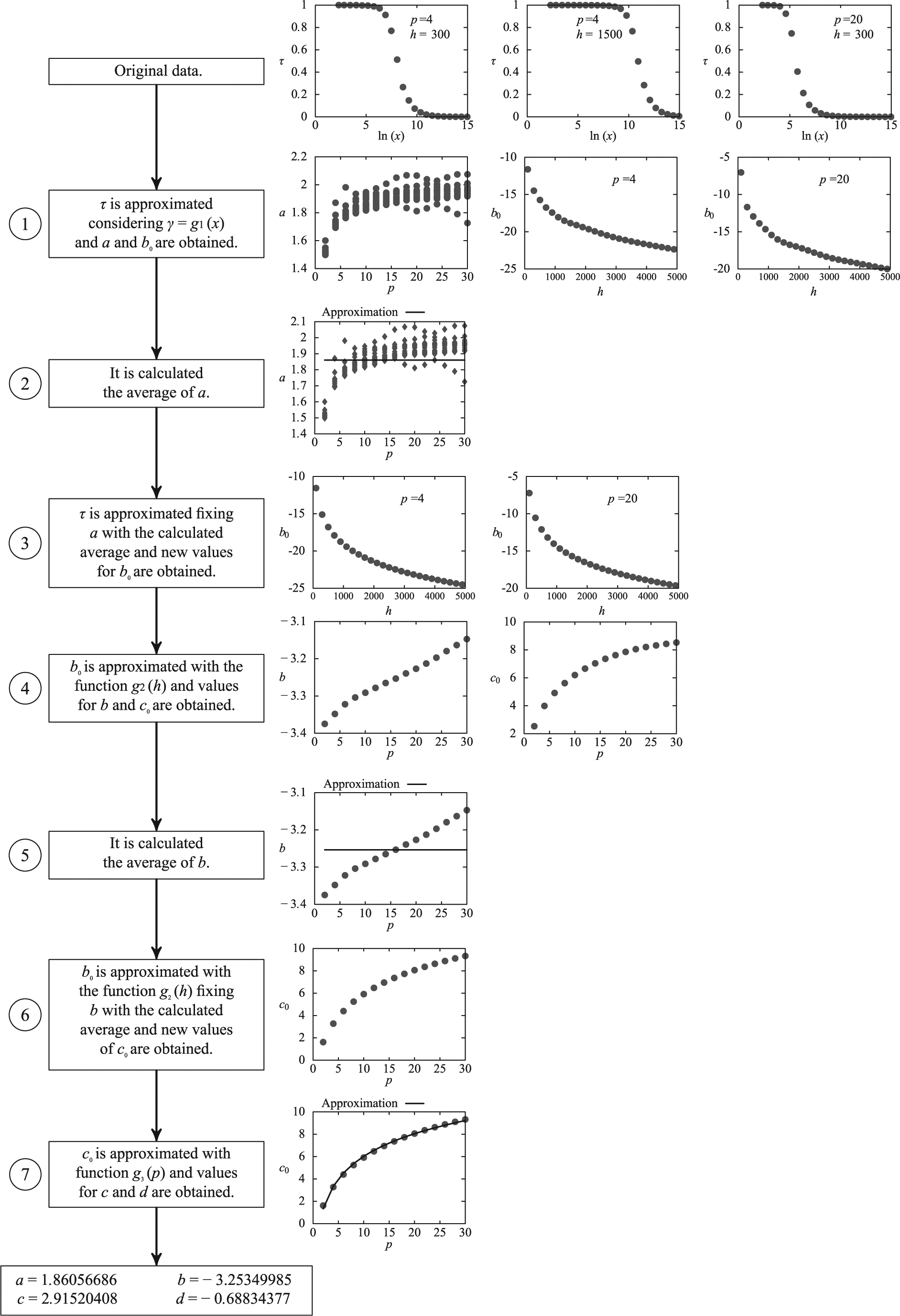
The seven function-fitting ran to obtain the coefficients a, b, c, and d of the approximation of
Error analysis
To analyze the approximation error of f, the relative and absolute errors between f and

Mean squared error = 0.00364.
It should be pointed out that the high values of the relative error correspond to the values of
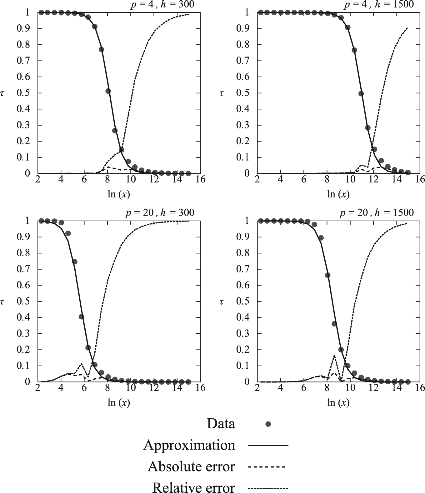
Plot of the relative and absolute errors between f and
How this metric helps the users with scatterplots’ configuration
Even though the formulae contemplate windows as big or glyphs as small as necessary, in practice, the size of the window should not be bigger than the size of the display and the glyph cannot be smaller than 1 pixel. In this context, for a given amount of data, it would not be possible to obtain a better result than the one with the larger possible h and the minimum possible p.
The goal of this metric is to guide the user while he or she chooses the parameters of the visualization, in particular the window’s and glyph’s sizes, by knowing the amount of data to visualize. Based on a display with a maximum resolution of
Synthetic dataset 1: the user wants to visualize a dataset with 1058 data
In this example, the goal is to analyze the relationship between the glyph size and the visibility index while visualizing 1058 data in a
In the first option, if he or she chooses a glyph of
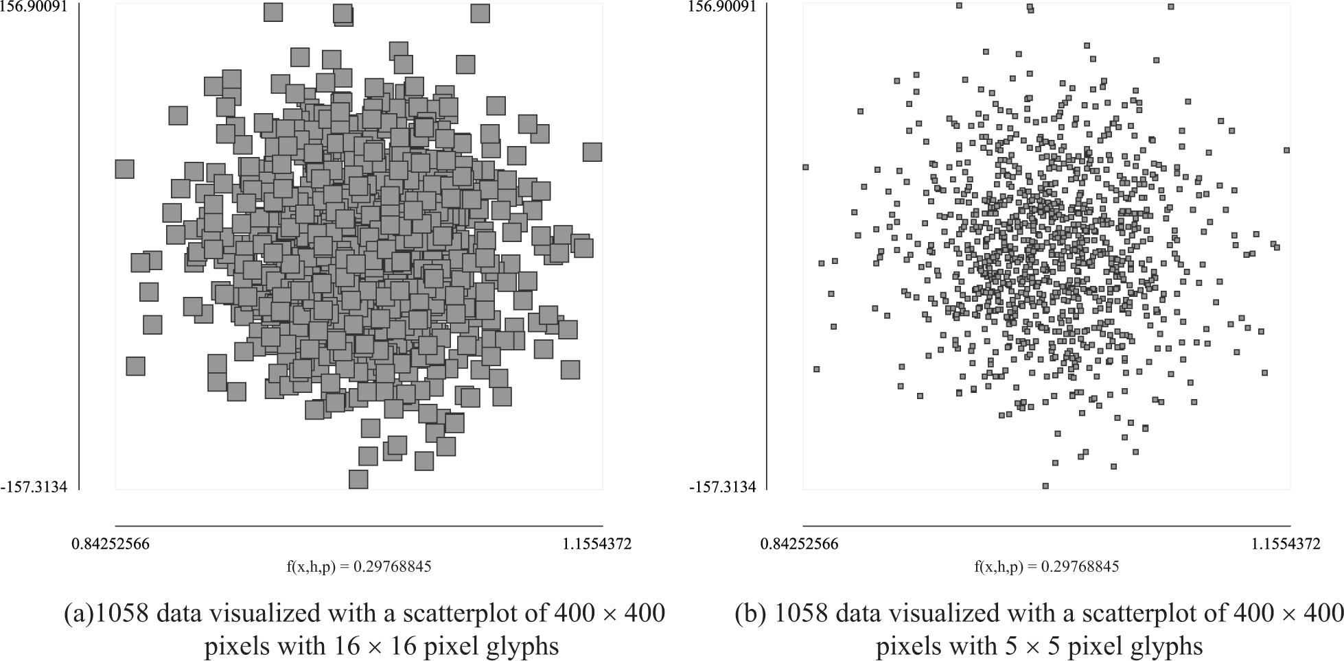
In case of (a), using the metric, the user may notice that only 29% of the glyphs are always visible regardless of the drawing order. In case of (b), the metric may help the user to notice that to get 90% of always-visible glyphs in a
On the other hand, if he or she restricts the minimum acceptable value for the visibility index

Synthetic dataset 2: the user wants to visualize a dataset with 300,000 data
In this example, the goal is to analyze the feasibility of a 300,000-data scatterplot visualization.
If the user restricts the visualization to a
On the other hand, if the user restricts the visibility index

Furthermore, if the user decides to use the biggest possible window (

In such cases where the visibility index is not promising, even with the smallest possible glyph and the biggest possible window, a system that supports 2D scatterplots should discourage this technique as a potentially acceptable one for this dataset.
Case study
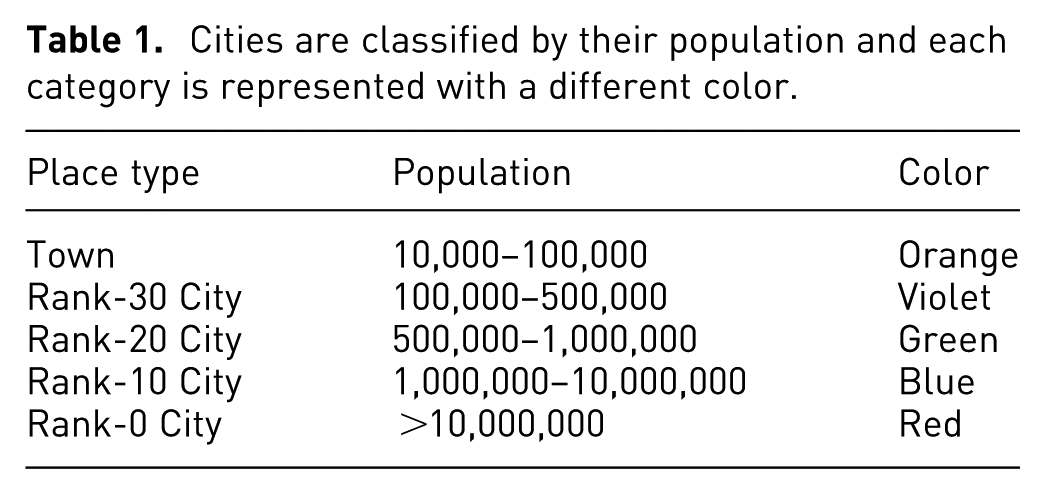
The travel book Places Rated Almanac 22 rates numerically 329 communities according to nine criteria: Climate & Terrain, Housing, Health Care & Environment, Crime, Transportation, Education, The Arts, Recreation, and Economic. For all but two of these criteria, the higher the score the better. For Housing and Crime, the lower the score the better. The dataset has the population as additional information about each city; as suggested by OpenStreetmap, (https://www.openstreetmap.org) cities are classified into town or different ranks of cities based on their population (see Table 1).
Cities are classified by their population and each category is represented with a different color.
Let suppose that a user wants to generate a 2D scatterplot to compare Climate & Terrain, Transportation, and city classification; the first two attributes correspond to the axis of the scatterplot and the later, to the color of the glyph (see Table 1). Membership disambiguation tasks 23 include tasks where the user explores the data to find objects with specific characteristics, counts the number of objects in a selection, or identifies objects in an area. Overlapping obscures the structure and the information present in the data and make it difficult for the users to accomplish the previously described tasks. Moreover, if the visualization offers a semantic-zoom interaction (i.e. the values of other attributes are shown for a selected glyph) to help with these tasks, glyphs should be identifiable in order to be picked.
Considering that the distribution of the two variables Climate & Terrain and Transportation resembles a normal distribution (see Figure 7), the visibility index could be used to guide the selection of the glyph size.
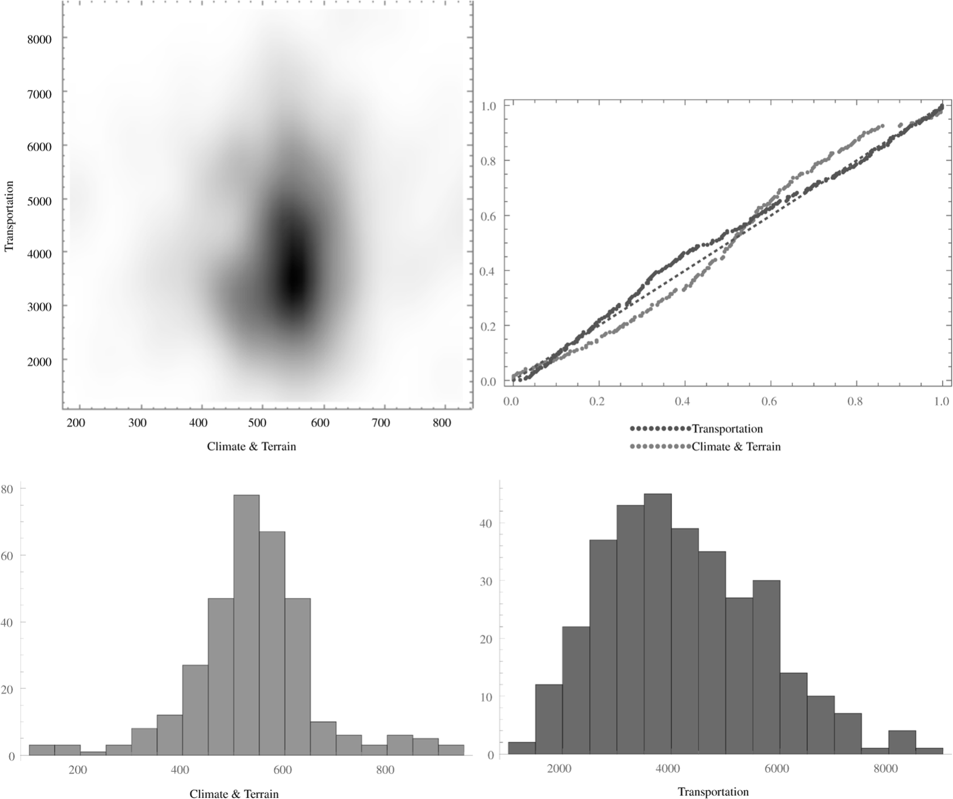
The density histogram, the cumulative distribution function of each individual variable against the cumulative distribution function of a normal distribution, and the histograms for each variable are graphical indicators that the distributions of the variables Climate & Terrain and Transportation resemble a normal distribution.
The user generates the 2D scatterplot in a
For 20-pixel glyphs, the actual ratio of always-visible glyphs is about 0.6603, while the predicted visibility index is 0.5045. Even though the actual value is higher than the estimated one, it is still low: about 34% of the glyphs are not visible. However, for 10-pixel glyphs, the actual ratio is 0.9361 and the estimated one is 0.9452. Moreover, for 5-pixel glyphs, the real ratio rises up to 0.9910, while the estimated one is 0.9818. In this last scenario, the glyphs could turn out to be too small for picking. Figure 8 shows how identifiable is each category of cities for the different sizes of glyph. Note that in Figure 8(a) glyphs are big and suitable for picking but overcrowded and difficult to identify. On the other hand, in Figure 8(c) glyphs are identifiable, although they may be too small to be picked. A trade-off solution could be Figure 8(b), where there is a good visibility of glyph and they still have a good size for picking.
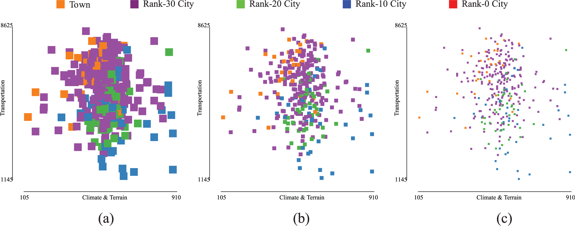
Comparison of how distinguishable the glyphs are as follows: (a) scatterplot visualized in a 400 × 400-pixel window with 20-pixel, (b) scatterplot visualized in a 400 × 400-pixel window with 10-pixel, and (c) scatterplot visualized in a 400 × 400-pixel window with 5-pixel glyphs.
The visibility index is an appropriate tool for selecting the biggest glyph that still results in a high rate of always-visible glyphs. If the user restricts the minimum acceptable value for the visibility index

Conclusion and future work
In the process of guiding the user in the selection of the different parameters of a visualization, the usefulness of metrics grows if every technique has attached at least one metric of visual scalability. A semi-automatic system could use these metrics to alert the user about decisions that degrade the visualization and guide him or her in the selection of the parameters that generate the best possible view. If the best possible view is not acceptable, then the semi-automatic system could use metrics to suggest alternative techniques.
This work presented a metric that, given the size of the scalar dataset to visualize, the window’s size, and the glyph’s size, estimates the proportion of always-visible glyphs in a scatterplot visualization with such characteristics. This metric could be useful to help the users to choose the most adequate parameters to get an acceptable visualization.
Given that the presented metric was derived from particularly distributed datasets, we plan to analyze and extend the mathematical model to other data distributions. On the other hand, in order to help the users along the visualization process, the ultimate goal is to have a variety of metrics that measure different characteristics of the potential resulting visualization and bring additional tools to choose the most appropriate parameters to visualize a dataset with scatterplots.
Footnotes
Funding
The author(s) disclosed receipt of the following financial support for the research, authorship, and/or publication of this article: This work was partially funded by PGI 24/N028 and PGI 24/N037, Secretaría General de Ciencia y Tecnología, Universidad Nacional del Sur, Bahía Blanca, Argentina.