
Abstract
The search for an efficient method to enhance data cognition is especially important when managing data from multidimensional databases. Open data policies have dramatically increased not only the volume of data available to the public, but also the need to automate the translation of data into efficient graphical representations. Graphic automation involves producing an algorithm that necessarily contains inputs derived from the type of data. A set of rules are then applied to combine the input variables and produce a graphical representation. Automated systems, however, fail to provide an efficient graphical representation because they only consider either a one-dimensional characterization of variables, which leads to an overwhelmingly large number of available solutions, a compositional algebra that leads to a single solution, or requires the user to predetermine the graphical representation. Therefore, we propose a multidimensional characterization of statistical variables that when complemented with a catalog of graphical representations that match any single combination, presents the user with a more specific set of suitable graphical representations to choose from. Cognitive studies can then determine the most efficient perceptual procedures to further shorten the path to the most efficient graphical representations. The examples used herein are limited to graphical representations with three variables given that the number of combinations increases drastically as the number of selected variables increases.
Keywords
Introduction
Despite its short history, the field of statistical graphics has been very prolific. Friendly and Denis, 1 for example, identified more than 50 different types of statistical graphics. Obviously, there are a series of rules that exclude many of these graphics in specific situations. Factors such as the number and the type of variables, the number of unique values for each variable, or the order of the values can restrict the number of viable options. Consequently, all these considerations make the task of choosing an adequate graphical representation for each case a rather complex undertaking that requires prior experience and knowledge of the applicable rules and the available options.
One solution to this problem is to define automatic graphic selection algorithms that, for greater convenience, can be implemented on computers to determine what graphic or limited number of graphics is appropriate for a given situation. This solution is mentioned in the literature and included in certain computer systems, but a solution that enjoys sufficiently broad consensus has yet to be found. In response, our article aims to advance a new set of rules for automatic graphic selection based on the characterization of variables in a dataset.
The set of rules for the automatic selection of graphics refers to the number of variables to be represented graphically and, separately, the characterization of the variables. The latter are the characteristics that can be described for each of the variables (e.g. “numeric” or “alphanumeric”) independently of the characteristics of the relationships between the variables.
A review of strategies to automate statistical graphical representations
This section reviews the strategies that have been proposed in the literature to automate statistical graphical representations. In general, these strategies all include a more or less sophisticated characterization of the separate variables. Nonetheless, they are organized here according to the following factors: (1) the characteristics of the data to be represented; (2) the characteristics and needs of the user; (3) the representation models used, and (4) the limitations of the hardware used. Each of these factors is further discussed in the following.
The characteristics of the data to be represented
Kamps 2 uses the term “functional design” to refer to the methods that determine the aesthetic of the graphics based on characteristics of the data. More recently, Schulz et al. 3 identify data descriptors that also consider the data acquisition, storage, and utility context. There are different aspects of the characteristics of the data that can help reduce the number of graphic possibilities for a given situation. Thus, considering the properties of each separate variable, automated graphical representations have been proposed based on, for example, the variable’s level of measurement (i.e. nominal, ordinal, interval, and ratio), its independent or dependent role, and the source type (empirical or theoretical) of the data. Implicit information such as the number of unique values of a variable and the presence of missing data are also factors. Examples of systems based on these properties include the CHART program, 4 the BHARAT 5 system, and ViSta. 6 Another aspect is the relationship between pairs of variables, such as if each value of a variable corresponds to a value of another variable (functional dependency) or if a value corresponds to multiple values of another variable (as in multilevel and hierarchical data). Examples of systems that use these aspects include the APT 7 tool, the SAGE 8 system, and the EAVE 2 system. Finally, the total number of variables to be represented is a relevant criterion as considered, for example, by APT, that includes as a criterion the “expressivity” of a graphic and regards a language as expressive if it includes all of a dataset’s information and only its information.
The characteristics and needs of the user
The characteristics and needs of the user should be taken into account when selecting what graphic to construct. If, for example, the user wishes to know the precise value of an observation for a variable, then a table is adequate. But if the aim is to detect trends in the evolution of the variable over time, then it is more appropriate to depict the variable’s variation over time instead of comparing numbers in a table. BOZ 9 is a system based on this type of information. It promotes what its author calls task-based graphic design. Another user characteristic is the ability of human perception. This led to what Kamps 2 defined as perceptual design, which has been implemented in, for example, APT. 7 APT includes effectiveness in graphic selection as a criterion, for which Mackinlay used a ranking based on the precision in the decoding of the variables according to the variable’s measurement scale and the type of visual variable with which it is encoded. Perceptual design is also the basis for the development of the quality metrics encompassed in the methods of automated evaluation of visualizations.10,11 The user’s preferences can also be used to select a graphic; these preferences can be gathered from the user’s graphic selection habits and history, as is done in VizRec. 12 Finally, users carrying out the statistical analysis of data require a type of graphic that is different from what is needed to present the information to a wider audience. ViSta 6 is an example of a system oriented for statistical analysis, while the infogr.am web platform is oriented for presentation purposes.
Representation models
Representation models use predefined graphic types to interpret the data. These can be classified as one of the three basic forms—“point,”“line,” or “area”—that a mark can take on a plane, a reduced set of visual variables, or a specified taxonomy of the set of graphical representations compiled by Engelhardt. 13 But representation models may also refer to multiple types of commonly accepted graphics, such as histograms, scatterplots, and bar graphs. One of the first systems to use this criterion was SageBrush, 14 which was implemented in SAGE and made possible the construction of graphics based on prototypes or an MS Excel that prompts the user to choose among a gamut of graphic types and subtypes.
Hardware limitations
Various hardware limitations can also be considered. First, there may be computation or data transmission limitations, as implemented in systems like Polaris 15 that can suggest, for example, a static instead of a dynamic graphic. Second, there are visualization limitations that adapt the graphic to be produced to the resolution and the size of the display screen, such as have been implemented in the BHARAT 5 system. These considerations have come to be known as responsive design, which refers to the adaptability of the presentation type to the characteristics of the graphic display.
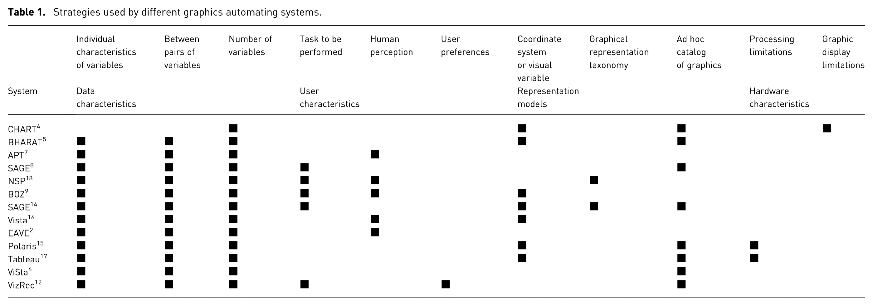
Table 1 concisely depicts the graphic selection strategies used by the different automated statistical graphic selection systems. We can see that the aforementioned functional design strategy is implemented in all the systems and complemented with other strategies to refine the final graphic to be presented. Thus, the SAGE, NSP, BOZ, and VizRec systems also use information about the task to be performed, and the APT, NSP, BOZ, Vista, 16 and EAVE systems incorporate composition algebra to consider human perception abilities and create new graphic types, hence avoiding reliance on an ad hoc catalog of graphics. The CHART, BHARAT, BOZ, SAGE + SageBrush, Vista, Polaris, and Tableau systems allow the user to choose between different coordinate systems and visual variables, while the NSP, SAGE + SageBrush, and Tableau + Show ME 17 systems allow the user to choose among a limited group of graphical representation types, such as tables, maps, scatterplots, and line and area graphs. Finally, systems like CHART, BHARAT, SageBook, Polaris, ViSta, and VizRec present the user with an ad hoc catalog of graphics to choose from.
Strategies used by different graphics automating systems.
Limitations of the various strategies
The following section discusses the limitations of the aforementioned data-automation strategies. It is presented here as a preliminary step to the presentation of our proposal. These limitations are summarized in Table 2.
Limitations of the various strategies.

Characteristics of the data to be presented
The first of the strategies, functional design, is implemented in all the systems. This strategy uses the characteristics of the variables taken separately, and the relationships between them that, ideally, are implicit in the datasets, and which the system uses to determine the graphic that is best suited to the data.
However, a limitation of this strategy is that these characteristics are not always implicit in the dataset; in these cases, it becomes necessary for the user to have a deep understanding of the nature of the data. For example, this limitation can be seen in the distinction between nominal and ordinal measurement scales, as well as between interval and ratio scales, in data displayed in tables. Usually tables contain text and numeric fields. The text fields may refer to unordered or ordered categories. If the categories are ordered, this should be reflected in the graphic. Let us suppose we have the categories “high,”“low,” and “medium”; in this case, the three categories reflect an ordered relationship and it would therefore seem natural for the graphic to reorder them as “high,”“medium,” and “low.” Yet it is difficult for an automated system to correctly deduce this relationship, making it necessary for the user to somehow specify this order. The same occurs with numeric fields; the systems are incapable of discerning if they are dealing with magnitudes with arbitrary units and origin (or zero) and consequently an interval measurement scale, or if, on the contrary, they are dealing with absolute zero and a ratio measurement scale. In short, it is often necessary for the user to specify the non-implicit characteristics of the data in order for the systems to automatically generate a graphic.
Another dataset limitation that impacts the characterization of variables is the number of dimensions with which the values of each variable tend to be characterized. Information is generally structured in databases that relate to tables, and these tables store information on the characteristics of the values of each variable, known as data types, such as Boolean, alphanumeric characters, and whole or real numbers. This characterization of the data is generally one dimensional, such that each category is exclusionary and does not allow for the combining of qualities from other dimensions, in order to thus restrict the gamut of graphic possibilities. An example of a multidimensional characterization is to consider, in addition to the aforementioned list of data types, whether the variable is a response or predictor variable, such that a variable can be characterized as, for example, Boolean and predictor or Boolean and response. Thus, the set of possible graphics to represent Boolean variables is further broken down into two smaller subsets.
The characteristics and needs of the user
The task to be performed is one way to complement functional design. For a given dataset, such as the number of traffic accidents per a country’s kilometers of highway, a graphic that makes it easy to know the ratio of accidents by each specific highway takes the form of a table with rows for each highway ordered by highway name, with the ratio of accidents in the adjoining column. But if we wish to group highways according to accident rate (“normal” versus “atypical”), a single-axis plot is preferable, since it depicts the distribution of the coefficients and makes it easy to identify atypical values.
However, complementing functional design with the task to be performed has its limitations. It is often the case that the user undertakes exploratory data analysis without a clear idea of the concrete tasks to be performed and may therefore be interested in visualizing representations for a dataset that serve different purposes. For example, to see whether the values of two variables are more or less correlated, or to identify concentrations in the distribution of the observations for a pair of variables, or to identify bimodal distributions in any of the two variables, or to compare the dispersion or the ranges of the values of both variables.
When the task is previously specified, the system can present graphics that are useful for a predetermined purpose. However, in addition to identifying the task to be performed, this requires identifying the tasks for which each graphic to be evaluated by the system can be useful. Let us assume that the task the user wants to undertake is to find the most economical flight between two cities in a certain period of time. The system can use a bar chart with the lowest daily prices when the period of time is short, or a line graph when the time period is longer. In general, though, the possibilities are more limited and it is easier to produce them automatically.
Quality metrics, based on perceptual design, can help in the automatic selection of graphics, but they are specially used to optimize some aspect of specified graphics. Another way to generate automated graphics is via a compositional algebra that can generate graphics based on rules derived from human perception abilities. But the drawback here is that this approach fails to take advantage of new and creative methods of graphical representation that are specifically tailored to a specific perceptual task. Systems based on compositional algebra tend to limit options to only one graphic instead of a gamut of graphics. Such is the case, for example, with the BOZ system, 9 which provides two results: the graphic that theoretically is the most effective to execute a specific task; and a set of instructions about how to use the graphic to complete the task satisfactorily. In order to obtain another graphic, one must change the dataset or the task to be performed. Examples of tasks that BOZ handles include those of the type: “determine horizontal distance,” which generates a graphic that depicts the difference between two points on a horizontal axis; and “search for objects with shade” which displays only those objects with a specified shade level. Thus, the system may not permit new graphics created ad hoc for specific problems because they do not fit within the framework defined by these rules. For example, tasks that use complex symbols like box plots and Chernoff faces might be omitted, which paradoxically results in users being unable to evaluate them.
One final way to incorporate the characteristics and needs of users is through the incorporation of their preferences. This is one of the newest methods and it is sure to undergo significant development, similar to the development undergone by search engine recommender systems. ViZRec 12 is an example of such a system; it compiles recommendations based on the data type with recommendations based on the scores given to the graphics by users with respect to criteria such as “boring,”“useful,”“effective,” and “satisfactory.” There are two main problems with this approach. First, the user may have an insufficient registry of preferences for the system to suggest graphics based on it. Second, users may be interested not only in the suggestions based on their past history, but also in the preferences of the specific social group for which the graphic is intended and which may have its own particular communication register.
Representation models
Representation models is the third aforementioned strategy. It consists of the use of predefined graphics to interpret the data. In this case, the system requires information such as the coordinate system to be used, the visual variables into which it is to transform the variables of the dataset, and whether a point graph, line graph, or area graph should be used versus some other specific graphic, such as a scatter graph and histogram. This requirement could cause the non-expert user to easily produce incorrect graphics from a semantics point of view. For example, the use of a pie chart for values that it does not make sense to add up or that lack a maximum possible value. On the other hand, if an ad hoc catalog of solutions is used instead, the user would be limited and lack sufficient flexibility to include new graphical methods.
Hardware limitations
Finally, keeping hardware limitations in mind, especially in terms of memory, screen size, and resolution, allows for the transformation of large amounts of data into graphics that are comprehensible across any device, thus increasing usability. The drawback, however, is that these graphics can, without the user being aware of it, become simplifications that limit interpretation. Furthermore, graphics generated by a system are stored and reproduced in other graphic displays with different characteristics.
System limitations in characterizing the data to be represented
Characterizing variables implies assigning attributes to them. These attributes tend to be exclusionary qualities and they can condition the selection of the graphic to be used because some graphics are better suited to some qualities than others. Below we look at how different systems characterize the variables to be represented and discuss the limitations of each.
As previously stated, functional design strategy is based on limiting the range of possible graphics based on the characteristics of the data. It might be possible to deduce these characteristics implicitly; otherwise, the user will need to define them. There are three levels of characteristics: those that refer to each variable separately, those that define relationships between variables, and those that consider the overall number of variables to be represented.
If the number of variables to be represented cannot be deduced implicitly from the dataset, it is easy for the skilled user to indicate which variables to represent among those included in the dataset. It is also relatively easy to characterize each variable to be represented separately once these variables have been chosen and the rules of a specific characterization are known. Therefore, this is not overly problematic. With respect to the characterization of relationships between variables, however, it would be very costly for the user to characterize all the relationships between variable pairs because this requires a solid understanding of the data and, additionally, the number of relationships grows exponentially with the number of variables considered. Nonetheless, we should also keep in mind that statistical graphics are generally displayed as diagrams and not as networks with nodes and connections that basically depend on these relationships; therefore, if the purpose is to obtain a gamut of acceptable graphics, the effort on the part of the user to characterize the relationships between variables does not seem justified. For this reason, this section only considers the limitations of the systems in terms of characterizing each variable separately, in order that we may later propose a new approach.
Depending on the number of dimensions that the various systems use to characterize each variable separately, we may be looking at one-dimensional or multidimensional characteristics. While the former categorize the variables from a reduced number of exclusionary characteristics (e.g. nominal, ordinal, and quantitative variables), the multidimensional characterizations allow for successive subdivisions in each category based on each dimension being considered. A clear example of this is also considering the role of the variables as predictor or response variables. Thus, a quantitative variable, for instance, can be further characterized as a predictor or a response variable, and this distinction produces two possible gamuts of acceptable graphics that can display this quantitative variable as one or the other.
There are certain dimensions, such as the number of unique values, for which the automated graphic systems can utilize one of two strategies. One strategy, as proposed by Bertin, 19 consists of categorizing this dimension according to pre-established limits, such as short variables when four or fewer unique values exist and long variables when more than 15 exist, and then evaluating the gamut of graphics according to these limits. Another strategy is to include ad hoc limits in the graphic selection algorithms based on the type of graphic being considered; for example, a maximum of 10 unique values per variable in a vertically oriented bar diagram that could, for example, increase to 30 if the bars are arranged horizontally. In this strategy, there are no pre-established exclusionary levels for the variable; in other words, the levels are diffuse.
The greater the number of identified dimensions and levels, the greater the number of resulting variable combinations and the greater the number of subsets of the sample space of available graphics, which restricts the search for an acceptable graphic. One-dimensional characterizations in two levels, for instance, allow for nine possible combinations to represent one, two, or three variables. In three levels, the number of combinations increases to 19, in four levels to 34, in five levels to 55, and in six levels to 83.
As can be observed in Table 3, the majority of the systems utilize a one-dimensional characterization of each variable taken separately that derives from Bertin’s 19 proposal, which characterized the variables according to two dimensions: first, the level of organization of the input variables, which distinguished qualitative, ordered, and quantitative variables; and second, the length of the variables, which also distinguished three levels: short (between two and four values), medium, and long (more than 15 values). These two dimensions, each with three levels, make possible a total of 219 combinations for one, two, and three variables. The APT and BOZ systems, for example, utilize the classification of the domain of the variables in three levels: nominal, ordinal, and quantitative. SAGE subdivides ordinal and quantitative levels based on whether they refer to amounts or reference values and adds another dimension called the “domain of membership.” NSP subdivides the nominal domains into simple and multiple values and the ordinal domains into discrete and continuous values. Vista divides the quantitative level into three sublevels (scalars, vectors, and tensors). Polaris distinguishes between ordinal and qualitative, while Tableau distinguishes between categorical variables (with three sublevels) and quantitative variables (with two sublevels). VizRec distinguishes between categorical, temporary, and numerical variables.
Characterization of each variable taken separately in different automated graphics systems.
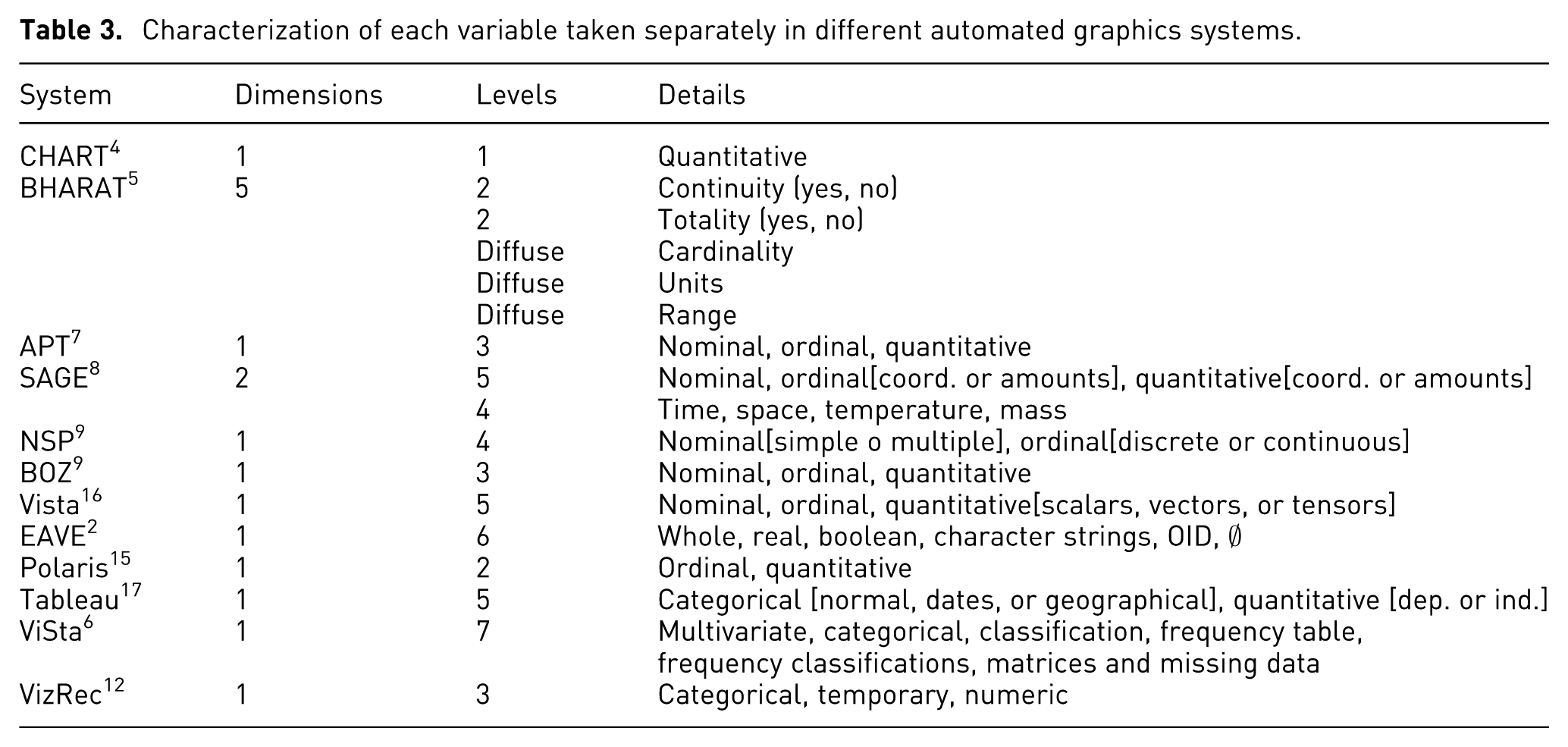
Other systems utilize other models besides Bertin’s. The CHART system, for example, only considers the quantitative domain. The BHARAT system uses up to five dimensions, but only identifies levels for the dichotomous variables “totality” and “continuity,” which necessitates the establishment of customized rules in accordance with the value of the cardinality (number of unique values), the units, and the range of the variables. EAVE uses a very different classification, since it considers the domain of whole, real, and Boolean numbers, and character strings, unique object identifiers, and the empty set. Finally, ViSta considers up to seven levels; yet these do not refer solely to variable types, but also to different data structures like “frequency tables” and characteristics that can have all sorts of variable types, such as “missing data.”
A proposal for automated graphic selection
The proposed method of automated graphic selection is based on a multidimensional characterization of the variables that allows us to reduce the gamut of possible methods of graphical representation for a particular combination of variables. This requires a two-front approach to finding the appropriate graphic: first, a top-down approach that implies the characterization of the variables based on the qualities that impact the selection of one graphic over another; second, a bottom-up approach via the characterization of the graphics according to the number of variables and those characteristics of theirs that fit with the previous characterization of the variables. This results in the grouping and situating of the statistical graphics into sets the length of which is the number of variables and the elements of which are the characteristics of these variables. Each set of graphics corresponds to the user’s various information search tasks, making cognitive studies necessary in order to include the task to be performed among the variables to be incorporated for a more precise automated graphic selection.
The dimensions of the identified variables are qualities that correspond to different aspects of the variables, for example, its scale of measurement or the consideration of a variable as an index. The levels of each dimension are the various exclusionary values that a specified variable can have for each dimension. Variables may be recodified into different levels, however, in order to broaden the search for an acceptable graphic solution.
It is possible that a certain combination of variables cannot be associated with any graphic, or that the task to be performed is more efficiently executed with a different combination derived from the original. Keeping track of data provenance makes it possible to evaluate all the possible derivations as well as inform the user of the changes in the perception of the graphics.
Below we will describe a new approach to automating statistical graphics based on the characteristics of the variables. In this section, we will describe the dimensions and levels in which we propose to characterize the variables and provide examples of our proposal’s application.
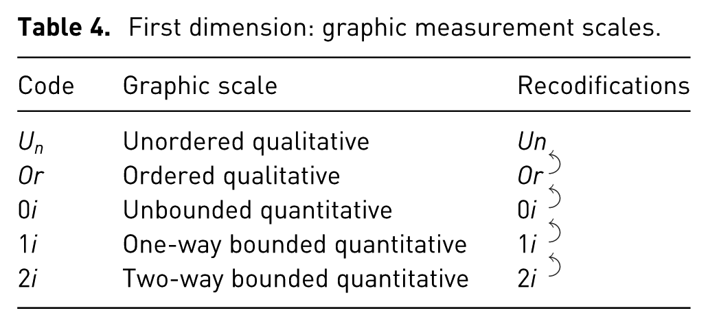
Graphic measurement scale
The first variable-characterization dimension considers the relationship of order among the values of the variable and the possibility of quantifying it as greater or lesser, or a relationship that allows for the addition of the values. A first distinction should be made between qualitative and quantitative variables, since the values of the former cannot be summed up. Among the qualitative variables, we can distinguish ordered variables
Among the quantitative variables, we differentiate three levels based on the number of limits between which the values of the variable are bounded. The first level is composed of variables with arbitrarily referenced scalar values
The graphic measurement scales used for the variables are susceptible to being changed under certain circumstances. For instance, when the variable scales are bounded on two ends, it may be convenient to recodify them as bounded on one end. This is the case when all the values to be represented are concentrated close to one of the ends. An example of this is a dataset of the probability of three independent events (
Scalar bounded on both ends and recoded to bounded on one end.
Scalar bounded on one end and recoded to unbounded.
First dimension: graphic measurement scales.
Data aggregation method
The second variable-characterization dimension distinguishes between sequential and non-sequential variables. Non-sequential variables are further divided into two levels according to the difference in the cardinality of the variable, meaning the number of a variable’s unique values in a dataset and the cardinality of the variable scale (in other words, the number of unique values that can be potentially observed and obtained in the dataset).
We have identified three levels in this dimension. The first level, which we call sequential variables
Additionally, we have non-sequential variables; in this case, the position of the values in a data column does not correspond to the order in which they have been acquired. Among non-sequential variables, we distinguish between variables of population type
On the other hand, our third level, sample type variables, is composed of variables with a scale cardinality that is so elevated with respect to the cardinality of the data that it does not make sense to predetermine the set of potential scale values; instead, it may be defined as between the range of a minimum and a maximum value. An example of this type of variable is a column of winning lottery numbers, a list of common names for newborns, and the weight in grams of students in a physical education course.
Sample type variables can be easily recodified as population type variables by grouping observed values in equidistant intervals or categories, such as age groups. The inverse recodification, however, is not possible because the data lacks information about specific observations. It is also possible to recodify sequential variables as population and sample type variables if the sequence in which the values have been obtained does not interfere with the analysis and, consequently, does not need to be graphically represented. But here, too, the inverse recodification is not possible given that the population type and sample type variables do not contain information about the sequence in which their variables were acquired. Table 5 summarizes the data aggregation levels and the possible recodifications between them.
Second dimension: data aggregation method.

Cyclicality
The third data characterization dimension considers the possible cyclicality of the variables, which could suggest more specific graphical representations that use polar, cylindrical, or spherical coordinate systems. In this dimension, we differentiate between two levels: cyclic variables (cycl) and noncyclic variables (ncyc). Quantitative and ordered qualitative variables can be characterized as cyclical, but unordered qualitative variables cannot, precisely because their values lack an ordered relationship. Additionally, the cyclic or noncyclic character of the variables allows for two-way recodification thanks to the duality of some variables, such as the days of the week, that can be characterized as one or the other depending on the values and the type of analysis. Table 6 summarizes the cyclicality levels and their possible recodifications.
Third dimension: cyclicality.

Explicitness
The fourth dimension considers the graphic possibility of representing variables on a non-explicit scale. This typically happens when the particular values of the variables are not an essential element in the analysis, but other characteristics of these variables are; an example is the cardinality of the data. Scatter graphs provide a clear illustration of how graphics utilize this dimension; they depict points without the possibility of our knowing the order of each observation or, for that matter, any other unique value identifier for any point. Here, we distinguish between two levels: explicit variables (exp) and ambiguous variables (amb). It is possible to recodify this characteristic of a variable in both directions given that this simply impacts whether or not the scale of the variable is represented. Table 7 summarizes the explicitness levels and the possible recodifications between them.
Fourth dimension: explicitness.

Length of variables
The fifth dimension is the length of variables as defined by Bertin, 19 referring to the number of unique values that it is useful to identify, and, consequently, to represent. The length of a variable should not be confused with the cardinality of its values in the data, which is the number of unique values obtained for a variable in a dataset, nor with the cardinality of its scale, which is the number of unique values that can potentially be obtained for a variable. In the case of categorical variables, it may be beneficial to combine two categories into one when the difference between them is irrelevant for a given analysis. In the case of quantitative variables, it is possible to reduce their length by doing away with decimal values when the precision they provide is irrelevant for a given analysis. It is also possible to recodify variables from sample to population type using equidistant intervals or varying intervals if the precision required is not uniform throughout the domain. Finally, quality metrics can be used to establish optimal length, for example, the number of bins to be represented in a histogram.
The length of a variable is especially useful when selecting a graphical representation because each visual variable makes it possible to differentiate between a varying number of different levels. Additionally, a visual variable can have one defined length limit to identify the different categories of a variable characterized as
Although there are many rules on the length of variables that can be used to evaluate the suitability of a graphic, it is useful to differentiate between variable lengths equal to one and those equal to two. For variable lengths equal to one, there are well-known specific graphics, such as an analogical barometer that shows the atmospheric pressure at a given time and a dichotomous pie chart that shows proportions relative to a whole. For variable lengths equal to two, it is important to examine logic variables and dichotomous factorial variables in many datasets, as they may suggest the use of reflections. For other variable lengths, we view it as preferable to use ad hoc limits with which to characterize the graphics.
The characterization of graphics based on the multidimensional characterization of the data
In this section, we show how the different data characterization dimensions make it possible to classify statistical graphics in increasingly smaller groups, thus limiting the gamut of possible graphics for a given dataset. To classify graphics based on the characteristics of the identifiable variables, it is necessary for the variables to be associated with at least one visual variable, even when they have gone through a transformation. For this reason, variables that have had their dimensions reduced via the application of a statistical method cannot be deduced from the graphic analysis. However, statistical methods that reduce dimensions produce new datasets with variables that have new characteristics and that can be associated with another gamut of suitable graphics.
Matrix of graphic measurement scales and data aggregation methods
The first two dimensions introduced in the previous section allow us to characterize the variables according to each of the cells in the matrix shown in Figure 3, in which the columns represent the graphic measurement scales and the rows represent the data aggregation methods. Figure 3 also indicates the possible recodifications of the levels of the variables based on these two dimensions.
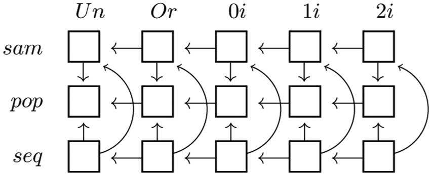
Matrix of graphic scales and data aggregation methods.
The matrix of graphic measurement scales and data aggregation methods produces a total of 15 combinations in which each variable in a dataset can be placed. Below we demonstrate different combinations for one, two, and three variables, with graphics that suit the number and characteristics of these variables.
One-variable combinations
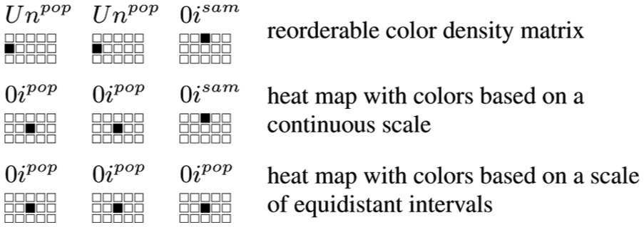
As previously stated, examples of graphics that represent one single variable can be placed in each of the 15 combinations. A list of tasks to be performed or of winning lottery numbers, for example, can be classified as a set of values for a sample type unordered qualitative variable
The different observations of an unbounded scalar
The reorderable matrix conceived by Bertin
20
is a possible representation of, for example, a column of responses to closed-ended questions in which the choices are a reduced number of unordered categories
A data column can also fix the sequence in which values were acquired, and in the case of unordered attributes like
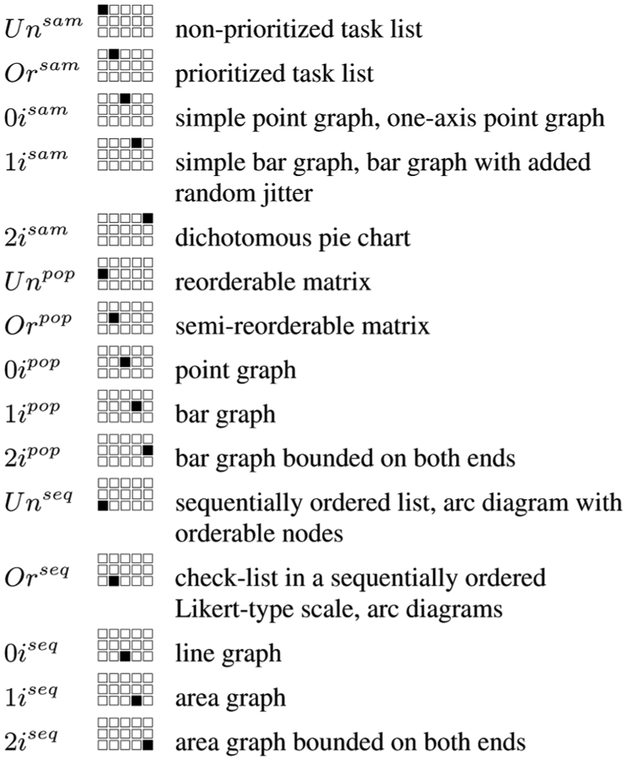
Examples of graphics suitable for one-variable combinations.
Two-variable combinations
With two variables, the number of combinations increases to 120; in this section, therefore, we will only look at some possible graphics for a reduced number of combinations.
If we have two variables of type
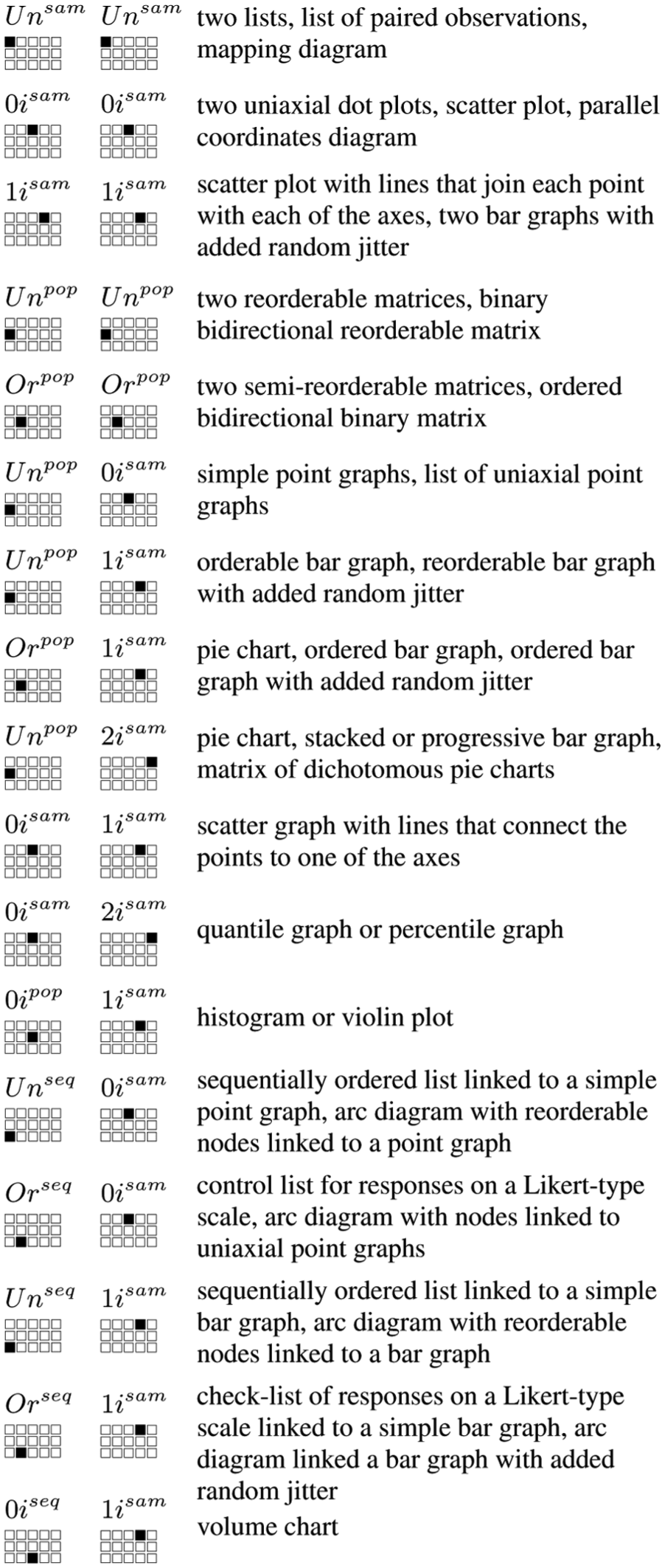
Examples of graphics suitable for two-variable combinations.
Combinations of type
For combinations of type
Combinations that include one sequential variable, such as
Three-variable combinations
Graphics that represent three or more variables usually use not just spatial variables, but also other retinal variables that make it possible to distinguish between a more limited range of values. The use of one retinal variable or another produces a great variety of possible graphics per dataset. With three variables, the number of combinations increases to 680; in this section, therefore, we will identify possible graphics for a reduced number of combinations.
Combinations of type
Examples of graphics suitable for three-variable combinations.
Improving graphic selection with cyclicality
The third data characterization dimension is cyclicality. As previously stated, this dimension is applicable to ordered qualitative variables and quantitative variables, but not to unordered qualitative variables. Cyclicality helps narrow the gamut of possible graphics because cyclic variables can be more effectively represented in graphics with polar, cylindrical, or spherical coordinate axes. Below we will show different combinations that include this dimension and suggest graphics that could be used with them.
Combinations of a variable type
Combinations of two variables of type
Finally, for combinations of three variables of type
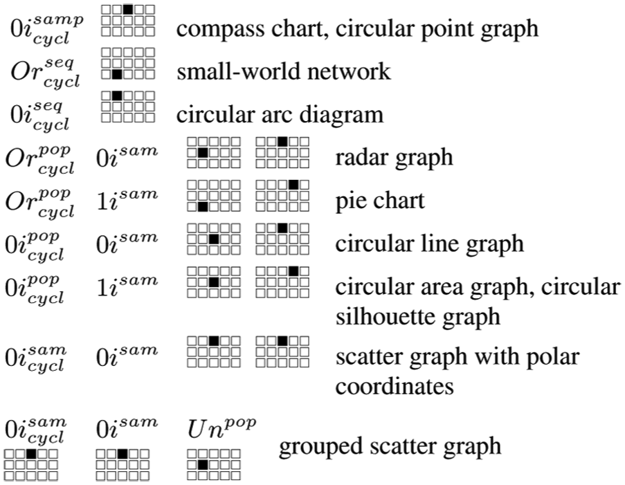
Examples of graphics suitable for use with cyclic variables.
Improving graphic selection with explicitness
The fourth data characterization dimension is explicitness. This dimension can be attached at any level of the previously mentioned dimensions and facilitates graphic selection because, as with the previous dimensions, it limits the gamut of graphic possibilities in accordance with the characterization of the variables as explicit or ambiguous.
A classic example of a variable that tends to be represented as ambiguous is the order of respondents in an opinion survey, for instance. Usually, the order is irrelevant; what is relevant is that the respondent be unique, that the information be structured based on multiple responses from each respondent, and that the sample consists of a concrete number of respondents.
Graphics that contain ambiguous variables display information about these variables, but not their scale. For example, to see whether men’s and women’s ages are equally distributed in a population, a population pyramid is often employed, but it is not necessary to know which side represents the male and female populations to discern if there is symmetry or not. In this case, the characterization of the “gender” variable as ambiguous would result in a population pyramid that would not display the values of the scale for this variable.
Here is another example of how explicitness in the characterization of variables can suggest a more precise graphical representation. Previously, we indicated that two variables of type

Examples of graphics suitable for three-variable combinations that include ambiguous variables or having a specific length.
Improving graphic selection with variable length
For various reasons, the length of a variable is a crucial factor when defining the gamut of possible graphics. This is because, first off, there are specific graphical representations for certain variable lengths. For example, an analogical clock with a single hand that represents a variable of type
Examples of graphic types presented to the user based on a small dataset
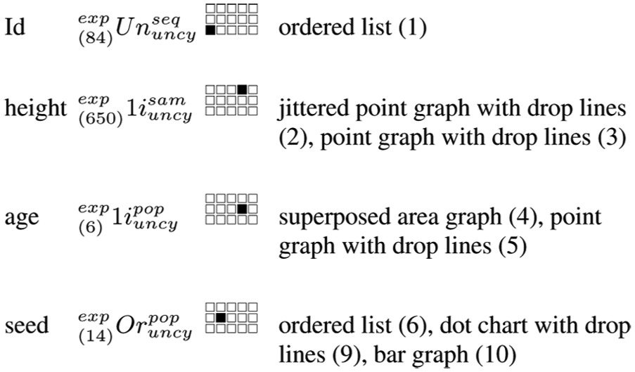
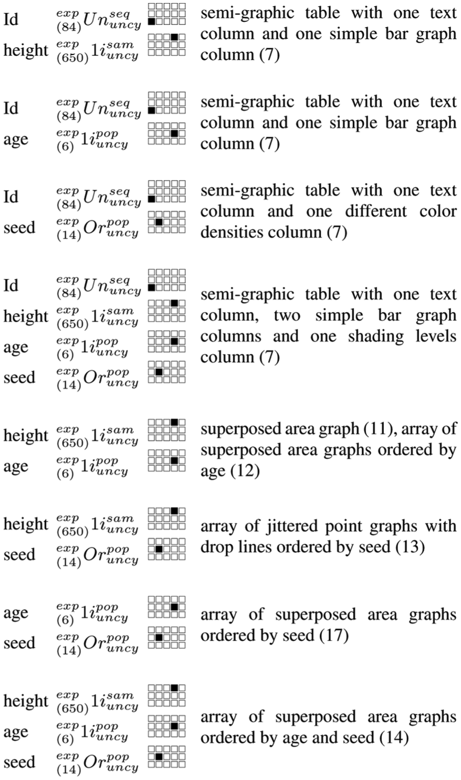
Having described the characterization of graphics based on the multidimensional characterization of data, we now present the results that an automated statistical graphics system might suggest based on this framework. For this purpose, we used the Loblolly dataset, limited to four variables, that relates the growth of loblolly pine trees in 84 plantations. For each plantation, the dataset includes the average “height” of the trees measured in feet, the “age” of the plantation in years, and the source “seed” for the trees. Despite this dataset’s limited number of variables, the results would also be valid for combinations of variables with the same characteristics in other datasets.
Characterization of variables
The plantation “Id” variable is composed of unordered categories. The aggregation mode of the data, assuming that all the values of interest are present, can be characterized as population type, but given that the order in which these numeric codes appear is not strictly ascending, it is preferable to characterize the variable as sequential type in order to not lose information that could be of interest. In terms of the other dimensions, this variable is characterized as noncyclic and explicit (because its values are to be presented graphically), and its length is 84.
The variable “height” is composed of scalars bounded on one end of sample type (given that this variable’s 84 values represent a small sample of the potentially observable values). Its domain is noncyclic, the scale is explicit, and its length is nearly 650 if we consider that a tenth of a foot is sufficiently precise for the graphic’s decodification.
The variable “age” is also composed of scalars bounded on one end. The number of unique values is six, each with a frequency of 14, such that this variable is characterized as population type, noncyclic, explicit, and with a length of 6.
The variable “seed” is composed of 14 qualitative categories ordered according to the results obtained in the variable “height.” It is a variable of population type, the domain is noncyclic, the scale is explicit, and the length is 14 (the number of categories).
In order to organize the possible graphics based on the selected variables and their possible recodifications, we first describe the graphics that can represent each variable separately. Then we combine two or more variables characterized a priori. Finally, we identify other possible graphical representations from a selection of specific variables on which a recodification is applied to a level of at least one of the variables. The resulting graphics, together with the combination of selected variables, are listed in Figures 9–11 and the number that follows the names of each graphic in these figures refers to the number of the figure in the supplementary materials.
One-variable combinations.
Combinations with more than one variable.

Combinations with one or more recodified variable.
Combinations
One-variable combinations
If we select the “Id” variable separately, given that the variable length is 84, one possible representation is a list of these codes ordered by their position in the dataset. The list could be presented as an array of values ordered by rows and columns, a single row or column with a scroll bar, or several ordered panels that the user can click through. If we select the “height” variable, the data could be presented on a jittered point graph with drop lines or a point graph with drop lines (see Figure 12). If we select the “age” variable, the data could be presented on a superposed area graph with rectangles that have one dimension proportional to age and the other to the frequency count of the values or a point graph with drop lines similar to the one in Figure 12. Finally, if we only select the “seed” variable, the data can again be presented in an ordered list, a dot chart with drop lines or a bar graph with the length of each line or bar proportional to the frequency count, and ordered according to the order assigned to this qualitative variable.
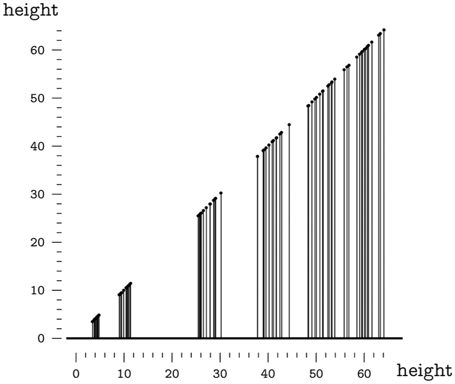
Point graph with drop lines.
Combinations with more than one variable
Any combination of the “Id” variable with the others can be represented via a semi-graphic table. If we combine the variable “Id” with “height” or with “age,” we can present an ordered list in which the column that corresponds to “height” or “age” can be represented via a simple bar graph with bars proportional to “height” or “age.” Given the length of the “Id” variable, the same aforementioned techniques can be used to display the list. If we include the “seed” variable, each row can include a mark filled with different color densities in a sequential increase in accordance with the “seed” variable’s 14 ordered values. If the four variables are selected, the table can include all of the aforementioned columns.
The combination “height” and “age” can be represented via a superposed area graph with rectangles that have dimensions that are proportional to these two variables (see Figure 13). Given that the “age” variable is described as a population type, the rectangles can be grouped by age and then represented in an array of superimposed area graphs. The combination “height” and “seed” can be represented with an array of jittered point graphs with drop lines ordered by seed type. The combination “age” and “seed” can be represented by an array of superposed area graphs also ordered by seed. If the variables “height,”“age,” and “seed” are selected, these can be represented by an array of superposed area graphs ordered by seed type.
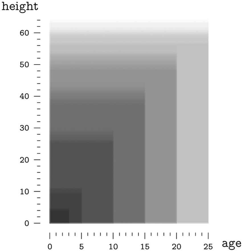
Superposed area graph.
Combinations with recodified variables
One possible recodification is to consider “height” as an unbounded scalar variable. This makes sense if we are interested more in the relationship between the observed values than in their relationship with the origin or zero. If in this case only this variable is selected, it could be translated in an uniaxial point graph that can use various techniques to avoid point collisions, or a stripe graph. If selected together with the “Id” variable, the semi-graphic table column that corresponds to the variable “height” would display a simple point graph instead of a simple bar graph. A possible representation of the “height” variable combined with the “age” variable is a graph that plots age on its x-axis and height on its y-axis and connects the points to the y-axis with lines (see Figure 14). Finally, the combination of the “height” and “seed” variables would now produce a series of point graphs or stripe graphs ordered by seed type according to the order assigned for this variable.

Point graph with drop lines.
If, in addition to the aforementioned recodification, we also regard the “age” variable as an unbounded scalar variable, the selection of the “height” and “age” variables would result in a scatter graph that would not necessarily include zero on either of its axes. If we then recodify “height” as a population type variable and select only this variable, we would end up with a violin plot, a box plot, or a histogram. If we combine it with “age,” we would end up with a succession of any of the aforementioned diagrams ordered by age group.
Recodifying any of the variables as ambiguous would result in the scale for that variable being omitted in the graphic. This includes the superposition of panels instead of its juxtaposition, the exclusion of scale tags in the axes in the case of spatial variables, as well as the exclusion of the legend in the case of retinal variables. For example, the combination of the variables “height” and “age” recoded as unbounded scalars, in addition with the variable “seed” recoded as ambiguous, would produce a spaghetti plot (see Figure 15) instead of the aforementioned array of line graphs ordered by seed type.

Spaghetti plot.
Discussion
In this section, we will compare our variable characterization proposal with the other solutions we reviewed and show how our new approach generates different and somewhat more accurate results. It should be noted that the systems we are comparing our framework to are in some way pioneering systems with limitations in terms of the set of graphics presented to users. The CHART system, for instance, only displays bar graph matrices that can have varying shading and circular graphic matrices of varying sizes. The BHARAT system only presents pie charts, bar graphs, and line graphs, as well as combinations of these. The APT, SAGE, BOZ, and EAVE systems display diagrams and networks, but only with two spatial dimensions. The NSP and Vista systems also include three-dimensional graphics, while the Polaris and Tableau systems include maps. Yet the catalog of graphic types in these four systems is also limited. Finally, the ViSta system emphasizes dynamic interaction with dynamically linked graphics, but the number of graphic types it offers is also limited.
Previously, we described the different strategies that make it possible to refine the selection of graphics based on the characteristics of the data, the user, the hardware, and the representation models. The characterization of the data presented follows the functional strategy based on the characteristics of the data. This allows graphical representations to be characterized based on the characterization of the data in order to present the user with a gamut of possible graphics for a given dataset. The double characterization of data and graphics has been implemented by systems like SAGE with SageBook and Tableau with Show ME.
Mackinlay 7 considered this approach to be overly simplified because there was no guarantee that an appropriate design existed for such a great variety of situations. Therefore, it was necessary to consider the full list of ad hoc solutions, even though only a few alternatives might be acceptable. From our point of view, the argument that there is no guarantee of finding an appropriate method for a great variety of combinations serves, first, as a challenge to find these combinations and, second, as an opportunity for the creators of visualizations to propose appropriate graphical methods for these combinations. With respect to the need to consider the full list of ad hoc solutions, we believe that it is necessary to classify the greatest number of graphical methods precisely in order to discard those alternatives that are not acceptable.
The presentation of graphics without previously determining the task to be performed results in graphics that are suitable to a certain task with varying degrees of effectiveness. Systems like APT, Vista, and EAVE do not inquire as to the task, and provide only one, supposedly optimal graphical representation. Conversely, the strategy we propose presents the user with several graphic possibilities for a dataset, as does the ViSta system, 6 which also includes other considerations for suggesting graphics, such as the theoretical distribution, which it compares with the empirical, and the type of statistical analysis selected. In terms of the strategy presented, it has a drawback, though, in that it offers a limited gamut of graphics, selected ad hoc, for the user to choose from. In order to improve the automatic selection of graphics in accordance with the strategy presented, it would be beneficial to undertake cognitive studies that classify sets of possible graphics for each combination of variables based on the ease with which they make it possible to execute a series of perceptual tasks.
The characterization of the data presented derives from the work of Jaques Bertin, who, however, did not consider the different measurement scales for the quantitative variables; consequently, his characterization of data groups together, in one single combination, graphics as diverse as bar charts, pie charts, and stacked bar charts. Additionally, in the level of ordered variables, Bertin also mixes in qualitative variables that maintain a greater-to-lesser relationship as well as sequential variables, which results in a single combination with graphics as diverse as a Gantt chart and a semi-reorderable matrix.
With the CHART system, it is only possible to graph quantitative variables. Because of this and the fact that it was a pioneering statistical graphics automating system, its gamut of graphics is very limited. Other systems, like APT, NSP, BOZ, Vista, EAVE, Polaris, Tableau and VizRec, consider between two and six levels in a single dimension. The possible combinations with as many as three variables with two levels are nine. With three levels, it increases to 19, with four to 34, with five to 55, and with six to 83. The SAGE system uses a bi-dimensional characterization, but the second dimension, the domain of membership, is unconvincing given that it does not consider other fundamental physical magnitudes, such as the intensity of an electrical current or of a light source, nor magnitudes derived from fundamental physical magnitudes. The BHARAT system has up to five dimensions; the first two are dichotomous, but the system does not establish predetermined dimensions for the others and it appears the algorithm is forced to use ad hoc limits when evaluating each possible graphic, which makes it impossible to know the number of combinations this characterization enables. The characterization presented, considering only the first two dimensions, enables a total of 815 combinations of up to three variables, and therefore, the gamut of possible graphics is necessarily reduced.
Limitations
Although this framework for classifying and automatically presenting graphics is valid for graphics that represent a great number of variables, this study is limited to graphic representations of a maximum of three variables. This is because, as the number of variables selected from a dataset increases, it results in an exponential increase in the number of possible combinations and the gamut of possible graphics for each combination. This is so because each variable in a dataset can be represented in various forms (as points, lines, or areas), with various visual variables, and various coordinate systems. Additionally, a juxtaposition or superposition of panels can be used. The study also does not consider variables comprised of vector and tensor type values.
Conclusion and future research
We have presented a multidimensional characterization for individual variables that can serve as a framework for the classification of statistical graphics and make it possible to notably reduce the gamut of graphic possibilities for a given dataset. The proposed method can be used to automate the presentation of statistical graphics based on the characteristics of the data and also to find new combinations that do not presently have graphical methods associated with them, thus creating new opportunities to design novel visualizations.
The next step in this line of work would be to create a database of graphics that are characterized according to the typology of the data source that each graphic is compatible with. This database can be built from the graphics mentioned, for instance, in the scientific literature. For each combination of variables, we can create a tree of compatible graphics that also considers the possible recodifications between levels for each variable. A second complementary task would be the creation and distribution of an
Footnotes
Acknowledgements
The authors recognize the kindness, generosity, and valuable feedback of Michael Friendly.
Conflict of interest
The author(s) declared no potential conflicts of interest with respect to the research, authorship, and/or publication of this article.
Funding
The author(s) received no financial support for the research, authorship, and/or publication of this article.
References
Supplementary Material
Please find the following supplemental material available below.
For Open Access articles published under a Creative Commons License, all supplemental material carries the same license as the article it is associated with.
For non-Open Access articles published, all supplemental material carries a non-exclusive license, and permission requests for re-use of supplemental material or any part of supplemental material shall be sent directly to the copyright owner as specified in the copyright notice associated with the article.