
Abstract
The use of interactive applications to support the decision-making process is more common every day. However, a huge amount of data is required in order to make more informed decisions. Fortunately, with the arrival of new technologies there are many data sources available. This requirement of data causes heterogeneity and data quality problems. A set of data quality problems are reduced in the preprocessing stage. However, many data quality issues persist after the preprocessing stage. For this reason, we proposed a methodology to take the data quality problems, to represent them and simultaneously support the analysis process. In addition, an application is developed as a use case of the methodology by analyzing the public transport system in Bogotá. Furthermore, a case study is performed to test the usefulness of the developed application. As a result, the methodology made possible the development of interactive visualizations that constitute an application that is useful to achieve the analysis tasks by including data quality features.
Introduction
The use of interactive applications to support the decision-making process is more common every day. Many use cases can be found in different areas: banks, logistics enterprises, technology-based companies, governmental institutions, among others. Further, this kind of interactive applications are in operational and strategic levels. 1
The interactive applications to support the decision-making process require huge amounts of data in order to provide relevant information to the users. This requirement of data involves many data sources generating heterogeneity and data quality problems. As a result, every year many companies and countries lost millions of money as consequence of bad data quality. 2
The analysis of urban systems is more complex due to the data quality problems. 3 One frequent problem is the availability of data. To deal with availability problem, a set of models can be proposed; however, these models can be inappropriate. 4 As a result, for the analysis of urban systems and to support more informed decisions, new ways to represent and visualize the data including data quality issues are required.
Currently, there is no broadly accepted definition of uncertainty. In computer science, uncertainty is described using metrics of quality called data quality dimensions (DQDs). DQD represent the uncertainty in a detailed way. In the section “Data quality,” a proper definition and discussion are included.
The problems of data quality can be treated in many ways; however, many of them persist after the preprocessing stage. 5 Our approach considers the persistent data quality issues after the pre-processing stage, in order to model and communicate them to the users. As a result, a set of interactive visualizations will support the decision-making process while including data quality issues. This support will help the users to take more informed decisions.
Considering these facts, we propose a methodology to enrich interactive visualizations with data quality features to support decision-making processes.
Our contributions are as follows:
The proposal of a new methodology to enrich interactive visualization with data quality features;
A process to select DQDs in urban planning context;
A use case in the urban planning context.
A case study that evaluates the usefulness and effectiveness of the generated interactive visualizations.
This article is structured as follows: first, the related work is presented, then the data quality is defined in “Data quality” section. Our proposal is described in “VafusQ” section. The use case and case of study are presented in “Use case” section. Finally, the conclusions are presented in the “Conclusion” section.
Related work
We review previous works, which are most related to ours in two categories. First, we review related proposals from information visualization and uncertainty visualization. These proposals are described in the subsection “Information and uncertainty visualization.” Second, we review related applications for data quality visualization. They are described in subsection “Applications.”
Information and uncertainty visualization
This section includes the works of Card et al., 6 Griethe and Schumann, 7 Pang, 8 and MacEachren et al. 9 as the most relevant works related to our methodology.
Card et al. 6 introduced the visualization pipeline, which describes a process to create a visual representation of data. The pipeline consists of three sequential steps, where the input is raw data and the output is a set of views representing the data. All the steps can be influenced through interaction by the user. The three steps are data transformations, visual mappings, and view transformations. The data and its quality can be represented using the visualization pipeline; however, when data quality is taken as an additional attribute, a conflict with other attributes is possible causing misunderstanding and increasing the cognitive load. Accordingly, we propose an extension of the visualization pipeline, and further details are included in subsection “Interactive visualization design.”
Griethe and Schumann 7 present a general view on uncertainty with respect to an accepted information model. They justify and explain the importance of uncertainty for decisions. They analyze the available methods for visualizations and recommend methods. Further, new ideas are derived for an improved visual decision support. One of the most important contributions is the discussion about how to visualize uncertainty: utilization of free graphical variables (GVs), integration of additional graphical objects, use of animation, interactive representation, or addressing other human senses.
Pang 8 focuses on how computer graphics and visualization can help users analyzing high volumes of geospatial data. A review of uncertainty definitions and modeling is presented as well as the challenges of visualization. The most relevant challenges are mapping uncertainty to graphical attributes and using animation to convey uncertainty. Furthermore, two case studies are presented, one to visualize the uncertainty of an ocean modeling application and the other to analyze earth observing system (EOS) data for histogram visualization.
MacEachren et al. 9 present a detailed review of uncertainty encoding including the works of MacEachren et al. 10 and Griethe and Schumann 11 as reference. They propose an empirical approach in order to define which visual features are accepted to encode uncertainty. First, a conceptualization of uncertainty is performed. Two experiments were designed for two different groups of users. The first experiment aimed at assessing intuitiveness with a large group of participants who have basic knowledge of visualization (students, most of them). This experiment established which features are right, acceptable, or unacceptable to map uncertainty. The results were that fuzziness, location, and value are adequate to map uncertainty; arrangement, size, and transparency are acceptable; and saturation, hue, orientation, and shape are unacceptable. The second experiment was a symbol test in map displays. This experiment was performed with experts in geovisualization and it aimed at defining the scale to represent the data quality. The results were that most of the participants considered that a scale with three categories is enough, while some of the participants considered that five categories are good. This empirical approach validates most of the theoretical foundations for uncertainty visualization.
Applications
The applications category includes examples and use cases of visualizations with data quality features. Therefore, there are applications with focus on the data representation with data quality features (known as integrated approach) and applications with focus exclusively to data quality visualizations (called specialized approach). The works of Kandel et al., 12 Batnagar, 13 and Höllt et al. 14 follow the integrated approach, the others follow the specialized approach.
Profiler: integrated statistical analysis and visualization for data quality assessment
Profiler is a visual analysis tool for assessing quality issues in tabular data. 12 The main features of Profiler are extensible system architecture, automatic view suggestion, and scalable summary visualizations. This work presents the DQDs as anomalies: missing data, erroneous data, inconsistent data, extreme values, and key violations. Each of these anomalies has an associated DQD. Missing data are related to completeness, erroneous data and extreme values to accuracy, and inconsistent data and key violations to consistency.
Visualizing financial information quality using heat maps and semantic data quality rating system
Batnagar 13 presents an automatic generation of heat maps using business rules based on information quality ratings to each information element in order to display outliers. The proposed methodology includes several stages of analysis in order to generate the business rules to establish the criteria. After the business rules generation, a quality rating set-up is done. Finally, a data quality heat map visualization is generated. This methodology was implemented using XBRL (eXtensible Business Reporting Language) and Microsoft Excel. This work presents some interesting visualizations that might be extended to visualize the DQDs; the heat maps and the automatic generation are a potential contribution to the proposed method.
Visual analysis of uncertainties in ocean forecasts for planning and operation of off-shore structures
Höllt et al. 14 present an application for exploration of ocean forecast representing the risk of the off-shore structures and its respective uncertainty. The uncertainty is visualized using histograms while representing the sea level. The risk is color-coded using red, yellow, and green color meaning high, medium, and low risk. The application provides a 3D view to visualize the geographical situation while a 2D view complements the analysis. The data to analyze are provided by a set of simulations that include the uncertainty.
Quality maps
Xie et al. 15 introduced quality maps, a visualization technique that represents the data quality for a data set. This technique takes each attribute of the data set and represents its quality using stripes. Every data quality is color-coded using the color value (brightness). In addition, there are summary stripes for each attribute and for every record. Further, a histogram quality map is presented. The interaction is guided by the quality issues. Quality brushing with N-dimensional brushes is proposed in this article. The quality maps represent various DQDs simultaneously. However, all DQDs have to be on a continuous, normalized scale from 0 to 1. Data for urban planning support includes binary and continuous unbounded scales, besides a continuous normalized one.
Visual data quality analysis for taxi GPS data
Wang et al. 16 present a novel visualization method to find data quality problems in raw taxi GPS data. The method consists of five steps: feature calculation, distribution visualization, interactive filtering, detail visualization, and known quality problem detection and separation. (1) Feature calculation: 19 features are defined, a subset of them are the number of sampling points, the total travel distance, the sum of turning angles, and the min, max, recsum, and logsum of the turning angle, the segment distance, the segment time interval, and the segment average speed. Problems with these features mean data quality problems, for example, a low number of sampling points causing missing data. (2) Distribution visualization: The anomalies considered are outliers in the trajectories. As a result, views for temporal and spatial distribution are provided. (3) Interactive filtering: The user can filter or cluster the trajectories manually. (4) Detail visualization: This view consists of a map with the detailed trajectories and a timeline showing the trajectories through time. (5) Known quality problem interface: By using an SVM classifier assisted by the user, the system can classify the trajectories according to their data quality values.
Data quality
The uncertainty has been studied over the last 20 years. Many theoretical approaches have been proposed by MacEachren et al., 10 Pang, 8 and Griethe and Schumann. 11 Moreover, several applications have been implemented by researchers like Cui et al., 17 Collins et al., 18 Xie et al., 15 Olston and Mackinlay, 19 and Potter et al., 20 including empirical approaches proposed by MacEachren et al. 9 However, there is no broadly accepted definition of uncertainty.8,21
In computer science, uncertainty is described using metrics of quality called DQDs proposed by Batini and Scannapieco. 22 It is important to take into account that uncertainty and DQDs are not the same. However, they are closely related because the DQDs represent the uncertainty in a detailed way.10,23
In this article, DQD are used. Based on the definitions of Eppler 24 and Batini and Scannapieco, 22 we define a DQD as a measurement or a perception of the degree of the data’s fitness in a particular context. The DQD considered are availability, accuracy, consistency, believability, volatility, currency, and timeliness. The first four were chosen by their importance in the literature. The last three are time-oriented DQDs. The definitions and methods to estimate each DQD are based on Batini and Scannapieco 22 and Triana et al. 25
Selection of DQD
The process described in this section selects a set of DQDs to be included into the data model for each case study. The data model for each case study structures all the required data to be analyzed including the DQD. The selection of the DQDs depends on the data types (

DQD-DT
The data types frequently used in urban planing are spatial, temporal, and scalars.
DQD for spatial data
For spatial data, the suitable DQDs are accuracy, consistency, and completeness. For accuracy, the syntactic accuracy for static and dynamic data can be estimated.
For static data, syntactic accuracy may be estimated: (1) by using a domain to define a geographical position where the phenomenon occurs, or (2) by getting the accuracy value from the capture device. For the dynamic data, all the valid options for the static data may be used; moreover, a domain might be related to the dynamics of the data, for example, the velocity of a car.
To estimate consistency, a set of semantic rules defined by the experts may be used. Finally, for completeness, it is possible to identify values of reference or rules by using the open world assumption (OWA, according to Batini et al. 5 ). For example, to estimate the completeness of a data set, it is useful to know that there are 20 localities in Bogotá.
DQD for temporal data
For temporal data, it is possible to have data with a single time stamp or with multiple time stamps. This situation will determine if the data are periodical or not. For single time stamp or non periodical data, the related DQD is currency. On the other hand, for periodic data, the suitable DQDs are currency and timeliness.
DQD for scalar data
For scalar data, the suitable DQDs are accuracy, consistency, completeness, and believability. The accuracy estimation is possible using three options:
By taking the accuracy value from the data source;
By defining a domain that represents the phenomenon to analyze;
By using a subjective value estimate by an expert.
For consistency, semantic rules defined by experts can be used. The completeness can be estimated using the OWA, when there are reference values or using the closed world assumption (CWA).
The believability can be estimated using
The believability of the data source;
By estimating the value using an objective method based on accuracy, completeness, and consistency;
By using a subjective estimation.
Table 1 summarizes the DQDs according to their data types.
Selection of DQD according to the data types.
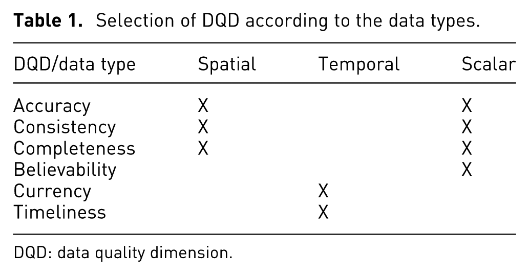
DQD: data quality dimension.
DQD-AT
The DQD selection depending on the analysis task type takes the types of analysis tasks proposed by López 26 as reference: observation, evaluation, alternatives generation, and alternatives assessment. According to López, 26 an impact variable, IV, is a measurement to monitor an urban system; a decision variable (DV) is an indicator that the analyst can control in order to modify the IVs of an urban system. In order to establish which DQDs are suitable for each type of analysis task, a set of questions is defined and their related DQDs are identified.
DQD for observation
The observation task consists of closely observing the system and its state variables over a period of time. The associated questions and DQDs are shown in Table 2.
DQD for evaluation
Selection of DQDs for the observation task.
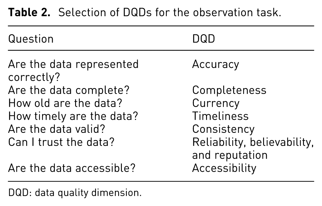
DQD: data quality dimension.
The evaluation task is an assessment of the system state. This task has a set of IVs associated to represent the assessment. The evaluation is performed after the observation task. The suitable DQDs for an evaluation task are presented in Table 3.
DQD for alternatives generation
Selection of DQDs for the evaluation task.
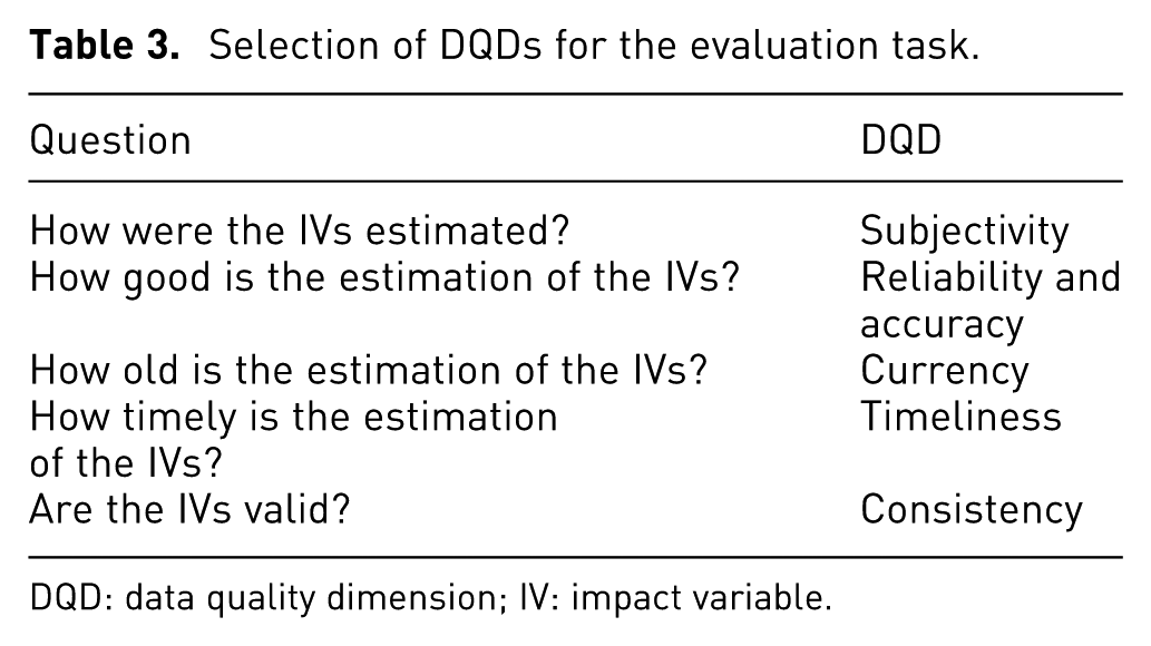
DQD: data quality dimension; IV: impact variable.
The alternatives generation task is the change in the DVs to modify the IVs. The valid DQDs for this type of analysis task are shown in Table 4.
DQD for alternatives assessment
Selection of DQDs for the alternatives generation task.
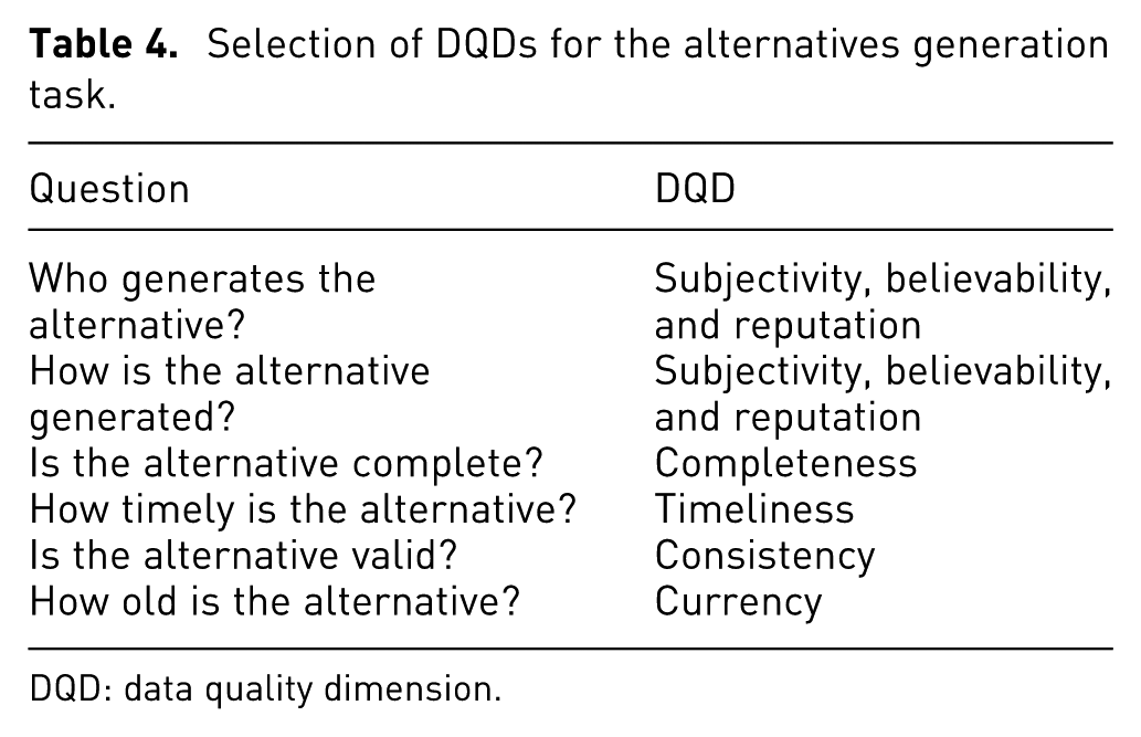
DQD: data quality dimension.
The alternatives assessment task is the selection between two or more alternatives using a subjective rule. The suitable DQDs for the alternative assessment task are summarized in Table 5.
Selection of DQDs for the alternatives assessment task.
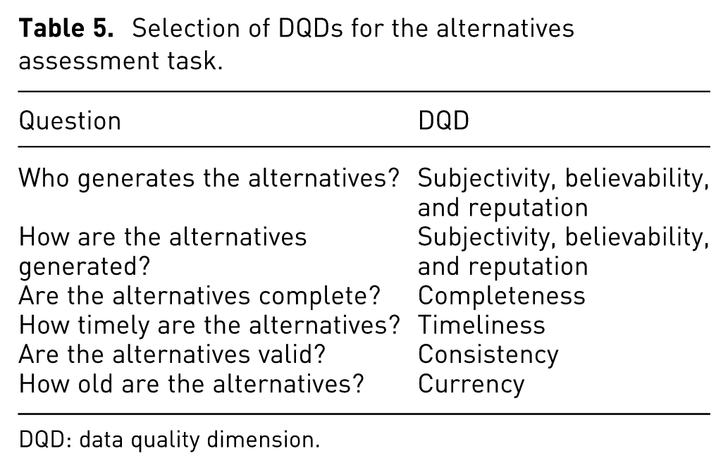
DQD: data quality dimension.
DQD-ST
This process considers two roles: experts in urban planning, and experts in data quality or data managers. This definition of two roles is inspired by the urban planing process workflow, where frequently urban planning experts work with data managers who process all the data and produce the visualizations for the analysis. The selection process presented here focuses on data managers.
The particular subtasks depend on the respective case study. As an example, a set of suitable subtasks is
How complete is the data set?
How believable is the data set?
How updated is the data set?
VafusQ: a methodology to generate visual analysis applications with data quality features to support urban planning
The use of visual analytics enables analyzing complex data; 27 the complexity can be due to the volume, the connections, the sources, or the type of data. The analysis of urban systems requires complex data, and it involves several stakeholders. As a consequence, tools based on visual analytics to support this analysis are required. Currently, a set of tools exists;26,28,29 however, none of them takes data quality (DQ) into account.
Moreover, a set of processes considers data quality,15,30–32 but only in a descriptive way and DQ is not included while performing the analysis or the decision-making process.
Consequently, VafusQ is proposed. VafusQ is a methodology to generate visual analysis applications with data quality features to support urban planning in fast-changing urban systems. The VafusQ methodology is presented in Figure 1.
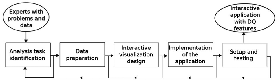
VafusQ workflow to generate visual analytics applications with data quality features.
The inputs are the problems and the data of the experts. The methodology is composed of five steps: analysis task identification, data preparation, interactive visualization design, implementation of the application, and set-up and testing. These are described in detail in the subsequent sections. The result of this process is an interactive application with DQ features that supports experts solving their problems.
Analysis task identification
The analysis task identification is based on the works of Fernández-Prieto et al. 29 and López. 26 In addition, the process was extended to include the data quality features. This stage is divided into three steps: identification of stakeholder profiles, determination of the context of the interactive visualizations, and documentation of the analysis task. This stage is performed using a survey and a set of interviews with the experts.
The identification of stakeholder profiles aims at establishing the domain (e.g. land use, traffic, or environmental), their experience, and the planning scenarios they have worked on. The determination of the context of the interactive visualization describes the requirements of a planning session and the potential sources of data. This may be achieved by interviewing experts or by observing a planning session. The documentation of the analysis task describes it using a suggested form with six features: description, type, visual operations, interactive operations, associated data, and subtasks.
Description summarizes the analysis task, including goal and justification.
Type classifies the analysis task according to the categories proposed by Ibarra et al.: 33 observation, evaluation, alternatives generation, and alternatives comparison.
Visual operations categorizes the analysis task as defined by Ogao and Kraak: 34 identify, locate, associate, and compare.
Interactive operations classifies the analysis task using six operations. According to Yi et al., 35 the interactive operations are select, explore, reconfigure, encode, filter, and connect.
Associated data describes all the required data to perform the analysis task. In addition, the DQDs are identified if the experts have experience with data quality assessment.
Subtasks divides the analysis task into a sequence of activities to perform the analysis task. Additional subtasks are suggested to the experts in order to consider the data quality during their analysis (e.g. is the data updated or how good/bad is the data source).
Data preparation
The data preparation stage aims at preprocessing the required data for an application to support one or more analysis tasks. This stage consists of three steps: data model design, data model loading, and data quality assessment.
The data model design identifies the elements involved and their dependencies. The data model structures all the required data to be analyzed including the data quality dimensions. The data models can be structured, semistructured, or unstructured. Then, a data model is defined and extended using the process described in following section. Finally, the DQDs are selected depending on the data types and the analysis tasks and they are included in the extended data model. When an application is built for supporting several analysis tasks (named case study), this step will be executed once in order to construct a unique extended data model and to provide the same data quality dimensions.
Extension of data model
The extension of the data quality model is inspired by the proposal of Batini and Scannapieco. 22 The process to extend a data model in order to include data quality dimensions is described below. As a result, an integral data model is generated (data and data quality included). A data model is required for each case study.
The prerequisites of the extension are as follows:
A data model must be defined for a given case study;
All the entities for the data model are clearly described;
All links between the entities are identified.
The process to extend the model is presented in Figure 2. The process consists of three steps: DQ item generation, DQ item relation, and DQ item estimation.
DQ item generation

Process to extend a data model with DQ features.
A DQ item is a set of DQDs suitable for an element of a data set. Every attribute of the data model should have a related DQ item. To build the DQ item, the selection of DQDs (presented in “Selection of DQD” section) must be performed in order to know which DQDs are suitable for the case study. Then, after selecting the DQDs, every attribute of the data model is reviewed in order to define the valid DQDs.
DQ item relation
The DQ item relation step aims at defining the dependencies between different DQ items. The entities in the data model have a set of attributes with several associated DQ items. Moreover, the DQ item could have different DQDs depending on the attribute. Consequently, in order to get the DQ item for the entity, a set of integration functions must be defined (as shown in Figure 3).
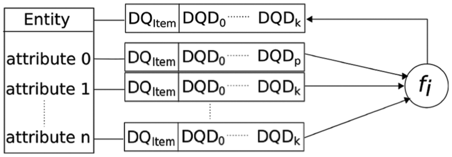
Process to estimate the DQ item for an entity of the data model.
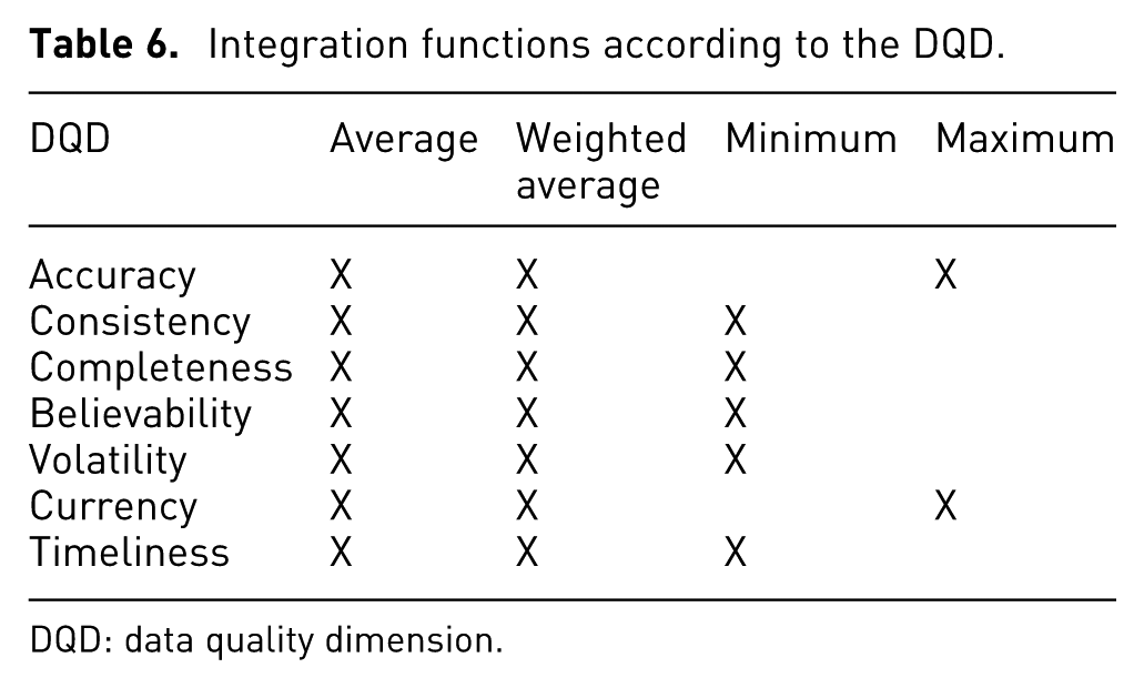
Integration functions: Each DQD should have a function combining the values for the different attributes associated with it. The function can be average, weighted average, minimum, or maximum.
Average: This function is suitable when the DQD values have the same scale or are in the same range and they have the same importance, for example, normalized values zero to one (
Weighted average: This function is suitable when DQD values have the same scale and when they are not equally important.
Minimum: This function is suitable for particular DQDs when the lower value must be selected, for example, timeliness or volatility.
Maximum: This function is suitable when the higher value must be used, for example, currency or accuracy.
The integration function is defined according to the DQD. Table 6 summarizes the possible integration functions for different DQD.
DQ item estimation
Integration functions according to the DQD.
DQD: data quality dimension.
The DQ item estimation step aims at defining the DQD estimation methods for all the DQ items, as well as the integration functions for the DQ items related to entities. As a result, a set of DQD estimation methods and integration functions are defined.
Finally, after the generation and estimation of every DQ item, they are added to each attribute and entity. As a consequence, the data model is extended and it includes the DQ.
The data model loading consists of loading the available data and generating new data in order to support the analysis task. The generation of new data is possible using integration and derivation methods, such as those proposed by Triana et al. 36
Finally, the data quality assessment selects the estimation methods for the DQDs chosen in the data model design step. The methods usually are objective; however, subjective metrics are possible when objective methods are not available. Then, the DQD estimation is performed and the result is loaded into the extended data model.
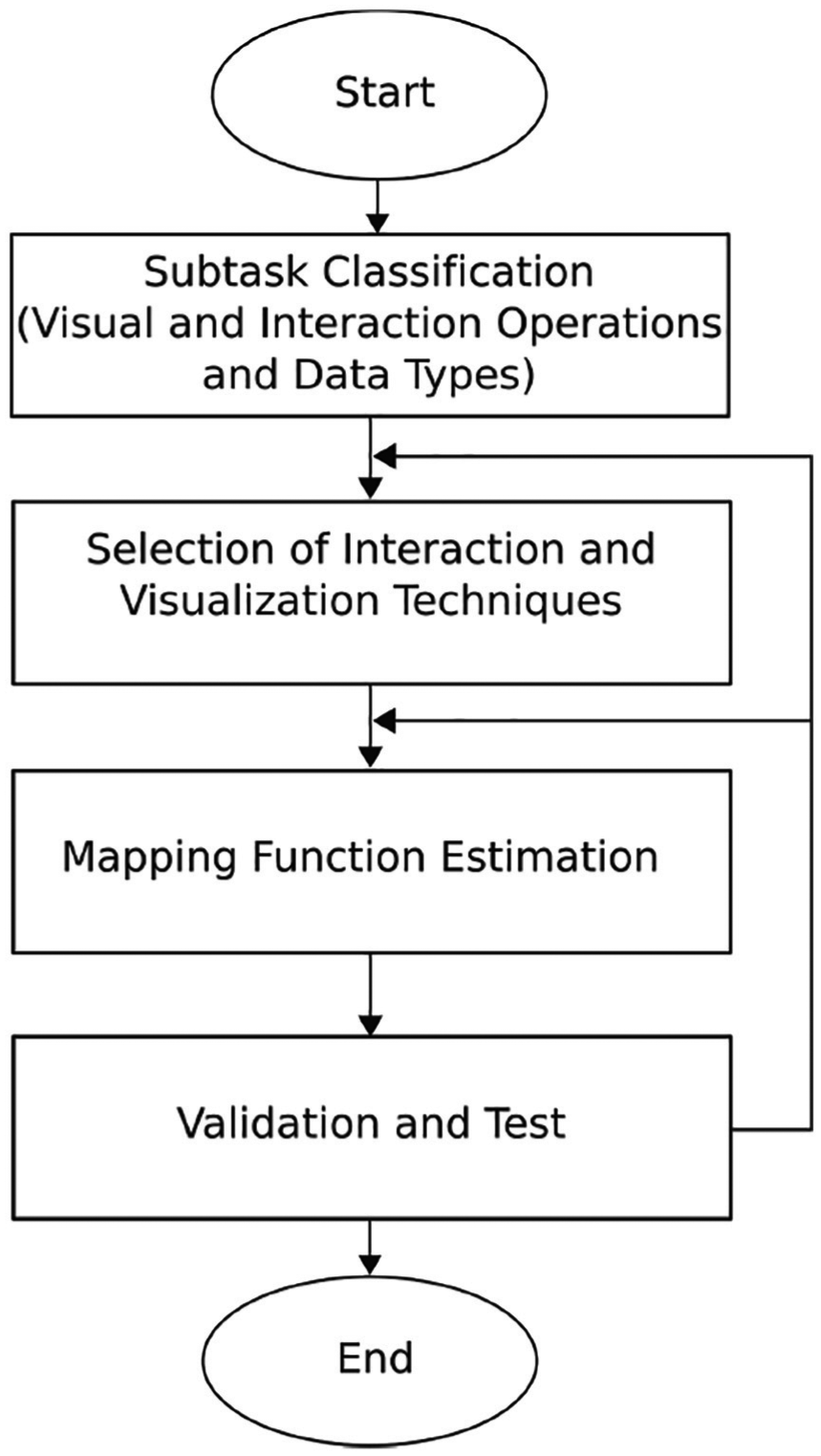
Interactive visualization design
The interactive visualization design stage is presented in Figure 4. The design starts classifying the subtask(s) according to their visual operations, interactive operations, and data types in order to identify which interaction and visualization techniques are suitable for the subtask(s). These visualization and interaction techniques will be called suitable techniques.
Interactive visualization design stage.
Then, the interaction and visualization techniques are selected according to the operations and data types from the previous step. The selection process can be based on the domain knowledge or the information visualization guidelines.
The selection from domain knowledge uses the most frequent visualization and interaction techniques in the domain area. For this research, the domain area is urban planning, and the most frequent techniques are presented in Table 7. The selection process consists of verifying if the technique is within the table.
Frequent visualization techniques for urban planning with their supported data types.

This selection process is convenient for the experts because they are trained to interpret these types of visualization; however, occasionally, the most frequent techniques are not suitable or recommended depending on the subtask(s). For this situation, the selection from guidelines should be applied.
The selection from guidelines takes design guidelines into account. The desirable situation in this process is that one technique supports several subtasks; however, using the same visualization technique for all subtasks may overload the visualization(s) or make it confusing.
On the other hand, the interaction techniques should be similar for all the visualizations in order to ease the interaction with the visualization. For this step, the visualization techniques should be selected first. Then, the interaction techniques are selected because there are visualization techniques that require specific interaction techniques. For example, using parallel coordinates suggests to use brushing and filtering.
After selecting the interaction and visualization techniques, the mapping function for each visualization technique is estimated. While estimating the mapping function, conflicts may occur. Because of this, all the mapping functions are estimated simultaneously using the process presented in Figure 6. As a result, all the mapping functions are coherent and conflicts are reduced.
For the mapping function process, three approaches are proposed: the integrated approach, the specialized approach, and the non-DQ approach. The integrated approach provides one complete view of the data including the DQ features. The specialized approach provides two linked views, one showing the data and one showing the DQ features. Finally, in the non-DQ approach only the data are shown. The integrated approach has priority over the others.
Finally, the visualizations are reviewed, and the support to each subtask is validated. All the GVs are checked, as for example colors, to avoid conflicts. Then, the interactive operations are verified, as for example selecting by clicking. If the validation or the test fails, then a new mapping function is estimated. If the failure persists, other visualization techniques are selected.
The mapping function process
Nowadays, there are approaches to represent uncertainty;7,14,18 and DQDs.16,30,32 These approaches present valid design criteria and interesting use cases; however, a systematic process to generate the visualizations while taking data quality features does not exist.
A systematic process to generate visualizations was proposed by Card et al. 6 and modified by Chi. 37 This remarkable process is known as visualization pipeline and is widely used and accepted by the visualization community. The visualization pipeline is a general process and applicable to most cases studies; nevertheless, using the pipeline to generate a visualization to support an analysis task while taking data quality into account is not easy.
The challenge here is to generate visualizations without overloading them and representing the data quality as an important feature and not as an additional attribute. When data quality is taken as an additional attribute, a conflict with other attributes is possible causing misunderstanding and increasing the cognitive load. Equally important, data quality requires several dimensions to be represented visually. Furthermore, mixing DQDs with attributes for the analysis is not a good design decision. As a result, there is a trade-off between the representation of important attributes and the data quality attributes. Consequently, an extension of the visualization pipeline is proposed in order to generate visualizations with data quality features easily and effectively.
The extension of the visualization pipeline aims at defining a clear design process and a set of design criteria in order to generate visualization enriched with data quality features. To generate a visualization with data quality features there are two possibilities: (1) by representing the data quality simultaneously with the important attributes, this possibility will be called integrated approach, and (2) by designing a specific visualization exclusively for data quality, called specialized approach.
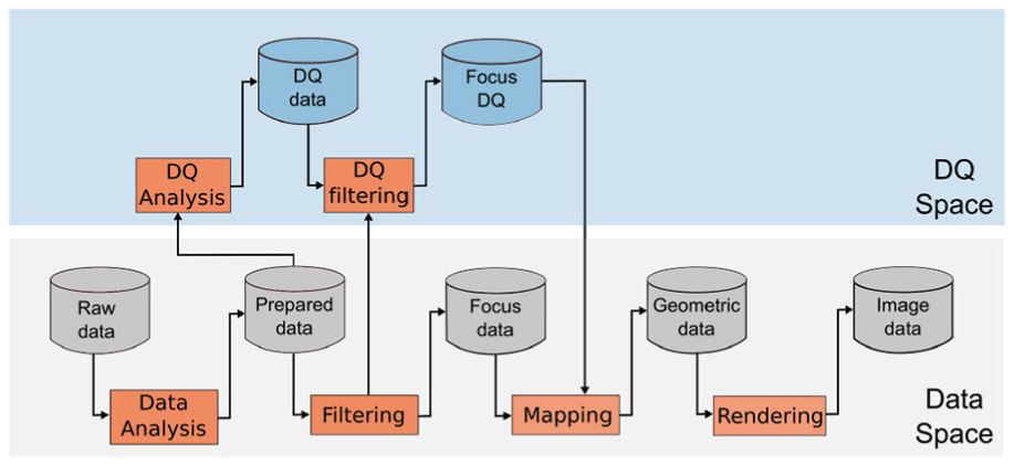
To extend the visualization pipeline, it is conceptually split into two parts: the data space and the DQ space (as shown in Figures 5 and 7). The data space describes the transformations applied to the important attributes, while the DQ space describes the transformations applied to the data quality features. The definition of two spaces decouples the information from its quality.
Integrated approach
Visualization pipeline extension for the integrated approach. Based on the visualization pipeline proposed by Card et al. 6
The integrated approach shows the data together with the data quality in the same view. Showing too many details in this approach could easily lead to overloaded visualizations and thus should be avoided.
For the integrated approach, the visualization pipeline (proposed by Card et al. 6 ) is modified as shown in Figure 5 by adding separate DQ analysis and DQ filtering steps.
The DQ analysis extracts the values of every DQD. The input of this step is the Prepared data in order to take advantage of the data structure and to use the data items after the preprocessing process. As a result, the data quality values are estimated and represented using different scales generating the DQ data. The different scales depend on the DQDs. For example, availability has a binary scale (
The DQ filtering in this approach depends on the Filtering from the data space and the relevance of every DQD for the visualization. The DQ filtering shares the filtering criteria from the data space, for instance, if a data item is filtered the data quality value for it is not needed and thus also filtered.
The mapping aims at defining a mapping function in order to encode the focus data and the focus DQ using predefined requirements, guidelines, and recommendations. The mapping function maps an attribute or DQD to a GV. In order to generate the mapping function, the process shown in Figure 6 is proposed. The inputs of the process to generate the mapping function are as follows:
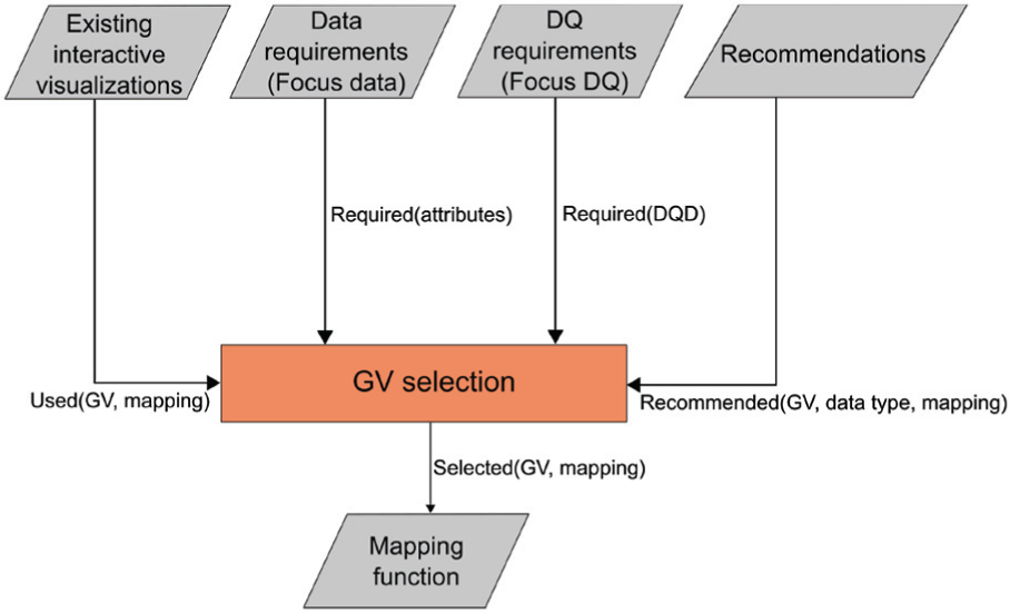
Process to generate the mapping function to include the data quality into the visualization.
Existing interactive visualizations: The existing visualizations are from the domain area and they follow conventions, restrictions, and requirements of every domain (e.g. geographical information systems). This input provides the used GV and the attribute(s) to represent in order to establish the free GVs and possible conflicts with other GVs. As a consequence, this input provides a set of attributes, their types, the mapping, and the used GVs (
Data requirements: The data requirements input contains the different attributes to be visualized (focus data), as well as their types and scales. Therefore, this input provides a list of the required attributes (
DQ requirements: The DQ requirements specify the different DQ attributes to be visualized, as well as their types and scales. This input provides a list of DQDs (
Recommendations: The Recommendations are from literature and provide a set of criteria and guidelines in order to represent the focus data and the focus DQ according to the data type (e.g. continuous, ordinal, or nominal). The recommendations of Griethe and Schumann 11 and MacEachren et al. 10 are used in this step. This input provides a set of recommended GVs for each data type.
GV selection: The GV selection is the main core of the function mapping generation. This step has the four previous steps as inputs and the output is the mapping function. This step has two substeps: strategy selection and GVs selection.
The strategy selection aims at selecting a strategy to modify or to enrich the visualization with data quality. The possible strategies are use of free GVs, reuse of GVs, and integration of additional visual objects. The use of free GVs takes used GVs and conflicting variables (from the focus data) into account to identify free variables to encode the data quality. The reuse of GVs is possible when an attribute must not be represented, such as when the attribute is not available or not consistent. For example, missing data in a colored map might be represented using the color “white” reusing the color GV. On the other hand, the integration of additional visual objects considers the existing and required GVs and elements (focus data) to include new ones (DQ data). It is important to avoid the inclusion of striking or big elements, as well as any element that causes occlusion or distorts the focus data.
The use of free GVs has a higher preference over the reuse of GVs and the integration of additional visual elements, because the reuse of GVs is often not possible and the inclusion of additional elements might overload the visualization. As a result, the integration of additional visual elements will be used when there are no other GVs available.
The GVs selection substep applies the selected strategy to determine the final set of GV to use for mapping the data attributes and the DQ attributes. The recommended GVs are taken as input, the selection strategy is applied, and the selected GVs together with the mapping are provided as output.
Mapping function: The mapping function maps a data attribute or a DQD to a GV.
For the integrated approach, two types of visualizations are possible: a new visualization or a modified visualization.
New visualization: To generate new visualizations, the following three inputs are required: focus data, focus DQ, and recommendations. The priority for the GVs selection is on the focus data, then the GVs for the focus DQ are selected according to the recommendations and the selection strategy. The recommendations also include guidelines or standards for the focus data mapping to GVs.
Modified visualization: To modify visualization, an existing visualization, it is taken as input to the process and the GVs and the mapping of the data attributes used by this visualization are extracted. Together with the focus DQ and the recommendations, they form the input to the GV selection process.
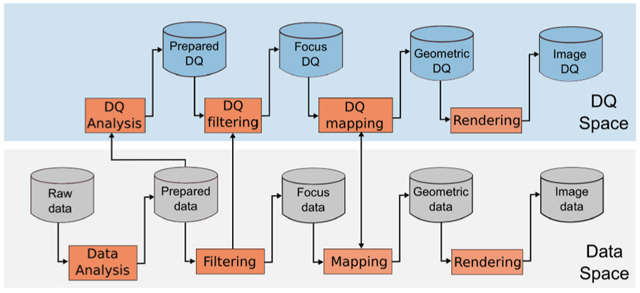
Specialized approach
The specialized approach provides a detailed visualization for every DQD. For this approach, two visualization pipelines are used, one in the data space and another in the DQ space, as shown in Figure 7. The two pipelines are synchronized at three points, the prepared data, the filtering, and the mapping.
Visualization pipeline extension for the specialized approach. Based on the pipeline proposed by Card et al. 6
The prepared data are common to the two pipelines, just after the data analysis process. The prepared data in the data space is the input of the filtering process. Furthermore, the DQ analysis converts the prepared data into DQ data that are the measurements of the DQDs of the prepared data as a result of a data quality analysis. The filtering from the data space shares the filtering criteria with the DQ filtering (DQ space) in order to synchronize the two visualizations.
The mapping and the DQ mapping must be synchronized in order to guarantee coherence between the two mapping functions and to avoid conflicts. This is possible using similar conventions, criteria, and variable encodings. For the mapping functions generation, it is possible to use the process described before (Figure 6). Finally, the rendering process joins the geometry data and geometry DQ, resulting in two synchronized images.
Implementation of the application
This stage determines the technologies to implement the application. The factors to consider are developing time, compatibility with existing technologies, and accessibility for the users. These three factors will be estimated for every case study. The developing time depends on the developer experience, the novelty, and the documentation of the technology. The compatibility with existing technologies will identify the interfaces to connect the application with specialized software or data processing software such as: Vissim, or R for statistical computing. Finally, accessibility for the users is relevant to test and validate the usefulness, effectiveness, and usability of the application. This factor suggests web environments that allow users to access to the application without set-up or compiling.
Set-up and testing
The set-up consists of a set of interviews with experts in visualization in order to validate the interactive visualization, as well as the design criteria. As a result, all the interactive visualizations implemented are validated and ready to proceed to a test with expert users from the domain area.
The test stage consists of a four steps: hypotheses definition, protocol establishment, assessment, and analysis. The hypotheses definition aims at determining a set of question about the usefulness, effectiveness of the interactive visualizations, and the inclusion of the DQ into them. The protocol establishment defines a set of activities to be perform in order to test or refute the hypotheses. The assessment step is the execution of the activities by the participants of the test, as well as the performance of a set of surveys and interviews to get additional feedback. Finally, in the analysis step, the results are processed, visualized, and analyzed in order to test or refute the hypotheses. In addition, changes and new requirements are documented in order to improve the complete methodology.
Use case
The use case for our proposal is the analysis of bus routes in Bogotá, which motivates estimating traffic patterns, as well as analyzing public transport performance. Nowadays, the new devices and technologies enable tracking all vehicles in real time; however, new challenges appear. The processing of stream data and its quality are potential challenges while analyzing these data.
The analysis of bus routes in Bogotá case study uses 4 month of data of a bus service in Bogotá. The goal of this case study is to analyze the behavior of a route and its services (instances of a route) and to identify points and hours with high traffic.
The analysis of bus routes is classically performed using specialized software in real time; however, the historical analysis is not provided most of the time. Another added value of this proposal is the inclusion of data quality metrics while analyzing the route.
Analysis task identification
The analysis tasks are identified with the help of experts in transportation. The analysis tasks are (1) to explore the bus services over time and (2) what was the status of a bus route/service?
Analysis task 1: analysis of bus route/service
Task description: To know the status of a bus route, bus service, and associated variables at a certain date.
Type: Observation.
Visual operations: Identify, locate, and associate.
Interaction operations: Select, explore, filter, and connect.
Associated data: Historical data about
Subtasks:
Analysis task 2: what is the current status of a route?
The current status of a bus route analysis task aims at monitoring a (set of) service(s) over a route in real time.
Task description: To know the current status of the route, the services, the buses, and the associated variables.
Type: Observation.
Visual operations: Identify, locate, and associate.
Interaction operations: Select, explore, filter, and connect.
Associated data:
Subtasks:
Data preparation
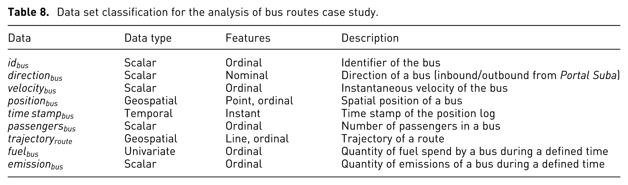
For this case study, one route (M84-C84) is considered; furthermore, several services (instances of a route) are required to be analyzed. The data set consists of 12,05,251 registers from buses covering the route (M84-C84). A register is a GPS position, a time stamp, and a set of attributes associated. As a result of a spatial accuracy verification, 12,01,323 registers are selected. The registers range from 31st of March to 9th of June, 2015. The classification of the complete data set for this case study is shown in Table 8.
Data set classification for the analysis of bus routes case study.
From the existing data for this case study, additional data can be derived such as the emissions or the fuel consumption of buses. The emissions estimation uses a simplified model in order to estimate the
Data quality selection and assessment
The DQD are selected by performing the Selection of DQD process presented in “Selection of DQD” section. The data types for the selection are spatial, temporal, and scalar. The analysis task types are observation and evaluation. The result of the selection process is summarized in Table 9.
Summary of the DQD selection process for the analysis of bus routes case study.
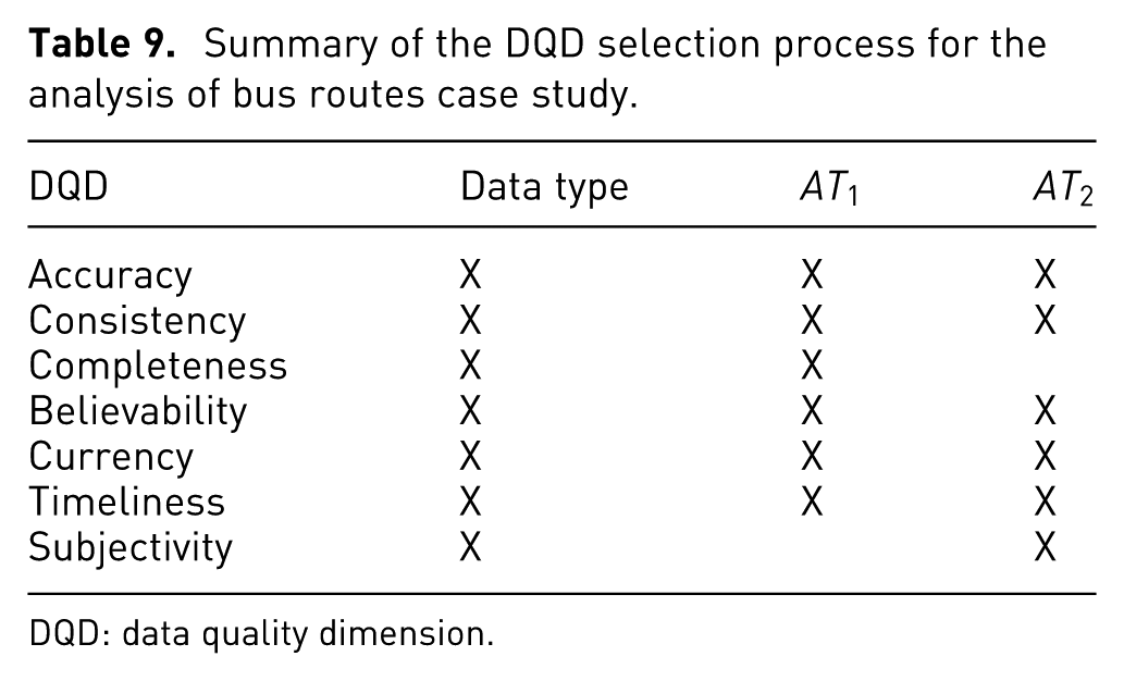
DQD: data quality dimension.
The selected DQDs for this case study are accuracy, consistency, believability, currency, and timeliness. The DQ assessment is performed as follows:
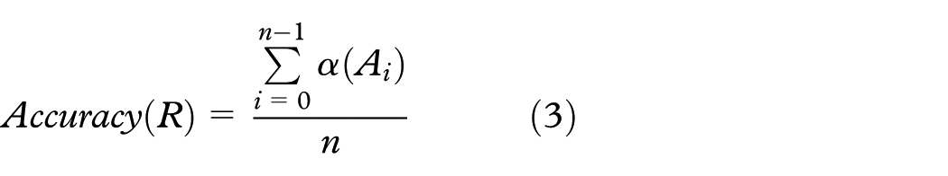
The accuracy of a register (R) is estimated by defining a domain (D) for each attribute (A) and by testing if the attribute is part of the domain or not (as shown in equation (2)). After testing every attribute, an average is estimated to get a normalized value from
Consistency is estimated using a set of semantic rules defined by the experts. The semantic rule of this case study is
The most recent position (
Believability is estimated based on the proposal of Moossavizadeh et al.
38
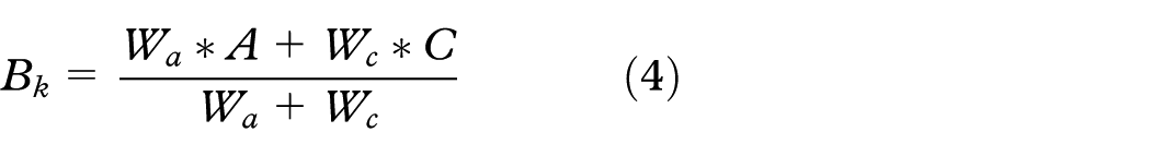
considering, only accuracy and consistency. A believability custom metric is proposed and defined by equation (4). Here,
Currency and timeliness are estimated using the equations (5) and (6), respectively (equations taken from Ballou et al. 39 and Batini and Scannapieco 22 ). Where Age measures how old the data unit is when received, DeliveryTime is the time the information product is delivered to the customer, and InputTime is the time the data unit is obtained. Timeliness ranges from 0 to 1, where 0 means bad timeliness and 1 means good timeliness


Data stream generation
In order for the support analysis task 2 (
Interactive visualization design
Following the process presented previously, two interactive visualizations are designed supporting the analysis tasks 1 and 2 (
Interactive visualization design for
Considering the data types, a set of suitable visualization techniques are selected. They are presented in Table 10.
Suitable visualization techniques for analysis task 1.

For this analysis task, four attributes are important:
Interaction techniques for analysis task 1.

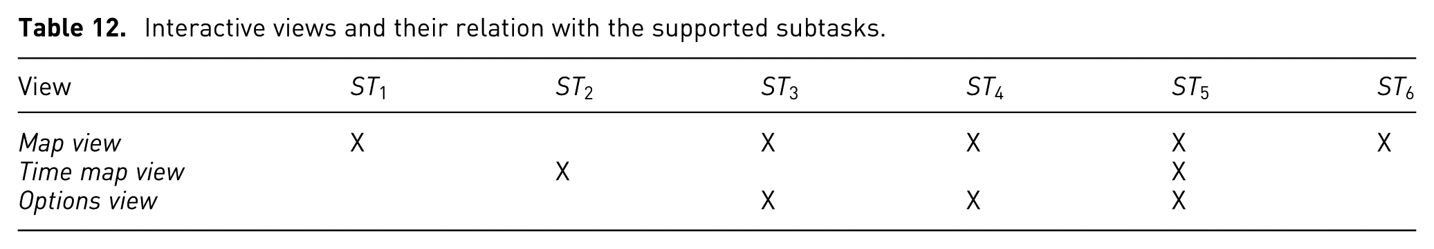
The interactive application to support analysis task 1 consists of three views: map view, time map view, and options view. Table 12 presents the interactive views and the subtask that they support.
Interactive views and their relation with the supported subtasks.
Map view
The map view shows a 2D map representing Bogotá with the bus routes (Figure 8(a)). The positions of the buses are represented by circles, while the velocity of the buses is represented by a 3-scale color. The color scale has red, yellow, green, and black (as shown in the legend of Figure 8(a)) meaning low velocity, medium velocity, high velocity, and positions with DQ issues.
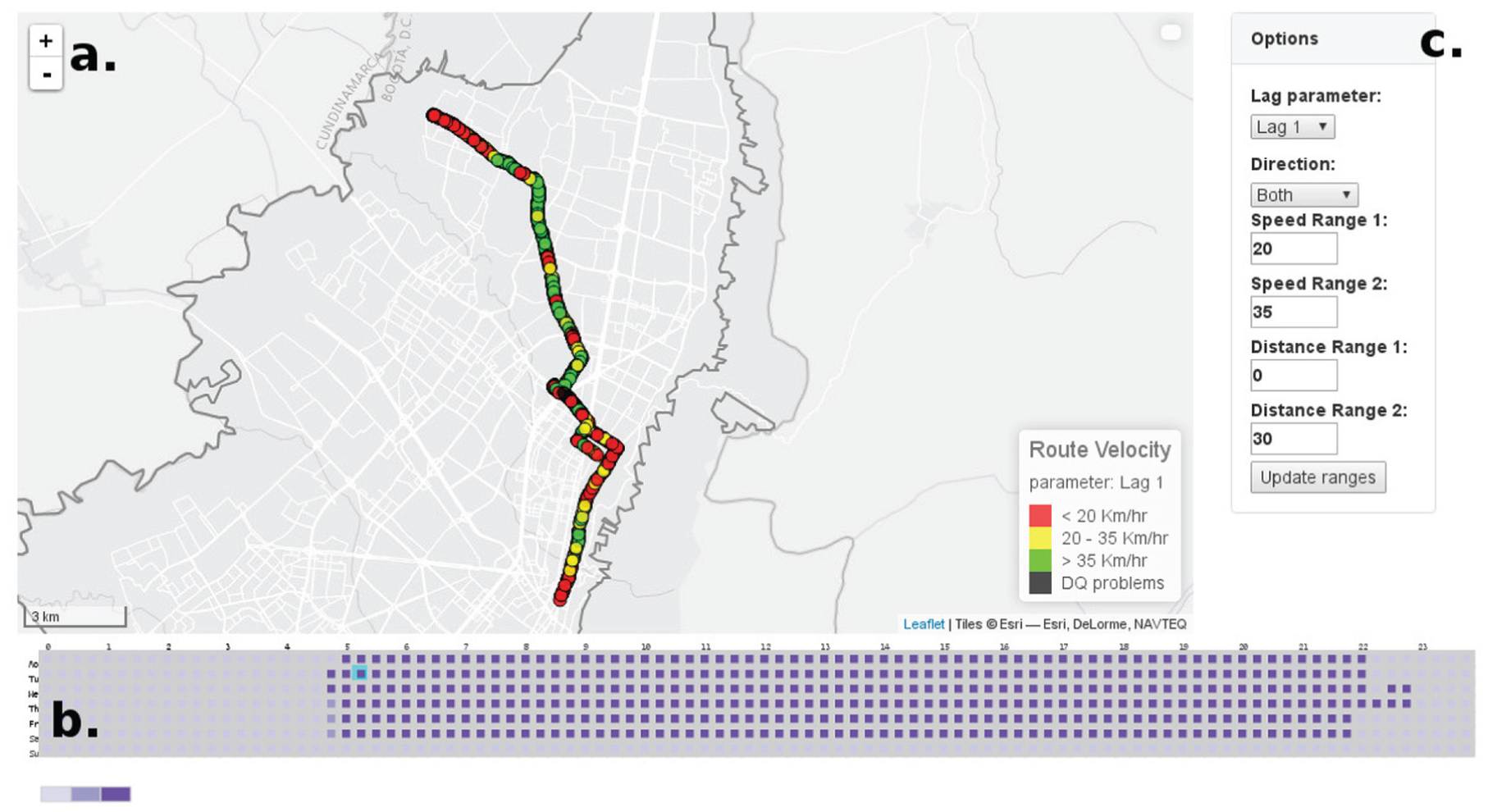
(a) Map view representing the bus positions for Route M84-C84. (b) Time view representing the number of buses for a complete week. (c) Options view showing the parameters to modify the visualization.
In addition, the trajectory of a route is represented using segments. These segments are color-coded using the same color scale as the positions visualization in order to represent the velocity of the route as shown in Figure 9. For this view, navigation and mouse over positions are enabled.
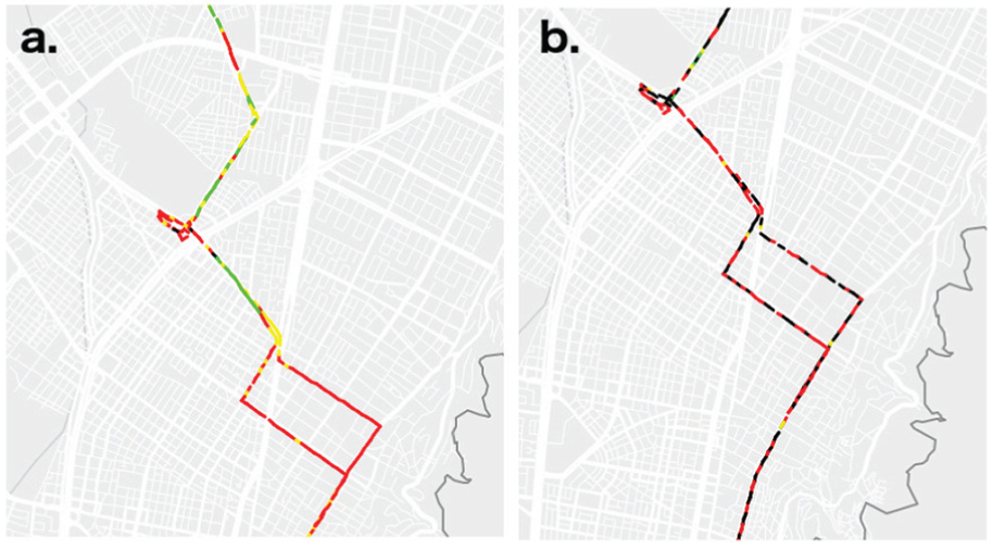
(a) Trajectory of Route M84-C84 with minor DQ issues. (b) Trajectory of Route M84-C84 with important DQ problems.
Time view
The time view is presented in Figure 8(b). It represents the number of buses covering a route over 1 week. The x-axis represents a day with 96 time intervals (squares) of 15 min each. The y-axis shows the 7 days of a week. Every square is color-coded using a 3-color scale according to the number of buses covering this route. In addition, on mouse over or click, the square is highlighted using a cyan border. A square is selected by clicking on it and the map view is updated with the bus positions for the clicked interval.
Options view
The options view allows to modify the values of six parameters and one update button. The first parameter is the Lag parameter that specifies the number of points used to estimate the velocity. The Direction parameter filters the service of a route using three criteria: Outbound, Inbound, or Both. The Speed Ranges 1 and 2 define the thresholds to define low, medium, and high velocity. The speed ranges are set by the users using text boxes. Similarly, the Distance Range 1 and 2 are defined.
Interactive visualization design for
Considering the data required to perform this analysis task, a set of suitable visualization techniques was selected, which is presented in Table 13. From the suitable visualization techniques, selection from domain knowledge is used (as introduced in Section “Interactive visualization design”).
Suitable visualization techniques for analysis task 2.
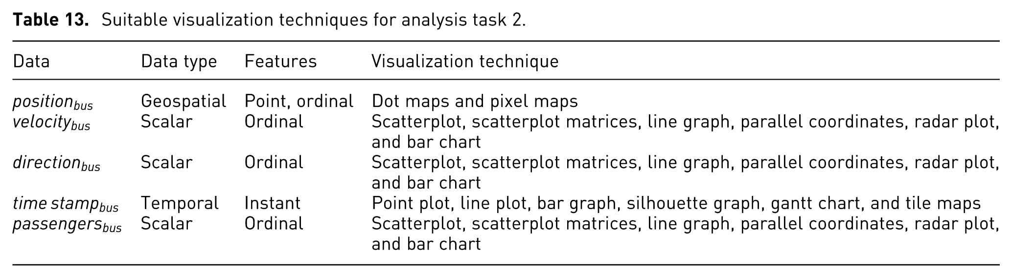
As a result, dots maps are used to represent the bus positions because this technique keeps the geographical reference. For the velocity, the color in the dot maps is used (showing the instantaneous velocity). Moreover, a line graph of the distance versus time, representing the velocity is included (showing the last values of velocity). For the DQDs, parallel coordinates are used to show all of them simultaneously. For the integrated value of DQ (believability), a gauge chart is used. Finally, the interaction techniques for these visualization techniques are presented in Table 14.
Interaction techniques for analysis task 2.

The design for analysis task 2 consists of six views supporting the eight subtasks: map view, options view, passengers view, temporal view, dq view, and detailed view. The relation between the views and subtasks is presented in Table 15.
Map view
Interactive views and their relation to the supported subtasks for
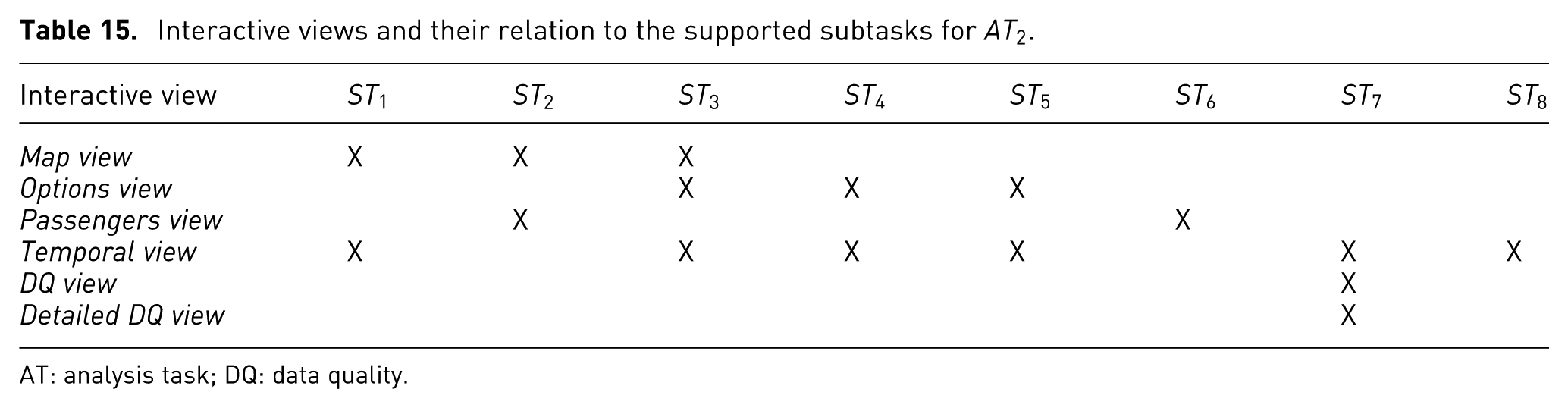
AT: analysis task; DQ: data quality.
The map view is a 2D map showing the city as well as the last position, and the velocity of buses (as shown in Figure 10(a)). It shows the most recent data from the stream. This view uses a dot map to show the position of buses and color to represent the velocity using a 3-color scale (green, yellow, and red meaning high, medium, and low velocity, respectively).
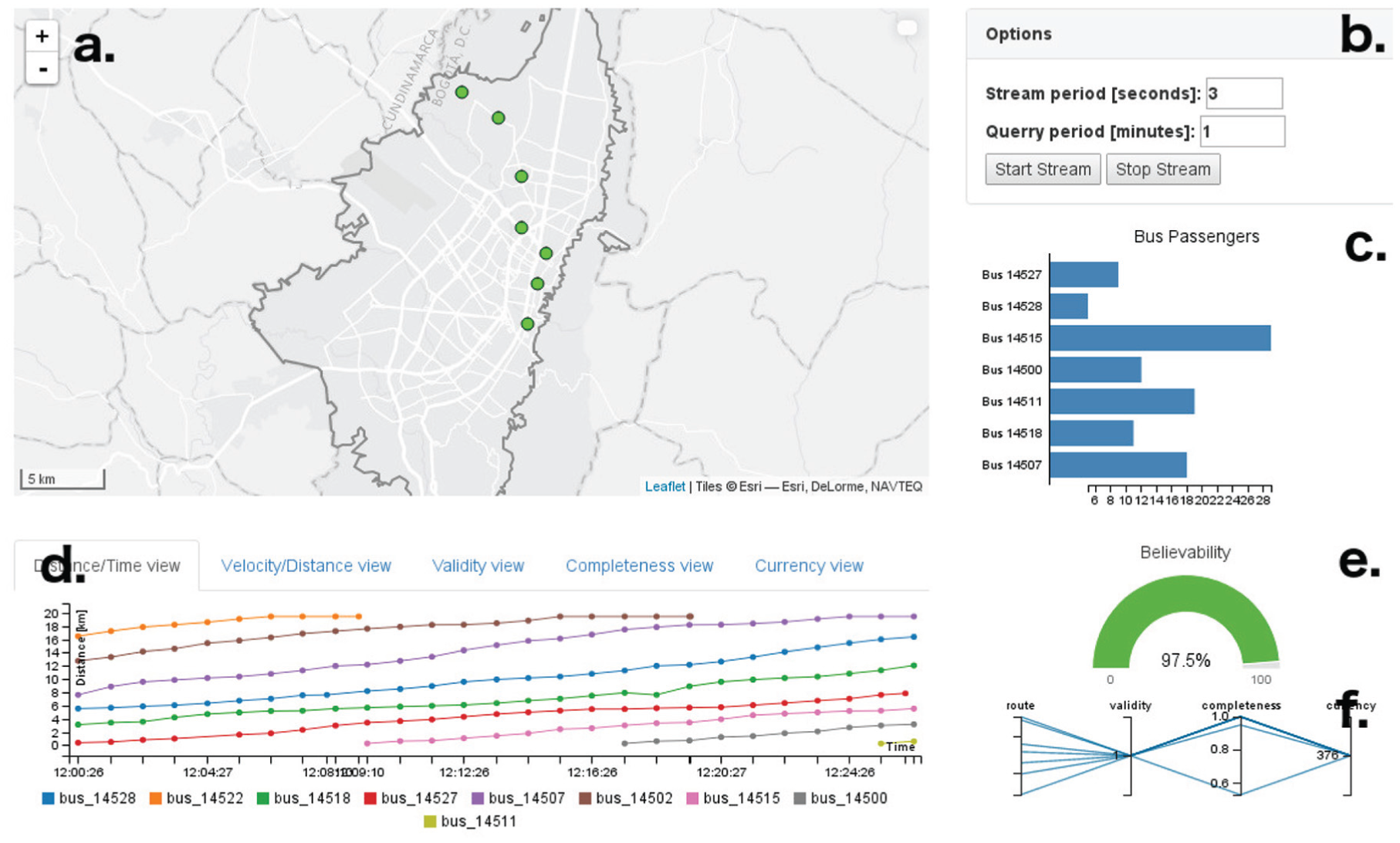
(a) Map view. (b) Options view. (c) Passengers view. (d) Temporal view. (e) DQ view. (f) Detailed DQ view.
In this view, the user can navigate by holding the mouse click. The mouse wheel allows to zoom in or zoom out. In addition, on mouse over a circle, detailed information of the bus position is displayed.
Options view
The options view (Figure 10(b)), provides control over the simulated streaming data source. The two parameters that can be configured are stream period and stream size. The stream period defines the interval of time for the synchronous data stream. The stream size defines the number of bus positions to send during every time interval. Finally, this view contains two buttons: one to start streaming the data and another button to stop the streaming.
Passengers view
The passengers view shows the number of passengers on each bus covering the route. The passengers view is presented in Figure 10(c). This view contains a bar chart that eases the comparison between bars. Each bar represents a bus, and the length of the bar represents the number of passenger in the bus.
Temporal view
The temporal view represents two attributes and three DQDs over time. In this view, it is possible to visualize the current and the past state of the attributes and of the DQDs. The two attributes are velocity (distance vs time) and velocity along the route (velocity vs distance). The three DQDs are accuracy, completeness, and currency.
The distance versus time visualization is shown in Figure 10(d). This visualization contains a line chart representing the time on the x-axis and the distance of the bus from the origin on the y-axis. As a result, the slope represents the velocity of the bus. Similarly, the velocity along the route visualization shows the distance of the bus with respect to the origin of the service on the x-axis, and the velocity of the bus on the y-axis. As a consequence, the velocity along the route is represented as shown in Figure 11. This visualization aims at identifying low or high velocity zones in the route.
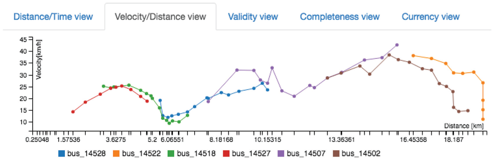
Temporal view showing the velocity (y-axis) of several buses over time (x-axis).
The three DQDs are visualized using a line chart. On the x-axis, the time stamp is shown, while the DQD value is shown on the y-axis. This visualization aims at representing the DQD over time. Figure 12 shows the temporal visualization for the completeness DQD. In the figure, it is possible to see, that for the first values, a set of bus registers is not complete.
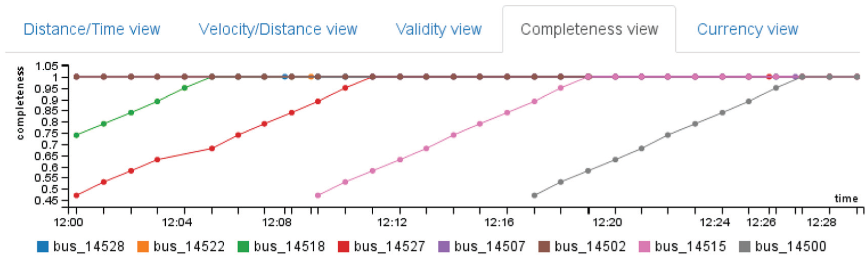
Temporal view showing the completeness (y-axis) of several buses over time (x-axis).
For this view, mouse over a line shows the exact value. In addition, the user can select or deselect a bus by clicking on the legend. This view has five tabs, one for each visualization. The use of different tabs make complex the joint analysis; however, each of them addresses a particular subtask.
DQ view
The DQ view represents the global quality of the most recent register from the stream, as shown in Figure 10(e). This view includes a gauge chart that represents the believability of a register, the most recent in this case. The values of believability are a normalized from “0” to “1,” and are represented using percentages. In addition, the gauge chart is color-coded using green, yellow, and red meaning good, acceptable, and bad data quality, respectively.
Detailed DQ view
The detailed DQ view represents the data quality of each register that arrives from the data stream. Figure 10(f) shows this view. For this case study, every register (a register is a set of attribute values or a row in a table) represents a bus and includes its position, velocity, and number of passengers, among others. This view contains a parallel coordinates visualization. Four axes represent the id of the bus, and three DQDs: accuracy, completeness, and currency. Every line in the visualizations represents a bus. In addition, brushing and filtering are included in this visualization.
Implementation
The implementation of the interactive application to support the analysis tasks of this case study uses a client server architecture. The server side uses NodeJs and PostgreSQL with the PostGis extension. The client side, Javascript as programming language and a set of libraries to support the visualizations such as D3.js and C3.js are used.
The Web environment is selected in order to ease the accessibility of the application by the users. Another advantage of this implementation is that all the compute-intensive estimations are performed by the server. This implementation consists of three interactive applications, one for each analysis task.
Evaluation
The evaluation for this case study is performed in two steps. The first step is a validation of the interactive visualizations with one visualization expert. The goal here is to test the usability of the application and to validate the selection of visualizations and interaction techniques in order to guarantee an effective interactive visualization. The second step is a use case with three transportation experts in order to test the usability and the usefulness of the application.
Protocol
The protocol of the evaluation consists of three stages. First, the application is introduced to the participants showing the main features of the applications, as well as all visualizations. Second, the participant is allowed to interact freely with the application while talking aloud about actions or tasks performed. Finally, the participant is interviewed about the usability and about the usefulness of the application. The complete test takes approximately 1 hr. The interactive visualizations for
Results
Regarding the first step—validation with one visualization expert—and the visualizations for
Regarding the visualizations of
Regarding the use case with three application area experts and the visualizations for of
Regarding the visualizations for of
The expert participants discussed about the real analysis using the developed application. By using the time view (Figure 8(b)) is possible to evaluate the quality of service of the route. Similarly, by using the map view (Figure 8(a)), the decision of changing the route path is possible. Another real analysis is the velocity along the route to evaluate the use of shared lane (from 0 km to 10 km) or segregated lane (from 10 km to 19 km) by using the temporal view (Figure 11); however, the velocities at the beginning of the route are not reliable because there are not enough data points to estimate the velocity as shown in Figure 12. For example, Bus 14527 (represented using a red line) started the route at 12:00; however, until 12:10 a reliable estimation of velocity is possible, because the required data points are complete.
The experts agreed that the analysis tasks can be achieved by the developed application. In addition, the expert participants agreed that the inclusion of DQ issues into the analysis is useful. They talked about the possible causes of DQ issues according to the devices, certain areas of the city, or specific periods of time.
Conclusion
VafusQ, a methodology to generate visual analytics applications with DQ features is presented. The interactive visualization design includes two approaches to generate interactive visualization with DQ features (integrated and specialized approach). The methodology uses as reference a set of definitions from other authors. However, the complete process is a unique contribution and many novel steps are proposed. The complete methodology was tested successfully.
We proposed a process to select DQDs in urban planning context. Furthermore, it could be extended to similar areas.
We present an interactive application to support the analysis of bus routes in Bogotá. The application uses real data and it supports real analysis. The use case includes static data and streaming data showing the effectiveness and flexibility of the methodology.
Footnotes
Acknowledgements
The authors would like to thank all members of the SUR research group and the IMAGINE research group. In addition, thanks to data quality expert, Professor Adriana Marotta from Universidad de la Republica, Uruguay.
Funding
This work was partially the Colciencias PhD funding program Convocatoria nacional para Estudios de Doctorado 567 en Colombia año 2012, Vicerrectoría de Investigaciones at Universidad de los Andes, and by the DAAD-Subject Related Partnership UNIANDES-UNIKL, the department of systems and computing engineering at Universidad de los Andes, and the Bundesministerium für Bildung und Forschung BMBF.