
Abstract
Design space exploration is an important part of design in engineering fields. Recent research employs surrogate models to emulate finite element analyses across a design space, allowing rapid design space exploration. With interactive speeds, there exists a need for tools that help designers compare designs to one another. This difference model is comprised of a three-dimensional rendering of the geometry with the location and magnitude of differences between the two designs displayed as colors on the model surface. This visualization is combined with juxtaposed views of the objects being compared. A user experiment was conducted with 28 volunteers to demonstrate whether or not including the difference model in the visualization can improve speed and accuracy for various comparative design tasks. It was found that, for certain comparison tasks, there is indeed statistical evidence that using the difference model alongside the two juxtaposed views improved speed and accuracy when making design judgments between two different designs.
Keywords
Introduction
In engineering, design space exploration is an important process for finding optimal designs. 1 The design space is the collection of all possible design variations. When used with a parameterized model, the space may be explored by varying input parameters and running simulations at critical points. Results are then compared to each other with the goal of discovering the interactions between parameters and outputs. 2 The structural results of a design (strength, stiffness, etc.) are affected by the geometry, or the values of the design parameters. Engineers can vary parameters until they achieve a set of parameter values that produces optimal structural results (e.g. lower stresses, minimize displacement, or shift stress contours to a more desirable configuration). 3
Design space exploration involving structural results can be inhibited by the time required for finite element analysis (FEA) and other analyses to solve. FEA is a simulation method which approximates the shape of a model with a mesh of points called nodes, applies loads and boundary conditions to the model, and then solves for results such as structural stress and displacements. 4 This process is meant to simulate how a part will respond to real-world conditions. These results are produced for each individual node in the model. The speed of FEA is largely dependent on model complexity, 5 and models used in engineering disciplines such as aerospace can have hundreds of thousands of nodes and anywhere from 5 to 50 parameters.6,7 The expense in time and computer resources can cause designers to consider fewer designs during design space exploration and limits the ability of simulations to facilitate exploration of design alternatives. 2
Surrogate modeling has recently been applied to this problem and allows designers to quickly emulate and visualize structural FEA results across a design space.5,8,9 Surrogate models create a relationship between input data and output data. Instead of computationally expensive simulations, these relationships can predict responses very quickly with low cost. 10 The surrogate model can be created, or trained, with the design parameters to an FEA model as inputs and the response, such as the stress, at each node of the FEA model. This allows the surrogate model to predict the complete stress response of the FEA model for new input parameter values and indicates the strength of a model without needing to solve new computationally expensive simulations. These results can be obtained very quickly. With this process, designers may adjust the input parameters to a model and see the predicted structural results displayed in a three-dimensional (3D) visualization immediately. Bunnell et al. 5 showed that this method can be applied to large, complex models such as those used for turbomachinery compressor blade design.
These methods make thorough exploration of the design space for a part much more feasible; however, even with the ability to visualize simulated FEA results in real-time, better tools are needed to make it easier to visually compare one design to another. 2 With a large number of possible designs in the design space as well as a vast number of points to compare between 3D structural results in each design, recalling the myriad differences becomes quite difficult. When changes between two 3D objects are small or subtle, the human visual system has limited perception. 11 Designing visualizations to aid the user in making such comparisons is a challenging, yet important, endeavor for discovery in science and engineering. 12 This is especially true for comparisons involving spatial 3D data, where spatial means the data have a meaningful 3D length, width, height, and so on.
According to the taxonomy for comparative visualization developed by Gleicher et al. 13 and Gleicher, 14 and extended for spatial 3D comparisons by Kim et al., 12 a side-by-side comparison of results (juxtaposition) is useful and common. Unfortunately, when objects are large with many points to compare, all the burden is placed upon the user’s memory and limits the ability to make effective comparisons.12,13 One solution is to use an explicit encoding visualization, such as displaying only the difference between the objects. This type of visualization provides a much more focused comparison of the objects than juxtaposition alone and is useful when the focus of the comparison is the relationship between two objects.12,13 Difference images and difference models have been used in many diverse fields for comparison purposes.15–25 These visualizations often show the degree and location of differences between two objects or models and strip away less essential information.
This research applies a type of difference modeling for visualizing the differences between the structural results of two separate 3D designs. This type of explicit encoding visualization will hereafter be used interchangeably with the phrase “difference model.” These differences are visualized to facilitate design comparison, particularly during design space exploration. The difference between the value of each node on one design and the value of each corresponding node on another design is computed using a simple node-by-node relationship. 14 The amount of change at each node is then displayed on the difference model, allowing the user to easily perceive even slight differences.
It is expected that, when the difference model is displayed alongside the two designs, combining the juxtaposition and explicit encoding methods of visualization in coordinated multiple views, shortcomings in each type of visualization will be overcome.12,13 With these visual obstacles removed and differences clearly displayed, users could more quickly and more accurately judge how changing design parameters affects a part design.
Although difference modeling and hybrid comparative visualizations are not new, Kim et al. 12 recently suggested that a valuable branch of research for comparative visualization includes not only exploration of new visualizations but also user studies that help quantify the advantages of various types of visualizations. These user studies should include a variety of tasks and should be used in real data analysis applications.
With these facts in mind, the contributions of this article are to (1) present an application of using a hybrid juxtaposition and explicit encoding (a difference model) visualization to facilitate comparison between different designs in a design space for surrogate-modeled structural results, and (2) conduct an experiment to help validate the claim that a hybrid visualization, rather than just a juxtaposition visualization, for this type of application will improve speed and reduce error in making meaningful comparisons between parts. The experiment tests the hypothesis for a variety of tasks and information, including search and quantitative estimation, as suggested by Kim et al. 12 This research presents these results, which show evidence that the difference model does improve performance in some types of design tasks, while for others, it produces no statistically significant advantages.
The scope of the application and experiments in this research is limited to showing the difference between the structural results of 3D compressor blade finite element meshes emulated by surrogate models, though this method could apply to a wide variety of engineering part design spaces. The implementation presented uses a reference, or baseline, design as one of the objects to be compared. Because the experiments in this research used random treatment assignment (i.e. participants randomly were assigned a certain visualization method to test), statistical inferences about the causal effect of the difference model may be drawn from the results; however, because the test subjects were self-selected volunteers (rather than by using random sampling methods of selection), general inferences about the larger engineering population are beyond the scope of this research. This study provides useful data that support conclusions about the effects of the visualization methods in this study, but further testing is required to make conclusions about the effect across the population of all engineers.
This article will proceed as follows: the surrogate modeling method used to create the data for this research will be briefly covered, followed by an overview of how difference images and difference models have been used in various fields for error visualization and other purposes. In section “Method,” the specific methods for creating the difference model will be discussed. In section “User experiments,” the experiment design will be explained and results for each task will be presented. Finally, conclusions are presented that show there is indeed evidence that the difference model improves speed and accuracy for some comparison tasks and that the difference model can be a useful tool in engineering design comparison.
Related work
Surrogate-modeled FEA
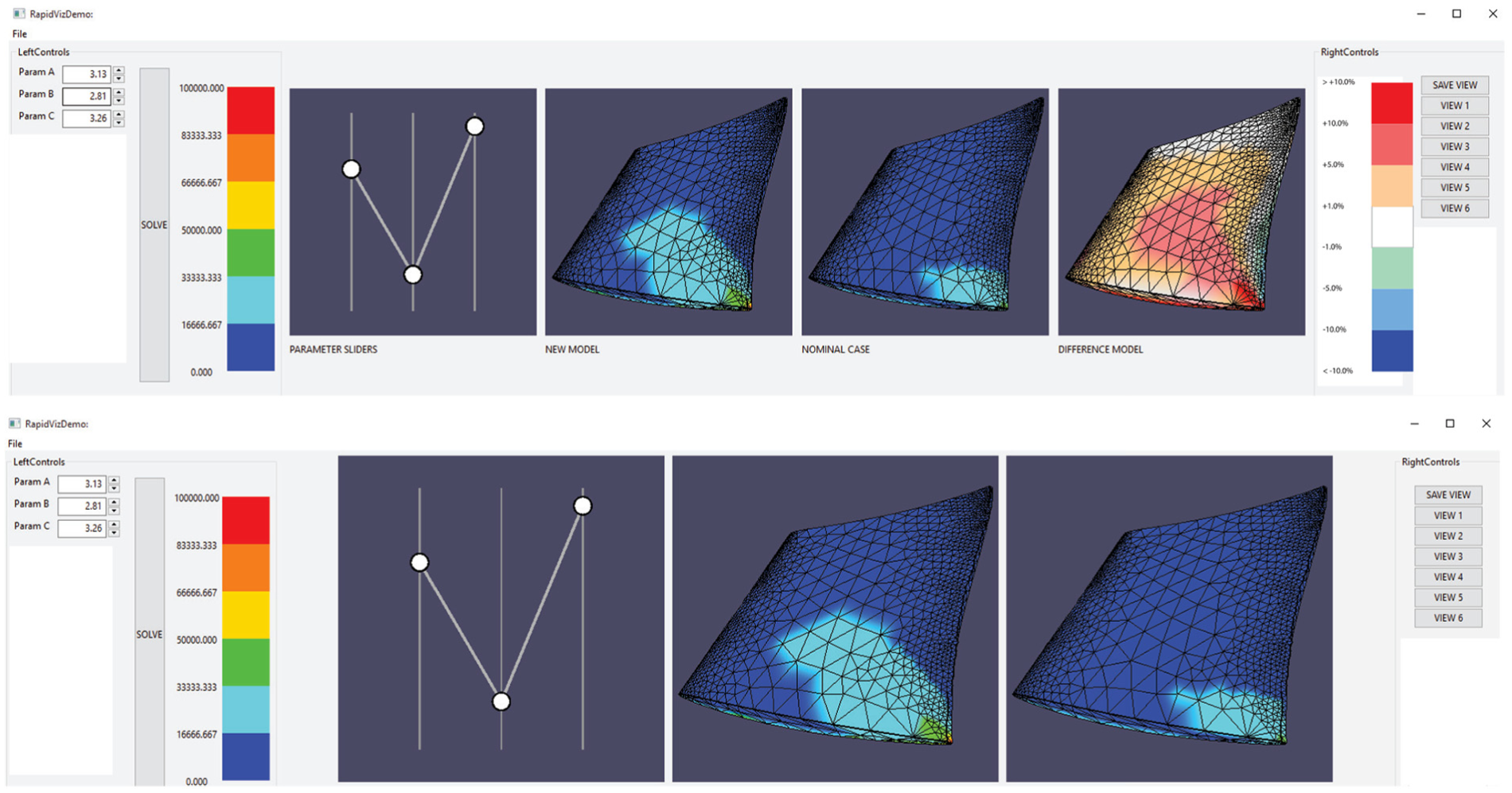
FEA is a common engineering tool for obtaining the response of a part to a set of loading conditions, or forces. 4 FEA programs, such as ANSYS, take a two-dimensional (2D) or 3D model of a part and convert it into a mesh of distinct points, or nodes. The program determines the response to the loads by solving equations at each node of the mesh. These responses could include values such as the amount of physical displacement or stresses at each node caused by the loads on the part. The response values are assigned a color and mapped onto the model’s geometry to create colored contours representing the response across the entire part (see the example in Figure 1).
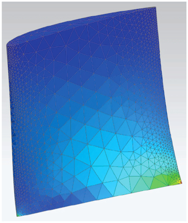
An example of FEA results on a compressor blade shape.
Surrogate modeling uses training data to create a relationship between inputs and outputs of a system. The resultant relationship can then be used to predict the system’s response to a new set of input values in a fraction of the time it takes to solve the original system.10,26 In recent years, surrogate models have been used to emulate the stress and displacement response of each node in a finite element mesh.5,8,9 A variety of designs are created using a design of experiments (DOE) to find a set of designs that adequately fill the design space. For a model with n input parameters, each design is represented by an n-dimensional vector. 2 Once the designs are generated, FEA is performed for each design.
The input parameter values for each design constitute the inputs to the surrogate models, and the FEA result values constitute the outputs. The surrogate models are used to model the relationship between these and can then take in new parameter values to predict the response across the part. These predicted results are assigned a color value based on the chosen color scale and mapped onto a reconstructed visualization of the finite element mesh. This process allows a user to change the parameters of a model and obtain visualized results up to 96% more quickly than waiting for the full FEA process, 5 allowing a user to conduct rapid design space exploration with instant structural feedback. Being able to quickly visualize alternate designs in a design space without the need to set up many independent models and wait for simulations to solve enables greater creative exploration.
Comparative visualization
Gleicher et al. 13 developed various classifications of visualization techniques for facilitating comparison. These classifications have been used and expanded by others,12,27 but the basic categories have proven useful:
Juxtaposition: a side-by-side comparison of two objects.
Superposition: two or more objects shown in the same space (also called “Overlay”).
Explicit encoding: computes a relationship between objects and represents the relationship, not the original models, in space.
Each has inherent strengths and weaknesses. Juxtaposition shows each object in its entirety, but places the burden of comparison on the user’s memory and perception as they look back and forth between objects. This may be helped by linked camera views, and so on.12,27 Superposition locates the parts together in space but suffers from occlusion. Explicit encoding directly shows a desired relationship, such as the differences, which makes the user’s task quite easy, but results are decontextualized from the original objects.12,13
When framing a comparative visualization problem, one must consider various challenges, as described by Gleicher 14 in a later study:
Number of items to compare.
The size/complexity of the objects to be compared.
The size/complexity of the relationships.
The most common form of comparison is between two different objects; comparison of three or more can be incredibly difficult. Objects being compared can be large with many simple small differences, small with very complicated differences, or any combination of these. Specifically, when an object has only small, subtle differences, the challenge for the user to perceive and correctly understand these differences is greater. Finally, the relationships between the objects may be simple or complex. Simple relationships include those where objects to be compared have corresponding elements that may be checked element-by-element. 14 When dealing with comparisons between two 3D shapes, the challenge of determining relationships becomes much more difficult if there are no clear correspondences between points on one object to the other.14,28
Research has suggested that hybrid methods are advantageous when displaying 3D data for comparison. 12 These can include coordinated multiple views or tightly integrated combinations of various methods. These combinations help combine strengths and overcome weaknesses. When combining juxtaposition and explicit encoding, the explicit encoding makes the relationship between the juxtaposed views clear, and the juxtaposed views provide context for the explicit encoding. 13
Comparative visualization in scientific studies
There are many examples of how explicit encodings (or difference models and difference images) assist research scholars to make scientific comparisons in many fields. In biological studies, these methods have been used to indicate increasing or decreasing accuracy of plant reflectance models, 18 exposing toxic leaf chemicals, 21 automatically detect cells in the root of a plant, 23 and illustrating concentrations of ethanol vapor on a sensor. 22 In medical fields, difference imaging can identify possible breast cancer in patients by taking two images of a patient in different positions and comparing them. 20 In computer vision, a type of difference imaging is used for motion detection by examining pixel differences between two consecutive frame images in a video sequence 24 or calculating the magnitude and direction of change with optical flow vectors. 25
A type of comparative visualization common to scientific fields is error visualization. This involves calculating the difference between an approximation and a ground truth in order to determine the error between the models. Explicit encodings may be used to map error values directly onto a 3D geometry, and allow a user to gain quick intuition about the reliability of the model with respect to its geometric location and features.
A specific example of the use of difference modeling with 3D models is the program Metro. Here, a geometric mesh is loaded and then simplified for faster computation. 29 The differences in position between each node of the simplified mesh and of the original mesh are computed, creating an error value for every node on the mesh. For example, a simplified mesh that closely resembles the original mesh will have low error at all nodes. These error values are represented with a hue and then displayed on the surface of the simplified mesh to indicate the distance between where the node is and where it should be. This allows the viewer to see, at a glance, where the simplified mesh geometry differs from the original and the degree of difference. The result is visually similar to the stress contours found in typical FEA results, but the colors represent varying degrees of signed error instead of stress. Using this visualization, engineers may more easily make judgments about the quality of the simplified mesh.
Similarly, in a 2010 study concerning ocean floor mapping, models of varying fidelity were created and then compared. The distance between each surface location on two different models could be represented as a signed error (positive or negative height differences), which was then converted to a range of colors and displayed on the geometry. This allowed the research scholars to determine whether the lower density meshes were reliable enough to use for further research purposes.
Finally, a combination of juxtaposition and explicit encoding has been used in some computational fluid dynamics (CFD) analyses to show the error between different models of a specific flow scenario (e.g. a high vs. a low resolution model).16,17 The researcher may compare the two models in their full representations via juxtaposition and then use the difference model, shown to the side of the juxtaposed models, to clearly understand which locations have the most change in accuracy.
While these examples do not use difference modeling in the context of design space exploration or structural results on 3D models, they do illustrate how using explicit encodings can help expose otherwise hidden results in a study. These studies use visualizations, but do not attempt to analyze the visualization choices used. This research aims to not only apply these methods to a unique type of aerospace analysis but also examine the comparative visualization benefits gained from the chosen visualizations.
Method
Visualization considerations
This research uses a combination of juxtaposition and explicit encoding. The juxtaposition represents the simplest way to compare two objects: side-by-side, with little to no extra insight to relationships between the two objects. The explicit encoding directly computes and conveys the differences between the two objects as positive or negative. This method is ideal for representing whether stresses at specific locations have increased or decreased for different designs in a design space due to changes in the parameters. By including both the juxtaposition and explicit encoding, the visualization presents the original models to the engineer for examination, clearly shows the differences, and does not suffer from decontextualization.
To address the challenges of comparative visualization set forth by Gleicher, 14 it was determined that, for this application, only two designs need to be compared at a time. The entire design space could be summarized by statistical methods, but insight into the significance of differences is gained from looking at the full individual models. 30 The focus here is on direct structural comparison, and looking at two sets of results at a time is sufficient.
In regard to object and relationship complexity, the 3D objects being compared may be quite large (each finite element model may be made up of thousands to hundreds of thousands of nodes) and the parts of the objects being compared (the results at each node) are comparatively very small. This increases the difficulty for the user to perceive such small areas of change. However, Gleicher noted that when the relationships between parts are simple, such as checking a set of data in an element-by-element fashion, the challenges are reduced. 14
Each different design in the design space is composed of different geometric parameter values, so pairs of objects being compared in this application will have different shapes. Because of this, it becomes harder to find ways to directly relate one point to another between the two objects. 28 For this purpose, this application makes use of mesh morphing during the data generation phase. Mesh morphing adjusts the nodes in an existing finite element mesh to a new shape, rather than create a new mesh. 31 As the geometry changes, the relative positions and numbering of the nodes in the finite element mesh are preserved. Thus, a consistent number and relative positioning of nodes exists for each design in the design space, and any two designs have an exact set of corresponding nodes and results to be compared. Thus, the relationships between nodal values on the objects are simple as per Gleicher’s definition.
Basic setup
The juxtaposed views consist of two renderings of designs in the design space and their structural results. When displayed, they look like the output of an FEA simulation. The camera views are linked so that both designs are always in the same orientation. This has been done to help the viewer make direct comparisons between both visualizations.12,27
The difference model, or explicit encoding visualization, is made by calculating the nodal differences between two designs. The calculated nodal differences are assigned a color based on the magnitude of the difference. This visualization maps these colors onto a third geometry. This produces a separate, 3D representation of the geometry that, instead of displaying the results of a single design, shows the differences between the results of two designs. For the purposes of this study, the geometry used for this rendering is the geometry of the first object to be compared. Although this does not make the results entirely independent of the first object, 12 it does provide a clearer, more meaningful representation of the data than applying it to some other geometry outside the comparison. The juxtaposed views are required for analysis of the geometric differences, while the explicit encoding shows the mapped result differences.
The difference model uses the results for each node in the compared designs to calculate difference values. These results could be stresses, displacements, temperatures, or any set of nodal values across a mesh. In this article, the displayed results will be von Mises stresses, 32 which are useful for determining problematic stress locations. Because each design in the design space is built from the same parametric finite element mesh, there exists a result value for each node in every possible design. Thus, no matter which two designs are compared, there also exists a difference value for every node in the mesh.
To render these difference values to the difference model geometry, they must be assigned a color that aids the designer in perceiving the changes that have occurred. The signs of these differences can be determined by calculating whether results at each node on the second design being compared have increased or decreased in relation to the first design. For example, the result values that have increased from the first to the second design can be represented with varying degrees of warm colors, for example, orange and red. Values that have decreased can use varying degrees of cool colors, for example, teal and blue. Values that have not significantly changed can be colored a neutral color, such as white. The threshold for significance can be chosen by the user. An example of these colors is shown in Figure 2. The result is a “double-ended” color scale which indicates whether results have increased or decreased by varying degrees, with warm and cool colors at the extremes and colors tending from bold to neutral as the differences decrease in magnitude.
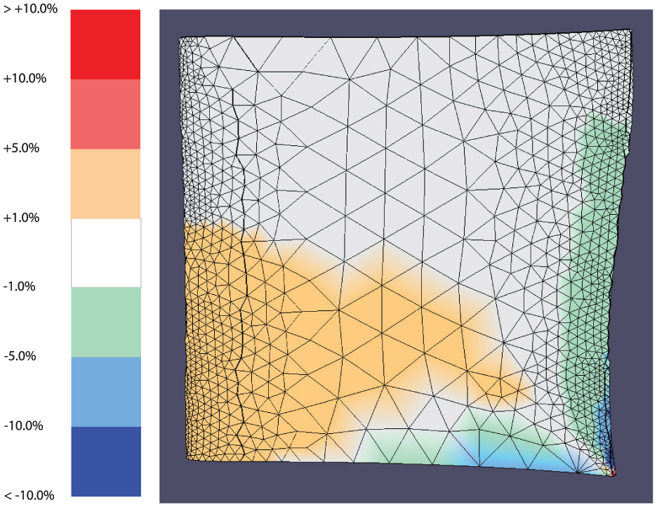
The difference model’s color scale and the difference model.
The difference model communicates the differences between the two designs more precisely and more completely than a direct visual comparison of the designs.12,13 From observing the two original designs alone, many subtle—yet significant—differences are still difficult to perceive or mentally judge. The difference model can highlight exactly how much each node has changed, where changes have occurred, and quickly provide the designer with a visual map of how design changes affect the structural results between the two designs.
Implementation details
In this implementation, a simple parametric geometry similar to a turbomachinery compressor blade design is used. The geometry used in this study will be referred to as a “blade” for simplicity. It is controlled by three parameters: the height, the chord at the root, and the chord at the tip. The root refers to the base and the tip refers to the top face. The leading edge faces the direction of motion, and the trailing edge faces away. The chord refers to the distance from the trailing edge to the leading edge. Unless otherwise specified, the trailing edge will be located on the right-hand side of all figures in this article, and the tip will be oriented toward the top of the figures. Each of these three parameters have a baseline value of 3.0 in (7.62 cm) and can vary by 10% (0.3 in.) in either direction, creating a range of 2.7–3.3 in. (6.86–8.38 cm). The design space is 3D, with each axis representing a different parameter between the values of 2.7 and 3.3.
This geometry and the associated nodal stress responses were obtained by creating surrogate models using the process outlined by Bunnell et al. 5 A DOE was used to obtain a set of designs that would suitably fill the design space. In ANSYS, these designs were given loading conditions of a fixed constraint of the root face and a load on the tip’s edge. These were solved for each design, and the results for each node were used to train radial basis surrogate models.
At this point, the three parameters’ values may be changed by the user, and the new nodal stresses are calculated by the surrogate models fast enough for the visualization to update without the user noticing any delay. Because the surrogate models were trained to respond to parameter values from 2.7 to 3.3, parameter values outside this range are not guaranteed to produce accurate results.
“The first design used in the comparison is the solution where all three input parameters are set to the baseline value of 3.0. This design does not change from one comparison to another, and will hereafter be referred to as the "nominal design.” The second design is any new solution, obtained by giving the surrogate models a new set of input parameter values and rendering the new stresses for the model. Hereafter, this will be referred to as a “new design.” The nominal design’s stresses remain constant, but the new design’s stresses update as users input new parameter values. This allows any new design to be compared to the nominal design.
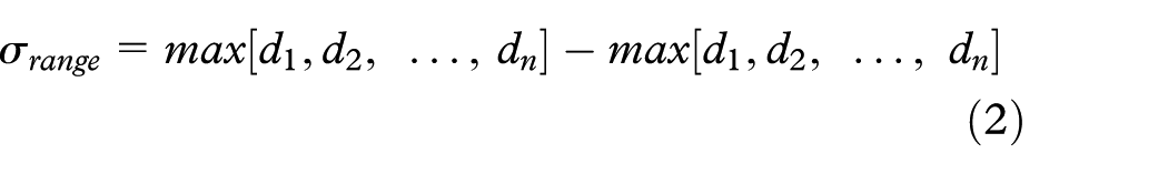
A graphical user interface (GUI) was created to facilitate design comparison and consists of a rendering of the new, the nominal, and the difference models simultaneously on the screen using OpenGL canvases. All models use linked camera views for convenient comparison. Controls are provided for changing the values of the various parameters.
When mapping data values (such as results from an FEA process) to color values, one of the most fundamental choices is what color scale should be used.33–35 This choice has great impact on all interpretations made about the visualized data. If each design uses its own color scale, mapped to the maximum and minimum value of that particular design, determining differences and comparing patterns between the two designs becomes problematic since the color mappings are not directly comparable. 34 Rather, because this research is focused on visualizing designs from an entire design space, a shared color scale is used based upon the maximum and minimum stress values that occur in the entire design space; that is, out of all possible designs in the design space, the maximum stress and the minimum stress that occur are used to create the range of possible stresses in the design space.
Figure 3 shows the canvases and color scales from the GUI. Even though the shared color scale helps make direct comparison between the two designs possible, it can still be difficult to discern the location and magnitude of differences between the two designs. Both designs have a large area of nodes with stress values that fall in the dark-blue range (0–20,833 lbf/in. 2 ), but it is not clear whether or not the stresses have changed within this region, or by how much. It is entirely possible that a node’s stress may have changed from one design to the next, but remains in the same color range as before.
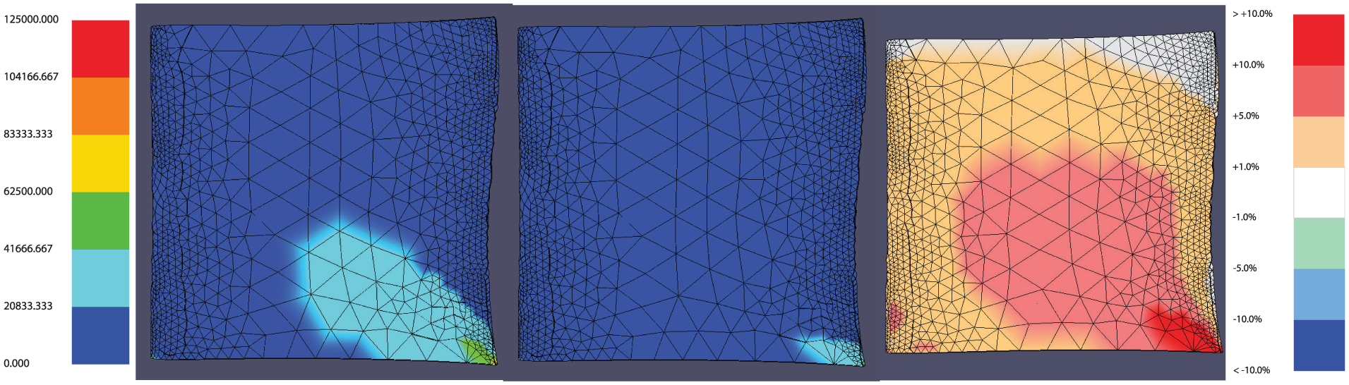
From left to right: the shared stress color scale, the new design, the nominal design, the difference model, and the difference model color scale.
The difference model clarifies these changes. The third OpenGL canvas in the GUI is used to display the same geometry as the other two canvases, but here the primary data displayed are the differences between the two designs. These differences are calculated using the stress values between each node of the two designs.
The difference calculations could be done in many ways, depending on the application. The simplest method is by a straight comparison, or the absolute difference (stress of Node X in the new design − stress of Node X in the nominal design), with the greatest increase in stress shown as a dark red coloring and the greatest decrease in stress as a dark blue. However, because every pair of designs compared will have variations in how different their nodal stresses are, this method exhibits the same pitfalls as local color scales do in the previous discussion.
This research shows the percent differences between nodes rather than the absolute differences. The percent difference method uses the shared scale for the design space that was previously determined. Once the amount a node has changed from one design to the next, or absolute difference, has been calculated, it is determined what percentage of the shared scale that change comprises. This can be described by equation (1)
where
with
For example, if a particular node were to increase by 12,500 lbf/in. 2 from the first to the second design, and the shared scale has a range of 0–125,000 lbf/in. 2 , then this particular node’s difference makes up 10% of the shared scale. An increase of 10% will be colored dark red, while a decrease of 10% will be colored dark blue. For the purposes of this study, any changes between −1% and 1% were chosen to be insignificant and thus are colored neutral white. The values of −1% and 1% are arbitrary and may be adjusted based on the needs of the analysis. This neutral range, as well as any of the ranges in the color scale, may be adjusted according to the needs of the user. Differences between 1% and 10% are colored in hues that exist between the neutral and extreme colors, depending on if they are increasing or decreasing.
The color scales used in this study were designed to reflect traditional FEA color schemes. These colors, however, were not necessarily designed for people with color-deficient visual impairments. 36 The color schemes could be adjusted in future work to meet these requirements.
Figure 3 shows that the new design produces the greatest changes in the bottom right corner, with moderate changes in the center, and small changes along the trailing edge, tip, leading edge, and most of the root. There are also two small areas of moderate change visible near the bottom left corner. No significant change has occurred along the edge of the tip. Some of these details could possibly be inferred from a direct visual comparison of the two designs but now are presented clearly with far less effort and uncertainty.
User experiments
An experiment was designed and conducted to validate the claims that adding an explicit encoding of the differences to juxtaposed views of structural results can improve a designer’s speed and accuracy when performing certain design comparison tasks. Tasks include comparing general and specific changes, examining groups of elements and single elements on the objects, and responding to specific and more open-ended questions. Speed and accuracy are measured for each type of task.
A request for volunteers was sent via an email from the Brigham Young University Department of Mechanical Engineering to students in the mechanical engineering program—thus, the volunteers used in this study were all undergraduate or graduate mechanical engineering students.
Volunteers were randomly assigned to one of the two different groups: one group had access to the difference model, and the other group did not. Each group had 14 participants, for a total of 28 participants. The volunteers had no prior knowledge that there were two treatment groups.
The volunteers were self-selected, instead of randomly chosen; therefore, this study cannot lead to statistical population inferences about the general population of engineers. However, because the treatment groups were assigned randomly to all volunteers, statistical causal inferences about the effect of using the difference model on user performance may confidently be made in this study. That is, while this experiment’s design does not allow for conclusions to be drawn about groups of engineers beyond those tested, it does allow conclusions regarding the influence of the difference model on performance.
Experimental setup
Each volunteer was given the same introduction to the test. The test administrator reviewed basic concepts of stress analysis, airfoil parameters, and design space exploration with each volunteer. Those in the group without the difference model had only the new and nominal models (juxtaposed views) rendered in the GUI. For those in the group with the difference model, the concept of the difference model and associated color scale were also explained, and the GUI in their program included the difference model rendering with its associated color scale (hybrid views, see Figure 4).
The user test GUIs, with (top) and without (bottom) the difference model. From left to right: parameter value displays, stress color scale, sliders to control the parameter values, the new design, nominal design, and, for those with the difference model, the difference model and difference model color scale.
All participants were given the ability to input different values for the new model’s parameter values. For tasks requiring precise inputs, values could be entered into text boxes, while for tasks requiring more exploration of the design space, slider bars could be adjusted. They had full ability to zoom, rotate, and translate the parts, as well as the ability to save different “views” or camera orientations of their own choosing for convenience as they looked at key areas of the blade.
The engine blade used in the study was the same simple parametric test blade described in the “Methods” section. For simplicity, the participants were not told what the parameter names were, but were given the pseudonyms Parameter A, Parameter B, and Parameter C for simplicity. The questions were administered and the answers were collected via Google Forms. Screen activity was captured visually with oCam software. The participants were given four tasks in order to assess the effect of using the difference model visualization. The order and the research objective of each task are detailed below:
Task A: an introductory task to familiarize participants with the test environment and controls. No data were collected during this phase.
Task B: a series of comparisons are presented to the participants along with three questions. The questions were designed to evaluate how the difference model enhances perception of specific kinds of differences between the designs: (a) Q1: evaluates perception of general level of difference across the entire part. (b) Q2: evaluates perception of general level of difference across a specific area or feature of the part. (c) Q3: evaluates perception of a specific value difference for a specific location on the part.
Task C: participants are asked to creatively find new designs that differ from the nominal design according to specific criteria. This task was designed to evaluate how the difference model enhances not only perception but also creative design exploration.
Task A
This task familiarized the user with the program by asking them to enter new design points and prompting the user to try to notice changes in the two design points being displayed (the new design and a static nominal design). No data were gathered in this phase. The purpose was to help users with the learning curve associated with the program and served as a tutorial. While it did not introduce the user to every type of task they would be asked to perform, this introductory task helped them understand how to navigate and make sense of the program.
Task B
In Task B, participants were asked to answer three questions about each of eight different designs, one at a time. The objective was to analyze the accuracy and time spent on each set of questions. These times were measured from when each question was presented to the participant to the moment they clicked the button to proceed to the next question.
For each of the eight designs, the participant was asked to answer the following set of questions:
Question 1 (Q1): “Using your best judgment, about what percentage of the surface of the NEW blade has INCREASED in stress?”
Question 2 (Q2): “Using your best judgment, about what percentage of the surface on/close to the TRAILING EDGE of the NEW blade has DECREASED in stress?” choices were provided because the task was deemed to be harder to determine, and larger ranges of answers might be easier to estimate.
Question 3 (Q3): “The max stress on the NOMINAL blade is 44,724 psi. Is the max stress of the NEW blade greater than the max stress of the NOMINAL blade by 40,000 psi or more?”
For Q1 and Q2, multiple choice answers were provided, and for Q3, the user could answer “yes” or “no.”
Task B setup
Preliminary testing revealed that the users spent much longer on the first few designs as they learned how to perform the requested tasks. After three question sets, the times and accuracy became more consistent. Over the entire group of participants, the average of the first three question set times was 165 s, while the average of the remaining question sets was 85 s. This time discrepancy could be explained by users continuing their familiarization of the interface from Task A or taking some initial time to understand the problem. Consequently, it was decided that the initial three designs presented to the user should not be measured so as to not bias the data. In order to have five measured designs, then, eight total designs presented to the user: three unmeasured sets to accommodate a learning curve (Designs 1–3) followed by five measured sets (Designs 4–8).
The design values for question sets 4–6 were given by a random number generator, producing values from 2.7 to 3.3 for all three parameters in each design. The answers and designs for these questions were not known to the testers beforehand, so they represent a better test of the program features (as they could not be contrived to favor the difference model in any way).
The last two designs (Designs 7 and 8) were identical for every participant. This allows for direct comparison of speed and accuracy on the last two designs.
Task B hypotheses
Since Q1 relies on perceiving increases in stress, it was hypothesized that using a hybrid visualization with the difference model would reduce the time spent on the question as well as reduce the error. It was designed to test perception of changes across an entire part.
Q2 had a similar hypothesis to Q1—that using a hybrid visualization with the difference model would reduce the time spent on the question as well as reduce the error. However, this question was designed to test perception of changes on a specific feature or area of a part.
Q3 deals with determining stress value changes between the two designs for a specific location. Because the difference model visualized percent differences without providing any additional information in the context of the actual stress values, it was hypothesized that using a hybrid visualization with the difference model would not improve the time spent on the question or the accuracy of answers over just the juxtaposed views. It was designed to test a comparative task involving specific values for a very small location on the objects being compared.
Task B evaluation method
In OpenGL, the surface of the model is broken into triangular faces. Each corner of the triangle has a specified RGB color, and the color across the face is a gradient between these corner colors. Thus, each corner is “responsible” for coloring one-third of the surface. Using this relationship, it was determined that, if a node was increasing or decreasing, it would produce a change on one-third of the faces associated with that node.
For Q1, the nodes that were increasing or decreasing were identified, and then, the surface area each node was associated with was totaled. This was used to produce the actual percentage of the blade that was increasing or decreasing. Because users selected a multiple choice answer, the actual values were rounded to the closest available choice presented to the users during the experiment, and the error between the two was calculated as
For Q2, all the nodes on the trailing edge were identified (see Figure 5). Using a similar method to Q1, the percentage of the surface area of the trailing edge was calculated. Again, the actual value was rounded to the closest available choice presented to the users during the experiment, and the error between the two was calculated in the same way as in Q1.
Trailing edge nodes discussed in Task B Q2 shown here in black.
For Q3, the location of the max stress was found on the new and nominal models. It was then determined if the difference between the two was above 40,000 lbf/in. 2 . Answers were given as “yes” or “no,” so each answer received a score of 1 if correct, and 0 if incorrect. Thus, instead of average error of responses, this question measures the average accuracy of correct responses.
For each question, the time was measured in seconds from the moment the task was displayed to when the user clicked the “Next” button to progress to the next question. The time for each question as well as the total time spent on the question set were measured.
Since data were only gathered for the last five designs, this means that there were 15 speed values and 15 accuracy values per participant in Task B. With 28 participants, this produced 840 data points.
Task B Q1 results
The speed and error for Q1 were calculated for the last five designs for each participant. Table 1 presents the mean values for each treatment group. Figure 6 shows a comparison of these values for each design presented to the participants.
Task B Q1 results.

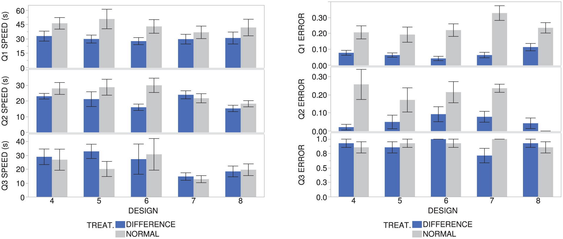
Speeds and errors for Q1, Q2, and Q3 for each design in Task B. Each error bar is constructed using one standard error from the mean.
Those using the difference model performed the task about 14 s faster than those not using the difference model (30.23 vs. 43.73 s), and the average error from the correct answer was only 7.23%, about 16% lower than those without the difference model. By running standard two-sample t-tests, evidence was found that both differences were significant (p-values < 0.05). Thus, there is evidence that the null hypothesis can be rejected for both the speed and error, which suggests a correlation between using the difference model in a hybrid visualization and reduced time and reduced error for Q1. This statistical evidence supports the hypothesis for Q1.
For reference, on Design 7, those using the difference model had 26.5% lower error, at about 7 s faster, on average (with only error being statistically significant). On Design 8, those using the difference model had 12% lower error, at about 11 s faster, on average (with only error being statistically significant).
Task B Q2 results
The speed and error for Q2 were calculated for the last five designs for each participant. Table 2 shows the mean of these values for each treatment group. Figure 6 shows a comparison of these values for each design presented to the participants.
Task B Q2 results.
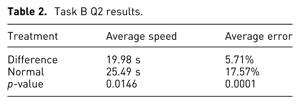
Those using the difference model answered the question about 5 s faster than those without the difference model (19.98 vs. 25.49 s), and the average error from the correct answer was only 5.71%, about 12% lower than those without the difference model. Two-sample t-tests revealed that both speed and error, when used with the difference model, were significantly different (p-values < 0.05) than those without the difference model. Thus, there is evidence that the null hypothesis may be rejected for both the speed and error, which suggests a correlation between using the difference model in a hybrid visualization and reduced time and reduced error for Q2. This statistical evidence supports the hypothesis for Q2.
A possible limitation of the data from Q2 is that there was ambiguity of what counted as the “trailing edge” in the question statement. While there was a fixed area used in evaluating the error, the participants had a less-specific definition of the area given to them. Participants could have had different understandings about which nodes pertained to the trailing edge and which pertained to the blade faces and may have included more area than intended in their estimation of the trailing edge. This could affect how long participants spent on this question, as well as how accurate their answers were.
For reference, on Design 7, those using the difference model had 15.7% lower error, at about 2 s slower, on average (with only the error being statistically significant). On Design 8, those using the difference model had 4% higher error, at about 3 s faster, on average (neither being statistically significant).
It should be noted that while some designs could produce abnormal results (see Figure 6 for Design 7, Q2 speed, and Design 8, Q2 error), most of the values follow a predictable trend. The error at Design 8 is near 0.00 for those using the difference model, and is 0.00 for those without the difference model because it was easy to tell that Design 8 did not decrease anywhere, thus both groups did quite well at making a correct judgment.
Task B Q3 results
The speed and error for Q3 were calculated for the last five designs for each participant. Table 3 shows the mean of these values for each treatment group. Figure 6 shows a comparison of these values for each design presented to the participants.
Task B Q3 results.
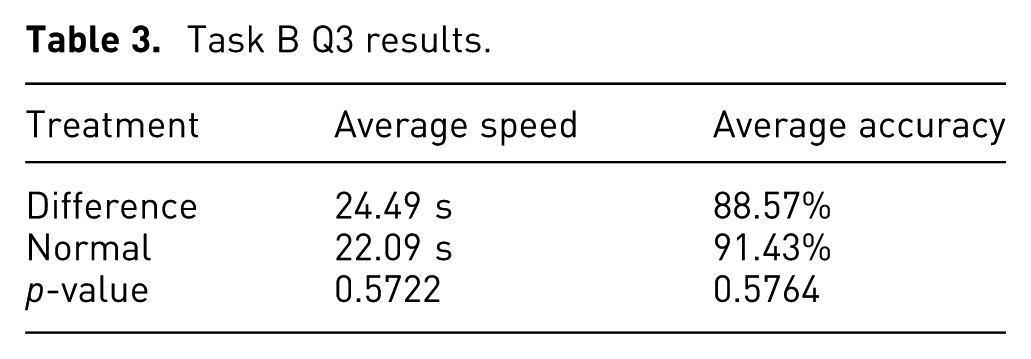
Those using the difference model performed the task 2.5 s slower on average than those without the difference model (24.49 vs. 22.09 s), and the average correct responses given was about 2% lower. The two-sample t-tests revealed that there is no evidence that the differences are statistically significant (p-values > 0.05), thus the null hypothesis may not be rejected, which does not suggest a correlation between using the difference model and the error and time spent on Q3. This task had little to do with making comparisons between designs, so this statistical evidence supports the hypothesis for Q3 that using the difference model in a hybrid visualization would not improve the results for this question.
The high degree of overlap in the standard error bars for Q3 in Figure 6 reflects the findings that there was little difference between the values for those with the difference model and those without.
For reference, on Design 7, those using the difference model had 29% lower accuracy, at about 2 s slower, on average (with accuracy being statistically significant). On Design 8, those using the difference model had 7% lower error, at about 1 s faster, on average (neither being statistically significant).
Task C
In Task C, participants were asked to find three separate new designs (combinations of parameter values) that produced at least one location that decreases 10% (10,000 lbf/in. 2 ) and, concurrently, at least one location that increases at least 10% (10,000 lbf/in. 2 ) from the nominal design. The purpose was to have the participants use the tools to find designs on their own that met specific conditions.
Task C hypothesis
It was hypothesized that those using the difference model in a hybrid visualization would spend less time on the task and recommend more designs on average that successfully fulfilled both conditions. This task was designed to test a more open-ended comparative question involving interactive design space exploration as well as perception of trends in change across an entire part.
Task C evaluation method
The three different designs recommended by the participants were entered into the program. In the program, a simple function identified if there were any nodes on the new model that had increased or decreased 10% from the nominal model. If there were at least one increasing and one decreasing node that met the conditions, that design was given a score of 1. If it did not meet both conditions, then it received a score of 0. For each participant, the scores were averaged together, for example, if two of the three designs were correct, the average score would be 0.66.
The time was measured in seconds from the moment the task was displayed to when the user clicked the “Done” button. The responses were measured for speed of the overall task and accuracy.
Task C results
Table 4 shows the average correct designs provided in Task C for each treatment group.
Task C results.
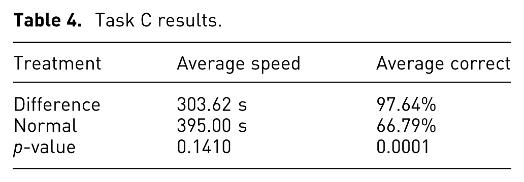
Those using the difference model performed the speed on average 91 s faster than those without the difference model (303.62 vs. 395.00 s) and provided 31% more designs that met both conditions. The two-sample t-tests showed little evidence of there being a statistically significant difference for the speeds (p-value > 0.05), but showed more convincing evidence that the average correct answers given were significant (p-value < 0.05). Thus, there is little evidence that the null hypothesis may be rejected in regard to the speed, which does not suggest a correlation between using the difference model in a hybrid visualization and reduced speeds for Task C. However, there is more convincing evidence that the null hypothesis may be rejected for the average correct answers given, which does suggest a correlation between using the difference model in a hybrid visualization and higher average correct answers. This statistical evidence supports the hypothesis for Task C in regard to accuracy, but not for speed.
Discussion
Overall, the results of the experiments show that, for many types of design activities, there is evidence that the difference model does improve the speed and accuracy of users’ abilities to perceive differences between the structural results of two different FEA models. However, the type and purpose of the comparison that a user is making affect how much including the difference model in the visualization will assist the user in their efforts.
The results of Task B Q1 suggest that the difference model can improve the speed and accuracy with which a user can assess the general level of difference across an entire part. For comparison tasks where general differences are important, visualizations with a difference model can help users accomplish the task faster and with greater success than visualizations without a difference model (e.g. “Is the new design generally higher or lower than the original design?,”“Is more than half of the new design higher (or lower) than the original design?,” or “How much of the new design has higher (or lower) values than the original design?”).
The results of Task B Q2 similarly suggest that the difference model can improve the speed and accuracy with which a user can assess the general level of difference on a specific area or feature of a part. Visualizations with a difference model can help users make comparisons about differences across an area of a part more quickly and with greater success than visualizations without a difference model (e.g. “Does the top edge of the new design generally have higher or lower values than the original design?” and “Is more than half of the front face of the new design higher (or lower) than the front face of the original design?”).
Confirming the hypotheses for Task B Q1 and Q2 suggests that, for future visualization designs when comparing two intricate designs or objects, like these 3D compressor blades, a difference model will help the users perceive not only the general trends between the two objects but also the trends over specific areas. Users can estimate the type of changes and the level of change with greater success and speed.
The results of Task B Q3 differ from the previous two by suggesting that the difference model does not improve the speed or accuracy of the user’s responses when making comparisons that involve specific values at specific locations on the two designs. This was an expected result; it was included in this study in order to confirm the limitations of the difference model in aiding perception. For tasks where users compare specific values instead of trends across the part or areas of the part (e.g. “Which locations of the new design have a value higher than X?” or “What is the lowest value between these two designs?”), there is no evidence that the difference model improves the users’ performance. While the difference model will likely not negatively impact the speed and accuracy of the users’ perception, it is not worth the cost of adding a difference model to a visualization if these types of comparisons are the only ones being made with the tool.
Finally, the results of Task C suggest that, when a user is asked to creatively explore a design space and find designs that satisfy certain comparison-based criteria, the difference model helps improve the success but not the speed with which users can accomplish the task. These types of tasks are more open-ended than the previous comparison tasks in that they there are many possible answers that will satisfy the question. The open-ended nature of this activity shows that the difference model helps users in both directed and creative comparison tasks. This is more in line with the objectives of design space exploration (e.g. “Find a design that generally has higher or lower values than the original design” or “Find a design where at least half of the front face is lower than the original design”). To take advantage of the benefits of the difference model in creative design space exploration, the types of objectives should be similar to the types of comparisons examined in Task B Q1 and Q2. While users may not necessarily complete these tasks faster with the difference model, they will have an easier time in correctly identifying target designs.
Conclusion
This research presented a method for enhancing design comparison in a design space for 3D designs with structural results. This method allows the difference in the nodal results to be calculated and shown to the user with an explicit encoding visualization, which clarifies the location and magnitude of differences between the two designs. When combined in a hybrid visualization with a juxtaposition of the two designs being compared, the context of the difference relationships is preserved and allows the user to make better use of the information. This was illustrated by comparing the stress responses of turbomachinery compressor blades to different geometric parameter inputs. Stresses that increase from the first to the second design are colored in warm colors, while stresses that decrease are colored in cool colors.
The difference model gives users a way to perceive the differences between the structural results of two designs more quickly than by simple visual inspection of the two designs. It also allows users to understand the magnitude of the differences with greater accuracy than making mental calculations between the two juxtaposed views of the designs. The user can thus understand key aspects of a design comparison more quickly and more accurately, enabling more effective design space exploration.
An experiment was designed to validate the claims that using a difference model combined with juxtaposed views of the designs would improve speed and accuracy for certain design comparison tasks. This study helps provide justification for useful visualizations in future applications of surrogate modeling of 3D structural results for design space exploration.
Based on the experiments’ results, there is evidence that including the difference model allows a user to perform tasks such as detecting changes across the entire part more quickly and more accurately. Including the difference model also helps users detect changes on a specific feature or area more accurately and more quickly. Finally, there is evidence that including the difference model can help a user suggest designs that meet specifications in an open-ended design comparison task more accurately than without the difference model, but not necessarily more quickly.
When tasks focus on a specific value rather than a decontextualized relationship (or difference), then the experiments did not yield evidence that the hybrid visualization produces advantages in speed and accuracy. This is because the difference model is designed to show the difference between two designs’ values rather than the actual values at that point and thus gives no advantage in this activity.
Further research and experimentation should be done to determine how users utilize the difference model to perform tasks. More focused tests could be done with industry experts (instead of student volunteers) to see how the tool helps with more concrete design tasks that are performed in a professional setting. Further research should also be done in how user perception is affected by displaying result values other than stresses on a part, such as using the difference model to display differences in displacement, temperature, or vibration. While the principles ought to remain the same for any type of results, perhaps other useful adaptions could be developed to enhance perception in specific applications. Useful future studies could determine how the usefulness of these methods change as the geometry of the comparison objects becomes more complex.