
Abstract
This study presents two experiments addressing the representation of scientific data, in particular airflows, with a user-centered design approach. Our objective is to provide users feedback to data visualization designers to help them choose an air flow representation that is understandable and attractive for non-experts. The first study focuses on static markers allowing to visualize an airflow, with information characterizing the direction and the intensity. In a second study, carried out in an immersive virtual environment, two information were added, the temporal evolution and the concentration of pollutants in the air. To measure comprehension and attractiveness, participants were asked to answer items on Likert scales (experiment 1) and to answer User Experience Questionnaire (experiment 2). The results revealed that arrows seem to be a very common and understandable form to represent orientation and direction of flow, but that they should be improved to be more attractive by making them brighter and more transparent, as the representation could occlude the scene, especially in virtual reality. To solve this problem, we suggest giving the users the ability to define the specific area where they want to see the air flow, using a cross-sectional view. Vector fields and streamlines could therefore be applied in a virtual reality context.
Introduction
Many physical phenomena are not directly observable with the naked eye, even if some indirect effects can be understood. This is the case for atmospheric pollution (e.g. pollutants, pollen...), underwater pollution composed of microparticles, or even wind. However, the improvement of numerical computation software and the development of increasingly accurate models make possible to obtain precise simulations in 2 or 3 dimensions, with temporal evolution. Data visualization enables a graphical transcription of these numerical data to allow user a concept exploration which could not be fully apprehended without seeing them. 1 In addition to the “invisible” physical phenomena mentioned above, simulation visualization can be extended to many areas, such as the flow of people during the evacuation of buildings. 2
These simulations results needs to be communicated using representations which are suited to the level of users’ understanding, who are still mostly experts in the specific domains. 3 Thus, the chosen representation metaphor will directly influence the users’ understanding. To engage a user, expert or not, on a complex topic, a consistent and attractive visual representation of the data should be created. 4 Few research works have studied the user experience when considering these representations. 5
The medium can also play an important role in the understanding of visualizations. The advent of emerging technologies such as virtual reality and augmented reality bring new modalities that go far beyond the most mediated uses such as entertainment, education, healthcare, or industry. Recent works show that it is possible to combine computational fluid dynamics methods with real-time 3D engines in order to visualize the simulation results not on a screen or a display wall, but via a stereoscopic vision device, and thus to be immersed at scale 1 in the environment used for the simulation. This paradigm shift opens the possibility of communicating results to non-expert users for sharing, discussion, or sensitization, but introduces a new issue concerning the nature of the representation and the interaction with it. The intelligibility of scientific data representations in virtual reality has been little addressed in the literature.
We thus carried out two experimental studies aiming at assessing different representations of scientific data, in the particular case of an air flow. The first study focuses on the static marker allowing to visualize an air flow, with the information characterizing the direction and the force. It is the preliminary to our second study, performed in an immersive virtual environment, which allows two additional information to the user: the temporal evolution on the one hand, and the concentration of pollutants in the air on the other hand. In this work, we are not interested in the possibility of directly modifying simulation parameters in real time in 3D space (for example by dynamically modifying the position of an air purifier in a room), because we aim here at studying the intelligibility of the proposed representations.
Related work
Visualizing scientific data, which can be multidimensional and multivariate, allows for understanding, analyzing, assessing and sharing. These data come from various areas such as meteorology,6,7 aerodynamics, 8 public health related to pollen, 9 geosciences, 10 or even archeology. 11 The constant increase in computational power (CPU and GPU) gives today the possibility to modify some parameters “on-the-fly,” like in flow simulations, based on CFD (computational fluid dynamics). CFD is a combination of physics and applied mathematics, 12 that allow the calculation of gas or liquid flows, and much commercial software (e.g. ANSYS Fluent, Paraview) exist today to address issues such as ventilation inside a vehicle or the behavior of air flows in a room. 13 A CFD process has three steps 12 :
Pre-processing: modeling of the geometries, initial and boundary conditions, solver;
Computation;
Post-processing: visualization of the results.
In this paper, we will focus on the last step regarding how to represent the results of a CFD computation, without mentioning the calculation process or the optimization of the whole chain as it is done in numerous research, like in Harwood and Revell. 14
Air flow simulation
Many works have proposed extensive literature reviews in the field of flow visualization,15–17 resulting in a taxonomy of different types of representations.6,18 These representations are most often “4D,” as they allow the temporal evolution of the simulated data to be examined. Adding a temporal dimension to a 2D or 3D visualization changes it into an animation, which helps to understand temporal characteristics of a phenomenon as well as the correlation between different factors represented simultaneously. 19 Although professional software allows the visualization of results from numerical computations, they are hardly accessible to non-experts. 20 Emerging technologies such as virtual reality and augmented reality can reduce the difficulties of interpreting results, through better contextualization due to immersion in the virtual or real environment, as was suggested already in 1995. 21 If computational power was a limiting factor to link CFD with extended realities, many works demonstrate the feasibility of a complete chain outside computational software, by directly implementing the Navier-Stoke equations and using video game engines,13,20,22 at the cost of lower accuracy, but which may be sufficient for exchanges with non-experts as it allows for rapid modification of scenarios and visualizations. 8 Augmented reality and virtual reality bring complementary benefits: thanks to the former, it is possible to visualize in-situ data, which is relevant in a room, 12 in a house 23 or in architectural projects, 24 but it requires the user to move. Virtual reality, on the other hand, allows the integration of many scenarios, from the real world (via scanning or modeling) or not. 18
2D and 3D representations
Helbig et al. 6 list the possible representations depending on whether the data is 2D, 3D scalar and 3D vector, emphasizing the interest of finding a representation adapted to each variable, with elements (mainly color) that allow to differentiate them. According to Post et al., 15 2D representations refer to texture-based visualization, while 3D scalar and vector 3D can be represented by geometric visualization. We will list the most commonly encountered in the literature in the context of flows. When the data is 2D, it is possible to use textures, isolines (the value can then be color and/or scale coded for the last mentioned). Representations of 3D scalar data are slices, iso-surfaces, and iso-volumes, with a possibility of figuring the value as color or opacity. 3D vector data can be represented as streamlines or arrows with color or size matching. These representations are sometimes referred to as glyphs in some works, as they can combine different information by their size, shape, texture orientation and color. 7 Finally, there is a last kind of representation, which can be described as indirect, which consists of representing the effects of a physical phenomenon on contextual elements, such as the movements of a tree and its foliage as a result of wind speed. 18 In a similar approach, some works are centered on multisensory aspects.18,25
Concerning the representation of flows in the literature, of air in particular, streamlines are the most common, giving the direction and allowing to associate an additional color information. For instance, we find this representation to illustrate the operation of an air purifier, 12 to visualize the results of an aerodynamic simulation in a wind tunnel, 8 to understand the behavior of the wind in a set of buildings 24 or to study the thermal comfort in a dwelling. 22 Vectors represented as 3D objects are frequently found in the literature to visualize the direction of an airflow, with additional velocity or force information given by the norm of the vector6,13; a color could add an informative element. There is most often a semantic link between the colors and the measurement of a variable, this link can also be related to the physical light spectrum. 7
To represent air quality, visualizations are frequently based on particles, as the concentration can be visualized by color or opacity. Colors typically range from blue to red to reflect quality degradation, 12 and similarly higher opacity indicates high concentration. 13 In this perspective, we can mention the volumetric rendering approach based on voxels, used for example to visualize interpolated pollen values, 9 rock fracture patterns based on acoustic emissions 10 or geovisualization of COVID-19 data 26 and which can be applied to air quality visualization. These works use both color and transparency: low density voxels are high transparency to allow visualization of high density, opaque voxels; voxels of close value can be drawn as isovolumes.
The representation of a gas can also be illustrated by a set of “visible” particles, such as small spheres with the same semantic possibilities.12,13,20 Densities of fine particles are frequently represented as 2D textures (heatmap) where color is an indication of concentration, for example, in cross-sectional planes.13,22,23
User-centered design
Most of the articles mentioned above are interested in the complete processing of computation and visualization, whether in virtual reality or augmented reality, and aim at technically assessing the use of emerging technologies for the visualization of data from numerical computations. Many works thus focus on optimizing computations to allow implementation on devices with low computational power such as smartphones, as they are interesting for low-cost AR. 14 Others are technical demonstrators of an integration of physical equations up to visualization (e.g. Yudin et al. 13 ). The question of understanding the proposed representations, yet crucial when they are addressed to non-experts, is slightly addressed. The development of new real-time 3D simulation tools requires a multidisciplinary approach, with knowledge in physics, mathematics, and software development, 8 but we need to take into account human factors and to consider how to make these data intelligible to experts and non-experts. Like Lan et al., 26 we believe that visualizing complex data can be useful not only for decision makers, but also for the general public. The user experience of these augmented reality and virtual reality tools is rarely assessed, even though it determines their interest for the end user. Among these few works, we can mention the study of Giraldo et al., 18 which evaluates the effects of three different wind representations (including a tactile restitution and an external restitution) on the perception and the feeling of presence, or the study of Stone et al., 20 which applies human-centered design principles in the design of the virtual reality tool dedicated to evaluate the thermal quality of a house. In the case of 2D representations, Quispel et al. 5 focused on ergonomic criteria to study the relationship between familiarity, perceived ease of use and attractiveness of graph designs. The need for a user-centered design approach is also evoked by Berger and Cristie 22 and Lan et al. 26 Beyond intelligibility, a representation can also be unsuitable for virtual reality or augmented reality, such as particles with an opacity gradient that hinders the user from seeing enough of the environment, or 3D visual elements (streamlines, vectors) too close to the eyes of the user and therefore disturbing. It is therefore necessary to conduct ergonomic evaluations of these representations, and to take the user into account when developing tools for visualizing scientific results.
The aim of the user-centered approach is to design software that is adapted to its end-users. 27 The ISO 9241-210 28 standard identifies six principles that characterize user-centered design: (1) the design is based upon an explicit understanding of users, tasks and environments; (2) users are involved throughout design and development; (3) the design process is driven and refined by user-centered evaluation; (4) the process is iterative; (5) the design address the whole user experience; (6) the design team includes multidisciplinary skills and perspectives. A human-centered approach requests four main tasks to be carried out. The first task consists in understanding and specifying the context of use. The second is the specification of user needs and the other stakeholders requirements. The third is the production of design solutions that can be for instance mock-ups or prototypes. The fourth task is the assessment of the solutions at each stage of the project, from the early concept design to long-term usage, to make the best design choices. There are two main user-centered methods that can be used to carry out this last task, namely user testing and expert evaluation.
In the present work, we opted for two iterations of user testing on mock-ups and prototypes with an experimental comparison approach.
How to represent particle flows in an understandable and pleasant picture?
Hypotheses
In the present experiment, the two parameters that will be represented are the direction and the intensity of an air flow. Overall, it is possible to represent flows in a way that evokes a vector, that is, with a line that goes directly in the direction of the flow. Another possibility is to use a metaphoric representation, such as a windsock with the position depending on the air flow, but this solution requires an effort of interpretation. Concerning the direction, our first hypothesis was that a vector-like representation (a line in the wind direction or an arrow) would be more understandable than a Windsock metaphorical representation, as it does not require interpretation.
The representation of flow intensity in a vector representation can be based on color, or on the shape of the representation (here, the length of the lines). The use of gradient color codes from green to red appears so common that it can be expected to be more easily interpreted and understood. Regarding intensity, our second hypothesis was that the use of a color code allows a better understanding than a difference in shape (i.e. line size).
Method
Forty-one participants (37 men and 4 women), all students in a French engineering school, carried out the experiment. The youngest were 22 years old and the oldest was 38 years old. Their mean age was 22 years old (SD = 2.828).
Each participant was asked to observe on a computer screen a picture showing a 3D environment in which an air movement (i.e. a direction and a force) was symbolized. Three pictures were examined successively by the participants, each of them using different way of representing the air movement (see Figure 1) color arrows pointing the direction of the wind, and color representing its intensity, (2) windsocks, like a real one, behave as if they were pushed by the wind, inclining in the direction of wind, more or less depending on its intensity, (3) tab are blue points which unfold under the effect of the wind, thus becoming blue lines in the direction of the wind, with a length depending on its intensity.
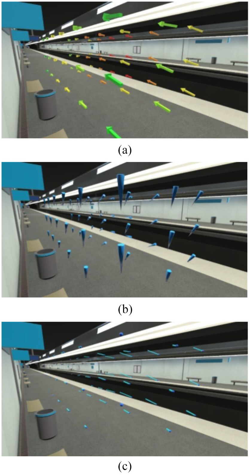
Three different representations of air movement (direction and force): (a) colored arrows, (b) windsock, and (c) Tab representations.
The order of presentation of the pictures was counterbalanced between the participants. After each picture examination, the participants had to answer the four following item on Likert scales from 1 to 10:
This representation allows me to visualize the direction of the air movements;
This representation allows me to visualize the intensity of the air movements;
This representation has good aesthetic qualities;
This visualization prevents me from seeing the scenery.
Results
The Means and standard deviations for the scores concerning the perception of the three pictures are represented on Figure 2.
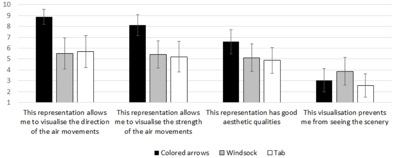
Means and standard deviations for the scores concerning the perception of the three pictures.
Regarding the distribution of the scores for each item, a Levene test was used to verify homoscedasticity between the three conditions. It revealed acceptable homogeneity of variances for aesthetic qualities (F(2) = 0.662, p = 0.518) and the visualization prevention (F(2) = 1.321, p = .271), but not for the perceived direction (F(2) = 16.186, p < 0.001) and the perceived intensity (F(2) = 3.554, p = .032).
ANOVA with repeated measures revealed a significant difference between the conditions for the evaluation of aesthetic qualities (F(2) = 7.914, MS = 34.96,
Friedman test revealed a significant difference between the conditions for the evaluation of the wind direction (χ
2
= 35.796, df = 2, W = 0.437, p < 0.001). Pairwise comparison showed that the condition arrows differentiate with tab (p < 0.001) and windsock (p < 0.001), and tab with windsock (p = 0.025). Concerning the evaluation of wind force, Friedman test revealed a significant difference between the conditions (χ
2
= 28, df = 2, W = 0.341, p < 0.001). Pairwise comparison showed that the condition windsock differentiates with tab (
Discussion
The objective of this first experiment was to evaluate the different representations’ intelligibility on the two air flows parameters: direction and force. The first hypothesis was that a vector-like representation would be more understandable in terms of direction than a Windsock metaphorical representation, as it does not require any interpretation. The results are only partially consistent with this hypothesis, as participants rated the colored arrows as better at representing the direction of flow than the two other conditions, but Windsock and Tab are indistinguishable. It is possible that the low score for the Tab condition is due to the fact that the line does give an orientation, but in the absence of any arrow, it is not known in which direction the flow is going.
Regarding intensity, our second hypothesis was that the use of a color code allows a better understanding than a difference in shape (line size). The results support this assumption since, once again, the colored arrows condition is superior to the other two. The colored arrows condition is thus judged to be the most comprehensible on the two parameters, while also being judged to be more attractive. Finally, we note that the Tab condition is the one that prevents the least from seeing the scenery. This last point will have to be the object of particular attention for the design of flow visualizations.
A limitation of the proposed representations is the necessary discretization of the space-time, which may lead to not accounting for some subtle variations of the flow. In a use case of decision support on the positioning of air purifiers in large volumes (subway station), this is not a blocking point. However, it would be relevant to be able to represent where these subtle changes occur and to provide a zoom in/out mechanism to inspect the corresponding volume.
How to represent understandable and pleasant dynamic particles in a 3D environment?
Hypotheses
In this second experiment, a third parameter was added in addition to speed and direction: the particle concentration in the air. Overall, the air shown in the scene is cleaner when it comes out of a filter than before passing through it. The representations are no longer static images, but virtual reality animations. Thus, the direction and speed of the air flows are directly represented by the movements.
In virtual reality, it is tempting to try to represent the phenomena as realistically as possible. However, it is questionable whether imitation of reality is really the best way to achieve an intelligible representation. The first assumption was that a schematic representation in the form of 3-dimensional arrows is more comprehensible than a realistic representation of moving particles.
In some cases, we are looking for beauty, while in others we are looking for intelligibility. Both criteria may therefore be important depending on the context. The second hypothesis was that a schematic representation appears unattractive, compared to a representation of bright particles with a trail like a comet.
Method
Eight participants (six men and two women), students in computer science, have been asked to carry out the experiment. The youngest was 22 years old and the oldest was 27 years old, for a mean age of 24 years old (SD = 1.941). All of them were familiar with using virtual reality. All the participants were asked to explore in virtual reality a modeled room in which dynamic air flows were represented by three specific types of animations (see Figure 3). The objective of the three representations were to make understandable the impact of an air filter in the room, by visualizing the dirty air and the clean air flows. In the artistic representation, the flows were represented by blue light trails moving in the air. The schematic representation was flows of 3D arrows, dark for the dirty air and blue for the clean air that came out of the filter. Finally, in the realistic representation, the participants saw gray particles for the dirty air, and blue particles for the clean air.
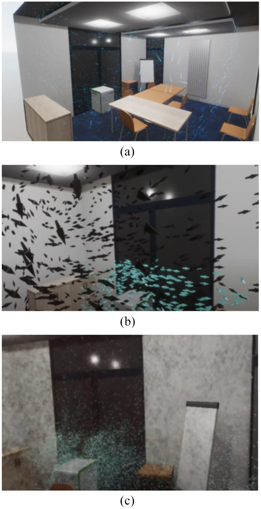
Three different representations of dynamic air particles: (a) artistic representation, (b) schematic representation, and (c) realistic representation.
All the participants were immersed in virtual reality with HTC Vive headset during 5 min with each of the three conditions. The order of presentation was counterbalanced. After each presentation, they were asked to answer the French version of the User Experience Questionnaire. 29
Results
Regarding the distribution of the scores for each item, a Levene test was used to verify homoscedasticity between the three conditions. It revealed acceptable homogeneity of variances for attractiveness (F(2) = 1.114, p = 0.347), perspicuity (F(2) = 0.073, p = 0.930), efficiency (F(2) = 1.732, p = 0.201), dependability (F(2) = 0.134, p = 0.876), stimulation (F(2) = 0.289, p = 0.752) and novelty (F(2) = 0.231, p = 0.796).
The Means and standard deviations for the scores concerning the perception of the three pictures are represented on Figure 4.
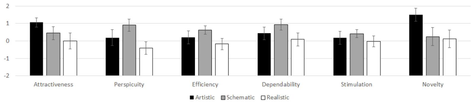
Means and standard deviations for the dimensions of the User Experience Questionnaire 29 concerning the perception of the three visualizations.
ANOVA with repeated measures revealed no significant difference between the three conditions for efficiency (F(2) = 2.923, MS = 1.255,
Concerning novelty, ANOVA with repeated measures revealed a significant difference between the three conditions (F(2) = 5.672, MS = 4.625,
ANOVA with repeated measures revealed a significant difference between the three conditions for attractiveness (F(2) = 8.477, MS = 2.272,
Finally, ANOVA with repeated measures revealed a significant difference between the three conditions for perspicuity (F(2) = 4.68, MS = 3.456,
Discussion
The first hypothesis was that a schematic representation in the form of three-dimensional arrows is more comprehensible than a realistic representation of moving particles. The results are in line with this hypothesis, as the participants found the application more insightful in the schematic condition than in the realistic condition.
The second hypothesis was that a schematic representation appears unattractive, compared to a representation of bright particles with a trail like a comet. The results are only partially consistent with this hypothesis, because there is no difference between the three conditions concerning the stimulation, a superiority of artistic condition compared to realistic condition for attractiveness, and a superiority of artistic condition compared to schematic condition for novelty.
In virtual reality, we noted that the problem of not being able to see the environment can be detrimental when a shape passes near the users eyes. This problem seems to be more important in realistic condition, which may explain why evaluations are so low in this condition.
General discussion and conclusion
The objective of the two experiments described in the present paper was to provide users feedback to support data visualization designers’ choice for air flow representation in order to make it understandable and attractive. The results revealed that arrows seem to be a very common shape understandable to represent orientation and direction of flow. This kind of schematic shape could be improved to be more attractive by making it brighter and more transparent.
Moreover, a difficulty concerning the shapes preventing the participants from seeing the scene has been noted during the two experiments. To solve this problem, we suggest giving the user the possibility to delimit the area where he wants to see the air flow. We also develop a different concept of representation based on the idea of a specific need to decide where to position the filter in the room to maximize the efficiency. The user can visualize a sectional view of pollution densities in the room, which can be simpler and sufficient to make a relevant decision (see Figure 5). This idea of a partial representation on a surface or a volume delimited by the user could also allow the use of vector fields, which does not seem relevant in virtual reality in the case of a representation of the whole data (Figure 6). Streamlines are very common in the literature, and we consider that they could be adapted to virtual reality, although they are in fact different from arrows representations and are closer to an artistic visualization. In the same way, the discretization of the space-time must be able to be modulated with the representation (i.e. without hindering the user), according to the need for precision, in order to consider the subtle variations in the flows. These new developments have not yet been evaluated by user testing, which constitutes our research perspectives.
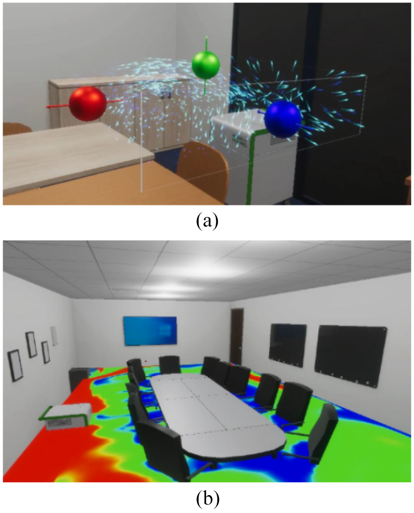
Partial views of the data: (a) air flow and (b) sectional view.
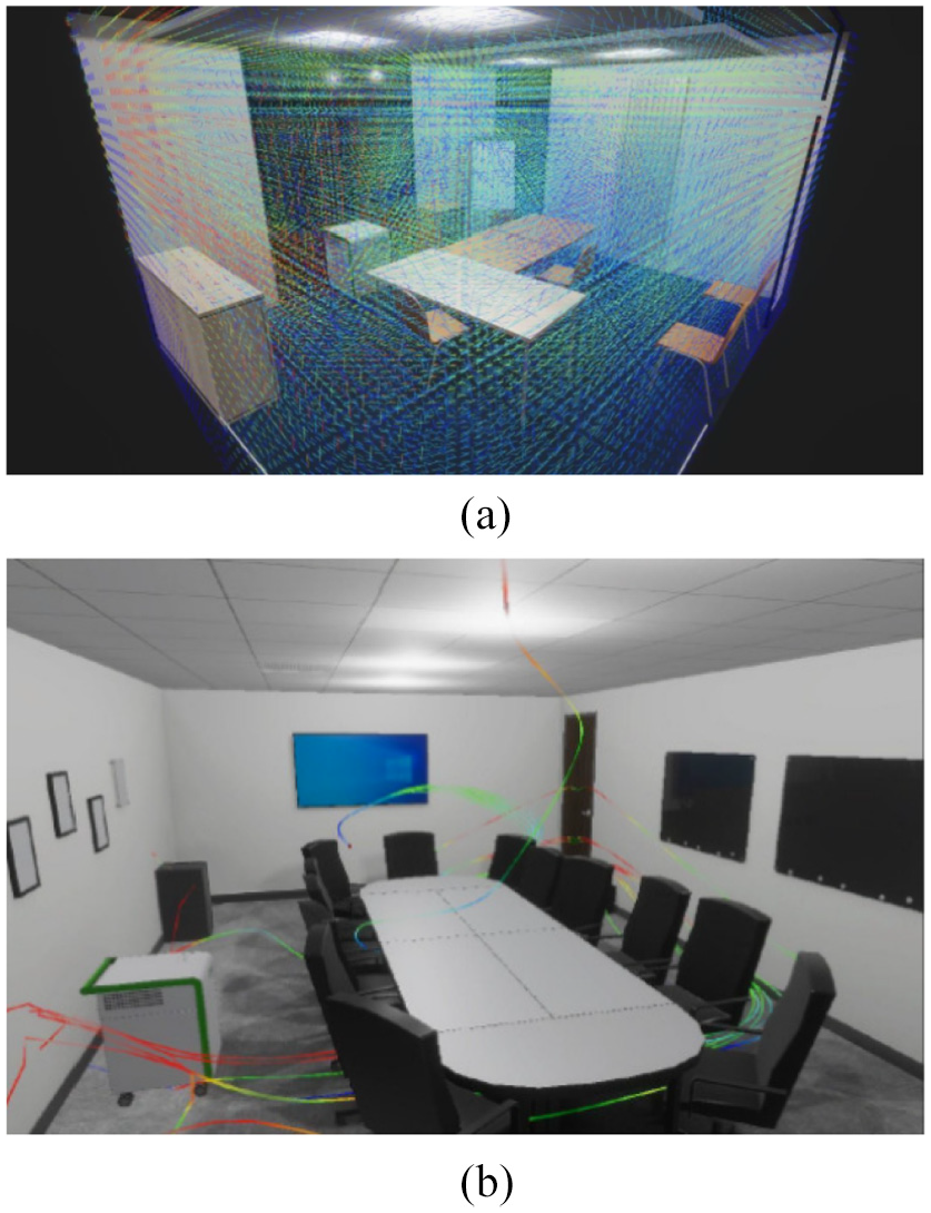
Representation proposals: (a) vector field and (b) streamlines.
One important limitation of this research is that the relevancy of design choices is strongly dependent of the specificities on the use cases. It depends on the parameters to represent, the use that will be made of the representation (training, decision-making, etc.) and presumably the technical knowledge of users. Because of these differences, it is difficult to have a general discourse on this subject. Future work on this topic would be to categorize the types of user profiles, data types and uses in order to build a set of targeted recommendations.